Transcripts
1. Introduction & What You'll Learn: Hi, I'm Vanita an
illustrator and a designer. In this class, I'm going
to show you how you can create a basic
crosstich brush, and with the help of this brush, we are going to
create some beautiful spring inspired
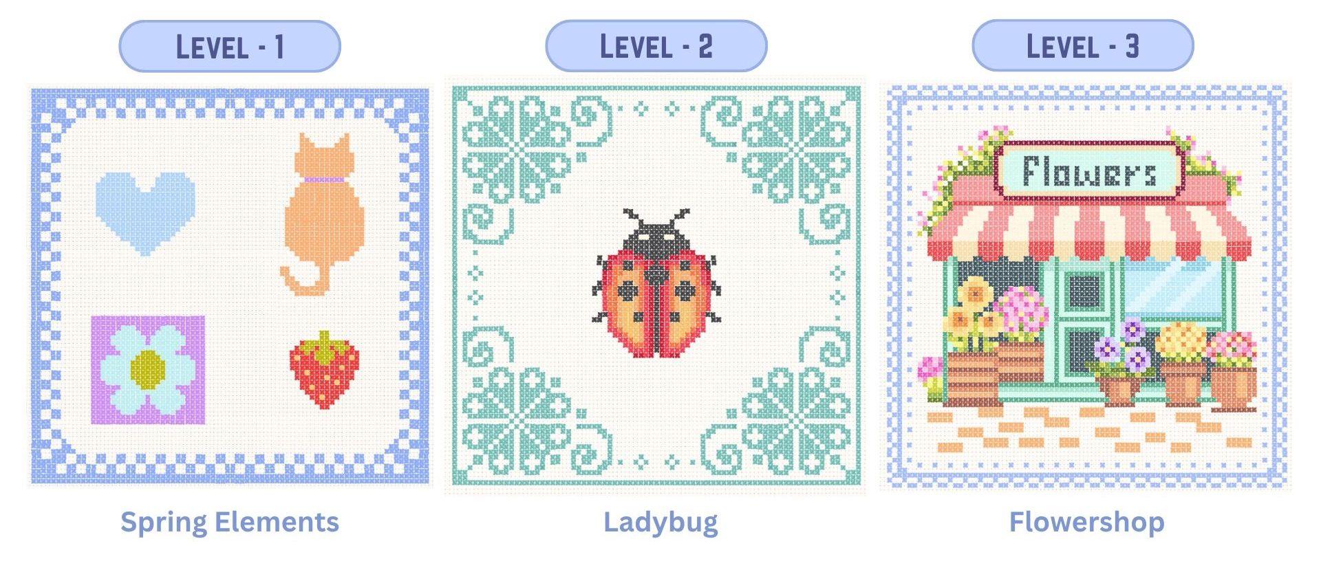
artwork in Procreate. We will be working on
three different projects. I have divided them
in three levels. We will start by creating
our own custom brush from scratch and use this brush to
bring each project to life. Level one will focus on simple shapes and using
just two to four colors. Level two will be slightly more detailed with around
seven to eight colors. And finally, in Level three with a more intricate project
that uses around 30 colors, which allows you to create a very rich and
detailed artwork. To get you started, there are numbered sketches
and color palettes in the resource section. So see you in the class.
2. Project & Resources: For your class project,
you can create either the artwork that we
have done in the class, or you can also create your own with the help of these
cross stitch brushes. I have included four
numbered sketches, and along with each sketch, there is a color palette. You can find them in the
resource section of this class. The mushroom is an extra sketch for you to practice
for level two. I have also included
this PDF file, which you can refer to while
working on these projects. It can help you complete the project without
any confusion. These are few more
spring inspired artworks that I have created using
the same cross stitch brush. I hope this class can
give you some ideas and inspires you to create some beautiful spring
inspired artwork. I would love to
see how you added your own twist to these
cross stitch artworks. Once you're ready
with your artwork, you can post in the project
section of this class.
3. Creating Cross Stitch Brush: So let's create our
crosstitch brush. Our very first step is to create a new canvas for which we'll
tap on this plus icon. Again, on this tiny
plus icon here. You canvas size should
be 4,000 by 4,000 pixel with 300 DPI and tap done. Now, next, we need to select our brush so that we can
draw our cross stitch shape, tap on the brush library, and we need to select
our studio pen brush, which you can find under the classic library in
the inking section. You can also select any
other similar brushes. Here, when I scroll down, you can see the studio
pen, select this brush. And before we start drawing, we need our drawing
guide on this Canvas. For that, I'll tap on this
wrench icon menu under Canvas. Toggle on this option called Drawing Guide and tap
on Edit Drawing Guide. Here you should be
under symmetry. After you tap on symmetry, make sure under option, your vertical symmetry is
selected and tap done. Next, we need to
select a black color. Make sure it is
completely black. Next, we can start by
drawing an oval shape. It doesn't have to
be very perfect, but try to create this
elongated oval shape. And fill it with the
same black color. Next, we'll select this shape, make sure your uniform
option is selected, and we'll rotate this so
that it can fit diagonally. Now to fix this corner, we'll select the warp tool, and I'll try to adjust
this nice pointy corner. So you should end up with a shape looking very
similar to this. Now, our next step
is to add texture and a very thread like brush strokes on
top of this shape, for which we'll add a new layer, tap on this layer and
add clipping mask. Next, from the color panel, we need to select a
very light gray color. Next, we'll go to
the brush library. Here under airbrushing, I'll
select the medium brush. And you can start adding
these uneven brush strokes. I'm trying to create
this thread like effect. After we are done
creating this brush, you can always come back to this clipping mask
layer and keep experimenting and trying
different strokes and texture. This will also help you understand how different
brush strokes and effect can change how your
final crosstich brush looks. So I'm done with my
brush strokes here. Let's move on to the next step, for which I'll select both
our layers and group them. Those this group, swipe
left and tap duplicate. Select the second
group which is at the bottom, select this shape. Make sure you are under uniform, tap on flip horizontal. This will flip the
shape at the bottom. Now the next step is optional, but I would like to adjust a few brush strokes
for the second shape. I'll go back to layers and I'll select the clipping mask
for the second shape, and I'll select my
medium airbrush again. And I'm going to
select the black color and start adding some
rough brush strokes. Now, my purpose
here is to not have a very even brush stroke
on both the top and the bottom shape because right now it looks very symmetrical because we flip the same shape now we are ready
with our shape here. Our next step is to
copy the canvas. For that, we'll tap on
this wrench icon menu, tap on add, here, tap on copy Canvas. This will copy everything
that is on the canvas. Now we'll go to
the brush library. I'll pinch and get
out of this section. You can either be in one of the section or you can
create a new section. I'll tap on one of the section, tap on this plus icon. Here we'll tap on
Create New set. I'll rename mine
as cross stitch. You can rename anything of
your choice and tap apply. Now you can see an empty
set that is created here. Now you can create
your new brush here. For that, we'll tap
on this plus icon again and this time we'll
tap on Create New Brush. Now, this will open all the settings we need
to create a new brush. Now our first step here
is to adjust the spacing. For now, I'll keep
the spacing to 62%. You can also come back
and adjust this again. Next under stabilization,
you can keep the amount to around 30% and the stabilization
amount to around 10%. Next under shape. We'll tap on edit,
import, and paste. This will paste our
shape from the canvas. Now we'll tap with two
finger on this image. This will invert your
image and tap done. Next, we'll tap on Apple pencil. Here, the opacity will be none, which is 0% and tap done. Now we have our brush ready. Let's try this on the canvas. I'll hide all the other layers, and I'll add a new layer. Let's zoom in, and this is
what the brush looks like. Let's see how this looks
with a different color. Also, let me show you how
to rename this brush. Select and hold on this brush. You'll get this
option called rename. I'll rename this as cross
stitch one or cross stitch brush and tap apply. Now let's move on to creating some beautiful artwork
with this brush.
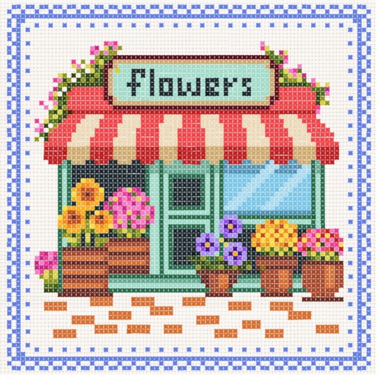
4. Level 1: So let's start with our very
first crossstitch project. You'll be able to find this file in the resource
section of this class. You can download this file
and open in Procreate. There are four very
simple motifs, starting with a simple heart
that has just one color, then a cat with just two colors, followed by a simple
flour and a strawberry. And this file also comes
with a very basic border. Next, you should also have the color palette from
the resource section. When you download under
the palette section, you'll be able to
find your palette that says cross stitch page one. Make sure it is selected. Next, you should be
under the card format. So tap on cards. Here you will be able to see that each color has
a number for it. Let's start with
the first color. This is light blue, which says number one. Wherever you see number
one on the canvas, you should be adding your
brush strokes accordingly. Let's start with number one. I'll select the first color. For easier access, you can also pull out this
color palette window, this stays on your
canvas and you can also move around
depending on your comfort. Now let's go to layers. Here I have around seven layers. The first layer is the grid. I'll zoom in, and this is
what the grid looks like. The second one is the border. So now each element is numbered and they are
all on a separate layer. I'll also be adding
a new layer for each element to add
the crosstich detail, but you can also choose to create everything on
one single layer. So let's start with our first
element that is the heart. For that, we need to add a new layer on top of
the numbered layer. First, select the heart layer, then add a new layer. I'll reduce the opacity of the numbered layer
to around 50%. Reducing the opacity
is also optional. Next, under the brush library, make sure your crosstitch
brush is selected. Now here we need to adjust
and freeze the brush size. You have to keep adjusting
the brush size until the size of each crosstitch
fits into the grid size. One cross stitch should
fit into this tiny square. That looks too small, so let's
increase the brush size. Right now it is at 25. I think this is slightly big. I think we should try 24. Let's reduce it slightly. And when you know
the size is perfect, you have to tap
on this tiny tab. On the right corner, you can see this plus icon. You can tap on that and you'll get this little
mark on your bar. Whenever you're adjusting
the size of the brush, it snaps on that little bar. I'll place this color
palette on the right side. Make sure you are on
the correct layer. And we can start with
our first motif. And now whenever you're
adding a brush stroke, you can hold on to
that brush stroke until it fits into this grade. Every cross stitch should be fitting into this tiny square. You can either draw your
lines as horizontal or vertical or just
tamp each stitch. I'll try vertical here. This will need some
practice and patience. You can also have any other
color of your choice. I feel this light
blue is too light. I have also included
a PDF file in the resource section with all the finished artworks along with their
numbered guides. Referring to this file can make the process much easier to follow and help you complete the project smoothly
without any confusion. And we are done with
our first motive here. Let's hide the numbered layer. And this is what our
crossstitch heart looks like. Now, let's move on to
our second motive. That is the cat. For the cat, if you see closely, there
are two numbers here. One is number two, and
one is number six. We'll start by
adding a new layer and we'll reduce the opacity
of our numbered layer. So for number two, we
have this color orange, so we'll select the color. We'll start adding this brush stroke wherever we
see number two. And Here, it says number six. So we'll go to the color panel, and I'll select
this purple color. Now for the rest of the body, it says number two again. So I'll go back and
select the orange color. We're done with our cat here. Let's hide the numbered layer. Now let's move on
to our third motif. This is like a square with
the flower in the center. There are three color in this. Let's start with our first
number that is number six. We can go to the color panel and select the color that
is for number six. Before we start, we need to add a new layer on top of
the flow numbered layer. Also, I'll reduce the opacity
of the numbered layer. Now for the petals, it says number seven. It's this light mint color. I'll start adding
these brushstrokes wherever I see number seven. Now for the center
of the flower, it says number three.
I'll select the color. You can experiment with a lot of different
color combination for this flower and patch them all together into
the seamless pattern, and that will create
a very cute print. And we are done with
our flour motif here. Let's hide the numbered layer. Now, let's move on
to the strawberry. I will be reducing
the opacity of the numbered layer and add a new layer on
top of this layer. In total, we have three
colors for this motif. Let's start with the first
one. That's number three. Next color is number four, which is this bright red. The last color is number five, which is this bright yellow. And here we are done with
all our four elements. Let's move on to the border. Now for the borders,
I'll go to layers and reduce the opacity
of my numbered layer. Next, we can add a new
layer on top of this layer. The number that shows on
the border is number eight. I'll select this
number eight color. And we also need
symmetry guideline. So we'll go to this
French icon menu. Under Canvas, I'll toggle
on this option called drawing guide and tap
on Edit Drawing Guide. Here under symmetry options, make sure your quadrant
is selected and tap done. We can start from the center. Now, when you add a brushtroke, it is going to work for
all the four sides, like you can see at
the bottom here. So we will work in
shape like this. And we are done with our first
crossstitch artwork here. I'll hide the grid layer and also turn off
the drawing guide. Cancel the color window. Let's zoom in, and this is what our final
project looks like. Now let's move on to our second project
that is the ladybug.
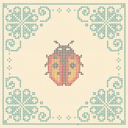
5. Level 2 Ladybug: Let's start with our
second crossstich project. You can find this sketch in the resource section
of this class, download the file and
open in Procreate. And this is what the
file looks like with a nice floral border and a
little ladybug in the center. And you will also find the color palette in
the resource section. So make sure you
have that file too. Make sure the color
palette is selected, and you should be
under the card format. Like our first project, you will be able to see that each color has a number for it, and we can start by
selecting our first color. I'm going to select number one, which is a dark charcoal black. I'm also going to
pull this color panel out so that it is
easier to pick colors. Now let's go to layers. You'll be able to see there
are four layers here. The first one is with the grid. I'll zoom in so we
can see it clearly. So the first one
is with the grid. The second one is the
lady bug in the center. The third one is the border, and the fourth one
is a fabric texture. Let's start with the ladybug. For that, we'll need a new layer on top of the ladybug layer. I'll reduce the opacity of the numbered layer
to around 50%. Next, we need to switch
on our drawing guide. I have already saved the file
with the drawing guide on. If it is not visible, you might have to go back to the canvas and switch
on your drawing guide. For the ladybug, we just
need the vertical symmetry. So under the option, make sure
your vertical is selected. Make sure it shows
assisted on the new layer. We'll skip the
center line for now. We'll start with
the second line. I'll start adding this
dark charcoal color wherever it shows number one. You can also work on this whole artwork without
the symmetry guideline. One of the reason of me
using this feature is just to show you how this
feature works with this brush. Now for the center line, I'll just switch off
the drawing guide on that particular layer, tap on the layer and
tap drawing assist. Now, let's move on
to the next color. We'll start by selecting the
color that says number two. It's this bright red. For this, we need drawing
assist on the layer. So I'll go back to the layer, tap on the layer and
tap drawing assist. And I'll start adding these brushstrokes
wherever I see number two. I can see I have missed this
spot that says number one. I'll go back to that color
and quickly fill in. Now let's move on
to the next color. So I'm going to start adding this brush stroke wherever
I see number three. Okay. I think we are done with our
Number three here. Let's move on to number four. I'll select the color and start filling in wherever
you see number four. Next is number five. Next selecting number six. You can see how different
shades of these reds and oranges is giving you
this nice gradient effect. For the ice, we have
this number seven, which is this off white color. So we are done with
our ladybug here. Let's move on to the borders. For the borders, we'll
go back to layers. I'll select the
numbered border layer and we'll reduce the opacity to around 50% and we'll add a new layer on top
of this numbered layer. Tap on this layer and
tap drawing assist. Right now, I just have
my vertical symmetry on, but we need the one
with the quadrant on. So for that, we'll go back to the wrench icon
menu under Canvas, tap on Edit Drawing Guide, and under options, you need to select
the option quadrant. And also, if you need
to adjust the center, you can always come back and
adjust here and tap done. Now, let's start
filling in the borders. For the borders, you can see I have numbered them as zero, so I'll select the
zero, the green color. With your quadrant symmetry on, you just have to finish
one corner of this border. The other three will be
created at the same time. For this particular space, we can come back later. For that, we don't need
the symmetry guide. You can see here when you
just add it in one corner, you can see it on
all the four sides. I have increased the
speed slightly here, but you can just pause the
video and take your own time. Let's zoom out and see how the flower looks on
all the four sides. Now for the center here, we don't need the symmetry. So I'll go back to the layer
and tap on drawing assist. It will turn off the
symmetry and we can manually just add a
stitch on both the ends. So we have completed the
ladybug artwork here. Now, let's hide the grid layer, and also I'll hide the
symmetry guideline. Cancel my color palette window. And Now, one tip I want to add here is, if you want your artwork to
get more darker and vibrant, just select your
layer and duplicate. You can see the difference how suddenly your stitch
looks more darker. I'll hide and unhide the layer so you can see
the difference clearly. Now let's move on to
the third artwork that is the flower shop
in the next lesson.
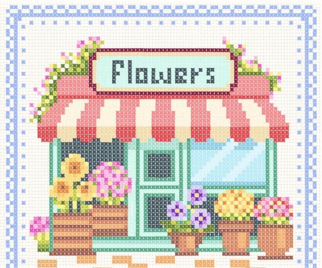
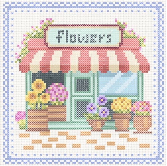
6. Level 3 - Flower Shop : Part 1: Let's start with
our third artwork. That is the flower shop. For this project too, you will be able to find the numbered sketch in the resource section
of this class. The number of colors
for this artwork is 30. There are 30 shades, so it may take a bit
more time to complete. Now, let's see the layers. I have four layers here. The first one is the grid. For this file, I have this extra layer
that says draw here, which we can use for drawing.
It's an empty layer. Next layer is the flower shop, which is the numbered
layer for the artwork. And the fourth one is the
fabric texture layer. You can either be on
the draw here layer or you can add a new layer on
top of the numbered layer. Let's start with our first
color that is number one, which is also the
roof for the shop. Also make sure your
crosstitch brush is selected. Next under the color palette, make sure you have this palette from the resource
section of this class. You will be able to see
that all the colors are numbered and the maximum
color is until 29. Now let's go back and select the color that
says number one. I'll reduce the opacity of
the numbered layer slightly, and I'll also reduce the
opacity of the grid layer. And I'll start adding this crosstitch brush stroke
wherever I see number one. Most of this number one
is part of the shop roof. For this artwork, I have
sped up the process since it's quite detailed and would make the lesson too
long otherwise. Feel free to pause at any point and work through
it at your own pace. After completing the
first two projects, you already have a
good understanding of how the brush works. So this will be a great
practice to build on that. I have also included
a PDF file with all the finish artworks along
with their numbered guides. Referring to it can make the process much
easier to follow and help you complete the project smoothly
without any confusion. I'll be illustrating the entire artwork on a single layer, but you can separate different parts of the
shop onto multiple layers. For example, you could
keep the roof on a separate layer and experiment with different
striped color combinations. And here I'm done covering
most of my number one. Let's move on to number two. Number two is slightly
darker of the same red. And most of this red is
also part of the roof. Now let's move on
to the banner or the board that says
flaws on the top. There's an outline for this
board with the number nine. I'll go back to
the color palette and we can select number nine. There is no particular
sequence or method I follow when
creating these artworks, but it often helps to start
with the basic shape or structure or begin with a color that covers the
largest area of the design. So now we are ready
with the outline. Now let's fill in some
colors and the letters. Next is number four. This is basically another
layer of the outline. Next is number eight, which is for the letters, the heading that says flows. Next, we can fill
in this whole area. They are all the same color. It says number five. You can also replace or
change any of these colors and we are done with
the banner here. Let's move on to the
remaining part of the roof. We can start with number three. I'll select the color. The roof has this red and
off white pattern. So what we are creating
is the off white part. Next is number four, again, which is the darker
shade of the same color. Now we are done with our
roof and the banner. Let's move on to
the bottom part. Here there is this outline
with number seven, and for that, we can select
this dark green color. It's like the structure or you can say the
walls for the shop. For this, we will be using the number five, six, and seven. All three are different
shades of mint. Next is number six, which is like a lighter
shade of the same color. There's one line at
the bottom here. Next is number five. Again, a more lighter
shade of the same mint. Now, let's see number eight. If you see here, most
of this is eight, which is this very
dark green color. I'll select the color. Let's
start from the left corner, which is a part of the window. We also have the same color at the top and the
bottom of this door. Next, we'll be
covering this area, which is like a glass window. And there are three colors
here that is ten, 11 and 12. It's like different
shades of light blues. I'm going to start
with number 12. Next color we need is number 11. This number 11 is the
reflection on the glass. Now, rest of the glass, we can fill in with number ten. This is what my artwork
looks like right now. Next, we can move
on to the pots. There are three
number for the pots, 13, 14 and 15. We can start with
number 13 here. These three numbers
are different shades of orangish browns. I'll go to the Color panel
and select number 13. Next is number 14. And And the third
one is number 15. Next, we'll move
to the right side. There are three more pots here. We need the same three colors
that is 13, 14 and 15. I'll start with 13 again. Next is number 14. Now, the third one
that is number 15. And here we are done
with all our pots. Now, here for the
tile at the bottom, we need the same 15 color Now let's move on
to the part two of this project where we will
be adding all the flowers. Okay.
7. Level 3 Flower Shop : Part 2: Now for the second part, let's
fill in all the flowers. Let's start with the first one. It's in different
shades of yellows, which looks like a
bunch of sunflowers. The numbers are in 20-23. I'm going to start with 20. It's this medium bright
yellow, like a mid tone. To add your own twist
and personal style, you can also experiment with different color choices
for the flowers. Next is 21, a lighter
shade of yellow. Next is 22, a more
darker and brighter. When you add different
shades of the same color, it adds depth and dimension
to your illustration. This variation helps
create highlight and shadows and also helps your
artwork from looking flat. Next is 23. Next is number 13, which is the darkest for
the center of this flower. Now let's move on to
the second flower pot. This one is in shades of pink. For the first
flower, I'll quickly add some stem and the leaves. And There is this tiny flower
in the corner here, which is, again, in
the shades of pink. We can start with
the green first. Now, let's go to our
third flower pot. Here, the flower is in
beautiful shades of purple. The numbers are 24, 25, and 26. Next is 26, which is
the darkest purple. For the center is this
nice bright yellow. Now, the next is, again, in the shades of yellows, same shades as the first flower. Now, let's move on to
our fifth flower pot. Again, I'm just going to follow the numbers and keep
adding these cross stitch. It's a mix of red,
pink, and yellow. And we are done with all
our flower pots here. But there are these
creeping plants at both the ends of the roof. It's like those very
common creeper plants with pink and lilac petals. I'll start with
the greens first, starting with number 16, which is this very dark green. I will continue with the same color on the other side, too. You can even complete one whole side and then
move to the other, whichever you prefer is okay. Now let's move on to the pins. Now let's move on
to the borders. For that, we'll start
by adding a new layer. And next we need our symmetry
guideline on this layer. For that, we have to go to the wrench icon
menu under Canvas. We'll toggle on
this option called Drawing Guide and tap
on Edit Drawing Guide. Here under symmetry options, make sure your quadrant
is selected and tap done. The borders are
showing number zero, so I'm going to select
my first color. You can also have any other
color of your choice. So like we did in the
first two projects, we just need to fill in
one corner of the border. We can complete
the center later. For the center here, we need to switch off the drawing guide. And we have finally completed
the flower shop project. I'll switch off
my drawing guide, hide the numbered layer, and also the grid layer. And this is what the final
illustration looks like. And if you feel it
looks too light, you can duplicate the layer. It multiplies and
the illustration looks more darker and vibrant. Mm
8. Create Your Own Motif: In this lesson, I'm going to show you one of the
method that you can use to create your
own motif from scratch. Let's start by going
to the layers. Here I have three layers. The first one is the grid. The second is the image
of this very basic leaf, and then the fabric texture. Make sure your image
layer is selected. Next, we'll select this image. You'll see this tiny blue
nodes around the image, tap on the one in the center. This will show you
the exact pixel of the image here on the left side, I'm going to type in 50 and that will make
your image very tiny. Next, just deselect this image. Now, select again and I'll stretch this image
and get it bigger. Once you're happy with
the size, deselect. This will make the
quality of the image very low and the image
will get pixelated. This will make the placement of our cross stitch much easier. Next, I'll duplicate this image and I'll place on
the right side, so it is easier for
us to pick colors. I'll reduce the opacity
of our first image. We'll use this image as a guideline to place
our cross stitch. Next, I'll add a new layer and make sure my cross stitch
brush is selected. So my goal here is to not really add every
detail of this leaf, but to create this light
and shadow effect. For example, here in the center, you can see it is darker compared to the other
part of the leaf. So I'll start with the mid tone. Now, for the center, I'll
select the darkest tone and keep adding lighter shade of the same green as I
move towards the left. I'll repeat the same
on the right side, but it will go from
light to dark. And I'll also use the same
colors that I used on the left side so that we
have limited color palette. There is no particular order or specific technique
to follow here. The main focus here is to build a pleasing
overall composition. Also, as you practice and
explore more examples, you'll naturally
start to develop an instinct for how to place
shapes or choose colors. For example, for the stem, you can also pick only one color and
create the whole stem. But if you add another shade, it gives this more light
and shadow effect. I'll hide the leaf image layer. Now, here you can do more changes until you're satisfied with the final result. This is another example that I created using the
same leaf image, but bigger in size. So the number of
cross stitch and the clarity of your artwork
also depends on your size. I hope this technique helps you create your own
artwork from scratch.
9. Final Thoughts: So now you know how to create a basic crosstitch brush and plenty of projects
created using this simple brush and
plenty of ideas and examples to inspire you to start your own creative project. If you have any question or
doubt regarding the class, you can post in the discussion
section of this class. You can follow me on Skillshare to get notified when I publish a new class and you
can follow me on Instagram for more inspiration
and behind the scenes. Your review helps me plan and
improve my future classes. Thank you for joining me and
see you in my next class.
 Vinita Upadhya, Illustrator & Pattern Designer