Transcripts
1. Introduction: [MUSIC] I don't know if
you know this or not, but we all make ugly art before we get to the beautiful pieces we
were meant to create. That was like a aha to me, because I would take
art classes and I'd see these amazing pieces of
art that the teacher had created after their 10
years prior to that and perfecting their skill
[LAUGHTER] and I'd be like, mine sucks, and I'd
get disappointed and move about and not
maybe play with that again. But I needed to realize early on that we all make ugly art. When I have a new idea, the first pieces of that
idea they look terrible. You don't usually see that
part of the process because by then I've done 30 pieces
and I'm like, I got it. I know what I'm creating,
I got my technique, I know my colors,
I know my style, I know what marks
I might be making, and I'm ready to film
a workshop [LAUGHTER] or film a class or
film a project. Because I've already
practiced quite a bit before that and made
all those decisions that you got to make
when you want to get to your bigger piece of art or your collection that
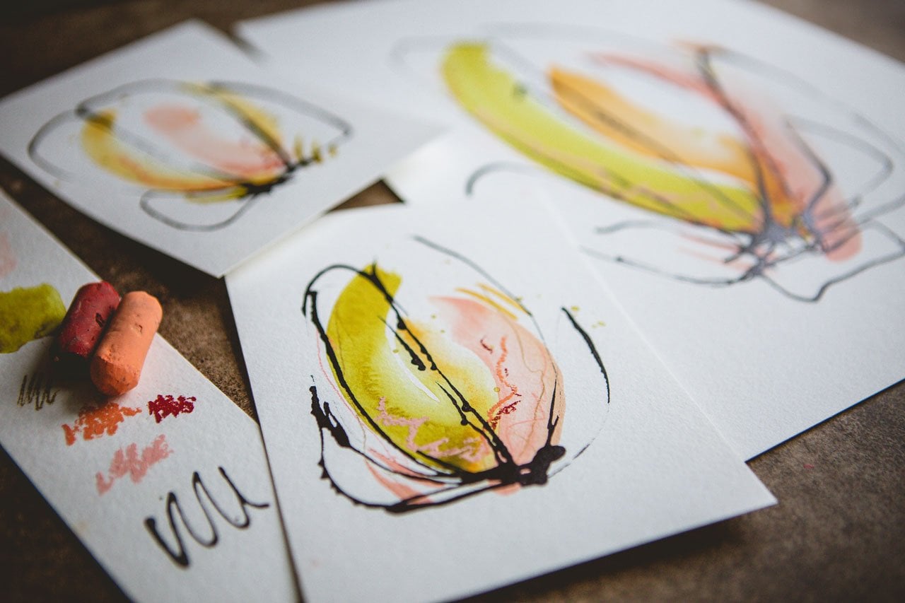
you're planning. I wanted to actually back up a little bit and show you a little bit earlier
in my process. We're still making littles
to get to the bigger pieces, but these littles all are going to look
like my ugly littles. They're my first 10
or 15 that I would create normally before I
ever sat down to film. Because I want you to know, we all start out that way. When you're sitting at your
art table and you're creating your eight or 10
pieces and they're all ugly, you know what? Me too. [LAUGHTER] In this class, I wanted to show you that
a little bit earlier, instead of spending days
practicing before I got on film. I hope you enjoy seeing all my thoughts and how I
decided on colors and papers, and maybe this was
too much water, maybe this was not enough water. How do I move the color? I start off wanting to go with the color wheel and pick some contrasting colors
off of the color wheel. As I was playing in colors and mixing things and
watching things spread, decided aha, maybe I like the analogous colors on the color wheel instead
of the colors opposite. It's interesting how when you're creating what tends to
grab your attention, and then you're like, this
is the direction I was going and it wasn't even the direction that
I planned on going, and how fun is that? Today, we're going to take a
look at the very beginning at my ugly little
pieces and then see, what did we take
away from these, what part did we like, so that we could then go on
to create the bigger pieces, and in that I took away good color combinations and
things that I was like, this is what I want to play in. Those littles got me to these
bigger, amazing pieces. You don't think they're
amazing, that's okay because it's my art and
I think they're amazing. Art is subjective, but I'm so excited with
these end pieces. I just want you
to know to get to this point and to get
to that excitement, to get to the point where
you're like, I love that, you got to work through
all those hard decisions before that of creating
some ugly art, and they're ugly because
they weren't the intended direction
that I was going. I may look at these
later and think, that's gorgeous,
what was I thinking? But for the purpose
of my project, it wasn't where I wanted
to go and it didn't end up the way I
intended it to end up, but it was very valuable
in my learning process, because on some of
these I'm like, haha, I love the oranges and the purples and the
reds and the pinks, and I love the blues
and the greens. I love this or I love
that aspect about that, so let me pull all the
little aspects that I loved and make that my project. Hope you have some
good aha moments, getting to see the
ugly part of the art, moving on into where we
finally we're like, aha, we've got it, this is
what we're going to use, this is the colors, here's
the amount of water, here's the technique, here's
what I want to the finished, really beautiful big pieces
that you end up with. I hope you enjoy seeing
that process and you give yourself permission to work
through the ugly pieces, because you know
that you're making your way to that beautiful art, after all these decisions you're working your way through. I'm Denise Love, and I'm an artist
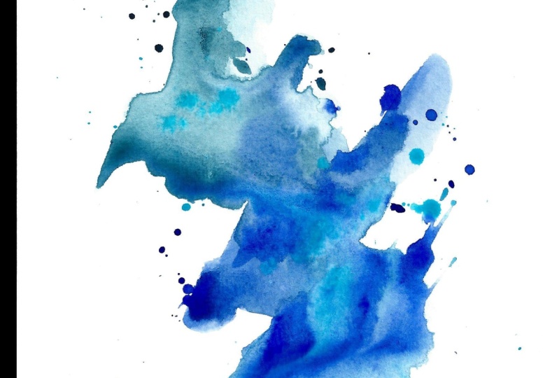
and photographer based in Atlanta, Georgia. Today we're going to create
some really fun abstract art, working with the flow of paints. We're going to add
a lot of water and then see how those paints flow and organically mixed to
create something beautiful. I love creating like that, just as much as I
love cutting up art. [LAUGHTER] This is
another technique that I'm going to
use over and over. Just because of
all the different I've experimented with, I know that I like things that don't really
require tons of thought. I'm not going to be
the person that paints a picture of a house and
it look like a house, that's just not my superpower. I'm going to be the
person that wants big splashes of color and going in
different directions and being a lot more abstract, you see me create a
lot of abstract arts, because that's what
really attracts me, and I even look for
that when I'm out, looking for pieces to purchase. I love abstract stuff. I love it even
more when you just serendipitously
get amazing things by the flow of water and paint. So much fun. It's therapeutic, this is art therapy. You could just
watch the water and the paint and the pigment flow and just feel yourself calming and the tension
leaving your body. If you ever get super stressed, come and just dip
ink into water. [LAUGHTER] Hope you have
fun today in class. We're going from the ugly
littles that I usually begin off camera to the
beautiful pieces that we were meant to create. I hope you have fun
creating these. Can't wait to see
what you create, so definitely come back and
share some of those with me. I'll see you in class. [MUSIC]
2. Class project: [MUSIC] Your class project today is to come back
and show me some of your early process and
then what pieces that you ended up creating after you've figured out the colors
that you loved, the paper you wanted to use, the paint that you decided on. I want to see what those early littles
got you to in the end. I cannot wait to see what
colors you selected, what you ended up liking, if you added additional
marks after the fact, just interested in
the whole process. I hope you enjoy
making some of these today and realize that as
you sit at your art table, the early pieces are not going to always
be your favorite, they're probably going
to be the ugly pieces, and those are the pieces that
you need to work through to get to the beautiful art that
you are meant to create. In this class, I tried to
show you a little earlier in that process that I
normally would so you can see the ugly art [LAUGHTER], and how I worked through
the ugly art to get to the further pieces
that I did in class. I can't wait to see
what you're creating. Come back and share
those with me, and I'll see you in class. [MUSIC]
3. Supplies: [MUSIC] Let's take a look at the supplies I'll
be using in class. I am going to be using
acrylic inks because I'm obsessed with acrylic inks
lately and you might as well play with the supply that
really speaks to you. [LAUGHTER] I have
a variety of inks, so I'm not going to give you like a whole list of the
colors I have because I think I have most of the
colors in a couple of brands now but I'm going to experiment with a
ton of colors to get to the point of making
my large ink abstracts. But you can do this kind of
project with watercolor, high flow acrylics, we can add water to, you've got any of these
golden high flows or the golden flow watercolor in the tube or
watercolor in a pan. We can water these down
a little bit to be like the consistency in
behavior of the inks. You could use watercolor ink if you've got
anything like that. There's lots of
different brands out there for watercolor ink. I've got a couple of here, so they act very similarly. I like using the acrylic ink
because I could do a layer, I can let it dry and I thought I need a little
bit more here or there, I could add more
water to it and it wouldn't reactivate the ink. The ink is there, it's
going to stay where I put it and putting
more water on, it's not going to change it. Whereas watercolor, if I add more water to the
top of watercolor, I will change it and create some differences in
the watercolor that I might not have intended and so just depends on what you want
to do when you're working. I want to play with the inks, I'm obsessed with inks and
so it's a good ink project. I'm also going to be
using a hockey brush, which is a very soft
sheep for brush. Say sheep for but sheep, [LAUGHTER] whatever that is and I like these because
they're soft and they hold a lot of water and I can put
this in water and I can put a whole lot of water on my paper and that's
what I'm going to do. I'm going to put a lot
of water on my paper. I'm going to dip lots of ink colors on it and
let them spread, bloom and do their thing, and then just see
what we end up with. I tend to like art that
is very serendipitous. I like to create and then
just see what I get and the surprise of what I end up with is the most exciting part. Because I'm using
a lot of water, I am personally going to be using either cold press paper, £140 or the £300 640 GSM
Arches cold pressed paper. I really like the super
heavy watercolor paper when we're adding lots of water to our paper because
it holds up really nicely and it does
not tend to buckle. Whereas with using the cold
press watercolor paper, when we put a whole
lot of water on that, it's definitely going to
buckle and you're going to have pools of color. When you get to making
little samples, the cold press is fine but when you get to
the larger pieces, you might want to experiment and maybe just invest in one pad of this heavier
watercolor paper to see the difference
when you're creating. I like having different
papers available. [LAUGHTER] Then I've got
some water over here, I've got a ray or a
little paintbrush to help me manipulate a little bit. Once we're done
with our samples, we can then decide, personally for ourselves if we want to add marks
on top of that. If you want to do
some mark-making in lines and doodles and whatever
on top of your piece, then you can decide at that point what those
materials need to be. One of my favorite
is my posca pen, another favorite is
my mechanical pencil. At the very least, those are some things I
might consider and then my goal is to really
love these as they are. This is very similar to the minimalist abstracts
where we were using as few supplies as possible to create really dynamic abstracts. But this one, I want to create really dynamic abstracts
using a variety of colors. I don't necessarily want to use a lot of different supplies, but I do want to use a lot
of different colors and let that rainbow of color do its thing and be
exciting and itself. We'll see what we get
when we turn out and if we decide to add
things on top of that, just have some other elements available to yourself
and you can play. Let's get started. [MUSIC]
4. Color Swatches: [MUSIC] What I want
you to do when you get started and
whatever colors you choose, whatever type of ink or watercolor or whatever
that you use. I want you to start if you
have never done this before creating yourself a little
color card of colors. I say that because
it's really hard to see what these are
actually going to be. Especially with these inks, every brand looks
slightly different. Right now, I'm making
a little color sheet of all my Deler-Rowney
FW colors. What I recommend,
especially with the inks is you shake
them up really well, and then you squeeze
the dabber and get any ink that might've been up in that dabber for however long. Whether it was
something you just bought and it's been
sitting in there for months or it's something
you used and you used it three days ago because
you don't know how many times I've pulled the ink out and went to squeeze
that dabber and a glob of paint glopped
out on my paper. Squeeze that dabber out
before you get started. What I've done is I have
pulled all my inks out because I don't know what colors I want to
use as I'm creating, maybe I want to do something with a color over
here and colors over here. I have some Deler Ronnie FW, I have some Amsterdam, and I have Liquitex. You can tell now that I've done a little color card
of all of these, that they're all
slightly different. They have a slightly
different feel to the way that they
land on the paper, they spread outside
slightly different, and the colors are
slightly different. I really love this
olive green over here, and it's completely different
than this sap green, and it's completely different
than this Deler Ronnie, olive green which I also love, but you see how much darker
that one is than this one. It's super helpful to go ahead and create yourself a set of color cards
for each brand. Then you can have
these sitting up behind you on your
wall to then say, okay, what do I want to use? Well, I really love
this turquoise, and maybe with that turquoise, I really like this
turquoise green. Maybe with that, I really
like his vivid or the sap green or this
transparent raw umber. Or maybe I like
this neutral gray, or this raw umber, or maybe I like this purple
lake or this indigo. They're all going to
be slightly different, they all operate a little differently when you
put them on your paper. Then I've just realized
on a couple of these, some of these I have duplicates. I just realized that this
is a duplicate of that. I want to maybe pull the duplicates out so
I don't get confused. [LAUGHTER] I must
have decided at some point that I liked that
color and I wanted it twice. Now that I've got all
my color sheets done, I'm going to be able to pick
colors that I want to use. Then you might be
thinking, well, how are we going to pick colors? I thought it would be fun to actually play with
the color wheel. I have several
color wheels here, but I really particularly
like this color wheel because it gives me some ideas. If I want to do something, say in this blue-green color. I could work with
anything around here, but let's say I want
to give it a pop of color or some discord, something to shake it up
and give it contrast, and really make it a
little more uncomfortable. I could pick out one of
these discord colors, I could also pick a group of analogous colors or
the complement color. I love how it gives you
ideas of where you're at and what color you could
do to make it exciting, to throw it up a little
bit and make it different. Maybe I like orange
and blue and I want to throw in one of these
purples or these greens. I really love this
color harmony wheel, and I thought that
might be fun to experiment with in class because sometimes I'm doing these and I'm like
what color do I want? I don't know, let
me just pick one, and [LAUGHTER] maybe
if we pull some of these known color
combinations and see if we can get something more exciting that might be fun. This one, this wheel is the color harmony wheel
by Jill Ritter.com. I think I got it off of Amazon, and the back gives
you how to use it, some ideas, and just some example of
how to use the wheel. But I thought it might be
fun to use a color wheel. You can use a regular color
wheel too, these are fun. It's the same thing
if you're using this, here's the opposite, the complement color, or I could use this and split
complement of the orange. I could use this and do a
triad with these colors if I wanted to work in a more
traditional color wheel, this is fun too, and this has dark colors
on the back, it's fun. I have several color wheels. These are fun to play in. I thought this will
be a great way to hop outside my own comfort zone and just see what we
can create today. I want you to make sure whatever
color type you're using, put a dab of water, dab some color in and see if it's going to
spread and bloom. Then we can see what color it is and we can see how
it spread and bloom because I just did dots and did a little dot of color
and let it balloon out. That's interesting too, some of these worked better
than others so we'll see. Before you get started, make yourself a color chart so you know what colors
you actually have, I'll see you back in class [MUSIC].
5. Sampling Other Paints: I wanted to do one
quick video on using other types of paint
because I'm using the inks, but not everybody has the
inks, I recognize that. I'm using it because that's my current obsession [LAUGHTER]. But if you don't have inks, there's lots of other
things that you could try. I've got some
watercolor in the tube. You could also use
pan watercolors. I've got the fluid acrylic by Golden and the high
flow acrylic by Golden. I've got some watercolor inks. You could use India inks, you could use heavy
body acrylics. The secret with the
heavier the paint is, is we're adding water to it. It really is, the better quality the paint, the
better that works, which is why I like the flow acrylics better
than heavy body paint. But if you add enough
water to your paint, you can get it to
do this technique. Basically, let's just
start with the watercolor here and get me a little watercolor brush
and I'm just going to add some water into this and I
can play with that as I need. Get our little mop brush here, a little water and I'm just
going to show you how we can get watercolor to dip
right in and spread, just like we did the inks. Maybe a little tiny bit
more work depending on how much water you get in your brush there but it still will
spread out quite nicely. The Golden fluid acrylics, again, I would also put
that on my paint palette. I would get some
water in my brush. We'll get a little water here on our paper and then [LAUGHTER] just being
all messy look at that. That one spreads around quite nicely. Let's see the fluid. The fluid acrylic is
even more liquidy than that one so let's put a little bit
of water on our paper. Get our paintbrush,
some water on it. See we can really get that
to spread out nicely. I really like the
watercolor inks. But keep in mind, watercolor
is like regular watercolor, you'd reactivate it if
we did multiple levels. Look at that one. See
that really works nicely. You can see, even
though they are colors, you can see that we can
get any of these paints to spread around just like an ink with very little effort, really just a little
bit of water added to your color and you
can use that instead. Definitely pull out
whatever paints you have. I've got this thicker acrylic. This may not be a nice acrylic, but let's just do one more little paint dab here to show the
thicker acrylic. Plenty of water on my brush, just get that water down some, and then we can touch that
color in to anywhere we want. If you're going to do
this with the heavy body, the better quality of
paint you're using, the more pigment that paint
has so it'll do a little bit easier with this technique because the cheaper paints have a lot of fillers
and less pigment. The more water that
you add to a paint, you're breaking that paint down. If you're starting
off with a really nice quality paint
to begin with, that breakdown is not as obvious as it is when we do
something like this. No matter what paint
that you happen to have, definitely try and
experiment with this fluid organic
flow way of working. But I do have the most
fun with the inks, so that's what I'm
going to be using myself all through class. I'll see you in class. [MUSIC]
6. Creating Small Pieces: [MUSIC] I've just taped
off some of these, and I've just realized it's not completely in
the middle there. [LAUGHTER] Didn't really matter, but I've just taped off four, so I can play with
several samples. I've got another piece
of paper taped off also, and that way I can
work on a bunch of little samples and
I can set them to the side and I can
create some more, and I can experiment
on littles before I get to a larger piece of
some colors I truly like. This way if half of them end up terrible and half
of them end up great, I'm still happy for
the day because the great ones turned out great. I need to create in this
way because if I just create one and it
ended up terrible, I'm upset and mad, and I leave unhappy. If I create eight, and I had four
that were amazing, I leave excited, and I can't wait to come back. Now I have a little guide to
work towards a bigger piece because I've now experimented on lots of different colorways. I'm thinking that
for the first one, I'm going to start
out with some of my very favorite colors and
then will grow from there. In the inks, my
favorite colors are this Payne's Grey by the
FW the Daler-Rowney, and I like this Antelope
brown for some reason. I'm in love with
these two colors, but this one is all
about more colors. What I want to stop
with just the two. I actually want to have a
whole variety of colors. I'm just going to start with my favorite and grow from there. If we're looking at
this color wheel, this Antelope brown, this is right here
in this color. This Payne's Grey is in this
color range but even darker. Some already in the
analogous stuff. I can see if I wanted
to add some discord, I could come in here with
a bright blue or magenta. That might be fun or purple. I can use any of those. I actually have pulled
out the liquid texts, turquoise because
that color I love. I also like this
Quinacridone Magenta. If we want to try some
of that we could, and then we could
add on top of that just depending on
what we're feeling. [NOISE] What I'm going to
do is get my hockey brush. I'm going to lay a bunch
of water here on one of these and then spread
those inks in there. With the water, we could
do an organic shape. We could do something
long and skinny. We could do something
with water, water, water with
some gaps in it. Get creative in the ways that we're laying
this water down. I also have a mop brush. Maybe this could be good for the areas where maybe my brush is bigger
than I was thinking. Let's just try it out. Let's fill the mop brush. Let's go ahead and just lay
a lot of water on here. I may be adding more water, but I want it to be a
good amount of water. On the littles, it's
okay if we start with cold press a £140 paper. This is the most exciting
part of [LAUGHTER] this, is watching the inks spread. I got some ink that I
spread. That's okay. Let's try this turquoise and look at that
color. Oh my goodness. The goal here is just to
let them do their thing. I'm not trying to control them. I'm not trying to change them. I'm trying to
experiment and see. Look at that. What
these colors will do as they spread out. Now I can tell you to that this probably
won't be my favorite. [LAUGHTER] Maybe
we will try again. I might even now just throw
caution to the wind and throw in some vivid lime
green. Look at that. [NOISE] Maybe this weird orange. Let's see, what is this? This is vivid red-orange because now I truly am experimenting. Now that I've decided that
it might not be my favorite, I'm less attached to it. But look at all those colors. Maybe I spoke too soon. Let the colors pile up and do whatever it is that
they're going to do. If you think you love it, but you're not getting
what you want, you can take a
tissue and then just gently let some of that
water soak up in there. But let me just tell you. Just try to resist doing that and try to resist moving
the paper around. In this project, I want that to do what it's going to do and just
see what we get. Super fun. Let's try
a different one. I actually liked that turquoise. Let's try the turquoise. Can move that around. If we need to, we can come back and add some water and
really help that along. If you end up with a dot, and you're like, I
don't want to dot. [LAUGHTER] I liked this green
now that we tried that out. I want a dot there. I love that. What else did we love
out of this one? I liked that orange. I'm putting some lids
back on because I have a tendency
to get clumsy and knock whole bottles of
ink over [LAUGHTER]. That is a sad day. I did like this orange, so let's just throw
some orange in there, see what that gives us. Orange and blue are complementary colors
on the color wheel, so we're still working
with our color wheel there. Look at that. The goal of these is not
to go as fast as you can. You really want to enjoy watching this stuff
spread and do their thing. What other color do we love? [NOISE] Do on this first one, I want to soak up,
it's all brown. Just see what we get. We'll resist that if
you can, my goodness. That was pretty cool there. Maybe this crazy, Indian yellow. Let's see what that does. My goal on these is to just
step outside my comfort zone, go with the flow, play in colors I might
not normally think of, mix things in a
way that I'm like, "Oh look at that." [LAUGHTER] That's
pretty cool, let's see. I'm going to go back
now with my hake brush and let's see if we
can get over here. I want to make sure I got
enough water sitting in there, and let's see. I like this purple. Look what that
did, look at that, my goodness, I like
this olive green. I've used this
color combination. I love it when it does that, you could just sit here
and watch color move, and it's the most
wonderful art therapy. If you ever had to have therapy, and if the therapist would just have beautiful inks
for you to play in, it would be the most successful therapy session, in my opinion. [LAUGHTER] Let's try this
quinacridone magenta , look at that. I'm feeling this orange. You know what I really love?
I love pink and orange. Now that I've thought of that, this next piece could have
some pink and orange. I'm just using my
little dubber here to move color around some, that's very interesting.
Let's go ahead. We might come back to that, but let's go ahead. I like pinks and oranges, so maybe we'll start off
with this vivid red orange. Look how fun that
is, oh my goodness. Let's get some quinacridone
magenta in there. After those Liquitex, this is Indian yellow. See they work different. Those Liquitex ones really
spread out. Look at that. I don't know if it's true
we throw a hot pink in there and just see what it does. That's a bright spot isn't it? We'll move that around a
little bit with our brush, just add water, really move it. I'm just tapping in a
little bit of water to encourage it to
do a little more. What else? Really liking that. I feel I want to let that
do its thing and dry, and I want these others to do their thing and completely dry. I want to resist moving them
and doing a whole bunch too. Let's set this one to the side. Let it do its thing for awhile. Some of these could take
12-24 hours to dry. I want you to not be tempted to heat these with a heat gun, because the big puddles of water are not going to do
what you expect. Let's get out our
next piece of paper. I really love blues and greens. What if we did another
one over here? Let's get some good
amount of water there, and we did some of
these blues and greens. My goodness, that was
crazy. Look at that. That was thalo seileen green. I might have said that wrong, but that's what it is. [LAUGHTER] This is
vivid lime green. That's crazy. What do we want to put with
that maybe some of this turquoise from the FW. You can see I'm really stepping outside my comfort
zone here with some of this because these are
not my normal go-tos. What if we had some purple
and green are opposites. What if we threw some
like a purple in there? I don't know if I'm
finding anything that I like at this point, but we'll let that do its thing. That's crazy. What else
do I like? Let's see. Let's put a whole bunch of
water down here. Let's try. This is our opportunity
to try out colors and make some decisions to just discover and see do
we like anything that we're getting with
any of our inks? That's fun. Maybe I
like indigo. Let's see. Indigo is the blue, look at that, that's
like a really blue. I like how the inks
push each other. Maybe in that, I wouldn't mind some antelope brown. We'll see. [LAUGHTER] I think that might not have been a
good decision there. Let's throw a surprise. This is cerulean blue. This is the vivid lime green. [LAUGHTER] I want stuff that
I wouldn't normally get. It's really surprising,
has a lot of color maybe. Let's throw some of
this vivid red orange. Definitely stuff that I
might not have thought of, and in your explorations
and your play, you might find a direction
that you never thought of, that never would have
occurred to you, and you're like,
"This is a new thing. A new collection is
being born out of this." We have white, I haven't
talked about white, but what if in something
we introduced some white? It's fun. If we need to, we can introduce a
little bit of water. See now the more
colors you get going, the coolest, craziest
things start to happen. Right in here, I would
love for that to really turn out whatever
that's going to do. That's fun. Now that we got all that going, I'm enjoying this right here. [LAUGHTER] Let's go ahead. Because I liked that, let's go back with some indigo. Look at that. I could just sit and watch
ink spread like that all day. I didn't love the brown, but maybe a tap of the brown. I did like the green. I love it when they are
really spreading out good. This is cerulean. This is that vivid red
orange, my goodness. The faster your work too, the more of these colors
do interesting things. This is that Indian yellow. I want to use the
cerulean but let's see. Maybe some of this white. Super fun look at some of these. I like what that's doing there, it is the very heavy
pile up of water. I'm just going to
take a tissue and soak in some of my water now. If I were working on a
surface that I wasn't going to move because
I'm going to move this, [LAUGHTER] and set it
on the floor to dry. Or if I was working
on a surface that wasn't going to buckle
because this buckles, I wouldn't soak up any water, but with this thinner paper, I don't feel like
I have a choice. Look what that's doing. But to soak a tiny
bit of this water, I like what that's doing. Now let's just not touch it. I don't like how it
buckles and does things. I might do one more on the
thicker paper so we can just judge how
different it really is. I really like this cerulean. I'm looking at this one because when you look at
each one and say, "Well, what did you
like about that?" I liked to the green
and the cerulean, I loved this vivid
red orange part. I didn't put
quinacridone in there, but I think I will add
this Indian yellow. Maybe a tiny bit of
the quinacridone. Let's see. I did white, I liked the white. That's crazy. It's just moving all around. Let's set this to the side
and let us do a thing, and I think I'm
going to get one of the really thick papers
to see how we can get the puddling to do
different so that you can compare what paper you
might want to work on. I'll be right back. [MUSIC]
7. Trying Different Paper: If you're using a
pad of this paper, I'm going to separate
this paper from the pad, and I just want to show
you how to do that. Once you open it, these
are all attached. You even think, did I
just get black paper? [LAUGHTER] But what we're going to do on the
very top of the pad, It's got a little slit
and we're going to put a palette knife in that slit. Then we just take that palette knife and cut
that paper through that slit. Let me do one more because I started cutting it
before I thought, I should just show
you how to get your paper off this pad. You just come around
with the palette knife and you can get it off. Now, if you want to
work with the paper on the pad, you can. It's on the pad for a reason. It's there so that
you can keep paper flat and straight
and use lots of water and it'll dry flat. But I want to do little samples. I probably want to even do more than this because
I don't know if I'm going to love any of the ones I did on a thinner paper because we used so much
water that I just don't know if the water pooling is going to be what I
wanted or, I don't know. Then I'm just taping this down. Maybe we could even do
something a little differently. Maybe we can make
these a little bit larger because we're working on larger paper. How about that? We will try a little
bit larger one instead of just sticking
with the little ones. You can see as we're going, how nice and how much
water we can put on this. Then I really liked
that cerulean. We still have a little
bit of water pooling, and I believe that's
just because I'm working on a piece of cardboard. I might just hold
that up a little bit. Might help some of this
move around if I need to. I liked the orange, so this is that. Bright orange, so
vivid red-orange, and the cerulean blue. This is that Indian yellow. Definitely stepping outside
of what I would normally do. Let's put this tape
over here on this. Well, that pulls it that way. There's just no way to not
have water pooling [LAUGHTER]. I really like this green. I want you to just look at these and think,
what do I like? Maybe we'll just dot some
color in here and there. Then look at it and say, what else do we like? Maybe I want a little more
cerulean right in there, maybe this quinacridone magenta. This is that Indian yellow. Maybe we want one that looks
more like a landscape. I don't know, lets let
that do its thing there. Maybe we want a piece
that does some stripes. Let's get this turquoise. where's that border
at? There we go. I could just watch
ink move around water all day [LAUGHTER]. Almost mindlessly like placing color better than
making a decision. Because sometimes
when you're placing specific colors and you've
got a project in mind, that's all good and wonderful. What if you don't have a
specific color direction in mind and you're like, I feel stuck, I can't get anything created
because I'm confused. I don't know what I like. If you'll do something
like this where you're really not putting a whole
lot of thought in it. What you end up with
might be very surprising. Sometimes not in a good way, but you never know [LAUGHTER]. I'm going to let these
do their thing and dry. That's a lot of
water on that one. But I'm going to resist
doing anything to it, we may have to come back to
it tomorrow, so we'll see. Let's take a look
at some of these. They're not 100 percent dry, but let's talk about what we've discovered on some of these. These longer ones that we did, I can see that there
must have been some really thick dry green
ink in my stop my dobber. It's made a big
glob of color here, so that's not good. The other thing that I discovered is with
too much water if you're trying to do some
stuff on your table and then move it to the side so you
can do some other stuff. If you have just
way too much water, then it's just going
to move and there's nothing you can do
to control that. I would say for
color experiments, I did like the colors that
I had going into this one. It would be fun to maybe do this deep purple
with this magenta, this dark teal, and
then that pop of green. That was interesting. But this was a learning curve. Rather than delete that
and not show it to you, I want you to know that we
all have a learning curve. Nothing is perfect the
first time you do it. I know it sucks to have to go through the learning
curve because you don't know how many years I would get
mad because whatever I did, didn't turn out
perfect the first time the way I had
it in my mind. But we've all been
there, believe me. But just look at
how far we got in this class with the
different projects and where we end up. You'll see that just sitting
here for an hour or two experimenting and
using a couple of pieces of paper that you
know are going to be wasted. But you learned some
important things [LAUGHTER]. It's totally worth it. On this set, I can see that this colorway
is my very favorite. I love the purple, orange, pink tinge of blue and I'm hoping that
was the cerulean blue. I'll have to look
back at the tape and even see what color I used. Because I love the way that
cerulean peaks through. If I had realized that I might've snuck
some cerulean into the bigger pieces that we have coming because they're drying. But I love the cerulean that peaks through and as
I was putting it down, I wasn't so sure. But even on this one, the way that dries I love the way that peaks
through there. Really cool discovery. The cerulean dries really cool. The third one, these actually, turned out
better than I expected. This one looks like
a popsicle to me. But I like the colors. I like the purple, I like
the quinacridone magenta. I like that pop of
green in there. Is that the olive green? Because I love that in there. I love that overall
set of colors. This one, super cool. I actually love the colors
in there, the blue, green the dab of what
looks like Indian yellow, but it might not be,
but it looks like it. There's a little bit of
a purple look in there, which could be the yellow
and the blue combining. I don't know, but I love the colors that we
have going in there. I love the colors
on the top of this. I don't necessarily love where the color pooled
and turned brown. Little bit less water, is what I learned here. Then dab the color in and we can move the color around
with our paintbrush. Because the really dark pool turns brown and looks [NOISE]. These were very interesting. This was our learning curve. Then let's take a look
at the next pieces [MUSIC].
8. Nailing Down Techniques & Colors: [MUSIC] Or rather, well, let's just
work on the pad and see if this keep
it the flattest. This is why I like doing
lots of little samples and tough trials and
tests out because now we can figure out
what is our water doing, what's the best way to
secure stuff on our pad, where is it going
to move the best, where's it going to
be the flattest? Your table could be crooked, so don't always assume it's the paper or the
surface that you're using. [LAUGHTER] Just
thinking about that. Look at that. Oh, my gosh, oh, my goodness, look what that did. [LAUGHTER]. Oh, my goodness. That is so beautiful. I can't even believe
what that did. We're going pink and orange
and purple here with this because now I'm filling it. I really love how organic
that is, oh, my goodness. Maybe we want a little
bit of white in there. Oh, my goodness look at that. That's really beautiful. I want to make another
one of those I think just to feel it. I like this more organic shape. That was super fun. Look at those. This is telling you
it's like meditation, watching that ink move
around and spread. I need to make a video of just ink spreading and then just [LAUGHTER] randomly
have it available. Well, what are the colors
do I have in there? Let's try a little
bit of yellow maybe. I love how that did that little
pattern there naturally. This is pretty. See it takes a few for you
and me before you're like, okay, now I felt like
I found my groove. [LAUGHTER] This
one is so pretty. This one I'm feeling. [LAUGHTER] Anything else we want to throw in
there as a surprise, I really like yellow oxide, but I don't know that I like it with the yellow
already in there. Maybe I need a little
bit of this yellow over here. Look at that. I'm feeling that
one right there. [LAUGHTER] Now the paper is
attached to the pad, shoot. I do have one more here
that's not attached though. I can move these out of the way and then we could do one more. If you're moving them,
this is the problem, then the ones that have
too much water spill down. That's okay. Because now I feel like
I found what I like, we're going to go for that. Let's take our tape, split it in half, and now I can see
after all of those, it took me that many to
get to the point where I'm now I feel like I've got
the water ratio down. Let's just try one
of these here. Organic. We can always add
more water if we need it. Now I was working in colors that I don't know that
they're really my thing. But now I'm right into some colors that
I genuinely love, so I love that. Look at that. Let's put some white in here. We can come back with our
little brush if we need to. Maybe not tons and
tons of water, but maybe a tiny bit less water, but enough that these start to move around and
do their thing. That's what feels right to me. As you're making stuff, just do what feels right to you like as you're
creating your like. Does this feel good or
do I need to do X, Y, Z? I'm actually feeling
like that feels good. [LAUGHTER] It's
like another one, so I like that. Now that I've got my groove, I like the mop brush. I like a medium amount of water. Then just let these
colors do their thing. Oh, my goodness, so beautiful
watching that water move. Now here's one where you
got to be real careful. I had a glob of color in the end of that
so I just rolled that off. That's why I mentioned earlier, as you start to
use this squeeze, that squeeze is out before
you get to your piece of art. As you're squeezing
into your piece of art, you don't get a surprise of that color go up and
down on your piece. Look at that. Let's get some white in there. I really like what the white does when it
gets spread in there. I take our little paint brush, tap in a little bit of water, let some of that
start to blend some. Look how pretty that is. We're going to let these
dry and do other thing. I now have really three pieces that I think I
definitely don't love. You'll see it took me 1, 2, 3, 4, 5, 6, 7, 8, 9, 10, 11 to get to some that I'm
like, I'm loving this. You got to play an
experiment with colors just thinking
of what do I like, what do I not like, what
do I want this to do? Then finally, you'll get to some colors
that speak to you, but you got to make
more than one. You can't do one and say, this did not work out because
look at this other one, I've got a little collection of three that are amazing now. I could have edited all that out and we didn't have all that. Let's just get that off there. We could have had all those, just the three that were
perfect, but why not? Just see what we're going to get [LAUGHTER] and share the trials and tribulations of
how we got there. Now we've got some
smaller pieces. I've done all my little samples, I feel like I'm
ready to now tackle a whole bigger piece
and see what I can get if I can
recreate this again. Let's take a look
at these pieces. I went back and I did
blue-green because I like the colors sitting side-by-side on the color wheel. I definitely encourage you on your color wheel to
just play in colors. They're all sitting
side-by-side because these colors right in here is where I was for
the blue-green. You can even see all those
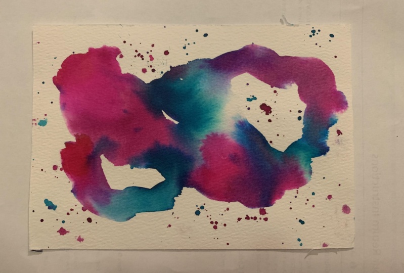
colors shining through there. Look how beautiful these are? Analogous colors, ones that
are sitting side-by-side, really come out amazing. I like that they tell you what
some of these colors are. We could have sap green, hooker's green, permanent
green, yellow-green. I think those are
acrylic paint colors. But you can get close like that. Cerulean blue is one that I said that I liked
on the little ones. I like that they give you what
some of these colors are, but the side-by-side,
red, orange, yellow, this yellow-green blue, those tended out to be the most dynamic and the pieces
that I truly love. After doing all
the little pieces, just experimenting and
seeing the colors, and then going aha, let's try the red-orange,
it clicked for me. Sometimes you've got to have
that learning curve for these things to click and a
collection to come together. That's how we're building
into something that we love. It's not all going to work out perfect with the first piece. That's why I like
doing all the littles then maybe some
mediums and then go, aha, now I've hit my groove because look
how pretty these two are. This one's still a little bit
wet but look how beautiful. We'll let that one dry. Then on the littles, it took one as a practice. I don't really like that one. But after I figured out, less water may be even not completely
covering the paper, that could be my
most favorite piece. But even over here with
the two pieces I did after that,
completely beautiful. I am in love with these. Once these are dry, I'm definitely going
to be thinking that that is a wonderful
piece of abstract. Then you can decide,
I love these. Do they need anything else? You can add additional
marks and mark-making and any other little extra thing that you might normally
do with your art. But I almost want
these to live just like they are. We'll see. But it's very interesting there how we got
from the littles that were these to the
bigs that were like wow. I hope you see the progression that we
make here in class with your own pieces and don't stop at the
first piece and think, this is not working for me. I don't like this. Get to something like this
and then get excited, because you're like,
look how pretty that is. This piece right
here, I love that. I'll see you back in class. [MUSIC]
9. Going Larger: [MUSIC] Now that
we've got our groove, let's do a larger
piece and then we'll see what those look like when
they're all completely dry. I've got some wet water, I've got some water
with some color in it, but that's okay. I can see where it's going and I'm using this
color in my piece anyway. That's alright. Let's get this to spread out and do some stuff. Look at that. I just love seeing what
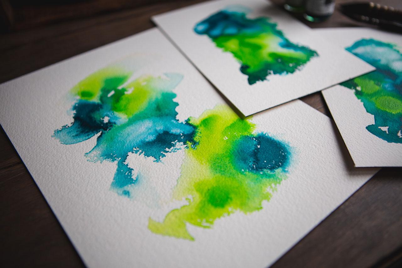
they're going to do. I might after this do a really fun colorway in blues and greens because after
playing quite a bit here, I can definitely see that I like colors that are complimentary. Well, they're analogous, they're on the same side
of the color wheel. I can see that that's really
definitely appealing to me. What about some blue-green? Let's just take our little
paintbrush and get some. I like that when it
does whatever it does there when that white mixes in and does some funky
stuff. Look at that. Got some bubbles. Look how pretty those are. There's one of our pieces. I think I'm going to set this to the side and do
another large one. Then I might move into some
blues and greens because if you do one and
it doesn't turn out right, it's disappointing. If you do another one and out of the two you get
one that you just love love, love, then it's exciting. I really liked how
in the little one we had some areas of color that did unexpected stuff and the way that it blended down into
the water and there were some natural white spots so
let's try for some of those. Yeah. I'm just
being real organic. The more you do, the more
specific you might become. But I really enjoy not
thinking too hard about stuff. I don't want to overthink it. I want to see, what can I get if I just drop color and enjoy what it's doing and then see what I
can get when we're done. Then if it's not moving enough, dip a little water in it. I'm trying to dip
the water without really dipping the
brush, but that's okay. Look at that. I really like
how this one is a little bit less heavy in the color. It's a little more organic. The more you do, the
more you figure out, oh, maybe less heavy-handed, maybe a little light more,
or more light-handed. Let's just see
where that ink can go and what it can
do. That's fun. I love when that white gets in there. I'm loving this one. Look at that. I'm loving this guy. Let's see if we can
move him around, see if we like it better
in a different direction. Do we need some color
somewhere else? We can lift and encourage the color to
move if we need to. I was trying not to do that on the smaller pieces but
look on the bigger pieces, maybe we want to do that and get that quinacridone
to spread a little, and then I might say, okay, now I feel like I could use a little dot
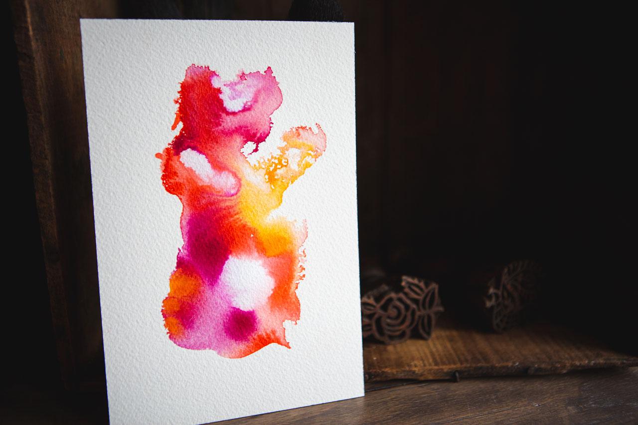
here and there of whatever. Look at that. Oh my goodness,
this is so pretty. Hope they will like this. It's all fire. [LAUGHTER]
There's a good one. We're going to let
all these dry and then we'll come back and
take a look at some of them. I might do a blue-green one
just to do a different color. I've got the pad of
paper over here. Let's do a blue-green just so that we're
not all orange-red. [LAUGHTER] My water is really dirty now so it probably
would've been good to go swap it out,
but that's okay. I'm feeling like turquoise deep. Look at that color. Oh my goodness. What do we want to go
with the turquoise deep? I like maybe the
vivid lime green. This is light green. From the daylight
around he was trouble. Oh my goodness. Blue, green, pink, red, orange. Those colorways, they really
going to speak to me. I definitely want to move some of that around
so let's go ahead, and get a little water going
in there with that one. Some of these really
move better than others and some of them
just leave like a spot. [LAUGHTER] I don't
necessarily just want a plop. Let's see. What else
do we got here? We have dark green. I don't know if I like this
dark green. Let's see. I think this is a bright or dark green that I'm, oh never mind. I like it. [LAUGHTER] There is some white in here
because I like the way the white changes
things a little bit. That's different. Look
how cool that is. Almost am like, don't touch it anymore because that's
pretty amazing. Got some little water bubbles. It's pretty amazing
just like it is, so almost say, don't
touch this one anymore. [LAUGHTER] Look at that. But you see how many
that we had to do before we got to the few that
were like, oh yeah. We're going to let this one dry. We've got our pink
and orange drying. I've got minimum of
two big ones that I like and three little
ones that I love. I could do a small
blue and green. Just from my own color
explorations today, I like colors that are on
the same side like these, green and yellow and blue. That would be this. Then the fan, orange
and pink and red. We were right here
in these colors. For these, I'm
feeling like that's the direction my personal
collection is going. Let's let these dry
and I'll be back. Let's take a look
at our pieces here. Like with the little
pieces I discovered, a little bit less
water is better. This piece is so beautiful. This piece had so much
water on it and then I moved it and all the
water started to run. I didn't really
intend to do that. The lesson here is, don't get over-excited and move your piece before
it's actually dry. If I weren't filming and
putting this stuff on the floor behind me to move on
to the next piece, I would not have moved this. I would've sat it there
and not moved it. But now that I'm
thinking of that, look at that heart right there. [LAUGHTER] There's
a heart in there. What I can do with pieces
like this if I don't love it or maybe I ruined
it or whatever it is, this can become a
piece that I cut out. We may cut this one up. I always love holding the
option open for myself to cut up my art and I'm feeling that I could
definitely cut this up. This is also the point
where you could say, is there anything else
that I need to do? Now that I'm planning
on cutting this up, I actually could just move that ink around,
look at that, so that it's a better fit and
I could always come back, tap in a little more ink on the section that
I really love. Don't discount
cutting up your art. I love to cut stuff up. [LAUGHTER] Maybe a tiny
bit of that purple lake. Look at the atlas.
Maybe a tiny bit. Maybe not. We'll see. Yes, we're doing some
fun stuff there. Maybe we'll move
that ink around. Look at your pieces too. Maybe you don't love
the whole thing, but is there a part of
it that you do love? Is there something
in there that you could say, I love this. I could go ahead and
save part of it. Don't have to be the whole
piece of art at this point. We could go ahead and plan on cutting this up and just see. Look at that. I love that. Now I'm feeling that
this is going to be its own little piece
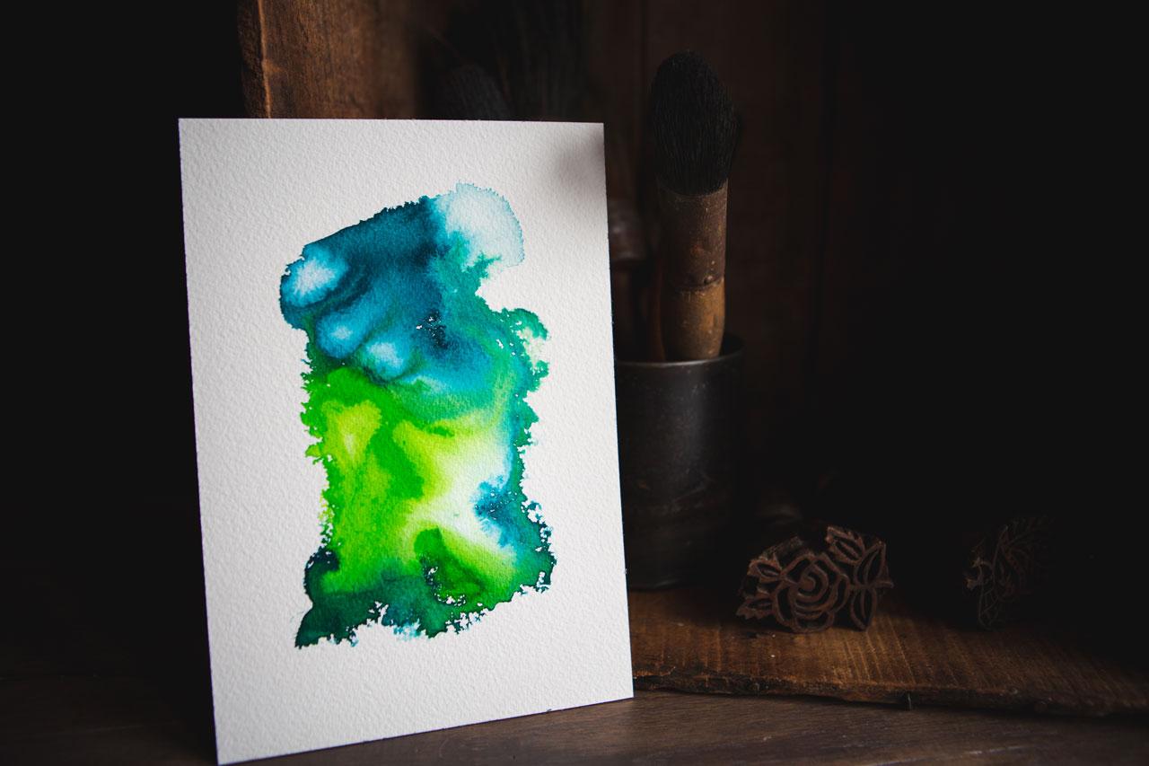
of art so we'll see. Let that dry. This is amazing. Let's throw this one back
on the floor so it can dry. [LAUGHTER] Because I love
that one so much, I was like, let's do blue-green and look at how amazing the
blue-green is. Now, if we pull
that together with our smaller collection, [NOISE] we've got this smaller
collection with the blues that work
with our blue. That's a whole
collection right there. I can cut these up
and I could decide. I've got a little that I
love and a big that I love or maybe I love both
of them, just depends. That one's still wet
so let me put it down. Especially the pink and orange, I've got a little
that I really love. Then two others that came
out super-duper cool too so I have a nice, fun little collection there
for the big one. I love that. Now I'm going to walk
away from my table today with several littles
that I don't like, several mediums
that I absolutely love because I had to
get to that point. I had to work through
the colors and the amount of water
and the thickness of the paper before I
got to something that I'm like, Okay I'm there. Then that got me to these
bigger pieces that I'm like, wow, [LAUGHTER] these
are super fine. Then, because this is acrylic, if you decide that I need
some darkness in here, I need some marks in here, I need some other
things going on, this actually has a
little better contrast to me because we have the
dark, we have the light, we have the in-between,
moves around, we've got movements so this one is a better contrast to me. This one we could say I need
a little extra in there, and what is that
extra going to be? We could add more water
to this and more inks. Now that I've decided that, we could go ahead and very gently tread
gently on doing this. It's not a 100 percent dry, but I think we can
still tread lightly and get maybe a tiny bit
of contrast and stuff going on there where perhaps
we don't currently have it. Look at that, super fun. I think I could have
gotten rid of some of that contrast because all of the white that
I put in there, but I still like it,
so I don't care. Then maybe we'll just
move this a bit. I don't want it all
sitting right there. Fine. I do like that orange. This is on fire. It's so amazing. What did I do with the white? I don't want to completely have the color super solid so we
can mix some white in there, let it do some stuff. That's pretty fun. We've
add a little more darkness. I do love all that orange. In fact, I love that
orange and yellow so much that that would be
a pretty color way to explore without the
magenta that may be more towards the
fiery oranges and stuff. It's these discoveries
that makes some of this so exciting. We could even maybe add
some of that down here. We don't want it to look like it's something we added on top. We still want it to blend
in with our original piece. But I just want to add more contrast because now
that it's dried in there, I can see that there's just
wasn't enough contrast. Super fun with the orange. That orange is moving and turning into some
pretty stuff there. Once you do the extra little, I think it needs whatever. Now we're going to sit
that and let it dry again and then we'll be able
to see that finished piece. This piece has now dried
and I want to just say adding the second
layer of ink on top gave it a little
more depth and dimension and it's super
cool how that turned out. I'm loving that piece now. At this point, you can decide, do I need anything else? Do I need any marks? Do I need any metallics? What other decoration
do we want? I personally wanted the
color and the movement and the blending to
be the art so I'm super happy with the way
it turned out as it is. But that's personal preference, but how fun that is. I hope you enjoy making
these different projects. I can't wait to see
what yours look like and I'll see
you back in class. [MUSIC]
10. Final Thoughts: I hope you enjoyed seeing a little bit earlier
in my process, I still filmed it
like I normally film my classes where
we start off with color swatching and then
we make some littles and then we get to
some larger pieces. But this time, I started a little earlier in that
creation process. For me, normally, I spend
several days coming up with an idea and then
playing around with it and creating with
it before I'm like, okay, I got my technique
down, I'm ready to film. But this time I was like, sometimes a lot of
people are going to sit down and they're going to create art and they're
going to think, Oh, man, it looks nothing like the instructors.
I'm disappointed. I didn't get it to do what
I wanted to do. First, try. I do that too. I might take
some art classes and think, Oh, I didn't get that. I did not nail that at all, [LAUGHTER] and maybe I would if I had stayed a
little longer or if I'd realized early in the process that you got to
make some ugly art before you get to the pretty art I had sat a longer at it. It took me a long time
to actually realize that maybe those first pieces aren't going to be
your masterpieces. Maybe those are the
pieces that you're figuring out what you're doing. You're figuring out your paper. You're figuring out your colors. How much water? What's your technique? What are you shooting towards
what you want to create? Those first pieces are all of those decisions
coming together and manifesting themselves in different ways on each
piece that you create. I take from the different
early projects in class to get to the further
projects where I'm like, okay, I've got it. This is what I'm creating. In this class, I wanted you to see the ugly early [LAUGHTER] rather than just me starting out and being beautiful
and the tiny pieces. Then beautiful and
the larger pieces, because I already made
like 20 pieces before I got there and I'd already
made some of those decisions. In this class, you're
seeing me work through some of those decisions
right on camera, thinking about it,
letting you know, Oh, maybe I didn't
like that color. Oh, maybe I used too much water. Oh, maybe this or
oh, maybe that. I wanted you to see that
we all make ugly art, and that's how you get to
the better pieces of art. If you'll make a whole bunch
of pieces at the same time, even if they're all
ugly because I created at least 10 ugly pieces
before I was like, aha, I've got something I like. Even on those aha moments, some of those didn't turn
out the way I wanted. You've got to practice
a little bit, create more than just
a couple of pieces, and get to the point
where you're like, I've got it, and
these look amazing. I hope you enjoyed
the process today. I can't wait to see what creative flow
pieces that you create. So come back and
share those with me, and I'll see you next time. [MUSIC]
 DENISE LOVE, Artist & Creative Educator