Transcripts
1. Welcome!: Hi everyone, and welcome to this class on Creative
Art and Junk Journaling. Creative journaling
is a great way to use both sides of your brain
in a productive manner. Not only does it act
as a great hobby, but it is also great for
self-care and mindfulness. There are many benefits
to creative journaling. And the best part of it all is that your journal can be
whatever you want it to be. You can use it to reflect upon
your everyday experiences, to make plans and to-do lists, to make a vision board or goal trackers, to keep a record of
your creative experiments, to preserve memories
from special occasions, or to simply relax and have fun. However, as exciting as
all of this may sound, I know that starting
a journal can sometimes become a
little bit overwhelming. Especially in this day and
age where everyone is sharing beautiful journal spreads on social media sites like
Instagram and Pinterest, one can often feel
a little lost. So if you're wondering
where and how to get started, then this class
is perfect for you. I'm here to simplify the
process of journaling for you and also to help you develop skills that make it fun for you. In this course, we will be exploring ten different
layout styles and exercises that include
a combination of techniques from art journaling
to junk journaling, scrapbooking, as well
as travel journaling. We will also be looking at interesting paper crafting
techniques that you can use outside the scope
of this class as well, such as to make greeting
cards, bookmarks and more. And all in all, this
class will serve as a great creative boost
for you and will give you a lot of
ideas to choose from. My name is Ridhi, and this is my sixth
Skillshare class. I'm a multi-disciplinary
artist, an art educator and a
creative entrepreneur. I run four creative brands under which I sell jewelry,
home decor products, surface design
prints, stationery, wall art, and different kinds of lifestyle and
gifting essentials. I have been making
creative journals for over a decade now. And today, in this Skillshare class, I'm gonna be sharing all
my learnings with you. From the supplies that I purchase to all my
favorite tips and tricks, I will share all my
secrets with you. So put your seat belts
on because we are about to begin a wonderful
adventure together. See you in class!
2. Before You Begin : Before you begin, I would
encourage you to watch my earlier class on "Introduction
to Creative Journaling", here on Skillshare itself. The class covers some
basic similarities and differences between junk
journaling, art journaling, travel journaling, bullet
journaling, and scrapbooking. So if you're new to the
world of journaling and are confused about what each
of these terms mean, then the introductory class
is a great way to get started and put yourself in
the right frame of mind. It is not mandatory
to watch that class before this one and you can
watch it later as well. But from general experience, I know that students benefit
a lot better and understand the context of this class a lot more when they have
already seen that class.
3. What is a Layout?: Now one of the questions that
I get asked a lot is what exactly do we mean by the word layout or what
even is a journal layout? So very simply put, a layout basically refers
to the placement of all the items you want to
include in your journal spread. To understand this better, think of your journal
spread as divided into two parts, images and text. Now your images will
have focal images. These are basically
the images that draw the viewer's
attention and are usually larger in size as compared to other
elements on the page. They are basically
the hero element on your page, so to say. So sometimes you will have
just one hero image and other times you will have multiple images making
a focal collage. And we will explore both of these styles as we
go ahead further. Now, apart from the focal
images, other items of visual interest include
embellishments such as lace, ribbons, beads, tapes, etc. So basically smaller
items that are either used to fill
up the gaps on your page or to make a background layer
before you can place your focal
image on top of it. Then the text is also
divided into two parts. So think of it like
headlines and body text; just like you see
it in magazines and newspapers, there's always
a headline or a catchphrase written in big bold letters that kind of like catches your attention. And then you have the body text. So similarly, your
headlines will be like certain
quotes, keywords, or phrases that you want to use in your
journal spread to draw the viewer's attention
or the ones that communicate the theme or
the idea of your spread. And then the body
text will mostly be your thoughts that you want to write in your journal spread. So these could include
personal thoughts or certain details of, let's say, a holiday that
you went... you went on. So you have the
name of the city or the place as the headline. And then you have your
experience written in a smaller font, in a smaller size to
fill up the gaps on the page. Now every journal spread will have a combination
of visuals and text, but it doesn't mean that
you will always have a headline or that you will
always have focal images. Sometimes the text itself
can become the focal image, or you could have a
spread made up of just images with
little or no text. Basically, your layout is a combination of visuals
and text in a way that it communicates a
thought or a theme or an idea in an easy
but appealing manner. And so we will be exploring
different kinds of layouts where we will be
playing with sizes, shapes, and placement to draw the viewer's attention
onto the journal spread and make them look
aesthetic and appealing.
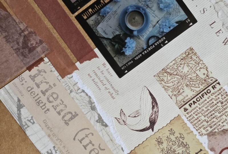
4. Supplies: For the supplies, I
use a combination of found objects as
well as purchased ones. Found objects
include cutouts from newspapers and
magazines, old letters, greeting cards, posters,
flyers and leaflets, mail packaging, old
stamps, et cetera. So I try to look for
pictures of cute animals, flowers, interesting
pattern designs, some quotes and phrases, basically anything that is of some visual interest or value. And I just cut those
out and save them with me. And in the purchased objects, I usually use a combination
of stickers, washi tapes, textured papers,
faux vintage ephemera, vellum cutouts and
basically a lot of stuff that
journal shops sell. I mostly end up purchasing
my supplies from this shop called Kioku Creations, which is based over
here in India. And they also ship worldwide. So in case, you want to use the
exact same supplies as me, I will put it in the projects
and resources section so you know where to find them. But otherwise, you can
use pretty much anything that you have with you and still follow along
well in the class. Now, just remember that purchased items can be
found at home as well. So for example, I like to
buy a lot of floral stickers because I use flowers a
lot in my journal spreads. But that does not mean that I cannot find pictures
of flowers in magazines and newspapers or print them straight
out of the Internet. So what I mean to say
is that you don't have to have the exact
same supplies as me. You can start off
with whatever you have and still make a
beautiful journal spread. As we progress
further in the class, I will keep throwing
in suggestions of alternatives that you can use to the supplies
that I'm using. And I'm quite confident that you will be able to
create journal spreads with the materials
around you. Now apart from the supplies
that I have mentioned, I also use stencils,
acrylic paints, watercolors, brush pens,
markers, and stamps. But then again, you can
achieve similar effects with just a few items
and you don't need to purchase as
many things as me. You can also use items that are different from the
ones that I'm using. So for example, if you use wax crayons or let's
say, soft pastels, instead of acrylic
paints and watercolors; or if you want to use
gouache, you're welcome to do that. And so you don't have to use the exact same
supplies as me. You will also need a
couple of standard things like craft glue and
a pair of scissors, as well as a paper cutter. And since we are going
to be working on different layout styles
in each of the lessons further, you can always go back and forth on the order of
the lessons if you like. So for example, if you
feel like you don't have the supplies ready yet
for the first layout. Then go ahead and watch
the video for layout two, and then come back
to layout number 1 when you feel you have
the supplies ready. Sometimes when you are
reading new magazines and newspapers or going
through your stash of old greeting cards or invites, you will realize that
you suddenly have found something really
pretty and you want to use it in your
journal spread. And it might just, you know, it might just click
an idea and you might feel that it would work better for a
particular layout. So you can always come
back to the videos and just make your spread that time once you have
the supplies ready. So the good thing about
the courses here on Skillshare is that you can watch them as many
times as you like. And you can also
pause the videos, take a break and
then come back and pick up from wherever
you left off. However, I encourage
you to watch all the videos and not
give up in the middle. Because the more you watch, the more comfortable
you will get with the process of
creative journaling. Very soon you will be able to
come up with your own ideas as well for creating
interesting layouts. And it all just
comes with practice. So make sure that
you watch all the lessons. And I promise you that it's
going to be a lot of fun.
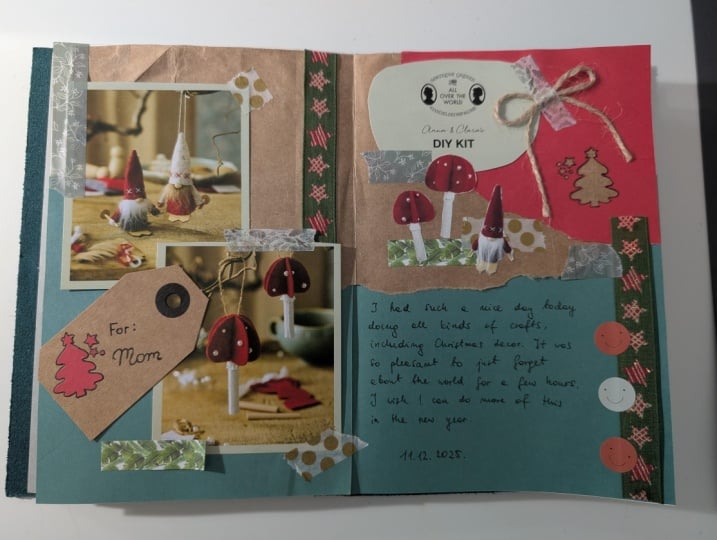
5. Layout 1 - Centre Band Approach: Hi everyone and welcome to our very first layout
video together. So I've got all my supplies
over here ready with me and I'm just going to walk you through all of
them one by one. Just so you know, my process when it comes to
selecting the supplies. And you don't need to have the exact same things as me. You can have different ones. That's totally fine just as long as you understand
the concept. So don't get overwhelmed by the amount of things I
have over here with me. First things first I'm
going to be using four pictures which are going
to be my focal images. So I've selected four images, which are basically these
sunflower pictures. So my color palette essentially
is yellow and green because of obviously the
sunflowers on my focal images. So I've selected a bunch of supplies in that color palette. So everything's in yellows
and greens right now. Now I've got some washi tapes, which are basically in
the shades of green to match the leaves
of those sunflowers. Then I have these
transparent stickers which basically have
leaves again on them. And I'm not even sure I'm going to end up
using all of this, but I just collect everything yellow and green to begin with. Then I've got these vellum
paper cutouts with me. Vellum is nothing but
like a transparent, translucent sort of paper with like printed pattern on it. You also get plain versions. So I've selected a
few printed ones. And then I have
these dots stickers, which are basically just like circle-shaped stickers. And I also have these
plain ones and I buy them from this brand
called Kioku Creations, which is easily
available here in India. Then I have this, this roll of tape which is
basically kraft paper tape. And you don't need to
have the exact same tape, you know.
You can actually just use kraft paper, like any
old wrapping paper, like packing paper
that you get in your Amazon packages or
anything for that matter, any of your standard shipping
packages will have that. So you can use that instead
of the kraft paper roll. And instead of the
circle stickers, you can actually use just colorful papers and just cut them out into small circles. So that's fine as well. For the pictures,
even though I have selected these pictures
from the craft store, which basically have
these sunflowers, like I said, made on them; these are actually stickers. But you don't really need to
have them in the same size. You can actually use
pictures of anything from magazines or from
newspapers or from old books. So you don't even need to have
them in a rectangular form, the way I've shown
them over here; you can have circle
pictures or square pictures... any other shape is fine as well. So basically, this was just like an introductory video to show you how I select my supplies. So I select my
focal images first, and then I select all my supplies based
on the focal images. So just to repeat it once more, since the images had
sunflowers and everything was in the color
scheme of yellows and greens with a
little bit of browns; I ended up selecting everything in yellows, greens and browns. So that's about it. Now, as I told you guys earlier, I usually use a black journal, but it doesn't
really mean that I always end up using
the base as is. So I keep changing
the base color of my journal spread depending on the color palette
that I'm working with. So it's pink over here. Then I have this
printed green thing over here, aqua blue here. So basically my base color kind of keeps
changing depending on the color palette that
I'm working with for that particular project
that I'm developing. So in today's project, I actually don't want
a black base again. And so I'm going to take some, some of this cream-ish
white paper and use that to create
my base layer first. So the way I usually do it is that I basically
take like a lot of liquid glue and just spread it out evenly
onto my journal. And then I stick white
paper on top of it. Now I'm using this spatula
to spread out the glue, but you don't really
have to be as extra as me when it comes
to using the glue. You can use the roll-on
glue sticks and that, that'll work fine as well. But because I use this liquid glue for so many of my other
projects as well, I have like these
really big bottles and the spatula kind of allows me to sort of spread it out evenly, which is why I use the spatula. Plus it also makes sure that I don't have like sticky
fingers and then I don't end up leaving glue
stains on my stickers, my washi tapes and
other pictures that I'm using on my journal. So just for cleanliness
sake, I use it, but you don't have to
use the same thing. So now I'm going to speed up this bit of the video
to show you how exactly I ended up pasting
the white base first. Now there's a chance
that your journal is already white and you want to use a white base itself so you can probably
skip this step. But in case you want to
change the base color, then this is like the
easiest way to do it. Now since my paper is
really, really big, I'm actually going to trim
it out from the edges. And I do this in the
beginning itself most of the times
because then it kind of just doesn't interfere
with my hand movement. And I can get rid of all that extra stuff so that
I can move around freely. Once I'm done with the cutting, then I begin to actually
form the layout. So in this lesson, we are working with a
center band approach, which basically means that
we are going to create a band right in the center of the journal spread,
right in the middle. And this is going to be
like a horizontal spread. Now, to make this
easy for myself, I have this pre-made
sticker roll of kraft paper with me, which I can actually just sort of paste right in the center. But if you don't have the sticker roll with you,
that's completely fine. Like I said, you can use kraft paper or any other colored paper
that you have with you and use that to create like this rectangular
patch in the center. Now one of the things
that you will see me doing frequently
in all the videos ahead is pressing down all the elements again and
again with my fingers. So I'll keep running
my palms or hands over the journal pages again and again to make sure
everything sticks. And I recommend you to do
that as well because it just ensures that the glue
is sort of stuck on properly and that your elements
are not like protruding, especially if you're using a
lot of liquid glue, then there are chances that thin papers will
crinkle up a tad bit. So you can actually see that my base is already
a little crinkled. And so you might want
to like keep pressing it down again and again to
get rid of unwanted texture. Personally for me, I
don't mind the texture. So you can see that my
base layer already has like a little bit of texture
on it and I don't mind it. So I'm just going to
leave that as is. But if you want to get rid of the texture on
the base completely, then I recommend using slightly thicker paper which
doesn't crinkle up as much; and also sort of like
going a little slower when it comes to the pasting process so that you can get rid of the wrinkles. Now, the next thing
that I'm going to do is get all my images. And so I have four
pictures over here today, which are going to be like the
focal point of the layout. Now there are several ways that you can put these pictures. So you can put them
all in one row. Or you could put them
two up and two down. You could put one up, one down, again, one up, one down. So there are several
different ways in which you can
arrange your pictures. And depending on the size as well as the shape
of your pictures, I recommend you to
try out a couple of different placements.
But don't go about sticking them just as yet
because for example, over here, like I have this
leaf sticker that I might want to use at the base, like under the focal image. And so you might want to
look for certain elements in your collected stash
that you might want to use under your focal images. Now, the way the
center band approach works is that basically
everything that is of focal interest or the maximum value should be in and around
that center band. So that's centre strip that you have just laid out
horizontally is going to be like the place where the viewer's attention is going to be centered
or focused on. So everything that you do in
your journal spread today has to be focused in
and around that band basically. Now once I've laid out
this leafy sticker, the next thing that
I'm going to do is use a little bit
of washi tape and put down little bits of it on the right edge as
well as the left one. For the left one, I'm placing
it in such a way that it looks as if that stem has been sort of pasted with the washi tape and the washi
tape's kinda holding it. And then for some
visual interest as well as to break
the monotony, I like to put in these printed
vellum paper cutouts. And for this, I usually end
up using the roll-on glue, which is faster and it holds
the paper decently well. Now the idea over here
is very simple. Anything which has lesser
visual value will stay in the background and will basically not interfere
with the focal images. Whereas the focal images, which are basically
your hero images or the ones that draw the
viewer's attention are going to stay on top; which are basically
our sunflower images. So currently I'm
basically looking at ways to decorate the page in such a way that the elements sort of connect
well with each other. But at the same time, the left page should be
balanced with the right page. So you've probably
noticed by now that whatever element I'm sticking on the right side of the page, I'm doing a little
bit of that on the left side of
the page as well. The only exception is that big leafy stem sticker
that I have on the left side. And I haven't done something similar to that on
the right side. But that's because I would
like my journal spread to have a little bit of, like
an asymmetrical approach, which is why I've
not done that yet. But as we go along further, maybe I'll do something more leafy on the right side
of the page as well. Now I'm pretty confident that
I want to have two pictures going slightly above the band on the left side of the paper. And I want to have
two pictures going slightly below the band on
the right side of the paper. But just for the sake
of experimenting, I'm going to try placing one of those other leafy stem stickers and see how that's gonna look. I have a feeling that this is
going to look a little bit overpowering and
it's going to take away all my writing space, which is why I probably
don't want to use it, but there's no harm
in trying it out. So I always recommend playing around with your
elements a little bit before you actually glue
them down so that you can experiment a little
bit more when it comes to ideas on the placement. So personally, for
me, I don't like this green leafy sticker
because I think it's too big and it's going to take away all that sort of writing
space at the bottom. So I'm gonna go ahead and just stick down my
yellow stickers now. Luckily, these
are stickers, so it's very easy to
sort of peel off the backs and just paste
them quickly. But even if they were
regular cutouts, it doesn't take much time
to sort of glue them down. Okay, now here's a tip.
I've accidentally dropped a little bit of glue on one
of these pictures over here. And it's kind of giving like a really tacky finish
to the picture, making it look a little untidy. So I always use a wet wipe to wipe off any of those residual
marks from the pictures. But keep in mind that these wet wipes work
only on stickers or other materials which have
like a plastic finish to them or which have like
a laminated finish. They don't work on
regular people because otherwise it's just going
to become very soggy. But if you have
something of like a plastic finish than the wet wipe is like
a great way to get rid of that excess dirt or sticky-gluey mess that you
might have poured on by mistake. Okay, now once I'm done
sticking the pictures, you can see that the layout
is pretty much ready. And I probably just need to add a few elements here and there to just make
it look finished. Now this is the beauty of
the center band approach. The centre-band approach makes it really, really easy for you to focus your attention exactly
in the middle of the page. Once you've actually placed a thick strip of paper in
the center of the page, the fear of an empty
journal spread goes away instantly
and your mind automatically knows
that you now have to focus everything in
and around this band. And this is actually one
of the reasons why I decided to keep this
as the first video, because it's the
easiest to begin with. Now moving further,
I'm going to use a little bit of washi tape
over here on the sides of these images just
so that it gives it a little more raw,
crafty finish. And I'm going to use two of these circle stickers, the
dot stickers that I have... one of them has a cute
little butterfly on it and the other one
has a cute bee. And so these are basically
going to help me get rid of that weird empty patch that I had over there in
the center of the spread. So you can see that even though these stickers have
elements made on them, they are not interfering with the focal images
for two reasons. One, because they
are really tiny. So since they're
smaller in size, they're not going to disturb
the rest of the spread. And secondly, because the colors on them are not so bright, so the viewer's attention
is still drawn to those four focal images
and not to all of these embellishments
and little tiny tidbits that we've pasted around. Alright, and now that
finishes up our whole band, which is looking quite
balanced and quite finished. Now there are some things
that you might want to do differently in this spread. So for example, there's still a little
bit of empty space above the two pictures
on the right side where the kraft paper is
meeting the white paper. And so you can try to put a sticker over
there if that's something that you like and you
could probably do one similar to that on the left
side of the page as well. But these are like
personal choices and it totally depends on your
tastes and preferences, whether you want to
add more elements on not. You could even use small labels with handwritten or printed
text above the pictures, if that's something
that you like. You could even use a
real dried leaf or like a dried flower stem over there if you like preserving real flowers and drying them in your
journal spreads. So basically once you have all your elements
collected with you, think of different
ways in which you can use them in and around
the center band. So personally, for me, I think the stickers
are going to be a little bit overwhelming
and they might take away the focus from the four images that
I have in the middle. So I'm instead going to
use a stamp set over here. This stamp set that I have
basically has like a variety of these
leafy stemmed designs. And I'm going to
use one of these just to add like a tiny bit of visual interest to the
kraft paper tape over there. So I usually use this Ranger archival ink pad in black color, but you can use a
different color as well. They come in a large variety
of colors and sizes. Alright, now you
can see that just using that little
stamp makes so much of a difference because that gap is not looking so odd anymore. And I think this finishes
up this spread for me. I'm now going to go ahead and start writing some thoughts on the empty spaces above and
below the center band. And this is exactly
why we need to select our base
color in advance. Because in this case, I'm
using a black micron pen. And so that's going to look
nice on this white page. But let's say you had a
colored base over there, then you would have to choose a pen which
compliments that color. So it's always a good
idea to even plan out your text color based on the color palette of
your focal images. And that just helps to
put everything together. All right, and with this, my journal spread
is completely done. And I'm quite happy with
the way this has turned out. I quite like
the look of this spread with a mix of the matte and the
glossy finished elements, because I feel that they add
a lot visual interest. And this is something that
you will see me doing a lot in all the
lessons ahead as well. Now just to give
you an idea of what all you can do with your
centre-band approach, here are a couple more ideas for you to take inspiration from. So as you can see in this one, I decided to have like
a colored background where I basically added all
my pictures and my stickers. But they were not
my focal images. My focal image was
actually the text itself. So I wanted the
viewer's attention to go to the text directly, which is why I decided to use
that on the center band. Then in this one I actually
have like multiple pictures, but all of them are
again focused at the center of the page on
that center band itself. And then again, basically
it's the color palette that kind of brings your
journal spread to life. And you can see that I've basically just
extracted colors from the focal images and used
elements of those in that same color
family in and around the focal images to make
it all sort of cohesive. So in order to maintain
continuity and harmony from the left side of your journal spread to the right side of
your journal spread, it's kind of important
for you to stick to similar colors and
sort of bind them together. And we're gonna be
talking more about this as we progress
further in our course. For now, this wraps up our first layout
style video together. And I hope this was as much
fun for you as it was for me. And I look forward to seeing all your wonderful spreads
submitted over here in the projects and
resources section where I'd be happy to
leave my feedback for you.
6. Layout 2 - Split Section Approach: Hi everyone, and a
very warm welcome to our second layout
style video together. So before we get into making
the journal spread today, I just wanna do a quick recap
of what we did yesterday. So I'm sure you remember
that yesterday we did the center band approach where we basically had
four focal images placed on that band in the
center of our journal spread. And the idea is that the band as well as the
little embellishments or the tiny little
decorations that you put in your journal spread... they are basically going
to stay muted and they're going to not interfere
with the focal images. So essentially, we
kind of built like a tiny collage with a few layers and
everything which was of lesser visual value
stayed in the background, whereas the focal images
stayed in the foreground. And like I said, there are variations to this. Instead of doing like
four focal images, you can totally do with just two or even just one single image, just as long as the
band is your focus. Or you could even do
text in the center. Now today, however, we're
gonna do something different. So today the goal
is going to be to work with one focal image, which is going to be like the largest on our journal spread. And everything else
is going to be slightly smaller as compared
to that focal image. And then we're also going
to add in a little bit of text to tie in the whole
journal spread together. So today I've kind of decided
to work with like a purple, violet-ish color scheme. And I'll just show
you why exactly. So I have this little cut-out with me from
an old paper bag. And this paper bag is
from a brand from where I usually buy all my tea from. So they're a tea
boutique and they have this beautiful printed paper
bag with this little purple, lovely iris flower
painted on it. And then they also have their logo and the shop
details over here. So I'm going to actually cut out the iris flower as well as
that little branding that they have on the paper bag and use these for my journal spread. Now, that's why I have all
of these purple supplies. So I have the vellum sheets, I have the printed ones, and I have this cute one
with little dots on it. Then I have some flower stickers as well as these dots stickers, plain ones as well
as printed ones. I also have this transparent
little sort of strip, which is again like
a sticker sheet and it has these
flower patterns on it. Then I have this lace doily, which I thought
would look really cool with the whole
sort of tea theme. And the reason why
this spread is going to work very well
for me is because I actually co-incidentally
found a little sticker with me which has like a teacup
with purple flowers in it. So I thought that the
whole theme could be about like tea and how tea is kind
of like important to me especially... I'm sure it
could be coffee for you. But the whole thing
was about how tea is like important for me. And I thought that
it could sort of tie in the whole tea
drinking theme together. Now I have this washi tape which has little
butterflies printed on it. And you can see that
the color scheme's kind of similar to the base of the paper bag. And then I have this
petal washi tape where you can basically peel
off every individual petal. And once you place the
petals in a circular manner, it becomes like a full flower. So again, because
this was purple. so I decided to just
keep this handy. And like I said, even
in yesterday's video, there's a high chance that I'm not going to end up
using all of this. But I like to gather all my supplies in the beginning
and just keep them right next to me so that I
don't have to keep hunting and digging
through my stash again and again while I'm making my journal and it doesn't
take away from my process. So now I'm going to
just quickly cut these elements from
the paper bag. I have the flower and I have the label of the tea boutique which I want to use
in my journal spread. Now I am sure you must
have noticed by now that all the little elements that
I've gathered over here, from the stickers to
the vellum sheets as well as this main element, they're all different
shades of purple. So some are more
reddish purples, whereas some are
more blue-ish purples; more in the violet space. But I've still kept
them all together as long as they are in
the violet-purple spectrum. I've sort of kept them together because you never know
what might just look nice with each other
and which color might help us to kind of break
the monotony of the spread. So I just like to
keep elements of a similar color family ready with me before I start my spread. Alright, now I've got all
my elements ready with me. I'm done with the cutting. There's one more thing that I'm going to use in the
journal spread today, and that is these mulberry paper sheets
that I have with me. Mulberry paper, also
known as saa paper, is very commonly available
at stationery stores. So I have it in these three
different shades of purple. And I want to use one of these, I think the ones
on the right side are going to look a
little too bright. And I also want to use it
in combination with like a creamish handmade paper. So I think I'm going to go with the one which is
the leftmost one because this I think is going to stay muted
at the background. And you can see that it has
this beautiful translucence to it and the fibers are really, really pretty when you put
them against the light. So this is one of the reasons
why I really like using mulberry paper because it's
got this lovely texture, a lovely handmade
sort of texture to it, which I love adding to
my journal spreads. So yeah, I think
the darkest purple, which is almost like a
plum-ish color and that ivory cream-ish color is
what I'm going to use. Now, the way I'm going to
work with today's spread is that I'm basically going to
create a wave on the page. And that wave is
basically going to be like a cutout from the papers. So first things first, just like I did with
yesterday's layout, I'm going to start off by
pasting the white paper, this cream-ish white paper. But the way I'm going
to cut this is going to be in a slightly
more abstract wavy pattern, as against covering the whole
journal spread with it. So I have basically folded
the paper and then split it into half by
cutting it like a wave. And so now you can see that it kind of gives this
interesting pattern. And it basically divides the journal spread
into two halves, like the top half
and the bottom half. So now the top half
is where I'm going to use that mulberry paper. And it's going to go behind. And I'm going to keep the
white stuff in the front. Now this mulberry paper
is slightly shorter in the horizontal length as compared to my
journal spread. But that's okay
because I can always cover it up with some
embellishments and ephemera. I don't want to use the
entire mulberry paper because I'm not even going to see
the bottom half of it, so there's no point in
wasting the sheet. Mulbery paper is also slightly expensive as compared
to regular paper. So it's a good idea to sort
of use it judiciously. And even otherwise,
for that matter, we shouldn't really waste
paper and your supplies. Okay, so I'm going to quickly
just add a little bit of glue and evenly lay it down. And basically, once I have applied the
glue all over this spread, just like I did in
the previous video, I'm going to stick my papers. I just have to be a little
careful while sticking the mulberry paper because it's really thin. And sometimes the liquid glue basically makes
the paper a little soggy and then it ends up
tearing up. Unintentionally, you might just end
up causing some tears and wrinkles
on the mulberry paper. I personally don't mind
tears and wrinkles because I feel it gives a raw sort
of look to the whole thing. But if you also end up using mulberry paper like
me and you don't want those little
tears and wrinkles, then the best
thing would be to just go real slow and take
your time in pasting it. Alright, once I'm done
with the mulberry paper, I'm going to put the
white paper. I will need a little bit of extra glue in
order to hold it properly. You can see that
my mulberry paper started tearing up in
the center and that was because the spine of the journal was giving a
little bit of pressure. But that's okay
because like I said, I don't really mind it and plus, it's going to get covered with some of the elements that
we're going to place on it. And once I've cut
out the excess, then the spread is ready
for us to work on further. Now one of the
interesting things about the split page approach is that you can do any shape when it comes to splitting
it in the center. So I have chosen to
do it with a wave but you could even do
like a scalloped edge or like a zigzag edge. Or you could simply
just do a straight, like a half and half edge if
that's what you prefer. So the idea is that we just
want to split our journal spread horizontally
in two parts. And we just want to have like
a top half and bottom half. And what do you do
in the center doesn't really matter because
you can give it any shape. I've kind of given it like a
mirrored wave because I like to have wavy organic elements
in my journal spreads, but you can definitely do a different shape if
that's what you like. Alright, now once
this is all set, the first thing I'm
going to do is bring in my focal image. But I don't want to go about pasting it
just as yet because I want little details
to be on the top band. So the way this approach
works is that you have all your visual elements,
which includes your primary and your secondary
images on the top band. And all your text is going
to be at the bottom band. The only exception
is your focal image, which is basically going
to cross over from the bottom band
onto the top one. And that's because it's
the largest element that we have on the
journal spread. So like I said, I'm not going
to stick it just as yet. But I know I want it
on the left side. And instead what I will do is add some washi
tape over here on the left side and
start to basically give background images
and some character to the whole spread before I
bring in the focal image. So this butterfly
washi tape that I've just pasted has colors which are similar to both the papers that we've just pasted. So it goes really well
with the whole scheme. Now I'm going to
bring in the little tea boutique label that I had and I'm going to see where
it's going to look best. Personally, for me, I like
overlapping things and I know I want it slightly
behind the flower, which is going to be
on the left side. So I'm going to stick this first and then bring
the flower on top. And now if you don't
have the exact same focal images as me, then there are a
couple of things that you can do differently. So for example, instead
of the flower picture, you could easily use like an illustration from
like a children's book or like an old picture of a monument that you must have visited from like a holiday, you can probably cut out like
a monument from a postcard. Or if you've seen like an interesting illustration in a newspaper or a magazine,
you can use that. And instead of the label, you can actually use
like any kind of text, which goes along
with the illustration. So probably it could
be like the title of the book from which you've
taken the illustration or the headline from the magazine article from which you have taken
the illustration. So it could be
something like that. And they don't even need to
be the exact same shapes. The only thing to notice
over here is that your focal image is the largest
element on the page and everything else is
going smaller in size as you progress further.
Alright, now that I've brought my focal image in, you can see that
the whole spread is coming together
beautifully already. And that's the beauty of
selecting backgrounds which coordinate well
with your focal images. Everything just looks
like one cohesive piece. I'm just going to bring
in a wet wipe and clean up all those glue
marks that I have accidentally caused on the
label as well as the flower. And now I'm going
to start working on the top right of the spread. So the first thing that I'm
going to do is bring in the sticker which has the
tea cup printed on it. And it almost feels as if like this whole spread
is telling a story. It's as if the tea boutique, is trying to tell
a story where they pluck the flowers fresh and then they go through a process and then they
create some blends with it, and then it finally
lands in the teacup of a
customer or a client. So I feel like this whole
thing is sort of telling like a beautiful tale or
like a lovely story. Okay, so I'm just
going to add in a little bit of washi
tape over there. And just like I did yesterday, I like to bring in
similar elements on both sides of my spread so that the whole thing looks
like one cohesive unit. So I've used the butterfly one. Now I'm going to bring
in the petal washi tape and add one petal right here. It almost looks as if the cup
was overflowing and one of those petals just
came to life from the picture and just came
out on to our journal spread. How wonderful would
that be though if pictures just came to
life? Just like that. Alright now what
I'm gonna do is add a little bit of the
lace doily over here. I don't want to use
the entire circle, so I'm actually going to trim
it just a little bit so it becomes like a
semicircular thing. And again, you can experiment
with placements, whether you want it
vertical or horizontal. Personally for me, I want it
to be horizontal. And the reason why I'm using
this lace doily is because, well, there are two
reasons actually. First, because it's
going to give a nice base to the transplant sricker that I want to add on top of it. So the flowers are going
to look a lot brighter and better once I place them
on top of this doily. And secondly, because
I think the lace doily goes really well
with the whole tea-time feel; almost reminding me of like sitting under
the sun in my garden and drinking like a nice
cup of tea... like in early winters or like just when
spring is about to begin. Again, I'm just like
romanticizing my journal spreads into fictional
imaginations in my head. All right, so now I'm
just going to bring in the flower sticker. And you can see how much
of a difference that lace doily makes because
now it almost looks as if the flowers were sort of like
printed on the doily and they've kind of like overflown from the
doily onto the spread. So that's the beauty
of layering things... unexpected things when
they come together, they create such a wonderful
visual which really catches your attention
and really creates magic on your
journal spread. Now just to add a few other
tiny elements on my spread, I'm going to add these petals
again at random places. So a couple of these
would probably look nice over here
next to the label. As if they're
overlapping the label. And I'm going to just probably
use a couple of these on the top edge as well
as at the bottom edge. The scattered petals
are really giving the journal spread
a beautiful feel. And like I said in my head, it's like a story as if the
flowers are being plucked from this exclusive
exquisite garden. And then they're kind of like going through
different processes to make it to the
final cup of tea. So I think the scattered petals definitely go into the
vision that's in my head. And once I'm done
with the petals, the final element that
I'm going to bring in is going to be like
this bud illustration. The bud is basically
an extension of the same illustration
from which I cut out the large iris flower. So the bud was actually
right next to it. I didn't cut the bud earlier
because I just wanted to focus on the big
Iris illustration. But now I think that
the bud is going to look really nice on
the bottom right. And it just gives a very nice, beautiful tea garden feeling with these little
organic shaped, random shaped cutouts on the left and the right
edge of the page. And we have two sharp
edged elements, which is the rectangular label, the tea label and the rectangular
image of the teacup. So when we basically play
with shapes and sizes, journal spreads start to
look a lot more interesting. If we try to keep everything in the same size or
in the same shape, then the spread tends to look a little monotonous and boring. And then we don't know
what to focus on. But this way we know that our eye will
obviously first go to the big Iris image because
that's the largest one and then the eye is kind
of traveling from there. So it's almost as if you are taking the viewer on a journey where you are asking
them to focus first on the largest image. And then gradually
their eye tends to move from left to right. And as their eye travels they notice the label, the teacup. And then finally come down to the little bud that
we just pasted. I'm just going to
trim out the excess from the top edge as
well as the bottom edge. And just to make this spread
look a little neater. And once I'm done with this, I'm ready to put in my text. Now there are a couple of
different ways that you can do the text in this spread. So since your large focal image is on the left side of
the journal spread, you know that everything
else has lesser visual interest or lesser value. So you can just go with like regular plain handwriting and
just use that little block of white on the bottom
right of the page and write down whatever little thoughts
that you have over there. But for me, I want to add
a little quote over there. So the quote is a short one. It doesn't have a lot of
words in the sentence, which is why I know that I'm still going to be
left with a lot of white space around it. And that's exactly
how I want it to be. Because I want the
focus to still be on the iris flower
and not on the quote. If I end up filling up
this whole white chunk, with like really big handwriting
or really big letters, then the attention
will go on the quote. So I don't want that to happen. So the quote that
I've chosen for today is this wonderful little thing that I read on the Internet, which is, "Tea is
always a good idea!" And this is something
that I live by because I feel that a good
cup of tea can really, really charge you to
do things nicely. And I'm a tea lover... So this really
resonated well with me. So I'm going to bring in
my alphabet stamp set and use it to put
the quote over here. And just to finish off the
whole botanical tea garden kind of vibe that is
going on in the page, I decided to use my leaf
stamp set as well to add one tiny little element
at the bottom of the quote, just like I did yesterday. Now, if you don't have a stamp
set, that's perfectly fine. You can do this in
regular handwriting too, or you could just use
like a marker to write this in capital letters
and that's fine as well. And if you don't
want to do a quote and you want to write
something else instead, that's perfectly fine too. So this is how the final
spread has turned out. And personally, I'm
quite happy with it because I don't usually
work with purples a lot. So this was an
interesting coincidence for me that I ended
up having a lot of purple elements with
me in my journal stash. And I've created a purple spread after a really,
really long time. And that's the
beauty of collecting supplies for
journals because you will suddenly realize that you have too many things
of the same color. And the next thing you know, you'll be making a
beautiful journal spread with those elements. So that's the beauty of
creative journaling. Now here's another
example that I've done with the focal image, again being the largest
element on the page. So this one, as you can see, was done with a
Christmas theme in mind. And again, the biggest
element over here, is on the left
side of the page, which is this cute little teddy wearing like
a Santa cap. And I have little
elements around, which are basically on
the top band again. You can switch it around. You can do the elements
on the bottom half and do the text on the top
half if that's what you prefer, that's completely fine. You can also flip the
placement of the focal image. So you can do like the
largest focal image on the right side of the page. And do all the elements going in the left direction instead
of the right direction. The only thing to keep
in mind in this kind of a spread is that your
biggest element or your focal image should be
able to guide the viewer comfortably in the
direction of the spread. Whether you want them to
go left to right or right to left or whatever it is that you have planned
in your spread. All right, so that's it for this horizontal split approach
that we have done today. Tomorrow, I'm
going to meet you with another interesting layout idea. Till then keep creating. And I look forward to seeing all your beautiful
spreads submitted over here in the projects
and resources section. If you get stuck somewhere, then feel free to leave
questions and work-in- progress pictures for me
in the discussions tab. And I'd be more than
happy to help you out. See you tomorrow.
7. Layout 3 - Window Cut + Collage: Hi everyone and welcome
back to the course. Today we are on day 3 of discussing different layout
styles for journaling. And I've actually got a very interesting style
to work with today. But before we get into the process of making
the journal spread, just like yesterday,
we're gonna do a quick recap of what we did. So yesterday we basically did the horizontal split
section approach, where we divided our
spread horizontally into two parts with a
Dobhoff and a bottom half. Now, you don't need to
have it as an exact half. You can have the
sections being slightly asymmetrical as well or unequal, and that's completely fine too. You can choose to make the
half as a street edged half. Or you could do like
a scalloped edge, a zigzag edge, and
asymmetrical abstract edge. Basically anything
that kind of gives you a partition from the top
edge to the bottom edge. That's fine. And you can be as creative
as you want with it. Now, apart from
dividing this spread, one of the other
things that we did yesterday was to
basically figure out how we can grab the viewer's attention
with a focal image. And how we can help create an
additive or basically guide the viewer's eye
into traveling from the vocal image to the rest
of the elements on the pH. So we basically start by placing a really big focal image on either the left or the
right side of the page. And basically you then sort of create like a
tale of smaller elements. And these elements are sort of related to
the focal image, or they can be of
a similar theme or at least of a
similar color palette, even if they're not
on the same team. So that the viewers eyes able to sort of travel
in that direction. And you're basically
guiding the direction of the journal spread and making it easy for the viewer to
understand what it's all about. So those were the key point does from yesterday's journal spread. And today we are going to
work on a new technique. And for today what
I've basically done is that I've kind of pasted
my off-white paper on my journal spread
and get it ready because I want the base to be this color
instead of black. So this is probably
unnecessary for you if your journal
is already white, but in case you have a different color
journal and you would like the
beast to be white. And we've already seen
it in the last couple of days that you can
just stick a layer of the base color that you want and then it's ready
to work on further. Now apart from this,
I basically have like a printed sheet
of paper with me. There's printed sheet of
paper is basically going to be part out from the middle. And that's what the technique
is all about today. So today we are
basically working on a hollow window approach
where we're going to actually do some
grafting and create a small window within
a pattern people, and use that as the space
to write our text in. Now if you don't have
printed people with you, you can also use
a colored sheet. And it's not
necessarily that you have to use a baton
and Bieber's. So as you follow
along in the video, you'll realize that there are
many different variations that you can do to the technique
that we're doing today. And it's not necessary for you
to have a back-end people. Now, as you can see, this baton people is actually slightly bigger than the
center of my journal spread. It's just a little
bigger than that. So I'm actually going to
cut it right to the center. And I'm actually
going to show this on the black paper so it's
easier to see the edge. So as you can see, I'm just using my Neal. I'm kind of just like putting a little
dent on the people. And what I'm going to
do is I'm going to guard the people in such a way that it slightly crosses the center mark or
the journal spread. So basically the left
side is going to be entirely covered
with this baton. People with a little hollow
cut out in the middle. And then just a tiny bit of that paper is going to cross
over to the right side. So I'm quickly going to use my cutting mat and guard this. I've actually measured
this already. I already know this
is about this journal that I'm using is approximately six by six inches in
width and height. So using that measurement, I am good leaders can do card
this and basically create a square for myself which is slightly bigger than the left
side of the journal spread. Alright, so I've got this cut
to the correct dimensions, and now the size
looks just fine. So now what I wanna do is I basically want to
create a hollow cutout. I'm going to go about sticking this pattern people just as yet. I am actually going to create a small square window over here. And, and for this, what we're gonna do is
we just have to look for the approximate center
of weather window will fall once you cut it out on the journal spread and
then got it accordingly. Now, if your backend paper
is something like mine, where you basically have a lot of different
elements to choose from. And then Uganda, your diamond
deciding the orientation of where and how you
want to place the paper. Now in my case, I have this really pretty blue
butterfly on the dog. And I actually want to keep it without ruining
the shape of it. So I want to cut
out the window in such a way that the butterflies
market out entirely. And it's only one of
the other flower stems, which are the flower
bunches that are cut out. So I'm just playing around with the orientation to see
what works best for me. And I think the
butterfly at the top is a good idea that when I create
a window right under it, the butterfly will only lose just like a small
section of the wing. And it won't really take away from the
shape of the butterfly. So I think that's
a good placement. Okay, So now once
you're happy with the placement of your people, we will proceed to cutting
out a small section of it. And what I'm gonna do
is basically create like a vertical
sort of rectangle, which is basically like
a hollow window cut out. But you don't need to do
the exact same shape as me. You could do a circular cutout, a triangle one, any
geometrical shape basically. Or you could even
do a flower shape, cut out an abstract
shape doodle got out. Any shape is fine. Now just a heads up. When you're doing the cut-out, make sure that you cut it in such a way that the
piece that you're left with eventually is usable. So basically we are going
to use both the sections, the piece from which you have
made the hollow part out, and the cartilage itself. So I recommend that you watch the video and see what
I've done with my card out before you actually go ahead and proceed with cutting yours. Okay? So as you can see in my case, I have basically created this vertical
rectangle and I've got this little window created from which you can basically
see the background layer. And then I also have
the small piece from that cutout left with me and we're going to
use that as well. Now, I'm going to start applying glue to the people
on the left side. And I'm going to stick it on
top of the background layer. And I've already created my background layer
as the white one, legged creamish white one, which is going very well
with the color palette of the paper that I have chosen. So that's a good thing. So now once I'm done with this, I know that I have to bring my cutout on the right
side of the journal spread and place it sort of diagonally opposite to where that
window is created. But before I do that, I'm actually going to create
some background layers. And we're actually going to build a mini collage over here. So this video today is also going to act like as an
introduction to collages. And now when we are
working on collages, is always a good idea to work
with contrasting elements. So think of a mix of Baron
papers and blame papers. And along with that also
think of the different obesity's in which the
papers are available. So for example, a card stock
is going to be really, really opaque, especially if it's colored card stock is
going to be really opaque. But when you work with
the vellum sheets, they are going to be quite
translucent in that sense. So you can use a variety
of different peoples. And depending on the color scheme that
you are going with, I'm sure you'll find
a lot of cutouts to use from paper bags, from all leaflets,
posters, et cetera. So there's no shortage
of people around us. Now I have this
old textbook page which has quite yellowed up. And so I'm basically using a little tear from
that over here. And I'm going to glue this down. All right, so now once
I'm done with this, I am going to bring in a film or printed papers to see what
else I can do on top of this. So as you can see, I have
a stack of printed papers, and some of these are actual book pages which have yellowed over a period of time. And I probably lost a
few betas of these books or some of these are
actually picked up from thrift stores
and scrap stores. So these books have no value, which is why they're
all kind of like tattered and there are just
lose people's left with me. But some of these are actually purchased
from the craft store. And the craft store
basically creates for when DEJ papers with different sort of
color grids to them. So you can see that some
of them are more yellow, some of them are more
than the pinkish space. Some of them are slightly
more coffee colored. So basically, depending
on the paper quality, each page kind of yellows or
basically ages differently. And so what the graph store basically does is that it gives you like a lot of options
to choose from in one good. So I'm basically going
to use this paper from which I have this very light pinkish purplish batch
that I can cut out. And I'm not using the
text element because I've already done one
text paper at the bottom. So on top of it
I'm just going to stick a little bit
of flame paypal. But because I like the look of that pinkish purplish batch that has on the paper.
I'm going to use that. And then I'm basically
going to bring in another little piece
of paper which is basically standard but of
people which came as part of the packaging from where I purchase my craft
supplies from. And you can see that this is quite transparent in that sense. So you can actually see
the text from under it. And to bring in a little bit
of interest and variety, I'm going to now bring in some
yellow well-known people. But I'm not going to
use it just as yet. What I actually want to do is place a flower stucco first and then use just a little bit of this vellum paper on top
of that flower sticker. I'll just show you how. So basically this is a
transparent sticker that I have the basis transparent and the flowers kind
of printed on it. And I'm just going to apply it on top of this crossing over. So you can see that it
already brings a lot of interesting character
to the collage. And as far as the William
strip is concerned, I'm actually going
to tear it out into a small section like an abstract piece and stick it as if the flower is
being held on by this. So basically what I've done is that I've drawn
the vellum paper, imagining it to be like
or don't piece of paper. And use that over here on top of the flower sticker
so that it looks as if this tape is
holding the flowers. And you can see that the
velum is also translucent. So some of the text from the bottom page is
visible through. Now. Before we proceed further, I'm actually going to talk about a few things that you can do
while building your collage. The first two are actually
kind of already hinted at, which is that you can play with a printed papers
versus spleen papers. And you can sort of apply
them alternately on your collage to create
interest and texture. You can also play with
opacities of these papers. So we've already done some
opaque ones as well as translucent ones and you've seen the effect that they bring. So it's always a
good idea to keep layering text sheets or no, and then adding some
translucent ones, then adding a few
more branded ones, and then again adding some transparent
ones so you can play with the layering basically. But one of the things
that really make a collage work well is basically the shapes and the sizes of the cutouts
that you're doing. Now, I personally prefer to
work with organic cutouts, which basically
means that I like to tear them out and
abstract shapes. And I don't really go for
structured shapes at all. But once in a while I will use
structured shapes as well. Now, what that
essentially means is that depending on the look
that you're going for, you should take out the papers
in different shapes and sizes and make sure that you have a large
word ID to pick from. Now, when we started off with
this particular village, the biggest element
that I had was the, was the old textbook
people that I pasted. Then I went in with
like a smaller element. And then I went in
with an element which was slightly bigger in size. And then I went
in with a flower, which was technically
the smallest so far. But then added like
a small deep to it or the well and paper
which then became, became the smallest element. Now, all of these elements will have different
shapes and sizes. And that's why the collage
ended up looking interesting. Had they all being
of the same size, then we wouldn't have
been able to see the bottom layers as much as we are able to
see them right now. And then the collage wouldn't
have had the same effect. Another thing to notice is the
orientation of the papers, not all the papers, at least in the same direction. And we started by
placing them vertically. And then we gradually move
to placing them diagonally. And the flower than game a
little bit more to the left, which was again diluted
a little bit left. And then the yellow vellum was actually almost horizontal. We'd like a little angle to it. So play around with
the angles and the orientations to
make a collage work. And that's how you will
be able to bring in a lot more visual
interest and drama into your collage as
against making like a monotonous one where
everything looks the same. Now the reason why I'm
mentioning these points is because as we go further, we are going to be working
more than collages. And these little tips will prepare you for
what we're about to do in the next few
general spreads. Now, coming back to what
we were working on. So now I'm basically going
to bring in some stickers. And I have these pretty little cutouts
from the sticker shock. Basically butterfly ephemera,
our butterfly stickers. And they have different
butterflies on them. So I'm gonna go
with the ones which have the yellow and
the bubble ones. Because I think they go well
with the journal spread. And the reason why I've
chosen the butterfly FMLA is again, as you can see, the left pattern
people already had like a butterfly printed on it. So it goes with the whole butterfly
garden botanical theme. So I tried to look for
elements which have similar motifs are
similar elements in them. Now again, this is going to
bring in some variety to the collage because this is
a more structural shape. So this is an absolute
rectangle as compared to all the organic elements that
we were working on so far. All of the other
ones were abstract, but this is more structured. And now before we
proceed any further, I will actually bring out my
cutout from the baton be, but I'm pleased that over here. So basically, all of this
collage work that we just did was supposed to go under that back-end
BBA, as you can see. And now we're going to build further on double
this patent paper. Now, an interesting thing
to note over here is that even though this is
your focal image, so to say, you have already done some work under it and
then you're going to continue with some
walk on top of it. But the work that you have
done under is going to connect with the work that's
on top of the baton paper. So what we're basically
trying to say is that even though this
was your vocal image, this is actually in a way become a part of the collage that
you were working on so far. So now, what I'm going to do is I'm going to continue working with the
collage techniques. And I'm going to bring in
some vellum paper which has these interesting yellow
dots circles on it. And just use a little
strip of that over here. And then I'm going to
use a couple of these, maybe one of these
so-called stickers. And again, this one has like
bird illustration on it, which again goes with
the whole garden field. I'm purposely choosing colors
and elements which go with the team of the baton
Bieber that I already have. And now I'm basically
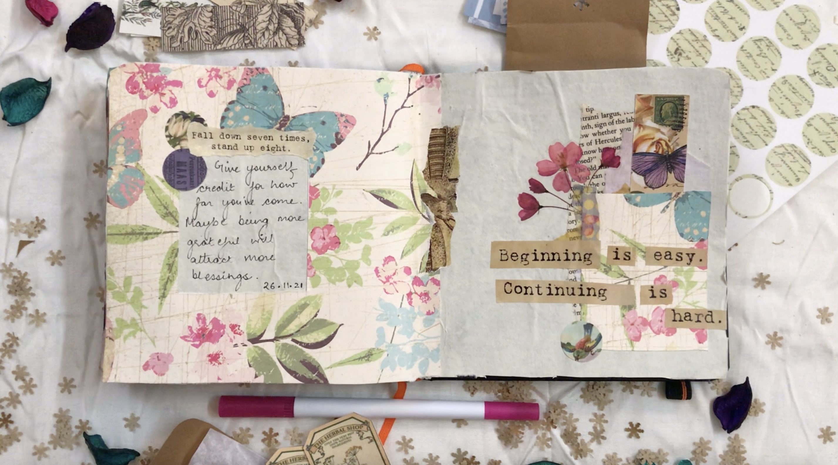
going to bring in a court. Now this quarter is
very interesting. It says beginning is
easy, continuing is hard, and it comes ready
as the sticker sheet from the shop when I
purchased it from. But I'm actually not
going to use it as is. I'm going to cut it
into little strips and use each word as a
separate element and arrange it in an
abstract manner on top of that cutout knife, you don't have a printed
stickler like me. You are free to do this
in your own handwriting and just create tiny strips of paper with your own
handwriting on it. You could also use brush
lettering or calligraphy or any other lettering
style that you usually prefer and use that. So as always, there
are no restrictions as to how creative you can get with this and how you'd like to personalize your journal spread. I usually like to place
the elements first and see how they're looking
before we actually go about sticking them. So it's a good idea to just play around
with the placement. Before you commit to
sticking the elements on the people are right now once
we're done with the code, you can see that the whole
journal spread is starting to look white balance and
it's all coming together. Now one of the reasons why it's also working is
because if you notice, I purposely placed my court slightly below the little
patch of the butterfly wing. That was important because that blue butterfly wing is
actually the viewers clue. To understand that
this little card hour has been taken from the
left side of the paper. So when you think of it
like a big puzzle piece, you know that this one actually
fits on the left side of the paper in that window
that we had created. So when you're creating
a journal spreads, think about these little
decisions and see how and what exactly your
journal spreads are communicating to a person
who might see them later on. And how would they be able to tell what was
going on in your mind. So these little decisions
will help you to make your journal spread a
little more planned as against going
completely abstract on it. Now because I've used circles stickers on the
right side of my people. I want to use a couple of
those little stickers on the left side of my paper
as well next to the window. And this is to bring in
a balance of sheeps. So the element on the right
side of the paper would have looked completely
4D if I had absolutely no circled on the left side of
my journal spread, which is why I've decided
to add two of these. And I'm going to overlap this
with another chord which basically says Fall Down
seven dimes, stand up, eat. Which I found interestingly to connect well with the
gourd on the right side. Now this is optional. You don't have to do
Bu courts like me. You could totally do a
heading on the left side and do a little bit of your own thoughts and
feelings on the right side. Or you could reverse it. And basically we text to him, really come up with
interesting ways to personalize your
journal spread. Now one of the things
to notice is that the text size on the sticker
that I'm using here right now is smaller in comparison to the texts that I've done on the right side of
the journal spread. And that's because
technically speaking, the focal image or
the focal point of our journal spread is still that little collage that
we've done on the right side. It's not the left side
of the journal spread. So the bigger the
bigger alphabets or the bigger foreign size is
what it's going to grab the attention of the viewer on the right side of
the journal spread. And then they'll notice
the puzzle piece. And then from the
puzzle piece we basically switch our eye to
the left side of the journal spread where we find secondary
text and secondary images. And so that's why I have
this quote over here. Now, another thing
that you'll probably notice is that the
color of the people. Which this Court has printed, is also a lighter as compared to the color of the paper on which the other
Gore-Tex printed. And again, because
that one is Dhaka, So the focus goes there instead of the left
one, which is lighter. So technically
speaking, the code on the right side kind of
becomes like a headline. And whatever I have on the left side of the
pages basically, just sort of follow-up thoughts on what I've already done on the right side
of the journal spread. So again, playing with color, bling with fond and playing
with sizing especially can help you make your journal spread a lot more interesting. And it'll help your
viewer don't know where exactly you want
them to focus on. Now what I want to do is
basically add some elements at the center of spread where the baton paper cut out is basically just sort of
meeting the blend BBA. And I'm just going
to cut out a sticker into some organic little shapes, abstract little
strips basically. And use those just to take away from the sharp
edge of that people. And the reason why I'm doing
that is because if you notice we have a lot
of organic cutouts. So starting from
the printed people that we had put at the
bottom of the collage. Do the code that we just recently based it on the left
side of the journal spread, we have a lot of these
interesting decorative edge or don't label as basically. And I want to maintain that raw feeling and not have such a sharp element in
the center of the spread. So I'm just going to
do basically mute the sharpness of that paper card out by adding a few
organic elements. So I'm not doing much. I'm basically just
going to add like to sort of strips which are
overlapping each other. And again, this is
optional for some people. The sharp edge
really works well. And they actually prefer
the look of the sharp edge because it kind of
gives like sort of like a partition and
it kind of creates like a natural barrier between both sides of the
journal spread. So some people like it, but I like to have some off beat elements in my
journal spreads because I feel that there should
be a little bit of an element of surprise
and they should not really be as predictable
as, as one would think. And I just like them to
have something off heat. So for me, I think this
is gonna do the trick. I might regret it later on, but there's no harm in
placing it for now. Alright, now that brings
me to writing my text. And so as always, I'm going to bring in my
micron pen and I'm going to fill up that little window
with some handwritten text. You can also choose to keep a picture inside the
window if you feel that the picture is
not going to interfere with everything that's
happening around it. So that's another
option that you have. And you can always
make the window bigger or smaller or of
a different shape depending on the team
that you're going for and what your preference is. So there are many ways to
customize this journal spread. Alright, so now that brings
us to the end of this one. And again, you can see that the different paper textures are really bringing
everything to life. Sometimes people shy away from making a goal edge at the base first because they feel that the focal hemorrhages
going to cover it and there's no point. But to be honest, it's all in the process. So once you making the colors, you will realize that nine out of 10
times your ability to choose the
correct placement of the focal image improves
because you might want to preserve some elements of the collage and
then you'd be like, okay, I don't want to
place my image here. I want to place my
image somewhere else because the collage is
looking really pretty. So based on such
conversations with yourself, you will actually see a drastic improvement in the way you place your elements
in your journal spread. And this really
comes with taking your own dime with
your journal spreads and basically just
enjoying the process. So don't be afraid to play with your elements and overlap
them and layer them. Thinking that you might not see them in the end
because for all you know, you might just
stop at that point and you'd be like,
okay, this is it. And you might just end up using that bid as your focal image. So play around and don't
be afraid to experiment. Now, as always, I will show you another
example of what you can do. So again, I have a Christmas themed
spread over here that I have done where I basically chose to work with this sort of arch shape design. And as you can see,
it's almost like, you know, how snow globes are. So it's almost like
that on the right side. And I use the large Dicker of that little glass globe as a reference to create the shape of the card
out on the left side. And then I basically did some elements around the
frame on the left side. And I also did some elements on top of the element
on the right side. So basically, you know, that that's actually kind
of like the puzzle piece. So if you pick up
that red blob on the right side and try to
base it on the left side. It'll fit in perfectly. So yeah, this is an
interesting way to grade your journal spreads where
you basically take a part of the paper or the image from one side of your
journal spread to the other, almost creating like
puzzle piece which is probably gone astray or has
fallen out of the puzzle, and then you build some
elements around it. So I hope you had
fun working with this technique and I
look forward to seeing your journal spreads with this in the projects
and resources section. Tomorrow I will meet you with another
interesting technique. Till then, keep creating.
8. Layout 4 - Window + Layered Flaps: Hi everyone and welcome
back to the course. So today we are on day 4 of discussing layouts for
creative journaling. And the idea that I'm
going to demonstrate today is actually one of my
most favorite ideas. And the layout style that
we're about to do today is perfect for filling in a lot of your text in
your journal spreads. But at the same time, including it in such
a way that nobody else is really able to see
all your private information. So if you're keen to share your journal spreads
on social media, but at the same time
you don't want to share too much information, then the general layout that we're doing today
is perfect for you. And we'll get to
that in just a bit. First, let's do a quick recap
of what we did yesterday. So yesterday, I'm
sure you remember we did though window
car technique where we basically created
a hollow cutout on the left side of our journal
spread with a baton people. And then that little
puzzle piece or basically that cutout was used on the
right side of your journal spread where we basically
created a little collage under it and as well as a little
collage work on top of it. So basically the collage
on the right side of your journal spread became
your focal image, so to say. And then on the left side
of the journal spread, we basically included
some secondary text. Now we're going to be using the window car
technique again today. And you can see
that I've actually got some amount of work on my journal spread already
done for today's exercise. So I have basically created this puzzle piece sort of
cut out on the left side. And I've used that
exact same piece on the right side of
my journal spread, pretty much like what
we did yesterday, except that I just chose to
do it in a puzzle piece. And I've also flipped and rotated the puzzle piece
on the right side, just so that it looks a little bit more interesting and is not an exact mirror image of what's happening
on the left side. I have also used a thin paper strip in the
center of the journal spread, which is basically
are going to help in continuing the journal spread from the left to the right side. And we're again going to see why this was important
in just about a minute. In terms of the supplies that I'm going to be using today. One of course, is the
BSP board itself. So by now you know
that I changed the color of the base depending on the spread
that I'm working on. And so today I have graded obese with this
creamish white people, which has blue threads in it. So if you look really closely, you can see some blue threads of floating about in the B-mode. And this is basically
handmade paper, so the texture is quite
visible over here. And then of course,
on top of that, I've used baton people, which is basically card stock that game as part of our
scrapbook paper bag. Now, apart from this, I'm going to be using
different handmade peoples, which are in the
same color family as the spread right now. So I have a neutral gray and then I have a
couple of shades of blue material in the
same color family as the back-end people
that we already have. Now in order to begin
the exercise today, the first thing
I'm going to do is create small strips
of these peoples. And I'm not really going to pay attention to the size as such. I'm just going to create strips
or varying measurements. So some are going to be taken, some are thinner, some
longer, some are shorter. So I'm just creating
a random strips. And basically the strips
are going to act as flaps for us and we're going to layer them one
on top of each other. So I'm going to start
off with this one, which is basically
like a chunky block that I have with me right now. And I'm going to apply
a little amount of glue to the edge of this people so that it can sit
right on top of that vertical blue strip that we've created
in the center. So as you can see, I
didn't apply the glue all over the back of the people. I only did it at the edge. And I'm just going to press it down so that it
settles in properly. Now I'm going to
do the same thing with another strip of paper. This time I'm going to
change the color of the paper and because
slightly darker blue. And this time I'm going to
place it would equally. So the bottom line opens in the left direction so I
can open it like that. And this one that I've
just be staid is going to open in the top direction. So you're going to always create a little trees like that, just to remember in which
direction the flap opens. Now the placement of this
has to be done a little carefully because when you
are placing the top flap, you have to be a little
mindful of where the glue is, you know, sort of
meeting the people. If the glue touches the bottom flap or the
flap that's under it, then the bottom flap won't open. So we have to kind of make
it in such a way that each flap is eventually
accessible to us. And you can create as
many flaps as you like. There is no restriction
for demonstration purpose. I'm just going to do like a few. But you can create
as many as you like. Now to bring in
some visual value. One of the things
that I like to do is add little strips of deep or basically create
some decorative elements. So I'm using this thin
strip of stucco over here to make it seem
as if that flap as kind of being held
on by this little deep. And I like to do this with all the strips depending
on how much it's visible. I've not done it
on the bottom one because we can barely
see the edge of that. But it really depends on how much detail you want to include
in your journal spreads. Depending on the free
time that you'll get on a daily basis, you can decide
whether you want to have really extensive
journals spreads, or just minimalistic ones, or maybe a mix of it depending on how flexible your
diamonds every day. So those are personal decisions. Again, I'm going to bring in that hood flap and you can see that I'm again using
a different color. So this is a green one, and this one is going to
open from left to right. So I'm going to add a couple
of stickers again over here just to make it look
a little interesting. And then I will open it
and just create a 3s. One of the reasons why I
like to create these creases because if somebody else has
to see my journal spread, I don't want them
to accidentally open it in another direction. So I like to have
that little crease as a glue for the plus-end
going through the Spread. Do know what to open, almost like unwrapping
are present. Now as I said, you
can keep building on the flaps folded and you
can add a fourth one, which is probably going
from bottom Goodall, and so that you can open
it in the south direction. So that's also possible. But I think for me I'm
going to stop it right here and not build
any further on this. So I'm happy with
three flaps for now. Now what I'm gonna do is
basically bring in some stickers and some ephemera to start
decorating my journal spread. So I have this
really cute stucco with a monument
illustration on it. And I'm going to bring that
and paste it over here. And again, I've
chosen stickers and the gray blue color scheme that go with my chosen color palette. I'm gonna give this a
wind damage feeling. But at the same time, all of my elements are nor
from a similar theme. So they're not all Bhutan
inquiry or all architectural. It's not the case today. Sam, just going random. But I'm not going
random on the colors. So I've stepped to
the color palette. So now the second one that
I have has kind of like this little text with some
stem illustration on it. And I'm using this right and overfit so that
it mirrors nicely. And then I'm bringing
in a couple of these dots stickers which have interesting
illustrations on them. And using them just
to fill up the space. Now I want to do some
little embellishment work on the left side of my
journal spread as well. So I'm going to add
one stucco over here on the left side
of the puzzle piece. And then I'm going to overlap it with another vertical strip. And these are optional
depending on how much space you want
to have for the text. These elements are optional. I'm adding a couple more of these wind dead stickers
on the left side. It's actually the same
sticker that has split in half from the middle. And I've just stored in it and I'm putting
two pieces of it. And just to balance
out the shapes, I'm adding the so-called sticker on the left side of the
journal spread as well. And once we're done with
the embellishments, we can start adding the
more important stuff. So yesterday what we
basically did was add secondary text on the left side of
the journal spread. And then we did all the
primary collage work and the code on the right side. Today I actually wanted to
use this people and which has this really interesting
illustration of homemade candies and
chocolates on it. And I'm going to cut
out this when did illustration and use this as my focal text for everything that I'm
about to do further on. So basically the
shop from there, I have purchased my age peoples. They had this wonderful kid where they will be edges
from an old recipe book. And it also had some ads for homemade candies and
home-made chocolates. Bye different women. And I don't know if
these were all real. David, just, you
know, fictional ones. But I ended up having
a lot of these papers. And then I realized that there's a little story
going on in there. So I basically
shortlisted some papers which had text of a
similar team level, all to do with candies and recipes of chocolates and
puddings and stuff like that. And I decided to use
that almost as if creating a small secret
recipe journal for myself. So I decided to use that. So for my focal image, I basically found
this text with said homemade candies recipes
specially prepared by Mrs. Janet McKenzie Hill, which I found very interesting. And to go with it, I also found an illustration of some jars and some
bakery products. So that also seemed like an interesting thing to put
in this journal spread. And I am going to air
this out as well. You've probably noticed that I use very little
says OVOC when it comes to teach papers
because I kind of like the dawn
people look a lot. But you're free to use scissors if that's
what you prefer. Now I want to use
the illustration on the right side of my
spread to be honest, but I think it's a little big. So I might have to separate
out the text from the image. And I think after separating out the text from the illustration, I realized that the
text actually makes for a good subtitle to the focal image that I've
just pasted on the left side. So I think, right
another level I can put recipes for making
Isis and confectionary. I think that works well. Because if someone
were to read this, it actually flows quite nicely. And it looks as if that text was a continuation of livable. And on the right side I can actually base
to that illustration. Now imagine if this were really a recipe journal
for you and you probably didn't want
to showcase a lot of text to a third party. In that case, you can
always keep pictures on the top flaps and put all
your text underneath. Or let's say you've got special 100 and notes or something of that
nature to preserve, then you're going to always keep pictures of the people
who've given you those notes on the top and you can keep the messages in
the labels inside. So there are multiple
different ways to use the flap technique. And the wonderful thing about
this layering technique is that not only does it give
you extra writing space, but it gives you the ability to add for the leaders
in case you decide to take impromptu decisions in the future and feel
like you want to add something more
to your spread. Sometimes when I'm writing
about my day and my journal, I feel like I have a lot
of information to put in, but it really annoys me to get you that information from
one spread to another. I basically want to contain all the information
in the same spread. And when I basically
flip the page, I want that to be a new
d. So in order to make sure that the quantum So one day don't spill into
the next spread. This technique helps me a lot because it's easier for
me to keep pasting papers and put all the information
about one day in one spread instead of spilling over that
information to the next one. So that's one of the reasons why I really like
this technique. Another reason why I
like this technique a lot is because if
I'm traveling and I have a lot of the seeds and tickets and general
memories to store. Then I don't like to keep adding all that information over
multiple pages in my diary. So I like to create flaps. So for example, if I
have visited a museum or movie theater as well as let say recreational
park on the same day. Then I don't want
to have kids or all three places spread across three different
journals spreads. I'd rather create
them in the years on the same journal spread
and give one focal image or just adding some
text about my day and basically put it
all in one spread. So that's where this
technique helps me a lot. Now, I'm gonna go ahead and add some more text cutouts
on these flaps, which are under the green one. So for this light blue one, I have a small image
which basically has like a little family breakfast menu that came out of the
same people bundle. So I'm going to add that. And for the load under that, I actually want to include a
small paper card out again, which has the recipe, but it's slightly wider
than the paper cut out. I can actually folded
and fit it to the size. So all of this
basically makes for a very interactive experience. Let's say if I open up this journal spread of
few years from now, I will definitely enjoy opening
all of these little flaps and opening these little folds to find information inside. And it'll make for a very
interactive experience for me. And similarly, if you're
using these techniques for, let's say a family
scrapbook or a memory. We'll then, when
you pass it down to the future generations
in your family or give it to your
friends or cousins or colleagues for that matter, then these kind of
interactive experiences really add value to the memory
book that you've created. Now for the bottom most layer, I'm going to add
this little thing returns icings and frostings. And what I'm gonna do is I'm basically going to
add this vertically. So I'm going to
turn this around. So again, changing orientation, being with size
being good shape, all the things that
we did yesterday, they apply overhead as well. So the minute you add this
in a different orientation, it's basically a queue for someone to root
it, the journal, and then read it again, which basically makes for a
very interactive experience. So it's fun to do all of these interesting things
in your journal spread. All right, So I
think that finishes up the flap work for me. I just want to add a
couple more elements on the left side. So I'm going to use
this little sticker which basically has like
a hub or a planned on it. And I'm going to add that. And I have a washi tape, which basically has
coffee beans on it. So I'm going to use a
little bit of that on the top right as well
as the bottom left. Because I think coffee
and confectionery and all of those gigs and
beaks that we have basically seen in all this text, they kind of go well together. All right, and we're done. So basically the spread
is all about creating interesting layers and creating extra writing space for you. So you can consider
doing this even when you feel that you're running out of space on your journal spread. Or you can do this just to
add some aesthetic value. You can use any number of laps. There are no restrictions. And of course, you
can play around with shapes and sizes as well. Now, just to give
you an idea of what else you can do with
the flaps technique. I have created another
spread over here, which is to basically lists down all my goals
for the new year. So I wanted to basically do
an interesting layout and not really write down my
goals in the form of a list. So I created these
flaps using people oily and I basically
Tolstoy it ease of different sizes and I got
my tables in semi-circles, use the oil lease as an
ornamental decoration on it. And then I created these flaps. So as you can see, there's
a little bit of influence of the center band
approach also over here, where I basically written
my text and created that as the focal image or kind of like the focal point of the journal spread right in the middle
on the left side over here. And then everything else is under the flaps
on the right side. So basically you can play
around with the techniques, mix and match them and greed, interesting journal
layouts for yourself. Just experiment and see
what works for you. And very soon you'll be able to come up with
your own layouts as well. So with this, we
come to a close for today's lesson and
keep practicing. I look forward to seeing you in tomorrow's lesson or with another interesting layout idea. Till then, keep creating.
9. Layout 5 - Mirrored Collage : Hi everyone and welcome
back to the course. So today we are going to
discuss layout number 5, which has to do with collages. Now making collages is something that I
really, really enjoy. And we've discussed
a little bit of this briefly on D3 when we were working on a medium collage on the right side of our journal spread I and we did the
window on the left side. But today we're going to
dig deeper into that topic. And before we get
to the exercise, as always, let's do a quick recap of what
we did yesterday. So yesterday as well, we did the window car technique where we basically Carter puzzle shaped obese on the left
side from the baton people. And then we used that piece on the right side of
the journal spread. On top of that these, we build some flaps. And the flaps can
be created very easily using small
strips of paper. These can be planed
papers or pattern ba bas. And we can write text on these papers or
we can stick images. You can have as many number of labs as you lie and there is no restriction on the shape as well as the size of these flaps. One of the reasons why I really like creating layered flaps as because they give a lot of
extra space for writing. If you feel that you are
running short of space on your journal spread
and you'll still want to keep everything within
that little boundary and you don't want to spill over your content to the
next journal spread, then this is a great
way to include all of your text within
those two pages. So coming to today's
exercise, like I said, we're going to be
working with collages. And to be more specific, we're going to be working
with middle and collages. So for the materials, I have basically gathered
a bunch of printed papers, which are in the shades
of pinks and reds. So they have beautiful
roses printed on them. And then I have some
textured people, which is again handmade paper. And then I have
some neutral people is like off-white green papers. Along with that,
I have basically shortlisted some
pictures and ephemera, which has roses printed on it, some beautiful vintage text, handwritten text on it. And then I have some
vellum sheets as always, then some dots stickers. So basically standard
supplies that I use on a regular basis. And most of these
I think are from the same gate which I bulges
from the general shop. So I think they were all part of like a floral FMLA rockets. So they any way sort of fall in the same color family and they kind of gel well together. So I just had to do a lot
of digging for the peoples. But I realized that all the
stickers and everything else was kind of
already sitting in a bunch in my box already. So I'm assuming that they
all came from the same kid. I don't remember that now. Now to get started for
this journal spread, the first thing
I'm going to do is stare out my white people. And instead of creating the
BSW in my usual manner, I'm just actually
going to create two large chunks of this people. And so this first
one, as you can see, this is quite big and
it's likely crossing over to the other
side. And that's fine. And then I'm just
going to quickly stick this and then do a similar thing on the
bottom right as well. So they don't need to be
exactly same in size and shape. You can vary the sizing
and shape a little bit. And depending on how
big your journalists, you probably might end up making even bigger
chunks than me. So that's fine. And once you have stuck
both your pieces, it'll end up looking
something like this. Another concept for
today's collage is actually pretty simple. Whatever we are going to
do on the dog right of the journal spread
is exactly what we'll do on the bottom left. And whatever we do on the top-left is what we'll
do on the bottom right. So basically the opposites are going to be similar
to each other. Now it doesn't mean
that they're going to be exact mirror images, but they're going to be
sort of similar so that the entire spread is in harmony and everything
looks cohesive. So I'm going to start
out by drawing out some small strips and pieces of this beautiful pink pattern
people that are having me. And this has roses
printed on it. And by now you know that I like to use very little
bit of scissors, but I end up actually
getting out most of these things by hand. So I'm going to quickly put in two small elements
of this people. One on the top right and
another one on the bottom left. And so like I said, they're not going to be
the exact same elements like they're not going to
be exactly mirrored images. So you can vary the
sizes a little bit. Now to bring in some interesting
with IT in the collage, I'm basically going to use this textured paper that I have. And again, got out
some strips of this. And I'm sure you remember from D3 when we were talking
about collages, that it's always a good idea to keep changing the orientation as well as the placement of the elements that you're
putting in your knowledge. So this time instead
of going horizontally, I'm going to place these
strips vertically. The previous ones were
placed horizontally, so it's a good idea to change
the direction for these. And so again, one is taken and the other one is slightly
thinner and shorter. Now I'm going to start bringing
in my FMLA and stickers. So I had this
beautiful stucco with a pretty rules and like
this sort of insect on it. And I'm going to place this
over here on the top right between the two peoples
that I had listed earlier. And now to bring in
a sense of harmony, on the bottom left, I'm going to use a
similar element. It doesn't have to be the
exact same size and shape. So I can basically take a vertical strip which is in the same sort of color family. And you can see that the illustration on
this one is similar to what was there on
the top right one. So I'm going to use
this over here. And if you don't have like a sticker pack,
the way I have it, you can easily use any kind of pattern
people or you know, any gift wrapping
paper and cut that into different shapes and sizes and use that over here instead. Because, I mean, the gift wrapping paper will have the same background, right? So in these two stickers
also that I've just pasted, the similarity is
the background, the a 100 and, and sort
of when digital letter background that it has and then of course the roses on top. But this could easily
have been like a gift wrapping paper or like a huge illustration
from a magazine or a newspaper that can be further card down
into smaller pieces. So you can play
with materials and not really depend on stuff from craft stores, that's
completely fine. All right, so now the next thing that I'm going to do is bring in off-white mulberry
people, my baby. But it's something
that I love using in my collages because
when you tear it out, the fibers sort of
come out beautifully. And I love to have those
little deck old edges, those frayed edges where the fibers are sort
of coming out. I feel like they make for a very interactive experience
in your journal spread. Because every time
I open this spread, I feel like touching
that deeper and just let you know playing
with the fibers on the edges. So it is really, I think it's just like I
think one of my fantasies is that I just want to like have everything
made of mulberry, like loans bags, everything made of Mulberry because I mean, the paper is just so pretty. And so yeah, this is something
that I like using a lot. So I think I'm going to
place this diagonally. And it looks quite
nice over here. And now I'm going to basically bring in a transparent stickers, which is not exactly a rules. I don't really know what
the name of this one is, but it looks like a regular
sort of garden flower. And I'm going to place
this diagonally over here. And the beauty of
these transparent stickers is that
they really sort of bind all the elements together. So up until now, that white mulberry paper and all of that being
textured paper, they will sort of looking
like two separate elements. But the minute I put this transparent sticker
on top of it, they just sort of
looked connected. And that's the beauty
of adding elements, add these edges because you can actually bridge the gap
between two elements very easily by just putting
an element in the center of those two bigger
elements that are not meeting each other. So that's always one place
where I use transplants because the largest to
attach elements together. And I think by now you
know that I like to put my stickers,
especially flowers, because in such a way
that they look as if they've been held on
by Lego piece of tape. So that's exactly
what I'm doing. I'm going to use a little
bit of washi tape to add that over there at
the bottom of the stem. And I'm going to use a
little bit of washi tape on the left side of the
journal spread as well. So this washi tape will not only create a sense
of balance and harmony, but it's also helping me get
rid of that 4D black spot. And again, because
this is translucent, so you can see just a little bit of that black paper underneath. But overall, it's bringing everything together in
the same color scheme, so it's kind of binding
everything nicely. Now use mulberry paper on the right side of
my journal spread, but I didn't really
end up using it on the left side, del now. So I'm going to add a small
strip of that over here. So one of the things to notice
over you'll notice that not only can you play with
the sizing and the placement, but you can also play
with the order in which you place your items
on your collages. So I didn't end up putting the white
mulberry people owe us. I'm going to put it now. And now on top of this, I'm just adding like a
small circle sticker. Again to get rid
of that, you know, that 4D gap that was
happening because that plays with him and very people was sitting on top of that
being printed paper. It was sort of
forming like this L, 90-degree kind of shape
which is looking at. So the so-called stucco kind of helped me get rid of that. And just to like add some
life into my journal spread, I am today going to use these dried flowers like this
baby red stems that I have. You have to be a
little gentle with dried flowers because they take a little bit of time to stake. So if you feel like, you know, they're not sticking in easily, just use a spatula, something to sort of press them and hold them for a
few seconds before you release your hands so
that they sit down and get pressed nicely
on your journal spread. They require a little bit of
patients, but eventually, the effort is it all completely worth the effort because
you will really, really love seeing these red flowers in your
journal spreads. On top of this dr. La stem, I'm basically going to
use a vellum BCE now. Welcome, as you know by now, is basically translucent
sort of paper. So it's going to create like
this nice pocket is going to basically appeared
as if there's a little pocket from which
the flowers coming out. And that's what I'm going
to place over here. And again, this one
had beautiful sort of abstract printed pattern on it. So that again brings
in a little bit of interest and variety
and do the collage. And just to make
it seem a little organic and get rid
of that sharp edge, I'm going to add a so-called
sticker over there, which also helps
me to balance out the other so-called element on the left side of
the journal spread. Now at this point, if you like, you can actually
stop your journal spread right here because it looks quite finished
at this stage. And depending on the amount of texts that you want to write, this is a good place to
stop if you feel like it. But for me, I like to
follow a little bit of like a maximalist kind of an
approach when I like to have lot of elements
in my journal spreads. And that's just a
personal choice. There are some days when I just wanna make larges
because they're so therapeutic and so addictive
for me that there is literally no other
activity that I find more relaxing
than making collages. So I like to have a lot
of elements on my page. And I don't want to write
so much on those days. But yes, I will have my thesis, but I want to focus more on writing and then I will not do so much of collage
work and I would focus on minimal elements. So depending on the
kind of mood, urine, depending on what
your preferences are, what kind of
approach you usually like in your journal spreads. You can stop right here or
do less work or more work. So there's no right
or wrong over that. So yeah, like I said, if you feel like
stopping over here, this is a good place to stop. There's nothing wrong over here. But as far as I'm concerned, I want to actually
add more elements. So I have this cute
circles to go with me, which has like an insect again. And this insect is very similar to the insect that was dead on the top right of the journal
spread on that rule sticker. So I thought that having like a couple of insects around
in a journal spread will sort of add to the whole
rose garden botanical wave. And so I'm adding this. And then I really want to use this little volume cut
out that I have with me, which has like a
betty sort of bland. I don't know what
this is called, but it looks like
some sort of like a garden Betty kind of bland. And I want to use this. But now the thing is
that I want to use this undermine
transplant sticker. And technically speaking, I
should have done this before, but sometimes when
I'm making collages, the processes so intuitive. And you know, I realized
things later on, which is going to be the
same for you as well. If you start doing this
on a regular basis, you'll realize that you're not always be able to
plan your spreads. So I want to use this article. And what I'm gonna do is I'm
going to basically check if I can actually lift up
that transmittance sticker. And please my Betty
bland ping under it. And I'm first going
to take it out. And then I'm going to lift up that sticker
and put it on it. So one learning and one
tip that we have over here is that anytime you
feel like doing something, which you feel you
should have done before, just try to lift
up the element and see if it's not
completely blew down. For all you know, you might have missed a spot of blue somewhere. Or the stickler might not have been pressed down completely. And that might just become your little window to
place an element under it. So just because, you know
you've pasted in element, don't think that it's
completely glued down and it's like set in stone or something like that. Don't be afraid. Check if you're
going to lift it up. And for all you know, you can place under it. So yeah, I'm going to
add this guy, undid it. And and yeah, that looks nice. So the good thing is that this well-known got out
that I've just done is also helping me get rid of that little all-black space
that was happening between the two white big background
patches that I had created. So this is helping
me to tone down that black patch in the center. Now some people have asked me there's any specific kind of glue to use with vellum. And frankly speaking,
any kind of glue works. If you use the rule on glue, there are lesser
chances of wrinkles. And if you use the liquid glue
there are more chances of wrinkles because volume
is of course quite thin. But eventually it all depends on what is
it that you like. And I think by now I've established in all my biggest journal spreads
that I don't mind wrinkles and
actually like having little sort of bumps and
humps on my journal spreads. So I don't mind
using liquid glue. But you can definitely use like the rule on glues or
the double-sided tape. If you like, a more
smooth sort of finish. Now just to finish up the
4D gaps here and there, I'm adding a little piece of vellum again at the dog, right. And then a little bit of it
over here on the bottom left. And this is slightly
brighter pink. So you can see that it's kind of adding like that
little pop of color. Then I'm taking a small
piece of standard but of paper and just
adding it over here. Just to again take away from the sharpness of that little
strip that I've just pasted. And finally, just to add
a little bright bulb, I'm going to add another pink
flower, stick it over here. So I'm sure you've noticed
that in today's spread, we don't really have
one particular focus, but we do have a sense of direction stable and ask spread. So whether the person notices the top right
or the bottom left, it doesn't matter because I will still travel in the
desired direction. It will either go from top to bottom left or bottom
left to top right. Because the spread is sort of connecting well in that sense. And the collages
especially are sort of almost meeting in the
center of the spread. If I broke the eye like a couple more elements
in the middle, then it'll just become
connected drill. But I'm not gonna
do that because I like it the way it is right now. But again, I mean,
they might be days when you want to create
like a connected real. And that's totally
possible as well. All right, So now
that finishes up the collage and here
are some glues, upshots of what it looks like. You can see that it all has
like beautiful texture. Another thing that I've
basically done is added a little bit of text
and all the MD spaces. And I basically chose to have
like a nice big heading, which is again in the
same color scheme as the rest of the page. It is slightly brighter, which is kind of okay because in a way I won some amount of attention to go
on the heading. So maybe you can think
like the heading is sort of like the
focal image and then everything else is sort
of like secondary stuff, which is complementing the text or the headline that's written, and the visuals as sort
of complementing that. So that's one way to look at it. But let's say I had not
done the heading and a head just like they can
maybe like a pencil. We'd like a really
light don't do it. And I had just done some text in smaller letters like the
rest of my handwriting, then they wouldn't have
been anything to focus on. And in that case,
the focus would completely go on the collages. So again, you can play around with the text and
the images to see what exactly it is that you
want the focus to be on. While this, while
we've also been talking a lot about what other people will spot for
us to know journal spreads. But frankly speaking,
journaling is such a personal and such an
intuitive process that at the end of the day
doesn't really matter what other people
see or don't see. There's a high
chance that you will probably not even share your journal spreads
on social media or you might not even show
them to someone else. And in that case, it's only you
eventually who has to be happy with what you're seeing on your
journal every day. So just as long as
you are fulfilling your goal of journaling and VD, or twice a week or whatever it is that
you've set your gold foil. And just as long as you see growth in your
journal spreads and you try new techniques
and try new ideas. That's all that matters. So if you don't really have
focal images and if you don't really have
the correct balance and the correct
harmony, It's fine. It doesn't matter
because you might have one bad spread
once in a while, but most of the other
threads are going to be good and you can choose to share them on social
media if you like. But if you don't share them, it's fine and there's
no harm to that. So yeah, basically just enjoy the
process and you practicing, That's the only trickier. So that finishes up
our exercise for today and we are going to meet again tomorrow with another
interesting technique. I hope you get to
practice collages a little bit in your
journal spreads because they're also really good for DIY projects such as
scrapbooks and making, reading gods and making collages is also kind of like
a fun activity. So I hope you get to do it. And I look forward to
seeing your spreads over here in the projects
and resources section. So I'll see you tomorrow then. Bye-bye.
10. Layout 6 - Mini Polaroids + Collage: Hi everyone and welcome
back to the cause. So today we are going to discuss our next layout for
greater journaling. And the idea that we are
going to work with today basically involves
a combination of structured elements as
well as collage elements. So yesterday when we were
working with collages, we basically played
a lot with textures, shapes, sizes, pattern pebbles being Bieber's opaque elements
and translucent elements. And we basically saw that leering elements 100
top of the other, creates a very
interesting effect. And it basically adds to the visual appeal of
your journal spread. Now borrowing some of
the ideas from there and basically using older learning that we had from yesterday, we are going to work on
today's spread as well. And Photuris spread. I'm basically going to work with a limited color
palette again. So I'm going to work with elements in the colors
of yellow and green. And I have basically done
my base work already. So the backgrounds all set with this handmade
creamish white people pasted on top of
my black journal. And the three pictures
that I'm using today are in the color
palette of yellow and green. So one of them has
beautiful green leaves, the other one has
pretty yellow flowers. And the third one is a court. Now the spread that we're
working on today can be a great activity to store pictures from special
event in your life. So let's say you've attended a wedding or you have
a graduation event or a birthday party from which
you have pictures and you want to add them to your spread or add them to your scrapbook, then this layout works
really well for that. So to begin with, I have some clean
paper cutouts with me. And these people cut
outs are also in the same kind of valid
as my focal images. I'm going to be using
these to create a fake sort of boundary or an edge around my vocal images, almost creating a
Polaroid sort of effect. Now Polaroids usually have
like a white border around. But in this case, I'm going to be playing
with yellows and greens. And along with that I
have some old book pages. Then I have 0, well MPs, some general FMRA, which is again all in the color
palette that I've chosen. I was up in doubt
like a couple of ornamental ones along with
some botanical leafy ones, just to create some interest
and variety in my spread. And again, there's a chance that I might not end
up using everything. A couple of these
already looked like. They're a little
darker than my liking, but we'll see how it goes. So I just basically like to collect all
my things in advance. And I also have some random
paper strips with me, leftovers from
previous projects. So yeah, I've kept
these also on the site. So now let's start
with the focal images and see how we can convert
them into Polaroids. Now, basically, the pictures
that I have with me are approximately six centimeters in width and nine
centimeters in height. And I've chosen people
got out with just slightly longer and wider
than the picture itself. So what I'm gonna do is
I'm going to take each of the pictures and place it on top of like a
contrasting people. So for example, in this case, yellow and yellow
won't look so nice. So I'm going to put the yellow one on top
of the green one. And you can see
that it's basically creating like this Polaroid
sort of an effect. The bottom is of course,
a slightly bigger. And the reason why
I've kept it like that is because I can
use that area to write some text pretty similar to how an
actual bullet Reuters, where you can basically add
some notes at the bottom. And you can of course
change the sizes. You don't have to do it in these vertical strips
the way I'm doing it. You can do the actual
Polaroid measurements. If that's what you prefer. Polaroids are slightly
more squarish. But since I had
vertical pictures, I decided to do
vertical Polaroid and just customized it
to the size that I had. So now what we're going to do is place these pictures
on the journal spread and we're going to do to one side and one
on the other side. Now you can play with
the arrangement. So you can do both the yellow ones on the
left side of the spread. You can do one yellow, one green on the left, and the yellow one on the right. So you can basically play
around with the placements. But the idea is that
I just want to have like an odd number on one and an even
number on the other. So now I'm first going
to start pasting my pictures on top of
these backgrounds. And you can see that the
value of the picture, or like the look of the picture, automatically
enhances the moment you put it on a background. So, you know, if you probably got some pictures
from, let's say a wedding. Weddings usually have
a color palette. So from the decode and the flowers and the addresses of the bridesmaids and you know, everything that you
have in the wedding basically is awful
color palette. So you can just take inspiration from the colors
in the pictures that you have and use those
as the backgrounds. Or let's say if you attended likability body and you want
to store those pictures, then the birthday party
balloons, the confetti. Probably if it was like a
coordinated with the body where everyone wore clothes
of a similar color. You can use all of those
colors and add backgrounds of those colors so that you have a color palette
to work with. Now, I'm going to basically
please my pictures in such a way that I
have two yellows on one side and the green
one on the other side. But before actually get to that, I'm going to do some
of the smoke and the bees woke basically
involves creating a collage. Now this time I'm not going
to do a very big collage. I basically one though focus
to stay on the pictures. And I don't want this to
be our text heavy spread. I want this to be more of like a visual picture heavy spread. So I'm just going to put some glue at the
bottom of my journal spread and add collage
elements only at the bottom. So I'm going to start
with old book pages and basically just sort of
add some random pieces. And you know, I, every time
I have large pieces of paper and I take out
certain elements, I basically keep the leftovers, I don't throw them away. So I have a bag of basically just like small random
tidbits of debug. And I try to hunt through
that as much as possible. Only when I feel that the
sizes are way too small, do I switch to my bigger box where I have the bigger sheets? And then I pull
those out and then I start tearing bigger
elements again. But basically I just
save all my Django high, never really throw anything out. Okay, so now I basically added this welcome cut out and you can see that
they're translucent. So volume is really
wonderful because you can actually see the
book page from under it. And at the same time, the illustration on top is
also looking interesting. So velum is really
useful when it comes to learning things
and adding some interest. But you can sort of
achieve this effect with butter paper as well
and probably add some stamp book or illustration
work on top of it. Now and basically
adding some stickers. It's basically the same stucco, which I have gone
into random shapes. And I'm adding it here in there. So basically added a couple
more printed well on visas. And now I'm starting to
change the orientation again. So I've added this
vertical stick, a strip. And we'd collages basically you have to keep adding
glue every now and then. So that's something that
we should keep handy. So now I'm adding this
translucent yellow realm cut-out. And basically everything that
I've done so far has been quite new data and the colors are almost
blending into the background. Now I'm just adding a few
drops here and there. Because eventually I do
want the spread to look a little sort of bright and somebody and cheerful because of the yellow flowers and the green leaves that I
have on my focal images. So I'm just adding
some lighter elements. I like to have at least
two to three pieces of each element just so that there is a connect in the spread and there's a sense of balance. So anytime that you're
creating a collage, if you just have
like one piece each, then the village tends to
look very, very random. So to make sure that edge has at least some
sense of harmony. And you know that everything
looks as if it's being brought together and it's
working well together. It's important to have at least a couple of
repeats here and there. And when I say the
beats, they don't need to be exact same pieces. They can basically be fragments of the same pattern
people, for example. So you can have a bigger
piece and a smaller piece. Or they could even
be images split from the center or split into multiple pieces and then
added here and there. So as long as you have at least two to three small
pieces of each element, the collage tends to look a lot more unified in that sense. And then you have the
focal images which basically tie
everything together. Okay, now have this really
large piece of a number. I'm FMRA, which I think
I had it as part of a kit that I purchased from
my journaling supply shop. And I found it quite interesting because it has
like this little illustration on the dog and then it has text of the bag and
then a number on the top. So it looked interesting to me and I decided to
use it over here. Even though the number
is quite big in jotting, I think I will be
able to do on a down once I add the four
kilometers on top. And since I've used a
piece and this color, I'm adding another sticker,
which looks similar. So I'm basically now
starting to make this spread look a
little brighter. I started with really
neutral pages and pages and basically whitish
elements which were sort of getting blended and
dissolved into the background. But gradually now as I'm
going on the top layers, I'm adding more yellow elements and trying to make it
look a little brighter. Now I'm going to
start bringing in my focal images so that they can also become a
part of the cartilage. So first things first, I'll bring my green Mano video, which has my quote. And then I'm going to
bring in the other two on the left
side of the spread. Now one of the things
to note here is that the placement of
the green element that I've done on the right side of the journal spread is almost on the same line or
on the same level as the second yellow
picture on the left spread. And that's because they need
to be on the same level or, you know, aligned together
on the same line. So that it looks as
if they're connected. If they are completely
away from each other, and if everything is haphazard, then the spread won't
look as unified. So again, it's all about
where your eye is traveling and how you're basically
guiding the vision. So you start with the picture on the leftmost end of the journal spread with
the yellow flowers. And then your eye travels to the second yellow
picture and then it automatically shifts to the
green one on the right. Or you could consider the
green one to be the brightest. Some people might
notice that first and then your eye travels
in the left direction. But essentially, it's
easy for the eye to travel if at least two elements
are on the same blame. All right, so now I'm
basically going to add some handwritten notes
under the pictures. And I'm just going to use
like some random words. You can totally are deserts or special messages or anything specific that might
have happened in the, in the event from which you
are taking these pictures. Or if it was a wedding, you probably can
add the names of the guests who are
in those pictures. I mean, the people who are in the pictures, whatever it was, a birthday party
and somebody said something funny or there was certain words or things that
you remember from the event, then you can add those. So basically the text
is totally up to you. And I've just added like some random things
here and there. Just to make sure that
the pictures don't look disconnected
from the background. I'm just going to add in a
couple more stickers so that, you know, they all look
part of the same spread. And so that they get blended
into the background work. Again, adding a so-called
sticker helps to bring in a certain amount
of variety in shapes. And then adding like this leaf, which has like a
leafy illustration, watercolor wash on it. So adding this one over
there just to bring in some interest and variety. I'm also going to add this
transparence ticket over here, which basically has yellow
flowers printed on it. And this is basically just to balance out the
yellow on the spread. So there's a lot of yellow
elements on the left side. And there's only
one yellow element on the right side of the page. So I just want to
balance it out by adding a couple more
yellow elements. And that's where this
sticker, it is going to help. I do want to add a couple
of leafy elements so that the spread has somebody
botanical sort of volume. And for that I have this
sticker would like, uh, hope, blonde illustration,
illustration. I'm not sure. So it has this
illustration on it which I'm using between
the two cutouts. And again, basically that's
kind of like bridging the gap between
the two Polaroids. So it helps to make them look connected instead of looking
like two separate elements. And just like we did yesterday, I'm going to add a small stem
of dried flowers over here. And in my usual style, I've decided to add another sticker on top
of the stem to make it look as if the tape
is holding the stem. And this one has a very
pretty bird printed on it. And now I'm basically
going to add in some text on the right side
of the journal spread. And as you can see,
the goal is to make sure that the
picture stand out the most and everything else
stays in the background. So I haven't used a
lot of bright colors. I did eventually also
add one small stucco on the right side of the
spread just above my cohort. And that was basically a
piece from the same sticker from where I took the bird stucco on the left
side of the journal spread. So I decided to just add like a piece of that on the
right side as well, just to create a
sense of how many. Again. So this is basically a
very simple journal spread. If you have a few pictures ready with you and
you want to basically just use your time
scrapbooking those pictures and clear like an
interesting layout. So instead of using the
collage elements at the back, you could actually use small things from
the event itself. So let's say again, taking the example of a wedding, you could always use
flowers from the wedding. Maybe your place cards, a little pieces of ribbons, balloons, anything that was part of the decor at
the wedding venue. Some people also get
like the names and emblems printed on
the wedding venue, tissue papers and napkins
and stuff like that. So basically just to use
whatever you find from the event that a special occasion that you'd
like to journal about, scrapbook about and add that to your collage and
it'll definitely don't out to be
very interesting. Alright, so that's it
for today's layout. Today we've basically done a
combination of collages and structured elements and created a sort of Polaroid effect. Tomorrow we're
going to work with yet another interesting
layout style. And I look forward to seeing your journal spreads in the projects and
resources section.
11. Layout 7 - Folded Flaps & More : Hi everyone and welcome
back to the course. So today we are going
to be discussing one of my most favorite ideas
for creative journaling, and that is the concept
of folded flaps. Now, before I explain
more about the concept, I wanted to talk a
little bit about what we had done with
layout number four. Now I'm sure you all remember
that we lay out number 4. We had basically created this
wonderful layering effect, where we had taken
small strips of paper and layer them one
on top of the other. And each time you
open the flaps, we will sort of
basically unraveling new pieces of information that were underneath the
previous layers. So this kind of
effect really makes the journal spread a lot
more interesting and fun. And as I had mentioned earlier, it also makes the
whole experience a lot more enjoyable
and interactive, especially when you let say, open up your journal pages
of few years from now. And as you're flipping
through the pages, then these kind of little
details really add to the whole experience and you
quite enjoy the process. Now borrowing from this idea, we also have the concept
of folded flaps. So folded flaps
also helped to make the experience a lot more
interactive and fun. And just to give you an idea
of how these flaps work, Here is a journal spread
that I have done earlier where I have basically
taken six images. And all of these images are
basically on the same team. So they had all about
beach holidays in ocean scapes and beat
sand and stuff like that. And there's a whole
vacation vibe to it. And I stuck these pictures in a grid-like fashion
where they're sort of evenly spaced out. And I also left a
little border around the edges just to make it
look like a little grid. To match the size of the grid. On the left side, I have
created a squared collage. And it basically adds to the whole grid like
feeling again. And the collage has similar colors to the
images on the right side. So essentially you can
think of the images on the right side as
like my focal images. And then I've sort of
extracted my colleagues from there and created a
collage on the left side. Now none of the pictures
that you see on the left side are real pictures. So none of these are
actual tickets or actual calendars or, you know, actual stuff from brochures or maps that I've taken
from the holidays. And none of this is real. So this is just an imaginary
spread that I have done. But the reason why I've done
this bread is because I wanted to demonstrate
and glass this, this entire layout so that you can get some ideas
on how you can document your travel memories and how
you can actually journal while you're on the move
during your vacation. And many times when we
don't know holiday, we basically have
museum tickets, hotel receipts,
restaurant receipts. And then we have boating bosses and small little
bits and pieces of information that we get from travel brochures and pamphlets
and stuff like that. So you can always take both elements and create
a real collage out of memories that you have
actually experienced instead of making an
imaginary collage like mine. So this bread is
totally, you know, sort of realistic in that sense that you can recreate
it for real. And now the beauty
of this spread is that it can actually store
a lot of information, especially when it
comes to writing your personal thoughts. So the square that you
see on the left side is not just a collage that
has been pasted on. This is actually a flap
that I have created. And so when I open this flap, I basically have all my
stuff written inside of it. So basically think of
it as if, you know, if you're going on
holiday and you want to write down everything that you're experiencing or human at IDEO thoughts while
you're on vacation. And you want to put it all in the same journal spread without really running over to
the next set of pages. And you don't want to extend the information into
more journals spreads, then this is a great way to
create extra writing space for yourself and keep all
your thoughts in one place. Now this kind of folded flap is actually a very
simple and easy one. It's almost like a greeting
card that opens left. So you have the flap opening
in the left direction. But you can make flaps
of different shapes and sizes and opening in
different directions as well. So for example, I have this vintage themed spread
that I had done in the past. And you can see that lots and
lots of images over here. I've done the
background with a lot, not a well-known paper washes, stickers, apes and general lake newspaper
clippings and stuff like that. And then on top of that, I basically created these flaps. One of them opens left and the other one opens in
the doctrine section. So this one was more
like a wind DEJ themed art journal spread
where I didn't really have any particular
concept in mind. Bursae. And I just took images of like perfume bottles of
women, women's clothing. And I think all of these
came from a paper bag, which was all about
Retro advertisements and wind damage elements. So I just basically played
it on with all of that to create a layering effect
almost like a collage. And I actually wanted
to film this and i o process and put it up on
my social media handles. But It just so happened
that my camera stopped working
somewhere in the middle and I couldn't get
the entire video and so I was a little upset. And so that's what I ended
up writing inside the flaps. So the inflammation inside the flaps was nowhere connected to the team or the collage that I had
created on the outside. So sometimes flaps can
just be, you know, a place for you to went out
and just write some pieces of information that you
don't really want to showcase to other people, like, you know, immediately. And like when they look
at it to the naked eye, that information's not visible. So you can just hide those
embarrassing little bits of information inside these flaps and nobody would really
know about them. So that's one way to use these. Now, I have also
done another spread where I basically wanted to refocus and all
greeting card. And this greeting card was a landscape reading guard which open in the top detection. So what I basically did was that I created a knowledge first. And you can see
that I've used lots and lots of people
in the background. I did a beach then
I did a little bit of white and green
and stuff like that. And I basically split that
bleeding guard into two parts. So I just got it a
little bit off center. And so I ended up
having two parts, one on the left, the
other on the right. The left one focuses more on the trees and
that little pathway, and the right one
focuses more on the lake and that little
house over there. So I thought that
individually they made for two very
interesting compositions, and I just decided to snippet in the middle and make
it into two cards. And I just ended up writing like a couple of quotes
inside each of these. And as you can see, it sends the whole thing had like a garden
knee while you've been it had like a very nice
cottage core kind of vibe. So I decided to add
lots of non stickers, butterfly stickers in bees and flowers and stuff like that. And I also extended the collage
elements into the cards. When you open up the flaps, you can actually see
the washi tape sort of overlapping from
outside to inside. So there's a little
bit of crossover that's happening over there. And I like to have that for just making the experience a lot more fun and interactive. Now there's a couple other ways that you can use folded flaps. So sometimes I just
a large pieces of paper and fold them like so. So this was, I think
of people that came as part of a Christmas people back. So depending on which side of the people you want underdog, you can fold them like so. So this basically opens up like a brochure and it has like
these three partitions to it. So you can play around with shapes and sizes
in something like this. And this is of course
a little too big for my journal spread currently. But you can always snippet
to the size of your journal. So that's one more
idea that you have. No, it's not necessary
that the threefold flaps should always have
equally sized flaps. You Gan folded with one side short and
the other side long. That's completely fine. As is the case with
this one where one side is a little narrow and the other's a little wider. So that's fine as well. Now for today's exercise, I have this information
booklet with me from one of my trips to brag, and I saved it with me
because I wanted to use it sometime later
for my journal spreads. And I thought today would be
a good opportunity to do so. So I basically pulled out some of the pages that I really like. I like the images
on the cover page. And unlike some of the
texts over here that says, Wow, pure emotion Prague
and stuff like that. And I also want to keep a
little bit of the texts that, that is giving me
some information about the history of the city and a little bit of information about the population
and stuff like that. So I wanted to keep
some of that bit. And what I actually want to do is that I first want to cut out all the images and get them to the right sizes according
to my journal spread. So I'm just going to
quickly gather my elements, whatever text in little pieces of information that I want. Now I'm not going
to actually end up using the diode crucial
because it's quite big and some of
the information is not even relevant
right now because it has a list of
events that were happening during the time that I was traveling over there. So that information is not something that
I wanted to save. But I do want to save like pictures of monuments
and places that I did end up seeing while I
was there on my drip because those sort of add
onto my personal memories. And so I'm going to focus
on only those images. Now also have this little map that was inside the booklet. So it folds up like so. So it was actually one of
the pages inside over there. And so this is the paper that I'm going to use
to create a flap again. Now what I'm going
to do with this map is that I'm going to convert it into sort of
like an envelope, like a folded flag, like so. So since this is an
almost squarish speech, I'm able to fold it in
these little triangles. But this technique
does work even if you have slightly
longer pieces of rectangular pieces of people which have mismatched,
we tend height. It will work on that as well. Now, one, that little text
that says culture in Prague, definitely on one
other dog flaps. I'm going to keep it like so. And the way this is going to work is that when I
open up these flaps, I can actually get the
indictment map in front of me. So when you're folding papers to create
these folded flaps, it's important to sort of decide which side you want inside and
Woodside you want outside. Because whatever you
choose to keep on the outer edge of
the flap will have a certain section on the
back that will be glue down to the people and that bit is not going to be visible
to you anymore. So in this case, I want to actually
have the view of the map when I
open up the folds. And that's why I've decided
to keep the text side up. But let's say this was a bad denoted design sheet where you had a design on one side and it was
being on the other side, then you could keep the design
side on the outer edges. And you could keep the inside
as being where you could write a lot of your text and basically stole your personal
memories inside the flaps. So that's another
way to go about it. Now one of the reasons
why I like to store my maps in this way is because I like to actually
take a pencil and mark out the places on the map, the monuments or the
streets that I did with it. So it helps me to keep
a log of the places that I visited when
I was on vacation. And if I have a
specific pictures in front of a
particular monument, and I like to sometimes print them out into small
little squares of about an inch and paste
them on double the map. Almost like, you know, I was there sort of
Memory, little snippet. And so I like to add those
little things onto my map. Now going further
on this spread, I'm going to start
basting all the pictures and the visual elements that I want to keep from the Russia and Iran in
the middle over here, I'm going to create another
tiny little folded flap from the leftover poeple people
that I have from Russia. And inside of this I
actually want to add another joe from the
blue shirt itself. So this is the Old
Town Square that had visited while I was there, and it was decorated quite
beautifully for Christmas. So I definitely want to add
this picture over here. And then there's this
another dynein picture from one of the
historically leases again, that I want to save. So I'm going to add this
on top of the flap. Now one of the things that
I really like to do is to add on decorative elements
to my folded flaps. And so I'm basically
going to cut out this really beautiful
picture which has reflections on the water. And use this to pasted on one of these triangular
flaps that I have created. And so this way when I stick the picture on top of
the triangular flap, all that text kind
of gets hidden. And so it's not so text-heavy. And the image sort of covers
up a whole load of the text, making it look a lot
more interesting. Plus I think by now
you've probably noticed that one of
the things that's common between all
of these pictures is that they have like a sunset. Why UWB? And they all have these
beautiful sort of street lights and window light sparkling through the pictures. So going with that whole team, I think adding a mobile
element on the left side definitely adds value
to the whole spread. Now to finish off this spread, I'm finally going to add in
one more little piece of text and I'm done now batch on the techniques that we
have discussed so far. One of the other techniques
that I really like a lot is to create
triangular flaps. So the way I do this is that I basically just take a square
piece of people and I put it either on the
edges to make the flap school in Word or
make them go outward. Sometimes I like to add
them in the center as well so that they open up
like a little butterfly. And then sometimes I
like to add them at the corners so that they
open up inwards like so. So you're definitely free
to get creative in terms of the shapes of these
little folded flaps. And you can definitely have them opening in literally any
direction that you like. I have also created
spreads where I have created one flap inside
of another flap. Almost like reading a layered butterfly
kind of an effect. And that is also a
great way to add extra pieces of information on the same journal
spread instead of writing that information
over multiple spreads. So I hope this entire lesson on folded flaps was useful
for you as you saw, I have used folder clubs
and multiple spreads, and some of them have
collage background. Some of them are more structured and some
of them assemble, some of them are more complex. So essentially these flaps can add value to almost
any kind of spread. It doesn't matter whether you're going for a symmetrical one, autumn or collage, abstract
one, it doesn't matter. The flaps will always give
you extra writing space. And it will also
help you to hide any information that you don't really want to make
visible in the first goal. So if somebody has
to see pictures of your journal spreads
on social media, then all of your little
personal bits of information can stay
hidden while you can still click a pretty static picture
of your journal spread overall for the empty spaces
in my journal spread, I'm just taking a silver
pen and just drawing some circles to add a little bit of
sparkle to the spread. As well as writing
little bits of information about
people that I met over there and a couple of
things that I liked about my holiday just to fill up
the empty space over there. So that's it for today. And I look forward to
seeing how all of you use these folded flaps creatively in your own journal spreads.
12. Layout 8 - Radial / Concentric Approach: Hello, hello and welcome back. So in today's lesson, we are going to be talking
about the radial layout. And there are a couple
of different variations that can be done
with the 3D layout. So I'm going to
be demonstrating, do techniques in today's class. And these will give you an
idea of how the 3D layout can be used for various
kinds of journals. So over the last few days, we've been discussing
so much about collage techniques and
how we can use a lot of visual elements to layer
them one on top of each other and create very
visually aesthetic journals. But just like everybody did out a few days when
even I feel like I don't have the energy at
the end of the day to sit down and guardian
beast pictures. There are some days
when I just wanted to unload all of the
thoughts in my head and just sort of offload all of that information and
put it down on paper without really
thinking much about visual value and without
thinking about aesthetics. And on those days I feel that the radial layout comes to my rescue because I
can just simply write, write, write, without really worrying about visual elements. So to begin the exercise, I've got two pictures
on my journal spread. And I am going to
be demonstrating the technique on
each of the sides. So one technique on
the left and the other on the right side ran. For the left side. I've got a picture of
like this little map. And on the right side I've got this beautiful ocean picture. So let's begin with
the left 1 first. Now this is actually pretty simple like the name suggests. We are basically going to be
working readily and we're going to be writing
our text and working it on the journal spread
in a circular manner. So I'm going to start by writing a couple
of courts over here. And I am using a
micron pen for this, but you're free to use
even your regular pens. And the way I do this is that I basically play around with the nib sizes and play around with thicker
and thinner bands, as well as different colors to just make my journal
spread interesting. So because this is
a picture of a map, I decided that I wanted to go ahead with some travel courts, some of my favorite
travel goats, and I wanted to put them
down this little globe. Once I've finished writing
my first sentence, which is a chord. In my case, it could be your personal
thoughts and your gaze. And basically it could be any kind of text that
you want to write. So once I finish the sentence, I basically switch to
a different color. And I tried to
switch the nib size. And now in this case, since I want to switch over
to the next line, because the sentences
in continuation, I put a tiny little
arrow and I move on to the next sort of layer
around the circle. And I started writing my
text just above that arrow. And then I go in a
circular manner again. And you can choose
to do this clockwise or anticlockwise,
whatever you prefer. There are no rules to this. Generally speaking, I
think most people find it easier to read it
clockwise because, well, that's how we
read Glucksberg. But if you wanna do it
the other way around, that's perfectly fine too. And then again, since
I'm running out of space on the second circle, I just put a shiny at all. Do mock that. The thing is in continuation
in the third line. And then I jump over that. Now you are probably going to encounter this
while you're writing your text that you
probably have just maybe a couple of words left out of a sentence that
you're writing. And those couple
of goods are going to end up in the next circle. So just to build
continuity and just to sort of give like a
gap between paragraphs. So to say, you can
just decorate all that empty space with
tiny little circles. I'm using a brush pen over here, but you can definitely
do this with a regular ballpoint pen as well. And then these dots
basically give me sort of like a
paragraph break. And then I move onto the
next one where again I switched my nib size and the color of my pen and
then I start writing. And so I basically
gave building up the circles one after the
other in a concentric manner. Sometimes if I feel like I
have a lot of empty space in one circle and I
again want to give like a boss or a
paragraph break. Then I like to add
little filler elements like this little line
that I've just added. And then I jump
onto the next one. So you can write as little or as much as you like with
this radial approach, depending on the size
of your journal and how much information you
actually want to fit in there. It's totally up to you. If you feel like you want to add some extra creative elements
to what you're writing. You can always feel free to add these little tiny lines as sort of sunrise coming
out of that circle. And you can feel free
to add any kind of doodle elements over here
or draw little patterns. And basically just fill up the entire space without
really thinking much. And I think that's also the best form of journaling because you're not
thinking margin. You're just basically
indulging in a little bit of self-care and just
relaxing and having fun. So you can definitely personalize this in
any way that you like. Now I'm going to stop right
here because I like to have negative spaces around
my circular elements. But you're definitely free to continue the text all
around all the edges. And so again, that's
a personal choice depending on how much
text you want to put in. Now moving on to
the second idea. In this case, I actually like
to draw these little blue like weaves where
I draw circles, but they're not exactly
proper circles. They're more like these
abstract do like shapes with some thicker elements and
some tenant elements. I like to think of
these shapes like little puddles or like
little ocean waves, because they don't really have any shape and they're
very fluid in that sense. So I draw these lines where some of them are
thicker, some other Martina. And then within
each of the circles also you can notice that they're sort of like abstract
on the edges. So you can definitely
feel free to experiment with the shapes
and the sizes over hill. And I, once I'm done
drawing the shapes, you have a couple of
different options. So you can either
write your text in those MD whitespaces
that you see between these concentric circles that
we've just drawn are these concentric, fluid,
abstract shapes. Or you could use
the colored side and squeeze in your text
on the colored elements. So any of these
approaches is fine. I like to do it in
such a way where I start from the white edges, but I let the text overlap
into the colored bits as well. So again, I'm just going to
write a couple of quotes over here just to demonstrate
how I usually do this. And so you can see that
sometimes I also skip a couple of these
circles and then move on to the outer
edge directly. Again, it totally depends on how much text you
actually want to write. Since I'm just
writing a couple of courts which are
travel-related goods. I don't have a lot of
stuff to put in today. So I think this much of space
is going to be fine for me. Now in case you feel
like you want to highlight the picture that
you've put in the center. That is, if you choose to
put a picture in the center, then you can probably just add
a little border around it. In my case, I'm just giving
you like a black outline just to emphasize and highlight the picture
a little bit more. But let's say you
don't have a picture and you just want to, you know, write
stuff creatively, then you can definitely
just put in like a plain colored
blob in the center, or just got out like a
solid piece of color from a magazine or a newspaper or something and just paste
that in the center. So that's also fine. All right, so that's
it for today. And I hope that this
journal spread has given you a little bit of
break from all those heavy collage spreads that
we were doing over the last seven exercises. So this is a good exercise
to use on days when you feel very tired
or you're not so motivated to work on
heavy color journal spreads, this will definitely
give you a break. So I would love to
see how you end up customizing this journal spread. And if you have any questions, feel free to drop them in the discussions tab and I'd be happy to answer them for you.
13. Layout 9 - Let's talk Pockets!: Hi everyone and welcome
back to the course. Today we're gonna be talking
a little bit about pockets. Now, if you remember in a
couple of our exercises earlier we had played with folded flaps and layered flaps. And both of those techniques
were helping us to create a lot of extra writing space
and a given journal spread. So whenever you have a lot of information to back
in and you don't want to take that information
to the next set of pages. It's a good idea to keep adding folded flaps or
layered flaps and basically just put all
your written texts in the same spread. Similarly, pockets
also come in handy to put in a lot of extra information
within a given spread. So for today's exercise, I have these vertical
strips of paper with me. And then I also have
this cutting mat. And this cutting
mat is basically just to give an idea
about the sizing. But it's not really mandatory. You can actually do without
the cutting mat as well. Now what we're actually
going to do is create a simple pocket out of this
vertical piece of paper. And as you can see, I am basically just going to fold this right in the middle. Once I basically what that
crease in the center, I can pull out my journal and just see what the
bucket is gonna look like. So basically this is gonna be the front side of the pocket. And all I have to do is blue the front of the pocket
to the back of it. And then of course, glue the entire pocket
itself to the paper. We have to make sure that
we apply the glue in such a way that the top flat and the bottom flap or not entirely
stuck together and that there is still a little
bit of space for us to put things inside of it. So for example, I have
this little scrap piece of paper that I'm
testing out with. And if you have a larger piece of paper
that you want to put in, then you obviously
need a larger pocket. The bucket that I'm
currently using is approximately 3.5 inches
to about seven inches. And I'll give you a
couple of examples of how the buckets
usually look like. So over here you can
see one example. I have this floral pocket, and you can see this little
fold over here at the corner. This basically creates
a pop-up effect. The pocket basically has a crease at the edges of
the fold at the edges, which makes it easy for
us to put in a bunch of papers as against
a single sheet. Similarly over here I
have a pocket again where I have a folded
piece of paper inside. And again, even this pocket has little folded edges
on the corners, which basically makes
for a more plump pocket. And so you can actually put in lots and lots of
elements inside it. We're basically
not just creating a simple strip and
pasting it on the paper, we're actually creating
a proper folded pocket. All right, now let's see how this popular
is actually made. This paper strip
that I have with me is approximately
nine centimeters wide and approximately
22 centimeters tall. Now you can obviously take
a different paper size. It doesn't have to be the
size just as long as you're happy with it and just as long as it fits
inside your journal. Now coming to how we fold it. So we basically keep the front side of the
pocket at the bottom. And then we create an
inward for like so. And then we basically
take half of that inward force and then folded back in the
opposite direction, then it's like an outward fold. It basically creates
this, please. We do the exact same thing
on the opposite side. We basically fold inwards first. Then we are going to fold it halfway back in the
other direction. And just make sure that you
press really nicely so that you'll get the creases
neat and crisp. Now, we are just going to fold
the bottom of the pocket. If you want to
really large pocket, you can for just a little
bit at the bottom. And this way you're
going to end up having a very long bucket for yourself. And again, the process
remains the same. You first fold inwards
and then you'll fold halfway back outwards. Now what we basically have to
do is stick the corners or the insides of this
bottom forward onto the folds that we created on the left
and the right edge. And we have to be a
little careful not to apply glue on these inner folds. Because if you apply
them over there, then the entire packet
is going to become flat. And so I'm just going to
mark this out in pencil. These are the areas
where we apply the glue. And then we apply
the glue over here so that it sticks
to your journal. And we also apply the glue to the sides so that it
sticks to the journal. So all these pencil
markings are basically the places where we are
going to put the glue. And as you can see, this rocket is quite
plump now and it can easily fit in at least a
couple of these paper slips. And just make sure that you
don't apply the glue inside. Because if you do that, then
the pocket is going to fall flat and then it's just going
to become like a TOC sport. And you won't have a lot of space to put in
your stuff inside. And of course, if you want to
make it shorter or longer, all you have to do is just
change the size of the paper. And then work
backwards from there. Now let's try this
other style where we want to show a little bit
off the back of the people. And so I'm going to keep
this emblem on the doll or this little stamp
like thing on the ball. This way I can actually see a little bit of the back people. This also creates for
an interesting pocket, especially when you have
a double-sided paper. Because you can actually
see the other side of the paper also with
this technique. Here. What we're gonna do is start off with
the same steps. We are again going
to fall inwards and outwards pretty much the same way that we did with
the other pocket. Again, we do the same thing
on the other side. This time. We're just going to decide on where we want that
pleased to be. So for example, if I want
this much of my MLM to show, I have to cut out all
that excess from the top. Here. This is basically going to
act as my cutting point. And I'm just quickly going to bring in a pair of scissors. And I'm very carefully going to cut out all of that
excess fold from the top. All we want to do
is make sure that the bottom fold touches
the back panel. And once you fold it, you're not going to see the
excess off the back panel. You'll only see the front panel. Now we're just going to
bring the folds back. And these two folds
are going to go on top of the back
panel like so. Again, we have to make
sure that the glue is applied only to the edges. And we don't apply it on the
insights so that you have a nice lamp pocket in which
you can put in things. This is also an
interesting way to create a pocket where you have a little bit of the
back people visible. And I'm just going to
trim this out to make this neat so that the
edges are aligned. Now some people
also like to have rounded edges at the top. And so you can
definitely get one of those paper cutters that give
you the rounded corners. Or in my case, I
just basically use this scissors and give it
a slightly rounded edge. Really use whatever
tools are available to you to create the
desired outcome. Now, with this
particular pocket, you can actually put all
your personal thoughts over here and create the rest of this spread with stickers and with other aesthetic
journaling supplies. And if you click a picture of it and you want to put it on your
social media, for example, then nobody will really know your personal
thoughts because they are going to be inside
of this particular pocket. And you can easily glue this down by applying the
glue at the backside. Put all of your thoughts
in a paper or a letter, and just basically put
that inside the bucket. Or let's say if you're traveling and you have a lot
of museums, tickets, boarding passes, and other
sort of collectibles. You can just put those
inside the bucket as well, and then you will have a nice
space to put them all in. So definitely pockets are
quite useful in that sense. Now I have another
example over here. And this one is
basically an envelope. And this actually came to me
as part of the rapping or as part of the outer
wrapping from the shop where I usually buy my
journaling supplies from. This was a ready-made envelope. All I had to do was basically just a stick this right
on top of my page. And I was able to put in
this little letter inside. This letter is basically
a newsletter that they usually send every month along with the
journaling suppliers. What decided to
store that because it had some interesting
information. And I've done a collage on the right side and kept this little envelope
on the left side, which basically
acts as a pocket. And I've put in this
little paper inside. So again, this is a great
way to store or letters and old pictures or
anything else that you want to add inside a
particular pocket. And now when I click a picture
of this journal spread, even if I had to write
my personal thoughts, they could easily go inside
that little envelope. And when I share this picture on the
Internet, on social media, I wouldn't really feel
very vulnerable sharing this bread because
my personal thoughts will still stay hidden. This is a great idea in case you want to share your
creativity with the world, but you don't want to share
all your personal emotions. These are all the different
ideas that you can try out when it comes to
pockets and envelopes. And I definitely love
to see what you come up with and how you end up using these techniques in
your journal spread. As always post them in the project section so that
I can have a look at them. And I'd love to share
my feedback with you.
14. Layout 10 - Play with Repetition: Hello everyone and welcome
back to the course. Today I'm going to
be talking a little bit about repetition
in your design. Now you have a journal
spread with me where I have basically
used to stamps. But what I've basically
done is that I have stamped the same two elements all
over my journal spread. And the reason why
I have done this is because I want us to
act as a background. Now, I can bring in a lot of other elements on
top of this background. For example, I can probably get a small piece of paper which can stay somewhere
in the center. And then I can either stick it with a little
bit of washi tape. And of course I can
apply glue or the back and then paste it right on
top of that background. Or maybe I could even add one of these pre-made wax seals over here just to make it look as if the vaccine
is holding the paper, it will almost look like a
posted like a sticky note over there which is being held on
with this little wax seal. There are many different
ways in which I can actually layer down plain pieces of paper on top of this printed background and
then add my text over here. Basically, repetition plays
a very important rule in your journal spreads
when you want to make them look aesthetic
and interesting. Because when you repeat the same element over and over again, then you're not really worried about whether the left side of your journal spread is matching the right side of
your spread or not. When you have similar
elements on both sides, then you know that the whole
spread is going to look cohesive and that everything
is going to look balanced. And that's pretty much
how surface patterns or any kind of repeat
patterns work. When you look at
them in fabrics for upholstery or even for
dresses for example. Repetition basically make sure that everything is in harmony. Now it's not
necessary for you to always stamp out elements. You can, of course, draw
doodle illustrations. And you can basically draw the exact same shape
over and over again. You can probably write the same letters or the
same words again and again. I've also seen journals spreads where people have
basically taken their alphabet
stamp sets and they have stamped the exact same
letter over and over again. Feel free to stamp out things. Feel free to draw
or illustrate them, and basically just have a nice background on which you can further later on things. Now, it's not
necessarily that you have to use repetition
only for backgrounds. For example, over here I have this journal spread
with me where I have pasted botanical
illustrations on the left side. And then I have these
ticker strips with me which are happy said
on the right side. The illustrations on the left were done on a separate
piece of paper. And these were some of my
practice exercises from an old sketchbook where I was practicing floral
illustrations. And I liked them and I
wanted to preserve them. I first cut them out
of my sketchbook and then I glued them over
here on this black background. And then I wanted
something nice to go along with it on the right
side of my journal spread, I was running short of illustrations and I didn't
feel like drawing them again. But luckily, I had these black and white sticker
strips with me. And I just decided
to paste them. And they seem to go well with the floral illustrations
on the left side. So I had the little
negative space and then I use that to just write a
letter to my future self. That can also act
as a bridge journal prompt in case you're looking
for ideas on what to write, then writing a letter
to your future self, a short crisp node
is also a good idea. Now, like I said, repetition doesn't necessarily
mean that you have to be symmetrical and you have to do the exact same thing
over and over again. It could also mean
repeated elements which are similar to each other. For example, over here I have
this journal spread with me where I have done a
collage on the right side, but on the left side
I basically done an entire border with these
little teardrop leafy shapes. And they're all different
in terms of sizes. But because I've stopped
with the same color palette, because I've repeated the same element over and over again. It makes for a nice
aesthetic border. And you can see
that I've also done some of these on the right side, just so that again, there's harmony between
the left side of the page, on the right side of the page. Here's another example
that I have done where I basically used my dot stickers
or my circle stickers. And I have placed them in
this grid-like fashion. They're all equally spaced. And I mean, well, they're not exactly
equally spaced. You can see that I've not really align them because it's
not like I measured them. I just basically eyeballed the distance and I tried to
be as precise as possible. But again, these kind of imperfections are
completely fine because. This is my journal
spread just for my personal use and I'm
not really using a phone, a professional projects,
so it's completely fine. In case you happen
to be the kind of person who likes to have equally spaced out things
and you actually want to get a ruler and measure it and place your elements
at exact distances. You'd of course free to do that. On the right side, what
I've actually done is use the leftover
wrapping of the sticker. So as you can see, all
those hollow spaces are basically left out after I build off all my circle stickers and I found that grid
to be interesting. So I placed that
on the right side. I'm probably going to use this to maybe add a code or a word, or maybe just draw tiny flowers inside these
little hollow circles. But I love to do this every time I get
those sticker sheets. And I basically just paste
the stickers on one side of the spread and then
whatever is left out after building
of the stickers. I like to use that as well. That also interestingly adds
to the harmony of the design because your mind tends to form associations
with the shapes. So you'll basically know that the hollow space is left out after you have
filled out the sticker. So the whole spread
looks cohesive. Very similar to how we had
done the window cut technique where we knew that the
window was actually created out of people. And then the hollow side was also used in
the journal spread. So a very similar approach. Now here's another example. So this one we've actually done together in one of our
previous exercises. And at that time we were actually focusing on the
folded flat technique. But I also want to now again, bring your attention to the
repetition aspect over here. Again, we basically followed
a grid-like approach where we stuck similar
sized pictures right next to each other. And again, because they were repeated and they
were all symmetrical. So that made for a very
interesting layout. Now for today's exercise, I'd actually like for
you to try and create some repeated elements
in your journal spread. So like I said, repetition doesn't mean
that you have to do the exact same thing
over and over again. It can also mean similar
elements being placed in a similar fashion so that there is some sense
of repetition. It doesn't have to be an
exact repeated process. Now in this journal
spread for today, I'm basically going to
bring in a few washi tapes. And these are in a
similar color palette. I'm going to play with a
little bit of light brown and gold and maybe a little
bit of tan coffee color. And so I'm bringing in three separate washi tapes
in that color scheme. They're all different
in terms of thickness. So some articles or Montana, but I'm just going to place them next to each
other one-by-one. Over here on the left side
of my journal spread. Now as I'm pasting these washes tickers
are these washi tapes. I have a couple of choices. Either I can continue
sticking the stapes in the exact same manner all
the way to the right edge. And that'll make for an
interesting background, almost like a wallpaper. And then I can stick other
elements on top of it. I can even bring in some
plain pieces of paper, stick them in the middle and then basically write my
thoughts over there. Or I could even just do two or three of these washi
tape strips on the left side. And then whatever
other empty space that I have on the
journal spread. I can use that to
create a collage or I can add a flap over there, or I can add pockets over there. And basically I can mix
and match my techniques. When I say that you can add repetition in your
journal spreads, it does not mean that
you have to repeat the exact same element all throughout your
journal spread. You can just have a group of repeated elements in one corner or just one section
of the spread. And that will also
look interesting. So play around with the
concept of repetition and try to use elements
in different sizes, in groups close together or groups which
are spaced apart. Basically just play around with the placement
of objects and see how repetition can add
value to your journal spread. So today's exercise is sort of limitless in that sense
because you will literally have no rules to follow
and there are no limits to how you can use the concept of repetition
in your journal spread. So feel free to have fun
and try different ideas. I've always emphasized
there's no right, there's no wrong because it's your journal spread and it's
the operating committee. Whatever you come up with. I would love to see you posted
in the project section. And I'd love for you to try different ideas and
experiment with this.
 Ridhi Rajpal, Artist + Film-Maker + Educator