Transcripts
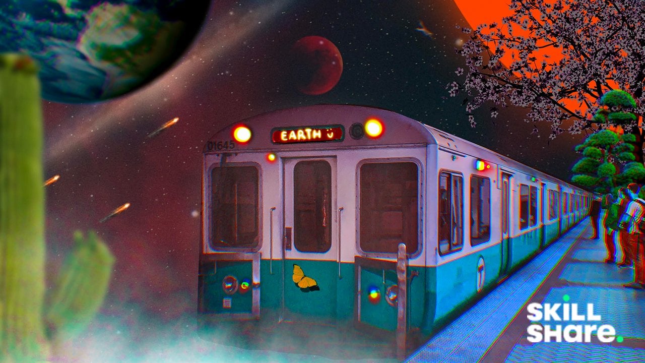
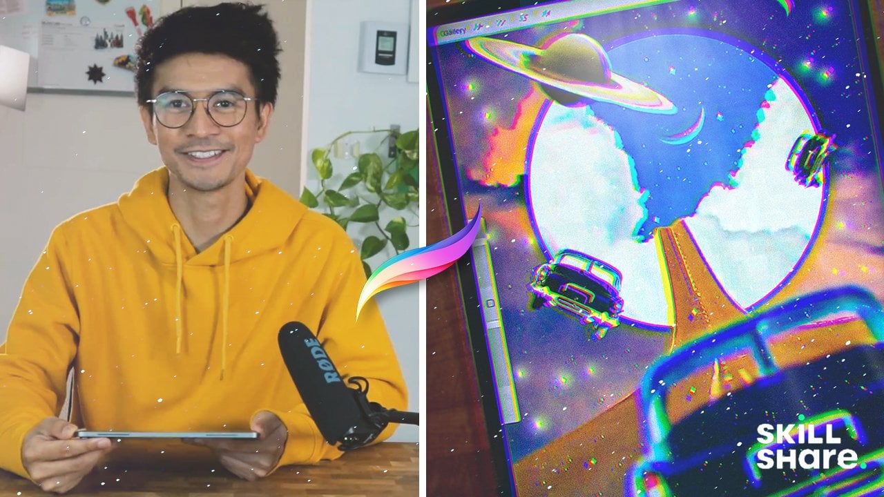
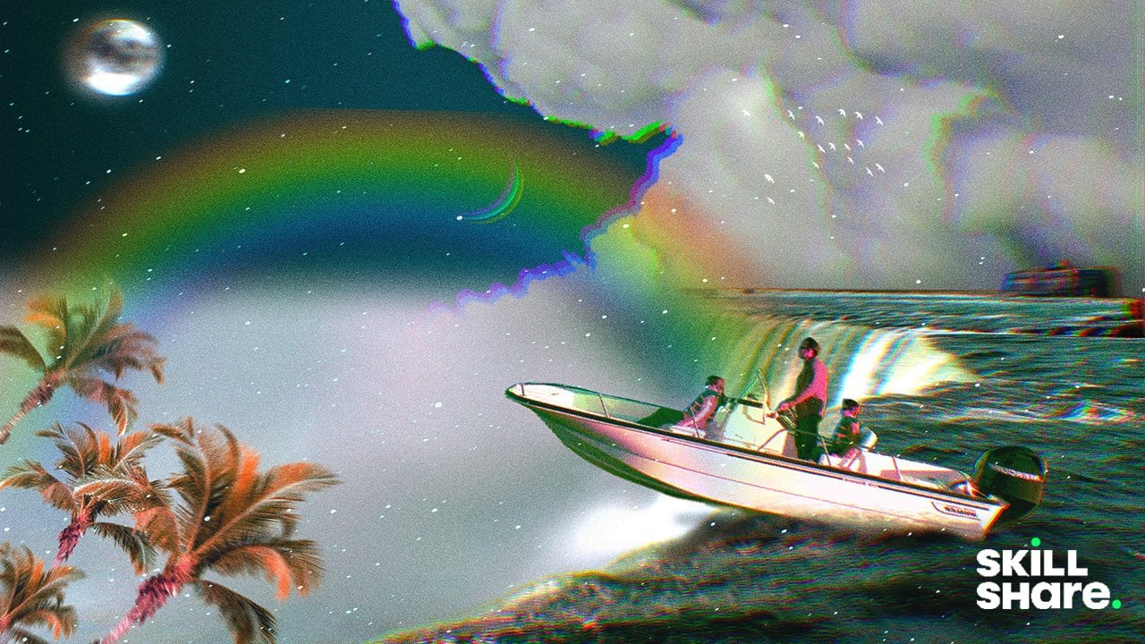
1. Hello there!: Hey there and welcome. In this class, we're going to mix different kind of images, textures, and concepts to give birth to a new composition. Hi, my name is Brian. I'm a graphic designer
living in Montreal and most of my work is designing
marketing and video editing. I also love or may be
addicted to digital collage. I have been doing this since 2018 when I first got
this ipad parade here. And I immediately
installed the procreate. And since then I fell
in love with it. Taking this course
will make you think. Outside the box, we will experiment with
colors and effect. All we need is our
ipad right here and Apple pencil, Pcap. And we're good to go. These are the breakdown of what
the class is all about. First we're going to get into
where to get those images, those PNGs and J
packs and all that. It's going to be the selection, which is very important
because this is the one that cut the images,
put them together. The adjustment actually
the one that brings our composition to life
because it brings the colors, textures, and different
special effects that we cannot do if we don't have those adjustments
along the way. We're going to learn
about tips and tricks on how to make our
overflow a little bit better and faster without compromising the quality
of our composition. And lastly, we're
going to create our Digital Clash project. And we'll apply all what we
learned from this class. Okay, by the end of the class, you'll be able to create
your own digital clash. And I can't wait for you to
share what you come up with. So yeah, let's get started. I'll see you on the next
video. See you there.
2. Where to get Images: This might go to website
that I like to go. This is Splash and
pexels.com I also go for peng img.com to have
some transparent images. These are all free. All you have to do is to attribute them. Let's get ahead. I'm going to go type in
like a sample images here. You can pretty much
select anything that's pretty interesting or This
one I actually like this one. I'm going to download it. You can easily download.
You can do that. But I ply like to just go
in and then the photo. If you want to print it out, make sure that you get the
original size somewhere here so you get the best
quality of the images. And we can also
download that by this. So these are kind of nice. Yeah, that's one right
here. This is free. So you can just get that part. And pretty much the same, you can just add the photo. It should be on the photo. This is a transparent
background. Just easily incorporate
it into your composition. That's all there is for here. I'm going to think
all the images for the project of this class so you can follow along and there.
3. The Selection Tools: Hey guys, welcome back And
in this part of the video, we're going to go straight
to the selection, which is I'm going to go
just use my previous canvas. So the selection is
just right here. All the selections right here. Automatic, freehand,
rectangle and ellipse. I don't really use the
rectangle and ellipse, but I usually use automatic and freehand for most
of my composition. So let's take a look
at how it works. Okay, we're going to add
an image right here. You can hit Ranch, and then you can go head
and then insert photo. Probably cut this car right here because it looks geometric. Easy to cut some images, sometimes it's not depending
on what the parkhound is, but we're going to
use this one right here to get rid of
the background. So I'm going to just put my ipad just like
here, transform. And I'm going to
go fit to canvas. And I'm going to go
hit this selection. For this one, I probably
will just go for freehand because it's going
to be easier for this. So I will be just using point
A to point B kind of thing. So as you can see, I'm just
pointing into all the edges. It's going to be easy because this shape is very geometric. And you can just point
just like this one right here for the wheel. You probably think it's going
to be easy just like this. And we can refine it
a little bit later. But for now looks okay. We're good to go
with our selection. We're going to go to layer
and we could go mask. And as you can see,
the background was illuminated just like that. And you can refine the selection right here
because it doesn't look good. But it's going to be easy. If you go to the layer mask, you can get the
brush right here. I usually go with soft brush. Right now it's on black. We probably need to go white. Well, actually black to
hide this one, right? So I'm just going to make
my brush a little smaller. And I think we're just going
to go for monoline brush, so it has like sharper
edges. Just like this. We could just a
little bit smoother. Just like this. Yeah,
something like this. I think we're good and if you want to review some details, you can just go to white and
then you can start painting. It probably need a real white. And I think I have to
hide some stuff again. And I think I'm just going to make it
something like this. I think it looks good. A little bit more right here, I guess it's a little bit even. You can change the background
of this one to a different, maybe orange if you want. You can also remove
the background of this car right here. I mean, what you could do,
I usually just merge it. If I'm finished
with the masking, I can just go to selection. It can go automatic and then just select
this part right here, increase the threshold,
something like this. You can invert it first. You can mask it. Think I'm good here. I think we use all the
selection right here. We were able to use free hand and automatic
at the same time. We will get into more details
on the actual project. I'll see you on the next us.
4. The Transform Tools: All right, welcome back and
in this part of the video, we're going to talk about
the transform tool, which is I'm going to get into different example of
my previous artwork just to demonstrate it to you. Because if we're going to
go start from the scratch, it might take a while
for this course. So just for the example and for you to see what is
transform tool is, I'm going to just click
this one right here. This is one of the
artwork that I created. This is the transform tool. So if you want to select some
of the subject right here, you need to go ahead
and click that part. So I'm hitting this
planet right here. If I want to make it
bigger, I can just, you can see there's a
couple of nodes right here. This one's right
here, the blue ones. These are the one, the
points that you can get. And then you can
see what it goes. But we're on the
uniform right now, so it's killing
proportionally equally. This is actually the
one that I use the most because if you
use the free form, it will distort your
subject right here. But if that's what
you're aiming for, then you can use that mainly. Mostly I just use the
uniform to make sure that everything is scaled properly and it
doesn't look weird. Can you rotate your composition with this one right
here if you want to have this one here free
format if you want like this. But I don't think for
this one it helps. And you can also distort it. If you want to make it a
little bit more treaty, it's going to be by points that you can change the perspective. This is actually
useful if perspective, like like a three
D or something, as you can see, it gives you a good perspective of the
planet and stuff like that. You can also go ahead
and go for a warp here. Let's take a look at
the clouds right here. You can go to transform, and then you go warp right here, if you want to show
the clouds instead, you can just kind of do
this one right here. You can go a advance mesh if you want more control of
your composition. Right here, if you want to get a little bit of more
kind of dramatic effect, I think that would work here. You can see it gives it like kind of a circle
vibe right there. But just be careful
when you're using, it might distort some of the elements like
this one right here. See now, it looks
totally different. You can fit into canvas. That is also helpful
if you want to just fit it into canvas
just like that. I don't really use much
of the other stuff here. You can also even reset
your composition. If you feel like you've
been doing it a lot, you can just reset it and
you can call it today. You can also use the snapping here if you want to be accurate with where
you're putting it. Sometimes it's quite
annoying to have this. I don't really use it, but sometimes I use it
on a different purpose. That's all about
this transform tool, here you can see it in action. We get into the product section, we'll get into another
part of the lesson, which is the selection,
and I'll see you there.
5. The Adjustment Tools: Hello guys and thank
you for tuning in. And this is going to
be the last part, the basic tools that I'm using. Before we get into
the actual project, there's actually a
lot of adjustment that we could look into. So I'm just going to go here. If you go to
adjustment right here, you can see that
there's a couple or a few different adjustment
that you can use. But I just use in saturation, sometimes use color balance
curve, all the blur here. I use them in
different purposes. Noise To give textures,
I never use sharps. I use bloom a lot, especially if I want to have my subject just gives a
boost on your highlights. I definitely like
chromatic aberration and liquefy and so
let's get into it. Color adjustments. So if you get into one of my
composition right here, probably get into
this one right here. Let's get into the
layer of the house so you can take a look
at how it works. So I'm going to go to
your human saturation. This is usually when I want to control all the colors
of the composition. So let's say I want to
change it to kind of blue, Kind of looks so as you can see, it turns into different
colors and all that. And sometimes it's good
and sometimes it's not. Depending on what you
want to accomplish. I usually have a color
palette are ready. Usually I just go
with orange and teal and blue and magenta. Or this one right here,
What I'm doing right now, and they usually has
the element of thrill. We will look into this
composition right here. If we hit the planet right here, this is the one I'm hitting. As you can see, we can also change the color
with the color balance. And as you can see, able
to change the color. If you want to blend it to
the color of the background, you can do that as well. And if you want to
turn into more green, you can see it goes to
magenta and goes to green. And this is very intuitive
way to use the color balance. You also want to hit the shadow like this one is the shadow, the darkest part of the image. So you can probably make it a little bit more
blue if you want. You can make it yellow. So this is a good way to
experiment with colors. As you can see it right here, all the dark part of the
image is turning into an. And if it goes to red, it could be a good
composition just like this. I think that's a
good composition. Let's go right here and we can this layer right here
and we can go for curve, we can go to the gamma
of the composition. As you can see, this is actually the darkest
part of your image. So if I go pump
it up right here, the darkest part goes brighter. You can see this is actually the brightest
you can turn it down. If you want to have the
highlights goes darker, this is going to be the point. Can also change the red
into different colors. As you can see, the highlight, the red highlight is going to change to
something like this. The dark part of the
image becomes red. You can also do that with
green and also blue. So this is also a good way
to control colors a little bit more specific because it's just hitting red,
green, and blue. All right, so we're able to
go to the colors right here. Now we go for Gausha blur. I'm going to go hit
the planet right here. And let's say I'm going to go Gausha blur a little bit blur. And this is good because
it's kind of like out of focus and it's kind of blending into the
entire composition. As you can see that Gausha blur is also helpful if you want to cast some shadows or some light emitting from the
back of your image. You can do that too.
Duplicated layer. As you can see, I
have one and there's two bottom part of that image, you can go gambler it. And as you can see,
it's kind of emitting some nice soft light. You can even intensify
it out if you want to make it a little bit
brighter and all that. Also combine it with the
color adjustment right here. You can use the motion blur, depending on what you're going. Motion blur can go up
and you can go down. You can go left and
you can go right. This is also good
for out of focus, but a little bit more dynamic than the gauche blur
as you can see here. For the last one, which
is the perspective blur, I probably will set an example
to this one right here, the cloud, we can go
perspective blur. This is a bit, a little bit tricky because
you have to set the position of where the perspective blur going
to be as you can see. Increase the blur
just like this. As you can see, if I move it, directional bubble right here. Only thing that was blurred is the outside of this buller. The more you intensify it, the more it gets blurred
out, this is good. And you can also go
for directional. As you see, it goes some a
direction. Start for pointing. Directional, you can point which direction and you can
increase the tolerance. As you can see, it goes
differently in here. And this is quite
experimental to me, but I kind of like
it with defect. It just gives a little bit more dynamic for
the composition. It gives it a little bit
more like a movement. As you can see
here, it looks like this cloud is moving too
fast and they have to, you get into the portal
before they run out of time. So this composition right here, if you want to
intensify the texture and gives you a little bit
more like a vintage look, you can just add a
layer right here. You can make black and
fill up with color. And if you go to the adjustment, you can get noise and you
can select pretty much here, but I just use clouds. You can go billows or
ridges. I don't think. I don't see any
difference right here. But if you go scale it up, you can see the difference in the octane as well
and the turbulence. And you can blend it. I usually use screen or lighting and then I decrease
to pacy just like this. It just gives it a little bit, kind of a texture look. Sometimes it doesn't look good. So you might want to change
the blending mode to overlay if you want to make it a little bit darker,
just like that. But you want to
make sure that it blends all the colors
because for the overlay, it doesn't blend
with the white or sometimes just being normal
and then you just decrease. The opacity is also good
and it's a little bit more subtle and consistent with the texture for
the Bloom effect. This is actually one of my
favorite effects in here. Let's just create a new, I'm going to fill
it up with black. If you want to go to lemons here and light pen
you color white, you can make kind of stars
everywhere just like this. If you want to use the bloom, that usually is the
thing that makes a star a little bit bloom, bloomer are brighter, just like this if you want to intensify
it just for that purpose. But I have another example. I actually use it in this
composition right here, just like this, I want
to bloom this one. So it's a little bit more inocenicerightreI'm
going to bloom it. As you can see, it
takes a couple of t, you can see the full
effect, just like this. Also, I use the curve to make the details a little bit more prominent in this area or in
this composition. Just like this
chromatic average, this is actually one
of my favorite effect, or actually abuse using it. So I'm going to just show
it to you right now. I usually use it. Okay,
let's try this one. The planet right here, you can see I already apply
the chromatic aberration, but if you want to intensify
it more, you can do that. Yeah, it looks like
like a treaty effect, but kind of have
that retro vive. You can also use it
with your main subject, so let's try it again. And you can see it gives it a little bit more
of a dimension. And kind of at the
last one that I usually is to liquefy to make my composition a little
bit more dynamic. So I usually use push
depending on what the project. As you can see, I'm trying
to control the position. You can make it a little bit bigger or you can
shrink the road just like this and you can
show a little bit more road. Or it's like if it's like
moving and all that, you can even twirl some of
it something like this. But just be careful on using
this effect right here, because sometimes
there's too much. But there's a lot of ways
that you can use it. There's a twirl right or left, there's different one here. You can just experiment that. But I just usually use
push because this is a way that I could control the image compared to the twirl. It usually just gives me, it's good for when you're
doing kind of like a marble. And yeah, that usually
is the adjustment. And these are the tools
that makes the composition into life because
it just gives it a little bit of
effect from colors, you know, perspective into different textures and effects. I'll see you on
the next chapter, which is the actual
creation or composition. So see you right there.
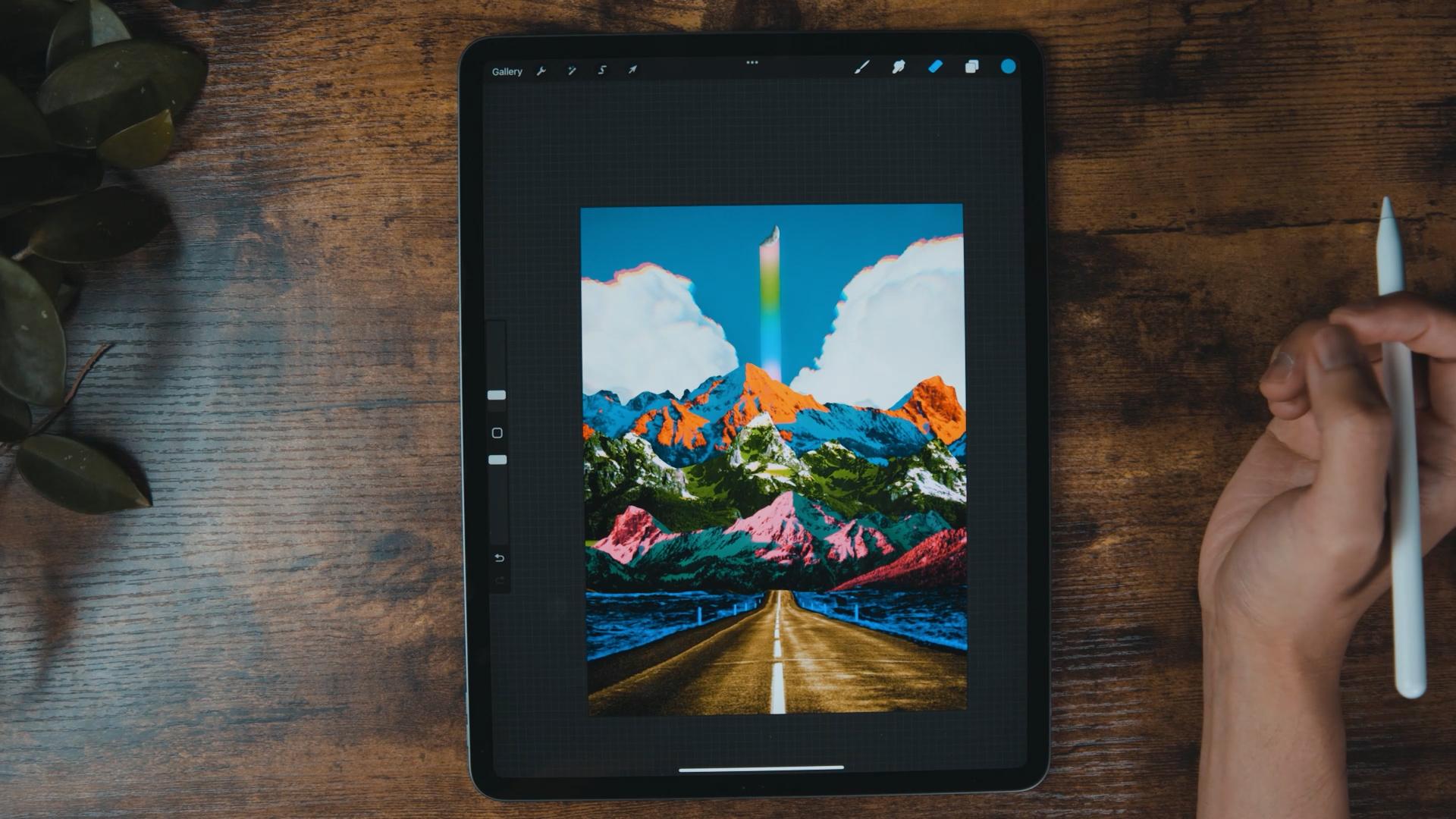
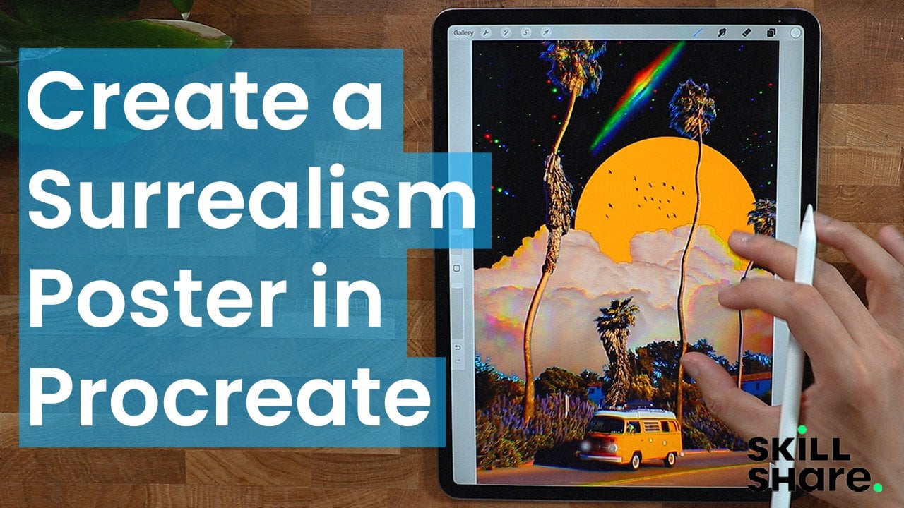
6. The Project: To create a new canvas. There's a couple of canvas
sizes that you like here. These are the pre built
canvas that you can use, the entire canvas,
as you can see here, these are my own canvas. Should rename them
for this tutorial. I'm going to be using
Screen size just to highlight the full screen
capability of the ipad. Otherwise, if you want to want
to customize your canvas, you can just go ahead
right here for the poster. If you go around this
part of your ipad, you can choose a metric system. I usually go for inches, but you can go pixels. I never use the two. I'm not sure, I'm really
familiar with inches and pixels, but I'm going to
go in screen size. At this point we get a blank
and a little bit scary. Yeah, there's nothing in there. The hardest part of creating is starting to break the ice. We're going to create our
guidelines first so we know where to put our
subject or our images. Since we're working
on images to do that, just go ahead and click
this part right here. So there's like four different
tools here appropriate. So this is the ranch icon where you can find
different actions, mostly regarding
about the canvas. This is for adjustment, this is your selection. We're going to go ahead, we're going to use all
this in a little bit, but for now I'm going to go
to Actions or Ranch Icon. Going to go for Canvas. Going to go Drawing
Guide right here. As you can see, it gives you all the guides right
here like a paper. I'm going to go Edit,
Drawing Guide right here. I'm going to go grid size left of the grid which is perfect
for what we're going to do, can move guidelines right here, I usually use
probably like this. I think it's good. The
reason why I'm doing this is for my elements
not to go wherever. It's also good for like
alignment and symmetry. When I'm working with text, I usually don't go
beyond the margins. Right here, I'm
mindful of where I put my elements and also to
practice good symmetry. Before we import our images, I'm going to go to sketching. And n pencil usually
I use for sketching, you can pretty much use all
of this pencil right here, but just like using
narinder or six pencil, but I'm going to go narinder. You can see I could
sketch composition. We're going to go ahead use different mountains
to create surreal. Try collage. I usually go ahead and create some sketches Right
here, that's mountain. I'm going to go a little bit of horizon right here or lines. Make sure I'm going to find
a pictures with some road. There's something going on right there,
something to look at. I'm going to go ahead and
draw different mountains right here with different
shape and texture. And I'm not making
any sense right now. But you'll see when we get into the actual production
of I'm going to create, I'm going to make what
do you call this, Like a moon in there. Just to give it a focal point. But we also want to make sure
that all the mountains has their own moments or something to look at and
they won't be overshadowed. The goal is to have
a focal point, but the eyes will roam
around the composition. And we're going to
put some elements right here just to make it more engaging and
worthy to share out there. That's pretty much it.
We're going to make sure that all the images
will have good colors, since we're getting
different pictures from different people
who took them. I'm going to rename it a sketch. You can rename it or not. And I'm going to go
multiply a blending mode. You click this and then lower capacity
just to give you a guidelines of what
you're trying to achieve. If you swipe to the
left, you can lock it. Let's create a new layer and
put it all the way down. That's pretty much it. We're
done with the first part. We're just going to create
or import our images. Well, mask it and then blend them together so
it looks seem less so. Right now I'm going to go
range add and it's photo. Okay, we have our first image and as you can see it's
automatically being utilized the transform tool
which is you get an option to make it bigger or smaller
and pretty much scaling it. Just make sure that
you're in uniform, not on free form because
if you're in free form, I see it's not uniform, it's going to
distort your image. Make sure that you're uniform. Also, if you do store's do if you want to
warp it. But to re. The image back to
its original state. You can just go
heat reset and go back to uniform and
then just position it. You can see our
sketch right here. That's what I'm aiming to do. Make it big and touch the horizon that we
set on the drawing. You can break it, but
just make sure that you have nice balance
between the elements, so it has a good symmetry. You can always break
the rule for sure. But that's not all we're
going to do today. I think this is pretty good. I'm going to turn this
upside down like this. We could start selecting
just this part right here. Just I'm going to go
to the selection tool, make sure you're on
free hand so we can pretty much trace and
make sure it's add. And I'm just going to go ahead and tie it
in just like this. Let me try to zoom
it in like this. So you can see I could probably
get out of the canvas. So you can see I'm
doing just like this. I'm going to zoom it in now just to make a good selection. You can just continue
just like this. Don't worry if you don't
get the right part. You can always refine a later. But I think this is
good. We're just going to close it
to the other side. We complete our selection. I think that's pretty good. I'm going to go to the
layers panel and then I'm going to go hit
Mask. There you go. If you're happy with it, you can just combine it so you don't have
a lot of layers. But if you're not happy with it, you can just leave
it just like that. I'm going to just
pinch it like this to make it just one layer. And I'm going to
rename it to probably first because we're going to add maybe two more
mountains just to stack. Or actually 31 to
three mountains. We're just going to
do that. We're going to import another image. I have this mountain right here. First thing that
I'm going to do is to make sure that it
fits into the canvas. To make sure that we don't
have those weird white lines, you can actually click
this one right here fit to canvas and
it fits perfectly. But sometimes it does
not just make sure that you don't have
a weird white lines. We have to actually change the arrangement of your images. For this to appear like at
the back of the first image, it needs to be below
the first image. So we're just going to do that. And you can see it
does work well. We could rename it
to like maybe second two could probably make
it a little bit lower, it fits into the sketch
that we created. I think this is good. I'm going to go
selection actually, before we hit the selection, just going to do
something like this. It's easier for me. You can pretty much do the
same thing right here, but I find it easier
for me to selection. I'm going to go out
here and then I'm just going to trace
it just like this. Don't worry if it's not perfect. You can refine it with the eraser tool or the mask
tool, something like this. You can get creative
with this too if you want to just take one
part of the mountain to. I'm just going to take this
roughly like we're going to close it to make sure
that it's closed. These running ends will
disappear. Just disappear. Go to the layers panel
and then mask it. And you can see we
have a nice mountain. We're going to import
another mountain to complete the two more
stacks of our mountain. Same thing. Range. Insert photo. All right, so this is another mountain that
I was talking about. Make sure that fits into the
canvas, to the layers panel. And put it on here, like the bottom part, so you can see it's a different stack. I forgot, I forgot to merge. These two layers right here
merge is just like this. You have less layer
to deal with. I'm going to rename this
third, pretty much the same. I'm going to do selection and remove the background selection. Free hand. We'll
start the process. All right, good. I'm going to connect it
and pretty much the same, I'm going to mask it. If I'm happy with my selection, I could just close it just
like this. And that's it. We need another mountain right here just for this tutorial. I'm not going to get
another mountain. I'm just going to get the
second mountain right here on the layers panel. I'm going to put it
all the way down, just above the background color. Then I'm going to push it
just like this, push it up. And then, yeah, I
think that's it. Just to make it less same
as this one right here. I'm going to just
flip it horizontally. And then we're going
to position it. It doesn't look
pretty much the same. We can even scale it
so it looks bigger. I think that's pretty good. We're going to find a
background maybe like a blue sky with a cloud
to the blank canvas. I'm going to go ahead
and get a image. We cloud in blue sky. I'm going to go back to
Ranch on in photo All right. We have this
background right here, you cannot see it in full. Let me try to put
it all the way up. So this is my background. It's kind of a sky where the moon, I
think that's the moon. And then we're going
to just put it, close it to make sure
that it fits into, you know, the composition
we're making. So I'm going to put it all
the way down, right here. Yeah, we're going
to do just that. And then I'm just
going to make it bigger with the
transform tool here. I'm not sure about the moon. We're going to remove that
for sure because I don't think it really
blends pretty good. This mountain right here, I'm
going to make it like less. We're going to fix some
issues right here because I want to also showcase
the background. Make it lower a little bit. Just like this, we
can disable our. Now you can see what's going on. Actually like it, we're just
going to remove the moon. We're going to add a
different set of moon. Make sure that
you're on the layer of the cloud or mname it. We're going to do some cloning. We get rid of this seamlessly. We're going to go to
adjustment clone, then this is where
the pointer where you get exact copy or clone. This part right here. We're just going to go ahead right here, it's a little closer to the
color or the tone right here, I'm going to get a brush,
maybe a soft brush, just to make it a little
bit more seamless. All right, so as you can see, we deleted or we get rid of the demo Sims to be the clone
tool. It's pretty handy. I think it's amazing. It doesn't look
good at this point since did not correct
the color just yet. So we're going to
make the colors a bit more pop and we're going to make
all these mountains, their own colors and
their characteristic. And something like that. I will get this part right here, I think it's called first. And we're just going to
go do some adjustment. We're going to change
the color to make it a little bit more like
Alice in Wonderland tone. Going to go to the
adjustment right here. And then we're going to
go for human saturation. We're going to increase
the saturation, as you can see the
colors becoming vibrant. That's what I'm trying
to do right here. I'm going to change the
color of the grass. Probably like blue.
It has a little bit of different tone, maybe
something like this. And we're going to
go to the next one. As you can see, this
is the next mountain. We're going to do the same. We're going to go
for hue, saturation, brightness, pink
or magenta color. We're going to adjust first
the saturate right here. As you can see, it's becoming
more vibrant like it. We're going to get something
probably like this. It has its own character. Vibrant. Exactly. This is the one we're going to go through, the
third layer, right? I haven't renamed it yet. I should rename it third.
This is like fourth. I'm just going to ream correctly so we're not going
to get confused. I'm going to go through the
third 1123 hue saturation. Again, we're going to be
aiming for like a green color. We're going to change the
brightness so it fits in here. I don't really like how the
brightness controls it. We're going to use a different
adjustment later on, but I'm happy with this. We're going to just
increase the saturation, get the hue set to green. But you can choose
your color as you wish to another
adjustment layer here, maybe curve to adjust
the color here. I'm going to get three
points right there. I'm going to increase this one. And then floor part right here is the white ones.
These are the mid tones. And this is the shadow,
as you can see, a little bit lighter
if I go up down, if I want the shadow to dark. And the highlights right here, as you can see, highlights
are the white ones. You can see I'm controlling it a little bit better than
the hue saturation. I think I'm good. You can
control the mid tones. You can see it's the mid
that I'm controlling. Yeah, I think
that's good. We can even increase the hue saturation
again if you want to, Just to make it a
little bit pop, we're going to go
to the fork one, which is this one right here, maybe orange to give it a
little bit of character. And to do that in
saturation again. And then probably hit the
max of the saturation. I'm looking for super
hardcore orange. We're going to decrease
the saturation, The brightness
probably like this. I'm happy with that for the cloud right here.
I'm happy with it. But I'm going to adjust
it with adjustment, which is chromatic aberration. It looks a little bit
more there and trip. Then to adjust it, we just use our pen or your fingers
as you can see, this chromatic aberration
percentage here. So you can just a, it's going to like 57. As you can see, it's
getting more intense. I want to like a subtle
hue of colors right here. So I'm going to get some
moon, like a half moon. Insert photo. So what
I'm going to do, I'm just going to
put it right here. I turn on the drawing guide
because I want to make sure that I don't go
beyond the margins. I'm going to make a kind
of like lights right here, I just don't know
how you call that. But to do that I'm going to
go and make a new layer. Make this all the way
up actually the moon. And I'm going to rename it
just to make sure that I won't get confused
with the layering. I probably want to get
another layer for selection. I'm going to go for tangle. And I'm going to
zoom just like this. And I'm going to go here.
I think that's good. And all the way here I can actually put some crazy
stuff right here. I'm going to go get
some brush right here. And I'm going to go for all the colors that we use
here so we don't get lost. Sample the colors right here. We're in your finger and you can just get it like do some
painting just like this. I think I'm going
to go like that. Another color right here, maybe green,
something like that. I'm going to go probably here or I'm going to just
make a little bit of here. We're going to get
the blue just here. We're going to blend it.
Another tool adjustment. I'm going to go for blur. We're just going to go
blur it quite a bit. It's not too massive color. But what I'm going to do here, I probably want to
duplicate it to have a nicer color
and more saturated. Also, I can go ahead and
go to hue and saturation, brightness, bump
up the saturation and change the hue if I want to. But I think that's
good enough for me. Below this mountain right here. I don't need to worry about it. I'm going to erase this part. I'm going to use the
eraser tool right here. You can get maybe soft
brush on a brushing, then we could start
removing this part. Okay, I think it's good. All I have to do now is
to make a bloom effect. It has a little bit of
life casting, do that. I'm going to go to the
bloom adjustment bloom, and I'm going to make it
bloom just like this. And I like it, it just gives more colors and a little bit of light. Okay. I'm good with that color
and I'm happy with it. Just the moon is
being overshadowed. I'm going to go to
the moon and I'm going to a also bloom, apply it to the cloud. Since the closer also
needs some blooming, a little bit of
blooming will not harm something like this. It has a bit of
nice color effect. All right? I have
the rainbow here. It's too small, but I'm going to make it something like this. It's kind of distracting
at this point, but free form because I want to stretch to rainbow
too. Distracting. So I'm going to do is
to decrease to opacity. I think this is good. It's not enough room here. So I'm going to select
all my mountains here. So for them, I'm just going to make them go a little bit lower. So I have a little bit
more like a nice drop of the lights right there
is a little bit more life. We're going to add
trees, butterflies. Details to make. It
gives it more live. So I'm going to add some trees
right here on the frame. All right, so this trees
right here, it's quite good. It reminds me of Spring. I think this is cherry blossom, if I'm not mistaken. So I'm going to put
it all the way up. And it actually is very complementary of
what we're trying to do. But this is not the focal point. We're going to just put it
out of the frame, maybe here. So it gives you a
little bit more context of what we're trying to do here. So we're going to duplicate it, and then put it on
the top right here, maybe something like that. It's empty and I
want to fill it up. I'm going to duplicate this again and then flip
it horizontally. And I'm just going to
put it right here. Also, put it right here. Apply a gasm blur just
to make it out of focus, because right now it's gasm blur and this is the one I'm hitting, just a little bit out of focus. Also, I'm going to apply
some bloom effect. It's glow up. I'm going to apply bloom
here too, but not too much. I think that's good. Okay,
this butterfly is perfect. And we're going to
position it right here. And we can change the color too, but I feel like the blue
is good enough for this. I'm going to make it, I'm going to duplicate
it three times. And I'm going to position
the other one here, but smaller out of focus. So I'm going to do
some gushing blur. Okay, put some more like a circle that glows like
a portal or something. So I'm going to go get
my brush right here, or actually I'm going
to get a new layer. Actually, I'm going to get
one of my monoline brush. I'm going to draw a circle anywhere in the
canvas it is ellipse, but I want to make it circle. I'm going to drop color. Right now, I don't
really like the color. I want to make it
like a gradient, like this color right here. I'm going to go
alpha lock it first. If you click the
icon of the circle, you can find alpha lock here. Alpha lock means you
cannot really go beyond the subject
that you draw. So right here, there's
no alpha lock. You can just go everywhere. I use alpha lock for this, I'm going to get my ear brush here and I'm going
to go get some, this pink color right here and I'm going
to get some green. You know it, I'm going to do, Goshen Blair,
something like that. Probably put it here. So what I'm going to do,
I'm going to put it all the way, something like that. Just below the first it goes
like something like that. I'm going to put I'm going
to release the Alpha lock. I could adjust the
Bloom effects. Not too much though, because I don't want
to make it too bright, and the color is just
going to disappear. Okay, the bird here. And I'm just going to
put it right here. It has a little bit more
something going on right there. And it doesn't really
like you can add more. Or this one right here and put it everywhere
if you want to. Something like this,
you just have to put it below the mountain. It hides something like
this, something like that. But it's all up to you. But I find the ore pretty good. I'm going to duplicate it
again. And then put it here. And put it just below the third mountain
and it should hide. You have different
you can play with. Probably will move the
butterfly a little bit higher. There's something to make
it a little bit bigger. We can move the moon a
little bit lower, I think. I think it's high. You can move it like
this. There you go. Our spring in spark collage. I hope you learn from this. So you can pretty much come
this composition right here. You can add your own
mountain, your own cloud, a different ornaments
that you will find from the resources that I
will provide in this class. Yeah, pretty much, That's it. I hope you have fun in this class and I'll see
you on the next video.
7. Closing: Hey guys, welcome back and this is actually
the end of the class. And thank you so
much for spending time with me and
watching this class. I really appreciate it. And I hope that you
learn something new here and inspire you to create the digital collage
on procreate. And I can't wait to
see what you come up with and I'll be happy to. I'd see your beautiful project. If you have any questions
or clarifications on how to get started with
digital collage appropriate, feel free to send
me a message or post any topic on the discussion panel
down below for sure. I'll get back to
you and thank you once again and see you
on the next class.
 Bryan C'ngan, Graphic | Web Designer