Transcripts
1. Introduction: You want to illustrate
books for children, but you get stuck in drawing the environments that your characters are
supposed to go into? I always enjoy
drawing characters, but I used to feel lost in trying to figure out how to
do the backgrounds for them. But over the years,
I figured out basic guidelines and steps to create engaging
backgrounds that create depth in my
visual storytelling. A lot of it comes from breaking down books that I enjoy and picking up on the devices those illustrators use
that can be useful to me. And in the class, we are going to look at a
lot of books and then break them down in different ways and
different categories. And so we'll look at basic styles on
illustrating picture books. We'll look at how illustrators
use design elements and color and light to move our eyes through the illustrations. We'll look at how
color can be used to enhance the mood we cover,
different viewpoints, and how you can be intentional with props and
little details that you add into the
background that add to the storytelling and reveal
more about your character. The class includes a 12 point
checklist that includes details to think
about when you are sketching and completing
your illustration. My name is Mirka
Hokkanen and I started my picture book publishing
journey about ten years ago. And in the beginning, the
first couple of years, I read hundreds
of picture books, and I soaked up as much
information from them as I could. I then started working
on my portfolio. I got an agent, and since then, I've created about nine
traditionally published books and a handful of self published
projects and licensing. Class is great for beginners and maybe even intermediate
illustrators who are looking to work on their portfolios and add to
their illustration skills and add more storytelling and depth into their illustrations. This class is part of a
series of three where we cover how to create amazing backgrounds and
worlds for your character. So if you're ready to
learn, let's jump in.
2. What to Expect: Welcome to my next picture
book Illustration class. I'm so glad that you
decided to join me. In this class, we'll look at creating environments
for your characters that have some sort of an
architectural and man made elements like
buildings and furniture. As I mentioned in the
introduction video, this class is part of
a series of three, and the first one is called How to create outdoor
environments. And the second one is
how to draw everything a beginner's guide
to perspective. And while it's not
a prerequisite to watch those classes before
you jump into this one, I recommend if you have time, at some point, just glancing
through those classes, we talk a lot about
basic design elements that are important in
composing your illustration. And then if you are unsure
on how to draw, like, let's say you're trying to draw a chair or even a
character or a building, and it's hard for you to draw in perspective to make
it look three dimensional, then I recommend the
perspective class for you. But if you already feel
comfortable with that, then it's totally
okay to skip one. Now, as far as
drawing backgrounds, I wish there was one magic style of illustration where
I could tell you that you need to draw the
cupboards like this and the bed like that and add
the lighting like that. And then magically, you would have an amazing
illustration. But unfortunately, there
are as many styles of illustrating
backgrounds as there are illustrators out
there. So instead of the goal of this
class being that you just follow me and
copy what I do. What we're going to
do is we're going to be looking at a lot
of source material. We're going to be looking
at a lot of picture books, and we are going to be breaking down different elements
in the different videos. So at first, we're going
to look at kind of three. I've kind of grouped
picture book illustration
background styles into kind of three main categories, and so we'll break those down. Then we'll talk about
mapping out your space. We'll talk about details
and lighting and colors. And we look at creating environments through all
those different lenses. And hopefully it will
spark a lot of ideas. So I encourage you to have
a paper and pen ready, write down the title
and the names of the illustrators
and take notes of things that feel like they kind of align with the way that you
like to illustrate. You might be a more realistic illustrator or you
might like to, you know, draw more
abstracted illustrations. And so as we're looking
at all the range of illustration styles and books
and illustrator's work, this class. Use the
inspiration from that to create your own illustration
at the end of the class. There's one handout that is kind of a 12 point guide of all the main talking
points in this class, and you can always
print that out. And it is not exactly in order of what I'm
talking in the videos. But most of the main points
that I make in the class, I've kind of collected
them in order of the way that you'd be illustrating
an illustration onto this handout. And so it's just a good
guide to have with you. And you can also
make notes in it. Um, and to just have it with you when you're working on your final illustration. And so grab a pen and paper, and let's jump into the exciting
world of picture books.
3. Most Common Layout Style: There's obviously as
many different ways to illustrate environments as there are illustrators out there. And what I wanted to do was look at it from a couple
of different angles. So first, I wanted to look
at illustrating buildings from kind of a stylistic
point of view, and I've divided
picture books up into kind of three main
categories stylistically. And then I have a fourth
kind of a bonus one. And so let's look at
those really quickly. First and kind of obvious one is where you're illustrating things from kind of an angle and everything kind
of looks three dimensional, and it looks like it's
happening in space. Your illustrations are
creating a sense of space in the way
that they are drawn. And so I just wanted
to look at a few. A lot of this book
happens within a kitchen. And so we have things
out in the front. We have things in perspective. Obviously, there's round things, so it's a little
bit hard to see. And here's kind of a
full kitchen view, and everything looks kind of nice and three dimensional
and drawn properly on there. So that's kind of
the first style. And this is, I would like to think it's kind of the
most common style. This is what you see. Like, when you think
about illustrating a kitchen or illustrating
a living room, this is what a lot of times
your mind will go to first. And so we'll look at a couple
of other books just for some inspiration
on different ways that illustrators
have done this. So this is one. Then we
have Bunnies on the bus, illustrated by Ben Mantle. And in this one, we are
getting a nice city scene. All the buildings look like they kind of exist in
a similar perspective. The perspective might
not be like 100%, 100% awesome or accurate, but it very much looks
like a cohesive space. And there's several
city scenes over here, and you see that everything. Like said, it looks
three dimensional. Things are receding in space. Things up close are bigger, things in the back are darker. And with those examples, you get the general idea of
how this category works. And in the next video, we'll
look at a difference though.
4. Flat Layouts: And the second style
that I wanted to talk about is more of a flatter, kind of a theater stage
approach where everything is flat and we don't get as
much of a depth perspective. And I see this style usually in books that are marketed
towards kind of the younger, kind of the younger
spectrum of kids age, kind of pre k aged kids. And so we'll just look at
a couple of illustrations. There's a variety kind of
in this category, too. And so these are illustrations
by Christian Robinson. And if you're familiar
with his style, his style is usually very
it's very kind of simplified. And so here you can see that
the background is one color. And then we have the furniture
being shown kind of flat. It doesn't look like it's
done in perspective. There's a little
bit of perspective indicated over here in the book. And it's also just
blue background with black outlines
for the background, and that pops our main
characters out really nicely. And then when we are looking at any other pictures in here, everything is very flat, the way that it's and the planes oftentimes kind of tilt
towards the viewer. And so over here we have
the rug. We have a kitchen. And usually in this style, instead of looking at
things on an angle, going into, so let's um, grab one of these other. So if we are looking
at a kitchen in this book where things are kind of on an angle and we're looking at things into the space, in this style, we
oftentimes just get very flat representations
of our space. And so this is just one example. Then we'll look
at a couple more. So we have This Gus
by Chris Chatterton. We have kind of a kitchen, you could think dining room, and there's some
things on the wall. We don't even have
an indication for where the wall ends
and the floor starts, and then we have very flat,
the table over there. Then we can look
at Happy Lamica. This is illustrated
by Lydia Nichols. And in this one, I know there's a kitchen scene
in this one, too. And so in the same way, we're
getting a very flat kind of kitchen scene
where our planes are tilted towards the viewer. And so it is much
more simplified. In the way that everything
is illustrated. And then we'll look at
a couple of other ones. So here is my book, Kitty and Cat Bent to shape. And this is a book, picture book that is also geared towards kind
of younger audiences, and it's a book about shape, so I wanted to have things a
little bit more simplified. And so we've got kind of
same thing kitchen scene. We've got a very
flat looking there's some things that are three dimensional kind
of receding in space, but things are a little
bit more abstracted. Over here, there's
a living room scene of the way that everything is. And so that's another example. So the ones that
we just looked at were very kind of
simplified illustrations. This is still kind
of in the same vein, but getting a little
bit more complicated, a little bit more textured. So this is a book illustrated
by Rebecca Green. And it's a really fun book. It's kind of almost
like a board book. It's got little flaps for all the different
buildings in it. And you can see that
inside of the buildings, everything it's a
little bit wonky, but it's in that same way as the books that
we've just looked at. Everything is flat
and some things are tilted to the viewer in order for us to see it. Some
things are kind of flat. So not everything
is perfectly in perspective in this book. And so that's another example. And then I have two
books by Kate Hindley, and I know I've shown
this one before. And in this one, we have
big scenes with buildings. We have interior scenes, and everything is
kind of a stage. Everything is drawn on top of each other and
looking kind of flat. And then same thing over here. Everything happens
on the street view, and everything is very
flat, not receding. Like, there's some
indication that there's a corner and this kind
of is coming our way, but it's not like 100%. It's still very you
could think of, like, things on a stage
overlaying on top of each other. Um, the way that things
are drawn over here. But obviously, her
illustrations have a lot more little
details when you compare it to some of the other ones that we
were looking at before, like in Guston, where
it would just be very flat shapes
and areas of color. And over here, we have lines and details and little dots
and things happening. And so, still very flat, but flat in a different way, compared to previous
the previous books. Um, let's see. And then I've got two more books to
show you kind of in this general category. And so this is noisy Night, illustrated by Brian Biggs. And this is kind of a
concept book in a way, where we're moving up. We have a very tall building, and every kind of spread, we're moving up in the building. And so if you look at
the illustration style, everything kind of
happens indoors. And so we have all
these different rooms. There's very flat kind
of textures on things and simplified kind of digital patterns on a
lot of different places. And then the last one that
I wanted to show you. So this one is obviously illustrated very
differently than the ones that we
looked at before. This one also has
a lot of texture, a lot of interest in it. But you also notice, let me tilt it so you can
see it a little bit better. Um, but you can see that just kind of like with
Kate Hindleys we have a lot more colors and kind of interesting
things to look at a lot of little details
happening over here. But the whole book also happens in the same way where it's
flat and happens in stages. And there's a few places where we get different kinds
of compositions. But a lot of the things, again, very flat and happening
as if a stage, and everybody's kind of walking
in and out of the stage.
5. No Solid Architecture + Bonus: And so the next
category or, like, the third main category
that I have is books books where
the architecture and this kind of three
dimensional space is architecture and kind of solid forms are more
of a suggestion than they are than they are reality. And so we'll look at a
couple of different places. And this book is, I think,
kind of surprising. So it's Mary Poppins, illustrated
by Genevieve Godbout. And in this book, if you think about the
movie Mary Poppins, you kind of know all the scenes and you kind of know I feel like this book leans a lot on what we already know about
the character and about, like, the location and where
everything is happening. And so the way that
she's illustrated this book is there is almost the kind of
first spread we have is we have kind of an
establishing scene. But then after this, it kind of the backgrounds
almost dissolve. And so there's kind of
an indication that, okay, we're in a room
and there's a lamp. Um, but then things are kind of just shown
from kind of flatly, and there's not oftentimes
like they're in a room, but there's no indication
of where the walls are. And like over here, they're walking and there's
just a little strip of grass with a lamppost. And like over here, they're
inside of Mr. Wigs house. But so they're inside, but there's things kind
of just sprinkled about, but it's not really giving
us, like, a real room. So just giving an indication of a room, and they're
all floating about. And I guess there's a little bit of an indication that
they're up in the air. So, like I said, the
architectural things are kind of suggested, but a lot of things are actually
not shown in this book, which is kind of
interesting, I think. So we get to construct
a lot of things in our brain of what their
environment is like. So it leaves a lot, I guess, you could
say to imagination. The whole book is all about MaryPuppins and the magic in it. And so the way that it's been illustrated really
supports that. Then we have Island Born. And so this is also kind
of flat illustration, but a lot of places some places
we get a little bit more, and then some places like
there's one like over here where there's a big storm coming and things are kind
of starting to fly away. And like over here, you'll notice that things
are just kind of obviously we're giving the
text a lot of nice space, but things are
kind of dissolving into into just the backgrounds or over here, we're
in the classroom. Again, no distinction between where the wall is and
where the classrooms are, and things are
kind of tilted up. And M. And over here, we have a scene where they're dancing outside of his shop. And again, you kind
of get an indication that there's some sort
of a shop over here, but a lot of the background is kind of left open and up
for your imagination. Then we have Queen and the Cave, illustrated by Yulia Sarda. And over here,
there's just a couple of architectural
scenes in the front. And again, over here, this is I mean, this doesn't look like it's
a solid. I'm not quite sure. There's things kind of in and out and on
top of each other. And so I'm not quite sure it's
architecture is implicated, but it's not 100% solid in
the way that things are. And kind of same
thing over here, things are some things are up and some things are
kind of on an angle. And I feel like in this book, it all kind of helps where things are kind of not
the way they seem, and things are a little bit
wonky and a little bit off. It gives you that nice kind of uneasy feeling that I think the Illustrator wants
to give us in this book, about the kind of the mystery and everything that
happens in it. And so, so that's that one. Then we have a very
popular book series, Dragons Love Tacos. And over here again, space is very much just a suggestion. Here we have a spattered wall, and we have the so this would be like a
giant gymnasium, I guess. And so a lot of it
just happens in this kind of awkward space. Everything is a little
little off and a little wonky and things are
kind of suggested, but it's not nothing kind of is quite matching up and things things are not on
right angles and whatnot. And so, again, this is
architecture suggested, but we're not quite 100%. And then I wanted
to show this one. This is the last stop on
the Reindeer Express, illustrated by
Carl James Moford. And over here, you can also
and you might not even notice these things unless you are really looking for them. And so over here again, we see that a lot
of these buildings are kind of none of them
seem to quite match up, and they're all kind of everything's kind of going
in different directions. Same thing over here. We have a building, and it's got bricks are going
kind of all different ways. We've got an iron fence that's kind of all
over the place. And so not everything
is quite 100%. Over here. And once
we get, we can look. There's a city scene
at the end over here. Ah, let's see where
Like this one, again, you can see that some
buildings are kind of going up and some buildings
are going the other way. And so everything is just almost it feels
like collaged together. And so, again, not
everything has to be 100% matching up and perspective if that works for your illustration style and if you can do it kind
of consistently enough. And same thing with an penguin. It's very simplified. Things are kind of
implicated with loose lines, but not everything is kind of 100% over here.
Lines don't match up. Everything. Things are receding. Balloons are they in front
or behind? I don't know. Um, I know there was, like, the and, for example, like, on this spread, we're
looking at this ticket booth, and and things just quite looks like this is
bigger and this is smaller, but technically isn't this
kind of coming towards us. And so there's things going on over here that
aren't quite realistic. And like I said,
architecture is implicated, and it is John, but, again, it's not 100%. But she kind of stays true to that through the whole book. And I guess maybe it could be that one's bigger
and one's smaller, but it doesn't really look
like that over here, either. But like I said,
everything is kind of equally treated throughout
the whole book. And so then that way, it all kind of makes sense
and comes together. So over here, again, we have kind of just
a suggestion of this curtain that
she's sitting behind. And then we have this kind of auditorium that this
person is talking in, and things are kind
of all around. There's kind of walls and portraits and people
indicated and I mean, some of their arms are
just little lines and so there's a big variety of
things happening over here. And again, as long as
you can kind of have a consistency in the way
that you are drawing things, then in general, you can kind
of pull things together. Then we'll do one more. So
we have her right foot, and this is all illustrated
by Sean Harris, and this is all about
the Statue of Liberty. And this is all
done with collage. So a completely different media. And so you'll see over
here because everything is collaged and kind of
cut and glued together, and then some things have
been drawn on the top. Um, uh it looks like it's
kind of receding in space, but also at the same time in the same way as
Christian Robinson. Things are kind of very
flat and simple colors. And then I love the scene where all these people
characters come in, and it's kind of the same
it's the same as here, but now we've taken he's moved some of the
pieces of paper, and then he's put all these. I think this is actually
him. And then we've got all these
characters that are just sitting on top
and collage together. Some spreads over here, we are just getting very simple, brush lines, very flat. There are some places
where things are a little bit more three
dimensional. Let's see. And over here, there's
just another city scene. That is also kind of kind
of three dimensional, but also at the same time flat. And so it's it all kind of pulls together and works
together for this book. Then kind of as your last bonus, I just wanted to pull out
one of the Olivia books. And with this one, this book has been illustrated a
lot with just photos. And I would I would not
recommend going this way unless they are
photos that you took yourself or photos
that are for sure, that they are copyright
free that can be used in a book that can then be copyrighted under your name and you're altering
them somehow. Um, and so over here,
he's used photographs, and then he's superimposed
his characters on top. And also Mo Willems nuffle bunny has been illustrated
in the same way. And so some things he's
obviously drawn on the top, and they're kind of old
black and white photographs, and you can see some of
them have kind of texture, like the texture when the photograph has been
blown up really big, and then he's just digitally
colored things and, like, added to clouds
in there and whatnot. And so I just wanted
to give that as an example of something else
that you can do and combine. And so this is kind
of the same way as the book that
we just looked at. Where this one was collaged together from different
elements of paper and paint. And in the next video,
I just wanted to take a moment and compare
and contrast books done by the same
illustrator in kind of variable styles or
variable viewpoints.
6. Illustrator Work Comparisons: This video, I wanted to look at some books illustrated
by the same person and the kind of
stylistic choices that they've done and how the books differ
from each other. And I've talked about
this book a lot before. It's Mr. Tiger Goes Wild. And if you remember
from previous classes, this is the book
about where there's a tiger and he lives in
a very proper world. And eventually he gets out of his shell and he
throws his books away, and he's naked, and life
kind of changes for him, and then he ends up changing
the life in the city. And if we look at the way that this book has
been illustrated, it's kind of for
younger audiences. You can see that the kind
of buildings are very flat, and it's got that very
stage look to it, and also colors are fairly
simple and over here. So you can kind of tell most of Peter Brown's books
or not all of them, but these series
of books are kind of for those younger readers. So that's one. And then I wanted to just look at
these two books right here. And so this is
Fred Gets dressed, also illustrated by Peter Brown. He author illustrated it. And so in this one, in the same way as in this book, we get kind of very flat space. It looks kind of staged and things can be on
top of each other, but everything is kind
of simplified shapes in the way that he has
illustrated things. And I just wanted to call your
attention for this kind of sequence of images as he
goes into the closet. And so we first have, you know, we have him, and everything is kind
of flat up above him, and he's looking up. And then when he tries them on, we see this kind of an
angle going this way. Then now we're looking at Mom. We have the kind of
same flat over here. So same kind of spread,
kind of sequence. Now we have the angle
going this way. And then now he comes
out of the closet. And so we had this
really great kind of sequence of spreads. If you think about
all these spreads kind of after each other and the way they lead
one thing into another, where we have little
spots he's going in, flat angle, flat. Angle, and then he comes out. With this, what I
wanted to call out is just being aware that
you're illustrating, you know, obviously,
we can do one off illustrations for our portfolio
and things like that. But if you're working on a book, make sure that you
are thinking of the book as a sequence of
images and how each image kind of leads to the next one and how they all relate to each other as full experience
of reading the book. Then for creepy pair underwear, it's also illustrated very
much in the same style. But if we are looking at we obviously get very
different colors. We get kind of very
gray tones over here. Peter Brown always uses
kind of simplified colors. We get very simplified
color palette with this very bright neon pink. And then over here
with this series, it's supposed to be
a spooky series. So we get Um, it's mostly black and white, and then wherever we have the
spooky pair of underwear, then it's always that
just spot color of green. So obviously, again,
everything is kind of flat. It's very boxy. There's
a little bit more kind of three dimensionality
in these books. But what I wanted to call out to you over here was the
great use of the gutter. So on this page right here, he is hiding behind the door. So on the previous page, he took his underwear. He mailed it to China, puts it in the mailbox,
and then dah dah, dah. Next page, there they were. And he's hiding on over here, behind the door, literally, you know, on the other
side of the gutter, and then we have the creepy
pair of underwear over here. So I thought this was a really
great way to have, like, an emotional moment in this book where we are going from
him doing something. We have a big spread.
We have him really big. He's hiding on this page, where the creepy
pair of underwear is coming at him from this page. And then you cannot help but see what happens in the next page. And then the other kind of case study that I wanted to do. So I wanted to show you
two books by Benji Davies, and they are illustrated
very differently. And these are a great example of how the story and
the narrative is driving the illustration
style and what the illustrator has chosen
to illustrate for each book. And so if we look at
the Grotlin first. So, this one is kind of
like a spooky story, and so we have things
that are, you know, it's not 100%, you know, correct perspective,
but things are, you know, kind of in
front of each other. We have kind of dark
colors. Things are spooky. But again, we have
things that are receding in space and that are
kind of three dimensional. And so these are kind of we have a lot of situational
illustrations. We're getting a lot of, like, something spooky is happening and we don't know
what's happening. And so we're getting a
lot of illustrations of the spaces as
she's trying to solve the riddle of what is happening around her and what's making all the noises and sounds and stealing things. And so this is kind of
illustration style for this book. And then when we flip over
to Come Home already, this book is much more of
a character driven book. And so this book, we have this duo of Characters,
a goose, and a bear. And the whole book is
about their interaction, the dialogue, how funny it is. And so in this one, the
background doesn't have as much of a weight and doesn't
add as much to the story. So Benji Davies has decided to forego a lot of the
background in here. So here we start with kind of an establishing shot of
one character living here, another character
living over here. You can also tell a little bit about the colors
that he's chosen. We have warm pink over here, and then we have kind
of the grumpy bear. We have blue over there.
And then as far as, again, what he's
chosen to illustrate, everything is kind of flat. Simplified shapes. And then
we get to Bear's house, and all we get is just a door and three bricks over there and a little line to indicate where the ground is and
where the building starts. And then Goose goes into
Bear's house and all we get is just little indications
that he might be indoors, all the things that's happening. Um, and so, again, a lot of the
backgrounds are very, very simple, and there's
barely any backgrounds at all. But again, because the story
is more about the characters and the dialogue and the humor between
the two characters, we don't really need all
that stuff in the background to be distracting us with
the stories, the characters. And so I think this is just a great example
of you to think about your story and how that story leads the illustrations
that you draw for it.
7. Ideas for Layouts and Points of View: The last video, we looked at some books that were illustrated
by the same Illustrator and how the story dictated some of the design choices that they made for the kinds of illustrations that
they drew inside of it. And in this section,
I wanted to look at some more examples of how
illustrators have bent the rules of illustration
in their books and just different ideas on
how to solve design problems. And so here in this book, this is Vamparina
ballerina by Lewin fan, illustrated by Lewin fan. And in this book, we have kind of we have
that three dimensional. Everything is kind
of we're looking at it from a little bit from above, and things are
three dimensional. And obviously, it's vampires, and in some ways,
it's kind of spooky. So having things a little bit
wonky and not quite lining up feels good for this book. But what I wanted to show was just this spread right here. Lewin uses a lot
of these kind of meandering compositions
to move her story along. So obviously, if you think about the ballet bar that
they have in studios, those things are not
curvy and S shaped. They're always straight.
They're usually against a mirror or a window or
something like that. But over here, for the
sake of the story, she has drawn it into an S, and then we have this kind
of a dotted line after that, and you can see that she's drawn the same kind of it's not
even the same group of girls, but she's drawn kind of the
girls and the main character in here in multiple
different poses to show the passing of time
and how she's kind of failing in everything
that she is doing. And so I just wanted to show that that even though
you are kind of doing your best and drawing
things you know, normally or drawing things
in the way that they're supposed to be in a lot of
the other illustrations, it doesn't always have to
be for each illustration. You can bend those rules
and come up with kind of solutions to move
the story along. And like, also over here, you'll notice that things I
know that Lewin fam knows how to draw things in perfect
perspective, but over here, she has chosen to draw
things where they're just a little bit wonky
and a little bit off, same thing, like with the coffin over here and the headstone. And then I wanted to I
love these two books. They're both illustrated
by Sara Gonzalez, and I really like her the way that she pulls us in and out of the story with
her illustrations. And so we can look
at this one first. It's called River of Caregiving. And these are illustrated with what I believe are
pencils and pastels. And when we look at
her illustrations, they're always kind of they
have this kind of soft, dreamy feel for them. And so we'll see, you know, we're kind of
setting the scene. And we have a kitchen
scene over here, and things are kind
of three dimensional. But if you look at the way
she's chosen to illustrate, things are we are looking at things from
many different angles. So over here, we're
kind of looking up. We have a close
up. A close up of. So she's not just showing the characters
next to each other, but she's also showing the
hands holding on the top. And I know this is
not architecture, but I just wanted to call your I just wanted to
call your attention to some of the interesting
things that she's doing. And so she's able to so these are all books where
it's, you know, memories interspersed
with, like, the current times and people remembering things and the
way that things are now. And then I love this
big living room scene over here where it's the whole living room and
we're kind of looking in. And we kind of have two sides, but you see the carpet it's still one big room, and
so people are coming in. And we've got a
kitchen over here. We've got a living
room going out. And so this is just such a fun. The whole book is about family and taking care of each other. And so you've had, like, all the different
family members and how they've taken care of each
other over the years. And now you have this
big scene at the end. And then this one kind of has
very similar compositions. And so, over here, we kind of start
with this big scene again into a kitchen where people are coming in,
kids running around. There's a table over here. And so just a really fun entry into the book and
the bread making. And then this is the next
step zooming closer. And then we have really
fun illustrations looking at from almost
like straight above. Then we're looking out from
a cupboard, and again, just really fun angles instead of just everything
showing from that, you know, same angle
looking into the kitchen. We have all these
fun ways to look at. Then we're kind of close up to the family or these are
different families. And we're up to a
different family. We are getting really,
really close up in there, and it's showing showing
multiple different scenes. And again, we have kind
of a close up with the bread bowls in the front and the kids kind of looking at it, and then all this other stuff happening in the background, and it's very much of a kind of a three dimensional space
with things happening in it. Then again, we're
really close up. And so there's really
this push and pull of going in and out of memories and all these different things
happening and the bread being made and what that means to all these
different families. We have a scene from
looking out from the oven. How often do you see
a scene like that illustrated and then you
got the kids over there. And so there's just really
fun choices being made in this book and it's not the first thing that
would come to your mind. And so what I recommend when you're working on your
sketches to, you know, make little thumbnails, as I recommend in my
previous classes, make little thumbnails of, like, the first idea that
pops into your head. But then also think about how else could you
represent the scene? Make a couple of different
ideas, and, you know, can you look at
something from above, or can you look at it from a different angle or from below? Do you want to be close up to it or do you want to be
far away from it? Like, what kind of which one of those ideas
will kind of serve the story best but also move with other pages around it
and move the story along. And so then as we get
towards the end of the book, we get these big community scenes again, where we pull out. We have all the
people with all the different kinds of breads
that they've made, and then they have a
big party in the back, and then it's Bmtter over here. And so, again, we move from things being
very close up and the bread being made to then the big community scene
at the end of the book. We'll look at three more books. Alright, so this is the
Iridscence of Birds, a book about Henri Matis, illustrated by Hadley Hooper. And this book has
been illustrated with Lino cuts and
then block prints, and then there's
also some crayon and some other details
that have been added. And this is kind of one
of those books again, where Things are not 100% lining up and
things are not 100%. Perfect. And things
have been treated. And so it also
because Henri Matis, the way that he illustrated the illustrations also
kind of harken back to his style and the
way that he's done things. And so they kind of go back to the way his
illustrations were. And so I just wanted
to show it as a fun example of another way to think outside of the box and to show backgrounds for your character and
showing the story. And then we'll look at two more. And so over here,
this is Lewin Paigan. She's got this fun
little city scene in the front of the book, The Man who didn't like animals. And over here, everything again, is not quite, you know, straight angles. It's
a little bit wonky. And then, if you look at
the living room scene, she illustrates the same
scene kind of multiple times, but she changes the color. And so, but you'll
see things just aren't quite like the
legs aren't the same, and the couch is a little crooked and the legs are kind
of pointing different ways. And then, as the book
progresses and we kind of come up to the same
scene, let's see. You can see how the colors
are changing as we go. And now we're kind of
in the same scene, again, it's full
of other animals, but you can see how
different the you know, we go from this to this.
So that's just one. And then I just wanted
to look at this one. It's called Sleepy
The Goodnight Buddy, Illustrated with Watercolors
by Scott Campbell. And with this one, I just there's so it's kind of three dimensional. We're
looking into a space. It's watercolor by hand, so everything is kind of lousy, goosy a little bit. And he just Scott
has this great kind of deadpan humor with
his illustrations. Like, over here, everything
is almost the same. But, you know, here the lights are off, here, the
lights are on. And then there's this series of this character
brushing his teeth. And so the story starts
with this little boy who does not who kind of gives
the parents a runaround. And now the parents
give him the sleepy, the good night buddy who now gives kind of him the runaround. And so there's this
really fun scene of these three illustrations as, you know, the character
has to go to the bathroom, and then they go back, and now he has to go
brush his teeth. And then he has food. Now he has to go brush
his teeth again. But if you're looking like the scene kind of
stays the same. And you have the character
who is at the door, you know, his hand you know, his eyes and his hands
might move a little bit, and the buddy moves
a little bit, but it's kind of the same scene illustrated multiple times. And so all of it happens
in the bed in the bedroom. So if you are looking at the choices that we're
making with illustrating, so it doesn't get
boring, we have things that are kind of the
same angle of the bed. Then we have a close up. We
have kind of bed on an angle, bed on a silhouette. Then we have a close up again. Then we're above the bed. We're from the side of the bed. Then close up, close up from the side of the bed, now
we're at the closet. And so he's kind of illustrating the same scene of them just being around in
and around the bed, but we are moving around the bed or we're moving
the camera around the bed. But then for these, like,
humorous deadpan moments, the camera, you notice
kind of stays the same. And so it's a visual kind of kind of same thing
over here where he's, like, finally had it. And so the just
really fun stuff. Then we have a big
emotional moment. Everything turns pink and he jumps out of bed,
really close up. Then he's finally out, and we have all
this, empty space when it's finally quiet. And so then a final picture of him finally going to sleep. So I just wanted to call
your attention to some of those choices that
the author has made. And so in the next
part of our class, let's work on two
simple exercises.
8. Where to Start with Your Illustration: So the class that's
adjacent to this class designing outdoor scenes
for picture books, we take a big chunk
of that class time to discuss basic design principles. We talk about how to
create a focal point, how to balance a composition. We look at how to
create movement, and we look at variety and unity and how shapes
can convey feeling, creating depth, and all these other technical design elements. Now, all those design
elements work the same for illustrating
architecture and buildings, too. So if you haven't
watched that class yet, even if you're not interested in how to do outdoor scenes, I encourage you to
just quickly go glance through those videos
and just kind of get, like, a brief overview of
what those principles were so that we can use
them in this class. And for this video,
what I kind of wanted to get into is starting to think about your illustration
and how to think about kind of how to start thinking about what
your composition is going to be for
an illustration. So when you're sitting down and you've got your sketchbook out and you're trying to
think of your illustration, it's kind of two possible
different scenarios. So one is you are
just trying to create a one off piece to put
in your portfolio, and there might not be
a story attached to it. And then the other scenario
is that you are illustrating a story and you have a story that you are
trying to convey. And so then you
are kind of bound by what the story
is telling you. So let's think about individual
illustrations first, something that you
are trying to beef up your portfolio with. So some things that I would think about before you Do
you want to illustrate? And what is already
in I would also take into consideration what you
have in your portfolio? Is does your portfolio have a huge cap on something?
Are you missing? So I've also talked
about things to have in a picture book
illustration portfolio. In a different class. And so I would think about, do you have spot illustrations? Do you have single page kind
of vertical illustrations? Do you have horizontal
illustrations? Do you have lots of people
and kids or for example, my personal kind of Achilles heel is, I
like to do animals. And so my portfolio includes a lot of animals,
but not a lot of people. So I know that I
should be working on more illustrations of
kids for my portfolio. And then from there, let's say you decide that you want to
do a vertical illustration. Then think about what
would you like to the kind of theme that you want to illustrate? Is
it going to be kids? Is it going to be
animals? Do you want the picture to be indoors? Do you want it to be outdoors? Do you want it to be
a scene where there's multiple characters or
just one character? And so you kind of come up
with the framework for it. And then the next thing
that I would think about is I'd probably
make a little bit of a sketch where you put
your first idea down. Then if you really wanted to beef it up, you can
think about, well, what kind of other
interesting things could you add to the composition
compositional elements. And so most likely when
you drew something, it's going to be kind of from that standard angle that
we were talking about. You're looking into a room and there's a bed or a desk
or something in it. You know, there's
nothing wrong with that, and you can absolutely do
an illustration like that. But you could also think about, would that illustration benefit from switching your camera angle a little bit how would it be if you drew that scene from below, looking up or from
above looking down? Or do you want to
zoom up really, really close or do you
want to zoom up really, really far and show, like, a bigger area of a room or a
city or something like that? Could changing the
camera angle increase or heighten the emotional
impact of that illustration. Like if you're looking up at something or looking
down at something that immediately kind of changes the emotions of
something that can make something look big
and looming, scary. It can make it something seem small and
insignificant, lonely. Think about if switching your camera angle to
a different place if it might add something. Then once you figure out where how you want to
design your piece. Then the next thing
or your illustration, then the next thing you
could think about is, how do you want to structure the edges of your illustration? So here we have a
horizontal illustration. It spreads the whole spread. We can have you know, this is still kind of
spanning the whole spread, but there's no background on it. Then on this illustration
or this spread, we have multiple little
spot illustrations, and they have kind of waggly, you know, little lines on it. Here we have an illustration
that goes into a corner. You can have a single
page illustration that goes all the
way to the edges, but you could also have a
single page illustration where it's kind of like
a spot illustration, but it doesn't go all the
way out to the edges. And so there's all these
different options of edges that you can
think about and how you're going to crop
your illustration. And think about cropping
your illustration if, like, going closer or
further out, will that help? Is there going to be
an awkward space, and it would look better
if you crop it, you know, something like this,
and this image, as we look has been cropped
a couple of different ways. So it's been cropped
where the whole, you know, we don't see the
whole bathroom over here. And so that would kind
of be the next thing is how you want to structure the edges or something
to think about. And then you can think
about the composition. On where if you have multiple characters, where
are your characters? Are they close to us? So in a lot of these scenes, everything is kind
of in the middle. And so in the same
way as we talked with our outdoor scene or drawing our outdoor
scenes for picture books, a lot of times it
looks nice to have different layers to
our illustrations. Can you draw something
that's in the front, and then we have something
in the middle ground? And then would there be
something interesting that you could add into
the background over here? Then that way, create
interest and textures and variation into
your Illustration.
9. Color, Focal Point, Prompts: Another thing that
I would think about is your color palette. And I feel like for an
illustration portfolio in general, it's nice that most of your illustrations look like they've been created
by the same person. So in general, when I'm
doing illustrations, I kind of stick with
the same color palette, and I don't vary it a whole lot. And you can oftentimes
kind of tell who made the illustration
based on the types of colors and the way
that they use colors. And so just looking
at a couple of books just to kind of
give you some ideas. So with Ryan Higgins book, we had it's in some ways, limited color palette for the background or it's
just one color. And then we've got the
characters in color. So that's one way that
you can structure a book. And not all of Ryan
Higgins' books have this kind of a structure. Like, he has his
Bruce Bear books. Those, everything
has color in it. Then we already looked at this book by Lee Wint
fan, and over here, we talked about also we have kind of a limited color
palette in this book. And then as we talked about it, not the character colors change, but the colors around
the character change. So once we get to the end, it is still kind of a
limited color palette, but it is u you know, it changes into a
warm color palette, and then we get to the
farm, and look at, you know, it's not all the
colors of the rainbow. It's still, you know,
a little bit limited, but now we have all the colors, and then we have a
little sunset seno here. And so what just a great change from he's kind of grumpy over here and in his gray
and blue little house, and then we get to
his farm and and how the colors enhance how our
main character changes. Um, we looked at
this one already. This one was kind
of a spooky book, so we get a lot of kind
of darker, muted colors. And then we also
looked at this one. This one, the colors
are not 100% natural. Like, we have the colors kind of reflect the moods
of the characters. And so we have a plain blue
background, and he's sad. We have a full orange. Background over
here, we have blue, we have yellow, grass over here. And so not everything has to be natural colors in our books. And then we looked at
creepy pair of underwear, where we have black and white,
and then just spot color. And the Fred gets dressed as kind of very
similar where we have a limited color palette but we have these pops
of pink here and there, and it's kind of
interesting how when we're at the dad's we get to the dad. There we go. When we're
at the dad's closet, everything is kind of gray
and he's not, you know, super excited about it, and dad's dressing is kind of boring and
it doesn't fit him. And then it's kind of fun when
we get to the mom's room, and Mom's side of the closet is much brighter and happier, much more fun looking. And then there are obviously
a lot of illustrators who use all the colors
of the rainbow. And so for example, this is the reindeer book, and we have lots of
colors over here. But you can also
see that the colors are kind of limited per page. There are all the colors, but a lot of them
are kind of muted. They're not super bright
and in your face, except for, you know, spreads when everything is, you know, kind of exploding, the
colors kind of follow the emotional story with
the way that they are. And so, like I said, he's
using all the colors, but in a controlled. And then with Island Born, and I feel like this is such
a book about joy in life. And so I love that there's
a lot of colors in here. But if you notice, there are a lot of colors. All the colors of the
rainbow are being used. The Illustrator does
a great job with always highlighting
our main character. So over here, we have a lot of empty space around
our character. Over here, we have a lot of empty space around
our character. Over here, we have
an empty space. We have a spotlight
on our character. We also have all
these lines that are all kind of bringing our
eye to our character. And again, but just paying attention to the way
things are composed. So even though it's colorful, doesn't mean that
it's hard to read or understand or kind of
see how everything is. And over here. So
everywhere else, she always had this kind
of a hallo around her. But over here, she's feeling upset right here
and look at the pencils. They're almost like
an exclamation point around her head in the way that she's kind of
feeling right here. And then also right here, she is kind of in this
emotional distress, and I feel like
the tree is almost like her thoughts just kind of her trying to
go away and trying to be far away from
where she is right now. So it's a really interesting
compositional tax. And so just keep some
of these things in mind as you are planning your
single illustration. And so for the class, I would like for you
to work on doing an environment with some sort of an architectural element
to it in the background. And so if you are kind
of short on time, work on a little
spot illustration. It could be just
something like this, and you could just draw
something like that. And so you could work on a small little illustration,
something like this, where we have a little showing of architectural elements
in the background, but it's a full kind of black background. It could
be something like this. You know, this is very simple. It doesn't have a
background in it. Or if you have a
little bit more time, then you could work on
a full some sort of a full page illustration where you were
adding background. So I'm going to create a
little checklist for you, and you can download
the checklist from the resources section in this classroom and then
kind of use that as a guide for when you start
working on your illustration. So if you are still
kind of feeling short on ideas and you don't know
what to draw from this class, I have another kind of a
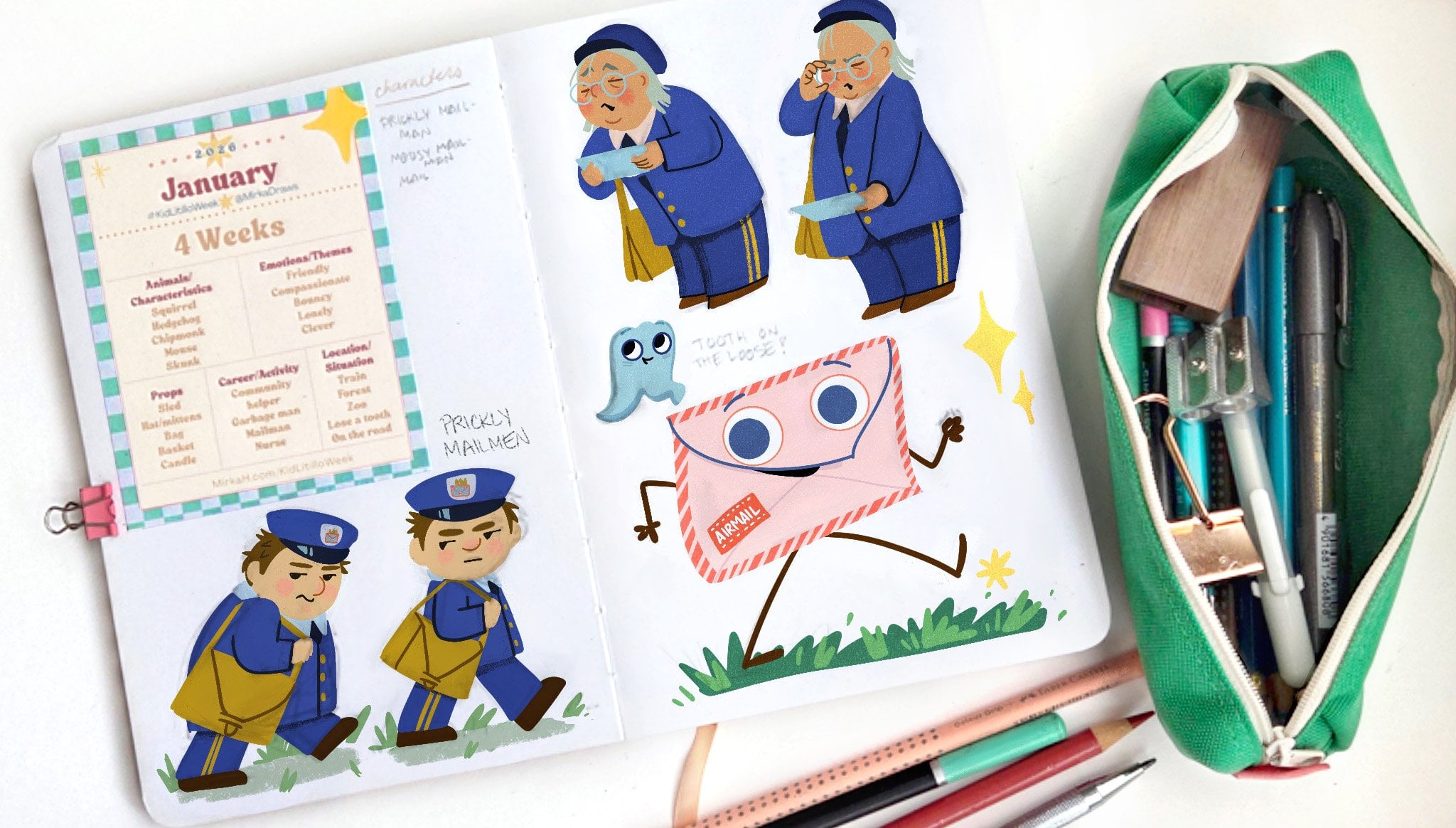
short class on this platform, and it's called Weekly
Kidlet Illustrator Club. Start and sustain a
steady creative routine. But in that class, I have
posted monthly prompts for the last year each month has
different sets of prompts. There's animals that you can just use them
for characteristics. There are emotions. There are situations
and locations. I've selected all the
prompts because they were all common themes
in picture books. And so, kind of, no matter
which you can pick, you know, a prop here and a prompt there
and put them all together, kind of, they should
spark your imagination. And then whatever you come up with should kind of fit in the picture
book world in general. Like, there are
themes like losing a tooth or soccer game
or something like that. So they should be a great
extra boost for you. And after you're done
with your illustration, you can always post it in the
classroom project section, or if you want to post more than one illustration
that you've done, the second one can always go
in the discussion section. And if you ask for it, I'm more than happy to give you feedback on
your illustration.
10. Simple vs Detailed: All the books that we've looked at throughout this whole class, there are different levels of detail that illustrators
have done in their books. And so the very kind of plainest or non detailed backgrounds that we've seen was for example, in Chris Chatterton's book, Gus. And so, for example, we
have One Spread where it's just Gus and a bowl of
food or with a very, very simple kind of
a kitchen scene. But if you are just
starting with Illustration, I would recommend
that this is not the only style that
you are showing in your portfolio because then you're not showing
art directors and agents that you can draw backgrounds and you can do
more complicated scenes. And so it's okay to have
a few scenes where, you know, you're just showing a dog grumpy dog with the bowl. You do want to have other
things in your portfolio, too. So as an example, Chris Chatterton also works on many other different
kinds of books, not just very simple books. And so, for example, he has this whole 10
minutes to bed series, and so this is just an example from the little dinosaur book. And over here, you can
see that he's worked on a full spread with a
lot of details in it. And so I just wanted to
give you a couple of other ideas of kind of different levels of details
for the background. And so we have the Sara go Gonzalez book that we
already talked about. And then this is Leon
Co's Pig town party. We haven't looked at the
whole book in this class, but I just wanted to
show that as an example. And so in the top one, we have kind of everything
has been filled in. It's three dimensional. There's kind of no
empty space over there. The text almost, like, barely fits in there
in this little space. And then with Pig town party, instead of the roads
being filled in, the roads are white over here. And actually, you know,
it's a white road, and the crossing signs the
crossing bars are yellow. And then having it white
gives us a great place to put our main character and then also somewhere to put
the text over there. And then once we kind
of move away from that, then we have all those examples
like Chris Chatterton. I something you already. So this is from I
Love You already. And this is a one
page illustration, and all we're getting is a door and basically a
door and a chair, and they kind of hold space
for both the characters. So we need the illustration of the door so we can have
the duck behind over then we need the illustration of the chair over there so that
we can have bear hiding. So, you know, you can see the juxtaposition of the
two characters over here. We haven't looked
at this book yet, but it's called S
Hello to Zorro, illustrated by Carter Goodrich. He's also the author in it. And in this one, he
pretty much doesn't give you a whole lot of
backgrounds at all. They're all kind of
spot illustrations. Like in this one, you
just see a little bit of a blanket as he's begging at
the door at the at the bed. And over here, it's a
little spot illustration as he's trying to get outside. But all the illustrations
in the books are kind of very simple and don't have
a lot of backgrounds. And just in the same way, as the Benji Davies
Home already. That whole series of books. It's also a very
character based book where all the fun and the humor, it's all about the interaction between the two characters. And the same goes for, say
hello to Zorro book two. And then I wanted to add this illustration from Matthew
Cordell's Trouble gum. And so over here, we have this the little piglets get their hands on
some bubblegum, and then the little one starts
blowing this giant bubble. Happens in the living room, but all you're really getting is the furniture in
the living room, but there's no actual,
like, room drawn in here. And if you think about the
room, the room wouldn't even be as big as this
bubble over here. I mean, that would
be the biggest size, tallest living room
that you've ever seen. And so for the sake of
the effect of having this giant bubble gum ball that's floating the
little character away, he's opted to not have any
of the background showing, and it's just showing,
like, where the floor is, and then the little
character is floating away. And so that's kind
of a star into talking about serial
Illustration. And in the next video, we'll
talk about making maps to keep track of what's
where in your illustration.
11. Learning from Layouts: Last video, we
were talking about all the different details that you could be thinking about when you are working on
your illustration. And I wanted to kind of cut this video in half and
take a moment to talk about what you could
be also thinking about if you are working in
a series of illustrations. So you could be working on a series of three illustrations for your portfolio or when you are working on an
actual picture book story, then it would be
your whole story. So when you're working on
a series of illustrations, you always be thinking
about what comes before spread or illustration of what comes after
and how you are moving your viewer's eye from
one illustration to next. When I'm thinking about a
series of illustrations, I think of it in the
same kind of terms as storyboarding for movies, and so I usually think of each page as a unit because
the way that you read a picture book is you open
it on a spread and you see both right and left side of the book pages at the same time. And so whenever I'm
doing my story boarding, I always draw kind of rectangles that shows both sides of the
spread at the same time, and I kind of treat them as one. And so there might be one horizontal illustration that spreads across the whole spread, or it might be one page and spot illustrations
or whatever it is. But I treat them as a unit. And then I always
think about how I move viewer's eye from kind of the left side of my spread to the
right side of my spread. How will their eyes move
from left to right? And also thinking about
turning the pages? How is the viewer's eye going to kind of
move and carry on? What is the page
turn going to bring? And how are those kind of carrying my story and
adding to the story? And a lot of times when I want to kind of come up with new ideas
for storyboarding, if it's a different kind of a book that I haven't
illustrated before, I always like to look at what other
illustrators have done. And so what I'll do is
I'll oftentimes just use my cell phone and I'll just
snap a photo of each spread. And so, over here, I'll just show a couple
of illustrations or a couple of examples of that. So this was the
spoonful of frogs. Story that we looked at earlier, and so I've just
taken a photo of each spread and put
them all in one. And this way, we can kind of look at each spread
at the same time. And if you notice over here some interesting things
is we have a full, kind of a spread
illustration over here, where our main
character is, you know, happy and she's dry and she's
standing next to the stove. And we're giving a little bit of context over here
with the camera man, so we know she's kind
of filming this show. And then, if you look at the last illustration
on the page, we kind of have the same
shot, but over here, the thing that has changed
she's been trying to cook, and now she still kind of has an empty stove and she's missing a shoe and
she's all wet. And so there's
this juxtaposition between the first and the last
illustration in this book. And then it's fun to look at what other kind of illustrational
devices they're using. And in this class, we're talking about
the backgrounds. And if you look at how she has created
backgrounds for this book, we start with kind of
an establishing shot, and depending on your book, I recommend that
you do this kind of an establishing shot somewhere in the beginning of your book. It could already be
on your title page. It could even be on your
end pages before this page, but somewhere kind of at
the beginning of the book, you usually kind of want to show your readers where we are, some sort of a
shot of a house or an inside of a room
or just something that you kind of give them, you know, a little
bit of the world, you know, so that
they can imagine the world that they're
stepping into. And then after that, if you look at the rest of
these illustrations, she doesn't really draw a whole lot of the
kitchen anymore. And so there's one
illustration that's, you know, two full
page illustrations. There's kind of
nothing over here. We're seeing a little bit
of a side of a stove and a little bit of the
island thing over there. We see one spread illustration of the kitchen with
the backdrop in it, and then we have a whole bunch of, you know, more close ups. We have this whole
series of images with the frogs and she's trying
to catch the frogs. We get a little bit of
a background in here. Over here, she's not even drawing any kind
of a background. It's just the frogs
jumping and a shadow. And so there's very
little of the background. And then when she goes outside, now she zooms back a little bit again and shows us
the environment. Okay, she's running across the street. She's
going into a park. And now she's kind of
established where we are. Then we zoom a little
bit closer again. And then she slips and falls. And remember, in the other
at the earlier video, we talked about
having the gutter and having that tension between
two sides of the gutter. I know there's not a lot of
architecture in this one, but here's a really
fun spread, too, where we get this tension
with all these frogs watching her as she's on the other opposite
opposing page, and she's coming
towards the frogs. And so just a really
fun spread over there. And then we have the Fred Gets
Dress book by Peter Brown. And in this one, as we talked, I really liked the kind of
series of illustrations where we have Fred is
going in to the closet, two illustrations over there. Then there's the flat of the
dad and the dad's pictures. And then we have the
diagonal going up. Then we have mom clothes and it echoes this spread over here, and then we have the
diagonal coming down. And then instead of two spot illustrations on
top of each other, we get kind of two
spot illustrations on pages next to each other. And so I find that interesting, and it's kind of
a fun series or, like, a segment
of illustrations. And then they're also
framed with, like, a single page illustration
on both sides right there. And so with this book, we talked about the
establishing shot. So in the first
picture right here, we're getting an
establishing shot. We have a living room, and there's mom and dad
reading over there, and Fred is there's a dog and Fred is
running around naked. And then we have
spot illustrations, and it's not necessary to draw
everything all over again. All we need is just, you know, some little tidbits of actually, you know, this is here
twice, so ignore that. But, you know, there's
little tidbits of what's happening over there. And then a little
bit he's showing a little bit more as he's
moving through the house, so we get the idea that Fred is kind of progressing through the house and through
the different rooms. And then as we get more to, like, the personal
side of the story, where, you know, or the
emotional, I guess, kind of heart of the story, then we get much
kind of closer ups. We get the makeup and the
closer ups over here. And then we get another
establishing shot. So all these emotional moments, we had the emotional moment with him running around with or,
like, the start of the book. And then we have
emotional moment where the parents find him. We have another big spread
again. Notice the gutter. We've got Fred on one side,
parents on the other side, and we're waiting to see
what their reaction is. And then, you know,
they're both smiling, and then we're zoomed out. Then we're zoomed in to their faces. So that
we can see that. And then we end with
the other kind of a wider shot instead of the family being
separated by the gutter, now everybody's
happily on one side, and we get just the
text on the other side. So really great
design over there. And then that very,
very ending page, he goes running around. He's like, almost
dressed, but not quite. And so those are just some
things to note in that book. And then we'll just look
at two more really quick. We had How to Make Bread
with Sarah Gonzalez. And with this one,
if you remember, I was talking about all the
different interesting angles that the illustrator is using. So we had the angle that
was from straight on. We had the looking
out of a cupboard. We had looking out of the oven. And if you look at
this illustration, you notice that you notice the illustrator actually uses quite a lot of full
spread illustration. Kind of the only
place where we get any lightness or white
background is right here in this one illustration
where we are looking at the tables from above of all these different families
who are making the bread. In some ways, we have kind of establishing shots over
here with the community, and then the different tables. And then we go into all
the different families, and they're all
kind of close ups of what each family is doing. And then we zoom out at the end when we get back
out to the community. So zoomed out and what the community and kind
of everybody is doing. And then everybody's personal
homes, it's all close ups. And then when we talk
about the community again, then we're back to kind
of being zoomed out. And then the last one I was going to show,
this is very different. And we haven't looked at
this book Closer over here. This is Hot Dog by Doug Sati. And he has a very kind of a different approach to his illustrations on
his illustrations. These are screenshots from
Libby, a library book, and so they don't
have the gutter as nicely as if I would have
taken the photographs, but, you know, the gutter Gutters obviously in
the middle over here. But instead of his illustrations going all the way
out to the edge, his illustrations are
mostly not all of them, but almost all of
them are inside of this kind of a border, and they're just a little bit blurry because we're
zooming close, and these are just
little thumbnails. Um and a lot of and a lot of
the ones, he'll have, like, the little box for
the illustration, and then the text is
in the white area next to the illustration. And so that's another
design choice. And so this way, you get these very vertical
illustrations, and so we're in the
city and we're hot. And so you see that everything
is very vertical in the way that he has designed the layouts and
everything is very busy. And then we get to that kind of an emotional middle
over here where, you know, everything is
yellow and everything is hot, and you can see it's
like this viewpoint looking up from the
dog's point of view, the dog has had enough, and there's all these people
rushing through and you kind of get really kind of
gets into his head, and then he just stops in
the middle of the street. And we get a horizontal, that's like the first kind
of bigger illustration in the book as we've had this
rhythm of these very, very small, and it's getting busier and busier and hotter and hotter as we keep going until
the dog finally has enough. And then from there,
they take a taxi, and you notice how everything
was very vertical. Over here. Notice how
things are getting to be more square as we're
kind of going, still a little bit
vertical, but see, now we're moving in space. Now we start having
horizontal things over here. And so this one, this horizontal blocks,
spans the whole spread, and he can feel the
wind in his ears, and they finally get to the
pier and we have you know, coming from left to right, they're on the boat, and
now they're on the pier, and they're moving
from, you know, into the off the page
onto the next spread. And then walking all the way down, walking
all the way down. And now we get kind of
this first full spread, and there's all this happiness
of being at the beach, a lot of vertical, a lot of or not verticals. I'm sorry, horizontals,
lot of horizontals, lot of horizontals over here
as they're at the beach. And then they finally
start heading home, and you can see the we're
starting to kind of come down. We have another kind of a
horizontal, busy scene. Um, and now we're in the city. We get more verticals again, and they're walking back home, verticals, verticals, and
then they're finally asleep. So they're laying
down horizontal. And in the last page we see him. He's dreaming about swimming
with the seals over there. And so, just some fun design
choices over here and how Doug is moving our character across
the different spreads. I hope that gave you some
ideas on how to treat illustrations if you're
working on a series of them. And in the next video,
let's look at the level of detail in the backgrounds
that illustrators are doing.
12. Maps: You're working on a
story that happens in a specific location and you need to be moving
your character from, like, one room to another, or let's say you're on a farm and they're
moving around the farm, it's helpful to make
yourself a little map or a floor plan so you know where the buildings are
or if it's in the room, you know where the furniture
is, so that that way, when you are moving
the camera around or your viewpoint
around to illustrate, it's easier for you
to make sure that everything is kind
of lining up and things are moving in
the right direction. And so, kind of, there's many different ways
that you can do that. If you wanted to make
a very simple one, you could just draw yourself
literally a map and you say, Okay, if it's a barn, my barn is here and
a silo is here, and I have a dog house
next to the barn, and it can be very schematic, but just so you kind of
know where everything is. I wanted to show you just
a couple of examples of the things that I've
done for my illustrations. These sketches are from my
book How the Forest Feels. And in this one, in the
beginning of the book, there is a Grandpa and
his grandson or grandkid, I guess, it's ambiguous. We don't know if it's a boy
or a girl in the story. And they come to the house, and then they take off to
go for a walk in the woods. And so in order to
kind of figure out how the rooms are aligned and how they're moving from
one room to another, it's not a huge
part of the book, but I still kind of wanted to know how to draw
believable space for them. What I did was first, I figured out what the house was going to look
like on the outside. And so these are just some
photos that I actually took of a house driving
along the road. And then I think the other one might I
think it's the same house, but what I did was I went
on Google Maps and then, like, found the
house over there and then took a screenshot of it. And that way, I was able to get a picture of the house from a
couple of different angles. And sometimes if you're lucky, you can also find
pictures on Zillow. So if a house has been sold
in the last couple of years, a lot of times that
listing is still on Zillow and you'll actually be able to find pictures
on the inside. So that's just a
little tip for that. This house had not been
on the market recently, but I just kind of looked at different similar looking houses to kind of figure out
what the floor plan was going to be for this house. So it's not a very
fancy floor plan, but I just wanted to
know where the doors were and how they were
moving through the house. And so over here, I
have the floor plan. This is kind of the front door. And then I figured this
was the back door, and there was a door right here, the kitchen table, and then an island, and
then a kitchen. And then once you
walk through there, you'd go stairs to go upstairs, and there'd be
bathrooms and whatnot. And then this would be kind of their living room over there. Then the actual final
illustrations for the book, this is kind of what
they look like. And so the book starts with the characters walking in through the back door over here. And so you can see
they're trailing in some leaves and whatnot, and we've got the kitchen
island over here. And this area, I actually
left it blank on purpose because this is where all the publisher copyright
information went, and so that was
left open for that. So I didn't have to draw all
the things from over here, and I didn't want to
clutter the countertop so that we would have a
clear area for that. Then as they're moving in, they've gone and put stuff down somewhere in the kitchen
or in the living room. And then we've got
them leaving out for the they're leaving
out for the walk. And so Grandpa's
standing in the doorway. And then I figured out where
all the furniture was and then was able to kind of draw
it for the illustration. And then once they leave, then they're walking
away from the house. So I just needed to be able to know what the house looked
like on the outside, too. And so I was able to use all the knowledge
from over here, from my little studies and maps to kind of figure out
how the story goes. And then the other tip for figuring out how things look in three dimension is to actually kind of
build three D models. And so I have this example
of mossy and tweeds, little houses over here, and I couldn't figure out knew that Tweed's
house was going to be this log with another
so it was going to be log with another kind of a stump or a branch
coming out of it. So it was very easy for me
to just do two cylinders basically attached to
each other and figure out what that would look
from different angles. But then for Mussi's house, it was going to
be kind of a tree stump with little addons, and it was going
to be a little bit wonky, and I couldn't
figure it out. So I actually ended up
building a three D model. It's not very well done. It's just kind of
cobbled together. And then that way I was able to this is just polymer clay that's been baked in the oven. Oops. And that way
I was able to kind of figure out what it looked from all the
different angles. And then for the
final illustration, it actually ended up I had
to figure out I had a map, and I knew where
the car was coming. And the way that my
characters were talking and where the coconut came from. And so I ended up having to flip my composition to
make sure that as I said, the story would carry
on logically from, you know, one place to another. And so and so I had a map
of where everything was, and I figured the
car was coming here and the thing was going to
be shooting from there. And so, like I said,
I ended up needing to move the locations
around over. So you can build
your three D models in any way that you want. You could use cardboard,
toilet paper rolls. They could just be salt
and pepper shakers. You can get creative
soda cans or, like I said, hot
glue and cardboard. And then kind of an extreme
of that is James Gurney, who has illustrated
the dinotopia books, and he actually builds
rather elaborate kind of maquetes he also lights
them with spotlights. And so that way when he does
his final illustrations, they actually, you know,
he has a reference, and it might not be exactly like the way that
he's illustrated it, but a lot of the elements from his three D models are end up
in his final illustrations. And so that's taking it to
a little bit of an extreme. You can just as well
do this, like said, with toilet paper rolls and
cardboard and hot glue. And the one benefit to actually having a three dimensional
kind of model of whatever you're working on is
you can actually take your phone camera or
little digital camera and you can move it around
and kind of pan and see what kind of a camera
angle would be interesting. And if you have any kind
of a special lighting, you can put a spotlight on
it and see how shadows fall. And then that way, if it's an outdoor scene and
you've got trees and buildings and you
need to figure out how long shadows affect things, it can be easier to do if
you have a hard time kind of imagining it if you have
something to go Alright, so now that we talked about
kind of serial images and building little maps
and maquetes so that you can get angles
on lighting correctly. In the next video, let's talk a little bit about
lighting your scenes.
13. Lighting: So in this video, we are starting to get more into the details of things and starting to polish
our illustrations. And the first thing
that I wanted to talk about is adding lighting
to your scenes. And so your lighting also has very different
approaches to it. Some illustrators will make
things very realistic, and for some illustrators,
just like everything else, it will just not even exist. And so we'll look at the
range of all those again. And so I have two
books over here, and this is kind of
coming from the range where these illustrators
are not adding shadows. And this doesn't mean that
for each one of their books, just for these book examples. And so there's no
shadows in this book, and it works for the kind of story and the
illustrations that we have. So we have Dragons of Tacos too. And if we look at
this book, you know, just the character designs in themselves already
are pretty, you know, naturalistic, but there's
not really any shadows. There's not a whole lot
of shading in the books. There might be just a little bit a little bit of an inkling
of something over here, but in a lot of
these illustrations, we're not getting shadows, like, underneath the characters
anywhere really, and there's not really
shadows over here. And so everything is textured, but like said, not a lot
of shading going on. Same thing over here for Mr. Tiger Goes Wild
with Peter Brown. If we look at all
the characters over here or the characters in the buildings,
there's no shadows. There's no shadows underneath. There's no shading kind of within the characters over here. And so everything
is just very kind of black and white with
everything over here. The kind of the
next level up from there I I Illustrators who
are doing some lighting, and it's kind of realistic. And so then we will look at
a spoonful of frogs again. And if we look at the
lighting in this book, the top of the table table is slit and the side
is in the shadow. And so we're getting
some kind of three dimensional
modeling in this book, as you would expect kind
of in the real world. But it's not like super
dramatic or anything like that, but it's enough to kind of
give things shape over here. And then same thing
over here for the River of caregiving
with Sarah Gonzalez. And the same thing over here, we're getting some shading
around her characters. There's lights and darks. You know, nothing
super dramatic, but enough to give things shape and make things
kind of three dimensional. And then in the last books
that I wanted to show, so we have how the forest feels. Illustrated by me.
And so in this one, I was concerned
with the lighting, but I also wanted the lighting
to kind of set a mood. So when we get to this spread, you'll notice that the colors are kind of gray
and they are muted. And as we move away
from the rain, now we are starting
to have sunshine, but the sun is also
starting to kind of go beyond the horizon. And so things are getting
a little bit darker. We have a sunset and kind of the golden little
haze over there. And then we have kind of
a cozy scene indoors with just the light of the moon
and then the lamp that's lighting the little
kid and the grandpa as he tucks then the last one, we've got Adam Rex, the
legend of rock paper scissor. And in this one, we have
very dramatic lighting. So, you know, it's a sunny day, so not all the lighting
has to be realistic. So in this one, we have
the two characters. It's obviously middle
of the day over here, but then when they're fighting,
we have this epic battle. We have a red sky with
the moon approaching, and so it's looking very
dramatic for us over here. And then over here we have the paper coming towards
the fax machine, and we have this bright
spotlight coming at us, and you can kind of see it almost looks like a
transparent over there. And then, again, we have another big scene as he's
blocking out the sun. So very dramatic
lighting over here. But also kind of the way that the light, even
though, you know, this isn't like
happening in reality, it's creating a mood
of kind of what is happening in the illustration as far as kind of the
plot points are going. And then this almost like
a Wild West where we have the character one character
framed by the other, and then we have this
back lit kind of a scene. And then we have another
very dramatic scene with volcano explosion, and we're getting all the, you know, highlights and
everything like that. So very high energy over here. And same thing over here,
you can see how we have blue light coming from the
outside of the garage, and then we have the
yellow light coming from the light source
inside of the house. Obviously, there's no living
rock and no living scissors, but it's kind of
a very realistic three dimensional looking
lighting for these characters. And so the lighting really
can kind of vary the gamut of no shadows to very
dramatic shadows. And then another thing
that lighting also does for your illustrations
is it also creates value. It creates light
areas and dark areas. And so if you remember in
the book, Island Born, when we were talking about
having the main character, most of the time has, like, a hallo around them. Over here, we have light around them over here, we
have light around them. A lot of the characters
have white around them. And so the character is
usually kind of easy to find in all the
illustrations. And we also talk about
values and lights and darks in the outdoor landscape
drawing class as well. And so I'm not going to go
too much further into it, but I was just going to show look at coptans over
here from this book, just to kind of drive
the point home. So for example, in this
series of illustrations, we have a lot of interesting things happening
as far as the values goes. Over here, everything is
fairly kind of generic, if you would imagine this illustration
being in gray scale. It would be fairly hard to see what
everything was going on. You kind of get this
mound over here, but the lightest areas
is the thunderbolt, and then these two round eyes, and this is kind of where we get our biggest contrast
in our values, we have the dark rims of the glasses and the
pupils over here, and then the lighter
areas in between with the white little
highlight in there. And so when we first glance
at this illustration, this is kind of
where our eyes go. And then in this illustration, we have a really
clever, you know, our biggest area of
contrast is right here, and that's kind of where
our eye is drawn first, and that's where Adam Rex
wants us to look first. And so that is a little
bit about lighting and adding highlights to
your illustrations. And in the next video,
we will talk about
14. Color: We talk about color in a
few of my other classes, for example, in the
character design class and then the outdoor
design class. Illustrators oftentimes
pair lighting or values with color
to move our eye through the illustration
and also to highlight our main character or the action in
that illustration. Colors and picture
books can be realistic, like the way that they
are in nature around us, or they can be limited, like in the book Van penguin that we've
looked at already, like in We don't et Dot
Classmates, her right foot. And we'll just look at
a couple of spreads. And so very limited over here. We don't eat our classmates, and we also talked
about this book having kind of plain or
monotone backgrounds in the characters
being in color. And then in her right foot, most of the spreads, there's
a lot of different colors, but most of the spreads are very monotone with just a few
different colors being used. Then the last way
would obviously be not using realistic colors
in your illustrations. And so over here, we have the Knight
who said No with Kate Hindley and obviously we
already have a red dragon, so we know that this
book is not 100% real. And if we look at the
illustrations over here, you can see some of them
are limited color palettes. But even when we are looking
at illustrations over here, we see that there's
kind of a lot of unnatural colors and it's kind of a limited color
palette, as well. Then we have the bookruNs you. And over here, it's also a
lot of imaginary creatures. And you could say
unnatural colors. And over here, the colors are also creating a specific
kind of a mood. And then, lastly, we had come home already that
we also looked at. And over here, if you remember, we had yellow grass
and over here we have the kitchen and
everything is just kind of colored in
different shades of blue. We have the house
and the ground. And so it is not
realistic over here. And the other reason
why color could be important for your
illustrations and for your books is it might also be important in
setting the mood. And again, this is
not for all books, but for some books, illustrators use color very wisely
to create the mood. So in Boko needs you, it's a Halloween story. It's supposed to be a little bit spooky and a little bit scary. So the illustrator, Serchu she uses a lot of
kind of purples and blues, and they're all kind
of nighttime colors. And so she creates this dark, spooky atmosphere over here
for all the illustrations. And then a couple more examples. We've already talked about
this book a couple of times, and so the same
way, let's just go. We can go straight to the
end. We're creating the mood. We already looked
at the rain scene. We're creating the
mood at the end over the book as we're
kind of winding down, the sun is setting, and then we get the
kind of highlights of where the light
hits everything. And then also we have this
really cozy scene with the soft light from the nightlight soft
hazy purply colors for the rest of
the illustration. So this is the what ifs
illustrated by Zoe Persico. And I just wanted to point out over here
a couple of spreads. You can see in
this illustration, everybody else is kind of
on a bright background. Everybody else is looking happy. Then our main character who's feeling
anxious and nervous, you can see that she's got
this kind of vibrating, dark cloud around her. And then in a lot of the
other illustrations, you'll notice that let's see. So over here, she's
kind of afraid and you can see the way
that there's a spotlight, and it's bright right
here in the center. You've got highlights
around the edges over here. And then we've got
our main character. She's kind of lighter and
more saturated yellow tones against all the cool
tones of the background. And then the illustrator
has also left room for where the text
should go on both pages. But you can see how she's
using light and dark to create this kind of drama in the scene and the way that
her brain is working. And then same thing
kind of here. And so we have
another kind of a fun spread with the spotlight,
and we have a nice, kind of a triangular
composition over here with everything
with the spotlight in the middle and then
highlights on their faces, and then a nice spot for the
text to go on the bottom. And then as she goes
and she kind of conquers her fears,
then all of a sudden, we move from that darkness
that she's been in, now we move into the light, and we move, you
know, everything is rainbow colored and happy. And there's a moment
where everything kind of turns scary and
she's purple again, but then her friend
cheers her on, and then she conquers her fears. And so you can see
how color plays a really important part in the illustrations in this book, and then we have her here back into her kind of
normal colors again, bowing after her performance. And then very similarly
as the what ifs with Sleepy the Good night
Buddy with Scott Campbell. We already looked at
this. If you remember, we had that one scene. And so everything in the
book is kind of blue. And then when we get to the blow up scene where he
has a mental breakdown, we get hot pink or kind of
a pink magenta background. And then he finally falls
asleep and then, like I said, we have all this kind
of white space to kind of indicate that
he's finally out. And so I like this book a lot. I love the way that it
transitions to all the different. And the very last thing that
I was going to say about color is just choosing colors
for your main character. A lot of times what
illustrators will do is they will choose
the brightest colors, the most saturated colors for the main characters
of their book or something that stands
out from the background. And so for that, I'll just highlight my character
really quick in this book because I know the thought process that went
through for this character. And if you notice in this book, everything is pretty
earthy colors. Everything is relatively muted. There's a lot of greens and
browns and kind of yellows. And so and a lot of warm colors. And so what I decided instead of a red shirt for my character, 'cause there's scenes that have red 'cause
it's also autumn. And so there's going to be trees that have red
leaves in them. And so I didn't want to pick a red shirt for my character, which is what I could have done. And so, instead,
I decided to put my character in a
striped blue shirt, and then that way,
he's the only kind of cool color in a lot
of the illustrations. And so when they go
out into the woods, even the grandpa's
wearing kind of khaki pants with the
green and brown sweater, our main character, the
little child is wearing blue jeans and a blue sweater. And so when you look at
all the illustrations, he's the first character, the first thing that kind of
pops out at you in each one. And so that was my
thought process with choosing the colors
for the character's shirt. And so, like I said,
colors are important. And so be mindful when
you are choosing them. And a lot of times what I would recommend is having kind
of a standard palette that you use throughout all your
illustrations so that if somebody's looking
at your portfolio or they see one piece
of yours on Instagram, having kind of a
standard palette helps somebody know that that is
one of your illustrations. For myself, I kind of use this I want to say it's
like a beachy, happy, joyful palette, and that's for
a lot of my illustrations, that's the base
that I start with, and I might add extra colors
to it, depending, you know, if it's an underwater scene
or if it's a jungle scene, I'll use all the colors in different combinations or in different ratios, I
guess you could say. But I have kind of
a standard palette that I use for most
of my illustrations. And when I talk to people, they will say that, Oh, when one of your illustrations
pops up on Instagram, I always know that it's yours. And so having a palette just helps with
recognition of your work. And in the next content video, we will talk about adding the final polishing details
to your illustration.
15. Polishing Touches: This video, I wanted
to talk about adding details and the final kind of polishing touches to
your illustration. And adding details really depends on the narrative
that you're trying to tell and the style of illustration that
you want to work in. And we talked about
illustrators who don't always add a ton of details
into their illustrations, like the Gus book with
Chris Chatterton. But if you are
just starting out, I would recommend that you have more illustrations in
your portfolio that do have a lot of details in them
than having a lot of really plain illustrations
that just show a character like tying
their shoelaces. And adding
illustrations that have more details in them
in the background, we'll add a deeper
narrative and kind of create a world for your
character to live in. Most of us as people,
we don't live in empty boxes unless you have a very minimalist
style of decorating. Most of us have knick knacks. We choose the clothes
that we wear, we choose the furniture that
we bring into our spaces. And so the details that you add for your character
and outside of your character all kind
of play off of each other and add to the narrative storytelling
in your illustration. So I wanted to bring one
more new book into the mix, and this one is called
Wild by Emily Hughes. And I just wanted to talk about this one really
quickly because of those details and how the
way that the character is how the character is interacting with the
environment that she is in. And so in the beginning, we have the character
Wild and she's out in the nature and she's
speaking with crows and, you know, we set
the story up that she's kind of brought up by all these animals
in the woods. And then one day, she's caught and she's
brought back into the, you know, we see the
city looming over here. And you can also see how we have kind of
darker illustrations, and we're out in the woods, in the kind of dark parts. And then when we get we're
inside of somebody's house, and it's all all of
a sudden bright. The color palette changes
from the kind of greens and browns into now more kind of
pastel tone blues and reds. And you can see how she's now been put in a dress and they're trying to comb her hair and how she's interacting
everything. And then she's trying
to learn things. And so it's really
building this up. And then now you know, she's trying to eat and
she's creating a big mess. She's in her room. She's destroying
everything. She's biting. She's got little fangs in her mouth and her hair
is kind of coming apart. And so there is really this
great play on the character. And she was wild before, and she was happy and
everything was great. And now she's this little terror when they try to tame her. And then she finally has
had enough and her hair is out and everything is crashing and she
destroys the place. And now she's back outside and, you know, her hair is flowing, and there's nature and greens, and you can see
the two characters unhappy in both of the
windows over there. But it's just a fun
example of coming up with different surroundings and how your character's
personality, how they will interact with the surroundings
that they're put in. And so when you
are thinking about details for your
character think about your character's
personality and what would add something
to your story. And for example, if you have a bedroom
that you're drawing, if I say, bedroom lamp, what kind of a lamp are
you thinking about? Most likely, kind
of the standard, you know, a rounded lamp
with or something like that. But what if your character had a nightlight in the shape of a dinosaur or what kind of posters would they
have on the wall? And so think about different
little things that you like, would there be eating, you know, empty plates and cups or
snack wrappers on the floor? And so think about what kind of little details you can add into your illustration
that would add to the narrative storytelling
of your illustration. And in the next video, we'll talk a little bit more about the assignment
for the class.
16. Finding Design Threads From Layouts: The last video, we were talking about all the different details that you could be thinking about when you are working
on your illustration. And I wanted to kind of cut this video in half and
take a moment to talk about what you could
be also thinking about if you are working in
a series of illustrations. So you could be working on a series of three illustrations for your portfolio or when you are working on an
actual picture book story, then it would be,
your whole story. So when you're working on
a series of illustrations, you always should be
thinking about what comes before spread or illustration of what comes
after and how you are moving your viewer's eye from
one illustration to next. When I'm thinking about a
series of illustrations, I think of it in the
same kind of terms as storyboarding for movies. And so I usually think of
each page as a unit because the way that you read a picture book is you
open it on a spread, and you see both right and left side of the book pages
at the same time. And so whenever I'm
doing my story boarding, I always draw kind of rectangles that shows both sides of the
spread at the same time, and I kind of treat them as one. And so there might be one horizontal illustration that spreads across the whole spread, or it might be one page and spot illustrations
or whatever it is. But I treat them as a unit. And then I always
think about how I move viewer's eye from kind of the left side of my spread to the
right side of my spread. How will their eyes move
from left to right? And also thinking about
turning the pages? How is the viewer's eye going to kind of
move and carry on? What is the page
turn going to bring? And how are those kind of carrying my story and
adding to the story? And a lot of times when I want to kind of come up with new ideas
for storyboarding, if it's a different kind of a book that I haven't
illustrated before, I always like to look at what other
illustrators have done. And so what I'll do is
I'll oftentimes just use my cell phone and I'll just
snap a photo of each spread. And so, over here, I'll just show a couple
of illustrations or a couple of examples of that. So this was the
spoonful of frogs. Story that we looked at earlier, and so I've just
taken a photo of each spread and put
them all in one. And this way, we can kind of look at each spread
at the same time. And if you notice over here some interesting things
is we have a full, kind of a spread
illustration over here, where our main
character is, you know, happy and she's dry and she's
standing next to the stove. And we're giving a little bit of context over here
with the camera man, so we know she's kind
of filming this show. And then, if you look at the last illustration on the page, we kind of have the same
shot, but over here, the thing that has changed
she's been trying to cook, and now she still kind of has an empty stove and she's missing a shoe and
she's all wet. And so there's
this juxtaposition between the first and the last
illustration in this book, and then it's fun to look at what other kind of illustrational
devices they're using. And in this class, we're talking about
the backgrounds. And if you look at how she has created
backgrounds for this book, we start with kind of
an establishing shot, and depending on your book, I recommend that
you do this kind of an establishing shot somewhere in the beginning of your book. It could already be
on your title page. It could even be on your
end pages before this page, but somewhere kind of at
the beginning of the book, you usually kind of want to show your readers where we are, some sort of a
shot of a house or an inside of a room
or just something that you kind of give them, you know, a little
bit of the world, you know, so that
they can imagine the world that they're
stepping into. And then after that, if you look at the rest of
these illustrations, she doesn't really draw a whole lot of the
kitchen anymore. And so there's one
illustration that's, you know, two full
page illustrations. There's kind of
nothing over here. We're seeing a little bit
of a side of a stove and a little bit of the
island thing over there. We see one spread illustration of the kitchen with
the backdrop in it, and then we have a whole bunch of, you know, more close ups. We have this whole
series of images with the frogs and she's trying
to catch the frogs. We get a little bit of
a background in here. So over here, she's not even drawing any kind
of a background. It's just the frogs
jumping and a shadow. And so there's very
little of the background. And then when she goes outside, now she zooms back a little bit again and shows us
the environment. Okay, she's running
across the street. She's going into a park. And now she's kind of
established where we are. Then we zoom a little
bit closer again. And then she slips and falls. And remember, in the
other the earlier video, we talked about
having the gutter. And having that tension between
two sides of the gutter. I know there's not a lot of
architecture in this one, but here's a really
fun spread, too, where we get this tension
with all these frogs watching her as she's on the other opposite
opposing page, and she's coming
towards the frogs. And so just a really
fun spread over there. And then we have the Fred Gets
Dress book by Peter Brown. And in this one, as we talked, I really liked the kind of
series of illustrations where we have Fred is
going in to the closet, two illustrations over there. Then there's the flat of the
dad and the dad's pictures. And then we have the
diagonal going up. Then we have mom clothes and it echoes this spread over here, and then we have the
diagonal coming down. And then instead of two spot illustrations on
top of each other, we get kind of two
spot illustrations on pages next to each other. And so I find that interesting, and it's kind of
a fun series or, like, a segment
of illustrations. And then they're also
framed with, like, a single page illustration
on both sides right there. And so with this book, we talked about the
establishing shot. So in the first
picture right here, we're getting an
establishing shot. We have a living room, and there's mom and dad
reading over there, and Fred is there's a dog and Fred is
running around naked. And then we have
spot illustrations, and it's not necessary to draw
everything all over again. All we need is just, you know, some little tidbits of actually, you know, this is here
twice, so ignore that. But, you know, there's
little tidbits of what's happening over there. And then a little
bit he's showing a little bit more as he's
moving through the house, so we get the idea that Fred is kind of progressing through the house and through
the different rooms. And then as we get more to, like, the personal
side of the story, where, you know, or the
emotional, I guess, kind of heart of the story, then we get much
kind of closer ups. We get the makeup and the
closer ups over here. And then we get another
establishing shot. So all these emotional moments, we had the emotional moment with him running around with or,
like, the start of the book. And then we have
emotional moment where the parents find him. We have another
big spread again. Notice the gutter. We've
got Fred on one side, parents on the other
side, and we're waiting to see what
their reaction is. And then, you know,
they're both smiling, and then we're zoomed out. Then we're zoomed in to their faces. So that
we can see that. And then we end with
the other kind of a wider shot instead of the family being
separated by the gutter, now everybody's
happily on one side, and we get just the
text on the other side. So really great
design over there. And then that very,
very ending page, he goes running around. He's like, almost
dressed, but not quite. And so those are just some
things to note in that book. And then we'll just look
at two more really quick. We had How to Make Bread
with Sarah Gonzalez. And with this one,
if you remember, I was talking about all the
different interesting angles that the illustrator is using. So we had the angle that
was from straight on. We had the looking
out of a cupboard. We had looking out of the oven. And if you look at
this illustration, you notice that you notice the illustrator actually uses quite a lot of full
spread illustration. Kind of the only
place where we get any lightness or white
background is right here in this one illustration
where we are looking at the tables from above of all these different families
who are making the bread. In some ways, we have kind of establishing shots over
here with the community, and then the different tables. And then we go into all
the different families, and they're all
kind of close ups of what each family is doing. And then we zoom out at the end when we get back
out to the community. So zoomed out and what the community and kind
of everybody is doing. And then everybody's personal
homes, it's all close ups. And then when we talk
about the community again, then we're back to kind
of being zoomed out. And then the last one I was going to show,
this is very different. And we haven't looked at
this book Closer over here. This is Hot Dog by Doug Sati. And he has a very kind of a different approach to his illustrations on
his illustrations. These are screenshots from
Libby, a library book, and so they don't
have the gutter as nicely as if I would have
taken the photographs, but, you know, the gutter Gutters obviously in
the middle over here. But instead of his illustrations going all the way
out to the edge, his illustrations are
mostly not all of them, but almost all of
them are inside of this kind of a border, and they're just a little bit blurry because we're
zooming in close, and these are just
little thumbnails. Um and a lot of and a lot of
the ones, he'll have, like, the little box for
the illustration, and then the text is
in the white area next to the illustration. And so that's another
design choice. And so this way, you get these very vertical
illustrations, and so we're in the
city and we're hot. And so you see that everything
is very vertical in the way that he has designed the layouts and
everything is very busy. And then we get to that kind of an emotional middle
over here where, you know, everything is
yellow and everything is hot, and you can see it's
like this viewpoint looking up from the
dog's point of view, the dog has had enough, and there's all these people
rushing through and you kind of get really kind of
gets into his head, and then he just stops in
the middle of the street. And we get a
horizontal that's like the first kind of
bigger illustration in the book as we've had this
rhythm of these very, very small, and it's getting busier and busier and hotter and hotter as we keep going until
the dog finally has enough. And then from there,
they take a taxi, and you notice how everything
was very vertical. Over here. Notice how
things are getting to be more square as we're
kind of going, still a little bit
vertical, but see, now we're moving in space. Now we start having
horizontal things over here. And so this one, this horizontal blocks,
spans the whole spread, and he can feel the
wind in his ears, and they finally get to the
pier and we have you know, coming from left to right, they're on the boat, and
now they're on the pier, and they're moving
from, you know, into the off the page
onto the next spread. And then walking all the way down, walking
all the way down. And now we get kind of
this first full spread, and there's all this happiness
of being at the beach, a lot of vertical, a lot of or not verticals. I'm sorry, horizontals.
A lot of horizontals, lot of horizontals over here
as they're at the beach. And then they finally
start heading home, and you can see the we're
starting to kind of come down. We have another kind of a
horizontal, busy scene. Um, and now we're in the city. We get more verticals again, and they're walking back
home, verticals, verticals. And then they're finally asleep. So they're laying
down horizontal. And in the last page we see him. He's dreaming about swimming
with the seals over there. And so just some fun design
choices over here and how Doug is moving our character across
the different spreads. I hope that gave you some
ideas on how to treat illustrations if you're
working on a series of them. And in the next video,
let's look at the level of detail in the backgrounds
that illustrators are doing.
17. Minimal Backgrounds: All the books that we've looked at throughout this whole class, there are different levels of detail that illustrators
have done in their books. And so the very kind of plainest or non detailed backgrounds that we've seen was for example, in Chris Chatterton's book, Gus. And so, for example, we
have One Spread where it's just Gus and a bowl of
food or with a very, very simple kind of
a kitchen scene. But if you are just
starting with Illustration, I would recommend
that this is not the only style that
you are showing in your portfolio because then you're not showing
art directors and agents that you can draw backgrounds and you can do
more complicated scenes. And so it's okay to have
a few scenes where, you know, you're just showing a dog grumpy dog with the bowl. You do want to have other
things in your portfolio, too. So as an example, Chris Chatterton also works on many other different
kinds of books, not just very simple books. And so, for example, he has this whole 10
minutes to bed series, and so this is just an example from the little dinosaur book. And over here, you can
see that he's worked on a full spread with a
lot of details in it. And so I just wanted to
give you a couple of other ideas of kind of different levels of details
for the background. And so we have the
Sara Go Gonzalez book that we already
talked about. And then this is Leon
to's Pig town party. We haven't looked at the
whole book in this class, but I just wanted to
show that as an example. And so in the top one, we have kind of everything
has been filled in. It's three dimensional. There's kind of no
empty space over there. The text almost, like, barely fits in there
in this little space. And then with Pig town party, instead of the roads
being filled in, the roads are white over here. And actually, you know,
it's a white road, and the crossing signs the
crossing bars are yellow. And then having it white
gives us a great place to put our main character and then also somewhere to put
the text over there. And then once we kind
of move away from that, then we have all those examples
like Chris Chatterton. I something you already. So this is from I
Love You already. And this is a one
page illustration, and all we're getting is a door and basically a
door and a chair, and they kind of hold space
for both the characters. So we need the illustration of the door so we can have
the duck behind over then we need the illustration of the chair over there so that
we can have bear hiding. So, you know, you can see the juxtaposition of the
two characters over here. We haven't looked
at this book yet, but it's called say
hello to Zorro, illustrated by Carter Goodrich. He's also the author in it. And in this one, he
pretty much doesn't give you a whole lot of
backgrounds at all. They're all kind of
spot illustrations. Like in this one, you
just see a little bit of a blanket as he's begging at
the door at the at the bed. And over here, it's a
little spot illustration as he's trying to get outside. But all the illustrations
in the books are kind of very simple and don't have
a lot of backgrounds, and just in the same way, as the Benji Davies
Home already. That whole series of books. It's also a very
character based book where all the fun and the humor, it's all about the interaction between the two characters. And the same goes for, say
hello to Zorro book two. And then I wanted to add this illustration from Matthew
Cordell's Trouble gum. And so over here, we have this the little piglets get their hands on
some bubblegum, and then the little one starts
blowing this giant bubble. Happens in the living room, but all you're really getting is the furniture in
the living room, but there's no actual,
like, room drawn in here. And if you think about the
room, the room wouldn't even be as big as this
bubble over here. I mean, that would
be the biggest size, tallest living room
that you've ever seen. And so for the sake of
the effect of having this giant bubble gum ball that's floating the
little character away, he's opted to not have any
of the background showing, and it's just showing,
like, where the floor is, and then the little
character is floating away. And so that's kind
of a star into talking about serial
Illustration. And in the next video, we'll
talk about making maps to keep track of what's
where in your illustration.
18. Class Project: Class project can be as simple or complicated
as you would like. You could work on a
spot illustration with some minor elements of an
interior room inside of it, or you could work
on a full page or a spread illustration with a
complete environment in it. If you're not sure
about color or lighting or some other
element in your illustration, then you can always post just a sketch onto the project's board and
then ask for feedback. Look at all the posts
that are created in the classes and respond to them within a day
or two, usually. If you want to
share your project somewhere on social media, you can find me on
Instagram at Mica Jaws and on BluSky and
Facebook at Mica Hokanen. And if you tag me
on any platform, I'll be happy to like and comment on your illustrations
over there, too. If you enjoyed this class, I hope that you would have a moment to leave
a short review. It helps me and other
students know how you enjoyed the class from another student's point of view. And in the next video, I'll give you my final thoughts
on the topic.
19. Final Thoughts: Thanks so much for
joining me in this class. I hope you've enjoyed
looking through all the different books in
this class and breaking down how different illustrators have treated their
backgrounds in terms of color and lighting and
shadows and things like that. And make sure to print out
the handout and keep it with you when you are working
on the illustrations. If you are new to picture
book Illustration, then I have a whole series
of classes that all build on top of each other
so that you can enter a picture book illustration
world confidently. Can follow me here on
Skillshare and get notified when new
classes get posted. And to see the classes
that I already have up, you can click on my
name above this video or go to my website
at murca.com. You are also welcome to ask picture book related
questions in the discussion section
of any of my classes. I look at all questions
that have been submitted usually within a day or two
and always respond to them. Thanks so much for joining me in this class. I'll see
you in the next one. Bye.
 Mirka Hokkanen, Illustrator/Author/Printmaker/Educator