Transcripts
1. Trailer: Hello everyone, it's still Share. My name is Susie oblate. I will be teaching you today how to do a dramatic sunset with a limited palette. So we're just using four colors. It can be difficult when starting out in this medium to find pigments that work well together, complementing each other on paper instead of mixing into a muddy mess, sweat, doing a wash. So by using these tried and true colors that I love and have used in my own professional work. You can get a beautiful sunset, wasting time on trial and error. So let's go ahead and get started and paint this beautiful sunset together.
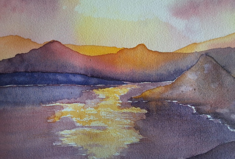
2. Art supplies: Hello everyone, and thank you for joining me today with a class on how to do dramatic sunsets. We'll be doing it today with a color palette of four colors just for, so unlimited palette. We'll be using a cadmium yellow, French yellow ochre, Alizarin crimson, and French ultramarine. I like to use these colors because they worked well together on the page. And speaking of paper, we will also be using arches, watercolour paper from, I like using this paper because it is the best quality that I've found. I've used a few other types that worked pretty well, but what I can tell, arches is the best one I've come across so far. You can use other ones like Canson, Canson watercolor, which went around. This is when I first started out, as I found it was the best price, best cheap option for the price, the best paper. But if you really want to have a watercolor that looks good, you want 100% cotton and this does not have 100%. So I already pre sketched everything on here. They used a watercolor pad block. So all these different pages here are separate, but because of this gum, we don't have to worry about it pulling up and warping. It just stays flat the whole time, so don't take it off until it's completely dry. And you'll know because it's no longer cool to the touch.
3. The sky: Alright. I always start by wetting my brush. And whether it when I'm dipping in between, I always dip it and then kind of take off the excess. So the first thing we're gonna do is we're going to what this whole area and get this all wet. We're not gonna have it stopping. Just gonna have a glycerin with some water. Might be better to have a bigger brush. Urea, nice big brush. This is a one inch flat. I have a mimic Lewinsky because the actual Galinsky, the actual Kaminsky brushes cost quite a bit. I didn't get this one until this past year. This cost me 50 bucks, but It's not the quality of the brush that really makes a difference. It's the quality of the paper. So if you'd have, you know, not so good watercolor paints, if you don't have so good of brushes, that's okay. Is the paper that really makes a difference. Again, I dip it, take off the access, but then again, I'm doing a wash so there's no need for that. So just cover the whole thing. And these mountains are gonna be behind the sun, so are actually in front of the sun. So the sun is going to be somewhere around here. These ones are going to be in front. So I'm just going to kind of go around this mountain because I don't want it to be included. There we go. And then these mount, these mountains here or on this horizon line, they're going to be included with the sunset. That's going to be easier to differentiate. Now the sun, we're not gonna do a big round circle right here. We're just going to imply that it's there by having a bright spot. So wherever you're painting, have a bright spot, picks somewhere that you're gonna leave mostly white. We're going to come in later with the cadmium yellow later. Now, doing it now are doing yellow ochre, Alizarin crimson, and the French ultramarine. Alright, now we're gonna go back to our small brush. And I'm gonna sketch this in, so it's a little easier to see. There we go. Again, I like to dip it first before using it. And we're gonna start with this yellow ochre color. That's very nice. And here, yeah. I'm going to say that the color of yellow is going to be right here where the sun's picking through. Oops. If you accidentally put your brush, if you accidentally put your brush into a paint, just wash it off. It's no big deal. And more of this color, I'm going to kind of Put it around a few places. Near we go. Alright. And then we're gonna have this beautiful Alizarin crimson coming in here. Well, like I said, this is going to be a dramatic sunset. So we're going to have all these beautiful colors mixing together. I'm gonna go in with some of this purple. Now the, this blue color, this ultramarine. We'll use that to mix up the purple. I'm gonna put some ultramarine blue in there later, but right now it's going to be mostly these purples. And sometimes you can get a really nice effect if you pull up these colors. Have them kind of wish around and spread. And I think that this read is a little bit too much. I'm going to tone down these roads a little bit. Now it's okay if you're mixing the colors here, they don't need to be perfect. That's my dog is a cute little dog. She's a mutt off to get a video of her later. So I think I'm going to have some sunburst go this direction because right now this color, it looks a little funny. How do you get a sunburst? How did you get a sunburst? You are going to take your water and add it here and let it spread on its own. Silica that might take some more this yellow ochre that C, and take some of this excess off. All right. We might not even need the cadmium yellow, but we'll see. Haven't decided if I'm putting it in there yet. Let's get some more this red. Wanna put it. Now what I'm doing here, I'm actually using just nothing. I'm just using the water to take away some of the paint as already partially dry. And now that you don't have to do this, I'm just seeing and experimenting and seeing how it looks. There's some color here that's mixing funny. I'm just gonna pull that up a little bit. Now you can do the same thing with the brush with water to pull away some paint. I'm also using this here. Have a chance of overworking this section. If I go too much. We're going to leave that to dry. And we'll move on to the next section.
4. The Mountains: It's completely dry now so we can start with the mountains. Go ahead and let your brush if it's been dried since since the painting dried. Let's see which one do we want to go on with first? Reuse this smaller brush? Because we're going into the background mountains first. Go ahead and dip it into that yellow ochre. And we're gonna do some really far mountains. So here I already have go ahead and color it in. And we're going to just do the first wash in yellow ochre. Suppose one way to do is just to bring it all the way down. Not sure yet if that's what I wanted to do. Minus well, go ahead and get this all wet. The entire thing. Fill in those mountains. Maybe not bring it all the way down because we're going to use more purples at close. And then just to create a little bit more drama. And take some of this red gum with the sides. Further away you are from that burst here of sunlight. More dark. It's gonna get away from the center. And there's that first layer. We're gonna go ahead and let that dry. And then we'll get down to the next layer of the mountains are gonna do this three different times. Before it's completely dry. I forgot that maybe we wanted to have a little cadmium yellow in there. So go ahead and dip your brush into the water and just grab a smidge of the cadmium. And we're going to be directly below where that bright spot is. So while this is wet, just put a little bit of this yellow here. And that's it, just a tiny bit. We just want to draw some attention to that center point so that it's attracts the iWork. And then we're gonna go ahead and let that dry. Then do the next part of the mountains. Next mountain. Go ahead and get some of that purple. I mixed a little bit more red into this purple for the third set of Mount or second set of mountains. And I'm going to start from this edge. That might be a little too dark and get some of that red. Because once we get closer to where the cadmium was, it's going to be a little bit more bright, so reds brighter than per ball. And the purple has ultramarine blue in it. And that does not like to mix very well with cadmium yellow. Still be that purple on the bottom though. Let's get a little bit more darkness down here. Back to the red, because we're going back to the center. And then gradually go back to purple. Does not have to be perfect. But take a little bit of this, just go ahead and grab some water onto your brush, wipe off the excess. And just kind of lightly. Go through it. Even wiping off some of this on a towel. My actually help more. That may or may not work, but that's okay. We are not looking for perfection on this one. And when you are actually pulling the when you're actually pulling the paint through here, usually in the water, do the work. You're letting the water spread the pigments for you so you don't ever want to put your brush on the same place multiple times and then you're just going to be working up paper, even arches, which is a 140 pounds in this case, a 100 and cotton rag. It has more resistance to having the paper pill. But I would still suggest not going over the same spot while it's wet more than three times. So I'll go ahead and let that dry. I guess we can do the next section just because it's over here and it's dry, it's not wet. So I'm just gonna go straight to, let's see, I'm going to use the yellow ochre again for the top part. And I'm just gonna going, I'm going really close to this edge here, but I'm leaving just like this burst, the barest smidgen of white. I'm not touching the purple and then having it bleed. Now this part here is already dry. I'm not touching it. So I can go ahead and go over that. And then I'm gonna go ahead and go to the Red. Now I'm going to switch to the bigger brush. Again, I always like to dip it, get the excess off, and then go. This is an entirely different Mountain. Is closer to the camera and may or may not keep this little red section here. Might go like this because I want to create a shoreline. Yeah. And then this is kind of going this direction so you can just lift up your paper and then it will start going this direction automatically. And you can help just a little bit as well. Can kind of pull it. See that that bloom could have been really nice on a flower or other pieces of paintings, but I didn't really feel like having a bloom, So I took, I took it away. They're going to make that edge more defined. And if this is, if I decided this isn't dark enough in the foreground, you can go home, go over it one more time. That's the beauty about watercolors. You can just keep adding layers as long as they're dry as it since it's all wet right now, I can keep adding more paint and more paint, more paint. But they won't necessarily look the best. I think that having a few different colors mix, then dry is the best option because then you can go over again later and then darken it. If it's not dark enough on that first time going around drawing. Remember to wipe off your brush. So decide, now this part here is all dry, where it's kinda drag left a mark there. I'm gonna do this part right here. Since it's separate and this is going to be just all purples. So this is going to be the ultimate foreground. And I'm gonna go over this part several times because I want this to be really dark right here. In fact, I might even go a little bit higher. There we go. Again. What's pulling off the excess? Wiping out there? Getting it drives not completely gone, but I'm gonna be using purple again with this brush any way. So there's no need to worry. Now since the foreground is wet and also this mountain here still wet, i'm not going to do the lake yet. The lake is going to be last. Because when it comes to reflections, you want to know what it's going to be reflecting. So you want to do all of the background, you want to do all the middle ground. Foreground doesn't matter so much if it's in front of the water, but anything that is next to or beside or behind the water. All of that needs to be done first before you do the reflections because any no, where certain parts are that are reflecting. And I'm gonna do a really simple one to show you. I could do a really simple one to show you that I have found who looks really good, but it doesn't take a master to complete. So we'll be doing that next.
5. The Lake: Okay, we're gonna get onto the reflections. This is going to be a lot of fun because it's really fast. So pay attention. We're going to start off with a round or if you have more of a calligraphy sort of brush, they're nice to use because we're gonna be using it discussed scrape across and have a shine effect for the water. Alright, so go ahead and get it. Well, let's go ahead and wipe off the excess because that's how I always start. I'm going to grab all this yellow ochre that's left. And here's where the sun is kind of hiding behind these clouds, these very fuzzy clouds, like how it looks. And directly below we're going to leave some white. So remember, does kinda stumble across. I'll show you. Here we go. See you that kinda looks like waves or water that's being blown on by play it by some wind. K. And I forgot to mix a Purple Hotel and put that in there. And then while it's wet, We're gonna go across again. This is really fast. You have to make sure you do a quick grab a little bit more water and delude this purple because I don't want it to be too dark. Oops, prohibition had done that. There we go. It looks like I have to mix up some more while it's wet. You can still do it. A little bit more red in there. Okay, there we go. That's a nice purple. Ou, see that? Nice. So I'm going to have no Chinese towards the edges because you wanna keep your eye center mixture that the viewer is looking where you want them to look and to keep just the barest hint of a white edge here. And then I'm gonna kinda go across a bit in the K-T, some beautiful waves and stuff. And get a real class as you can try and leave a couple bits of water line, some white here. Go and get some more paint. And go ahead and get to the edge here. We want the Center to be the lightest part. I just coughed, so that's why some funny. There we go. We want the dark the dark to be on the outside, lights on the inside. And I'm gonna go ahead and go in here a little bit with this purple wipe some of that excess off. Then there's your beautiful scum link. We have the shine from Sun. You have the darks on the side to keep the eye moving towards the center. And there's a small spot. That's okay. If you don't want to have a perfect reflection of the mountain, where else you can do is you can take some of the darks and just kind of touch here, like just randomly and then have it kind of bleed downwards. Go ahead and mix up a dark. Now we have a nice dark purple and use that to make the reflections. So Ben kind of lifted upwards and kinda touched the surface. And then you can go ahead and move your brush through it. Kinda have come down a little bit. It looks pretty nice. So it's not a perfect reflection. It just kinda bleeds down. It looks nice that way. And we have a little bit more here. Remember, you're getting darker as you get closer to the camera. Ripping off the access again, maybe pulling it around a little bit more. There, it looks kinda nice. We're gonna do a similar thing for the background over here, but I'm going to dilute the purple a bit. Maybe not stopped quite dry here yet. Go in with a little bit more red. So it looks more like mountain behind it. And kind of pulling it. I'm still keeping it elevated up bottom, top so that it's still pulls down over here because it's not dry yet. Get some more of this purple because right here, since it's going downwards, I wanna make sure the reflection doesn't get too light. Even closer to this line. Having a few strokes going across just gives them another to the illusion that there's some wind on this water. And I think that's about it. We're just gonna go ahead and put something under it so there's a little bit of an incline. And let that dry ice is there's a little bit of bleeding that's happening here. Some blooms. I'm not sure I like that. So it's going to do a couple of adjustments and see if I can fix it. Little more dark here. There we go. All you have to do now assign it as how you do. What are reflections? It's nice and simple. Just scuttle your brush across the whole page. Leave some white areas so it looks like the sun's reflecting. And make sure to have the dark part. More dark colors around the edges just so that it brings the eye towards the center where the sun is.
6. Tips and Encouragement: Okay, well thanks for joining me on painting a dramatic sunset with the lake setting. The mountains were a little tricky because you have to do is dots instead of letting the water spread your paint. In the foreground part. This was a lot of fun and I'm gonna do some more examples on how to do some simple settings set. Look great if you use the right colors and if you use the right techniques, it's gonna take a little time to get used to using watercolors if you're still new to it. But I encourage you to keep trying. I know that when I first started out, my teacher would tell me, it takes a 100 paintings for you to start thinking that your watercolors look anywhere. You're good. Just keep at it. Keep painting everyday. And you'll get there.
 Suzy Paint N Simple, Watercolorist