Transcripts
1. Intro: Hello, my name is T0 and I'm
an artist, graphic designer, and urban sketcher who enjoy
sketching on location. I also create art digitally. In this course, I'm
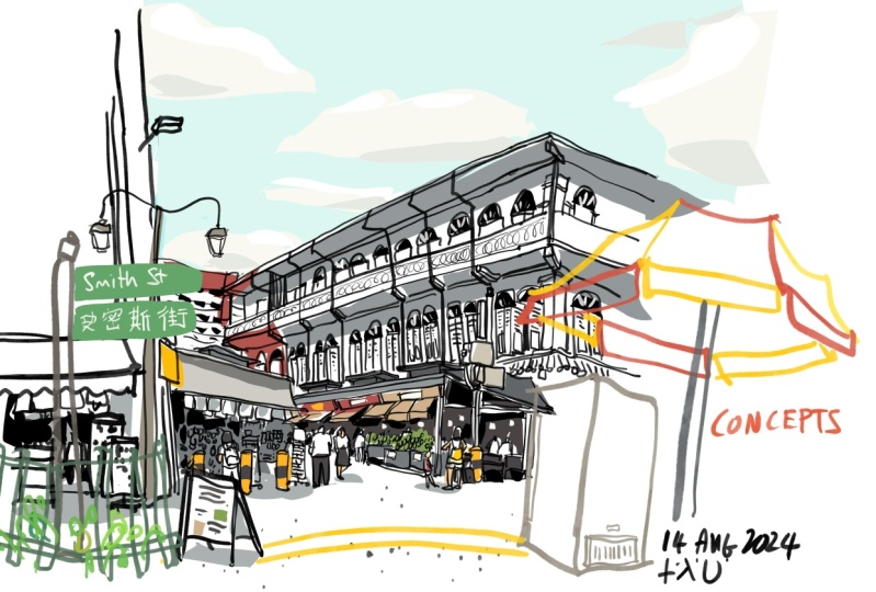
going to show you how I create this detailed
illustration or sketch of an old building in this neighborhood using
this app called concepts. Now this course is at the
beginner to intermediate level. So you will need to know
the basics of using concepts in order
to follow along with the lessons smoothly. If you have not used
concepts before, I highly recommend you check out the beginner courses
that I have created four concepts before you
start on this course. And in this course
we will be using some paint brushes
which are not free. Because those paint
brushes can create certain effects that free
brushes are not able to. So you will have to spend some money to buy those brushes. Concepts is a really
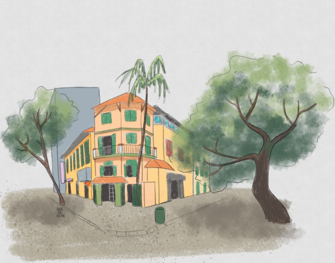
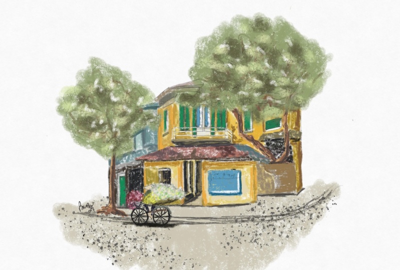
fun app for sketching. And these are some of the other artworks that I have created. We have concepts. By the end of this course, you should be able to learn the techniques that I use for
sketching and for coloring. And you can use
those techniques to create sketches like
this for yourself. The reference photo
will be provided so that you can follow
along and after you have completed your project or your sketch do shared with me so that I can have a look
and maybe give you some pointers on how
you can improve. Before we start
the first lesson, I have a favor to ask of you. If you find this course useful or helpful to live this cause a review so that you can help other students
discover this course. Alright, let's go to
the first lesson.
2. Tools and brushes needed: In this lesson, we
are going to look at the tools and
brushes that are needed to create this sketch and this 2s and
brushes are not free. You have to buy
them and buy them. Just tap on this button
here at the top right. You can also tap on the button from the main gallery page. Concepts is free to use. However, sudden tools
are locked behind a paywall and we need to
buy some of the tools. So tap on one-time purchases. And by the essentials set, which will unlock
infinite layers. And several File export
formats such as PNG and PSD. After buying the essential said, we will buy some brushes. So to do that, go to
your gallery page and tap on the plus button here
to create a new canvas. For me, I will open
an existing file. So right here under
the Tools palette, just have one, a two, and tap again to show
this pop-up box, which will show you all the brushes that
are available for you. These are free brushes, and if you scroll down, you will see the online
store for the brushes. I have already purchased
all these brushes because I do find them
to be quite useful. So these are the
different galleries and these are all
onetime purchases. So the categories that
we need our pastels, because we need the chalk brush within the pastels category. Bypass dolls, we
need what a fool. Because we need
this brush that is, in this category or
in this group that is called splatter seven. And we need em blood textures because we need
the sponge brush, which is this one here. And lastly, we spray paints because we need another
splatter brush. Here. The essentials set and the brushes that you
have purchased are specific to the version of concepts that's running on
your tablet or computer. So e.g. I'm running concepts
on this Android tablet. So all the brushes that I
have purchased will not be available for the
concepts app that I also have on my Windows
computer or on my iPad. So if you are using concepts
on multiple platforms, you will have to
buy those brushes. Again, let's take a look at the brushes we have purchased. The main brush for
drawing is going to be the soft pencil brush. And if it's not available
here under the Tools palette, just go into the brush
settings to look for it. And it's here, soft pencil. This brush reacts
with pressure to give you the faint
and darker lines. And this brush also has
to, to sensitivity. So if your pen supports tilt, you can tune your pen to get a draw those
broader strokes. This soft pencil brushes
quite versatile. The next brush is chalk brush
that I use for coloring. Chalk brush also reacts with tilt and pressure sensitivity. So if you want to
color small areas, you can hold a pen more upright
to color the small areas. If you want to color, broad areas are bigger areas. You can just cute pen or a
brush to color a larger areas. You can save multiple twos here. So I have another chalk brush beside with a different color. So this allows me to switch
between colors very easily. And it can help me save a
lot of time when it comes to coloring my sketch. The next brush is the
sponge brush that I use for painting trees and
leaves and also clouds. So this is the sponge brush. Let me change to
a lighter green. So this is a beautiful
texture brush. And I can create light, the pockets of light that is coming from behind
the tree as well. You can see the
edge of the brush. It's textured. So if you look at
this brush from afar, it looks like the
texture leaves. And I can add some
darker sheets here. For the shadowed areas. What a shaded areas. And this brush also
reacts with pressure. So if you don't need your
color to be debt dark, you can just press
on, tap lightly. And this can be used to
create clouds as well. So let's have some gray
clouds in the sky. So this is quite
versatile brush as well. The next brush is
the splatter brush. So this is the brush
that I use to create textures on the ground. I like to have this
brush at 100 points, which is the largest width
you can get for the brush. And you can just create
splatter marks by tapping on the canvas
or just drag around. The next brush is also
a splatter brush. This is the splatter brush under the watercolor brushes category. So this brush, let me
just increase the size. Has more variation in the
sense that you can get small splatter marks and
very big splitter monks. And split the marks are
quite random, which is nice. So compare it to the
previous splatter. You can see the splitter here of finer or coarser texture
or more obvious texture. You can go with the watercolor
splatter instead of the spray spray splatter. So those are the brushes that I have used to create the sketch. Let me zoom in closer
for you to see. So I have the colors, the chalk brush beneath
the soft pencil brush. And all these
little red dots are created with the
soft pencil brush. And here for the tree, this was painted or drawn
with the sponge brush. You can also
increase the size of the chalk brush to draw
or paint the leaves. But I prefer the sponge brush for the texture
which is quite nice. Here. At the bottom on the ground, we can see the finest splatter and the watercolor splatter. So this will help you
create more texture in your sketch to make your
sketch look more likely.
3. An essential drawing shortcut: In this lesson, I
want to show you an essential tool
that can help you with drawing complicated line
art using the concepts app. More specifically, how can you delete lines accurately
using the locking feature? E.g. here I have a
building which is behind this tree and you
can see the tree overlap. So how can I delete the
lines for the building without accidentally deleting
the lines for the tree. It's actually first and bone
or you have to do is use the arrow selection tool
and use the lasso or the item selector and select the lines you want to keep
and lock those lines. And now go back to the eraser. And now you can erase
the lines behind this tree very easily without accidentally erasing the tree. So this is a technique that I use when I draw very detailed
sketches using concepts. And to unlock those lines
that I locked earlier, just select the layer
with the lines, select the arrow tool
and tap, Unlock. All the elements on
that layer will be unlocked for this to work, the line that you want to protect must be a
continuous line. E.g. if you have drawn tree like this with several lines
joined to get there, it will mean that if you
want to protect the lines, you will have to select
those lines individually. And it's quite tedious because you will have to select those lines
and not other lines. So if you have drawn the
lines with a single stroke, you can just select
that line in one step. So that's the technique
that I use to create a line art for this sketch. More specifically in this area, I have drawn the tree in
front of the building. So I locked the tree to erase
the lines for the building.
4. Creating the line art: Welcome back. Now this main drawing
project will be split into three parts. The first part that
you're watching now is on creating the line art. The second and third part will be on coloring and
creating textures. This sin can be considered complicated in the sense that there are many
details to draw, but it's not a particularly
difficult scene to draw. If you fire seeing
challenging or difficult. My recommendation is
to start by creating, drafting license verse, such
as what I'm doing right now. So create the big shapes
to draw the building. Make sure you get
the perspective accurate at a
startup, this sketch, if not, the wonky perspective
will affect you later on. So it's very important
to make sure you get your perspective accurate
at the start of the sketch. One way to help you draw accurate perspective from
observation is to sort of step away from your
sketch and look at your scene and see whether or not the angles
are drawn correctly, see whether or not the
proportions are drawn correctly. So try to identify
any mistakes that you make during this this
drafting process and avoid making the
same mistakes when you ink or draw the
lines later on, you don't have to worry too much about composition
because concepts, app, features and
infinite Canvas. So you can draw on and on and you will not
run out of space. So the most important thing at this drafting stage is
to draw the big shapes. Divide those big shapes
into smaller shapes and makes sure your
perspective is accurate. Now that we have drawn
the drafting lines, we need to reduce the
opacity for the layer. Drafting lies. And I have reduced it to 30%. I've just created a new layer
for the pencil line art. And this is where
we will draw on top of the drafting lines. Make sure the pencil lines
are on the pencil layer and the drafting lines are
on the drafting layer. With the drafting
lines as my base. I can now draw the individual
floors and stories easily with the
correct proportion. So having the drafting
lines at a start really helps with saving time. And if you have
made any mistakes during the drafting stage, you can easily avoid those mistakes while
you draw the sketch. The building or the war on the left side has
compressed perspective. And it will be easier
to draw that wall if you have the vanishing point
drawn out at a startup, because if you don't
find a vanishing point, you will have to draw those
angles that are affected by perspective using
observation techniques, which is actually
what I'm doing here. Just draw those diagonal
lines at the correct angle to create the illusion
of perspective. Growing the windows
and sign pots on the wall that has compressed perspective can be
quite challenging. So it is important to make sure that you have
drawn the beak shape for that war accurately so they can place the windows on
that wall accurately. The things that I
disliked drawing our bicycles and motorbikes because of the irregular shapes. So when drawing
motorbikes and bicycles, I get mental fatigue
quite easily. If you want to draw
anything accurately, you will have to spend the
time to observe what you're drawing for
challenging subjects, or it can get quite tiring
mentally to draw them. The nice thing about drawing
digitally is you can erase lines that are
beneath other lines is Lee. So here I'm drawing
the tree in front of the building and I need to erase some of that lies beneath, such as the windows
and assign bots. So as shown in the
earlier lesson, you can lock the
lines for the tree, and this will help you erase the lines for the
buildings behind without accidentally erasing
the lines for the free. And I have just added a very tall building
in the background. Just to create this
sense of foreground and background fill to make the
sketch look more dimensional. Once you have drawn
the big shapes, you can then add the details
within the big shapes. Once I've drawn the walls, I can draw the
windows on the walls. And once I have drawn the
shapes for the windows, I can draw the details
for the window panes. Rails. When you're drawing windows
on different floors, makes sure that Windows
and align vertical Lee. So the windows on the
second floor should be directly above the windows
on the first floor. And chances are the
windows will be directly beneath the dog
on the ground floor. If there is a door on the
ground floor, while drawing, it can be helpful to think of negative shapes and think of how you are going to color
your sketch or later, e.g. with the open
windows you can see the interiors are kinda
dark, almost black. So you can color the interior
lag and you can use white to draw the frames that we
know frames are the reals. And for areas with solid colors, you may also want to
use a lighter color to draw or paint the
negative shapes later on. So continue to draw and add
more details to your scene. Have overlapping elements
in front of the building, have the trees overlap the buildings and have foreground and
background elements. This will help make your sketch, make your scene look
more dimensional. When it comes to simplification,
it's quite easy. Just add as much
details as you can. And when you run out of
space to add details, just leave out those details. That is how I
simplify this sketch. It would be good to zoom out of your sketch to look at the
overall scene once in a while just to see whether you have overworked certain
areas or whether you need to add more details
to certain areas. When drawing trees,
you don't have to draw all the leaves for me. I just draw the boundary for the leaves and I also
add some little dots at boundaries just to suggest
details and make sure to draw the branches
at correct angles. And lastly, there is this coconut tree in
front of the building. I have used a single line to draw the tree trunk
instead of two lines, so I don't have to color
the tree trunk later on. And this is me adding little
details on the ground.
5. Adding colours: Now that we have
completed a line art, it's time to add some colors. And this is where
you will need to know how layers work in concepts costliest work a bit differently compared
to other drawing apps. Now if you look at the top
of the layers palette, you will see this
option called salting. And there are two
types of salting. There is automatic sorting
and manual sorting. If you choose automatic, each time you click
on a tool such as a pencil or a pen
or chalk brush, a new layer will be created
for you automatically. So if you are drawing
with a pencil, you will automatically be
drawing on the pencil layer. And if you want to add
colors with the chalk brush, it will switch to the chalk layer or the pastel layer
automatically for you. So you can switch
between the 2s and the layers will switch
for you automatically. And this can help you
save a lot of time. If you have the layer
settings set to manual, you will have to
create a new layer manually for whatever you
want to draw on the layer. And each time you want to color, you have to select the layer
first before you color. And if you want to
draw a line art, you have to select the layer first before you
draw that line art. So this is a bit more tedious compared to automatic sorting, but you get more control. So right now I'm actually
using the automatic setting. And when I select
the chalk brush, a pastel layer was
automatically created for me. And it just happens that pastel layer is
beneath the line art. So when I color, you
can see the line art is on top of the colors. If the pastel layer, for some reason he is
above the line art, you will have to drag that layer down
beneath the line art. And doing so may change the sorting from
automatic to manual. So you will have to change the sorting again
back to automatic. Now the coloring process is actually pretty
straightforward. I'm just copying the colors that I see from the
reference photo. When coloring, I recommend
you color the big shapes first before you
add the details. So this is kinda
similar to drawing. When you're drawing, you
draw the pink shapes first before you
add the details. So I start the coloring process by using this muted yellow, this warm yellow to
color the building. And the building has
to be colored first because the details
are on the building, the windows and the details
are on the building. So you have to add color
for the building first, followed by the colors for the windows which are
on top of the building. It will take some time to understand the sequence
of adding Hollis, because certain colors
have to be added before. There's, the chalk brush that I'm using is
actually opaque. So if you make any mistakes, you can just choose
another color to paint over your initial colors. Notice I call it the yellow building with two
sheets of yellow, it would be good to
introduce additional sheets of color even though
you aren't just coloring one big shape. This is to make
your single color look more interesting, e.g. when I'm coloring the tree, you can just see
this single color which is not interesting. So you have to add
more colors to create more details
to make that color, that **** or that area
more interesting. So after the big shapes have been added, have been colored, it's time to add little details such as the
colors for the rooves, the sharps, the shadows for the ground floor,
the black windows. The coloring process is
pretty straightforward. So I just select the colors
from the color wheel and that matches the reference
photos for the black. And I'm using right now, this is not black, black. There are several blacks
from the color wheel. This is actually 100
black or 110 lakh, which is not as black
compared to black black. If you choose the black, that may be too dark. So it may actually draw unwanted attention to
how dark that color is. It may draw attention to the extra contrast
provided by that black. I'm coloring the
interior of the window with this lighter black. And later on, I can add
some white lines to suggest the window frames or the
grills in front of the. So at this stage you can see the sketch is almost complete. After adding more
D tilde coloring. Just look around
your sketch and see where else you may
want to color. And notice at the
top right there, I have white lies
over the black area. I have intentionally left that area with a light yellow so that I can cover over
it with black so that I can draw the white
lines over the black. Now I'm just adding some
shadows, believed the rooms. Just to create this effect
of light and shadow. Just to make the sketch make the building look
more dimensional. It is possible to color this sketch with the
soft pencil brush. But if you do so,
there will not be a new layer created for you
automatically for the pencil, which is why I'm using chalk because chalk is a different
category of brush. So a new layer will be created for this chalk automatically. If I need to add line art again, and I select soft pencil, I will switch back to
the soft pencil layer automatically and
back to coloring. So the leaves that
you see were actually colored with the chalk brush, which are used accidentally. I should have used
a sponge brush to paint the leaves because
the sponge brush is great at creating those
little pockets of light that goes
through the leaves. Right now you can
see the leaves, they are just read, there is no pockets of light that goes
through the leaves. In the next lesson, we will add some textures.
6. Adding textures: Adding textures
to your scene can make your scene
look more lively. So right now I'm actually adding pockets of light into the leaves because I had used the wrong brush to color
the leaves earlier. If I had used a sponge brush, those pockets of light would have been created automatically. But now I actually have to use the soft pencil brush to add
those little white spots, those short strokes of colors. It would be good to
create the leaves. I'll paint the
leaves and trees on a separate layer so that
if they don't look right, you can turn off the layer and try a different coloring style. If you look at the layers
palette on the left side, you can see I have
actually painted leaves on a separate layer. It would be good
to name the layers because the name of the layers that I have
now, new layer one, new layer two, and
exactly descriptive, which is alright in this
case because I don't use that many layers
for coloring. So now I'm choosing the
soft pencil brush to add more details
on the ground to create more texture
on the growl. Now this photo was
taken on a cloudy day, so there are no cast shadows. But it would be good to add some shadow effects just
to make your building, just to make the subjects
look more dimensional. So this is where you can use your artistic license
to add shadow effects. The foreground doesn't look very interesting
now because it's just this one Grieg handler and it's just this
single warm gray color. So I have just selected the splatter brush just to add some texture
to the foreground. I have a darker 1 gy added, and I have switched to
a white splatter brush to create white splatter. Notice how I keep
coming to this tree to create the pockets of light. If you have painted leaves correctly at the
start of the sketch, then you don't have
to do what I do, which is to correct
the mistakes. Even though the reference photo doesn't show the tree trunk. I have drawn the tree trunk and additional branches just to make the tree on the right side
look more interesting. I'm going to add some
shadows on the ground later because under the tree
it's usually quite dark. So I'm drawing additional
lines for roads. So you can definitely use
your artistic license to add more elements in the scene, even though they may not
appear in the reference photo. Notice I'm using the chalk brush again to color the leaves. I still did not
realize I should be using the sponge brush. So this is me testing
out different colors, testing the darker greens
to create automatic. The bottom side of
the tree, darker. Just below the tree there is this white area that
is not covered yet, so I need to color that. If not the white area, we'll draw our attention to itself because that's the
only white area there, whereas everywhere
else is colored. That's the shadow. Notice the splatter marks are actually on a separate layer. So when I add the shadows, you can see the
shadows were added between the splatter marks
and on top of the road. If the layer sorting
was still automatic, when you add a splatter marks, a new layer for the
splatter marks will be created for you
automatically. And if you need
bigger splatters, you can use the
watercolor splatter. And if the layer
sorting is automatic, new layer for the
watercolor splatter will be created for you. Remember to write the date and the name of
the place and sign your name after you
complete your sketch. And usually I will
have the date, the name of the place and
my name on a separate layer so that I can move
those elements around. Here I am actually signing the name and the date
on the pencil layer, which I should not do so. So that's another mistake, but it's a very,
very minor issue. The one last thing you should do after you complete
your sketch is to add an empty layer on top of all other layers
that you have. This empty layer will
protect your artwork. So if you introduce any stray
strokes on the artwork, those trays, drugs will actually go on to the empty layer. And you can delete that protective layer to remove the unwanted
straight strokes. So that's that's a tip
that I have for you.
7. Export your art: After you have
completed your sketch, you may want to export your
ad to share online and do share out with
me because I will love to see what
you have created. So let's say I want
to export my sketch. The first thing to do
is I will want to hide the Layers palette so that I
can see my sketch properly. I will zoom into the
frame that I want to export because I actually
want to export a screenshot. This is the frame that
I want to export. Now let me tap on
the Export button. I usually export my files
as PNG, which is lossless. I want to do a screenshot and I want the paper texture
to be included. And for the resolution, I usually go with 100 per
cent or 200 per cent. I find out if I
export the file at 400% at we'll just crash. Solo managers export this
at 200 per cent and tap on the Save button and choose the folder that you want
to save two and tap safe.
8. Experiment with different styles: In this lesson, I
want you to look at your completed sketch
and see how you can improve your sketch. For this sketch, I actually have the tree on its own layer, so maybe the tree
doesn't look that great. So I can actually hide
the layer here and create a new layer
for another tree that I want to draw or paint. Here I may want to choose
a different brush to see if the texture of the brush
is something that I like. And nope, it doesn't
look that great. And also the coloring
style looks kinda flat. So let me just hide this or undo the leaves and choose
a different brush. Let me just choose the sponge
brush that I really like. Oops, too big. Let's reduce the size. So this sponge brush
is nice because unlike the texture at the H. So you can test out different brushes on this new layer and test out different coloring style to see what works and what doesn't. So this is actually kinda nice. I may want to draw some
branches above the leaves. So let me create a new
layer and use this pencil, soft pencil brush to
draw some branches. So one nice thing about
this sponge brush is it can help you create pockets
of light are easily, so it's not completely green, you can still see
pockets of white. Another thing you may
want to do is to look at your sketch and see what are the darker areas and try to use negative shapes
to create interests. E.g. here I have window
which is just black. You can see some white grills
here in front of the black. But when the grills or above
the yellow color, It's like. So what you can do here is to use lighter value
against darker values. So I may want to draw
like this app works. So maybe I can draw a frame
here for the Glassdoor. Glassdoor. And this can help you create
more visual interests. So use a mix of darker values against the lighter values and lighter values
against darker values. This will make your sketch
look more interesting. The thing about using
lighter values against darker values is you have
to plan in advance, e.g. here with this electric box. I actually wanted
to color this with some dark gray color, but I decided to just use black so that I can create lighter
values against black. Another thing that's
quite fun to do is to create a frame
for your sketch. So you can see now I have colors extending all the way
to the left side. I've colored
extending everywhere. So you can do a screenshot
when you expand, fall or your sketch like this. Or you can actually add a
frame just to frame this. And I can add a frame using this sponge brush again that I like because I
like the texture h. Let me just test it on a
new layer that is created right at the top of the
line art and colors. Okay, this is too thick. This is alright. I mean, we get our ten
points around ten points. Now, you can use
this sponge brush, which is white to draw
the H to draw the frame. I can use this to
draw the frame here. And now I have a
rectangular frame, which actually looks quite nice. And when you want
to export the file, you can choose to export this
with the textured edges. And if you feel like the
frame doesn't work for you, you can always hide it
or delete that layer. Now the thing that you may
want to do is instead of using the black soft pencil brush
to draw another line art, maybe sometimes use other colors for the salt pencil, e.g. let's redraw this coconut tree that's in front with
some other color. So I have soft pencil selected. Maybe I can choose a brown for the tree trunk and just create a new layer
for this new tree. And use this new color is brown soft pencil to
draw the tree trunk. And the colored pencil
to draw the leaves. Just to see how it looks. Let's switch to a
darker color here. Hopes. And compare this, drawing, this tau with this, and see whether or
not it works for you. And if it doesn't work, again, you can turn off the layer
or just delete that layer.
9. Outro: Thanks for completing the costs. I hope you found the course
useful and insightful, and I hope you can
go on to create more artworks using concepts. If you have any
questions regarding certain techniques
or the app itself, feel free to contact me
before you go do live this course and
review so they can help me and other students out. Thanks for watching. See you in the next course.
 Teoh Yi Chie, Sketcher, watercolour lover