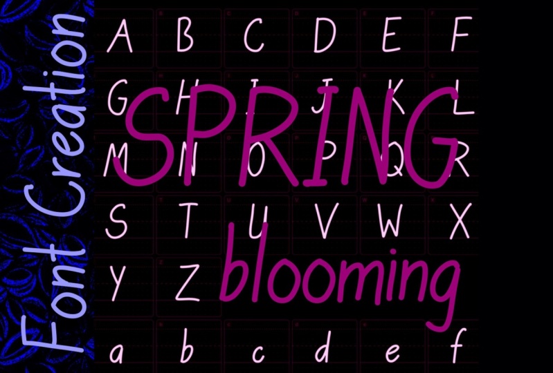
Transcripts
1. Class Introduction: Hey, everyone is Xhico. I'm so happy that you're
here with me today. I have been doing this for quite a while,
over 30 years now. And when I first got started, it was because of my
love of lettering, and I first started doing logo
designs and logotypes. I have been doing it ever since. And I always get
asked by people, "how do I turn my
handwriting into a font?" And you know what,
these days it is so easy. So I'm going to show you today how to turn your
handwriting into a font. All you need is an Apple Pencil and iPad and the right app. And you'll make a font
in less than 30 minutes. So in less than half an hour, you're gonna be
able to transform your handwriting into a font that you can then type with on your computer or your iPad. You can incorporate
it into your designs. You can incorporate it
into your branding. You can incorporate
it into logo designs. There's all kinds of
things you can do once you turn your
handwriting into a font. If you don't know
me yet, I'm Xhico. I'm an artist and designer specializing in its surface
pattern design and branding. Here's another look
at some of my work. I'm also a design educator, so you may have seen my
other classes on Skillshare, teaching design and
Adobe Illustrator. I also have a membership
for creative entrepreneurs to help them level of their design
and branding skills. That's called Multi Color Minds. Okay, Enough about me. Let's get into it, and we are going to make a font
with your handwriting.
2. What You Need to Start: You're going to see
that making a font of your handwriting is so easy, and you're not going to need much to get
this project done. They need about 30 min
to an hour of time. You're going to need
to be able to write. And it doesn't really matter what type of
handwriting you have. Just write whatever handwriting your natural handwriting is. You can take time
and print nicer, you can make interesting
shapes and draw more. There's all kinds of potential when you start to create fonts. But the way I'm gonna
show you today is a super easy way to capture your own writing and
turn it into a font. You'll be able to have it on
your computer or your iPad. And you'll be able to
use it on your projects, your branding, your designs, whatever you want to use it on, you're going to have your own
handwriting in a font. So you don't need much
for this project. All you're going to need is
an Apple Pencil and iPad. And you're going to need
to download this app, Fontself. So the first thing you wanna
do is download the app. Go to your App Store,
search for Fontself. And this is the app
you're looking for. It's just the app right here. Now you might be asking, "what is this thing on my hand?" This is a drawing glove. This is for heavy
handed people like me. And when I draw, I drag my hand on
the surface so this prevents unwanted marks
while I'm drawing. So I always use this with
whatever app I'm using while I'm drawing on the iPad
because I'm a heavy hand. I also recommend a
screen protector. I use Paperlike. I
love Paperlike. I love the feel of it because
it feels like paper, but it also saves your screen
from scratches and marks. So that's all you need.
Let's get started.
3. Fontself 3 Download the App: Okay, The first thing
you wanna do is go to the App Store right here. Once you've gone
to the App Store, you're going to
search for Fontself. It's this app right here. Download that to your iPad. Once it's downloaded
to your iPad, you're going to
see it right here.
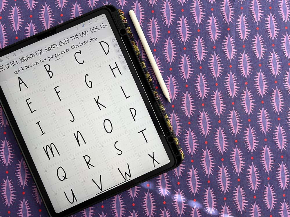
4. Fontself Overview: Okay, Now that you have Fontself downloaded to your iPad. We're gonna do a quick overview. When you open Fontself, you're going to see a
lot of options here. And then these are
the fonts that you can be working on down further. They have hand, curl, scrib, goth, graf, sans. These are just guides for you. So you see if I open sans, there's a rough
sans guide here. Open goth, there's a
rough goth guides here. If I open hand, there's a rough
handwritten guides here. This Home button
takes you back to the homepage that
I'm seeing here. These two are drawn
by proportions. Okay? I prefer to use this one
to draw my handwriting, the one to one to one. This feels more
like a school text. The next thing is
to know is here you have settings, and this adds
things like a grid, for example. You can see a fine
grid pop-up here. I prefer to keep my grid on. This has Help. This has Undo, Redo. This is Select. This is the Drawing Brush
that you're going to use. This is an Eraser.
These are tools. After you design your font, you're gonna look at letterspacing and wordspacing. We'll look at that later. And this is where
you're going to be exporting your file
when you're done. Alright, let's get into the next lesson and
get into drawing.
5. Brushes & Erasers in Fontself: Before you start
drawing, you're going to want to select your brush. When you click your
brush and hold down, you can see it pops up
with different options. You have a Brush, you have a Pencil, you have the Scrib, you have the Qalam, you have a Marker. You can suggest other
brushes if you want. You also have the
size adjustment, the thickness adjustment,
the pressure adjustment, which is the sensitivity. You can see this in getting
a little bit more narrow. That's the pressure adjustment. And streamline is a
really nice tool that makes your hand look a
little bit more clean. So this is more wobbly
if you have zeros streamline and this is a little
bit more of a clean line. If you have line, I like to use the brush. You can see here
the size variation. You have roundness. You have the pressure again, and that's where you
get the size variation. You have the angle at
which you're holding it. And then again you
have streamline. So you want to go through and find the tool that's
right for you. I think I'm going to use Brush. And I just like to test
and see the way it feels. And you can see as I write, it's filling in
the alphabet here. This placeholder,
"The quick brown fox jumps over the lazy dog," is a placeholder often used by typographers when
they're designing fonts. And it's because it has many of the letters
of the alphabet. And it also uses the essential shapes that
are varied in every letter. So you can go here and
keep refining your brush. I might want to go a
little bit smaller. I think I want to have
a more even lines, so I'm gonna do less pressure. And I think I'm gonna go
a little bit smaller. I like my roundness to be
100 and my angle at 90, and I'm going to allow more streamlining so
it has a nicer effect. So let's test it here. So that's what my
new brush looks like compared to this brush. Alright, so you want
to go through and find a brush that's
right for you. I might wanna go a little bit
thinner for what I'm doing. And that feels right to me. So I think I'm going to
rely on these settings. Size 50, Roundness 100%
Pressure zero, Angle 90. And I'm going to keep
it on Streamline. And I'm going to keep this off. This is actually would control that pen
direction of this pen. But for this purpose I'm going
to keep this off. All right. So get your brush set and we'll get drawing
in the next lesson. Before we go any further,
let me show you how the eraser works.
That's this tool here. You can click this and you can adjust the size
of the eraser. And you can also use trim
strokes for this lesson, we're just going to adjust
the size of the eraser. We're going to adjust to large. Then you can go into
each of these cells, then erase, wait
for it to release, and then you can go to the
next cell and release. You can also zoom
in by pinching. And you can make a smaller
eraser and make smaller edits. That was not small enough. So you can make little edits. But in this case
we're just going to restart our whole alphabet. So we're gonna get a larger
eraser and erase everything. Now it's time for us to
draw our handwriting.
6. Drawing Letters for Your Font: Okay. You have your
brush settings set. Correct? And now it's
time to get drawing. So what you need to know is that this dark line
is the baseline. That's the bottom of
where the letter sits. This top line is
your cap height, that should be the top
of your capital letter. And this is the midline. Anything that got drops down
here like a lowercase g, This would be the descender. Alright, so just go
through the alphabet here, try to keep on the baseline. I'm gonna move to
the next letter. And you can just
see it filling in. Now I didn't get down to the baseline and it's
going to look up higher. See how that looks higher here. So you're always
looking at your preview to see how that looks. So I'm gonna go Undo, and I'm
just going to redraw it. That feels better, it
still feels a little high. So I'm going to go back and maybe give it some
more character. There we go. You can see it's filling in the
entire alphabet up here. I went too low here, so I'm going to redo that. Don't forget, you can zoom in if you're comfortable
drawing larger. This depends on how
your hand moves. So find what works for you. The great thing
about Fontsself, is you don't have to
get anything centered. It's not super technical, like a lot of font
design programs. So it automatically is
arranging the letters up here with the measurements
it needs from side-to-side. For it to work. That looks a little tight
on the Z. I'm going to make the top of the
Z a little smaller. I like that better. Okay, That feels better. And now we're gonna
do the lowercase. Now the lowercase, you
don't have to do lowercase. You could do an
alternate version. So, for example, if I wanted
the same case, I could do that and
have it all be a mix. So I could do another alternate "B" if I wanted a wider be
compared to this narrow "B," I could do a "C" without the
serif that this one has. So I could do alternate
versions of my font as well, or I can do lowercase. So now we're gonna do
a lowercase like this. With lowercase, you
just want to pay attention to this x-height, which is this distance here.
Let's zoom in to the "x." It's called the x-height
because it goes from the baseline to the x-height. So that's the measurement
called the x-height. You want to always pay
attention to the x-height. And then where your ascender, which is going up ends, and where your descender, which is going down. So like a "G" ends. And we would have that with a "P." Now you can get technical
and pay attention to the grid that's smaller here, these smaller dots and have
the end at the same spot. So, for example, I want my might want an "L" to go all the
way to the top. Whereas I want the "D" and the
"B" maybe to stop shorter. So I might erase it like that. But you can see how it made it blunted, and I want
to keep it round. Here's where I would
use trim strokes. And I'm going to undo that. Erase. And then
I'm gonna go here. Trim strokes is on. And I'm going to trim this down. Now you could see it
kept around point because it actually trimmed the stroke that's
underlying there. There's a vector
underlying there. And if you've taken my
Illustrator classes, you know a little
bit about vectors. So you can see how
that trim the stroke. So now when it lines
up in the alphabet, the "L" will feel
taller than the "D," and it will feel better when
it's against the letter like an "i," for example. Okay? So you just finish
writing out your letters. And the other fun thing about this is you can do
this over and over. You can do this in
all different styles. You can have friends and family
do their version for you. And you can have
different handwritings. Or if you know someone that has really cool handwriting,
like my grandmother. Alright, so we've completed
the lower-case alphabet. You can see over here
these little symbols. What these do is take you to
the section of the fonts. So if we click 09, That's going to take
us to the numbers. So now we have numbers to do. If we want a full,
complete font. That's cuter. Alright? And then we have punctuation. You can see I'm just following the little symbols up
here in the corner. And it's going to assign it
to all the right keystrokes. All right. That completes
all of our font. That looks good. I think
it's time to export.
7. Letterspacing & Wordspacing: Before we export, we want to
look at a couple of things. We're going to
adjust the settings. This is the letter spacing. You can see how the
letters get further apart and tighter together. So you want to set
your letter spacing. I think 60 looks good for this. And then the word spacing, the spacing between the words. You wanted to have
enough of a gap to be able to tell there's
a different word, but you don't want too much of a gap. That looks too funny. So think about how it reads
and how it feels natural. Maybe 1200 feels good. I think maybe if you go a little bit more on the word spacing. Okay, That feels good. Now that we have
those settings done, it's time to export.
8. Exporting Your Font: Though the app is free to
download and draw in. When it comes time to exporting, you actually do have
to make the purchase, at least at that moment, if you want to export your font. You'll be prompted to do
that when you do the export. So you're gonna go up here
to Export, Export Font File. And I'm going to type the
name of my font, Xhico hand. And then I'm going
to click Export. It's going to ask me where
I wanted to save it. So I'm going to
click Save to Files. And I'm going to save it to my Desktop so I
can find it easy. And I'm going to click Save. Alright, it's saving
to my Cloud right now. And the next step is to open it on my computer and
get it installed.
9. Install Your Font on Your iPad: Okay, let me show you
how to export this to use on the iPad. We're going to Export
it and we're gonna go Save to Files. And I'm going to save
this on my iPad. And I'm going to
create a New Folder. Fonts. Click Save. And here is my name. And I'm going to click Save. Okay, Now that our
font's exported, we can go to Adobe Illustrator. You're going to
use your type tool and you're going
to type something. We're gonna go over to
our Properties Panel. We're gonna go right here
where it says your fonts were any click Add, Add More. We're going to find
that font we save on an iPad and our fonts folder. I'm going to click that font. And
"you've selected 1 font." Adding this to the Cloud. So now this font is
going to be synced across all my devices, and I can use
it on my computer as well. My font was added to the Cloud. Right? Then let's see
if we can find it here. Now. In here it is Xhico
Hand Regular. But okay, there's the
font I just designed. Happy designing, happy getting
your font into projects. And I can't wait to see
what you come up with.
10. Install Your Font on Your Computer: As I just showed you in
the previous lesson, you were able to
install your font in Adobe Illustrator and that
syncs to your cloud. So now here I am on my
desktop, on my Mac. And you can see if I go to
the Character Panel here, I have my font here
available and ready to use. And it's actually
the font that I used for all the titles
and this lesson. So to install a
font on your Mac, you're going to go to Font Book. If it's not in your dock, you can find it in your Applications. I'd like to go to My Fonts, and then I simply
drag and drop it. And it's going to say
"validating fonts." And then I'm getting the issue because I've
already installed this font. But I'm just going
to say "keep both." And it's going to deactivate
the other font. And here's my font. Now that it's installed
on my computer, I can use it in any app, including a simple
app like Pages. Down here, scroll to the
bottom and find Xhico Hand. And now I can type in
my own handwriting. Pretty cool, huh?
I don't have a PC, so I don't know how to
install a font on a PC. So if you are a PC user, you're going to have to Google
how to install a font on a PC or your version of Windows. Alright, It's pretty easy and I'm sure you'll be
able to figure it out.
11. Thank You!: I told you that was
using within it so easy. So now you have your own font
of your own handwriting. And I hope you share this class with other
people if you like it, I would love to see
your finished font. So when you get it finished, write a cool word
or type something and post it down in
the project section. Also, you can tag me on Instagram at #studioxhico. Make sure you spell it right. S-T-U-D-I-O-X-H-I-C-O. You can also find
me on Instagram @studio.xhico You can check out
my website here at studio-xhico.com And if you're interested
in learning more from me, you can join my membership for creative entrepreneurs
at multicolorminds.com I hope to see you there and I can't wait to
see your project. And if you love this class as
much as I love teaching it, I would love it if you
can leave me a review. Thanks so much. I'll see you all in next class!
 Xhico, Artist, Designer, Creative Educator