Transcripts
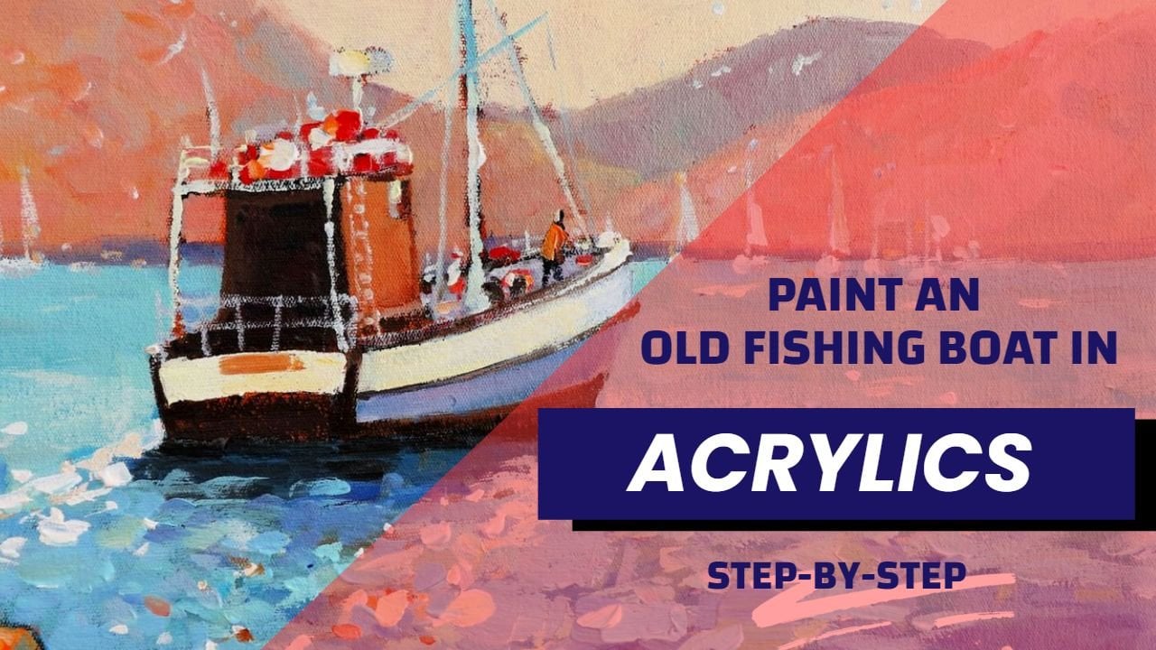
1. About the Tutorial: Hello and welcome to my
studio, Malcolm theory. And in this tutorial, you can to learn how to paint a contemporary still-life
painting in acrylics. I'll be going through
the materials and also the demonstration in a
step-by-step fashion, breaking up the demonstration
into sections with a distinct progress in the demonstration and the
development of the painting. And you'll be able to
use this approach in your own step-by-step version
of the painting as well. There's a reference
that you can download. I'm also going to
give you photographs of the process step-by-step. So you can have that also as a reference while you're
doing the painting. So if you want to try out this more contemporary
approach to acrylic painting, then this is the course
for you joining, watch the demonstration, download the reference
and the materials to help you create your own unique
version of this painting. I hope to see you in the class and we're going to have some fun painting this contemporary
style life in acrylics.
2. Before You Begin: Alright, welcome to this course. I'm glad you could join
me on this course. And I'm going to be
helping you create in this contemporary style
of painting and acrylics, we're going to work step-by-step through the whole process. And by the end, you'll be able to take on the subject with confidence and any
similar subject as well. Now we're not talking about a contemporary acrylic painting. What am I really talking about? This approach gives a painting
that is more graphic. It is more modern. It's not trying to create a realistic old master painting, but it's making the
best a modern medium. That is a critic's
to give the bright, graphic, strong version
of this subject. Now, a contemporary
painting like this is the foundation for a lot
of commercial art as well. This painting are not only
make an attractive decor item, frame it up in a block
mount or something similar that is going to
give it that modern appeal. It is also the
foundation for something like perhaps a book cover or a poster or some type of illustration in a
contemporary publication. This is the sort of thing that I did when I started
my painting Korea, which was in graphic design, creating art that is versatile and can be used in various ways. Next up, I'm going to lead
you through the materials. I'm going to be using very
simple palette of colors, cost-effective as well,
or student materials, but in good-quality
nevertheless.
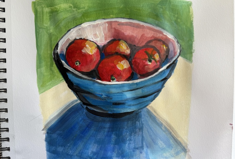
3. Part One Drawing: Now I'm going to start
the actual painting starting with a drawing, very rough and then
going into blocking in. And as I mentioned, this
is a step-by-step process. Make notes as you go
to get your process. Our plan also referred
to the download that I've provided you
and you won't go wrong, please don't expect
every painting to be perfect from the start. Sometimes you have
that ugly middle stage where it doesn't look like
it's going to work out. Try and persist through that. At the end of the painting, know that your next
one is important, started as soon as possible and your
progress will be quick. And you'll be very happy with
how your painting develops. Is the reference very simple, but we're going to make
something more out of it. Having a look at the
paper I'm drawing on, this is simple 300 gram
hundred and 40 pound paper. It's got a slight turn to it. The colors I'm using. You can also have a look
at the PDF downloads, get the color
palette from there. I'm using a pencil obviously
to get the basic shapes. And as you can see, I'm drawing this in a sort of a rough or free form fashion. It's not critical that I get
it geometrically perfect. But I'm just squaring off edges, working my way to
get this oval shape. Then the base is this sort of concentric lines around the base of the bowl which
I want to get in. They'll be a nice
feature in the painting. And then of course, these
shadow at the base. So the point with this approach, so this contemporary
approach we're using is not to have to draw a
geometrically perfect. Still laugh. Alright, so that's important. The tomatoes. And as you can see it, I'm also using a sort of a squaring off approach
to get the edges. Not a perfect circle. But doing it little strokes of the pencil to get this
slightly squared off edges. As I paint. I'll make those more
smoother and more round or oval shaped as required. As you can see, I'm now getting each object because
that's all I'm looking at here is shapes of the objects and building
that up steadily. So don't get too dissuaded or
stressed on by the drawing. You can build it up little
by little as I've done here. So using my pencil as a guide, I can see that the
base is too long. Just shortening that. Because if I'm going to
take the view of the bulk per the reference and
looking down at the bowl, the base is going to
have to be shorter. So that immediately is
a quick correction. And it looks better for it.
4. Part 2 Background Colors: In part two, we blocking
in the background colors, the simple shapes to create the foundation before we really move into the
heart of the painting. And that is the
tomatoes themselves. So a bit of lemon yellow, cobalt blue, getting
a greenish color. I'm thinking of the complimentary
relationship between green and the red that's going to come up when I
painted tomatoes. And this green background
will really set off the bow of the
tomatoes a lot more, putting in a little more
yellow to warm it up. But it will still
be a yellow green. So that's within the
color scheme that I want, that complimentary color scheme. I'm not so much a color scheme, but just thinking of
complimentary colors. So the greens with the reds. And now I'm doing the table, which I'm using yellow, ocher and white to give me
a warm yellowish color, which in turn is
going to set off the shadows and the blue
of the bowl itself. So that's how you can
work out color schemes. Think about what's going to
set off your main color. It generally a
complementary colors. So as I'm mixing here, just some basic violet shades is a beautiful color to
bring into the shadow, as long as it remains
a cool violet. Cobalt, little bit
of magenta on Wyatt. And getting this really
juicy violet color, which is going to
look so nice against that yellowish table with color. A little more gray
dawn as more light filtering in on the
edge of the shadow. A little bit of yellow ocher
into that violet will act as a breaking down of the violet into a
cooler grayish color. Alright, let's get some
color into the vars. It's still first layers, so it's not critical, but it's in the
general direction of where I want to
take these colors. More cobalt and some of
that brilliant blue. Don't worry, if you can't find a color called
brilliant blue. If you're not using
Amsterdam acrylics, you'll be able to
find something that could even be cerulean. It could be a sky blue, could be many names like
this, or severs blue. It's really a kind
of a cerulean. So that'll do just
fine with the cobalt. Touch, some magenta,
but more cobalt and a little bit of orange just to give me a darker color. And I want to create a shadow on the ball
on the left-hand side. So starting that off, of course, acrylics dry quickly, I can always correct
and go over with further layers.
Problem with that. So go with your instinct. Try something out. Shadow enables us to fade from the middle towards
the right-hand side, accentuating the
three-dimensional nature of the bowl as well. Alright, next step, we will
get into the tomatoes.
5. Part 3 Blocking In: Onto something a bit
more exciting this time, we're getting into
the tomatoes with some red light touch
of magenta and orange. And just going to start
blocking in the first layers. Kidding the intention
behind this painting. We want these tomatoes too. Stand out. Almost feel like
you could pick them up. So keeping the red, making the red even
warmer actually, by adding orange to it. Using the square brush, basically a short flat. This would be a number six. And trying to get that
squared often look to it. So pulling the brush
along those edges. As the painting develops, those squared off sections gets refined to be a
little more rounded. But they give that
contemporary look towards that more modern feel. We're blocking this in, in a sort of square
root of choppy way. And circling the end result. We're working from the
outside in shapes are a little bigger,
rough, and refined. Getting the first
main colors in. I haven't gone into
or not gonna go into the shading and the
outlines quite yet. And you notice with roughing in the edges like this and that's sort of cutoff
blocked in a fashion. That doesn't mean you
start off with slowly, with a painstaking
way of trying to get the perfect round shape. That really is a waste of time. It's very inhibiting. It keeps things
looking very, very. How shall we put it overworked? That's not what we're about. You were trying to just get the painting off
to a good start. Lots of energy,
vigorous brushstrokes, strong color, very
little white paint. You notice that's
very, very important. Use as little white paint
as you can get away with. That keeps the colors vibrant
at keeps you going forward. Now, the back of the bolt
is of course much lighter, but it's still colorful. I'm not using sort of
a dead beige color. Just getting some of that
orange somewhat handover, great Dan, Pink color. You can see the shadow
on the back of the bowl. That means it's a shadow color. Shadow family color
therefore must be cooler than colors
that are in light. That means adding a
little bit of blue, little bit of white. And that cools things down
into the lighter part. But more widely,
some yellow ocher. Now it's in the light family, so it must lean towards yellow
and be much warmer than the cools outside rim of the
bowl, catching direct light. So using the sharp side of the brush to get that
whitish pink color in there, which is just going to
help define the edge. I could stand out a bit more. So block in the
back of the bowl, cutting in as well to start shaping some of the
tomatoes at the back. That's why I do start off
with shapes a little bigger, and then cut in with background color to get the
shape a little more accurate. But also the shape turns out to be a little more
interesting because of the cutting and
as well shadow side of the bowl harmonizing the blues are the bowl with bringing some blue violet into the shadowy sides
of those tomatoes. So we're off to a
pretty good start, bringing some color into
the shadows as well. But the blocking in now, pretty much all done. So we're into the second layers. And we'll take that further, steadily refining the painting. A little more detail and more color vibrancy as
we worked through it.
6. Part 4 Outlines: In part four, I'm going to
be focusing on the outlines. Mixing up some dark
blue and burnt sienna, little bit of magenta as well. Mostly blue and burnt sienna
to create a strong dark. I'm not using black. I prefer to mix my
own chromatic blacks. Now, I'm painting strong
outlines as part of the process for this modern
or contemporary look. Using the flat side on
the thinnest side of the brush to give these sort
of chopped black lines. Now this helps to
define the shapes, also make them stand out. You can see I'm painting
them quite loose. These chalk lines,
as I call them straight edges around the
tomatoes done very loose. And the reason for the strong outlines is that they're going to help
to create that modern, contemporary look, a more graphic or stylized
look to the painting. As opposed to if I
was doing this in a old master style or
Impressionist approach as well, edges would be
generally hard or soft, but not like this, not strong dark outlines, which gives us some
more, as I said, a more graphic approach. Something you would also
find in, let's say, a graphic novel preps or an
illustration that would have these strong outlines to bring the subject out
from the background, make it stand out clearly
and come forward. But it's also a technique
that's been used for centuries. Things like jewelry making. Even clothing designs, relied on a strong contrast between the color and a
surrounding elements may be a frame, for instance. Now putting in the brilliant
blue in big thick strokes. Adding up some cobalt for
the mud to set a range. By these blues, I will
let them dry down over the period of the painting and then refine the
shapes a little more. But what I've got is a nice, strong color, very
vibrant color. Bringing in this loose blue
and magenta for the shadow. Because I like colorful
and interesting shadows. Not a lot of detail
in the shadows, but there is something going on. It is not plain, flat color. And I believed that an interesting shadow
helps the entire painting. Now the background has
dried down substantially and in the process
got a little duller. And that is a thing with
acrylics, of course. As the painting dries, the textures flatten out a bit and some of the vibrancy
will disappear. But this is also
an illustration of how I like to paint
with acrylics. And that is bring on
layers upon layers. It's different to oils
with the layers hold the shape and vibrancy a lot
better with the critics. You've got to keep
putting in the paint. And after two to three layers, you've got a deep,
rich, strong color. I really do believe
that a critic should be painted
in this fashion. Even if you're doing a
more traditional approach, you will have to bring in
layers of color and bold up your painting in a logical
step-by-step fashion. One part of the painting
you're working on that. The other part is drying. You come back to that
trap potlatch Ron, bring in more vibrant color, especially in the
lights. Of course. You can see the rim of the bowl really
standing forward now and separating from the
tomatoes in the bowl. And that's just palpating on this yellow ocher and
white combination. To give this strong light. Going over some of
the dark outlines, showing some others, most with the outlines
must talk show. We don't want to get
rid of them entirely, but you can go over one or two-year are there
to get that Lost and Found. Look, that's all about creating
an interesting surface. A little softer, violet. On the edge of the shadow, where there's a bit of
light filtering through.
7. Part 5 Textures and Layers: In Part five, we're
getting to the fun stage. We're getting into the
main body of the subject. And that is the
tomatoes themselves, where our start putting
on the layers to create texture and rich color using a number six
long flat brush. And the red light, magenta, burnt sienna,
and yellow and orange. All of these colors
are going to come into rendering these
tomatoes in a loose, textured and rich
paint covering. Now, to approach this, you've got to look at your
reference and start seeing the shadow and the
middle value range and the lights on each tomato. Now the shadows
will be the darker, cooler reds, magenta, perhaps a bit
of blue as well into it. The middle value range will be the red lights and maybe
a touch of orange. And the light part of
the tomatoes will have a lot more orange and some yellow being mixed into the red. You can see, I'm at this
stage not putting in white. So it's keeping away from trying to create a strong
highlight at this stage. Rather concentrate
on the textures and layers of actual color. Basically, I'm using clean
colors straight from the pile onto the brush and
onto the painting itself. As this develops, I can
then start looking at bringing a little
bit of white to lighten up the highlights. The highlights at that point, as you'll see, will
not be a bright white, there will be a
warm color, right? So even though there'll
be lighter in value, I'll still keep them
warm by having more yellow and orange
in to the color. Hopefully that will
clear up as we go along. But as you can see now, does tomato on the
right hand side has got quite a lot
of paint on it. Nice thick juicy acrylic paint. The top of the tomato, catching the light
that we'll have, as I said, the
orange and yellows. Now, just a touch
of white in there, but even that, I think is
just a touch too cool. So I'll probably revisit that, but be very careful with
your highlights. Too much. White is not a really good idea because it makes
the color too cold. I'd rather have a highlight that is something like lemon
yellow with a little bit of white into it because
lemon yellow is already light and it's going to be
light compared to your ribs, which are not really
a very light value. Red is a relatively
dark value color. It's just warm, so
it's deceptive. We think dark value is always
going to be a cool color. So moving from one
tomato to the next, looking for the shadow, getting the shadow reds
in there, those magentas. Then to the red lights into the orange and
yellow and so on. Little bit of white
in that orange. I think that's a bit better. That's a highlight, but warm, so warm and that is what I want. I want a rich, strong color. A little bit of blue, getting a purple there. Quite a strong dark
as you can see, but we'll work over it and incorporated bringing
in some of those blues. The blue is a
process of harmony. So the blue from the bowl in the shadows of tomatoes
is about harmony. Textures. Try to drag the brush in
the direction of the, the colors of the objects
swell or the round objects. So you will essentially
at the roundness, doing brushstrokes in
that direction as well.
8. Part 6 Details: Getting into the final
stage of this painting. And as it suggests, it's about details
and corrections. Were putting the smaller details like the Stokes
and the tomatoes. Some of the tomatoes
will have stalk and that's just an
important little touch. And it also gives me
an excuse to bring in some colors like
these notes of green. And it's very important
to have nodes, green color where you've
got lots of read, a few greens balance
out all of those rates. Still stylized, stole using the basic shapes to
convey these stocks. But bringing touches of
green and blue as well. I'll talk a lot about harmony
throughout the painting. When you use a small palette
of colors like I'm using, where you pretty
much have to mix all your secondary colors
for the most part, or modify your colors. Your painting automatically gets a harmony to it because most of the colors you put
down or coming from a mix of colors
on your palette. And that helps to
harmonize your palette. You're not using 20 tube colors where you could end up with a whole mixed salad of colors
that don't hold together. So now I'm bringing color
in the back of this bowl. You'll notice some of the
tomatoes reflecting the red, orange colors into
the back of the bowl. You go to try and observe
that and bring that in. Some touch ups and corrections
on the left-hand side of the bowl where I haven't
drawn it accurately enough. That's not a problem. I think that also adds to the the quirkiness of this loose and
contemporary approach. I will come back to that
area and bring in a bit more blue to
neaten the ball up. Swapping to a round brush. Now to get these little details in breaking up a
few solid shapes, dropping in a few
common nodes of glue. That little note of color
over there as well. To link up with the
blues of the ball. It's typical to explain
each of these strokes. They pretty much done instinctively with
that idea of harmony. Once again, break up the one color or a solid
color somewhere else. Break it up. Adding
another color to it. This brilliant blue or Cerulean, whatever version you use, has a lovely modern looked. Really stands out. Few little spots or that amongst the tomatoes helps
with that harmony. Little bit of a highlight at
the back there, the ball. I want to brighten
up the background on the right-hand side where
there's more light. So just getting a bit of a gradation from
left to the right. And this is warm highlights
and the background, if you could call it that. I think it picks up the, the reds and blues so nicely. A little bit of breaking up
this edge of the shadow. I just think that
carries a bit of color into the table as well. Let's just try and pull
this left-hand side. I think that's a bit predator. Balances up few final little notes, dots and dashes, little
things like that. These little things of color, just spots to pull
things together. You have to really
experiment with them and see if they look good. If they do, leave the moment, if not, let them
dry paint over it, a few lost in pester notes. And then I think it's time
to sign off the painting. Get one or two spots of highlighting neat on
this edge up here. And now let's get a
signature down and we're going to use bold red just to link up with that
main color of the painting, we will get the tape off and I hope you enjoy
painting this. I've certainly have
enjoyed it myself. I think it's a cheerful, fun and energetic
little painting. And now you can have a go and have some
fun with us as well.
9. Conclusion : Well, I hope you
enjoyed this course is a subject that I really
enjoyed painting. It's fun. No real pressure. And you're just playing with
shapes and beautiful colors. Please try the painting
out for yourself. Maybe the next one,
change the subject. Maybe put lemons in a bowl
and you try that out as well. But practice is the key. You won't make the
perfect painting the first time around. And that's to be expected. And you must appreciate that
about your learning process. Try it out. Perhaps
your first one is a smaller version
and then you go into something a bit larger. And when you are familiar
with the subject, you can go for a nice
big painting as well. That's how it works with all craft and art
subjects as well. Painting, no different. Enjoy it. Keep practicing. And if you want to go further
with your acrylic painting, have a look at my
painting school. I've got extensive courses. They from beginner
acrylic painting to master lessons as well, until next time, just for now.
 Malcolm Dewey, Artist and Author