Transcripts
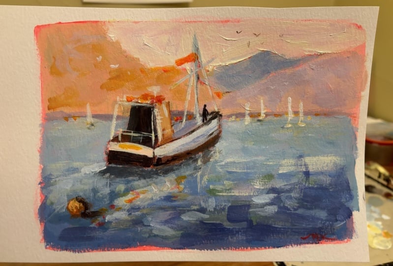
1. What You Will Learn in this Class: Hello, thank you
for joining me on this course. Outcome, Dewey. And I'm gonna be showing
you how to paint beautiful scene with
old-fashioned fishing boat. Fishing birds are
still in operation in an around the Cape Town
area in South Africa. It's a favorite subject for many artists, are no exception. I love painting these scenes. And I'm gonna show
you how you can do that very easily as well. We're painting in
vibrant or critics. So you're going to end up with a beautiful painting that
looks something like this. I think that's a very
appealing scene. You're going to learn how
to paint it yourself. So as I said, we're
going to adapt the subject into a scene, something a lot of
artist struggled doing. But if we keep things
simple, it'll be effective. I'm gonna show you how to
draw the subject as well. So it's a few tricky things
about this top subject, but once you learn a few, a handy tips and tricks, you'll be able to paint us
with confidence then into the paints with some big brush
and some vibrant colors. And then you'll see how to bring the subject to laugh with
a few figures as well. So all in all, we cover
everything from start to finish and including
the planning of the painting,
the composition. And that is so important. If this all sounds like
a good way to create a beautiful painting
for your home or maybe as a gift
for someone else. Then enroll in the course
and let's get painting.
2. Painting Materials: Well, thank you for
joining me on this course. I know you're going to enjoy
the painting very much and the end result I'm sure
will be very pleasing. Now, we're going to have a look at the materials you'll need. Are trying to keep this
as simple as possible. We don't have to
spend a lot of money. You probably have all
the materials already. We're just using good quality student grade acrylic
paint as well. So no need to break
the bank. They either. Alright, Let's have a
look at what you'll need, all right, materials for
your acrylic painting. Well, starting with paints, of course, I'm using
Amsterdam acrylics. These are made by royal tollens. Good quality, student
grade acrylic, and good value for money. Strong colors, very easy to use. Another one you can also try is Winsor and Newtons Galleria. That's also a good
quality student paint. My merry acrylic, WHO also
good results with that. All reasonable. But they are good. They won't let you down. And that's all you need if
you learning to paint or even as part-time professional, even you could use these points. If you weren't
professional quality, then I would suggest
something like golden acrylics and golden
make excellent autos quality. Critics have a look at the list of colors that I'm
going to provide to you. And you can just download
that and get the cutters. You need. Pretty much though,
have titanium white and a warm and
cool of the primaries. So somebody OK, red light and
then a Magento or alizarin, and a cobalt for ultramarine blue and
cerulean blue Earth colors, burnt sienna and yellow ocher. And maybe just for convenience
or get orange as well. Although you can mix
that up yourself. Painting equipment, a
couple of good brushes. I think my favorite or
store the dialogue Ronnie, long handle, synthetic
brushes by the crawler range. And the USSR six long flat and there's a size eight full boat. And these are my
standard paint brushes I use for pretty much
most of the painting. A little detail
brush, this case. And this is simply
a synthetic hair, flat, but it's got
very crisp edge. And I may use that
for crisp edges, geometric shapes,
that sort of thing. Small round brush,
any brand will do. And this is simply to get those little shapes
in those curves, probes the figures or
some rigging on the, on the fishing boat. Some lines easy to do. If you can. Slightly bigger round brush
like this can also be useful also for larger organic shapes. Round soaps, very
useful for that to keep your brush clean
during painting. Lots of tissue paper, even though these acrylics, I'm always wiping off the excess paint to help
me pick up clean paint. Of course, you need water to wash your brush thoroughly
from term to term. Don't get water
into your paints. These paints are ready to use straight off
the tube and you don't want to weaken your
paint with excess water. So once you've washed
your brush off, dry out with tissue
as well and get any excess water out of your brush so it doesn't
get into your paint. A painting knife always
useful even for mixing colors or even applying colors
to your painting surface. You'll need a pencil maybe to help you with
your composition on the painting surface or to just planet in your sketch book. And speaking of sketchbooks, a little A5 like this, this is my Fabriano. It's fairly nice paper
to do your sketching on. You can even paint on this to test colors with
your acrylic paint. Do all your planning before you put paint on
your painting surface. It'll save you a lot of troubles when it comes
to mixing paints and getting to know about
warm and cool colors and the front mixing
possibilities, adding white, etc. Get yourself one of
these color wheels are a little expensive. At first you may say that
but you'll want regretted. That's also got a value scalar via to help you get
your values correct. What do you paint on? This demonstration? I'm painting on a canvas, but I would say the best and easiest surface
is some sort of panel. This is MDF. You can just adjust this with some acrylic white gesso paint straight onto
it with acrylics. You can stick on some
canvas as Tanya. And just so that, that's a good surface. But for most artists, I would suggest get some
good-quality mixed media paper. And your acrylic
painting on that, let's say is 250 grams
Fabriano mixed media paper. That's a four size clot sturdy. But what are normally do, I would tear this off and tape the edges onto
a painting surface. That makes it easy to move around and make sure you
don't get any buckling. Although that's not really a problem with good
quality paper. Then of course you can buy a stretched canvas
if you want to. Get a little expensive though
when you're practicing, good quality paper or a panel of some sort will serve
you very well. Last item to mention is
something to mix your paints on. Now these are tear-off
palette paper pads that I get very handy, handles any sort
of paint on you. And this is an A3 size mask
bit of space to work on. And when you're done,
you can tear it off and throw that away. Now one other thing
is if you are leaving your paints on the
palette for maybe a few hours, you can give them a
little spots with water. Just a few little sprays over
your your paint on that. It'll just help them not get that irritating dry
form over the paints. If you're going to leave your acrylics art
for a long time, overnight or
something like that. You can get things like
stay width palettes as well that you can
close over with the lid. And I also have a
demonstration in my acrylic painting
for beginners of how I make a stay wet palette. There are many ways
to try and preserve your acrylic paints from
drying too quickly or wasting. Best thing of course, is used them all quickly and
get them onto your painting. All right, that's
it for materials.
3. Composition and Drawing: Before we start painting, we need to compose the scene. So let's have a look at
the subject and I'll explain my thinking
behind it and how we can put the fishing
boat into a nice sort of composition that'll
look right and authentic. Then get this onto
a canvas drawn out. In the next lesson, we'll be looking at
some drawing tricks. Can try out as well. This is the reference, or rather this is the boat
that I want to paint. But as you can see, all the unfortunate
background to it in a harbor down in the waterfront
section of Cape Town. These office buildings
in the background. And obviously I don't want that, but I do like the boat itself. I think it's very attractive. So one of the classic
old fishing boats. What we wanna do
is we want to put this in another environment. Create a scene that
is more authentic. Now, what I like about this is not just the general
look of the book, but also the angle of
the viewpoint sort of point where we
are facing the edge. Now the corner, I should say, this will be one of the
hardest and strongest edges. And we've got the edge of
the sides of the part as well that are quite strong and record those
dark against light. So these are things
that I'm considering. Strong edge down there
on a sharp edge. Sharp edge is just one that is very crisp and clearly defined. So what we're gonna do
is we're going to take the image of the boat itself and draw that
into a background. Also, change the
foreground a bit, but we wanted getting a lot
of light on it as well. And getting the sense of
some movement as well. So there'll be awake
behind the boat as well. That will include
in the drawing. Now the drawing
itself off the boat. Got to have a look
at these blinds. And I quite tricky if you've
never done them before. I suggest that you print
out the reference. Just have a go at
practicing these lines. You can draw on the boat
itself, on the picture, or I should say, and get an idea of how
these curves work. Remember, the meeting
point between the boat and the water is straight, flat. There's no curves, they're just get that perspective, correct. You'll also notice
that it's quite dark with the bot
meets the water, so there's a good
strong dark element. To another point for
the drawing is to see these dark severe or how
all of this is strong dark. Then we've got light on
this side. Actually. Strong lots, lots probably
coming down this way. And you can see it's lighter
via that bit of white paint. But these contrasts between the shadows and lights or something to take note of. And we want to bring that
into the drawing as well. There's lots of bits
and pieces appear. What are lookout for, things like the railings. All right, So those sort of
add elements to the drawing. Verticals, aerials,
and the Master view. Also important because these
top scenes of a lot of horizontal lines and you break that up with
some good verticals. Things that are important
to include as well are any of these
specials of color, the reds and oranges. I'll look out for those. And there's some
up here as well. On the top. Yeah. And I include that. You've got this Moscow
downloads sod as well that we definitely want
to get right in our drawing. Then I'll bring some figures in. The figures we'll add in. Especially where there are gaps. Perhaps something
figure up here. Perhaps over there, there's
some space as well. We will have these figures that bringing a bit
of left to the scene. Very simple. Just suggestions of
face. That's all. Ready tax. As far as inspiration
for the scene itself, I'm looking at this photo off the Bay in which these
fishing boats would operate. There's the little
Harvard on there. Things that I'm looking for are these hills and sort
of overlapping. And we can bring some
of those shapes, the background, something
in the distance there. I will select the sort
of pinkish warm colors. I think that'll add something
into the background. Sort of cooler
colors over there. The overlapping mountains
to push that back. And then we've got the water
will have this lighter via. And then the water
gets darker towards the foreground with stronger
highlights on them. These are things
I'll just improvise. May also add a few things
in the background. Might be some yachts or
some specials of light. Then we'll have our fishing
boat during its thing. And leaving awake as well. That's it. That's the inspiration for the general scene in which
we're going to place the spot.
4. Drawing Tips: Box Method: Drawing a subject like this
can pose some real headaches, especially if you've never done something like this before. And I have taught a method called the box
method of drawing. And it's to help you deal with awkward shapes like this if you're not
familiar with them, all it really entails is taking marker pin and obviously
printing out your scene. Or perhaps you can do this digitally on a screen
or on a tablet, but it's simply
involves putting or drawing a block
around your subject. So we'll do that quickly. Just with straight lines are not following these curves yet. We're drawing a box
around the subject. So the end of the fishing
boat edges over there. I will just do the line, pass that edge and
then the top here. And we're just going to
select rarely as the top. And take this rod across. Try and get the
parallels correct. This line is going
to come down side. We've got a box
around the fishing, but look now for important points in the
structure of this shape. I'm not really interested
in the minute details. Now we're just
dealing with a shape. Let's look for points where
important parts of the shape can intersect and go beyond
the outline of the box. For instance, there's
the tip of the bow. Let's do a line from the top of that bar outside the box there. Then we've got this
corner over here. And let's take that and do a straight line along
that, the outside curve. We can actually take the rod outside of that line and
outside of the line of the box. This line over here of the
edge of the fishing boat. Projects all the way
to their curve over your projects off the box
there and Arthur box there. The bottom of the boat
meeting the water. Let's draw a line and
at exerts box there and upright of the cabin. And so on. Plot out
the main shapes. These markings can help
you with your drawing. Don't do too many, you don't have to
every single item you do the big shapes. All right, so then when
you've got those plotted art, you can find your
painting surface and draw out a box to
the size you require. Now you can plot out where
these lines are exiting. That one is up there. Other important markings for me or these curves and we want to get control of those. So this is an
important line for me. I'm also with the then just
improvising these curves. Some of the that drawing
a line over there. All right, so now we've got rough idea of the proportions. You can complete this on
your canvas if you want. You can just spend time
drawing it more accurately. What's your pencil,
whatever you want to do. That for me, it's just to get the placement of
the main shapes. All right, so that's using
the box method just to get important placement of different
elements of the shape. The shape is this,
something like so? That is basically and
our plan of the shape, we just want to look for the
main parts of that shape.
5. 1. Painting: First Steps: Now I've got a primed canvas. And what I'm gonna show
you now is how to turn the canvas using some
burnt sienna and yellow. The large brush. A fair amount of water added
to Sunday, a credit card. And I just get in a good
rough toning session in, and this is quite fun. Just get stuck in. Cover the whole canvas
with your tone, color. I like the warm, burnt sienna. Most of my landscapes are quite sunny and I try to
go for rich colors. I prefer the burnt sienna tone. It gets rid of all the
white for a start, and it's a nice way to
get the painting going. Once that is all dry. You can compose and start your drawing on
the canvas itself. Getting in that box I was
showing you in the last lesson. We're just going to
try and draw out the outline shape of the bird. Get a bit of the
background hills as well and the horizon line. Then I can get into
drawing the butt. When you turn your Canvas or panel helps to actually
see the values. That is the lightness and darkness of the
colors you put in. You're not competing with the
very bright white canvas. Sometimes the tone shows through and becomes
part of the painting. Other times let's cover
it up completely. But I do believe that
turning the canvas, in many cases is a good idea. Even if it is just to get started and start getting
your confidence going. As you can see, drawing, especially
drawing on a canvas. This is cotton canvas. Got a bit of a tooth
to it as well. So I'm not trying to
draw tiny details. I just want that
shape with a boat. And then getting a
small round brush. Any round brush will be fun. A bit of burnt sienna
and ultramarine blue mixed together
to get a dark color. I'm going to draw out
the main lines and reveal the main shapes within
which I can start painting. No point in laboring
and drawing and trying to paint everything
carefully between the lines. In fact, very often I start with the shape slightly bigger than
what it's going to end up. And the simple reason
for that is I'll actually cut in with
background shapes to help me refine the shape
of the positive object. I'll use the hill colors and the sky colors
or watercolors and hope to just cut in here or there wherever I went to
shape the bird. But more. That's all part of the
process of painting. Cutting in is very
important and very often undervalued parts
of the painting process. It's not always about getting the positive shape
perfect from the start. You can refine it with cutting in using
background colors. That big dark behind the cabin, there is very important
dark mass shaping, which is going to anchor a
big part of this painting. The darks act as the structural
foundation around which I can put the lats
and light colors to play off that dark element. Very loose. As you can see, that line
of used for that part of rigging There is too thick, but I will cut into that
and make it much finer. Later on, the mask. I'm not using a ruler or some sort of straight
edge to make it perfect. Our refine it more with
cutting and later on. These important dark shadows
under the boat hope to tie the boat onto the
surface and not have it floating around sort of indeterminate basic
shapes for the hills. Getting a diagonal there which helps to take the iodine to the boat as well and another diagonal to
bring the app back. So all thoughts are
on composition. I'm getting a rough
idea of where I'm going to put in reflections. Let's very, very loose. I'm not referring to
a reference photos. It's simply finding my
way at this early stage.
6. 2. Painting: The Background: Alright, let's start by
having a look at the palette. Quite a few colors. Some are used more than
others, of course, but I actually have a
good number of acrylics. And now just getting in the blocking in starting
from the top down. First color, I'm doing
this guy quite warm. And I'm using some
yellow ocher and white. And just brushing that in with
a big number eight brush, long flat and scrubbing it in. You can see some of the toning showing through there and
you can leave a little bit of that to show if
it fits in with your concept or idea
for your painting. But it's really satisfying
to get that first bit of bright warm light
onto your painting and turn surface makes
it really pop as well. So that's quite a
morale booster. Our founders and our enjoy
this part very much. Nothing too
complicated with this. So I just wanted to bright
sky in the background. And that will set up
the opportunity to bring in some sparkle
on the water later on. Because of course
your sky does reflect into your water and you've
got to set that up. You can't have a dark sky and then expected to
make lots of bright, warm sparkle on your water. It's not going to add up. Get it in very quickly, very simply, quite flat. I'm not trying to put in clouds. There's gonna be a lot
going on in the painting. Now I'm moving into the
mountains now these, as a, showed you earlier and
composition ideas, these are improvised based on the references
that are found. And I'm setting the
mountains up for sort of warm but cool colors. Doesn't quite make sense. I'm desaturating yellow ochres, scar blues, bit of magenta. Just trying to find
the color or one that's a bit too bright, too close to the sky color actually put more blue in there. And that just gives enough cool. But I think it's going to work better for the distant mountain. Bit more cool, blue
and magenta to get a sort of a grayish violet. And that will be the third
mountain, soft good. Three Mountains
foreground one behind, but then the next one, so joining it, making a V shape. And then behind that, another distance PQ,
just showing through, that's gonna be the
coolest mass shape right? Now the, the mountain behind the boat going to get some of the sort of slightly
warmer pinkish colors. Because of aerial perspective, you want to push that all back. It doesn't have to be cold. Colors called blue of course. But a tank is much cooler than a red and already is much
cooler than yellow. Don't really want yellow in
the back they're the closest. Yellow is gonna be a bit of
desaturated yellow ocher. When I talked about
the saturation at simply means you take
in your tube color and adding something to it
to either knock it back. That is make it more
atmospheric and cool by adding white
and a cool color to it, like maybe some blue. Or if you want to
warm up your color, you'll add other
warmer colors to it. So yellow ocher, you
could add more yellow and red to it and turn it
into a much warmer version. So desaturating
normally talks about knocking a color back and making it cooler and
more atmospheric. But you can desaturate a cool color by
adding warmth to it. That just breaks
a color dots are desaturating is sort
of just reducing the strength of your tube color or adding something to it. Popped in a few
broken colors and basically using broken color
throughout these mountains. But very close in value. So they light to dark. It's very close in color. Fairly close. Seeing some broken color, but it is soft edged,
sort of diffused. To try and give that
impression of Seaside air. Really the atmosphere
is quite thick and lot of moisture in it. Putting some magenta and
a little bit of yellow, getting a sort of
pinkish color there. This is still a
blocking in stage. I will go over this later on
when it's dried down a bit. As required, you come back in. Because the nice thing with
acrylics that trust very quickly and it's easy to
work over that color again. Now, you can see the three distinct mountains using both sides of the brush. And getting an automatic
broken color reflect. Paint up and down,
left to right. Just varying the
direction of the brush. Some cool coming in. You're making a gray
with a bit of cobalt blue and the magenta
and red and yellow. But these are not mud colors. And you see that nice diagonal, both of them hitting
to the boat. That's part of your composition. Keeping your eye on
the potential to direct the viewer to your
focal point and using the two mountains to get that diagonal meeting
point where the boat is heading towards is
all part of composition. Little touch of warm color. To complete the blocking
of the background shapes.
7. 3. Painting: Middleground: Alright, let's get
into the middle ground of the painting as I'm putting in what looks like a line
of sort of a purple, violet color and that
infects going to be the suggested a humble wool. Or it could even be the
edge of the coastline. But in this particular scene, the humble bowl is I'm just going to be that line between water and mountains. And I'll probably put a
few suggested all details, little highlights
on it later on. Now, let's get into the
water and it doesn't water, I'm using a brilliant
blue or you can use the cobalt blue little
touch of yellow, lemon yellow and white. Getting very light but
stole colorful and vibrant. But of seawater in
the background. Now it's picking up a lot
of reflection from the sky. And the sky is v0,
warm and bright. White and yellow ocher. And that's going to influence the color of the
water back there. I went to it quite light. But don't fall into the trap
of just using white paint. With your blue. You're going to end up with
a very light but also very cool and almost chalky color. As you can see, I've put
quite a bit of blue into the mix and try to keep
it store a vibrant, a nice vibrant light blue. Just scrubbing that in. This is of course a
blocking in stage. So the first layer is always a bit of a scrub in just to get some paint on more or less than the
correct value you need. Just to get through this, you can see with the picture. Now, bringing in darker
blue just to blue-violet, really add a bit of strength to that hobbled wall
in the distance. Refine that as we go, just get the basics and getting a bit over
that brilliant blue, sky blue touch of yellow. So there's an almost a
turquoise color reemerging. But the point here is that the water gets darker the
closer it gets to us. And also I wanted to
variety in that water. Just don't want a big
block of flat color. Use cobalt blue, I'll throw in a little
bit of yellow to get the greenish tones
that took quiz terms, as you can see, just testing
this foreground color. It's going to be a fair but darker and more vibrant
in the foreground. Dropping in some
variety now because I'm already revealing
brush marks. Putting some paint in
with different colors. So there's dabs of color. Broken color surface, almost like I did with the
mountain in the background. For a close in value, nothing standing
up dramatically. But already, it's not
just a flat blue surface. They are different blues,
this turquoise blue, this light blue,
slightly darker. So this is the idea of
using layers of paint. Blend it all into one
flat mono chrome surface. Already suggesting
some of the week that's going to come off
the front of the boat. The broken color,
very important, but more yellow and
white back there. I actually just want that to be quite light but also
store vibrant so that touch of yellow
gets that sort of vibrant quiz green of suggestion of that
turquoise, green. We're in the foreground
is relatively dark. That sense of distance. Four, come through nasty. Mixing bit of burnt
sienna, white and blue. Touch of yellow, white mix burnt CNS circle
saw putting a bit of yellow just to
warm it up again. White paint,
especially a critic, is incredibly cold color. Titanium white. Very often I will drop a
little bit of yellow back into to add that touches sunlight to your wife is
yellow is the color of Sanat. Some of this cool dark brown. Leaning it more to a dark
violet now but can be darker. Nevermind, Just get the blocking and done, get it in there. And you can then compare shapes and
colors and decide what needs to be darkened up a
bit more or lightened up. The first layer is about getting something done fairly quickly. And that also creates the energy of your painting right
up at an early stage. If you switch over every brush milk right
from the very start, it's going to be a quad, a torrid and hard. If it ultramarine into this brand yet to cool it down and darkness at
all at the same time. These rails paint, painting them fairly thick using a number six round
brush at the moment. But I'll cut in with the surrounding color so you
can make them quite sudden. Once you've cut him, that's not a worry. Gets that down and you know, you can adjust it to
the width you need. This is the side of the boat that is not
getting direct light. The white I'm putting
down is cool. I think we can definitely
warm that up a little. Urea of birds getting direct, lots of used white and
lemon yellow to get a very warm and fibrin watch. It's really does stand out. What do we could just lighten
up the sides as well. Otherwise, it's
bleeding just a bit too close to the watercolor. The next layer down, sort of a cool gray. I'll use the same color for
the inside of the boat. That's a kind of a violet color. So there's some
red, blue, white. But are the brown as
well coming into it harmonizing because they're
coming from the same colors. So all these colors are mixed from the same
colors on little grid. And natural harmony. Picked up a little brushes. I wanted to just get this. What's off the boat, correct. Stop putting a lot of paint
on it but helping me a little probably darken the side
of the boats a bit more. It's just a bit light. The base will got the
darkest shadow color. That'll sort of fuse the birds
to the water much better. Well, we've made a start with the middle ground and the boat, and then we'll continue to
pull up the foreground and constantly add more information
to the boat as well.
8. 4. Painting Boat & Foreground: In part four, we're going to
work a little bit more on the boat and start developing
the foreground as well. There's quite a few details
on the boat that I'm going to try and add in as we work
through this section. But remember, you are
trying to suggest details. It's not about trying to paint technical
drawing of the bird. I know nothing
about fishing boats or boats in general,
to be honest. But what our paint is, what our C and interpret. Just want to suggest things. Maybe if you notice
somebody about boating, it'll make sense. Avf just got a bit
of background color, so I've thrown in a few more bits in
the background there, but not back into
the boat itself. What I do is I look
at the reference, close my eyes sort
of halfway and just try and see a shape. All of this paraphernalia
on top of the bird. The red and orange shapes. I don't even know what
half of them are, but I'll look for those shapes. And that's just a
bit too much there, but I'll cut in and
fix that later. Look for those shapes
there, a round shape, there is a semicircle,
this rectangle. Try and mix an
appropriate color, perhaps giving it
just a little bit of extra punch because
these are punchy colors. And put that shape done. I like to work different
parts of the canvas. At all times. I started with a few
touch ups on the boat, did a few on the background. Now I'm back in
the budget again. I think that's one of the ways
with the critics as well. We avoid messing up
the width paint. So you can see I'm just
dragging some whitish fans, not pure white slot
but a yellow in it. Very, very loosely done. Just put the side
of this flat brush. All free hand are preferred
to experiment with the little happy accidents that freehand painting provides. If the shapes too big make
it smaller by cutting in. Leaving some of the dark
of the most showing. Putting some light
in the middle. And at the same time that makes the shape a bit
more interesting, that masked and also
helps to define it. Everything has a slightly
wonky appearance, but it's still
relatively accurate. There's a few other
lines like this one. Just adding a little
bit of balance to the other line attached to the pole
attaching to the mosque. Drugs at one across. When you're passing over a
large shape like the scar just darken your
line just slightly. Passing over a dark shape, you'll make the line light. There's some sort of, I guess it's part of
the radar system. Just put that shape in
and that's sufficient. Little letter down the side that might be announced
little detail, very loosely done that
sort of lost and found. If you do something too
hard edged or to perfect, it will show up very clearly
and get too much attention. Be careful of that. Make sure you want that attention if you're
going to go to that trouble. There's no orange flag
in the reference, but of course I want an orange flag to add a spot and punch
off color up there. Echoing the colors on
the top of the boat. And I'll try and
spread a few more of those around elsewhere. Soap to a round
brush here to get a little calligraphy
top shapes just to these lines and
curving shapes. Round brush is quite
useful for those. Just need a few darker marks. Dawn. Yes. So it's not the
shape on saga is not too flat. I'm not sure about
that white line there, but if you're not sure, leave it, move on to
another part of the butt. Let's get some foreground going. And then you go
back to those areas and hopefully you've
thought of a solution. Getting a nice big brush. This is number ten, short flat. Also a dealer Ronnie
acrylics brush. And getting an ACE transition
from the darks to lights. Many layers will come over this stole breaking up the shapes, a little bit of magenta into the cobalt blue. Now this foreground
part behind the boat, the reference is not
particularly helpful. I'm going to make
this area darker. And it creates the
impression of the boat sort of moving in a forward direction
with a bit of shadow behind it and
some lights down sides. These reflections,
I'm testing them. I don't see them in
the references such. But I'll see if I use them. Not too keen on
them to be honest. If you unsure foot, put the markdown that you went and stand
back, have a look. Perhaps even walk out the room, gov a cup of tea, come back. And if it's looking bad, looking odd, then best
to get rid of it. I gotta keep in mind
this boat is moving, it's out in the open sea. It's not stationary on
a very flat surface. Reflections are
going to be well, probably not even there. That's just something
I must work on. Definitely needs to be darker at this point where
it meets the water. Dropping in a bit of von that they're
ultramarine, magenta, touch a white reflection
of that most ordinary. I'm not really making
too much sense, but let's try it out. I think what I'm off to, a sense of movement, more broken color, more sense of disturbed
water around the boat. Something like this
I think will be helpful to soften that edge a little like that little touch I think that is hitting
in the right direction. This is more like it. The same effective are there. I think this is a good idea. We can definitely
work with this. Let's get some darker, dark, cool, violet and blue. The boat can emerge out of the dark as it would
to the light beyond. That's got a nice
way to look at it. Re-establish the
foundation of the docs. And then I can get lights
and gla onto the water. Light and dark contrast
is always important. Using the brush to
cut back and forth like this to get
that broken effect. Just watch out for
muddling up your paint, putting up fair amount of
thick white paint on here, but It's still early. As far as the layering
is concerned. I quite liked this idea as the
acrylic dries in one area. I'll come back to it
and putting new layers. That's perhaps a little
on the light side. But gauge the effect. Just get the paint
on, have a look. The nice thing with acrylics
is addressed quickly. You can get some colored on, give it a ten minutes, assess and decide if you want to go over it again and
you don't have to worry about paint cracking as it draws or anything like that. Getting out a small round
brush to get that dark line. Feel immediately I feel
better about that. Just sort of pulls
the bowed down into the water and makes it look
like it's in the water, not just on top, if
you know what I mean. Little touch of
yellow in the blue to get that little turquoise look. That's lemon yellow. Sky blue. Of course, the big
brush creating big dynamic, energetic shapes. No fiddly little details. Save the little things
for the, the boat itself. But these big shapes have
a lot more energy simply because the brush is the size it is and it's
doing the work for me. I'm getting a much better
feel about this foreground. I'm going to mix
up a little bit of orange and cover this. Boy in the water. Once again, that burst of orange color links
up with the butt. It's a composition
device as well. Little shadow there. And now get some orange
onto the boat and just take the color note from the
water into the boat. Then you get your harmony. This is how you harmonize color. You have a little bit of
everything throughout the painting and then
some of the mixes.
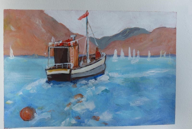
9. 5. Painting: Refine Shapes: We're now in that stage
of the painting where I start developing and
refining shapes. This is kind of the middle
phase of the painting. We've got all the
blocking and done. Some ideas established and
others are stored forming. It's often the ugly part
of the painting as well. Kind of a stage where
you can easily get lost. Sometimes completely
Ahead, dejected, and abandon a painting. Look at this technique, gear scumbling technique
that I'm using. And very useful over dry paint. Just drag your brush
with wet paint out of the dryer and you get that
sort of broken color effect. I've used a little of that. Definitely finish
off the painting with a lot of scumbling as well. Adding a few little details
of background for spots of light will be
suggestions of yachts. I'll develop those as I go. But now I'm stopped playing with ideas,
with the foreground. Bringing in sort of orangey, kind of desaturated colors. Trying to repeat some of the colors in the
boat as reflections. Looking for a spark, looking for something
that just feels right. This is the real part of the, a middle phase of a painting. Very often I will put something
down like this highlight. Then I can see it's too wide. Try to join up to that
with some lights. And then bringing some darks suggesting the reflections
from the bird. But still not a happy with it. These orangey browns, I don't think add much store
considering that reflection, but if it's not adjourning, immediately, move on to
another part of the painting. I wanted to lighten up
the distance a bit. Get that sort of really
high key blinding. Top of reflection. Really nice and
light back there. Have those distant yachts
sort of disappearing in the look of the painting. And high key simply
means very light value. Sort of merging, disappearing
into the other with soft edges and very
light value setup. Back into the foreground. It's dried a bit, so I'm going over that
with some wet paint. Just trying to find
malware little. This is lesson, this is
a lesson in persistence, which is so critical to get to a completed painting when that is satisfactorily
completed. Picking up the big
number ten, soft flat. Hoping that will simplify some of the information
up for town. There's way too many sort of nondescript brushstrokes
in the middle section into go over that. Consolidated a little simplify, I think is the main thing. It can look way too busy. You simplify it by
making the shapes but larger and getting the
values less contrasting. In that way. Shapes
look less jarring, one against the other. Let's calm things down a bit, but I do miss the
dark behind the boat. And I'll definitely have
to come back to that. Stolen to add a
touch of orange or to these bigger shapes,
little more satisfactory. Scarpia for light against dark. But I've got to reestablish
some darks. At some point. Just too many lights
behind the boat. Getting a bit of transparent
color, moving on. Something different.
Get into the bird. Little just click
foreground dryer but lightning up these sort
of violet colors in the boat. Attractive cutters. Y naught, if you doing the painting, want to put in a few
attractive colors as well. All about variety. Strong highlight on the bow sits at a portrait
on the background. A few of these details, the sides of the boats, the, the railings,
whatever they may be cold. They are a good excuse to
put some light against dark. Putting this down
with very loose and lack of sit
in the beginning. If I'd make a shape
and it's too big, cut in with the
background color. So I'm never worried about that. Few burnt sienna strokes
to define a shape or too dark. And to find that
shape a little more. Red light, add a bit
of Spark and energy. Nothing in particular other than an excuse to put on
and asked color node. Got out my rigger brush now to make some of these
finer detailed marks, just scumbling a little there. Let that dry and then
fix up these yachts. Stupid off improvisation. To get a sale or two. Vertical shapes link up
the C to the mountains in the background and echo the verticals from
the boat itself. Very useful device to add
in a few yards like this, breaks up static areas and
it's a bit of sparkle. Few more on this side. But not as many as you add a shadow at the base
of the larger shapes.
10. 6. Painting: Adding Details: This video is about
developing the foreground. I've already made a start with us and we've got some progress. But the problem is, I don't have a reference
that working from directly. So what I'm doing is finding my way with this foreground by designing it in a way
that I'm happy with. It's a kind of a trial
by error process, as you can see. But hopefully watching this, you'll get a few ideas of the different brushstrokes
that I'm using. And also the impasto strikes
that I'm using as well. In this case, I'm now using a small brush mixing
up kind of greenish, turquoise, bitter lemon
yellow and some scar blue. Putting that down fairly thick. But in a sort of back and forth or S-shaped
motion with the brush. What I'm trying to get
is a broken surface with the boat has passed along and the wake is
breaking up the water. There's a lot of
lots involved there. Now, I need to try and set
us off with a darker value, blue color as well. If it's all just, let's, let's not going to really
show up as effectively. On the righteous got
darker value color, which gives us since the
deeper, more undisturbed water. But on top of that, I'm going to put some highlights as well to give a sense of some
motion in the water. A breeze perhaps, or a wind
blowing across the water, just creating little
reflections and white caps. Nothing too drastic. It's a more restful part of
the painting compared to the left-hand side where
there's a lot of broken water. I'm putting down
fairly thick paint. Yeah. This is impasto over the writ of the
dry surface below. And as I explained
already with the critic, use the quick drying
effect by letting a part of the painting rest for a few minutes while you
work in other part. And then you can come
back to that and put down thick paint and be assured that you're not going to
just create a lot of muddy mess or mixing
very wet into very wet. Also have a lot in touch
as you put the paint on. I just touch it on the
canvas and liftoff. Don't press in. Ncaa back-and-forth. Try and go in one
direction and pick up and then put the brush
down in another place. You'll see that are
sold or mortgage over the same area with the
brush straightaway. Let me go to that area again. When that paint has dried a bit. Light against dark,
warm against cool. Those are my sort of
guiding principles. And if I put down large
stroke like this, I went to near a dark stroke. Few touches of highlights
in the distance just to break up
a very flat area. But not much. They all the action is
in this foreground. Now at the big number ten, I'm dragging some warm white at this junction point
between the foreground and the background just
to create a transition. And also that lovely
broken light effect. Scumbling is
definitely a technique you have to use
for any seascape, even some landscapes of a grassland or
something like that. But remember it's going to be
thick paint of a drop paint and the light dragging motion
parallel to the Canvas. Consolidating a bunch of joining up a few shapes or it's
just a bit too busy. This right-hand
side, I've got to get some darker color in
there. So I'm going to. Mix up, split of ultra marine and yellow but
it looks a little muddy. So think of us just
clean that up and wash the brush and then get some clean color notes
of that spot there. It does happen. Alright, yes, a bit of blue and red. But you can see it's not purple, it's just a very bluish violet. Big brush, big shapes. Touch of green in
the blue and white. To get that, to quiz effect, I need some dark yes, so I've mixed up a ultra marine and read to create this purple. That'll settle down a bit. It could be a bit more
blue to be honest, but I'm looking for a
darker value, not ready. Need this right-hand
side to act as a frame for all the busy action in the middle and to the left. As it dries, it will be
a little more restful, often say as the very
weights at the moment. And now this cob blue, just getting these really
juicy and pesto strikes. A variety of size of
brushstroke is so important as basically three
brushstrokes of US Steel, three sizes from a small to this middle saws and then
the launch number ten brush. For the bigger flat strokes. Quite impressionist. I'm ready relying on the impressionists
for some inspiration. Yeah, I'm hoping that this
design pulls together. This is very much
flying by a CTO pencil, as we sometimes call it. You proceed and you
design your foreground. You make it look what you want it to be when it looks
right, and you happy. Then you got to
know when to stop. Few small dabs of the brush
to create strong highlights. Small brush, not just to get an idea of a
rope of the, the boy. Few little highlights around it, and then a few dots and dabs. Once this is done, I will let the foreground rest of boats and then
go back to the boat and we'll add a few figures
and a few finishing details. Peach color, just
a bit of radon. Watch touch of yellow. And a few dabs in the mountains.
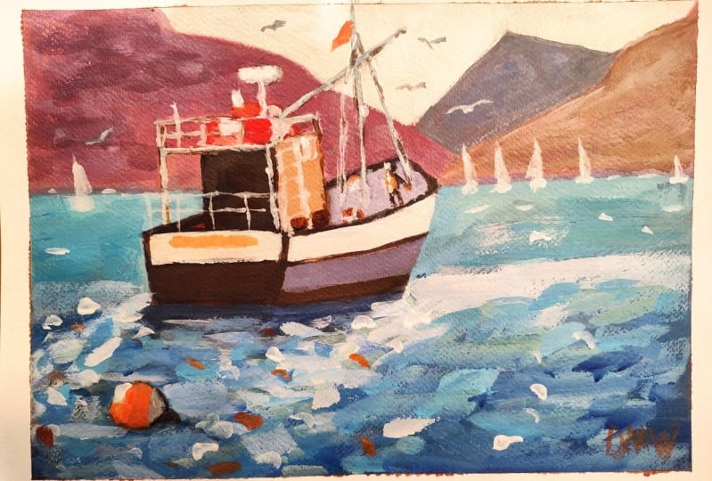
11. 7. Final Steps to Completion: Onto the final details, starting off with adding
a figure onto the bird. Pretty simple, using a bit of ultramarine and burnt
sienna to create a dark get the shape
in just basic. The heads, torso, the
legs, and an arm. And then I'll go over these
silhouettes with some color. A bit of orange to suggest
a rain jacket or something like that also fitting in
with the colors in the Ching. A bit of light on the
back of the head, they just do add bit
of spark of light. That's really all, that's
all you need to add. That little element of color and human interests us suppose. And it does add a bit of
something extra, something fun. Little odd, odd surnames. Life preserver for instances on other items that you
find on these boats. And it adds a touch of
red or orange as well, which is also good. Keeping these very
loose though don't make things too
perfectly detailed. That weren't 15 with the scene. The solder Butcher,
I actually would like this to be a
little crisper. I think a warmer white. We'll just finish this
off a little more. A couple of suggested
see goal shapes. There's always a lot of these
around these fishing birds, of course, but the
same thing again. Try to keep the
shape very simple, just sort of little V-shape. And you don't want
to get caught up in trying to paint an accurate C go little
look totally wrong. No little black dots
or things like that. Just one color. And lets the viewer
fill in the details. It's all part of
the imagination. I'm going to take
a bit of white and yellow and just warm up
the side of this bird. I think we'll just make
it look a little more. I guess, just a bit
brighter perhaps. And echo those colors into the water as well with a
few impasto strokes so that yellow white mass
glaring light on the water. That's finally finish the
foreground to my satisfaction. Now, I feel much better
with the painting. Those little touches,
pulling it all together. Well, time to finish. Get out to red paint and a rigger brush and put
your signature on. Don't forget, it's now your turn to try out
this painting for yourself and share
the final result. Already hope you enjoyed the painting process and
the final result on our, I enjoyed it very much. I think we'll be able to adapt this to your own
style of painting, very easy as well. But remember practice,
it makes perfect. If your first result is not quite something that you are
happy with, try it again. Every time you paint a subject, you'll learn new
things about it. Repainted many, many subjects that are
we enjoyed and each one turns are different and
hopefully a little improved. And I've learned
something about it. So don't give up. Persist. Paint this a few times. If you need to share
the results as well. I'd love to see
your work if you've enjoyed this and you
want to go further, try out my acrylic painting
for beginners course. That will certainly show you a lot more subjects
and techniques. I've got plenty more on my website at Malcolm
Dewey fun art.com. And I'm all about helping
artists like yourself improve and learn new techniques and try different
mediums as well. All right, until next time. Happy painting.
 Malcolm Dewey, Artist and Author