Transcripts
1. Introduction : Watercolors often feel like the perfect medium to add
magic into one's life. Yet as time goes by, you might have noticed
how easy it is for each new painting too quickly vanish into this
fast-paced world. If this sounds familiar,
I would like to help you. Hi, I'm Francoise Blayac. I'm a self-taught
artists from France. I create realistic art with
watercolor and mixed media. Overtime I have specialized into teaching
online and locally. As above all, I love to experiment and share my
findings with the world. When I started watercolor, I knew I wanted to create
one-of-a-kind keeps sakes, fun collections to stimulate creativity by taking myself and others on a magical ride without necessarily selling
or exhibiting my art. Instead, because I
didn't know how, because it felt a bit
scary to be different, I ended up quieting my urge
for adventurous creativity. With this class, I want
to help you uncover a new world of possibility
for watercolor painting, and finally released to
creativity hand break. That's why we're going
to allow magic into our practice and create a one-of-a-kind lift
the flat painting. I'll show you what supplies I use for
this type of project. Then we'll practice
techniques to paint a wet door that looks
dreamy and magical. Specifically, we'll learn
about the use of colors, white gouache, and textural
effects for magical art. We will create a door with flaps and go on to painting
a seascape that fits beautifully with
the first painting in terms of colors, size, and overall aspect for an exceptional
final project. Finally, we'll finish putting the lift of flat
painting together, and I will give you
some tips and ideas for future projects of the
kind in the last lesson. This class is best suited to intermediate
artists who have played with
watercolors for a while, who feel ready to repeat it their art to this medium and to allow their inner creativity
to finally takeover. Tell me, are you ready to allow
a different kind of magical watercolor
into your art? Because if so,
let's get started.
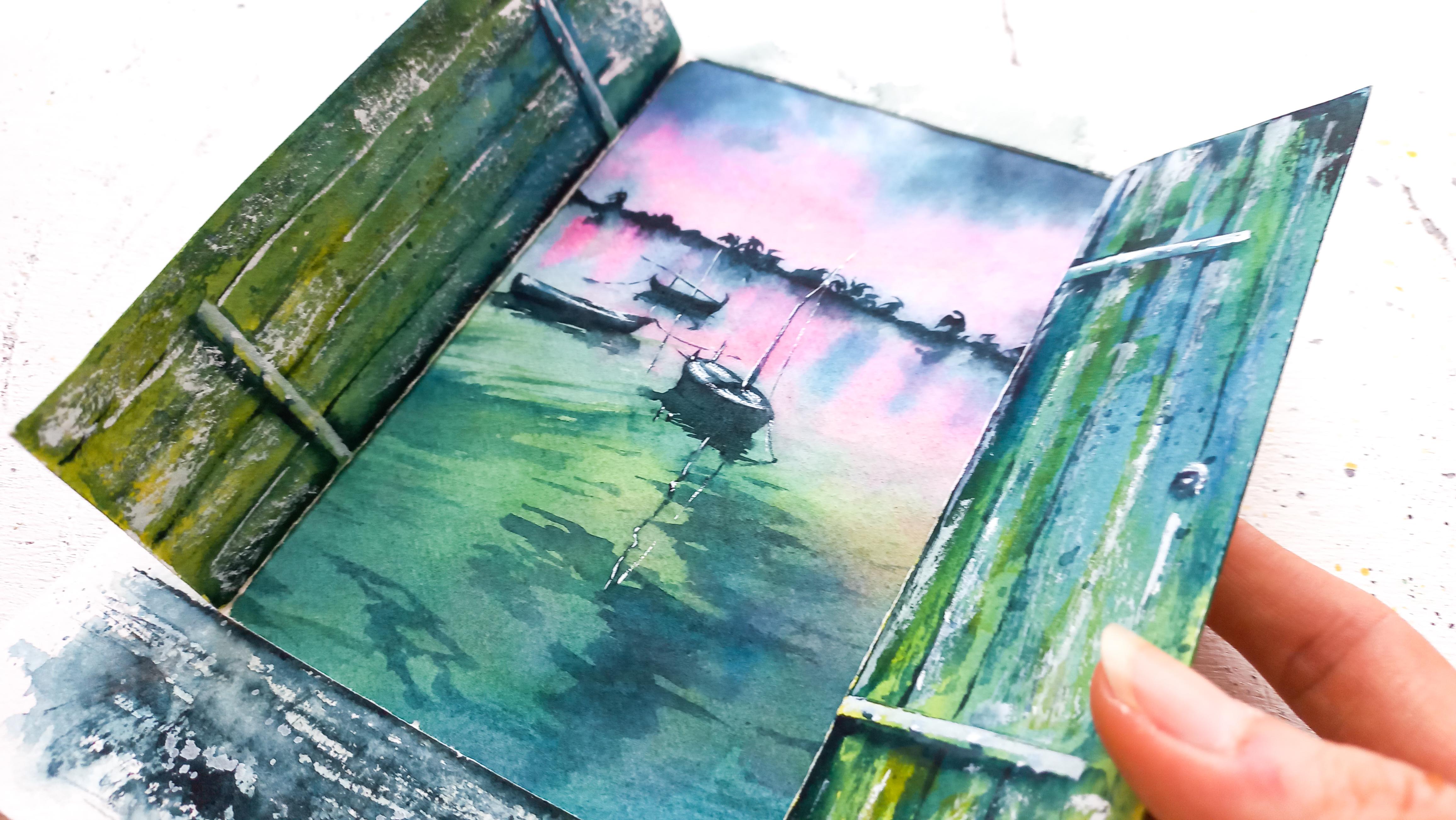
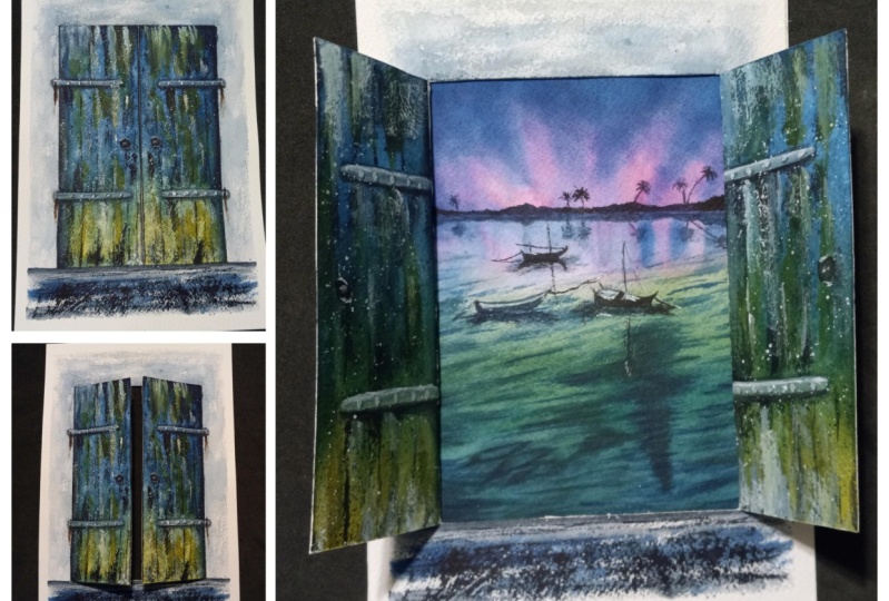
2. Your Class Project: Our class project is made of two distinct paintings that are meant to merge into one
illustration with flaps. We're going to work on each
painting step-by-step, and you'll notice that
even though this type of watercolor painting might look quite intricate at first glance, the DIY part of it is
quite simple and minimal. However, I recommend
not to skip any of the lessons as
they're specifically tailored to this
type of project. Lessons build on
top of each other, and with each one, they're going to be
small adjustments and tips to implement. Starting with sketches
where I'll show you how to plan and adapt the sketch to
lift the flap illustration. Color palette lessons will also teach you how to
create harmony between two different
paintings and maximize the magical effect when
opening the flaps. We will proceed to create each
painting and I'll show you what techniques I use to infuse magic into
a piece of art. Finally, with both the
door and the seascape, we will learn how to prepare for our final project
and put it together. A suppliers list,
photo references, photos of my paintings
are available in the resources section
when you need them. Don't forget to
download them there. When you're done, please
share your project to the project and
resources section like so, and feel free to reach
out to me if you need any help or extra information. Without further ado, let's
get started and meet me next for a look
at our supplies.
3. Supplies: To create a painting
with a flap, all we need are basic
watercolor supplies, a cutter, and some glue. The paper I use my
actual watercolor paper, I cut out two sheets
out of a large pad and you can go for a size
of 6 by 8 inches like me for both paintings, or you can use something
slightly bigger or smaller. Really want to make
a huge difference. I always recommend 100 percent
cotton papers like this one with a cold-pressed finish
and a weight of 300 GSM. Other watercolor papers
will work just fine. A major difference I notice
is they dry a lot faster, which can cause blooms and other marks or
hard lines to show even when you work fast. The colors might also
spread and mix less easily because of that. But overall, don't worry if what you're using is
different than what I have because with supplies, it
really depends on preference and what you're used
to in the first place. Next, we'll need
some paintbrushes. My go-to are a couple of round and round and pointed
paintbrushes. I think a minimum of
one round paintbrush like this one will help. It can be a bit smaller
than mine if you like. Then it is going to be
useful to paint large areas or paint the base layer
because there's no detail. Then one or two round
and pointed paintbrushes will help with fine lines
and drawing little things like the door knob in
the first painting, or the boats on our
seascape, for instance. Don't forget that
you can download the list of the supplies in the resources
section of the class, I made sure to include
precise references to what I use in there. For our watercolor paints, we'll keep it simple with black, pink, yellowish green,
and a bright blue. With practice, I've come to
work with limited palettes as many artists recommend to do, and I can vouch for the fact that it helps focus on painting and even help create a certain
harmony in the artwork, and I'm confident
you will also notice with the experience
on this class, that four colors is enough
to paint gorgeous works. We'll prepare the mixes later in some of the next lessons. These are the exact art
philosophy shades I'm using and what you could
substitute them with. Although it really
does not matter if your colors are not
exactly like mine. Masking tape is very useful to tape each sheet onto the
surface you choose to work on. I really enjoy and
never have to worry about the paper moving
around as I paint. Thanks to that. If you don't
own such construction tape, scrambling washi tape will
be an excellent substitute. A few paper towels and two jars of water
like this one here will be useful as well. These are actually very basic watercolor
must-have supplies as we need to wet, rinse our paintbrushes, but also soak the extra water
or paint off with a towel, depending on the
techniques we'll be using. To draw sketches for
watercolor painting, I use a basic pencil and eraser. This type of ruler is
very convenient too and you will see how we use it for our lift the flap painting, what you have at home
will be just fine. White gouache is my favorite
way to place highlights. It's also great to create
more of a magical feeling in a painting, and I'll show you how I use
it to achieve that effect. I've had students substitute
with white acrylic paint, which works except, so you know, it dries a lot faster and it's hard to easily
create the translucent, magical look we can
get from gouache. I use large tins like this
one to mix my colors, and I like that
because it's roomy, and I can also use it to pour
the paint from the tubes and take my favorite colors
with me wherever I go. Let's not forget a
heat gun or hairdryer. Because if you're
not patient like me and you prefer to keep painting rather than wait for the paint
to dry between each stage, it will be very helpful. For the shore-to-do-it-yourself
crafty part of the class, you will need a cutter
or anything similar to cut the door open. I also use the backside of
my watercolor paper blocks whenever I need to
make sharp cuts because the cardboard
there is very thick. This way, I'm sure I don't
damage my desk, otherwise, scrapbooking math works
great for the same purpose. Some glue would also be helpful, although don't worry, you really don't need
such a large bottle. I found this one on my art store and I picked it because it works with multi surfaces like wood, cardboard, paper,
and other things. Acid-free products
are always best to avoid and damage our
watercolors over time, and you will find those in
the scrapbooking department if you're not sure
about what to get. That's it for the supplies, so meet me in the next lesson, where we'll start
sketching. [MUSIC]
4. The Door : A Simple Sketch !: [MUSIC] In this lesson, we're going to draw the
simplest door sketch there is. So let's tape the
paper all around with masking tape first. [MUSIC] Now, grab your ruler, pencil,
and eraser, and let's start. The first thing I do to
center my door nicely is decide where I want
the bottom to be. Once you have that, trace a line and locate
the middle of that line. It will be the middle
of our door later. [MUSIC] I'm measuring how
much I have between the masking tape and
the start of the line. This helps in making sure that we have the same
width above too. That's why I'm placing
a dot further up to make sure the side of
the door is straight. [MUSIC] I repeat on top to
finish the door frame. Make sure to decide
where the top should be and take into account,
we'll be adding a little bit of wall texture
above and all around, as well as the ground
at the bottom. I know where the middle
of the door should fall, so here's the last line. [MUSIC] The ground will be right there. That is all we need
since with watercolor, we can add all the
detail and cool nuances with paint directly. Intricate and detailed sketches are not that necessary
most of the time. Remember to determine
where the top and bottom of your door should be and to leave room for whatever you wish
to paint all around to make a door painting
a bit more interesting. Now, I'll see you
in the next lesson for some color mixing. [MUSIC]
5. Start with Three Colors: Aside from white gouache, we need only three colors
to paint the door. The ones I'll be using, are bright green, mine is
called greenish yellow. Then a vibrant blue, and the one I have
is Prussian blue. Finally, I decided to add
black for strong shadows. In this class, there won't be much layering. We'll paint a beautiful
door with minimum effort. This is why I recommend to make your green and blue
mixes very creamy, loaded in pigment, but
still runny enough that both colors can flow and
mix together on paper. I pick up some water to
mix it with the paint, but I'm careful to keep
this quite concentrated. I usually love my paintings
very realistic and detailed and I'd normally go
with lighter mixes and then layer with
more paint later. The reason why we'll be
taking a looser approach with this door painting is
because with the final project, there's quite a bit going on. This door painting,
the seascape painting, and the door opening up. Besides all the loose techniques I will have used later on the door will contribute to the magical feel we want to
convey with this project. For black, the mix is
going to be different. First of all, I think it's nice to mix a little
bit of blue to it, just so we can establish
that connection between such a strong color and the door's main
color, which is blue. To keep the door as the main
subject in our painting, I decided the wall would be
very light and minimalistic, which is why here the
mix is very watery. We could take many
different routes with this type of artwork. Whether it is a very
loose or a very detailed painting
style, in the end, we are looking for the
different elements of the painting to contrast
with each other, and that's when having
a very light color to balance with our strong blue and green mixes comes in handy. Remember that there's no right or wrong in terms
of what color or shade you pick or how you decide to conduct
the painting itself. It is all about choice
and preference. One project can lead to so
many different outcomes. What can help drive
decisions though will be to see what you wish to
emphasize in the painting, and how you can mix your colors so there is contrast
between each one of them. The way I went
about it was to tie the black mix to the rest
by adding blue in it, and also to add a lot of
water to that same mix to balance with the vivid
blue and green colors that we will add on the door. I will see you next to paint a quick base layer on our door.
6. Create a Base Layer: We are ready to start with a loose and magical
base layer on our door. You will need two paint
brushes, one to paint, and the other one
will remain clean so we can add water
splatters at the end. To make your job easier, I will suggest to
use masking tape around the door so
you can focus on just painting instead of
trying to keep the paint off the area that is
meant to be the wall Let's start with green that I'll keep towards the
bottom of the door. I attached the reference
photo I used for this. You can find it in the
resources section. You'll notice it's
quite different than the painting
I came up with. But there are elements like these bits of greenish
moss that I kept. We want to work
fast so this paint doesn't dry on us
before we add blue. Because ideally, both colors should be able to
blend and intermix, and that will only be
possible if they're both wet. Don't be afraid to
overlap both colors. It's one of the best
techniques I use for realism because this will lead
to creating new colors. The more variety you can create
out of a limited palette, the better for realism. We really want to avoid an
area that's just a solid blue and another one that's just a solid green right next to it. We need some a connection
between the two. Let's not wait for this
to dry and splatter clean water with the
other paintbrush to get some blooms to
form on the door. This watercolor effect
will contribute to making the door look more
dreamy and weathered to. You will see we
will cover up some of those blues later
when we add details. But there will be some of them showing through
still and it will be beautiful as we're
heading towards a painting that's
not quite loose, but not hyper-realistic, either. Just dreamy and realistic enough to look dimensional
and eye-catching. Let's try this completely
before moving on. Your takeaway from
this lesson is to remember and overlap colors when working with a
limited palette to create different tones
of color in a painting. Use splatters of water when the paint is wet
for added texture. Let's meet next to paint
the wall and the ground.
7. Paint the Wall & Ground: Let's spice up
this door painting a bit with the addition
of a wall and ground. We'll still need the
two paint brushes we used to previously, one to apply the
paint and one to blur hard edges and places for
more of a loose look. We're using the light
mix of black and blue. Remember, this is
what helps us tie all colors together
in a very subtle way. You can play it by ear here
and completely let go. I like to brush color on paper and loosen up the hard edges
with my other paintbrush. That other paintbrush
needs to be clean, wet, and, just damp. If it's very wet, you will see huge
blooms happening which is fine if that's the
effect you want to go for. If you have a hard
time to assess if your paint brush
is too wet or not, the best is to wet it
normally then dab on a paper towel once or twice so the towel soaks
that extra water up. After this, you
should be good to go if you want to use the
same technique as me. On my painting, you
can see part of the paper is still showing
when I apply color. This is because my brush is
not overloaded with paint. It is not dry but
not full either. Notice, I'm using the
side of it to paint and I press slightly which helps in preserving some of the paper. It's a cool way to create a sense of texture
in a painting. Here too, if you find you're
not getting that look, that too much paint
gets deposited, it means your paint
brush is too wet. Try and dab it on a
paper towel again, you will see some of the paint gets sucked up at the towel. You should get the same effect as I as long as you
don't press hard, and that you use the
side of your paintbrush. Let's make horizontal strokes where the ground is. Before this dries, pick
up some of our blue mix and less at that at the
bottom of the painting. It will help distinguish
the ground on the wall and add a bit of variety here. I enjoy making splatters
on such loose paintings. You can make them with
any color of your choice. Here, I picked blue. I like that some of them will dissolve a bit into
the wet ground, while others will stay sharp because there the paper was dry. While we're at it,
let's add some on the door too
for added texture and an even better
impression of a weathered and mysterious old door. It's looking beautiful. Let's try it. Remember to play with different
techniques for texture, whether it is using a
paintbrush that's not too wet so some of the papers
specs shows for your strokes, or you can also use
splatters on wet, dry paint or both. See you in the next lesson
and play some shadows.
8. Place Subtle Shadows: [MUSIC] With this lesson, the
door will start to look more dimensional,
thanks to shadows. They will be the
dark touch we need to balance with mid
and light tones, and also the highlights
we'll add next. Let your paint brushes ready. I'll work with these two
for most of the lesson because they're most precise, and I will also use the
large brown one I have to make splatters layer. First, we're going to draw the metal parts that are
visible on this door. Notice, it's absolutely fine
to add it to the sketch after you started to paint. Especially when
you know the lines will get covered up easily, because we'll use a dark color. I do this sometimes for
silhouettes for the same reason. We don't need those metal
parts to be super straight. On the contrary, to have
them slightly tilted can add to the
abandoned door look that we're looking for here, since this is going
to be the gateway to the dreamy seascape
that is coming up. [MUSIC] Let's remix a
little bit of blue. Add black to it just enough
to get a dark blue shade. Remember, this is what will
make those shadows pop and the painting
look more impactful. We need contrast from the blue
color we used previously. With a fine tip
of my paintbrush, I add this mix at the
bottom of the metal parts to create a shadow. I personally dislike hard edges, so I soften them with a
clean and damp paintbrush in the same way we did previously
when painting the wall. But you're welcome to leave
yours untouched if you prefer. [MUSIC] I'd like to show the door is not completely
leveled with the wall, that it is slightly
further back. So I'll add some of that
mix on the sides too. It will create an
impression of dust and help separate door and wall from each other a little better. [MUSIC] Let's paint the line that
marks the separation between each door panel. Now, the knob. I soften the bottom of
it with clear water just to create a
subtle shadow there. We need way more
definition at the base to suggest some tiny gap between
the door and the ground, and also better distinguish
the wall from the ground. [MUSIC] Let's use that dry
brush technique again, where the paintbrush
has to paint, but it is more dry
than it is wet. Remember, you can dab it once
or twice on the paper towel to get rid of excess
paint and water. This is giving us some [inaudible]
texture for the ground. When you press more, you'll be able to
deposit more paint and make this effect
less visible, less papers specs showing, which is good too for
natural looking textures. I like to use my clean
and damp brush here again to make some parts
a bit more blurry. I find it's really nice to mix
and match different effects as you can see. It's pretty spontaneous. That's why I invite you
to have fun with this and just add texture with all
the techniques I showed you. It doesn't really
matter if our grounds look completely
different anyways. You can also implement lines. Here, I added mostly
horizontal lines, but when you add
more like these, it will strengthen the idea
of perspective of a path opening up in front of the
door here, for instance. [MUSIC] Let's play with more splatters, mix and match water splatters
and paint splatters depending on the results
you would like best. [MUSIC] I almost forgot the bolts
on those metal parts, and after that, we're done. [MUSIC] Make sure this has dried
before you move on. Remember to use a dark color
to make shadows stand out, and mix and match
different effects, splatters, strokes with a
damp or dry paintbrush. We are almost done. Let's meet in the next lesson to add texture on the door. [MUSIC]
9. Add Textural Effects: [MUSIC] In this
lesson, we're going to add some texture to our door. Have one paint brush
ready for this. We're using the same
technique as before, and it's called the
dry brush technique. It's when a paint
brush is paint, but it's still dry
enough that the tooth of the paper easily
shows through. Remember that also depends on the pressure you
choose to apply. Less pressure leads
to more texture, while more pressure leads to more regular
strokes of paint. Let's use our blue mix. You can have this to be the vivid blue shade or
the one we mix to black. Notice I always use
the paintbrush on its length to get a better
textural effect out of it, rather than using the tip. [MUSIC] We're going to overlap green on top of this door
and phases only. Watercolors are
transparent most times and you can see here how overlapping green on top of blue helps us get a new
shade of color. [MUSIC] If you'd
like, you can add vertical lines to
suggest planks. It's better if the line
is broken and even, it will look more natural. Let's clean and perfect
them straight lines. [MUSIC] This is enough to
suggest planks, and that's all we really need. [MUSIC] Let's add a few hinges. [MUSIC] Now you can dry this if you're moving on right away. Although since we added very
little water in this step, I trust this will dry on
its own in a few minutes. Remember, watercolors are
mostly transparent and you can layer a color on top of another at any stage
in a painting. Let's meet next for
the final part of this painting, the
highlights. [MUSIC]
10. The Magic Touch !: [MUSIC] Replacing the final
highlights in this lesson. I'll be mainly using this
paintbrush for the fine point, as well as white gouache
for a magical effect. White gouache will come
balance all of the colors, it will add a nice translucent
glow if we want it, but also nice and
sharp highlights. Have another paintbrush at hand, clean and damp to
fade any hard edges. I prefer to use white
gouache as pure as possible, even though it's
still convenient to mix some water into it, just so it's easier
to paint with. Let's take care of
that metal parts first and highlight
the top of them. I like to run a clean
and damp paintbrush in this area to make the paint
more translucent there, it really adds to the magic. [MUSIC] You can use the dry brush technique with white gouache in the
same way as watercolors. We're going to add a lot of
paint on the edges once more to make sure they really look like the wood is worn out there. [MUSIC] I'd like to add a
few whites patterns on the ground and the door. Remember, white gouache gets easily translucent with water. Here you want it
just liquid enough that the splatters come out
of the paintbrush easily. If they don't, you
need more water. But if they do and
they dry very light, then you need to add more paint. [MUSIC] Remember to use white gouache for highlights, but also for a
nice magical look. [MUSIC] Congratulations on finishing the door. You may share it as
such in the project and resources section or move on to the next lesson
to learn how to turn this painting
into a flap. [MUSIC]
11. Finish the Door: [MUSIC] This lesson, we'll teach you how
to finish a painting that is meant to turn into
an illustration with flaps. Grab a cutter and
the hard surface you need to cut the door open without damaging
your workstation. We need to cut the
bottom, the top, and the middle of the
door so it opens up. Try to be careful and
remain on the main lines. It's okay if it's not
entirely straight though, as after this, the door will remain
completely shut anyways, which means someone else might not even
spot little flaws. [MUSIC] When you're done, you're going to get your ruler and place it on the
side of the door. But we need to bend the paper. I found this is as
really effective, especially with a small and sturdy metal ruler
like this one. Watercolor paper is really thick and not an easy to
bend otherwise. [MUSIC] Now, if you're like me when
I started these flaps, you're realizing
we have a problem as the back of the
door is blank. This means we need to
paint the back now, so let's repeat each
step we did previously. It doesn't have to be done in
the exact same way though. We don't even need to
refine it very much. [MUSIC] I'm quickly adding green and
blue like we did before. Make sure to get white
spaces all around the ones that could show when
we opened the flap. Don't forget to
overlap the paints. I'm doing this really
fast as you can see. I just want to base layer down and get to the
next step quickly. [MUSIC] We're going to dry this. That's when a heat
gun comes in handy to speed up the process. Now, let's draw the metal parts, either not in the exact
same place as the others. It really isn't a problem. This is really not
about perfection, but having something
that looks alike and cohesive in the end. [MUSIC] We're going to work with
two paint brushes again, one to paint the shadows, one to fade them into
the rest of the door. [MUSIC] Let's add the bolts. We need a handle as well. I try to have it close to where
it was on the other side, but I doubt anyone will
be checking to see if we have it in the
exact same spot. So don't worry if
it's not perfect. Now, we're drying this again
to move on to the next step. We need to add
shadows on the side. I want to add them on
top or the bottom here because we won't be seeing what's around this on this side. [MUSIC] It's time to add texture
with a dry brush technique. First, a dark blue. [MUSIC] Let's add green. [MUSIC] A few lines now to
suggest the panels. [MUSIC] Before we paint the highlights
with white gouache, we need to make
sure this is dry. We're going to add the white
paint on the metal parts. [MUSIC] Don't forget to highlight
the knob once more. It's really important, it really makes
everything pop more. [MUSIC] Finally, we need some texture with a dry brush technique. [MUSIC] I almost forgot a few splatters
and that says we're done. [MUSIC] Remember this side
does not need to be as refined as the other, just very similar. When we open the flap later, our eyes will be drawn to
the new painting beneath it, not the back of the door. Talking about the new painting, we're starting on it next. Feel free to share
this finished door to the project section. Otherwise, see you
in the next lesson. [MUSIC]
12. Seascape : Draw the Sketch: [MUSIC] In this lesson,
we're going to draw a sketch for a
seascape and I want to show you how I make a second painting fit
the one that has flaps. You will need the
second watercolor sheet we prepared in the
supplies lesson. Because this is no ordinary
watercolor painting, first let's grab our
door painting and check how big the seascape
hitting needs to be to fit inside the door. Let's make sure both sheets
are on top of each other and place a small pencil marks around the door opening [MUSIC]. Once you have this, a safe way to go about the
second painting is to make it slightly bigger than the size
of the door opening. This way, we are sure
it's going to fit and we want to end up with
blank spaces all around. [MUSIC]. I have the size of
the seascape now, it doesn't really matter
the lines aren't entirely straight as we want to
see those edges anyways, but we can still place
and glue the flap as we wish once both
paintings were completed. [MUSIC]. Remember a reference photo for the seascape is available in the
resources section. I'm looking at it
as a sketch to make sure I placed the main
elements accurately. Let's determine the
horizontal line first. Imagine I would divide the
sheet into three parts. This leaves us with two lines
and three distinct parts. Oftentimes in art
and photography, horizontal lines are placed
on one of those two lines. You will rarely see them
placed right in the middle, although sometimes it happens. This has to do with
something called the rule of thirds and
a picture being more appealing when the
main elements are placed on one of those lines or one of the focus points is connecting places where
each line meets another. The original photo
was a lot different than this and for the
purpose of the painting, to see the boats better
and turn it into a portrait photo, I cropped it. So the horizontal line
and boats will be placed around one of
those strategic areas. The rule of thirds helps with the painting to look
more harmonious, more pleasing to look at. You can use this to crop any photo for your left
the flag illustrations. The boats don't need to be
placed extremely accurately, but it helps to look at the
way they're positioned. [MUSIC]. Very important though, for the lift, the flat
concept makes sure that second boat on the left is not too close to the edge. Remember, we will
reposition this painting in a slightly smaller
door opening, so we want to make sure and
have the main elements show. Notice that while the
top one is straight, this one here it seems like it's pointing upward slightly. This is why I used a ruler
to help sketch it [MUSIC]. Let's do this again
with a third boat. Don't worry, they
don't look perfect, simple sketches never look
that great to begin with, and in this particular case, we'll be painting the boats
with a very dark color, which means we can fix the
shape later as we wish. Notice I'm not drawing
all the details. In watercolor landscapes, the main elements are usually all you'll need to
start painting. We can add to a
painting later with the details, shadows,
and highlights. [MUSIC] Remember not
to limit yourself to certain photos when you paint something to fit inside a
lift-the-flap illustration. You can crop pictures to benefit your painting
and to do that, you can use the rule of thirds. In the next lesson,
we'll take a look at our color palette once
more and add something. So let's meet there [MUSIC].
13. Add One Color: Previously on the door, we worked with blue,
green, and black. To keep our palate limited, I suggest we add
just one more color, pink for the sunset in
our seascape painting. Let's remix our colors
for this second painting. There's a lot of sky
and water showing. Let's first mix
blue for the sky. Then for the water
it's nice to have tones of green added
to our Persian blue. I'm going to mix it in
different proportions. A dark mix made of
mostly blue and some green and another made of
mostly green and some blue. I make them creamy once more
so they can intermix nicely. It will still show
vibrancy when they dry. With these three
different mixes, we have a nice variety of
tones to add to our painting. The reason I picked the blue and green for the door painting, was because I knew they were important colors
in the seascape. It was a way to make
sure both paintings looked connected once completed. Connected, but not too much. We don't end up with a
monochrome painting. That's where pink comes in. This is opera pink, but you're welcome to
use another shade. Pink is opposite to green and blue green on the color wheel. In other words, it's the best
contrasting color to add to this illustration even though in my left photo that
color was yellow. When someone opens a door, they should get a sense
of both paintings being connected through the use
of blue, green, and black. But pink will surprise
them in a good way. It will make the seascape
stand out some more. Lastly, let's mix a
little bit of blue to a lot of black and
make it very creamy, almost on the thick side. This will be used
for shadows with the trees and boat silhouettes. It's important they pop
and we achieve them by making the paint
as opaque as can be. Remember to use color
wheels and explore color theory for mesmerizing
lift the flap illustrations. Help the paintings
look like they're connected with one
or two main colors you will use in both
of them and one or two extra for the
second painting. It's important to keep
a limited palette so the final illustration
looks harmonious. Even more so because
we have two paintings. Next, we'll paint a
quick base layer. See you there.
14. Paint the Base Layer: We're ready to apply a base
layer on the whole sheet. It will be great to block
the main colors in. Have two paintbrushes
ready at least. One to wet this sheet and
apply those colors and another to make finer strokes to paint the main
house and reflections. Let's wet our paper
with clean water. When I do that, I like to
insist a bit so the water can seep into the fibers
inside the paper. It will make it easier to work on wet with the
paint drying fast. The reason why in this
painting I wet the paper first is we want to cover
the whole sheet in one go. If we paint on dry paper
like we did for the door, it will dry so fast we will get harsh lines. For skies and water, working on wet
paper is much more appropriate since we can avoid that effect showing up and instead get all colors
to blend smoothly. In the door, it wouldn't
have been as important because even if we
had had line showing, that would have contributed to the weathered look in some way. [MUSIC] I like to start with a lighter
color here, pink. This way if I don't rinse
my paintbrush well enough, it won't impact the
other colors as much as they would
affect this pink. [MUSIC] Plain blue for this guy seems adequate. Remember everything is
a personal choice and not a truth you have to go
by every time you paint. You could very well decide to mix pink to your blue to make it more purple or add
black to make it darker. Just depends on what you're
looking for in the end, something dreamy,
something more dramatic. [MUSIC] In the water I try and add all
the blues and greens we mixed to make it
look more interesting. As seen on the reference photo, the bottom of the water
is much darker than the top so that's something
I try to keep in mind. It also contributes
to depth to have those parts of the
water that are closer to us look darker. [MUSIC] Let's switch back to this guy and a paintbrush
that will be more precise. We can start adding an
impression of clouds and add color because watercolors dry so much lighter than
they look when wet. While the paper is still wet, it's a good idea to take
advantage of it and keep working on strengthening
the shapes and colors. However, don't worry because
if you feel this is drying, please stop painting, let it dry and come
back to it later. This is what we will
do next actually so it's okay to pick up
where you left off them. Don't be afraid to make movements with your
paintbrush for clouds. Just swipe the paintbrush,
frankly on paper, or tap the tip of it for
a more subtle crouchy. Let's increase color intensity here with that
darker mix of blue, the one we added black to. [MUSIC] As we're refining the top, you can see the
bottom looks a bit pale so if your
paper still is wet, let's keep going with
pinks first. [MUSIC] With the edge of the paintbrush, let's start adding
some reflections. [MUSIC] And now I want to emphasize
to see colors a bit better, and once more, I use all of the blue and green versions
we mixed previously. [MUSIC] I think this is a good base,
quite pale still, but we have a nice color foundation
to build on top of. Make sure it's completely
dry before moving on. [MUSIC] Remember to take your time when
wetting the paper. It will stay wet much longer. Painting on wet
is best for skies and water that look
smooth and natural. Keep applying color
while it's still wet in order to end up with
a nice foundation. We're ready to work on
this guy a bit more so let's meet in the
next lesson. [MUSIC]
15. Refine the Clouds: In this lesson, we're
going to refine the colors and
clouds in the sky. If you're happy with yours
or you prefer lucid style, it's an optional step. Now I personally
like to do this to add some depth and
realism to my paintings. When we're refining part
of a painting like this, where you have a clear
horizontal line, I suggest add some
masking tape there, just so you're able
to paint freely without worrying about
getting paint on the scene. Let's wet this briefly. I'm using one of my paint
brushes with a fine tip since it's easier to create detail
on such a small scale. As always, I start with
pink and add more there. Then we can start
switching over to blues. Notice I overlap
a blue into pink and places to build a
natural sky look where we have many different
shades showing. Let's add dark blue now, mostly towards the
top for depth. I'm satisfied with the
sky so let's try it. Notice how I got paint
underneath the masking tape. It happens sometimes it's
not always easy to avoid it and it's very random. Usually, the paint
will still be wet since it crept underneath. I hurry and wipe it off
with a paper towel. Remember a second layer
of sky is completely optional and depends entirely
on your style preferences. Use masking tape to keep horizontal line looking
clean and defined. It's time to add the
ripples in the sea, so see you next.
16. Add the Ripples: [MUSIC] We are ready to add
ripples in this lesson. Get one of your round and
pointed paint brushes as we will make good
use of a fine tip here. Notice on the reference photo
that the back of the sea is far and light enough that we can't distinguish
the ripples much, so we'll just start
below the second boat. Make sure and add some water to your paint mixes so those
top ripples stay light. It will help show
they're located a lot further than the ones at
the bottom of the sheet. The closer something is to
us when we're looking at it, the darker and more
detailed they will be as a general rule, and here it's true
for the top of the sky and the
bottom of the sea. We can see those elements
better than what's far away towards the
horizon. That's why. My lines aren't
straight because I noticed this is the way
it is in the photo. It matches the second boat
being pointing upwards. Remember how we do it earlier, and that all has to do
with water movement. [MUSIC] I used to dread painting the
sea and ripples. I find it doesn't look nice when painting it and looking
at it from up close. Maybe you're feeling
the same way right now. I noticed however that when it's finished and we
take a step back, it looks much nicer. I'll show you tricks
also to improve the overall look of
a sea with ripples. I pick up darker
colors as I moved down and I try to use
several of my mixes. It's not always
one single color. [MUSIC] I'm done and as it is now, it's looking off compared to the rest of the painting that is very light and
free of any details, but that's because we're not
finished, so don't worry. Here's how to improve
the sea very easily. Let's just glaze more sea colors on top of what we have done. The ripples we just painted
should dry very fast. If not, please let
them before moving on. I start with the reflections. I want to make
them more obvious. This is why I wet
the top quickly. Let's add blue first. [MUSIC] A bit more blue to even this out up
there and make it look a tad busier so it's not as bland to compare to
the rest of the sea. We want to keep moving
down before this dries and we already have a
drying line forming, so let's glaze paints on
top of the sea directly. First, a light mix
of our sea colors. Remember we're going
darker as we move down, but the top needs to
stay quite light. Then you can add more green or blue, doesn't really matter. We're doing this to intensify
the colors in the sea, but also as a way to
make those ripples we just added blending a
bit better into the sea. With that paint we're
glazing on top, we're going to
achieve this effect. You can keep refining
this as you wish. If you'd like to see
the before and after, scroll back to the beginning of the lesson and it
will be obvious how much nicer and natural
the ripples are looking now. I like to think it's one of those sneaky and secret
little techniques to improve something that looks too harsh and not realistic enough. I really love to use it. [MUSIC] Let's dry this. Remember that ripples
are best painting with paint brushes
to have a fine tip. A cool trick is to
glaze the sea colors on top of the ripples to
make the water the deeper, more natural, and realistic. Go darker as you reach
the bottom of the page. You're getting close to finish. The next steps will
be easier as we get to paint the detail and
make little tweaks. You already completed most
of the painting. [MUSIC]
17. Place Strong Shadows: [MUSIC] In this lesson,
we're going to spice up this painting with
strong shadows. In fact, we're adding
silhouettes and they'll serve as the dark
tones in the painting. Grab your paintbrush with
a fine tip, we'll need it. We're going to work with a
thick mix of blue and black. Let's start with
the trees that are located on the horizontal line. You can be as random
as you like here or detailed or a little bit of both which is what
I'm trying to do. I'm adding a little palm
trees, but if you want, you can keep yours looking
like a mountain or just trees. [MUSIC] I choose to work section after section, I find it's easier to mirror
what I just did on top, on the other side of
the horizontal line since we're seeing a reflection of the trees in the water. To better get that
impression of a reflection, I suggest to add a little bit of clean water in places
below the line. It's very effective to blur the silhouettes
as you can see. Let's keep going
all along the line. [MUSIC] Look at how pretty it's looking
already with the trees. Now, onto the boats. The first one is just a shape, it's very dark all over. [MUSIC] Again, let's make
a reflection of it and blur it a
little with water. [MUSIC] For the second and third boats, I'm going to add a little bit of our plain blue mix on the top just because it's
lighter on the photo, but it's not a must because
we can always make the dark blue lighter with a
coat of gouache later. [MUSIC] Don't worry if your boats don't look
exactly like mine, as long as we have the overall shape of a
boat and impression of reflections and a
very dark color to balance with all of the
colors in this painting, you're doing an
absolutely amazing job. In watercolor is completely possible to tweak and
improve a painting, even correct little mistakes
despite what we often hear. With this painting,
you should be able to, because we did start
with very light colors, so if there are changes to make, it is easier to do on top
of light washes of paint. If you're having any
problem doing so, please feel free to reach out in the project section or discussions
so I can help you out. [MUSIC] I love to add the finest details, the poles, and ropes, you'll see how that nicely
finishes the boats. [MUSIC] Notice I'm altering the shape of the boat and
the reflections on purpose. You can pretend your hand is
shaking to help that effect. With that, we can easily tell that part is just a
reflection in the water. [MUSIC] Remember with this lesson that the trees or mountains
that are located on the horizon line will look better and they're a bit random, not even, and
similar everywhere. Use irregular strokes and water to blur the
silhouettes for reflections. I'm excited for the final steps, we're getting very close here. Let's meet next and
intensify pinks. [MUSIC]
18. Intensify Pink: Pink is our contrasting
color here, and we want to make
sure it shows. We're going to add some. To do this, despite the fact the painting is almost finished
and shadows were added, we're using the same
technique as we did earlier, since we're going to glaze more paint on top
of what was done. To make sure there
are no harsh lines simply wet the sheet, as long as it's completely dry from the previous
lesson, you're fine. We have shadows here now, a strong dark blue color. Make sure to be brief
and avoid a lot of back and forth as this might lift some of
that dark paint. The goal is to wet the whole
sheet as fast as possible. We don't need a ton
of water there. Now, let's add pink
where we want it. I want more on this sky
and on the top of the sea. I'm keeping mine
quite subtle still, I could have made
it a lot stronger by adding more paint in the mix. We're going to need to let this dry. Remember it's
possible to intensify one or more colors even when
the painting is finished. Just make sure and wet the whole sheet to
avoid drying lines and do it very quickly so the previous layers remain
as intact as possible. I'll see you in next
for a few beautiful highlights to brighten
up this seascape.
19. Add a Few Highlights: [MUSIC] In this lesson,
we're going to add more magic to our illustration
with some highlights. They will look dramatic
on such a painting because the silhouettes
are so dark. We're still using a paintbrush
with a fine tip here. I prefer my gouache to be fresh, so let's squeeze some
more out of the tube. Remember, it's best to
use it almost pure for stronger highlights as it easily gets translucent
when water is added. Here, the highlights will
be minimal but strong, so just a tad of water we'll do enough to make it easy
to paint with gouache. If it's too thick, it
can be hard to paint. We're going to add a
little bit in the poles, whether they are
real refractions and some at the top of the boats and on the ropes
will be enough here. [NOISE] It's okay if all of the pole or a rope is not highlighted with gouache, I actually find it looks better, more realistic when just a
few sections are highlighted. Inside the boat, we're adding
a little more so you can add some water in places
to make it less opaque. [MUSIC] Remember to keep most of the highlights
on the darkest areas in the painting for
maximum effect. A little goes a long way. A few touches of paint
can be enough to add a touch of light and
magic to a painting. [MUSIC] Next, let's put the flap
illustration together. Meet me in the next
lesson. [MUSIC]
20. Make the Magic Happen !: This is the satisfying
moment we've been waiting for to put our illustration
together and lift the flap. Congrats for making
it till here. You will need both paintings. Papers are the same size, so if your seascape
painting feels like it aligns just
fine to the door flaps, you can glue it now all
around and leave it as such. Otherwise, if both sheets
don't align nicely, an option is to
trim the edges from the seascape painting while leaving enough
space for the glue. Now you're able to better center and place the seascape painting as you want it behind the door flaps, especially if it didn't align properly in the first place. We're going to go
ahead and add glue. The only issue now is the back is not
very pretty since we can see two different sheets
have been used for this. I'm going to show
you how to fix this in the next lesson,
so see you there.
21. Presenting Lift-the-Flap Art + Inspo: In this lesson, you're
going to learn how to make any left the flap illustration
look nice and polished. Whether it's part
of a sketchbook, are meant to live on its own. In case you were unable to
have both sheets aligned very well in the previous lesson so that when we glue
the paintings together, it looks like we're looking
at one single piece of art. You can buy colored paper, here I picked craft paper. Make sure to cut out a
piece that is the size of the back of your final
illustration or even a bit bigger. We're going to glue it at the
back and conceal the fact we have made two paintings
to create our illustration. It's a nice way to
finish the work to make it look polished. Either paper at the back shows when we look at the
painting from the front, we can still easily
trim it all around. What I like to do to make
sure the glue does its job and the paper stays
flat and nice, is to place the illustration
underneath a pile of books, something heavy, preferably. I would not use this
lightweight pack of paper but books that are much heavier. Let it sit underneath
overnight for best results. In this sketchbook I created two lift the flap illustrations. Here I had this envelope conceal the little DIY arrangements
I made with paper and glue, it looks neat and polished. With this one, I made the flap and the statue
painting separately. I glued them in the sketchbook, the sketch book page
was not affected by it. The back of it was intact to
use for another painting. In this little sketch book, I used the craft paper method and it's looking
nice and cohesive. There are a lot of different
things we could try, maybe add papers of different colors for
a more colorful look. I was happy to be able to share this lift the flat
watercolor painting system. I hope you enjoyed
learning about it and I can't wait to see your
beautiful illustrations in the project
section of the class. See you one more time
for final thoughts.
22. Before You Go: Congratulations for completing your first
lift-the-flap project, I hope this has helped
you fuel your creativity to soon create your own one-of-a-kind
watercolor paintings. In the class, we learned
how to sketch, pick colors, and paint to create
magical artworks that merge together into a
beautiful painting with flaps. I'd love to know your thoughts
about this class and how it helped release your
creativity handbrake. Please share this as
well as your project in the project and
resources section. Also please leave a
review as it helps potential students to know the classes are
right fit for them, and it helps me learn
how I can improve and whether to offer more
classes in the similar theme. Remember you can follow
me here on Skillshare to stay updated about
my future classes, and also find me on
Instagram and YouTube for added lift-the-flap inspiration
and behind the scenes. You can also use the
hashtag createwithfrancoise if you want to share
your work there as well. Thank you so much for taking
this class with me today, and see you in the next one.
 Francoise Blayac, Professional Artist