Transcripts
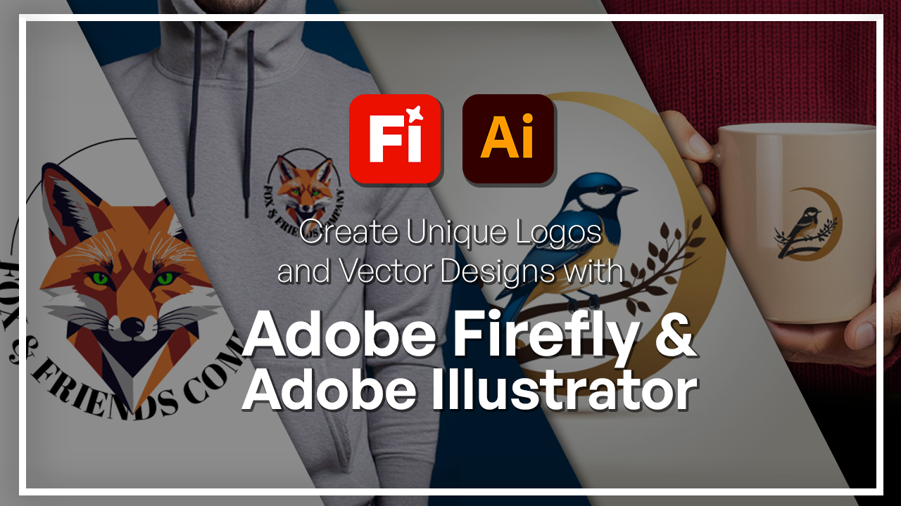
1. Welcome to the Adobe Firefly & Illustrator Logos and Vector Designs Course: You ever wanted to design a logo or brand symbol that
looks so professional, even if you're not
an Illustrator? In this class, I'm
going to show you how to combine Adobe Firefly and Adobe Illustrator to create some stunning vector
designs that are clean, professional, and
ready to use anywhere. Adobe Firefly helps you generate ideas
using generated AI. This can be a pattern, a background, a vector,
or anything else. An Adobe Illustrator helps
you turn those outputs into crisp editable vectors that you can customize
for any purpose. Together, they form the
ultimate combination for any sort of brand logo pattern design vector, and it can make your work
a lot more efficient. I'm Hosakahui a
graphic designer and digital artist with over
six years of experience. As a part of the
Skillademia team, my mission is to help students be able to transform their ideas into creative works using the latest softwares and
tools that are released. This class, we're going to
start in Adobe Firefly, where we're going to
build our base images using some references
and creative prompts. Then we're going
to bring it into Adobe Illustrator
where we can further refine our logos using the many tools that
Illustrator has to offer. For this course, you're
only going to need an Adobe account and
some creativity. There's no need for you to have any prior experience with
Adobe Firefly or Illustrator. I'm going to be walking you
through each of the steps. That way, we can go through
the whole process together. By the end, you're going to
have your very own logo, and there's even going to be a class project where you get
to apply what you learned. If you're ready to
blend creativity and precision using Adobe
Firefly and Illustrator, then you're ready
to get started.
2. Generating Logo Design Ideas in Firefly: All right. So let's start by generating some
logo ideas in Adobe Firefly. So right over here, I'm in
the generate Image tab. We're going to switch
to Firefly Image four. You could try the other models, but for this course, we're
going to stick to Firefly. Image four ultra
is the latest one. This is just a
preview, but for now, we're going to stick
to what works. Right in the prompt box, we want to describe the logo. So in terms of
shapes, the style, if there's any colors
you want to use, this is the time to put it in. So I'm just going
to paste my prompt. So I have a minimal
geometric logo. And the character is a fox. You can switch out for any other animal or just
not have an animal at all. I'm going to go for
a vector style. My background is dark blue, bold shapes and simple symmetry. I'm being very
descriptive right now. I'm just going to
switch this out to a white background so it's
easier to conceptualize. Once we're done, we're
going to hit Generate. I don't have anything
else changed. This is just the default. But what you can do is turn Auto off and make sure that it's in art form and not photo. Let's generate and
see what we get. Here's my first fox. You can see it's indeed
what I asked for, it has bold shapes. It's geometric. And it
has the white background. If I switch something out, I could get different versions. I'm just going to switch
out my aspect ratio to a square just so we have that standard logo and I'm
going to generate this again. Then we can try switching
out a few of these terms so you guys can see how just one word makes a big difference. You can see it gave me a
completely different variation. If I wanted to be like this, I could just go to
generate similar. It's that same fox position, same colors, that sort of thing. But now let's try switching
out the geometric, so we can just take that
out and then generate it. Now you can see instead
of geometric shapes, which is what we had before, we have these smooth lines. And if this is what you
want to go for, go ahead. If you want to try a different
style, we can put that in. So let's do minimal
sketch box logo. So we're looking for
those pencil strokes, and this is exactly what we get. So it does have that
sketch look to it. I could switch out
the background. Let's do a green background, just to get a idea,
and now it's green. When you use the term logo, that has a very specific style in these AI generative tools. There is one specific element, it's very clear cut. That's all because of this
one word that we're using. Now if I remove the logo and
just put a regular prompt, we're going to get
something else. This is a fox, indeed, but it's not a logo because it's not that symmetrical,
it's not that clean. If I were to use this for
a client or something, there's a lot of editing I would have to do putting
the logo back in, I will get that something
like the previous designs. So once you have that
first variation ready, just go ahead and save it or you can download
it or just keep it here because we're going to be editing that in
the next lesson. This is the one that
I'm going to keep. It has a Fox, and
it's very geometric. That's the sort of
style I want to go for. In the next couple of lessons, we're going to take
this very base design and bring it into Illustrator, where we add in some text and
some additional elements.
3. Refining & Selecting the Best Concepts: Once you have several
design options, it's now time to refine them
and choose the best concept. So this is the one that I
ended up liking the most. And instead of just going
with what I was given, I could actually edit
things in Firefly by either generating variations or editing them in the Edit tab. So let's just look at
this fox real quick. We can see that there are
some inconsistencies, especially around the whiskers. I could just tweak
that in the Edit tab, but maybe I just want to
see more options that look very close to
this. Design option. So what we're going
to do is just being the generate tab and then go to the three dots in the right, and we're going
to generate more. So this is going to be
first with the same prompt. So as you can see,
what I have down here matches the one that is
currently being generated. And now I have that
same fox idea, but in a different position. If I want to explore
this, I can do that. But what you can
also do is go on the image in the little
bar on the top left, you can generate similar. Let's say I want to
get a few more options with the fox being
in this position, I could do that real quick. While that's loading, let's do the same thing with
the first one. I will generate similar
and then we'll see. This is the similar concept
drawn from the first one. You can see that the fox
is in a similar position. Let me actually do this. This is the first concept. This is the second concept. You can see if the
circle is there, and the fox is somewhat
in that same position. This was the original
for the head only shot, and this is something
that's similar. So it has that geometric
shape and the shading. And if I wanted to go
with something like this, I can now take it from here. But I'm going to just
stick to the first one. I think it's the cleanest
out of the other ones and I just want the fox head
and not so much the body. So now I could just use this
as a composition reference. Let's say, I don't want
Firefly to add body or a circle in the back and just
strictly keep it head only. So we're going to use the use as composition
reference here. You can see that it
popped underneath, it's the same prompt, but now we have a reference. If I want this exact same style, I can do the same thing,
but with the other option. Now it's going to maintain that geometric three
D looking shape, that shade of orange as well, that's going to be maintained. So with these two references, we're just going to hit generate and see what other
variations we can make. Now we can see that this
guy is a lot closer to our first fox because we
use the two references. This is what we had where we use the same prompt,
but no references. And you can just see the
difference right here. This looks like a younger fox, while this one looks
like a really old fox. And this being the original, you can see how it kind of played out really well
with the two references. You can also switch
things out with the terminology that we looked
at in the previous lesson. You could have references. You could have that
perfect prompt, but maybe just switching out a few words can get you
closer to that concept. We have minimal
geometric fox logo. I could add in the
word abstract maybe. Instead of minimal, I'm
going to go with abstract. Let's generate that
and we could also do another one that's
bold and symmetrical. So different words here, we can see the difference
when it generates. But now with the word abstract, it added these colors
at the bottom, so it's not just that orange. I'm going to try the bold
symmetrical one as well. Next, we could try something that's a little
different in terms of color. So I will remove
my style reference and instead, so just hit the X. Instead, we're going to go to
the styles right over here. So this is the bold
and symmetrical, pretty close to what we
had in the beginning, but the shapes are a lot
more shaded in this case, and this was the abstract. So there is a little bit
of a difference there. So now back to the styles, I could just go to the
gallery and choose either a certain color or a certain texture that I
like. And just add that in. Let's try as a watercolor one. I'm going to generate. We still have the composition reference because once again, I only want the fox head, not the body or any other
shape that may pop up. And then afterwards, we
could try a three D one. I think that would be cool.
We could do something else. So this is watercolor, still has that fox, the same angle, same
face and everything. But now we can try something
that's a little different. Let's try a neon one, actually. I'll go with this guy. So there's my neon fox. It added a background
as well, which is fine. We could remove that background
using the editing tools. So what we're going
to do is just go to Edit and choose generate a fill. Edit image is going to be
a little bit different. It has a chat bot interface, you choose your model
and then you're maybe turn the Sian into green,
something like that. But that's not what we're
going to work with. We're going to go with
the generator fill, which is the second option. Over here, I only need to click on this button,
select background. And there it is. We
completely got rid of it. If I hit Generate, it could add some
stuff in the back. But for my purposes, I just want the fox's
head separated. But let's say I wanted
a different background. When I hit Generate, I get these still neon background
styles that I could explore. If I don't like any of them, I could click on more and it's going to give me
different variations. Now we have all of
these different things, pretty colorful, but it's not something that
I'm looking to do. But in case you wanted to
remove a certain part, like a smaller part, you
could use deep brushes. We have insert to
add something on, remove to remove and expand if you wanted to
expand the background. We got rid of our background, so we can't really
use this anymore. But I'm going to zoom in
with my scroll wheel. And let's say I'm not too happy with the way
the nose looks. I'm going to go to pan.
And when I clicked away, it brought back the background, but if you just go to remove, background, it's
going to remove it. That's going to solidify
our first action. So just go to remove
the background, make sure you're on subtract
because we're trying to remove from the original
image and not add. Let's say we wanted to
get rid of the nose. Let's say it's not
up to our liking, I'm just going to
click away from that remove
background situation, use the pan to bring
it to the center, and then use a remove tool
to just brush over the nose. Now, let's go to add to
add to our selection. You should be seeing this
transparent thing show up. Once you have that, you
can just hit remove. Remove is going to exclude
that selection from the original image
and try to blend it in using the
surrounding graphics. So the colors, if
there's a line, it's going to try
to make it look as seamless as possible. So now we have a faded nose. But as you can see, it has
that shading and all of that. Again, if you're not a fan,
you can generate more, but you can also do
the opposite thing, which is to insert. I'm just going to go
to Insert and now a chatbot shows up where I could type in
the thing that I want. So let's say Fox nose. We could also put in nothing and have Firefly figure it out. But I'm going to try
Fox nose and just play around with the way the image looks until I have
something I like. Now we have this more
three D looking nose, and if I click away
because we didn't save, it goes back to the original. You could use the generator fill to do some quick editing. Of course, if you don't really like the way the
tools function here, that's no worries because
we're going to take our Fox into Adobe Illustrator
in the next lesson. Choose the variation
that you liked the most. I think I will go with
definitely one of the fox heads. I'm just not sure which one. I think maybe this one
looks pretty clean. We even got a shadow, which I didn't really ask
for, but it just showed up. So you just kind of hit download to get this into your computer, and then we're going to fire up Adobe Illustrator in the next
lesson and see what we can do with this vector that Adobe Firefly generated
in a few seconds for us.
4. Converting to Vector in Illustrator: Now, let's turn our
Firefly generated image into a fully editable
vector. This is Illustrator. This is going to be a separate
program that you can just download under your Adobe
Creative Cloud subscription, and we're just going
to hit on New File. Since we're dealing
with a logo here, we're going to go
with a square canvas and then decide on the
width and the height. Now, luckily, Adobe Illustrator, like all the other
Adobe programs has some templates depending
on what you want to do. So I will go to Arts
and Illustration. There's also a branding one
as well, like a square logo. You can just get it
here very easily. Just going to click on this
and try to do a larger size. So 500 pixels by 500, meaning that it's a square. If you don't want it in pixels, you can click on this to
choose any other measurement. You can decide if you want
more than one artboard. I'm just going to turn
it into two just so we can look at the effects
of image trace. The rest are pretty standard. Now, if you want to print this, you can switch the
color mode to CMYK, which is the colors that would
respond well when printed. RGB is just your screen colors. I'm going to leave mine at RGB since I don't want to print it. Then we have some
raster effects, which you can pump up or down depending on
what you want to do. I will go with medium. For my case, keep in mind
that if you do increase it, it may slow down the program
because we're dealing with 150 pixels per
inch in this case, and then the highest one is 300. It's going to take
a while to load. Once you're done,
you can hit Create, and now I have my two artboards. Now, previously we
downloaded our Fox logo. All I'm going to do is
go up to File Place, or you can hold down
Command Shift P or Control Shift P on Windows. Just grab your image
wherever you saved it on. You can see that my Fox logo
is attached to my cursor. All I have to do is either
click and drag to decide on the scale or just
click one to drop it in. This right here is our logo. I could just move it
around using the move tool and we can also scale it
up using the edge here, so it could fully
expand the artboard. Now, when you have an image, if I grab any tool, let's say, I want to be
able to move the eyeballs. If I click on it,
I end up moving the entire image and
that's not very helpful. To turn this into
an editable vector, all you have to do is just
go down to Image Trace. If you do not have the latest
version of Illustrator, you can just go to Window
and then go to Image Trace, and it's going to give
you this little box, or you could just
click on it here. Now, there are some presets. We have photos,
depending on color, sketch, silhouette, technical drawing,
that sort of thing. This really depends on what
sort of logo you have. Now, generally with logos, you're not trying to make
an art piece where there is hundreds of strokes,
hundreds of shades. You want something very simple, either three color or six color. If it's an illustration,
maybe 16 color. But usually for logos, you would stick with
one of the two. There is an image in your logo, you may want to
consider one of these. But for my case, it's a pretty standard fox
and from looking at it, I could see how many
colors I'm dealing with. There's whites, blacks, and
different shades of oranges. If I choose three colors, it's going to flatten all the different shades
of orange I have. But if I go with six color, it will preserve some of those different
shades of oranges. I will choose six
color. We have view. You can see the tracing
result when it's done. See the outlines when it's done, which is the lines
that you get to edit now or the source
image if you want, I'm going to leave it
on track and result. Then we have mode, color, gray scale, black and
white, leave it on color. Now palette, you
could limit it to what's in the image itself
or go for anything else. You can also go to your
Adobe Illustrator library. If you have a certain color
palette ready to use, I'm going to just stick
with the default. If you want more than 16 colors, you can just drag this
to up to 30 colors. I have six right now.
That's what we chose. And when we're done,
we could hit trace. You can also see a
preview, hit Okay. It's going to start
looking at the image and trying to extract the
lines and details for us. I'm not really doing much here. When it's done, you can
see that my fox changed. This is the preview
I get to look at. Before you do anything before you click away or hit Expand, try to see if this is the
result that you want. If this is not what
you're looking for, you can cancel or just switch out the patterns a little
bit, the settings. Let's say I want more colors. I just increase it to eight. It's going to do a
little process again, and then the result
will be on this side. So now I added the shades
of white in the background. This is my fox, if you're
happy with it at this point, you would hit on Expand, so it could actually
start giving you the paths that you
can later edit. Just going to click on
this once and you can see all these little blue
things that pop up. These are all essentially points that you now
get to move around. So just for reference,
I'm going to grab this guy and put it here. You can also hit X if you want. I'm just going to
bring the original Firefly image onto art wart. Command Shift P on Mac and
then just the same image. I'm going to scale it
up and then let go. Let me just dab click
here, call this Firefly. Call this image trace. So we can see the difference. It's not identical, but
this is really where you get to apply all the tools in Illustrator to make
it the way you want. If you want it to be
the exact same thing, you can go back to image trace and try working with
maybe less colors, more colors, maybe a certain
color palette you want. But you can see the main details are pretty much identical, so it didn't give
me a different fox. All right. So once we have this, I'm going to use my track
pad to zoom in here. Now I'm able to move all
these different components. Let's say I'm not
happy with the nose. You can use a space bar to move the canvas around, hold it down. But I could just click
once on this area and you can see that it grabbed the nose and the whiskers. If I want to change
the eye, click once, I could move it around
and maybe change the color if I wanted to so
we can just click on it. Down here, there's
the color box. Double click, and maybe
I want a green eye. So you have the freedom
to change your logo. Now, sometimes when you
do add a lot of colors, Illustrator tries to add some details from
the background, even though in the original one, we weren't really dealing
with a lot of details. There's some slight
shading going on, like a slight gradient, but that's not
really what I want. I could just click and drag with a direct select
tool, the white one, and the black one, click and drag and try to get rid of
the stuff that I don't need. I'm hitting backspace to delete and just make sure that your fox is
not being selected here. So now we kind of
have this situation. I can't really get rid of
these because you can see that it ends up grabbing the
highlights of the fox. So I'm just gonna leave that B. So that's how you get to turn your Adobe Firefly images into an editable vector
using Illustrator. In the next lesson, we're
going to clean this up a bit and make it into something
that you would want to use. So that's the time to also learn about Illustrator's tool. You get to explore the
different shapes, texts, and pen tools and
see how you can utilize it to make
your logo perfect. So I'll see you guys in
the next lesson. Hello.
5. Cleaning Up & Customizing Your Vector: Okay, now we're going
to clean this up. We brought it into
Illustrator, and once again, the one on the right side is the firefly version and the
left side is the image trace. So all we did last lesson
was to bring it in and we chose a few
selection of colors, and the details are
pretty much the same. Now, what we're going to
do is just clean it up, and if there's any sort of
shape that's a little rough, we're going to smooth it out
using Illustrator tools. Zoom right in and immediately you can see
that we are getting this issue where
the background is connected to the
highlights of the fox. What we're going to do is
just use the pencil tool, which is N on your
keyboard. Click at once. We're first going to hit A to get the direct selection tool, click on this white area
until you see the blue dots. Hit N on your keyboard to switch to the pencil, and
all we're going to do, I'm going to zoom in here is connect the two points together. So we're closing it. Making sure that our
shape is its own thing. Now you can see that the giant white piece does
not extend to the fox. By undo that
Commander Control Z. You can see that before it
went in on the fox's face. But all we did was
just go right in, connect this point
to this point. We're closing these gaps. You can think of
it flowing water. You want to make sure that
doesn't flow in places, it shouldn't just making a
connection when I let go, it's no longer on the Fox. Now with the direct
selection tool, I could hit Backspace and we
got rid of this wide area. There may be some
little bits left over, but you could just
do a general grab to clean everything off. Usually that's going
to end up happening, but it's an easy fix. Got some stuff up here. Here, for example, we
don't have that issue. You can see that the
border of this white thing is right by the
fox's head and ears. I could just delete
this. However, we are getting the same
issue with this one. It only goes into this part. Once again, I'm going to
hit N after I grabbed the selection to connect it and I'm going to make the
little sharp thing. So that it looks more natural. Now, you can see it closed
it off into the fox, but I could just remove the little shapes
that were leftover. As long as you're maintaining your main subject,
you should be fine. All right. We also have
this part in the bottom. I don't think that's
connected to anything, so we could just delete it. You could keep it if
you want a shadow, but I'm not going to do that. Already, we were able to completely remove the
background from our fox. Now we're just going to zoom
in and do the same process, but with different
parts of the fox. For example, we're
getting these cuts, and that's an easy fix for us. When we grab it, get
the pencil tool, and then make the connection. You could start from something very little, going to zoom in. I could grab this point and connect it here and
you can see it extends. But if it's a straight
line like this, all I really need to do
is go to my pen tool. You grab any, want
to go with this one. And right now there's
a minus next to the pen tool that's going
to delete that point. Instead, we're
going to hold down command until your
cursor has changed. Click once, and we're just
going to move this up. Now you can see it's connected. I didn't really have
to do the whole pencil thing numerous times. Here we're getting an
interesting thing. I just need to
delete this point. Going over with the pen
tool, when I see the minus, I'm going to click
once and you can see that it went over went up. There's another shape underneath it, so I'm just
going to do that. And now we have this situation. The reader part selected, I could use my pencil tool to once again make this connection. Sometimes you're going to
get duplicates of the shape. You just really
have to remove it. Here we're getting this
interesting shape, so I'm going to grab the
whole thing, use my pencil. Since we have a geometric logo, I'm going to make sure
that I'm maintaining that. Let's go like this. Oops
missed a little bit. And if it's not that smooth, you could just go over
it with the smooth tool. So over here, we have the
brush tool. If you long click. Yeah, get the brush tool if you grab the let's first
grab the section. Get the brush tool with B and
then hold down alteroption. You should see a change
in your cursor again. Just go over that area. You can see it's going to
smooth out that section. And then if you're more
comfortable with points, you can switch to the pen
tool to make the adjustments. So I can smooth
it out like that. Now the rest is pretty abstract. If you want, you could
change the colors out, remove some of the weird lines. But overall, it really depends on what sort of
logo you're looking for. I think I added way
too many colors. That's why we're getting
all these details. I'm going to try again with less colors just to show
you what that looks like. I'm going to put the
sky away for now. We're going to duplicate
it, Alter option, click and drag, and
then I'm going to go to Window Image Trace. Let's try something a little
less intense, three color. Now you can see that
it's lot less detailed, but it did lose the
main parts of the logo. We could try a black
and white logo. This is something
you could explore. We have the default. Then if you do high fidelity, that's going to be
very detailed and very close to the image
that you presented. Now you can see
this is identical. I could just expand this and you can see the number of points we're dealing with here. But you can just
see a difference between this guy and this guy. It really depends on
what you're going for. With this, I do have to
redo the whisker part. But you can see that there's
a lot of details here. But I'm going to stick
with this version just because I want
it to be more flat. For example, here we
have this issue where this shade of orange is extending to the tip,
but this guy isn't. I'm just going to grab this and then we're going to
grab the Pen tool, make a point in the
middle, click once, Commander Control, click and drag until we reach the side. Same thing here, click and drag. It's the wrong section. You may have to click more
than once until you get that point only instead
of the entire thing. If you're dealing with
a curvature issue, let me see if we're
dealing with that. Going to make another point
here, command, track. So we may be dealing with
some curvature issues here. You can just switch over
to the other pen tool for curvatures and try to match the side or
delete the background, whichever is more
comfortable for you. For example, here,
the red part is rounded and that's not
what I'm looking for. I could just grab
both the shapes, the one underneath
and the one on top with a direct
selection tool. To the Shape Builder, which is this tool and then
holding down alter eruption. There's a plus on
this right now. If you hold down alter
eruption, it turns to a minus. That's because we want
to exclude this overlap, and now you can see
that it's gone. You can also merge
things together. For example, we have this
section and one underneath. I grab both, you can see that it's two different sections, even though it's one
part of the fox. I could use the Shape
Builder to just connect it. Since I have a plus already, I don't need to
hold down anything, click once, go to
the other part, and now it's one shape. This is really important
because if you do plan on changing the colors, let me actually see how many
layers we have right now. If you go to layers,
open this up, the little blue
dot indicates that you're dealing with that layer, so I know I have to go there. You can see that there's
a lot of layers. So if I want to change the eye, I have to go and find it, repeat the process with
every part of the body, and that's going to
be very tedious. Plan on changing the
colors, but in case you, just remember that
you should use the Shape Builder to
combine any of the areas. For example, here, we have this gray and orange. It's
not a good look. I'm going to grab
the Shape Builder, go over this part, and now it's all orange.
Same thing here. Just connect them
all. Turns orange because our foreground
color is orange. If you're getting
a different color, you just have to switch it out. And yeah, so even though
we are doing some edits, I'm sure you can imagine how harder it would
have been if we use the firefly generated
fill because these are very fine details and it would have
just taken forever. So that's why we move this to Illustrator because
we know Illustrator has a lot of editing tools that we could just
use and utilize, so we might as well use them. Gonna turn this part sharper. Just click once, grab the handle with command
and just make it sharp. Same thing here. So
if you extend this, you're going to add
to the curvature, which is what we're
trying to do. Okay. Let me just go
over the eyeballs. I think we did change
the color here. I'm going to use my
pencil real quick. Okay. Just a little
detail here again. I think we just
have to switch out the point here is interesting. Okay, so I'm going to
leave that for later. We'll clean it up at
a different time. But if you want to
change the color, you just really click on that shape and you
switch it out here. Can you use the eyedropper tool, and I'll make like this
guy a different color. So green is good, but that's really green so maybe
something like this. Grab this other eyeball, use the eyedropper tool, click ones on the other eye, and then there we go. So that it matches the
colors. That's important. I'm getting two shapes again, so I'm going to use
the shape Builders, my foreground colors, different. Same thing on the other side. Just some minor edits, and
then we're going to move on to adding text and some
other cool things. Let me just fix this guy. Okay, so this is where
we're going to stop. We just did some cleaning. Feel free to do more edits if
you want to change colors, or if you want to
kind of combine shapes or switch out something. I will leave mine the way it is. In the next lesson, we're
going to use the shape tool, the text tool to just
kind of bring this all together into a real fox logo. So I'll see you guys
in the next lesson. Hello. Hello. Hello. Hello.
6. Creating Logo Applications (Mockups): So now we're going to finish
up the logo and then put it onto some mockups as a sort
of application of just logo. So they need to be
on something to advertise your brand
or your company. So let's go ahead and add a little circle behind this fox. I'm going to grab
the shape tool, which is right
over here, circle. In my case, I'm going to
hold down Alter option, click, and just hold
down shift as well. Just make a circle
big enough that it's almost the full size of
the fox, but not completely. Over here on the
properties panel, if you're not seeing this,
go to Window properties. We're just going to
remove the fill. Click on that, get
rid of the fill and then add a very thin stroke. I'm going to grab
this black color, and then we can go
for maybe two points, and now we have the circle. But I wanted to
go behind my fox. I'm going to grab it and then go to as V and then grab it. Go to the Layers panel. If you're not seeing
the layers panel, just go to Window layers. You can see how in
the layers panel, it has this blue sign next to it that indicates that
that's where the ellipse. So I'm just going to grab that layer and put
it under everything. Now it's behind my Fox. All right. So we have
our shape. It's cute. I think I'll do
like a 0.5, so 1.5. Then let's add some text. The text tool is right here. We can do type on a path
tool if you want to do a circular thing or if you
want to do just a flat text, I'm going to go
with the path one since I have the circle already. Click on the circle. You can see the text
just goes all around. Let's put a name
Fox and Friends, maybe company. Or Control A. On the right side, again, properties you can
choose your font, and it's going to give you
a little preview as well. I think I will sort
this out with a serif. Here's some serifs.
Let's try this one. If you want to get larger, just go down here and
increase the size. IT 36 is good. Color, if you want
to change that, that's over here, but I think I'll leave
mine the way it is. To see the different
styles if you are font, you can go over here, but
I only have the regular. Now if you click away on
the direct selection tool, you will see these 2 bars. This is where you get to move the position so you can
see I'm going over, think we could hard to grab it. To do something like that. But maybe the other
way, actually. Let's put it inside the
circle and then put it underneath so the
ears don't cover it up. Now I just need to make my
shape bigger grab the edge, shift option, hold down both, click and drag until
you can read the text. Now we have this shape. You could go ahead and
add another circle. I think I will leave
mine like this. Perhaps actually we could do just with a pent tool,
something very simple. I'm going to go with
these two points using the little purple guides to make sure it's the same. And I'll just lift this up. Now we get this curvature.
This is optional. When you're done, you can hit escape and I will
go to Layers panel. This is the path, it
has the blue light, the blue shape next to it. I'll just grab this underneath everything and there's my logo. Oops it didn't go. Click
and Drag, there we go. Now the ears are on
top of the line. And there's my final logo. So you could add in, like, a little slogan or anything, but I think I'll
leave mine like this. Now, in terms of application, I'm going to move this
firefly image away. This is the firefly image. So let's actually make
this our mockup artboard. So Illustrator actually
has its own mockup tab, which is really convenient. All you really have to do
is go to Window and scroll down to mockup and it
has its own tag here. Now, you want to have
your logo selected first. I'm going to just using the direct selection
tool, grab my logo. Let's grab our logo and I will preview mockup on
any of these that I like. There's different
categories like apparel, branding, graphics, digital
devices, and so on forth. I will do stripe packaging. So when you find
something that you like, you can just do preview
mockup and it's going to put your logo on
these platforms. Then if you go back to
the different categories, you can see how they look. Because I have black text, I'm going to go with this
hoodie place on Canvas, and there is my logo. I'm just going to minimize
this so that it fits. Oops. Well, not like that. Let's hold down shift so we
maintain the aspect ratio. Just want it big
enough. For this. So you can see that my
logo is placed right on there and if I grab my logo, I'm still able to move it, let me do that. There's a release
option if you ever wanted to edit while
it's in logo mode. I wouldn't suggest doing that, but you can see now how
right now it's slanted. When you hit release,
it makes it flat again. I'm not going to do that, undo. And the funny thing is that,
well not really funny, but when it comes to bases
where there's curves, for example, the mug, I'm going to place
on Canvas again. Illustrator has this dome where if you were to
move the logo around, so I'm going to grab it with
my direct selection tool, it would be within
the scope of the mug. That's pretty cool if
you wanted to change the size or make
other adjustments. Let me squeeze it or
anything you want to do. It's going to be
all within the mug, so you don't need to
redo your mockup again. So that's pretty much our logo. We started from this image. We brought into Illustrator, added some change the details a little bit to
match our liking. We added this text
and then that shape, finally, it went
on this sweater. I hope you guys enjoy this and we're able to follow along. In the next lesson, we're
going to do a class project. So we're going to apply
everything that we did in these little lessons and combine
it into one big project. For that case, I want you guys to be able to follow along. So make sure that you were able to get
comfortable with all of these tools and were
able to at least make a logo like the
one we did here. I'll see you guys in
the class project.
7. Class Project: Create a Logo and Mockup: Uh huh. So let's put it all together with this
final class project. I want you guys to
follow along so make sure you have
Adobe Firefly and Illustrator open and try to make your own logo and mockup the same way that
I'm showing you. We're right here
in Adobe Firefly and similar to the
earlier lessons, we're going to start by writing a prompt for
the logo that we want. You can brainstorm on
different mood boards. There's Pintas Instagram,
that sort of place. To figure out what sort of symbol or mascot you
want for your logo. We tried a fox earlier, but you can go for a flower, a car, or just a text
without any sort of symbol. I'm just going to go
down to generate image, and this is where we left off. I'm going to remove
everything if clear and then try
in a new prompt. Also going to make
sure I don't have any references at the moment. Again, we're doing
Firefly image for ultra. There's other models out there, but this is what I'm
going to stick with. Choose your aspect ratio to be a square since we're
dealing with a logo, make sure this is an
art and not a picture, and we're going to deal with the composition and
style reference later. So let's think of what
we want for our logo. I think I will go with
something with the moon. We tried an animal last time, so let's try to go with
a different shape. So there's our moon. It looks very minimal, indeed. I think I will do a logo of
the moon, minimal details. Let's do outline style
instead of vector. I'm given less details. And of course, if you
saw that the prompt is not really portraying
what you're looking for, remember, we're going to bring this to Illustrator anyway. So this is an interesting logo. I didn't really
ask for the face. So let's see what we could
put in for the prompt. We can put like a
bird on the moon, maybe, a bird on the moon. This is going to be
a good time to start bringing in the
composition references. That's actually very cute. I'm going to try to get
some more versions. You can look at the
composition reference. I think I definitely want
this to be the reference. I like the placement of
the bird and everything. I'm just going to
hit on Edit use as composition reference. It's two D style to exclude the three D
details that we got earlier. In terms of the style reference, just open it here and
see what we can put in there to make
our logo stand out. Now you can see
that it's too deep. If I want a certain color, I could put that in right now. Trying to see what sort of
shape you want to go with. Actually, I think I like
the way this looks. I'm just going to generate some similar, so generate similar, but this is something
I'm going to save the favorite so I can come
back to it later. So this is slightly different. We're getting a little
bird in the far as well, which is a good touch. Trying to see which
one of these I like. I think this one looks
a little bit more creative compared to this one. This one looks a
little bit flat. Perhaps we could use the generative fill to switch
out some of the details. So I'll just do a
change on this. Go to edit, generated film. And I'm first going to
remove the little bird. I feel like once
we do the mockup, it's going to get lost. So I'm just going to remove that using the removed
brush, as we know. G to hit Keep and
then use my track pad to just zoom right in and see what we're
dealing with here. Use the pan tool to move
your canvas around. We're getting some little specs, so I'm just going to
remove those as well. You can make multiple clicks. So just use your brush to
click on these little dots. Use your pan tool to oops. Let's first remove those. Okay. Now it's a lot better.
Use the pan tool now to try to remove any sort of imperfection,
like this area. I'm not sure what's
happening here. So let's just go over
it with our brush. I'm going to remove
this leaf, as well. Okay, so now it's a lot less crowded, which
is what I wanted. Keep on the one you want. We've got some
smaller circles here. And again, just because I
want to put this on a mockup, I'm trying to get rid of the smaller details because they just won't be
on the final mockup. You don't want to
take the attention away from the main subject, which is the bird in our case. Use the brush to prevent that. And then get rid of these
little shapes on the bird. Let's get that all cleaned up. Okay. Head keep. Got a little bit more
of these lines here, but then we should
be good to go. Okay, we have some issues
here as well with the wing. I'm sure you can see there's a distortion happening there. I could just have Firefly either remove it completely or replace it with a
different pattern. I'm still going to
use my remove brush to just go over this area. But if we saw that firefly
can't give us what we need, we can always just add in a
shape inside Illustrator. So it's not that big
of a deal because Illustrator is
there for any sort of task that firefly can't do in terms of
editing, at least. I'm just going to go
over this carefully. Try not to go over
a different color because then it's going to try to figure out how
to blend those two. But for us, it's a very
obvious separation between the blue part of the
wing and the yellow body. So I don't want to
confuse firefly. Okay, at least this one
is a little better, but I'll just keep that for now. And looking around our bird, everything else
looks pretty decent. So I'm going to stop
editing the image. And once you're done and
you're happy with everything, just hit Download and it's
going to save it as a PNG, which is a high
quality image file. Now, let's open up Illustrator
and make a new file. So let's go to New File. Again, I'll do the
custom 500 by 500 pixel. Feel free to switch that out and do something
else that you like. I'm going to do two artboards again just to show
you the difference. Command Shift P on Mac. That's Control
Shift P on Windows. Click and Drag your image. I'm going to call this Firefly. And this one will
call it Illustrator. Okay. Now let's click on the image with the
direct selection tool. Hold down Alter option, shift, click, and then hold down
alteroption, click once. And then when the
cursor turns black, get shift and just move
it to the other artboard. So we just made a duplicate. If you also want to do it
in a less short cutty way, you can do right click, do a copy and then just paste it somewhere and then just
put it in the artboard. But it's good to know all the
shortcuts in Illustrator. You're done, once
again, we're going to hit click on the Image, Image Trace, and this is what I get with
the default settings. So I'm just going
to hit Command or Control Z and bring
the image trace panel, which I already have up here
through the Window tab. Now, we're going to
choose our presets. Let's do that. I think
that looks good. Again, you can switch
out the amount of colors depending on how
many details you want. Then once I'm happy, I could hit Expand and now I got all
these points to work with. I'm just going to get
rid of the background with the backspace key. Just grab any pieces
that you don't want. I think that's pretty much it. Got this background. So now I have my bird,
but as you can see, some of the colors are mixed up, and it's not looking that
good. Et's get rid of this. For example, here,
we're dealing with different parts of
the old background. You can do a couple of things. First up, I could just switch this color to let's get
the eyedropper tool, turn in the rest of the moon. Then if there's
anything down here, I think we're getting
the same issue. Getting the same issue. So what I could do is
just get the pencil, hit N on your keyboard and
just go over this area. So that got rid of
that extra bit. And then we're going
to grab the half of the moon and just
use the brush again. So on your keyboard
to just connect this part roughly to the edge, and then we're going to
clean it up, of course. Just like connect it like that. Alright. Now that I have this, I could use whichever
tool I want. Usually the Pen tools are the
easiest one to work with. So I'm just kind
of clean this up with my method of curving. Some people like to do with
a direct selection tool, really depends on which one
you're comfortable with. You can see I'm just
kind of curving it back to the original look, and you just have to zoom in and make sure the guy is
meeting the edge here. And if you want to
make a sharp cut, you can just hit Command on that point and
then alter option. Then when you go in,
you can see that it's like a sharp edge. I could just put that
in. Same thing here. Now I have the curve of
my moon already to go. Sometimes with image trays, you get this cluster of points. If I click on as you can
see that it's a lot, even though it's just
one simple curve. So to smooth it
out, we're going to gravity the reg selection tool, click it so you see the little areas that need the smoothing. Go to your paintbrush or
just hit B on your keyboard, and then we're going to
hold down Alter option. You can see that
switches out my brush. While still holding it down, I'm just going to make
a line over this area. An Illustrator should be able to detect what
you're trying to do. This is, of course, one way there's so many other
ways out there. Now you can see from
20 points we went to four and the same
thing you can apply here. You want to redraw a place, just make sure you
have it selected with a direct selection tool and just go over it with the pencil, which is N on your keyboard, grab one of the points and just redirect the curve and make sure you meet
with the other point. Now I have a more
manageable situation. Same thing here. We have
this thing poking out. Click on one of the points, exclude that and then go to have to connect these
two now. There we go. Then here, I have this white
bit I'm going to remove. It's missing the tip, so I could just hit
N again and try to mimic one roughly like this. And then of course, we
can grab our pentols to either remove a point or kind of smooth it
out with the curve. If you dabble click, it's
going to force or curve. You can see it's kind of shift. The less points you have, the more it's going to
follow a certain curve. Try to fix that up
as much as you can. Then here we have
this little bump, so I'm going to once again
use my brush to exclude that little bit shape and then switch over to this
guy, we can extend. Now, here I'm using a shape, the circle just so we can
make the eye more visible. You can see it's not even there, go to make it color black, just like the AI Image
had in the beginning. Command, backspace. Oops. Are these not
separate shapes? Okay, I see what's
happening. Just go to start over with the eye. So we can go in and use the brush to make
that little like eyeball shine. There we go. Got some extra cleaning to do. So once you're done
cleaning up your logo, it's now time to put
it onto a mockup. On the left side, I
have the firefly image, and on the right side
is what we got with Illustrator after
we use Image Trace, the pen tool, the brush tool, Smooth tool, and
all of that stuff. Now, what we're going to do
is grab the selection tool, click and drag logo
on the right side. Go to Window mockup, and we basically
get a few options. We have apparel,
branding graphics, devices, and so many things. And the reason why my
logo is showing up on these platforms is because I already clicked on
preview Mockup. If you're not seeing your logo, just click on that button and you should see
the same thing. So a couple of options
to choose from. I got some packaging. Let me
see what that looks like. I think this mug
looks pretty cool. All I have to do is just
hit Play on Canvas, and now I have my logo. This is going to be its
own separate image. You can see I'm
moving it around. But if I grab the
direct selection tool, I'm still able to move
components of the logo. We can see the outline. However, I do not recommend
that you guys do that. You want to make sure you do
all your adjustments while it's on a artboard so that
you don't mess up the curves, miss any crucial part of a
logo and that sort of thing. Then we're also able to
change the blend mode. If I click on the logo, you can see I get
this little bar. You can switch to a different blend
mode if you wanted to blend in a different way. Usually multiply will give
you the most realistic one. But depending on the background, if it's dark, if it's light, you may want to play around with the different blending options. We could just grab this image and you're able to just
export the selection. You can make it a PNG or JPEG, whatever you want, and
I'll call this my mockup. Choose your folder.
So there's my image. I just opened it in my file, and I could showcase
my brand new logo, which I started in Adobe Firefly and finished an Illustrator. Now, for the logo to
look more realistic, there's only so much
that Illustrator can do in terms
of image editing. That's not really its
specialty as we know. So if you want a
hyperrealistic logo mockup, I would suggest that you either take this image
into Photoshop or Canva or any other
photo editing platform and make your adjustments there. So you can see that once
I select this image, I can't really,
like create a mask. Well, you could create a mask, but there's not that much of a flexibility compared
to Photoshop. But the mockup tool still
is very good when it comes to skewing your artwork
into different shapes. Like we even have this
cream, hand cream. You can see how it kind of molds the logo into the
right position. You also move it around. If let's say you don't want
it on that edge of the mug, I could just move
it somewhere else. It stays within the mug. If I go to the edge, you can see that my logo is
just disappearing, and to keep it in the middle. Same thing applies here. You can see how it's contained
within the hand cream. I could just duplicate
this with Commander just option click the logo, alter option, and
just make another duplicate it's all going to
be once again contained. That is the end of
our class project. I hope you guys
were able to follow along and make a
mockup like this. Again, you can use
any other software to set it up in terms
of photo editing, and there's tons of
options on the mockup tab. You can also add in your
own mockups over here, but that's going to be
a whole other process. I would suggest just
playing around with the very good canvases that
Illustrator has to offer. Now you're left with
this cool mockup that you made all by yourself, starting from Firefly and
ending in Illustrator.
8. Congratulations! What’s next?: Congratulations.
You've just finished the logos and vector designs in Adobe Firefly and
Illustrator course. You started with one idea
and then transformed it into a professional and clean logo using these two tools combined. Now it's your turn to create. For the class project,
I want you guys to create your own logo
or vector using both of the tools and the
procedure that we went through from the start of
the course until the end. When you're happy
with that result, be sure to upload it into
the class project gallery alongside your prompt so that I could see how well you
applied the knowledge. Also so your classmates can
see how well you performed. I will also be giving you personal feedback and comments on your work, and that way, you can use it to further
enhance your work or just get some validation for
your incredible designs. I hope you guys enjoy
this class and I hope to also see you in our
next part of the series.
 Skillademia Academy, Creative Skills for the Future