Transcripts
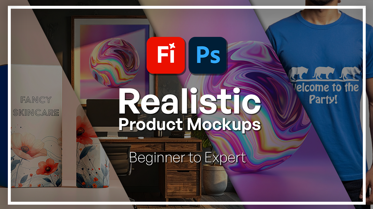
1. Welcome to the Adobe Firefly & Photoshop Mockups Course: You ever wanted to turn a simple idea into a
professional mockup? One that looks so real
you could almost touch. Well, in this
class, I'm going to show you how to do that with Adobe Firefly and Adobe
Photoshop together. I'm Hosta kehii a
graphic designer and digital artist with over
six years of experience. I've been teaching Adobe tools
and AI for many years now, and I have been seeing
one big change. That is how AI is transforming
the way designers work. Adobe Firefly is just one
of the many examples, but it now helps you
generate things and design things in a more
faster and efficient way. That's exactly what
we're going to focus on how we can integrate Adobe Firefly into one of the main design components
which are mockups. From product packaging and framed prints to
apparel and posters, we're going to start with generating our images
within Firefly and then refine them and do some final edits inside
Adobe Photoshop. When you finish this class, you're going to be walking
away with a professional, realistic mockup
that you can put right away into your
portfolio or social media. So if you're ready to
get started and explore this wonderful world of design with Photoshop
and Firefly, grab your coffee,
grab your computer, and let's get right into it.
2. Generating Base Images in Firefly: Let's start by generating
our base image. This is going to be something
you can do when you're going to be building mockups
either in Photoshop, Canva, or any other software. But it always starts
with a base image, and that's what
we're going to be focusing on in this lesson. First, let's go
to Adobe Firefly, and we're just
going to head down to the text to image feature, what we've been doing
in the past course. But over here, instead of
talking about a subject, we're going to be talking
about either a setup, an environment or a object that is clean for us to put
something on there. That could be a white mug, a white t shirt, or
maybe a different color. But there is no longer focus on the features of the
human or the landscape, but more so on that thing that is going to be your mockup. For me, I'm going to be
doing something very simple. Let's first make
this a white screen, and I'll turn this into photo because that's what mockups are. If you're not familiar
with what a mockup is, it's essentially a way for you to display either
a pattern, a logo, an image onto
various surfaces to show your client or the audience
how it's going to look. Let's say you're an artist and
you draw pictures of dogs, you want your audience
to visualize how that picture is going to look
like on a T shirt on a mug, on a key chain so
that they can make better considerations
when they're buying your product instead of just
looking at the flat image. By the end of this lesson, you'll get a better idea
of what a mockup is. Let's go for
minimalist desk setup, just emphasizing
that I don't want too much detail on things that are not related
to the mockup. Talk about the lighting, and then I'll say with a
mug on it. Let's generate. If you found it hard to
come up with your prompt, remember that we have
the prompt suggestions and you can just go over that. Here are my options. You can see how it even added some blurring in the background and the focus here is the mug. Now, just like that, I
could switch out the color. Not much changed in the prompt. And then all I would have
to do is bring it into my other software to add
my logo or design on it. We can also do the same
thing with a garment. So maybe a folded t shirt on
a clean wooden background. Again, I could give it a color. Let's go for blue.
Here is a t shirt. I struggled with
the folded aspect, but we could just remove that. You can see try to
do a folded shirt, but at the same time
spread out one. If I remove folded, now we have a regular shirt. If you want, you could have
someone wearing that shirt. Crop body of a person, a man wearing a blue t shirt in front of a clean
wooden background. You could also just
do the full man this is crop body.
That's what it means. No head, no legs, just the main focus
of this mockup. This way, people can
focus on that design and not so much on how
that person looks like. If I remove that, I get an actual person
for the most part. Now, just like any
other image generation, you can work with the composition reference
or the styles. I'm going to go with
this dramatic lighting one and for effects, we can add some
colors and tones. Let's try to do a cool tone just to show you what
it will look like, and I'll do another
dramatic light down here. Essentially, you're
manipulating the way the camera is catching this base image so that you would have
the perfect mockup. You can see that going
from this to this, it's a lot more dramatic. There's harsh lighting. And
we have a lot more details. I could switch out
the camera angle to shallow depth of field. And now you can see there's space between the subject
and the background. We're getting that
nice cinematic blur. Same thing here, here and here. That's pretty much how you get to create that based image. It's a very simple formula. You just say what it is that you want to
put your design on. Add some references or
one of these effects. You could also go for a
composition reference so that it follows a
strict guideline and try generating a few
variations every time because Firefly strength
is in its iterations. You save the one
that best captures your product's wipe and then have it generate
more like that. This way, I'm able to start
on the right track and continue on with some editing and refining using
Generative film.
3. Editing & Refining with Generative Fill: H Now that we have
our base image, let's clean it up and
make it protection ready. Previously, we made a bunch of these edits, and as you know, with any sort of AI
generated image, you make get some
mistakes in there. Scrolling up, I have
this photo where the guy has two watches
instead of one. Instead of just downloading this and editing it in Photoshop, I could use fireflies
built in tools to just make that adjustment and then bring it
into Photoshop. Let's go to the remove tab and adjust our brush
and I will remove his left hand watch in
just one simple click. I will keep this one and I'm thinking of switching
this other watch. Let's zoom in. I'm not
sure what that is. It doesn't even
look like a watch. Use the Insert tool, give it a good enough
room for a new watch. Let go and type something in. Now we're getting something
that looks a lot better. I will generate
another set just so I can get different
looks for this watch. I will stick with this one. Now my model, my image is
ready to go into Photoshop. If you have any distraction, feel free to remove
that as well. But what I'm going
to do is select the background with insert
so that I could replace it. I think it's better to have
a solid color just so that the focus could be on the design that we're
going to put on later. Let's do white background. There is my based image and I'm just going
to hit Download. Now onto the other image that we made where it was
one of these shirts, think I will grab one of the white ones just
for some variation. Let's do the same thing, but I could use the brushes
to add an element. Let's increase the size here. Something like in the edge. I'll give you a big room. Then in the prompt box, we can put a let's say, folded towel on the side. There's a folded towel or
maybe something like this. I'm going to keep
this and then use the remove to get
rid of the I think that's a candle and a piece or just one rock.
We don't really need that. All right. Let's accept one of the changes and then go
in with the insert again. I'll add maybe
some Dumbles here. Maybe this is a fitness mockup. And lastly, I'm going to use the expand with the same ratio, so 16 by nine. I'm just going to increase the size a bit so
I could zoom out, just make sure that
whatever canvas you have is in the middle or
in the right area. There we go. Now it's
zoomed out more. That gives us room to add in some text maybe or a disclaimer, anything else necessary
for our mockup. When you're happy
with this, download your refined image and then get ready to bring
it into Photoshop.
4. Bringing Images into Photoshop: In the previous two lessons, we generated various
types of images. We call them base
images because we're going to be building
on them as we go. But now we're going to see how Firefly can make
those base images, but the rest of the
work will be done in Photoshop and not
so much Firefly. I'm going to leave
these for the project walk through that we're going to do at the end of this course. For now, we're going to start
with another base image, and I'll just show you
what happens when you get a complicated base image
that you can't really refine using the three
tools that Firefly has. Let's do a very simple prompt. I'm in the text
image once again, and I will do something
like studio shot of skincare bottle
because the surface being beige, smooth,
lighting wise. Let's say it's diffuse. I'm going for that clean studio look so we could put a go
or something on there. Some minimalist aesthetics
and hyper realistic photo. Once again, I'm going to
go for the white screen 16 to nine photo and then I don't have
any styles or anything. That's what we're
going to start with. Ours we can continue building
up using these references. While that's happening,
that was quick. We're getting some
stuff, not that ideal. This one looks fine,
it's not too bad. And this one's perfect
actually. All right. So we have this shave. I'm going to stick
with this one. And let's say that I wanted
to add something on there. We're just going to see how
that's going to play out and then why we should
go to Photoshop. Here with inserts, going
to go over this bottle. I'm just going to go over
this bottle and say pattern. So as you can see, it's
not exactly catching on. I could say flower
pattern or something. But it's having a hard
time trying to generate an image first and then
blend it into the base, which is that glass
skincare bottle. We have some stuff, but I'm pretty sure you
can see there's a halo effect and this
one looks a little weird, it looks like the flour is
not part of the pattern, it's three D. This one, again, we have that halo effect. I could keep going
back and forth with this using my insert
brush remove tool, but there's an easy way and
that's using Photoshop. I'm going to hit
Cancel and go back. Simply, you can either hit Photoshop here just
to show you what this looks like if you don't have the program or open
it up in the program. In this course, we're
going to do both, but for this one, I'll just do it in the b in case you guys don't have
Photoshop installed. What we're going to do
first is open up the image. We have layer zero. Going to devil click on
it and call it MyPase. It's always a good idea
to name your layers because as the project
gets more complicated, you're going to lose
track of what's what. First of all, you can
refine the size of this. You could use the crop tool to make it a little
smaller or zoom in. But I'm going to just push my bottles to the
right so I could have some space for a text. Then maybe extend this
a little further. Generative expand. I'm not going to
say anything and just have Firefly figure it out. Have three options. It
works just like fireflies. If you don't like any
of these options, hit the plus, add
another prompt. You can get more variations, can generate similar to
what you've selected here, get feedback, delete pretty
much the same thing. I'm just going to
choose this one. You can see now we
have a new layer called Generative Expand. If I hide it, we're going to go back to the
original image. The mask is basically the part where the new
section is visible. So if I go on the mask
and I get a black brush, foreground is black
paintbrush, and I go over it, you can see how I'm taking away from what's
visible on this mask, Commander Control Z, and
let's keep this as it is. I use the crop tool and I
use the Generative expand. This one, as you can
see is a little bit different because
now in Photoshop, I get to see the layer. So if I change my mind, I could always delete it and I don't have to
start from scratch. Whereas here, if
I were to do it, I could do what I
did in Photoshop, but I'm not giving any layers. That's going to be a
little bit harder as I make the project
more complicated. I just get to hit keep and this is what I
have to do with them. Back to this, we're now going to clean up the edges if needed. You're just going to zoom in and see if there's any sort
of hallucinations. Usually there shouldn't be, but sometimes you
get a weird line and it's not a straight line, that sort of thing. But
I think we're good. Everything looks pretty decent. If it didn't for you guys, you're getting weird shapes. You can use the retouch tool, choose the bottom
layer, retouch, and go over that area, and it's going to just fix it for you, remove
those blemishes. But for me, it was clean
already, so nothing happened. Okay. So now we can
edit this image. What I'm going to
do is grab both of these, select the first one, control or command,
select the second one, right click and we're
going to group layer. Now I'm dealing with one layer. But of course, when
I open the triangle, there's sub layers too. I'll call this base image again. Now I get to treat
this a regular photo. If I want to change
the brightness and contrast, I get
to do that here. That's another benefit of
moving this to Photoshop because we don't have any
image adjustment tools. For example, I could go
to adjustment layers, brightness contrast, it
will make me another layer. Maybe I want it brighter, darker, add more contrast,
that sort of thing. That's going to be something separate so I could delete it, lower its intensity with opacity and just build up
on my base image. Another thing that we could
do is add color balance. This is going to help if your image is a
little bit too green, too red or any of these. You balance it out by putting in introducing the
opposite color. This right now is a
little bit too yellow, so I could add a little
blue to make it different. If it's too red, I could
add some cyan and then if it's too purple, I
could add some green. Before or after, you can see
how with one adjustment, you're able to completely
shift the image. Again, if it's too much, you can always reduce
the opacity so the effect is not as visible. I'm going to add some
vibrant just to bring out the colors in
the background. Now I have three adjustments
on top of my base layer. We're going to leave it
here for this lesson. If you want, feel free to
add any other filters, there's so many
things you could do with these, play
around with them. If you want you could
blend it in a certain way. But we're going to take
this to another level by adding some designs onto
these two packaging. And that's going
to be the mockup. Mockups are essentially
a way for you to present your brand without
your product virtually. If you want to put in
your original pattern, you can display it on this box and it gives a great idea to the audience as to how that
box is going to look to them. That's going to make more
sense in the next lesson, do all your adjustments. Once you're done, we can move
on and add some designs.
5. Creating Product Mockups: Here's where your design
becomes a real product. So this is where we left off. We cleaned this up, move the object a little
bit to the right, and did some little adjustments. We have two very different
base objects here. We have a rectangular one and a semi round one
like a cylinder, but then it gets
rounded on the top, and then there's
little the shape. So we're going to
see how not only to add patterns onto your mockups, but also how to make
it look realistic. So to get the patterns, I'm going to use Firefly. Is going to go to
texto Image once again and just make a
really fun pattern. Let's say, minimal floral
pattern with fine lines. Here we want it
to be an artwork. I will do about the
same thing so I could flip it and adjust it if I want to so we got
some pretty patterns, and I'm going to just put
them on both surfaces. So you can play around
with the way they look. We already know how to do that. Adjust your prompt, add
in a style reference, composition, and so on forth. What I'm going to do is
just choose the one I like. I think this one looks cool and we're just going to
download it as a image. Going back here, I'm going
to use a shape, rectangle. Let's start with this one and just click and drag on the area, right click and we're going to convert this to a smart object. Let's go into that layer. Rectangle one, I'll call it box. Then go over to the main menu, edit transform, free transform. You should be seeing these
and just zoom right in. Let me just lower the opacity
so I could see the edges and we're just going
to actually it first. Then go back here. And you're just going to align the edges onto the
corners of the box. I will use the
distort right over here and just click and drag. When I bring back the opacity, you can see that it's perfectly fit and it's ready
for my design. Now, you could only do one
side or do another box here. I'm going to do a design
where I have the front, have the pattern and the sides are going to be a solid color. Let's make another rectangle. Grab the rectangle, another
color and do the same thing. We have two boxes, call this side box. So now we're able to edit
the smart object to either change the color of the
box or add in a design. For side box, which is the
most simple option here, we're going to double click and it's going to
open a new tab. But this is essentially
just that smart object. You can see we don't have
the rest of the image. That's back here. Now whatever changes I do here, when I save it, it's going to be applied in that initial project. All I have to do is
choose my colors. I'm going to remove the stroke, maybe do a dark
blue or something. Something like that,
click away when I'm done, Command or Control S
and when I go back, you can see that it's changed in this original document
and these two are linked. Now for the box itself, the main box, we're going
to tapo click again. This time, this is going to be the canvas for our pattern. I'm going to hide my rectangle and just import
that pattern that we just downloaded.
Let's scale it up. I'm going to grab one of the
edges and put it in this. Then I'm going to grab
the select tool with the marquee one to grab the top here for
some generated fill. I wanted to expand white so that we have the floral pattern only at the
bottom and not everywhere. Okay, I'm going to choose this one and then
you can use one of the other tools to just get
rid of the excess items, do remove, and there we go. This is my pattern,
and now I'm going to hit Command or
Control S one more time. Going back to the original, we now have this pattern. Once you have these, it's time to blend them into
the original box. Grab the side box and simply
change the blend mode. Depending on how you want
it to look like on the box, you can play around with these. The ones over here are going
to be the darkest ones. This is going to be
the lighter ones. These are going to
be high contrast, a mix of both, and
then these are just completely
different things. Focus on the light ones. I'm going to go I think
pin light looks good. Same thing for box. We're just going to change
the blend mode to multiply. Now, with a design
with the side box, we were dealing
with a solid color, so we could just play
around with any of these. But that's not going
to be applicable to a design because if you choose something
other than multiply, you can see that you can
barely see the pattern. So that's why you want to stick to one of these first ones. You can see they're
categorized with these lines, and I find that multiply
is the best one, so that's what I'm going to use. Okay, so we have the shape in
and everything looks good. You could also, if
we change our mind, want to add a text or something, you can always go
back to the box file, and I'm just going to do
a little text preset. Let's do something fancy
and give this a title, fancy perfume or actually
let's do skin care. Let's make it a
little bigger. Okay. And then if you grab
the edges here, you can fit the whole text. You move tool and
just put it up. Now, we forgot the
RE is missing. It's 100 points, or
maybe 90. There we go. Now I have this text, Commander Control S. Go back here and now
you have your text. We're going to stop
here for this lesson. We made this mockup with
a pattern that we made in Firefly and also a base
image that we made on Firefly. To continue on with
our next shape, which is this bottle, we're going to have to move to Photoshop Dektop the
software itself, and that's also a very
quick thing to do. I'm trying to make this
accessible for everyone. Whether you're using
web or the software, there's still options for you. What you could do is
send to app and then choose DeckstopO you could continue if you had
another design, go onto Adobe Express. It's going to open it
up just like that. I didn't have to do anything and it's exactly where I left it. That's the beauty of Adobe. It lets you create
something in one program, move it to the next seamlessly. In the next lesson,
we're going to be continuing in the software. Feel free to download Photoshop. If you're not sure if you
want the desktop version, there's a free trial that
you could try out, do that, and then we can continue adding maybe the same design or another
design onto this bottle, which is going to be
a little bit more complicated than a
rectangular box.
6. Using Firefly Inside Photoshop: Let's continue in Photoshop
Desktop, the software itself. I'm going to once again
use the same procedure. The only difference
is that we're using a tool that's
not available on Photoshop Web and that
is the warp transformation. Make your shape,
give it a color. I'm going to just keep it white. Right click and convert
it into a smart object. Now, call this bottle. Now we're going to lower the opacity and begin
the transformation. It Command or Control
T on that shape and then this tool is what was
missing in Photoshop Web. But before I do that,
I want to make sure that the edges are
perfectly aligned. Let's right click, distort, and just zoom in to make
sure it's nicely fit. You could also create a mask, but I'm just going
to do it like this. Then this is where
things get interesting. We're going to push this down. Actually, we're going
to hit the warp first. Click warp and now your
grade is a little different. Basically, what
we're trying to do is create those curves. I'm dragging the edge down to basically the
center of this curve, the same thing here. You can tell where you need
to stop using these handles, we can push it up. But you can also
hold down Command or Control and then click once on the middle and this will give you another point
that you could use. Now, each of these come with
a handle on either side. This is where we get
to add that curvature. Use the handles to
add those curves. It's okay if it's a
little bit out of frame because we're going
to create a mask anyway. So you can see it's
a little bit out, but we're going to
fix that later. Just make sure that the
corners are in at least. Then to continue
on the curfness, we're going to just use the
handles for these guys, the original ones to make
sure that we're dealing with a curve and not so much
like a weird shape, so it needs to go down. Same thing down here, it's
a little bit less intense, of course, but we still have that curve that we
need to work on. Okay. So once we have this, looking at it from afar, we should be replicating
the roundness. I'm holding down Commander
control to make another grid and just pulling it up a little bit so it looks like
a little bit rounded. I'm just following the
pattern of Did bottle. So it shouldn't look like flat. All right. Once you're
done, hit the checkmark. And then when I bring
back the opacity, it should look very
close to the bottle. But now to make sure that it doesn't go outside the bottle, we're going to make a selection.
Go to your base image. I'm just going to unlock it and use any selection
tool you want. I'm going to go with the
object selection tool and just click once on the spot. When you see the marching ants, which is these little lines, we're going to go back to
bottle, bring it back, and then hit this
button to make a mask. Now, even if we didn't do a
good job with the selection, we're not going to get
anything you know, going out of the bottle. And if you saw that
it's not really clean, you can always go into the mask, so not the image, the mask. Use your brush, black to
remove, white to introduce. So you can maybe go around
the edges to soften it up or introduce more
of the pattern. So now we're just
going to double click, same story and paste our design. I think I'll just drag
it in and I'll do a full screen and
maybe move it on this side so we could
get another flower. Hit the checkmark,
Command or Control S, close this, and
there's a bottle. Now we need to change the
blend mode one more time. I will go with multiply
and you can see how it did a great job bringing
back the reflection. This was on normal.
It was very flat. Now, another thing that
Photoshop Web doesn't have, and that's the reason
why we came here is the blending options. Every layer has the option
for you to adjust the way that pattern color or effect blends into what
there is below it. When you go to FX
blending options, we have current layer, which is the bottle, and then the underlying
layer, which is the base. These aren't really fully
layers because these are just adjustments and these are
the things on the box. Now using these, I get
to fade out the pattern, which is the current layer, the sky onto the brightest part of the underlying layer
or the darkest part. Just to show you, we're going to go on underlying
layer because that's the bottle and the bottle is the thing that has the
highlights and the shadows. You can see the reflection. If I grab this, you
can see how it's going to remove starting from
the brightest part, on the other end is
the darkest part. That's what's happening. To make it a little bit more smooth. We're going to hold
down alter option, click on that triangle to split it and then
just drag the side. You can see how that is
a better representation. You can repeat that
with the dark side, but you don't really
need to because when you get too much light, that is when things
start to fade out. If this was a really dark room, you may want to do
it on this end too, but you don't have that problem. I'm going to repeat
the same thing for the box lay,
which is this guy. Just go to let's unlock it, FX blending options
and do the same thing. Slightly fading out on the
highlights of the box, and that really helps
blend everything in. Now we have both
patterns on the objects. Let's use Firefly within Photoshop to add some
details or remove some. I'm just going to go to
base image and merge it since we don't
need them to be separate anymore, merge group. Then using the Lassa tool, make a really big selection, generate a fill and just maybe we can introduce
some plant leaves. You can put in a candle or whatever you want to
do for your mockup. But since I have
flower patterns, I might as well add
some plant elements. Down here, you can
see the variations. There's a pot, and I think
this one looks really nice. When you're done,
you can just click away or generate one more time. But you can see how
I was able to bring a newly generated thing
inside Photoshop. It also added the
shadows for us. So it's perfectly ready to go. You could go back to Base Image, make another selection, and
continue that addition. I think we could
do a candle maybe. Just do a candle. That
looks pretty good. We have some glass candles too. I think I'll keep
that. Now this guy is a little bit too in the face. I'm going to go to that layer, get my selection tool and
just click on it once. Now I was able to add
these additional elements. I did say that we
want some text here. Let's do that with a text tool. I'll do something like
quote maybe start your day. Is fancy skincare.
Choose a font. Let's do a serif
to make it fancy and then increase the size.
I'll just do it like this. Let's make it left aligned. Try to fix the letters,
maybe the words. So it doesn't cover
our actual product. Then I'll choose. I think I
want to get a different font. Let's double click and then try out a bunch
of other things. See which one's cool.
This one's fine. I'll just go on the color, maybe grab the same blue
but make it a little darker or should we do white actually?
Think I'll do white. So now we have used
Firefly inside. Photoshop, the desktop version. In the next lesson,
we're going to do some final touches
with some shadows, textures, and noise just to
tie everything together.
7. Advanced Final Touches: Shadows, Textures & Realism: We're now going to
polish the mockup with some small details and
overall adjustments. This is where we left off, and these are my layers. The first thing I want to do is take the attention away from this plant and have the main mockup be
the main character. So we're going to just blur
out this plant entirely. Luckily, the generator
fills its own layer. All I really have to do
is go to filter, blur, maybe do some caution blur and make it a little
bit, out of focus. And you could do the same
thing with a candle, but I think I like the fact that it's next to the bottles, so I'm going to
leave that as it is. Now, the text is hard to see given the white color
and the background, so I'm just going to add a very simple drop shadow effect by clicking on FX, Drop Shadow. Increase the distance, and then we could spread it
out a little bit. The spread at 27 size at ten, and you could adjust the angle. If this is my light source, I want to maintain that. The shadow should be towards the left side,
something like that. If it's too intense, just lower the opacity
and there we go. Now you can see it's a
little easier to read. For some final adjustments, we're going to group
everything together. Shift click on one layer, shift, and the last layer, then do another group, Command or Control G, everything is nested here. I'm just going to add
some additional things. Now, the easiest thing
that you could do is do a color lookup table click
and essentially, there it is. These are presets that you
could just click on and it's going to instantly change
the way your image looks. I'm going to go with
threestrip o the second one, and to make it a little
bit less intense, we're just going
to lower the fill. I think I'll make
the text a little larger just so the
screen is filled up. Okay. This way, the plant
is not as distracting. Even if the eyes
do move that way, it's the slogan or the text. We last thing I want to do is just kind of blend this
text with this box. So we're going to
just make it a little larger and then make a
selection from this box. So go to base, get any tool you want. I'm just going to click Os on the box until I see
the marching ants. Go back to the text, hold down Alter uption
and click on this mask. Now you can see that part
of the R is hidden behind this mask and this just
makes it fun as if it's interacting
with the bottom. But the letter that's
hidden is half the R, so you could still understand
what this is saying. Don't go overboard doing
something like this because then the viewer can really
understand the message. It's pretty much our design. We started from Firefly. We came to Photoshop. We utilize both
powerful tools to make this very simple and
aesthetic mockup for this skincare brand. Now it's time to
apply everything and get started with
our course project.
8. Class Project: Design Your Own Mockup: Let's put everything together
in one full example. We're going to be creating a poster mockup from
start to finish, follow along, open up Firefly, and then we're going to move everything over to Photoshop. Step one is always to create
or have a base image, basically what your
design will be placed on. For me, that's going to be
since we're doing a poster, I'm going to go for
something rather simple. Let's go to text to image. Choose your ratio. I will do a landscape one, photography, and I
have nothing else. I'm going to make sure I
have nothing else selected. Here we go. For my prompt, I'm going to do something
like modern workspace with a poster frame and
maybe soft light. Daylight. Let's hit Inter. And then you could,
as we saw earlier, add in different descriptions. So maybe the wall
is like purple, maybe it's golden hour and
switch it around like that. But for me, you can see that I got a very clean workspace, and whatever design I make put
can be put inside of this. And we also have
a computer screen if you wanted to do
like Dable mockup. But let's try the other
options so we could do with a dark
wooden poster frame. And maybe golden hour light. We could also do something like with a wooden
poster frame and the moonlight shining
through the window at night. The opposite, we have day and now we're going to have night. This is the golden hour. You can see how it stil gave us that frame and the frame is
the main character here, and we're getting
different variations. This right here
is the moonlight, if you wanted to do
something night related, some pretty good options. Now, I really like this one, and when you have that base
generation that you like, we can use the
generative fill within Firefly to either
remove a distraction, add something or expand
the entire image. Similar to before,
I'm going to edit and there are some things that don't really need to be
there, to be honest. First one is this
attempted reflection. You can see it's not
in the right spot, but rather in this other place. It looks like there's
a pot outside. With the removed tab, I'm
just going to go over that and then just remove. And now we don't have that pot. This one looks the best and
it continued the frame. Now on the table, I'm not sure what that is. I'm just going to
again remove it. If you want, you could
replace it with something, maybe another potted
plant, a mug. Anything that you see fits, we have another unusual shape, so I'm going to remove that too. I don't want any of my base
images to be too distracting. Hence, removing these things. If you saw that it didn't do
a good job with blending, just go over that
area one more time so that it could build
upon its own generation. Same thing here. I'm
just going to go over that area and click Remove. It gave me another object. I'm just going to go
over it one more time. We said, the more you
build upon the generation, closer you're going to get
with those modifications. Okay, now I have a
good based image, and what we're going
to do as always is download it and import
it into Photoshop. Now, you could also
share it from here, do it in Photoshop web or use the Photoshop the program that you have downloaded
on your computer, whichever works
for you, I like to do it on the software itself, but feel free to
do it over here. Here we are in Photoshop
and I first need to open up my layers panel and just create a duplicate
in case we need it, and I'm going to be making
a shape right on top. Let's grab our rectangle, fill doesn't really matter, but try to make
something that fits. We're going to convert
this into a smart object. Then we're going to, um, basically, we're going to
mold it into this frame. I like to use distort, but you can use any
of the other options, lower the opacity, zoom
right in, use a space bar, and just make little tweaks and try to be as
precise as possible, especially when it comes to
the angles because that way, whatever you put on, this frame is going to fit the perspective. Okay. Once you're done, click Okay, and we're going to just bring
back the opacity. Now, when we dabble click
on this mockup layer, we're going to be brought into that different window,
the PSB window. Just hide that one, and now we're going to put in a design. So for the design, I'm
actually going to be using Firefly again to give
us a full picture. Just going to go back and perhaps use something
that we've made before, so go into your files, generation history, and
I'm going to look at maybe one of these
cool balls that we made the other time
in the previous course. So I'm just going to
go down to the shape. I'm just going to
use the Expand tool. We have a portrait situation and I want to give
it enough room, something like this, generate it's going to fill
in the edges for us. Once I have this, I'm
going to just download it. Once again, bring
it onto Photoshop, but except this time we're
putting it in the dot PSB. Just scale it up,
fill in the screen, and this is why we had to
expand a little bit more so it's okay if I lose
the top and the bottom. Hit the checkmark, Command
or Control S to save, then close the file. Now we have this image on there. It's obviously way too vibrant, so we're just going to change the blend mode into linear burn. This mimics the golden hour. You can see how
the yellowness of the light is being
reflected here as well. No one last thing
that we need to do is soften the edges a bit. It's a little too harsh. So we're going to make a mask. Let's command, click
on this so we get the marching ants and
then click on the mask. Then we're going to grab the
edge the slider and just increase that amount. All right. Now, if for you the laptop screen is
going a little higher, remember that you could
always make a selection from the base image using the
object selection tool. Let me get the click
on it actually. Make a duplicate to
Command or Control J, call this computer and just
drag it above your mask. For me, the computer is
actually perfectly aligned. But say it was a little taller, you can see how this way it
looks a lot more natural. And just to mimic the
glass feeling of it, I'm going to go on
mockup and just add a overall fill color to it. Let's go to color
overlay, use white, and I think I'll just keep it normal and lower that opacity. Just to give it that
milky finish and you could blend it in with
a different mode, but for me, I think
either normal or screen can see
how it really helps. If you don't have
that, it's going to look like this. This is with it. You can also just go
back into the effect, go to color overlay and
adjust us further, maybe 7%. So there's our mockup
with a very simple case. Now I want you guys to go
over to the clothing one. We made a clothing
example and a frame. But there's a little bit
more work that goes into garments because of all the
wrinkles and the folds, the lights, and all that stuff. I'm going to go to that image
that we edited earlier. As you recall, we had this
guy with two watches. We removed one of the
watches and then um, edited the other one to
make it a little different. That's what I'm
going to import in. You can also just
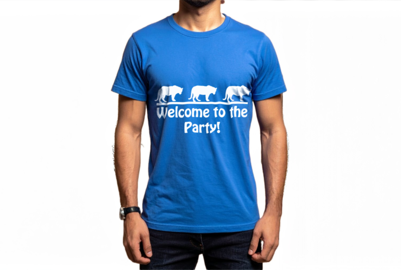
use the same prompt to generate one yourself. We kept our model in front
of a white background. You can change the background, but I was going to go for
something very simple. With this case, what
you're going to do is, first of all, as always, make it a habit to preserve
the original then call the second duplicate when you command or control
J to duplicate. Command Control J. Call it your base and then do
all your work here. This time, let's say logo
is going to be a text, so nothing too complicated. We're going to use the base
image to select this shirt. Use any tool that you want, I like to do the simplest one, which is the object
selection tool. You could switch over to the
Lasso mode or rectangle, but I'm going to do Lasso
and just go over his shirt. When you're done, you can see
that it selected for you. Just to make sure hit
Q on your keyboard. If you brought in
anything unnecessary, just hit B on your keyboard, the color black to remove, color white to introduce. For me, just brought
in some of the hair, and when you hit Q again, there shouldn't be anything else other than the shirt
in your selection. Look out for the marching ants. When you're done, you're
going to hit Command or Control J to make a
duplicate of only the shirt, and that's what we have exactly. I'm going to hide everything
for now, go to layer two. I'll call this shirt,
Commander Control J. Let's hide the original. Then we're going
to go to filter. Blur, gaussian blur, and I'm going to add
a little bit of blur. Maybe four pixels. When you're done,
Command or Control S, save the file as a dot PSD. I named mine displacement map. Just make sure you know
where you saved it because we're going to
need it in a few seconds. Now we can delete shirt copy and bring back
the original shirt. Over here, we're now going
to just bring in our design. For the design, I'm just going
to take another rectangle. You can also just drag in an image, whatever
works for you. But I want to do a logo right in the middle,
something like that. I'm going to call this logo. Once again, we're going to
make it a smart object. And when you're done,
you can adjust the size. I'm going to hold
down alter option, click and track one of
the edges, scale it up, then hold down alter
uption and click between the logo and the
shirt so that we are clipping it onto the shirt only. So now you can see
it's not showing up on his arm or anywhere else. Now, over here, we're going
to just double click on Logo to go into
the dot PSB file. Do whatever design
we want to do here. Let's make a new layer. To keep it simple, I'm
going to use a text. Let's say, we'll come to the party or
something like that. I'm going to choose a fun font. Let's do a decorative one. Let's see what we
have. That looks fun. It's just the size, add
any shapes if you want to, and I'll do since it's
a blue colored shirt, I'm going to change this to white or something
that's easily readable. Next up, we could
add in a fun shape. So I'm going to do a
line first, and again, I'm going to make it
white so that it's easy to see on the shirt, and then we could
maybe use some of the custom shapes
within Photoshop. I found this one
in wild animals. Not sure what it is, but
let's just put it on. If you hold down Shift, you're going to get
the perfect size, like a proportional size. I'm going to do two of them. I may be three, grab all three, move them in the
middle. There we go. Let's grab the whole thing
and put that in the center. Now we can hit Command or Control S to go back.
There's my logo. We can now blend it in
using any of these, but since it's a white
font over something blue, it's not that necessary. I'm going to keep it normal. But now to add in the
folds that the shirt has, you can see we
have this wrinkle, but the text looks very static. Going to go to logo,
go to filter, distort, and then displace, and we're going to do ten
by ten stretch to fit, and the following that you see. When you click Okay, just import that file that we saved earlier. All right. And there is the
little wrinkles applied. This is without the
displacement map, this is with it. Huge
difference there. This is something you have
to do for anything that has fabric feel to them so
that it looks realistic. I am going to change the blend
mode to something screen, and then we're going
to just go to FX, blending options and then use
now go to underlying layer, alter option on this triangle to split them apart and
then slowly track it until you see the text
blending into the shadows. Same thing on the other
side for the highlights, and that's just going to
make it a lot more natural. You can also overall remove
some of the fill to give it that worn out look if
you want.This optional. Now we've added a logo onto
this AI generated base image. Now you can add in some text edit it further using Photoshop's
many other tools. But essentially,
you have completed this portfolio ready
mockup all built from scratch using Firefly
and Photoshop together. I hope you guys are happy with your results and enjoy
this project walkthrough.
9. Class Project: Design Your Own Mockup: Congratulations.
You've just completed the Adobe Firefly and Adobe Photoshop mockup
creation course. You now know how to
turn one idea into a beautiful mockup using Adobe Firefly generator
Generative Fill, and Photoshop's many tools. And you now have
one complete mockup that looks professional, real, and clean.
Now it's your turn. For the class project, I
want you guys to create your very own mockup using
Adobe Firefly and Photoshop. You're going to be doing
the exact same process that we did in this course. So generate the image, refine it, bring
it into Photoshop, to put it onto either apparel, a box, mug, or whatever
else you want. When you're happy
with your work, go ahead and upload them into the class project gallery
alongside your prompts. That way, me and your classmates can
see how well you did, and I will be coming
in from time to time to provide you
with personal feedback. If you enjoy this class, make sure to follow me on
Skillshare so that you do not miss the next class in
our Adobe Firefly series. Keep on experimenting and designing and I hope
to see you all soon.
 Skillademia Academy, Creative Skills for the Future