Transcripts
1. Introduction & Class Overview: Creating your own realistic
framed art maps in Adobe Photoshop is much easier and faster
than you might think. And by taking advantage of Adobe firefly to generate
interior images, you can showcase your work
in any design setting, which perfectly matches
the style and vibe of your work and resonates
with your audience. I'm Jen creative.
And in this class, I'm excited to share with you
how to get the most out of B file ply when generating interior images of
framed art Mc ups. And step by step, walk through
the process of creating two types of framed art
mockups in B photoshop, including the super easy ones using straight on images
over the picture frames, and more advanced ones, using side on images with the perspective distortions
and some reflections. In this class, you'll also learn how to write
effective prompts for generating captivating
interior images for your framed art mop, how to take advantage
of the various attacks and settings available
in other B firefight. To find the of your
generated images, how to use structure
references to generate interior images of the
specific compositions and exact proportions of the
picture frames and how to develop customized and clean up your generated images using
a range of photoshop to, including the new
generative AI features. To follow along,
you'll need access to Adobe fire fight in the latest version
of Adobe Photoshop. Whether you want to
create your very first mock up from scratch in OB photoshop add
some new tricks and techniques for creating
realistic mockup for your creative toolkit or simply want to learn
how to generate exciting interior
images in AB firefly. This is the class for you. If you like me, aboard of C and using the same old
mock ups over and over again and aspire to showcase your work in a more
engaging and original way. Join me in this class, let's create some
unique mock ups. You work deserves.
2. Getting Started with Adobe Firefly: Let's begin with a quick
overview of Adobe firefight. Adobe Firefly is a web app, which you can access
through your browser. Technically, you can use
firefight on any device. But I would highly recommend
generating your images on your computer and
using the same browser. This will allow you to take full advantage of firefight and store your favorite
generations in one place for future reference. You can start
generating images in a fi fly in a few
different ways. You can go to your home page and type your prompt
in this field, or you can go to the
text to image option. Click on it. Then click on any image you have in front
of you in the gallery. And this will bring you to the actual interface with all of the controls
and settings. In the model drop down, select Firefly image two, which will allow you to
generate photoralistic images. You might have some new
models available here, which in the long run might
generate even better results. But in this class, I'll
be using image two model. A at the moment, it works
better for generating interior images for
framed art mock ups. Next, make sure to select photo here to generate
photoralistic images. As with all things, AI, it is all about the
quality of your prompts. But the great thing about
BFI is that there are a lot of settings you can use to customize the look of
your generated images. These include various effects you can assign to your images, color lighting and
camera angle settings. And when the content
type is set to photo, you can also specify particular
camera and lens settings, you would like to emulate. Apart from all the
specific controls, there is also the visual
intensity slider which allows you to control how
realistic your images look. With the slider set
to the left position, five will generate
realistic images. And with the slider set
to the right position, you'll end up with
more surreal stuff. You can play around
with the slider, but I would recommend
setting it either to the middle or to the left to
generate realistic images. There is also a style
strength slider which allows you
to adjust how much the aesthetic of your
generated images is affected by all of the
effects and settings below, and how much they modify or enhance what is specified
in your prompt. You can also customize the aesthetic of your
generated images using your own style references or
those included in firefly. And use the structure
references to generate images with a
specific composition. I will share with you
my tips for using all these five fly settings
in the following lessons. But first, let's talk about
writing effective prompts for generating interior images
of framed art mock ups.
3. Prompt for Generating Images of Frames in Interiors: To generate the best
possible images using AI, your prompts must be clear,
descriptive, and specific. And to be able to generate images which will make
exciting mock ups, your prompts will need to
include a few important things. Start by describing the type of shot you want to generate. For example, a straight on shot, a side on shot or
a top down shot. Next, describe the picture frame you want to turn into a mockup. And then you need to go
into some detail about the general setting and all of the elements you want
to have in your image. And on top of that, to generate images with
just the look you like. You need to specify the
style of the interior, a mode and feel you
want your image to have and describe the
lighting conditions. With a descriptive prompt, which has got all
these elements, you'll be able to generate
exciting images even without styling them using
the effects and settings available
in adobe firefly. To make it easier for you to get started with your prompt. I have created for you a
prompt template and some mix and match suggestions
which you can use when generating your images. So don't hesitate to download it from the
class resources. But of course, it is all
up to your imagination, and you can go in
any direction you want and just use the
general structure of what needs to be
included in your prompt and describe exactly
what you have in mind. And here is the example prompt. I'll be using to
generate my images. So for me, it will be
a straight on shot of a white living room wall with a modern slick
minimalist black four by five picture frame hanging above a mid century
modern console table. So this describes my subject
and the general setting, as well as the technical
aspect of the shot. Next, I want to describe
the setting in more detail. So I want to have a bird of paradise plant in a pot on the floor next to
the console table, a large low pile white trap on the floor in front
of the console table. A stack of large designer
coffee table books on top of the console table with a white container
candle on top of them, and even si plant in
a slick ceramic pot. You don't have to go into
so much detail if you don't want to and leave it for AI to interpret it
any way it wants. But I like it to be a little
bit more predictable, so I don't end up with some random and weird
stuff in my images, always boring and empty sets. Next, I describe the style
as a Scandinavian style and natural light cram in from the window and cozy and
tranquil atmosphere. And this should be enough to generate some exciting images. When writing your props for images for the
framed art mockups, make sure you describe your picture frames style and size in detail to avoid ending up with something
weird and random. You can also include the word blank in the description
of your picture frame. But from experience, it
is not usually necessary. Just avoid writing framed
artwork or something like this, which will make firefly fill the frame with something
of its own choosing. If you are after
particular compositions, proportions and shapes of
the objects in your mockups and especially specific scale and aspect ratio of
your picture frames, you can also take advantage
of the structure references. You can download a few
structure references, you can use to get started
from the class resources. And if you use
structure references, you'll need to make sure
that your prompt describes the elements in your reference
and doesn't contradict it. So this is something to keep in mind for now and I'll cover using structure references in more detail later in the class. When coming up
with your prompts, I would recommend
drafting them first in the notes app or any other app you use for
writing and planning things. And when ready, copy and paste your prompt into the
prompt field in firefly. And then join me in
the next lesson, and you shall quickly share
with you if you tips for choosing the aspect tracia
of your generated images.
4. Choosing Aspect Ratio: With your prompt ready, before you hit the
generate button, make sure you go and select
your desired aspect ratio. At the moment, you can generate images in four different
sizes and aspectrato. And I would highly recommend
picking the aspect ratio, which is closest to the
outcome you want to create. For example, if
you want to create a mockup for sharing on
Instagram as a post, select a portrait three
by four aspect ratio, which is the closest
aspectrato 24 by five, which is ideal for
Instagram posts. Only four aspectratios
and sizes might seem like a limiting
factor, but don't worry. You can easily extend
your images in AOB photoshop to fit your
desired format afterwards. And I'll show you how to use the new AI features
in Adobe Photoshop to extend your images and add some new elements to
them later in the class. So select the
closest aspectratio to your intended final format. And then let's move on to
generating some images.
5. Generating & Saving Your First Images: After you have selected
the desired aspect ratio, double check that the
content type is set to photo and then remove all of the effects
you might have here, so you only see the
photo tag like this. And then go ahead and hit this button to
generate some images. And if your prompt is descriptive and specific
like my one here, your first set of images should look pretty
decent straightaway. You can keep on generating more images by
hitting this button, but because you never end
up with the same results, make sure that you
download all of the images that you
like to your computer. I usually save most of them because it is
easier for me to go through them on my computer afterwards and view
them in full size, and then simply delete any images which are
completely unusable. Apart from downloading
your images to your computer or any other device you are
generating them on. You can also save them to
your creative cloud library. And this can be useful if
you want to be able to seamlessly access your
images on another device. And apart from
downloading and saving your images to your
creative cloud library, you can also add them to favorites by clicking
on this button here. This will add your
selected image to your firefly favorites, which will be kept in
your current browser. Because adding to favorites
allows you to see your prompt and the
firefly settings used for generating each image, I would recommend adding
all of the images which you like to your favorites
for future reference. But don't rely purely
on favorites and always download all of the images that you like to avoid losing them. When you're generating
your images, you might notice some weird random things happening in them, but don't worry about things like this because you can easily remove any weird stuff from your generated
images in Photoshop. And also, don't worry if
five light decides to generate you some artwork
inside of the picture frame. This is no problem at all, and you will be able
to easily remove and replace your image within the
picture frame afterwards. After generating your
first set of images, you can carry on generating more completely
different images. Or if you like the look of one of the images from this set, you can also
generate some images similar to it by using
this option here. And this will generate you
a few alternatives using the aspects of your selected
image as a reference. For example, in this case, it took into account the style
of the console table here. So again, save all of the
images which you like. And then if you want carry on generating more images based
on the selected image, or generate some fresh
images from scratch. So these are the
basics of generating and saving your images
in a Dobby firefight. In the next lesson,
we're going to have a look at how you can further
customize your images, in various effects and settings.
6. Customising Your Images With Effects & Settings: To customize the look of
your generated images and build on top of what is
specified in your prompt, you can use various effects and settings available
in Adobe firefight. First of all, have a look at the movement section and select any effect or effect which can help you to create the specific interior style you're after. Choose an effect
which works with your prompt and can help
you to enhance the look, but make sure that it doesn't
contradict your prompt. For example, in my case, I could use the
minimalism effect here to enhance the minimal
Scandinavian style. Or I could use the industrial
effect to add a bit Mmusculinity to the objects
and textures in the image. To add effects to your
future generations, simply click on the
effect you want to use, and you will see the
effect tag pop up here. And after adding your
effect or effects, hit generate to create
a new set of images. And then proceed
as usual by saving any images you like and adding
them to your favorites. When I start adding effect and customizing fire
fight settings, I also usually grab a full screenshot of
each generated set with the prompt field and all of the edit effects and the
other custom settings. And I would highly recommend you to do the same
if you don't have some easily accessible
reference images to be able to study how different effects and settings affect your images. Remember that when you start
applying different effects, five will still take into account what is specified
in your prompt. And you might not notice
a huge difference, especially if your prompt
is very descriptive. If you want your
applied effects to have a more pronounced effect
on your generated images, make sure you set the
style strength to the maximum and try simplifying your prompt and how you describe the style and vibe
of your interior. Apart from exploring
different movement effects, when generating interior images, check out the effects
in the them section, namely interior design
and cinematic effect. Interior design
effect will help you create cleaner images
which look like interior design shots
with an accent on interior decor and
everything looking sharp. And in this case, together
with the minimalism effect, interior design effect helps to create slightly
more detailed sets, which are a nice and crisp. And if I remove the
interior design effect and apply the cinematic
effect instead. Five, you'll add a
bit more character to the images and create more
interesting lighting. Cinematic effect
usually helps to make images look a
little more lively, so it is usually my goal to effect for all sorts
of lifestyle images. When you start mixing
different effects together, keep in mind that they will
also affect each other. So you can play around with different effect
combinations and see how it changes
your generated images. But with this kind of images, one effect on top of a good descriptive prompt
is usually enough. For example, in this case, I am going to remove
the minimalism effect and only keep the
cinematic effect, and this should help to make my images look a
little less clinical. Apart from adding
different effects. You can go to the section
here and customize the look of your images
using the lighting settings. In my images, I like
having moody lighting, so I usually use
the dramatic light. But you can also try using
other lighting options here. For example, golden hour, Harsh light or studio light. If they work for the
vibe, you want to create. Cinematic effect and
dramatic light combo usually helps to add a bit more personality to the images and make them
less clean in a good way. And this somewhat helps
with the realism. So if you're after
creating quasy interiors, these are two settings, I would highly recommend
you to use and generate a few sets to see
how the look develops. Apart from using the
lighting settings, you can also explore various options available
in the color and tone and camera angle dropdowns to further
customize the images. These are pretty
self explanatory, play around with these
settings as you see fit. As you can only select one of each of these
options at a time, I would recommend applying the surface detail camera angle here, nginerating some images. Surface detail usually helps to enhance the look of the
textures in your images. So it is another important
medifi to keep in mind. The more you generate, the more varied your
sets will become. But you might also
start noticing some weird things
happening in your images. For example, the
picture frames might start to get filled with
the images of plants or plants from the
pots or *** in the set might start making
their way into the frames, for example, like here. Again, you'll be
able to easily clean up the contents of the
frames in photoshop. But that said, to avoid
doing too much retchion. It is best to avoid
any images where a plant starts from a pot
or outside the frame, and then somehow becomes
an artwork within it. To customize your
images even further, you can also play around
with the photo settings. By default, they set to auto. SoFi uses the photo settings, which suit your prompt and
other effects and settings. But if you have something
specific in mind, for example, a wider angle or a
smaller aperture, go ahead and change
these settings manually. That said, interior images
are pretty straightforward. So you can usually rely on
using the auto settings. So play around with applying different movements effects to enhance the style
of your images, add the interior
design effect as a modifier to create
super clean images, add the cinematic effect, to make your images look more lively and use the
lighting effect which suits your style. And when you're done playing around with the
effects and settings, join me in the next lesson, which I'll walk you
through the process of customizing your images
using style references.
7. Using Style References: Apart from styling
your images using different effects and settings
available in Firefly, you can give your
generated images a unique look by using
reference images. These can be your
own photographs. Stop photographs you
have got rights to use. Or as the last resort, you can explore some references
available in Firefly. To add your own style
reference image, click on the image
U uploader here, and select your desired image. For example, I'm
going to try using this image of a
wall in our studio. So upload your image. Then it continue. And you will see your
uploaded image pop up here. And now with your
style reference ready, proceed as usual to
generate your images. When using style references, firefly takes into account the specific
technical properties. For example, my
reference photo is not very bright and has a
shallow depth of field. And you can see how it affects these generated images here. So depending on your
reference image, your generated images might
end up a little to messy, dark, or bright, moody, or blurry and not particularly suitable
for use as mock ups. But if you have some effects
added to your images, these will affect
the look as well. So after generating
some images with the style reference to
turn them down a little, you can remove some
of the effects, which might affect the
look in a negative way. For example, I am going to
remove all of these effects. So there are only
the style reference and photo tags left here. And to make my images
cleaner and crisper, I'm going to add the
interior design effect instead and try
generating more images. And this worked pretty well. These images now
take into account some of the aspects of
my reference image, such as spots of
the orange color, but they are much cleaner and more suitable for use as mops. So remember that the
interior design effect helps to generate
cleaner interior images, but also don't feel
like you have to discard all other effects
at the same time. Best experiment with different
effects combinations, which makes sense for the
wipe you want to have in your image and play
around with the style strength slider to
further alter the look of your generated images
and how much they are affected by the effects
and your reference image. Play around with using style reference images if you want to, but don't feel obliged to do so. If you manage to generate some
exciting images which sit your style by using just your
prompt and some effects. Next, let's explore how you
can generate images with more predictable and
precise compositions using structure
references. Okay.
8. Using Structure References: If you want to
generate images with a specific composition and predictable shapes and elements, you'll need to use
structure references. And when it comes to generating interior images for
framed art makeups, using structure references will allow you to have control over the aspect ratio scale
and placement of the picture frames in
relation to other elements. Generating images based on
the structure references is a more involved process in comparison to just working
with the prompts and settings. And it requires some
during skills or having some reference photographs or renders the desired composition, you should have a right to use
If you are using drawings, these don't need to
be super detailed. But having clean lines
and correct geometry and perspective is important for achieving the best
possible results. For your first experiments
with the structure references, don't hesitate to
grab and use some of the reference images I have provided in the class resources. To get a cleaner result, I'm going to discard my
style reference here, but you can play
around with using style reference at the
same time if you want. I'm also going to remove
the interior design effect and instead go and add my
favorite cinematic effect. If you have some
favorite effects and settings combination from
your previous generations, go ahead and add them now. Then let's go to the
structure reference panel and add a reference image here. Select your desired
reference image. For example, I'm going
to use this image, I have shared in the
class resources. As you can see from this image, it includes all of the elements I have described in my prompt, and it just puts them into
a particular composition, making it easier for Firefly
to interpret the prompt. Make sure that the structure
reference that you use visualizes your prompt and
doesn't contradict it. This image here also
features a ceiling light, which is not mentioned
in my prompt. And you'll see in a
moment how Firefly deals with the elements
which are not specified. So with your structure
reference selected, hit upload, and you'll see the image added here and in the prompt
field here as well. In the structure
reference panel, there is a strength slider, which you can use to adjust how much generated images adhere to the structure
in the reference image. If you are using well
drawn images with fin lines and correct
geometry in perspective, set the strength
to maximum to make your generated images perfectly adhere to the structure
in your reference image. And if you are working
with a less perfect drawing a rough sketch
or a photograph, or simply want to use the structure reference
as a rough guide. It is better to set the strength
slider to a lower value. Otherwise, you'll end up
with something one key. With a low medium structure
reference strength, Firefly will loosely interpret
your structure reference, and it will create more
varied compositions. This could work well too. But since the main
benefit of using structure references for
the sort of images is the ability to generate
picture frames in the exact aspect ratio and scale in relation
to other objects. I would recommend using clean and precise
structure reference images and keeping the structure
strength set to maximum. And then you can
have a ton of fun by generating multiple sets
with the same composition, but in different interior
styles, colors, and materials. After setting up your
structure reference, go ahead and generate
some new images. After you have generated
your first set of images using
structure reference, you might notice some elements looking a little unrealistic. For example, I noticed that quite often plants start
to look pretty plastic. If this happens to you, be sure to go to the
style settings and reduce the visual intensity
setting to try to make your images
look more realistic. And then generate more images. When using maximum structure
reference strength, it is a good idea to describe
all of the elements you have in your structure
reference to avoid surprises. For example, I didn't
mention the light fixture, and you can see the varied
results in all these images. Sometimes it is fun to leave something to AI's
interpretation. But if you want everything
to be predictable and not to waste your
generative credits on something completely random, make sure that you
nail your prompt before you hit the
generate button. Another thing to
remember is that firefly tends to pick up some of the descriptions and
then apply them to other objects which lack
a complete description. For example, the color of the console table was not
specified in my prompt, and it ended up being black. So if you don't want to have some random colors or
materials in your images, addit your prompt to include
more detailed descriptions. For example, I'll
add white here, and then go, nginerate
some more images. So I play around with using structure references to generate more predictable
compositions and explore different
visual intensity and style strength settings, as well as different effects, lighting and camera
angle settings and see what you end up with. And now that we
have covered how to generate your images
and customize, let's quickly recap what
to pay attention to when generating images
for framed art mops.
9. Recap & Tips for Generating Images for Framed Art Mock-ups: To get the best results
when generating images of picture frames
in the interior settings, I recommend relying on Good
prompt and only mildly modifying your images
using movements and films effects and
enlighten settings. It is best to experiment with different things
in your prompt. For example, vary the
type of short you are generating the style
of the picture frame, the elements you
have in your image, the general style of your setting, or
lighting conditions. Also, don't forget to
generate both straight on and side on images
of the picture frames so that you can explore both of the following photoshop
techniques I'll be showing you in a moment and equip
yourself with a range of different images you can
use to showcase your work. And remember that you can simply switch up the type of
short description in your prompt to create more cups with a frame
on a different angle, but with the same wipe. So generate as many different interior images with
frames as you like. Download them to your computer, and then join me in the next lesson we're
going to work on preparing generated images for use as framed art Maps in
Adobe Photoshop.
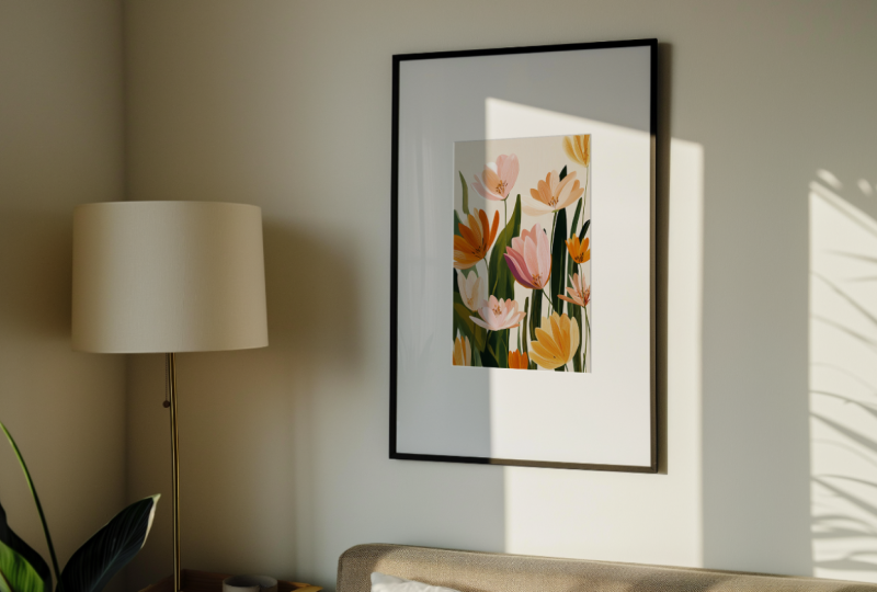
10. Preparing Your Image for Creating a Mock-up: Straight on framed art mock ups are the easiest ones to create. And if you've been lucky
and managed to generate some images which don't
require any alterations, you'll be able to turn them into mokps in just a
few simple steps. So open an image with a straight on view of the
frame in Photoshop, and let's get started. For demonstration, I'm going
to be using this image here. It is pretty good as it is, but I have generated it in
a square format by mistake. So in a later lesson, I will also show you
how you can extend your images if you end up
in the same situation, we simply need to
change your images aspect ratio for
your desired output. But before we get into all
this additional stuff, let's quickly turn
this frame into a mop. Even if you have
an empty frame or a frame with a frame mount
or mut like I've got here, it is still a good idea to make this area blank so that
you can choose the size of the image you place within the frame and have
an option of filling the whole frame or imitating a frame mount
yourself afterwards. To remove anything you might have within
your picture frame, select the rectangular
mark and draw a selection within the frame
which you want to clean up. This sort of selection will work for me because I don't need to go up to the edge of the
frame as it is just fine. With your selection ready, go to the contextual task bar. And if you don't see
it in your workspace, go to the window menu and make sure that
it is checked here. Here, hit the generative
field button. Leave the prompt field
empty and generate. And just like this, the content of the frame has
been cleaned up. And not only that,
but the lighting still looks realistic
within the frame. You'll see the generated results
in the properties panel, and you can choose between
different variations here. And you can generate
more options by hitting the
generate button here. Keep on generating
new variations until we find something
which works really well. In my case, I'm pretty happy
with this original variant. You will still be able to
access all these options afterwards as long as you keep your layer set
to generative here, then don't sterze it. In this case, I don't
need any other options, so I can just discard
them like this. GeneratFll works best if you have some highlights and
shadows in your frame, which you don't want to
lose whilst cleaning it up. Alternatively, you can use
the new removed tool like so, which works best for removing
any images from the frames and creating a blank
and plain surface within the frames instead. Choose between these
two techniques depending on the original
content of your frame. Clean it up, and then join me in the next
lesson in which I'll show you how to turn your image into easily editable mock up. Okay.
11. Creating a Simple Framed Art Mock-up: With the frame
prepared. Now let's move on to adding
some art into it. Start by switching to
the rectangle tool. Draw a rectangle inside of the frame in your desired size. You can have some border around your rectangle if you want to include a frame mount
or a simple border, or you can go up to the
edges of the actual frame. If you do that, make your rectangle slightly
bigger than the frame, so you can mask
everything out around the edges of the frame to
make it fit seamlessly. I'm going to make my rectangle
a little bit smaller, so I have a nice
frame around it. Then switch to the
selection tool, and position it perfectly
within the frame. Next, go to the layers panel. Rename the layer with your
rectangle to framed art. Then right click on this layer and convert it to
a smart object. Next, double click on the
smart objects layers Pum nail. And this will open its contents
in a separate document. And this is where
you're going to be placing your artwork. So go to the file menu. And select place embedded. Select the artwork
you want to place in your mop. And he place. Scale and position it
within your canvas to fully cover it and he enter. After you have
placed your artwork, you can go ahead and delete
the layer with the rectangle. Then save the smart
objects contents. Close this document, and
go back to the main file. Now to make this image
look more realistic, we need to blend this artwork
with the layer below. So go to the layers panel. Select the layer
with your artwork and set its blending
mode to multiply. And this is p. Working with an empty white frame makes it super easy to create
more cops like this. I will cover a more complex blending technique
later in this class. But for this kind of mock ups, you really don't
need to do more than this to make them
look convincing. Now you can leave
your artwork with the border within
the frame like this. Or you can very easily
elevate the look by creating a simple
frame mount effect. And this is what I'll be sharing with you in the next lesson.
12. Creating a Frame Mount Effect: Leaving a wide border around your artwork
can totally work. Since it is a pretty
common way of how framed art is displayed. But if you're after
a more classy look, you can very easily create
a frame mount effect. To add a frame mount
effect to you mock up. Start by going to the artwork
layer in layers panel. Click on it, and select
blending options. Here, select Bevel and
Emboss. Click on it. And then go ahead and set
up the L. Set the style to Atol technique
to chisel hard. Direction to down. Then change the depth
to your liking. Set the size to one pixel, which works well
with the size of the generated images can make sure that soften
is set to zero. And then you can go and play around with the
shade and options. Angle controls the
direction of the light. So in my case, the lights
coming from this side. So 30 degrees works all right. But if you have light coming
from another direction, you can rotate it around until you create a realistic effect. Altitude controls the height
of the light, and again, you can play around
with change in it to measure the light and conditions
in your generated image. In this case, 3040 works well. You can also play around with the apacity of the
highlights and shadows if you want to make
them more or less pronounced. And lastly here, you can have a look at the gloss
contra options. The standard linear
usually works quite well, but you can also check out
Cove Dep option for a more subtle or the Gaussian one
for a more pronounced one. I'm going to keep
mine set to linear. So make sure that your
settings look more or less like this and these
check boxes are checked. And click a K to apply changes. Because we are working
with a smart object, the babble and in both settings are added as effects
to the layer, and you can easily change them by double
clicking on them here. So this is how easy it is to convert a
straight on image of a picture frame
into a more up of a framed art with a
boder or a frame mot. Next, let's have
a look at how you can extend your images and add some new generative elements to further develop the SAP.
13. Extending & Customising Your Generated Images: If you get lucky
with Adobe firefly, your generated images won't require any modifications
or retouching. But even then, you still
might need to crop or extend them to make them fit into the required output format. So in this lesson, I will show you how you can
extend and customize your images with additional
generative elements using the new generative
features in Adobe Photoshop. Picking up from where we left
off in the previous lesson. Before we do anything else. Let's quickly save
this document. Set format to photoshop. Make sure layers are
selected and embed the color profile and heat save. To extend your image,
select the crop tool, then go to the layers
panel and select your background layer with
your original generated image. This will ensure that the
generative expand will take into account only the
contents of this layer, and these layers
will stay above it. Next, go to the
contextual task bar and select the
desired aspect ratio. You can select something
from the preset or set your own width and
height and resolution. I'm going to select
four by five to prepare my image as a
post for Instagram. With the aspect ratio selected, go and recite the crop box. I would recommend using the
width or full height of your existing image and extending it only
vertically or horizontally. So in this case, I'm going to
be generating a little bit of wall above my image
and some floor here. If necessary, ne image
within the composition, if you need to adjust it, and when ready he generate. Again, you'll see the
generated variations in the properties panel. So look through them and see if there is
something decent. If the first generated
set doesn't make the cut, go ahead and it
generate once again. Pick the option you like. Orry on generating more options until you find
something which works. When you have found something
that you want to use, go ahead and delete
all the generations, you definitely
don't want to keep. And if you leave a
few options here, you will be able to switch
between them later on. In this case, I'm generally not too fast about how the flow looks here because I still want to generate
a rag on top of it. So with the image extended, the next optional
step is to customize it and you can use the
following technique to add any new elements to
your image or to cover up any existing elements
with something different. To generate new elements, start by selecting either the rectangular or
elliptical market tool or the lasso tool. And then create a
selection in the spot which you want to feel
with your new object. With the selection ready, again, go to the
contextual task bar. Type the prompt for what
you want to generate. In my case, it is going to be minimalist large light
beige low pile ug. And with the prompt
ready, let's generate. Again, look for the
options or generate more. If you want to have a few
more things to explore. I quite like this rug
from the original set, so I'm going to stop here. You can carry on generating
more elements if you need to add more stuff
to your composition, but I'm pretty happy with
how the set looks as it is. So next, I'm going to move on to tighten things up and removing some awareness and imperfections to make the image
look more realistic.
14. Tips for Retouching Generated Images: Okay. Cleaning up your images and removing any Dodge stuff
firefly has generated, doesn't take a lot of time, but it is also not
something you have to do if all these weird things are not to noticeable at
the first glance. But in this case,
I want to quickly tidy up this area
around the leaves. Regenerate a little
bit of the leave here and make sure that everything looks as
real as possible. Before I proceed, again, I'm going to quickly
save my document. Then zooming into my image and inspect which areas
I need to tidy up. You can edit this kind of
stuff in a few different ways, but it is best to do
it non destructively. So start by creating a new
layer in the layers panel, which should be above you set, but below the smart
object with your artwork. So select your new layer, and then use any of the retachon tools
to clean things up. I'm going to start by using
the spot healing brush tool. Make sure that the sample
all layers is checked here. And then go and brush
around the areas, which I want to tie the up. This tool is good for removing some small imperfections
from the background. But to work with something
a little bit more specific. For example, like
here, I would use the clone stamp tool and cover the imperfections
up this way. If you want to learn
in more detail about the non destructive retaching workflow and using various retaching tools
in Ado photoshop, don't hesitate to
check out our class, beginners guide to
retachon old photographs in Ad photoshop. Apart from doing some
manual retention, you can also take advantage
of the generative field tool and use it to restore or cover up some elements
in your image. To select specific areas, switch to the tool and then carefully draw a selection
in a free hand manner. For example, I want to generate a missing
bit of the leaf here. Keep the prompt field empty
to generate the elements in a context kind of way and
repair existing elements, or use a prompt, if you want to generate
something different or specific. As usual, select your
preferred variant or carry on generating more. And then repeat the process to retouch any other
elements in your image, which don't look quite right. The new generative fill
tool makes it super easy to restore or replace
elements in your images. So use this technique when
it gets too difficult or time consuming to
retouch elements manually. Now, I think I am
probably done with this plant here as it
looks good enough. After generating new elements, if you want to do a bit
more manual retachion, remember to use your
separate retchion layer, and then switch back to any of the traditional retachion
tools and carry on working on your image until there are no more
glaring issues left. It can be easy to get
carried away when customizing and retouching
generated images, but try not to obsess too
much over small details and concentrate on the
elements which definitely look odd
in an AI kind of way. And regardless of how
much or how little work you do on your image, when you're ready
with all your layers, there is some
essential housekeeping and layer prep which
needs to be done. And I'll cover it
in the next lesson.
15. Organising Your Mock-up File: When generating or
removing elements, or if you're doing
some touch ups, you're going to end up with quite a few layers in
your layers panel. So when you're done
with all this work, it is best to select all your layers apart from your smart object
layer with your artwork. Group them, rename
the group to set, and convert the group
into a smart object. Then you'll be able to make
any changes you need within the smart object document and keep you made mockup
file neat and tidy. Another benefit of combining all your set layers into
one smart object is that it allows you to easily apply any adjustments or filters
to all these layers as one. For example, you might want
to edit this as a photograph. In this case, select your
smart object layer is the set? Go to the filter, menu? Select camera or filter. And edit this image as you
would edit any photograph. For example, one quick
thing I like to do is to go to the effect section and
add a little bit of grain. About ten is good on the amount, then I usually change the size to about 20 to make
it a little bit more. And then I go and
play around with the roughness to create
the look I like. You can also make any color
or exposure adjustments here or generally make any
changes to the image you want. I won't be making any additional
changes to this image. But if you want to
learn how to edit color photographs and create
different exciting looks, don't hesitate to check out our class on advanced
color editing. When you're done making
changes in the camera filter, click Okay, and it will be applied as a smart filter to your smart object
with the image. And because your artwork
layer is set to multiply, you will be able to see the
grain through the image. When you're done extending
and finalizing your image, be sure that you save
your PSD document. And then go and save it in the required formed
size for your output. So this is how you can create super simple framed
art mock ups, using generated
images and customize your images using the
new generative tools in Adobe Photoshop. Have fun creating this
kind of mock ups, and then join me in the
next lessons to explore techniques for creating more
complex framed art mops, featuring some
perspective distortions and reflections. Okay.
16. Creating a Placeholder for a Side-on Framed Art Mock-up: If you want to
showcase your work in a more complex setting with
a frame, being on an angle. The process of
preparing a mockup will entail a few extra steps, which include transforming
your placeholder, masking it within the frame and behind some
foreground objects, and imitating realistic
reflections and shadows you might have
in your picture frame. And this is what
I'll be covering in this and the following
two lessons. For this demonstration, I'm
going to use this image, which I have generated
using this prompt. And to save some time
preparing this image, I have already done
some minor touch ups to get this set ready for use. So get your side on the
image of the picture frame ready using the techniques I have covered in the
previous lessons, and let's begin
turning it into a mop. Again, when you have your image and all additional retaing or generative layers
ready, select all of them. Rub them together.
Rename the group to set, and convert it into
a smart object. As you can get away
with not converting all your layers into a smart object if you're
working on a simpler mockup. In this case, you'll
definitely need to convert all these layers into
a single smart object. In order to be able to use
the copies of this layer to create shading and highlights
later on in the process. With the set smart object ready. Next, let's prepare the
place holder for our art. In this case, I'm
going to create a place holder which
fills the entire frame. To create your place holder, again, select the
rectangle tool. And start by drawing a rectangle roughly in the size
of your frame. Next, change the field color to some bright color which you
can see over your image. Set stroke to. And turn down the opacity of this layer to be able to
see the image behind it. In any side on images, your frame will be
in perspective. So your image needs
to be distorted and squashed a little in order
to make it look realistic. And to achieve this,
you will need to make your rectangle wider than
the frame to begin with. In this case, it
doesn't need to be much wider because the angle
is not too acute. But if you're dealing with the
frame in more perspective, make sure you make it
a little bit wider. Make your placeholder also a little bit taller
than your frame. To ensure that you
won't be scaling your artwork up afterwards
and losing the quality. Basically, look at the
contents of the frame and bod aspect ratio
of the placeholder, and when you're happy with it, switch to the selection tool. Then go to the layers panel. Rename the rectangle
layer to artwork. Right click on it and
convert it to smart object. Next, let's transform this rectangle to
fit into the frame. Switch to the fritransform tool. Zoom into the first corner, you want to move and holding down the command key or control key
in the windows, move the corner of
the place holder just over the inside
frame edge like this. Then go to another corner
and repeat the process. And then continue until you get all four corners in
the correct position. Make sure your place holder goes over all edges
of the frame. And then hit enter. Making your place holder go slightly over the
edges of the frame, we'll ensure that you
won't end up with having any empty pixels between the edge of your
artwork and the frame. With the place holder ready, the next step is to
work on the mask to hide the areas where the
artwork overlaps the frame, and to make the
artwork appear as if it is behind any objects
in front of the frame. For example, like
these leaves here. So create and transform your
placeholder and then join me in the next lesson
in which I'll walk you through the
process of masking it.
17. Masking Your Artwork: If you want your artwork to fill your entire frame or if you have some objects
in front of the frame. You'll need to
mask your artwork. The first step is to create a selection for
your future mask. Let's start by
hiding the artwork. Place hold the layer, and then select the
layer with our set. To create a selection
of the area within the frame and behind
any foreground object, you can use any tools you want. And this will depend on the
tools you're comfortable using and the complexity of
the objects in your image. If everything is pretty
straightforward, you can use the Quick
Selection tool. But in this case, because the
edges are not super clean, and the quick selection tool won't create the best result. I'm going to use
the plegon tool. I start by creating a selection around the edges
within the frame, making sure that I'm
slightly over the frame. To avoid ending up
with some light pixels around my artwork
when it is placed, which will be particularly visible when masking
darker artwork. When you create an a
selection this way, avoid creating one straight
segment from corner to corner because it is highly likely that the
frame is not even. So somin and work
around the edges of the frame in
smaller segments. Close your selection when you get to the point where
you started from. And if you don't have any elements in
front of your frame, your selection is ready
to be used as a mask. In this case, I have
an extra complication of these leaves here, which I need to subtract
from my selection. To subtract any elements
from your selection. Switch to the quick
selection tool. Set it size to something small in
relation to the element. You want to subtract?
Set hardness to 100%. Then switch to the subtract
from the selection mode. And then go and brush on the
areas you want to remove. Use the square bracket keys to change the size of the
brush in relation to the element you want to remove and carefully create
your selection. In this case, I can see that the selection goes
over the edge here. So I'm going to
switch to the add to the selection mode and
quickly refine these edges. If you end up
adding to selection a little bit more than
what you intended, simply hold down the d or
option key to activate the remove from
the selection tool and carry on refining
your selection. So go ahead and mask any elements which
need to be masked. After creating your selection, you can also refine it using
the selected mask tool. But I find it to be
more straightforward to refine my mask
afterwards when it is already applied
to my artwork and simply use the good old brush
tool to refine the edges. So with the selection ready, let's go to the layers panel. Reveal the artwork
placeholder layer. Select it. And click on the Ed
layer mask button here. Now, with the mask credi, let's go into the contents
of the smart object layer. And place artwork into it. So go to the file menu. Place embedded. Select
he desired artwork. And he place. Scale and position it within the
canvas. And he er. Now, let's quickly delete the
original rectangle layer. Save the smart object
document. Close it. And that's how it now looks
in the main document. The mask worked quite
well in this case, but if you need to refine some little bits
around the edges, you can simply select your mask, then switch to the brush tool. Set at hardness to about 50%. Zoo mean to see all
of the details. Change the brush size using
the square bracket keys. Make sure that the
foreground color is set to white and brush
around the edges, which you want to make softer. Because you are now dealing
with your actual artwork, it will be much easier to refine any edges in your mask and make everything look realistic and avoid having any
odd pixels around. When working with
generated images. In most cases, you
shouldn't have any particularly tricky
elements to mask. But if you do, don't
hesitate to play around with the select and mask tool to refine the edges of your mask. The quality of your
masking will hugely affect how realistic
your mockups. So spend as much time as
needed to refine your mask, and then join me in the next lesson in which I'll walk you through
the process of adding realistic
reflections and shadows to your framed art mock ups. Okay.
18. Creating Realistic Reflections & Shadows: Okay. With your artwork
placed and masked. The next step is to blend
it with the shadows, highlights and reflections,
you might have in your frame. If the contents of your
frame are pretty basic and you simply have some white background with some shadows, you can simply use
the multiply mode like we have done earlier
and be done with it. But in this case, because I have a reflective surface within my frame to make the artwork
look more realistic, I'm going to use a
different technique. Start by selecting
the smart object with your set and duplicate
it a couple of times. Then select both copies and drag them above
the artwork layer. Then go to the top layer, rename it to shadows and set its blending
mode to multiply. Then go to the layer below. Rename it to highlights and set its blending
mode to screen. And now we need to make
a few adjustments to these layers to make
everything look realistic. Let's quickly hide
the shadows layer. Then go to the highlights layer. Hold down the old or
option key and clip it to the artwork layer by clicking between these two
layers and this arrow. And now this layer only affects the contents of
our artwork layer. This is incredibly bright, so we need to edit the
levels in this image. Because it is a smart object, simply select this layer and hit Command L or Control
L in windows. In the levels dialogue, start by dragging the
white point output levels indicator to make
the image slightly darker. And then go and play around with the indicators for the mid
tones for the input levels and the black point and move them to the right until the lighting starts to look more realistic. These adjustments will
depend on the image you're working with and the
artwork you are placing. So simply move all these
indicators around. Until the image looks good. When ready press okay. The levels adjustment
will be added as a smart filter to your
highlights layer. And you can revisit its
settings at any time throughout the process to make it work better with your current image. What to adjust it
if you decide to place a different image
within your placeholder. Sometimes it just the
highlights is enough. But to make this image
look mo realistic, let's go and work with
our shadows there. Again, clip it to
the layers below. Then select the layer. And again, go and play around
with the levels adjustment. In this case, move
this indicator to the right to make the whole
image more washed out, and then go and play around
with the input levels to bring in the shadows
in a desired way. Again, the position of
all these indicators will depend on the image you're
working with and your artwork, simply carry on moving them around until you
like what you see. Then apply changes.
And if you want, you can also go and turn
down the opacity of your shadows layer to make the shading a little
bit more subtle. If necessary, you can also add the hue saturation adjustment
to your shadows layer, which you can do by pressing command you or control
you in the windows, and turn down the saturation to the desired level to make
everything look more realistic. If your artwork looks to sharp in comparison to the
rest of the image, you can also go and
add a little bit of realism to it by selecting
the artwork layer. Make sure you select the layers fam nail and not the mask. And then go to the filter menu. Blur and select Gaussian Set the radius to
something super small, for example, 0.1 or 0.2 pixels, whichever works best
for your image, and it. And this is how you can
present your work using a more complex mocap with some distortions,
masks, and reflections. And here's a final quick tip. If you're creating
the sort of mock ups with the artwork filling
the whole frame. Be sure to check the
quality of masks by using both dark artwork
and some light ones. And refine your mask if
you spot any issues. Also remember that
if you go from using a dark image within your
frame to light or bright one, you will most likely need to adjust the levels
for your shadows and highlights to make them work better with your
particular artwork. And we're done with
the techniques for creating framed art mock ups. So let's wrap this cuss up
with a few final thoughts.
19. Final Thoughts & Your Class Project: So this is how you can generate various interior images and create two kinds of
framed art mock ups. And I hope that you have enjoyed this class and are
excited to start creating your own framed art mock ups to showcase your work in
the unique settings. Since we've been creating more
caps using smart objects, you can easily
reuse your mops and swap the images within
the placeholders. But the beauty of generating
sins for your mops using AI is exactly that all your mocaps can be different and
project specific. And with the framed art Mc ups, it really doesn't
take a lot of time to place your work into
different generated sets. Take advantage of the ability to generate any number of
the unique scenes and let your imagination run
wild and don't get frustrated if you end up
generating some with images. I cannot wait to
see what sort of interior images you imagine and generate and how you
showcase your work using them. For your class project, generate some images
with picture frames and turn at least one of
them into MoCap in Adobe Photoshop and
be sure to post your work in the project
resources tab for this class. Share your selected generated
images as they came from Adobe and if you do some retouching or
image development in photoshop afterwards, be sure to include
before and after. And then share your final
mock ups and be sure to share what prompt and settings
you have used in Ado to generate your
selected images. And I would also love to hear about your
process of turning the images into mops and what you have
learned in this class. If you're going to
share your work created in this
class on Instagram, please follow and tag as I creative in your posts
so that we can easily discover them and
share your work with our followers and be sure to follow us
here on skill share, to be the first to know about our new classes and updates. If you have found
this class helpful, please leave a review in the
review stub for this class. If you have any
sort of questions, be sure to leave a comment in the discussion stub
for this class, and I'll happily answer
and provide feedback. Okay. Thank you for
watching this stuff, and I hope to see you
in our other classes.
 Evgeniya & Dominic Righini-Brand, Graphic Design & Photography