Transcripts
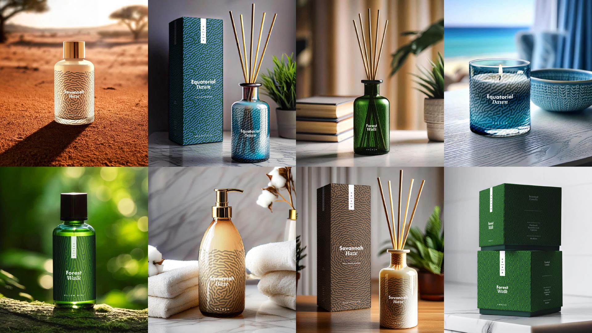
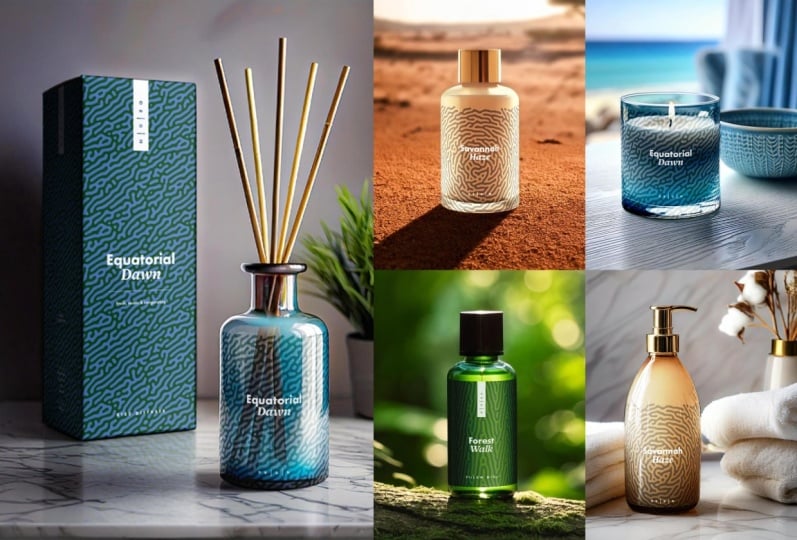
1. Introduction & Class Overview: Whether you're
creating mockups to showcase your work
on social media, pitch proposals to your clients, or present concepts in your portfolio, to capture
the viewers' imagination, your mockups must not only visualize the
potential applications, but also tell a story! And this is where AI-generated images can make a
huge difference by allowing you to easily
showcase products or packaging in any unique
location or setting, and all you need is your
imagination and a few skills for creating mockups from scratch in Adobe Photoshop. I am Jenya from Attitude Creative, and in this class,
I'm excited to share with you how to
leverage Adobe Firefly to generate exciting
lifestyle images for packaging and
printed product mockups, and step-by-step
walk you through the process of
realistically mapping your designs on boxes and cylindrical objects
in Adobe Photoshop, and then blending
your graphics with the existing surfaces
in the images, imitating translucent
print effects, and creating opaque packaging
labels from scratch. In this class, you'll
also learn how to write effective prompts for generating unique images for your
packaging or product mockups, how to use composition
references to generate images with specific
and precise objects, and how to customize the
style of your images using Adobe Firefly effects and settings and your own
style reference images. If you're a packaging designer or create artworks,
surface patterns, or illustrations for printed
products and want to elevate the look of your mockups and showcase your work in a
more captivating way, this is the class for you! To get the most
out of this class, you will need Adobe Firefly, the latest version
of Adobe Photoshop, and a solid understanding of Adobe Photoshop's core tools
and functionality. I cannot wait to see all the different scenes you imagine and generate and how you bring your work to life
in your mockups! So join me in this class, and let's create some
exciting and unique mockups your work deserves!
2. Workflow Tips for Creating Mock-ups Following This Class: Hey, welcome to this class. Before we begin, here are a few tips for following
this class and streamlining your workflow when using
Adobe Firefly to generate images for packaging and
printed product mockups. In the Adobe Photoshop
section of this class, we will be exploring techniques
for creating mockups, using boxes and
cylindrical objects. So this is the kind
of packaging or products you'll
need to generate. The range of objects which fall under these categories is huge. So you have a lot of
options to explore. Firefly is pretty good with generating
cylindrical packaging, but it often struggles
with the boxes. So for generating
images of boxes, I would highly recommend using composition
reference images. I will talk in detail about the composition references in the respective lesson
in this class. But you can find
a few composition reference images in
the class resources, so don't hesitate to
use them if you want, or create your own references if you're after something
super specific. If you want to
explore generating different scenes and playing around with the
prompts and settings, consider generating images with some straightforward
packaging or objects first. For example, drinks cans, mugs, or cosmetic pots. Firefly handles
generating images with these kinds
of objects, well, so they're good for getting
started with generating various scenes and tweaking
the prompts and settings. And when you get your
scene to your liking, you can simply
swap the object in your prompt to whatever
you actually need. For demonstration in this class, I will be generating a pretty straightforward
interior scene. But if you want, go ahead and generate something
more exciting. If you need some ideas for the kinds of scenes
you can generate, be sure to check out the proms I have shared in the
class resources. The Adobe Photoshop techniques I'll be covering
in this class will allow you to blend
your designs with the existing surfaces
in the images, imitate translucent
print effects, and create opaque packaging
labels from scratch. So be sure to
generate images with plain and preferably
white surfaces as well as some translucent packaging to be able to explore all
of the techniques. So grab the prompt structure and templates document from
the class resources, and let's get started
with writing prompts for generating images for packaging and printed
product mockups. Oh
3. Prompts for Generating Images for Packaging & Product Mock-ups: Writing clear and
descriptive prompts for generating your
images is crucial to ensure that you end up with some exciting lifestyle
or still life scenes. And if you like imagining in different locations or settings, prompt writing can
become a really fun part of the whole process of
creating custom mockups. But if you're not really
into writing, do not worry. I've got you covered with
the prompt structure. I'll walk you
through in a second. Plus in the class resources, you'll find a few templates you can use to get started
with your prompts. So grab something to take notes, and let's begin with
the prompt structure for generating lifestyle austere life images for your product or
packaging mockups. Start by describing
the object or objects you want to
make into mockups. For my mockups, I want
to generate an image of a cylindrical green
glass diffuse a bottle with a tall white box, it was packaged in next to it. So I cover both bases of having a cylindrical
object to put a print label onto and a box to wrap around
in a package design. You can include
multiple mockup objects in your prompt if you want. We use just one to keep it simple and do not
hesitate to refer to the prom templates
for some ideas for different objects you can
generate and turn into mockups. So specify your subject, then specify where it is set. In my case, they are both on a modern slick white
console table against a white wall with a bones plan in a minimal
clay pot next to them, a stack of designer coffee
table books to the other side. And then I move on to
describing the style and vibe. So it is minimalist airy and cozy Scandinavian interior with natural soft diffused light. Next, specify that it
is product photography, and then you can
also write studio, which will allow you to produce images with cleaner
studio lighting. Not that in my prompt here, I do not specify a type of shot and rely on mentioning
product photography instead to give Fifi a little bit of freedom with the
composition with a focus on the product being the main
element in the image. But if you're after
a specific angle or composition, for example, a straight on shot
of an object against some background or a top
down shot of a flat lay, be sure to mention
it in your prompt. And if you're generating
images of objects outdoors, be sure to remove
the word studio from your prompt
and consider adding lifestyle or
lifestyle photography to get more lively images. So follow the provided prompt
structure to come up with your prompts for any kind of boxes or cylindrical objects. And because we'll be exploring both opaque and
translucent print effects, don't hesitate to generate
some translucent objects, for example, glass
bottles or jars. But when generating
any opaq objects, make sure that they
have plain surfaces which are preferably
white in color. So describe your objects
or design labels as white. Also remember that
you do not have to include both types of
objects in the same images. I'm doing this for demo
for a couple of reasons. Firstly, to show
you the process of generating more complex
multi object images, and secondly, to demonstrate
how to best manage files, which include multiple
mockups in Adobe Photoshop. But if you're not up for this
kind of scene complexity, to generate usable images
easier and faster, consider writing and using separate prompts for
different individual objects. Also keep in mind
that when you start generating images
in Adobe Firefly, you will most likely need to edit your prompt by
tweaking descriptions, removing some words which might
trip Firefly up or moving the words around to adjust how Firefly interprets
your prompt. So don't overthink it. Draft your first prompt, and then join me in the next lesson in which
I'll share tips for getting started with
generating images for your mockups in Adobe Firefly.
4. Initial Setup & Generating Your First Images: With your prompt ready, go to
the Adobe Firefly website. Then scroll down to
the text to image, click on it, and paste your
prompt into this field head. Double check that
everything in your prompt is correct and hit generate. And this will bring you
to the Firefly interface. Depending on your prompt,
your first set of generated images
might already look pretty decent like my ones here. But before you go ahead
and start saving them, there are a few important
things to check. First of all, go and check
what model Firefly has used. If you're using the
Firefly image free model, you need to check if the
fast mode is turned on here. And if it is and you want to use some of the images
you have generated, now you need to go
and upscale them to make them all a
reasonable usable size. At this particular moment, Firefly allows to upscale all four images at a time
for an extra credit. But the way things work in
Firefly change fairly often, so be sure to check what is
happening when you get to use it and to be on a safe side and not to waste
any generative credit, hit the upscale button on
the image you want to use. With your images upscaled, go ahead and download all of the images you want to
use to your computer. I like downloading
one image at a time, because at some
point in the past when I tried to use Download, or it actually didn't download all of the
images I wanted, and I lost some of
the good generations. So to be on the safe side, just go and download
each image individually. Apart from downloading your
images to your computer, you can also save them to your Five fly favorites by
clicking on this icon here. And this will allow
you to revisit these images at a later date, provided that you haven't
cleared your browser cache. So these are the very basics of generating and
downloading your images. And if you're using the
Firefly image free model, if you don't want to,
you don't have to use the fast mode and you
can turn it off here. In this case, each generation will take a little
bit more time, and you won't have to click on the upscale button every
time and use extra credits. For demonstration,
I'm going to keep the fast mode on because
it will allow me to quickly generate a
few different options and skip anything I don't like. So all of this is relevant if you're using the Firefly
image free model. But if you want, you can also use the Firefly Image two model, which will allow you to
generate pretty decent images. And as a matter of fact, most
of the examples you see in this class were generated using the Firefly image two model. So pick whichever model
you want to use or switch between the two in the process to see
the difference. I'm going to be using the
Firefly image free model throughout this demo. Next, before we move on and generate a ton of extra images, be sure to go and set the aspect ratio to
your desired setting. Set it to the
proportions closest to your desired output
format so that you can then either crop or extend your images in Adobe
Photoshop if necessary. I'm going to select portrait three to four aspect ratio because it is
closest aspect ratio to photo five and my
intention here is to generate some images which I can use in my Instagram posts. The aspect ratio, selected. Next, double check the
content type here. With a Firefly image free model, you can keep it set to
auto or select photo here. And if you're using Five
fly Image two model, be sure to select
photo because it will allow you to produce
better results. I'm going to keep it set to auto because I noticed
that Firefly usually produces better
results this way when photography is specified
somewhere in the prompt. The next thing to check is the visual intensity setting
in the style section. And to begin with, I
would recommend keeping it set to the middle
default setting. If you like the look of your first set of
generated images, after you have tweaked all of the basic settings and set
your desired aspect ratio, I would recommend going and
generating more images. Checking out the
results, upscaling any images you like if you haven't generated them in
the highest resolution. Then again,
downloading each image you want to use
to your computer. Now you can carry on generating more images and see what
different results you get. Or you can go and explore different firefly effects and settings to customize the look. And in the next lesson, I will share with you what
effects and settings are best to play around with when generating these kind of images.
5. Customising Your Images With Effects & Settings: When generating lifestyle or still life product
or packaging images, you can easily
customize dialog using various effects and settings
available in Adobe Firefly. With the product
chots like this, I would recommend going
to the effect section. Go to Famous and select
product photography here. This will slightly
change the aesthetic of your images and help to
bring the objects you want to turn into
mockups into the center of the composition or make
them more pronounced. Apart from using the
product photo tag here, you can also select the
cinematic effect to create more interest in
lighting and composition. When generating product
and packaging images, you can also go and explore different movements here to highlight a certain
style in your set. For example, in this case, I could use the
minimalism effect to emphasize the
minimalist aesthetic. But you can use any
movement effect, which works for the
style you're after. And apart from trying
out different movements, you can also go to the effects and explore different
visual effects here. Some co things here you can
try are the bouquet effect, a faded image effect, and the misty effect. These work amazingly
when you are generating any outdoor images or anything
with exciting lighting, a bit more atmosphere, or want to have some nice blurry lights in the background. In this case, I am going to
skip this effect since I want to generate a super
simple indoor shot. If you more effects which
you might want to explore, you can find in the
concept section. For example, you might want
to set it to beautiful if you're generating images
for some cosmetic products. Bohemian, if you want
to generate some cozy Bhemian
anterior, nostalgic, if you're after something a
little bit more rustic and romantic or futuristic if you're generating images for
some high tech products. So be sure to explore
different effects and try out anything that works
with your prompt and the vision you
have for your images. At the bottom of
the effect section, you will also find a
few more settings, which will help you adjust
the look of your images or clarify and enhance what is
specified in your prompt. You can use color in tone to adjust the colors
used in your images. So explore different
options here and pick anything which
works with your prompt. To be honest, I rarely use this option because
I like to edit my images afterwards in Photoshop as I would
edit any photographs. But in this case, let's
quickly try muted color here. Next, go and explore different
lighting settings and pick the option which
sounds right for the mood you want to
have in your image. A few good options to explore
here include studio light, if you want some clear
lighting, low light, if you want to
generate something a bit more moody or atmospheric, or if you want to generate
some nighttime outdoor images, harsh light if you want to have some strong shadows and
contrast in your image. Golden hour if you want
to have beautiful light, particularly in any
outdoor images. And dramatic light, if you
want to have stronger shadows, the things looking a little
bit more deep and rich, I'm going to pick dramatic
and it is usually my goal to effect unless I'm after something super specific. Next, go and have a look at the camera angle settings here. For these sort of images, you can set it to
surface detail to have more detailed realistic and
generally better textures. You can use close up to have a narrow field of view and focus on the
particular object. Use shallow depth of
field if it is something that you're after or use shot from above or
shot from below options if you're after
these specific compositions, for example, use shot
from above if you want to generate an
image of a flat lay. Unfortunately, you can't use more than one setting
here at a time. So pick the one which
is most important. I usually pick between shallow depth of field
and surface detail, and if I'm after a
specific composition, I usually achieve it using the composition reference here. Using the composition reference is a little bit more
involved process, as it requires you to create a specific reference
image to begin with, and we'll look at
it in a moment. But before we start looking in the more complex ways of
customizing your images, let's go ahead and generate new images customized
with the edit effects. If you're generating images of objects which are not too
complex structurally, you almost likely end up with some really decent images by just using a descriptive prompt and a few firefly effects. But in this case,
because I'm generating a complex image which has these reads sticking
out from the diffuser, and I have a box which needs to work together with the
bottle as it's packaging, it is getting pretty
tricky to generate images which actually
work and make sense. And this is when using a
composition reference becomes the only way to generate
images which I am after. So in the next lesson,
I'm going to walk you through the process and
share some tips for using composition
references to generate more precise images with
specific compositions.
6. Generating Specific Images Using Composition References: Composition references
in Adobe Firefly, make it possible to generate images with specific
compositions, shapes of the objects, and arrangement of the elements. Composition references
don't need to be super complex and can be as simple as a rough but
relatively clean drawing of the composition year after. A more precise drawing of the prominent shapes you
want to have in your image, a blank free D model of a
specific product or packaging, or even a collage of
particular objects. As usual with any images
you fed in the firefly, you need to make sure that
you have rights to use them. So best stick to
your own sketches, drawings, or three D models. To generate my specific
diffuser and the box, I'm going to use this
image which I have created from scratch
in Illustrator. You'll find this
image along with a few other options for different products in
the class resources, so don't hesitate to
use them if you want. With your composition
reference image selected, hit Upload, confirm that you have got
rights to use your image, and you'll see your composition
reference pop up here. If you're after a super
specific composition, go and set the strength
setting to the maximum. This will work with any clean
and super precise images. But if you're using A
sketch which is not as precise and a little bit wky, best keep strength set to the
middle or even low value. With all of the
composition references you'll find in the
class resources, I would recommend using the maximum or medium
strength settings. With your composition
reference uploaded, make sure that
there is nothing in your prompt or in edit effect, which can contradict the
composition reference or confuse Firefly. In this case, everything
should work just fine. So I'm going to go
ahead and hit generate. After adding a
composition reference, your images should start looking considerably
more precise. And as usual, if you
like the result, go ahead and upscale any
images you want to use. Download them to your computer. And then either
proceed generating more images with exactly
the same settings and the prompt or go and modify some of the settings
or edit your prompt. For example, in this case, Firefly is getting confused by the word read in my prompt, as it not only generates the reads coming out
of the diffuser, but also make the diffuser
made out of add glass. Because in this case,
these reads coming from the bottle should be pretty apparent from my
structure reference, I'm going to go ahead
and edit my prompt, remove read from here, and I'm also going to change the description of
my glass bottle. Unless for a change, try to
generate some frosted glass. Have a look if there is anything you want to change
in your prompt, remove or add any effects. For example, in this
case, I'm going to remove minimalism to see
what I end up with. And you can also go
and experiment with the visual intensity and
style strength sliders here. And in this case, I'm going to increase the visual
intensity to the maximum, hoping to get more interest
in detailing in my image, but I'm going to keep
the strength set to medium so that the effect
of all these effects here is not as strong
and the styling specified in my prompt still
comes through in my images. With the prompt and
any settings changed, go ahead and generate
more images. And after seeing how the changes you've made affected
your images, it can upscale and download
any images you like. And then quickly
analyze your images and see what could have affected
the change the most. In my case, the textures and details are getting
a little wid, so I'm going to go and turn
the visual intensity back to the medium setting to make my
images look more realistic. Also because my boxes here
are getting out of focus, I'm going to remove
shallow depths of filled t here and go ahead and
generate more images. With the medium
visual intensity, the elements and textures went back to looking a little
bit more realistic. So the setting is something to keep in mind and experiment with throughout the process to create the most
realistic results. So carry on adjusting
the settings, checking out different effects, and modifying your prompts, and generate as many
different images as you like. Sometimes when you tweak a few
settings and hit generate, it will just slightly
update the results. So it is often worth clicking
the generate button once again to end up with a
different set of images. I experimenting with editing
your prompt and adding different play
effects doesn't allow you to nail the exact
aesthetic hereafter, you can also customize your images using the
style references. And this is what we're going to look at in the next lesson.
7. Customising Your Images Using Style References: Style references allow you
to transfer the aesthetic of the selected image to the images you generate
in Adobe Firefly. Images you use as
style references can be your own photographs. Photographs, you have rights
to use some images from the Firefly gallery or some images which you have generated in Firefly previously. For example, here is an image I generated earlier using a
part of the same prompt, but which doesn't
feature the product, but has additional elements and textures and some nice lighting. So I'm going to use it as
my first style reference. Okay. If you're after building a set of
different mockups, I would recommend generating some stylistic images
which don't necessarily feature your product and then using them as a reference
like I'm doing here. With the style
reference uploaded, let's keep the strength
set to medium to begin with and hit generate. And you can straightaway see
some of the aesthetic of the reference image coming through in these
generated images. So I'm going to upscale and quickly download some of
the images that I like. And next, it's a
good idea to check the maximum strength setting. After changing just the
strength setting, again, the images look pretty
similar to the previous ones. So I'm going to
hit generate once again to end up with
some different images. When using star references, you might end up with some
weird things and elements in your images which
you might need to retouch afterwards in Photoshop. But if you like the general
look of your images, go ahead and upscale them, download them, and then deal
with them in Photoshop. Fifi usually works
pretty well with any reference images which
come from its own generations. But of course, you can also
use real photographs instead. In this case, I'm going to
use this photograph here, which is shot in our studio, and even though it is not a
product photograph, as such, it has got some visual
qualities which I would like to replicate
in my generated images, for example, shallow
ducto field, some grain, and pretty
moody lighting. So I'm going to select this, keep the strength set
to maximum to see the most pronounced
effect, and heat generate. Using your own style
reference images can be hit or miss depending on the
complexity of the image. And sometimes you might end up with something really weird. In this case, it actually
works surprisingly well, even though all my
bottles are now textured. So in this case, I might
need to go back and modify my prompt and add something like plain or
smooth glass to it. But other than that,
I really love how my reference image gently affected the colors in
these generated images. So play around with using style reference
images, and again, be sure to modify your prompt to remove
something which might be affecting the aesthetic of the image and which contradicts your reference image and
remove or add any effect. For example, in this case, I'm going to remove studio from my prompt and replace frosted
with smooth and clay. When using style references, you'll notice that the
more you generate, the more interesting and develop the aesthetics of the
image will become, even if you carry on
using the same settings. Have fun and carry on generating more images until you find something which
you truly love. And if the images which
you generate don't look great straightaway,
just be patient, play around with the prompt
and all of the settings, try different style
reference images and visual intensity and
strength settings and see what you end up with. And next, let's quickly recap what to pay
attention to when generating images
for your product and packaging more cups.
8. Recap & Tips for Generating Packaging & Product Images: As all things AI, Firefly can be quite
temperamental. Sometimes you might end up with a great images straightaway and sometimes it might take a while to get the
images you're after. So don't get
frustrated and keep on editing your prompt or
even simplifying it, and experiment with the
different effects and settings until you generate
the images you like. If you don't get great results, using the image free model, try switching to image two model and see the slightly different
aesthetic of the images, it can help you generate. If using Firefly
image two model, be sure to set the
content type to photo, and if using the
image free model, I would recommend
keeping it set to auto and specifying
photography in your prompt. If you're after a
specific composition, use composition
references and explore different strength setting
to create images which are super precise if the
strength is set to maximum or give Firefly a bit more room
for interpretation by setting the strength
setting to medium. And if you are not using a super precise and
clean reference images, set the strength to
medium or even low. Play around with the
visual intensity and style strength sliders
throughout the process, or if you want to play safe, keep them both set to medium. Explore different
effects appropriate to the style of the image
you want to generate. Modify color lighting and camera angle settings to create the desired
composition and lighting in your images and play around with using
style reference images. If you want to replicate the specific aesthetic of
your own photographs, your previously
generated images or some images which you
have got right to use. So have fun generating
different images. Download all of the images that you like to your computer, and then when you have decided which image or images you
want to turn into mockups, join me in the next
section of this class, you are going to be
exploring a range of Adobe photoshop techniques for creating realistic mockups, using boxes and
cylindrical objects.
9. Quick Tips for Preparing Your Images for Mock-ups: Creating packaging or
product mockups using boxes and cylindrical objects is
not as hard as it might seem, but it requires a couple
of different techniques for mapping new designs
onto these objects. And if you end up
generating images with objects which
are not solid white, you also need to use
different blending techniques to realistically apply your
designs to the surfaces. For both of my product mocaps, I will be using this image, which I absolutely love, and in this case, I'll
ignore the fact that the box doesn't exactly look like the
bottle would fit into it. This image is also a little trickier than any image
with white objects, so it will allow
me to demonstrate different blending
techniques and show how to create a bottle
label from scratch. But for mocaps, you can use
more straightforward images and simply follow the same steps to create realistic blending. This is how this image came
straight from Adobe Firefly, and I haven't made
any changes to it. But if you need to retouch or clean up your selected image, you can simply use
the new remove tool and brush all the elements
you want to remove. Occasionally, you
might also need to use some of the
traditional retouching tools, but it is a separate subject. And if you want,
you can learn about the non destructive retouching workflow using these tools. In our class beginner's guide to retouching old photographs
in a doggie photoshop. But that said, if you pick
your images carefully, in most cases, you won't
need to do much to them, and the remove
tool will suffice. If you need to
extend your image to a different aspect tracer,
select the crop tool. Select the desired
aspect ratio or size in the contextual
task by here. Resize and reposition the
crop box if necessary. Select the generative
expand and hit generate. And then select the
desired variant in the properties panel or generate more options if the first batch
doesn't look right. These new generative tools
in Adobe Photoshop are pretty self explanatory and
not particularly complex. But if you want to
learn some quick tips for cleaning up
generated images, generating some additional
elements within them, or expanding them, do not
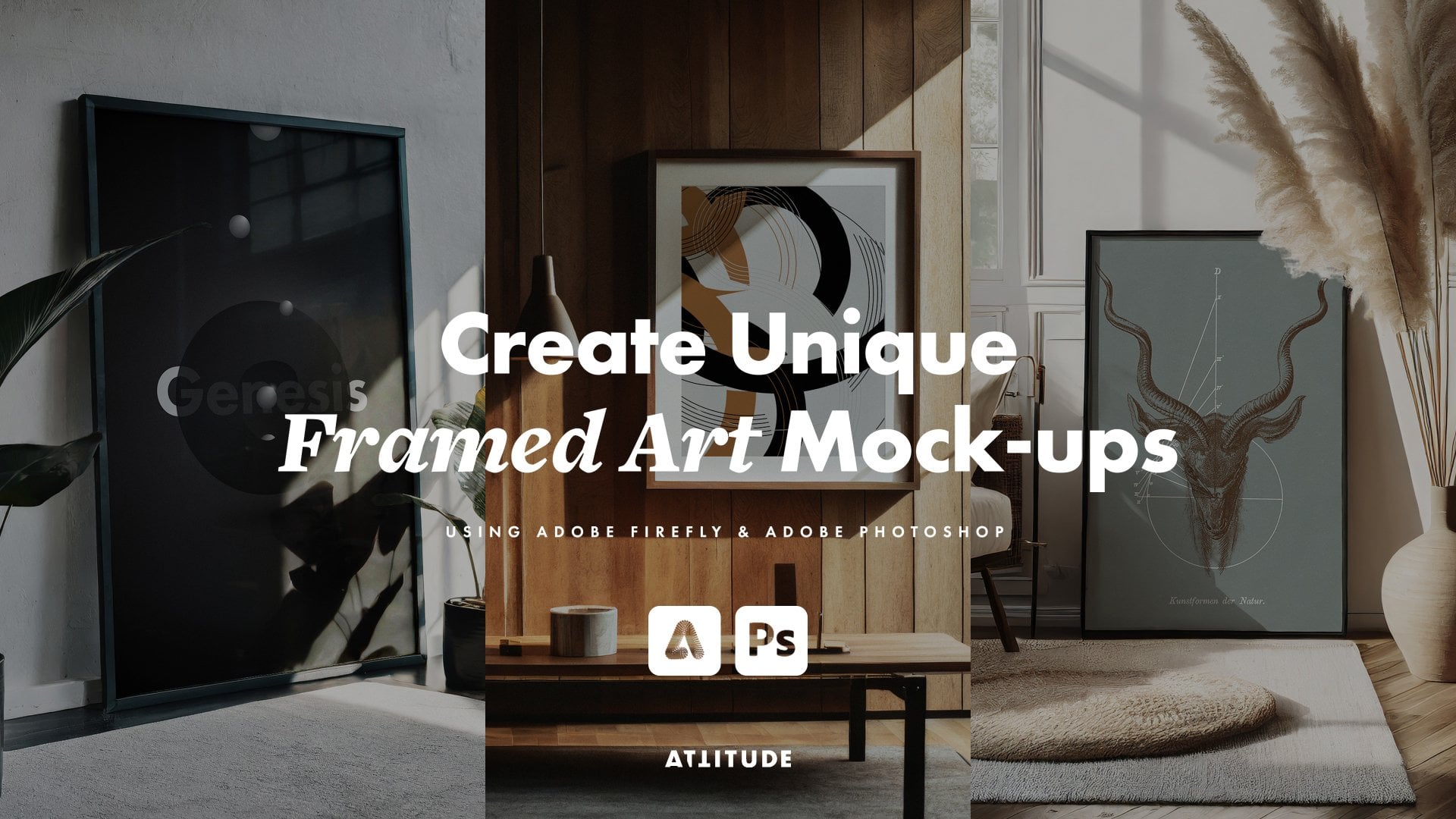
hesitate to check out my class, create unique framed
art mockups with Adobe Firefly and
Adobe Photoshop. When you have finished
preparing your image, place all of your
layers in the E group, rename it to set, and convert it into a
single smart object. Or if you're not planning to revisit the original
image and layers, simply go ahead and
flatten all of the layers. In the next lesson, we'll be starting with
creating Abox mockup. Open and prepare any image with Ebox you want to use
and let's begin.
10. Creating a Placeholder for Your Box Design: To wrap a design around the box, we'll be using the
perspective Warp tool. And when using it, I would highly recommend that you
are working with the file, which doesn't have any
complex layers within it. So if you have done some work on your image and have
some additional layers, I would recommend to at
least turn them all into a single Smart Object or even better merge them into
a single Rasta layer. To wrap our design
around an object, we need to start by
creating a placeholder. Select the rectangle tool
and start by drawing a rectangle over one side of your box and I build the
aspectratio of this rectangle, taking into account the
perspective distortion. In my case, my
rectangle needs to be just a little bit wider
than the front of my box. Then make sure that
your rectangle is slightly taller
than your box. And after you have created it, set its stroke to none, set its fill to
some bright color. Then switch to the
selection tool. Create a copy of
your rectangle in the direction of the
adjacent side of your box. Change the fill color of your second rectangle
to some other color. Reduce its opacity so
you can see the image underneath it and
then resize it, again, taking into account
the perspective distortion. If you have a third side
of your box visible, repeat the process to
create an additional plane, and again, assign it a
different fill color. When you're ready,
increase the opacity of all your rectangles
back to 100%. Make sure that the blending
mode is set to normal, select all your
placeholder rectangles, group them, rename your
group to box design. And convert it into
a smart object. Next, reduce the
opacity or change the blending mode of your smart object so
that you can see a box. Then we can move on to wrapping our placeholder around the box.
11. Wrapping Your Design Placeholder Around a Box: Before you do anything else, go ahead and save your
document in a PSD format. It is super important
at this point because the perspective W tool
which we are about to use might crush
your Photoshop, and you really
don't want to lose any changes you've made so far. With your document saved, select the Smart Object
layer with your box design. Go to the Edit menu and select Perspective W it will be set
to layout to begin with, which is the mode
which allows you to draw the planes of your design. So start by drawing a rectangle over the rectangle
for one of your sides. Then zoom in a little and resize this box to fit with the size of your
colorful placeholder. I'm not 100% sure
whether it is connected, but as soon as I started moving my box just within my
placeholder by one pixel, like you can see here,
I stopped having issues with the perspective
warp freezing my Photoshop. So I recommend you do
the same and place these boxes within the
edges of your placeholders. So just the size of
your first plane. And when it comes to the
edge which is over the fold, make sure to put the box
exactly on the edge like this. With your first plane ready, go and draw another
rectangle for another plane. You'll notice the sides
getting highlighted, which indicates that these
edges will snap together. So simply release
your mouse button and you'll have two
adjacent rectangles. Now go to one of
the corner pins of your second rectangle and drag
it to adjust its position. Again, make sure that it is within the actual
placeholder like this. Then go to the other corner pin and adjust its
position the same way. Repeat the process
for the third side of your box if it is visible. And when ready, go and click
on the war button here. This is when the perspective
wor tool usually crashes. So give your computer a second and don't rush to
click anywhere. When a few seconds have passed, go back to your planes
and start moving the pins around tow your
placeholder around your box. Keep your pins and
placeholder just outside your box to make
sure that your design will fully cover it
and to be able to effectively mask anything
which falls outside your box. Start by working with
the outside pins and then adjust the position of any pins around the folds. And when the perspective
looks correct, hit Enta and the
perspective warp will be applied as a smart filter
to the box design layer. If necessary, you can
revisit its settings later, but it is best to get everything
right the first time, so you don't have
to risk crushing your Photoshop once again. After the perspective
warp has been applied, again, make sure to
save your document. And then let's quickly
create a mask for our box.
12. Creating a Mask for a Box: After you have worked your
placeholder around the box, using the perspective Work tool. The next step is to create
a mask for your box. Start by hiding the
placeholder layer, then select the layer
with your image and create a selection around your box using any
tool you want. In my case, I'm going
to quickly create a selection using the
Quick Selection tool, but you can also use the polygonal Lasool
magnetic Lasotol or a pen tool to
trace the edges. After creating the
initial selection, I'm going to subtract some areas from it
by drawing over them whilst holding the old key to switch to the remove
from the selection tool. And then I'm going
to quickly go around the edges to refine
them a little bit. This will do for my
initial selection. When you have your selection
ready, turn your place, hold the layer back
on, select it, and create a layer mask
from the selection. Now, as the mask
has been applied, you can refine its
edges anyway you want. Since there is not too
much work to be done here, I'm going to switch
to the brush tool, make sure its hardness
is set to about 80%. Set the size to something
relatively small to work with the edges and simply go and
brush around the edges, using the white color to make
the areas visible again, and using the black color to
hide elements from my mask. So create and refine
the mask around your box and then join me in the next lesson for a few crucial tips about placing your design
into a place holder, which is wrapped around a box using the
perspective warp tool.
13. Placing Your Design Onto a Box: When creating a mockup
of an object which has multiple sides and
apply a new design to all of its sides using a single smart object distorted using the
perspective work tool, the technique for
placing new design will have a few very
important caveats, which I'll cover in this lesson. With your place holder
masked and ready, go to your box design
smart objects content and create or place your
design within this document. Using different colors
for different sides of your box makes
it quite easy to position your different
design elements in the desired place
within each side. But apart from using
your rectangles, you can also add some guides to define the edges of
different sides. In order to do so, switch
on the rulers and then drag the guides out from them and snap them to the edges
of your rectangles. This will help you to see where one side ends and another
one starts and it will make it easier to place
your design elements when you don't see
these rectangles. For example, I'm going to start by applying a pattern
to my design, select a patterns
what you want to use, set a scale to 50%, and hit a. Next, I'm going to quickly color this pattern using
a gradient map. If you want to learn to create these patterns and get your hands on these
gradient presets, be sure to check out my class about designing turing patterns. In this case, because my design only features two
adjacent sides, everything is pretty
straightforward. But if you have a
third side somewhere, you need to make sure that your design is clipped
to your placeholders, which you can do by
old clicking between your design layers and the folder containing
your original rectangles, all of which need to be set to 100% opacity and the
normal blending mode. If you have three
original rectangles, you will basically end up with having one corner being empty, and this is what you will need to be able to effectively wrap your design around your
box in the main document. So make sure all your
design layers are clipped to the group with
all your rectangles. So place your design
into your document. In my case, I'm going to
embed additional files which contain graphics for the front and the
side of my box. And again, I will make sure that all my layers are clipped to the group
with the rectangles. When you reduce your design, save this document, close it, and go back to the
main document. Change the opacity of the
design layer back to 100%. Next, let's explore how you can blend your design with the box.
14. Blending Your Design With the Image: After placing your design
into the place holder, the next step is
to blend it with the surface of the
object in your image. If you're working with a
straightforward white box, you can simply change
the blending mode of your design layer to multiply. But in this case, because
my box isn't white, multiply blend the
original color of the box with my design, and this is something
I want to avoid. So I'm going to keep the
blending mode of my box set to normal and create shading and highlights using a
different technique. First, we need to have a couple of copies of our image layer. In case you would want to make any changes to your
original image afterward, and if you are working
with a rasterized layer, start by renaming a two set and convert it into
a smart object. This way, any changes you might make to your
set image afterwards will be applied to
the layers which are used to create
shading and highlights. With a smart object ready, duplicate it and put it
above your box design. Rename this layer to shadows. And set a blending
mode to multiply. Before you do anything else, make sure you click between these two layers to clip your shading to
your design layer. Now you might ask what
is the difference since we still have the coloring
coming from the original box. And here is the trick. Select your shadows layer
in the layers panel, press command or control
you in windows to open the hue and saturation
adjustments and turn down the
saturation to your liking. You can desaturate it
fully if you want, or you can keep a
little bit of color. And hit the k when you
like what you see. Because this is a
smart object, again, you can revisit your hue and
saturation adjustments at any time if you want to
further tweak the saturation. Apart from changing
the saturation, you can also control the
strength of your shadows. In order to do so, with the
shadows layer selected, hit Command L or Control L in Windows to open the
levels adjustment. And here you need to play with the sliders to change the
look of your shading effect. When working with shading, you will need to work
with the indicator for the black point here
and moving it to the right will make
the whole image lighter and hence the
shadows will also be softer, then you can move around
the white indicator here to change the brightness of the image and move the midton indicator to
change the contrast. What you do with the
leiders will depend on the images you're working with and the look
you want to create. So move them around until
you like what you see. And then when you
apply the changes, you'll be able to revisit
your levels adjustment at any time by clicking
on their name here. Now, this is starting
to look better, but it is still a
little bit flat, and the areas of the box, which should be lighter,
still lack depth and detail. So to bring back the highlights, go to the Layers panel, duplicate your shadows layer. Again, make sure it is clipped
to the design layer below. Renname it to highlights. Set a blending
mode to screen and then go and reduce its
opacity to about 35 to 40%. At this point, your mockup
will start looking even worse, so you need to go to the
levels adjustment for your new highlights layer and adjust the sliders here to make your blended layer
considerably darker, which will mean there are
less light areas which remain visible when they are blended using the screen mode. In this case, you need to keep the black point for the
output levels at zero, keep the white point for
the input levels up to 155, and then move the mid tones and black indicators until
you like what you see. Remember that your
highlights layer is not at its full opacity. So when you're
generally happy with the level of detail
in your highlights, apply changes and then go
and adjust the opacity of this layer to make its
effect more or less pronounced. So this is how you can create realistic shadows and
highlights in your mockups. Next, let's finish
this mockup off with some final touches
and layer organization.
15. Finishing Touches & Tidying up the Document: After you have applied shading and highlights to your mockup, now it is time for a
few final touches. If you want to add a little bit more realism to your mockup, you can consider blur
new design layer. So select your box design
layer in the Layers panel. Make sure that the
layers famil is selected here and not the mask, and then go to the filter menu. Blur and select Gaussian set the radius around 0.1
to not 0.2 pixels depending on your image
and apply changes. And you are done
with the box mockup. Save your document
and if you don't have any other objects in your image which you
want to turn into a Mup, simply keep your file as it is. But in this case,
because I'm going to be creating a second mockup
using the bottle, I'm going to select and group all the layers
which I used in my box mockup and rename
the group to box. And I highly recommend you do the same if you
are going to be creating at least
one more mockup within the same document. So now you know how to wrap
your design seamlessly around the box and create realistic shadows and
highlights in your mockups. Have fun creating mockups
using different boxes or other objects which have
multiple flat sides and folds. And when ready, join me
in the next lesson in which we'll start working on mockups of cylindrical objects.
16. Creating Warped Placeholders for Cylindrical Objects: If you are a packaging
designer or create artwork or surface patterns
for printed products, knowing how to create
more cups out of any cylindrical object is
pretty much essential. And it is actually pretty easy as long as you
know a few tricks, which will allow you to avoid stretching or squashing
your designs. The first trick is creating your placeholder the right way. For demonstration, I'm
going to be creating a product label which
wraps around the bottle. But you can use the following
techniques to create more cups out of all sorts
of cylindrical objects, including bottles, cans,
mugs, and packaging tubes. Let's start by creating a design placeholder
using the rectangle tool. Start by assessing the height of your object and the height of
the label or print design, you want to apply to it. For example, I'm
going to be creating my label starting
from this point here and going down
to the bottom of the bottle to the point where it is just
starting to curve. After you have decided
on the height, create a rectangle
in the width of your object. Here is the trick. If you use the place holder
in the size of your bottle, your design will inevitably
get stretched when it is applied to it because
the surface isn't flat. So in order to be able to
wrap your design around any cylindrical object and keep all of the distortions
looking realistic, go and increase the
width of your rectangle to be about twice the
width of your object. With the rectangle ready, if you need to go
and quickly adjust its height to make sure it is
exactly what you're after, then go and set the stroke
of this rectangle to none. Rename the layer
with the rectangle. And convert it to
a smart object. Then turn down the
layer's opacity so that you can see
the object below it. Next, let's wrap this
placeholder around the bottle. Switch to the selection tool. And with this layer selected, press Command T or Control T in Windows to switch to the
Free Transform tool. Then right click on your
object and select Warp here. Go to the Warp settings
in the Options bar, and in this menu, select Clinda. Now simply bring the sides of your cylinder to just
outside the sides of your object and then adjust the curve to make the
wrapping look realistic. Start by working
with the top point here and when the
curve looks correct, go and adjust the bottom point, taking into account any
difference in perspective. If you're dealing with
a straight on shot of a regular cylinder,
you can stop here. Alternatively, you can
further adjust how you place holder wraps
around your object using the perspective tool or the regular distort tool or using the scale
rotate or skew options. In this case, I don't really have to do any more
work on my bottle, but I'm going to
quickly switch to the distort tool and just nudge this corner
a little bit down, so it looks a little bit more realistic in relation to
the shape of the bottle. When you're done wrapping your placeholder
around your object, hit Enter to apply the changes, and unlike when using the Perspective Warp tool which we use to wrap the
design around the box, you won't see any
new smart filters applied to your smart object
layer in the layer spanel. But this doesn't mean
that your distortions are not editable or destructive. And to edit the
distortions later on, simply switch to the free
transform tool yet again. Choose your desired
distortion tool and make any further changes you need to make to
your placeholder. If you need to wrap
your placeholder around your object in
a more complex way, for example, taper it around
certain parts of the object. You will be able to do it
using the liquify filter, and I'll show you how
a little bit later. But for now, let's stick with a straightforward label design. Now with the placeholder ready, let's quickly create a mask around the edges of the object. Again, you can use any tools and technique you want to
create your selection, and it will depend on the
object you are working with. In this case, I'm going to
simply start by creating a layer mask and then use a hard round brush to work
around the edges of my bottle. So create warp and mask
your place holder, and then join me
in the next lesson in which I'll share a
super important trick, which will allow you to avoid
stretching or squash on new designs when applying them
onto cylindrical objects.
17. Placing Your Design & Adjusting Cylindrical Distortions: With your placeholder
masked and ready, the next step is to place
your design into it, and then adjust the
cylindrical distortions to avoid any unrealistic stretching or squashion of the design. So let's start by quickly placing the design
within the placeholder. I'm going to create
a similar design I have used on my box. So I'm going to start by
creating a pattern fill layer, finding the pattern
I want to use, changing its scale and
position within the canvas. And then I'm going
to color it using a gradient map layer and the same gradient map preset
I have used on my box. And then I'm going
to go and place my label design on
top of this pattern. So place or create your
design within this document, and with your design ready, save this document, close it. And then in the main document, start by changing the opacity
of this layer back to 100%. Now this is looking
pretty squashed, but it can be easily fixed. So start by switching to
the free transform tool. And in this point,
you get this message. So simply click Okay
link your mask here. Make sure that the smart objects layer thumbnail is selected
here and not the mask. Then again, switch to
the free transform tool. Select warp and then go and drag this square along
this line in the middle to make your design look
realistically warped around your object and not look squashed or stretched
around the center. When ready, hit Enter to apply the changes and go
back to the Lars panel and link your mask to
your smart object to avoid moving either of them in relation to each
other by mistake. So place and adjust your design
within your placeholder, and then join me. In the next lesson, I'll share with you a technique for
creating a shading effect, which you need to use
if you are like me, creating an opaque
label on top of a translucent object
or using an object, you cannot easily blend
your design onto.
18. Creating Shading & Lighting for an Opaque Label: With your design
applied and adjusted, now it is time to blend
it with your image. If you are working with a solid white or light
cylindrical object, you can simply go and change the blending mode
of this layer to multiply or use the
same shading technique which we have
applied to the box. But because in this case, I'm working with the object I can't easily blend
my design onto, I will need to create lighting and shading effects manually, and you need to do the same
if you're working with an object which is either
not white or translucent. To manually add shading
to your mockup, start by selecting your
smart object layer in the layers panel and put
it in a group on its own. This is super important because
it will allow you to play around with the blending mode of this layer later
on if you want to, and ensure that your shading
and lighting effects won't affect the way you
design blends with the image. So let's quickly
rename this group. And then go to the
add new fill or adjustment layer button and add a new exposure
adjustment layer. Put this layer above and outside your group and clip it to it. Rename this layer to shadows. And then go to its properties
and decrease the exposure to roughly imitate the amount of shading you want to have
in the darkest area. Next, select the layer mask for your exposure
adjustment layer. Switch to the gradient tool. In the options bar here, set the gradient preset
to black to white, which is a standard
photoshop preset which you should see
in the basic section. Make sure its opacity
is set to 100% here. And then go and draw a gradient going from one side of
your object to another, for example, like this. After creating your
initial gradient, you will need to adjust
it further to make the lighting consistent with
the lighting in your set. So go to the gradient slider in the properties panel and adjust the gradient to make the
lighting look more realistic. Remember that the
white color stop here will indicate the area
where your adjustment is visible and the black stop will conceal any changes made
by the adjustment layer. I'm going to move my black
colo stop somewhere around here so that I have the original light level
of my design in this area. Then I'm going to add
a new color stop on this side and check out different shades of gray to make this area a little bit darker. Then I'm going to quickly
adjust the shadow side. And because I want my shadows
to start around here, I'm going to start by
moving this color stop inwards and then adjust the position of the midpoint
to control this transition. So play around with the gradient with a new mask to create a more or less realistic
look and then go and adjust the exposure value to make your shadows lighter or darker. If you also want to
add some highlights, which are brighter than
the colors in your design, simply duplicate your
exposure adjustment layer. Rename it to highlights. Again, clip it to
the group below, then go and increase the exposure and then go
and adjust your mask. In this case, you can
simply invert it. Or if you really want,
you can also go and set up a custom mask
for your highlights. With the mask for your
highlights ready. Go and fine tune the exposure
level until it looks right. Now with the shadows
and highlights ready. Next, let's add some
finishing touches, which will help to
make any opaque label look better integrated
with your image.
19. Finalising Your Opaque Label Mock-up: After adding shading and
lighting to your opaque label, it is a good idea to apply
a few quick effects and adjustments to it to make it blend better with the
rest of the image. Because we haven't
blended this design with the realistic object
below, it lacks texture. You can go and text your design within your Smart
Object placeholder, or you can simply apply a
few effects to this layer in the main document to make it look a little bit
more realistic. Select your smart object and
then go to the filter menu, noise and select Add Noise. Set the amount to about
one or 2% distribution to Gaussian and
check monochromatic. Apply changes, and now if your design looks a
little bit too noisy, go to this icon next to
the At noise filter. That'll click on it and reduce the filter's
opacity to your liking. You can also play around with different blending
modes here if you want. I usually keep it set to normal or salt light depending on the
colors in the design. In this case, I'm going
to keep it set to normal and apply changes. If your design is looking
a little bit too sharp in comparison to the
objects in your image, again, you can go
to the filter menu and add a Gaussian
blur to your design. Keep your blur radius
to about 0.1 to not 0.2 pixels and
apply changes. Another thing you can do to
make your mockup look more realistic is change
the saturation and lightness of your design. So hit command you or control
you in Windows to open the hue and
saturation adjustment and play around with slightly reducing the saturation
of your design to make it fit better with
the rest of the image. And hit a K to apply changes. Then to edit the brightness
and contrast to new design, hit Command L or Control
L in Windows to open the levels adjustment dialog and adjust the levels new
design to your liking. Move the mid tone indicator to change the contrast
in your design. Move the white indicator to
make your design brighter, and if necessary, move the black indicator
to make it darker. But you probably won't
need to work with it, and changing just the
contrast and brightness should be enough to make your
mockup look more realistic. So keep the level
adjustments in mind and apply them to your
designs if necessary. And remember that you
can edit or discard any of these effects or adjustments
whenever necessary. So this is how you
can create a moup of an opaque label or a
print using opaque inks. But if you're creating a moup
using a translucent object, you can also create
more complex effects, imitating the look of print created using translucent inks. And this is what we'll
explore in the next lesson.
20. Blending Your Design With a Translucent Object: If you're creating am cap
using a translucent object, after you have set up your
custom shading and highlights, you can experiment with blending your design
elements with the image to create a
more sophisticated look, imitating a combination of translucent and solid
print elements. To blend your design with a
translucent object below, you can use various
blending modes. The blending mode
you use will firstly depend on the look you want
to create and secondly, on the colors featured
in your design. For example, because
my design features dark and bright colors and also it has some
white elements. If I want to blend this
design as a whole, my only reasonable choice is to use the hard
light blending mode, as it will allow me to keep my white elements visible and at the same time nicely blend all of the other
colors with the image. Sometimes hard light
could work pretty well. But if you want to
have more flexibility and more options for
fine tuning the look, it is better to split
your design into two or more separate
layers and take advantage of applying different blending modes to each of them. To split your existing
design elements between two or more
separate smart objects, start by going to
the Layers panel. Right click on the
Smart Object with your design and select New
Smart Object via copy here. Unlike when duplicating
smart objects, the usual way when you create
new smart objects via copy, the contents of your
new smart objects will be separate from the
contents of your original one. So create as many copies as you want to blend with
your image differently. And in my case, I simply want to separate my white elements
from the background pattern. So I need just these two copies. When you have your smart
object copies ready, go and modify the contents. For example, in
this smart object, I'm only going to keep my white design elements visible and hide
all other layers. And then apply changes
and close this document. Now, back in the main document, it still looks the same overall. But when I hide this layer, here is my original
smart object unchanged. In this case, I
only want to keep this pattern within
the smart object, so I'm going to
edit its contents, hide the design layer, save this document, close it. And now I have my
background pattern separated from the logo
and the product name. If you split your design between a number
of smart objects, make sure to go and
rename your layers, so you know what's what. I'm going to rename
this layer to bottle design pattern and this one to bottle design logo
and product name. With your design split
into separate layers, now you can go ahead and explore different blending
modes for both layers. For example, any layer which
contains white element can now be also set to the
screen mode or even normal. In this case, I'm going
to set mine to screen. So I have some transparency
within the letters here. Since this layer
is a duplicate of the original label layer with all of its
adjustments and filters, it is a good idea
to edit or discard any adjustments or
filters you don't want. In this case, I don't need
the levels adjustment, so I'm going to delete it. So this is an easy way of imitating a solid
white color print. But when it comes to
any design layers which you want to
look translucent, you have a few more
options to explore. If your design features dark or saturated
colors, you can explore, multiply, darken, overlay
and hard light modes. And if you're working
with the lighter colors, you can consider
using screen or ten. In this case, I'm going to set my pattern layer to overlay. Again, because I still have all these adjustments here which I applied to
the opaque label, I'm going to quickly
check how they affect my translucent design. I'm going to keep my hue
and saturation adjustment because it helps
to make the colors a little bit more subtle, and I'm going to
quickly play with the levels adjustment to fine
tune the look of my button. In this case, I'm
making it just a little bit more
intense by moving the black point inwards and by further adjusting
the contrast using the midtone slider and adjusting the brightness
using the white slider. But when working
with transparency, you don't necessarily need to
use the levels adjustments, so use them when
and if necessary. And if you need to further fine tune the look
of your design, remember that you
also still have your shading and highlights
adjustment layers, which you can play around
with whenever you want. If you start getting
pedantic about the realism, you might also suggest
that you need to have some print visible
on the other side. But because the main point of mockups is showcasing
your design, I would recommend keeping
it simple and not making your image unnecessarily fussy by adding any
additional elements, which might distract
from humane design. So this is how you can create translucent mockups
and take advantage of using different
blending modes to imitate different
printing techniques. And this is pretty much it for the techniques for
creating more cups, using straightforward
cylindrical objects. But if you're working with
more complex or uneven shapes, you need to take an
extra step to work your designs around non
cylindrical parts of the objects. And I'll show you how
in the next lesson.
21. Wrapping Your Design Around an Uneven Surface: If you want to create more
complex mock ups and wrap your designs around objects which are not
entirely cylindrical, you need to apply
additional distortions to your placeholders. For example, I want my pattern to go to the very
bottom of this bottle. It is best to start with the correct height
of your design when creating your placeholder. But since I haven't,
let me quickly show you how you can extend your
design if you need to. To extend my pattern
placeholder, I'm going to start by
unlinking the layer mask, then select my Smart
Objects thumbnail, then switch to the
free transform tool and simply make my place
holder a little bit taller. Once I've done that, now
I'm going to switch to the Warp tool and quickly
adjust my cylinder. Because I have stretched
my placeholder, I need to quickly
compensate for it by adjusting how squashed
it is using the square. And when my new place holder looks correct, imply changes. After you have adjusted the size of your
design placeholder, relink the mask and
edit it if necessary. For example, I'm
going to quickly work on my mask using the brush tool. With the extended
design and mask ready, the next step is to warp the design around the
tricky parts of the object. To work your designs
around uneven shapes, start by selecting the
smart object thumbnail of the design you want to distort and go to the filter
menu and select liquefy. Here, select the forward or tool in case it is not
selected by default. Then in the options
here for show backdrop, select the layer with your set. Keep the mode set to
behind and opacity at around 40% so that
you can clearly see both your image and the
design you want to distort. Keep density and pressure
settings here set to 50, then go to the area of your
design you want to distort. Change the brush size
using the square bracket keys so it looks proportionally correct to
the part of the object, you'll be warping your design around and then start pushing
and pulling your design to make it conform
to the shape of your object and
look realistically applied to And when ready, hit Okay to apply the changes. You can spend as much time using the liquefied
filter as you want, and you can always revisit the settings later
when required. I'm pretty happy with
the look of my bottle, so I'm going to stop here. Using the liquefied filter
is super quick and easy, and it allows you to keep both the liquefied and cylindrical distortions
fully editable. But if you want to create
more advanced mockups, you can also adjust the shape of your placeholder
using the Warp tool. For this, you'll need to add extra lines and points
to your work tool mesh and manipulate the points and curves to follow the
shape of your mockup object. This will allow
you to create more precise and even distortions, but apart from being a little more laborious than using
the liquify filter, it will also make your cylindrical
distortions uneditable. So if you want to
try transforming the placeholder using
the custom work mesh, you need to make sure that you nail your cylindrical
distortions first. Generally, using
the work mesh is a more advanced and
fiddly technique. So by all means, try it
out if you really want. But in most cases, the liquify filter will
be much faster and less stressful to use for
visualizing something quickly. So now you know how to
create product mockups and seamlessly wrap
your designs around boxes and cylindrical objects. So experiment with the
techniques to show CCO packaging
designs or artworks, designs or surface patterns
created for printed products. And this brings us to
the end of the class. So let's wrap it up.
22. Final Thoughts & Conclusion: So this is how you can showcase
your packaging designs or printed products in any unique
setting you can think of. Generating scenes
for your mockups can become an addictive process. So, have fun experimenting with your prompts and exploring various effects and settings
available in Adobe Firefly. And don't forget to download and use the provided
class resources to make it easier to get started with generating exciting images. I hope that you have enjoyed this class and are
excited to start creating your own mockups using boxes and cylindrical objects. I cannot wait to see what sort
of scenes you imagine and generate and how you showcase
your work using them. For your class project, generate some lifestyle images featuring cylindrical objects or boxes, and turn at least one image into a mocap in Adobe Photoshop. Create a project in the
projects and resources tab for this class and
post you generated images, your finished mockups, and any work in progress
images or experiments. And be sure to share what prompts and settings
you have used in Adobe Firefly to generate
your selected images. And I'd also love to hear
about your process of turning the images into mockups and what you have
learned in this class. If you're going to
share your following this class on Instagram, please follow us at Attitude Creative and
tag us in your posts so that we can easily
discover them and share your work with our
Instagram community. If you want to learn
about generating interior images and creating two kinds of framed art mockups, do not hesitate to
check out my class, create unique framed
art mockups with Adobe Hi fi and Adobe Photoshop. If you have found
this class helpful, please leave a review in the
review tab for this class. And if you have any
sort of questions, be sure to leave a comment in the discussion
tab for this class, and I'll happily
answer and provide feedback and be sure to follow us here on skill
share to be the first to know about our new
classes and updates. Thank you for joining
me in this class, and I hope to see you
in our other classes.
 Evgeniya & Dominic Righini-Brand, Graphic Design & Photography