Transcripts
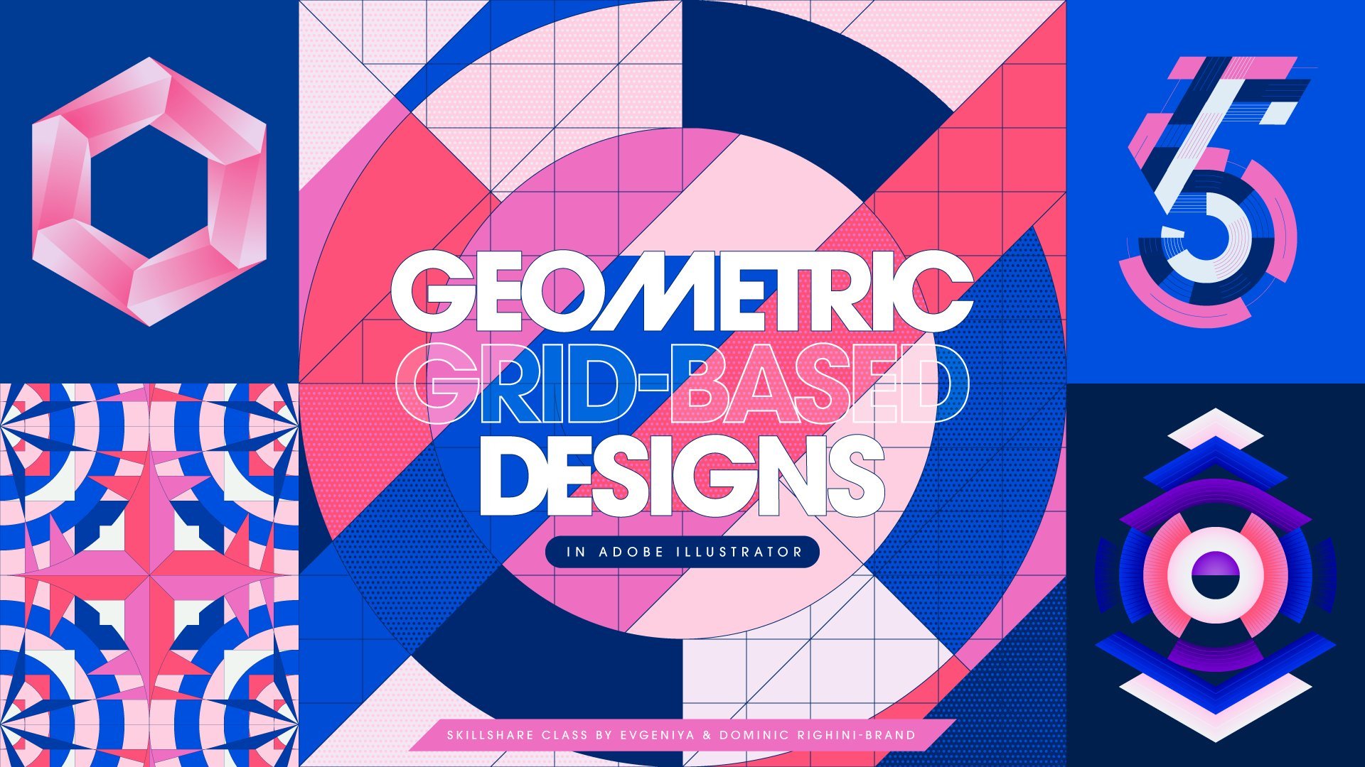
1. Introduction: Hey guys, I am Jenya from Attitude Creative. I am a graphic designer, and most of my work is created in Adobe Illustrator, and features geometric elements or is based on geometric grids. I teach quite a few classes here on Skillshare, including a popular in-depth class Mastering Illustrator Tools & Techniques for Creating Geometric Grid-Based Designs, and I am always experimenting and looking for ways to make my Illustrator workflow more efficient and more fun. And in this class I am excited to share with you my favourite workflow tips and technical tricks for working smart and getting the most out of often overlooked and underused settings, tools and functionality in Illustrator so that you can create geometric designs faster, easier and with more precision, and ultimately spend less time on boring technical stuff and have more time for the creative play! This class is designed for graphic designers, illustrators and pattern designers, who are into creating geometric or grid-based works in Illustrator, and who are looking for ways to streamline their Illustrator workflow, spend less time performing repetitive tasks and get things done more efficiently. And if you work in a team, I hope this class will also give you some ideas for how you can establish and use a common framework, consistent approach and project assets to be able to collaborate with your colleagues on projects in a more seamless manner. This class is for intermediate and advanced Illustrator users who are fluent in using Illustrator’s core Drawing tools, Shape tools, and Appearance attributes, and who are familiar with working with custom grids and guides. I cannot wait to share with you my special tips & tricks which made a huge difference to my workflow when creating geometric designs. So, let’s jump right in!
2. Make Snapping & Smart Guides Work for You: Illustrator has quite a few obscure settings and functions, which can make things super easy when working with geometric designs, as well as cause no end of pain and frustration. And some of the most important settings are the Snapping Options in the View menu. Snap to Grid, Snap to Pixel, Snap to Point, and the new Snap to Glyph option all sound pretty clear. But there is a catch. They cannot be properly used together as some of them override each other! Even though, adding to the confusion, for some reason you can check all of them at the same time. So when working with geometric designs in particular you need to keep these peculiarities in mind, decide what you actually want to snap to and disable the rest of the options. Snap to Grid overrides or rather disables all other snapping options when it is turned on, and it allows you to snap objects to the Document Grid which you can turn on and off using this option in the View menu or using this shortcut. And you can change the cell size in your grid to better suit your project. To do this, go to the Preferences, and in the Guides & Grid section specify the desired grid line spacing and the number of subdivisions between the grid lines. Snapping to grid and the fact that the grid is customisable can be super useful when you need to create small to medium scale graphics which don’t have complex geometry. I normally use Snap to Grid when I need to create icons, simple linear illustrations or geometric linear lettering. Snap to Pixel works in a similar fashion to Snap to Grid, but snaps to a pixel grid instead and essentially is designed to make your work pixel-perfect for any raster output. It is best used for creating some small-scale graphics or something which needs to be pixel-based, and if you need to see the pixel grid whilst working, you’ll need to zoom in to at least 600%, have this box checked in the Preferences and have the Pixel Preview checked in the View menu. Otherwise, you can snap to the pixel grid blindly and see your work as vector. Whilst Snap to Grid and Snap to Pixel options have their uses, I find Snapping to Point to be the most useful option for creating precise work, where you either have more complex elements, or need to have precise intersections of paths, or need to be able to freely move the objects around and snap them to each other. But to use it properly, you must disable all other snapping options and activate Smart Guides. Smart Guides also work a to certain extent with the other Snapping Options, but when used together with the Snap to Point, they offer more hinting which helps to keep everything precise. And to get the most out of Smart Guides, make sure you go to the Preferences, and in the Smart Guides section check all of the options here. Pay attention to the Snapping Tolerance value, as it determines how far you need to be away from the point before Smart Guides pop up and things snap to each other. I tend to keep it set to 2 points, but you can increase this value if you are working with large-scale elements and there are no tiny elements and potential options for your objects to snap to. Smart Guides work best when Illustrator does not get confused what to snap to in the vicinity of your point or path. When snapping to point and moving elements, to make snapping easier it is best to drag elements by the point you want to snap to some other point in your design. And to avoid transforming your elements when moving them by dragging an anchor point, just hold down the Command key, or Control key in Windows, which will allow you to drag by this point without any issues, and position it somewhere where you want it to snap to. Smart Guides and Snap to Point are super useful when your need to perfectly position elements against each other. And if you also want to be able to snap your elements to a grid at the same time, it’s best to create your own grid which is basically a collection of paths or guides. And since you’ll be creating the grid yourself, it can have a custom size and structure. It can be as simple as a square grid to mimic the Document Grid, or isometric, hexagonal or a grid with 45 degree angles, or any other kind of grid you might need. And if you need to, you can learn how to quickly and precisely create all these kinds of standard grids and more custom grids in my class Mastering Illustrator Tools & Techniques for Creating Geometric Grid-Based Designs. Because I like having an underlying grid structure to snap my objects to when creating, moving or transforming them, I always have some kind of overall grid in my documents, keep it on a separate locked layer, set its stroke to some faint colour just to use as a basis for my construction, and either put it below all other layers, or above all other layers and set the grid layer’s Blending Mode to Multiply, to be able to see my grid over the design elements. So by using a separate grid, in a sense you can have benefits of snapping to a grid and snapping to points, and you can use the Smart Guides to help size and position everything correctly and precisely. So check your snapping options when you start creating, use whichever one works best for the project you are working on, and regardless of the snapping option you use take whatever advantage you can out of the Smart Guides.
3. Devise & Use a Consistent Sizing System: What matters most when you are developing your geometric work are the proportions of the elements in relation to each other within the design, and not the sizes they need to be when used in the final format. Ultimately this means that you can work in any size you want as long as you use the correct aspect ratio required for your final format, and then scale your work to fit the required size for the output. And since you can work in any size, you can seriously speed up your workflow if you establish a consistent universal sizing system for elements and use it across your projects in the developmental stage. For example, in my work I often use 100 pixels as the basis for a standard module or element size, and then everything else is either a multiplication of 100, or its subdivision, such as 10, 20, 25 or 50 pixels which I sometimes use for adding smaller details. If you like using the Golden Ratio, or even better Fibonacci sequence, you can also use either of them as a basis for your sizing system, and if necessary you can always multiply each of the numbers by 10 or 100, to create large-scale work whilst adhering to the same proportions of the elements. The huge benefit of developing work using consistently sized elements or grid modules is that you can use round numbers which make any calculations easier and generally make it easier to be precise. And you can also learn what works in terms of proportions and styling and make your decisions faster. And even better, using consistent sizes will allow you to reuse grids, styling or design elements, but these are separate tips which I’ll cover in more detail shortly. Also I find that sticking to just one unit type in the developmental stage of any project really helps me to streamline my workflow. I advocate working with either pixels or points as they are the smallest relative units which allow you to be precise and also easily integrate type into your designs. And either can be used when creating work for digital and print use, and there are no rules saying that you have to measure everything in millimetres or inches when developing work for print. All these tips might sound counter-intuitive if you are used to starting with the format of the work you need to create and coming up with the elements’ sizes in relation to it. But having your own sizing system and always starting with set precise elements sizes, makes it just so much easier to get things done, and you won’t need to spend time working with some weird numbers, and sizing or positioning elements correctly. And if you work in a creative team, having a consistent approach amongst you will make it so much easier and smoother to collaborate when developing your projects!
4. Use Artboard Rulers: Even though you might not be using the actual rulers when developing your work, I know, I rarely do, they are important as they establish the coordinates in your document. By default the rulers are set to Global, so when you have a number of artboards, they function within one system of coordinates, which is not ideal. So to make it easier to position objects in relation to each artboard, be sure to go to the View menu, and set Rulers to Artboard Rulers here. This will reset coordinates for each artboard, and 0 will be in the top left corner of each artboard when it is selected. And if you need to, you can also reposition the 0 point by dragging the rulers to any desired point, for example, to the centre of your artboard, like this, which can be useful if you are creating symmetrical work and want to keep an eye on coordinates when creating your elements. When working with multiple artboards and using Artboard Rulers, make sure you have the artboard you want to work with selected, otherwise you’ll see the coordinates in relation to some other artboard you have selected. Also keep in mind, that when using the Artboard tool you’ll see the Global coordinates for each artboard’s position in relation to the specified 0 point. And whilst we are here, another little tip which will help you avoid having extra or empty pixels around the edges of your work when exporting it in raster, is to keep the position of the artboard and its size in whole pixel values. It would be awesome to be able to set Artboard rulers as default when creating new documents, but since it’s not the case as of yet, you just need to remember to set them up when you are creating a new document. And also set rulers to Artboard Rulers if you create any document templates, which I’ll talk about in the next tip.
5. Create & Use Document Templates: It does not take long to create elements or set up grids, but you can save yourself a huge amount of time by creating document templates for specific projects, or more general versatile templates which can be used as a starting point for many different things. What sort of templates you create and use depends on what sort of work you do. Maybe you need layout grid templates with a simple structure of rows and columns. Or maybe some advanced custom layout grids with shapes which can be used as placeholders for images, or function as graphic elements. Or maybe you create a lot of icons or logotypes and need a template document full of separate construction elements, such as circles or arcs in different size following Fibonacci numbers or the Golden Ratio, so that you can easily arrange them together without worrying about creating elements in the right proportional size every time. Or perhaps like me you use geometric grids as a framework to develop designs, custom letterforms, patterns or illustrations and want to be able to quickly jump into creating work without spending time creating the same construction elements over and over again and spending even more time making sure that all elements are precisely sized and positioned in relation to each other. For example, I often use polar grids in my work, and combine them with other types of standard grids. So one of the templates that I use features a polar grid with a number of circles, a few sets of radial dividers with different angles between them, and 4 other standard grids which match my polar grid perfectly. So that’s a lot of different elements in one document, but I prefer to keep them all together to be able to quickly try alternatives when I start creating. And every time I start with this template I just quickly select the elements I need, and simply hide all other elements but keep them in this document, in case if I need to try out something else later on, or delete them, if I know for sure that I won’t be needing them. This is a very general grid, and when I set it up as a template, I made sure that it is quite versatile and there is also room for moving my circles around. Most of my geometric designs in Illustrator are usually created on 1200 by 1200 px artboards with 100 px modules, and this grid template is twice as large, so I have a lot of compositional options and can easily create work in different aspect ratios if it is required. On the other hand, here is another example of the template which I use which is more project-specific. I use it to create my geometric letterforms, so it features less elements, but I still have a few options for what to combine my polar grids with, which is super useful when creating different letterforms. Because I mostly use my grids as construction elements, I usually just keep all paths as paths. But if you are working on layouts or generally like having guides in your work, you can also create some custom guides based on your geometric elements. To create custom guides, just select any paths you want to convert, and press Command+5, or Control+5 in Windows. To keep your document tidy, keep you guides on a separate layer. And if there are different types of guides, you can also put them into separate groups, to be able to easily select and view some of the guides independently from the rest. Make sure that your guides are locked in the View menu, so you won’t move them by mistake when you use your template, and you are good to go. And if you ever need to use the paths which form your guides, you can simply unlock your guides, then select them and release your selected guides by pressing Command+Option+5, or Control+Alt+5 in Windows, and they’ll become usable paths once again. Apart from all the structural elements and grids, you can also load any assets you might need in this document, for example, some custom swatches, or graphic styles, or symbols. For example, in this template, I have a few colour groups which I use in my geometric designs, so I don’t need to go and find my custom colour groups every time. So create any template elements you need, create guides if you need to, load your assets, double-check your artboards’ sizes and positions, and set your Rulers to Artboard Rulers. Make sure that you start on the right foot and make it easy for yourself to work with documents based on your template in future. So spend a little bit of time making your template document tidy, so that all of the layers are properly named, any elements which can be grouped together are grouped and also renamed, and make sure that all elements are positioned and sized correctly and precisely, so you won’t have the same errors to fix in all of your future files you create based on your template. Once you have set everything up, save your document as it is for back-up. Then go to the File menu and save your document as a template. Illustrator saves templates in the Illustrator folder and not in your Library as it does for some other assets, and sometimes it won’t allow you to save right into this folder. In this case, just create a new folder for your templates within the Templates folder, like I’ve done here. And save your template there. To create a new document based on your template, simply go to the File menu, select New From Template and pick your template. And here you go! Resave your new document under a proper name and start creating! So whether you are working on something which has a visual system and need to keep everything consistent, or you want to simply avoid starting with a blank canvas, creating and having templates on hand will cut out all of the repetitive tasks you need to do when you start creating something, help to keep your own or your team’s work consistent across a number of pieces, minimise imperfections and defects in your work you need will to fix, as you can fix everything once when setting up your template, and also it will allow you to progress faster from the construction stage to precise final outcomes.
6. Work Smart With Repeating Elements: One way or another, geometric graphics are often based on the repetition of elements, whether it is some linear repetition, reflection, or rotational symmetry. And by working smart and utilising these principles of repetition you can go from just a few elements to a complex design in a few easy steps and save yourself a lot of time creating multiple elements and positioning them correctly. All of the Transformation tools in Illustrator allow you to set up a custom reference point for transformation, including the centre point of rotation and reflection axis, and you can also copy elements upon transformation and easily repeat the previous transformation. So take full advantage of this functionality and whenever you need to create some element in your work which mimics some pre-existing element, just stop for a moment and think what you need to do to it, to make another version without recreating it from scratch. For example, here I have these three curves which I want to repeat around these circles. So first, I need to select them, then switch to the required Transformation tool, which in this case is the Rotate tool, and find the Reference point around which I want to rotate these elements. And here it is pretty easy as I have my grids. So I’ll precisely align the cursor with this point using the Smart Guides, and Alt-click in this point to set the Reference point and open the Transformation dialog. And then I’ll set my desired transformation. When using the Rotate tool, you can either specify the rotation angle here, or type in 360/ and then the desired number of final elements you need to create. And this will calculate the angle between each element, which makes it super easy and precise. After everything is set up, I need to create a copy, and then proceed with creating more copies by pressing Command+D, or it will be Control+D in Windows, which is the shortcut for the Transform Again function. This trick can be used at any stage of the design process, including grid development or when creating the underlying structure of your design, or when putting elements into a desired final composition, and even during the styling stage, as you can easily replicate some custom styling by using multiple copies of elements with a desired appearance. So work smart, draw something once, and always analyse how you can use the elements you already have to create the rest of the composition.
7. Unlock the Full Potential of Live Corners: For a while now in Illustrator we’ve been able to create some fun shapes with Live Corners and edit them on the go. And I bet you use them for rounding corners at least every now and again! But apart from the obvious corner rounding, they are an amazing tool for customising shapes very quickly and easily! And they can save you so much time and effort when used in a less straightforward way and applied to different kinds of shapes. First of all, there are other corner styles which you can create beyond round corners. You can access them all in the Transform Panel, if you are working with a rectangle created using the Rectangle tool, like I’ve got here. If you are working with any other shape or path, you can first select a corner or a number of corners you want to modify using the Direct Selection tool, and then double-click on one of the Live Corner widgets, and change settings of the selected corners here. Alternatively, you can select some or all corners the same way, and use the Corner settings in the Control Panel. All corners can have different styles and radiuses, and you can decide which corners to modify in which way and which ones to keep sharp. And because you can style your corners one at a time or multiple corners simultaneously, it makes it super fast and easy to customise any shape in a desired way. When working with Live Corners and transforming your objects, you can either keep the corners unchanged, if you do not check the Scale Corners box in the Transform panel, or scale them proportionally with the shape when it is checked. And both options have their uses, so don’t forget to make use of them to make your workflow smoother. If you won’t be needing to change the corners any longer or if you want to be able to transform your shape and the paths forming the corners in a more complex way than scaling them proportionally, you can convert the Live Corners into regular paths. To do this, select your shape with the Selection tool, and in the Pathfinder panel click on the Unite button. This will allow you to keep editable strokes, if you had any applied, and transform the whole shape, for example like this. Apart from creating some custom shapes, you can also use Live Corners to easily fit shapes into each other! For example, here is a diamond shape, and I want to perfectly fit a circle inside of it. And all I need to do, is copy this diamond, paste the copy in front, then switch to the Direct Selection tool and round all of the corners to the maximum. And that’s it! All these lines are perfect tangents, and it didn’t require any extra steps with snapping or calculations. And of course, it is not just about fitting circles into other shapes, as you can still vary the corner radiuses, choose which corners to modify and use different corner styles. So there is a lot of room for experimentation depending on what you are working with. So using Live Corners you can precisely and in just a few clicks create a lot of things which in the past required using multiple objects, aligning them with each other or using Pathfinder to cut pretty basic corner shapes. And since Live Corners are adjustable and non-destructive, you can play around with them as much as you want to create some fun custom shapes!
8. Use the Right Tools to Trim & Splice Paths Precisely: Trimming paths to a desired shape or length, or cutting multiple paths and joining them together is one of the most common technical tasks when working with any kind of geometric designs or illustrations. And there are a few ways of doing it quickly, easily and precisely and without eyeballing anything or manually aligning points to paths. In most situations to trim or to split paths you can use the Shape Builder tool, which can do quite a few super useful things as long as you take advantage of its full functionality. The Shape Builder tool is really a game-changer in Illustrator, and I usually have it set up this way to be able to get the most out of it and work with open and closed paths and easily erase shapes or paths. For example, in this icon here, I just want to trim these circles to be inside this main circle. And I can easily do it by selecting these three circles, then switch to the Shape Builder tool and Alt-click here or go like this whilst holding down the Alt key. Because I have gone over the inside of the shapes when erasing them, now in the Layers panel I have these closed paths like this. And this could be useful, if I wanted to colour these bits in a different colour to the rest of the circle. Or, fill them in with a pattern, for example, like this. But what if you just want a linear illustration with trimmed open paths? Well, no worries, Shape Builder got you covered, you just need to use it in a slightly different way. Instead of clicking within the shapes or drawing a selection over them when trimming, you just need to Alt-click on the path you want to erase, like this. And you’ll be left with an open path segment with the end points which precisely line up with the path used as guide for cutting. And another cool thing about the Shape Builder tool, is that if you have checked ‘In merge mode clicking stroke splits the path’ option, if you just click on the path which intersects some other path, you will split the path you clicked on from the other part of this original path on the other side of the intersecting path. And this could be super useful when you want to use both parts of the original path and either style them differently, or move them apart. So keep this little trick in mind too. But here I don’t need this part. So I am left with just these two trimmed open paths within the circle. And this is nice and neat, because there are no overlapping layered paths. And now if I want to, I can go and style these strokes inside this circle, for example, to make them thinner, like this. So these are three ways you can use the Shape Builder tool for trimming or cutting which gives you different results. And the cool thing about the Shape Builder tool, is that you can quickly trim or erase multiple open paths, for example, like this. And then quickly repeat the process if you want to trim paths along some other path. The Shape Builder tool in the Erase mode keeps the paths which define the boundary for trimming untouched structure-wise and just might put them into a Compound Path, which you can easily release if you want to continue working with these paths separately. Or quickly delete them, if you don’t need them. And in this case to finish this thing off, I can go and quickly style all these paths with the Stroke Weight and Stroke Profile, like this. And I’ll also need to quickly select these paths here which go in a wrong direction and go to the Object menu and reverse the direction of these paths to make them all look the same. And that’s it, looks complex, but how quick and easy was it! If you are working with something a bit more complex with a lot of paths which are intersecting each other at multiple points and you just want to neatly cut and join them together, for example, like these circles and these lines, a trick you can use is to create a separate auxiliary path for cutting which goes precisely through all of the points where you need to cut your paths, so use Smart Guides to help you position your points, and if you have a construction grid, you can use it too to help you create and snap your new paths. Also when working with closed paths, you cannot trim them along just one path like this, because you’ll just erase these paths. You need to cut closed paths in at least two places to form open paths, so I’ll create another path here, to be able to trim these segments. After creating auxiliary paths for cutting, you’ll need to separately trim your elements along these paths. For example, here I can select and trim my lines like this first. And then select and trim my circles. This is not too many elements, so I can just about manually carefully Alt-click on each path I want to erase, but it is already getting a little tricky as I cannot draw a selection over multiple paths at once, because it will create closed paths and I don’t want that. So the trick I use when working with multiple paths which I need to cut and trim in multiple places, is that I start with creating auxiliary paths for cutting, for example, like this one. And in this case I also need to create copies of these paths here to use them for cutting, and to preserve the original paths. Then I need to select these new paths and the paths I want to trim, and instead of using the Shape Builder tool, go and apply Pathfinder Outline. This cuts all of the selected paths into open paths between all of the intersection points, and discards the Appearance attributes. So after applying it, I need to quickly apply the desired Appearance attributes. Then because all of these paths were automatically placed into one group, I can isolate it, select all of the paths, then quickly deselect those paths I want to keep and delete the rest. And I find this to be quite a bit quicker when working with a number of paths than tediously and carefully clicking on separate paths using the Shape Builder tool. Either way, when splicing multiple paths together create and use precise auxiliary paths for cutting, and choose between the Shape Builder tool and the Pathfinder Outline depending on the complexity of your design. Then delete the auxiliary paths if you have any left, and join the paths which need joining. And style your work as required. So using the Shape Builder tool and in some cases Pathfinder Outline makes it super quick and easy to precisely trim paths within or along other paths, and I hope that you’ll save yourself a lot of time using these tools instead or manually aligning intersection points or using the Scissors tool when it is totally unnecessary.
9. Speed Up Styling With Graphic Styles: If you use anything beyond basic Fill colours for styling elements in your work, for example, patterns, gradients or effects, or any stroke styling, then it is well worth creating Graphic Styles based on any Appearance attributes which you keep on using across your work in general or within one specific project. For example, I often use dot patterns to add a little bit of texture and more colour variation to my work. The base patterns are saved as Swatches, but because I usually rotate and scale my patterns within the shapes, I created a few sets of Graphics Styles featuring patterns in different colours and being used in different scale and at different rotation angles. Using Graphic Styles allows me to quickly try out alternative looks without needing to transform the pattern fills manually every time. And that’s one less thing to spend time on, especially when working on some designs or illustrations that have a lot of elements which need to be styled. And it also allows me to keep my styling consistent. So when you create your work, analyse, what kind of appearances can be turned into styles to make it faster for you to apply them. To save appearance attributes as a new Graphic Style, select the object with the desired Appearance attributes and click on the New Graphic Style button in the Graphic Styles panel. And make sure to rename your styles so you can easily understand what they contain. When you apply a Graphic Style to an object, the Appearance attributes of the object will be replaced with the attributes saved in the Graphic Style. And if you want to merge the attributes saved as a Graphic Style with the existing Appearance attributes of the selected object, for example, if you are applying a Graphic Style which has a pattern fill, to an object which has a stroke which you want to preserve, you will need to hold down Option, or Alt key, when applying your Graphic Style. Then you might need to rearrange the Appearance attributes to get them in a desired order, but anyway this ability to add additional appearance attributes to already styled objects makes it super fast and easy to create different styling combinations. Also, Graphic Styles are smartly connected to the pattern Swatches in the same document, so if you modify the pattern swatch in any way, the styles which feature this pattern swatch will update automatically. But to link the colours in your Graphic Styles with the colour swatches, you need to be using Global Colour Swatches in your styles to begin with. And then, if you modify any of the Global Colour Swatches, everything else which features this swatch will update. To use the styles you’ve created in other documents, you will need to save your graphic styles as a separate library. So quickly remove any styles which you don’t want to be in your new library, and then go to this menu, and save your new library. Make sure to give your library some understandable name. And then you will be able to easily find and load your Graphic Styles via this menu either from the User Defined section or from any other location, if you have saved them outside of the default Illustrator Library folder. If you are going to create styles based on a few different kinds of Appearance attributes, for example, some patterns, some stroke styling and some texturing effects, I highly recommend saving them as separate libraries so that they are easier to work with. If you are creating a template document and want your custom graphic styles load by default in the Graphic Styles panel every time you create a document based on your template, before you save your template, open your custom Graphic Styles library, select all of the desired styles and add them to the Graphic Styles panel via this menu. And then you can close this panel, and save your template. Graphic Styles can include all sorts of Appearance attributes, so think what sort of Graphic Styles can make your workflow faster and your work more consistent. And I’ll be excited to hear what sort of styling you use in your work and what sort of Appearance attributes your Graphic Styles are based on!
10. Create Symbols From Reusable Elements: If you want to take your reusable assets collection even further and speed up your workflow by having different graphic elements ready at your fingertips, you can create some custom Symbol Libraries. What you save as Symbols can be as simple as some geometric shapes which you usually tend to use in your work. Or something more complex, like project-specific graphic assets. As for geometric shapes, it makes sense to create symbols out of those elements which take more than a couple of simple steps to set up. For example, diamond shapes, various polygons, stars, shapes with adjusted corners or some other custom shapes. Before you save your custom geometric shapes as symbols, have a look at their Bounding Boxes. If you see something like this instead of a straightforward rectangular Bounding Box, go to the menu Object, Transform and select “Reset Bounding Box”. And this will allow you to have a regular Bounding Box which you can use to easily and precisely transform your objects. Make sure you size your elements in a desired and precise way, and that’s when having a consistent sizing system can come in handy. If you really want, you can create version of each object in different sizes, but I usually just create each object in just one size. And for any simple shapes I don’t worry about any styling as I can easily style them when using them in the actual work and use my Swatches or Graphic Styles to make it faster. As for more complex multi-element objects, it is usually a good idea to colour and style them in a desired way before saving them as Symbols. When you have created a set of objects you want to save as Symbols, select and add your objects to the Symbols panel one by one. Set your symbols to Graphic, and Static or Dynamic, depending on how you want to use them. If it is just some construction elements, which you’ll be styling separately, it does not really matter. But if you want to use more complex symbols and might want to use slight variations of them and modify them without expanding or unlinking them, then use the Dynamic type. And don’t forget to rename your symbols to keep everything neat and tidy. To use any of your Symbols, simply drag them out of the Symbols panel. If you want to use your Symbol as any regular object, whilst keeping it selected break the link to the symbol. And then you’ll be able to edit it the usual way. Alternatively, if you’re using a Dynamic Symbol and want to still have an option of updating it and changing all of its Instances at once, keep it linked. The great thing about the Dynamic Symbols is that you can select elements of their Instances using the Direct Selection tool and edit their Appearance attributes. And this change will only affect one Symbol Instance you are working with. But, on the other hand, any changes you make to the actual Symbol, will affect all of its Instances. Using Symbols can be confusing at first, but it’s worth spending time getting used to Symbols, as they are very useful and make it easier and faster to work with precise construction elements or reoccurring complex graphics. To be able to use your Symbols in other documents or to share them, you’ll need save them as a Symbol Library. As with other kinds of assets, firstly, remove any Symbols you don’t want to be in your new library. Then go to this menu and save your new library. And do the same with any other symbols which you might want to use at different stages in your project's development or in different projects altogether, and save them as separate libraries. If you have saved your Symbol Library within the Illustrator Library folder, to load your symbols you most likely will need to restart Illustrator first, and then you will be able to see and load your library from the User Defined section here. Keep in mind that the Symbols panel contains Symbols added to it or used in the particular document, whilst Symbol Libraries are additional separate panels which contain different sets of Symbols. And when you open a Symbol Library panel, it will be shown as a part of the workspace when you go to any other documents, but it won’t automatically affect what symbols are shown in the Symbols panel for each specific document. From the Symbol Library panel you can add symbols either directly to your work, or to the document’s Symbols in the Symbols panel. You can add individual Symbols to the Symbols panel by clicking on them in the library panel, or you can select multiple symbols and add them at once via this menu. And then you can dispense with this library window. This trick of adding your custom Symbols to the Symbols panel is particularly useful when creating document templates, because then your symbols will be neatly loaded by default in the Symbols panel in all new documents based on your template and it will allow to keep your workspace tidy. Symbols are one of the most useful, but often neglected, workflow aids in Illustrator, and you can save a lot of time by creating certain elements once, and then reusing, scaling and styling them as necessary. And when used in combination with Graphic Styles, they can make it much faster to progress through your project. And I’ll be curious to hear what sort of elements you convert to symbols and how you use them in your work!
11. Final Thoughts & Conclusion: So, that’s it for this class! I hope you have learnt something new and picked up a few ideas for creating your future geometric designs in a faster, easier and smarter way! If you want to learn all my special tips, tricks and workflows for creating geometric designs in Illustrator, be sure to check out my in-depth class Mastering Illustrator Tools & Techniques for Creating Geometric Grid-Based Designs. And if you are into creating linear geometric designs, don’t hesitate to check out my class Creating Custom Arrowheads for Styling Linear Vector Graphics in Adobe Illustrator to add another type of re-usable assets to your creative toolbox to speed up your workflow and enhance your work. For your class project try out any of the tips from this class, and share what you have created, including any final designs, or Templates, Graphic Styles or Symbols which you plan to use in your future projects. And if you have any favourite tricks of your own, be sure to share them as well when you post your project in the Projects & Resources tab for this class! If you have any questions, please leave a comment in the Discussions tab for this class, and I’ll happily answer and provide feedback! If you found this class helpful, please leave a review so more people could discover it! And be sure to follow us here on Skillshare to be the first to know about our new classes, updates and announcements. If you want to see more of our work or just connect with us, don’t hesitate to follow us on Instagram, Facebook, Behance or Dribbble. Thank you for watching this class, and I hope to see you in our other classes!
 Evgeniya & Dominic Righini-Brand, Graphic Design & Photography