Transcripts
1. Introduction: You have a good grip on creating vector illustrations, but you're starting to think that your images are looking at a little bit flat and lifeless. You see illustrations online with texture and clean and full of life and you wonder, how did they do that? Well, you came to the right place because I am going to teach you. My name is Kevin Brian. I'm a graphic designer and illustrator from Toronto, Canada. In this class, we're going to be creating textured illustrations with Adobe Illustrator and Photoshop. Now, there are a variety of ways to achieve the same look and feel with Adobe Illustrator alone. But I want to show you my unique process, which I think using Photoshop is very natural looking. It doesn't require you to go and buy or download any expensive texture packs to get it done. For the class project, we're going to be creating two images with varying levels of difficulty. We'll take our vector images from this to this. Just like any project, we'll start with pencils and end with computer. We'll start with some quick sketches to lay down the overall blueprint of our illustrations. We'll then move our sketches onto the computer and build up the bones of our images in Adobe Illustrator. I'll show you some sweet tips and tricks on how to speed up your process and stay really efficient. Then we'll move our illustrations into Photoshop and apply our textures from there, to add some real life to it and make arc and just pop. By the end of this class, you'll have two stunning images that you can share with your friends online. Plus you'll know how to inject this life and volume into all your illustrations moving forward. If you are ready, let's do this. [MUSIC]
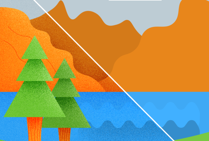
2. The Project: [MUSIC] We are ready to get started. For the class project, we're going to be creating two visuals, both inspired by travel. We're going to be creating a landscape visual that's the one we're going to be tackling first, which is a bit more simple approach than the second one which is going to be a suitcase visual. Now, I say that these are two different approaches because the landscape visual has a few bigger, chunkier assets that we're going to be applying textures to. When it comes to the suitcase itself, there's a lot more smaller elements that we have to apply that texture look to, so we have to really get in there and apply more tension to that one. If you are experienced in illustrator and you have created a visual that you just want to apply this texture look too. I am excited to see that as well, so please go ahead and do your own thing. Let's get into it. For the class project, all you're going to be needing is a piece of paper or a notebook, a pencil or pen, a computer obviously, and a copy of Adobe Illustrator and Photoshop. The first lesson we're going to be tackling some quick sketches to lead down the blueprint of our illustrations. There's nothing worse than jumping onto a computer staring at a blank screen and hoping that some ideas just pop in our head. Grab your pencil and paper and let's get into it. I'll see you there.
3. Sketches: [MUSIC] We're going to jump into some sketches. These are going to be really simple and very rough. We don't have to worry about creating a masterpiece or even overthinking this part of the process because we're just doing something super-duper quick with pencil. Again, we're just basically getting started in exploring what the opportunities are before we jump onto the computer. For our exercise right now, I'm going to be using a pencil and mole-skin notebook, but feel free to use whatever you have, even if it's a scrap piece of paper. Just get something onto paper. Using my mole-skin, I'm going to use both sides of my paper and then make a quick note at the top of my sketch here, 1,080 by 1,080, because I want to remember that. I like to draw the artboard out. I have a bit of a guide on what I'll be putting within here. The suitcase we'll be drawing could be a classic suitcase, else could be one of these modern ones that has that handle on the top. I like to explore outside of my artboard itself or my fake artboard in my sketch. Maybe this could be a duffle bag. I'm pretty sure we don't want to do a duffle bag, but duffle bag looks cool. What I'd like us to create for our example today is one of those vintage briefcases with the straps on them. They have a nice chunky handle here. That can be filled in with a color, but they have these straps here, almost like leather straps that hold them together with a bit of a buckle. Their edges here we'll have these little corner protectors. What I think is they have these badges monitor, maybe one of them could have a tree in it because I think that I envision that this would have stickers on it almost like they had traveled all over the world. Can't forget the buckles here. It's going to be living on a bit of a surface here. I want to add some shadows. I think that it could be highlighted as well. Maybe it's got a bit of shine in the background, and that's what we'll do. We'll draw this one out. I think this one's good to go. Now for the second one, and this was going to be the easier approach here. Now again draw another artboard. The easier approach one will be a landscape. What I think we could do is we can do a bunch of layered, chunky elements. This is going to be a tree. You'd see this is in the background here. Maybe the tree has some details here, some little critters can live inside this. I think we should draw more pine trees as well. There's a few ways we can draw pine trees. We can do them as triangles, we can do as layered triangles. Maybe they're a bit taller. I think that's the way we want to go. Let's draw that there. Again, that's going to be a different color. There's an ocean behind here and it has water, or maybe it's a lake. There's different ways we can draw our water. I just want to remind myself outside the page, maybe the wavy kind rather than the upside-down birds and adding rolling hills. I think that this is going to look good when we are playing around with our layers here and maybe there're some mountains. This is where a beautiful scene comes into play here. There could be snowy peaks, perhaps. Maybe they are textured on the edges. They can have textures or lines running across them. I definitely want to have one in front of the other, so it shows a little bit more depth there. Of course in the sky, we would need obviously some clouds. Maybe there's more clouds in the background, maybe they bleed off the edge. Almost similar to the way we did our trees, or maybe we could just keep it like that. There it is. We have the bones of our sketch done. We're going to go ahead and take a picture of this or if you have a scanner, scan it in. In the next lesson, we're going to be drawing these vector images out. See you there.
4. Illustrator File Setup: We are on our computer now. We're ready to get started here. At this point, we've all taken a picture of our sketch. I have mine on my desktop here. It's strategically labeled sketch and let's quickly inspect it here. It looks really good, I can clearly see all the lines that I've drawn out here. Sketchbook itself isn't any harsh angles, so I'm not going to be thrown off when I am drawing any objects on top of this here, looks really good. Use your own judgment. Make sure you can see what's going on here, and you can work with the sketch picture that you've taken or the scan that you're working with. Now, let's go ahead and fire up Adobe Illustrator. If you don't have Adobe Illustrator, go ahead and use the link in the class description. That's going to give you a 14 day free trial for the entire Creative Suite, that includes Adobe Illustrator and Photoshop. That's going to help you get through this exercise today. Once you do have it open, go ahead and hit "Create New." If you recall when we're doing our sketch, we made that note that we are going to be doing this at 1080 by 1080, because we're going to be sharing this with our friends on Instagram or we're done. So go change the units here to pixels, and let's change the width to 1080, and we'll change the height to 1080, and we'll label our file SS drawing. I don't know. Use it more creative title if you want your file name to be cooler than mine. Then go down to Color Mode here and change this to RGB. Now, we're changing it to RGB because we're going to be using screens to display our drawing. It's going to be shown on our phone, or on our computers. We're not going to be printing this out, which is more CMYK, that's what that color mode is four. Change this to RGB and make sure we have this at 300 pixels per inch. Go ahead and hit "Create." Now, we see our artboard here. It looks nice and square we're ready to get started. One thing we should mention before we do jump in, your screen might look a little bit different from mine. Make sure that you are on the painting workspace up here in the top right. You can make your own so you can eliminate any tools that you don't tend to use or that you find confusing. You don't really need it in your face there. I encourage you to make your own workspace. I've done that in previous Skillshare classes. But for this one, to keep things simple, we're going to be using the painting workspace. With that other way, let's go ahead and bring in our sketch, go "File," place. There's our sketch, place that here, we're going to see a thumbnail of it. Let's click. It's huge. Let's use our zoom tool and step back a little bit, and then back to our selection tool hitting "V." We can drag that around, and let's drag our suitcase to the center here. Well, it's actually almost perfect size. You can grab the edges here, holding down shift, to make sure that you are keeping it the right size. So it has centered. We did that pretty good. That's actually almost perfect. Let's zoom a little bit closer here. Now, you're going to notice a blue X that runs through the picture itself. That's because this is a linked file. I like to embed my sketches into my Illustrator files so I don't lose them. I find that with linked files. Someone who will delete the file if it's rogue on the desktop or it's not saved properly somewhere on your computer, and then you'll lose that sketch forever, and you'll constantly get warnings every time you open your Illustrator file. Go to the top here with that sketch selected, hit "Embed." Now, it's baked into our file here. One thing I want to do is eliminate my wood table that I drew this on. Let's create a box, hit shortcut "M," and make a rectangle over the drawing area that we can see here, or at least we want to see, and let go. It's going to cover everything. With that still selected, go ahead and hit "V" to switch back to your selection tool, and with the rectangle selected, will also select the image itself. They'll both be selected. Let's right-click it, or Control-click it, and hit "Make Clipping Mask." That's going to eliminate anything that wasn't covered. Now, all we can see is just our drawing here. Now, we're going to stay hyper organized here because it will be very helpful when we do go into Photoshop. So go down to layers, and let's label this layer sketch, hit "Enter," and let's lock that up so we can't move our sketch around. Let's zoom in a little bit here. You can see the artboard for our suitcase is nicely placed around the suitcase. We need another artboard for our landscape. Go to Window, artboards, our artboard dialog box is going to show up. The first one's, very vague, it says "Artboard one." Let's change that to suitcase. Then let's hit the plus sign down here to make another artboard. That's going to make another artboard that's exact same size as the first one. That's going to be 1080 by 1080. We're going to change this one, I'm going to name it landscape, hit "Enter," and then we're done with this dialogue box with X that, using our zoom tool, it step out a little bit. Now, we can already see that thin black line that is our artboard isn't falling in the right place, so we're going to have to move that over slightly. Let's hit "Shift O." What that's going to do is that's going to engage our artboard tool. You're going to know it's ready to go, because when we do move our cursor over, it's going to change, it's going to look like we can move something here. Go ahead and grab that holding down. I'm going to hold down shift as well, so It is completely aligned with my first artboard. I'm going to drop it right on top there. Deluxe good. Let's hit "Escape" there. We have that nicely set up. Let's take a step back. We're good to go. Next thing we have to do is we have to save our file, something we should get in the habit of trying to do constantly because we don't want to lose in your work. Go to the top here, "File," "Save," and let's save it on our desktop next to our sketch, or anywhere you find handy. I'll hit Save there. When the dialog box shows up and we're ready to go. We have our file setup. We're now ready to start drawing. The first drawing that we're going to be doing, our landscape drawing. I know that first, you need the suitcase before you go into vacation, but the landscape itself is an easier execution of this drawing process that I'm about to share with you today. So we'll get started with that one, and I'll see you in the next lesson.
5. Vector Landscape: Let's go to our Layers panel and create a new layer called landscape. Again, we're going to be staying hyper-organized here with our setup over illustrative file. Let's zoom in a little bit closer here. Now when we are drawing this thing, we're going to work with layers here and we're going to make sure that we are drawing things with the top layer in mind and then working our way to the background. For instance, this one here we're going to be tackling the foliage here in front of the tree, then we'll tackle the tree stump, then we'll tackle the Christmas tree , then the other foliage. Again, we're going to work until we get to the background sky of this image. So, let's hit our Ellipse tool. Let's hit "L". Let's drag out. I'm holding down "Shift" and "Option" here to scale it from the center. Right away, we have a white circle here. That's not the color we want. So let's go over to our left Tools panel. Let's select our stroke and turn that off by hitting "None" here. Then let's go back to our fill here. Select that one, making sure that that's on top. Go over to our swatch library and choose a green. Any green you like, totally up to you. We have that first circle there that's the top upper edge. Let's hit our "Selection Tool", and let's click that same circle holding down "Option". We're going to copy another circle here. Then we'll do it again and copy another circle here. Now we can scale these so they all look different from each other. I'm going to grab this top edge here, hold down "Shift", and just make this one a little bit smaller. This one here, I'm going to make a little bit bigger. I think I'm going to leave that one as is and move this one over a little bit. Great. Now we do have that gap here on the top of the artboard here. Let's grab another circle holding down "Option" and copy this so it fills that upper edge here and we can't see anything here. It looks a little bit sloppy hanging over the edge here. We'll clean this up afterwards when we do have all of the objects in place. Let's select all of these green circles that we got here. Let's go to our Pathfinder and unite them, make them one object, and then close our Pathfinder tool. Great. We have the foliage here. Let's draw the stump here. One thing we want to make sure we do is get this nice little rounded edge bleeding off the page. I'm going to hit my "Ellipse tool" again, shortcut "L", and I'm going to make a circle here. I'm holding down "Shift", so it's a perfect circle. I'm going to drag it out here. Now it is green. Let's choose the color of our stump or of a bark of our tree. I'm going to make mine orange. I don't know whatever color you think. If you want to make yours brown, go ahead and make your brown, but I think orange is a nice color that will pop here. I'm going to hit "A" to bring up my Direct Selection Tool. I'm going to make a marquee box over these two edges and I'm going to hit "Delete." That's going to just give me a little around the edge here. I'm going to switch back to my Selection tool. It's going to show me that shape here. I'm going to move it into place here until I like it. I think going to make it a little bit bigger and hold down "Shift", make it a little bit bigger here. Again, it's going to bleed off the edge, but we want it to look good when it does and it is down here. We're going to clean this up after again. A lot of stuff's going to be hanging over the edge. With our Pen Tool, hitting "P", let's go ahead and complete this bulky area. I'm going to hold down "Shift" to make a very straight line here, and then come out to the edge here and do the same thing. I'm still holding down Shift. I want everything to line up. You're seeing that things are lining up here. Those are my smart guides engaging, should have mentioned that in the past. If you're not seeing the smart guides and these pink notifications show up, go to the top here, go "View" and hit "Smart Guides", and make sure this is checked on. Some people might find it frustrating to work with. I find it very helpful because it does help me through my process here. Great. I do have that now drawn here. But it is that we have a layering problem here. Let's right-click this or we can control-click that, go arrange center back so it is below or foliage here. Now let's create our second set of foliage in the back here. I think what we can do here to keep things really quick and simple, we can use this exact set of circles that we made over here. Let's click this and hold down "Option" to duplicate it. Drag it out here. Let's change the color to a darker green. I'm going to go on my swatch and just choose something over here. I'm going to right-click it or control-click it. I'm going to go "Arrange" center back here and already looks pretty good. It doesn't have to be perfect. I'm going to angle it a little bit more so no one can tell that. I'm going to scale it up a little bit too so nobody can tell that I just duplicated that edge there. Alright. That looks pretty good. I think it looks good. Alright. We have that there. Next thing we should do, let's draw our Christmas tree here. To get a triangle like this, it could be tough. So I'm going to make another rectangle here. I'm going to drag it out here. I'm going to add an anchor point directly on the top here that is exactly centered here. Again, if you didn't have your smart guides on, you won't be able to see that. Look a little bit closer here so you can see exactly where I'm putting it right down the middle here. I hit my Pen tool. I'm going to add an anchor point here. With that one added directly centered here, I'm going to go ahead and delete these two here. You can see I can delete it there because the minus sign does show up. Then I'm going to hit "V" to engage my selection tool. This looks pretty good. I'm going to make this a darker green, so it does look like a different tree here. I'm going to go to my Swatch panel, choose the darker green there. With this one still selected, I'm going to hold down "Shift" and "Option" to duplicate it and bring it to the lower edge here. Again, our smart guides are going to tell us when we meet that lower edge of the artboard. Now with that duplicated, it does look skinny here. I'm going to make sure that this triangle below the top triangle is a little bit bigger. I'm going to hold down "Shift", grab this top edge here, and just make it a little bit bigger. Alright. Now I'm going to select both of these, go back to my Pathfinder and unite both of these so they are one object. I'm going to close Pathfinder and then I'll right-click or control-click it and arrange center back so it is beyond this little stump here. Using my Zoom tool, I'm going to step back a little bit here. Cool. The trees are good to go. Let's start creating our water here. I'm going to use a Rectangle tool to help me do that. I'm going to hit "M" and go into my lower edge of my artboard here. Again, when they intersect things show up, it's going to let me know that I've reached the lower-left edge of the artboard, and I'm just going to drag something out here until I meet the right edge of the artboard. I'm a let go. Now it's still the green from our tree. Let's change this to a nice blue. Then using our Selection tool, hitting "V", let's right-click it, arrange center back. Great. That's a nice water here. Now we're going to make these cool little wavy things here. Let's zoom a little bit closer to our water here. Let's create a box again. Hit "M", drag out a box here. I'm going to hold down Shift so it is a perfect square. Actually, maybe I didn't need a perfect square. Let's grab the lower edge here and make it more of a rectangle. We're going to do exactly what we did for the tree here. Let's zoom in a little bit closer. We're going to hit "P" for our Pen tool. We're going to go along this top edge here and wait till we get to the middle here. We'll put an anchor point there, and then we'll delete anything that's on the right and the left here so we have a nice pointy triangle. Now, if we did unselect this, because it's the same blue, we're not going to be able to see this. Let's change the color of this over here to a darker blue or maybe just any other blue. Maybe this dark blue will work and with that still selected, I'm going to go ahead and just copy it a few times over here. There's a really neat way of doing this. I'm going to hold down Shift and Option while clicking and dragging it. I'm a do it once. I'm a let go of it when I like the spacing in-between. With that first one copied, I'm then going to hit command "D" a few times. What command D is going to do is it's going to copy it the exact same spacing that I had, that first one. I'm going to do it a few times until I like it. After I have a bunch of triangles in a row, I'm going to go ahead and using Shift, I'm going to select all of them, and I'm going to make it one object with my Pathfinder tool. Go to Pathfinder, let's hit "Unite". Now it's closer Pathfinder tool and now take a step back. It's this nice little spiky edge here. If it's too spiky, go ahead and just you can collapse it down here. I'm going to make them round on the edges by using our Direct Selection tool, switchover and hit A. When you hit "A" and you have that shape selected, you're going to see all of these little circles that are showing up on the edge here that are going to help me round off these edges. When I do grab them, they'll all start rounding off here. Now, when I do get to a point where I do think it's nice and round, I'm going to let go. That does look pretty cool, but I do think that maybe we can go a little bit more. It looks like a boat. Let's select both of that and the water and make sure that they are together, and we're going to send them both to the back. I'm going to scale this out until I like the overall dimensions of it. We're going to be cleaning this up. We're going to let this bleed over the edge. I'm not huge on how uniform this is. I'm going to grab this lower edge here and I'm just going to squeeze it down so it does look a bit more wavy. I'm going to duplicate it again by using shift and option and dragging that out here. I'm going to make another one. I'm thinking this color is a little bit harsh here for the blue, so maybe this top one here, I'm going to change this color to something else. I'm going to make it lighter blue. I'm going to hit "I" to engage my eyedropper tool. I'm going to choose that blue again and then hit "V", come over to my color here. I'm going to "Double-Click" and bring up my select color dialog box and I'm just going to pick something a little bit lighter, brick, and free from the swatches they provide because they haven't given us too much of a selection here. It looks pretty good. Let's hide that little edge here and we do have something that looks pretty cool. I'm going to just squeeze a little bit more, so it looks like more wavy water. We have that there again, it does look really sloppy. We're going to clean all of this stuff up once we do get down to the end of our drawing here. Let's draw our hills now and we're going to be doing the same thing that we did when we created our waves and we created our tree. Let's create another rectangle here. Let's hit "M". Let's drag our rectangle out here, and using our pen tool hit in "P", let's make an incision right here at a point here, and let's delete these points here on the other edges. That already looks like our mountain up here and that's not what we're trying to create, but we can collapse that down and just make it look like our edge. We're going to do the same thing we did with the water. Once you do get a size that you think is a right peek thing there, let's duplicate this over one more time. I'm going to hold down "Shift" and "Option" till I reach that edge there and maybe I'll scale this one down slightly a little bit more, so we do have some variety there. I'm going to select both of these, come down to my Pathfinder, and I'm going to hit "Unite" to make them all one object, and I'm going to close my Pathfinder. I'm going to hit "Arrange", "Send to Back". We still have this blue. I don't know why I left this blue. Let's change this to a color, it should be a nice green. Let's go use our eyedropper tool and choose the same color we chose for the foliage up here. Let's switch back to our selection tool and let's round off the edges here. I'm going to "Double-Click" this to enter isolation mode, and using my direct selection tool, I'm going to just select these top edges here because these are the ones that I really want to be wavy and you could have done that with the water, but I thought that the effects that we're going to be doing at Photoshop are going to help us clean that up. I'm going to create a Marquee box over these and I'm going to start just rounding these off until I like the way it looks. I almost nailed it. I can go ahead and Marquee over this edge here too, to maybe adjust this one slightly. Make them look a little bit different. Let's hit "Escape" to escape out of that. Let's take a step back. It's looking really good. We have a nice rolling hill. The layers are coming together nicely. It looks nice. it looks good. Let's create our mountains. We've done this before already. We can do this one more time again, create a rectangle here. Any rectangle at all? Let's get a little bit closer. Using our pen tool, let's go along this top edge here, make a point right there in the center of the rectangle and then delete these other edges to make a triangle here and then drag it out till you're happy with that edge grabbing the lower edge holding down "Shift" let's bring it beyond this rolling hill. We don't want to forget to change that color here. Let's change these ones to gray mountains that we have here. Change this one there, and then let's copy over another one. Let's hold down "Shift Option", drag that out here. Let's make this one a different color. Maybe this is a darker gray and we're going to just scale this down so it is a little bit smaller than that hill. Let's bring this hill in front. We're going to "Right-Click" it arrange, bring to front, and then select both of them, and send them all the way to the back. Grab these two points and just round them off slightly using our direct selection tool. Round them off slightly, and there we go. We have our mountains. Next thing we need to do is our sky. Let's grab a rectangle and let's go to the top edge here and this background color that we are going to be doing here is going to stretch the entire canvas. This is going to be 1080 by 1080 and I'm going to use my smart guides to do that, to make sure that yours is 1080 by 1,080. Go to the top click "Transform" to bring that up as well and you want to make sure that this is 1080 by 1080 in the width and the height. Let's go to our Align tool and we're going to make sure it's centered to our artboard and hit "Center" here and then center vertically and we were right. It was centered, but just for peace of mind and with that selected, let's "Right-Click" it, or we're going to hit "Control" click and send to back. It's still the color of our other mountains. With that still selected, let's hit an Eyedrop tool hit "I" and let's steal the blue that we have here from our water and create that as our sky. Great. Let's hit our "Selection Tool" again. What we're going to be doing is we are going to be using this guide here to make sure that we are cleaning up the edges here, and we're going to be using our Pathfinder to help us do that. Let's select that background sky color, hit "Command C" and then we're going to go in and start isolating all of these objects that hang over the edge and Pathfind these so they are flush with our Artboards. We'll start with our foliage up here. Let's "Double-Click" that to isolate that, we're going to hit "Command B" to put that in the background. We'll select both of them using our Marquee tool, use our Pathfinder, and we're going to be using intersect. What that's going to be doing? It's going to be grabbing anything that is overlapping and making it one shape and the color on top, it's going to keep that color. That is very handy for our purposes here. Let's take a step back by hitting "Escape" and let's do this with all of our objects here. Now, this one here, we didn't go all the way to the edge here. It's going to be totally fine because it is going to be layered, but if that does annoy you, you can grab this point here and then drag it out here and then we'll hit "Command B" to paste that background color again. Select both of them, and then hit "Intersect" again. We're going to continue to do that with all of these shapes that hang over the edge, "Double-Click" it, "Command B", select them both, hit "Escape." We have both of our waters here. "Double-Click" that "Command B", select them both, hit "Intersect" "Escape". Double-click this one "Command B", select them both Intersect, hit "Escape" our hills "Double-Click" "Command B", "Intersect". We'll do that and then we think with the last and we need to do is our mountain. Command B, Intersect, Escape. We have our scene there. Everything is there. It does look a little bit clunky. We have our water does look a little bit flat right now. We're going to be adjusting this when we do jump into the Photoshop process, and we start playing with the textures here. One thing we are missing is our cloud. I don't know how we forgot the cloud here. Let's go up to this area here. We can move this in a little bit if we wanted to, but we can also have this live behind this because we are having a layered effect here. Let's hit "L", create a circle. We'll use our direct selection tool to delete this lower edge here. I'm going to select that, delete it, hit "V" to engage this one again. Let's change this to white so we know it's a cloud bringing into place here. Scale it as much as you want here, so it does make sense. Maybe it does live beyond this mountain. Then with that selected, let's use shift option to create another circle and it will scale that down slightly. Then maybe we do another one out here, make that one a little bit bigger, and then with all of those selected, let's just move it over a little bit. Let's go to our Pathfinder tool. We have our Pathfinder still open over here. Let's hit "Unite", close our Pathfinder and now we have our clouds. It is odd here. Let's select it with our background and hit "Arrange", "Send to Back" and there it is. We have a cloud beyond the mountains there. That looks pretty good. Let's take another quick look at this and see what else we can do. The distribution of our water here can be a little bit better. Let's clean this up here. We can just move this out a little bit. Let's "Double-Click" this one here and then using our direct selection tool, let's grab all of these anchors at the lower edge here and just shift it all the way down here. I'm holding down "Shift" and grabbing all of those and hitting "Escape". Then let's do the same thing for this one and have it a line down at the lower edge here. Double-click this one, grab it, and then pull it down here, "Escape" and now that's looking pretty cool. We have our scene here. Let's quickly save our illustration. Hit "Command S" or go up to "File", hit "Save" here. In the next lesson, we're going to be creating our suitcase.
6. Vector Suitcase: We're ready to move on to our second illustration here, which is our suitcase. We have the first one here created on its own layer. Let's go ahead and lock that one up, down in our layers panel and let's add another layer. This layer is going to be called suitcase. Great. Get a little bit closer here, click into that artboard to activate that one there so we know that we're working within this artboard now. Again, just as we tackled the previous illustration, this one here we're going to be doing the same thing. We're going to be working from elements that we perceive to be at the top and we're going to work our way all the way to the background. For this one here, we're going to be doing the buckles, the leather straps, the stickers on the brief case, the handles, then to the body of it and working our way all the way to the background. Now, this one here is a little bit tougher than the landscape visual because it does include a lot more details here. To get started first thing we're going to do, as I mentioned, let's go and start tackling these buckles. Another thing that's going to be different here, that was different from the landscape itself is we're going to be working with strokes as well as fills. Let's play with that right now. Our buckles themselves are going to be strokes, hit "M" to create a rectangle and just drag that across here and it's filled. Let's go over to our left panel here and flip it to stroke. Let's go to our stroke panel at the top here and let's just increase this to maybe 15, is a good width here. Now, that color obviously is not going to stay blue so let's activate our stroke and let's go over to our colors here and change the color, maybe it will change it to a nice gold, a yellow. Then let's get a little bit closer here, click in. Using our pen tool, we're going to make this line down the middle. Hit "P" to bring up a pen tool and using our smart guides, let's just center our pen tool right in the middle, it's going to tell us where the center is. Holding down Shift, we're going to make a line that intersects with that lower half there. Great. Now, using our zoom tool, let's zoom out a little bit more. That looks pretty good and, select them both with our selection tool, maybe it's a little bit more shorter rather than high. Now, one thing I have noticed is these leather straps, this round edge here, it likely go after the buckle. I think we messed that up, and by we I mean me, my bad. Thinking about belts, the belt itself would have to go below the belt buckle. It'd be round on this edge here and then we'd see the dots that would connect into this little tooth here and then it can go up. Let's make that adjustment again. I mentioned that when we're doing our sketches, we'd likely change our mind when we get to this vector part. Let's hit "M" to create another rectangle, let's have it centered within this little buckle area. Using Option and Shift, let's hold that down and create another rectangle out here. Creates a perfect square but it still does have the stroke engaged there. Let's go to our tools over here and switch this back and make this fill and then click on it, so our fill is above our stroke here. Then we'll go over to our color panel and we'll choose a brown that will serve as that color. Now, I'm just going to use my selection tool and just bring this up here and bring this just below as well, right here. Then we'll right-click it or control-click, "Arrange", "Send to Back" and now it's placed behind there. Now, let's double-click it because what we're going to be doing is we're going to isolate now and we going to make this round edge here. Using our direct selection tool, let's just hit "A" and let's make a marquee box over these two lower points here and it's going to engage those round edges there. Let's just make them round along the bottom and hit "Escape" to bring us back here. Looks pretty good. Let's get a little bit closer. When it comes to this little spacing here, I think we can close that up so the stroke either goes flush with it or it's a little bit closer so it doesn't show too much of a gap there. That looks good. Now, let's take a step back. I think that this little round edge should go further down, let's double-click that into the isolation again. Using our direct selection, let's select this whole lower half and select all of these points and with our arrow tool, let's start nudging downward a little bit so it gives us more breathing room and then move until we're happy with it, hit "Escape" to bring us back here, great. Now, let's create those little circles that we have here. Get a little bit closer. Let's hit "L" to bring up our ellipse tool and having it centered within our buckle area, and make it just bigger than the tooth itself. Maybe this tooth is narrower, I'm going to change the stroke width just a few points and bring it down to 12. Then with this dot selected, let's choose a different color, brown, awesome. Take a step back out and see what that looks like, looks good. Let's now create another series of dots, we're going to want to have the same space between. As we mentioned, we did use our step and repeat technique before, let's do that again here. Let's hit "Shift and Option". Drag that out to about here and then do the same thing, hit "Control D", "Control D". Let's select our stroke here, we need this outer stroke to be above everything, let's hit "Arrange, Bring to Front", and there you have it. One thing we will do as well is, I think it might be handy to have all these dots grouped together so when we are moving things around, they're not losing their spacing in between. Select one, holding down Shift, I'm going to click all four of them, and I'm going to hit "Command G" to group them. Now, they are moving independently without being moved away from each other, I don't know how better to explain that. Great. Let's take a step back. Let's do the lower edge of this leather strap. Now, let's hit "M" to bring up our rectangle tool and using our smart guide to make sure we are selecting the top right part of that leather band, let's bring it down, make it flush with the left side and then let go, and then switch over to our selection tool. We'll left-click it, "Arrange, Send to Back", and now it has that other dark brown here, it does look pretty good because you can see that round edge here and we can also add some shading here so it does give that look of depth to it. Now, we have this created, I think we need to just duplicate it and bring it over to this side. Now, one thing we want to do and a little trick that is very handy, let's select it all with our selection tool our black arrow, which is V and then with all of those selected holding down Shift and Option, let's drag the whole group out and copy it completely over here. Now, take a step back. It looks really good. One thing we want to make sure that we're doing here is this suitcase is going to be centered within the artboard. One handy trick that we could do just temporarily to get that centered is to select everything that we have here, hit "Command G" to group it, or you can right-click to group it and then with our Align tool, which is along the top here or you can go to the shortcut here that's in our toolbar. Let's center it horizontally. We're going to center it up and down once we do have all of the other elements in here. Let's close down our Align Tool. Now that we have that centered, let's go ahead and ungroup it. We're going to hit Command Shift G, or you can just right-click it and go to Ungroup here. We now have these objects ungrouped. This is going to be handy because when we do transfer this over into a PSD file, it will keep everything nicely broken up into their own layers. Next thing we need to do is our handle here. I think that should be our next step. Let's create a rectangle here, hit "M" to bring up our rectangle tool, drag it out here. Because we want this to be a stroke, let's go ahead and hit "I" for our Eyedroping tool and let's click on the buckle to inherit that same width. With that selected, let's use our Direct Selection tool, which is A, and then make a marquee box over this lower edge here and just hit "Delete" because we don't need that there anymore. Just to be safe, let's go ahead and select this again. Go to our Align tool and make sure that that is centered as well. If you want to make sure that it's being centered within the artboard, make sure that you have the Align to Artboard as opposed to the Align to Selection. Aligned to Selection would be a group of things that you want to center together, whereas aligned to the artboard, we just align it to whatever the artboard is. So move that in there. A little bit of a glitch there. I think that when we zoom in, that should disappear. It's just my display. My display sucks. Sorry about that. Now that we have that centered, let's go ahead and close our Align tool up there and let's create the handle itself. Hitting "M" again, let's bring up our Rectangle tool and make sure we're using our smart guides to get to the center here. Holding down option while we are moving it from the center here, let's bring it to a good width here. It's not going to be exactly the same as our drawing here. Once we do have that drawn, it's going to be stroke because that's the last thing we did here. Let's steal or inherit the color that we have from our brown here hitting "I". Hitting that tool there and stealing that same color and that same hue. Great. Let's take a step back here. Now we have our handle. We have that there. Let's create our stickers that are going to be living in here. Now we have made them fairly vague right now, but I think we have a lot of fun with these stickers because as we mentioned, when we were doing our sketch, maybe this is a badge of honor. This person that's traveling with this briefcase is really pumped about all of the places that they've been and they like to show off when they're at the airport or they're traveling. So let's create these stickers here. Let's hit "L" for Ellipse tool. Let's create a circle here. I'm holding down Shift and Option to scale it from the middle. I'm going to flip it over here because we know we want this to be filled. Let's go over to our colors here. Flip this back to yellow. Let's change this to green. Now, we're going to create a half-circle as well that's going to live below the band here. We can steal the same circle. I'm going to hold down Option, grab and drag this out. Getting a little bit closer here, I'm going to go ahead and delete this lower edge here so it's a half-circle because we don't need the full thing. But before I do that, I think we can have some fun with this and we could put a sun here because often when you're traveling you're going to a sunny place. Let's add a star to the middle here that will serve as almost like a half sun. Let's just go over to our tools here and select our Star tool, and let's use our smart guides, so make sure we are in the center here. Let's click in the middle and we're going to hit the "Star" dialog box show up here. To clarify what's going on here, there's a radius 1 and there's a radius 2. Radius 1 is where the edges of the inside points will touch. Radius 2 will be the edges on the outer points. It's going to make a lot more sense. It's going to be trial and error when we first start playing with it right now, but you'll get a sense of what I'm talking about once we do hit "Okay". Let's go make it how about 10, 10 points on the outside, 25 and 50. I think that the inner part of that star should be a little bit bigger. Let's make it 30. Let's hit "Okay" to see what that looks like. That's actually not too bad. Let's make it a little bit bigger and if you remember, there was two radiuses. Let's just imagine there was a circle in here. That one there would be the 25 or we change it to 30, and then this outer one would be the 50. Let's change the color of this to yellow in our color palette. Let's double-click it and let's use our Direct Selection tool to delete the lower half of this. It's almost going to be like our rising sun. I'll select all of these points down to the edge. I'll leave these ones here because I do feel that that's that middle point and let's hit "Delete". Let's now do it again, but we'll do it to the circle. Let's double-click it. Enter isolation mode with our white arrow our Direct Selection tool with our shortcut A. Let's just mark over that lower edge and hit "Delete" and let's hit "Escape" to bring us back. Looks pretty cool. One thing that is missing but maybe there is another circle in here. I'm going to select that circle in the back, hit Control C, then click away from it and let's hit Control F. Reason I clicked away from it is because if it was still selected and I hit Control F, it would only copy it in front of that shape. We want to make sure it goes in front of everything. Grabbing this top edge here holding down shift, let's make a circle down here. Already looks pretty cool. Let's make this one an orange and then maybe the back here is a blue. That's pretty dope. What do you think? Now let's select all of these now and let's right-click or control-click, arrange, send to back. Make sure it's behind that leather strap here. Just holding down Shift, let's scale it up a little bit and we can just grab an edge here with them all selected and we can just rotate it like this. Another way you could do it if you want it to be exact with it and you wanted to perhaps remain or maybe angle your things at a very specific angle for everything you're doing, you can also rotate it by hitting "R Enter" and the Rotate dialog box will show up here and at that point, you can start entering any number you want as long as you have preview on there, you can see what angle that is. I'm going to go 11.25 and see what that looks like. That's pretty good. I think maybe 22.5, which is halfway through 45. This is a great way to remember the angles that you have everything on. I'm going to hit "Okay" there and I'm going to just drag this underneath. That looks pretty good. Right underneath there. Looks pretty sweet. Another thing that we need to do, if you recall that we were just deleting points there. We didn't have full objects or we didn't close off our paths. I like to close off my paths because it does make everything a lot cleaner. I'm going to select all of these individually and I'm going to make sure I pathfind them to close off that path there. I'll select the first blue one, I'll go to my Pathfinder and I'll go Unite even though it's just one piece. I'll then click on the "Star". I'll hit "Unite" again and then I'll go to my in-between circle and I'll hit "Unite" again. Now, these are all paths that have been closed off and we're keeping our vector really clean here. Great. So let's close our Pathfinder now. Let's take a step back and see what this looks like. It looks pretty cool. We need another sticker here. Let's do a rectangle one. Let's hit "M" to bring up our Rectangle tool. Just drag it out here. This one here we can make another color. Maybe it's a gray. Let's zoom in a little bit closer there. Right away what we can do is hit "Arrange", send that back, so make sure it's behind that leather strap there. Then again, we can just rotate it. This one here we're going to just rotate with the edge here and maybe rotate it downwards this way. Feel free to use the other technique I just shared with you, but we're going to add a really cool thing here too. What I think could be cool is, what if there was a bend here? This sticker was applied but it didn't really go on too well. Let's go ahead and use our Pen tool. Hit "P" and over the shape with it still selected, let's hit one of these edges here. It doesn't have to be perfect. Let's hit another one here. With those little anchor points added there, let's get rid of this other corner point and then hit "Enter" to end that there. Now, we'll hit our Selection tool. Looks pretty sweet. If you don't like, maybe it should be more on an angle. Go ahead and hit your Direct Selection tool and select these parts here. With your smart guides on, it'll help you go along that path there. I get a little bit closer. You can see exactly what I'm doing here. You'd see that it might go a little bit rogue, but if you move it down really carefully, it'll go along that line and have a perfect setup for you. With that there, let's now create a fold that comes out here. Let's hit our "Pen" tool again, hitting P. Then with it not selected, make sure it's not selected because if it was selected, you're going to be deleting that anchor point. We can go over it now, click here, click here, click here, and then close it off here. Then let's change that color to a darker gray there. Let's take a step back and see what that looks like. It looks pretty cool. Now it looks like a folded sticker that wasn't applied or maybe it's peeling off a little bit. Looks pretty cool. Awesome. Now, we do have our sun in here. We have this one here is just it's got this nice detail here. This one here is plain. I think what we could do is add a tree. Since our landscape has trees in it, we can go ahead and add a tree in this one as well. Let's get a little bit closer here. I think we can make it a little bit bigger. Let's change the background to it too. Maybe that green is okay. Maybe we add a large tree inside here that's a darker green. So let's hit our "M" tool. Choose the middle of this or use our smart guides to get to the middle here, drag a rectangle out. Let's change the color of it to a darker green. Using our Pen tool, let's go to the middle here, select and intersect the middle, and then delete these edges again. Make one of these cool tree looks here and now we can scale it as much as we want and let's duplicate this edge bring it upwards. So holding down Shift and Option while clicking it and then we're going to hit Command D to double that again. That looks pretty cool. Then selecting them all, let's make sure we bring them down so it's centered within here. One thing that we might want to do is let's squeeze it in. Let's select all of them again, select this one, holding down Shift and selecting all of them. With them all selected, we can squeeze this in. I'm going to hold down Option so it's centered within that circle rather than having it down here I can scale the width of it and have it still centered within there. Get that to around here and then we can adjust these as we see fit. I think this lower part of the Christmas tree should be a little bit wider than everything else. Let's grab that top point, drag it up. Do the same thing. Let's grab these both and then do it again. That's a sweet tree. Now let's create a stump now. Hit M for a rectangle tool, and then we can do this from the middle. Let's go shift option. Make a stump here, change that color to orange because that's the color of our other tree. Then we can select all of these here, go to our Pathfinder. Let's unite them and then collapse our Pathfinder and then right-click or control-click and go bring to front. Now we have that there. I'm going to bring this down a little bit lower. Now let's hit "Z", bring us I was a little bit that's pretty cool. One thing we need to do though is obviously put it on a little bit of an angle. Let's select it all. Hit "Alt-Enter", and let's make it go the other way. We can add minus here, and let's just have it angled like that. Sweet. The next thing we need to do is let's create our body. Because I think once we have the body there, that's going to help us create these edges on the sides here. Let's hit M. Having it unite to the bottom here. Hit M have it aligned with our smart guides, having aligned with that lower edge of the leather strap, and let's just drag it out so it goes to the top here and it'll help us lock into place there. Let's let go when we feel comfortable, we feel like it's a good size for a briefcase and its green. Ops, let's change the color of that. Maybe it's an orange, we are using a lot of orange lately. With that now selected, let's hit our selection tool. Control-click or right-click, arrange, send to back, and then take a step back out. It looks pretty cool. Just to be sure, let's make sure we're having this completely centered and make sure it is and again, we have this aligned to the artboard, we're going to hit, this horizontal line centered. Make sure that is in the center and then we close down our align tool. Now, it looks pretty sweet. Let's get a little bit closer here. We already see that our little handle here. We can select both of these and with them both selected, let's go control, arrange, send to back, it doesn't matter if it extends a little bit lower than the suitcase itself because again, these are going to be layered so we don't have to worry about that. One thing I do think we can do is we can make this a little bit taller. I think that maybe this should go around here. Using our direct selection tool, let's hit "A" and let's go down here and just grab everything that is at the top here. Try to avoid hitting any circles or anything else that's on your suitcase. Let's just nudge it with our arrow tool until we feel like it at a good space. I think this is good. I think that's good. Sweet. It is looking dope. Now, what we need to do is create those little protective edges that I said that we would make here because the body itself is going to help us path find that to make sure that they are just flush with the other edges here. Let's create the first corner here, and let's get a little bit closer. Select our M tool, which is our rectangle tool, using our smart guides is going to help us get right to the middle here, holding down Shift and Option. Let's drag this out here till we feel comfortable. Since the last time, I guess it still is on stroke. We can go ahead and use our eyedropper tool, hit I and let's steal the brown from here again, and then hit V to go back to our selection tool. If you remember, our sketch had a little bit of a round edge here. We can round that off with our direct selection tool, hit "A" to bring up our white arrow, and just click the edge here, and then now engage our round edges and then we'll just bring it out a little bit using our selection arrow lets hit 'V", select the briefcase, hit "Control C", "Control F" to paste it in front. With that still selected, let's hold down shift, grab this one, and then go. There are pathfinder tools and hit "Intersect". What that's going to do is any overlapping areas it's going to just grab that there. Now let's close down our Pathfinder and let's take a step back and see what that looks like. It's pretty cool. With that there, we can start to duplicate these on all of these edges here. The first one we can do is really simple. We can grab this holding down Shift and Option, drag it until it locks in. Our smart guides are going to help us intersect there if you have to get a little bit closer totally fine. Let's make sure that it did connect their intersect. Then because this was a little bit of a shape and it looks like a square. We can grab the top edge here and just rotate it around there. If you don't feel like it is locked up, try to drag it up and put it back down there again. Let's take a step back. Sweet. Now that we have those two there, what we can do is we can reflect these to have them nail this side here. This also gave us an idea of whether our whole image is centered at all. Let's select both of these holding down shift using our selection tool and then control C, control F. Once those are copied, let's hold down shift and select the orange base of our suitcase and then reflect it by hitting O Enter. What that's going to do is it's going to bring this reflect dialog box up, which will allow you to reflect things horizontally. We want to do this vertically, so it just flips everything, it's over there. That orange shape did help us bring it exactly over because we knew that it was flushed with this side when we did reflect that shape while still having those selected, it just brought them exactly over to the other side. Let's hit, "Okay", let's hit our selection tool and click away from it. Let's step back. This looks pretty cool. Now, the next thing we need to do is create this floor here. We weren't sloppy to draw outside of the artboard here we get very well so let's just hit our rectangle tool M and using our smart guides, make sure that it does intersect with that lower line and drag it out till it goes to the left edge here, and let go. It is brown, so let's go ahead and select another color. I think that this floor, maybe we inherit some of the colors that we used over here on our landscape. Let's hit our eye drop tool, and let's click this blue and then right-click or control-click it and arrange center back. Send that behind the briefcase. With that still selected, let's hit Control C, control B to copy one of these shapes to the back, and with that still selected, let's just drag that all the way to the top here till it intersects with the top of the artboard. Great. Now it's all blue. We're going to have to change that background color, so it does give us a little bit of contrast. We're going to inherit some more colors from here. Let's hit the eyedropper tool and then go ahead and steal that light-blue. One thing we might want to do is we might want to scale it so we don't have too much whitespace around this area here so we could do is just select everything that is on the artboard here and once we do have everything selected, what we can do is hold down shift and marquee box over these two other elements. What that's going to do is it's going to unselect those and then keep everything else that was selected, originally selected. With that there, what we can do is just drag this out holding down Shift to make sure we are maintaining that the same constraints that we had before and we can just make this to a size that we think looks proper. I think that that's about right. Looks pretty good. Now, let's take a good look and see if there's anything we want to change before we move into Photoshop, one thing that I do think that we should change is the color of this handle. I don't think that should be gold anymore, and I think it should be a little bit thicker so I'm going to change the stroke width of this up till about, about 25, is that too thick/ Let's try 25, and let's change the color of it. I don't like the golden anymore. Go to engage our stroke here and let's change it to a dark brown. We could play around with that brown to see which one's the good one. I think maybe this brown is good. Great, I think that looks good. Another thing we could do as well, I'm seeing this the sun because we made the briefcase orange let's change the color of the sun as well. Select that and let's change this to a different kind of orange maybe. Oh, but you see what we did here? We will troubleshooter here, coming over to our tools here we select our stroke engaged. Let's go ahead and create none for stroke and then click over to our fill to get that above there. When we are changing the color, we're changing the fill. Now we can come over to our swatches again and just change that color. I think that that's a nice vibrant color. Another thing that I'm not like and I don't like the Grey anymore. I think the Grey would be good as a shade, but maybe this should be white. Let's go over and change this one to maybe a lighter gray. I think that looks good now, another thing that I think would be really handy is, and that's a pan almost is that handle. I think the handle would look really good if it had some lines in it. Let's create some lines in here that will help us give a little bit more detail within our handles. Let's hit our pen tool P, and let's use the top edge here, holding down Shift, let's create one line here and hit "Enter" to end that shape, Let's use our eye drop tool to steal the same color and stroke width from this handle shape. With that there, we can now isolate that down, double-clicking there, holding down Shift and Option to copy that shape and then we can do Command D, command D, command D, command D. Let's select all of these now and hit G to group them. Let's hit "Escape" to exit the isolation. With that still selected, we can go ahead and just center that we know that everything on our board right now, our briefcase or handle, all of this is centered within the artboard. Let's do the same thing for these handled details. Let's go to a line and a line that in the middle. Now, this is a little bit thick. I thought that it would look good with this stroke. We can bring that down slightly using our stroke tool right there. How about 15? Fifteen looks like a good number. Let's use our Zoom tool to step out a little bit and looks good. I think we have all of the objects here. We are ready to now move these images over into Photoshop. We're going to be doing that in the next lesson so I'll see you there.
7. Applying Texture to The Landscape: We're back. We're about to jump into Photoshop. Go ahead and fire up your landscape psd. We're going to start with the landscape because it's a bit simpler approach to the textured application process here, because it's a lot larger elements we're working with here as opposed to the suitcase, which has a lot of really fine details that will take us some time to bring that to a final stage. We have Photoshop open. The first thing I want to bring attention to is our workspace. If your workspace doesn't look like what I'm seeing here, it's probably because you're using a different, I guess, Photoshop setup. Go to the top right here, bring down this drop-down menu and make sure you're working from Painting. If you are working from Painting and you have that checkmark there, you can go ahead and reset that workspace to make sure that it does go to the default settings. This is a lot like Illustrator. If you wanted to set up your own workspace and play with it and only highlight the tools that you really like using, that's the same thing you can do here. But to keep things simple, we're going to be working with Painting because it has a swatches or it has a brushes and our Layers panel, which is really all we need. Now we have that out of the way, let's go into our Layers panel and take a quick look and see what our Illustrator file did when we exported it to a psd. You can expand that folder. You'll see that everything that we've drawn in Illustrator has its own layer and it's labeled Layer number. We're going to go ahead and relabel that to make sure it does make sense and it's easier for us to understand. Before we do that, what I want to do is intro you into a few of the tools that we'll be using, which is predominantly the brush tool, masking and blending modes in the Layers panel. Go over to your Layers and let's just create a new layer here. Once you do have that new layer, come over to your artboard and hit B. What you're going to see here is a circle show up. Or if you don't see a circle, you might see a cross hair. The reason you're seeing that is because your Cap Locks is engaged. What you can do, you can hit Cap Locks in your keyboard and you'll see that once you do hit it, it brings over either a crosshair or you have that circle. I prefer to work with a circle because it shows me the real size of the brush. Speaking of size, you can adjust the size of this brush with your keyboard as well, using the square brackets on your keyboard. Left square bracket makes it smaller, right square bracket will make it bigger. What you can do is you could test out what that looks like there. When I do hit it, you see that just the circle there. It has soft edges around the paint brush that we just made there. I'm going to Control Z that to bring us back. Although that does look great, what we're going to be doing is something special and we're going to be changing the mode there. Hit Brush again, come up to the top right and change your mode to dissolve. Then if you go back to the artboard, you click that, you'll see that the brush is a lot different. I'm going to zoom in with my zoom tool. You'll see that it gets noisier and a bit grainier, it's got more grit to it. That's the brushes that we're going to be applying across our entire illustration here. We're going to be masking elements to make sure it only applies to certain elements and it allows us to be bit more dynamic with the way that we are adding this textured look. Control Z that, let's take a step back out here and do a little bit of a test here. We're going to test it on our front foliage area here to give you a bit of an idea of how that masking technique will work. Go ahead and with your new layer still engaged, let's hit the eyedropper tool to select the white here from the clouds. Hit B again. Let's size up our brush and just do a few quick touches on the edges here that will be ultimately touching and following the path that we've created here for that tree. It might look a little bit messy at first. What you'll see is just paint brushes just in the middle of your picture and you're probably freaking out right now. If you come down to your layers panel, again, make sure that you are applying it to that new layer. Once you do see that the new layer has some brushes on it and it's above your foliage area, hold down your Option key and just hover above here between these two layers. You'll see that a white box will show up when you get to that really middle intersecting point. While you're still holding down option, go ahead and click that with the arrow there. Then if you see what happened to your image, it just basically applied to that one object. That's basically what we're going to be doing for the majority of the time while we're in Photoshop, is we're going to be applying this type of texture to everything. That's the first one here. What we want to do is now just play with the blending mode of this, because this does look a little bit bright. It just looks too white. If you come to the top here in your Layers panel and you got a drop-down here, you can play with the blending mode of what you've just applied there and get something that is a bit subtler. Right there I see Overlay or Soft Light, look great. Let's put Overlay. Actually, let's put Soft Light. Then what you could do if you wanted to add additional texture to this one object, you can go ahead and click on the object itself, hit the plus arrow, and do it again. I'm going to add a darker color now to the right edge of the shape, then hit my eyedropper tool. I'm going to steal the same green as the object itself. Let's hit Z to take us a few steps back. Hit my brush tool again. I'm going to make it a little bit bigger, my square arrow. I'm going to click these edges a few times and you're not going to see anything happen. But if you come down to the blending mode and we change that to multiply, it's going to change the color of this slightly. It'll be a little bit darker because even though we are using the same green as the foliage, when you change it to multiply, it takes the value of that color and depending on what the background is, it will make a very unique look. We got that there. Looks really, really cool. Now, we have a bit of an understanding of those layer masks, which we're going to be jumping into really, really hard right now. Let's first clean up our Layers panel and label everything appropriately. Again, this is going to be very helpful when we are handling this off to clients or third parties and to make sure that they understand what's going on and they have to open it and make any adjustments. It also just is something that is for peace of mind as well to make sure that we are understanding this file next time we have to open it. First of all, what we're going to do is the two textured layers that we made. Let's label this one, Highlight, the one below it we're going to name Shade Right. Make it anything that makes sense to you. This one here I'm going to name tree front. The one below it's going to be Stump Tree or actually let's Tree Stump. Why was I switched it up Tree Stump. Next one will be Tree Back. If you can't see these thumbnails you can't really make out what it is. Let's name this one Pine Tree. You can hit that hamburger menu on your layers panel and go to Panel Options. You have an opportunity to adjust the size of these thumbnails as well. Keep in mind that this might slow down your system, so use it at your own risk. I'm going to keep it the regular size for now. Now, continuing to relabel our layers, this one here is called Water Front. Water middle. This one we just call Water, this one is called Hills. Mountain right, cloud. Then the final layer, we'll call it BG for background. Now we have that labeled. Let's jump into it and start applying all of these textures. We have our front foliage area applied. Let's go to our tree stump, and with the tree stump selected, let's hit "Plus" to create a new layer. Holding down Option between the layers, let's make this a layer mask. Let's change the blending mode right away to multiply. We'll label this one, Shade. Using our Eyedrop tool, let's steal that orange. Hitting our brush tool. Adjusting the size that you need. Let's just apply a nice edge to this here. You could already see that this is really looking a bit deeper than initially it was, when we created the flatter layer. We have that there. Let's go to our tree back here. Again, with that selected, hit "Plus," Holding on Option, come between the layers. Let's mask it. Change the blending mode to Multiply. We'll label this one too, shade. Using our Eyedrop tool, again stealing that green. Hitting B again, and then just giving it a few touches there. This might get a little bit repetitive, but once you do get into the groove of things, you'll really start to get amped up applying these textures. Next, we'll go to our pine tree. Again, adding a new layer, holding down Option, creating a mask. Let's add a blending mode to it. Again, this one, when we multiply too, or didn't do a lot of shading here. Call this one, shade and Eyedrop tool. Let's steal the green from the pine tree and let's just touch a little bit of the edges again. I think we could do something pretty cool with this one here. Let's go back to the pine tree, select that one and create a new layer. Using our marquee, we can isolate where we're applying this texture. Go ahead and hit "M" to bring up your marquee tool and just drag a box here to come to the edge of the first point. Let go there. What you're going to have is a set of marching ants just creating a box around that tree with the marching ants doing their thing. Let's hit "Command+Shift+I." What that's going to do, it's going to flip the selection instead of this being selected, it's everything else but that box. With those engaged, let's hit our brush tool again. Let's just touch the edge here. You're not seeing anything yet because we forgot to change the blending mode. Come down to your Layer panel and hit "Multiply." Once you do have that there, let's hit "M" again, click anywhere in the screen. It looks pretty cool. What we could do as well with that layer still selected in our layers panel. We can just drag it over. I'm holding down Shift to make sure it is lined up with that edge. It looks pretty cool like that. It's almost like this tree is casting a bit of a shadow. Awesome. Let's label that one, edge. Again, anything that makes sense to you, it doesn't really have to make total sense, but you can just label it to make sure the thoughtfulness was there. Now, we want to do is add a little bit of a shine here because we're anticipating the sun is coming from the top left here. Go ahead and add a new layer and we're going to label this one highlight. Using our eye drop tool, let's steal the white from the cloud. Hitting brush tool again, let's just touch these edges here. With that still selected, you can go ahead and play with the blending modes to see what you like there. I think that one looks good, overlay. Let's choose overlay. Now, our pine tree is looking pretty cool. Now, we're moving on to the water and we're going to be doing a different masking technique here. Instead of using another layer to mask this one, we're going to start just taking away from this. Inner layers panel go down to the bottom here and hit the square with a circle in it. What this is going to do, is going to create a layer mask. On that layer, you're going to be seeing a white square to the right of it with a bit of a lock in between it. What that's doing is it's basically locking these two layers together. But what this right layer mask thumbnail is, it's ultimately is a stencil. If you click on that square and you'll see little white edges around it, you look at your colors in your tools that I've selected. It will be white and black. Now if you click "Back" it'll go back to whatever colors you had selected. That's because when it comes to the stencil application, black is ultimately removing from the stencil and white is adding to it. Go ahead and click that white box again. Come into your art board with your brush tool activated, hitting "B" if you don't have it ready to go. Start clicking away at the shape and you'll see that it'll start taking away from it. We're just going to make it subtle around the edges here. It looks like these waves are getting hit by sun and there's some light action there. If you find that you're messing up, you can go ahead and just switch back to white and add a bit more there too. But that looks really good. With that done, let's go to the next one. Make sure you're clicking away from that white box. Let's hit Layer Mask again with the white box selected. Go back with your brush tool and let's start taking away from this one. You could see what that does when it's taking that away there. Then we have a cool look here. We can go back up to the darker blue on in a room, some of the edges off here. You could change the size of your brush to give it that unique look. Looks good. All right. Snowy, taken away from those. Let's go to the water now. We're going to go back to our masking technique. Let's add a layer holding down option between it. Let's mask it, change it to highlight. Using our eye drop tool. Let's steal the white from the clouds. Using our brush tool, I'm going to make this one really big. I wanted to cast it a nice large gradient over the edge here. Then with our blending mode, let's just play with it to see which one we like there. Well, I like this blue one, color dodge. You'll soft light. Let's go color doge. Then with that still selected, we can play with the opacity of that layer too and just bring that down. You could do that with all of your shades. If you find that maybe it's a bit too harsh, you can always just play with the opacity of it to bring it down a little bit. That looks really cool near water. Let's do the same thing on this edge too, just to apply a little bit of an edge behind the trees. It looks cool. Let's go to our hill now. Again, applying a new layer, holding down Option key between them, masking it and let's change that blending mode to Multiply. Let's label it shade. Let's use our eye drop tool to steal the green from the hill. Hitting "B" to bring up our brush tool again. Now, let's bring down the size. I'm going to add a nice strong line across this one to add it all between the hill and the water. I'm going to hold down Shift and make a straight line across this. It might take a long time to draw there. My system might not be as fast as yours. But once that is done, hit your V tool and what you could do is just move that around till you like it. You like the spot that it's in. I think that looks good here. Play with the opacity too, if you think that it's a bit too harsh. I think it looks pretty good. Let's move it out a little bit more. Let's also add some highlights to the hill. Click your hill layer. Hit the Plus to add another layer to the mask set. Let's label this one highlights. Let's hit the eye drop tool to steal the white from the clouds. Hitting our brush and let's just touch these edges here. Let's go over to the Layers panel and play with the blending mode. I think overlay looks good. All right, great. Moving along. Let's go to our mountain on the left. Again, add a new layer. Hit "Option" I apologize if this is getting repetitive. Hold down the Option layer between the two. Let's change the blending mode to multiply. We'll call this one shade again. Using our eye drop tool, let's steal the gray. Hitting our brush tool. Let's just add some nice shading between that layer. Now, this is going to be one of those ones where we need to highlight again. Go ahead and click on your mountain. Add a new layer. Let's call this highlights. Let's all use our eye drop tool to steal the white from the cloud. Hit and brush again. Let's touch it along these edges here. Sweet. That looks good. I'm not going to change the blending mode there, I think that the white looks nicely if shaded there. Go to the mountain on the right. Let's add a new layer. Again, holding that option, masking that piece, changing the blending mode of that new layer to multiply. Let's label it shade. Using our eye drop tool let's steal the gray from that mountain now. Hit B to bring up our brush tool and let's touch something on the inside here. It's pretty cool, I think we should also do a highlight even though it's behind the mountain. Let's see what that looks like. Go to click on your mountain right layer, hit the plus sign using a eye drop tool. Let's steal a white from there. Let's label this. Going back and forth here. Let's label this one highlight. Let's now hit the brush tool and touch that up on the inside here. Let's come down and change the blending mode to something a bit subtler. Let's go soft light. Now our mountains are applied. Great. Coming down, now we have a cloud. What we're going to do with the cloud is we're going to take away from it. We're going to use that same masking technique as before. Let's go ahead and hit the square with a circle within to mask that there. Let's hit our brush tool. Make sure you have black engage because we're going to be taking away from the shape. I should make it a little bit bigger. Just click away at it here to steal from that. That looks good. Now onto our background, let's add a new layer. Again option, click between. Let's label it, highlight. With white still engaged there, let's make this brush really big and we're just going to make a big, blobby brush stroke behind the tree here. Then let's go down to our blending options and let's change it to overlay. It looks a little bit grainy there. Awesome. Change back to our selection tool and what we have to do now is if you recall, when we were doing our sketches we had a few lines here in our tree and what I've done is I've created a wood texture and I've included in the resources that you can just trap right here, it is completely vector. Go ahead and download it from the resources. Let's go into our layers panel and go straight up to our tree stump. Let's click on that. Once you do have it downloaded, let's open up a folder where it is located minus located on my desktop. It's called wood.ai. I'm just going to drag it to my file here. You'll have an open as smart object dialog box show up here, which is perfect. What Smart Objects are is basically it retains the edit stability of that layer instead of having it as a flat raster layer within your layers panel. Go ahead and hit, Okay, and you'll see it lands on our desktop here with some bounding boxes it gives an option to resize it, and you can just drag it around here and make sure you're dropping it in a spot that you like. I'm going to make it go around here. I'm going to resize it until I think it's in a good spot. I'm going to hit Enter to drop it. Great. Now you'll see that something happened here. If you go down to your layer panel, you'll see that we have some weird things going on here is because when we did drop it, it messed up our mask layer set. With that still selected, we can go ahead and hit option and square between the tree stump and the wood. Now it will mask both of the shade and the wood. If you ever had to go back and take things out, you can always hit Option, click them and remove them as well. With our new vector layer added there, let's add a blending mode to this as well and just go down and hit a blending mode that you like. I think soft light looks great. With that still selected, let's take away from it so it looks like it is a part of the image. We'll add a mask layer there and with our brush tool, make a hole through [inaudible] last time I used it. Let's just take away from these new lines that we took to make it a little bit subtler. We just do that all around these edges here. Alright, that looks cool. Then we can even just go into our opacity layers and just play with that a little further as well, just in case we don't like the way that we apply that we think is a bit too harsh. Go down to 70 percent. Alright, now that we have applied all our textures here, let's take a look at what we did here. We could take a step back. One thing I want to do here is add another layer to this tree because I do think that we can give this thing a lot more depth if we played with the shapes here. Go down to your tree front here and let's right-click or control-click that layer and come to the top here and hit duplicate. This one here we're going to go tree front to hit Enter. Right away in our layers panel, everything just gotten messed up and you'll see the same thing happening on your artboard. What you want to do is now let's just make sure that everything that's on top here is masked within that lower tree front. What you want to do is just mask them all. Holding down option and clicking between all of these layers to make sure they're all masked there. With that new layer that we just duplicated, let's hit our V selection tool and just move it around here. You're not seeing it yet but what we're going to do is now click here on your tree again and add another layer that's below that tree front to layer. Let's hit our eye drop tool to steal the green from our tree. Let's change the blending mode here to multiply and let's label this shade below. Then with our brush tool hitting B, let's just start peppering it on the edges there to make sure it gives us that. That's looks really cool. You can just hit your direct selection tool. Let's go to your tree front and you can start just moving that around to you like it. You like the spot that it hits. I think this looks good here. I think we have a complete visual here. We have the textured applied to all of the shapes. One last thing we need to do to really give this thing it's extra textured look, is add some noise to the entire thing. Go down to your layers panel, let's unexpand that folder and with that folder selected let's hit a new layer and label this one noise. Let's hit our eye drop tool to steal the white, make sure we have white selected. Let's hit G to bring up our paint bucket tool. We'll just click once to fill the entire screen with white. Now, once that's done, hit V to bring up your direct selection tool so we're not getting confused and then come up to the top here and let's go to Filter Noise, Add Noise. You get a noise dialog box is going to show up here. You can change the degrees of the noise here. You can also change the level. You can also change it to color or not to color. I'm going to choose minus a monochromatic and let's make it 50 percent. With that new layers still selected, let's come over to the Layers panel and let's change the blending mode to color burn. Once you do have to color burn, you'll see that it's going to make the colors really vibrant and it's going to make the image really, really pop. There you have it. We applied the textures to our landscape visual. Next we're going to be tackling our suitcase.
8. Applying Texture to The Suitcase: We are back. I have just minimize Photoshop here to bring us back to our desktop. I'm now looking to get started on our suitcase. Realizing that we have our PSD, store them on our desktop, we're now ready to inspect it. We haven't had a chance to see what it looks like, so give that a "Double-click". Now the very first thing we want to do is head over to our layers panel to make sure that everything is in order, and it's easy to understand. Let's go through and label it and check out what we have here. We have a folder called Layer 3. Let's put that invisible that is our handle lines. We can go ahead and just change this to handle lines. We can remove that folder as well. Let's drag it outside of the folder, and then we can go ahead and trash that folder. Next thing we have is our corners. Now, what we have is all our corners on separate layers. Let's select all of those which we know are four to seven or it might be different for you. We're going to "Right click" our Layers panel here, and we're going to merge those layers, now with one piece and we flip that on and off. It's one piece, so that'll open corners. What's the next thing is a tree. Here's where we can start using folders to our advantage here to keep organized here is we know that this is the tree top. This is the tree stump. We can group that together and make that tree sticker. This will keep us a lot more organized we have everything there's the circle. [inaudible] comb through these layers to make sure that everything is in order. When we are executing, it's fairly easy to navigate and you see some things aren't together, that's very odd to. You could just keep hitting the eyeball on the layer itself to see what they're talking. I'll just call this one corner. Seems like it's really out of order here which is okay because there we can always fix that. We don't need that folder any more, delete that, call this Dots. I think we're going to combine them once we find the other dots to make sure that that's altogether, and we have our straps here, another gold. We know that there's dots again, we have more dots. Once we found that we can just bring that up here, get this one here, and then let's merge this together to make it dots. You'll see over on your artwork some things will be a little bit messed up when we start playing with our layering. That's something we can definitely fix , when it comes to it. This one is Strap. Let's find the other strap now. Top Brown strap, there it is. Let's click those two "Right click" it, and we're going to merge them. We see the other straps there too. I'm just looking at the images now to see what I have. Let's label this one Lower Strap, and let's bring it below that Strap 1. We have everything somewhat in order here, but we can keep plugging along. We can get back to our gold buckles in a second here. Let's folder these ones up, Sun sticker with these ones here, I'm going to call this one just really simple names. Because once they're in the folder, you really make out what each piece is depending on the layers itself. Then we got the white paper, finally the white sticker. Let's bring that up and let's find it, I'm just holding down and dragging this up here to find corner. We're going to group those together and call it White sticker. We want to make sure that we're moving this below the straps. We're just going to do it below all of the straps here so we can get a little bit of color there. This one here is the case itself. There's the handle, and you would see that the handle is very far away from the other handle lines to bringing those together and then come back down here, and get a handle or call it Handle Below. Hopefully we'll remember what that is and then floor. We'll call this one BG for background. I realized that we haven't labeled to everything in the middle here. Let's go ahead and find out what we have going on here. Great, that's our gold buckle. We can't move that, so let's call this one Teeth. We're going to move this one up to this one here. Let's merge that one and call it Buckle. Come down here we have our other tooth, let's merge that call it Teeth and there we go. Now we're looking at it, make sure everything is in order. We have organized everything appropriately. We're ready to jump into it and start blasting it with some dissolved textures. Let's start from the top here. We have our handle lines and I think we can fade that below. We have two things that we have to apply here. Let's go to the bottom here and choose "Add Layer Mask. " Hit your Brush Tool, and get a really big brush with your black marker in your layers mask itself. Let's just take out some of this lower edge here. Then with the handle below, Let's add a layer above. Hold down option click between it call it Shade. Change the blending mode to Multiply, use our Eyedropper Tool. Let's choose the brown from the handle itself, then hit a Brush Tool and using any kind of brush that you like, Let's just add a little bit of a shadow down here, and we'll do the same thing to add another layer, bring the shade below it and we'll call this one Highlight. It has a little bit of a shine at the top of it. Oops, spell highlight right. First, there you go. Let's choose the white with our Eyedropper Tool from our sticker, and let's just drag something across there. That was really too much. We can use our Selection Tool hitting V as a shortcut and just drag it up a little bit till it's got a little bit of shine there. Then let's change the blending modes, play with it and maybe soft light. Looks good, moving on. We have our corners on our briefcase. I think a good approach for this one here is to give it the idea that light is coming from the top left or a little bit above the suitcase. We want to apply the textures in that manner. Let's add a layer and a layer mask by clicking option between the layers. Label this one, Shade. Using our Eyedropper Tool, let's choose the same color as the dark leather strap. Hitting our Brush Tool, let's just brush a straight line, hold down "Shift" and just brush right across the bottom here, and again using V, which is our Selection Tool, I'm just going to select that same layer and just drag it down a little bit here. Looks pretty good. I think what we could do as well is we can add it at the corners here, two of these little things we have here. Then let's add another layer called this one, Highlight. Using our eyedropper tools again, steal the white from the sticker here or whatever that is, a gray. Hit our brush tool and let's just touch things up and maybe a bit of a bigger brush and just touch these sides here. You can make a little bit smaller or make it little bit more there and do it on the corners of our suitcase, and then come out to our layers. Let's play with the lighting effect here. I think soft light again is going to be the winner because it looks nice and subtle, that looks good. Moving on, let's now get to our tree sticker and we're going to have to get a little bit closer here, so zoom in real tight. What we're going to be doing is just hitting the sides up here with a little bit texture as well as the stump itself and then a bit of the sticker so it looks like it's got a little bit of shine to it and maybe a little bit of shade as well. Starting with our tree top, add a layer, again, we're going to layer mask and we're going to call this one shade. We're going to change the blending mode to multiply. Using our eyedropper tool, let's choose the green from the tree, hitting our brush tool, and let's make it a little bit smaller, just touching the edges here. Doing the same thing with our tree stem, adding a new layer, masking it, changing it to shade, changing the blending mode to multiply, hitting our eyedropper tool, let's select the orange and do the same thing. Let's just touch the corners here. When it comes down to the circle, we can make a big blob texture here and then another one over here, and we could just make one a highlight and then one a shadow. Adding another layer, ''Option Click,'' call this one shade. We're going to change the blending mode to multiply, and then let's again, don't forget to hit your eyedrop tool to steal this same green so we can multiply on top of it and go back to your brush tool. Let's add another layer ''Option Click," and we'll call this one highlight. Using our eyedropper tool, lets steal that white or gray from that sticker again, and let's just touch it on the edge here, and this one here we want to make a real subtle. Then using our magnifying glasses, step out here so they're really good so far. Let's move on to the next thing in the layer panel, go ahead and minimize that folder and we're going to move on to the buckles, and we could have a field day with these buckles, but I think that something very simple is probably the best bet here. All these textures obviously are just a great touch, so I think less is more in this instance. Let's choose the white from our sticker again with our eyedropper tool, add another layer above buckles. Let's Option click between, call it highlight, hitting our brush tool, let's bring it down a little bit. I think that we can come up to the hardness of it, just make it a little bit harder because we don't want it to spread that much this is just a buckle. Then just brush the edges here. It doesn't have to be perfect, just something that looks a little bit highlighted, you can even just click along like that, just really small cliques, actually anything. We're going to be playing with the blending mode now as well. Go ahead and touch that, change the size of it with our square brackets. Then coming down to our layers panel and take a good look at those highlights, Let's play with our blending mode to see what works the best here. Overlay looks pretty good. Let's select overlay. I think that looks pretty good. Let's add another layer in between these two here and call it shade, and then I said less is more, but I think there's something really cool we can do here, so let's select the orange. Now with our eyedrop tool from the suitcase, hit our brush tool, make this a little bit bigger, remember we did play with the softness of it so we can make it a little bit harder. With that done, let's just hold down ''shift'' you could draw a line right below the buckle and then let's play with the blending mode. Now we can go straight to multiply, and what we can do here is play with the opacity of that layer as well to make it a little bit more subtle. I think that looks really good. We can move on now to our dots. There's not really too much to do with the dots, other than add a little bit of shade to it, so add a new layer option, click between, let's call it shade, select that same brown from the holes themselves or the dots, and then back to your brush tool. Let's click just very subtly all we're not seeing anything here because we forgot to change our blending mode, so go back let's change that to multiply and just give it a few quick clicks there. It does look pretty aggressive, so I'm going to take [inaudible] at this one as well. Moving on, we have the teeth of our buckle. We can go ahead and add just a little highlight to that one. You might want to follow the same highlight technique that you did for the square edges of the buckle, and let's remind ourselves we didn't overlay at 100 percent so come back down to our highlight above the teeth area. Let's use our eyedrop tool to steal the white from the sticker, hit B again, and just right here on the edges, let's just touch these up. Then with our blending mode, let's change that to soft, light, sweet, very subtle, but there's something there taking a step back out. What's next in line is our straps. Now, the straps themselves don't look like they need too much. Let's just add a layer, mask it, label this one Shade. Using our eyedropper tool steal, that brown, hit our brush, let's make sure that it's the softest brush it could be at zero percent. Then let's make it really big and touch the edges here. Just gives it a little bit of depth and it doesn't have to be perfect. We have our multiply on great, moving on. I think that a lot of impact here will be with the shape of this overlap here, so add another layer, let's Option Click. We're going to call it Shade, and don't forget to change the blending mode to multiply. Using our eyedropper tool, let's steal that brown. Let's hit B, and let's just play with. Feel free to just adjust the size again. I'm using the square brackets to make my brush bigger and smaller dogs. We can go to the bottom edge here too and just give it a few clicks, so it gives it those edges a little shape. Awesome. Moving on, we have our white sticker and there's not too much to do here other than perhaps just add a little bit of shade below that corner. Let's go to a white sticker, add a new layer, click between it, call it Shade. Let's hit our Eye drop Tool, steal the gray from the sticker itself back to our Brush Tool. Go down a little bit smaller, give it one click, and then let's play with the opacity rather than playing with the blending modes. I think that that will have a little bit more impact there. Another thing we might want to do is just add a little bit of shade between, because this is the first sticker we're dealing with that's overlapping with the strap. Let's bring the size up a little bit and just give it one click. Feel free to zoom in to see what shade you are putting. I think that looks good. We could still play with the opacity a little bit more. It's not so harsh. Great. Now, moving on, we have our sun sticker. This one's going to be fun. Expanding that folder, let's go to the red. It's very repetitive, but it will look amazing in the end, so let's add a new layer. Let's option click it, call this one Shade. Let's choose multiply. Using our Eye drop tool, let's steal the color from the red. Then make that a little bit and just touch that up, great. Then going down to our yellow, add a new layer. We're going to option-click between it. Let's label this one White. Steal again, the greater the white from our white sticker. Be sure not to hit that texture. Make sure you're hitting the whitest part there. Back to our Brush tool, let's scale this up a little bit and click right behind here and see what that does. Looks cool. Let's just see what the blending mode does. Color dodge looks very nice. Then to our blue is where we can have a lot of the fun. To the blue, we can add another white one there as well. Using the same color, let's hit our Paintbrush and just touch it up. You can do it a few times. Then play with the blending mode. Color dodge is starting to look really cool, but soft light, I think I'm always sold with soft light. Even overlay. Let's do overlay and then play with the opacity a bit. Now, for that part as well, we're going to have to add some shades, so a new layer. Let's label this one shade. Again, we're going to hit Multiply. Let's Eye drop and choose the blue from our sticker. Using a smaller brush, let's add a little bit of shade there. Using our magnifying glass, let's step out a little bit and then zoom in a bit to see how it looks. It looks really good. Next on our list will be our case, and this is where we're going to be doing a lot of shading here. Add a new layer. Again, we're going to mask it, and label this one Shade. Let's change the blending mode to multiply. Using Eye drop Tool, let's steal that orange, change over to our brush and start playing with this. The first thing I think we need to do is just do all of the textures that are behind all of the elements here. The corners of our suitcase, maybe it's behind the stickers, let's just do a click there. Another click here. This one here we could do a little bit off. Then maybe we do under the straps. A little bit toast to give that bit of depth. Now, we can add more specific area shades as well that will overlap with the shade. Let's add new layer, bring it back down, change this one to multiply as well. Let's call it Lower Edges. Using our Paintbrush Tool, using the same orange, let's just drag a nice strong line at the bottom and a not so straight one here. Then using our Selection Tool, we can go ahead and move that around, and you can even click on the layer and use your keyboard to just nudge it around till you like the spot that it's in. I think that looks really cool here. But what I'm noticing now is that we need some darker shade along these bottom edges of our corners. Let's go up and find our corners. There it is. Let's add a new layer. Call this one Dark Edges or Lower Edges. I'm not sure which one was a better name. Then using our Eye drop Tool, let's steal the dark brown. Switching back to our Brush Tool, and let's just touch it up along the bottom here to make it match. Feel free to Control Z if you think it's not appropriate and try to make it match the other one. Doesn't have to be perfect. Then with that still selected, let's play with the blending modes. I think this does the trick, darker color. Let's go back to where we were before. Let's choose the next thing in line, which is our handles that are below the actual handle part. I guess the handle attachment. Let's create new layer. Again, mask it, label it Shade, change the blending mode to multiply. Using our Eye drop Tool, let's steal the dark brown from the handle and then hit our Brush Tool. Anything that's being covered, it gives it that depth. We're moving on and now, we're just adding some textures to the background and the mid-ground that lives below the suitcase. What we need to do is now, apply textures to the floor and the background. That mid-ground will just basically be a floor that this suitcase is sitting on. Likely, we would have to add a little bit of a shadow. The shadow doesn't have to make complete sense. This is again, just an illustration that we're putting together. I think that a lot of folks that are seeing this thing will use their imagination and say, it's a shadow. Go ahead and add a new layer above that one. Again, we're going to option click it and we're going to mask it, and we're going to call this Shadow. This might be trial and error. What we're going to do is do a mask inside of the mask, inside of a mask. I'll show you how we're going to do that. Using our Eye drop Tool, let's steal the blue from the bottom, change our blending mode to multiply. Then using our Brush Tool, let's make a strong straight line at the bottom here. Now, switch over to your Selection Tool, which is shortcut V. Just move that around a little bit until it's just below the briefcase. Once that's there, we can go ahead and add to this layer. Choosing our Brush Tool, again, I'm going to use a bigger brush this time. I'm just going to touch up the top here and make it almost seem like it's fading a little bit over there. Then when I do have that somewhat filled in over here, we can now remove aspects of this shape, mask that over the floor, we can then mask that one. Make sure you are drawing within your white square there. Using your Brush Tool, let's use black and just remove some of this now. You could just touch the lower edges just very slightly, so it's just a little bit off perfect. Same thing with this side here. You can make it a little bit bigger too. With that added, what we could do is just add a little bit more of a scene here. Let's call this one highlights. Then selecting the white from our sticker using our Brush Tool, let's just make a really big brush and touch up these edges here. Just add a little bit more to it. Then we'll do the same thing for our background as well. We still have the white selected. Let's add a new layer here. We're going to mask it. We don't really have to, because it is the very last thing in line. Go ahead and hit G, to bring up your Gradient Tool. Go to the top here, make sure you are selecting, Dissolve in the settings, and make sure that you have white to transparent selected here. Then holding down Shift to come back to your layer and just drag the gradient up. The alternative there would be for you to use a really big brush and just make the size of it very large. Just start clicking away and adding to this gradient. I do think that sometimes those really straight gradients are very helpful. With that all done, we have a textures applied now, we can just inspect this a little bit more to see if we have missed anything. Right away, I'm seeing that we have this nice strong shadow on the bottom. We probably need a highlight above the top here. Go to Locate Your Case Layer, add a new layer to the Mask subset, and let's drag it to the top here. Call it Highlights. Use our Eye drop Tool to steal the white. Again, use our Paintbrush and we had it really big from before. Hold down Shift, let's drag it across the top, and let's play with the blending mode. I think that soft light might be the way to go here. You are realizing that now we have to add it to our corners. Go locate your corners. Your corners layer which should be at the top for now, there it is. We already have the layers called Highlights. Let's add to that. Click on that Layer. We still have white selected. Let's just add a little bit of a shine at the top here that matches that set. Great. Looks awesome. Now, we're zooming in. Everything looks like it's applied. It looks nice and deep. The very last thing we need to do, of course, is what we did with our landscape visual. We're going to be now adding the noise layer. Go to your main suitcase root folder and just collapse that down, add a new layer above and we're going to call this one Noise. Let's go and hit our Bucket Tool, which is G. Let's fill the layer with white. We already had white still selected. Then coming up to the top, Filter Noise, Add Noise. We have the same preset that we had before, which is 40 percent uniform monochromatic. Let's hit Okay. Then coming down to our blending mode, select Color Burn. Of course, let's play with the opacity. I think last time we used 55 percent. Let's play that again. See what that looks like. Looks good. We did it. We have finished applying our textures down to our visuals. In the next lesson, we're going to be exporting these images. See you there.
9. Export Final Artwork: [MUSIC] We're ready to export these. We have both the suitcase and landscapes, so open in Photoshop. The method we're going to be using here for saving these as just flat images is a rather classic tool called save for web. Go to the top here, go file export, save for web legacy, and the dialog boxes is going to pop up, and it's going to give us a lot of details about the image itself and what we can expect once we hit ''Save''. What I want to bring your attention to, is the size of this one. When we're posting on Instagram, we are going to be doing them at 1080 by 1080. Now it did Jack itself up to 4500 by 4500 in Photoshop because we did choose 300 pixels per inch, totally fine. What we could do is just change the values here to 1080 by 1080, hit ''Tab'', and now you'll see the actual size of it. Once we have it there, another thing I want to draw your attention to is the size of it. Now, this one says 1.666 megabytes once we do save it as Ping, but what if we saved it as a JPEG? What would that look like? Brings a little bit smaller. Users decisions there, make sure there is no quality loss as well. When you are changing between the file formats, I'm going to go ahead and save mine as a JPEG because it is a lot smaller here, hit ''Save''. Make sure we're doing that on our desktop. We have the same filename, let's just hit ''Save'' there, and then going over to landscape, Let's do the same thing. Now, I'm going to show you how to do it with a shortcut. I'm going to choose to bring up your save for web dialog. Let's go ''Command'', ''Option'', ''Shift'', ''S''. I know it's a lot of buttons, but it's going to bring up that dialog box a lot quicker. Go to your size, change it to 1080, and then we're going to go to the top here, save it as JPEG, and look size looks good. Let's hit ''Save'', and again, save this on our desktop as well. There you have it. Let's minimize that and let's go take a look, and we could just drag this to the middle here. We can hit ''Space'' to preview them and take a look at our images. We did it. These images are ready. Now you have your textured filled volume as images ready to be shared with your friends on Instagram.
10. Great Work!: Yay, we did it. Together we have bridged the gap between Adobe Illustrator and Photoshop, and we're able to inject more life and volume into our vector illustrations to give them a little bit more [NOISE]. But hey, we're only scratching the surface here. Please play with this process a little bit further. See what you can do with this and see how you can use this and other areas of your design work. Not only illustration. Thank you again for joining the class and I'd love to see what you've created. Please share it in the project gallery so I can give you some comments and feedback there. If you are going to share online, please give me a shout-out so I can comment there as well. Thank you again for joining the class and all the best move forward and good luck. Bye.
 Kevin Moran, Illustrator & Designer