Transcripts
1. Introduction: Hello, everybody. My
name is Kevin Moran. I'm a graphic designer and
illustrator from Toronto, Canada, and in this class, we're going to be creating
three D inflated images using Adobe Illustrator. I'm excited to take you through this creative journey as we take your flat designs and turn them into eye popping
three D masterpieces. In this class, we'll dive into the essentials of the three
D and materials panel, and I will take you
step by step through the process of transforming
your plat vector. Ito stunning inflated
three D designs that are perfect from everything from social media graphics to
high quality presentations. In today's digital landscape standing out is more
crucial than ever, and adding three D to your
designs adds that extra dimension and will
make your work more engaging, dynamic,
and memorable. So if you are ready to elevate
your illustrative game and start creating three
D inflated designs, let's get started. I can't wait to see what
you're going to create. Oh.
2. The Project: Welcome to the class. I'm so
glad you decided to join us. This first video
we'll be talking about the project for the class. Of course, there's
going to be a project. It's always good to get involved rather than try to passively
learn by watching. This way, you'll be
actually doing the thing, seeing the things take place, and you're going to be happy
with the results, I hope. For this project, I
invite you to bring your own vector artwork to apply the three D
inflate effect to it. This could be an illustration that you're currently
working on. Perhaps it's a type project that you'd like
to bring to life, or maybe it's just something you're doing to support
your team at work. I have provided resources
for the class that you can also download in the project
in resources section. Go ahead and grab those. If you don't want to start from scratch and you just wanted to learn how to apply the three D effect, you can work from my files. Along the way, it would be fantastic if you could share
some of your progress. That's not only great for me to see what
you're working on, but also for you to get some feedback from your
classmates as well. This first lesson, we're
going to set up our workspace and start playing around with some vector artwork. See there.
3. Lesson 1: File Setup & Illustration: We're on the computer.
Ready to go. Let's go ahead and open
Adobe Illustrator. Depending on what version you
have of Adobe Illustrator, you might already see
a cool inflated visual there, which is really cool. You might see something
else, but who knows? Once it's open, let's go
ahead and hit new file. You can go ahead and set up
your artwork at any size depending on what
the use case is and what you're going to
be using this image for. But I'm going to set mine
up at 1,200 by nine. 100. And the reason I'm doing this is
just because I think it's the best size for sharing on any kind of
social media platform. So it's a little bit
wide, a little bit tall, and it should work
for everything. You can also go square. So
whatever size works for you, go ahead and set that up. I'm going to make
sure it's in pixels. I'm going to set this up, make sure the final is
called three D inflate. No bleed, I'm going to make
sure it's RGB color mode. 72 pixels per inch is okay. Let's go ahead and hit Create. One thing I do
suggest before you do get started is to clean
up your workspace. By coming up to the top here, you can set up your
own workspace, and this will have only the
dialog boxes that you want. So you don't have to
worry about maybe having just things
that are in your way. I always like to suggest that because I do think
that it is very handy, and it keeps your
workspace fairly clean and it keeps you focused. Let's go ahead and
set up your own, but the ones that I'm
going to be showcasing here are swatches, stroke, pathfinder artboards and layers
because I think those are the handy ones that
are really going to be helpful as we are
pushing forward here. Now, what I'm going to do here
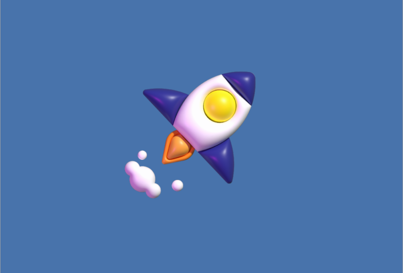
is set up my first image. This is going to be a rocket. I'm going to take you
through my process of how to set this
up as a bit of a flat piece of artwork before we do take it to the
three D inflate stage. So make sure you have
one point stroke here. And then go ahead and
toggle your fill off. Make sure that's none,
so all we're seeing is lines at this point.
I'm going to hit L. It's going to bring
up my elips tool. Holding down shift, I'm going
to make a perfect circle. The reason you're
holding down shift is because if you
don't hold down shift, you get some walkie circles. Make sure you're hold down
shift, drag that out. I'm going to hit V, which
is my selection tool. I'm going to grab
that same shape. I'm going to hit
shift and option. What that's going to
do is, it's going to copy that shape over. I'm going to leave that
there. I'm going to hit M to bring up
my rectangle tool. I'm going to come
to the top here and just make a quick box out here that will kind of capture that
top part of my spaceship. I'm going to hit L to
bring my lips tool again. I'm going to make the
window, drag that out here. You might be seeing these pink lines show up on the screen, but that might not be
showing up on your end. If it's not showing
up, go to view. And make sure that your
smart guides are checked on. Getting back to our work here. I'm going to make another
rectangle at the bottom. I'm going to hit M. I'm going to make a large
rectangle here that, that will kind of break
up this lower part here. I'm going to hit L. What I'm going to do is
I'm going to make these large fins here
that are going to be almost the fins
of my spaceship. Now, right now, you're just seeing a bunch of
shapes on screen, and this might not
make any sense at all. I'm going to go ahead and
bring up my path finder here. I'm going to drag it
out from here so I can see some of these
options here and I can start those bulk pieces
that I'm ultimately going to be layering
for my flat artwork. I'm going to select
those two first circles that I've created. I'm going to hit intersect. And what that's
going to do is it's going to leave one
path behind or one shape that is the overlapping area
of those two shapes. I'm going to grab this
rectangle at the top here. Holding down shift, I'm
going to select both shapes. And I'm going to hit
intersect again, and you're going to see
that that's going to ditch the lower half of my body. That's totally fine. I'm
going to hit command C. Undo. I'm going to delete
that rectangle. I'm going to hit command F, a little handy trick
there for you, just in case you wanted
to move a lot quicker. Now with this larger
circle at the bottom, I'm going to make sure
this rectangle is on top of the circle. Actually go to drag it down
a little bit more here. You can see that it didn't cover that lower part of that circle. And what I'm going to
do is going to select both of these and
hit minus front. What that's going to do is
just going to leave behind these little fin tight
things that I just created. I'm going to hit command C because we need
that rectangle back. Command Z to undo that. Delete this circle and then hit command B to send
that to the back. And then with this
lower rectangle here, I'm going to actually
select the body of the space shift itself
and the rectangle, and I'm going to
minus front again. And you're going to
see that that leaves behind a little space
shift thing here. Now, I still need to create the fire down
at the bottom here. What I'm going to do
is I'm going to create a square it on your keyboard to bring
up your rectangle tool. I'm going to scale this up. I'm going to rotate
this 45 degrees, so it looks a little
bit like a diamond. It's centered below
My rocket ship here. I'm going to hit command C, command F. What
that's going to do is going to copy that
same shape on top. And then grabbing
the quarter here. I'm going to scale
it from the inside. And I mentioned that I was holding down shift
and option before. You can see that when
you let go of option, it scales from the left edge. And then if you
hold down option, scales from the center, I'm
going to make it around This size here. And then I'm going to grab my
direct selection tool, grab these lower points here and just nudge these
down slightly. So it looks a little bit
more pointy and then these two shapes almost
conforming to each other, but you can see it
gets a little bit tapered at the bottom here. Now, grab that first one
that you did create. I'm going to double click this to enter an isolation mode here, and you can see I just
double click the shape. And I can't select
anything else here. I'm going to select that shape. I'm going to hit A. Which is my direct
selection tool. I'm going to make a marquee box over all of these anchor points. You can also select them
and holding down shift, select them all the same time. Now, you're going to see that
these little circles showed up at the corners here.
Get a little bit closer. You can see that once
you do hover over it, you have a little bit
of a curved icon there. That's going to allow you to adjust the roundness
of the edge here. I'm actually going
to bring it as far as I can until it stops. You're going to see it
turned all red here because it basically saying,
I can't go any further. I'm going to hit escape. I'm going to select the
other shape inside. I'm gonna double
click on that one to enter isolation mode. I'm going to do the
same thing. Now you can see once I get it, I get that red shape
on the outside. You can see that
I have this nice even kind of edge around it. Now, I'm going to hit escape
to go back to the shape. And here you can see
we have our rocket. Now, I'm going to go ahead and add some smoke at
the bottom here. Just by a few circles, I'm going to grab
the ellipse here. I'm going to copy
this over. I'm going to scale this back a little bit. I'm going to move
this one over here. Maybe they should be a little
bit smaller, like that. I'll delete this one and
then copy this one over. Selecting the both,
I'm going to just just shift this over and make sure it hits the center of that circle. Maybe a few little
random circles might also make this look
a little bit more organic. We have our rocket here. We don't need our
pathfinder anymore. I'm going to go ahead
and just drag that back to our right panel here. Now we're going to
apply some colors. You can go ahead and scale this to whatever size you want here. I'm going to make sure it's
in the center of my artboard. What you can do is
start selecting some of these shapes here and
applying colors to them. I'm going to first add a background because
I do think that that's going to be helpful to get
a little bit more contrast between what is happening on the foreground and
then the background. I'm going to add a new layer. Call it B G. While I'm at it, I'm going to also
label this layer art. I'm drag this one above. I'm going to lock that up here. Choosing B G, I'm going to
select my rectangle tool, hit. I'm just going to drag
a shape out here. This could be the same
shape as the art board. That way, you can almost guarantee that when
you do save the art, you don't have any
white spaces on the edge or maybe
transparent areas. I'm going to add Phil here. I'm going to just flip this over to make sure it engages as Phil, but I'm going to make
this a nice blue, something that is contrasting, and I always change this after. This isn't going to be
the final colors that I do choose. I'm going
to lock that up. Go back to my art layer, and I'm going to get a little
bit closer here and start selecting different colors
for the rocket ship itself. For the top part, let's
choose something like a blue. For the fins. I'm guessing that that should match as well. I then I'm going to
choose the body. May I choose the window
first. I'll make that yellow. The body itself could be white. As you can see, we have a layering issue
here. That's totally fine. If you need to maybe
get that behind, you can either because we have the background layer locked. We can actually
make a marquee tool to see where that thing is. A good rule of thumb here is if you want to send
everything to the back, you can select everything
that is in front because we are
missing the window and the tip of the rocket ship. I'm going to control click it. If you're on a PC,
that's a right click, and I'm going to go
arrange sent to back. Now I have my window and my
top portion back with me. With my eye drop
tool, I'm going to actually use the same
yellow from the window. I'm going to hit I, select that. The outer fire is
going to be red. And then for these lower
bubbles that I have here, I can go ahead and
make these white. I think I forgot is to
make these all one shape. You can see that
they're all different saps and they're
overlapping here. I'm going to go ahead and hit Unite to make that
all one shape. Now, great. I need
to take my fire. Let's right click that
or control click that. Send that to the back.
There we have it. Now I'm going to
select everything here and remove the stroke. You can see that we still
have some black stroke there. We don't need that for this. We're going to make
sure that it is flat, and we're not going to
need the stroke anyway. Go ahead and hit none. We might want to
tune the edges here. You can see it's very, very
sharp on all these edges. I think that using that same
rounded corner technique that we did with
our fire down here, we can do that to some
of the edges here. So I'm going to hit my
direct selection tool. I'm going to make a mark key
box over this edge here, round that off a little bit. I'm going to select
this one here, and then using shift, I'm going to also
select the other one. I want these to be a
little bit more uniform. Inm going to go to
the bottom here, make a mark key box
this lower edge and round that off as well. If you wanted to know what the
values are of these edges, you're going to go
ahead and just click and come up to the top
here and you can see, this is the radius
for the corners. You can go ahead and change
it if you want to have some even numbers there,
totally up to you. I just wanted to let you
know that's where you can find some of those options. But anyways, we have our
vector artwork ready, and the next lesson,
we're going to be applying our three
D inflate effects.
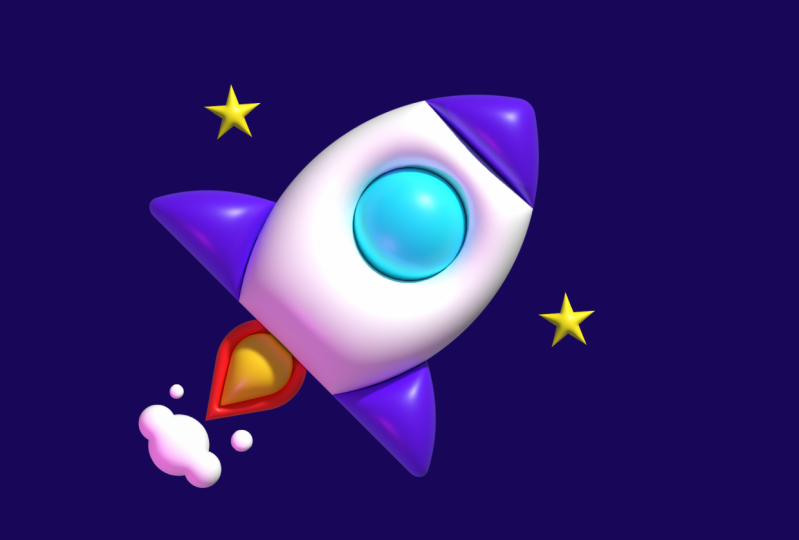
4. Lesson 2: Applying 3D Inflate: Okay, welcome back.
We are ready to start applying some three D inflate
effect to our rocket. But first, we go to
open up the dialog box. L come to the top
and click Window, three DN Materials, and we'll get our three D M
Materials dialog box. Now, there's three things
that's going on here. The object itself,
so that's applying the three D effect to
your illustration. We have materials,
which is going to allow you to
add some textures, maybe some looks and feels to
the surface of your render. And then we have lighting
that will allow you to adjust the lighting
within the environment. Let's go back to object here, and there's four
different types of three D renders that
we can do here. Let's start playing
around with these here. First things first. We want to group everything that we want to be three D. So go
ahead and hit command G, or you can right click
that and hit group. Now when you move these around, it all move together, and when you're applying
the three D effect, it's going to apply everything that's within the group here. Let's take a look at some of
these three D types here. The first one is plan,
and you're going to see it's going to render
it on a flat surface. You're going to even
rotate this using the little widget that lives in the middle of your illustration. You can also just flip
it around and go 360. Once you do rotate that,
that can be reset, so you don't have to
worry about it getting stuck in that type of
rotation or that view. Come down to rotation
in your object tab, you can make these
all zero again, and it'll take you back
to your original view. The next one is Extrude, you can go ahead and
hit extrude here. And what you're going to
see here is this is going to add depth to your drawing. You're not seeing
anything yet. We're going to have to rotate
this one again. Here you can see that we are
able to add some depth here. It does a bit of a twist
too if you want it to maybe one of the edges to
be twisted along the way. You also taper it as well, so maybe it has a bit of
a jumping out feel to it. The third one is revolve, and I'm going to
be frank with you. This one here is a little bit messy because it does
do some crazy stuff. Usually a bit of
a rotation here. Um But the one that we're
all here for is inflate. Go ahead and hit inflate. Let's go down to our
rotation settings as well. Make sure these are all back to zero, so we see them flat on. We also don't need
to add any depth either because it's going to be the same look and feel to it. You can see that
the surface here. If I rotate this slightly, you can see that if I add
some more depth to it, it doesn't really
impact or change the inflate look and feel that we have on
the surface here. Let's go back to
zero, this flat on. And what you're going to see first is something that
doesn't look too impressive. It looks pretty
good, but it's not exactly this polished
look that we wanted. Go ahead and click that.
And up at the top here, you can hit render
with ray tracing, and that's going to render it for its final look and feel. One thing that drive me nuts is the color of the
background right now. I think that it's
a bit too bright. We need a darker background. So go ahead and select
that back color, and let's just change it
to Maybe it should be something like a
little bit more navy. That looks pretty cool. All right, I feel better. Go back to the art layer here, and now you can see with
the ray tracing on, we have a very polished look and feel to our rocket. I think
it looks really cool. Now, if we take a
look at some of the three D inflate
settings that we have, you'd see that they're
all at zero or 100%. We want to keep it this way. We don't want to
adjust this at all because this is almost like
blowing up a balloon here. It can only go so
far before it pops. We don't want to
adjust this at all, and even if we did do some adjustments and make
it look a little bit off. Is a look and feel we want, but we can adjust the lighting. So go ahead and click the rocket and let's go to lighting. And there's some presets here
that you can choose from. Right now we're on Standard.
If you hit to fuse, it's going to have it
centered in the middle of it and it's going to
distribute some of those shadows. If you go top left, it's just going to be the
reverse of standard. Then if you go to right,
it's just going to be a bit lower and a bit
harsher of shadows. Let's go back to
standard because that's what we want from our
render right now. And you can see down
here at the bottom, we have intensity at 70, which is basically the
overall brightness here. We can go and bring that
down just a bit more to about maybe 60. That looks good. And We have rotation, and that is where the light
is hitting around the object. If you did adjust that, you
could see that it would just move around and same thing if you were to grab
the circle here and drag it, you could see that as you are making the light
move within your render, you're also seeing
that number in the rotation panel
change as well. I did like the angle
of it because it was that standard look and feel of where the
light could come from. Let's keep it at 1:45. Hight is going to be the distance that
the light source is and how far away it
is from the object. Let's keep that at 45, and I have softness at 40, and this is going to be how the light spread
some of those shadows, and it will make those
shadows a lot softer. An ambient light is
going to control the global light source. We don't want to
touch that at all. Let's keep the
intensity at 50 here, and we're going to
keep shadows off. Now, we're looking pretty good. We have the three D applied. Maybe there are some cosmetic
changes you want to make to the paths and shapes and maybe the size of
some things here. One thing I would
suggest is going ahead and turning
off the render. That's going to
bring you back to your quick render mode here, and you can go ahead and double click and start making
some adjustments here. You can make adjustments
to the size of things. Maybe we wanted these
wings to be a lot larger. That looks ridiculous.
Let's put that back there. You can even make some
color changes as well if you wanted to change
some of the colors here. I would suggest that
you do keep the render off because it might take a long time if you do have it on, depending on how
good your system is. Go ahead and make any changes
that you need to make here. What I'm going to be
doing is, I'm going to rotate this because I think it should be
kind of heading up in the air and up
to the right here. You can see that I think
this looks pretty good, and let's go ahead and
put our render back on because this also adjusted
the light source here. So it's looking pretty good. One thing I want to do, though, is I want to add
another light source. Let's go back to lighting. If everything is great
out, make sure you click on your drawing and
you'll see everything show up. You can see that we
have light one here. If you go down to
the plus symbol, you can add another light. It's going to
initially just drop it right on top of where
the first light is. You could see that your render might get a little bit brighter. Maybe some colors are
getting washed out. We go ahead and move
this light source. I'm going to move it to
the lower bottom here, and I'm going to go to color, and I'm going to adjust it to something that's
going to give it a cool look and vibe and
a bit more polish to it. I'm going to add a pink here. Let's hit. You can see already. It looks really cool with this kind of pink
under shadow here. What I want to do is I want to bring the intensity
down slightly. I'm going to bring
that to about 50. Rotation, I'm going to make
this a solid number just because that bothers me
to have so many decimals. In height, I'm going
to leave this one at 40 and softness. I'm going to increase this a bit more to about 50. And
there we have it. Actually looking and I'm seeing the yellow is getting a
little bit washed out here. I can go ahead and
adjust the lighting, but one thing I think would
be helpful here is if I just hit my direct
selection tool, I selected this yellow. Holding down shift, I'm going to select the yellow from my fire. Double click your fill and adjust this to make it a
little bit more orange, maybe a little bit lighter. And now it has a little bit
more of a polished look here. And I think that the yellow
is not getting washed out. So we're looking pretty good. I think this looks fantastic. In the next lesson,
I'll show you how to export your final files
for different use cases.
5. Lesson 3: Exporting Final Artwork: All right, we are ready to
save our final artwork. If you're happy with
the results that you see on screen right
now, and again, I want to make sure
that everybody has their real time preview on, you'll see it at the top right of the three D materials panel. Make sure you have that selected because when you are
saving your artwork, it's going to save it the same way you are seeing it on screen. If you have that off, again, it's going to be saving it the way you are seeing it on screen, so it might look
a little bit off. Make sure you have
that toggled on. Go ahead and make
any last minute adjustments that
you need to make. If you aren't happy
with anything at all on screen and you want
to start from scratch, you won't be able
to do that from the three D materials panel. You can see that if I select
it and I deselect inflate. It still is applied. What you're going to
want to do is go to Window appearance, select your image,
and you'll see that you have three D
materials applied here. You can hit the eyeball
to chocolate on and off, or you can come to the trash
can and delete it together. But if you are happy with the results that you
have on screen right now, go ahead and close your
three D materials panel, and come down to your artboards
and make sure you are labeling the artboard or artboards that you
have available. So when you are saving it, there is no file name
confusion and you're not just getting a bunch of just artboard one artboard two artboard three. I'm going to put Rocket enter. I'm going to go back to layers. Another thing you should
decide at this point is whether or not you want a solid or transparent
background. If you want a
transparent background, make sure you toggle this
background layer off. I'm going to save my image
with the background on. There's two different ways
that we can save the image. The first one is
to save for web. So go to the top here file. Export save for web. This is going to give you a
preview of your final image. It's also going to
give you details about the image
itself like the size, the percentage, if
you are increasing or decreasing the scale of it, that you have it currently
set up in the artboard. There's a drop down
up here that will allow you to choose
your file type. I suggest a JPEG or Ping. A ping would be great if you are using it for a
transparent background, and you would be able
toggle this on and off. I'm going to go ahead
and save mine as a ping. Whenever you're ready
go ahead and hit Save. The second way you can
save your artwork is file, export Export As, and this is going to show you
a simplified dialog box. This is a great process for saving multiple artboards if
you have multiple images. Just make sure you
have use artboards selected here and all, or you have a range if you want to just select a few of them, and then hit Export
when you're ready. Here you have your
final artwork. It looks great. It should
work for your purposes. One thing to note is if you want to increase the
size of the image, you're going to have to go
ahead and adjust the artwork, as well as the artboard
and Illustrator, as opposed to doing that
through the save dialog boxes. Do make sure that
your system has enough memory because this
is a very heavy process. But there you have it,
your final artwork, it's ready to share with your team or ready for
you to post online.
6. Conclusion & Final Thoughts: All right, we reached
the end of the class. By this point, you're
able to create three D inflated images
using Adobe Illustrator. You've also learned
how to create simple vector images using geometric methods and
overlapping principles. I hope you did enjoy
what you learned here. It would be amazing if you could post your project in
the project to gallery, so we can all see what
you've been working on. If you've already
shared it online, go ahead and drop
the link there too, so we can all check it out
and give you a thumbs up. Speaking of thumbs up. If
you did enjoy this class, please go ahead and
leave me a review here. Give me some feedback. I always love hearing how I can if you have any
suggestions on what my next class should be, feel
free to reach out to me. I'd love to hear what
your thoughts are, what you'd love to learn. Thank you again for joining
me on this journey. All the best, stay creative. I'll see you in the next one.
 Kevin Moran, Illustrator & Designer