Transcripts
1. Introduction: Welcome to the studio, it's Froyle here, I'm so glad you've joined me. I've been painting and
exhibiting for 30 years, and what I'm most passionate about is giving
you an experience of creating art and
unleashing your creativity. I've been running developing
creativity workshops in-person and online
for many years, and what I have found
is everybody is creative and with a
few simple techniques, a little bit of encouragement, some coaching, you
can create anything. [LAUGHTER] You can produce
absolutely beautiful artworks even if it's your
very first time, even if you're a brand new
beginner or virgin artist, you can create
beautiful paintings. Creating art can be a life-changing experience
as you connect with your own creativity and unleash
your creative expression. There's just something
so validating about creating something
from the core of who you are as a person
and saying that materialize on the
paper in front of you. During my many years
of making art, I have tried every
possible style [LAUGHTER] and experimented
with all the mediums, water-based materials
that's on the market. I absolutely love
experimenting with art supplies and I love to
see what we can create. It's this excitement
to experiment that really makes for absolutely
enjoyable art classes, and I really hope you're
going to join me. In this art class we're going
to create a collection of beautiful artworks using acrylic paint and
collage elements. I will lead you step-by-step
through the process of creating artworks that
are uniquely individual, while at the same time creating
a cohesive collection. You'll learn how to choose a harmonious color
scheme and how to work with a limited
color palette. I'll teach you creative
techniques for effective mark-making and how to add collage elements to create additional
textured layers. You will immediately be
able to use these skills, and by the end of the
class you will have a beautiful collection of artworks that will
be ready to frame. You might want to give them
to your family and friends, or you might want to keep them, put them in a frame, hang them, or even sell them. Anything's possible. You'll be amazed at the beautiful artworks that
you're going to create. This class is suitable for
students of all skill levels. Perfect for beginners
because I will lead you step-by-step
through the process. I will show you
exactly what to use, how to do it. I'll give you an art
supplies list if you want to follow exactly the
colors that I use, and you'll be able to create
with the same results. If you're already
a seasoned artist, then what you're
going to enjoy about this class is the
freedom of expression, the experimentation, and
the mixed media technique. It's just so fun. We're going to use
multiple layers and we're going to create absolutely beautiful
collage paintings that you're going to love. I'm so excited to be working
with you on this project, so let's gather our materials
and let's make art.
2. Paper Prep: Let's get prepared. This is the watercolor paper
that I'm going to use. It's a 300 gram, 140 pound, 41 by 51 centimeter, or 16 by 20 inches. You don't have to
use this type of watercolor and you don't
even have to use this size. I'm using this
because I have it. It's a watercolor block, which means it's already
glued together on the side, I don't need to tape
it down or do anything I can just open the
page up and away we go. But you don't have to
use one of these pads. You can use a single
watercolor sheet. Any watercolor sheet, any particular brand or
type that you prefer. But I would suggest a more heavy weighted
watercolor sheet so that it doesn't buckle as
we're going to be applying acrylic
paints maybe some ink, so lots of mixed media. You want to make sure you've got a fairly sturdy and thick
or a good pound paper. The first thing
we're going to do is divide our paper into four. Seeing as my page is 20
inches or 51 centimeters. I'm going to want to
split it in half, which is 10 inches, which is 26 centimeters
by 16 inches, which is 20 centimeters. I work in centimeters, you might work in inches so
I'm going to talk about both [LAUGHTER] and we'll
keep everybody happy. I'm just going to
divide up my page. I think I said 26 centimeters, put a mark at top and
bottom and roll a line. Easy, peasy, lemon, squeezy. Now, don't get too pedantic
about your measurements. What we're going to do
is split our page into four sections so we can
create four artworks, all at the same time and create a very harmonious and
beautiful collection. I'm putting some low-tech tape, that's what this is called. You can use masking
tape, a washi tape, or any tape you want to use because what we're
going to do is separate out four pieces
for your artworks and it also makes a really nice
white border around the edge, which looks really
good when we're finished with creating
the artworks. I'm roughly going to
put it on the middle of this line so that it puts
a white edge on each side. Like I said, don't get too
stressed out about making it absolutely perfect in dimension because this is art work anyway. Perfection is not something
that we're striving for, we're striving for that
creative expression. Put your tape over
your lines so that it creates a really nice
white border edge. I might even also put
it around the sides. If you do have a single
piece of watercolor paper, you can type your
single shape to your work table so that it holds it in
place a lot better. I can guarantee
you by time I pull this tape off line will
not be perfectly straight. Don't get too hung
up about trying to make these lines
absolutely perfect. Because mine won't be I
can tell you right now. Give them a good press so
they're nice and firm and it'll create the clean edge that
we like when we're finished. I like to use the
low-tech tape or masking tape so that
it doesn't pull the page and rip the paper when I'm all finished and I
want to take the tape off. This is not a guarantee. Sometimes it sticks, especially
with the acrylic paint. But don't let that stress you. Now that your paper
is all ready to go, let's move on to the
paints we're going to use.
3. Choosing Colours: Right now these are
the colors that I've chosen to use for this
particular project. Of course, you don't have
to use these colors but I am suggesting you use
four colors plus white. White is going to
lighten your colors to create more shades, tints, and tones and then
you'll have one of your darkest colors to balance
out the light and shadow. You want to choose colors that are going to
work well together. The Payne's gray here
is quite a bluey gray. That's going to work well with
the magenta because that's quite a bluey, cool-toned
red-based paint. The unbleached titanium
is a warm color, so that's going to work
and the iridescent bronze is going to be my highlight
or my accent color. White is going to make, of course, all of these colors, lighter shades and they should
mix well together nicely. You're also going to want and need a selection of brushes, different sizes and shapes. Don't get stressed
out about having really fancy paints
art supplies, you don't need them. These are just from
the cheap shop and they work really well. You also want some baby wipes and something to
put your paint on. This is just a
disposable palette again from the cheap shop. Or you can use a plate or a piece of plastic or
anything that you've got. Use the colors that
you've already got and especially
choose some of your favorite colors
because it always works better when you love the
colors you're working with. Now, I'm going to use these
colors for the paints. We're also going to create some texture with some stamping and adding some other shapes and perhaps a little collage. I'm going to use this particular color
palette for all of the applications that
we put onto the paper. It just keeps
things very simple. It makes a harmonious artwork and it's a heck of a lot easier. [LAUGHTER] You don't
have to get stressed out about what colors to use. Just look at the palette
that you've chosen and stick within that range and it's going to work really well. It's going to be an easy
exercise and a lot of fun.
4. First Layer: Let's Begin: We have our paper
board prepared, we've chosen our paint
colors so where do we begin? Have a look at the
brushes that you have. What do you want to start with? I like to start with
a broader brush. First, I like to
put down flat areas of color and establish
a bit of a composition. We're going to put paint
down for our first layer. On our second layer we're
going to add some texture and on the third layer we might add a little
bit of collage, change some highlights,
fix some areas, and make sure the
composition is working. In the first layer, you want to be really
free and expressive and don't stress too much
about the marks you're making. I'm going to start
with my darkest color, which is the Payne's gray. Now, if I add a little bit of
water to the Payne's gray, and remember, we're
on watercolor paper. You can see that
it spreads out to a really beautiful
blue-gray color. That's going to mix well
with my other paints. I'm just going to put some
of these color I'll use. I'm going to spray it with
some water just to move it around the paper and I'm just going to create
some broad shapes. You want to not be
too stressed out about how it looks
at this stage. Just put down some broad strokes and some shapes onto your paper. I find the paint moves better on the watercolor paper if you just give it a little bit of a spray. I spritzer with some
water to get the paint moving and it gets
you moving as well. You don't have to
worry about going over your taped areas because hopefully that should have
sealed off the paper. [LAUGHTER] That's
the plan instead. Just put some broad
strokes on with your darkest color
so that you get started and you actually
touch the paper, and then it relieves that
whole fear of messing it up, and that blank page syndrome. Spray a bit of water on
so you get a little bit of movement and
we're already away. Now, I like to wipe my brush with baby wipes to
get the majority of the paint off
because there's less going in the water and there's
less going down the sink. I will wipe off the majority
of the paint first, give it a little
bit of a swish in some water and perhaps
dry it with a tissue. Now that it's relatively clean, I'm going to take some of my beautiful magenta color
and add that to the page. As you can see, if I add it
on top of the Payne's gray, it mixes and it's a really
nice color that it makes. I really like that color. You want to allow
yourself to have a little play with how your
paints are going to mix. Again, if you don't want it to stay muddy like that
give it a wipe on tissue and add few dabs of some more paint and then
it's nice and clean again. Really is very simple
don't get stressed out, just put some beautiful
expressive marks with your brush on the paper all the way
around on all four pieces. Don't think too much about it because then you're going
to get stressed out, and second guess yourself. Just allow yourself
to create freely, put on some music, and allow yourself to
just enjoy the colors and the beautiful brushwork of just literally slapping
it on the paper. Now we are going to do a few
layers on these paintings. It's not going to look fantastic the first time
you touch the paper. [LAUGHTER] Don't get stressed out about that because there are so many ways to
develop the painting and we will keep working
on it until you're happy. This time, I'm adding some of the unbleached titanium and I'm just going to first of all, put it on the page
without touching any of the paint so that it
stays nice and clean. I want a good section of that beautiful light toned color before I get it messed up
with the other paints. Once I've put down some good blocks of
this particular color, then I'm going to mix it in with the other paints and see how it looks with
the other colors. Of course it's going to go a little pinky with the magenta, and that's okay, that's quite a nice color. Remember just to keep wiping your brush or
washing it in water if it gets too dirty and your colors aren't what
you want them to be. The unbleached titanium mixes really well with
the Payne's gray, it just goes a
really gray color. Have a bit of a try with
the colors you've chosen. Mix them together, see what
other colors they're making. If you don't like it, don't stress out, just let it dry and we'll
paint over it. What you'll find as you start putting the
colors together, is that some of them you're
going to really enjoy, and some of them you might not. I'm really liking
this color here, I think that looks really cool. I'm going to add a
little bit more of the Payne's gray
in this section, because I think it
will really look nice with that beautiful
purpley color. Then you might want to
add some of those colors that you mix onto
the other sections. Look how good that color looks. Basically, I'm taking
it from there, I'm putting it up to here. I really liked the
way that color mix, so I think I might do it over
here on this space as well. Allow yourself to experiment
with your colors and see how they look
when you mix them together with different
tints and tones. Remember, you can change it down the track if
you don't like it. But at least at this stage, allow yourself to experiment and try different
color combinations. It's only paint
and it's on paper and we can fix it if
you don't like it. Get a little experimental
and a little expressive. Try different brush strokes, try different color
combinations, and just see how it looks. Some of your ideas you'll like and some of them you won't, and that is the process
of creating art. Now if I add some
white into the mix, how's that going to change
up the dynamic of my colors? Let's have a look. Do I like
it or do I not like it? That's the question. I think I like
some of the white, but I really don't
want the whole thing to turn into shades of pink. [LAUGHTER] I'll have to watch where I'm putting it and not too much on
the magenta color. As your paper starts to dry
and being acrylic paint, it dries really fast, then the paint colors
will sit on top of each other instead
of always blending. That could really
work in your favor. Now, remember, this is only the first layer
of your painting, so you will not
be entirely happy with how it is now as long
as you're just semi okay, then we're fine, we're on track. [LAUGHTER] What you
need to do now is stop. It's really easy to
keep going over and over the first layer of your painting because you
just want it to look better. I'm really happy with
my brush strokes. I did the whole thing
with the broad brush, and I only use the colors, they mixed well together, I'm fairly happy with it. I'm going to let this dry now, and then when it's dry, we're going to add
some texture with some different applications
to create the next layer. Allow your painting to dry. Basically put your brush down, step away from the
painting [LAUGHTER] and allow it to dry because you
can always make more changes, especially in the composition
with the next few layers. Don't worry if you're
not happy with it now, that is very normal, it's also part of the
creative process. Probably the hardest part is to leave something when
you're not happy with it. But truly, we will
get there in the end. You'll be amazed at how
much your paintings will change as we add
more layers to it.
5. Second Layer: Creating Texture: How is your painting drying up? Mine's still a little damp
in some thicker areas, but it's mostly dry. It's dry enough definitely. [LAUGHTER] There's a few
things we can do with this particular layer
and we can also reassess and see if you like
the combination of your colors and how your
composition's progressing. For instance, this has got
a nice light section of the unbleached titanium on the top left corner and then it comes out and gets
darker and darker. This one has one
on the top right. This one has the
unbleached titanium and then white on
this side as well. This has it down the bottom. If we look at that, they're all very different
compositions because of where I've placed
the lightest area. That's a good way to start. Now, scumbling is
using a dry brush like this one with stiff bristles and a
tiny bit of paint. If I put a teeny-weeny bit of the magenta paint on my brush and I just
go over it like this, this is what we call scumbling. We're just putting another
almost broken color on top of what's
already underneath. Because this area I
think it's a little dull and boring and
I just wanted to light it with a bit more
of the rich magenta color. Look at your
paintings and see if there's any areas that
you want to change, you might want to darken
them or lighter them. I'm going to add a little
bit on this one as well. The scumbling is just a
different application of paint. It looks different
and it creates more interest and more
texture on your painting. I'm going to add a little
bit around each of the areas just for a bit more interest
and then we're going to find other ways
to add texture. You can see either
this white section here when I'm scumbling some of the magenta because the
magenta is quite transparent. But then you've still got that beautiful brush
strokes underneath. I think it looks pretty good. A little bit pink, but I guess I can survive. [LAUGHTER] I'm going
to put some of the Payne's gray on it as well
maybe so it's not so pink. [LAUGHTER] We can also take one of our
other sized brushes. I've got this small sized brush. Add some marks and
textures with this. I could add some
white marks onto the painting just
with this brush and it will create
a different look and a different texture. Very simple, very easy, and actually quite therapeutic. The marks could go
in different ways, different angles, and it just add some more
interest to your painting. It doesn't have to
be all uniform. You can just create
random marks as well and everything doesn't have to be measured and exact. Little bit of random mark-making
is a whole lot of fun. It's very easy at
this stage to change sections of your
paintings if you're not happy with certain colors, how they've dried up, you can change them really easy because now that
this layer is dry, whatever paint you put on
top is going to stay on top. If you wanted some
more white sections or some lighter areas, or you wanted to change
some of the colors, it's very easy now to do that because your base
coat is nice and dry. Also, [NOISE] it's
a great time you could draw on your paintings. You could add lines to it or scribbles or marks or anything. I'm just using a Posca
pen and I'm going to take this line for a
walk across the page. [LAUGHTER] It's so much fun. Don't get stressed out about how things are
looking at the moment because it will all keep changing the more you
add to the layers. What about a bit of scribble? What if I decided
that I didn't like that line and I'm going
to make it messy? Well, that's just a
whole lot of fun. Seriously, you should try it. It's quite therapeutic. If you don't like it, you can just add some more
paint over and change it. But I think that
looks pretty cool. [LAUGHTER] I might add some into these
other areas as well. It just creates another
texture on the layer of paint. These Posca pens are
great because they go over so many
different surfaces. I might just add a little bit of scribble into all of them. Then the textures
are connecting even if you just say a
tiny little piece. [NOISE] Of course you can
use commercial stencils. This is a Tim Holtz stencil with some numbers and I
have a makeup sponge. I can put some of these fabulous numbers
in different places. I'm just going to put
it on pretty rough. Don't get too careful
and precious with it. Not yet anyway. I'm going to put a
few of these numbers in some places just like that. You probably won't see them overly clear and
that's what I want. You'll see them in some areas. They might come through in
the end or they might not. It depends on how many lives I want to add to the artwork. It's a bit of fun. It's another thing to try. It's just another
way of making marks. See, that look pretty cool. I'm pretty happy with that. As long as you're sticking
to your same color palette, then all of it's going
to work together. It all makes your
decisions also very simple because you know what
colors you're going to use, and it just means that
it's all going to tie together with similar elements. I'm liking that even
if it's munchy, I think it's pretty fun. Another favorite
way to create marks on the painting is with
using bubble wrap prints. Iridescent bronze
vine is running out. [LAUGHTER] Now, this
is the color that I've chosen for my accent
on my highlight color. I'm just going to add some
areas of it in small places. I've got this piece
of bubble wrap. I rolled on some of
the iridescent bronze. I'm going to use it
to take some prints. There it is on the bubble wrap. Just ordinary
packaging bubble wrap. I just love it because it
makes such a great print. I put it on the
paper. Look at that. That's just fabulous. I absolutely love it. Some of my painting is
still a little wet, so it may transfer across to the other side,
but that's okay. I'm all right with
that. Look at that. As I take the print on each one, it gets less and less paint, but the marks are just
beautiful. Look at that. I love it. Now the thing is, if you put something on and it's not where you want or you're not happy with it or it's not the right shape or
it's too much paint, you can just take it off
again with a baby wipe. Easy peasy lemon squeezy. Don't stress about trying ideas because if
it doesn't work, we can fix it. You can change it. You can add more paint over it. It doesn't have
to stay that way. You put something on
and you don't like it, you can just change it again. I'm liking the way there's only partial prints on this one. That one is a bit full-on because that was
the first print, but I might add some
more paint over that. I would like some more
of the print up there, so I might just do
another little roll on my bubble wrap here [NOISE] with whatever paint is
left on the brayer. Then put this up here
because I think it'll be enough paint on there for
that to take a print. Yes, loving it. That looks fabulous. Then I might just knock it back a bit so it's not so straight. That's looking just beautiful. See how the bronze is just such a nice
highlight to the page. I'm really liking that. Now another very simple mark
making tool that I love is the trusty tube or roll that
at the end of anything. [LAUGHTER] There's
so many tubes and rolls at the ends of things. I like to use them
for mark making. The circle shapes are always imperfect and that
makes me happy. They're a little bit thicker
around some of the edges. Look at that, that looks glorious there on
my white scribble. Now, if I didn't want
them to look so perfect, I could give it a
little spray with some water and that would make
it bleed out a little bit. Make it a little bit messy, go over it again just so
it's not so stiff looking, and I like that much better. I think I might add a circle shape to a couple
of the other sides. Yes, loving that. I might even leave that
one just by itself. Give it a little spray so
it bleeds out a little. I think with these other ones, they need a different color. I'm thinking with this one, perhaps it would look
better in the magenta. It does have a bit of the
Payne's gray with the magenta. But as you know, I like these colors
when they're mixed together so it
will be all right. Let's put that there. It might even run off the page. That's just so much fun. I'm pretty happy with
this mark-making and this second layer with
the beautiful texture. I'm going to let the pages dry now and then
I'm going to add just some little elements of collage to finish off
these beautiful artworks.
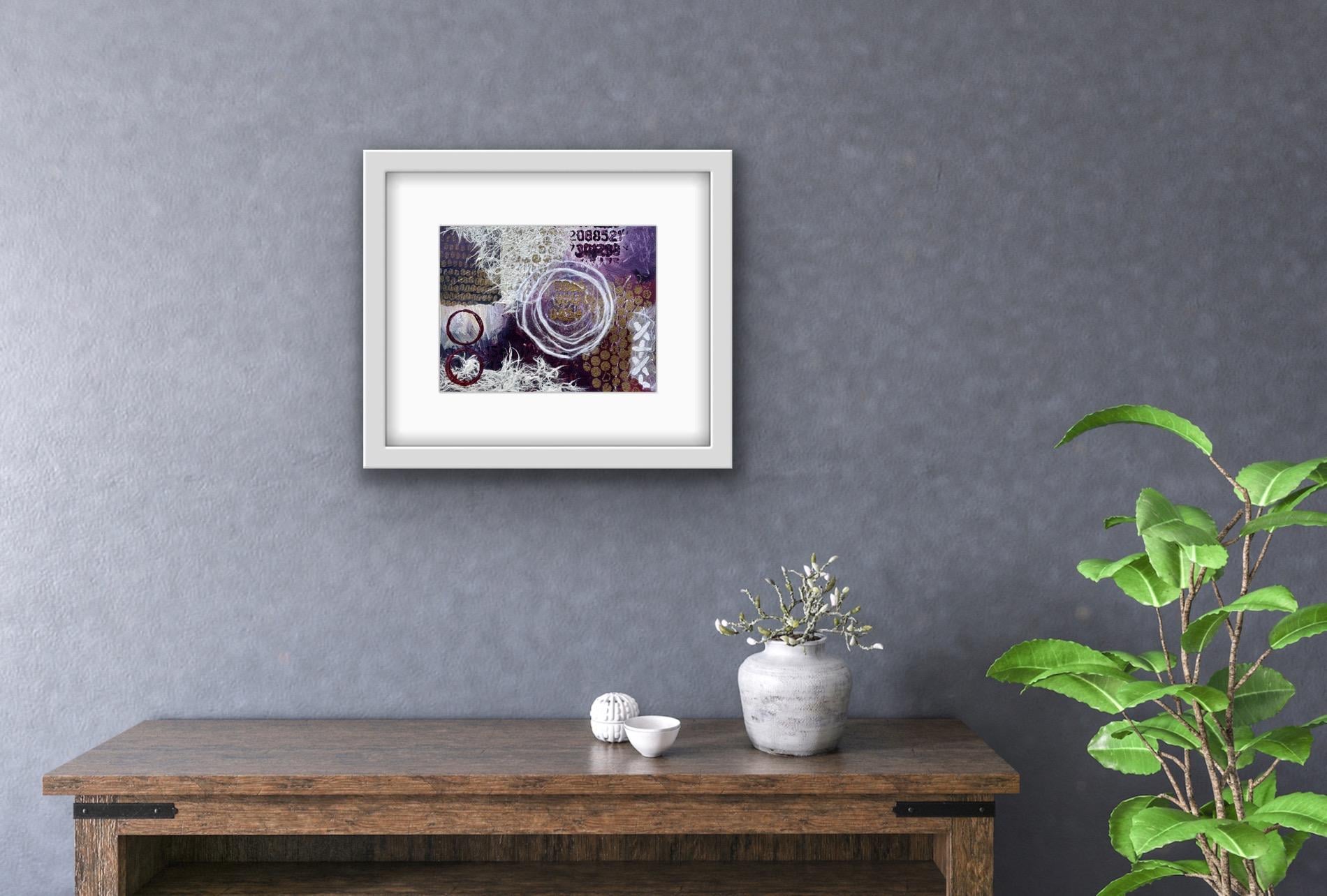
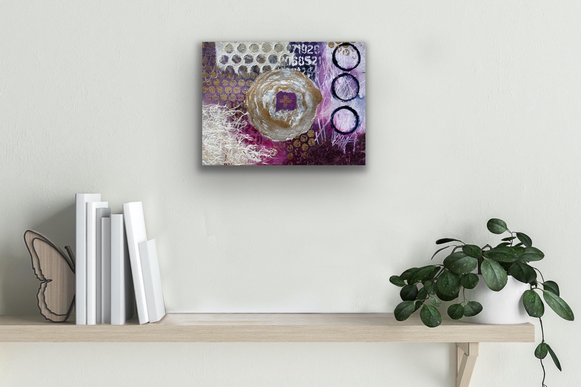
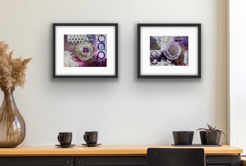
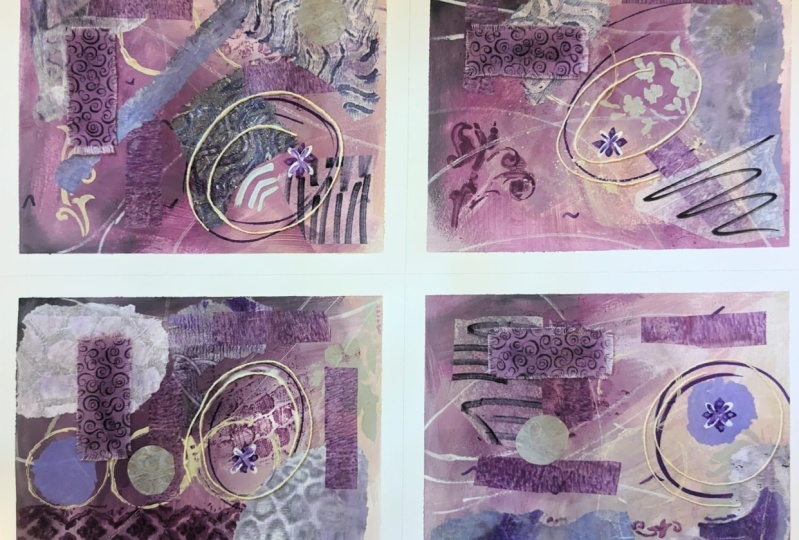
6. Third Layer: Adding Collage: Once this layer is dry, then you look at your beautiful paintings
and decide if you're happy. Now each of these paintings has a similar element of color
and textures and markings. What we need to do now is create some focal points
to separate them, to make them individual
works of art. Now I'm going to
use collage to make focal points and I have bags of scrap paper from previous
collages that I like to use. I'm pulling out some
papers in the same colors. I want some whites and I've got some leftover
pieces of strips of jelly print from previous
collages, the end pieces. But they're in the same colors, they're in the bronze and the magentas and
the Payne's gray, so they're going to work
for my color palette. Stick to your color palette
as much as you can, but if you want to create
a focal point that is a contrast that can
look good as well. Gather up some papers
and some textures that you have that's going
to work with these elements. Then it will just be a matter of putting them on and
trying them and moving them around to see which way you want them to work. Now that the paintings have
such a solid foundation, what we need to do is create
significant focal points. I'm going to use one
of these elements of the beautiful handmade papers to use as one of the focal points in one
of these paintings. I'm going to have a little
play with some of these papers to see what I might want to
add to them to contribute. You want to look at
each individual artwork now and enhance it, create a focal point, and make sure you're
happy with the way the colors are sitting and the composition
has come together. Now, I like to use matte
gel medium to glue on my collage and I like to
put it on with a brush. It's just easy, I will put it on the base
and lightly go over the top. Makes everything stick
down beautifully. I don't think the paintings
really need too much more, I'm just going to add a
few elements that are in a similar color that's just going to contribute
to the composition. Remember, if you
don't like something, you can just change it. If it's not working for you, change the shape, or the color, or even
add some more texture. Adding some papers that go transparent will create
another layer without adding any more colors to it and
that can just look really interesting for your
overall artwork. That fibers paper, a friend
of mine recently sent me, I just love it and it goes quite transparent when it dries. It has such a beautiful
texture to it. I kept going on my beautiful paintings
with the collage papers. I added some more of the beautiful textual
paper on all of them, maybe not that one. That one I added that
paper on instead. I'm repeating the shapes, so this particular paper looks like the
bubble wrap print, which I really love. I'm loving this
bubble wrap print in my highlight color of bronze. Then I added some more circles. Now, if your collaged
over some area, I collaged over this
area and I really wanted that circle
back so I just got my beautiful trusty circle maker and put it back on
top, easy peasy. Such simple techniques but that creates really
beautiful artworks. I added some more of the
numbers in the bronze, put this beautiful
textured paper on, and I'm really happy
with how this looks. Each painting has a focal point, the elements are very similar, but they all are different
and unique little artworks. This focal point,
I cut a circle out of this paper that
I had stents hold on and it's roughly
the same size as these other ones so they're
very similar but different. I'm loving the bronze
on the Payne's gray there and this little
textured piece of paper here. Found these little
slithers of crosses in my scrap bag and I'm really
happy with this one. This one here I used the same
textual pieces there and I put the little cross
that I've found at the same time with that one. I'm pretty happy
with all of them. Which one do I like best? I'm not sure [LAUGHTER]
which one do you like most? This one I had some
bronze with the circle and they've all got
similar tones of color. Now, if you look at them, you can see all of the layers, the pint work underneath,
the glorious stencils. Even my scribbles are still
there in some of them. At this stage before
you take your tape off, if there's an area
you don't like, just say, I'm not happy
with this color here. I could now paint over it or
add something else to it. At any stage you can change your paintings if you're not
happy with certain aspects. You can keep adding collage
to them to really establish your focal points or you can reintroduce some of the colors
that might've got lost. I put a little bit more bronze
here with my bubble wrap. It was really chunky
and I like it. I like the shape of it there, but you could also see it
underneath that piece so it's very consistent in the
colors and the textures. I think they're all
looking pretty good. This one, I only printed three quarters of the
circle and I like that. I like that it's chunky, I like it when things are not
so perfect, that suits me. It's got a little bit
scribble on it still, lichen that scribble
that was fine. You could have
caused scribble with oil pustules or pencils or it really is endless what you can do with
these simple techniques, just make sure each
layer is dry and then it builds up to
these beautiful artworks. I'm pretty happy with
how they're looking. I'm going to now take the
tape off and I'm pretty sure some of it's going to stick because I did
collage over areas, I know wouldn't want
it to be too easy.
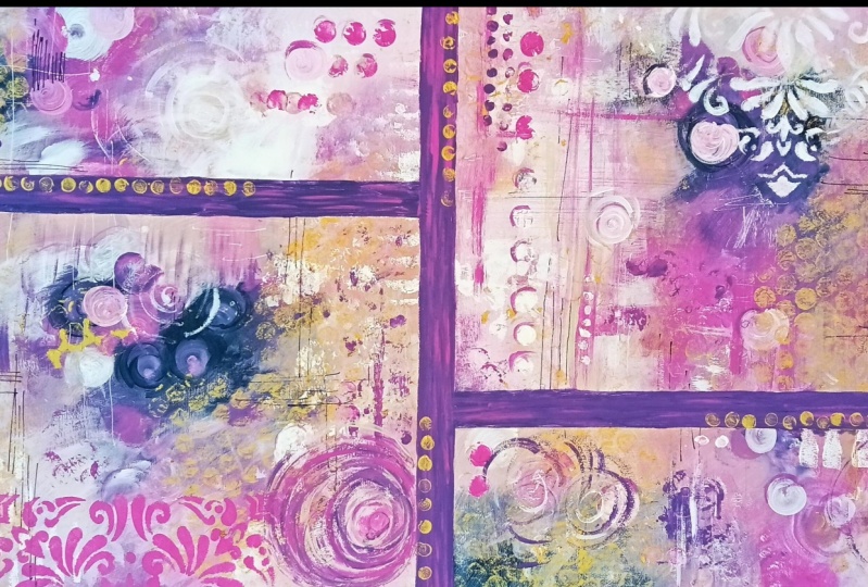
7. Finishing Touches: The collage that I put
over the edge of my type, is going to cause some
problems with removing it. But don't let that worry you. You can just cut it with a Stanley knife and it
will all be just fine. Just going to stick a bit in some areas where I
collaged over the edge. Little bit of a trim with
the knife and wear away. Much easier on the areas where I haven't gone over the
edge with the collage. [NOISE] Now I'm back to my
original drawing lines. I will cut them, and will have four
beautiful unique paintings, all closely related and
similar in color and texture, and they make a
fabulous collection. [NOISE] Here they are, my beautiful
individual paintings, and which one do
we like the best? [LAUGHTER] I think there is something really
beautiful about each one, and I loved the way they sit
together as a collection. Now, don't forget
if your type is sticking because you went
over it with your collage, just cut off with a knife
or a blade to trim it off. It may blow out in some
areas like debit tight, let that worry you. Don't get stressed
about things like that. It's beautiful, original art. It's not meant to be perfect. It's meant to be an
expression of creativity, color, and texture. If you get some little
[inaudible] along the way, it adds to the beauty and
intricacy of your artwork. Now you have four beautiful, individual, and
original artworks. Your options are quite endless. You can leave them as they are on this fabulous
watercolor paper, you could sell them
just like this, you could give them to a
friend or your family, you could even exhibit
in an exhibition. Now you can frame
these very easily. You can get frames
from office shops or department stores
quite inexpensively, open up the back,
put it in a frame, it look absolutely stunning. Any of these would work
well in the frame, or you could glue them onto Canvas and then you
don't need to frame it. You can just hang it
straight up on the wall. Options are quite endless, with what you can now do with
your beautiful collection. You can hang them
together with as a pair or even a triptych, three of them or you can hang them just individually
by themselves. I know very well
there so much you can do with your beautiful artworks. I really hope you
enjoyed making them, because now you have some fabulous original art in a series that make
a fabulous collection. What are you going
to do with them now?
8. Thank You: Thanks for joining
me in the class. I truly hope you enjoyed this fabulous
creative adventure. Don't forget to put a picture
in the project section. I would so love to
see what you created. I'd love to know what
color scheme you chose and how you texted
your beautiful layers. Are you going to finish
your paintings with a frame or put them on Canvas? I know, there's so many choices [LAUGHTER] Have a look at my
other classes on Skillshare. I have topics on jelly
printing and collage making. I know you would really enjoy
these other techniques. You can also connect with me
on Facebook and Instagram, and you can find out more
information on my website. There's some free prints to access, some digital downloads. There's always
something happening. Go on and have a look. I know that you're going to be really pleased that you did. Come and have a chat with me in my private Facebook group. I would love to see
what you're creating. I hope to see you again
next time in the studio.
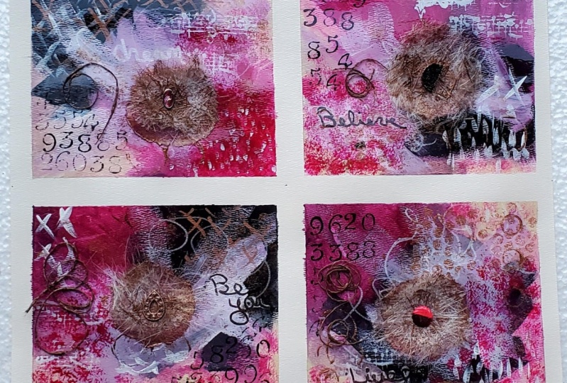
9. Bonus Lesson: Let's Try This in Blue!: I just thought I would do this extra bonus lesson for fun because I love this class. I had so much fun
making this class, and making the glorious
little paintings that I wanted to do it again in a different color scheme just to show you that
anything is possible. I've chosen some blues
and a turquoise, or probably used some of the
bronze for the highlight, and I might even add this
lovely blue gray color. These are the paint and I'm going to do the same approach. I'm going to paint on my
beautiful watercolor paper, which is all taped
and ready to go, and then I'll do some mark making and lastly some collage. I've got the cobalt blue hue, ultra marine blue,
the phthalo green. My darker shade is going to be the Payne's gray,
which is that one. These colors are still all wet. I only just watch them. They will dry a little darker. That almost looks
black, but it's not, and when it mixes with the other colors,
it looks fabulous. I'm loving this new
blue gray color, so I might put a
bit of that in it. Of course we need some white. Just to add a little bling, I've got some bronze. I'm going to start
with the painting and then we're going to move
on to the other layers. Let's start with the
beautiful cobalt blue color. Because look how glorious it is. I just love it. Putting it in
different shapes on all of the four pieces, and then I think I'll add some
of the blue gray color and see how that changes
the tone of the blues. Loving that, loving it. [LAUGHTER] This first layer is really all about getting the
paint on the paper, getting past the
fear of starting, and just getting
yourself moving. You can definitely
change things around. Once this layer is dry, it's really easy to
change the composition or the shapes of your
colors because you'll be able to paint
right on top of them. I'm thinking I could just
use a little bit more white before I let it dry. It's really hard to
stop at this stage. [LAUGHTER]. If you've
had trouble stopping, just know so do I. [LAUGHTER] I just want
to keep painting but, then you just keep painting round and round covering it up. Man, it's tough. [LAUGHTER] Anyway, I'm going to add a
little bit of white and then this is me backing
away from the paper. [LAUGHTER] I think
I'll leave that one. I like the blend of it. This one's okay. Maybe we'll add a little bit of light tone over this side. Then I think that
one's all right. This one's looking good. It's got some great movement. Let's let it dry, and then I'll be very excited. Put the next stage on
with the mark-making. I'm thinking we're
probably 95 percent dry. [LAUGHTER] Most of it is dry. We can't wait any longer. I think what I really want to do first of all is use
my Payne's gray, which is my darkest color, and put on some of
these fabulous cross looking shapes
with this stencil. Now, they may or may not
still be here buy the time I'm finished covering
the beautiful paper , and that's okay. It just gives us an idea
of somewhere way start, adding some shapes, and some mark-making doesn't have to stay exactly
the same way. Especially as you add
more and more colors, or more and more shapes or
textures to your paintings. Things change over time. That's part of the process. It's the creative application of intuitive painting and
working it as you go along. I absolutely love it. It's my favorite way of
creating a painting. It's not sticking too bad. [LAUGHTER] The thing is
it's 95 percent dry. [LAUGHTER] That's a good
start to my mark-making. I have this Posca pen
this time it's got a really fat chisel on the end. I'm thinking last time I did some scribbles which
I really enjoyed doing. It was so much fun. This time, I'm just going
to make some shapes with this fabulous chisel tip on any of the areas that
are actually dry. [LAUGHTER] I'm thinking
maybe here, oh, yes. Next I'm going to
add some shapes with this fabulous foam stamp. Again, really easy to add. I'm adding it in my
beautiful bronze color. Yes [LAUGHTER] that
just makes me so happy. This color works really well
with these beautiful blues. Using a firm stamp is so simple. Of course, I can't go past
my favorite circle maker. I'm thinking this would look
great in the cobalt blue. Oh, man, look at that color. That is just beautiful. Let's add a few of
these on the paper. With each layer we add, it just gets a little bit
more and more interesting. That's a fabulous layer of mark making on a
beautiful paintings. I think I'll let that dry, and while that's drying, I'm going to go and have a
rummage through my script box and see what I might want to
add in some collage pieces. What I love about
using my scrap bag for collage is you'll find amazing pieces from
the ends of things. Like this piece here, which is the end of a stencil or a stamp or jelly
print or something. I've got all sorts of
bits and pieces that I've pulled out on my
scrap bag and my box. That's going to suit the style and color of these
glorious paintings here. Well, yes, I did get carried away with the collage
layer of this. I was just having
such a good time, just loved all the textures. I'm feeling very textural today. All of these fibers
and beautiful texture, papers are just making me happy. What can you do? You've
got to go with the flow. Now, I put these bronze
circles on here. That one is the iridescent
gold, bronze fine. That looked really good
and it was on the paper, but I didn't like the
paper tissue on the black, so I've just put them in with
my favorite circle maker. Look how good that looks. [LAUGHTER] You know I'm going to want to do
some more, don't you? It's not hard to add the same patterns and textures on top of the collage elements, and it's a whole lot of fun. Don't worry about
getting too carried away or going too
far because you can keep changing it as you add the layers and it gives
the painting more history, more volume, and more
interests if you do add too much and you have
to go through again. [LAUGHTER] Don't let
that stress you. I'm pretty happy with
how it's looking. I need to let it dry, but I think I might
stamp some circles in the centers of these
beautiful papers. I think that'll be like
the finishing touch. Beautiful, I love it. I have to do that again. Onto the smaller
one on this one. Just love them. Love it. What do you think about my
blue and turquoise paintings? Aren't they fabulous? Yes, I did get a little
carried away with the collage, and I did have to
cut with a knife around the edge to get the
tape off because like I said, if you go over the edge
with your collage, you will have to cut the tape off afterwards,
but that's okay. They look all right,
and they would look absolutely stunning in a frame. I'm really happy with
this color scheme. They've turned out beautiful. I just felt like that fibers paper yesterday and I love the multiple layers. Which of the colors schemes
do you like better? This color scheme that the bonus episode or the
previous color scheme? I don't know, man.
[LAUGHTER] I like them both. I think they would
frame out really beautifully and we
might even do that. Can I have another like
bonus, bonus lesson? [LAUGHTER] I'm thinking so. This was so much
fun creating these. I really enjoyed it. I hope you enjoyed watching this bonus episode and I'd love to see what
you're creating, so make sure you
post your project in the project section and show me what color scheme
you're using.
 Froyle Davies, Mixed Media Artist