Transcripts
1. Introduction: Abstract expressionism is an exciting style
of creating art. It's about painting intuitively
from the inside out. From the core of who
you are as a person. And this expression gives us an opportunity for real
creative development. Welcome to the studio. It's Froyle here, and I've been painting for over 30 years, and I'm incredibly passionate about developing
your creativity, about drawing you into a
space where you can find your creative voice through mixed media and
collage techniques. Welcome to class
12 of 100 Days of Collage abstract
expressionism in collage. In this class,
we're stepping into a more intuitive and
expressive way of creating. We're exploring abstraction
through movement, line, color, and mark making,
allowing the artwork to unfold without needing
a fixed plan or outcome. Over the next seven lessons, you'll be guided through
seven creative prompts, each one designed
to help you loosen control and trust your
creative instincts. We'll be working with
jelly printing, collage, bold gestural marks, layered color and
experimental techniques. Not to create anything
representational, but to explore how
energy, rhythm, and structure can emerge
through the creative process. This class is very much about
process over perfectionism. It's about letting go, taking risks and allowing
the materials to guide you. You might even find yourself working in ways that
are unfamiliar, and that's where
the magic happens. Whether you're just beginning your creative journey or you've been making
art for years, you'll find plenty here to
inspire and encourage you. I'll be guiding you
every step of the way, showing you the
exact materials I'm using and how you can
create the same results. This class is perfect
for beginners. And if you're a
little more advanced, I know you're going
to really enjoy how this class is going to deepen and stretch your
creative expression. This is part of my ongoing
100 days of collage. It has been an epic
journey of self discovery. We're working in an
art journal style that allows for
personal expression, creative play while you're
learning technical skills. So much freedom to create, and by the end of the class, you'll have a series of abstract art journal pages and a deeper confidence
trusting your marks, your instincts, and
your creative voice. I know you're going
to love this. It's one of my absolutely
favorite creative art styles. There's so much fun and
so much to explore. So let's gather our materials, and let's make art.
2. Material List: Class 12 materialist,
how very exciting. Now, you're going to hear me
mention this a few times. I absolutely love
this creative style. It's definitely my favorite. So we're going to do a
lot of experimenting, a lot of mark making. We're going to be making a lot
of papers for our collage, and it's so very exciting. Of course, we're going
to use the gel plate. Now, that goes without
saying it's one of my favorite techniques for creating a beautiful
collage paper. It's so endless.
Endless possibilities. We're also going
to be creating on some mixed media paper that doesn't require
the gel plate. So if you don't
have a gel plate or you don't want to
use it, don't worry. There's going to be
plenty of lessons and exercises and experiments for just working on paper as well. Now I'm going to be using quite a few different
types of acrylic paint. I've got my favorite
liquitex basics. I also have the
golden fluid paint that I absolutely love. I'm using some of the
beautiful little median tubes because the colors
are so extensive. I've also pulled out the other medium paints in
the soft body because they have this fabulous
nozzle and they're amazing for scribbling
with on the paper. Now, remember, most important
part of this video, you don't have to use all of the materials that I'm
using in this class. This isn't a shopping list. This is a guide to inspire you. I want you to pull
out of your cupboard all the things that you've got that you want to work with. We want to use some
pencils and some markers. Ooh, I've got some of the
fabulous poska paint markers. I also have some
other poska markers. So you might have
a different brand or a different kind of markers. Pull them out of your cupboard. We're going to have
so much fun painting and scribbling with
these markers. You should already have a
ton of these art supplies, all the different brands
that you like to use. I've also pulled out
some watercolors. You can use any brand, and, of course, use the colors
that you like the best. I've got some of the
fabulous gelatos. I've used these for
quite a few classes now. Building up all of these
fabulous resources and art supplies means we can
keep using them each time. I've got some of my
favorite acrylic inks, and I'm drawing with
this with the dropper. Oh, wait till you see that. It turns out amazing. I just loved it. I'm also using some high flow. Oh, maybe that wasn't
on the list last time. Very highly pigmented. Again, it's the fabulous
little nozzle that I like to use to create marks
and lines and textures. And perhaps the clear tar gel. That probably wasn't
on the list last time, although I think last time we might have used
a glass bead gel. So wait till you see what we do with this fabulous medium. I'm using just a tiny bit of my favorite deco foil with
the mixed and paste relief, a tiny bit, but you should already have
some from last time. And, of course, we're using
fabulous tools and textures, all of the basics that
we need some baby wipes, some licritex mat gel medium if you're using this adhesive and we're going to be doing
some unconventional mark making with all
sorts of free supplies, paper packaging, things from
the cheap dollar store. Have a good rummage through
your cupboard and pull out your favorite texture making tools that you know and love,
have a look at this one. Super easy and super cheap. But I'll tell you a secret, this is my favorite of all the tools I've
used in this class. This particular piece of foam
is my absolute favorite. Car'twait to show you
what I do with this. Don't forget you
want to pull out some scraps from your scrap bag, get a few different papers, maybe some Coso paper. I love the so paper. And I'm going to
start the class by showing you a couple
of my favorite books. We're going to be talking
about abstract expressionism. The glory and the joy
of expressive painting. And don't forget
your art journal, if that's what you're using. I'm using an art journal to put all of my
beautiful collages in for this whole class because then I have
a treasure trove. I absolutely love it of beautiful experiments
and papers and textures, and I can look back and remember which ones I
really liked the most, which ones worked well, and then I can repeat them
again down the track. I love having them all together. In an art journal like this, but you don't have to
use an art journal. You might want to
use separate papers. You might want to
collate them together. You might want to make your own. That would be
amazing. This class really is about you
developing your creativity. So make sure you pull out
your colors or your textures and just be inspired by the prompts and see where
the creativity takes you. You don't have to create the lessons like
I'm showing you. They're just a springboard,
an inspiration. You to get going on your
path of creative expression, especially for abstract
expressionism. There really isn't too
much we can't do or try. I know you're gonna
love this class. I absolutely enjoyed every
minute of putting it together. Now don't forget you
will find a full list of all of the art supplies and materials in your class notes. You'll also find a
description of the class, some things to think
about to help you with your inspiration and
your creative expression. Right. So go and grab all of your fabulous art supplies,
pull them all out. I'm so excited. And let's get moving.
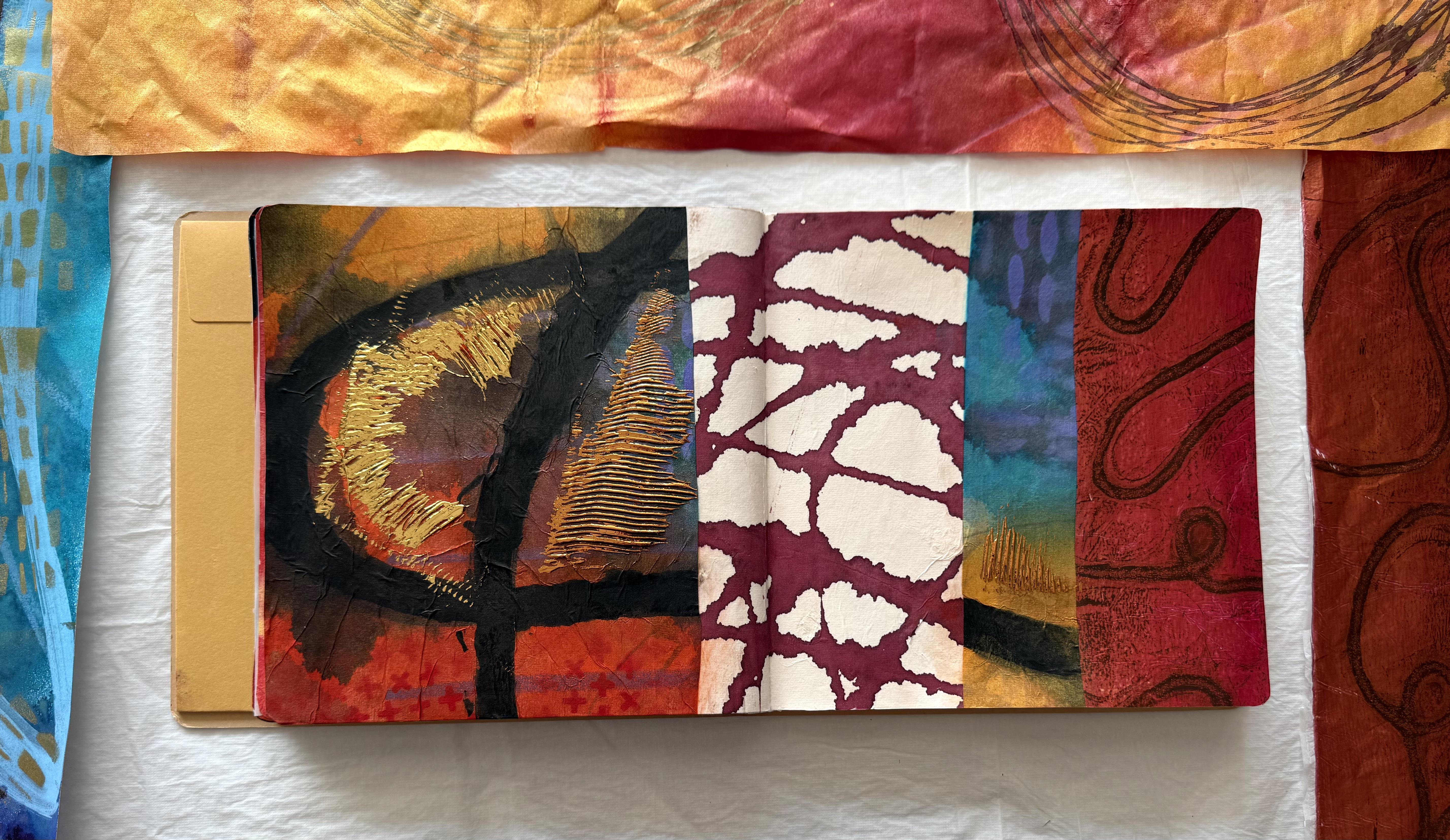
3. Day 78: Line First, Everything Else Later: Welcome to class 12 Abstract
Expressionism in Collage. I'm so excited for this class because
abstract expressionism is my absolutely most
favorite art movement and art style of painting. Collage does a feature
into this style, although not as much as
the painting application. But what we're going to do
in this class is create a whole heap of papers,
textured, beautiful, unique and original papers
that we can then create our own collages
with inspired by the fabulous styles of
abstract expressionism. Can you tell I'm
a little excited? Now I've got two art
books here that I want to share with you on
abstract expressionism, and I'm going to show you
a few fabulous paintings. Abstract expressionism is
the term used to describe the art movement developed in the late 1940s and
early 50s in New York. This phrase was not coined by the artists because true to
the artistic temperament, they themselves did not all
agree on their theories of modern art and definitely
did not want to be labeled. The title first appeared in a review for the New Yorker by Robert Coates to
describe the artists who made up the New York school
and were exhibiting together. Painters, such as
Jackson Pollock and William De Coning
were referred to as action painters
because they worked in a spontaneous and
improvisory manner, deploying rapid gestural marks. While Mark Roscoe and Clifford still relied on simple
compositions with large flat areas of
color to represent a more contemplative or
meditational response. This style became known
as colour field painting. The abstract expressionism did
not have one uniform style or paint application or
even follow a similar path, but they did all
ascribe to the idea of creating abstract art from
one's emotional expression. They were inspired by
the surrealist idea that art should come from
an unconscious mind. It's about finding
the connection within the human spirit. So we're going to be
exploring a few of the different styles
from the painters. Now, 1940s and 50s, it wasn't great for the
women artists at the time. So I have this women of
expressionism book as well because they were
kind of relegated to the wives of the
famous painters, even though the women themselves were
absolutely fabulous, stunning painters
in their own right. It was always a little
bit of an uphill battle. For our fabulous women artists. Look at the glorious colours
and the painterly style. Yes, we're going to be experimenting with some
of these techniques. Oh, have a look at this one. Have a look at
these lines because our first prompt for day 78, we're going to be
looking at line work. So, have a look at how the fabulous painters and the artists use line
in their composition. I think these are all
fabulous examples. Splattering, yes, we're going to have to do a little
bit of that and a little bit of soaking the
colors into our substrate. Definitely some thick
gestural marks. I Oh, I know I'm going to be a little bit excited with
this class the whole time, and I'm probably going to
make a heap of papers. So, oh, look at that. Have a look at that
line work there. Because day 78 begin with line as the foundation
of your collage. Using drawn, scratched,
painted or stamped marks, activate the surface first, then respond intuitively with color, collage, and texture. Let the lines guide
the composition and reveal the structure
beneath the abstraction. So that's going to be
our first prompt for day 78 of our hundred
Days of Collage. And we better get
started, I guess, even though I could
very much sit here with you looking through these
beautiful art books. Now, if you want
to have a look at these abstract
expressionism artists and these books that I have, I will put the link
in your class notes, the title and where I
purchased them on Amazon, if you want to have a look
at these even further. Now, Lee Krasner well, just mention this
before we move on. Lee Krasner fabulous story. I mentioned this story
in class number one. She was the wife of the
famous Jackson Pollock, and her exhibition where she presented her paintings
didn't do very well. It completely failed in sales. She was so disheartened
that she was in her studio and pulled some paintings down and
ripped them to shreds, threw them in the air, and
left the studio disgusted. It wasn't until she came back a few weeks later that
she walked in and saw all of these
beautiful pieces of shapes and colour
arranged on the floor. And she realized she
had an epiphany, how stunning they would
all work together, and that's how she
began creating collage. So some of her
works here are from the collage that
she's put together from ripped up pieces
of her paintings, and I think she put in a
couple of Jacksons, as well. So that is so fun. Don't get so discouraged
that you rip your papers to shreds,
but it might happen. And that's how we're going to create some of our
fabulous collages. We're going to make
numerous amounts of beautiful textured paper, and then tear some of them
and cut some of them, put them together to make
fabulous new artworks. Okay, okay. Oh, look at
the linework in this one. I just goes on and on. I'll stop now and I'll show you what I did with the
prompt of day 78. So I started by
pulling out a nice, beautiful, big piece
of Chinese rice paper. It's very absorbent, but what I like about it was
the large size because we're going to allow
ourselves to really express and use big sweeping movements
for our gestural marks. So I'm starting with graphite, which is just a pencil. I'm creating some
marks on my paper. But I pretty soon got
bored with the graphite, because I'm not really
a drawing type person. I find the graphite too hard and the gray color
a little boring. So very fast, I pulled
out the glatos. Now, I love these glatos. They're soft and buttery, and they have so many
beautiful colors. For what I want you to do
is notice when you start creating and drawing and
putting lines on your paper, what you're responding to, what do you like,
what do you not like. Because in this whole
process of celebrating your creative self through
our hundred days of collage, we're developing
your creativity. So it's about you finding
your own artistic voice. And for that to happen, you just need to
know who you are, what you like, what
you don't like, and how you want to express
that through your artwork. So learned very fast. I don't really like
drawing with pencils, and I did like the gelatos, but I moved on very quickly. I pulled out the giant
posca mappa paint pen, which is very lush, but it creates a really
nice thick line. I absolutely love these, and I straightaway intuitively did a curvy kind of a line. I took up the whole space of
the paper with this line, and I do think I really enjoyed that curve style more than the straight lines I had
previously drawn on them. Then I pulled out
the acrylic ink, and I was making lines with just dropper of the acrylic ink, not squirting it, but
just drawing with it. And I loved this line because it's on the
Chinese rice paper. It's soaked in straight away, and it's got all fuzzy edges. It's not hard and sharp. And that's when I thought, Hmm, I'm loving the this
looks on the paper. I might need to do it some more. Then I pulled out my
dilusion shimmer spray and sprayed in some different areas creating shapes on the paper. Because it's the rice paper, it sucked it up straight
away and spread that colour. Now, it's going to cause the acrylic ink lines to run
and the posca pen to blue, but I wanted to just
spray some shapes on. I could have waited
until the paper was dry. And once that layer was dry, I could have then put the paint spray on the top,
but I didn't wait. I I was already in
a creative frenzy, so I sprayed it all
on. It's all wet. It's all kind of
merging together, but you can still see those
drawing lines underneath. So then I moved that piece of paper off my table
onto the floor. Make sure you've
got lots of drying space and lots of
pieces of paper, so you can really try a
heap of different ideas and experiment with different
types of creating lines. How many can you try? What have you got pencils,
pens, markers, inks. Oh. The list really does go
on when you think about it. So the second piece of
paper I pulled out, I just used the acrylic ink and created lines with that on
the paper. I love this. I think I'm loving
this the best. I don't know why, but I
love the way it bleeds out. I like the shape
that the lines make. And I just left it alone because I loved
the paper so much. And that's what you need to think about when
you're creating. What do you really
like the most and lean into that and create
whole sheets of it. Really, it's a
very simple way to work out your creative
voice and to find Who you are as an artist, you just push into the
things that you love to do. So now I have two pieces of paper with lots of curvy lines. I decided the third time to use straight lines with the
gelatos Beautiful colors. I really do love these
'cause they're so soft. And I'm putting straight
lines on my paper, trying not to do
anything curvy and to see how I feel
about these lines. Well, I don't like it
as much as the curves. That's what I'm saying. Isn't that just so funny? Such a simple thing, creating a line and deciding what you
think about that line. So I cover the paper with
all sorts of straight lines. Trying to keep it all
together like that. And then I sprayed on
my shimmer sprays. I bought a new packet, so I'm very excited with the
shimmer sprays today and covered the beautiful
Chinese rice paper with the glorious colour. Now, the other thing
you need to think about as you're
creating these papers and experimenting
with your lines is what paper are you using? I've been using the
Chinese rice paper, which is a nice big size, but it's very absorbent. So it makes a different line on that soft absorbent paper than what it does on
a mixed media paper. So this piece is a
mixed media paper, and I'm starting
with the glatos. How differently do they
look on this harder, more condensed paper than
the soft fibrous rice paper? I don't think the glatos really made much
difference on this paper. They still run very smooth, very beautiful, great colours. And the posca moppa paint pen. Works fabulous just as well on this paper as it
did the other paper. Of course, I'm doing
another swirl line. What can I say? I just seem to
automatically do that. But it is really noticeable on this paper when I was
putting the ink lines on it, because, of course, they
didn't bleed out as much. They didn't create
those fuzzy edges and those beautiful
patterns that I really liked on the Chinese rice paper. It made more crisper lines, which is very logical because the paper is more
dense and thicker. So, have a look at the
paper that you're using, as well as what mediums
you're creating your lines with and
see what you prefer. Which ones do you like better? Do you like things to bleed? Do you like things to say crisp? Do you like curves? Do
you like straight lines? Our pursuit into abstract
expressionism is going to be about exploration
and experimentation, really digging into what you like and how
you want to create. So then I covered this piece with the spray ink,
and, of course, the spray inks don't soak in as much and as saturated as
they did on the rice paper. I sit more on top of this mixed media paper because it has a
slight coating on it. But I do still think
it looks pretty good. It's just different,
and I'm loving experimenting with
the different papers. Now, when the first piece of paper was completely
dry this time, I waited I added some more
lines with some stencils. There's another way to add
lines. What are we up to now? Graphite, gelatos, acrylic ink, dencils, so many ways to
create lines on your paper. And I finished it off by
going over that black line again with a thick
posca mop up paint pen. I really like that
black line on it. I think that looks
similar to some of those pictures
we were looking at. See, I'm already influenced. Now, the second piece of
paper, when it was dry, I pulled out the massive
big stamp that I have from the nested circles
from Pmrtist studio. Look at the size of
it. It's fantastic, and it's got the most amazing
lines on it to stamp with. So there's another way to
create lines on your paper. And the beautiful third piece of paper with the sunning
purple and blue, I added some gold also in
the fabulous spray paint. The liquitex is an
acrylic spray paint. We have used all of these art supplies before
in the previous classes. So you might have them already if you've gotten
them for other classes. I love them, and I love that I keep using the same materials. I haven't added anything new. Just some of my favorite ways to create marks on the paper. So now that the papers are dry, I could still add some more. That shimmer spray looks
pretty nice, don't you think? It's got a real
metallic shine to it. Dencils look great. It's kind of curled
up a little where the paint the thick paint line is because it is the rice paper. It's very thin and
very absorbent, but I do like so I'm
thinking about cutting a piece of this to start my
collage in the art journal, mainly a section
here where I get this lovely thick black
line because that very much reminds me of that abstract
expressionism style. And I could even add some more detail once I stick
it into my art journal. So that's a strong possibility. I do love the second
one, as well, and you can still see
the lines underneath, the straight lines
underneath from the gelatos and look
at the fabulous stamp. It's the biggest
stamp I've ever had. It actually comes in a
whole cluster of sizes. I love this one. I love
the line that it creates. So super, super easy to
create lines on your paper. That turned out
rather beautiful. But this is my favorite line of all the lines I did on
these papers is this one. The acrylic ink super
easy Chinese rice paper and acrylic ink dropper. I just drew with it. I didn't squirt it. I didn't spray it.
And there it is. I absolutely love this. Why am I obsessing over
this? I don't know. I just am. I really love the shape that it creates and the
line that it makes. So I'm thinking I might have to stick a piece of this in
my art journal to remind myself on how much I love it because that's
the beauty putting our collages into our
art journal is we can flick back and look
at it down the track, maybe six months,
maybe even next year, I might be looking at it and find this little piece in
the art journal and go, Yes. Yes. I love that. And then it might bounce off some inspiration to create a whole new series of paintings. Who knows what we might do? But I love this. I'm definitely
cutting a piece of that for my art journal. And then there's
the beautiful one with the blue and purple. I love this, too. That spray
paint works really well. See how it's got now. Little lines on the top there. And again, I could add more
to this if I wanted to. See, the lines of the ink don't bleed as much because
it's stronger, thicker, more condensed paper, whereas the rice paper is more fibrous, it's loose, it's
softer, more absorbent. And I'm loving this one. But of course, you know,
I couldn't stop there. We had to pull out
the gel plate. Now I've got my 16 by
20 inch gel elf plate, and I pulled out my
meten 100 colour pack because it's just got so many beautiful,
colorful options. And I'm just using a catalyst tool to scratch those marks into
the paint layer, putting on some paper, pulling it straight off. Tada tada. It looks absolutely beautiful. What a great way to create
lines and so super easy. Then I just rolled
on some more paint. I'm using Liquitex basics in
magenta and the deep violet. I'm putting the
catalyst tool on again, and then I've pulled out a silicon brush, I
think you call it. It's just got a nice
silicon tip on the end, and I'm running that
through to create a beautiful, free flowing line. Then I thought, What about
if I put something else on top of that free flowing line to create more of
a contrast shape. So I've poured out some
corrugated cardboard, and I'm putting
that on, as well. That's going to create
some strong straight lines against my fabulous free flowing scribble across the gel plate. So I'm using the
liquitex metallic bronze to pull this print, and I've put it on to
wet strength tissue. It's looking
absolutely fabulous. The colors are glorious, and you can see all the
different lines on the print. Now, my next brilliant idea was to pull out a ball of yarn. I decided I wanted to create a random flowing kind of pathway or one continuous
line on the gel plate, and I absolutely love how yarn looks when
you pull a print. So I've put down
some Mars brown from the fabulous meten 100 color and I've put on a fabulous yarn. Now, I've made a
continuous line with it, which I'm thinking is
going to look pretty fun. And then I'm putting on some
ordinary doll store tissue. What I want to do is pull up
the paint around the line of the yarn so that the white line will
be left on the print. Now, when I pulled up the print, I could see that I didn't really pull off enough
paint from the middle. I think I got a little nervous because it was
doll store tissue, and sometimes when
you leave that on the plate too long,
it just tears. So I didn't really pull off enough
from the middle section. I then tried to go back in and pull a little
bit extra off, but I didn't want to wreck the beautiful pattern
that I had on there. So I thought, Oh, well, we'll just take the print
and see how it looks. So I rolled on some
magenta and some bronze, although the magenta
was a little thick. I did get a little heavy handed, and I didn't quite leave
it long enough to dry. Yeah. It did stick a little bit when I was pulling up the print. But, oh, well, it
doesn't matter too much because we're ripping
it up for collage, anyway. So with the print that I had left with the line
from the yarn, I did get a little carried
away with my shim sprays. I don't know what I
was thinking, really. I just got carried away with it. May. What can I say?
I've got no excuse. I was just going a bit crazy
with my shimmers bras. Look how shimmery pink it is. I did put some gold on it
and some red, as well, but look how
fabulous the line is that continuous line from
just a ball of yarn. Really super easy. You have to try this one. It's so much fun and so easy. I love this print. Look at the line there. It looks like an aerial shot
of a road, don't you think? I really like this one, and I really like
using the yarn. So I think I want to
put some of this into my collage again so I remember how much I
love this technique. It did stick on the plate
'cause it was too much paint. And I didn't wait long enough, but not to worry. I'm only going to pull a
piece out of it anyway. So this one looks great as
well with those lines from the catalyst tool and
the silicon brush there and putting the
corrugated cardboard on there. So I hope this has given you a whole heap of ideas to think about when you're creating your lines on your paper
for your fabulous collage. There's so many
ways you can create lines with pencils and pens and markers and acrylic
ink and stencils and stamps and catalyst tool and a silicon brush and yarn. So many ways to create lines. Now, do you like them straight? Do you like them curved? I love. What I love about this one is
the continuous line. Do you like that? Or do you
like short straight line. So, ask yourself that as
you're creating your papers, and you'll be on the
way to working out exactly what your artistic
voice looks like. Right, so I'm going to
pull out the art journal. I'm going to decide which
ones I'm going to put in. I definitely want pieces of some of them to remind
myself of the techniques and maybe some of the other ones just because they're a beautiful
splash of color. Well, that was a
really tough decision. That's the problem when you make so many beautiful papers. Trying to put them into a very small art journal
is a bit of a challenge. Now, I did decide on these pieces because I
really wanted to have that ink line on there to remind myself how
much I love that look, and I really love the yarn. This continuous line here
loved that, as well. This looks very abstract
expressionism to me. So I had to put it in and a little piece
coming across there. Now, I'm not sure, really, if I've actually
finished. It still does
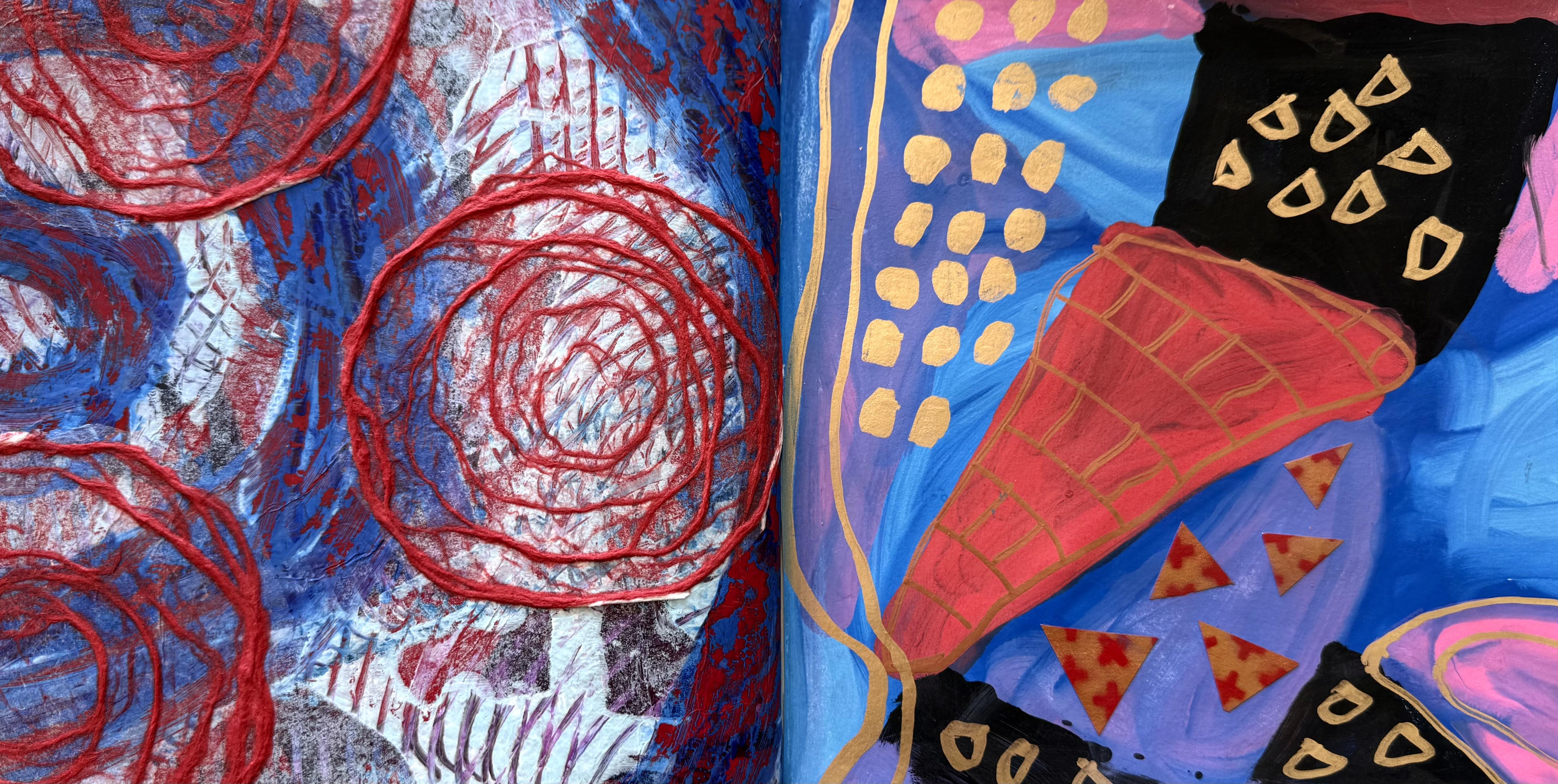
4. Day 79: Designing with Dynamic Energy: Day 79 designing
with dynamic energy. This is going to be so much fun. Design a collage that
captures the sense of movement and energy found
in abstract expressionism. Use bold gestural marks and
vibrant colors to create a composition that radiates a spontaneous and lively spirit. Look out, baby. We're gonna
be busting a move today. Right, dynamic energy
sounds like so much fun. And I'm starting with the
Kenston mixed media paper. That's what I'm going to begin with for this fabulous lesson. And then we'll probably
move on to the gel plate. But first of all, let's pull out a nice big piece of paper, get some paint happening, and have a whole lot of fun. A, so I'm pulled out this
pack of Amsterdam paints. I bought this
recently from Amazon. And what I like about it is the 24 Tubes of glorious color. Have a look at that. That's like my med and 100 colour pack. They're small tubes, but they're absolutely
beautiful colors. So I'm going to start with bees. Of course, I do have a tendency to go straight
for the warm colors. Now, this is what I'm
using for my mark making. This is packaging. It came in a box of something. Like, no chance of remembering
what it came with. I'm going with my favorite
permanent red violet. And what I'm thinking is, what about if I just put some of these beautiful colours on the paper and then
smooge them with this. Basically, I'm going to paint with this.
Is that possible? I don't know, but we're
going to give it a try, and I'm going to use some of these fabulous stunning colors. I have no idea if this
idea is going to work. In fact, I can honestly say, I've never done this before, but I'm figuring that it
can only not work, right? How's that for dynamic color? I'm lobbing this. These
little tubes are a bit cute. I mean, they're not very big, but I like the way they come
in those color palettes. Alright, what do you
think? What do you think? What do you think? Let's
start with this side. I'm thinking. And
we're going for. That's We're going
for dynamic energy. Oh. Oh, you have to try this. It's absolutely so therapeutic. You can use that side
of it, so it's a thin. Or I could use the edge
there. That could work. Oh, look, look at that line. I'm loving it.
Loving it already. And then I'm thinking
that you could even use the fat side if you wanted to
get a broad stroke. But oh, all the different lines that it makes are
just beautiful. Oh, you could do
that. Right, you're gonna have to pull
out some packaging. Next time you see a bit of foam arrive at your place
'cause you've bought something, make sure you keep it, pull it out because it's going to be an absolutely
fabulous tool for creating amazing abstract
expressionism paintings. There we go. Look at
that. I'm loving it. Now, that's going to take 2
seconds to fill up my paper. And we're already done. I might do another one with those beautiful
blues and purples. I think I'll fill up
the background of this, and then I might put
another layer on. And then I think I'm going to let this dry and then perhaps put some of those lines that we were doing yesterday.
I like that idea. Oh, this is fabulous. What a great tool this is. Who would have thought maybe a little bit of this on there. And then I think, I'll
let this paper dry because I like the idea of adding some layers
or some lines. In fact, I think
I'll go and have a look at what could
create some lines, osis on this fabulous
piece of paper. Well, that was Oh,
a whole lot of fun. Look at that. Oh,
I like that, too. That's pretty dynamic.
Dynamic energy. I'm feeling it. Right.
We need some lines now. Now, that was a pretty
fast and fun way to fill up the paper. So this time I'm going
to put some blues on. Now, I have found that when you're experimenting
with a new idea or a new product or paints or a new application or
you're playing around, it's much easier
to do something in cool colors and warm
colors separately, so you don't end up with a
whole big mess on your page. That's just what I find really works well because then
you can freely just play and experiment with what you're playing with like a piece of foam and you don't
have to stress so much. About how it's going to
work with the colors if all the colors are harmonious and are going to work together like these ones, they're all beautiful
cool colors. This is a different
way of putting it on. I really like this, too. The other line I was using
was very curvy. Of course. We all know I like curvy. So this time, I'm going, Oh, I'm liking this piece
of foam. This is fun. This is This is really fun. Alright, that didn't take very long to cover that
piece of paper. So I'm going to leave this
once I finish playing again, and then when it's dry, I'm going to add some lines or some marks or some other hoops, stuck it in the paint or
some other application onto the paper once this
base layer coat is dry. That's the plan. Stan, that's
what we're going to do. Let's see how much
more fun we can have. Yes, I'm liking the foam tall. That worked very well. Look at those beautiful colors. It's hard to stop, really,
because you're just. You just want to keep doing it. Alright. I'll let it dry. Then once your base
coat is mostly dry, it's not entirely dry, so I probably couldn't
use a pen on it, but it's mostly dry, so I could use more dramatic
contrast of colour. This is a oh man. Now, that's dynamic dynamic
energy right there. This is a meat and soft body, what I like about it is
the fabulous nozzle, of course, because you can
make fabulous scribbly opsies, scribbly lines on it. Super super easy.
And look at that. Contrast of colour
now works fabulous. So if you're finding your colors are getting a
little muddy, try this. Try doing cool and
warm separately. Wait for it to dry and then add some more contrast to
your paper or your page. Then things don't get so muddied
up. That looks fabulous. But we need a bit of glips
and glamour, don't we? Oh, what about a
little bit of orange? Let's add just a little bit. Oh, highlight, highlighting
our dynamic energy colors. That looks pretty nice. Perhaps a little gold, little bling with the
golden high flow, which also should come
out in a nice line. Yes, it does. It does. Absolutely fabulous. This line is a bit fatter, but it's still a
line, and loving it. Look at that for my dynamic
energy. I'm feeling it. Now, this one is a
little more damp than the blue one because I
put on a lot thicker paint. So it's still patchy in places where it's
wet, but that's okay. We can still do
something with it because we wouldn't want
to have to wait now, would we for it to dry. I'm using a burnt sienna
in the high flow, and I'm still going with those fabulous
dynamic energy marks that we've got going on here. Putting that on, and then what about if we just create some? Oh, that's fun. I've just got a normal comb in the $2 store. I bought a packet of them, and I used them for
quite a few textures, especially with the deco foil. I love using it like yesterday with the deco foil.
That was fun. But it just creates
a different mark, a different texture.
That's okay. I'm not minding that at all. And it's a whole lot of fun. Let's add some bling to that. We've got some of the deep
gold of the high flow. Oh, yeah, baby.
Well, we might spray this We may get a
little carried away. Let's add a little bit
of water onto that. Get that flowing a little, get that moving around. Then I've got some of
the meat and soft body. We'll add a little bit
of orange to that. Got a catalyst tour. Have a little bit of a
scratch into the paint. And just allow yourself to create freely
without expectation, without worrying about what
it's gonna look like without stressing about if it's going to work and see what develops. Look at each particular color you put on or mark
you put on and think, do I like that? Do
I not like that? I really like this.
This is a catalyst one. And look at the marks it's making through the thick paint. I like that. I like
the orange with it. I'm liking the other colors of the burnt sienna
and the gold. I think I just might add
something deep to the edges. And that's how you continue
to develop your creativity, allowing yourself to
just create freely, especially with
abstract expressionism. That's what it's all about. You don't have to use the
same colors that I'm using. Use whatever you have
in your cupboard. I'm adding a little bit of muted violet onto the
edges just to deepen it. Oh, that's a bit deep. Oh, well, it'll be alright. It was a bit deeper than
I thought I was gonna be. But that'll be just fine. Oh, what about some
powdered pigment? Oh, baby. And that's
how we do it. One idea leads to the next idea. Then when you bottle is empty, fill it with water and
squirt that on, as well. It makes great texture. Fabulous marks, and you get to use up all of that
fabulous pigment. Right. Now that I've completely
saturated this piece, I think I will put it on
the floor and to let dry. And I'm gonna pull
out the gel plate, and let's see what we can create with these ideas
on the gel plate. What about if I use that piece of foam on the gel plate?
That could be fun. Because there's so much water
on the paper, I'm thinking, What about just a little bit of powdered pigment to add some more texture?
Just like that. Oh, I love the way it spreads
out once it hits the water. I do get a little carried away. I know. Put it
away, put it away. Right, ho. Let's pull out the gel
plate. Yes, I know. I did get carried away, but the paper did
dry eventually, and I'm really impressed at how well this mixed media paper does stand up with all of my loving and my layers of paint and
extravagance and water. There was a lot of
water on this paper. Man, look how beautiful it is, and you can see
the glorious shine of the powdered pigment that I threw on at the last minute. Onto the surface here, it is rather a glorious
look, rather glamorous. Now, what I love about this
piece in my dynamic energy is the fabulous thickness of using that catalyst tool and the
ridges in the paperwork. I really like that, and the colors are beautiful.
It worked really well. This is fabulous. I would
definitely be happy to use this for the beginning
of one of my collages, but we're going to have so
many prints to choose from. Look at this one.
It's not as thick, it's not as covered, but it's stunning
in its coloring. Now we've got that fabulous
blue background painted with my new favorite
painting tool. Of foam. Don't forget paper packaging
is your best friend. And these fabulous meat and soft body paints,
I love the nozzle. Also, if you've got
something like this, even if it's not this brand or whatever, and it empties out, you can fill it up with other
paint and reuse the bottle because the bottles so
useful and the tip of it, the nozzle is so great
for creating lines. So that's another good idea. I'll be doing that for sure. These red and orange
lines and the gold sitting on top of the blue
just absolutely come alive. They just sing. Dah. I screams abstract
expressionism. Now you can tell this is
my favorite art style. I'm gonna love this
glass so much. Now, this is looking
absolutely beautiful. And remember, I said, if you put the blue background
first and let it dry, then put the contrasting
colors on top, it works a lot better. The colored dot merge together then and it
doesn't get or muddy. They sit on top. They sing. They look amazing, and I
love this piece as well. So, of course, I had to
pull out the gel plate. It'd just be wrong not to. Right. So I've got my 16 by 20 inch gel elf plate because it's abstract
expressionism. We couldn't use a small plate. I've got my fabulous
little tubes of paint, and I curious piece of foam, which is today my
favorite painting tool. And I've pulled out some posca
pens because what I think I might do is how about by just, Oh, yeah, put some lines
on the plate first because we are designing
with dynamic energy. Why do I keep doing
the same thing? Oh, man, I'm going
to go this way. I just did the same line that I did on the pieces of paper. You can't do the same same
same. That would be no good. So I'm going to try
and make myself go back this way because
I tend to do that. So, that's really interesting. You need to pay attention
to what you naturally do and think about it and maybe do something a little
bit different. So I'm going to try
and go that way with the lines instead of the same one that I
tend to do each time. So we'll see if
any of these lines are still left on the plate
after we pull a print. Not sure if they will be, although they would have more
chance of being there if I was to let them dry before I
start rolling the paint on. But, you know, oh, man. I'm not overly great
with letting things dry. Maybe I'll give it a
couple of minutes. Oh, that's pretty nice. I like that. Some
dynamic energy lines on the plate to start. The print turned out
absolutely fabulous. Now, I poured all
of those beautiful, glorious colors, the
violets and the gold, and a couple of the
other colors from my fabulous little packs and put them on
with my favorite. Painting tool, and it worked really well
on the gel plate. It worked as well as it did
on the paper. I'm loving it. Now, when the layers were dry that I added
with the paint, I rolled on the
iridescent bronze fine, and I pulled the print
with wet streak tissue. I wasn't sure if
you were going to really see the Poskapens, but you can see them
a little bit there. On the surface of the print, you can see the scribbly marks, and I really think
they look great. I'm glad I put them there. But what I really love is
the actual scratch marks. I call them scratch marks because it kind of
looks like that. The pattern from this
particular tool, going like this on the gel plate with
the paint I love it. It's a new favorite.
What can I say? I know. I keep raving about it, but I really do love it. I think the print
turned out beautiful. And that's the fun
with experimenting. And that's the fun of
doing this fabulous class. We get to really try things
we wouldn't normally do using different tools you wouldn't normally grab for
and trying different ideas. You've got nothing to lose. Make sure you have a great time exploring and experimenting, especially in this class with our abstract expressionism
theme, because really, art is anything you
can get away with baby I'm telling
you, it really is. Have a great fun time
trying different layers, different paint colors,
different tools, and see what your prints turn
out like. I'm loving this. I love the technique of it. I like the layering of it. I think it's very successful. I'm very happy with it. And then, of course, I had to try something
completely different. I started with the cobalt
teal on the gel plate, put a good layer of that on. And then I picked up the fabulous fluid,
soft body bottle. And I couldn't help myself. I had to scribble
across the plate. Now, I have no intention of waiting for that
paint layer to dry. So I pulled out this
piece of paper, which is one of the new pieces of paper I
was experimenting with. I bought it on Amazon. It's said tea bag paper, but it really is more like
a wet strength tissue, and put it straight
down onto the plate, pulling a print while
it's still wet. I absolutely love it. I had so much fun doing this. Of course, there's an absolute
ton of paint on the plate. So I picked up another piece of paper and put that
straight down, as well, and pulled that off. It's still got a heap of
paint left on the plate. So then I waited for
that paint to dry. But while I was waiting, I decided to fill in some of the shapes with
the posca pens. I thought it might add a
little bit of contrast, a little bit of color, and it's a great way to create shapes. Then I rolled on
iridescent silver, and I pulled this print with
the wet strength tissue. This time, I had
turned the plate over and pulled the plate
off the paper because I just found that pulling it off this way makes it tear
just a little bit less, especially if the
print is slightly wet, which is very possible because I don't like waiting
long amounts of time. And I couldn't leave it alone. I had to add a little
bit more scribble. So what I really love
about the first print was the swooshing motion
of when you pull off the paper Whip like that. You get this swishing
motion of the paint. I love it. Very
abstract expressionism, I must say we're creating paintings with our
gel plate now. I love that. And then the second one pulls off
a lot more of the paint, and it's quite beautiful and very textured.
It's a lot softer. It's got less paint on
it. But it's beautiful. I'm really liking the lins and the paint was beating
up from the background. I really like this, too. And then the third print
three for one, baby. Now, the posca pen didn't really work on the plate as much
as I would have liked, but you can see where
it is there. It's okay. I'm just not enraptured with it, but I do love my scribble
right across the top. That was with this one, the med and soft
body in vermilion. I really love this colour
and look how fabulous it looks against the
turquoise and the blue. Actually, it's quite a nice
paint when you look at it. It's got a nice mat to it, and it just works well
for this kind of thing. So there you go. We have
three different prints, three paintings
from the gel plate, and I'm thinking that there's aspects of them and sections of all of them that I
really like that would work well for a
base of the collage. So we have another option. But of course, I couldn't
stop there. I get it. I had to try it
just one more time, one more time with
my favorite colors. So I started with I think it was the magenta that I pulled out
of my little packet there, put that on the plate first, and then scribbled with
some white and some black. I just wanted that drama of the red base with
the black and white, put the paper on, pulled
it off straight away. It's looking pretty nice. But what I found was all of the lines stayed
really neat and clean, and I'm thinking, I
need to mess this up. We need to have a bit
more dynamic energy. We want a bit more
paint look to it. So I just rolled over it, messed it up a little, put the scribbles on again
and pulled another print. Loving this one? This
one looked fabulous. Of course, I did it again,
just one more time. 'cause there's so much
paint left on the plate. I just rolled it over, and then I put on the
wet strength tissue. This time, I pulled
off the gel plate from the paper again because it
was still a little damp. I didn't want it to tear, and I do find this
is the best way. Now, with this print, looking so dark and moody, I decided to pull one of the nested circles from my stamp set and put on some beautiful, circly lines with the Amsterdam in bronze is what that color is. And it looks stunning against those deep red violet shade. Now, I found it really
interesting that when I pulled this print and did the same
washing with the paper, it didn't really move the lines, and that's because the
lines are going in the same direction as
what the movement is, so it didn't really
cause much of that. Texture, like it
did on this print. I love this whing texture
on there from the paint. And really, it's all just
personal preference. I just happened to
like that look of the painterly aspect from
the gel plate. I know. This could lead me down a
whole different rabbit hole. Anyway, the first print it
looks so lovely and clean, which I like, and we could add some really nice pieces of
collage paper onto this. We could add some
circle shapes or some more straight
line shapes or some gold or some texture
or some coso paper. So many possibilities. But I did roll over it to blend in that background some more
threw the lines back on. And I think I like
this even more. Look how nice that painterly
quality is from the print. Oh, I might have to
use this one today. I'm not sure. I can't
decide I've got too many. And of course, the third one. You get three out of this idea. I put the fabulous
circles on from those nested circles stamps set, and they look great in the
beautiful Amsterdam bronze. So three different
prints entirely, but using one technique, rolling on some paint, making some scribbles, and pulling the
prints straight away. I love doing this. I'm gonna
have to do this again. I did get a little
excited about it. So, which piece am I gonna put in the art journal,
I don't know Man? It's gonna be a tough decision, and what am I going
to add to them? Ha, man, I should have got
a really big art journal. You know, what little
square one too small. Anyway, I'll go and
pull it out and then decide which ones I just
can't live without. It's a pretty tough
decision because I do like parts of most
of the prints. Well, all of the
prints, actually. There's great sections
to all of them. So it's just a matter of what I feel like putting in
the art journal today. I really love this one
with its dynamic colors. I think that worked really well. I could put a section
just like that. Would be fabulous.
I love that piece. I would stick that
in right there. So that is definitely
a possibility. I do love the red
one, of course. I could stick a section of
that in just like that. And I might add
something on there. I do like the way I've put the bronze or
circles on this one, so I could perhaps do
smaller ones on there. That is definitely
a possibility. But then I also like
this one, as well. I mean, I love the
whooshing, the whing action. And that's definitely
dynamic energy. So I might even put that piece
on there just like that. And I don't even know if I'd
add any extra bits to it because I love that painterly
application and style. We're painting with
the gel plate. I think this is a new step
in a direction for me. You know what's gonna
happen. I could go crazy. I love that idea, and
I love that idea, but I also love this
section as well. So I'm going to
decide, eventually, I'm going to glue
them down and then think about if I'm going
to add anything else. I could add something. I could add some kind of
dramatic contrast to that. And maybe some gold or
bronze onto that one. That could look really nice, too. So decisions decisions. So what do you think
about my pages? Did I make right decisions? There were so many
to choose from. And then I wanted to add
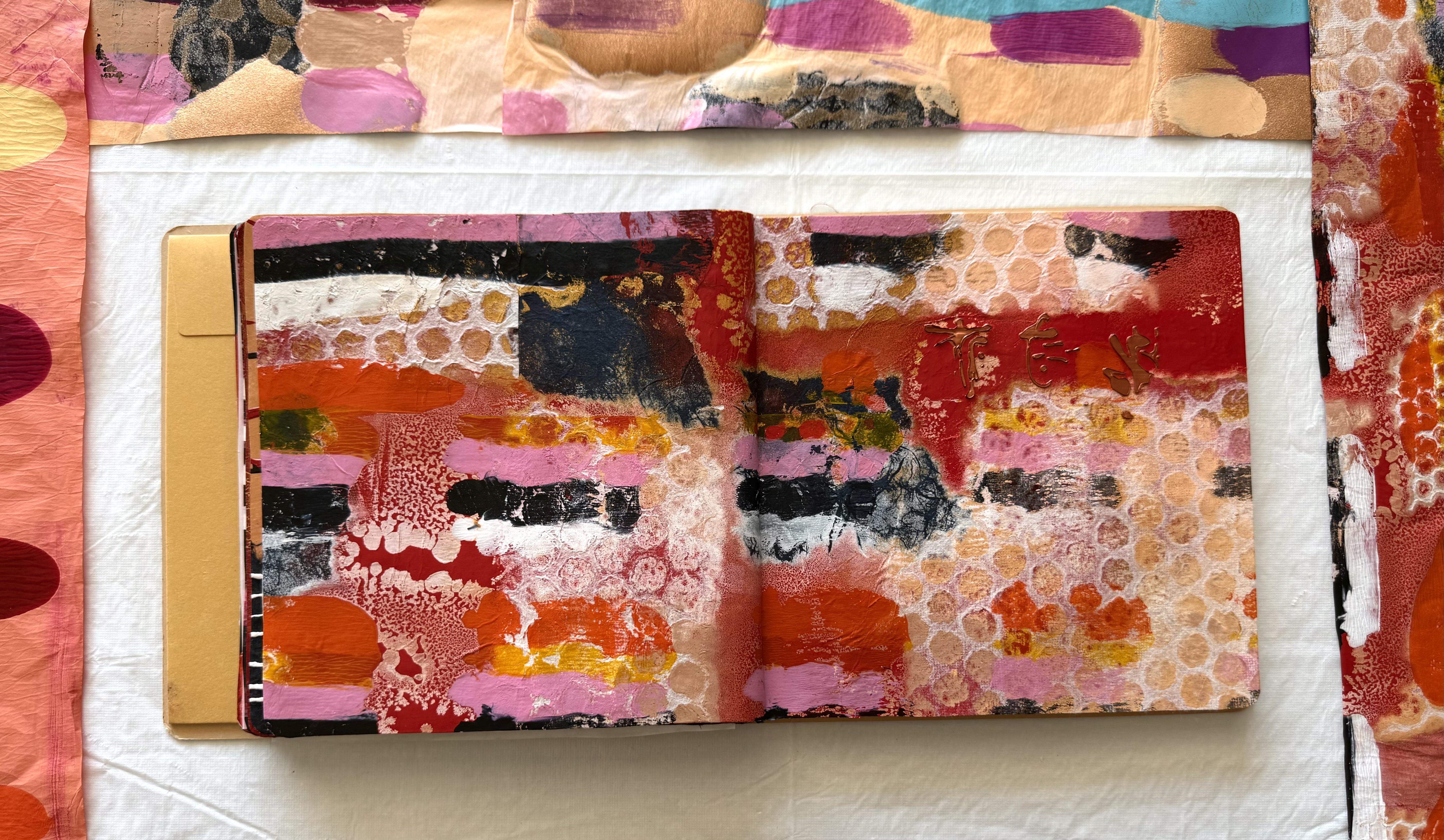
some collage to the pages, but I didn't want
to add too much. I pulled out my scrap bags. I ummed an ad for quite some time about
what to add to this page. I ended up with a
beautiful hole punch shape out of metallic copper. Beautiful piece of paper. Of course, I had quite a few
on the page to start with, but I restrained myself. And limited it just to one. I wanted a focal point, and I didn't want
to take away from the beautiful print
that I absolutely love. And I do think it's very representational of
abstract expressionism. Very happy with
myself, I must say. Now, on this side, I
also used a restraint, and I've just put some
beautiful Coso paper. What I love about the Coso paper is that it goes quite see
through once it's glued on. So you can see these
fabulous circles, but you also have the glorious colour coming
through underneath. And it does really change the dynamic structure
of the composition. Just putting in
those little pieces, those spaces there
gives it another layer, and I really like it. I think I love these
two pages the best, even though we've
only just started. So I'll give you a close up. Very happy with today's
beautiful prints and my collages I am loving. So next we move on to
colour field study, and I'm going to start by showing you the
fabulous paintings of Mark Rothko because
he is the most famous in this particular style of abstract expressionism.
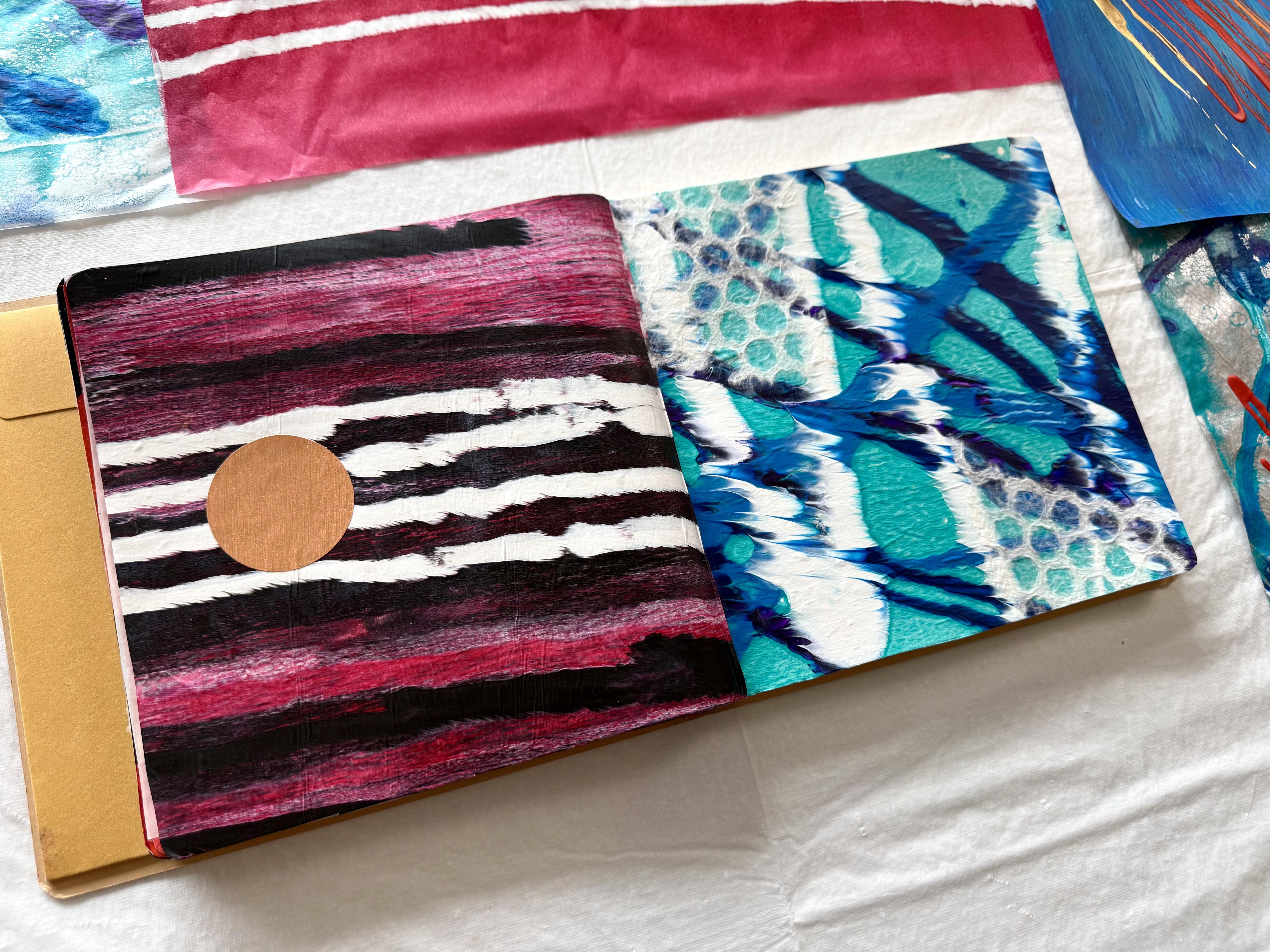
5. Day 80: Colour Field Study: Day 80 Color field study. Inspired by colour
field painting, this prompt explores how color relationships
create emotional impact, work with large areas of
color and minimal detail, allowing subtle
shifts, overlaps, and transparency to shape
the mood of your collage. So I've been showing you
paintings from Mark Rothko. He's definitely very famous for this particular style of
abstract expressionism. What do you think when you
look at the paintings? How do the colors make you feel? Now, it's a bit hard when
we're working so small, because some of Mark
Rothko's paintings were the size of walls, so I think there is
definitely more impact in the bigger painting sizes when you're looking at beautiful
saturated colors, but we'll just have to imagine our paintings
being that big. So we're going to start
with jelly printing. We're going to
start with creating some prints and some papers, overlaying different
transparencies on the paints. That's where we're
going to start. And then let's see where
we head after that. Now, of course, you don't have to create something like Rothko, but it's a great place to start. Now, I'm using fluid paint and very transparent
colors because we're going to have
a little play with just some colors
on the gel plate. This is beating up a little.
That's pretty funny. I must have something on
the surface of my plate, but not to worry. It will just give me
some beautiful texture, and I really don't mind that. So if I was to just pull
the print, like this. Straight on the paper, we get that beautiful
colour tone of the different sections of the paint like a Rothko
painting, taratara. Now, there's not a lot of
difference in these two colors. Oh, look at that. I love that. I know you probably
don't like it when your gel plate creates that
kind of beading up texture, but I absolutely love it. So I'm just going to have
a play around with some transparent and
some opaque colors and create some bands
on a gel plate. I may even put
some second layers on the papers and
see how they look. And then I'm going to also
use some wet strength tissue. This is the Japanese
sketchpad rice paper because the different paper also responds differently
to the paint. So we're having a bit of a play. We're creating
othcot style prints, one layer, two layers. We might even get to
three. Who knows? Let's just create with
some beautiful colour. Then we'll see where we're at. I really liking the transparency of the fluid paint with
these beautiful colors. I'm not sure why it's
beating up today, but if this happens to you, if it doesn't go exactly
how you first planned, don't stress over
it. Just go with it. I'm liking the textures
that it's making. And what I'm going to do is put a second print
right over the top, because these are
transparent colors, they're just going to deepen the colors that's
already on there. Well, that's the plan, anyway. So second layers are happening
now on the same prints. And it should fill in these beautiful textures
with extra colour. And if it doesn't, I'm just
going to touch them up with a brush because the prints
are looking pretty nice. I just want to separate
these bands of colors a little from
the top and the bottom. I've got magenta at the bottom, some beautiful nickel
ozo yellow at the top, and I've put some
gold in the middle. Now, the gold is
an opaque color, and the other two
are transparent. So it should create a really nice fill in for those areas if my
paint stays on the plate. On quick quick
sticks, get it on. Don't worry if something
doesn't go exactly how you want or how you planned in your mind because it
happens to all of us. I'm really not sure why my plate is beating
up like that today, but I do like the texture of it, so I'm going to go with
the flow of how it's looking and adding these
second layers to these prints, I think it increases the
quality of the print. The colors look amazing, and it's all about experimenting and exploring with
these bands of color. You can't get it wrong. You may as well just
have a whole lot of fun and see what you create. Right, let's see how that looks. It wasn't dry, of course, I've just put it on
and pulled it off. There's a lot left on the plate, but I am going to pull that onto some wet strength tissue because look how
fabulous that color is. I'll let that dry and I'll
pull that print, as well. This is what we've
got from this one, and it's so looking. Very mark Rothko with
the bands of colour. What I'm going to do is get a little brush and just touch up that area to fill it in with the rest of the
nickel ozo yellow, loving the gold across here, and I really like the texture of adding the second
layer onto the print. It's a whole lot of fun. You got to allow
yourself to have fun and just to explore what
you're creating with. Just remember you can't
get it wrong and you just don't know
what amazing prints you're going to come up with. Now the prints have such
interesting layers and textures because I put them
twice on the gel plate. Don't know if you
can quite see it, but it's got a really nice, interesting surface
texture to it, and the colors have built up. This one's quite neure. That looks very Rothko. I know this doesn't where my gel plate has been
beating up today. Look how good it looks. I actually really
love it. Like that. I love those textures. And these colours are
filled in nicely, and I really like the blend. And this one where I
smudged off some of the paint and brought back
some of the underneath colour, that was a whole lot of fun. But really, out of these
first three prints, I actually like
this one the best. Now, this was what was left on the gel plate after I
pulled these prints, and then I rolled on the
copper. Over the plate. And then I put on the zarint crimson in
the liquitex full body. So it was a nice thick layer
of paint, heavy body color. To pull up all of these
beautiful textures, you can see the copper, and you can see the gold. And the layers there underneath. I actually think This
one's my favorite. I know it started
as the leftover roll off kind of a print I
really love the texture of it. I like the shape of the
combination. I like texture. Yeah, I really do. Now, you don't have to
like exactly what I like. It's okay. I'm going
to be showing you quite a few ways to
create different prints, looking at bands of color, and you don't have
to do it the same. You do it how you like and
with the colors that you like. But it is so much fun
experimenting and exploring, and I want to encourage
you to do that. Now, of course, the other
way to build up bands of color is to create the
layers right on the plate. So with this print, I'm
putting down the nickel ozo yellow with the
transparent red iron oxide. And when that had
dried a little, then I put them, I'm pretty sure it was magenta right over the top
of those two colour. I'm thinking it's
going to work out right because they're
all transparent colors, and you'll see them coming
through in the final print. I'm hoping now. My plate still beating up with
the fluid paint. Oh, man. So when that was dry, I rolled on the liquitex gold and pulled it with that color. And the print turned
out pretty nice. This is the print here. What I'm loving is all of the incredible textures from where the paint was
beating up on my plate, and you can then see
the layers of color. So you could have
experiment with this idea, putting the layers on the
plate and then pulling one final print instead of going back to the plate
and putting prints on. There's no right or wrong. I don't think there's
right or wrong. I just think it's all
experimentation and exploration. So make sure you have a little play with
your gel plate. Now, Yes, the fluid paint has
been a little tricky today, so then I decided to use some full body
paint on the plate. I used magenta and orange in the liquitex basics and put that on the plate and
just pulled that print, which it actually does look like a Mark Rothko painting
with its bands of color. But if you're asking me what I would paint
if it was just me, I'd be going for the texture.
That's all I'm saying. I love that pattern and texture on the
print. I really do. This is nice, but, you know, it needs another
layer as far as I'm concerned. It would be really good for our collage background.
That's for sure. So if you want to
do just bands of colour on your prints to
pull for your collage, use the full heavy
body paint if you're having trouble on your jaw
plate with the fluid paint. Now, yours might not be doing this today,
and that's okay. I love it. How many times
can I say that? I love it. But that's another way to
get the beautiful color on the print to create our
fabulous collage papers. Now, this size is okay, but, you know, I'm going to have to pull
out the bigger plate. Right. So I've got my
16 20 inch gel plate, and I've pulled out the Amsterdam little
tubes that I love. Now, of course, you
don't have to do straight lines for
this kind of idea. You could do all
sorts of shapes. Helen Frankenfeler, she actually put the
paint on the canvas and watered it
down with a lot of turpentine and
stained the canvas. And she was also technically the post abstract
expressionism color field. Style of painting, and that
looked really amazing, too. So there isn't one way to explore or experiment with
this particular style. So I'm going to put
some full body paint on the plate on my big plate, but I'm thinking I might pull different sections of man
that's a beautiful color. What one was That's the
permanent red violet. I'm sorry. It's still
a favorite colour. Look at that. That's
just beautiful. I'm still starting
with bands of color, but I don't know if I'm
going to stay doing that. I'm kind of really exploring as I go along with this idea. I like the way the fluid
plate beaded up on the paper, and some of those prints
look just amazing. So this is going to give me
a completely different look. Now, if I put the paper on here, and if I put it more to
the top than the bottom, I'm going to get
more of the blue and turquoise and less
of the red violet. If I go the other way and put more of the red violet on by putting the
paper at the bottom, it changes the amount of color. On each print. And that's
just a bit of fun. When you look at
Rothko's paintings, you can see some areas
have big bands of color, two sections of
shapes on the canvas. Some of them have three, some of them have some other
shapes on the side. So there's no wrong
way to do this. It really is exploring with
how the colors make you feel. And looking at if you have certain amounts of
the different colors, how that looks on your print. The full body color of my
Amsterdam paints are going to look different and respond differently to the
transparent fluid paint. And that is all a bit of fun. See how beautiful that looks. Paints cover nicely
on the paper. It's not entirely dry, and I'm already pulling it off. Because I'm going to roll over some more
colors on the top. And we are getting a nice
coverage on the paper. There's that one.
They're both beautiful. Which ones do you like more? Do you like more
blue at the top, or less blue at the top and more red
violet at the bottom? I don't know, ma'am.
They're both pretty nice. So there's a fair amount
of paint on there. What am I going to
do with it now? Well, I might just
scrape off some of this creating these different
layers of the paint, and then I'm going to put
another colour on the plate. Let this dry add another color, and it should create
different bands, depending on which colors are going to show through the most. So this is just creating some
more texture on the plate, using what's there, but let's enhance it with
some more paint. Now, the paint is
still a little sticky, but I'm busting to
have a look and see. God what we've got with the area that I chose
to put the paper down. Well, it's not too bad?
It's coming up, okay. Not too bad at all. Have a look at these
different layers of color. I really like that. I like the different blend there from other color coming through. I think that's so
interesting and so much fun. Oh, imagine these prints as a massive big
painting on the wall. I think that would turn
out absolutely wonderful. That is just a whole lot of fun. Look at that. I love that. That was a great idea. Look at these areas in
here. That looks great. Now, what I'll have to
do is move these off, and then I'm going to fill
the background with paint, and I'm just going
to pull up with wet strength tissue just to lift up all that paint basically
and clean my plate. But of course, we don't
have to use a gel plate. I'm going to pull out a
piece of mixed media paper, and let's try the idea of
putting our fabulous bands of color just onto the paper
without creating a print. So I've got my
mixed media paper. Now, what about if I
did the same idea with my blobs color and then spread them
across oops the paper. So you don't have
to use a gel plate, but why would you not Amazing. It's amazing. Shelly
printing is amazing. But just in case you don't
want to use a gel plate, let's do something else. Let's put some
colour on like that, and then see how
that's going to look. What do we want
next to that one? What about About this blue. This looks nice. Right,
oh, right oh, oh. Let's try that idea. Maybe one more. Maybe
one more up there. Oops these might have been a bit much paint that time not to worry. Let's
go with that. Well, that looks pretty nice, but it's a little
boring, don't you think? I think I need to
mess it up a little. So I'm gonna mess
up just a little. Just a little. Let's
mix up some of these colors so that they're
not in such perfect lines. Oh, maybe I'll throw some ink on or do
something dramatic. Ah. That's so possible. Mm, I think we need
some more blue. Down here, maybe we'll get the other one.
Let's go with this one. I mean, it looks alright, but it just needs a little something
else, that's for sure. We could do with a
little more paint in this section here. Right. I have to mess it up. It's all looking a bit too neat. So I've got the high
flow in the golden. The beautiful gold color that
I think I had it yesterday, and I've got this fabulous
Pyle red in the liquitex. This is gonna mess it up
very nicely, I'd say. And I've got a fabulous
pearlescent blue in the FW inks. Love this 'cause it's got such a fabulous
pearlescent color to it. Let's add some of that,
as well. Right, on. Now, the inks will flow
and blend very nicely. And we'll just create
a different layer and a different texture
on the paper. Oh, just fabulous. Just like that. Lots of water. Lots of texture. Lots of color. Oh, much better. Just beautiful. Now, depending on, of course, how much water you
put on your paper, the ink will run and flow
the more water you add. So you could just leave lines on your paper if
that's what you like. But this is what I like. This is what I was hoping for
that the inks would blend out and create that beautiful
fuzzy looking texture. I just love that.
Now, I might just add a little bit of
muted violet down here for a little bit of dramatic contrast with our
fabulous peralescent blue, just a little sun
orange at the top. Now, depending on how
much you move your paper, how much you tip it up and let the inks flow will create the
different textural marks. If you leave it flat like this, it pretty much will
stay like that. But if you get a little adventurous and move
the paper around, it creates far more
interesting texture. And if you don't want them
to be perfectly straight, you can tip it a little
up this way and up that way and see how you get
your lines flowing. I'm liking this. I'm
thinking it's looking right. A little more on this edge here. And then I'll just let it dry. The paper dried up. Beautiful. Have a look at my fabulous abstract
expressionism painting. Now, what I really love about this the best is this
fuzzy line through there. Why do I? I don't
know. I just do. Have a look at the
texture of it. Again, with the texture.
I really like that. That was the high flow gold. And sitting on the beautiful
acrylic paint there, it just makes a lovely texture. Now, this would make a
fabulous start for a collage. Absolutely. I could add
Oh, there's so many ideas. I could add different bands
of colour of texture, of paper in the same colors
or in contrasting colors. And if you took a section, like, have a look at that, if you blocked out
all the rest of it and took this one section, look how good that looks. You could go right
down and use up all the blue and just have a little bit of the
pale orange at the top, and that across that
looks fabulous. I would add a little
bit of texture in here and here, definitely, loving that or I
could use more of the orange from the top and have a little bit of
the blue at the bottom. So it's all going to
depend on which of the colors I feeling like on the day when
I'm creating something. Also, if I was to turn this
painting around this way, then it looks very
Barnett Newman, which is another
abstract expressionism. And, look, that is very abstract expressionism.
I could do that. I could have the line
going down the middle. I could even have two lines, which I love that, as well. I really do. Put a
little bit of texture, a little bit of coso
paper on the sides. Ah, baby, beautiful. I could stick that onto a
canvas, hang it on the wall. Now we're moving past
the art journal. I knew I'd get carried
away with this class. I just want to put it
on the canvas now. But that would work really well. I love it down like that. Just love this style.
That's all I can say. So that's really successful. I could use parts of that
in the collage today. But of course, I've got all
the other prints as well. This one is definitely a fave. These turned out
absolutely fabulous with all their lovely colors
and textures and gold. That one is a perfect base to start for our
collage, definitely. Oh, this is so much
fun. I would use that. And these ones they're so interesting in the shapes that ended up pulling
off the plate. I'm not a green person, so I would probably
chop the top off, but that's easy fix. Just cut it from there.
Do it like from there. Let's have a look. Do it
like that, chop that off. And then I could definitely
add some more collage. Pieces to that, I really
like that section of it. So don't forget that
in your prints, you might like
different sections. You can even put those
different sections together for your collage. Have I given you
too many ideas this time It's quite possible. Now, these look fabulous. Do I like more of the
magenta and less of the blue or more of the blue
and less of the magenta? Well, it depends on the day. Today, I'm really
liking this blue, so I might use some
of that section. Chop up some of that even. So many possibilities. I don't know which I'm going
to work with today because I find every day is a little bit different on where you're
leaning in your colors. So depending on when you
put your collage together, it might make a
difference on which of the prints you
actually choose to use. Fascinating. I love it. Don't you just love making art. So I'm going to pull out the art journal and have to
decide how I feel today. How do your colors
of your prints make you feel on the day
you're creating your collage? Now, it can be
different the next day, the next week. It
doesn't matter. On the day you're
putting it together, think about which
colors you're really enjoying the most.
I don't know, man. I don't know which one
I'm going to choose. I'm a little partial
to this one. But let's have a look once
I pull out the art journal, and I think I'll
get my scrap bag to add a few little
pieces to the collage. So out of all of these
beautiful prints, I have to narrow it down, and I'm still really
partial to this one. There's just something
about the shape. Of course, it's my
favorite color. But besides that, I like the textures and the layers
and the shapes on the print, and I'm going to put some coso paper with
it either this one, which is very dramatic. I could cut a piece. I want to add something to
this section here. So either I'm going
to put a piece of plain black coso paper or
I'm going to cut or tear, which is even better,
a piece out of here. I haven't quite decided, and I probably won't decide to the minute that
I'm gluing it on. But either of those pieces is going to go in
that top section, and that's going to
go on that side. And then on this side, I'm still really partial
with this one today. It's the shapes of the paint
layers here and the print. I just really like it. But I'm going to put
it on this section and chop off the green
'cause I like the green. It's just not me. And then I'm going to
pull out my scrap bag, and I'm just going to add
some bits and pieces on here, and here, I'm not sure. Until I start gluing
it down, I don't know, but I'm thinking little pieces from the scrap bag
just to enhance the print and add some more abstract shapes
onto that piece right there. That's the bland, Dan So let's see how I go
and what I end up with. Right. So I think I'm
finished with my collage, but that's not a guarantee, especially with
something like this, where I just pulled out
beautiful little pieces from my scrap bag and added
them onto the page. I really like it. I like the way it was created
from the beautiful print, exploring the color fields, and I've added some little
beautiful bits and pieces. Now, I'll give you a
close up when it's dry because I may or may not
add a couple more pieces. I have an extensive scrap bag. What can I say? But that
was a lot of fun today. Now, make sure
you're creating with the colors that
you want to create with and think about how it makes you feel when you're
creating with those colors. Don't get stressed out if
your prints don't work out. You can always
paint over the top again or use them
for collage paper, rip them up or add
other layers on top. Have a lot of fun, really
explore these ideas and see what amazing creative prints and papers that
you come up with. Now, I hope you have a lot of fun putting your
collage together. It can be a little overwhelming. You might notice
that I kept changing my mind on what I wanted
to put on this side. I really loved that
beautiful Coso paper. It was rather stunning, but I thought it
overpowered my print, and I'm very happy
with this print today. So I put the one that wasn't
going to be so overpowering, but I might scumble a little
bit of gold over the top to give it a bit of a zing once
the papers actually dry. So then we're on to day 81
with experimental mark making. You know, that could
get a little crazy. I can't wait to get
into that lesson. Pretty happy with this one, and I can't wait to see what
it is that you're creating.
6. Day 81: Experimental Mark Making: Day 81 experimental mark making. Now, this is going
to be so much fun. A lesson that starts with experimental is going
to be a lot of fun. This day is about exploring
rather than outcome. Using a variety of tools and materials experiment with making marks simply
to see what happens. Scratch, stamp, drag,
scrape, and layer freely, allowing texture
and surface to lead before transforming
mark through collage. So we're going to make a
heap of papers and then put something together for our
collage in our art journal, and I just can't right, so to begin our
experimental mark making, we're going to start with the cheapest and
easiest tools. Ta. Your hands, we're going to
create something on the paper. This is the mixed media paper. Just using your hands
with whatever marks and scratches and textures you come up with the paints
that you put on. Now, I highly recommend
using gloves for this because you are directly
painting with your hands, and it's probably not
the best to be putting all of these pigments
into your skin so easily. Now, I'm going to go
with some fluid paint, but of course, you can use
any paint and any colors. I'm just going to throw some
on the paper like this. Not really sure
what I want to do. Oh, look at that
beautiful color. It's just experimental
mark making. What can we do with our hands? Well, we can scratch and
we can make marks like that or you can make blends like that.
That's pretty nice. You can do all sorts of
textures and patterns just with the fabulous God given tools on the
ends of your arms. So this is the first
way that we're going to start our experimental
mark making. Don't think about it. Don't get stressed about how it looks if you like it
or you don't like it. Just put some colours
on the paper and have a little play with the beautiful
paints that you've got. Oh, I love that. Covering
them on top of each other. Moving them around. And don't forget you can move
your paper around as well, so all your marks aren't
going in the same direction. I realized during this
class that I tend to put the marks in
a similar direction. So I'm going to keep
moving the paper around just so I don't have those marks in that
direction all the time. And look how fabulous it's
already looking. I love this. And did I tell you, it's
a whole lot of fun. Now, if you filled up
your paper really fast, 'cause you've got a
little carried away, then just put it aside and pull out another
piece and keep going. Don't think about it. Just create the mark on the paper and see how
it makes you feel, see what kind of
textures you can create, and see how the different
colors blend together. Now, you could keep going
on your first piece, create the second layer, or you can put it aside
and grab another piece. I'm thinking I might
see what other mark making tool I want to
put on this piece next. Right. So now I've got this fabulous look
brand new roll up, which I got from
the dollar store. I'm going to put a
toilet roll on like that only because then
I can take it off and keep changing it
with different options. And I'm going to put some
fabulous rubber bands around to create some lines, making some textural marks. Depending on how
you put them on, how many you put on, how close together or
further apart you put them, you'll be creating
the different lines. Let's just put that
many on there. I'm liking this plan,
and then I might just use the Titan buff that
on there like that. Roll that in now it's going
to be very experimental. I. I love it. I already love it. Look at that. Look at that mark. Loving that. That is fantastic. Ooh. And then what I could do is
take this toilet roll off and put another one on with
a different amount of rubber bands or
if I want to change the color or change the texture that's
on the rubber band. I'm liking that. Oopses.
That's a whole lot of fun. I might also put on some of that bronze 'cause we do know
I do like a bit of bling. So I'm just going to add yes. So bling to that. And then I think I'll put this one down and pull
out another piece. And find another way to create
experimental mark making. Looks like fireworks,
don't you think? Now, of course, you can put your paint on and rub it around. And make all sorts of marks
really easy like that. This is a, from
the dollar store, it's like a recycled
shopping bag, and I've just chopped
a piece off the side. Oh, I could spray through that. That would make a
really cool mark, too. That's a pretty cool idea. Now, you're really only limited
by your imagination and, of course, what you've
got in your cupboard, but make sure. Love that. Make sure you pull
out your art supplies and have a little play with what you've
got. Look at this. Is just a piece of recycled
reusable shopping bag. Oh, I really like the
texture that makes on there, that's a whole lot of fun. Let's add some of this color. Of course, we've got our hands, and we're just going to create layers of texture and color. Oh, it's so fun. And so therapeutic. Make sure you have a
really fun time with this. Don't be limited by anything. Don't try and make it look beautiful or perfect
or anything like that. Just allow yourself to create
and see what comes out. See where you head, see what
ideas you come up with. I like that texture of that. I might have to do that again. Okay. Let's add some here. Just allow yourself to create without any
restrictions and if you end up doing paper after paper and page after
page, well, yippee. You get to make some
fabulous collage material. What else do I want? Oh,
what about some of this? Gold gold, my favorite. B What a fabulous masterpiece. Let me tell you how
much fun this is. You've got to have some fun
and pull out what you've got and slap it on and
see how it turns out. Now, when I was putting the soft body on this
one and scribbled it, it reminded me of
Jackson Pollock. So, we have to have some scribbly marks.
Oh, look at that. We have to have some because we are doing abstract
expressionism, and it would be wrong not to pay homage to Jackson.
Look at that. That is so much fun. Now, this is a No
plaque jacquard paint, and what I have found with this paint is that
it is like this. Look how stringy it is. It's incredibly stringy,
and it comes out like that. Now, depending on
how much you put on, whether it's fast or slow, it will come out accordingly. You can kind of control it. Jackson said he
could control his, so you can kind of control it, depending on the speed that
you put your lines and marks on with and also how much
paint you're putting on. Oh. That was pretty fun. My paper's already covered. Now I want to do another one. Oh, man, let's just add a
little bit more line to there. Loving the lines. So much fun. Now, if you can't get
this particular paint, you could string gel. And string gel will do
exactly the same thing. You can either have
it clear or you can have it with paint mixed in. Shall I show you? Okay. Okay. I didn't have any string gel. Brilliant idea, but
I've got clear tar gel, and that really does
the same thing. So, if you've got
either of these, you can create these
beautiful Jackson pollock inspired marks for our
experimental mark making, the targel C is
beautiful and stringy. And it will create
these kind of textures. Now, this is perfectly clear, and it will dry clear. But you can mix paint in with it to do exactly what I
did with the black paint. I think you should just
leave it like a few hours. If you're going to mix a
color in with the tar gel, just leave it for a little
bit so that it returns to its chemical makeup to create this kind of
stringy consistency. Oh, that really is
a whole lot of fun. Oh, now that I've covered
this piece of paper, maybe I'll just do
one more piece of paper entirely in
a polick style. A posible. I was going to go crazy
and just, like, you know, do a Jackson and totally cover the whole thing in
crazy scribbly marks. But once I sat down and started, it's so therapeutic and so enjoyable that I'm loving
these lines like this, and I'm not going to go crazy. I'm going to actually be
more deliberate about how I want it to look because
I think it looks fantastic. So I'm just going to put a few more lines on with
this beautiful red. And then I actually
might leave it alone because I just love
the simplicity of it. To making me feel more calm. And it really is quite beautiful just on that glorious
bronze color. So you never quite know
what you're gonna create. You just have to start creating. Cover your background,
find something to scribble with and allow
yourself to just be present, be in the moment, enjoy
the creativity of it, and listen to what you
want to see on your paper. I really thought
I was going to do a crazy pollock painting, but once I started and looked at the beautiful
line that it was making, I thought, no, I don't
want to do that. I actually just
want to leave it. Beautiful and simple because I think the line is really
peaceful and calm. It's kind of looking
like landscaping. So I'm going to leave it. Maybe one more red
one across here. Now, the faster you do the line, the thinner it is, the
slower the fatter it gets. Also, if you notice, I'm using the back
of a paint brush. So depending on what you use
to pull it out, this, again, is the same Nop Jaqard In red, I'll put this in your notes if you want to find
this exact paint. Or, like I said,
string gel or tar gel, add colour to it, and it
will do exactly the same. Well, I've completely
surprised myself. I thought I was going to
go crazy and do a pollock, but I'm not because I'm
loving the simplicity. I'm actually loving
the calm of it, and I'm going to leave it alone. The papers have
dried are beautiful. And I really did have a lot
of fun. Creating with these. Now, this mixed media art
paper is held up rather well, considering all the paint and layers and scratching and
splashing that I've put on it. I think it's pretty good. Look, it's fabulous,
don't you think? Look at all those layers and my very easy tools to make
when you think about it, a roller, a toilet roll some, rubber bands, easy peasy, start with your hands. It can't get much
easier than that. Don't stress out. Use what you've got rummage
through the kitchen. And pull out all sorts of tools to create your
marks on your paper. Now, I'm really loving this one. I love how peaceful it is. Well, that's how it feels to me. So don't forget when you're
creating your papers, stop and listen to yourself. Do you want it to
be all frenzied and chaotic and fun and
energetic and explosive? Oh, do you want to have
a little moment and just ease and relax and create
something more meditative? I'm loving this piece. I think I'm going to
have to use a section of this in my collage today
because it really was a moment. All of a sudden, it
was just like, h. Just finding that space of being in the absolute
essence of now. I really enjoyed it. And this one now, this one, I added some more
white onto the paper. Once the layers
were already dry, I then pulled out white
in the same paint and scribbled across the
paper. Look at it now. It definitely does look
like a Jackson Pollock. Now, don't you think? Of course, we see this kind of painting
style everywhere now. But back in the day, when he first started creating these paintings,
it was absurd. There was a time magazine
article written about him, and they called him
Jack the dripper because the critics
thought it was absolute rubbish,
what he was doing. But he was breaking
through the ceiling that had been contained on what
was expected for an artwork, what described an artwork and what the galleries
were wanting to see. He busted it all open
and created something that was incredible
spontaneous and unexpected. And I think that's what
the real breakthrough is creating something that doesn't just please everybody else, but it's coming from the core of who you are and how
you want to express. I think that's what
I really love about abstract expressionism the
most is the way we can really pour out emotion and
expression and movement and action onto the paper through all the colors and
layers of textures. Right. I'm loving this. But remember, you don't
have to do scribbles. What about creating
some circles? Don't these look
absolutely fabulous. Now I'm using the
paint to create these fabulous circles
on the Coso paper, but you can also use the
string gel and the tar gel. These ones in the red, I'm using the medium. I've put in a little
bit of paint, and I do find that the fluid paint mixes really
well with the medium. Now, you do have to let
your mix just sit for a few hours so it comes back
to that stringy consistency. But the circles, I did have a season there when I
created these all the time. I took it a little obsessive, but when I get into something that I'm really
passionate about. And also, there was
a season that I went through where I was creating
collages based on music, inspired by music and
putting in instruments. And I used this paint, this jackard paint to create
fabulous scribbly notations. So it looks like
notes flowing across the surface of the canvas and the painting
and the collage. Oh, absolutely loved it. It really was very
expressionistic, very abstract expressionism in its style and fluidity and the action of actually
creating the notes. So don't be limited to just
creating scribbly lines. Oh, and you can also create
beautiful straight lines. I created this one on
the Coso paper as well. And I really like it. I think it's because I was inspired by this
piece and its calm meditative feel that
I decided to put some beautiful white lines
on the black Coso paper. I think I might put a bit of both of these papers
onto my collage. So you're not limited by one
expression. Remember that? You can do a Jackson
Pollock crazy scribbles all over your paper. You could do something
more meditative, or you can do different shapes. There's not one way. In fact, everything is open. Y. There's so many possibilities, and there's nothing
containing the ideas here. So allow yourself
to really create. It's so much fun, and it's really good for you. So I've got all of these
fabulous papers now, which are dry and beautiful
and ready to collage. But of course, I did have to take a print on my gel plate, and I wanted to use the similar tools that I
was using for the paper, some of the same colors, and see what I could create
with a gel plate print. Right, so I've got my 16
by 20 inch gelelf plate. And when you're
using the gel plate, you've got to think that
whatever you put down first is what's going to be on top when you
pull that print. So, unlike when you're working
on the mixed media paper, you're piling all the layers
on top of each other. This way, you're actually
working backwards, which is, I think,
a whole lot of fun. It does get a little tricky sometimes but what do we want
to see first on the plate? Well, I'm thinking,
let's add some of these beautiful gold
marks from this material. I'm going to use all of the same tools or most
of them or some of them that I used on the
mixed media paper and probably some of the
same colors as well. It's just another fun way of creating some paper
for the collage. So I'm starting with that. Oh, yes, I like that. This is actually quite helpful. This is quite a nice piece. I'm gonna keep that
one. I'm loving that. That's on the plate now. Now, what do I want to add? Well, I'm thinking maybe
some of those lines. That was pretty fun, perhaps
in the quinacido violet, which is, Oh, man. Emptying out probably because
it's my favorite colour. So I did like the lines from this simple tool here
with the rubber bands. Now, my paint has
got a bit of water in it because I was
emptying out the bottle, which is why it's
kind of doing that. Oh, I like that. Beating
up there on the plate. It's not really fully paint. It is quite watery, but that's really fun, and I do like those
textured marks. So I'll just give this probably a couple of minutes
just to dry a little, and then I'm going to put
something else on the plate. But everything I add
sits behind the marks, whereas when you're using
the mixed media paper, you're piling it all on top. I think it's fun doing both. Now, of course, you
don't have to wait. I'm not good at waiting, but you will don't get the preciseness of the lines if you don't wait for
the paint to dry. But I do rather like to push on. I think that looks really good. This is just the
catalyst tool and my fabulous soft
body med and paint. I do like the look of that.
This is really simple. It's just a piece of
corrugated paper packaging. Absolutely fabulous. Always check out
your paper packaging when it comes into your house because you never know what amazing piece you can
use for your gel printing. Look at that. That
looks beautiful. Makes such a great line, and because I've cut
it into a circle, it just creates a
different shape. This time, I'm putting
the paint onto the fabulous bubble again
with the paper packaging. It just makes you want
to rush out and buy things so you can get
the paper packaging. And then I'm going
to put that on in some places just like that. Oh, a little bit of magenta. And then I am going to have
to wait for the print to dry before I can put the pickup plate onto
it and pull the print. Yes, there will be a
little bit of waiting, but that is so much fun. Have a good plate on your gel plate with
some different tools, lots of paper packaging, anything that's going to make fabulous experimental
mark making. Oh, look at that. Can't wait to see how this print's
gonna turn out. I think I'll pull it
onto wet strength. Tissue, just like
that. Easy, pid. Right? So this is now dry. And I think, look at that. It's looking rather fabulous. I'm loving all the
marks and textures. But are we finished? I don't think so. I'm thinking, What about if we make a temporary temporary
mask shape like this. Because it's temporary
because it's just printed paper, so
it's not gonna last. But what about if we
just put a few shapes on here to make a mask by clearing this paper and then
put another layer of Shapes and texture
for our mark making. Yeah, I'm liking that. Why
me one more? One more. And that just makes
a fun organic shape. Uncovered it with paint, you won't be able to
probably use it again. Maybe you might be able to. It depends how thick, I
suppose you put the paint on. If you don't put it too thick, you could probably use it again. Rodo. Roo, roh. Let's put one up
there, and one there. And one there. Okay,
I'm liking that idea. We'll put some copper
on this layer, and then we'll pull these off, and then I'll pull
the print onto wet streak tissue with
maybe unbleached titanium. Yeah, oops. Oh, you got to be a bit careful with your temporary masks. I did get a little
carried away then. A little bit more gentle, gentle, gentle does it. Then we lift off
our temporary mask, and then when I
roll the paint on, it'll just be in those shapes. So let this dry and then I'll pull the print with wet string. My print turned out beautiful. Have a look at all of those
fabulous, glorious layers. I really enjoyed
making this print, and you can see the
marks that I put on first with the roller and the rubber bands on
the toilet roll. And you can see the round marks here of the lines
from stamping no. There they are there, the
corrugated cardboard. And then we go Oh, I forgot. We've got this bray
gold paint on first. That looks fabulous. I think it's fun
because the gel print, you have to think backwards in reverse for what's going
to come out on top. It's a little challenging, but I'm pretty happy with it. The bubble wrap looks good
on the print, as well. All of those layers and
textures and colors. And what about my
disposable masks? Don't you think they
turned out great? Look at the shapes.
It's so cool. And now I've got these fabulous pieces of paper in the glorious
metallic copper, and I could use these in
the collage, as well. That is a really fun way to put some mask shapes
on your print. Without spending a lot of money. So now I've got my papers
and my fabulous gel print. Which ones am I
going to put into my 02 small art journal today to create our fabulous experimental
mark making collage. Well, I think I
already did decide because I totally
love this piece. I'm going to have to have
some of it on my page. And then I think I might also add some of
the black as well. That is a maybe idea. I just love both these pieces. So some of that and some
of that on one side. At least I have
lots of leftovers, and I think I'll put
some of this print, which I really love
on the other side, maybe a section like that. And perhaps the black, beautiful circle
maybe in the middle. That's what I'm thinking at this stage until I
start cutting it up, or do I want some of that
on there? I don't know. That's where I'm going to head. I'll cut up those pieces
and decide on that. And then we'll see if that's
what I'd end up doing. Right, these papers
are now stuff down. Now, remember, the
mixed media paper, if you're using
something like that is a lot thicker than the
wet strength tissue. I really like using the
wet strength tissue, particularly in my art
journal because it's thin and it doesn't bulk
up the pages too bad. But don't let that stop you
from using other papers. Because it does it really matter if it doesn't shut in the end. My art journals get so fat. And yes, it might
bust the spine or perhaps the binding becomes a
little torn in the process, but you can't stop
your creativity. You have to do what
you have to do. And I had to have this particular beautiful paper on the page because I love it. Now you have to be
a little bit more patient in the drawing
of thicker papers. The corner here
didn't want to glue down as fast as what the
wet strength tissue does, a little bit of patience, a little bit of coaxing, push it down a little more, and it will ****. But those two pieces
I absolutely love. I love this torn edge here. This is a coso paper. So, of course, it's beautiful, and I love the combination
of the warm colors with the scribble lines and then the simple black and white. Makes me happy looking at it. Now, this one, I have to
have the centerpiece. So I think I'm going to use
one of these, maybe this one. So I'm not sure if
I'm going to be able to tear it or
if I'm going to have to cut it because this is quite tough this
particular paper. But I do absolutely love the
fibrous texture of the edge. So I'll give it my best shot at tearing around
the circle shape. Without tearing the circle
shape, that would be best. And then I'm going to use it for my focal point on
this particular print, which I really like. There you go. It's a circle ish. We can't be too precious
about these things. Well, I think I like
it up that way. I don't mind if it's a
little wonky on one side, I don't mind that at all. I think that makes a
beautiful focal point. Just trying to decide
which way I like it. I think I like it
best like that. It's not an exact
circle, but it's an ish. And it's a fabulous vocal point. So don't get too fussy when you're creating
your beautiful pages. I had so much fun in
making the papers. I could have kept going quite happily making more and more. And that's what I like
about the art journal. I can come back
another day and look at these papers and go,
Oh, yeah, that's right. I really liked making those, and I could make some more. Right. So that's going
on there like that. Look at that beautiful
fibrous edge. I think that's glorious. And then that's going
to have to dry. I'll give you a close up, and then we'll be moving
on to the next fun idea. You know there's
going to be one. I love this theme the
most. I'm thinking. So we'll be moving on
to the next lesson, class 82, colorful
chaos. Just ct weight.
7. Day 82: Colourful Chaos: Day 82 colorful chaos. Build complexity through layered color and
overlapping forms. Allow elements to
collide, repeat, and interact without trying to control the outcome too early. Trust that harmony can emerge
from the accumulation, play, and intuitive
decision making. It could get a little chaotic, but but it will be a lot of fun, and we have to pull out
the beautiful colors. Right, so I'm starting
with an idea that I was thinking about when we were
doing the colour field study. I like the way I rolled the
paint across the gel plate in those strips or bands
or layers of colors. But I thought, if I put less on the plate,
like, just a tiny, weeny little pea shaped
dollop of paint, maybe it would roll
shapes onto the plate. So that's my idea for today. That's what I'm going
to try to achieve. I do have a little difficulty with not putting too much
paint on the gel plate. But this is what I'm going
to try and create today. And I'm starting with the packs that I have of the
beautiful Amsterdam colors, putting them on the gel plate in little dollops of paint to see what I can create by rolling it with
the brayer. Yippie. I actually think it looks
absolutely fabulous, and my idea works. So, once I have that first
layer of beautiful shapes, traveling across the gel plate, I'm going to wait a little bit, and then I'm going to put them
in a different direction. I do have to wait just so
it's dry enough to run over those shapes
without smudging them all and
creating a big mess. That can be a bit
of a challenge, but what I do want to do
is see how the colors and shapes look as they layer
on top of each other, and some of the paints
will be a little more transparent and you'll be able to see the shapes in the layers. Well, that's my theory, anyway, but the magenta didn't
go according to plan. It's one big strip of color. I must have had too much
paint on that little dolop. Small amounts is
the key to create the shapes on the gel
plate with this technique. Oh, man, it's a challenge. And once I left the paint
long enough to actually dry, I rolled on the pickup colour, and I'm using naples
yellow, reddish. What a beautiful colour this is. And then I'm going to
pull it off the plate with my favorite wet
strength tissue. Now, I'm thinking the print
turned out rather beautiful. Especially for a new crazy idea. I love the way it
rolled those shapes on, but you do have to have
the smallest amount of paint to create that rolling
of the paint onto the plate. Otherwise, it just does the big long strip of
color, which I do like. And if you want to
try this idea and experiment with this,
you could do both. You could do the
longer strips of paint colors and
rolling the shapes on. The only drawback is waiting
for the layers to dry. I do have a small
fan in my studio, and I put that on the gel plate when I want something to dry. It does fasten things up, and then I'll probably
go and get a cup of tea or do another job and
then come back to it. And I also pulled the gel plate off the paper instead of
the paper off the plate, just in case there were some sticky bits
or some wet areas, that usually helps
to get the plate off without pulling
or tearing the paper. But that's pretty nice. I'm liking the idea. There's my beautiful,
colorful chaos. Doesn't look too chaotic, but it was a great
idea, and it worked. So I'm going to do it again. This time, I'm going to add some little pieces of collage on it just to create more texture and to experiment
a little bit further. So this time I'm doing
the same idea with the little pea sized dollps
of paint on the gel plate, and I've pulled out my
Medan 100 colour pack because I wanted to have a whole heap of different
colours to choose from. It's just so much fun. And because these little
tubes are so tiny, maybe it won't be so
hard for me just to put a little piece
size doll upon. I'm absolutely loving this idea. It looks beautiful. And look
at my rainbow of colors. Now, once I put all of the shapes and rolled across
the paint on my gel plate, I then stuck some coso paper in a beautiful copper colour, and I had this
other little print that I added on, as well. I wanted to see
how it would work, how much paint
would come through, what it would look I'm always experimenting with another
idea to see what I can create. And what a good theme it is
today to be able to do this. Now, when your paint
is wet on the plate, putting the collage paper
on, it's super easy. Just stick it on the wet paint. But if you've got layers of paper sitting on
top of each other, make sure you put
a little bit of gloss medium between
those papers so they stick together so
that when you put the pickup paint all
over your gel plate, you want to make
sure it's all pulled off and it's all embedded
and stuck together. I have found just
a little bit of the gloss medium
works really well. Then when the paint
layer was dry, I squeezed out the med
and little tiny tubes onto my plate. Now, what I found it does take a fair bit of paint to
cover the plate when you've got very porous
and texted papers because it sucks up the paint. So you do need a bit of paint
for pulling off that print, and I think the medium ones were a little bit too
small for this idea, but it all worked
out in the end. Now, I did give this
print a fair amount of time to dry like quite a while. And then I pulled the gel plate off the paper to make
sure it didn't stick, and it turned out
absolutely beautiful. What do you think
about this idea, adding the collage
elements to the paper? I think it turned
out rather good. You can see the glorious
copper paper there, which is also a coso paper. And this was a print onto coso
paper from the gel plate. I'm liking it. I'm liking the shapes of having that collage piece
sitting behind the paint, I think that looks great. I like all the beautiful
colors of the meat and paints. I really do like these paints. I think they're really
buttery and soft. And, of course, they come
off the plate. Super easy. No problem. I'm liking
the second idea, but of course, I
couldn't stop there. I just wanted to do
one more, one more. What I want to try next was putting more of the coso paper on Jelly print so that it's got more
texture coming through. I like the way that this collage piece is coming through the
paint layer because, of course, it sits
behind the paint layer. When the paint layer
goes on first, the collage paper is going
to then sit behind it. So I'm thinking, I
want to try using some of the white
textured coso paper, especially in the bubble round
or the tiny dots ones to see how the texture would look coming through the different
beautiful shapes of color. So that's the next idea. Starting with the beautiful
mediant colors again, little tiny pea sized
dollops on the gel plate. Can I keep them small enough? That is always the challenge. Have a look at the
dramatic colors that I decided to put together. Then I added the beautiful textured coso paper
in the white. It's called the poka dot one and the mini Poka
dot one, as well. I think these shapes would show up nicely behind
the paint colors. We just have to try these ideas. It can only not work. Then I decided to
add some more of the cosot paper in a beautiful, like, Prussian blue color, really deep, really textural. It'll be very interesting to see how this one comes
through the paint colors. And, of course, I just
had to get dramatic. I was just feeling
dramatic, so so, I pulled out my
liquitank acrylic paint in a beautiful cadmium red. Oh, what a stunning color and sprayed it in
and around the colors. So over the colors. So just next to the colors. I just wanted to add that
beautiful pop of red and the texture that the spray paint leaves on the gel
plate. I just love it. Now, when this paint layer was dry and I did let
it sit in front of my little fan for probably 20 minutes
definitely that long, just to make sure the
paint layer was dry. I then put on some more of
the little meat and colors, and I added some
beautiful gold, as well. Now, I did find the
paint really sucked up into these coso papers
because they are so textural. They're so soft, and they really absorbed all that paint that I put on for the pickup layer. So just remember that you are
going to need more paint to cover the plate before I put
on my wet strength, tissue. And then I left it
overnight because I did put a very thick
covering of paint on that layer of the paper because I had
absorbed it so much. So I left it overnight and
then I came back this morning. And pulled the plate
off the paper. And look how fabulous
this print is. I absolutely love
this technique of the gel plate collage because there's so
many possibilities. It's endless what we can do. Look how good the print looks. I absolutely love the
texture that it makes. The poker dot coso papers
coming through here, and there's the
Prussian blue paper. Look how textural and beautiful those marks are
coming through there. Then we've got the
fabulous spray paint peeking through in all of
these areas with that texture, and there's the mini dots. This Coso paper worked particularly well for
what I wanted to create. I'm going to have to cut a piece and put this in my art journal today just so I can remember
what I did I just love it. I think the textures
came through beautiful. Look at this section here. I mean, when we're talking about abstract expressionism
and color, I'm thinking this is
a perfect example. I just love the way the
papers came through in the texture and underneath
the beautiful colors, and you can even see a
little sneaky peak of the gold coming through
that I put in up the top. Yes, this one's my favorite. Yeah. But if you watch my progress of this idea
from the first one, which is really nice. And I think I might use
some of this, as well. It's got a great pot of colour. And then the second
one where I just put a couple of the pieces on, and then this one, where I
really got a little bit crazy. It's just such a great
development of an idea and such a fun way to create an abstract painting
on the gel plate. Love it. I really
hope you try it. That's all I can say. Now, if you don't want to
use a gel plate, you can create your fabulous
colorful chaos just on the mixed media paper or any
other paper that you have. Try the idea of putting the little dollps on and
rolling it with the roller. You don't have to use the
gel plate to do that. You can do that just on paper. Easy peasy, the same technique. Give it a go and see how your prints turned out.
I can't wait to see. Right. So for my collage today, I am definitely using
a piece of this one and taking up that full
space on my art journal. I might even do two pages with it because I
love it so much. I don't know, man.
I'll think about it. I like some of these
colors as well, but maybe some of this one. This one would sit
well with this print. Maybe I'll add some
of this one to it. I'm not sure. Haven't decided. I'll go and get the art journal, and I think I'll
get my scrap bag, as well, just in case I want to few more little highlights. I really do love this print. I know it could be
a little messy, and maybe it's not your colors, and maybe you're wondering
why I'm going on about it. You might not like it at all, but I just really do. So that's how it
goes when you're creating papers for your collage or you're putting
something together. If you like it,
just lean into it, push into those
areas that you like. It might be the color or the technique or
the combination. For me, I love this print
because of the combination. I think that coso
paper worked really well and I love the
spray paint texture. I always love that
watery textural look and the way the
gold pops through. And I think adding that dark
kind of prussian blue color, I really love, as well. So I'm very tempted to
stick the print across both sides of the art journal because I just
love it that much. I think that I
might just do that. Am I allowed to do
that? You're allowed to do whatever it
is you want to do. I'm just here to inspire you and encourage you
and push you on to really do something you
haven't done before and allow yourself to
really, really create. So, baby, you do it
however you want to do. I'm going to definitely
do that today. I haven't done that yet. And we're up to date 82. So really, I've
done 82 times too. G is the first time I've decided I'm going to run my print across both sides of my art journal. Now, I might just
use that section. I like it that much, or do I want to add
more of this section? I like that, too. Oh, man. I'm gonna have to decide. I do like that. I don't
know why I do. I just do. So I might put
that edge on there because I like that
little sneaky bit of gold coming through there. I like this bit
here. I like this. Okay. That's what
I'm going to do. I'm going to stick it all the
way across my art journal, both sides, that
side and that side. Then I'm going to think about
if I want to add anything else from my scrap bag or do I want to stencil
something on it? Oh, that's not a bad idea. Or maybe I'll pull out some
dance moves and put those in some stencil butter
across there, okay, if you insist, because we've got such a beautiful
collage element already happening in the
gel print itself. It's all embedded and it's
all beautiful and textured. And I actually don't want to
add any more collage to it, but a few dance moves
on that red section, I think that could be
just the finishing touch. Mm hmm. The print is all stuff down, and I just really like the
tactile quality of it, where you can feel the
papers and the paint, and you see bits chipping off, and you see then the
other paint colors coming through from underneath. I know today is making me
happy. What can I say? I'd like to come back to
this idea another day, and that's what I love
about the art journal. We can can flick through it and find some ideas
or some colors or some textures
or something that really inspires us and
have another go at it. Create another print using
the Coso paper like this, but with different colors. The spray paint
worked really well. I'm definitely doing
it another day. I'm totally in love with it. So I'm thinking it's a few
little dance moves here. Now, how many is the question? I think the whole rows too much. I'm thinking just a
few little ones across there just to enhance
that section. And I think I'll do three. Right. There, in the beautiful
stencil butter, copper. What I love about
the stencil butter is it's nice and thick. Look at that. Thick and chunky
straight out of the pot. I don't have to mix anything with it to make it
nice and thick. And I like it thick because then the beautiful
little shapes stand up and they stand out and tra, tra just like that. It It's already done. I love it. I think it looks
absolutely beautiful. I'm totally in love with
this printer today. My gel plate collage. I think it's a
fabulous technique. You really have to give it a go. So I'll let this dry. I'll give you a close up. And then we're on to
the next lesson day 83, creating from the other side. What does that mean? That's
a little mysterious. You'll just have to come
along and find out. In. Do it. Do it.
8. Day 83: Creating From the Other Side: Day 83 creating from
the other side. Create a collage using drawings, lines and mark making from
your non dominant side. How does it feel to not
have so much control? How does it feel to make a mess? The challenge is to turn your messy scribbles
into a unique collage. Well, this could actually be a little challenging,
I'm quite sure, because I like having control and I don't
like making a mess. So I know for me, this prompt is going
to be a challenge. Right, creating from
the other side. Well, I can honestly
say I've never thought about developing my
non-dominant hand, which is going to
be my left hand. In creating? Oh,
it's not so bad. It's not so bad. It's okay if you want to
do something abstract. And you don't want to be precise to use your
non-dominant hand, I'm thinking because
that was okay. It wasn't as bad as I
thought it was going to be. But then, I'm not trying to specifically
really do anything. So I think it would get harder if I try and do some actual
details or do anything. But I think what I might do
is just fill up this piece of paper with my beautiful
posca moppa pens. And then I think I'm
definitely gonna pull out the gel plate and
try something on that. Oh, yes, well, if you don't
try and be too specific, you can not so bad. But I don't know
that I'm going to want to try and be too specific. But it is a bit of fun. Let's see what we can create
with our mark making, using our non-dominant hand. I definitely won't be doing the same kind of action
that I've been doing so far because I did notice that I do a similar style and shape when I'm creating
my mark making. So I'm thinking that this
is a really fun idea to try and I do feel
very awkward with it. It doesn't flow as easily
as my dominant hand, but I'm like on the
idea of actually developing the other
hand, I mean, why? Would be quite fun to do. So I'm just gonna fill
up this piece of paper. I might wait for this
paint layer to dry and then add some more on it. Filling in these shapes
is okay. I can do that. Look at me with my non-dominant
hand. Oh, I can do this. A It is actually quite tricky because
I'm a lot slower in getting the marks on
and filling in the spaces. And I just want to
take the paint pen off that hand and and get it
moving with my other hand. A couple of times I've stopped
myself from doing that. And I think that's really funny. I'm always in a
hurry to do things, and I want to just
get on with it. But what happens if I
just don't be in a hurry? So that's really
interesting observation of my own particular habits. It's definitely takes a
lot more concentration, and it's a lot slower going
using the non-dominant hand. And I definitely
wouldn't want to try to be doing anything too detailed because it's a
little tricky to maneuver it. Well, Chi thinks really funny. I haven't really thought
about it before, but it's quite a cool exercise
so think about how you're responding to how the marks
are made and how it feels. It feels awkward and slow is
pretty much how it feels. But that's really
quite interesting. I'm going to let this
paint layer dry, then I think I'll add some
of the other posca pens, just the normal
sized posca pens. I might try adding some
more marks and lines and a few maybe dashes
or dots or something. I'll add something to it
once these poska ones, these fat ones have
dried because otherwise, the other ones aren't going
to work over the top. So we'll give that
a go and see if I can get Oops went
over the line then. It definitely doesn't want to go exactly where I'm thinking
that I want it to go. Oh, man, that is pretty funny. So when the paper was
a little bit dryer, I added the black. I didn't want it all
smudging together. And I also went over some of the red paint and a little of the pink because the colors
needed to be cleaner, but I'm telling you, it's not that easy with your
non-dominant hand. Then when it was completely
and totally dry, I added the beautiful
gold and copper mark making with the pens. Now, these are the
metallic pens that I used, deco colour. They
worked really well. This was the first time
I've actually used them, and I'll put them in your notes if you want to know
what they are. They work absolutely fabulous. But I can't draw a straight
line with my left hand. And some of my marks are wonky, but looking at it now, I don't think it's that bad. At the time, I thought
it was terrible. Look at the beautiful
metallic shine of those pens. They worked really
well, not a problem. I've had problems with
metallic markers before. Some of the posca pens don't
work as well as I had so. These ones are a great find. And I think my
painting looks quite beautiful for my
non-dominant hand. If it was me doing
this, like normal, I would never leave these
areas like that all that. So there's definitely, for me, a different look to the
painting that comes from using a hand that doesn't flow as easily or in
the same direction. But it was a great start, a great way to get going. I don't think it's
so bad after all. I could probably cut
some sections out of it and use them for collage
because it's quite happy. I do like it. The shapes
are organic and round. And even though
it's not perfect, I'm thinking it's okay. So then, of course, I have
to pull out the gel plate. Now, I'm pretty sure that this is going to be
just as challenging. But we have to dry it. Can I even roll
with my left hand? Oh, I can. There you go. That's not so bad. Using a stencil with
some gold paint, that's always a good
place to start. It just feels so incredibly
weird using my other hand. But that's a good
place to start in getting some shapes
onto the gel plate. What else can I use with
my non-dominant hand? Let's have a look. Oh,
yeah, they're pretty nice. What about some bubble? I should be able to manage that. Or at some of the scribbly
lines. That might be okay. Should we give it a try? Okay. Let's give it a try. Oh. Oh, man, that's really,
really quite challenging. It definitely doesn't have the flow that I had
happening before. But it's okay. It's okay. We're going to push past
the uncomfortable feelings, and we're going to create
something amazing. So I can do that easily enough. Look at that scratching that. That wasn't a problem. So let's just continue
build up the gel plate, and then I'll pull
the print and see what we end up with in all
of this experimenting. And Now, that is just so much fun, but I have to admit I
feel incredibly awkward. I want to keep changing my hands and using
my dominant hand. But it's amazing how
different the marks are from a different angle and also
with the awkwardness. It creates a whole different
feel with the mark making. I'm going to add this
dramatic black on now because I just want to create some kind
of line with this. And. And yes, I know it's not
going to be brilliant. Might not even be beautiful, but I have to do
it. I just have to. Let's see how that looks. It was actually a lot
more fun than I expected. But yes, I am a bit
of a control freak. I do like my print to be Beautiful and work out
exactly how I want. So it has been a challenge, but I have really actually enjoyed the process
and I might even do it some more in my
studio by myself just because I think it could be good to get used to
using the other side. Of your hand and
brain. Look at that. That's very abstract
expressionism. Now, I'm gonna have to wait
for this entire thing to dry. I didn't wait for
each layer to dry. I wanted to, but I just
couldn't it's gonna look a lot smoogier than what it would if I had
have waited for it to dry. But I'm gonna wait
till this dry. And I'm gonna pull it, I think, with some iridescent bronze, and then I might
just do one more because I enjoyed it
more than I expected. Now, the print
pulled up just fine, but I did leave it
for quite some time. I can't remember how
long, but quite a while. And I had my little
fan on it drying. In the studio, have a
look at all the textures. I really did have a lot of
fun using my left hand, but I found even putting
the foam piece on, it all felt a little stiff. And awkward. That's
what I can say. I felt awkward.
But all the layers in it are quite amazing. They all turned out
really interesting. There's so many
layers on this print. It did take quite a while to dry before I
could pull it off, and my layers in
between weren't dry, so the paint at smudgier. So for the next print, I had a different idea. I decided I'm going
to put the paint on the plate and then pull it
straight away with paper. I've got some new paper to
try. I got it from Amazon. It tea bag paper slash
wet strength tissue, and it came in a roll. So I want to try that on the plate with some beautiful,
thick, luscious paint. Now, first of all, I rolled
on the Atil Arctic blue, really pale, pale blue colour. Beautiful. Wasn't
sure where I was heading or what I
wanted to do or create, but I just wanted to start
with a little bit of a base, and then I'm squirting
on the paint with those fabulous meat and
soft body paint tubes. I love the way they come
out with the little nozzle. Now, it wasn't super easy squeezing it out
with my left hand. I did. I managed. I made some shapes in some
circular and some loins. I do laugh at myself because
it was quite difficult. And then I put the paper on and pulled it
off straightaway. Of course, because all the
paint is so lovely and thick, it's going to create
quite a few prints. So after I pulled the
first prints off, I then put on some magenta, and I'm scratching
away at it with my left hand and
the catalyst tool. It does feel a little funny
coming from that angle, but I did really enjoy it, and then I created
some marks and doing some lines with the catalyst to it really was a
whole lot of fun. Of course, I
couldn't stop there. Then I started going crazy
with the posca MopaPaint pen. The ke, a big fat, thick one, putting that on the gel plate in those fabulous marks
that I had been making. I scribbled some more on
with the soft body paint. Look at those lines. I really did have a lot of fun, and then I pulled that print. Now I decided I was going to
wait until what was left on the plate to dry and then pull the print with
a pickup colour, which I was using
that beautiful, rich and luscious cadmium red. Look at this colour.
What a stunning color. And then I waited
for this to dry. I actually left it overnight it was late in the
afternoon yesterday, and I decided to wait
until this morning. So when I pulled
it off the plate, it came off absolutely perfect. It just worked so
much better pulling the plate off the paper instead of the paper
off the plate, especially when there's
so many thick layers. And if you wait, an extended amount of
time like overnight. Look how clean my plate
is absolutely fabulous. This print turned out better
than I thought it would, because it's so interesting. Because I put the
Arctic blue on first, it's kind of got that
light blue color over the whole print. Then where I've
scratched into it and created the marks and
added the posca pen. Then it's got the overall
beautiful cadmium red, but the red doesn't
overpower it or come through strong because the light
blue was on the plate first, and whatever's on
the plate first comes out on top when
you pull that print. So I think it worked
out really well. You just have the cad red coming through in
different areas from those marks that I had created with the circles
and the Poscapen. And then you can see
it coming through the scratchy bits of the catalyst tool.
Pretty cool, really. Considering it's all
done with my left hand, it wasn't too bad. Now, I definitely wouldn't make those marks in
those directions. They would be going this way
instead of going that way. So it's a really
interesting experiment and a whole lot of fun. Make sure you really allow yourself to create
with this idea. Let it all go. What
does it matter? It's only paint and paper, baby. You can top it up. You can create collage with it. It doesn't have to be perfect. And that's the whole plan. Really allow yourself to
create something amazing. Even if you don't like it. Now, this one here is the
print that I took off that. And then I've added some
watercolors to this one. This is the print that I pulled straight up off the plate with the paper that's a cross between a tea bag paper
and a wet strength tissue. I'm not sure. It's the
first time I've used it, but it did pull this print up straight away
with no problem, and it has soaked up the
watercolor quite beautiful. It's very absorbent. I don't know if it's as strong as wet strength tissue because I haven't yet tried it to pull
a print off the gel plate, but I'm going to
do that for sure. I do like the color from
the waterclour soaking in and going in and around
the beautiful acrylic paint, I think worked out pretty good. I might even cut out a section from this
for my collage today, but I'm really not sure I've got so many
beautiful prints. Now, this is the first print
that I pulled off the plate, and I left it alone because
I just really like it. The shapes of the mark
makings are really fresh, and I'm really quite astounded that it
turned out quite good, considering I was
using the other side. That really was a
whole lot of fun. You can see the beautiful
after blue there with that fabulous bubble wrap mark of the print that I
took first of all, on the plate, and
then straightaway, put this paper on
and pulled it off. I think the paper's okay. It's come up right. It's handling it quite well considering it's had
a lot of paint on it. So oh, what am I
going to use today? Am I going to use a
section of these? Oh, I've got one
more to show you. Now, this one is still
a little wet, actually. This was the second
print that I pulled. This was the first print
straight off the plate, and this was the second one. And then I decided to add
some of the beautiful glatos, scribbled with them
with my left hand, and added some of the water from the brush and
move them around. The colors are
absolutely beautiful. The glatos worked
well on the paper, and then also wetting
them with the brush, blending them in a little it all kind of looks quite nice, quite like a nice watery
kind of watercolor painting. And then I pulled out the acrylic bronze in
the liquitex inks, and I just put it on
with the dropper, putting marks across the paper and adding that beautiful shine. It's just stunning
with these colors. Gave it a little spritzer of water so it would
soak into the paper. From the golden high flow, paint added a tiny bit of
gold onto it's still drying, but it does look
rather beautiful, especially with all of
those abstract marks. Oh, I love abstract
expressionism at its finest. I really had a lot of fun
today doing that with all of these beautiful mark making
techniques and tools. Definitely one of
my favorite ways to create prints on
the gel plate. Right. So I've got all my
fabulous prints. Now I'm going to have to
decide which ones I'm actually going to put
in the art journal. What can I not live without? Well, this one could wait because it's actually still wet, but but I might put
a piece of this one. I really like this one, or even this one, I like this one, too. So perhaps one of these three
do I want the other one? I'm going to go and pull
out the art journal, and by then, I
will have decided. So I think I'm definitely going to go with either
this one or this one. I think the watercolor turned out really
well on this paper. And it's got such great sections of it with such
dynamic movement. And then I also pulled out
some of Coso's handmade roses. Look at the beautiful red color. So I think, do I want one
or some of these on here? I really do, but I just have
to find the right section. And how many do I
want on the page? This could work well, too. Both of them would work. And the colors work really well. If I put that section on, I could get that bit in there and that bit on there,
and then I could add. I definitely have to add. I want more than one. I don't want one just in the middle. I want two. But if we have two, we should really have three. We've got to have an odd number. Alright. That's what
we're gonna do. We're gonna use this one, and I'm going to
put this on like this somehow with the three
of the handmade roses on it. And then on the other side, such a toss up if I want to
use that print or that print, I think I might use well, even this original one,
I really like this one. It's the first print of putting the paper on and
pulling it just straight off. The gel plate. Super easy. So maybe that one or
I really love this. It just makes me happy. I really like this section here. So I might even put that section on because
it makes me happy. Right. That's what
we're gonna do. That's the direction we're
headed and we'll see Oops, how many I end up with once we get the paper stuck on the page. Mm So I'm going with the three handmade roses in this stunning
red color on here. They do dissolve a
bit more as they dry, you'll be able to
see those colors underneath coming through. But I think the textures look fabulous, and
it's so much fun. I'm really, really
happy with this. Turned out considering I was very skeptical
to start with. So if you're feeling a
little skeptical about this idea, don't jump in. And have some fun. I think this has turned out much
better than I expected. So I'm going to put these on. I'll give you a
close up once they dry because they do
dry a little bit more transparent and
you'll be able to see that fabulous texture
underneath coming through. And then I just have to decide, am I going to leave
this side like this or shall I have a little
rummage through my scrap bag, which is highly likely. I feel like I want to add
a little something to it, but I'm not sure until I
rummage through my scrap bag, and I'll find a little something
to add maybe just there. That's my plan. So
you're not gonna know until I give you the
close up what I decided on. Because I'll probably
change my mind ten times before I
actually decide on it, and I'll spare you all
of that agony. Right. The handmade roses are on. I think they're fabulous. The color is actually what
really sold it to me. It's a perfect colour match with what's already
on the print. So that really looks fabulous. I'm very happy with that side. Now, I've just got
to make up my mind. I'm going to add a
little something there. Once I have a look
at my scrap bag, and then we're on to
our final listen. For this class, we're crafting
collage in combination. So, are we going to use some of the techniques
that we've already learned or are you just
going to use some of the prints and papers
that you've already made? I don't know about you,
but I ended up with a ton. I think it was just so much fun. And I just love that expression of really just
putting it all out there, being highly experimental and not stressing about whether
or not it's going to work. That is an absolutely perfect
way to create and develop your creativity and
allow yourself to really grow and work out
your artistic voice, what you like, and
what you don't like. So I hope you've had
as much fun as I have I definitely
had so much fun. I'll show you when these pages are dry and what I
decide to put there, and then we're on
to the next lesson.
9. Day 84: Crafting Collage in Combination: Day 84 crafting collage
in combination. Bring the week together by combining any of the
approaches you explored. Choose the techniques
that resonated most and allow instinct to guide
the final composition. Reflect on what challenged
you, what felt natural, and how abstraction has
shifted your collage practice. Now, of course, you might
have an abundance of prints and papers
already. I know I have. I absolutely love
the experiments that we've been through and the techniques that
we've learned. Yes, some of them were
definitely challenging, but look how much we've
learned and look how much we've grown as a
creative artists. The journey really is the
destination in itself, and it's about exploring,
encouraging your creativity, and pushing you on to see
what amazing designs and prints and papers and
collages that you can create. Now, I really loved a day 79 designing
with dynamic energy, I pulled out that foam piece. And I just thought it
was absolutely magic. So I decided today
I'm going to use that again on the gel plate with
these beautiful colors, and I'm going to pull
a couple of prints. Now I'm using coso paper
straight on the gel plate, straight off. It's very soft. It's very fibrous, so I'm not leaving it on the
plate to pull the print, but creating that kind of painterly effect by putting it on the plate and pulling
it off straight away. Look how beautiful and
fabulous these prints are. After I finished pulling a few prints with the
beautiful Coso paper, I decided to cover the plate entirely and pull
the final print with the wet strength tissue. The colors are beautiful, and it pulled off.
Absolutely fabulous. Now, I did wait
for this print to dry with the wet strength
tissue before I pulled it off. Don't forget to do that step. Then I took a couple
more prints with these beautiful
lush, warm colors. On the Coso paper, and I think I like
these ones the best. Have a look how beautiful
these prints are and what I love about doing this
particular technique. Number one, you don't have
to wait if you're putting it straight on the gel lack and
pulling it straight off. But it's also how soft it is, how soft the so paper is. I really like that,
especially when I'm collaging a lot of
papers together. I like the soft papers. This also works well
with the rice paper. Putting it on, pulling
it off straight away. Tissue paper, not so much the cheap tissue paper it tears, but the wet strength
tissue paper also works well for
this kind of technique. But what I like about this
one is on the coso paper, you've already got the
fabulous background color. So that looks really beautiful. They worked really well. I
think this one's my favorite. These ones worked well, too, and I like the scratchy
marks on these ones. You can see where I've
brushed on that foam piece, which is my new favorite tool. Paper packaging people, don't forget to look at
your paper packaging. All of these turned out really beautiful on the Coso paper. And also the print
to clean the plate. Look at the colors of this one. That turned out beautiful. You can see all those scratchy
marks, all the texture. I really liked this technique. And I think what I'm going
to do today is put one of these ones in my art journal, probably this or
maybe with a piece of that those colors
are going to work so well together because
I want to remember what I did to create this print
because I really like it, and I'd like to maybe do
it on a bigger scale. I think it's great assets for the collage pile when I'm wanting to create a different
mixed media artwork. So I'm going to use those today. In my art journal for Day 84, I think that's fabulous. But also, I was really fascinated
with the clear tar gel. So I pulled out a piece
of the mixed media paper, and I just let the
tar gel drip and spread and run and create those
beautiful textural marks. It's completely
clear. Remember, you can mix this with paint, make sure you let it
sit for a few hours before you try to use it because when you
mix it with the paint, it kind of changes the chemical combination
of it and the makeup, and it's not so
stringy and running. So remember that mix it, leave it if you want it colored. But this time, I decided to
put it on perfectly clear. And when it was completely dry, then I added the paint. I added the fluid paint of golden manganese blue
thalo turquoise and teal. The beautiful colors, put it on the paper and just rubbed
it in with my fingers. You know, that's really
so much fun to do. Is spread it all over the paper, covering all of that
texture of the tar gel, make sure it's perfectly
dry before you try this. And then once that was
completely dry completely dry, I added some fluid golden in the beautiful
iridescent gold. Of course, we had to have
a little bit of bling, so I put it on, I rubbed
it in, I moved it around. Then I wiped some off in some areas where I had
a little bit too much. And then I added some more of the blue to it and
putting the color on, taking the color off, wiping it around just until I was happy with
what I was looking at. And that's what you have to do. You have to try, you
have to experiment, put the paint on,
wipe the paint off, rub it around and
see how it looks, see how the colors blend, see which shade you
like more than others, and have a look now. The paper is
absolutely beautiful. It looks like a stunning
abstract expressionism. Painting in the beautiful
teal and turquoise, it looks very
golden as well with those rich colors on it and all of that beautiful, fine texture. Now, when it was just the
targel all by itself. It looked like an invisible abstract expressionism painted. So there's so many ways to use it. You can
use it straight. You can use it colored. You can put it on first. You can put it on top of already painted paper
there's so much to explore. There's also the string
gel, which is very similar. It's just a little more wiggly
and a little more stringy. So if you want to
try either of those, and there is that
Jaqard paint as well, which does this
fabulous textual line of creating all of those
marks, I'm loving it. So I think I use some of this in my art journal today as well because I really
enjoyed making it. I liked experimenting further with the medium because
there really is so much to explore with all of these different techniques for creating
incredible textures. I so enjoyed making
these papers. And look at the stunning colors. I'm really definitely going
to put these two together. One of these ones. Oh, which one do I like the best?
I don't know, man. They both look pretty good. And some of this color as well, because it just sits so
beautifully together. I'm not sure how much
I'll put on there, but those two
colors are amazing. Of course, I've got
so many off cuts and bits and pieces of other
prints that I've made. It really was hard to decide, but I think I'm going to stick with this idea today because I like to put some of each of these pieces
into the art journal, also to remember the techniques that I really liked the best. But I could have chosen any of the prints and papers and put them together in
another collage. There were so many options. Now, I'm going to
put a piece of this. I'm just not sure which section because there's so
many that I like. The colour is really
interesting with that metallic look with the
gold and the turquoise. It's kind of a greeny gold. Look to it. Which is not. And this section's got more of a bluey turquoise look to
it, so do I want that? Or do I want this other section? I really like the
texture of this section. Oh, maybe I'll put some
of this one on there. And perhaps a little piece
I was thinking off cut of this with the
beautiful coso paper and the white jackard paint. I just like the thought
of them sitting together. That piece or maybe this piece with the torn edge.
I'm not sure. Now I can't decide. But that's what I'm thinking
to cut a piece off there. That's where I'm headed. Maybe I don't want the black. Oh, man, maybe I just
want it by itself. I'm not sure now.
There's so many options, and there's so many
sections of this paper. That looks so beautiful. So I'm going to decide
it's gonna happen, and then I'll stick them
in to the art journal. And then, Oh, man, you know, we'll be up
to our final farewell. I can't wait to see what
you've been creating. How many papers and prints have you got to
choose from today? I could make another
few collage pages with some of those other prints, but oh, just try and
decide on this one first. So what do you think
of my final decision? It wasn't easy to
stick to this plan. I went and had a look at
my other print and papers, and I think that made it harder because I've got so
many leftovers and so many beautiful
pieces that I could put together into
another ten collages. But with this one, I
really wanted this paper. I wanted to remember
what I did to create it. And I like it over this beautiful piece down here because you can
see it coming through, and you can see the colors
coming through as well. And I was going to
add some more to it, but I really just
like it how it is. It's more of a Rothko kind of a feel where it's
the simple bands of galor the beauty of that it
does look pretty glamorous. Now, this side, I
just thought that this piece really went well with the green
gold of that color, and I just loved this piece of black
with the white on it. It's fresh. But then it's
got that fabulous torn edge. I thought that went well
with my scribbly pattern. So there you have it. The final collages for this fabulous class of
abstract expressionism. And I do think that
both these pages are a great example
of this style. As you might have noticed, it is my favorite style. Of art and painting. And I have loved every
single minute of it. Now I'm going to let these dry, trim up the pages. I'll give you a close up, and then so sad, so sad, we're up to
our final words.
10. Lets Celebrate: Oh Congratulations to us, and we've finished
another class on this epic journey.
Well done you. Now, don't forget to
post me some peeks here on the platform or
in my Facebook group. I'd love to see how you
responded to the prompts. I'd like to see your abstract
expressionism style. So which of the prompts
did you like the best? Which styles did
you resonate with? I absolutely loved
every single minute of this class and
creating these lessons. And I tried some techniques
that I haven't tried before, created some papers I've never even thought creating before. What about that piece of foam
that I was painting with? Oh, man, that's
going to continue to be in my toolbox for sure. And that's what I love about creating these classes
and these lessons. I'm learning along the way, and I love that we get to
share this journey together. Now don't forget you
will find all of the materials that I've
used in your class notes. But they're not there for you to have to rush out
and buy any of them just so you know if you want to know what colors I've used or what mediums or if you forget after you've
watched the video, what I was talking about, I'll be there in your class notes. There's also the
treasure map for you to download because
it's just a bit of fun, and I love tracking
where we're up to, and we're getting
pretty close to our hundred collage marker. So it's pretty exciting. I think this class has
definitely been my favorite. But then I do say that each
time. I love the colors. I love the expression. I loved looking at the artists. Do you think we did
abstract Expressionism? It's justice. Yes,
I do think we did. I loved looking at all of
the different painters. And I have included
those books if you want to have a little
look at them yourself. I really hope you enjoyed
this class as much as I did, and I hope that you
took the time to think about what you
were resonating with, which colors, which
style, which expression? Do you like more
structured or do you like more kind of free flowing
expressive marks? What is it that you
really like to create? I hope you created as many
papers and prints as I did. Because really that's how
you find out what you like, what you don't like, and you learn the
different techniques. It has been so much fun. Thank you so much for joining
me on this adventure, and I can't wait to take
you on the next one. Now, if you have any
problems or questions, you can email me and
you can find out more of who I am on my
website, froula.com. All of this information
is also in your notes. So make sure you check out your class notes
and download it. Have a read through the lesson plans
because it just might inspire your ideas. D,
 Froyle Davies, Mixed Media Artist