Transcripts
1. Introduction to Class: Hello, everyone, and welcome to this new course where you
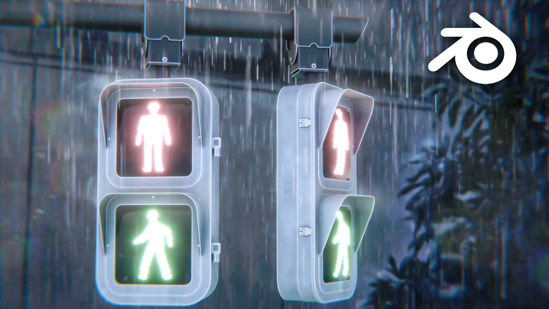
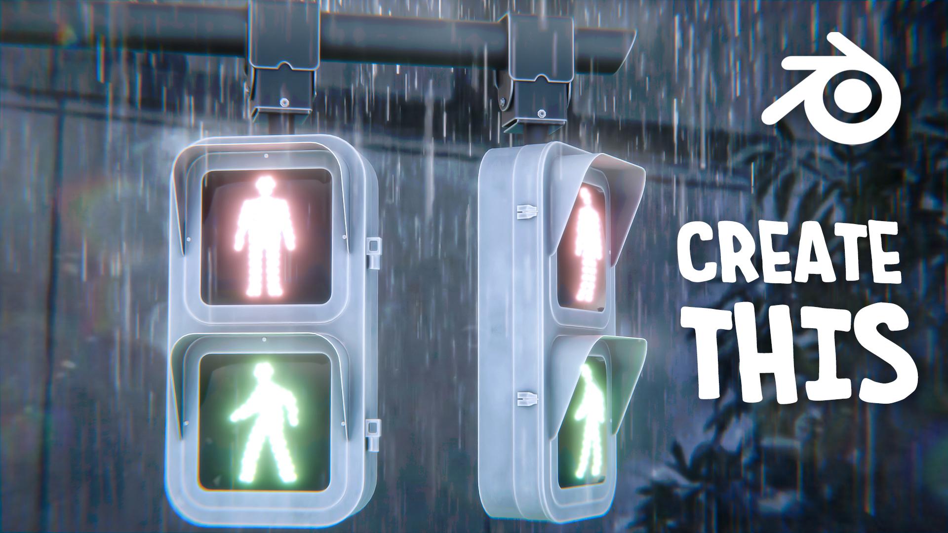
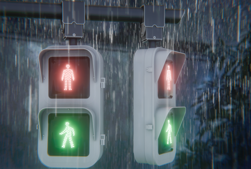
will learn how to create a beautiful anime inspired traffic light animation from start to finish
just using Blender. We'll cover the
complete workflow from molting and texturing
to lighting, animation, rendering, and post processing, learning the techniques used to create a cinematic
anime style scene. We'll begin by modeling the
traffic light from scratch, building every part of
the scene step by step. We'll then set up the
camera and composition to establish the overall look
and framing of the scene. Once the modeling is complete, we'll create stylized materials
for the entire scene, including painted metal,
glass, traffic signals, and other surfaces that give the project its
distinctive look. Next, we'll set up
the lighting and rainy atmosphere, creating
rain, reflection, glow, and adjusting
the color settings to achieve a soft anime
inspired aesthetic. After that, we'll polish everything using
Blenders compositor, along with a few
Photoshop enhancements to produce a portfolio
ready render. Finally, we'll animate
the graphic light signals and create a realistic
brain animation, adding subtle motion
that transforms the scene into a cinematic
anime inspired shot. Whether you are a beginner or an experienced blender user, this course will teach
you practical techniques that even apply to your
own stylized projects. So I hope to see you
there in this course. Thank you.
2. Blocking Out the Traffic Lights: Hello, Ann, welcome guys to
this new course where we will be creating an anime
style scene in Blender. So if you go into
the course files and open up the
reference images folder, you will find this
image that we will be using as our main reference
to create the scene. So this image itself is from the movie Garden
of Words by Mako do Shinkai and all
his films have a really distinct art
style that kind of blend detailed photo realism with the traditional anime hand painted look that we
can see over here. So yeah, we'll try and capture that style in this project. Also, this movie
particularly was based around the monsoon
season and rain. So we will be adding, like, rainfall and some traffic light animations in
our scene, as well. So yeah, let's just start. If you look over,
I have also added the reference images for
the traffic lights itself, and we also have this rain
animation that we will be using like to add
rain in our scene. Alright, so let's just
start right away. So now in a new blender file, press A to select
everything and just delete all of these
existing objects. Now you can just press one for the front orthographic view, basically to align your viewport
with the front view like this so that now we can add in our front view
reference image. So press Shift A go
into image reference, and now in your reference
image directory, just select the front view. Press G then Y and just
move it back like this. Now you can press three
for the right side view, press Shift plus A, and
now add in the side view. This way, we can
easily model out this traffic light
without any difficulty. Also, you can select this
image, press S, then Y, and type in minus one so that the image faces this
way. All right. So press one, once again, press Shift plus A
and add in a cube. Let's select the cube,
move it down over here, scale it down. Press tab to go into the
edit mode enable Xray. Press one for word
C select and just select this left side
word C and bring it in. And now basically match it with the reference
image like this. Obviously, you don't have
to be exactly precise, but as long as you are roughly matching with the
reference image, it would be fine. All right. So now that you have done
it from the front view, make sure you press
three now for the right side view
and also align it from over here as well. So again, press tab,
select the front word C, and just move them
back till here. Press G then Y and
move them back. Again, select the
backward C press G and Y to lock on the Y axis
and bring them over here. This way, we can very easily model this by
pressing one to go into the front view and
then press three to align it with the side
view as well. All right. Make sure you go into object, set origin and origin geometry
to fix the origin point of this object so that
now we can use a mirror modifier to
basically duplicate it. And how we can do
that, press tab to go into the edit mode,
press Control R, to add edge loop and
then hit right click to add the edge loop exactly
in the center like this. Make sure you have
Xray enabled and just select all of
these bottom word Cs so that you can also select them at the
behind as well. Now press X and
delete the word Cs. This way we only have the half top side of
the traffic light. Now we can simply
go into modifiers, add modifier, and
select mirror modifier. Select it on the Z axis
and disable it on the X. This way we have easily added the miror modifier,
and basically, whatever we do on
the top side would automatically be duplicate it
on the bottom side as well. Alright. Again, enable X ray. Make sure you press
Control A and apply the scale whenever you change
the scale of any object. And now we can just pressTab, press two for Ecellen and select this edge and
select this edge. Again, press one for front view. Press Control plus B to
bevel it out like this, and then you can use your
scroll wheel to add, number of segments to
basically smoothen it out. Now just match it with the
reference image, once again, Ma sure it is pretty smooth. We don't want it to look
rough or look low poly. And yeah, basically, I think
this much is pretty good. Now you can just right click
and shade auto smooth this. Let's move it to
the top and also add in a bevel modifier. Again, make sure your
scale is applied. So press Control A
and apply the scale. Let's decrease the bevel amount. I will also just
quickly go over here and enable cavity and shadow. This is basically to improve the edge visibility
in the viewpot. It does not really do anything like with your final vendor, it basically improves
visibility in the viewpoart. I will also enable hardened
normals from over here. And now we can start to add more details into our
object. All right. So to start off, press three
for the right side view, Enable X ray, and now press tab, press Control R, and add one
edge oop right over here. Then again, press Control R, add one Edge Roop
right over here, to create these uh, extrusions. So now we can press
three, whole dot, and select this loop completely, then hold Shift naught, and again, select
this one completely. Make sure you have clipping enabled in your mirror modifier. I'll just quickly show
you what it does. Basically, if you don't
have clipping enabled, you can move around the word Cs, pass the midpoint like this, which we obviously don't want. So make sure to enable clipping. This way you won't
be able to move them around, pass the midpoint. If it's disabled, you can see they're going past
each other like this. Just make sure
clipping is enabled. And once again, press three
for face select, hold dot, select this completely,
hold Shift naught, and again, select it completely. Let's enable X ray
press Alt plus E and extrude faces
along normal and just extrude it a little
bit like this to create like this
extruded part over here. I think it's maybe
a bit too much. Again, press plus, extrude
faces along normal, and I think this much is fine. Once again, press
three hold Alt, select this loop
only now, and again, press all plusE, extrude
faces along normal, and extrude it just a tad bit. Like this. What I will do is, as now the bevel modifier
is not really working, you can go in geometry and
disable clamp overlap. What this will do is it will basically allow geometry to
overlap over each other. But you can also manually
control your bevel and you also kind of figure out where the problem areas are. Maybe we can decrease it a
little bit to like 0.002. And that seems to
be working fine. So let's just go with that. Press three, enable Xray, press tab and select all of it, and just move it down to once again match better with
the reference image. Press one for the front
view enable X ray, and it is a little bit out
from the reference image. So just select both of these
sides, select it completely. Press, then X, and just
squish it in like this, so we are matching the
reference image properly. And with that, I think our base shape is
looking pretty good. Alright, so let's add
in some more details. We can create this extrusion right over here in the middle. So for this, just press Shift
plus A, add in a plane, press R, then X, type in 90 to rotate it by 90
degrees like this. And I will just go over here so that we can see the
edge properly. All right. Now just once again, press
tab, select this word C, move it down over here, select these ones and move
them right over here. Yeah, that looks
pretty good to me. Press Control A and
apply the scale. And now what we can do is we can press A to select
all of the word Cs. And instead of pressing
Control plus B, which is basically used
for beveling edges, this time we will
press Control Shift B, which is basically used
to bevel vertices. Now, once again, we can
create a bevel like this. And I think this match
is looking pretty good. All right. So now, how we can actually create
this cut on our model. So we will be using
knife projects. So how we can do that, make sure you are
in the front view, so press one to go
into the front view. Select this main object
that is our base object, press tab to go
into the edit mode. And now you can press Control. So just hold Control
and use your left click to select this
object like this. You can see we will get
this orange color outline. So as soon as you
get that, you can now press A to
select everything, press F three, and search
for knife project like this, hit Enter, and Select
our main object, press tab and you
can see we have created this cutout over here. So now we can just
select this object and press delete to
remove it completely. Again, enable Xray,
press I to inset, and just insert
distill here, press S, the Z, scale it down to match it better with
the reference image. And, I think that's pretty good. Press three, whole lot, select this loop completely, and now just press E to
extrude it outwards like this. Yeah, again, I think
thismg is pretty good. Before proceeding,
let's just press Control plus S to
save our files. And then in the
blender files folder, I will just save it
as traffic lights. All right. Let's move further. We can add this like this part that is on the top,
covering the light. So press Shift A,
add in a plane. Once again, place
it right over here. Let's scale this
down, so press S, then X and scale
it down like this. Select them both and move
them back till here. I'll just kind of
make sure it is in the center because we can try and use the mirror
modifier with this as well. Scale it around till here. Press control, apply
the scale first, press tab, press Control R, and add edge group
right in the middle. So hit rightly, and we can just remove
this side, press X, and delete the word
Cs and now add in a mirror modifier. All right. Perfect. Press
tab, enable X ray, press E. Sorry, not this. Make sure enable clipping first and just select
this left hand side, and now press E, then press
Z, lock on the Z axis. Now we just need to
make sure that both of the edges are
lining up properly. So for that, we can
move it like this, scale it down a little bit. And yeah, now you can see,
both of them are matching up perfectly on the left
and the right side as well. And now we can press Control,
apply the scale again, press tab, select
these two edges. Sorry, just one edge
because the other one is automatically done
by mirror modifier. Now press Control B
and bevel it out. Yeah, I think
that's pretty good. Right click and shade
or smooth this. Again, enable Xray,
and let's just align it up quickly from
the left hand side as well. I'll select this word
C, move it down. And just adjust these as well. Yeah, I think
that's pretty good. Press S and X and scale it
up just a tad bit outwards. I'm just trying to match it with this edge right over here so that we don't really
see much space. And I think this is pretty good. Now to give it thickness, you can just simply add in a solidify modifier and just make sure to move it in the
negative direction like this. I think this match
is pretty good. Let's remove the
pin from the smooth biangle modifier and
move it to the top. And now we can add
in a beble modifier and also enable hardened noels. Decrease the bevele amount so that we don't get any
shading issues right over here. And I think this is
looking pretty good to me. Just select this press tab, press A to select everything, then we can just
press Shift plus D and lock on the z axis
and just bring it down. Yeah, that feels
pretty good to me. Let's just hit Save. And I think this t is pretty
good for this first lecture, we'll continue adding
in more details into our traffic light
and working on the model. So yeah, thank you for watching. I will see you in the next one.
3. Creating the Top Part: Hello, and welcome, guys. So let's continue modeling
our traffic lights. One thing that I do
want to fix before starting is that if
you look over here, just at the middle of
our traffic light, we do have some shading
issues over here, and that is because I kind of forgot to again, enable
clipping for that. So let's just quickly
fix them first so you can turn off the
mirror modifier and also turn off the bebl and we can clearly see we do
have some issues going on. So first select this press
tab and we can press three for face select and
just select these two faces, press X and delete them. Now you can also press
one for tic select, select these two vertices, press X, and again, delete the vertices as well, so that we have something
flat like this. Next, what we have is we have these vertices
flying around. So what we can do to fix that is just press one for the
front view, enable Xray. And I know it is over there
on the left side as well, but you don't have
to worry about that. You can just select
it all like this and press S then Z
and type in zero. This will flatten this entirely like this and make them
all on the same plane, which is exactly what we want. But now the problem
is that we do have some double
vertices like this one. So what you have to do is just press A to
select everything, press M, and then select
merge by distance. This will remove three vertices, as you can see over here. Basically, it removes all
of the duplicate vertices. So any of the vertices that are overlapping
on each other, it will remove and
now the last thing is this vertice is not
connected right over here. So instead, we can
just hold Alt. So press two for H, select, select this edge completely, press X, and we can dissolve
the edge loop entirely. And this way, I think all of our issues are
resolved over here. Now I know we do
have the same issues over here on the
left side as well, but you don't have to
fix them over here, press A to select everything. Then you can go to mesh, symmetrize and you can see it has symmetrized the left hand side on the
right hand side. So now you can just click
over here. And flip the axis. So basically minus x two plus x, we can change this
plus X to minus X. And now you can see
this has entirely fixed our issue over here as well. So now we can just
safely enable back the mirror modifier and you won't see any of the
shading issues up here. I will enable back
the bevel as well, and yeah now it
looks much better. I'll press tab press
34 face select hold Alt and hold Shift andat and select
this loop as well, and maybe just scale
it up just a tab. And with that, I
think we are done. Let's move ahead,
press three or sorry, press one for the front view, and let's start working on the
top piece right over here. Start by pressing Shift A, and let's add in a cylinder. Press R, then type in 90
to rotate it like this, and you can scale it down. Let's enable Xray, and again, match it with the
reference image, press S and X, scale it up. And let's scale it
roughly like this. Obviously, it does
not have to be exact. Now press three and just
bring it in over here, once again, match with
the reference image. Now to create this slanted part right over here,
it's really easy. First, press Control A
and apply the scale, press press one for words C select and select all
of these word Cs. Now hold Shift Alt and control, and then press S. This is
basically shortcut for shear, and now we can
make it like this. Just move your mouse
towards right inside, and yeah now just move it back. Perfect. We have created
that shear as well. Right click and
shade to smooth this and we can also add
in a Bbel modifier. Make sure the scale is applied and obviously reduce
the Bbel amount. Let's enable harder
normals, as well. And now we can just press Tab, press three for phase
select, select this phase. Maybe insert this a little bit, and then we can just extrude it. So it is extruding in the
wrong direction like this, so just hit right click
and now you can just press G then X and move it back. Yeah, I think that
is pretty good. All right. Let's continue. Press one for the front
view once again and let's start working on
this type of thing, which is connected to the traffic light and
to this pole as well. So let's first select our
cylinder, press or sorry, go into object, set
origin and origin to geometry to fix the origin
point right over here. Now, press shift plus
cursor to select it. And the reason I'm doing that is basically wherever
the cursor is placed, if you add a new object, it will be added
right at the cursor. So let's say you can move the
point or this cursor point by holding shift and using your right leg and now
dragging it around, you can place it
wherever you want, and now wherever you
add a new object, it will be added
right over here. So I want to add the object
roughly around here, so just select this pre
shifts, cursor two, select it. Press Shift A, and
let's add in a cube. Once again, press one for
the front view enable X ray, and we can just quickly scale
and place it like this. Now let's press tab, press
one, move this down. Press three for the right side
view and just scale it in. Yeah, I think
that's pretty good. Now what we need to
do is we just need to delete all of these faces
that are right in the middle, press X and delete the faces so that we have this hollow
shape right over here. Press Control A and
apply the scale. And now we can just press tab, press two for insult,
select these two edges. Before that, let's just add a solidify modifier to
basically give it thickness, and we will also
be able to see it properly because
without any thickness, we cannot really see our object. So I'll just add a
solidify modifier and set it to even thickness
because as you can see, around the corners, it gets
a bit squished in like this, so make sure to enable
even thickness. And now we can just adjust
the thickness according to the the difference image itself. Make sure the scale is applied, select these two edges, and now you can just
press Control plus B to bevel them out and give
them a bit of smoothness. Maybe decrease the solidify
thickness tad bit, so 0.015. I think that's a bit better. All right, right click and
shade at to smooth this. Let's go to the front side, enable Xray, press tab
for the edit mode, and now we can just select
these vertices over here, press Control Shift
and B to bevel them, and to create this
rounded out corner. All right. Now what we
need to do is we need to create this curved out part over here that is in the middle. So just select this edge like this and now you
can just right click and subdivide it a couple of times to create a
lot of vertices. Press one for the front view. Select all of these
vertices, press S, the x, and just squish
them in this way. And now we can just move them up to create this curved part
over here in the middle. Maybe you can press Control R, add a couple of them over here. Yeah, I think
that's pretty good. Now we can just finally
add in a wel modifier. Let's move the smooth
biangle to the top, enable harder normals over here, and then adjust the wel amount. Maybe a bit more, 0.005. Now we can add in a
weighted normal modifier. You can also increase
the bevel segments over here to improve the shading around some corners. And if you feel like this
looks a little bit too weird, you can select these
word Cs and then press Control Shift and B again to bevel them out to give
them, even smoother look. But not too much.
Otherwise, they will collide with each other and create
shading issues for us. Yeah, I think that's fine.
It looks pretty good. Now we can move ahead.
Let's press shift A. First select this go
object set origin and origin to geometry. Once again, press shift plus, c to select it, press Shift A and add in
a cube this time. Let's enable Xray move
this cube down over here. Once again, press three move back and just match it
with the reference image. Yeah, T one is pretty simple. Let's just press Control, apply the scale
first, press tab, select this phase, press X, and delete the pace, and maybe I will select this phase as
well that is on the top, press X and delete the phase. Now we can maybe
press two for select, hold Control aught, and select all four of
these side edges. And then we can just
maybe bebelt out just a tad bit to
smoothen it out this way. A to smooth this and once
again, do the same steps, add a solidify modifier
for thickness, and also add in a Bb
modifier for smoothness. Mable hardened normals. And you can also add in a
weighted normal modifier to further improve to further
improve the shading. I think this looks
fine. Maybe we can increase the number
of segments over here. Yeah, that looks a bit better. All right. Let's continue. Again, I will select this,
go to object set origin, and I'll set the
origin to geometry. Shift plus cause to select it, and let's create this piece. And again, this
is pretty simple. We can add in a simple plane, press R, then Y and rotate
it. 90 degrees like this. We can go into the wireframe
shading mode as well, but I think this is better. Just place it at the top over here and this one
right over here. Press one for the front view, we can just move it towards
right over here like this, to match with the
reference image, and let's add in a
solidify modifier, apply the scale, and I think
the thickness is perfect. Now we just need to create
this curved out path. Once again, just select
these two vertices, press Control shift in B, and you can kind
of bevel it out. Increase the number
of segments to make it a little bit more
smoother and just increase the bevel until it is like matching roughly
with the reference image. I think this much
is pretty good. I'll go ahead with this.
And now we can just first, right click and
shade out of smooth, add in a mirror modifier. This time, select the
mirror object as this one, so that we can mirror it
on both sides like this. Maybe I'll increase the
solidify a little bit more and move it a little
bit inwards like this. Now I think that's pretty good. Now we can just add in a bevel modifier to again
smoothen out the edges. I'll move the smooth
biangle to the top. Enable hardened normals over here and adjust
the bevel amount. Yeah, I think this
is pretty good. Let's just hit safe first. And now we can create these
parts right over here. I think I'll just move
them a little bit ahead to match them better with
the reference image itself. Let's increase the solidita
bit more. Yeah, that's fine. Now we can just press
Shift A add in a plane, scale this plane down and
just place it around here. Press three, press tab, enable Xray, and just
select these two words Cs, press X, and delete them. We just need these
two like this edge, and now place it right
over here and just extrude it to match with the
reference image once again. Yeah, I think that
is pretty good. Now we can just add in A solidify modifier to give
it again, a bit of thickness. Let's add in a
Bbel modifier now. We can do the same
steps we did earlier. Yeah, I think this looks fine. So with that, we can hit Save. We can finally just
add in this cylinder. So scale the cylinder down. Pace it roughly like this. Press three, and let's see. We can match it
over here as well. Let's move this
down a little bit, press tab, enable X ray. Move this edge up a little
bit and this one over here. And, rest everything
looks pretty good to me. Right click and shade out smooth with the
cylinder as well. And we are doing pretty
good with our model. Let's just sit save,
and we'll continue from over here in the next one.
Thank you as watching.
4. Adding Details: Hello, A, welcome, guys, so let's continue modeling
our traffic lights. And in this lecture,
we will wrap up with the modeling phase of our
course. So let's just do that. I'll press one for the
front view enable Xray, and let's just create these
small, like, nut like things. Add a cylinder and rotate it
by 90 degrees on the X axis, scale it down and place
it right over here. Press tab to go
into the edit mode, press A to select everything, and then press Shift
plus D to duplicate, place this one right over here. Then once again, duplicate
and place this one right over here. Now, let's
spring them out. So press G then Y. And they are not really,
placed correctly, so just place them according
to our current model. So let's just move them towards
the right a little bit. I'll select these two and just
move them in a little bit. Supply the scale and add in a bevel modifier and
reduce the bevel amount. Okay, in shade to
smooth this and enable harder normals and
yeah this is pretty good. Now I'll just select this
and now we can press Shift plus D and Z to lock on the Z axis and
just move this down. I think somewhere
around here is fine. I also want to quickly fix
this part right over here, so just bring this down a
little bit so that it actually lines up with this edge
of the traffic light. Yeah, now it looks
much better, I think. I also want to just quickly, as you can see, it is a little
bit overlapping over here, so just disable the
mirror modifier. And this is pretty easy now, so we just need to select
all of the bottom vertices, make sure X ray is enabled. Then press S then
Z, type in zero. Let's move this up a little bit. And now when you enable
back the mirror modifier, you can now just simply enable clipping and now join them together at the
center like this. Now it is perfect. All
right. Let's continue. Again, press one for the
front view enable Xray, and let's create these
parts right over here. These are again some nuts. So let's just select this press shift puss
because I selected, and we can start by
adding in a cube, scale this cube down and
place it right over here. Now we can just press Control, apply the scale, press tab, and now we can press
two for it select, hold Control and naught and
select all of these edges. Now when you press
Control plus B, just don't give it any
segments to smoothen it out, keep it like two only so that
we can create this type of, I think, octagon like shape. Yeah, that's fine.
Now, bring this out. Three for the right side view. And yeah, that's fine. And Now I will also just press tab to
go into the Edit mode, press A to select everything. Again, press Shift
plus D to duplicate, and now you can hit
right click to place it exactly over here and just
increase the size of it. Now we can just move it back to create a small
base like thing. Yeah, that's pretty
good. Press Control A, apply the scale and just simply
add in a bevel modifier. Reduced amount of bevel
to really low number, 0.002 and enable
hardened normals Yeah, I think
that's pretty good. Now I will also just select this and press Shift
plus to duplicate. Press one for the front view, and let's place it
right over here, so rotate it like this and
place it right over here. Nb X ray and just place
it and match it with the reference image.
Yeah, this is fine. It does not have to
be like, perfect. I'll move this back. I think I will reduce the bebel
modifier a little bit. So 0.001 because it does
look a little bit too smooth right now. I
think this is good. Now we can just add in a
mirror modifier to this. Let's try and select the
mirror object as this one. And yeah, I think it
is working perfectly. With that, I think the only
thing left to create are these pieces right over here and also the ones over
here, these ones. So let's create these two, and I think we will be
done with the modeling. Okay, we have to create
one more thing that is the actual glass of the
traffic light that covers it, because right now it
looks pretty flat like this. Let's do these things. Press shift, add in a cube, scale this cube down,
place it right over here. Sorry, just scale it down. A apply the scale, press tab, enable Xray, and just add sage loops. Now I will just press
one for word, C, select select all the
behind word Cs, press X, and delete them, and then you can press
three for face select, select this pace, press X, and again, delete the pace. Now we can just select this all, press E, and extrude
it backwards. I think this much
thickness is fine. Now we can add in A, D modifier and enable
harder nomals. Let's select this loop. So hold Out and select this loop entirely and just scale it in a
little bit more. I click and shade or to smooth this and move this at the top. I think I will also just
select all of these edges, so hold Control and naught
and select them all, press Control plus V
and bevel them out a little bit like this. Yeah, that's better. I will also bevel these two edges
as well on the side. Now that looks a
little bit better. Just select this press Shift
plus further to select it. And now we can simply
add in two cylinders. That is pretty basic, scale them down and match it with the
reference image like this. Duplicate this one and
fit towards the left. Make sure it has
enough thickness. Auto smooth both of them. A, I think this is pretty good. We can maybe just select them both press Control
J to join them and add in a bevel
modifier, apply the scale, move the smooth
biangle to the top, reduce the bebel amount, and enable harder normals.
Yeah, pretty good. So let's just select
these two now. Now we can press Shift
plus D to duplicate them, pre z to log on the z axis, and just bring them
down over here. Yeah, it looks pretty good. Press three for the
right side view. I'll just select this
image that is on this side view image and then press slash to go
into the local mode. Basically, this way
you can select any of the objects and press
slash on your number pad, and you can isolate
them in a local view, which really helps
out a lot when you have to single
out one object and work on it without the interference of
any other objects. So I can just select this one, press slash to go
into the local mode and easily create these
things over here. So press Shift A,
and let's start by adding in a simple
single vertex. If you don't see this
option upear over here, that is because you have to
enable two add ons for this. So go into the add on section
and search for extra, and you can just enable
both of them extra curve objects and
extra mesh objects. If you don't find these over
here in the add on section, you can find them in the
Get extension section. So, you can just go over here and search for the extensions, extra objects, and, like, download or enable
them from over here. And then you can just press
Shift plus A and you will get this option of
adding a single vertex. I will place this
one right over here. Press E to extrude it, press Z to lock on the Z axis. Now again, press E, and Y, lock on the Y axis and just basically trace out this shape. Again, press E, then Z
to lock on the Z axis, then E, and Y, lock on the Y axis. Now you can select these two
press F to join them like this to make it like a complete
figure and connect it. Now what we can do
is we can just place roughly whole shift
and use your right click to place the three D
cursor roughly around here, and now you can go to object set origin and set the
origin to three D cursor. This will bring
the three D cursor right over here or sorry, the origin point
right over here, which will help us to
easily mirror this object. Now when you add
a mirror modifier and set it on the Zt axis, you can see it adds roughly
in the same location. And yeah, that's pretty
good. So now select it all press F to
fill out this phase. You can press E to extrude
it downwards like this. Right click and shade
How to smooth this. Maybe what I will do
is press Control R and add a couple of
edge loops over here. You can select these two, press J to join them. Maybe I will move this
one little bit like this. Again just select these
two, press J to join them. Bring this one over here, select these two and press
J to join them. Basically to create a quad shape so that we don't
have any engons. We can add one
over here as well, select these two and
press J to join them. The ones behind don't have it. So what I will do
is I will quickly just select the behind
ones once again, press X and delete them. This way we have this phase. Again, press A to
select everything and just extrude it
backwards like this. Now we get the proper
quad topology all over. So maybe we can
select this phase right over here and raise it over here like this to create
a bit interesting shape. Something like that. So, that's why I created all
of those edges, which will help me
create these shapes. Maybe move this a
little bit inwards like this and create
something like that. Now we can add in a
bevel modifier to this, move this to the top, reduce
the bevel amount, obviously. So let's go with 0.0 015 and it looks pretty weird.
The shading looks weird. First, let's decrease
the pebble to 0.001, and now we can enable harder
normals from over here. And yeah, now it
looks pretty good. Now what we will do is let's press slash to come out of this, and we basically want to
place these over here. So press R then Z type
in 180 and ate them like this and just place them
on the left hand side. Maybe I'll select this
phase and move it out and we can hold At
and select this loop, maybe press Control B to
smoothen it out like this. I think the earlier
one was fine. Select this press shift
plus further to select it, and we can also add in a
simple cube in between them, just like a really small
strip type of thing. Increase the scale
of it on the Y axis, move it down. At
something like that. Press controller, apply
the scale, press tab, and maybe we can Heat
something like that. You simply add in a
bebel modifier to this. Again, reduce the bebel amount. So now I basically want
to extrude it downwards. But if you just
press E like this, it will create this weird shape. So what you can do
is you can go over here and select the
extrude manifold. And now when you push this down, it will work out a lot better. And I'm pretty happy with
how this is looking. So we can just select this now. Let's press three for the
right side view enable Xray. Yeah, it is pretty much
in the same location now press Shift plus D and
bring this down till here. The reason it is flipped
like this is because we have to put it on the other side of
our traffic lights. That's why it appears this way. But everything is
pretty much done. Our traffic lights
are looking good. Let's just work on the screens
that I was talking about. So press Shift A. Let's select this, press Shift pluss further to select it. Let's press Shift plus A and
add a simple plane press R, the next type in 90 and
rotate it like this and make it just roughly the same
size of the screen itself. Like somewhere around here.
Now you can press three. And once again, I
will just select this plane and select
the side view image, press slash to go into the
local mode, and again, press three, and now we can work a little
bit more freely. Just bring this out
till here like this. Press tab to go
into the edit mode. Make sure to press control, apply the scale, press tab, press A to select everything, and now you can press E to
extrude it and just scale it according to this part
of the reference image. Now extrude it just a little bit, scale it down like this. Again, press E to
extrude it a little bit and scale it down.
Create like this. Uh, like smooth shape
for the screen itself. Press slash to come out of the
local mode, and let's see. And now we can just select this, press right click and
shade auto smooth this. And yeah, I think the screens
are looking pretty good. Yeah, I'm happy with the
look of our glass over here. So just select it,
press Shift plus D and Z and bring it
down over here. Or I think we can use the
mirror modifier for this. So just add a mirror modifier and select the mirror
object as this. Set it on Z axis. Yeah. Perfect. We have
got our traffic lights, and I think they
look pretty good. Now just select this all Make sure to hold control and
deselect this image, deselect this part as well. Just make sure to select
the traffic light itself. And now we can press
Shift plus D, press X, and bring it over here so that we can create these two
traffic lights, obviously. And with that, we are basically done with the modeling
part of our course. In the next lecture, what we will do is we will set
up the scene a little bit, setting up the camera, obviously moving the position of them because they don't look as good, like, completely straight. So we'll just move them
around, place our camera, and then we can
finally just U and wrap them and start with
the texturing process. So thank you for watching. I will see you in the next one.
5. Setting up the Camera: Hello, and welcome, guys. So in this lecture,
we will be setting up our camera and
composition a little bit. So first, let's select both
of these reference images. We can press M and move them to a new collection and rename this to reference underscore images. And I can just easily
turn this off. I will also select all of the models that we
have just created. Again, press M, move this
to a new collection, and rename these
two traffic lights. All right. What I will
do is I will also select these four things like these screens that
we have created, press S and Z or sorry, S and Y and scale them
up a tad bit like this, basically increasing
this size of them. So just press S and Y and just
increase it a little bit, not that much to make it a
bit more curved like this. Next, what I will do is I
will select this all and I will increase the scale of my traffic lights a little bit. Also, you can press
N over here to bring this sidebar
view up so that you can match the measurements
that I'm going for All right. Scale it up a little bit next. I've also opened up Pure ref to actually see the
reference image that we have so that we can kind of match up with
this shot over here. So yeah, I have just opened this image in my second monitor. So I'll place it
right over here. First, what I will do
is, as you can see this part over here is a
little bit at an angle. So what we can do is I'll
just first scale it down. All right, so you can
just select it all, press R then Z to lock on the Z axis and just
rotate it a tad bit like this. Maybe
something like that. Now, as you can see,
this traffic light is facing in this direction, so just carefully select all
these parts and then again, press seven for top you. Let's enable X ray and
rotate it like this. I will go into the
wireframe mode and place it roughly in the
center of this part. And I think something
like this is pretty good. And the left traffic light is facing in the other direction. So again, I will select it all. Again, press seven for top view. Now you can just press R
and rotate it like this. So I am matching this
circle with this line to keep it in the center roughly. I think that's pretty good. And now, as you can see
the traffic lights roughly line up with the shape that we have in the reference
image as well. I will move the reference image back to my second monitor. Press three or sorry, press one for the front view. Then you can press Shift A
and add a camera like this. Let's move this
camera over here, press G then Y,
and move it back. Now press zero. To view
through the camera, you can press zero
on your number pad to view through
the camera itself. Let's go to the
camera settings like the object data
properties and increase the focal length to
something like 60. Now again, press G then Y and
move it back a little bit. Let's move it up, press G and Z. Now what I will do is I will
just select this camera and maybe rotate it up a little bit like this at an
angle then move it down, so to give it a feel that
we are looking it from downwards because we kind of have a similar angle
over here as well. And now I think it
looks pretty good. Maybe just move it a
little bit like this. With that, I think we are lining up with the
shot pretty nicely. I'm really happy with
how this is looking. Maybe move it a little bit
more to the left like this. Now we can also go into
the rendered view mode. Let's just simply go
into render properties, set this to cycles, set this to GB, also
enable denoise, maybe just add like
a simple sunlight glad we can actually see
how everything is looking. And yeah, I'm pretty
happy with how the overall model
has turned out. Now what we can do is
we can finally start to U and wrap it and start
working on the textures. And then after that,
we will set up, everything properly like
setting up the lighting, the background,
the rain as well. So yeah, I think this much is pretty good
for this lecture. I will see you in the
next one. Thank you.
6. Minor Fixes: Hello, and welcome,
guys. So this will be a quick
video where we'll do just a couple of fixes before we actually
start the texturing. One thing that we
can see is that this screen light
thing that is in the front is poking
out from over here. So let's just quickly fix that. So press tab on this, press Control R and
add edge loop right over like here,
just around here. And now you can
just scale it in. In my opinion, that is a lot better because now it is
not poking around anymore. Let's do the same thing
over here as well. Press control A edge
loop right over here, scale it. Yeah, that
is pretty good. Next, what I will do
is you can select this and you can also add in
a weighted normal modifier, which will kind of fix up
the shading a little bit, enable keep sharp and
decrease this weight to zero. And you can see the shading
has improved a little bit. Let's do the same over here. Just select it, add a
weighted normal modifier. And set this to zero. With that, we have fixed that. I will also just
select this object. Let's select both of them at
the same time, press tab. And what I want to do
is I want to select this single vertice and just kind of like I want to bevel it a bit so that it
is a bit smoother. So hit Control Shift in B
and just bevel it like this. Just so it becomes a
lot smoother like this. I think this looks much better. Next, I will also just select it and decrease the thickness of this like the
solidified thickness. So negative of 0.006 maybe. Or instead, we can increase the bevel amount to
something like 0.003. Yeah, that feels a bit better, and I will just set
the thickness too. 0.7. Yeah, that feels good. I will do the same
over here as well. Now just increase the bevel. Alright guys. With
that, I'm pretty happy with how our
models are looking. Let's just hit save.
We'll finally start with the texturing in the next video. So thank you guys for watching.
7. Adding Materials: Hello, and welcome, guys. So now that we are done with the modeling part of our course, we can focus on texturing,
lighting and rendering. So in this video, let's add
some materials to our models. First, what I will do is, I'll
just open up this section, click on over here
and change it to the shade radiator. All right. You can also go over to the rendered view
mode so that you can actually see the materials, and you can just select this. Let's select this first, click on New and rename
this to the glass material. So to make it the glass
material, it's pretty simple. You just open up the transmission
section, set it to one, and let's set the roughness to zero so that it reflects
off completely, and then you can choose
the base color to be like something
dark like this. I think somewhere around here. Then you can select this
one as well and just click the glass material so that they both have the same
material. All right. Next, what I will
do is, I'll just select our main
traffic light body, click on New and rename this two traffic
lights. All right. So for this material, again, we'll be going with
something simple. So first, press Shift and add
in ambient occlusion node. So what this will do is,
if you plug this in, you can see it will
basically add all of these shadows like
contact shadows. You can just select
your node and press to turn it on and off and
see the effect it adds. First, before continuing, what I will do is I'll just
select everything, like all of the
models that we have created over here as well. Let's select these ones. And what I will do is, I'll
just select this one at last. So select the one that has the traffic lights
material at last, press Control plus L, and now you can select
link materials. Basically, this will copy
your material to all of them. Let's just change the
color to something random so that we can
actually see the material, like if it has been
copied to all of them. Also select these three
as well over here. And this, then again, select any of the objects
that has the material, press Control L and
link materials. Perfect. Now we can again, give it some type of color. So I will be going with
a desaturated blue, so just decrease the
saturation, the value as well. Let's make it a bit more darker. Yeah, something around here. So now we have the color
of the traffic lights. So to improve this material, what I will do is I will
add some edge highlights, which we usually see in like
animate type of materials. So what I will do
is there is, like, a basic setup of nodes to add edge highlights to any
object in blender. So what you need to
do is press shift A and search for a bevel node. And again, press shift a
search for a geometry node. Now what we need
to do is we need to press Shift A and search for dot product node and you can just plug both
of them in over here, select the normal input from over here and plug
it in the vector. Now you can take this value
and we need to just map it, select a map range and then
we are basically done. You can just change them
two minimum value to one and two maximum
value to zero. Now when you plug the result in over here in the base color, you can see we have
successfully masked out the edges of our models. And if I increase the
two minimum value, I can control the
brightness of them, how bright I want them to be. And with this radius value, I can also control how thick
I want these outlines to be. Like, if you put it at 0.01, let's say, you can see
they are pretty sharp. So this is like a really
powerful set of nodes that we can use to add these edge
highlights wherever we want. So now to properly set them up, we basically need to mix the ambient clusion and
this edge highlight thing. So first, you can just hold
control and disconnect this, and we need to press Shift A
and search for a mixed node. So just add a mixed color node and plug the result
in over here. Now what I will do is
I'll take the result of this and plug this
in the factor. And you can take your
ambit illusion and plug this in the A input. Now, what this will do is
this B input or this B, color input is
basically the color of your like the highlights. So obviously, I'll just
keep it at white only maybe make it even
brighter like this, and then you can control the
value like this bevel value. So increase it to 0.04 maybe let's just decrease it a bit 0.035,
something like this. And we can also decrease the
two minimum value to 0.8. And yeah, as you can see, we get these very nice edge
highlights around our model, and I think they
look pretty good. You can just select
it all and press to turn it on and off like this. So you can see this
model was pretty flat and now we have added
some edge highlights. Pretty good. All right, guys. So now to improve the look a
bit more, what I will do is, if you'll go in the course files and in the reference
images and texture folder, you will find this grunge
texture that we can basically use to break up
the surface of our material. So just drag and
drop it into blender and you can plug this into
the ambient oeclusion. Right now, it does
not look pretty good. So what I will do
is just select it. You can select
these four pieces, press Control, apply the scale, then press tab, press A to
select everything and press U, and then select Cube projection. This will basically
UV and wrap them, and now they look a
lot better. All right. So to obviously improve
the colors of this, what I will do is press Shift and add a color
ramp in between. So just plug this color ramp
in over here like this. Now you can select
the black color and just maybe make it
a bit more brighter, as you can see, because
we don't want it to look like too dirty as
it is looking right now. So just maybe make it
a bit more brighter. This way, next, what I'll do is I'll just select the
white color over here, select this white
slider and again, select it and give it roughly the same color
that we had earlier. Make it a bit more dark. Something like that, and I will also maybe make it a bit more darker over here.
Something like this. Basically, this will
help us to break up the surface of our material. Otherwise, it is
looking like too flat. Another thing that we can do is we can probably go with like a bluish type of color
for this as well. Just make sure to
desaturate it a bit. Yeah, I think something like
this looks pretty good. Yeah, that's good. Next, what we can do
is we can select this, again, click on New and
rename this cue simply metal. And I'll first give
it like black colour, set the metallic value to one, decrease the roughness a bit, and we can first just copy to the rest of the objects as well. So select them all you can just make
selections like this. And if you by chance,
select anything extra, just hold control and
deselect this way. Now you can at last select this metal rod, press Control L, and link material so that
all of the materials get copied up to the like all
of the selected objects. All right. With that, what I will do is, again, select your graphic lights and just copy all
of these nodes. Like this section, press Control C, and come
back over here, press Control V,
and just plug this in this way. Let's see. What I will do is
probably I will reduce the metallic quite a bit because it does look
a little bit weird, so somewhere around 0.5. I think the roughness is fine. Next, what we can do
is we can definitely make our base color
a bit darker. Yeah, something like this. And now for the
outlines, let's see, can probably increase this to minimum value to
something like this, and now select
your outline color and maybe make it a little
bit lighter as well, because it is a bit too bright. Yeah, I think something
like this is pretty good. Also, the material of the
glass looks pretty black, but don't worry when we
will add lights in here. They will look pretty
good. And yeah, with that, I think the materials
are added to our models. Let's save. And with
this, in the next video, we can focus on adding
the background, the rain and yeah adding
the lights as well. So thank you as watching. I will see you in the next one.
8. Adding HDRI and Background: Hello, and welcome, guys. So in this lecture, let's add our background
and we can also adjust lighting a bit to make our scene look
a little bit better. So first, what I
will do is I'll just go in over here and switch the shaded tie from object to world so that we
can add in HDRI. And if you will open
up the reference images and textures folder, you will find this
city HGRI available. What you can do is
first press shift in and search for
environment texture. So because this is a HGRI we need to add a
specific node for it. So add in environment
texture node, click on open, and we can just come into reference images and
texture and select this. You can plug it in over here. And basically, it will give us this stylized GRI all around. But what I will do is, first, what I want to do
is go in over here. And under the
performance or sorry, under the film section
in the render settings, you can enable this
transparent thing. What this will do is it
will remove the GRI. It will make it invisible, but we will still have
the effects of the light. And also, I will just set the strength to
something like 0.5. Because it is a bit
too bright right now. So yeah, as you can see, now we get these nice
reflections in our glass. So yeah, that's pretty good. Come back to the object now. We can select our
sunlight. And let's see. Let's move it up like
this a little bit. And what I will do is in the object data properties
of my sunlight, I will start by increasing
the angle of the light. What this will do
is it will make it really damp and not really
sharp, as you can see, that right now we get
really harsh highlights, but you can just increase
it a lot to maybe max only. And this will give you
really flat shadows, which is exactly what we want because our scene is
like a rainy scene, so we want it to look
like really damp and we don't really want
any shadows exactly. So yeah, I think
that's pretty good. Maybe I can set this to 140. Yeah, that's fine. Next, what I will do is I'll also
enable temperature. Basically, if you decrease this, it will give it yellowish
tones to your scene. And if you increase
it past 6,500, it will basically give
these bluish tones. So somewhere around, I think, 8,000 8,500 is fine. If you enable or disable this, you can clearly see that it is adding these bluish
tones in our scene, which we really want
with R environment. All right. Next, what I'll
do is I'll press Shifte, go into image,
select mesh plane. And again, in the
reference images in texture, select your background. Let's scale it up. And move it back somewhere around here. Just make it pretty far away
from your traffic lights. And right now, the color
of it looks pretty weird, but don't worry. We
can easily fix that. Just select it. Go in over here, make sure to come
back to your object shadotype and now
you can just plug in this background like node
directly into the surface, and you will instantly see
the colors improve a lot. Because now it is not really going through
this principle BSDF. We can just delete it now and the colors look a lot better. I will also come
back over here in output properties and just
enable render region. Basically, what this
will do is it will only show us the area which
is going to be rendered, and that is the
important part anyway. So yeah, I will just enable
this render region thing. Another thing that
I will do is I will come in over here in
the render property, scroll down under the
color management section, you can just change
the look from none to something like
medium high contrast. You will see it will
give your colors like this really punchy
look, which we want. You can also change
the view transform from AGX to something
like standard. Which I really like to use
for anime style scenes. Like, I really use standard, but you can work
with AGX as well. For this particular scene, AGX also works really nicely. But let's go with
standard for now. And when we create
the final result, then we can compare
both of the results of Standard and AGx and
see what looks better. Let's sit save now. And yeah, this was basically
a very short video. I think this much
is pretty good. In the next video, we will be
adding rain into our scene. So yeah, thank you
guys for watching. I will see you in the next one.
9. Adding Rain: Hello, A, welcome, guys. So let's continue
working on our scene. And in this video, we
will be adding rain. So if you will go over
in the textures folder, once again, you will find this rain video that I've added, which is basically like this black and white video
of rain where we can mask out this rain animation from the video and
use it in our scene. So yeah, it's pretty simple. But first, what I want to do is just select the traffic light, and I do want to make the
material a tad bit darker. So just select the
color ramp over here and you can move it a little
bit to the right like this. And also just select
it and just pull down this value slider so that
it is a bit more darker. Yeah, I think this
feels a bit better. Next, what I will do
is I will once again just press Shifte
and go to Image, select mesh plane, and we
can in our textures folder, select this rain video. Again, scale it up and
just try to rotate it up a bit so that it
matches the camera angle. You can press seven for top
view and you just move it back over here. Let's see. We can move it back over here, increase the size of it, and just make sure
it is covering our scene like entirely. Also, make sure that
the video is imported. You can see it is like green
dot mp four over here. And if you play it, and I don't think it is showing up because we are in
currently cycles. But yeah, it is
definitely updating. I think it would be a
little bit better like EV. We can see the
effect a bit better. As you can see, the rain
is playing up over here. In cycles, it is not really working correctly because
it is a path tracer, so yeah, it is slow, but don't worry in the
animation, it will look fine. All right. So next step
is to just basically mask out the rain so we do not need
all of these black parts. So what we will
do is just select this penciple BSDF
and delete it first, press Shifte and search
for a mixed shader. So we are using a mix shader and to drive the factor of this, what we will need is we'll
just use this only directly, so you can plug this
into a color ram. And this can go over
here in the factor. Now press shifty and search
for a transparent node, and this one can go in the top and press shift A and search for an emission node, and this one can go in bottom. So basically, all of
the black parts are being masked out with
this transparent node, and all of the white parts are being used by this
emission node. You can increase
the emission of it to make the rain kind of glow, if you want that, but I don't
think we will need that. Maybe you can set
this two or three, and that would look better,
but I think one is fine. One is pretty good.
Let's switch back to cycles again so that we can actually see the rain animation. Okay, so it is not showing
up properly, but as I said, it will look fine in
the final animation. Let's come back to cycles, and what we can do is right now, we just have this one
flat plane of rain. What you can do is just
duplicate it and bring it a little bit closer
and now increase, sorry, decrease the scale
of it so that we have, like, a bit of layering effect. And once again,
just duplicate it and bring it really
close to the camera. And just scale it down so that you get these droplets which are looking so that you get these
droplets which are really close to the camera
and later on we can use a little bit
of depth of field. So it will give us a
really nice effect. Maybe you can put one over
here as well in between. Yeah. I think this
much is pretty good. Now you can just select
all four of them, press M and move them to a new collection and
rename this two Rain. You can turn it on and off
from over here directly. And yeah, with that, our rain
animation is also set up. Next, what we need to do is we need to add some
kind of, like, traffic signs in our light
so that we can further add those like those will be having some kind of emission, which will look really nice. It will add some
color into our scene, and we can also use them
for animation as well. So, I think this is pretty
good for this video, guys. I will see you in the next
one. Thank you for watching.
10. Creating Traffic Signs: Hello, and welcome,
guys. So let's continue working on our scene. And in this lecture,
I will be adding some traffic signs
into our light. So yeah, that will add a little bit of color
into our scene. So first, I'll just turn off this rain collection and we can select our
background as well, the light and the camera, press M, and move them to
a new collection as well. Just create a new
collection so that we can easily just turn them on
and off whenever we want. I'll just rename these
two Lights camera. All right. So let's press
one for the front view, press Shift A and go into Image, select reference this
time because we just need the reference image of
the signs of these signs. So just select it, let's
scale it up a bit, reshift pluss to select it. And the way we are
going to create this is basically just we can trace out this line over here
and then we can add like these circular things, we can add cylinders and we can give them
emissive materials, which will be emitting light
of, like, red or green. So press Shift A and start by
adding in a single vertex. Again, if you don't
see these options, when you press Shift
A and you don't find these extra options over here in the curve and
in the mesh menu, you can go into edit
preferences and just search for extra, and you will find the extra
curve and extra mesh objects. You can just enable them
both now press Shift A, go to single word and
add in a single word. I'll place this one
right over here. And again, it's pretty simple. You just press E and
extrude it out like this and basically
trace out the outline. I keep on pressing
E to adjust it, just press E and move it around. You can also hold shift while
you are moving it around, and it will move a little bit slower so that you can place your like the vertex a
little bit more accurately. Now, if you want, you can
just quickly fast forward this because I am just basically repeating these
steps again and again. So I'll just quickly
finish this up now. Now, when you need
to close these two, you select them both and press
F to connect it like this. And, we are basically done. So next what I will do
is I'll just select these two t press control
shift and B to bevel them out and maybe make them a
bit smoother like this because they are looking
pretty harsh edges. And yeah, just select this vertex press shift plus D and place this one over here. And this is a bit repetitive
and boring process, but it barely takes 2 minutes, so let's just quickly
get this over with. Y. Let's just select them both and press
F to connect this. And now we are basically done
with creating this outline. Now we want to give this
outline a bit of thickness. There are multiple
different ways to do this. Let me just quickly
go over all of them because they can be helpful. I think the simplest is
to just select this and add in skin modifier. And we'll get
something like this. You can press tab,
press A to select everything and just
press Control A, and you can just scale
this down like this. You can see how
easy it was to add. Thickness to your like the
model you have just created. Also, what you can do is maybe just press tab and hold Alt and just select
this entire loop, press B, and separate
the selection. This way, both of them
are separate objects. So yeah, as I was saying, you can use the skin modifier
to give it thickness. Just make sure to
press Control A after you've
selected everything. So press A to select everything, then press Control A, and then scale this down
and you can adjust it. But as far as I know,
this adds a lot of geometry if I just apply
it now and you can see, we have a decent bit
of geometry added. So the way I do A, sometimes I will use
the skin modifier only if I want to do it quickly. But other ways to
just select it all, press E to extrude
it like this first, and you can extrude it
on the Y axis this way. So just a little
bit. So right now, it still does not have
any kind of thickness, so you can now go
in over here and add in a solidify modifier. And now you can just increase the thickness from
over here this way. We can see there are
a couple of issues. So first, press tab
to select everything, press Shift plus N,
to fix the normals, and you can see now
everything is perfect. You can also change the mode
from simple to complex, and that sometimes helps. I will also set the
offset to zero. And now I can adjust
the thickness. I think the offset to
minus one was fine. And yeah, now I can adjust
the thickness very easily. And I believe if
I apply this now, this will have way less geometry
than the skin modifier. So yeah, this is something
that I wanted to mention. And let's go with the
solidify modifier only because I think
it looks fine. And yeah, let's do the
same over here as well. I will select it and add in a solidify modifier, press tab, press A to select everything, press E and then press Y
to move it on the Y axis. Just quickly make
sure to press A to select everything
and press Shift plus N to basically recalculate
the normals and much better, you can now adjust thickness
to whatever you want. Make sure you select
them both and just check if both of them
have the same thickness. So 0.03 is what I
will be going for. Let's just select
them both and give it 0.03 of the thickness. With that, our outline is ready. I will now press tab to again go in the edit mode,
press Control R, and you can add
edge group right in the middle and hit right click so that you can
add it in the middle. Press Shift plus D to duplicate so that
you can duplicate, again, hit right click so that it stays exactly
in the location. Now press P and
separate the selection. The reason I did that is I will now remove the
solid if I modifier, press tab, press A to select everything and press F
to fill out this phase. We basically give
it this closing. Do the same over here as well. Press control R, over here, hit right, click press
plus D to duplicate. Again, hit right click, press P and separate the selection. Basically, if you don't
know, right click is basically used to
cancel any movement. Like if I'm moving it around and now I just want
to cancel this operation, I can hit right
click and it will be back where it was initially. You can do this with any
operation like scaling, hit right click, it will
be back over there. Yeah. I'll select this now, press A to select everything and press F to fill out this phase. All right. Press one
again, guys, enable Xray. And now we kind of again, have to do that repetitive task, but don't worry,
it will be quick. So press Shift and let's
start by adding a cylinder. I will decrease the word
C to something like maybe 16 because we do have to
duplicate them a lot of times. Press R, the next type in 90. And now you can just
scale this down. We could also use UVSpay
as well. But this is fine. I will now start placing
a the cylinders, you can press Tab to
go into the edit mode. Now press A to select
everything and just keep on pressing Shift plus
D to duplicate. I'm sure there is some
better way to do this by probably automating it or using geometry
nodes or whatever. But I'll just quickly
do it this way because it's just easier, keep on pressing Shift
plus D and move it around. And once again, I'll just
quickly fast forward this video because this is a pretty repetitive
process again. What I can do is maybe press
X and delete this one. You can just select
all of these ones, and maybe you can just quickly duplicate them because I think that will
be a bit quicker. Press S and X, type in minus one to flip them
on the left side. Yeah, works pretty good. Let's quickly do.
These ones as well. All right, guys. All the
for this traffic sign, press S, then Y scale
it down this way, and let's move it
back over here. All right, guys. So now we are done with this traffic sign. I do feel these over here do
feel like a bit switched up. So I'll just press to
select a couple of them, and maybe we can just
space them out a bit more because otherwise it was feeling a bit too
cramped over here. That feels a bit better. You can also hover
over any object and just press L to
directly select them. You don't need to, like, make a manual selection every time. You can just hover over
the object you want to select and press L,
and it will select it. Let's do the same over here. I will just select this
one Presl and preseX, delete it, and just space
these out a bit more. Yeah. Much better now. Again, press one
for the front view. Let's select this, press
tab and you can again, press L on any one of them, press shift plus D and
bring it out over here. Press B, separate the selection. Let's enable extra quickly. Pase this one over here, press tab to go
into the edit mode, press A to select everything, and just quickly now presifPlusD
to duplicate these all. Alright, guys,
this is also done. Let's just quickly see if
it looks crammed anywhere. But yeah, I think
this one feels fine. And with that, we are
done with the signs. So let's just select them all and move them
up right over here. Press one for the front view. And I think we will have a little bit of trouble
placing them around, but nothing too much. So let's just place
them like this. What I will do is,
let's just turn off the lights and
camera collection. But first, press
and move this to a new collection and
rename this to signs, and now we can just turn
this collection off. I will select this top one. First, let's give this
the emission material. So click on this. Let's move over to the rendered view mode. Click on New and rename
this material to emission. You can remove the principal BSDFPresShift day and search for the emission node and plug it
in. For now, this is fine. We can give it like
a simple red color. And for this one,
two emission green, remove the principal BSDFPrehifA and add an emission node, plug it in over here, change the color to somewhat
green like this. Perfect. I will select
these back plates. Click on New, just rename
this material to black, and we can give it
roughly darker color. Similarly over here as well. And now you can just
select all of them in press Control J to join them together so that it is a bit more easier
to move them around. Select this one, go to
object and set origin, origin to geometry, and
for this one as well, go to Object set origin,
origin to geometry. I'll select this now.
Let's press one for the front view enable Xray, and I can place it roughly
in the middle like this. So the scale for
it is around 0.013 I just select this
one and place them roughly on top of each other so that they kind of
have the same scale. And yeah, I do think they
both have the same scale. I'll select them both and maybe increase the size a bit more. And yeah, now you can just
move this one down over here. Like this, and this
one is fine over here. Now, make sure it is like matching up with
the rotation as well, so you can just
rotate it this way. Base it like this. Similarly
for this one as well, press seven for top view. Et's just quickly view through
the rendered view mode, remove the glasses, and
just select this one. Press G Y and Y once again, or press G Z then Z once again so that you can move
it on the local Z axis. And that would be
really helpful to, like, get you to place this. And similarly for
this one as well. Press G, Y and Y once again. So both of them have
a little bit of different local axis,
but that's fine. Now, I think it
looks pretty good. We definitely do need to, like, increase the emission of them because right now
it's a bit too low, so maybe we can go to
something like 50 for now. Let's see 50. Similarly,
for green as well, you can set this to 50. You can notice that the color is almost turning up to
something like white, but don't worry
when we add stuff like emission. Oh sorry. Like all of the compositing and everything, it
will look pretty good. So yeah, don't worry about that. Let's just select them both. And let's see. I'll select these
two pressure plus D, and maybe we can place these two exactly the same over here. Let's match it with
this line so that we know that the rotation
is roughly the same. As I mentioned earlier as well, they both have
different local axis. So just press G z and z once
again to move like this. Make sure that the
back face is touching the traffic light like this. Similarly over here as well. Press G Y and Y once again. All right, guys,
that's pretty good. Let's press R plus H to
bring our glass back. Let's enable the lights and camera and
everything as well. You can turn on
the rain as well. And right now, I do feel it does not look that great right
now, but don't worry. When we add compositing
and everything, it will start to
look really good. Let's just sit
save now and we'll continue from over here
in the next lecture. Thank you for watching. But
11. Compositing in Blender: Hello, and welcome, guys. So let's continue
working on our scene. And in this lecture, we will
be doing some composting, which will improve the
looks of our scene a lot. So let's move over to
the render view mode. And over here in the
render properties, you can just set the max
samples to something like 100 because we do want the render
to be done quickly. Also under the denoise section, make sure you use GPU because
then it will be faster. I will also enable back my rain and you can
just quickly press F 12 to give your scene a render and see how it
looks actually right now. Then we will start adding the compositing and everything
and see how that goes. All right, guys, the render is done now, and this
is how it looks. It looks fine, but
we can improve it a lot just by doing
some compositing. So let's close this and move
over to the compositing tab. You can click on New and I'll just quickly make
a couple of changes. First, you can just
hold V to just minimize this so that we don't see and get distracted
by our render. Instead, we will
just go over here in the corner and just
split our window like this and we can instead, I will split it,
I think this way. So go over here in this corner
and split it like this. And now we can just
change the top one to image editor and set
this to render result. Now I think it is much better. Over here, we can add
our nodes and over here, we can also see what
effect they add. First off, I will start
by adding a glare node, so press shift A and
search for glare, plug this in over
here and instantly, you will see you start
getting all these streaks. If you do like this
type of effect, you can definitely put it in, you can decrease the
strength obviously, and you can add it a little bit, but obviously I
won't be using that. I will be switching this to fog globe and I will decrease
the threshold to zero. And now you can just increase
the glaa size to one. And as soon as you do
that, you can see, our traffic lights
start to glow. But I do want a bit
more of that glow, so I will just select this node, pre shift plus D to duplicate
and add it once again. Now we get a lot of this glow. You can set the
threshold to maybe 0.5 to decrease that a
bit. Yeah, this is better. You can select both
of these nodes, and now you can press M to turn them on and off and see
the effect they add. Instantly with this glow,
it looks a lot better. But let's add some more nodes, press Shifte now, and you
can search for vignette, which is basically the
darkening of the corners, which will help us to focus
on the subject of our scene, which is these traffic lights. You can definitely
decrease the factor to a pretty low
number. 0.3 is fine. And maybe 0.6 for the feather. So, again, we want this
to be pretty subtle, but we do want some darkening
of the corners like this. Maybe I can increase this
to something like 0.4. Yeah, that's fine.
All right, guys. So that's pretty
good. Let's continue. And next what I will
add is I will add a pasteurized effect
because right now, everything looks a
little bit like flat, there is no color banding. So you can take this from over here and plug this into
a pasteurized node. And first, you can see what
the effect actually is. So plug it in over here, and this is the kind of
effect it will give you. We definitely need to
increase the number of steps. Also, you can go over here to options and switch this to GBU, and that will make your
compositing a lot faster. So I think I will go
with something like 23. Right now, we get
a decent bit of color banding and like
these variations. And now we can just mix it
with our original vender, so you can press Shift A and search for a mixed color node. And let's put it over here. You can plug this in over
here in the A input, and this can go in the B, and now you can plug the
result in the final. This way, you will see we
get effects of both of them. We get this posturize
effect as well, and we get the glow as well. But I think again,
it's a bit too much, so you can definitely adjust
the factor over here. So one means it is
totally completely using the B input and zero
means it is completely using the A input. So we can go like
somewhat in between, so around 0.25 because
obviously you don't want too much of that
posturize effect. This much is pretty good. All right. Next, we can press Shift A and search for
a dispersion node, or sorry, lens distortion node. And we can just add
a bit of dispersion, which is basically
chromatic aberration. As you can see, we will get
these splitting of the color. So I think it's a bit too much. So somewhat like 0.03
should be pretty good. Like this effect only looks good if you add it really subtly. So around these
edges, you can see, we get like this
disposion of the colors. Now, I think it is
looking pretty good. So you can select
them all, press to basically turn it on and off. Like the composting, and you
can see how much of effect we can add just with
these simple nodes. I will also be doing
some composting in Photoshop as well as I think it will elevate the
look even more of our scene. But if you want, you
can do a couple of those things over here
in blender as well. So let's say I add
something like tune Image, which is a node I
really like to use, you can increase the clarity. And you can see we get a bit
more contrast in our scene, and instantly the look
of our scene improves. I do like to add this
effect in Photoshop itself, but you can add it
over here as well. You can increase the
clarity and detail. And you will see they instantly improve the
look of your scene. Like if you increase detail, it is basically sharpening of the edges. And you get
something like this. Obviously, this is
a bit too much, but you can go subtle with
this and get decent results. If you select this node only now press to turn it on and off. You can see earlier it was
like everything a bit blurry. But with tune image, you can just make everything
a bit more crisp. But, as I said, I like to add
these effects in Photoshop, but I just wanted to mention that you can do these
things in blender as well. I will remove it now, so hold all and remove it and
you can delete it. Okay. So I do want to
make a couple of changes. So let's come back
to our layout, and we can press F 11. So this is how our
render looks right now. So the things that I want
to change are you can select your main traffic
light material first. Okay, first, I will just
turn off the rain thing because it gets in
between our selection. We cannot easily
select our objects, select the traffic light now, and I just want to
increase the metallicness, because you will see it
will get a bit more darker this way and look a
bit better as well. You can increase
the metallic and the roughness so
that it does not like increase the roughness as well so that it does
not shine of light, and it will get a tad
bit darker as well. I will select the top
part of the metal, and maybe I'll just
decrease the bevel to 0.03. Because this bevel over here is looking a bit too much.
That's better, I believe. You can now press F 11, press J to switch between render slots and press F 12 to give your scene a new render. This way, basically we can compare the two
renders and yeah, it's kind of helpful to
switch between the two. You can instantly see right now the traffic lights do
appear a bit too bright, but with this, they look a little bit better
integrated into our scene. Obviously, these things are totally up to your preference, how you want to, play
around with them. But yeah, I will be going
with something like this. Also, I will be selecting
the background. You can press Shift
A and search for a huge saturation value node and plug this in over
here in between. And now what I'll do
is I'll just decrease the saturation of it
to something like 0.75 to make it a bit desaturated and you can decrease the value to
make it a bit dark. Basically, this will again integrate it better with the sea because it is a bit too saturated and bright for
the look of our sea. Again, I will just press F 12 over here only so that we can compare it
with our initial vendor. Alright, now it's turn, you can press J to compare
between the two. So earlier it was, like, a tad bit too bright, and now it's looking a little
bit more like damp and cold also like you get a bit more of a sad type of
Y from our render now, which I think I was going for. This is looking a
bit too bright. But yeah, all these things are totally up to your
preference as well. If you want this kind of look, you can definitely go for it. Next what I'll do is I'll also
decrease the saturation of our emission lights because if you'll notice they do
look a bit too saturated, in my opinion. So
you can select this. Maybe I'll increase
the emission to 100 so that they are more bright and we can set the saturation to
something like 0.35, so that they are a
bit desaturated. Again, set the emission to 100 and decrease
the saturation too. Maybe I'll go same for both
of them, 0.35. All right. Well, let's just okay, all of these materials are
connected, so it's done now. You can again just make
sure to enable Varain. Yeah, it's already enabled. It is just hidden only. So we can press F 11
and press F 12 on this. Wait for the render to finish. All right. This is how
our render looks now, and I do believe the
extra added emission helps us to not really see these dots which did
look a bit weird, and I do feel like this look
is a little bit better. Don't worry. Right now, all
of the lights are glowing, so it does look a bit weird, but later on when we
set up the animation, where the lights
are kind of in like a strobing animation, it
will look really good. So yeah, don't worry about this, but I do feel like this look is a little
bit worse and this looks way better because everything is a bit more
integrated in my opinion. Also, what you can
do is if I come back to the compositing
only over here, and you can scroll down
in the render properties. Under the color
management section, I do want to try different ones, so we can go for AGX as well, and with AGx we will
get this type of look, and with standard, we will
get something like this. I'm honestly still a bit
confused which one I want to go for because AGX
looks nice as well. But we do, again, see
these dots because it has a higher dynamic
range. That's why. So maybe we can go
with standard only. You can set the contrast
as well to none if you do like it a
bit less contrasty, or if you like the contrast, you can go with
medium high only. But I think this
is pretty good for the composing in blender. The scene already looks
like pretty much finished, but I will be doing some
composing in Photoshop, as well, which will improve
the look even more. So yeah, thank you for watching. I will see you in the next one.
12. Finishing Touches: Hello, and welcome, guys. So let's continue with the
compositing of our scene. And in this lecture,
I will be doing some additional compositing in Photoshop to make it
look even better. And while I was
testing things around, I kind of find out that the AGX color
management gives me the best results as
it is more dynamic. So yeah, you can obviously go for whichever one you prefer, but I will be going with AGX
and medium high contrast. So to start off, just press F 12 to give your
scene a render, and we can just copy this
render from over here. You can either save
it when it's done, or you can just copy the
file directly like this. Now I can open up Photoshop, click on New create a new 1920 by 1085 and just paste
it over here like this. So now we have our
scene in Photoshop and we can start
working. Let's see. First, I will just remove
this background layer and you can just right click
on the render, right click on it, and
select Smart Object. Convert to Smart Object. Basically, what this will do
is whenever you add, like, a new filter, let's
say I add blur, you will see that it
will appear over here and you can just adjust
it however you want, enable or disable it or even copy it to
some other render. So first, let's
delete this Yeah. Okay, so first, let's do
some image adjustments to it and you can go over here and
add in a levels adjustment. Basically, this
will help you give your scene more contrast. So you can just push this
slider in over here like this. And you can also push
this slider over here. This will basically give it the brightness that I
was talking about. Because as you can
see, right now, we can see all of
the singular dots of our emission lights. But if I start pushing this
slider in the brightness of our scene will increase and they kind of get
faded into this. Singular like
emission mask only. So that is the type of look
that I want to go for. So you can push this slider
in to basically increase the contrast and over here, you can just push it in to increase the
brightness of the cea. So I think somewhere around
here is pretty good. You can already see it looks a little bit better
than earlier. I will also go into filter, sharpen and select sharpen more. Basically, again, it will
sharpen up all of the edges, and now your scene looks
a little bit more crisp. Earlier, it was
pretty blurred out. And yeah, let's see. Next, we can also add
in something like a photo filter just to
give it some bluish tones. So around here, instead of
choosing the warming filter, you can go for the
cooling filter, and not that much
somewhere around, I think, five or 10%
should be pretty good. Yeah, this looks pretty
good to me because we do want some of those bluish stones as it is raining. All right. Next, you can go into filter and select camera off
filter this time. So what camera off filter is, it is basically
like a combination of all of these filters in a single one only
like you can do all kinds of image adjustments
in a single filter only. So it is pretty powerful. But I won't be using
too much of it. I will just be using the
texture and clarity, which improves the look a lot. So you can start by increasing the texture to
something like Okay, this is too much so
somewhere around 60, 65. Then you can also
increase the clarity to something like 30. I will also go into optics
over here and increase the vignette a little bit to basically increase
the darkening of the corners like this. But now you will also
notice that the rain looks very grainy and you can kind of see
everything over here, which does not look good. So you can open up
this Where is it? Yeah, detail thing over here and increase the
noise reduction. You can see if you basically
increase it to 100, your rain now gets
very blurry and we don't see all of
that extra detail that we were getting earlier. So you can set it to
something like 50. And now you will
see that your scene looks a lot more cleaner. You can toggle the visibility of it by just holding
down over here. And you can see
right now over here, it looks very noisy, but this looks really clean. So yeah, I will also increase the noise reduction over here. Maybe you can add a
bit more of vignette. And then you can also open
up this calibration thing. And if you want to,
like, let's say, make just the red light
color a bit more saturated, you can push it like this, and it will be maybe I'll increase just a tad bit
for the red and the green. Not a lot. Maybe you can increase the saturation of blue as well just a little bit. Yeah, I think this is looking pretty good now.
Let's sit, okay. And if you just turn on and
off your smart filters, you can clearly see
that we have completely transformed our scene just
with the addition of, like, a couple of few
filters over here. So earlier it was looking
something like this, and now it is looking
something like this. So I think we have
improved the look of our scene a lot with this
additional composting, and we can improve it
a bit more as well. If you go over in the reference
images and textis folder, you will find that I have added, a couple of other overlay
textures that we can use to add some more
details into our scene. Just drag and drop
this lens overlay thing over here and you can increase the size of it so that it covers the
entire render like this. Hit Okay over here and first just change the blending mode
to something like screen. Now it blends a
little bit better, but obviously it is washing out our image a lot
because as you can see, we can see a lot of these white spaces which
we don't really want. We just want this
overlay effect. So I will go ahead and
add in levels adjustment. And what we can do is first, let's just push it
in from over here, and we can also push it in
from over here as well. Which will help us kind of isolate the effect,
as you can see. It is a lot less washed out now, so just hit Okay now and basically just decrease the
opacity to something like 30. Be obviously we don't want
a lot of this effect. We just want it to be there
like present very subtly. So yeah, I think this
looks pretty good. Next, we can add in like
the fog overlay thing. And the way I'm going
to use this is, let's just again scale
this down first, and let's see, again, change this to
something like scream. Let's move it below the
lens overlay and if I just go ahead and select
my fog overlay and place it over here like
this, it looks pretty weird. So what we can do is go to filter blur and
select Gaussian blur. And yeah, set this to
somewhere around 30 only. I think 30 is pretty
good. Yeah, that's fine. Okay. And this
looks pretty good. Press control T so that you
can adjust the scale of it, and you can just place
the fog around the areas where you think that the raindrops are
going to be hitting. Obviously, decrease the opacity of this as well to
something like 30, 35, because we do not want it to be very overpowering
in our scene. Maybe we can push it to 40. Yeah, I think this
much is pretty good. You can also use different
blending modes as well. We have screen, color dodge, or even like this
linear dodge thing. This also looks pretty
good, in my opinion. But I think I will be
going with screen only. All right. Now we can
just select it press Control J to duplicate. Now you can press Control
T to move it around. Let's place this one over here. Again, hit Okay, again, press Control J, Control
to move it around. Let's ine the scale of it a bit and place it
right about here. Again, you can
press Control J to duplicate and Control
T to move it around. Yeah, that's pretty good. I think I will do it a
couple of more times. So we just duplicate and
move it around and we can place like over here
as well like this. One over here and another one over here in
the corner like this. I think for these top ones, I will definitely decrease the opacity to
something like 30. Yeah, that's better. Now you
can just select them all, like all of the
newly added overlays and put them into a
single folder like this. And when you just again, enable and disable this folder, you can clearly see even with the addition
of these things, our scene looks even better with all of the
additional composting. Now, I think the only
step left to do is to actually export
out the animation. And also, we need to, like, uh, animate the emissive
lights as well. I don't really want
them to be glowing like all four of them at the same time because
that's just weird. So yeah, we'll kind of animate them a bit so that
it makes sense. Like first, the red
lights will be glowing, then the green so that
the pedestrians can pass. And yeah, we'll also have
the rain being animated, so that will look pretty cool. But yeah, with that,
we are basically done with the composting. The next lecture is going to be the last one where we'll just
export out the animation, and I will show you how we can add all these effects that
we added to our render, we can add those effects
to the animation as well. So let's just save on this
and I will save it as let's save it over here only as
compositing Photoshop. And it's safe. So yeah,
thank you for watching. I will see you in the next one.
13. Animation: Hello, and welcome, guys. So now that we are done with
everything in our scene, let's focus on animating a bit. So what I'll do is I'll just
go over here in the corner. You can go in the bottom left and just split your
view like this, just a little bit, and you
can add in a timeline. So obviously, we need the
timeline to add key frames. So to start off,
let's just select our red emission lights. So first, I will just
disable the rain thing so that it gets easier to
select everything over here, and now we can just select
the glass and hide it. Now, select your emission lights and make sure to select the emission material
from over here. Now what I will do is, first, I will just start off by
making everything at zero. So just press I to
add a keyframe, you can hover over here on the strength the strength value and just press I
to add a keyframe. You can see a keyframe
is added over here and you can just
send this to zero. Make sure to press I once again so that the keyframe is
recorded. All right. So right now at the
start of our animation, the red lights are off, and similarly, I will just turn off the green lights as well. So type in zero over here, and then you can press I while hovering over the strength
value. All right. Now, both of them
have the emission lights off at the start
of our animation. Now we can jump over
to frame number 25, and we can just set
the red light 200. So you can set this
200 and again, now press I so that
it gets animated. We won't be able to
see it over here, but slowly as we keep
on increasing it, you can see the value
is increasing slowly towards 100 and it gets
to 100 at 25th frame. Then we want the red lights
to be glowing for a while. So you can go over to
the 75th frame now and just directly press I
over here on the strength. Now you can see this
highlight like thing. Basically, this
means that the value stays the same throughout
this entire region. So 25-75, the red
lights stay glowing. Basically, that means
the cars have to stop. Now we want to turn them off, so I will move over
to something like 100 and then you can type in zero over here and
once again, just press I. So now our animation starts off by all of
the lights being off. Then at 25, the red
lights turn and stay on till 75th
frame and then at 100, they turn back off again. So after 100, we don't really need to do
anything over here. Now you can select the
bottom lights which are for the green thing for
the green signal. So what I will do over here
is I will at the start, you can see, we have the
emission strength set to zero, so I can move over to
something like 85 maybe and then press I over
here once again so that the green lights stay
off for all this region. So till the 85th frame, I want the green lights
to stay off basically because till the 75th frame
only, the red lights are on. So I want them to give a little
bit of time in between so that we have a little bit of breathing room
for both lights. So now around 110th frame, I can set the green lights to go 100 and then press I so that
now they are turning on. And basically, what
I'll do is I'll make them kind of like
blink animation. They will quickly turn off, then quickly turn back on again. So now what we can do is
we can basically make them kind of blink with like
a 20 frame interval. So this was around here at 1:10. You can go to 130. Set this to zero, and again, just press I while hovering
over the strength value. Then go to 150 now, set this back 200,
again, press I. Then we can go to 170, set this to zero and press I, then 190, set this 200. Then press I, and
finally add 210, you can set this to zero.
And again, press I. So basically, this will make all of the lights
turn off again, and we can shorten our
animation to 210 frames. So just go over here
and set the end to 210. So basically, our
animation is done now. So it will start off by
all of the lights being at zero, like completely off. Then around 25th frame, our red lights will be on. They will stay on for a
while till around here. And then after that,
they will turn off. So when they turn off
around that time, we will have our green lights glowing and then
they will basically give us this like
blinking animation where the green lights constantly
turn on and off. To show that the
pedestrians can walk now. And then at last, at 2:10, all of the frames or sorry, all of the lights turn back off. And the reason I did that is so that this can become like
a looping animation. So to make it a
looping animation, you basically have
to make sure that the first frame and the
last frame are same. So at the first frame, all of the lights
are completely off. And now at the last
frame as well, all of the lights
are completely off. This will help us to make
a looping animation, which will look pretty good. All right. So next, what
we have to do is first, make sure you enable the rain go in over here in the
render properties, and let's scroll down. Just check the view
transform is set to AGx and Los at medium
high contrast. Then you can go to
output properties, and I will click over
this folder icon. Or first, I will
just quickly make a new folder over
here and rename this two animation and compositing so that I can move over my
Photoshop file in here, and I can also click
on this and just set the animation to go save over here in this folder
and you can hit Accept. Then make sure this file extensions thing
is also enabled, and next you can change
it from image to video. Make sure to change the media
type to video because we want to export out
a video animation. And now we can open up
encoding and change the container from
Matroska to MP four. So Matroska is, I think, MKV, which kind of gives a bit
trouble in editing software. So I like to go with MP four. And basically, I will
set the output quality to something like high
quality, which is pretty good. And yeah, rest of
the things are fine. You can change the frame rate of the animation if you want to, but I think I will be
going with 24 FPS only, and you can hit Save now. You can also go in over here
in the render properties. And if you want to make
a quick animation, you can send this
to something like ten samples so that it
is finished up quickly. But what I'll do is
I'll just go with 100 only and wait for the
animation to finish. So now you can press
Control plus F 12. And this will take a while. So just wait for the
animation to finish up a bit. And when it's done, I will
show you how we can add, all of those composting effects
to the animation as well. Alright, guys, so the
animation is done now. Let's close this and
see how it looks. You can see it has
appeared up over here so we can check
the animation. I think it looks pretty good. You can see we get the
green lights blinking, and then it is a proper
looping animation as well. We do not really see any cuts. Like it can continue. So it's
a nice looping animation. So now what we have to do is
that we have to add all of those extra compulsing
effects that we added in Photoshop to
this animation as well, although it looks pretty
good this way as well, but we can definitely add all of these effects
that we just added. So what you need to do is go over like in this
Photoshop file, and you can go into
view, I think, and just make sure
to enable sorry, in Windows and make sure to enable timeline
so that we can see the timeline
over here and you can click on Create
video timeline. And now you can see this video
timeline has been created. Then what you need
to do is just take your video file that you have and drag and drop it over here. Like as a new Photoshop file, don't drag and drop
it right in this one, only just drag and
drop it at the top of this bar so that it gets
added as a new file. And now you can just copy the
video group from over here. So just select the video
group and the layer. So hold Shift select them
both press Control C, and now you can just click over here and press Control
V to paste it basically. And here, now you can see
that our animation is added. First, what we need
to do is if you'll notice that our animation
goes on for longer, we can just first decrease
the size of this, yeah, so that we can
see all of it properly. And the length of like these
overlays is a bit shorter. So just make sure to
drag them like this and make them equal
length to the animation. Otherwise, it will look
somewhat like this, some of the effects
won't be present. So just make sure to drag
this like this till the end, so that all of the fog and
overlay effects are present. Alright, so we have successfully added all of these effects to our
animation like these ones. What we need to do is
we basically need to do the like these ones. So to add them, just right
click on your layer two, make sure to select Layer two, right click and first
convert to Smart Object, and then you can just drag and
drop this thing over here. Like if you see this icon, just drag this icon and drop
it over here like this. And instantly, all of your like the effects
would be copied up and you can just easily
move them around and you can see they are working perfectly
with your animation. Now, you can't really
play and see how the animation looks because
it is a pretty heavy file. So what we need to do is we need to render out
the animation. So go over here, click on
this and select Render Video. And now this dialogue
box will appear, make sure to select your folder, and let's select
the correct folder. I will save it over here only, and I will rename it to
something like final animation. Once again, just hit
render now and just wait for this rendering to
finish for the animation, and then we can see how
the final thing looks. Alright, guys, so the export from the Photoshop
is done, as well. Let's just open it up and see how our final animation looks. And this is something that
we have just a second. I will decrease the size of it because my screen
is a bit too big. And, yeah, I think I'm really happy with the final result. It is also a looping
animation as well, so that works out
perfectly for us. Although I do feel
like everything feels a little bit
slow, but that's fine. We can increase the speed of it if we want adjusting
the pre flames. But yeah, apart from that, I'm really happy with
the final result. I hope you guys like it as well. And with that, we are basically done with the course, as well. Thank you guys for watching.
I will see you in the next.
 Aniket Rawat, 3D Artist