Transcripts
1. Introduction: [MUSIC] Wordmark logos are a powerful and often overlooked
solution for many brands. Some of the biggest, most successful brands in the world have
skillfully used them. They can be extremely effective, combining the meaning
behind their name with a tone and personality
crafted in their design. It could be easy to think that, with less elements to design, wordmark logos are easier. But actually, I think this presents more of a
challenge for designers because all of the
attention goes to just a few key details which then have to be
absolutely perfect. [MUSIC] How can you craft the correct
tone in a wordmark logo? How can you ensure your
wordmark is unique and memorable without
breaking design rule? How can you create a simple but effective sub-mark to give your brand that bit
more versatility in certain situations? I'll show you exactly how to do each of those things
in this class. [MUSIC] Hi, my name is Jason Miller, I'm a freelance graphic
designer based in London. Although I'm London-based, I've had the privilege
of working for clients all across the globe, specializing in brand identity design and I've been doing this successfully as a freelancer
for over 12 years now, five of those years with no
need for any agency work, clients that have
been all my own. This class is ideal
for designers of really any skill
level because we will look at principles that can be applied at different
stages in your career. I'll be taking you through my full design process
using Adobe Illustrator CC, although, you can follow along in a software of your choice. I will assume you already have a good idea of the design brief, the tone and the
messaging that's needed to reach your
target audience. Lastly, we need to
explore options, and we'll do that
using existing fonts from various boundaries
as a starting point. Fonts each have a certain
tone and personality and so there's a skill involved with picking something
that really fits. Then once we've shortlisted
our starting fonts, I'll show you a range of
different techniques you can use to manipulate and
customize these further. If you're doing this
for the first time, please be sure to create your own version of a wordmark
logo as you follow along. I'm ready for this. When you're ready,
let's get started.
2. Course Project: [MUSIC] I believe the
absolute best way to learn new skills is to start putting them
into practice. That's why you could just watch this course
and get some ideas, some inspiration to get
the best out of it, see if you can follow along with your own word-mark logo project. Please use either a real brief if you have one that
would be great, or you can create
a fictional one just to follow along
with this project. Either way, try to consider not only the industry
of your brand, but its target audience, your key messages, and what this brand will want to convey. The more detailed and
realistic your brief, the easier you'll
find it to make decisions later on in the class. I'm going to walk you
through not just the theory behind creating a
strong word-mark, but all tips and techniques that you can follow along
with, and hopefully, you can adapt these
and apply them to your project to create
something really special. When you're ready,
fire up illustrator or something similar and I'll
see you in the first lesson.
3. Selecting Fonts: [MUSIC] Now, I know
some designers prefer to start by sketching out
ideas and then perhaps looking for similar fonts
or with larger budgets, perhaps even creating their
own font from scratch. But that's not what we're
going to do this time. We'll assume that
for this project, we already know we're going down the route of a word mark logo. Initially, we're going to
focus not on sketching, but I'm trying to identify the right style and
tone for the wording. Personally, I've
found it's much more efficient if I
dive straight into shopping around on my
favorite font foundries to find something appropriate, make a shortlist, and
then refine that later. Before we dive in, let me give you just a quick
background on my brief, the brief I'm going to be working through
in this class and we'll be diving in and out of the solutions that I develop. This is for a high-end
clothing brand, it's called Maison Magrissi. I think I'm pronouncing
that correctly. It's an Italian brand. Here we have a brand messages. This gives you some idea and
I go in my other classes, if you're interested into a lot more depth about how to put something
like this together and how to really
nail your strategy before we even get to
the designing stage. But here are our key messages, the primary message that really must come
across in the logo. We'd hope that the
key messages here, they're reflected in
the tone for the style, the design solution we
come up with for the logo. Supporting messages, those are bonuses if we can get any
of these across as well. This is the kind of style and tone that we've agreed
on for the brand. I'll be referring to this
in your class project, come up with something
as detailed as you can. Then at least you've got
a benchmark to measure the designs you create against
as we come to do this. Let's start sourcing fonts. Ultimately, this is what
we want to end up with. Here's one I made
earlier, a shortlist. This is to be deleted down. Maybe your shortlist
would consist of six, seven, eight fonts that
you want to play with. I'd be deleting the
weakest ones from here. But basically, we want to go on the web to various
font foundries. I've got a few, there's
four I'm going to show you and many others
you can find, but these are some
of my favorites. The idea is to
start shortlisting fonts and then testing them
out with a brand name. Now, on some websites
like this one, now, this is fonts.adobe.com. If you are following along
of a class with illustrator, well, then you'll definitely
have access to this. The good news is all
of our fonts here, you have that as part
of your CC plan. You can use for logo design any of the
fonts in their library. No licensing issues for
you or for your clients, which can be a big advantage. In this box up here, you can put your sample text. I've put the brand name in. I'm just going to focus on the main name of a prefix
for now to make it easier. There's a number
of tools you can use to actually refine this down and to show fonts that fall into certain categories
and formats. Now, did you know there's such
thing as font psychology? Well, there is. It's
not just down to what color you use for a fonts. I'll include it as
a downloadable. There's this quick reference
guide I've created here. You're welcome to download
this from the class resources. This gives you, I guess
just a good starting point, a quick reference to what
different font types convey. Serif fonts tend to
be quite trustworthy, serious, authoritative,
formal, and so on. You get the idea. It's not an exhaustive list, but this is a really
useful quick reference if you're just dipping
your toes into this and you're not quite sure which
form represents which traits. Feel free to download
the reference guide. There's a lot of nuance to this and there will be
occasions where a font maybe crosses over
from one brand to the other. But in general, something
like this will at least help get you pointed in
the right direction. Adobe has something similar where they allow you to
click some of these tags. Some of them are, they just say what the font is, a brush pen or rounded. But sometimes we've actually
used a descriptive word, an emotion, so friendly. This starts to give us a
look into font psychology. If you had a brand
that needed to feel friendly and approachable, or you might click this tag. Then you have some fonts
for at least Adobe recommend it feels a
quite friendly luxury. That's a title I often click. I don't agree with
all of these choices. For example, I'm not
sure of this one here, that class as luxurious. But you get the idea. I think there's 12
more different tags. Some of those are
useful, some aren't. Then you can further
refine this down. If you wanted something
that was luxurious but had a script or a
handmade field to it, nope, there's nothing luxurious but that's handmade
according to this but, yes, there's a few
videos scripts. Then you can even further
refine by weight, by contrast and so forth. This is the first place I come. I love the Adobe
font collection. Added bonus, but it's
included with my CC account. To download these, as long as you're logged
into your Adobe CC, it's as easy as twirling one of these fonts open by clicking it, and then you simply
toggle this button to activate fonts,
and that's it. Automatically,
that's now usable. If you flick across
to illustrator, you'd have access
to use about font. Really, really easy. Let's look at another
foundry, fonts.com. This is almost not a
foundry in itself, but a collection of lots
of different fonts. I think I've saved one
here to share with you. Beautiful scarlet. You can see you can add
it to your cart and you can license it
for various purposes. To create a logo, it would just be the
desktop license. I wanted to show you the license information page because this is
really important. You don't want to open yourself and definitely not
your client to any liability by thinking just because you find the
font you can download, it means you have license to use it or design logos from it. If you just have a quick
look at the license, you can see here it specifically says in this section here, fonts can be used for the
creation of print documents, static images, and logos. Not all licenses will
be that specific. But I think graphic designers are probably the
premium customer, the primary customer
of font foundries. It would be quite unusual
for them to distribute licenses for desktop use and actually prohibit
designing a logo. Usually a desktop font
license is enough. But always read the fine print and don't just google
a font and use it. Make sure you look
into the licensing. Now, does this mean
I need to purchase this font for 12
pounds before I'm able to add it to my
shortlist and run it past my client and see if we actually need to
license it for use? Well, unfortunately
sometimes that's the case. You can do little workarounds, like you could screenshot
this and then you could just copy and paste it in place,
that's a possibility. But some foundries, we'll go to our next one
now, which is stereotype. I love these guys. They have
some really creative stuff. You'll notice as well as
the ability to license, they have this button that says free download for personal use. Or sometimes it will have
sampled or trial download. If you download
for personal use, just be sure not to forget that if your client
picks this font, when you come to
package this and put it together, just remember, you've got to purchase a commercial use license before you get
started with that. These free downloads will
enable you to at least start populating your shortlist playing around a little more, which we'll do in
the next lesson. I wouldn't license fonts
just to play with them, but definitely license them once you're sure you're
going to use them. Likewise, another foundry and the last one we'll look
at is Dalton Maag. This is a legendary foundry. The problem with that is many designers will
be using their fonts. You may have to customize
them a little more just to make sure it's not recognizable, that it looks really unique. But you can see they again have the option to download a trial. Again, they're really trying
to work with designers, try this out, see if
your client likes it. Only then would we expect
you to buy a license, which I think is very
reasonable of them. I've already been through
and picked what I feel are a potentially
appropriate fonts. I would of course be
deleting down the shortlist. This is supposed to be quite a traditional
timeless brand. That's quite a round it. Ultra modern font, I
would delete that. I think I would delete this one. From that shortlist, if you
just delete the weakest until you're left
with around eight, I think is a good number. Once you have that
shortlist of fonts, come and join me in
the next lesson, and we'll see how we
take this step further. [MUSIC]
4. Taking Fonts a Stage Further: [MUSIC] We're ready to take our shortlist of
fonts stage further. Now in the previous lesson, we picked out fonts and we had a very quick look
at what we felt might be appropriate or not. But you'll notice
in my example here, all of the fonts are uppercase. I haven't explored
different weights if those are available. This is something
we're going to look at further now in the next stage. It's important to explore different weights,
upper and lowercase. Sometimes you really
get the best out of a font once you
explore those options. To show you an example, if I take this here, which is Lato light, [MUSIC] I mean, that's really nice, probably not appropriate for something
trying to be traditional. It's quite timeless, but also very modern. I'm not sure if this brand wants to give off a modern vibe. But look at the difference
it makes to do a few things. I make sure I do this every time just to explore
the possibilities. I'm going to take uppercase off. You can try a regular case, and you can also
try all lowercase. Even the first name of
a brand, lowercase, and that sometimes
really softens things if you compare the two
and the spacing. Now I already had
this space quite widely because I know I have a preference
for that generally. But that's a regular spacing. Look at the difference, spacing out that makes, maybe feels a little bit
more of a theatrical title. Of course, you can
try font weights. Completely different impact. That gives you different sizes. When you look at something
different sizes, you may realize that a really light
font-weight is going to struggle or isn't going
to have enough impact, or maybe it's just what
you're looking for. [MUSIC] We do have a prefix, which is Maison for the
brand I'm working on. If you're working on
a brand where there's more than one line of
type or perhaps there's a tagline you know you
have to include from the outset or a descriptor, then it's quite nice to
start playing with that now. It may be that you
use the same font with a different variation
a different size, of different weight, or it may be that you use a pairing
of two different fonts. This is what we
begin to explore. Just as I've talked
about those options, you've realized
that for a page of, I think I actually have 12 here, but say for a page of eight
fonts you shortlisted, you can spend a lot of time just exploring all the options
and playing with these. I mean, I know
straight away that a pairing I like if
I grab this one, which is a favorite
font of mine, is an ultra-modern
with a classic. Something like that is so appropriate for a luxury
brand and so timeless. But there are hundreds if not
thousands of combinations. You can spend a lot
of time exploring and pushing the boundaries of that
shortlist you've created. As I go back, this variation we're looking
at here just wasn't done justice by this quick version here that I grabbed and
put on my shortlist. But make sure you take the time and go on to
explore some of the options. You don't have to
explore every option. The more you do this,
you'll get a feel for what's worth exploring
and what's not. A few other tips
that can help you. If you pop open
the layers panel, I often find on an
underlying layer is useful to test for logo out on
black or on an off black. This is like charcoal. It's not too harsh and it can be even
amazing the difference it makes to compare something on a dark background to
the light original. Sometimes you see something
different about it. Make sure you try it
on light and dark. Something else you
can try is turning on the built-in guides
that Illustrator has. Sometimes that helps
you line things up and can help you
better visualize it. To the left here, these are some variations
I've explored earlier. Here we are. We have a
classic font pairing, which I really like. In the next lesson, we look at breaking the
mold and looking for opportunities to
create something that's more customized,
the more unique. But even now at this stage, there's some really quick
variations you can try. For example, here, I've just reversed out a letter
and I've done that. You can see that S
is floating there. I've just duplicated, deleted
away the rest of the type. In the version that's left, I've just added a few spaces. Then this is still a live text. But if you right-click,
transform, and reflect this vertically, very often characters
that work quite well, they're quite
aesthetically pleasing when they're reversed, we can still read them. They're still legible. But reversing something out, especially where I see a
double letter like this, I think that can be
quite a nice touch in just customizing the brand, giving it something
a little different, and also drawing the eye. A few other examples I've prepared to share
with you earlier. I like this font
a lot actually is a Google font is
called Italianno. I think it's a more
recent one developed. It's got elements
of a script to it, but also elements of a more
traditional serif font. I quite like it. It's a classy
combination of the two. Rather than just place it floating above or floating
center as we often do, I was just looking for
opportunities to maybe have it weave in and out to
have it interact somehow. We've been below, so you can look for something like this
where maybe the A's, and we would tidy
this up afterwards. They run together
to some extent. That's quite a nice
little hook there. You could outline
this and subtract and make it look like there's
a shadow or actually have one appear to be on
top of the other. All sorts of interesting
opportunities. I'm not sure this
has quite worked, but there's something there. I quite liked that idea of
some of the letters almost fretting and weaving
through the others. That's quite nice. Scripts will give you the
versatility to do that. Because we have such
free-flowing letterforms, I find they can work quite
well when you really weave them in and out of other
characters or each Java. There is a centralized version. Then this is a little
more traditional. But if you notice
because we've got an M starting off both
lines of the brand name, I think this is quite
an interesting concept I might explore further. The idea of having one M and perhaps this
could even be a different M. Maybe it could be a script if I found something
complimentary. I do like that. I like the fact you can have his left-the-line positioning and both lines of texts start
off with that character. That's quite a nice touch. Of course, you won't always have brands [LAUGHTER] that begin with two words that have
a first same character. But when you do, there's
an opportunity and there's a more traditional layout there. Again, we see on the black. That's the level I
would recommend. Bear in mind you've not
drawn anything by hand. You've just grabbed some
fonts from other foundries, you've played with the layouts, the upper and lowercase, contrast for weight, and already some ideas are
starting to come together. I think this is a really
strong starting point and in the next lesson, we'll look for some
opportunities to customize this even further. [MUSIC]
5. Manipulating Fonts Looking for opportunities: What opportunities
are we looking for? Well, let's start by going
over a few examples together. This is the first example,
so tinacleary Photography. It's an appropriate font. I've used a lighter weight here, a bolder weight here so
that we don't have to have a jarring space
between the two names. You could be forgiven
for thinking, that's fine that's as
good as it could get, but there is an opportunity
to do something a little more special
and creative. If we look at this version here, that's something that
really excites me. The fact we've got
this clever alignment. Not easy to pull off because the first line of this brand
name has four letters, the second has six. It's taken quite
a bit of playing around than adjusting
things to get the weights to balance and to have this line up so nicely. A few nuances like the fact, if this l wasn't exaggerated, I think that doesn't
quite do the same. I quite like the fact you've
got this deliberate overlap. You can see it incurs
into the i that's above. An opportunity I found
just by playing, by not stopping at the
obvious and having a little play around
and thinking, what would happen if these
were closer in size, if we could massage that
letter into the one below it to get something a
little different to happen? That's one example. Here it is on the
black background, simple but really
effective and for me, this really encapsulates
what a word mark should do. It should be distinct. Sometimes just typing something out in a particular
font isn't enough. But if you can find something,
that's not gimmicky, but it's a clever way to
create an interesting, maybe an interaction between the different words
in a word mark. I think that can
work really nicely. Another example here, so Bspoqe, wheel
re-manufacturing. They restore wheels, rims to look as good as new. There's a chrome finish to this. That could be acceptable. That could be their logo. But again, when exploring some concepts and taking
things a step further, I had the idea to, why not actually
exaggerate that? Why not fill in this o and have it look a little
more like a rim? Give it a really
obvious shiny finish and part of a brief and the brand messaging was
we had to really hammer across that this is going
to look as good as new. We wanted a logo that really strongly conveyed
a sense of that. Here, was it necessary to do
it to two of the letters? Well, no actually, I much prefer this version, and this is the
version we went ahead with where we've just
filled in the o, no need to do it to
the b as well here. That's it. No need to do to every letter and to make it
may be difficult to read, just a little touch that gives
it that distinctive flare. It gets the message
across clearly. You've then customized
something and it's not just text typed off a shelf. These are the kind of
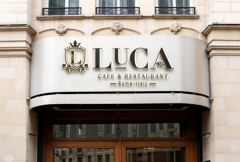
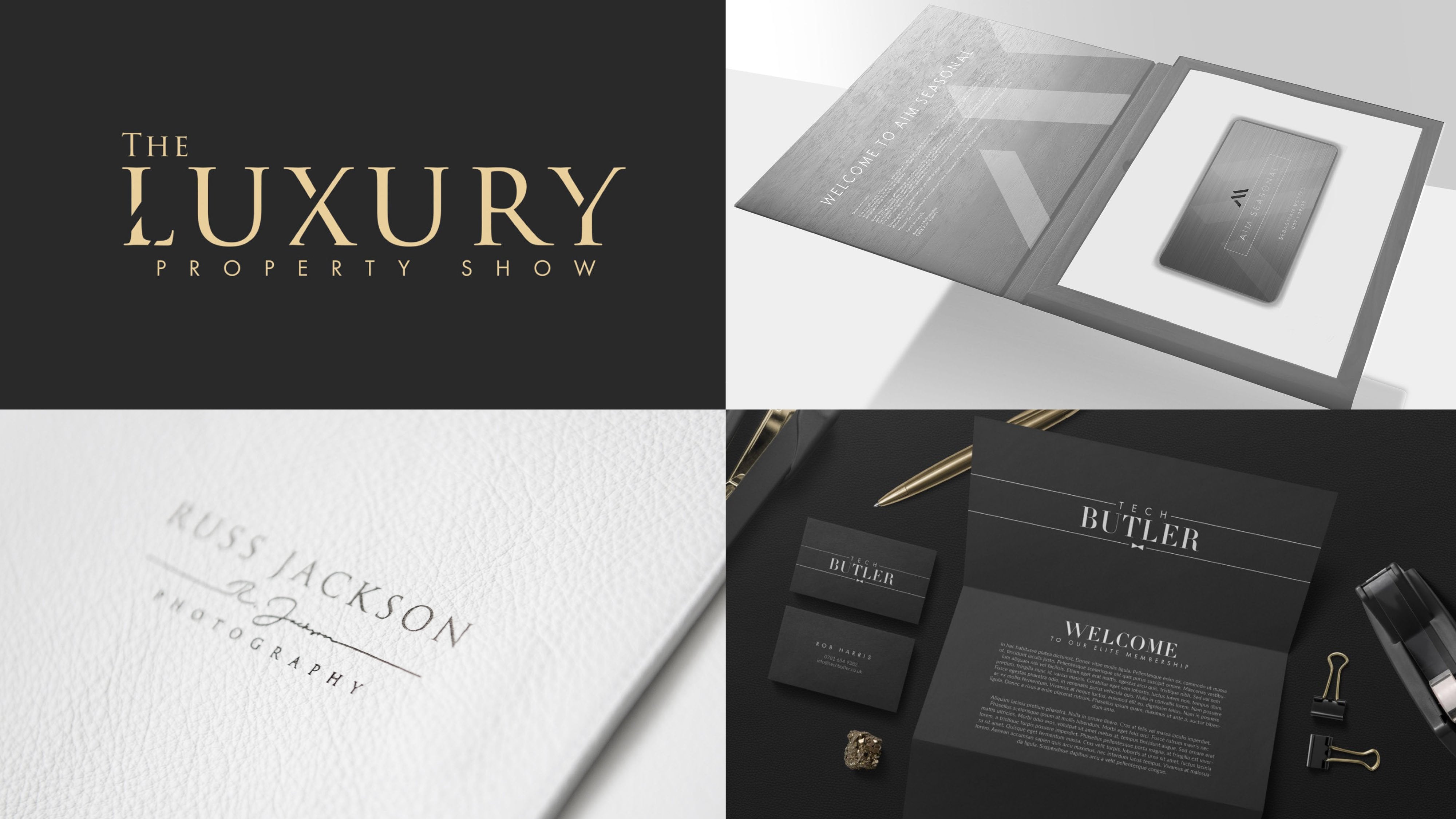
opportunities we're looking for. Another one here. Again, the Luxury Property Show. The tagline is bordering on the point where
I say to a client, "I'm sorry, we can't do this. It's going to be so difficult
to read at small sizes." But they assured me this
version of a logo would be used in large banners,
magazine covers. It wasn't going to be
used at small sizes. But this could have
been the final logo. I really like this
concept to customize it. Just taking the angle
of the x of a y here and subtracting away
from those characters. There was a concept behind
this for luxury sash. Sometimes ribbon
go across things, so there was a deeper
meaning behind it. But on the surface level, we've just taken something that is fairly generic and we've added something a little
more memorable to it without negatively
affecting it, without reducing its legibility, and without breaking something that was looking
good, to begin with. That's a key. We've
got to look for opportunities to enhance, not just to decorate. But this I think
works really well. If we come down here, there's a version we've decided to take a second piece out of the l rather than the one just to make
it really distinct. You can see actually up here, I've staged that just placing a stroke over the
top of the text, and then here this
is outlined text. I'll show you quickly how
to do this in case it's a technique you'd
like to replicate. We'll start with a stroke. We can't see if it's white, so let's use medium gray. Get it to the weight
we're looking for. Obviously, I've
already reduced this, but let's say we
wanted to reduce from this section up here, make sure your type is outlined. The shortcut for that
is Ctrl or Command, Shift, and O, and when
your type is outlined, you then need to
expand the stroke, so Object, Expand, and Okay. Then select those
two objects and you can use a shape
builder tool, Shift M, and simply hold Alt to subtract portions of your choice that's removed the serif. But if we had done that
further down here, a much easier selection
to make. That's it. Using that you can quite easily subtract one shape from another. That's another
little opportunity you can sometimes look for. None of these are rules. There has to be
meaning and something more behind it than just
doing it for the sake of it. But these are the opportunities
that we are looking for. Let's come on now to
the brand I'm working on in this class and
that's Maison Magrissi. I've taken this concept
where we had the Ss facing. How would I take
this step further? Well, perhaps this
is good enough. No need to overdo it. I did have a little idea
here for perhaps a submark, and we'll come to submarks
in a later lesson. It's quite interesting. It's something brands
will often need, but you can take whatever
distinction you've added, whatever you've included to make your word mark more unique. Sometimes you can just
extract that and it may be a few characters and then
that can stand alone. In fact, let me just increase the contrast here so
you can see it clearly. That's something that convinced standalone on social media. That's simply the i, which I've elongated a little so that it fits better
aesthetically, and then those two facing Ss, and that's quite a nice little
standalone submark there. The difference, I think, between a submark and let's say this was a permanent
fixture of a logo. Let's say this was
your logo lookup, well, then that's really
your brand mark and there's lots of different names and it's confusing for these things. But for me, the difference
between a submark and just the symbol of a brand mark portion of
a logo is not included. This is the full logo as it should be used and
then separately, this is for submark. But we're going to come to
that in a later lesson. This is another way you
can customize things. Now, you've got to be
careful with this. It's not always going
to be appropriate. Of course, you can't always
have these textures, although this has been
done live in Illustrator. Actually you can export a
vector version of this. If I go to, where is my Transparency
panel and I release, this is just a clipping mask. This actually has all the
properties of a vector graphic. It can be stretched
and blown up. The texture is super high-res but you've got to be careful and quite likely you'd have
to give your client a version that has the texture but also
doesn't have the texture. But because the nature of this brand is they do
luxury clothing but specifically this kind of tweed blue clay to overlay
the logo in that texture. Is a really nice nod for
this particular brand. There was a time you would
avoid using texture in logos, but more and more commonly, as long as you're providing a
plain color option as well, using a texture is acceptable. It's becoming more
and more acceptable. In modern times, there's a version let's
reverse them black. If you're interested in
doing this yourself. What you need, I'll just
release this again. Is a source texture, your logo artwork
needs to be outlined. You can't have any live text, and you just drag and it can be fairly roughly and position your texture just
make sure there's nothing sticking out that
it completely covers it. Drag to select both the
texture and underneath. It's important it's underneath. We have the logo artwork, simply in the
Transparency window, click Make Mask and that's it. If you click Invert Mask, you can see you've got
the option to either reverse it out or have
it shine through. Quite an effective way of
adding something distinctive. Again, it won't
work for all logos, but in certain cases it
could be just what you need. Let's spend a little
time just looking at script fonts and how we
can customize these. Now if you're doing
hand-drawn scripts, real hand-drawn logos, then
this isn't the course, perhaps to teach you how to
expand that skill further. But if you are using existing fonts and you're
using script fonts, then perhaps just
manipulating them, you might be surprised to learn. There's a lot you can
do before you outline the type without having to
tweak any anchor points. First of all, glyphs, that's a useful quick tip. If you're not sure
what glyphs are. If you select a character, an illustrator will often offer a few glyphs at the bottom here if it has any
embedded in the font. By clicking one of these, you can see we can
actually switch. This font includes not one, but two different styles of M. It's got quite a few
different versions of A here. Sometimes the difference
is these little ligatures that join one character
to the other. But as you play with these, just selecting and
looking at the options. What a difference.
Unfortunately, you have to select one
character at a time. This one all play together
as you want them to. But look at that,
what a difference? Even though we're using the
same font between that, I think the A is a little much, but look at that. Then if I go back and just
compare it to the original. For me that's a great tip. As soon as I discovered the
world of glyphs it opened up all opportunities I didn't
even know were there. Of course, this is a quick
access to the glyphs. You can actually open
up the Glyphs panel if you go to Type and Glyphs. Then from here, you'll be
able to see the full library, you might have to
increase the sample size. There's a lot to look through,
often special characters, but it's well worth
having a look sometimes, and not all of the
variations will come up as these quick suggestions. Glyphs, that's your quick tip. If you're working using scripts and there
might be a lot more to your typefaces when
you realize were there hidden away
in the back-end. Now lastly, because
I'm conscious of the time we're
spending on this lesson. We just want to look
at some existing famous wordmark logos and just identify why they
work well and maybe how we can look to do something
similar in our own work. This is a very famous and
successful script logo. I don't think they use the font. I have a feeling this one
was hand-drawn for Disney, but it's simple and it's
unique script handwriting, with some very positive
symbolism behind that. Facebook, when you look at it, not much customization at all. I believe they have leaned away from the closest matching fonts. But it's quite a basic
logo when you look at it. Yet look how successful
this has been. You don't always have
to add something fancy, or clever or unique, sometimes the
strongest wordmarks, they just have really subtly perfected detail or
completely custom font. Google, likewise,
although the color is what really makes
this feel unique. This is the latest
iteration of their logo. Kellogg's is another
very big brand. Again, I have a feeling this was hand-drawn type
created just for them. In fact, I think it's got almost a 100 year
history with the brand. Subway, this is a more
recent iteration, and they've included
these little arrows were part of the previous
iteration of their logo. They simplified and
flattened it now, but the arrows are still there. Zara, again, this had mixed reviews, but it's simple,
and quite clever. They've chosen to overlap. The A gives it a
contrast between these thick portions of the characters and
these thin portions. That creates quite an
interesting overlap. No spacing there at
all, negative spacing. Now we touched on sub marks and we're going to come back to that in a future lesson in
creating our own sub marks. But let's look at the
theory behind it now. For Disney, although
they rarely use it this is actually
a standalone D, they use to represent the brand. That is of course,
simply taken from the first letter of
the word Disney. The same for Facebook, it's just the F. They often reduce that from a color block. Google, it's for G from
their regular wordmark. This doesn't sit in
addition to Google, you don't have a G
floating above the logo. It's interchangeable. It's a sub mark, they divided it quite
interestingly with a brand colors, but it's quite simple. The subway sub mark, so that's something new
they've created that gives them some additional
opportunities. We will circle back to look at sub marks again in that lesson. But for now, let's go back to this process of manipulating and looking for opportunities. This is something
I've created here. I'm going to take in the next
lesson into Adobe Fresco, and I'll show you another
interesting technique you can use to explore customizations on your
wordmarks and your fonts.
6. Manipulating Fonts Adobe Fresco: [MUSIC] This is
almost a bonus lesson because it's not a
method you have to use, but I really like it and
enjoy working this way. It's perhaps a
little backwards to the way you've been taught
or some designers work. But I really like
to start first of all with the fonts and I'll explain why I've
arranged these here like this in just a few moments. But we begin with
the fonts and then the sketching comes afterwards. For me, the advantage to that
is I've picked my fonts. I've got a good idea of the tone of 80 percent because
this is a word mark, maybe 80 percent of the detail that's going to
really make this come to life. Then I'm adding
these fine touches and that's why I want to sketch. I want to sketch with a
little more accuracy. We're going to take this
page I've created here, simply export it as a JPEG or a PNG is even better than
you've got transparency. In Adobe Fresco, which we'll jump over to in
the tutorial now, you simply import that
image as a layer, which is very easy to do. Let's do that now and
I'll show you how we can work with a text
I've prepared here. Something I found
to be a great way to further customize type
when I've locked in a font, maybe a font pairing
that I really like is to pop this open. This is in Adobe Fresco. All I've done is import a photo. You can use the little
photo import button and I just start duplicating
that a few times. This layout I've
created for myself, it's to allow me to explore
the concept where we have an M at the beginning that links both of
the letters together. Then I want to see if
there's anything we could do further with this nice semi serif
font at the top. Popping open in Adobe Fresco, it just gives you the ability. I'm just transforming
these in place of PNGs. I think free should
be more than enough. As long as you have
a drawing layer. I'm just going to move this
to the top of the stack. You can scribble and sketch over the top and it's completely
non-destructive. You can have a little play. You could even
erase away bits of the image and see how
things might look. I was considering maybe
some sort of flourish here. No, that's too much, so we can go back. That really [LAUGHTER]
hasn't worked at all but you can see
how easy it is to draw on top of what you
have and just to explore ideas and it gives you the ability to
look and think either, yeah, that's a great idea or no, this really isn't going to work. Let's try a few more. In fact, this is another great
thing about Adobe Fresco, you can just do a new layer
and try to get this M right. I think maybe
something that's quite scripty and exaggerated, that actually [LAUGHTER] isn't legible but something along those lines maybe, yeah. Or let's leave that
the other way. I like that. It's miles away from an M, but if we can bring
the legibility back, I really like the idea
of that kind of shape. I keep going the wrong way
with this. It's getting there. It starts light, it's going harder, and light and harder and around. Maybe something like that. This is where because
we've got a new layer, we can just drag and
put that in place. Erase away the ones we don't want without erasing
my one as well. I quite like that. Something else you
can do and this isn't supposed to be a
Fresco tutorial, but really is useful. Under the layer controls, you can just lower
the opacity back. I'm going to give myself
a faintest of outlines, then another new layer. In this layer, I'm
going to try to do it a little lighter. I'm not someone skilled
at calligraphy, but I can do enough to get by, then digitally refine it
to take it where I want. For me, having that guide
makes it so much easier. I've got this moving quite. Well, actually it's not too low, but I'm going to knock
this moving right up. Just to leave, I
want to try again, I think I can do better here. It'll just give us something
to import and to work with. We've got to stay light
and there's the pressure, light again, pressure.
I'm liking that. I may perfect that off camera, but I think we've got
something really strong there. I really like that concept. In fact, one last
thing we could try, we duplicate this, hit Transform and we'll take it
to our last little area here. I wonder if it could actually
interact in some way. This is really close
to the A. I wonder, could I actually have this flick out and form the
center of the A? That could be a
really nice touch. Let's lower the opacity here. Another new layer, same brush as before because I'm looking for similar results. I really like the
look of our figure, we're really getting
somewhere here. You can see how useful
it is to have this and to combine the precision of starting with your
fonts with the ability to draw and decorate, and of course something
else you can do, I've focused on scripts here, but you could actually look at manipulating the type itself. You might decide you want to exaggerate the serifs
for particular form. You could do that, here
I'm doing it very roughly. But you could begin tweaking
and see how that would look and I said you could erase away portions of a letter. Well, to do that, I'm not sure erase
works on an image, but server it's non-destructive and I still have all my layers. I simply go to white or whatever the
background color is, and then I use that to
just paint over the top. Let's turn down the
smoothing because that does lower frame rate. Just like that,
especially if you're someone that prefers to
work with your hands, you can fly in and you
can test out some edits and especially if you're not as familiar with Illustrator. If it takes you a little
while to construct and deconstruct things
if you're starting out, this is a really
quick and easy way to make fairly
advanced changes to the letters and to
see if they work before you commit the time
to doing them digitally. Technically [LAUGHTER] we
are working digitally, although on the iPad
with the Apple Pencil. I really like this technique, I think it's a great way of
exploring the possibilities, I hope you enjoy it too. We've imported these concepts from Fresco into
Adobe Illustrator, there's a simple Export
button for that, and now we're ready to start refining and taking
things a step further. I did indeed work on
this flourish style M, which I really like and I was able to refine it
to this point here, which I'm really happy with. This is embarrassingly, I think as good as
I was able to do in the app with a pen but
thankfully you are able to digitally refine it so that it looks far
more professional, so find goodness,
for possibility. I'll show you just quickly how I achieved that in
case you want to do the same [NOISE] with
a locked layer here, and the best version
I was able to create. You then want to open
up your brush tool, and the shortcut is
a memorable one is b and you want to
double-click [NOISE] it from the toolbar and make
sure that fidelity is overweight to its
smoothest option [NOISE] and select Okay. Then, and I haven't even plugged my graphics tablet in
for this so I'm going to do this freehand using a mouse because the digital smoothing
is really quite impressive just to show you how easy it is to accomplish something
professional from a rough sketch. I'm just going to click and trace as carefully as I
can but not too carefully around that sketch and you'll see in a few moments
we're going to have the opportunity to
digitally refine this. [NOISE] There we are, hide [BACKGROUND] the
underlying layer, and it's done a fairly good job smoothing that out
with the fidelity to max and we can smooth it further if you again have
a brush tool selected, but you hold the Alt key and that brings up the
smoothing tool. [NOISE] As you draw over these lines it just moves them and refines
them even further. Again, I'm doing
this with a mouse, so [NOISE] this tool doesn't
work based on your control, just as you give it a rough
idea what you're aiming for, it does that for you. Lots of clicking later, I did arrive at version
that was nicely smooth, but you'll notice this
has got differences in weight and the way
to accomplish that is using the line width tool and 'Shift W' is for
shortcut for this. If the line width tool and I'll just show you on this
version I created earlier, allows you to create
width anchor points. As you drag, you can
see you're able to manipulate the
width of the shape. It takes a little bit of
playing with and you've got to carefully place
your anchor points, you can see I've
placed one just here, so that it transitions rounds into something
nice and thin, and then at the very end we've got an anchor point where it reduces almost to nothing
and almost fades right out. Another little thin
anchor point here, you can see the difference
between that and this, which looks far more elegant. Using that technique, even with no natural calligraphic skills, I was able to create this
kind of abstract M flourish, that I'm really happy with. If we look at the results, when I combine this, because I had the
benefit of that sketch, I was able to position it
in such a way it would intersect for crossbar of the A, so another advantage
of using this method, I think that looks stunning. I'm not sure about the end of it into setting the S
here and in hindsight, that almost forms $ sign, so I think I may have to remove that maybe I'll just
have it taper off here just after VA
[NOISE] but I'm really happy with that and on black
that looks equally stunning. That's my concepts, a little bit of manipulation [LAUGHTER] and some time
spent in Adobe Fresco, but not massive changes
to the core font, but we've created something
that looks really unique by focusing the attention on one letter and on
layout and composition. As you're following along
in your class projects or perhaps you even
have a real-world project to follow along with, try to look for
those opportunities, not to go overboard and not to break what's not broken
in the first place, but for opportunities
to add some flair and some creativity and to create something that is really unique. [MUSIC]
7. Manipulating Fonts Secret Techniques: Secret techniques. Well, maybe not so much a secret, but these are techniques
I've collected over the years and I'd be
absolutely lost without. These are my go-to techniques
that I most commonly use when I'm working
on manipulating type. Adding serifs to a
sans serif typeface. It seems counter intuitive, but I absolutely
love this technique. It gets you some really
interesting results, and because you've had a hand
in crafting this yourself, it makes sure it's truly unique. This isn't something
someone else can download and type out
their brand name using. Here's one I've created
for a client in Colorado. I really like it. The base I can show
you here in stages, how I've done this. The base is actually Futura, Futura PT, which
is super modern, very crisp geometric hard lines, and viscera is really, I think, compliment this nicely. I've chosen to do a
really simple serif. This is literally what
you get if you take a square and when
you take a circle, and you subtract
one from the other. Once that intersects, you're
left with this shape here, and then I've just
manipulated ever so slightly from that
starting point. You could use the shape
builder tool and subtract away to leave yourself
with something like that. Using that as a base,
I've positioned it. You can see just where you'd
expect for serifs to be. You have to be
fairly familiar with the anatomy of type to do this. As you can see, it's placing
them as you'd expect. When you are happy and using a different color at first I found makes this
a little easier. I made a few tweaks. If you compare the
top to the bottom, I realized the N it didn't work to have
serifs on every corner. In fact, that's not what
you would do traditionally. For VN instead, we've got the serifs
on both sides of the flatter legs and the
stem that sticks up here. VE, I believe we've just reduced via for way
too further little. It was looking a bit clunky, and some of the
tweaks and changes. But this is the result when
you now combine the color, trying to select these, I've got something
in the background. There you are. You can see I've not yet merged the objects, but because the color is the
same before it's committed, you get to see how this looks. There was still a fair bit of
balancing and fine tuning, I needed to do here. Something you might notice is VR is really narrow compared
to something like VN, which I wasn't happy with. I did quite a bit
of tweaking and fine tuning for my
final iteration. But by the time it
reached this point here, I was quite happy
with it in concept. I won't show you the
my new changes I made, I widen VR using
some anchor points. But we're safe to select and
even had to rebalance it. But on the surface, you can create something really stunning using that technique, and then the more familiar you are with type and balancing, the better you are able
to fine tune that. But maybe that's more
than a quick tip. Maybe a subject for
a future lesson. Our next tip is using the
shape builder tool to create circular curved
portions of type. To show you a problem, first of all, and
then the solution. In this case here, my client really liked
this Trajan Pro typeface. He really liked for
look in the form of it, and especially how you've got this smooth little
portion of the G here. If you compare that
to this alternative, there's almost a
little serif there, and a more pronounced
serif there, and they really like
this smooth transition. But when you position the
S and the G together, the S is far, far narrower than the G. There wasn't really a way to
make them sit nicely. Where if we look at this font, they sit and they look much more balanced when
they're overlapped. The challenge was we
needed to create this. To turn the typeface we have here into the good things
they liked about Trajan Pro, to manipulate it and give
it those properties, which was this smooth,
less detailed curve. How enough do you go about
doing something like that and keeping it looking
smooth and professional? There's a version where
we've done a cut-out. You can see an overlap. Well, by using circles, and at first this might
look very confusing, but actually it's quite
a simple technique. If I select this, you can see here, I've got the opacity down just
so I can see the overlap, and I've just
dragged these ovals in and I've tried
to position them. They don't have to be
perfectly equal circles, you can elongate them,
that's absolutely fine. In some cases that's
what you need to do, and you just want to
drag them into position. Make sure there's a
slight overlap that your base shape sticks out
and see if there's a gap. You'll see why in just a second. Let me do an
exaggerated example. Just so I can show you quickly. You can position it
better than I have. But when you are
sure that one is inside the other because
you can find tune that, use the shape builder tool
and you want to combine. Just remove that so we
can see what we've done. You're combining the
circle with the top of the G rather of this shape. Then if you go in as
close as you can, you can then manipulate
the anchor points. So for this one here, I think I would just delete that and it can end
following that curve. Then up here, this needs
to be a little smoother, so you can always select the anchor point and
just drag it across. You get a sense when you
look at the preview of where that's going to blend more seamlessly into
what's already there. There will be some
little artifacts you need to get rid of. I have this artifact here
from something underlying, but you get the idea. Using that technique, I do the same here. Here's my oval that I've positioned and
I'm going to use to add and follow
around the curve for the G and you just keep
working your way around. Eventually, we've
ended up with this. You could use any shape
using something circular, lets you do a nice, smooth, gradual bend. But really you can
use any shape and place it over
existing characters, and then that way
you manipulate them and you create something
that's really unique. I'm quite proud of this one. It's got the traits
of Trajan Pro, but it's most certainly not
Trajan Pro. Another tip. Now, the new Zara logo with its negative spacing caused
quite a stir in the industry. Some love it, some hate it. If you did want to do
something similar, a few issues you can run into and some tricks
to solve them. As soon as we go into
negative spacing, you'll notice that while some letters transition
really nicely, so there's no
problems here so far, but you can just see
the R and the I. There's this horrible overlap. If we close that up even more, then you might get it to a point there where one bleeds
into the other. But let's say it was
at this stage here. We want to do something about this traffic jam going
on with the type there. You've got a few options, but I would definitely
outline your type, so "Control" or
command "Shift" O, and I'd use the
shape builder tool. With both selected
shape builder, there's no need to have
this sticking up here. Simply hold "Alt" and remove it. Then you could even
have maybe extend the anchor point and drag that there so you've
got a smooth base. I would even be
tempted, I think, to just carry this anchor
point over way across. Open the shape builder
again and then subtract. We just lose the
natural end of the R, but when it blends so
much better into the I. Those are the small tweaks and manipulations that I
think make the difference between something that looks professional and something
that looks quite amateurish. Here's another one.
We've got a choice here. We could subtract that. Nice. But I think
if we also lose that, that's even better. Here I'd be inclined, I think, to just nudge this S so
that that runs seamlessly. You can see by zooming
right in and making these very technically
basic changes, it makes a big difference to the overall professionalism
of the logo. That's my third tip. The last
tip comes when you want to mix and match elements of two similar but
different typefaces. This is similar to the one I did with the Trajan
Pro just now. But in this case, we have this here. Well, I won't tell you for
background of a brand. It doesn't really matter, but we have this version
and then this version. You'll notice for wavy L comes under the O and
the R comes under the S. In this heavier
fonts is quite nice, quite well-balanced,
where in this one it's almost touching
and is susceptible, but it's a shame we can't
have a best of both worlds. Well, we can have a
best of both worlds, so it takes quite
a bit of patience. You will see these
of a stages it went through before I arrived at
something I was happy with. We'll come back to this. In fact, in the next lesson, we'll look at some common
mistakes you can make. In trying to combine
these different fonts, there are lots of
potential pitfalls, and I'll highlight some of
those in the next lesson. But if we look at what
has worked, ultimately, manipulating existing letter, it doesn't work really well. It's got a very spindly form. It's quite hard to make
that flow fluidly. Instead, we've taken
the L and the R from this bottom fonts
and we've placed them here along with
the other font we want. If it was left like this, maybe you could say
they act as bookends. Maybe it's a creative
way to vary the weight, but I don't think that works. I think really they need
to be better balanced. If we come down here, you can see in this
version we've kept the R, but I've manipulated that
to make it suit better. We've actually taken the
bottom part of the L and use the shape builder to
combine or rather reduce it from this here. It's going to be difficult
to select the two with an unlocked
layer underneath, but let's give it a try. There we are just to show
you roughly what we did. Something like this to remove the top half and then some fine tuning here to keep the bits we wanted
of a bottom half, and you can see that's
exactly what I've done. A little portion of
each of the letters and then just making sure
they flow smoothly together. That needed a little bit
of further fine tuning. With the R, we've done
the same thing and that needed a lot
of fine tuning. We've just used this
portion of the R. In fact, you can see here,
if I drag it off, that's the portion of
the other letter we've used and then use the shape
builder to delete away. But this needed to be much
thinner as it is here. Exactly, how I made that
thinner without losing the shape and the form. A lot could go wrong there and actually we'll focus on that in the next lesson
for common mistakes. But those are a few quick
tips that I think will give you a lot of joy
when you're trying to customize word marks. These tips should allow you to create something that's unique, but in a subtle
and tasteful way. We've covered a whole range
of opportunities to look out for and some great techniques to help us take
advantage of those. But next, we need
a few boundaries, so we're going to
look at some of the rules that can
help us ensure our type looks at not just
creative and attractive, but most importantly
professional.
8. Avoiding Common Mistakes: Unfortunately, the things we're going to
cover in this lesson are common mistakes in the sense that once you begin
looking out for these, I'm sure you're
going to see them start popping up everywhere. Mainly, it will be
local businesses, perhaps your local bakery and it's made a few design mistakes. But every now and again, you'll actually see a larger
or high-profile brand that makes some
amateur mistakes. Now, I'm not saying you have to read and memorize a whole book on type design before
you're ready to make even simple changes. Although if you do want to
read a book on type design, this is my absolute favorite. It's Designing Type, and it's by Karen Cheng. This will really teach you
all of the hidden rules and nuances that make type look beautiful and make
it professional. If you have the time to
study a book like that, fantastic, that will really
improve your design. But in the meantime, there are just a few
rules that you'll want to at least be aware of so that your logo design doesn't
look wrong in some way. As promised, we've returned
to this piece of artwork, and done the wrong way, there's a lot of mistakes
that could be made here, trying to stitch together these different fonts used for these different characters. First of all, let's look at
this poor attempt to just manipulate the L. Now, you can see in the original, which is from the original font, it has a certain profile, and it's got a certain curve
over a set space of time. It curves just like that. When you try to extend that, even though if you zoom in and you were to look
at the anchor points, they've got quite
long transitions and there's no kinks in it, it just doesn't feel right. It feels very different to the profile of curves in
the other characters, and it feels a little
bit unnatural. We have a version we've
stitched together below, although it comes from a different font we've
kept for profiles. It's got a more
natural curve to it. To illustrate the difference, if we were manipulating something like the
E from this font. I'll just outline this. Let's highlight that, put it in a black so we
can see a bit better. If I just select
the anchor points here and hit my arrow
key a few times, we can quite easily elongate that or we could make
it a little narrower. If we wanted, we
could select like this and just reduce
the weight of the stem. It's quite easy to make
proportioned changes. Because we've selected
the entire curve, this isn't changing the angles at all as we manipulate this. Now, there is a better way
to edit and alter curves. We don't have time for it in
this class as a quick tip, but just take care when you are manipulating
curved portions. This R, if you're
manipulating this S, you can't simply grab the anchor points in
the same way we did as the E and start stretching
things because you get these. Even if it seems to
follow the same form, it's very easy to
get bumps or kinks. That would be much
better, and again, I'm not going to attempt to
show you this right now. Maybe we'll do this
in a future class, but it would be much
better to pull in a geometric shape
and position it, and then subtract, and add, and use a geometric shape
as a reference so that you avoid those kinks and
uneasy, unnatural warps. That's the first
mistake to avoid. Another is consistent weight. Now, if we were
manipulating this, you can see this has a little
bit of a [inaudible] style, which is where some of the strokes have a thicker
weight than others. But even where that's the case, we want to be consistent. We can see the A and the V. One stroke has a certain weight and the other has
a certain weight. Let's do this maybe with an
easier character with an E. Let's select this. What would happen if, selected too much, if we did this so that the
line at the bottom is heavier? Well, that just doesn't look balanced and that
shouldn't be done. Usually, all of the horizontal strokes are even in width or even in
weight, I should say. Usually, the horizontal, the stems or strokes, they'll follow some
consistent weight. You should ensure
that something is either for weight of this stem here and here over
weight of this one, but it shouldn't be
something in between. I'm going to lose
my curve, I think, to try to manipulate this. But I can try to show you. I think I've got it there. Yes. If I bring this across
and let's say it was there. It's not a big
difference perhaps, but that is now not consistent
with the part that should match the weight of
this part of the A here and the weight of
this part of the O. Now, how do we know this? Where do these rules come from? We have our resources. There's a book I
alluded to earlier. There are lots of rules that you can spend the
time studying and learning, if you want to. But an easy rule of
thumb as you get started is to look
for consistency. Try to follow the form
of other characters, and particularly when
it comes to weight, it should always
match its partners. You should see a consistency in the widest weight and in the
narrowest weight for a font. Next comes spacing. We're going to jump
over to this artboard. This is a little
technique I like to use to balance my spacing
between characters. If I just grab these
placeholders and remove them, you'll see that looks
quite well balanced. The spacing is consistent. Yes, you can achieve this
just using your eye, but I like to put these
placeholders down, and they use the golden ratio. They're quite close to
rule of thirds as well. But you can see here they step up in line with
the golden ratio. As long as a space, it hits one of these points, one of these widths, then it should look
pleasing to the eye. The space here, it uses that width, which is the same as the
space here and here. The smaller spaces are all the same and you're taking into account a curve that I don't think makes a big
enough difference for me to, for example, move that
whole line down there. I think you've got to
use these as guides, but balance it optically,
not metrically. You've got to, to some
extent, trust your eyes. The space on the edge here, it could be that I used this. Let's just shrink this down and then
rotate it in place. It could be that I thought, let's use that space up. But for me, that doesn't
quite look balanced, because it's a wider
logo than it is tall, I wanted it to
reflect that form. So I wanted it to have
a wider space there. You can see that space, this one is almost exactly double this space it has above. When basic math behind it
and you can read up more and use rule of thirds
or use the golden ratio. It tends to also help you
balance things are optically, and it feels pleasing. To show you how easily this
could be done the wrong way. If I just select this and we
don't give it enough space. It can feel very tight and
constrained or some of the spaces were large and then some of the spaces were small. If we had perhaps a
really small space at the sides. This is extreme. You'd have to have
quite a bad eye, I think to position
it that badly. But when you're trying
to line elements up, I find that this really helps. You can easily create these little guidelines
for yourself. Another common mistake
is mismatching fonts which don't necessarily
pair well together. This here at first glance, it may look okay, over similarities in before. We've got serenity light
and Warren Gothic. But when they look this close together and
they're are different, it can look like a mistake. Contrast can be a good thing. This can just look like
someone's accidentally used the wrong fonts. If you use something that
had a much lighter weight, maybe a very different form, then you get something
more interesting. When it looks like you've maybe accidentally
mismatched fonts, it just confuses, it
doesn't quite sit right. I think sometimes going for contrast makes a
better pairing than going for something that's
similar but not close enough. There's another
example where it's looking much better balanced. Here, you can do
something like this, but a script won't always
work nicely with everything. You can't always
run straight from a script into any
other style of font. This here I think is
quite a bad pairing, even though we've
tried to match up the size and the positioning, this doesn't flow
very smoothly to me. You want to look out
for clashes where fonts look like they've
been shoehorned together, but they don't quite share
the same characteristics. They don't really flow together, or they don't contrast each other enough if it's on two
different lines of type. Our last mistake
to look out for is visually aligning rather
than geometrically aligning. You may not notice, this has already been done to many of the
fonts you're using, V's are not
geometrically aligned. If you look at VV, if you look at VA, I've added some lines
here to show you. They actually stick way over for baseline
and the cap height. The O because it has a curve, we often have the same. When we zoom out and
we look at that type, it looks balanced but we
couldn't trust our eyes. If you did reduce VO
and V so that they were sitting perfectly along that
baseline or the cap height, then it would seem like
they were too small because our eyes make those
smaller elements shrink. Where you've got something
coming to a point, it seems to be smaller and
where you've got a curve, especially a thing
curve like this, it seems to shrink to our eyes. This is even more
obvious example. This is using the font Futura. Here you can really see this almost looks badly
misaligned when you zoom in. But when you look at that
from a distance or at lighter weights, it's
properly balanced. Now, this is where if you
decided to use this font, which fave balance over at very small sizes, it reads okay. If you decide you're
going to use it at this size and you've got this obvious tip of
the end sticking out, this is where you might
want to address that to manipulate it so that
it suits your purposes and it suits the size
you will be using it at. You might decide you need
to manipulate or trim that. If we outline the type, you'd have to take great
care as you do this. This could be another mistake. If you select those
anchor points and drag them up to
those baselines, you've now actually
changed the angle. If I copy just that character, we'll go back, and then I'll superimpose
it in a different color. You can see you've
actually changed the angle of the N. So that
might not be a problem, but again,it's something
to be aware of when you begin
manipulating type, you've got to really pay
attention to the balancing. As you've probably realized, to improve fervor, you really want to practice and familiarize yourself with
the anatomy of type, the components that form it, and a lot of nuances that
make type appear balanced and these little rules you could accidentally break if
you're not careful. You can download if you want this quick reference
guide that I've created. This is in a class resources. This helps get you familiar with the different
components of type. The more you practice, and there's lots of more
in-depth tutorials out there. You can begin to safely make some pretty extreme
manipulations and keep the form, keep the balance as you do that. As with most things in life,
practice makes perfect. The more you begin
closely looking at type, understanding how and why it's been designed
in a certain way, the better your design will become and the better
position you will be to safely manipulate
type to suit your needs.
9. Add a Tagline: [MUSIC] Adding a
descriptive tagline can be the perfect way to tell potential
clients or customers, consumers know exactly what a brand does without having to create a clever symbol or an abstract way of
communicating that, you can just say it. If you look at
this example here, here we have the deliberately, I might say misspelled
brand Bspoqe. You might get a hint of
what the brand does from the styling of its logo but
why leave that to chance. You can remove any ambiguity by simply adding a
descriptive tagline. Now, everyone that
looks at this logo, will know exactly
what this brand does, which definitely in
terms of advertising, can be the cost-effective
way to go. Now, larger brands
like Apple and Nike, they've been able to with their budget and time and create the recognition that
everyone knows what their brand stands for
and what it is they do. But if you're working with smaller companies,
perhaps local businesses, or those with smaller budgets, this can be a very
powerful approach to just make a brand say
what it does on the tin. Another advantage is
using this approach, you haven't got to try to
create something gimmicky. Like perhaps we've
all seen a logo for a bakery and it's got a loaf
of bread as the symbol. It's really not a need for that. It could just say that it's
a bakery in plain text. Speaking of Nike and Apple, here is the Nike logo and
its tagline, just do it. This is perhaps one of the most successful taglines
ever created. Almost everyone can
associate that with Nike and the e-force
behind their brand. At times, it's okay to do that. Use the tagline to
communicate a mission, statement, or an e-force. But I've found that with small to medium-sized
businesses, it can really be a
powerful approach to use a descriptive tagline.
10. Creating a Submark: [MUSIC] We touched on sub-marks in a previous lesson and why they can be needed. If we look at Facebook
as we example here, here's their word-mark logo, but they're well-known sub mark and I think perhaps even
their brand mark now, is this where we've just
taken the first f of a logo, it's on the same background. It follows the same style and aesthetic as their main logo, but it's able to be used as a substitute and here there's
even a variation on that. Sub-marks are a useful
thing for a brand to have, and if we look on
Instagram, Facebook, Instagram account,
I'm sure enough, they've not used
their full logo, they've used the sub-mark here. Sub-mark is just
one word for it. It's sometimes called
different names. But it's substituted in situations where the full logo perhaps wouldn't fit as well. Now, not all brands
use this approach. If we search for Disney, you'll see that Disney, across its official channels, it still uses its full logo. Perhaps they've decided
it's still legible, but on my screen at least, it's quite blurry
and I think they'd do well to make use of just
the D from the Disney sign, which I've seen them
use in other places. Where does sub-marks get used? While sometimes your
browser bookmarks. If you bookmark a
website and you go to visit it again
on your phone, often a little symbol will show that can be a great
place to use a sub mark, and there are all sorts of useful applications
for these things. How do we create one? Well, I'll give
you a few examples in my project and for your
class project of course, this will be different, but
a brand I've developed here, I can simply take VM, separate to the
rest of the logo, and that's for perfect symbol
of a perfect sub-mark. You can see there
can be reversed out, that can be used really effectively to
represent the brand. Now this won't be
shown alongside this. There's no need for me to do
something like this but it is a core part of a logo and then it can be used as
a sub mark as well. I'll provide my client with both files with a logo
and then with a sub mark. I can show you another example. This is the luxury brand I created and you may have guessed what I'm
going to do here. What could I do if I would
create an effective sub-mark. Well, again, we'll just take VL will use the same colors, same exact form, and it's just a
standalone symbol. And because of the
customization, the part we've reduced from VL, it's unique enough to represent the brand and certainly
with this color scheme, VL, via unique touch, I think that's enough for
sufficient recognition. Let's look at one more example. You remember when we looked in the earlier lesson
at this brand, and I decided I wouldn't fill
in VB in the logo itself. This is our logo, but it's not shown
in the logo itself. This is where we've decided
to use with field B. We're using the first letter, which is always useful
if you're going to use a letter to represent the brand is common
to use the first one. We didn't think just using VO by itself would be
recognizable enough. But adding that
treatment to the B, that's definitely an
effective sub-mark. In some cases, we can just use a full logo. In other cases, separately
use the sub mark. Have a look at your logo that you're creating in
your class projects. Look for those unique
touches you created. Perhaps it's her first letter, perhaps it's some
other design detail, and see if you can
extract something to create a custom sub mark as this is a useful thing
your client will no doubt want to use for
their brand in future, perhaps alongside,
or I should say, substituting for the
word mark in some cases.
11. Selecting a Colour Palette: [MUSIC] We certainly don't have time to have an extensive
look at color theory. That could be a whole
class on itself. But we do have time to just
look at a surface level, some of the choices we make
and some of the tools you can use to pick fitting color
palettes for your brand, particularly where
it's a word mark. First of all, a little
bit of color theory. There's an excellent page and
I'll put the link up here. This is by 99designs and
its tips on color meaning. This just gives you a
really good overview of different colors and the
popular meanings behind them, at least as they're used
in Western culture. You've got a little bit of a
meaning behind red, orange, and some real-world
examples of brands that have used these and the
way they've used them. It's not an exact science. There's often brands that use these colors in different
ways for different reasons. But this is a
really useful guide if you're just dipping your toes in and you want to head in the right direction with
which colors to use. Now over to the
project that I've been developing and
your class project will be different to this. But you can see we have
our word mark logo, which I'm very happy with and I'm showing a reversed
version of that, an irregular version
and then I'm showing the sub-mark we've created,
regular and reversed. Then I pull in just
a little something, maybe some body text, some texts for the headings and I put something
like this together, just two pages, one that's
reversed and one that's not. I find that helps me to be a little bit
more confident with the color choices
than if I just made the color changes
to the logo itself. I feel like these pages, you're making those
choices in a little more of a real-world situation and it helps you to compare the way these are balancing and working. If I zoom out, I tend to
duplicate that row of examples and then
I'll start tweaking the colors to create
different color roots. Actually a great quick
tool you can use to do that if you select, and I'm going to be
careful to avoid this title I've got at the top. You select all of the
artwork on a row and click on this ''Recolor
Artwork'' button, ''Advanced Options'' and you can pick any of the
colors that are currently showing and you
can change them on the fly to another
color of your choice. Just as easy as that. I've got two slightly
different shades of gold here, so that one shows better on white and one shows
better on black. But it's really easy to try out different color roots and color harmonies using that tool. A few quick tips
you can use when it comes to color and I'll just talk about a few of the
most common options. Monochromatic means the
hue is exactly the same. This has no color at all so this is technically
monochromatic. But if I changed, let's say the background
blue to this, then I pick the same color for the logo and I'll double-click
the color palette there. Using this HSB area
in particular, you want to leave
a hue as it is, that ensures it's
monochromatic and then I'm going to
increase the brightness. You could lower the saturation if you wish, that's okay, it's just for hue has to
stay the same and there, that is a monochromatic palette. Again, I could slip
for background, and this time I could
bring the brightness down so that there's
more contrast. Both of those options
are monochromatic. You could change the
hue for both of these and explore other
monochromatic options. That's probably one of the
easiest color routes to choose because you're guaranteed
that it looks fitting, there won't be any clashes. It's quite an easy and potentially effective
route to use. Something else, you can use are complementary colors
and Illustrator has a tool to help
you with this. If I select my logo and I click
up here this color guide, I just need to click
the base color here to set it to the
color I've got in my logo. You can see now if I
click the drop-down, it actually has
pre-programmed for us these different
harmony rules and if I click on complementary, that gives you different
shades and tints of a color to
complement that blue. If I click on my background, and then I select one of these, you can see it gives me
a complementary color. If I open the color wheel the best way to explain it
is the complementary tool, it gives you options that come almost within
a certain cone. A color harmony
is always a color of directly opposite on the color wheel so
you can see how blue would sit just here, and directly opposite, that's our complementary color. The wider harmonies was an
acceptable cone around here. Either side of that, that technically
complement that color. Let's come out of that. Let's revert back to something that's a bit easier
to work with. In fact, if I pick my
switch as a purple, then I'll put that in here
to the base color and then I look at complementary tool,
select for backgrounds. Straightaway, perhaps
that reminds you of a famous basketball team. This is my problem with
complementary colors, I think because this
became very popular and very well-known in
recent decades, almost every complementary
color harmony has been used by a major brand. To that point to me, these harmonies sometimes
look a little dated, and I favor the monochromatic
harmonies or the harmonies with a little more subtle so perhaps one strong color that can pop and then something
much more subtle or almost a tint to go alongside it and not necessarily a
complementary tint. Perhaps even a gray. For me, something like
that is much cleaner than the traditional
complementary color harmony. But you can play
with these options. It's good to understand
the theory behind this. There's a few other color
routes I came up with here, I'll show a bit more new ones. This one's quite nice
with red and gold. One that uses a dusty rose, gold with a green and you won't find that on the slide
of the color harmony rules. Of course, you
could look online, you could look at
Pinterest to get ideas, you can look at other brands, perhaps look at brands and different industries and
color harmonies videos, and then try something similar
to manipulate it yourself. But have fun exploring the
different color options. In the next lesson
we look at making a final presentation of
your new word mark logo.
12. Presentation: Presentation is so important. Showing a logo in
contexts can bring it to life and can make all the
difference in a client size. Often in a real-life project,
presenting the logo, creating some fitting
mockups would be one of the last stages
in a design project. You can see why this is such an effective way to
showcase your final logo, seeing it living and breathing
as it would be used. For this clothing brand, I'm showing the logo
on a clothing tag, is one option I've created, and another where we've actually mocked this up as if
it was stitched in, engraved into an
item of clothing. For one of my other brands, this one, BSPOQE, we've actually got this
rendered as it would look if it were cutout in metal
against the background. Then this version here
printed in silver foil, which the client actually had
for their business cards. These mockups are
really powerful way to present the concept. They make it jump off the page, and I think they catch the eye and capture
the imagination. Everyone likes to
see a logo as it looks when it's being used. Where to find a way of
creating mockups like this, well, it's quite easy for a lots of different
places you could look. Here's one I'm quite
happy to share with you. This is graphicburger.com. Most of the options
here are free to use. Occasionally, you get perhaps a sponsored product or something you
have to pay for, but most of these
are completely free. You've got everything from, you can mockup the logo
on the side of a van, to t-shirts, to
packaging and devices, so lots of templates
to play with there. Really, this is the best way to present your work
in your portfolio. If you look at my
own Instagram page, you see that most of
the work I showcase, I'm doing that inside a mockup so that you can really see your
product come to life. If you compare, just looking at
this flat dieline, well separated dieline
for this piece of packaging to actually
seeing it rendered in 3D. This is something I did
in Adobe Dimension, but there are mockups that
can do this thing too. There's just no comparison, is a much better way
to show off your work. Make sure you do the same. Have fun finding some
mockups and create some stunning examples
of your word mark logo. Then you are ready to share
and present facts of a weld.
13. Conclusion & Thanks for Watching: [MUSIC] Well done. If you're watching this now
it means one of two things. Either you're someone who
likes to click through the chapters and watch
them in a wrong order, and why would you do
that, I don't understand. Or you finish the class and if you've followed
along closely, you will have your
own wordmark logo to proudly display in
your own portfolio. If that's the case thank you so much for watching the class. I really hope you've
gained something useful from watching
me share my process. Building a professional
portfolio can take time and it can be quite good to
show range and versatility. You've got a strong
wordmark logo example now, if you'd like to widen your
portfolio in other areas, why not check out some of my other courses on
Skillshare and see if you can widen your
portfolio fervor in a certain direction. Please don't forget to upload your creations to the
class project area. I absolutely love looking
through and seeing what you're able to create by putting
your own spin on things. Lastly, please feel free to leave a review if
you enjoyed this. Follow my profile and
that way hopefully, I will see you in
the next class. [MUSIC]
 Jason Miller, Freelance Graphic Designer