Transcripts
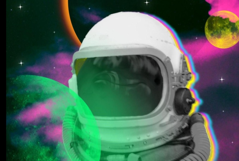
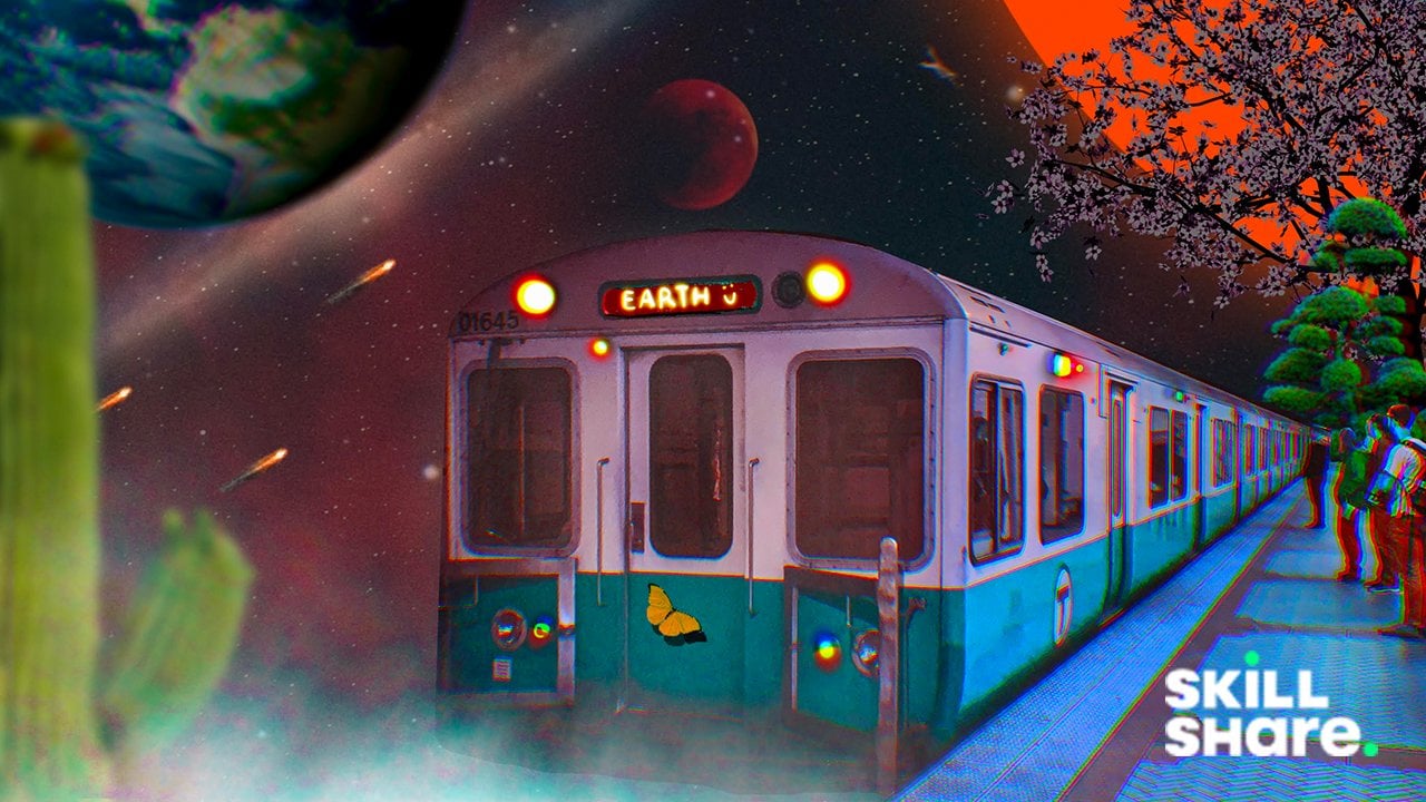
1. Hey there!: Hey there and welcome. Hi, my name is Brian. I'm a content creator
and graphic designer. In this class, I'll be
showing you how my process of high created this trippy
surreal space portrait, a collage in Procreate pipe. Always loved making collages and I want to share
it with everyone. This project manifests
my love of astronauts space travel in vibrant colors for the galaxy far, far away. You will learn to Select
and Mask elements. Color grading,
make subjects pop, create highlights and shadows, and make trippy elements and
clip it Today's subject. Then lastly, we will
create a flickering light to bring our
composition to life. So grab your iPad. Let's get started.
2. Project: For this project,
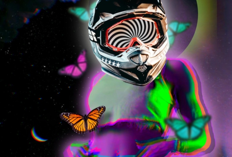
you'll be creating as surrealism posterior
of your choice. Or you can follow along
and use all the assets that we'll be providing
in the project and resources tab down below. The main goal is to play with colors, movement,
composition, and cutting images, blending them and making them
fun and trippy. Once you've finished, go to the project and resources
section of this class and click on the Create
Project button and share what you've made
and tell us a bit about your process and results.
3. Resources: Where to find Images?: These are my go-to website
that I like to go. This is Unsplash and Pexels.com. I'll also go for PNG, IMG.com to have some
transparent images. These are all free. All you have to do
is to attribute them though let's get ahead. I'm going to type in kind of
like a sample images here. You can pretty much select anything that's
pretty interesting. So, or this one, I actually like this one, so I'm going to download it. And you can easily
download, you can do that, but I like to just go in and then to photo if you
want to print it out, makes sure that you get the
original size somewhere here. So you get the best
quality of the images. And we can also
download that by this, yeah, this one right here, this kind of free. So you can just get that
part's pretty much the same. I can just add the photo. It should be on the photo. So this is kind of a
transparent background. You just easily incorporate
it into your composition. That's all there is for here, I'm going to think all the
images for the project of this class so you can follow along and
I'll see you there.
4. Let's Get Started!: Alright guys, so this
is a time where we create our canvas first
in this particular class, I'm going to use a screen
size because I want to focus on the dimension
of the iPad. I liked the dimension
of the iPad because it gives kinda like
a full screen. Alright, so what
we're gonna do first, we're going to insert our image, which is our background image. I'm going to insert
it right away. So I'm gonna go a range in an ad and then I'm going
to insert a photo. I'm gonna be using this
background image right here, and I'm going to
de-select it for now so I can freely move around. I'm going to flip it vertically
because I want this moon here somewhere up in the sky and I'm going to flip it
horizontally as well. And I'm going to fill our
canvas where the image is. We're going to put this
object right here, and I don't want this
to show up as well. So I need to be mindful of
the positioning right now. But I think this is okay. We can always go back though. I'm going to insert our
main subject right now. Okay, So this is
our main subject. Great, here, we don't
need the head shot, we just need the
body shot right here because we're going to cover
it with us space helmet. But the first thing
we're gonna do, we're gonna scale this 1 first, makes sure that it fits into the canvas that we're
gonna be working on. But I'm going to make the
image a little bit opaque, less than the transparency here. If you go to layer's opacity, have a good chance to kind
of nail the positioning. I'm not going to center this image right
now because I think it feels natural if the
image is not in the center, so we can fill it up with different objects
when it's a time. Probably I'm going to make
the body a little bit bigger. Turn on the opacity, a 100%
5. Cut and Blend Images: And right now I'm going
to cut the background. I will be using the
selection right here. I'm gonna be using
my free end here. I'm just going to
trace the entire dress and probably all the
way to the neck. But I'm pretty sure we're not getting we're not
going to include the head because it's going to be covered with a space helmets. So I'm going to just
trace it right now. I'm going to start
probably here. I'm going to make my
canvas little bit bigger, so it's easier for me
to get all the details, but probably gonna
do this right now. And then I'm gonna go here. I think this is scary. Going to be a neat cut. I'm going to kind
of get right here. And I'm gonna go to the
Layers panel and I'm gonna go mask and the head is
cut. Just like that. We could probably clean up
some of the details here, but I think we did a good
job with the selection, so we're gonna leave with that. But don't worry, we still
have the head right there. If you need to go back. We can always turn on, turn off our mask, and we can always get
back some details. So right now, I am going to insert one of
our highlights in here. So I'm going to insert, okay, we have our third
image right here, which is gonna be one of
the focal point in here. Actually, it is the focal
point of this composition. So we're going to place
it just like this. I think it's quite cool. The collage is turning into
masterpiece right now. So I will try to scale it
correctly and proportionally. I'm going to make this
a little bit bigger, so it gives us more. And I'm still looking
at here is two here. So that's quite good. And I'm going to align
it onto the right side a little bit so you can
put more elements in here. So we're just going to
keep inserting images. So this is our 1234. This is gonna be
our forte image. I'm gonna put it
right here for now. And the last one
that we're going to insert is going to
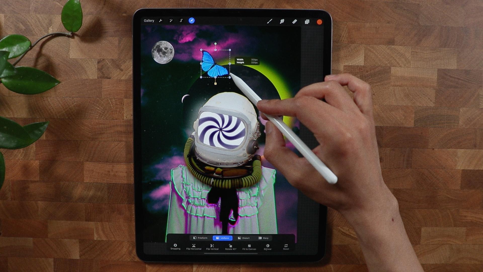
be the butterfly. This is gonna be our
composition, our images. So it's all been cut and
place and we're ready to hype hover composition and the next video.
See you there.
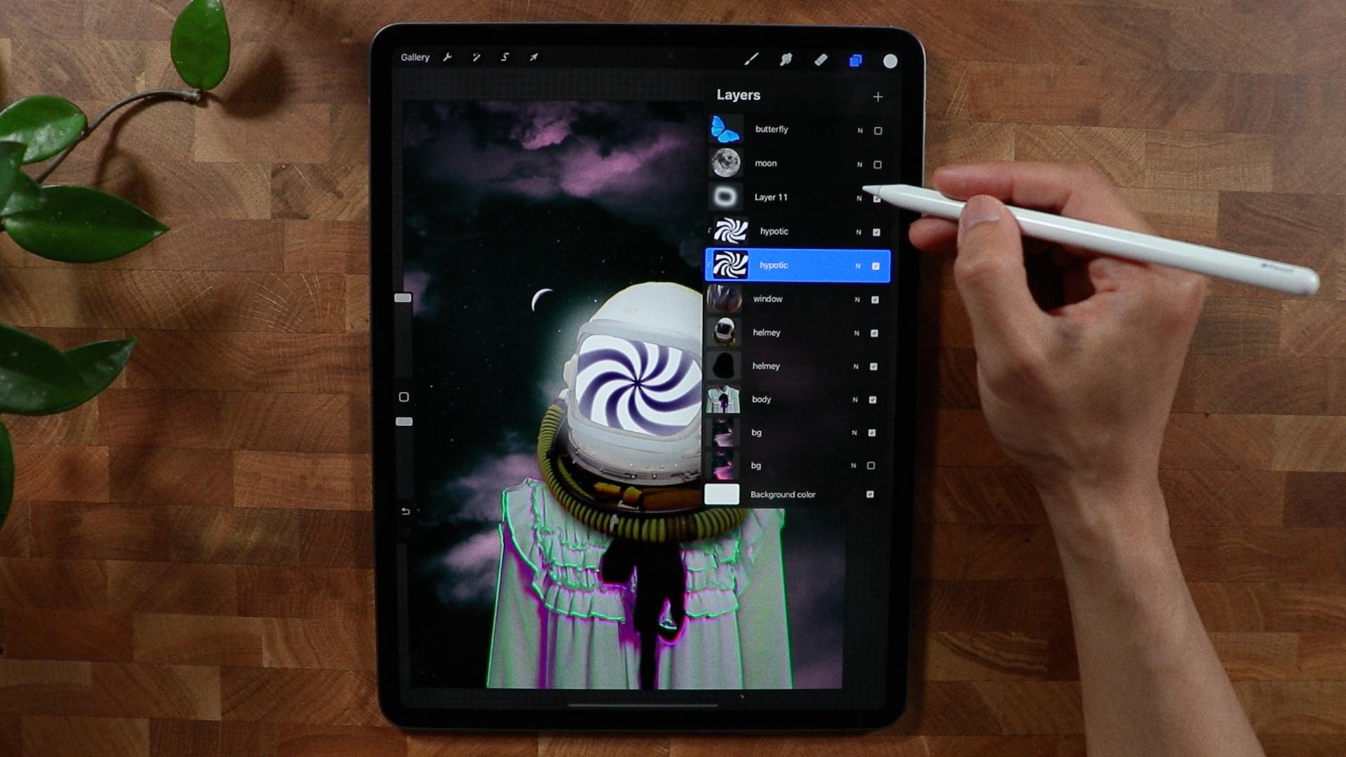
6. Create a Psychedelic Pattern: Alright, so all is done here. All we have to do
is to color grade, put elements, put
some focal point. I'm gonna be focusing on the
helmet first and foremost, I'm going to cut this
part actually right here, the window part of the helmet. So I'm going to use the
selection right here, make sure that I'm
on the helmet. We should rename it right now. So helmets, moon, butterfly. And this is the body. And since I'm happy
with the body, I could actually just
merge it together. So I don't have to
worry about it. And this is gonna
be our background. I don't think we
have to rename it, but just to be organized, I will just kind of do that. I'm actually going to
lock the background right here so I won't be
able to move it. To focus on the helmet. I'm going to disable the
moon, the butterfly. I'm going to get the selection and make sure I'm on the helmet. I'm on the helmet layer. And it's going to be easy. I'm just going to tilt this
a little bit just like this. I'm gonna get to selection. I'm just kinda get
this part right here. And you can always
go back later on. But I think I'm gonna go
in something like this. I'm going to just swipe my
three fingers right here. I'm going to copy and
I'm going to paste it. So we have that separate
layer right there. And I'm going to de-select it. And so this one right here, we have a copy, you don't see the
effect right now. But there it is. So because I want to put
something here that's kinda like hypnotizing and a
little bit more trippy. I'm just going to show you
because it's hard to explain. It's just all in my head. I'm going to disable everything right now, hide everything. I'm going to make a
new layer right here. So this is gonna be, I'm gonna rename it right now. Hypnotic effect, have all
the blank layers right here. And I'm on the layer of
the hypnotic effect. I'm going to get to the ranch and I'm going to go for Canvas. I'm going to go on drawing
guide, edit, drawing guide. I'm going to go for symmetry. And on the options. I'm gonna go probably Rachel, how I'm going to hit Done. Okay. I'm just gonna make the opacity a little bit here so you can
see what's happening. So I'm going to hit Done and I make sure
that is assistance. So make sure that
drawing assist is on. Or I'm gonna get my
monoline brush right here. And I'm gonna query
block at the moment. And we can always change it. So what I'm gonna do here, I'm just going to
make sure that I have a good enough size of brush. So we're going to test it
out for us because it's kind of hard to go all the way. So I'm going to test it out. I'm gonna see if I can. Okay, So this is gonna be
our first one right here. We're going to create
another one I think. And just hold it. And you should be able to
get perfect straight line. I'm going to try it again
because I think I messed it up. So I think that's good. And I'm going to go make
another one right here. Oops, I think I
should do it here. So I'm going to just do it here. I'm going to close
it just like this. I think we have a radial
pattern right now. I'm going to disable
the assisted. And also I'm going to disable the Drawing
Guide right here. And I'm just going to fill it
up with colors right here. Just like this. And probably alternative
will be good. I'm gonna go here, fill it up alternately. And we have a good
pattern right now. And while we're gonna do next, we're gonna go to effects, and we're gonna go to liquefy. We're going to play
around with trill, right? And see if we can
make That's good. I think I liked that. We can try it again, make the, get a little bit trippy. Think this is good. And we have the hypnotic
effect right there. Turn on all of our
images right here, especially those three ones. And I think, I'm going to think that's a
little bit of problem. Are you? I'm going to
just turn off everything. And I am going to add
another layer right here. And I'm gonna put white. And I'm just going to fill
it up with white color. I don't think I've put
white something like this. And I'm just going to merge
it because there's kind of like a transparency
issue right there now, if we turn it on, you don't see anything. But if I select the
hypnotic layer right here, I'm going to rename it again
because I merge some layers. Okay, that's it. And I'm gonna go just a little
bit just like this. And I think that's good enough. And I'm going to drop the hypnotic layer
here just above this. Okay, Let's go window, the windows helmet, probably
masks, clipping mascot. And you see right there, it's kind of Living already on the clipping
mask right there. I don't like the access
part right here, so I'm gonna go to eraser. On the windows layer. I am going to just trim it probably will use mono
line brush right here. We're just going to make
it nicer looking here. Because at the moment it's
kind of like all over place. Let's just make it a
little bit more softer. You can also use mass, but I think I'm just
going to use eraser here. I think that's good
enough for me. And you can take
your time trying to make it a little bit
smoother this selection. But the thing that's good enough if we remove
it, this one, it looks boring, but with this, it hands us more of the trippy out of this
word kind of vibe. So we're going to work on
a body dress right now, because right now it's
kinda little bit plane and kind of like non-existent. Then I go to the body layer. I'm gonna go for
probably I'm gonna go chromatic aberration to produce a little bit more tricky color. So I'm just gonna
go, as you can see, there's a percentage
right there. You have to do is kind of like do the best with your
finger. Not too much. I'm just going to bring some
colors right here so I can easily manipulate the
color C. As you can see, the harder you go, like a 100%, It looks very
creepy, but it's not. At the moment. I
just wanted to bring a little bit color on the edges. And as you can see, it brings out
something right here. And I'm gonna go to hue
and saturation right now. I'm going to just pump
the color a little bit, as you can see here, and also going to shift the
color to a different tone. I think this is quite good. I liked the magenta
color right here. It kind of like bringing back, kinda just goes with all
this color right here. We can always go
for orange as well. But I think I like
this color right here. Go for curves. And we'll try to manipulate the color of
the dress again here. So I don't really
have a process here. I just want to put color. I think this is quite good. It gives a little
bit of shadow and more drama on
decomposition right there. And I'll go with all this
panel or selection right here. So just pick which one
that will look good. And since we're not, we're not following
any rules in here, we can always kind of put yeah, I like, I like that
that color right there. It just brings kind
of like a cyber punk. Five, I want to
focus on the helmet. I'm going to go for
chromatic aberration. I just want to bring
color right here, so it goes with the dress and actually I'm going to
go duplicate the helmet. Forgot what I was thinking. I'm gonna go for brightness. I'm going to decrease the
brightness of the helmet. Like if you can see it's
kind of super dark. I'm going to put it right here. And I'm gonna go for
a Gaussian blur. So this Gaussian blur I'm doing, I will actually use it
for oh, right here. So it doesn't look
like it just it was just placed on the dress. So I am going for
Gaussian Blur again. And this is good. And all I need to do is to decrease the
opacity array here. And so I have a
shadow on the dress. It just doesn't look static. So as you can see
before and after, can even make it a
little bit more. So it's not that harsh
shadow right there. But I think that's good.
7. Pop the Background and Subject: So I'm gonna do color
grade the background. I think it's time for me
to see what looks good. So I am going to unlock it. Adjustment. And I'm gonna go Hue Saturation
and make it a little bit darker because
I want to focus on this subject not
on the background. I think I'm gonna go
for this kind of color. What do you call this kind
of like a magenta color. And I'm gonna duplicate
it right now for later. But I'm going to disable
the first one right now. But the background
color on top of it, I will make another
adjustment right here. I will go for lower
the saturation. Because I want the
focus to color on the subject
something like this. And I'm just going to put a little bit more
details right here. As you can see, there's
a lot of details, but I will just make
it kind of like this. And I think that's good. I'm going to go to the helmet and we're just going
to go to the curves. And I'm gonna go to gamma. I can, I'll just put
three points right here. And I'm just going to lower the brightness of
the highlights. So this part right here, it controls the highlight, your sci-fi lowering right here. As you can see, it's, it's kinda get a little
bit less bright. I don't know if you can
see that right here. Yeah, it's kinda lower
down the brightness. I'm going to go to hue
saturation brightness. And I'm just going to lower the brightness just like that. And we can always modify this
color a little bit later. And I'm gonna put
highlights in here. So to do that, I'm going to duplicate
the hypnotic right here and this
one right here. I'm gonna go to adjustments. I'm going to use the
bloom to see if I could make it super bright. But it's kinda super bright. I want to lower the
size right here. So I just kind of emit some
nice light right there. Something like this,
but I don't want to have it to match
something just like that. Let's see. We're gonna play with
the burn and the size. As you can see, this kind of
light emitting from there. So I will just make this probably will go
for adjustment here, make it a little bit brighter. Just like that. And I could go further. I'm gonna make a
layer right here. I'm gonna go for, I'm
going to go for luminance, I'm going to go for light pen. And I'm just going to
use the widest color. And I'm just going to
draw something here. And we can blend it
a little bit later. This is just for light purposes. As you can see, it's
super, super white. I'm going to probably
go for Gaussian blur. I will go lower the
opacity just like that. I don't know if
you can see that. It looks cool. And you can always
control the brightness of the helmet by this
one right here. So I'm going to rename
this light helmet. Remember the background
that we had here? We're going to work on
it on the next video.
8. Create a Blooming Halo: Alright, As you can see, we're able to emit some light, is a little bit
more dramatic and a little bit more engaging to
anyone who's looking at it. Going to be working
on the background. And I'm going to
create a new layer. I'm gonna get my monoline. I'm going to draw a circle. I'm just going to edit shape, make it super circle. And as you can see,
I have some kind of a halo right here. I'm going to put
this halo effect. Okay? I'm gonna put this halo effect right here and this
background right here. I'm going to just clip it. And I'm going to duplicate
this halo effect background. And this one right here, I probably will go check. Is it if it's gonna go balloon? And it sure did bloom. As you can see, there's kind
of a little bit of color. And we could caution blur. It gives it a little bit
more punch right there. And as you can see, it just gives a little bit
more dynamic of the shot. And we can go a
little bit further. As you can see, it
gives a little bit more kind of a
drama or something. It can decrease the opacity. So I'm just gonna
put it on the side. We could change the
color as we wish. If you go to adjustments. And we could see if we could, probably that's
kinda too bright. Get this color right here
to be the same color. So thin. And decrease the saturation, maybe increase the brightness. Probably kind of orange. So it has a different color. I think that's good for now. We can always change it. For sure. We could always move it as well if you want to make it here. Okay. I'm going to just
put it right there. I can always move it. Anyways, revealed the Mooney,
reveal the butterfly. And we're gonna work
on this butterfly.
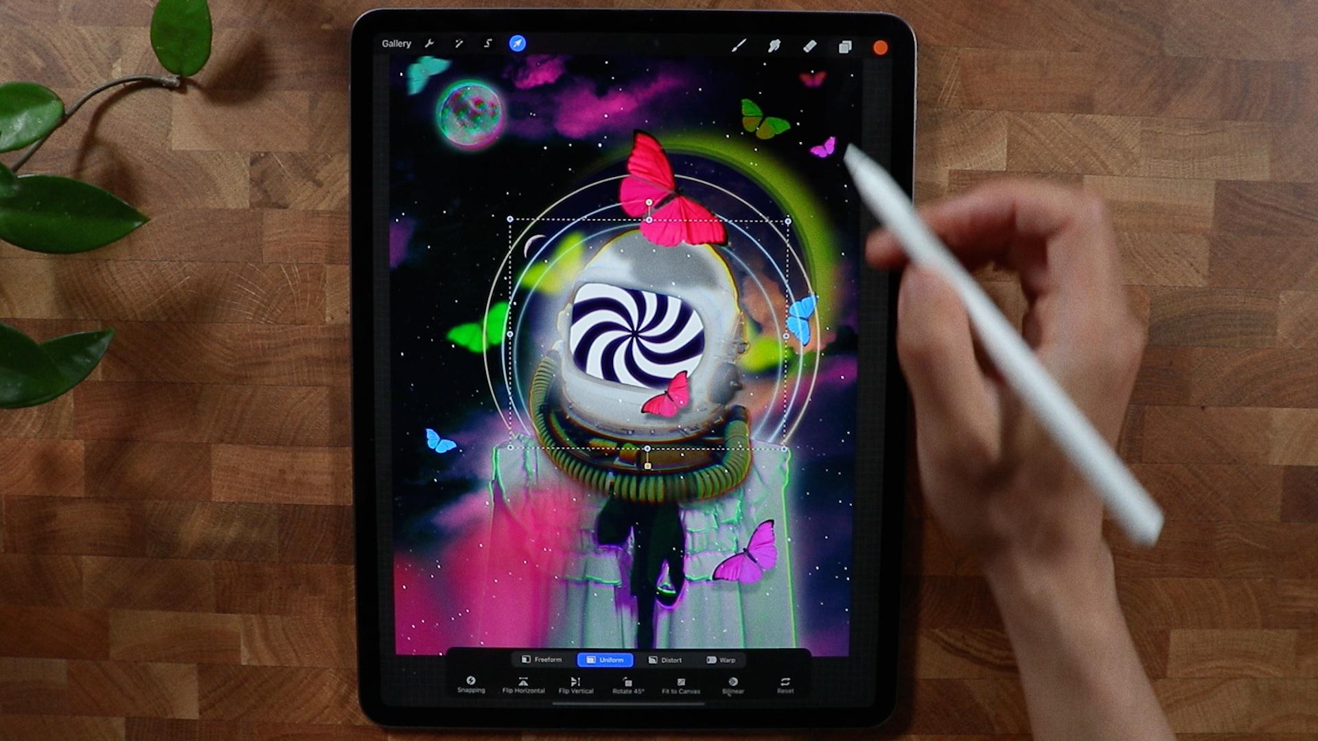
9. The Magic of Butterflies: So we are going to be working on the
butterfly right here. We're going to create different iterations
and different colors. This is going to be at the
moment, our base color, but I'm going to
duplicate it a couple of times and we're going to
position it to something. Then we're gonna
make it big here. And I'm going to
duplicate it again. Probably will put
it somewhere here. So it has a little bit
something to look out on that side going to work
with this tree for now. Okay, so the
butterfly right here, I'm going to probably
change the color to red, something like this. And this one right here, probably I'm going to color
it to something else. Probably this color,
or I'm going to exchange it actually with
this one right here. This one I kinda like the color, so I will stick with
this one right here. I'm going to duplicate this one. And because I'm going
to create a shadow, so I'm going to decrease
the brightness. I'm going to position it right here thing that's
a good position. And I'm going to go for Gaussian
Blur just a little bit. Just soften the edges of the butterfly shadow,
just like that. And we can decrease the opacity. And as you can see,
a shadow effect. So it gives it more
kind of a dimension. I think this is good. Maybe a little bit bigger. Yeah, I think
that's, that's good. And the green
butterfly right here, I'm just going to position it's something they're not too big. And thing I'm going
to Gaussian blur it a little bit to give it
more kind of a perspective. Something like this. I
think this is quite cool. Yeah, so it looks a
little bit better. This guy or shadow effects, so it gives it more
kind of a dimension. I think this is good. Maybe a little bit bigger. Yeah, I think that's good. And the green
butterfly right here, I'm just going to
position it's something, it is butterfly right here. And I'm going to
position it right here. I'm gonna make it super
big just like this. And I'm probably
thinking, this is good. And I'm going to
probably Gaussian blur it are probably we're going to experiment with
motion, Motion Blur. I liked the Gaussian blur
effect a little bit better. And I think this is good. I just, I still want to see
the butterfly remnants. So I think that's good. And I am going to duplicate it. I'm gonna make it black. And I'm just gonna
put it right here, so it gives a little
bit of shadow. And I'm gonna decrease the
saturation just like that. And I think it's quite big. So I'm going to select
both of these layers. So just like this. And so it's not
super overpowering. Think I'm going to just, I'm going to add more butterflies. So to just kinda put a ray here. I think here is good. I'm going to change the color
to something different. Yeah, Think Purple is good here. I think it just makes
it a little bit better. And I'm going to duplicate it. And I'm gonna go to Adjustments, Brightness, decrease
the brightness, go back again, do
a Gaussian Blur, and just put it right here. And we're going to
decrease the opacity. So it creates a shadow. And as you can see,
did just that. So I'm going to create another
butterfly again and I'm going to just keep adding here. And I'm going to
change the color. Something like this. Actually, I'm gonna make
it brighter and I'm probably going to color it the same as this one right here. And that'll be easy to
create his brightness. Yeah, I think that's good. I'm going to duplicate it again. Put it right here, make it a little bit bigger. And we could maybe Gaussian
blur it quite a bit. And we're going to
duplicate again. And I think this is gonna
be the last one here. Two here. I'm gonna
put it at the back of the helmet. Something like this. So it gives a little
bit more perspective and a little bit more
dynamic just right there. I'm going to change the color to kind of I'm going to Gaussian
blur it quite a bit. And I'm going to
duplicate that and put it just probably here as well. I'm going to duplicate
another butterfly array here. And I am going to just put it on the face of our
astronauts devotee. I'm going to make a
shadow for that one. So I'm going to decrease
the brightness. Do a Gaussian Blur. It probably here. I think that's too
much Gaussian blur. I think I don't need to do Gaussian blur because it's
too close to the helmet. I think I'm just going
to lower the opacity. Just like that. I'm going to add
one more butterfly right here and I'm going
to position it here just to break something here
and probably add one more. And I'm just going to
put it something here. Not too much, but I think
that's pretty good. So we're gonna take a
break and we're gonna get back here to continue
this composition. Very bad. Right now, it really looks good. And I'll see you
on the next video.
10. Prepare to Launch: We're going to fix something here that doesn't look right. I think that is too strong, so we can always fix that part. And I'm gonna go to this
halo effect right here. And I'm probably going to
decrease the opacity if I can. I'm going to target
this moon right here. And I'm going to duplicate it. And I'm gonna go chromatic aberration
to bring some colors. As you can see, it
brings kind of a color. And I think it's quite good. And now we can manipulate the color with the
hue and saturation, want to make sure that it
gets a tone right here. Now, all we need to do is to
increase the saturation of this color right here reflects
with this one right here. So I think I'm just going to fix this butterfly
right here because I think it was left behind. So I'm gonna go
saturated quite a bit. Change the opacity. And we're gonna go to
the moon right here. And I'm going to just make
the brightness quite 200. And I am just gonna
go for Gaussian blur. So it just creates kind of
light's coming from there. Go to the helmet. And I'm going to duplicate
this on this layer right here. I'm gonna go for brightness. I'm going to go make
it super bright. And I am going to
Gaussian blur it. Let's see if we can get some illuminated light
amid at the back. It looks not so good actually because emit other
lies right here. So we can always get the eraser. And I'm going to
go to the eraser, I'm gonna go soft brush
and we're just going to go delete the part. Dad. Don't need sunlight right there. I think it's quite good. We can decrease the opacity. So it's not too much
that super bright. I'm going to go to the body as well, the duplicated layer. We're going to do the same. So I'm going to increase the brightness and I'm
gonna go Gaussian blur. So I have another light's
coming from there as well. This light helmet right here. I'm not a fan of the
slides coming from there because I want this
one to be super crispy. So I'm gonna go to the eraser, I'm gonna go soft brush
on the delight helmet. Probably going to delete some
kind of pixel right here. I'll put an overlay
stars right here. This is the stars
I'm talking about. I'm just gonna put it
all the way to the top. And I'm going to change the
blending mode to screen. And as you can see, we get all these nice
stars effect grade. They're really the delights. The stars that goes to
this part right here. And on the helmet, I'm gonna go back because it's kinda like, kinda boring in this part. So I think I'm gonna go another chromatic
aberration here, just to bring a
little bit color, but not too much to
the dress as well. I'm going to modify the
chromatic aberration, maybe a little bit more
punch halo effect layer. And I'm probably going to go chromatic aberration as well. So it creates a little bit
more kind of like this. And I think we're
good to go with these static version
of this image. We can now do some
animation right here. So it gives a little
bit more like throbbing, light, trippy lot. So we're just going to do that.
11. Create a Flickering Light: Alright, to start
the flickering light around the helmet
of the subject, we actually need to
group everything. When we're doing
frame-by-frame animation, we have to take note of layers since we have
a lot of layers here, I'm going to work pretty good. So I'm going to group
it just like that. Now it's grouped. I'm going to turn on
the Animation Assist. And if you click this
part right here, we can enable the background and we're gonna
get our light pen, get out of the dark group, this group right here, I'm going to add a new layer, crease the size of the brush. And I'm just going to
do something like this. Good. Let's try it first before
we do some modification. And think this is quite good. Let's just make the
circle a little bit bigger and fit into
the character. We're gonna do this
excess part right here. See if we can. Okay, duplicate right there
and this layer right here, I am just going to decrease the opacity,
something like this. And let's try to do the
setting. We're gonna go loop. We're going to probably do this. And as you can see,
it's kind of a delight. It's kind of throbbing
and all that. It gives me a chill. As you can see. It
has a good effect. But I want to get
this butterfly. So I'm gonna go, I'm gonna go to that group. I will get this
layer right here. And I'm going to put,
I'm going to just duplicate it just
right now so we have a backup and I'm
going to disable it. I'm going to put the
butterfly out of the group. And as you can see,
there's kind of a new frame that was created. So I'm going to select this one. Can put it on the
way all the way up, make sure that you put it
all the way under the top. And you should just make
it as a foreground. And a second see, it won't change anything. So just like this. And we could duplicate this layer right here,
make it smaller, I think so it's a little
bit easier to manipulate, put it right, just
about right there. We can decrease the
hue and saturation to some thing different
color just like that. Duplicated as well. Make this opacity
a little bit less. And let's try to see if now it looks like it's a little bit, a little bit trippy right now. It creates this kind of a different fire.
Think this is good. We can even make another
duplicate right here. We can make it smaller,
something like this. And see the effect. I'm going to delete
this part right here. And let's try it out. I actually just like
one light emitting. So it's a little bit more
focus on the character. I'm gonna do it all in, but that is a
possibility with this. We can also do something
here. Let's try it out. So in the same layer, I think this one right here, we can may kinda the
same thing here. I'm not quite sure,
but straight out. We could explore more
possibilities in here. I'm going to put
it kind of whites or blue tone. Something here. Probably will put killers just put a little bit more
lights here. Let's try. Yeah, it's super trippy. Probably will use one
of my stamp here. Okay, let's try again. Now it's just too much. I think I went through fire. We're going to stop right here. So this is going to
be our final render and we can upload it to
Instagram or social media. You can even print
it, but you know, the lights, the glowing
lights, it won't be printing. But I hope you enjoyed
this tutorial and I can't wait to see what
you come up with. And I'll see you guys
soon and take care piece.
12. The End and I Thank you!: Hi again, and thank you
so much for spending your time with me and
watching this class. I hope you enjoyed it
and learned new things inspire you to create
surrealism poster. As always, I'll be
here waiting to see your beautiful project. If you have any
questions or something, feel free to ask anything and
I'll see you on next one.
 Bryan C'ngan, Graphic | Web Designer