Transcripts
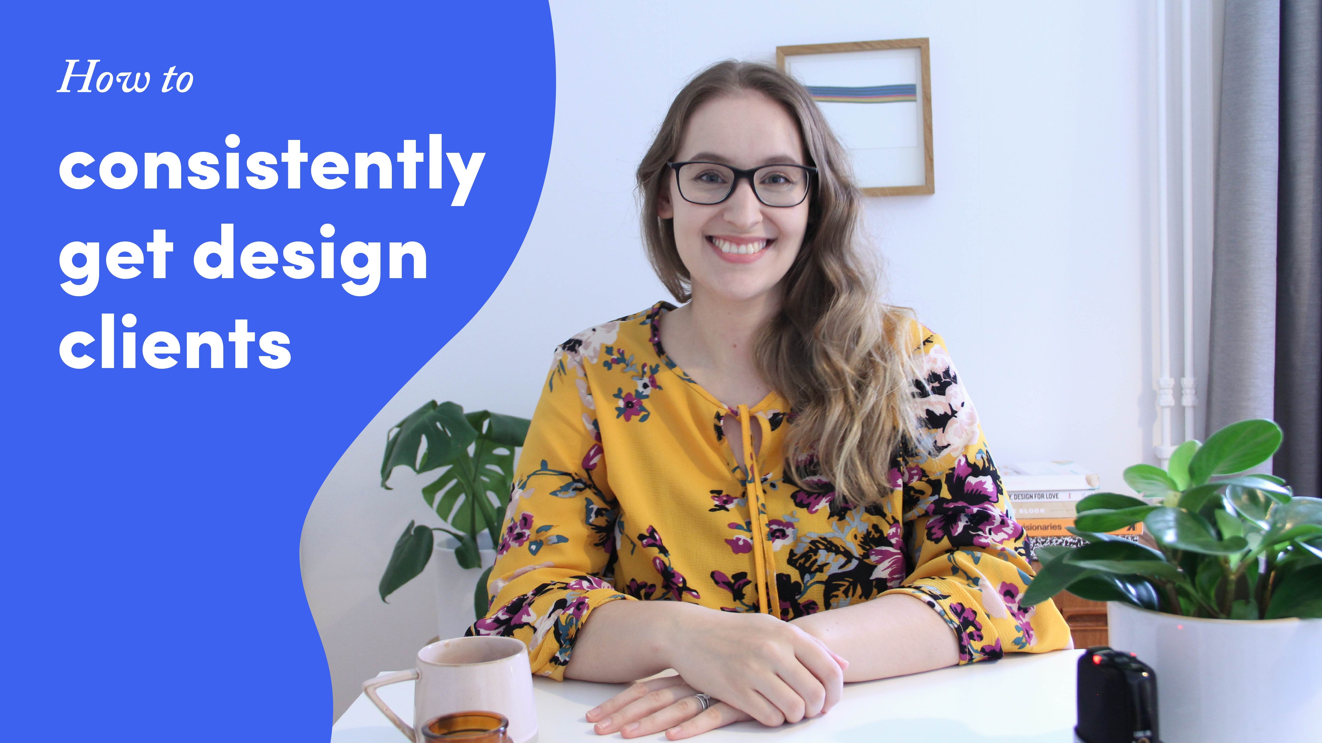
1. Class intro: Hi and welcome to the Skillshare course on how to create a really good portfolio that shows your value, and gets you more work. My name is Marlin, and I run a branding studio together with my husband. We work with sustainable businesses. We really try to focus on both creating strategy and something that is really beautiful and impactful. When we're designing our portfolio, I think there's a couple of things we want to think about. The first one is to really focus and show the type of work that we want to get more of. The second thing is we want potential clients to see themselves in the different case studies we're showing, so that they get excited about reaching out. The third thing which I think is something a lot of people miss, and I used to not do this at all, is to rethink about SEO, and how we can write titles and descriptions that will both help us get found on search engines, but also will help both people who are really reading your case studies in depth, and also people who are just skimming through the titles and need to get the highlights of the project. In this course, I'm going to be walking you through how to portray yourself and your team, how to show the work that you have done, building up case studies, showing your portfolio work page. I'm also going to be having a peek at and about pitch, which I think can be really useful as well. This class is for anyone who is creating a portfolio, and you can be completely new or you can be redesigning your portfolio. I know it can be quite challenging, when you're branding your own business and doing your own things. I'm going to try to make it really actionable and step by step. I'm really excited to get started. I'll see you in the class.
2. What makes a great portfolio: For this very first chapter, we're going to be thinking about what makes a really good portfolio site. I'm going to be sharing some of the things that I think are important, and we're going to be having a look at some other portfolio sites that I think are really inspirational and that I always look to. I think that any portfolio site needs to do a couple of things for it to be able to help you reach your goals. The first one is to answer a couple of questions that could seem quite simple, but just take a little bit of time to think about them. The first one is, who are you helping? You want to make sure that it's really clear from your portfolio who your dream client is. Secondly, how are you adding value? Not just talking about yourself, but talking about specifically why customers or clients would want to work with you. The next one is a very practical one, which is, what services do you offer? Is it animation? Is it branding? Is it web design? Just making sure that's really clear. Then the last one is, who are you as a person? Not just like which city you live in but thinking about things like your values, your working style, your personality, so, people can really get a feeling for you as a person. I always think that a really good idea when you're designing your on portfolio is to have a look at some companies that you admire and portfolios that work really well. We're going to use two different ones for inspiration. We're going to have a look both at their work overview site and on an actual case study. The first one that I wanted to share with you is one of my absolute favorite studios or agencies, it's called Hyperakt. This is a company that designs brands for sustainable companies and mission-driven businesses. What we see first when we land on the work page is these two statements, so brainy and beautiful and design is our force for good. I think these are really clever. What we're doing here is we're answering most of the questions that we had in the beginning. Brainy and beautiful is talking about how they're adding value. It's going to be both functional and beautiful. They're also revealing a little bit about their values when they're saying their different approaches and also that they're wanting to work with companies that have a force for good, which also ties into who their dream client is. If we scroll down a little bit, we'll start seeing different projects. We have really nice clear thumbnails that feel very curated, so it's not too many projects, we can look at one project at a time, which I can really appreciate. We also have a little bit of a short explanation for each which is really good because it can start to help potential clients see, this sounds like us. I want to see what they did for that type of project. If we're going to have a look at one of their case studies, I wanted to have a look at this moment is an MTV social impact squad and what I like right off the bat is that they have a little bit of an introduction. It feels very easy, like you're landing on this case study and you're going to be taken through what has happened. If you scroll down, you're starting to see some visuals and then it's mixed in with the copy. As you're scrolling through the case study, you're being told a story which I think is really helpful. The last thing I wanted to show you with this is, they have a little behind the scenes section. Here we're able to see a lot more of their personality and you get to see a little bit a peak from inside those studio. I think this is really good for building that rapport and showing that you are people and you're trustworthy. Next up, we're going to have a look at a company called Farm Design and again, when we land on the work page, we are given a really clear statement. We're a tribe of thinkers and creatives that roll up our sleeves to help brands grow through thoughtful strategy, collaborative inside, and quite frankly, hard work. Again, here we're answering a lot of these questions. They're talking about who they are, that gives them personality, they're saying who they are for and they're saying a little bit about the way that they work. Once we start looking here, these filters are actually revealing a little bit more about who they want to work with, so their dream clients. We have lifestyles, food and beverage and restaurants. As you start to look through these different thumbnails, you start to see that there's a lot of packaging and there is mainly food and drinks packaging. You can right away see that they have a really clear niche. Let's go ahead and look at one of the actual case studies. This is the one for Big Island Coffee and so here what I really like about this intro section is that they're listing the services that they have, so right off the bat you can see the different types of services that were involved in the projects and you're getting a bit of a background of the project as well. Something that Farm Design does really well is they're really creating this feeling of the brand. You have mixed in with the actual mock ups, you have pictures of the actual people behind the company and you also have these little design cards at the attempt to mix in. If we scroll down, you'll see that it's not just a mock up, but it's a statement together with a mock up that stylized in the brand style. This is another beautiful example of this where they have this split screen where you have a detail shot of the actual mock up and then you have a picture that is really going along the lines of the products. I think they're so good at this personal storytelling aspect, which is why I wanted to show you this projects. Lastly, at the end we have a call to action with either going to view more projects or getting in touch. There's a bunch of different options for getting in touch. I think this is a really good thing to keep in mind that besides just the project, it's always a good thing to have a call to action at the end. Another aspect that I think a lot of people forget about is when we design our own portfolios, we really want to add all the bells and whistles. We want to make sure that it's a really well designed websites, it's a really impressive website, but something that we want to remember is we still want the website to be really easy to use. It's easy to add a lot of features, let's say, a lot of micro-interactions, lot of different animations and transitions, but sometimes that can make the website both slow to load, which will damage your SEO, but also make it confusing to use the website. We really want to make sure that our clients have a really easy time understanding the answers to these questions and also making sure that they get to all of the information that we want them to see. Now that we've had a look at these websites and we know what's important, try to answer these four questions that we asked at the beginning.
3. Goals - creating a roadmap: Great. Now that we know a little bit what we're trying to achieve with our portfolio site, it's time to start thinking about the type of work that we want to show and setting some goals. We're going to be doing this really quickly as a little bit of an exercise. The first thing we want to do is to think about the type of work that we want to get. Because this is going to both define ideal our clients, but also help us pick out which projects we want to show in our portfolio. There's three questions that I want you to ask. Have a look at your past projects and if there's a lot of them, you can choose to look at the past year, or the past six months. If you're new and you haven't had any projects yet, try to think about it from a hypothetical perspective at this point. The first question that you're going to ask yourself is, did I enjoy this project? Did it feel creatively fulfilling, or was it super draining and really frustrating, and you can also, of course, ask more questions, why did I enjoy it? Was it because the client was very open and free, was it because of the type of work that I did, and so forth. The first one is, did I enjoy this project? The second one was, was it actually profitable? To answer this, you might have to dig in a little bit to how much time you spent on the project versus how much time you thought you were going to spend, what you charge, and if there were any unforeseeable things that happened, I think that the absolute best type of work happens when we both enjoyed the project and it's profitable, but that's not always the case. Sometimes if a project is really profitable and okay, enjoyable, or if it's something that you really enjoy but it's not as profitable, you can simply sprinkle those projects in as well. I think it's good to have the answers to both questions, and the last question is going to be, what type of work was involved? What deliverables was it, what type of skills did you need? This is going to help you describe exactly how you define your services and your offer and the type of work that you're looking for. Now that we know the type of work that you want to get, we're going to look at some goals. Again, these three goals here. The first one is, what do I want the ideal clients to know right away as they land on my website, what kind of information do they need to know about me right away. If you remember, when we looked at the two sites, Hyperakt and Farm design, they have this statement that is like a one or two-sentence description of who they are, what's their brand essence? How can they help you? The next one is, what are some secondary things that feel important? Once you've had that major statements, what are some things that you want to use to back up this information and make sure that they feel very comfortable and excited to work with you? I think that having these secondary things, it can help you write the initial statement because it takes away the importance of having to put everything into one statement. Think about first, what do you want them to know right away? Then what are some secondary things that you can use to back that up with? The last one that is really important is what actions do I want them to take from my website? When they're on my portfolio, how do I think that the user flow or the user journey will look like? Will they land on my homepage and look at some of my work? Will they go into specific case studies and then get in touch? What's the idea of how you want people to interact with the website? This is of course going to make it a lot easier for you to tell the story in a way that is actually answering all those questions that someone might have as they're going through this process. Once you've thought about the type of work that you want and goals, you can write everything down in the workbook, which you can find that a little bit further down as an attachment to this course.
4. Work page - give a clear overview: The first page that we're going to start designing on our actual website is going to be our work page. This is where potential clients and people who might partner with you are going to get an overview of your style, the type of work that you'd like to get, and basically see the quality of your work. I always think that the easiest thing to do is, rather than trying to just explain, I'll walk you through my portfolio and basically explain my thinking process behind what comes in what order, why I put certain things and just how I was thinking when I was designing it. When you first land on my portfolio, you'll have couple of things going on. The first thing is you have mindless statement here. Our design studio is actually based on me, who has a background advance and my partner, who has a background in human-centered design, UI, UX, and film. The thing we want to communicate here is we want to talk about what makes us a little bit unique. We have design created with a pinch of scientific curiosity and a lot of experience. Every project is different, but the impact is always important. Here, we're tying this together with design for sustainable businesses, with the fact that the impact is something that we really want to focus on. We also have a preview of the work. So right away you can see that you're encouraged to scroll down and start exploring our different case studies. You can then go into these different case studies and start seeing a little bit more details of the work. What I decided to do was the work that I'm most commonly hired for or the work that's representing the work that I want to get most, I put in these slightly bigger thumbnails. Then I also wanted to mix up the different things in terms of the services that I offer. Rather than putting all the branding up top and then having categories, let's say to bring people down to other types of design like illustration or print design, I wanted to give people a good overview that we have a lot of different services that we offer. Our niche is industry specific, but it's not as specific when it comes to service. Our main core services is branding, which is why a lot of what you see is logo design and you'll have a lot of things that back up the brand experience. But I'm mixing, so we have illustration, we have print, and we have some branding, then we have some poster design. You can see that there's a breath of work that's going on. I think it's really important that you don't stop at your different portfolios, but you actually show the type of services that you offer and other things that are important for basically talking someone through why they should actually get in touch and hire you. Now that you've seen the quality of the work, they might have already clicked away to a case study, but if they haven't, we want to catch them and make sure they understand everything that you can do for them. In my case, I like to add services in this section here, where I'm showcasing the type of work that I do and I'm encouraging someone to go and check out all of my services where I go way more into depth. Then I also like to introduce the team. Here we have a little bit about me and my partner and basically trying to introduce what we think is important to us, who we are, and what is driving us and encouraging someone to get in touch and learn more. Then we get to the social proof. This is where I like to put some sort of testimonial in, and in this case, I have both a written testimonial and previews from the project. So people can see, "Okay, this is what the person said and this is the kind of the end result." I think having social proof is such an important thing, and I used to always put it just in the case studies themselves. But I heard such a great tip from Louise Shanahan, who's actually the person behind this testimonial. She has a podcast as well where she talks about copy writing and running your freelance business. She talked about baking in the different testimonials where they are most relevant. If you have a testimonial that is talking about your process, put it on the page on your portfolio where talking about process. Last but not least, I think it's really important that now that we've shown them our different case studies, we've shown them our services, who we are as a team, and we've shown them social proof, we really want to close the deal and make sure that they feel comfortable and excited to get in touch. Having a contact form at the end or some sort of call to action that is encouraging people to get in touch is really important. You'd think that once people have seen everything, they're excited, they'll take the action to get in touch. But sometimes you need to just have it there for them to make it easy. I suggest having some sort of contact form or contact button at the end. This was a quick walk-through of my portfolio. If I'm going to summarize the different things that I think are important are: to make sure that you are being clear of what you're showing on the page. That you have a mix of case studies that are showcasing the breadth of work that you want to get; Also that you're choosing things I feel curated and I feel appropriate to the type of work you want to get. Once you shown everything that you wanted in your portfolio, make sure to also add other sections on your portfolio work page that are going to encourage someone to learn more about your business and see the value. It could be things like service sections, meet the team, testimonials that show social proof, and de-risk the choice for someone to get in touch. The more they know about you, the more they're going to feel comfortable. In the next video, we're going to have a look at how to structure each case study.
5. Case studies and story telling: Super. Now that we have this overall web page that people can click on projects, we need to take them somewhere when they click and this is where we move them on to case studies, which are much more in-depth, stories about the work that you've done and the impact that you've had. This is where I really think we can do a lot of good things because a lot of people tend to put a couple pictures and maybe a short description, but there is so much more that you can put. I'm going to take you through as I'm designing my own one, and to process in the way that I'm thinking about it. You can do line along with me. Today we're going to be designing the case study for a company called Investeo which was a project we did that was actually fall out, it was like branding and it was website design, it was document design. There's a lot of different things to show and to get across. The different pieces of information that I want to communicate, are going to be the impact that we had, the goals of the project, and how we solved for those. Here's the copy that have prepared and we're going to try to fit all of this in. I have the different category already like the different things I want to share. I like to write all the copy first to make sure that I know everything I want to communicate. In the same way, I've prepared the different photos for the case study. Most of these are grabbed from my current portfolio, but some are a little bit new and a little bit updated. The first thing you want to do, is to just think about the information that you'll see above the fold. Basically well we'll grab someone when they land on this case study. Traditionally I have had this setup where actually the client name has been in the biggest one and then we've had the thing that we've been doing for them or the big takeaway. In this case, it's empowering Millennials take control of their finances. This is basically a company that is tired of how hard it is to talk about money, how many people have questions and they want to take back control. But it's just really challenging because the information is so scattered. They made a guide specifically for Millennials. The person who did it, our client, he knows a lot about this and he's made a very comprehensive guide. We want to get across the type of work that we did and also the type of work that they offer. The problem we're having with this is the name itself really isn't the most important thing for someone else like a potential client. The impact that we had and what the goal of the project was, that's much more important. Then these different services that we offer it, I think those are also important to show. I think what I'm going to do, because I have this format of having this big title, I think I might have to break that format specifically for this and I might use it for titles further down the line. I think what I'm going to do, is I'm going to switch this to my bigger title and we are going to make that bigger. We're going to try to make sure that this really is standing out because this really is what potential clients would care about. Empowering Millennials to take control of their finances does what the project is about. Then we have the different services that we offer. I think what I'm going to do is, I'm going to offer a little bit more information just here. I'm just going to go and grab the normal piece of text. There we go, and here I want to give a little bit of background. Now, I have the whole description that is a much longer background, that's going to come a little bit later, but what I'm going to do is just to give a teaser of what we did here. I'm going to write something like this. This could be an example of what this little teaser could be. I'm talking about how we help them build a brand that feels approachable and formative and makes it easy for Millennials to become financially stable. Before we move on to put the rest of the copy, I'm just going to be putting the banner image just so we have this top portion result. I'd like to put something that is really showcasing the full breadth of the project, in this case, I'm going to try to put this banner image here. Now, if we move it around, we'll see that it has examples of the guide, it has examples of the full visual language, the website that we designed, business cards, but it doesn't quite fit here, I have to make a decision and I think I'm going to just cut the business card out, and have focused more on the website and the other deliverables. We have to make it a little bigger. I think that looks good. It gives a good sense of movement and there is something happening. I think this one works really well and the good thing about it is as well that on different formats I think we can make this like a [inaudible], it will be a lot taller, so that means more of the image will show in the middle, which has the actual computer screen with a website that shows the logo and the branding and the photography style and the colors, and I think those are the most important, we're going to keep it this way. Next we're going to be putting some more copy here. What I'm going to do is, I'm going to have a look at the copy that I had. Here we're talking about the background of the project and mainly what the client is trying to do, and how we are trying to help them solve a specific problem. I'm going to be copying this and think, that maybe we want to have something here that feels a little bit more visually interesting than just purely putting the text. One option would be to put like a graphic next to it, but I think what I'm going to do is, I'm going to go in line with the rest of my website, and I'm going to be putting here, another title. Let's see. I put this and then expands like that. This way we can put project goals. This way it's really care, this is what we're trying to do and we have a nice interesting layout. Now I think it's time to get into some nice graphics. I think what we're going to do is, we're going to drag and drop some of the ones from my case that even folder that I've used. I'm going to put in some containers here for the actual images because I'm working in Adobe XD. If I didn't mention that already, sorry and there what you can could do is you can just purely create these containers and then drag and drop images into it and the benefit of that, is that you can instantly resize them. If I want to, let say I have a much taller, that's super easy, I don't actually have to crop anything in a different way. I think that is something that I really like. My thinking behind the pictures that I'm showing now, is that we've shown primarily the website up top. As I'm turning this creative story, I want to put something that is complementing and showing a different part of the project. What I'm going to do is, here I've got the logo as an icon and the slogan, finance done differently. I'm going to try to do something that feels very different. I think what I'm going to do is I'm going this, which is the guide that we developed for him. Here now we've got an overview of some other things that we haven't seen them top, they're starting to tell the story. Now, what I'm going to be doing for the rest of the actual case study, is to build out the sections step-by-step to tell the story of what we did. The different sections that I like to have are the idea behind the brand and we're going to make it better title for this. But basically the concepts that we had behind the brand and the logo design and things like that. Then I like to pick up a couple of things that we were trying to achieve. For this case study, we had working with empathy because money is something that can often feel quite challenging. Then I also like to bring in impact. This is like three different things that we were able to help the client with or some positive impact that we had because we worked with sustainable clients, so we like to show the impact that we had. Those are the different sections that I'm going to be having. The first one here is about the concept of the logo and the brand. Because the concept here is actually a little bit easy and a little bit exciting, like you have all these opportunities and if you get your finances in order, you have more freedom. Because of that, I'm going to be writing a title that is a little bit more related to that. Then I'm going to be adding a pre-title to qualify what it is I'm doing. I'm going to be grabbing this and my title. This way we can keep it nice and consistent in terms of the hypography and making sure it's all nice. Here we're going to have the concept. The reason that we don't want to purely put as a brand concept as the main title, it's for a couple of reasons. The first one is that when we think about SEO, brand concept is very vague. But if we have something that is truly solving a problem, that's something that people might be searching for in an SEO and mindset. Therefore, we want to put the title that's a higher hierarchical title, as something that is more searchable, more SEO focus. Then the second one is, as you're skimming through the side, some people don't read that much, it's always good to have something that catches people's interest. Brand concept, they might not necessarily stop and read it sounds a bit dry, but if we have something that is joining them in, that's talking about the goal and what we achieved, that's more interesting. We can, for example, put something like, money creates freedom. Then we can add the little description that we had. Now, we have a little bit of background here. Because this is now talking about the brand concept, I would like to put something that is very related to branding. What I'm going to do is actually going to put the logo design here which I think makes a lot of sense. We're going to drag them here. I think that looks nice. Of course, I could put something here, I could put it, but I do like the whitespace. I think we're going to go with this. Then I think what we're going to do is we're going to show one more set of imagery. That is going to be a good way for us to build out a little bit more of the feeling of the brand before we start explaining a bit more. I'm going to put this here, which is the slogan and the feeling of the photography style that we have. Now that we have that in place, I think we're going to be putting the next description of the goals and what we achieved. We're basically going to do it exactly the same way that we did this, but, of course, you can switch the layout if you want. The next one is going to be talking about designing with empathy. That's going to be the title itself. I'm going to put that, I'm happy with that. This is basically going to be talking about how money is a really stressful subject and how it is very scattered and complex, and how we are using the soft shapes and imagery and color and clean layout to bring clarity to this very complex topic. That's a way that we can help explain how the idea behind the brand and basically the entire goal of the project has been reflected in the visuals. We're talking about bringing that strategy into the visual design. Let's have a look. I'm just going to fix the formatting. Just notice. The title here might be something like translating goals. Then we can again put a few different images that are reflecting this. I'm going to be grabbing, see what would be a good fit. Do we have [inaudible]? I think this might be a good one. I'm going to put this one. This is more of an overview picture. I think that suits it really nice. I think I'm actually going to be putting it next to it like this. There we go. That feels nice. I think I'm going to move it just to keep it consistent with the other format here. I think that's great. We're going to go with that. Remember how we talked about the impact that we have as designers and as people who were helping this client, so we're going to be thinking about impact. The first one we're going to have is improving mental health. We're going to put the actual copy that we have. I'm just going to speed through this paste, you're about to watch me to copy paste too much. I think I'm just going to center this and make it nice and clear. That's something that we really care about. Let's move that up a little, keep this nicely recognized. Basically, we have the impact now. This is something that is really important to us as people who are focusing on strategy. Then the last thing we're going to do is, before we move on to a couple different sections is, I'm going to be putting in a couple more images just to give a little bit more context. I like to show lots of different settings. We're going to be showing this one which is the guide because this is really where these different impacts touch points come up. Because it's the interactive bit where Investeos customers are really getting the benefit of their products. Let's see what else we have left. We've got these two, which is how it works on mobile and how it works on their social media platform, and then another nice grounding one. I think we're going to be able to just put those in here. I'm just going to grab this so I can keep the same format. I'm going to put those here, okay, this one. Okay. If we're going to be doing a super basic summary now, basically what we have now is a nice overview section so that straight when someone's landing on this page, what they're getting is the goal of the project. They're getting a bit of a brief and background. They're seeing the services that were included in this project, and then we can scroll down to learn more about the actual project goals and see the different case studies and the different things that are going on. As you scroll down here, you'll get a really good overview of the goals of the project. We're not having all of the texts in the beginning and then a lot of images. We're interspersing them and mixing them with the kind of description that seems to match what is shown in a portfolio if it is. This is how I like to do it because I know a lot of people like to have a big set of the brief and the solution at the top, and then show a bunch of images. Which is totally fine, but I think that makes it more interesting reading experience to have that mix of content that you're interacting with. Now that we've actually put together all the sections that we want to have to showcase the work that we did, we want our clients to take a certain action. In our case, there's two things that people tend to do. The first one is they might get in touch with our project, and the second one is they might not be quite ready. Sometimes they actually sign up for our branding course which is totally free. That gets them on our newsletter which then is a really good way of building that relationship long-term. I want have both of those in there to give opportunities for people to get one option that feels right for them. What I'm going to put first is just a super simple little description that is giving them an option to get in touch and this is taking them to our contact page. I'm just going to put a button on a quick description, so let's grab a button from our guide. Get to see something nice. We have this section here for getting in touch, and then in case people interested in the lead magnet that we have which is the free course, I'm going to put in that as well. I think what I'm going to do is if people are ready to get in touch, then I don't really want to show them this right away. I'm going to put in some images of us in-between just to create a nice separation between the two. I don't really need this form here because we've already got our contact area. Let's grab some pictures of us. In this case, I really just want to make sure that we're focusing on showing a little bit of us so we don't have to have the whole link to the contacts to be about page, for example. I am just going to get that, the team and this. That's good. Basically, we've got then the portfolio case study. We have given them an option to get in touch. We have a little bit about us, who we are so they can see our faces. We could have more description here, but I think we're going to be fine for now, and then our lead Market. Then what I'm going to do is I'm going to put the fodder. That's the case study page button. Now, we're going to move on to the about page so it can show potential clients why they should pick us specifically.
6. About page - skills meet personality: Now that we have all of our work on our website, we also want people to be able to find out a little bit about you, the style that you're working in, how you like to approach a project, but also who you are as a person. Not just like which city you're from, but also just your personality, your values, and making sure that people completely understand who it is that they're hiring. This will be really important because I think that your work is important and the quality of your work, of course is important. But there are a lot of great creatives out there. Our personality can really be what wins you a project sometimes. Let's have a look at how to design a good About page. When it comes to creating a really strong About page, I think there's a couple of things that we want to think about. The first one is, how are we showing our personality so that people feel comfortable reaching out and they know what to expect from the work culture and the process. The second one is, how do we show our skills? What are we really good at? What is our experience, how can people feel comfortable that they understand the type of projects we worked on before, and how to get in touch? This is my portfolio About page. The first thing we'll see is we'll have a little bit about the studio itself. Talking about how we love challenges and ambitious ideas and that we really take the personal touch very seriously. As we're scrolling down, we have a little bit about each person. We have a little bit about our professional background and a little bit about us personally. Things that we find as interests or sports and things that we have as hobbies. Then we start going into our values, and because we're a design studio for sustainable businesses, we wanted to talk about what ethical design and sustainable design means to us. This is all about backing up what you're saying with more meat and more information. Let's say you're talking about being someone who cares a lot about creating very inviting or fun designs. What does that mean to you? Why did you think about doing that specific approach? Talk about your story and what made you interested in the specific direction. We have a little bit about what it means to us, the different things we do to become a sustainable business ourselves. Then we also start talking about our services. This is where we start showing a little bit more about how we can actually help them. We bring it from what we think about and what we're good at to how we can actually translate that to help. We can never know exactly which page is on our website someone has been on before. This could be the first page that they land on. I think it's important to show the breadth of services that we have. I want to give a little bit of an overview and encourage someone to come to the Our Service page. Now that we know this, I'd like to show a couple of pictures from the office and go a little bit more into our actual story. Sharing a little bit more personal information and what got you into the field in the first place. In our case, we also have a set of values that we go by. These are things that really guide both the style of work, but also how we are as people on what to expect from working with us. I think having these little quick statements, it's a good way for people to get a clear overview. Lastly, we have a little bit of social proof at the end. This is a way to showcase the type of clients that we worked with before. In doing this, we're giving an idea of the type of industry that we have experience in, we're showing real faces, which I think is really important because it really brings in that personal touch. We then have a call to action, which is just encouraging people to, once they've gone through everything they found out a little bit more about us, they have the option to get in touch and start their very own projects. To summarize, we have an introductory section of who we are and what we stand for, similar to what we did on the landing section on the work portfolio page. Then we have a little bit about us as people. We have a little bit about our values and what matters to us, the different services that we offer, and some social proof in terms of who we work with and what they thought about the projects. Instead of putting the people, you can also put testimonials or do anything that feels right for you. Now that we looked at this, have a think about what sections you think are important. What values do you want to communicate? What kind of personality traits do you think that your clients value in you as a designer and a creative partner, and write those down in the work.
7. Class project and end note: The class project for this course will be to create at least a sketch or maybe even a full fledged work overview page. I think this is a really good place to start, because you can really figure out what it is that you want to communicates with this overview work page. You'll need to communicate exactly who your dream client is and why they should work with you. We also need to include the type of work that we want to get. Which means we need to do a little bit of soul searching to see what work is rewarding, what work is profitable and what projects don't want to get in the future. Thank you so much for watching this class. I hope this was helpful. If you're building out your own portfolio, I would love to see yet the different designs and concepts that you come up with, so make sure to put that in the class projects. If you have any questions or you just want to talk about the class a little bit, make sure to join the discussions. They're just under the video here. I would love to hear from you if you have any questions at all. Thank you so much for watching the class and good luck with your portfolios.
 Malin Lernhammar, Designer and teacher