Transcripts
1. Welcome!: Welcome to the class, create a mobile phone
wallpaper in procreate. In this class, I show you how to draw your own mobile
phone wallpapers, even if you are not an artist, but willing to create a digital product for
sale or just for you? If we have met yet. Hi, my name is Maria. I'm an artist and graphic
designer and teacher. I love to create
digital products because I deeply
believe that making these kind of products
can help you to create a sustainable and Eve
environmental friendly business. Actually, that is what
I always do since 2008, even without even
knowing it those days. And the digital products
I created them, I still selling as digital
scrapbooking kits. So yes, there is
nothing better than creating your own
products and building a little empire consisting of
business assets it can sell again and again without any
further production costs. After you've created them. In this class, we'll
grab our iPads, explore the app, Procreate, and draw two different mobile
phone wallpapers together. I show you how the
Procreate gallery works, how you can handle
colors and brushes, and even how you
can add a bit of depth to your wallpapers. We do that step-by-step together so you can follow
along and in the end, you have your first wallpaper. No matter if you use
it for your own phone, give it as a gift
or sell it online. Join me in this class
2. What you learn in this Class: In this class, I'm going
to show you how to create a wallpaper in Procreate. We start by creating this
one and adding some depth. So we're going to use
different brushes here. We are also adding
different layers. So we have a depth
here in our artwork. And we also draw this line
art here on our wallpaper. We also create this document
and the right size. So you can start creating
drawing right away. And later on, we're going
to create this wallpaper. And again, we are adding some depth here was
different layers. And even more important, we're going to add
different blending modes. So we're going to
go to our layers and we're setting the
blending mode right now. You see it's all with m. But we can easily change that
to another blending mode. And that is what
I'm going to show you in this class as well.
3. What you need for this Class: For this class, you
need your iPad. Of course, it doesn't
really matter which iPad it can
be an older one. The only difference
is that you might have less layers when you
set up your document. You will also need
an Apple pencil, or at least your iPad should
have the capability of using an Apple pencil or a stylus
pen, whatever you have. And this might be, that might result
in iPad Air, e.g. or an iPad Pro. So just make sure you can
use an Apple pencil with it. We will also use Procreate, which is this program here. You can see here on the bottom and you can
find it in the App Store. It is not really
expensive, it's above ten. I say ten to $15 because of course it
will vary and depend. But the number you have to expect when you
purchase procreate. We will also need some brushes. I am using the acrylic brushes and the instant artists
brushes from these are glands. But you can basically use
whatever brush you want. You don't have to use these. You can also go e.g. to Etsy. And when you type in here, procreate brushes,
procreate stamps, you will get a ton of
brushes and stamps so you can just pick
whatever you want here. You may also find some free ones online that here is recommended. I recommend just
to check out Etsy, you see, that's not
very expensive. So in case you want
something else, but you can always
get along with those which are
already included. Of course, you don't
have the same results, but you have a lot
of brushes included already in Procreate so you can totally get
along with that.
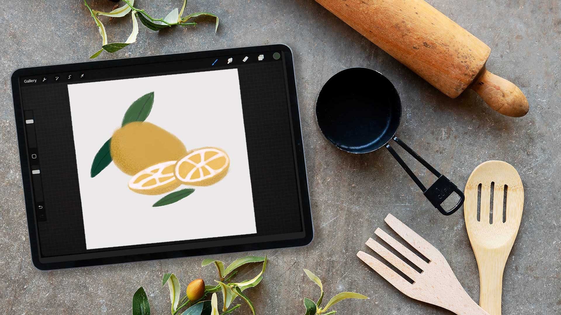
4. Let's explore the Procreate Gallery: So now let's explore
the Procreate gallery. First of all, you
should know it is a very good idea to
have these stacks. Stacks means nothing but folder. So when I click on that, you see there are two artworks inside and here are even more. You see, I can just stack them. So that means I can
put them on top and have them together and it looks much more
clean up here. So let's take something. I just hold my finger down and then I move it
on top of this one, you see the blue line
and when to release it, it's not stacked. So when I click on it now
you see both are inside. So let's go back and I
can add a third one. So let's go to this one. Again. I move it on top and you see now it even opens
and I can release it in. The same thing happened. It's all inside. And now I can even move these. So e.g. if I want to have this here on the left side
as something there, so I can just move
that one to the left, release my finger,
and then go back. And you see this one
is on the left saying is now you don't really see that there is
something under it. So let's move it back. And you can just have
all your artwork inside. You can also name your stack. So this is this thing here. You can just say, I want to give it
another name and I just say now wallpaper. And then I have named
that wallpaper here. So it's pretty handy. I don't have to have to
guess what's inside. I just go through
it and see here It's wallpaper here,
Bo who patterns. And so of course, this gallery will also allow
you to duplicate and delete artwork will let just go over your artwork and you see
here it says duplicate, so we can just do that. So I have something to delete and then we can
also get rid of it. Ups. I go over it again, say delete. So you see, I can easily
delete my artwork again here. Yeah, it's pretty handy the gallery and when
you have it's sorted, it's much easier to handle it. You can of course, also
import photos and also files. Just click here on
important you see, it goes to my iPad, to my iCloud Drive on my iPad, and I can get my
files from there. I can also just
click here on photo. And then it goes to my photo
stream for the library. And I can import
whatever Frodo I want
5. Your Document: Find the right size, color profile and resolution: So now let's create
our own document. And for that, I go here
on top right on the plus. And I also have already some presets in here and
I might need them or not. I can always get rid of them. If I swipe to the left, you see I can edit
them or delete. I won't do that right now. What I'm going to do is
I create a new canvas. So I click here on top
right on the plus. And I can now set the width and height I need
for my wallpaper. And for that, I just
type in here in width. And I'm now a need of the size. So what I need to do, I need to figure what size
my wallpaper needs to have. And for that, you just
go to the website. So I pretend I'm in it. I have an Apple iPhone and
now it's already 14 released. But you can basically find for any iPhone you have the size. So just go here, just go to the specs here, Learn More, and then
you go through it here. I just ask Google, you find the size of resolution. The iPad or iPhone or whatever you are
creating should have. So once you have
figured the numbers, you can go back to procreate
and type them in here. So for me, the width is thousand 170 and the height is 2532. And then I can create my canvas. But before I do, let's quickly talk
about the resolution. On the website. It says PPI, while here it says DPI, there is not much
of a difference. I'm going to use these
DPI they have asked for. And that was 460. I believe it wouldn't really matter if you
use 300, but okay. We'll go with it now. And now. It says I have 349
layers I can use, so there's a lot of space, so it might differ the
size on your iPad. It depends if you have the
iPad Air and the iPad Pro, an older version, whatever,
this might differ. And now you can name your
template and I do it now, I say no iPhone searching. Then I have my template ready and I can
just click Create. So don't get confused. You haven't named your document. When you go to the gallery, you say it says untitled
artwork because now we have just
temp and template. When you scroll
down, you see here iPhone 13 is my template
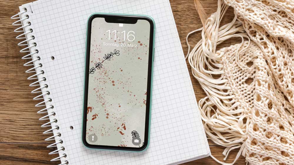
6. Give your Wallpaper Depth and Splashes: Now we start creating
our wallpaper. Let's start by explaining
these tools here on top, we are going to need
all of these here. So let's quickly
talk about them. This is your brush library. So here you have all
the brushes which are already included in
Procreate, which are those. You also have those you have important because
you can easily click here on the Plus and import whatever
brush you off board. When you click on that, you're sent to your iCloud Drive or you can just add drop it to your iPad so you can just get it from there
also from Dropbox. Get it on your iPad. So once done, they
are showing up here and you can easily
access to all the brushes. So you see here
are some of mine, but it depends, of course, what you have board, what brushes you need. So you have them all here. And now here is the smudge tool. When you have drawn
something and you want to make it a little bit blurry
so you use your smudge tool, you can use the
same brush you have here and then go over it. We don't need it
for this artwork, but in general,
it's pretty handy. Then we also have the eraser, which have the same as your brushes actually
are all your razors. So once you have chosen
a brush here, e.g. this one, and you need the same brush as arrays that you just type a little
bit longer here. And you see now it's set out in jumps to the
magic textures and pigs, the brush we have
just talked about here in the brushes section. And you can then erase
something with this brush. Pretty handy as well. Then of course, we have
our layers palette, which is super, super
necessary and super important. Of course, because it always
says new color, new layer, which means whenever
we have a new color, we also need new layer, otherwise we getting confused. So that's my rule of some
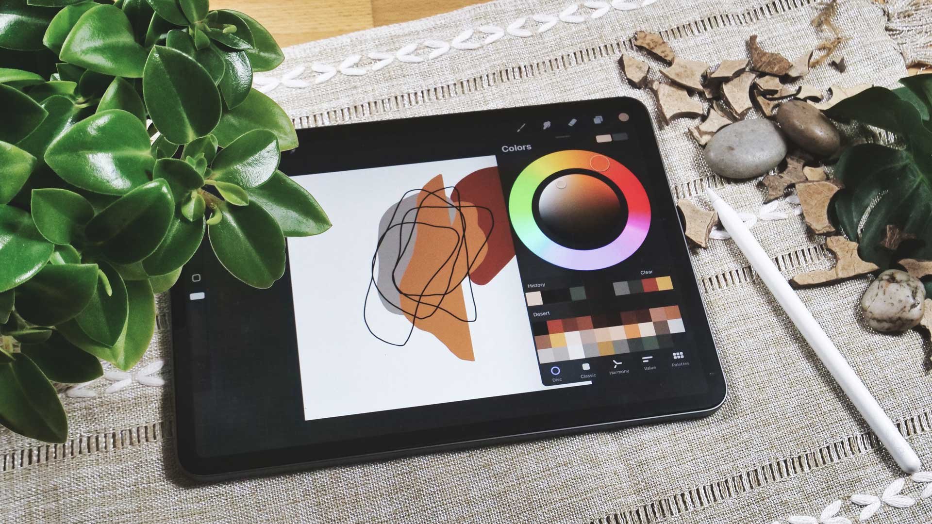
new color, new layer. Keep that in mind. And here
are the color palettes. You see I have already
imported a lot, but you might not have them all. Doesn't matter really. It's just you can
create your own ones, but you also can import tons
of them from the Internet. You can even find some free ones at
digital design resort. We're going to use this
color palette now, which is also included
in the class. So now I set this as default
so we can easily access it. Now let's start by filling the background
with the colors. So I pick this
light creamy color. And once I type on that, it jumps here on
top into my color. And now I can just drag it onto my Kendra and it is
filled with a color. So now we start by
picking a brush. Let's quickly talk about recent brushes,
which are important. Once you have just
work with a brush, you'll also find it here and a recent because sometimes
it's pretty hard to find all the brushes
you have just used and you cannot see which
one it is a new document. So it's handy if you
have them under recent. So now we need to go to
the acro real collection. And I need to find
the subtitle brush, septal irregular splashes here. That's the pressure
of my choice now. And then I'm going to create a new layer because you
remember new color, new layer. And I'm going to
create a new layer because I'm not
picking a new color. And I'm going to use this even lighter color
now, nearly white. So we see how that goes. Now, the problem is, I don't really know what
size my brush now is. It depends really here. You see here on the left. But you can hardly say, I just type in here and
you see it's not that big. I put like to have
it a bit bigger. So two fingers I can get rid of it and increase the
size of my brush a bit. And then I type in again, and you see it's bigger. Now, I can go here to my transformation tool and I can move whatever I
have on that layer. So let me put that here. And you should not really increase that
because these are pixels. So better you do
it with your brush and firsthand that
you make it bigger. But you can. It's not a big deal. But if you need to
really increase that, please do that over your
brush pallet here and say, okay, that's you increase
the size of your brushes. Okay, let's do that. Again. I don t need a new layer because I don't
have a new color. I could do that because then I have each on
a separate layer, but in this case, I'm good with this one. So I just need to
put another splash. You see, I can hardly
say where it goes. And now I have the problem
that when I go here, I have to move the entire thing and they cannot
move just this one. So let me quickly show
you how that would look. If I had another layer,
I create a new one. And if I have
another splash here, I can just go here and
just move that one. What I cannot do when I have
them on the same layer. And in case you want to do that, but then have new color, new layer in your head. You can pinch them so we can
just put those two together. And then I have all my
splashes here on one layer
7. Using Brush Stamps on different Layers: So now we put our next brush. This is again from
the actual real set. Again, keep in mind, you can use whatever you want. I'm using a tiny
spray brush too. Sometimes you have
to go through it so you find what you're
looking for here. And now I have my
tiny spray brush, and now I need to
pick a new color. I know pick the dark red so you can really see
what I'm doing. Again, I type on that and you'll see it jumps here on top. And then again, new
color, new layer. So we need a new layer. And now I just go in here again, I can hardly say what size
my splashes will have, so I can increase or
decrease it here. But I just type in here
and I'm happy with it. You see now it's already
come that it has these steps because there are these light blobs
in the background, while here is blushes, I'm moving more to
the foreground. This is pretty nice. Now let's create a new layer. Although we won't
have a new color, we just have a new layer because in this case
we have new brush. So yes, this rule of some
very slowly Lapiths. So make sure you have
a new brush now. And I'm using now the
pattern mechanical brush. So let me look for
that one. Here you go. I stick with a red
color and now I start to put my brush
here on the new layer. You see this is a new one. I can just add some leaves here. I'm going to add it here. Here. I just keep brushing for now. You see what happens is
cut off here the edges. So I definitely need
to work on that. But for now, I just want
to draw a little bit here. Once I feel I'm done, I can do what I've
already shown you. I can keep the eraser down. So now I have the same
eraser as I have in brush. And now I can just make it a bit bigger and cut everything
that is cut off. Like this one is also cut off. I can just delete that. I like to have the same
brush while I'm doing that. But you don't have
to. Of course, you can also use something else. Okay, now let's
make it look nicer. So I go through all
the leaves I put here. You see my splashes
from the layer underneath are not affected
so I can get rid of that. But the color, the sprays, the splitters is all stays. Okay. I think I like it now
and leave it now as it is.
8. Let’s draw some Lavender as Line Art: Now we add some line art here. And for that, again, we create a new layer here. And I pick black as my color, or a really dark gray, e.g. that if I want to have black, I go to my desk and just type in here so
it jumps to black. And I can start
fresh with my brush. I use, or I like to
use one of these, maybe the fine tip or I also like to use the
mono line or this one. So it doesn't really matter, it just shouldn't
have for edges. So you better choose something
which is really straight, like a marker or
something like that. They are already included. So you shouldn't have a hard
time to find one thing. You shouldn't have
a hard time to find one of the brushes. So now let's draw lavender. I just draw here a line. Let me do that again. I can always move it later
on because now I think it's a little bit too wide. So I go down here. Yeah, that's better.
Now I really need to go and to create my leaves. Now vendor has
pretty tiny leaves, so just put them
here on the stamp. You don't have to be an artist. You know, it's not very hard to draw some of these leaves. And you feel it looks
better at some more. Of course. It's up to you. You don't have to
follow along here. You can do it to your liking. Once done, you have
a stamp with leaves. And if I go now on that, you see what mistake I made. I put it on the same
layer listening, I want you all the time. I didn't know. So I have two choices now I can weather selected and
put it on a new layer, or I can just get rid of it. And those what I want
to do now, again, I'm just typing
here on this one, so I have the same brush and
I quickly get rid of that. I could also use my
two fingers and just get rid of all
that if I want to. It's just harder. You can also select
the entire thing and then cut it off and
move it to a new layer. But that's maybe something
for another class. Right now. We just want to make sure that we are on a new layer.
So here you go. Let's do that again. Half the same brush and
now withdraw our leaf. You see what happened? If I hold it down? Let me do that again. A little shaky and it gets trade when I just hold it down. So I get rid of that. And now I start again
with my little leaf. Make sure they're going into different directions
because nature is unique. Each leaf is unique, so it doesn't look alike. And usually no, they are
not going to the bottom but they can, on your leaf, they can often put something like that in
which is not so common. And makes mine look unit. Once done, you have your
stem with the leaves ready. And now you see it's different. This one is on one layer
so you can easily move it. What we do now is we're going to duplicate that
and then we flip it. So let's do that first. Go to my layers palette, swipe to the left,
click, Duplicate. And I have a second stem. But now you see it
looks pretty alike. That's not what we want. We have here now
flipped vertically, we have flip horizontally
and that's fine for now. So I'm going to
transformative it. Now I put here and maybe
turn it a bit around. I have something
really unique here. Once I'm done, I released
the button here. And you see now my
wallpaper is done. I could have some more here. I think it would look nice. I could also draw some more because then it gets
even more unit. So that's, I guess what I would do now if I want to create
something for sale. But for now, I can
just modify that one. Just duplicated. Flip it, be creative here,
or rotate it a bit. You see, now it doesn't
look like the other one. Okay? With a few you get
along, you need more. If you need to draw some more. I believe our wallpaper is
ready now and we can move on.
9. Export your Document: So now let's export
our wallpaper. It's pretty easy. Just go here. And then you say share. And now you choose how
you want to share it. If you want to save it as a Procreate file or as PSD file. The huge advantage is that
you keep all the layers. If you don't do that. Take here a JPEG, you flatten your entire image, but then you can use it e.g. on your phone. Now you
would just say JPG and it is exporting now
and you can now send it directly to your iPhone. Or when you click
here on on AirDrop, you can send it directly there. Or you can even email it to you if you have something else, not an iPhone or
Samsung or something, you can just email it to you and then have
it on your phone. There are several
options what you can do with your artwork now, and then you're done. Quickly. I want you
to name the thing because it says
Untitled Artwork and I really want you to name that. You don't have a mask layer. And I say lavender wallpaper. Okay? And now you see it
says Love and wallpaper. And now what you
already learned, we can move it to the
folder and stack it. There
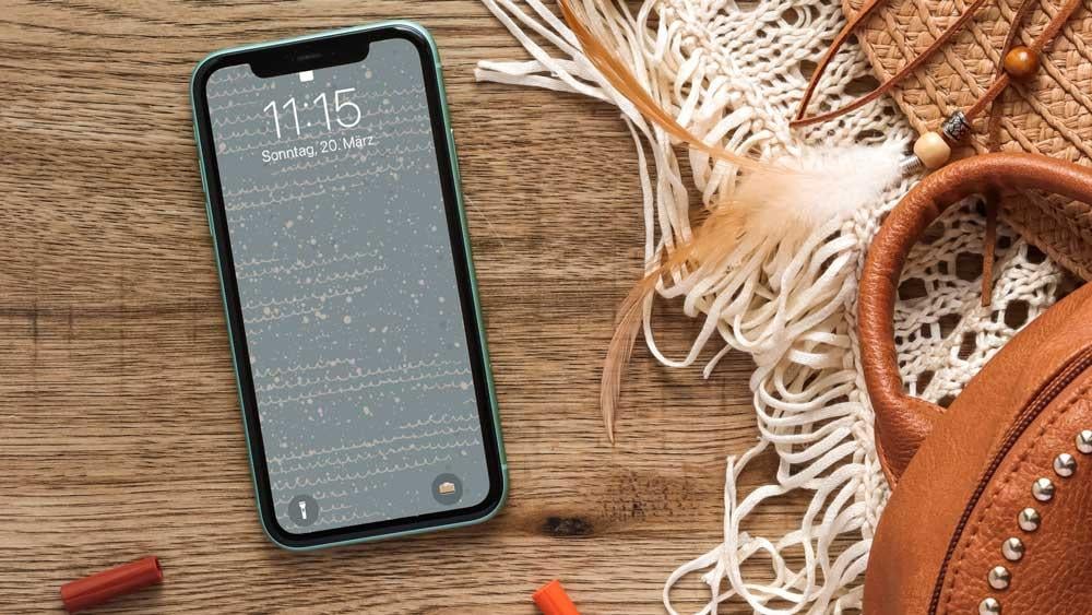
10. Bonus Lesson! Let’s do another Wallpaper together: Now let's create a new wallpaper for that typo here on
top right on the plus. And I don't have to
create a new canvas, I just can pick what
I created before. So let's go to the iPhone 13
template and pull that up. And now you see the
same size as before. And now we pick a color. So maybe let me
pick a light blue. Then I use it and drag that light blue here
onto my document. And then we use
the splatter brush from the incident
artists collection. You see here it is. It's an artist buildup
splatter brush. And now you need to pick
another color, of course. So I'm using the
darker blue now, here. And then I create a new
layer is pretty important. So always create your new layer, new color, new layer
here, remember? And now we need to figure
the size so it's okay. If I decrease it, you can hardly see it. So be careful with that one, so make sure you zoom in. Otherwise, you might have the impression that there
is nothing on your paper. Okay, so now we have
some splatters on it. Asked me go back here, create a new layer,
pick another color. Maybe now we pick a
lighter, creamy, this one. Brush on top here. You see, I just tried to give
it a little bit of depth. Satellites should be fine. Now we create a new layer and we use powder puff brush from the incident
artist collection. You go. And let me see
what color I use now. I guess I will stick
to the creamy one for now because I need to get
a little bit more here. Yeah, you see what happens? So very large splash. Maybe. I want it smaller. So let's try that. Yeah, I think it looks better. Feel free to play around. I just realized this color on the bottom is
not the right one. So let's pick a light blue here. Maybe it didn't work. Yeah, it's better. Okay. Now you can see the
brush much better. Maybe you don't
want it like that. Let's see. You see now it's all on
one layer so you cannot really get rid of
it or not of all. But what we can as what
we learned already, I can get the same brush and just get rid of a
little bit here. So it's not that strong. Okay, I think that's fine. So now we're going
to blend that in. You see it here and you see
a little bit of it there. But we want to now change
the blending mode. Click here on the N. And now you have different blending modes
here all over the place. And one, you now go
through each of them. You can see a little bit of
a difference. It depends. You see, here it's brighter
or darker, more light. And you pick one of your choice. I like that one, lighter color. You can go through
all of them here. You see I will leave. Soft light is nice. You know, depends on
what you want to reach, what effect you want. This is what you pick here. If you have a hotline, that also looks good, okay? Now we have set most
of the things we need. Now we want to draw a
bit on our background. And for that, of course, again, I create a new layer. And then we use
the pattern brush, pattern waves brush from the
instant artist collection. Let's see this one here. Or this one pet on waste. So now we need another color. So to give you can't
see it right now. Maybe I pick that one. Let's see if that works. If not, because
he's too much blue, we need to pick another one. But again, checking I'm a new layer. So I can just go in
here and see anything. Okay, that's fine.
Let's clear that. But I guess okay. You see here, you can see
something is too small. So again, clear it and
makes it a bit bigger. And then I also pick
another color here. Now you can see a little bit. At this point, we might want to change the
background color. I'm going to show
you that as well. Because otherwise it gets, it doesn't really work. So let's see what we do. If we want to keep
this pattern brushes. We can do here. We can pick another color, maybe a lighter one, or we can turn off one
of the sprays here. Also something we could do. We don't need all
the layers that maybe adjust this color here. Now, the fun stuff, because now you can just pick whatever you want and play with
different colorways. But you can just do that if you have set it to different layers. That's the most important thing. You see. It pops out a bit more.
I really like that. So it now it's a question if we still need all
the splashes here, maybe we don't need that, or we use another
color mode here. So it's not popping
out that much. Yeah, it's better, right? You see, you can do
what you want here. There are so many options. So you really need to
figure out what you like or what you want to
have for your artwork. And now it might be a
good option to have the pattern waves with
another, with another color. So let's create a new layer. I just turned it off. So I pick the darker blue. Now my pattern brush. And now I go in here again. You see, we can
see it better now. Okay. I like that. I believe that it's
ready for me now. But as I said, you can play around here. Just be creative. That's the point of all of it. You should be creative and
see what you like best here.
11. 10 Skillshare DDR 2: Congratulations, you did it. You've mastered this
class and you can now create your very
own wallpapers. And now it's time
to do exactly that. Grip your iPad and your pencil and start drawing
your own wallpapers. Start mixing with
different brushes, create different shades and different layers with
different chest. Start creating your
very own wallpapers is totally up to you. As I said, you can use
whatever brush you want. The main thing is that you have fun and that you start layering. And once you have created
your own wallpaper, police post them here in the class section so we can
all see what you've created, looking forward to seeing
your creative endeavors.
 Monja Wessel, Graphic Designer and Teacher