Transcripts
1. Introduction: Text Logos: Hello and welcome to this course. Today, I'm going to show you three fun text logger projects that you can make. Whether you're looking to make your own logo or design something for another business. I'm going to teach you all the skills that you'll need even if you're a complete beginner and get going with making your first text Logo project today. At the end, you're going to have three complete text logos and a brand new set of logo making skills that you can be super proud. So let's jump in together.
2. Create A Text Logo: Okay, so let's get started jumping straight in without first text a logo project together. We're going to want to make ourselves a brand new canvas to give us a lot of space to work with. I'm not too fussed about what the size is right now. So I'm gonna come over here to create new. And then I'm probably going to make this may be eight by four inches. That'll give us a lot of room to work with. A bit of extra space. We weren't needed at the end, but we can always trim that out. I also like to work in 70 pixels per centimeter because it makes things nice and crisp and we don't have to worry about anything getting too blurry, at least getting going. So once we're happy with that, we can go ahead and press Create. So here is our blank canvas ready for us to get going with our first logo. But I want to remind you how easy it is to make something that's recognizable, that's really clean, just made out of text. And the number one rule with the text is that font is everything. So if you find yourself a font that you're really excited about, that is enough to be a logo for you. But let's have a little look at what we've got here. There's the New York Times logo here. It is the same font. They've been using it for a 100 years. And if you see this font somewhere on the side of that building in New York City, you know that this is the headquarters or this is the newspaper, The New York Times. So there is just font there. They've chosen a very regal looking old font, which is awesome. So that is one example that let's bring up the next one. Disney. This font is so recognizable that you can even just shorten it down to this d, you know, instantly that this is a Disney font and that is just black on white. And we instantly knew that was Disney. Let's see what else we've got. Coca-cola. They were very particular in their branding and they have not changed their logo since they started way, way, way, way back when they used to put cocaine into their ingredients. Their logo has stayed the same, just a text logo. Jungle Scout, you may not have heard of, but it is a company that helps with Amazon FBA selling. And Jungle Scout is just two words pushed together. One is a different color and they've added a slight addition here to there. But again, if you just see the j and the S together, which they sometimes do, text logo. Calvin Klein, all capital letters, very particular font, very clean. The letters are quite close together, but you instantly recognize this canon, which is a photography brand here they make cameras, but you've definitely seen this before. And lastly Group, which is the Gwyneth Paltrow brand. She just often uses this G by itself, very standard Fanta, just black on white. So we can do so much with text. And I don't want you to overthink this. So let's jump back into our own project and create something super simple that is going to be recognizable. And I'm gonna come over here to our T icon here, which is our text. And The top here, my properties window is not set to my character, so I'm gonna make it character. You can also find this information up the top here once you press the T. So bringing in my text is gonna bring something quite generic down here. I can also see that my font right now is white. So let's go ahead and make that black so that we can see what we're working with and we can change it at anytime. Alright, so I'm going to highlight this and we are going to be working with an imaginary company called Green Space. Alright, so the first thing you need to do, let's type out the name of the company highlighted and make it a size that is easy to say so that you can really start thinking about what it looks like from above. Let's go 48. They seem to be enough for me right now. Alright. And the generic thing that it was set to was Myriad Pro, that was the texts that I had last used. So that is what we were working with. Always try to send to your piece. You can use these rule a buzz right here to find the center of your page. If you don't have these rules set up like that, you can hit command R to bring those up or command architect them away at the same time, see how they change gray. So you can drag just from here, find a bar and it's going to kind of snap itself to the middle of your page. And then you can use that to line up your text. There we go. So we have green space written here in Myriad Pro. I don't think this is very strong. I don't think that it is anything too special. Let's have a little look on what some different texts looks like. I personally love using this font called railway. And the reason I do is because it has a ton of different versions of how you can present this font. The regular, of course, is quite plane in the middle. It's not too fat here, it's not too thin. You can go really, really thin with it. To create a very bold in kind of looking font or the opposite. It has a really black font here that's really thick and it's really bold and takes up a lot of space. So that's why I love using railway because there are just so many variables. There is the black Italic as well. You can go the light italic. It just really depends on what it is that you're looking for. This font really has. So our first one, I'm going to stick here with this railway font because I think that there's a lot for us to play around with. What I'd love to do is start with it being quite regular, non italicized. And we can start thinking about whether or not we want this in capital letters in lowercase or anything and how we're going to differentiate between a couple of words here. Now, there is nothing wrong with creating a bunch of space between our letters and having this be a real minimal logo that just looks like that. Let me zoom out and show you what that looks like. I'm going to remove my rule is for now just so that we can see really cleanly what that looks like. So that's sort of a very minimal futuristic way of going with a logo. You can add oldest space. I've done that up the top here with this VA. If I drag this bar, it's going to increase and decrease the space between, I think I was on about 500 and so I'm gonna click that back. The other option that you can do is completely remove it and good the opposite. And how that led us be really close together. I find that that can look really quite cool if it is a lack of Dhaka font and the size, and let's bring this really small. Maybe the letters are touching like that. So there's an option there if you have your letters up and if you saw this consistently on a business card or a shopping bag or a website, you would start to associate this kind of text with this brand called green space. Let's bring it back to 0 here so that we remember what it's like to start with. That is an option there of doing that. The other thing that I really like to do is to separate my woods. That there's two words right here, separate them by using a different style for each section. So if you come over here and make maybe the first word really quite light and the second word really quite bold. Maybe add a little more space between each letter. That looks a little familiar, maybe like The Jungle Scout one we just saw together as well. So they like to have different kinds of words, be different fonts. So there is a very, very acceptable texts logo here. The last thing that I'd like to show you on this very, very simple text logo is if you choose a font that have different options, you have different versions for each letter. If I'm not happy with the way that line comes down on the G Initially, I can just hover over that and it gets changed to a different kind of gene. And when we get talking later on, different sorts of monogram logos, which was just letters like Google or Netflix or McDonalds. They all have just one single letter represent their whole logo. The font choice is obviously imperative with those things so that it becomes recognizable just by itself. So yeah, play around with this, find a font that you really excited about. I personally would like my second word to be quite bold. I'm gonna go black like that. I like the green being thin. And I'm also going to create just a little bit more space between my letters because I think that looks really claim. Okay, so let's mark this up on to some business cards. First things first, we need to make this fit as much of this page as we can. So Command T. And then you can just drag that size wise or you can increase the font size of the top birds find this a little bit quicker and easier. The more size this is taking up on the page. The cleaner it's going to look when we mock it up. So there we go. I'm going to also remove the background from this so that it is transparent behind. And then I'm going to open up my text Logo project files. And I have a couple of business cards mockups here. So let's get these open into Photoshop because this is a black text. I'm going to mock it up into my color. So let's open that up into Photoshop. Beautiful. This is what it looked like. Generic back at the cod where you can put some info. And let's go ahead and get our logo onto our mockup. So what I'm going to do is because they have both of these open in Photoshop. Now, I'm going to right-click on my layer and I'm gonna duplicate it. It's gonna bring up this menu here that asks me where I'd like to send it. And I'm going to send it to my mock-up color page. Give it a moment to load. Come across here and you can see how green space logo up the top here. So let's throw that on our business card right there. We can zoom in and see what that looks like. If it's a little too big, Come on. T will change this layout. And we can, we can send to that in our business card. And there is a perfectly acceptable, awesome looking texts logo that we made just using black and white text. All right, join me in the next lesson and we can work with another kind of font.
3. Using Color and Text: Welcome back. Let's keep going with our text loggers. And let's take this same brand that we're using. And I want to show you how easy it is to sort of play around with that font as we were talking about in the first lesson. So let's take exactly what we have. I'm coming over here to the right-hand side, and I'm just going to make a copy of this layer so that we have our capital letter green space logo saved. I'm going to turn that light off because we don't need it. And then I can make my edits in this copy layer. So the first thing I'm gonna do is highlighted old. And I'm also gonna make it oldest, same sort of layout here. So I'm gonna make it all medium text. I'm going to bring the sizing back to 0 space between each letter so that we're working with a really generic, a really generic starting place. So let's have a look at more of a, more of a serif fonts. So the difference between Sans Serif and Serif fonts, this one here has no, it has no corners, it has no ends. It's very clean. Every letter is very neat. And it has a spot where it gets put on the page and the smaller it gets put off the page, a serif font has those little feet almost on a, on, on something. So I feel is here is a font and you can see this is a serif font because it has these tiny little feet sort of on every let us, you've definitely seen one of those before. The most popular serif font is the Times New Roman, which has little feet as well. So I'm going to type this out again because I'd like it to not be in capitals this time. I think we can play around with a lowercase, lowercase. So, so let's work with green space. And I'm going to separate them on a different line. You can say that my space between each line is quite small. That's why the letters overlap. And if you'd like something like that, absolutely keep it. But if you would like to change it, you see this pattern over here with the a's separated by line. That is going to let you know how much space between each line. I'm going to click 72 because currently my font is 70. So that's gonna give us a nice low space between each line. And then we go. And then I'm also going to make sure that my font is centered. If your font is to the left or to the right, that could be an artistic choice that I'd like to keep mine in the middle. So if you don't have access to a lot of fun, there are a ton of places online that you can get free fonts if you find a font that you like, like this one here, DID NOT Dido, you can download that by typing in Dido font, download onto Google some funds you'll have to pay for, but there are a lot of free options out there. So go ahead and find some free fonts that way. And you install it straight into your computer and it will show up in your Adobe Photoshop. So I really like this font. I think even though it is a serif font, see has little feet on all of my lettuce. I think that it's clean and minimal as definitely my kind of style. So I'm gonna go with this for now. I'm going to add some more space between my letters just to space that out slightly. And I'm also going to tab across my second word because I want to have a two line would, but I'd like it to kind of be a bit stylized, so I'm spacing that out a little bit. Then I also think I'd like to remove some of this space between and I think it would look kinda cool if that g sort of hung down past where the S might start. So I'm going to try and bring my S app into this whole space up here. Now we were doing that before by adjusting the space between paragraphs, just going to hit my down arrow. And you can see that move up numbers changing on the right-hand side and my letter is getting closer and closer to the top. I'm gonna try and find the right kind of space between that. If it's too far, it looks like it's on a different line, but if it's too close, it's a little jumbled and hard to read. I'm going to use the space between my letters as a guide of how much space should be between my lines. So I'm always looking at this space between these two 0s here as the kind of space I'd like between top and bottom, right there. Alright, I'm going to center that. And like we talked about, text is really powerful and really strong. And this would be a, an extremely acceptable, really eye-catching, clean logo that you could use for green space, whatever this company would be to you. But I want to take this one step further and I want to add some color. After all, this is called green space. And I think that we would be losing an opportunity here if we didn't try adding some color to our logo. So I'm going to highlight the word green because I think we should try this being green. I've clicked the color over here and it's brought up this color menu. So I'm going to scroll through until I find a color I'm excited about right now, my dots down there, which is why you still see black. So let's bring it up to sort of the middle here. Now, I'm Asoka for a pastel color. So let's see if we can find a cool green pastel here that we're excited about. I quite like that a lot. Maybe even a little more of an aquifer, just tensing that up. Again, play around with this. Maybe you wanna go totally the opposite direction and not have any grain on this old, you can choose any color that you wish to think. I really like that. So let's hit OK. And while we have this green highlighted, it's always a good idea to come in and see what options you'll font gives you. So we have irregular and italic and bold. Give them a press and see what it looks like in your space. You know, high like that. I don't love the italic. Let's see what Bold looks like. I think I really like the boat actually because it has brought out more of this color. And I think that our space could probably stay the regular, regular font, just like that. So we have two different sized fonts. You see this E is slightly thinner than this E. No one else is going to notice that, but that is something that will subconsciously go into someone's mind and then they identify these things as your brand. So I'm really happy with this as a colourful texts logo. I'm going to hit Command T and resize this. Make it as much of this space is I can, without losing some of our logo. And we go up, stretch it to the edge. They're wonderful. We're going to look that into place. And I'm going to switch off my background. They're not that layer. And I'm going to save this as a PNG. So save as, I'm going to call it something that we can find later. And I'm going to save it as a PNG. Png will maintain this transparency in the background so that we can add it to our mockup business cards and see what it looks like. So hit save, end. Okay, Let's open up our mockup files because I've added some color to this. I don't think I'd like it with the colorful background here. So I've added one in here that is just a grayscale mock-ups, so feel free to use that one. And I'm going to open this in Photoshop. Here we go. Here's our mockup grey. Now we could transfer our text over as before, but I want to show you how to add a photo to a mock-up are PNG file that we just used. So if you find that on your computer, you just simply drag and drop our P&G. See there's our green space logo, PNG. Drag and drop that and let it land. Then you can just resize that. Add it to our business card. And I honestly think that's a little too big then what will get printed? So let's make it even smaller. Kind of center that they're on your card. Hit. Okay, and just for little more realism, I'm going to decrease the opacity super slightly so that, that black in space is not as harsh and we can still see some of that. The business card look on that. So let's zoom out. And there is our green space with some color and some text on our business cards mockup. So join me in the next lesson. And we're going to really take our idea of text and color to the next level.
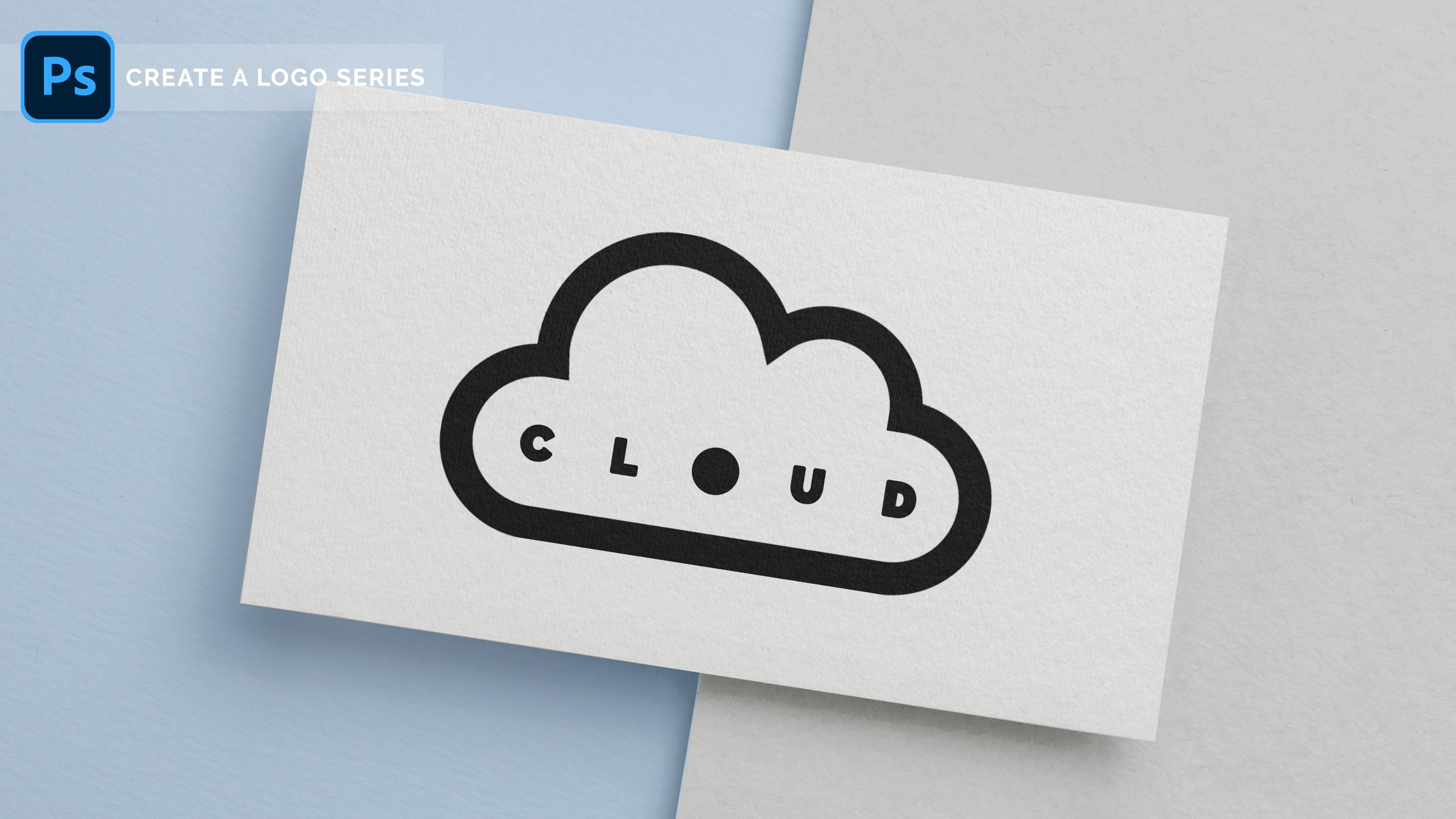
4. Using Text As A Shape: All right, welcome back to our lucky last text logo idea that we're going to come up with together. And the first thing is first is I'd like to hide the last one we've just done. We have this green space here with some color, and we also have our original green space for that capital letters and a different sized fonts here. So I'm just switching both of those off. I'm gonna keep my background on because I love working on a clean background. But for this last one, I really want to play around with the idea of colour and using text to show different colors. And I'll show you what I mean as we go along together. But I actually would like to be working with bigger canvas in this, we could go file new and add a new Canvas if we wanted. But I'd like to throw in an extra tip here to show you how to change the size of your Canvas once you've already opened a project. So we're going to come up here to our image. And if you come down to canvas size, it'll bring up this menu here and bring that across. And here we go. We have our eight by four. It's close enough here. And all we have to do is just add a different number here. So at the moment it's eight by four. I'm gonna see what it might look like if we do eight by five and see if that is enough here. So kid, okay, and you'll see that we have expanded our canvas slightly. I think that's good enough for now. I'm going to stretch this background layer by hitting command t. Just making sure our white covers the edges. Doesn't have to be too neat because we'll switch this off before we export any layer. Alright, so we can zoom in. And that's just an easy tip for you there. If you found that you've opened a project and it's not the right size. So I'm going to leave these both turned off because I'd like to work with a new imaginary company that we're going to call shine. So let's grab our text here we are t tool. Open up a color that is not, that it is not y to put it on black. And let's type out shine. Now remember that font is everything and I already think that looks really cool. But I'd like to show you a tip today that is going to involve this text actually missing from our image. The first thing I'm gonna do is change our background color. So let's put an overlay here. So if I double-click on the space next to that layer, I can bring up this layer style menu. And if I hit color overlay, come in here and choose a color that I like. And now I'm going to choose quite pale, pale yellow, I think, maybe something, something like that. Okay. Now we're working with a bright color and you can see already just by adding a background to this, we can now associate the font and the color to this brand. I think it looks really cool, but this is not where I'm stopping today. I'm going to make this font the exact same color as my background and have it cut out of a circle. That sounds like a lot of steps, but let me show you, come over here to your shape and grab the Ellipse tool. And I'm going to hold Shift while I drag and bring down a circle. Shift, holds it in the same place so that it's all relative to each other. If you weren't holding shift, you might end up with an oval or something like that. The second you start holding shift, you get a perfect circle. Sorry, good to hit, undo on that one. And let's work with this circle. We've just put in double click over here to bring up the color menu. And let's make it the same color as our background. And then add maybe one or two shades darker. We're going to go, they're very hard to tell the difference between these two shapes. But that's sort of what I'm going for. I'm going to bring my ellipse layer down underneath the shine, so that shines sits on top of that. And I'm going to make my Shine layer by hitting command t. I'm gonna make that take up the whole width of this circle. Can have it so that the e and the S touch the edges of this circle. Just like that. It's helpful because they are quite round letters as well and they almost fit pretty perfectly with the sides of this, of this circle. So that's really cool. Okay, now my text color, I'm going to make the same color as my background, hiding that completely from this circle that we have. Now, this is so simple. This is such a simple thing that we have just done, but we have created a really awesome color palette and the text logo from nothing. Basically, we did that in just a couple minutes together. Let's play around with what it looks like to change this font. Let's take it back to our trusty railway font, which gives us a lot to play around with. I'm gonna make it a really black font. Black meaning quite bold. And I'm going to change the size between my letters here, bringing those closer. And I am not super happy with the size of that. So let's make it a little bit smaller. Actually, I just changed my mind. Let's make it a little bigger. Let's push it to the edge here. I really like that. I think that looks really strong. If you're not happy with the colors of these, you can always tweak them. If we want to make this more of a yellow, yellow rather than a pastel, bring that maybe, maybe up to there. I think that's very bold. I like that. Let's make our text font matches. So come up here, change the color of your text, just use the eyedropper tool as the background. And now I also who looks pretty, Pretty Brown and grow. So let's make it just slightly, slightly darker or lighter if you want. And the text that we are using. Quite like what it looks like when it's a little bit lighter. Let's stick with the original plan and have it just slightly Dhaka. And we go and tweak this until you're happy with the size, can eat a little more of that. S, There we go. All right, so let's say this is a picture here. We're gonna go File Save as, let's call it the shine logo. So we can find that on our desktop in just a little bit. We don't have to worry about saving this as a PNG because our background is not transparent. So it doesn't matter if it's a JPEG or a PNG. I am just going to keep it as a PNG though for now. Hit save and over K. And let's come over into our mockup where we have our last green space logo there. Let's turn that off. So we have this blank thing here. And let's find our shine logo somewhere, wherever you've saved that, I've just brought mine across here and I'm going to let that fall into the middle here. Let's line that up with our business card here. And I'd like to show you an easy way to have this snap to the border of our business card. So switch it off for now. We can come back to it in a moment. And we're going to draw a box. The rectangle here around the size of our business card does not have to be exact, but something a little bit close grey, going to reduce the opacity so that I can see through it so that I can tell when it is lined up. And I'm using my kit move and I'm using my arrow tools just to nudge that so that it's on top of the business card. Looks like it could be just a little bit longer. Going to hit shift while I transform that so that it snaps to that size and we go, all right, and this is going to be what we use as a clipping mask by switch this Shine logo back on him. And I right-click on the shine logo layer and click create clipping mask. It's going to only show up where the layer below it is. And we know that we just made that rectangle. Let's make it a little bit planner. We know that we made that the same time it sizes are business cards, so shine logo on, create clipping mask. And it's going to snap exactly to the layer below it, which we need to bring up our capacity. That shine is written right there. This is a live layout. We can move this around. You'll see some of the black will show up if it's not quite lined up. But it's not showing up over here anymore because our rectangle doesn't go that file. So it's a really cool way of adding something to a page if we want to come back and we have a big picture and we want to put it here instead of, instead of this one, all we have to do is swap out the clipping mask. So there's a really great tip for you there. So let's zoom out and let's have a little look at what our shine business card looks like. I think this looks so strong. I think this is a really awesome way of showing a logo, is having that text be removed from an item, just like we did here in this circle. So there is out there texts logger together using color, using shape, using different fonts. And we've created some really cool, strong ideas of logos here. So show me what you've made below. I've attached these mockup files in the project files folder for you. So you, all you have to do is just simply create yourself a clipping mask, throw it in. Let me see what you've made and I can't wait to hear how you went.
 Genevieve Wilson