Transcripts
1. Introduction: Icon Logos: Hello and welcome to this course. We are going to be going through step-by-step exactly how to make full fun icons together. In Photoshop, I'll show you how to use some free to use resources so that we can get started with an icon logo straight away. We'll look at modifying them so that they suit out Company. And then we'll look at creating some monogrammed logos, like the McDonald's M or the Netflix end together logos that cost these companies hundreds of thousands of dollars. We're going to be doing them for free today in Photoshop. At the end of this course, you're going to have four logos that you can be sued, plus all the Photoshop skills needed to do this on your own. So let's jump in to give up.
2. What is an Icon Logo: Okay, so before we get started on our very own icon logo, we are going to take a quick look at some icons that we already certainly knows. So it's really good to have a little look at what's out there that's on, on the same line of the logo that you are trying to make for you. Just so you can see if you're either over complicating things or if you're not thinking about it enough. But let's just take a look at things we already know. So we're going to start nice and simple. We all know this logo. It is Apple's logo. It is an icon, is very, very simple, it's very plain. And they've had it for or years and using, using Easy News almost since the very beginning. So that is very recognizable. One of the first things you think of when you think of an icon, logo. So there's that switch that went off. We have Nike as well, this swoosh, this tick that is synonymous with their Just Do It campaign and everything. Nike stands for this, which is one of the simplest icon logos that exist out there today. I challenge you to think of something even more central than this. So it doesn't even matter how simple your logo is. If, if it is memorable, people are going to associate it with your brand. And that is all you want from a logo and just switch that went off. There is target, which is the shopping chain targets. So this is very recognizable to. They have a bold color here as well, and everything to do with Target, including their stores, is borrowed from this color as well. So they're, they're using color and an icon to, to talk about their logo. We have Mercedes Benz, that's very easy one as well. We see that everywhere, even on every single one of the front of their cards, you see that there. And then there is Snapchat, which is using color and an icon as their logo. I've walked through Times Square and seeing a series of massive, massive billboards that are just yellow, they are just this color. There is no text on them whatsoever. And then one of about five of the billboards have the ghost icon. And it was an entire ad campaign dung for Snapchat. And all they used was their signature yellow color and this single ghost icon, it was super, super effective. I remember looking at it and thinking, wow, that really narrowed it down for me exactly what this brand is. They've done so well. So there's that. Then we start to look at things that are icons, but they're actually monograms. They are, they are examples of letters that have become the logo itself. So we have Google. Google have over time narrowed their logo down, cycle through a few different things, and this is where they currently sit. This is the simplest form of their logo. They have all the colors that we certainly recognize in a Google logo. And they've put it on this G, which is the font of the latest logos. So that is a monogram. It's a single letter that represents their whole brand. Another example of that is McDonald's. Mcdonald's have their texts written everywhere. But if you see these two golden arches, which is what they are there, they are known, they are not even known as the m it's known as the golden arches. You know, this is McDonald's to super recognizable. But Alicia, We have Netflix's logo as well, which is super-simple and logo. I don't know about you, but whenever I see this logo, I certainly hear the Netflix bombs that happened as well. So that is very synonymous with their brand. And then you have some things where you start layering letters and we're using a series of letters as the logo itself. So it's still a monogram, it's not an icon. But these letters together then make the icon logo. So we have Lube return here. And we also have chanel, which you see these everywhere. And you know, this instantly is Chanel. So taking a look at all of these logos together, it really gives us a great place to start when you, when you start thinking about what you'd like for your own brand, let's make a couple of different things together today, I'd love to show you how to make a monogram. Had to take a letter and make it super fancy. Turn that into your logo itself and then also come down here. And we're going to make something that is a simple icon that we can use for our brand. Alright, I'll see you in the next lesson to get started.
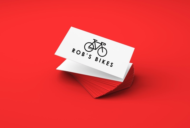
3. Simple Icon And Text: So a lot of times when we are trying to come up with a logo for our brand, we really just need to get something on the page and you don't have to try and redefine exactly what it is that you want. You don't have to invent a new shape. You don't have to come up with something that's never, never, never been used before. And I want to show you this really cool. It's a totally free resource. It's called flat icon.com. It's this website here. You can choose to login and sign up and you get almost unlimited downloads on all the free ones. You can pay and get some of the better icons. But you can just pop over to this website, not sign up or anything like that, and just typing a few key words and get some really strong usable icons to start incorporating into some your logos. I'm definitely sharing this resource because it can be super overwhelming to have to design a logo. And a lot of the hard work and the heavy lifting has already been done for you. And I just want to show you how to access that. So if you come to flat icon.com, it's a website. You can just type in something that you, you have in mind. Lets say we have, let's say we have a flower company so we can type in flower, hit Return. And all the ones without the crown on them, a free to use so long as you credit the person who has designed, then if you ask if you were charging for for this product. So anything with the crown is only available to premium uses. Feel free to sign up if you liked this website and show them your support. But if you're just here for a couple of icons, you can scroll through here until you find something that you like. Let's take this rose for example. And you can download this icon to use as part of your logo and jumps straight in. You can choose to download it as a PNG file or an SVG. And SVG is going to be a vector format, which means you can scale it up and down as much as you want without it getting blurry. But for the exercise for today, we can just use PNG until you start looking stuff into place and you need to be printing them on big banners and things. We can just start with a PNG. So download that you just hit PNG and it's going to say you can pay to get the rights for this use, or you can get a free download if you attribute the author. So always make sure you give credit where credit is due. This one here is by dinosaur labs, as you can see like that. So if we're using that, that is who designed this logo. You can come back up at anytime, change your search. Let's say now we're using, maybe we're a pet grooming company. So you can type in Pitt and see what pops up and use any of these, these are free to use again, so long as you credit who wrote them. So there's a resource. Let's jump over to Photoshop together. Here it is as well. And let's get started by using our. So let's make a new document together and we're going to create an icon logo that we can use on our mockup templates. So let's go create new weight for this document thing to pop up here. And I'm happy to go. Let's do eight by oops, let me highlight that. Let's do eight by five, gives a lot of room to play around in. And let's make sure that we have 70 pixels per centimeter. Great. I hit enter and here is our canvas. You can zoom out if it's a little, little too when you face them. Okay. So in our project files, so if we open up our icon Logo project files, you'll find that I've already put some images in here for you. So feel free to play around with these if you're just getting started. But you can also use our website like flood icon to find something that's more particular to your niche. So let's go ahead and bring in this bike PNG icon. Let's say we have a bike repair store. So I'm going to throw this icon and say right up here, up the top. And without even touching this icon at all, I'm going to throw in a text layer and name our bicycle store. It's chosen to use a pretty bold text here. And that can be super powerful if that's what you like. But at any point, of course, we can come into our characters properties at the top here and choose a different sized texts. And maybe we want it to be a little smaller. And we want it to be quite light. And maybe we want our text size and pressing the down arrow button. If you want it to be quite small. You're going to do that and then increase the size between my letters. That always gives it a really clean, minimal look through that directly under and looking at this, that is a logo, that is a brand, that is a color scheme. We have black and white here and we didn't do anything. All we brought in was a free icon that we found together. And we added the name of our company and we have a logo. If this was a business card, that would be strong, that'd be acceptable. It would be clean and Vineet. So there you go. If we want to even go one step further, maybe I can try and match my text size to be the same size as the line here, and maybe add a little bit more cohesion. So let me, I'm going to say semi bold might be the way to go. We could probably go up one more step. Let's go to bolt. That's better. Now that I actually think looks a little more cohesive, I'm gonna make this slightly smaller by pressing Command T and resizing my bike. Probably hit right? Yeah. If you open back up our project files, you'll see this photoshop file here, code zeros 01. If you go ahead and open that, I've given you a business card mock-up template here, so this is free for you to use. I've created this so that you can use it and see what your designs look like locked up onto a nice business cod. And so I'm going to zoom out just a little bit. And I'm going to come across here and actually make these quite, quite big. So highlight both of those layers. Come on t. Let's stretch it so that we don't have any pixels running around here and missing up. I'll look. Let's go. Okay, gotta turn the background off. I'm going to go File Save As. And I'm gonna call this our bike by Kluger. Save it as a PNG. Remember a PNG keeps our background transparent and I'm going to hit save. And okay, if I come across to our business cod template, if you drag in your logo that you've just made together. So wherever you've saved that, go ahead and drop that in. And that's looking pretty good right there. So I'm gonna just tilt that to match our shape of the cod. And there you go. That is our bike business card that we made in probably two minutes together. So join me in the next lesson and we'll do something a little more complicated.
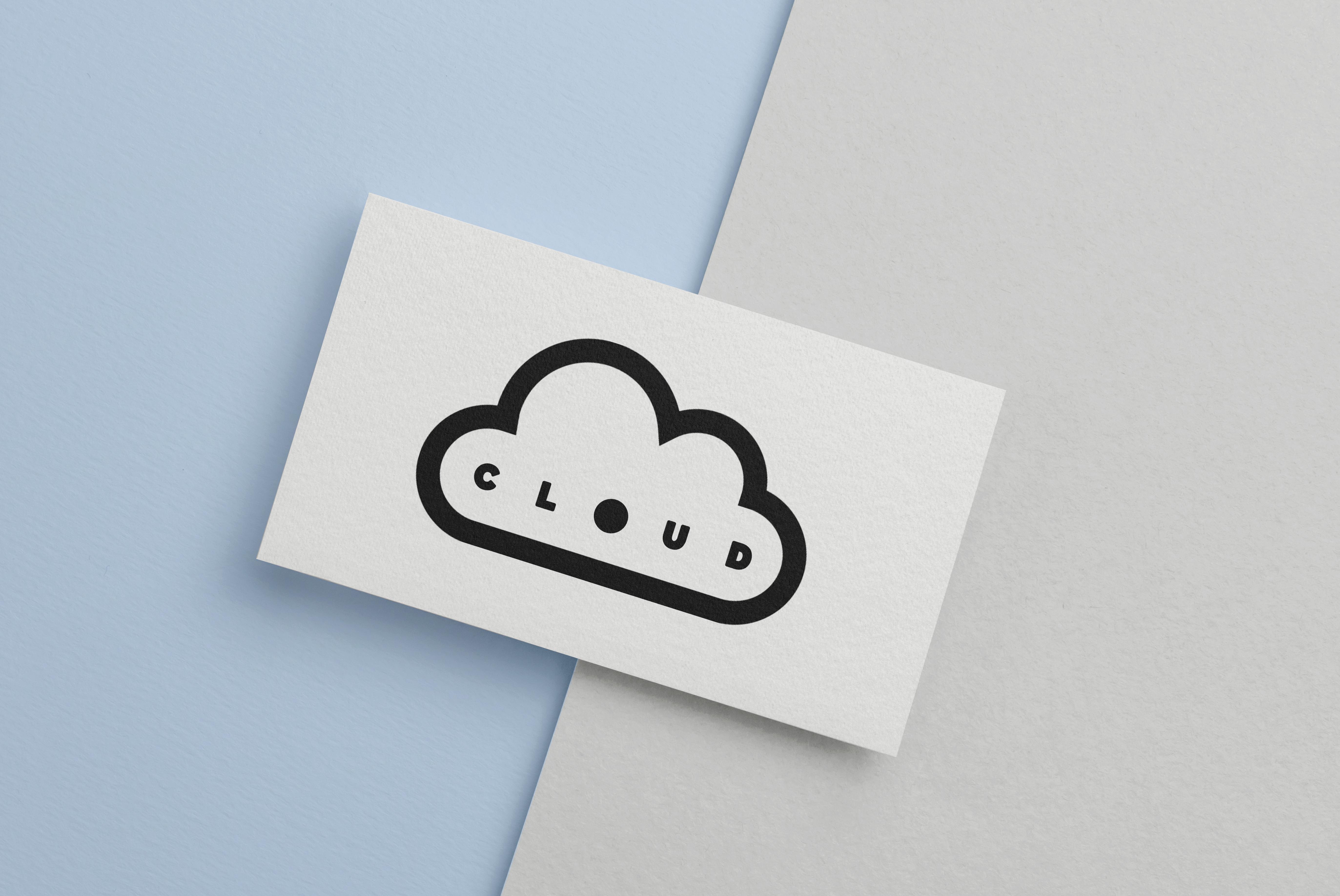
4. Modifying An Icon: Okay, so let's put these things here in flight of a folder so that we can get started on our next project together. We're just going to highlight both of those layers and press command G to group those together. And then let's give this a name. Let's call this our bikes and hit return. And if I switched that off, we're back to our blank canvas. I'd like to work with the background on, But you do what is best for you. Okay, so let's open up those project files again. And while we're on talking about icons that we can find that somebody else has made for us to streamline our projects. Let's talk about how we can go about kind of customizing those and making those a little bit different to how we found them. So I've brought in the one called Cloud and I'm gonna make it just a little bit smaller and show you sort of the same idea of what we were just doing. So I'm going to show you how easy it is to throw some text next to an icon and be really happy with the product at the end. So once again, let's get our text tool and write right next to it. Let's, let's say that we have a streaming service called Cloud. I'm not sure if this exists or not already. But this is just pretend. If it does, we can do cloud, let's say was called Cloud services. I'm going to press command a to highlight all of that. And then I'm going to line it up on the right-hand side there. So this is something that we can do by having the icon on the left-hand side of our text like that and making it the same size as our text. That is something that we can go ahead and pop onto something and see if it's mocked up. But that's a little plane for what I would like to do right now. So what I would really want to do is show you what it looks like to incorporate the word inside of your icon. So let's go ahead and transform this cloud and make it quite big. Let's make it, let's make it always take up this entire page here and hit OK. And then I'm going to get rid of the word Services and just say that cloud without brand name. Now, I'm going to highlight all of this and make it as bold as we can. So right now it's selected at a bold. I'm gonna choose black and I'm also going to see what it looks like if I spread these, lead us out so that they stretch the full length of this space in here. I'm looking at this space inside. It was almost like this really so-called shape here, this really long circle shaped and the bottom, I'd like it to fit in the middle of that. So I'm actually going to make that even further apart and line that up so that it's nice and centers using that guide to help me. And the curve of this D I really like. And he was sitting in that curve and the curve of the say I like hitting in there. So why not? Let's make it a little bit further apart just to keep that API. And this is a different way of sort of creating your own icon, reusing your brand name to sort of sit inside of that. If you'd like this a little bit bolder, You can always hit this bold button here. It will make it slightly bigger again. And if you're still not happy, if you double-click on your cloud layer and bringing your layer style panel, if you add a stroke to the outside, it will increase your boldness. See if I, as I add that button up and up and up, that string gets bigger around the outside. And wanted to, because I still want to be able to read. And it says clouds, I'm probably going to be happy there with that three pixels outline. Great. And just to change it up even more, because I'm trying to think of how I can use these icons to be recognizable for my brand. I'd like to change this just slightly. What if we were to add a circle, press Shift and hold to make a perfect circle. Let's call that O in at the bottom here. Okay, nice incented, lovely. If we zoom out, but still says cloud, but it gives us the opportunity to remove that text later and have this become an icon. People's minds will fill in the rest of their letters if they've seen this enough. So there's an option there. I'm going to export this as is and pop it onto our business card to see what the mockup looks like. So switching background off file save as, save it as a PNG and given a name. Save and okay, and then once we're over here in our business card mock-up, let's change the background here. So if you double-click that square right there, you can choose whatever color you'd like to be on this side of the panel will only change that side. And then wherever you saved your logo to go ahead and drop and release that into Photoshop. It's dropped at the back there. So I'm gonna bring it up above that rectangle. Hit command D, and resize that so that it fits our business card. Now really quickly using a mosque, I'm going to show you what it looks like to get rid of the word cloud, remembering a mosque that black ink hides and white reveals. So from our logo layer here, I'm just going to use a bit of black ink over the top of our letters so that they get hidden and make that a little bit bigger. Just getting rid of this, just to show you what it looks like, to mark this up without any text in it. And there you have it. That is our cloud logo design, made from an existing logo that we found that we've chosen to use text on and at anytime I can come in and hold shift and see what it looks like with all of our text. All right, I'll see you in the next lesson where we're going to be working on and letter icon, logo together.
5. Monogram Logo: Okay, so now let's move on to creating our own icon from a letter that might be in the name of your company or your brand, or even your first name. So let's, let's talk about those kind of icons that we saw already. We had the McDonald's icon, we have the Netflix icon, we have the Chanel and the Louver time. These are all monograms. They are monographs to using the letter as an icon. So let's open a brand new document together. So we'll click Create New. And again, it doesn't really matter what the size is of this, but in this particular case, I'm gonna go ahead and make it ten by ten. I've already got custom one right here. Great. So we have our square canvas ready to get going with our letter icon. So for this particular one that I'm going to use, a letter that has a sharp corner because they wanna make it look really three-dimensional. And I'm thinking the letter v is what I'd like to do here. So straight off the bat, I've grabbed my text tool. I'm going to tap on here and I'm just going to type a capital V. I'm gonna highlight that. Come on up to my character Properties menu and make it really big. I'm going to make this at least 72. I'm actually throw a one in front of that and make it a 172 pixels. And we go and pop that right in the center here. And I am going to keep my background on, I think I was about to switch it off, but coming over here, I think it's easier to work with a white background. So let's get going. Let's make this enormous. Actually, let's go command t to transform. And we're just gonna make this really, really huge. Now, if you find like you have what I have here, which is a bunch of space and you're trying to figure out why that's there. It's because the space after each letter still counts in the space the space size over here. So if I make this rhinos 1300, so I'm gonna go ahead and make that 0 and we lose all that extra space. It was clearing off all that space so that when we put the next letter, it was nice and spaced out. But we certainly don't need that for a single letter icon. Center that right there. And why not? Let's make it enormous. Let's work with something that's really big here. You can always resize it later if we want. But I think it's helpful if it is large. There we go. Okay, so the first thing I'm gonna wanna do is choose what kind of color I'd like this monogram to be. You know, we know that Netflix is red and they use different shapes, shades of red. We know that McDonald's is those bright yellow, those golden arches. So let's choose a really bold color and we'll commit to something like that. Maybe. It goes sort of like a bright, a bright teal color. I really like that. Let's do that. So I've made it this bright teal color and I love this. I think it's a really simple, I'm always drawn to something that's a little more minimal. But let's make this v look like it is a piece of ribbon that's been folded. And there, there are two specific dimensions to this and here's how we're gonna do that. I'm going over here to your Layers panel. And let's make a copy of that and exact replica. So we have a top one and the bottom one. If I switched that off, you can't tell because the one at the bottom is still on. And I'm going to make this top color a little bit lighter than the bottom color. So let's go ahead and make that same kind of shade family. But I'm just going to bring that up maybe a little bit more in that direction. Like that. So that's where I was and that's where I am right now. And if I reduce the opacity of this layer, you'll see the other colors starting to peek through, maybe go. So what we're gonna do is create a bit of a shadow. Look here. To make only half of this. Let us see this band here. I want that to be the light color and the one behind it to be Act aka color. So what I need to do from this top layer is hide this back end of the letter. And we're gonna do that with a mask. So come on down the bottom and press the Mask button here, that square of the circle in it. We're adding a mosque to our top layer. And super simply, I'm going to just use this as a bit of a guide for my direction. I'm going to imagine that that line cuts off around the perfect up tapped on. And I'm just completing that shape doesn't have to be perfect up here because this is the only thing that's going to be effected. Let's grab our pen tool and remember when we were on a mosque, black hides, white reveal. So I want to hide this color from here. As I start to draw that on, you're going to see the darker color from the one below. Start to show up. I'm gonna make my brush nice and big so that we can do this quickly. I've done that by using the close bracket tool on my computer. And we go. And just to remind you what I've done here, I'm not coloring in this layer. I am actually hiding this from the top using our mosque and the color from the bottom is peeking through there. If I switched that whole layer off there, you'll see all of it is dark. But when I keep it on, still had the light area over here. So Command D gets rid of that line. And I think already this is looking, this is looking really cool. I think it looks like we have a shadow here and this is where we could leave it. But I'm going to take it one step further and I'm going to create a bit more of a shadow in this area here to make it look like this. This piece of ribbon at the front has real distance from the one behind it. How I'm going to do that is with a clipping mask. So I'm gonna grab the bottom layer here so that anything we add is gonna go directly on top. And I'm going to press Command Shift N to bring up a new layer, and i'm going to call it shadow. Remember always give your layers names so that it just helps with organization and you don't get confused later. So on my shadow layer, I'm gonna come over here and grab my Gradient tool. Sometimes it's hidden inside the paint buckets, so just press down and hold on that and grab your gradient. The default gradient is black to invisible, so it's just going to add a black tint to everything. If I drag across my canvas, you'll see it goes from black to white. So Command Z on that. And I'm gonna make this quite small in the middle here. Maybe just like that, maybe a little bit more. The only part of this I'm really looking at is what is showing up on this piece of letter here. So I'm gonna go a little bit more than that. The longer my line, the bigger mine gradient's going to base. Only want quite a small gradient. And just to cut a corner, I'm going to move the whole thing till, remember, I'm only looking at what's touching on this blue letter here. Going to press command t. Change the shape, shape of that just slightly so that it looks like we're further away here and a little bit closer together. They're so I'm really happy with that. Now, how are we going to get rid of this whole big black square on the background? Super easy. We're going to make this layout only show up where there's something on the V below it. And to do that, you just right-click create clipping mask. And instantly this shadow only grabs on to what is below. If I were to switch off this layer, our shadow completely disappears because it has nothing to grab onto. So that little arrow right there indicates this layer is a clipping mask for this layer. And I can make it a little bit lighter by decreasing my opacity there. And we go and I liked that a lot. I think that looks like we have a great big shedder here from the top ribbon. Let's, let's export it and see what it looks like on our other mock-ups. So go into your project files. You're my project files. Open up that W1 file and let's get rid of this pink. So remember we can change the color by just pressing that, lets make it a different shade of grey. Maybe you just like that. So anytime that's completely changeable for you. And let's save this as a PNG file, File Save As, bring up your save as box. Here we go. I'm gonna type just the letter V. Keep it as a PNG. And I'm going to save it to my desktop, hit Save. Come on across into our business card mockup and dragging our file wherever we have that saved. It's landed right underneath that background. So I'm gonna bring it up above that rectangle layer. We can already oxidating. We can already see that stunning to peek through, but let's just make it the right angle and the right size and maybe we have it on the side of our card here. Hit OK and zoom out. And that looks pretty cool if I do say so myself. So we have created our self and icon logo using a letter that might be in your brand name or personal name or anything you like. Alright, join me in the next lesson and we're going to make one more of these.
6. Monogram With More Than One Letter: Okay, so we made this V together. It's really powerful and really cool. But what if you want to use more than one letter in your logo and still have it seem like it's an icon and that it represents your brand minimally. Well, let's make that together first things first, let's go ahead and pop these away in a folder, will keep them all as is c'mon g groups them together. And let's just give this a name in case we come back to this folder a little bit later, you can switch that off and put my background back on. And I'd also like to make this no longer a square. I'd like to make it a longer image. So you remember how to do that? We go up to image canvas size and we can make our width slightly bigger than our height. So let's do, let's do ten by seven. We can see that change in real time. All right, so this one's going to be super straightforward, very fast, but super-effective. Let's come across to our text tool. And first things first, let's just press anything down on our Canvas and type in the letters of our brand. Now this brand that again I am making up, but it could be something that you have is m and eight maybe there are two names that have this brand together and we have m and E. The reason I've selected these two letters is because both the m and the a really have straight edges here. And I think that can work to our advantage if we're clever enough with the spacing between these lead is the first thing I'm gonna do is actually take out our ampersand. I like it a lot and I'm gonna bring it back. But to start, let's get rid of it. I'm going to hit command X to cut that. Right now it just says Me, which is m e. Let's make a giant commodity. It gets you the big pick up most of this canvas here. The bigger it is now, the less it's going to get pixel. And when we go ahead and lock it up. You might also be wondering why I always choose to. Marketing's up is not on this canvas, but on something that's real life, on something that's a business card like this. And it's a great question, but for me, it takes me off of, off of Photoshop and gets me out of my technical head and lets me see what something's going to look like in real life. It gives me a real opportunity to say, oh, if I had this on a business card or a tote bag or a coffee mug or something. Does that look good? And is that something I'm going to want to keep around? And it just gives you that opportunity to say something that's not just a bunch of letters on a Photoshop Canvas. So that's why I always do that. Alright, this is nice incented. I'm gonna get rid of all of this space between these letters here. And there are two ways we could do that. We can see what it looks like if we go up, come up here and reduce the size between l it is, let's start with that and let's have it go very small. Ok, there you go. Because that, that's an icon right there. You could use that if you wanted. It does look like your brand name is me rather than N and E. I'm gonna see what it looks like if I try to put the ampersand on top of this, I'm going to press command and V to paste that item. And then I'm actually going to make that the opposite color to this white. I'm gonna make it the, sorry, I'm gonna make it the opposite color to the black, so I'm going to make a white. Let's got to the color and make that white. If you've done what I've just done and made it the same color as the background and you don't know where to click to try and move it. If you hold the command key, it's going to give you some borders around the outside so that you can press and hold Command while you move it. And it will show up. For you. So that's a nice tip there. So this is really cute with it being quite small in my mind, aid envisage this quite large. And we can certainly do that in a moment that this is a really cute way of making this N and E that still looks like an icon, this ampersand, because it's the same color is out background actually looks like it's missing from the canvas completely. And that's a really cool effect. But I'm gonna stick to my original plan, which is making this quite big. And pressing Command T to transform that shape and dragging it until it is the same size as our letters. So there's the top reaching there to have the bottom rage almost there. And then line this up almost there at the top and hit OK. Now the problem with doing it like this is that while I like the size of it, you really can't read that this is the letter E and I do feel like a letters need to be further apart. So I'm gonna go back into the AMI layout and come on up and increase the size between those letters until I feel like I can read that, which is probably around there. I move this across into the middle a little bit more. I can still see, oops, I can still see that this is an m And this is an E. I'm going to fill in the space behind because I'd like to be able to see the full empty set. So come on over to the MME layer. And let's just throw a big square behind this line, line up at the top of those letters, and release at the bottom of those letters. And instantly we have filled that space between the M and the E. And I actually think we could go even further apart. So this is the kind of thing you need to do. You just go to trial and error, keep pushing things around until it looks right to you. Because something will jump out and you'll be, you'll be shocked at how easy it is to find stuff if you're willing to press around a little bit and explore. Okay, I think that's super strong and exactly what I had in my mind. So I'm going to highlight all of those ways to give us so holding the shift key to get all of them and making sure they're nice and centered. So I was about to go and mock this up over here on our business card layout. If we get rid of the background, that embassy and is no longer invisible, it's going to be still in white ink. And why that's totally fine for a white business card. I do think it would be worth our while making this completely transparent rather than having it be in white ink in case we want to use it on pink background or something like that. I'd love the color to be able to come through that Canvas. So let's have a little look and see how we can do that together. The quickest way I think that we can do this is by making this ampersand mosque invisible on our letters and R-square layer. So here's how we're going to do that. Follow along, if you can hit shift and highlight the rectangle and the MAC layer, we're going to make a copy of those. Anytime you're going to make some changes and you might make those permanent, always make a copy so that it's really easy to revert back if you hate it, I'm going to right-click on these layers and press merge layers. Now we have both of those layers in the one to get it. So if I switch off my rectangle in my lee layout, you can see that the end, the e and that rectangle we drew to bind those two letters are all on the one layer at, let's give that a name. Now the next thing I'm going to do is use this shape here as the shape of the mosque. I'm going to hide from this layer. So it's all going to be just a one layer at the end of this, let's make a copy of our and layer. And we go. And I'm gonna switch off that. And I'm going to rasterize this layer so that we can start editing. I'm gonna press restaurants type. Great. So let me just go over what we have in case you're a little bit lost because I'm sort of doing this as I go and I want to make sure that you're still with me. We have our text layer ampersand on me, Layers panel here switched off. We don't need that anymore. If we want to make a change to an ampersand will come in here and use that layer. Then we have a copy of our ampersand that's been rasterized so that I can highlight it in a minute. We have this layer here, M82, which is our text and E plus our rectangle or rasterized and merge together in one lab. Then the only two ways we can see right now, our text and our ampersand, both being able to be edited, They have been rasterized. Now what I'm gonna do is highlight my shape of the ampersand here just by clicking on it with the magic wand tool. The reason I can do that here is because we rasterize that layout. If this was a text lay, you cannot highlight it like that. So if you're having issues, that might be what's going on. Now that I have this shape selected, I'm actually going to switch that lay off completely and you'll see the outline of it right here. I'm going to go onto my m0 to layout and make a mosque. And we have everything that's missing that wasn't part of it. So all we need to do is invert our mosque, go to Properties and hit invert. And we have a mask over our ampersand. So we have the M rectangle E, And then the mask is here in the shape of our ampersands. So we just have one layer here. There's going to be really easy to first to export. We're gonna go File Save As I'm gonna go in IIT logo. Save it as a PNG so that the background stays transparent and press OK, come on over into our business cod and dragging al PNG that we just made together and make it a little bit smaller. I think at the right angle and pop it in the center there. And there we have our logo that we just made together with our M and L E using the distant transparency. Now you see if I add a color overlay to our cod, the ampersand is invisible. It doesn't, it doesn't just stay in white ink so we can make this whatever color we want. People, we get our business cards printed in our cool teal color. Maybe they're bright orange, maybe they are pink. It stays with that color here in the middle, peeking through our ampersand. So there we go. There is a monogram logo using a couple of letters and a shape.
 Genevieve Wilson