Transcripts
1. Introduction: [MUSIC] Thanks to Adobe Dimension CC is now easier than it's ever
been to create stunning, photo realistic mock-ups for your brand identity or
packaging projects. Is possible now to create these in just minutes, not hours. The advantage of a mockup
is what you get to avoid the high cost
of a physical sample. You can easily explore options and share examples
with your clients in the early stages of the design process,
removing any guesswork. Now, something that may have
held you back in the past is the seeming complexity
of freely modeling. But I promise you, Adobe Dimension is
so easy to use, but even with no
prior experience, you'll be creating incredible
mockups very soon. [MUSIC] Hey, my name is
Jason Miller and I'm a freelance graphic
designer based in London. Although, I'm London
based I have had the privilege of working for clients all across the globe. Specializes in brand
identity design, and I've been doing
this successfully as a freelancer for
over 12 years now. This class is designed to
get you up and running with Adobe Dimension as
quickly as possible. We'll cover the essentials you will need to navigate through the software and start bringing your packaging and
branding artwork to life. We'll look at just enough that you know exactly
what you're doing. But we won't bog you down
with any unnecessary details. Towards the end of the class, I'll cover some slightly more advanced techniques
that you can use if you wish to create something with even
greater complexity. I'm ready for this. When you are ready,
let's get started.
2. Class Project: [MUSIC] The class project, create your own 3D
packaging mockup using the techniques that
you'll learn in this class. Actively learning and
following along with the class is the best way
to to this information. I highly recommend creating your own project and following along as we go
through the lessons. To do that, pick something online as a point of reference. It could be a coffee bag,
luxury packaging box, cosmetics container,
alcohol bottle, or can, and this will serve
as your point of reference. Then as we complete the class, you're going to create and customize your own
version of this. This will give you
something unique to show off in portfolio,
or if you like, you can even follow along
with a real-life project or client and use this to showcase your next
packaging mockups.
3. Overview of the UI: Let's begin with
a virtual tour of a software and via user-interface just to
get yourself familiar. This is the screen
you should see when you first fire
up adobe Dimension. And if you click Create New, you can click for
free pips to kind of customize your defaults here vis-a-vis the defaults for
I use for a new project. So 2 thousand by 1400
pixels for the Canvas, 150 pixels per inch resolution. And click Create. And that will take
you into this screen, which is a blank canvas, and various sections and
toolbars around the outside. So I'll give you a
quick overview of this now where to look for
the different panels. But in future lessons we'll
dive into a bit more detail and actually show you how and
where to use each of these. But if you're used
to software like Photoshop or
Illustrator InDesign, and then you will find
this is really simple. They've kept it streamlines. And compared to real hardcore
3D software like Cinema 4D, this is extremely simple. It's very easy to get up and running and start
creating things. Over to the very left, we have some tools. And as you hover
over each of these, you can see what
for hotkeys are. We'll come to these
in a later lesson. Next we have this Assets
panel by default, which shows starter
assets which are all built-in to the software. You have some basic shapes
as you scroll down models. There's quite a
generous selection here when you have
a material section. So these are materials
you can apply to models. And don't worry, I'll
be showing you how this all works step-by-step later. This is just an overview. Then some more
dynamic materials, substance materials
that's labeled. Then the lighting section, which is separated into directional and
environmental lights. And then finally
images that you can apply either to objects
or backgrounds. So it may seem like that's
quite a lot to take in. That's all various. That's just one panel. And you've even got
filters at the top. If you just want to look
at objects or materials, lighting pitches, That's it. And really this Assets panel
is the main panel where you refer to for adding anything
new to your creation. Along the top you have your zoom level and
various camera controls. Again, we'll have a lesson teaching you all
about the camera. And over to the right, this is quite an
important panel. So you have your scene, and this will list
everything you place in this virtual 3D scene. We'll come to this
in a future lesson. If I just place an object here, you'll see appears in
this scene section. You've also got
your environment. Any lighting will
appear on the here. You've also got cameras Settings below that you have the
actions and properties. Panels, which are dynamic
and v's will display various options depending on which object you
have highlighted. There, contextual,
by clicking sphere, but I've placed on my canvas, you get all of these options
on their properties, the size, and various actions. But you could apply to
the selected object. If you click on the background, then the contextual
Properties menu, it changes to show you
the background options by clicking the
background of a canvas, you can see the contextual menu. It now changes to show you options for the
background, which again, we'll dive into a bit later
if you hit the Escape key, but it will deselect
the background canvas. And you'll see contextual
properties for the canvas. So it's here. You could
adjust your canvas size. If you're not happy with, it will be overrule resolution. The resolution really comes into play when you try to
export and render. And that's something you
do from the panel up in the top-left here,
this Render tab. And that gives you various
options for rendering. High-definition output. Stills of your freebie mock-up. If you're like me, you probably
like to first be given a very high level
overview and then dive in a little deeper once you know what
you're working with. Now that we've done that, let's take a closer
look at beginning with our models and finding a good starting point
in the next lesson.
4. Find a Good Starting Template: [MUSIC] Before we even come to placing and manipulating the various
models and assets, I want to show you how to unlock the full power of
Adobe Dimension. That really is by taking
advantage of this huge, almost hidden library of
professionally created assets. Now if you're following
along with a class project, this is a really good chance to get something that's is close to your starting reference
object as you possibly can. So as we look in a moment
at some premium assets, try to find something that
comes as close as reasonably possible to your
reference objects and that's going to
make life a lot easier. It may be that there's
a close match to your reference objects
already included. I can see here
there's a coffee bag, there is a food pouch in the
included starter assets. That may be the case for you. But let's take a little tour at the additional assets that are available and see
if that helps you. To find this, I think the easiest way is to
click the Filter by models. Scroll right down to the bottom, and you'll see a little
hyperlink browse Adobe Stock. Assuming you've got your
Adobe Dimension license from having a CC account. This should already be linked
up to your banking details. You may have some plan where
you have assets included. Even if you don't, they're really not very
expensive to license, you can see there are 15.3 thousand results for 3D objects. There's a huge library to take advantage of here in comparison to maybe 100 or so if that
were included in dimension. Don't be afraid to start off
a search quite specific, I'm going to search
for a whiskey bottle. You can see there's
really beautiful designs here to start with. If you find your
searches too specific, you can try to
broaden it a little. [NOISE] They tend to be
quite good at tagging. So you can see Oliver
whiskey bottles I searched for and
found that first. I've also come up when I've
searched for alcohol bottle. Have fun looking
through the assets. There are some brilliant
templates here. To start using them, you just need to click License that will add
it to your library. You'll see it pop-up. If you change from starter
assets to libraries and you'll be able to drag
those license objects in. This isn't a compulsory
step by any means. But I've found given V time, you may spend trying to perfect
something is well-worth, very small cost of licensing the asset if it
does just what you need. When you've got the
asset you intend to use, whether that's a
premium asset from Adobe Stock or one I've
included starter assets, join me in the next lesson
and we'll look at how we can place and start
manipulating your model.
5. Placing & Manipulating Models: [MUSIC] Now we get
to the fun part. If you followed the
last lesson, hopefully, you've picked
either a premium or regular asset model
that you wish to use. If you're following
along the class project, then make sure you've
picked something that is close as possible to
your reference objects. I'm going to use this
twist jar and you can add that by just clicking it and it will appear on your canvas here. We'll go through
some of the tools to move your camera and adjust your view but a
tool we can start using straight away
is the dolly tool, which appears just
here in your toolbar. The shortcut I like to
use is the mouse wheel. You can just use the mouse
wheel to zoom in and zoom out so that you place your model in a position
you're happy with. You'll notice there are these different colored
axes and at the moment you might be wondering
what this does but it's really simple and
quite easy to use. You have a different color
for each of the axes, for the y, the x, and the z, and the arrows that appear
on this outer edge, they allow you to move your
model along that axis. You could actually
just click and drag the objects around but using one axis at a time is a little more precise so I
like to use that. You've then got this little
circle on each of the axis, which allows you to
rotate the object. So if you click hold the circle and start
to move your mouse, you can rotate on
these various axes. Then finally this little square, which again appears
on each of the axes, this allows you to scale. As you'd expect with
an Adobe product, if you hold the shift key, that will constrain
proportions and you can then scale proportionately. Another very useful
shortcut is the undo key, so Control Z or
Command Z will let you take this back and you can
undo the changes you made. That covers how you're able to move and manipulate
the selected object. Let's cover some of the
camera tools that you really need to move
around the canvas. Now, all of these do appear in the toolbar to the left but I prefer to use the
shortcuts because they're really easy and intuitive. This tool here, if
we hover over it, that's the orbit tool. An easier way to use
this is simply hold down the right mouse button
or if you're on a Mac, hopefully, you've
got a magic mouse and you're able to do that. Right-click and drag
and this will orbit you around the object
you're targeting or around the center
of the canvas. Next, we have the pen tool, which is here in your toolbar but I like
to hold down space, right-click and
drag, and this will actually move you
around the canvas. This is different from moving the object and if you
look at the grid marks, if I click and drag the object, the object has moved but if I
space right-click and drag, I'm actually moving the
camera around the canvas. There's a difference
between the two. When you have multiple
objects in a scene, you will definitely
you need to use one rather than the other. I should also mention
the orbit tool. Right-clicking and
dragging, you can actually come down
below the baseline. You could work if you wanted on the underside of an object. You can really, just by
using those few shortcuts, you can position your camera
wherever you need it to be. There's a little
more to the camera but we'll come to that
in a future lesson. This should be plenty just for
us to get started for now. A few other little
tricks that I find I use quite regularly and when I'm
putting things together. If I move this up in the air and let's say
I want it to snap to the ground you will see a little snapping
indication there. But another way you
could achieve that is by clicking under actions, this move to ground action. Sometimes that's quite
useful especially if you have multiple objects selected. Also, you may be placing more than one of the same
object on the canvas. I'll click to add another jar, so we now have two of them. You can alt-click and drag to duplicate as
many times as you like. If you hit the delete key, that will delete an object. Nice and intuitive. Something that's really
useful that I've started to use quite a bit if I
create a few of these, is dragging over a number of objects to select
a few of them. Or you could just hold shift and click to
select them all. Under actions, this option appears contextually
as long as you have more than one object or asset selected and that's
align and distribute. Once you click on that, you see again, we've got the different colors corresponding to different axes. You can click on this
broad flat section here to distribute
the objects along that axis and it
will distribute them an equal distance or you can click on the little
pip to align them. If I do this, to put some space between them, select them all again, click on align and
distribute and I'll distribute evenly
along this axis. That puts them in an
even space and then I can align them along that axis. That's a really easy way if
you've got multiple objects and you want to show
them in sequence, you want them to be centered and lined up nicely and of course, you want them in equal
distance from each other. That's a really useful
little shortcut I'm using more and more often. In our next lesson,
we're going to look at changing materials. But there's one last
change I'm going to make, just going to delete two of these jars and I'll
work with this one. I actually want the
body of the jar to be a little larger and the lid
to be a little smaller. With this particular object, I can see that if I
look on the scene, you can see there's a
folder for the object and it's actually split
into two portions. This is the case for
many of the assets, and I've got the lid
separate to the jar. If I click to select
just the lid, you can see the blue outline is now just around
that top portion. I can actually manipulate this, I'm going to just scale it down, separate to the jar
and then the jar, I could also manipulate
if I wanted although the problem here would be the one object might
bleed into the other. You can see the problem
that would cause there. Rather than do that, we're going to hit "Undo", I'm going to select
the entire object, scale the whole thing to give
it a little more height. Then if I wanted I
control that folder open, select the lid, and just make the lid a
little smaller again. That's it. I think
that's the kind of proportions I'm looking for. Useful to know that you can manipulate different
portions of an object, just take care if there's some
interaction between them, you don't cause problems by
manipulating it too much. You can also choose to show or hide the different portions. If I hide the lid by clicking
that little eye symbol, you can see then we've just got the jar which is nicely
rendered for us. We could always make that
lid reappear in future. I think that's plenty
to show you, for now, to get you to manipulate
your base model. Now we'll look at
really customizing it in the next lesson by
changing the materials.
6. Changing Materials: [MUSIC] If you're joining me having watched
the previous lesson, this is the object I've chosen to work on as a demonstration. If you're following along
with the class project, perhaps you have a
different asset. I'd encourage you to place that where you want
it on the Canvas. Maybe manipulate the
different portions of it to your needs until you're happy
with the way it's looking. Now we're going to look at my favorite part
of this software, which is the ability to
change the materials, and you're able to do that
so easily and effectively. To begin with, on your
Starter Assets tab, change the filter to Materials. I'd say initially just
have a play with this. Play with it by
dragging and dropping different materials
onto different portions of your chosen object. You can create some really
beautiful combinations here. Or you could go for the same
material, top and bottom. It's completely up to you. But the best way to get used to this is to have a little play, explore, and experiment. If I select my twist jar, and within the folder
I'm going to make sure I'm selecting just
the base of it here. You can see that under actions, an option will come to seen, which is place graphical model. In fact, let me quickly
digress by showing you. I'm going to just place a standard object
onto the Canvas here. It's huge, let's scale it down. You'll notice that that icon isn't present for this object I've just placed under actions. Instead it has converted
to standard model. That's because this has some
advanced properties that prevent it initially from
having a graphic placed on it. You need to, in that situation, just click this button, then it becomes a
standard model, and again, you could
place a graphic on it. Sorry to digress there, but that's something
you might need to know. Again, I'm going
to select my jar, select the base of it. Under Actions, this time
we select "Material", which is at the end. I'm going to click that. That takes you to this
section here where you have these contextual options
for the material. Because I dragged on I
believe it was the brass, some of these are locked
in and grayed out. Depending on the
material you use, you may see different
options here. But at times you can
alter the base color. If I click on that, this is the kind of preset
to achieve a brass finish. You can see that the metallic is locked in all the way to 100, but I can change the color. I could either use an image as a reference if I click
on the Color tab. They started off
with something like this in their reference
to achieve a brass. But let's say I wanted it to
be a little more saturated or I wanted it to
actually be copper. I could start to move
the hue over here. It's visits using a
starting point and making quick tweaks
and customizations. But really lets you unlock
the power of this software and create really precise
finishes very, very quickly. Brass is a starting point. Some changes to the color allows you to create different kinds of
metallic finishes. Just to give you a
better overview of the contextual properties
for a material, I'm going to drop on
just a standard matte. You can see now none of
these options are locked. I can run through
these with you. The base color that
we just looked at, I could change that to
something like a red. The opacity, you can actually have something that's
semitransparent. I don't see what the point of completely transparent would be. Roughness, when it's
at a 100 percent, that means it's completely
non-reflective. As it comes down, it gets more shiny,
more reflective. We'll have a quick peek at
another little shortcut, which is in your top right here. It's this button, show
or hide render preview. Render preview gives you just
a taste of what the object will look like when it's
rendered in high definition. That gives you some of the more advanced
lighting effects, which you don't see in this standard default
quick preview. If I click on that button, as it begins to render, you can see you're getting a little more of the
effect the lighting would have on the
shiny metallic lid, and on this material
for the base that we've just changed and
lowered the roughness on. If I put the roughness
up to a 100 percent, you'll see that there's then much less reflection
coming off of that. The same with metallic. If I increase this kind of
replicated metallic finish, it seems as if metallic
finishes done nothing. But the problem is
our roughness is too high and so you're not
getting the metallic sheen. As soon as I lower a roughness, you can see even in
a quick preview, it now starts to
look very metallic. When I release, and we've
got this toggle activated, you can see that it looks like a much more metallic red finish. Next we have glow. Glow can actually give your material a light
source of its own. If I put this right
up to 100 percent, you can see it's now actually emanating a glow of its own. If there are other
objects nearby, [NOISE] let's just
double-click to select this, and we'll have that rough, we'll have it non-metallic
and we won't give it a glow. When this preview loads, you should see that the glow
from our glowing objects, well actually, that
light will bounce off and it will interact
with the object next to it. Some pretty cool effects you can create by using the glow. Just delete that object for now. We'll turn off the
render preview. [NOISE] Let's double-click again to select the base of the jar. Translucence. Now, this is similar to opacity and it allows
you to replicate things, with a little more advance, like if you had a bottle of champagne and you
wanted the lighting to actually shine
through that and refract at a certain angle. I'm not going to cover
that in this class. That's a slightly
more advanced option, but you do have options
for translucence here. Now that we're familiar
with the Properties panel, perhaps you realize
that a lot of these presets that we
can drag onto an object, they are actually just applying certain parameters to this panel and then locking
some of them in. You can completely tweak and
customize these yourself. Some of the presets, and I know there's
one in particular. Let's take this laser
cut material here. You get these
additional options. Because this has a
laser cut pattern, you can change the
pattern itself, you could change the thickness, you can change the
way it's tiled. You've got all kinds
of extra options for pop-up, for certain materials. I'm definitely not going to run through all of
these with you. But just be aware
sometimes you get an increased degree of control
for some of these options. One last tip I'll share
with you is how to use the eyedropper tool to good effect to link
or sink materials. If I select by double-clicking the bottom section
here of the jar, and I either click from the toolbar or I
use the shortcut I, and I click on this material that's used at the top here, it's going to straightaway copy that with all of the parameters, including any fine tuning
I've made to the preset. What's great about this is that the two materials
are now linked. If I double-click on the top and let's say I
make some changes, let's say I go to the base color and I start changing this, you can see it's changing
it to both the top and the bottom because I've used the eyedropper and
there is a link. If I want to break that link, you can see that in
the contextual actions there's now this icon
that's popped up, and the tool tip says
break link to materials. If I click on that, and I now proceed to make
changes to the color, it's only making those changes to one part and not the other. The great thing is
if you duplicate the object or just
have multiple objects, you can sync up a large number of this and it would save you having to make painstaking
changes every time. So really that's, I think, enough of an overview and my favorite tips for
materials and objects. In the next lesson, let's now
look at really customizing this and placing
graphics on the objects.
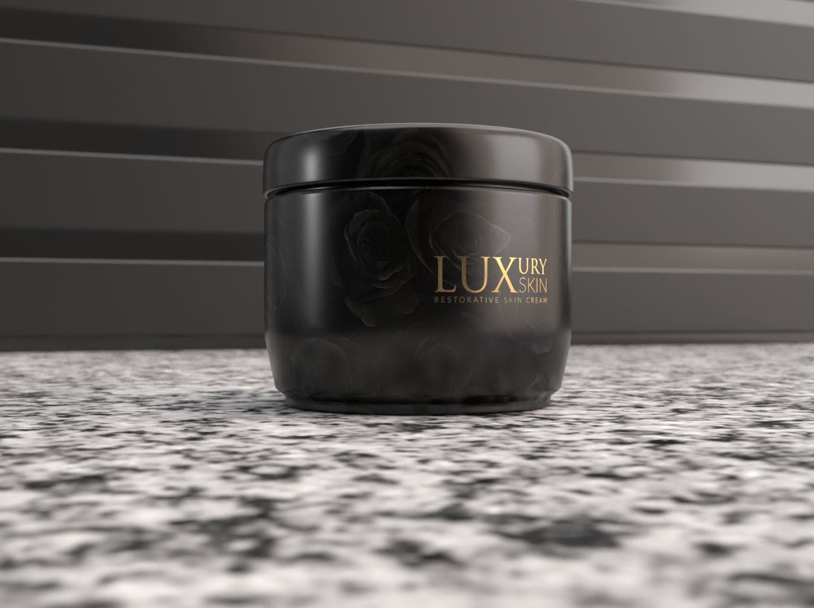
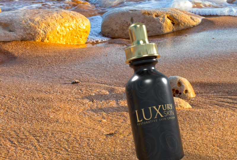
7. Placing Graphics: In this lesson, we're
going to really kick things up a gear and start customizing and making
these look like real professional
packaging mock-ups. As you can see here. These are a few
I've created from a starting point I had in the
last lesson that base jar, and these are looking
really sharp, there's just a little
graphic added, a logo asset I've created, and on some of these, there's a subtle
background image I've used on the material and it looks
really, really stunning. I'm going to guide you
through my process for creating these and enable
you to do the same. I'm actually going to
share these assets with you in case
you want to create this exactly as it looks and learn by reverse
engineering it. It's up to you, you
can either work on your own unique item as part of a class project or you can use the assets I've included
in the class resources, and you'll be able to replicate creating exactly these that
you're seeing here now. But let me guide you through the process and then you
will understand how to get here and you can do
the same yourself and you can do that with
your own unique objects. Here's my starting point, and the first thing I want to do is change the background color. Just click the "Canvas." You will get the
background properties. I'm going to change
this to black. I think that creates quite a
moody atmosphere and I quite like to show my mockups
on black when I can. Next we want to take
care of the materials, so for this one I'm going
to go for a matte finish for both the top and
bottom part of the jar. I'm going to change the
base color to an off black, about there,
double-click the top, change the base color, and it's quite useful
you actually get recent colors appear
at the bottom here. I'm able to match wrap, and now we're going to
place our first graphic. Click, and under seen, select the part you want
to place the graphic home, which for me is
for base, the jar, and on the actions, we're going to click
"Place Graphic Model". You should have access
to the same assets. I'm sharing them with you
under class resources, so you can download
exactly the same just to make sure you're
getting identical results, and then from
there, feel free to explore and experiment
with this yourself. One of these logos
is placed on almost, it's replicating what a gold
sticker would look like on an actual cosmetic jar. I'm going to select that
version and click "Open", and you'll see it places
it on the object. Something that really
does annoy me about this software is that if you've made any changes
to the base model, to its proportions,
unfortunately, when you place graphics, it tries to replicate those adjustments and
it warps the graphics. This is a little warped. It's actually a bit
taller than it should be. I'm going to eyeball this
and just bring it down. This is only a sample, but of course you'd
want to be much more precise with this if you're doing it for an actual client. I think that looks about
right proportionally, and I should explain
what I'm doing. You can see because
of this graphic is selected at the moment. I've got these little control
handles that I can click. If I clicked without
holding Shift, I can warp it either
horizontally or vertically, if I hold Shift and click, I can constrain the
proportions and modify that. I can also left-click
and drag to move this around the material
I've selected it on. You saw what happened there
as it went to the bottom, it got a bit confused
versus bevel on the edge and sometimes it gets a little bit complicated. You can always hit "Undo" and go back to the
starting point. It's really easy to use but sometimes when it comes to fine tuning placing
the graphics, you just need to be careful you don't accidentally skew things. Before I deselect this, you can see that
under the properties which are contextual, you've got some options here. You've got placement, and
you do have the option to fill rather than have
a floating decal. We'll use that next
for our background, and you've got the opacity. You might want something
that looks semi-transparent. You've got roughness which we explained was how
reflective it is. I'm going to drop that
to make it feel very reflective and then metallic, because I want this to really shine as if it's a gold
sticker and look at that. As we just orbit the camera and we let the lighting play
against that, look at that. That looks beautifully
realistic. Even before we played with any advanced lighting.
There we are. We've got a gold sticker now, sitting on the jaw. Let's go to the back. I'm going to use
the orbit tool by right-clicking to rotate
around to the back. I'm going to double-click to
select the base of a jar, and again, I'm going to click
"Place Graphical Model". But you can see as
you look above, you've actually got layers here, and you can see there's a
little thumbnail showing the graphic that I've just placed and you could
rename that if you want, just to keep things organized. I'm going to place
another graphic, and this time I'm going
to pick a label for the back and I'm going to
keep things consistent. Pick this one. A nice gold
outline on a white label. Again, it's warped it slightly because of the changes I
made to the base model. Just bring that, eyeballing it again, so that it's roughly okay just for the
purpose of this demo, and that looks pretty
good for the sizing. The resolution on
this is a little low, but when you go to render, that will come out looking
just fine and you can always increase the overall
resolution if you need to. There's our ingredients
label on the back. If you're creating mockups, maybe just for a portfolio, I'd recommend not skipping that, to make it really realistic, advise little detail,
just come up with a quick ingredients
label if you need to. Finally, we're going to
place a background pattern to really make this pop and
do something different. Looking at it, I
think I wanted it to be a little bit darker, so I'm going to select, first select the jar. Look at this base color, and I just want to make
this a bit darker with that matte finish is not coming out quiet for where I
wanted to think about here. That's looking good, and then I can just
double-click on the top. I could link the two, and in fact I will, so I'll use the eyedropper, and I'll link for two, so that the materials
match on this occasion. Lastly, I'm ready to now
add a background pattern, so I'll double-click
to select for base, and you can see it accidentally because I double-clicked
on this dical. This graphic here is selected that so I don't have
my base selected. Actually I can add a new layer, I think even if I do have one
of those graphics selected, but useful to show you what can happen when you
double-click anyway. I want to add another graphic, and I've included a few
backgrounds that so some are subtle flowers on
a black background, so it all ties in quite nicely. One is quite a generic
luxury pattern. For this, I'm going
to use flowers too, which you'll have access
to in the class resources. At the moment there
are two problems. One, it's placed right
above my offer graphics, and I want this to
serve as a background. I'm going to just drag
it down and place it below those other graphics. Secondly, it's
appearing as a decal, and I need to change
placement to Fill. You'll see that now tries
to fill the object. I'm going to just drag. When this looks
roughly circular, I figured that that's when the proportions are non-warped. Unfortunately there's
nothing here. There's no option under properties that lets you make sure there's
no warping happen, which is quite annoying. When this circle
with the control handles looks like
a perfect circle, that's when it's not
being warped in any way. I'm going to just drag, now holding Shift, and scale this down. You can see I've got
the option repeat it. I can scale this right
all the way down and actually have it
repeat many times. But that's not the
effect I'm going for. I'm going to place it I think
about here, and then drag. Let's make it a little smaller. Change that to mirror. I want something like that. That kind of effect. Where you can see
the flowers just peeking in below the label, and then decorating the
back of the jar as well. I think that's
looking quite good. That's quite effective. I might change the top now. I'll double-click on
the lid, unlink it. I'm just noticing it looks
quite different in color. I don't really want to place
the same artwork on the top, but I'm going to darken
that base color. I might just make
this a little more shiny just so it doesn't clash. With the finish we've got now by adding that background
to the object. I think that's pretty good. I'm going to jump across
now to the classic. Here's one I made earlier. Here it is. This is the one I've just
demonstrated to you. In fact I've placed a little bit of a background
from this one here, which I really love. I think that works so well with, that's replicating,
just printing in gold, the logo one without a sticker. I think that looks
really premium. We've used that background
actually on the lid, which ties the two
together nicely. All of these have been created
using the same techniques, just different 2D objects to create these
different options. This has, I think it's
a warm-up finish, and just a basic black logo, but that also looks
quite effective. It's got the same sticker
as this other one. Then over here we have one
that's again quite simple. Just white ink used to print both the logo and the
ingredients on the back. I don't think it's
a damask pattern, but something similar that's subtly printed in
the background. Of course with these two we've got the lid
layer turned off. If I select that, you can see lid is hidden. Because for this we're
just showing what the exposed jar looks like. Two things you can do before moving on to
the next lesson. Using the assets I've included
in the class resources, see if you're able to show your mastery of the
techniques we've used so far. See if you are able to
replicate these examples. Feel free to pause the video
as long as you need to, see if you can replicate these. Or even better, create something
better than I have using the assets and then share that in the class projects. It'll be really cool to see
what you're able to come up with. You can do that. I think that's quite
a good exercise to really cement what
we've learned so far. The next, if you're doing
the class project and you're creating a unique
product for yourself, try to use these
techniques to create your product and tweak and
customize it to your liking. Now to do that you
may need to create the 2D assets that
I've been placing. I'm going to jump
over to Illustrator. These are the
artboards I've created for the class assets
I shared with you. I just created a very
simple wordmark logo with a tagline included, and it's positioned so that
the whole canvas forms the size of a sticker that you might place on
a cosmetic jar. The same for the ingredients, I've just used placeholder text under the actual ingredients. We've got this organic
certified logo here to make it seem
more realistic. They're just a simple
border around the outside. If you use Adobe
Illustrator or Photoshop, you just want to
create these assets one-by-one as you would
for any branding project. The difference being
you're actually going to be able to mock this up and show your clients
what this will look like on the intended product. The artboards that seem
to be blank are actually hiding white text or objects. That's why they appear
to have nothing on them. You'll just need
to export these as PNGs if you want
the transparency, which Adobe Dimension
will honor. If you look at the results, it does indeed let you place the PNGs with that transparency
working beautifully. It takes a little
bit of planning. If you need some help
maybe sharpening up your logo creation skills, I've actually got
some courses here on Skillshare that will help
you to do just that. But see if you can
create at least a logo, maybe some ingredients, labels, or warnings, something to make
it look realistic, and have fun creating your
very own packaging mock-up. Or if you're happy just creating the samples that I've
shared with you here, then that's also
absolutely fine. Either way, you've learned to put this together
using the software. I always think it's
helpful to look at existing examples to
reverse engineer things. For that reason,
in the next lesson I'm going to share with you some real-world examples from projects I've worked on
with various clients.
8. Real World Examples: [MUSIC] As promised, some
real-world examples, and for each of these, I'm going to share
with you what I've created in Adobe Dimension. We finished mockup, and I'm
also going to share with you the assets I created in Illustrator to
achieve the effect. Hopefully, looking
between the two of them, you can reverse engineer the process as I've used it
in these different projects. This is a very
makeshift dieline. A dieline is essentially the way a box looks when
it's deconstructed. As you can see in the
illustration here, it's going to be shipped out to the client completely flat. When it's folded
and glued together, it's going to look
something like this. That's what we have here. This is a very rough version of the flat dieline that
would be needed. Unfortunately, you can't
go straight from a dieline into the finished result that we're hoping
for in dimensions. In a real life project, usually you have to put that dieline together
for the client, but you then got to slice apart the individual assets
you're going to need to create this
realistic mock-up. In this case, I've
done that by laying out what I need as it needs
to appear on the dieline. I've got some notes here, so a spot UV varnish was going to be used
for one portion, regular ink printing
for another, and if I zoom out, in this case, I did create
other options for the client, but I won't show you
mockups of that. Here on these art boards, I've saved out the
individual graphics that I would need to place over
in Adobe Dimension. You can see I've simply
placed these here. These boxes were premium assets. I found those on
the Adobe Stock, and they were just perfect, they match closely enough what
we were hoping to achieve. Using those as a starting point, and thankfully they had in this model a version that's
shown with a lid open, a version with a lid closed. It was just perfect. I could just
double-click and you can see I've got my layers here and just start placing those
different graphics in place. Then under the properties, just playing with the finishes to replicate what
I was going for. This is something I came up
with to replicate the way spot UV varnishing would look if it was printed on
that portion of a box. This is quite a
straightforward example. I'll share another one with you. This is a project
I'm quite proud of. I actually did this
almost as soon as the software was released, and these are luxury candles. I jumped into using
this software because the client didn't
have a massive budget, but we needed to create some
concepts where we really illustrated what the full
range would look like. You can see you've got
these different boxes and candles corresponding
to each range, which would have a
different fragrance. This is a bit busier than the
thing I tend to design now. But it was appropriate
to the audience. It was I think a UAE audience and it was
to look very detailed and opulent and the
software really let me do a nice job showing
this concept off. The objects themselves
are really simple. We've just got
cylinders and boxes, but the layering and the
artwork had to be carefully organized before it could
be placed correctly. If I jump across
the Illustrator, you can see we've got a dieline here for each of the box types. This is the base used for
the candle and then the logo itself was placed in
the space separately. Then we've got a PNG
created for the logo here. Nothing too complicated. But when you need
to prepare that for eight different objects, and they all need to, when they're lined up like this, they need to look identical. You can't have one that's warped or looking
different to the other. You've got to have a
nice precise workflow to get the results
you're looking for, and dimensions let's
you do exactly that. Something else which is
quite nice is you can create just one scene for all of your objects and you're able
to toggle and hide them. If I wanted to hide all of a
range except for this one, I'm then free to
use these objects. You can always line
something up for a specific shoot
and just save it. I could save this now or undo these changes just to
get a particular shot. But I generally find it's
quite useful to have all of my objects included
in a single project. That's the way I like
to work, at least. I'll show you one more
real-life example, and that is this one, which was a concept
created for the brand, Billionaire, to do a range of champagne and also prosecco. Here's a really nice mockup
of the champagne bottle, and you'll notice
without the full render, it looks quite fake. There's no transparency
showing to the bottle here. But if you turn the
quick render on, and I'll show you also the final render I
output for the project, then it starts to take the
lighting into account, and refraction, and it
looks far more realistic. Here is the final render that was presented
to the client. You can see all the lighting
details you'd expect. Even this reflection
here of a gold foil in the logo being shown
on the base of a canvas. Really nice touches. Let me show you how this
looked in Illustrator. These are the range
of assets I created. Some of these are for
the prosecco bottle, which I'll show you secondly, but we have a wraparound that I could use on the
champagne bottle, an emblem that we
placed, I think, on a little bit of a
foil paper for the top, then the same again for
the prosecco bottle. As long as you plan carefully, you figure out which assets
you're going to need, you can just take it
a piece at a time and it's possible
to put together something that looks quite complex without it being
too much trouble at all. If I double-click on the bottle, in fact, if I go back one there, you can see this
particular asset, it gave you a liquid
separate to the glass, which was really
useful so that I could get the lighting just right. I won't cover all the ins and outs of this in this course. But suffice to say, if on this glass layer, you play with the, this is a translucent, so I alluded to earlier, and a little bit of a
metallic reflection showing you can
create something that is very, very realistic indeed. Next, I'll just show you
the prosecco bottle. Here it is. It's very
similar to the champagne, different types of bottle. Something unique about
this was what the client wanted there to be
edible gold inside. When you moved or
shook the bottle, you'd see that floating through the liquid and they wanted
that replicated in a mock-up. I wasn't sure Dimension
would be able to do this. But actually, by placing, you can see here
these gold freckles. By placing that in
the liquid layer, it was possible to do this. If I twirl open the liquid, you can see here I've
got two graphics, which are essentially,
I took stars, I just took some
images of galaxies, I deleted the black out of it, change the color to give it a gold tint and
used that as a PNG by placing that in the liquid with a little bit of a
metallic sheen to it. When you look at
the final render, it really sparkles and looks
very realistic indeed. I'm really happy with the
way this came to life. I think that nicely
illustrates that. Although this software
is quite simple, it's easy to use. You can dive straight into it. When you plan carefully and you take advantage
of its features, you can do some things
that are very advanced indeed in 3D and get
professional results.
9. Changing the Background: [MUSIC] Although we touched on backgrounds in
an earlier lesson, I just want to
focus specifically on some of the presets and the options that you have
for your background because it can really make
or break the mockup. If I click on the canvas to bring up the background
and the properties, first of all, you can see that you have
this option here on the ground plane that
can be turned off or on. But if it's turned on, you can actually use this
to create a reflection. This can give a really
nice showroom effect. If I turn on the render preview. You have to play with this
to make sure it's not too strong and distracting
or not to faint. But you get this
really nice effect here where it's as if it's on a glossy car showroom floor, which looks really nice for certain mockups you might
want to put together. The roughness, as always, that controls how shiny, how reflective or
non-reflective that looks. You can see that where
I'm using something like gold as I start to put
that roughness up, is actually diffusing and it's
almost blurring the gold. The more detail I'm adding
here is actually going to take longer to render and to put this preview
together for us. But there's much more to
backgrounds than that. If you click to
filter by images, you'll see that some
of these images are labeled as backdrops. If for example, I click on this, this one with the table, it's designed to make it
look as if your item or your object were placed on a
table in a certain location. Now, the problem
is, at the moment, it's hovering in the
middle of the air, and the lighting doesn't
look very consistent, but you've got this handy action over here which
says, match image. If you click there and you can tell it what you
allow it to change, if you've carefully
position your lighting, you may not want to
let it change that, but we're going to let
it change everything. The canvas size, lighting, even the camera perspective. When you click "Okay" incredibly it's placed
your object to look as realistic as it can placed
within that environment. It's not something
I use a great deal, but when you do need to
create something that looks realistic in a
particular environment and you don't want to
spend a lot of time on it. Well, it's two clicks away.
10. Lights Setting up Your Lighting: [MUSIC] As anyone who's ever worked in a photography
studio would know lighting really makes
all the difference. Adobe Dimension gives
you a wide range of lighting options to
use and to choose from. Now I've placed two very
basic options here, just to illustrate the way lighting works and to
make sure you really understand what you're
working with so that you can create your scenes and have
that extra level of realism. The first thing you'll
want to do is bring up the lighting filter under
your starter assets tab. You've got directional lights and also environmental lights. Now the difference
between the two, the environmental lights,
as you click them, they apply a different preset to your single environmental
lighting setup, and that setup uses an
image that's diffused and it's projected onto your scene as if that's where the light
source is coming from. If there are any reflections, is actually going to be mimicking this here that you can see when
you click on it, this is the preview image. You can see this
little softbox here in the center that's
actually being replicated as if it were reflecting onto the right side of a
ball and the same to the left here with this much warmer softbox,
they've replicated. That's a single
environmental light and all of the presets
in this bottom section, they change, sometimes the base image
that's being reflected. You can in fact change and
select your own base image, which lets you really
customize the results. But these options are just
changing that preset. You can rotate, which makes that lighting source come
from a different angle, and for something like this
where we have a gold finish, I'll definitely want
some lighting to play on that gold so that
it really pops. That's quite useful.
Sometimes you need to position and fine-tune even
the environmental light. You can also colorize
the light source. If you tick that box, you'll then be able to either pick a base color or
what I quite like to do is click on the
temperature tab and you can then adjust for color
temperature freely. That's the environmental
light and that appears in a scene panel up here
on the environment. The directional lights are different in that they replicate the 3D setup that you would get with movable lights in
a photography studio. Essentially, it's
trying to replicate a setup like this and
as is the case here, you've got the option
to add as many of these directional lights at different heights and
positions as you would like. You can either click to
add a circular light or a square light individually
and I'll click once, twice, three times and you can see over
here on the scene, we've got three square
directional lights. As I click to select each one, I could change the
intensity of that light, I could click color and temperature to change
the temperature, I could rotate the light that it's coming from a
different position in the scene and I can
even adjust for height to create just the
effect I'm looking for. You can also see that, unlike the environmental light,
the directional lights, I'll just turn two
of these off for now and they interact
between the objects, our tower we have
here is actually casting a shadow
onto our sphere. That's an extra
layer of control you don't get with the
environmental light, no matter where the environmental
light is coming from, one object isn't going to
cast a shadow onto the other. So that's quite an
important difference. You can delete lights by
simply, while they're selected, hitting the "Delete"
key or you can select them and hit the trash
can icon under "Actions." The sun can be quite useful. It tries to replicate
the lighting effects you would expect
from having the sun. You can change the rotation
and the height of that. That gives you
something that is quite close to a daylight effect. For certain scenes you want to create may be just
what you need. I'm going to delete that. Free point light. This is an interesting one, and if we click to add
this to the scene, it actually positions
three different lights, a key light, and the presets here are
set in such a way that it replicates the effect of a strong sharp key
light, a fill light, which if I turn the others off, is intended to be much softer, to just fill in
any shadows across the scene and a backlight, which by default is
going to position behind your object and the direction
that you're facing. So you get this backlight effect here which can be quite nice. Maybe create something
similar to the scene I've created here and the
best way to learn is really by experimenting
until you really get the hang of what these
different lights are doing. You can see it can make a big
difference if you're using special finishes and you
really want to bring out the shine in a gold, for example, then you're really going to
want to make sure your lighting is
bringing it to life. Some of the advanced options
will allow you to do that. I'm using the fill light, which is quite soft
but if I increase the size and the edge softness, and then I'll just bump
the intensity up a little, you can see that
that's really making a portion of a gold pop. Just play the
intensity back a bit, but that's a very
different effect. If I reduce the size
and the softness, you would then get a very harsh, almost a flare appearing
on the objects, which might be exactly
what you're looking for. Have a play of the options and make sure that
you're completely happy with your lighting
and the way it's bringing your scene to life.
11. Camera Setting and Saving Key Camera Angles: [MUSIC] Camera angles and
although we've learned how to manually manipulate and move the camera when you're trying to create consistent previews of products and maybe you have
more than one to show off, and you're asked to go away
to make changes for a client. You want to come
back and you want to show the same mockups. It's really useful
to use some of the inbuilt camera tools, the dimension has to offer. The area we're going to be focusing on is this
little pane here. There aren't many options, but I'll run through
them and what they do, ''Frame Selection''
clicking in that, as it says in the tooltip, it just fills your currently selected
objects within the frame. If I was off somewhere
here, I click that, it just zooms us back, so up the object is
centered in view. There's actually a specific
camera Undo button. If you click ''Undo,'' it won't undo changes to your
camera positioning. But this specific
Undo button up here, I would do just about. When you've manually positioned the camera and let's
say you've got just the angle
you're looking for, so that's quite nice there. That's looking good in
the render preview. In fact, I would due
to the lighting, probably just change the lid
and that material from being a jet-black to something a bit softer so that when
it's rendered, it shows up nicely like that. But let's say I was
happy with this. I wanted this to be a shot
that I sent to the client. We first save the position of the shots we want to render, and then in the next lesson, I'll show you how
to output those. We've got our lights ready. Now we're getting
the camera ready. In the next lesson, it will be action. We need to go to this icon here, Camera Bookmarks, and click to "Add a bookmark of a current
view," which we'll do now. We'll name this front
and that's now saved. If we mess around
and rotate things, we can click on that
bookmark and it will take us straight back to
that exact view. Let's get another view. Let's have one showing
the back of the product, perhaps be ingredients label. Let's do it from
that angle there. You could do it completely
centered if you want. But I always think it
looks nicer to have it at a little bit of an angle. Let's save that view. It will put that as
back, and so on. You get for your ID, you
might want to show the top, the bottom, and you're
welcome to do exactly that. Finally, when you're ready
and you've got the bookmarks for the different angles you
want to render from saved, join me in the next lesson and we'll look at outputting this.
12. Action Rendering: [MUSIC] Rendering, which if you followed
the steps previous, this is actually the easiest
step in the entire class. If you click the Render
tab at the top of Adobe Dimension and if
you've carefully set your camera bookmarks
and labeled them you'll see under Render
settings rather than just recurrent view you
can take and select which of your bookmarked
views you would like dimension to
carefully render, which is taken into account all the lighting effects and
reflections and it creates something that looks very
polished and professional for your clients to see or
perhaps for your portfolio. Just a few options
to choose from, you can choose a filename, you've got a few
quality settings. High I found isn't
really necessary, a medium seems to be
more than good enough. I tend to export as a PNG. I don't think a PSD is
necessary unless there are things you want
to tweak maybe in Photoshop in the
post production. When you're ready
just click to choose a safe location and hit Render. Depending on the machine
you're using this could take just a minute or so or
it could take 10 minutes, half an hour, even an hour if you've got
something complicated, high resolution with
lots of objects. It will give you once
I click that button a render status and it will try to estimate the
time it will take. I'm working on a bit of a beast. I've gotten Alienware PC
and 64 gigabytes of RAM, a decent graphics card. My PC tends to make
short work of this. If I was working on
my MacBook Pro it actually takes sometimes
5-10 times as long. The power of your machine will really make a difference here. Actually I'll show you. Now
that these have finished, you can see it took just under a minute for each of those. This is how the final
renders came out. Absolutely flawless, no pixelation and this is
with a medium quality. I'm very happy with the results you get from that setting. Sit back, relax, let it render your
artwork for you. When you're ready, join me in the next lesson where
we'll look at a few ways, we can just push
the boundaries a little further if you want to.
13. Bonus Push the Boundaries: [MUSIC] Now, unlike a real-life
photo shoot in a studio for product
photography, where you have some
very hard restraints. Because if this is a
virtual environment, you really have some
freedom to push the boundaries and to
create dreamlike scenes, but you could really never do, never replicate, or
at least it would be very hard to in a studio. For example, taking
this product shot here, you could add a splash of
a very realistic gold. It's a little bit over the top, but just to show you the
thing you can create, and there's actually
a designer I follow who uses
something like this, even behind her branding
and product mockups, and that sometimes it just
adds that extra bit of flair and dimension to
what you've created. Something like this, if you render it, in fact, let me just show you
the end results. Because that's better than
giving you a render preview. Here's is the base, and that's what it
would look like if you rendered it with
this gold splash. This is deliberately
over the top, but you can see what's possible. Again, it looks reasonably
photo-realistic. Something else you can
do is actually create a virtual studio background. I'll show you what
I mean by this. What a difference this
is to just showing it on a plain black background. There's a few things I've done here and I'll walk you
through how I did it. On the camera, you can actually change
the perspective, the field of view, and even the focus to create
a sense of depth for field. You've got a little
set focus point button here that lets you target
that on your object. That really makes a difference, when you are rendering. I think that depth
of field can make or break professional-looking
product shot. If I zoom out here, you can see I've created a
virtual studio backdrop, floor and then a backdrop. To create that, I've simply used the plane as a basic shape. You drag that where you want it, scale it as desired. Let's just move that up. So that it's covering my
marble floor underneath. You've got the
option then to use any of the finishes you'd like. You could shoot against
a wooden walnut floor, you could do something
quite creative, you could make the floor
look like it were gold, and then when you click
the Render Preview, you'll see that you get a very
realistic gold reflection. You might have to fine-tune that so that it's
not over the top, but really the
possibilities are endless. All I've done is
rotate that plane into place to serve as a background that we have
there behind my object. Actually for my
background plane, I've literally just used
this striped glossy paper, which you can customize for the width of the stripes
and the number of stripes and so on to really get the effect
you're looking for. That really lets you
take things a step further and the results you get once you position your camera, just take care of it, none of her background
is cutoff or peaking in. You can always enlarge it if
you needed to scale that, or you could just
zoom the camera to a point, it's not a problem. Clicking the camera in scene, you can change the perspective. I think a fairly tight field of view just keeps the
focus on your object, especially if you're shooting
just a single object. Turning focus on, making sure you've targeted
your item correctly, when you look up
a render preview, it really makes a
world of difference. You can quickly see
the results from these view that I've exported, one here of a gold floor, which is actually quite
effective for this product. As is always the case in design, it's the little details
that make the difference. Just for a few touches, if it's a single object, adding a depth of field, thinking about your
background environment, that can help you to take
this a step further.
14. Conclusion & Thanks for Watching: Well done for
completing the class. I hope you've enjoyed it
and I hope you've learned some simple new
techniques along the way. Please don't forget to upload your own creations into
the class projects area. I'm excited to see
what you're able to come up with using
these techniques. Please feel free
to leave a review if you've enjoyed the
class and be sure to follow my profile so that hopefully I can see
you in the next one. [MUSIC]
 Jason Miller, Freelance Graphic Designer