Transcripts
1. Introduction: Hi there. Welcome to create
117 gorgeous colors using only three
colors and white. My name is Pamela Robertson. I'm an artist and I
coach other artists in my own program,
strong artist's life. Together. In this class, we're going to create
a color chart. And in that color chart, we're going to end up
with 117 gorgeous, harmonious and sometimes
surprising colors all in using paints
you already have. And without emptying out
the art supply store. It is deceptively simple, but it is really powerful and it can be used again and
again and discover new color combinations
and create a wide range of
harmonious colors. Creating this color
chart can help you see and create more mature, sophisticated and
complex colors. Colors that you can put
into your paintings. And because you're using elevated colors you're painting is will naturally be elevated. My own work with color
charts has really broadened my own, my
color vocabulary. And it's inspired a whole
beautiful new series, really a body of paintings
that I'm working on. I'm so excited about
still working on them, even though it's a
limited palette. I love this palette. I wouldn't have found
this palette had I not been messing around
with color charts. Column charts is a
great warm-up exercise. If you, before you
go into the studio, can start mixing up some paint to get an excited about colors. And it's also a great exercise for those days when you really don't feel like painting
like a big project, you've got something on
the easel that you're maybe not really
ready to move on. Or you're just not really in the mood to start something new. Color charts are great. Exercise kinda
keep you creating. But without a lot of commitment. Because you could
take a lot of breaks. Anyway. I'll explain more in the
course. Let's get started.
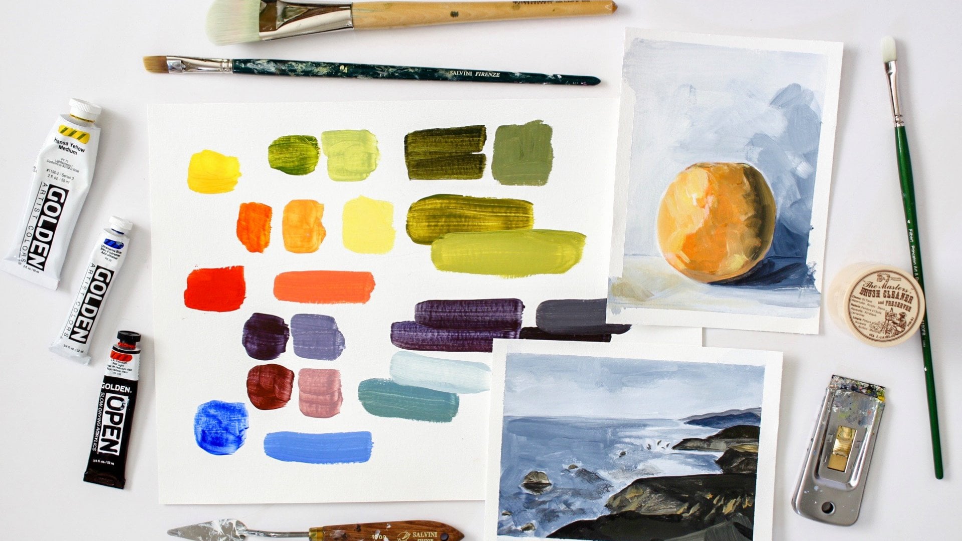
2. Anatomy Of The Color Chart 1: Okay, so before we break open our paints and start
making a color chart, I want to walk you through the anatomy of the color chart. I will admit the
first time I came across the diagram
for this color chart, it was pretty intimidating
and looked very confusing and seemed like it
was going to be really hard. So if I just threw this diagram at you and said there
make your color chart, you'd be in the same
position I was. And frankly, it wasn't a
great situation to be in. So that's why we're
going to take a moment, kinda walk through
this whole thing, explain every bit of it. So then when you're making your own color
chart, you get it, you know what you're
doing and more importantly, why
you're doing it. And I wanted to take a
moment to talk about that. This color chart is
very methodical. It is not just winging it. That means you have two really great
benefits because of it. One is, it means you can
get interrupted or take a break and just walk away
from it for a long time. And whenever you
come back to it, you'll know exactly
where to start, right where you left off with no visual break and
the whole thing, because the diagram
is telling you what each square requires. But more importantly than that, this means that
you can go back to a color chart you
created a year or even longer ago and recreate those exact colors,
shades, and tones. Because you have all of
the information there. You know what colors you used, and you know how much
of each color you used and how much white was introduced and what
the third color was. It's fantastic. That's really the point
of a color chart. It's not to make a color chart. It's not to fill in little squares and
say I did something. The point of the color chart is to bring more sophisticated, complex, and harmonious
colors to your art. This will improve your art. Alright, now we're
really are going to look at the anatomy
of a color chart down. Our color chart is 12 columns
wide and ten rows deep. Each. There are three main sections to the color chart
in each section, as you can see here, is four columns wide. The first section
is colors a and B. The second section
is colors B and C. And the last one, our
colors ASC and a. Now the nine bottom rows of the entire color
chart is where we introduce different
levels of white. And finally, in the bottom
five rows of each section, we introduce the third color
in just a little tiny bit to show even more complexity and range for these colors
that were focused on. So in the first section that
focuses on colors, A&P, naturally we would
introduce see, in the second section, focusing on colors B and C, we would introduce color a. Finally, we would introduce
be in the final column. So that's how it all
basically works. Okay? So this is the actual diagram that's going to tell
you exactly what you need to do for each
square of your color chart. And I want to mention
too, as we go, as we develop the colors
in this color chart, we're working column by
column from top to bottom. We're not working across. And we're not working
section by section, but column by column. Okay. Let me get this tool here. I want to talk about what all of these letters
and numbers mean. Remember this was section, our first section which
focuses on colors a and B. Now it doesn't matter what
color you choose to be a or B or C is
totally random and up to you and you can start
with whichever one you want to just identify that one color is
going to be your a. This column indicates
that it's 100% the a color and no other colors being
introduced in this column. It's just a straight
out of the tube. Our second column is going to be two parts a mixed
with one part b. The following column is going
to be equal parts a and B. And after that comes one
part a to two parts B. Now, this kinda makes sense then that the next color
you're going to use is your beak color because
slowly you've been introducing more and
more of that be color. And so now we've got 100% B. And we do the same thing
over again with RC color. Now we've got two parts, B to one part C, one part b to one part C, and finally one
part B to part C. So naturally, now we're
going to look at C. Then we do the same thing again, 221121 and 1.2 with a color. So you see it's kind of like a little circle we
can loop around now, all the colors have
been mixed together. And then you're
probably wondering, okay, well, what are
these percentages mean? Well, these percentages
mean they tell you the percentage of pure pigment
to white for each row. The top row is gonna be 100%
pigment with no white added. The second row in our case. And you can change
these later as you continue to develop your
color chart and skills. But we're going to stick
with this for right now. So our second row is gonna
be 75% pigment to 25% white. Our next row is going to be
split evenly half and half. The next one is going
to be 25% pigment. In our final row in this
section is 10% pigment. Now you say, why did you
say final row, Pamela? Because you've got
five more rows after that. Yes, I know. So as we're creating
these columns of color, what I'm going to do, and
you'll see in the demo, is I'm making five
little piles of paint that coincide with these
ratios mixed with white. And then for the
bottom five rows, remember this is where
we add our third color. So once I mix and lay those colors into the
chart, into that column, then I'm going to
add a little dot of the sea color and mix that into those little
piles that I already have a dot of that color in
each one of those piles, and then take that
color and lay them into the corresponding
square in that column. Just to remind you,
in this section, we would add color of dot of color a in the final section. And in this one we would introduce just a
little bit of B. And that is the whole chart. It's very simple once you
understand the rhythm of it. So I have created a black and white diagram that I encourage you to download and print and use as a guide
when you're making your color charts are
now having to go back and forth from your
paper to the computer. And I think you'll find
that pretty helpful. So next we're gonna go over materials list and
then we're going to start creating a color
chart, I promise. See you then.
3. Materials List : Okay, we're gonna go
over our materials list. Fortunately, there's
not a whole lot, so this won't take
too much time. We are going to create our
color charts on paper. And I really like these Canson
mixed media sketchbook. I like that. It keeps all the paper together. I like the paper itself has a really high-quality
and it's very heavy, so it's not doing a lot
of warping and buckling when you put wet media on it. I use the 11 by 14 size, which is perfect for
our color charts. Now, if you don't have
this kind of a sketchbook, you can certainly
use watercolor paper and you can also use a
heavy Bristol paper. Both of those will
work really well. Okay. Since this is something that
we're using acrylic width, I'm using my wet palette. If you don't know
what a wet palette is and you use acrylics. I would encourage you to
Google that and get one setup. It will change your experience
with acrylic paints. This prevents the paint
from drying very quickly. And depending especially on
the climate that you live in, that can really be a, well, it is a game changer
in any case, but it can really
make your life a lot easier when you're using a wet palette with
your acrylics. This is a must-have
a palette knife. You do not need to have
a metal wind like this. You could have a plastic one
that will work just fine. But you do need a palette
knife to mix the colors. You do not want to be
using your brush to mix the colors because that will shorten the life of your brush. When you use it to mix, it pushes all of the paint up into the
feral of the brush. And that's how you end up with the really splayed bristles. Now, depending on how you paint, you may end up there anyway, but certainly by using
your brush to mix paints, you will hasten that
process and you will wind up with a not-so-great
brush a lot quicker. The other thing
as far as keeping brushes clean and
in good condition. I also use a shop towels. You can also use
paper towels and I use this to clean off residue, residual paint on my brush before I plunk it
in my paint water. And what that does is it traps a lot of the pigments
and the actual paint here, instead of putting
it in the water, this extends the
life of my water. And it also makes
recycling that water, making it clean enough to get back into
your water system. It makes it a lot,
lot less of a hassle because you're not dealing
with so much water. This is a new habit I picked
up in the last year and I really like it and
you can like this. Paper towel has been
kicking around for a few weeks and it still
has some use out of it. So you're not just using one paper towel per
use and tossing it. It's just I think it's just a little better or
sustainable way to paint. Okay, you're going
to need a pencil, you're going to need
a measuring tool, a ruler, I'm using
my tape measure. You will also need
a straight edge. That could also be your ruler. But if you have a
T-square, use a T-square. I don't have a T-square here. And I'm always mad that I
don't have my T-square. I set up my color
chart because the t-square makes this whole
thing a lot easier. For my straight edge
on this project, I'm just using the back
of another sketchbook. Then you need white paint. And for this first color
chart we're going to do, I'm really encouraging you
for your first color chart to stick with the
basic primaries. So to pick, pick a blue and
a blue from your blue family and yellow from
your yellow family and any red from
your red family. After that, you can
start getting more creative and working
over into mono, monochromatic colors or more secondary colors,
that kind of thing. But I think this
kind of gives you the classic experience of
creating a color chart. And that is it. Now, after all of that, we can finally start painting. Yay.
4. Setting Up The Color Chart: So I have marked out
here 12 columns, 123, 456-789-1011, 12. And if we look at our download, we see we've got 12 rows that we're going
to do of paint and we've got 12 columns and
we're gonna do ten rows. So this is an 11 by 14, so the 12 columns fit
nicely in the middle. And I am what I wanted to just
add some leading a quarter-inch
in-between every column, and I'll leave a quarter-inch
in-between every row. And what you could do if you really wanted to or if
you have this on hand, you could use a quarter inch
white or a quarter inch tape and tape out these squares. If, and if you want to
ensure that you get a very clean edge
on each square, then you'll want
to paint the thing with a paint the whole thing basically with a layer
of acrylic gel medium. I started out when I first
started Color Charts. I started doing it with
the tape and spent a lot of time getting it
just right and just perfect. And in the end what I found out is it wasn't that important. And I can get just as nice, neat look with just
mapping it out in pencil and forgoing
the paint, the tape. It's just a lot of
trouble I thought for a color chart because
this is an exercise, this is not a painting. I'm not super-duper
concerned with it being gallery ready
because it is an exercise. So I'm more if
waiting for the tape and I'm waiting then for the acrylic gel to
dry after you put all the tape down and
all that just will make it even less likely
for you to do actually get to mix colors and
put them in a color chart. I say just do the more
immediate method. I think I know I'm
counting this out. I know there's a ruler here
by just counting out to make sure because I think I'm
lacking 123,456,789.10. Okay. There we go. And then I'm just going to use a straight edge that's long. That's actually
another sketchbook just like this one
so that I don't have to measure
over here as well. And then also over here, I'm going to save a little
bit of time, just a bit. So this might not end up
being exactly perfect. Like my lines might
end up a little bit on the diagonal when
all is said and done. But like I said, I don't think that's
the most important part of this color chart. The most important part is that your creating a color chart. When I, when, later
on in this course, I'll show you the
color charts that I've made and you'll
see the first one I made with tape was
incredibly wonky. And certainly nothing
I would really show off except for it did kinda kick-start this whole
fascination with color charts. And what these colored, what these color charts
have done for me. It's really opened
up my eyes about what you can do with just
a small handful of colors. And it has actually in
one of my color charts, has inspired my
current body of work. It's a whole series using three colors
of the color chart. And then I did
introduce a dark umber into it to kind of add some
more darks to the palette. And I'm absolutely enamored with this particular color combination
that I would not have found had I not just
been trying out different colors with the
color chart with this method. So I'm going to
speed this part up because this is not exciting. Okay, So that didn't take too long and you can see I
snapped perfect here I've got some wonky
lines which I may go back in and correct just because this does get
rather squished here. But like I said, I could even correct it as I'm painting it if I really cared. So I think I'm going to just accept that I've got some
wonky squares in here. And I'm just going
to move forward without getting too
hung up on the details. What I am going to do now
is to choose my colors, the actual three colors
that I'm going to use. And I'm going to map it out
so that I can put this aside. Then I can just focus
on the chart and then just on my paint here. I don't really have
room for all three. I'm going to use a red
pen so you can see this. And I'm choosing go really
basic with a cad red light, a fellow blue, deep green shade, and a cad red, cadmium yellow. Those are gonna be
my three colors. And I'm going to say that
my cad red is Mike color a. So in square or square, zeros, zero here, or above column one, I'm going to designate
this as the red. And that square.
I might even want to put cad red and
I'm going to add a line down here when we start painting so I can see
that more clearly. So cad red is going to be my a. So now I'm just
going to call it R for red and that's two. And then I'll go ahead
and go with the blue. And that's going
to be two parts, red to one part blue. And the next column is gonna be one part read to one part blue. And then the next one
is going to be one part read to two parts, blue. So you see this
transition is 100% read, twice as much read equal parts
red and half as much red. That's the standard that we're going to go through all of them. Since then my color
blue is going to, my color B is going
to be the blue color. Because that was
kind of figure that, that's your biggest one here. So now we're going to
fade into more blue. So this is gonna be 100% blue. And I'm going to
put in the fellow, I'm putting in here for
my own notes, green. Just not that big of a deal. And then they're going to
do the same thing again. So this time I'm going
to start with blue to two, yellow, one. And then one part blue
to one part yellow. And then one part blue to, whoops, to two parts yellow. And then color see obviously
is gonna be the yellow. So this is going to
be yellow CAD medium. And then we're gonna
go yellow, two parts. And we're gonna go back to red. So red, one part, and then equal parts yellow, two equal parts red, and then one part yellow
to two parts red. Okay? So if we go back here now, this starts to make a
little bit more sense. We're going to get
in our gradients of white added to each one of these colors and
color combinations. And then on this bottom
section here is going to be a small addition of the
third color, right? So since we're mixing
red and blue here, our third color mix is going to be yellow in this first section, and we'll just follow
along like that. Now I want to put in
my ratios here of white and let me put in
this line real quick. So it's going to bug me. Find my pencil and get this
in my wonky color chart. I guess I'm glad I'm
doing this sort of wonky because that means
this gives you freedom to not get too hung up on all of the minutiae of trying to make
something perfect. If you're like me and
you're not really set up very well to make a
lot of straight lines. It is more difficult and you do end up with stuff like that, but it's not the point
of the exercise, so I want you not
to worry about it. You know, if you have the the room and you
have a nice T-square, it'll be a lot easier
for you to make. Straight lines and nice
right angles everywhere. But for this exercise and trust, trust me, it's not
that important. Alright? So now we're going
to talk about, now are I'm just going to
map out these ratios here. And this helps keep me on track while I'm painting because
sometimes you can, you can get a little confused for kind of forget
what you're doing. Is this is 100%, 100% of the pigment to wipe. So it'll be 100%
pigment, 75% pigment, 50% pigment, 25% pigment, and ten per cent pigment. And then when we move
on to this next part, we're going to start adding in this dot of our third color using the same colors
that we already created. So we're going to put the
10% plus the third here, the 25% plus the third, and so on and so on. Now, you can also
play with the ratios. And here too, if you've got bigger paper or you wanna do smaller squares,
you could do this. You could do 100%,
80%, 60%, 40%, 20%, and on and on and on, and then go back up the other
way with your third color. This is not set in stone either, but I think this is gives you the best general sort of
color range from 100%, um, of the saturation
of that color or color combination to
pretty low to 25%. If my book was bigger, I mean 10%, 10% is pretty good. I think a lot of
times I'll end up getting less than
10% just because I'm interested to see how
much color comes through, even when there's
even more white. So this, again is not science. If we were to, we're
sitting down together in a workshop using the
exact same colors and making our charts. We would all end up
with different shades. Once you leave that 100%, really just in the paint
colors after that, everything else
would be different. Because we're going to see
it a little bit differently. Or one-to-one ratios and two
to one ratios and all that. And I know mine
sort of shift and change even through
a color chart. But like I said, it's
not that important. Okay, so next we're
going to work on, I'm starting to actually
mix color and paint. See you then.
5. Color A : Start with the cad red. And what I, what I have found
doing this is you need a lot less color than, than you think,
but you'd need to. Also be careful not to do enough color because then you'll run out in here and it's makes things a
little more difficult. So this is E, It is a lot easier, I will say it's a lot
easier with this sort of soft body paint that you have in Guizhou tube thing because you can
control it a bit more, but this is totally doable with the heavier
body paint as well. Just use your palette knife and just kinda pick
what your size is, what your size is
going to be making the same every time.
Does that make sense? That didn't really make sense. Just kinda keep an
eye on the portion that you're pulling
it with your knife and just be very if you're always the same with
that, it'll make it easier. As you go along. For red here, what I'm
doing is I'm going to make a little pile of paint for
each, each row, right? And as I go, if I can get a little
less pigment down there, that will be even
better because that means I'll be mixing less
paint that will go to waste. So that's gonna be
my hundred percent. And already I realized
that was too much. I don't I don't I
won't need that much and I tend to
do that every time. It's probably should
have been this size, but it's gonna be okay. Okay, So this is my 75%. I'm just going to
squeeze about a quarter. About, I said about short of putting this on scales
and weighing everything, it's not gonna be accurate. That's it. My one-to-one or my 50%, and this is gonna be my 25%. So I'm gonna do a little
dot and a little bit more. And this is my 10%. Do quite a bit more. Just simple as that. Let's see, do I have a
clean palette knife? I do. Perfection. Okay, so first I'm
going to mix these. And I want to keep these together and not spread
it out too much. I am working on a wet
palette which will extend the life of my paints. But I don't want to get
it so smeared around that I won't have
enough left to use one. I'm down here at the bottom. This is cutting it really fine. But I think I'll make it. I hope I make it. If not, I'll show
you how to fix it. Okay. And now my 5050, I think what you'll
find if you're anything like me and the
other students that have walked through this course is that we're really not mixing
our colors very well, we think we are, but we find out pretty quickly
that we're not spending enough time thoroughly
mixing our paints. And you'll know you're not, when you go to
latest paint down in these little squares and
you have streaks of colors. It's you feel like you mix them, mix and mix, and you
still get a streak. So it's very interesting
to see an amine. It'll be amazed. It'll
be cool if I can make all the paint
I need to make with just these tiny little
dots that I did. I do hate wasting paint. But it took me a little
while to figure out how to mix just enough. When I'm not paying attention, I'll end up with too much paint. But as long as it's just
a little bit too much, it doesn't bother me so much. It's just one, It's a lot
too much that it bothers me. What you can do. Because in the
beginning you may, like me struggle with making little piles of pain and
end up with too much. You can take this
paint and put it down, painted with a palette
knife or brush or whatever on a canvas or a board. I paint on boards and use that as a basis for
a new painting, right? So then you're building
an underpainting already for a painting
that goes forward. And especially if
you're really kind of start to fall in love
with these colors, you might find that very cool, very cool exercise to do. All right, so now we're
going to actually paint. Here's my cad red. Obviously, if you go a
little slower with this, then your squares will
be a little bit neater. I am because of the camera
and at an odd angle. So I'm not going to
stress too much about making perfect gorgeous squares. In the end you'll see it's
not really that important. And the most important
part are the colors. What I do want you to
do as much as you can, because some of the
colors you might have picked are
very transparent. But as much as you can, I want you to get the full, a full coverage on these colors. So if you are using very
transparent paints, when you may want to go back once this is dry
it a bit and do a second, a second layer. So you can really see the actual real saturation of that color without the white of the paper underneath
interfering. I use a lot of
transparent colors. But once we start
adding the white, the transparency
issue will dissipate. It will become much
less of an issue. And you'll be able just to
knock in these squares. Also when I'm not talking
and I'm a paying, paying attention
to what I'm doing. I'm also not cleaning my, my very dirty brush in the
water right away because it shortens the lifespan of
my of my cleaning water. And what I do now is I just wipe the brush off on a paper towel
to get that paint off. And it's still a little
damps like its color isn't going to contaminate
that color too much. Just a tiny bit of it
left on the brush. So obviously, if I was wanting to move from
a color to a pure white, then I would definitely then after wiping the brush
on the paper towel, then clean it in the water. But the benefit of putting it in a towel is that it means
it extends the life of your paint water and makes
that whole job of making sure your filthy acrylic paint
water doesn't go back into the municipal water system until you've filtered
it or cleaned it up? Okay. But sometimes I forget this
is a new habit for me. So sometimes when I'm narrating
what I'm doing, I forget. So please forgive me. If I'm not always
doing what I say I do or would like you to do. And I don't usually spend a lot of time
talking when I'm painting, even with color charts. And it's one of the
things I really love about the color charts is because once you get
going into this rhythm, I find this to be a really almost meditative
practice and so exciting to watch these colors emerge as I make them column by column. Alright, so now I'm going to
introduce our third color, which is our color. See in this section, which is the yellow. And I just need a tiny
little dot camera shot. Just a little above, isn't it? There we go, a tiny
little dot there. And now I'm going to introduce
these colors into here. Okay? So I'm just picking up
a little bit of yellow. And I'm not going to mix
that whole bit of red to it because I use a
lot more red paint than I actually needed. So I'm just adding that much. Yellow, introduced a
little bit of white. They're not going to worry about it because
this isn't science. So it's a very subtle
shifts initially, in your idea of a dot of white or a dot of the third color is going
to be different to mine. This is where everything
starts to change. So that even if you were
to do a color chart with the same colors over
a period of time, those colors in each
chart would be different. Because we are just kinda
doing this by feel. But if you're anything like me, you're going to really
start to thrill about. I probably need a
little bit more about the amazing colors, the surprising
colors that can come out of just this very,
very simple palette. And I think we'll start
to see that here. Okay? So I am going to wash off my brush because I've got
some white on there and I don't want to contaminate that fully saturated
orangeish color, Persimmon color I've got here. I don't know how
much of a difference the camera is going to pick
up with these reds Sunday, my camera has a tough
time sometimes with reds. But in real life, this is
a much more orangey red. And it's quite lovely. And so what you see also
is that I'm making a read that still if it were especially if it
were standing alone, it's still looks very, very red. But it actually is
starting to look richer than the red right
out of the tube. Because now it has a
little bit more depth. I'm doing this upside down. Okay. So I started again at the top and I should've started
here at the 10%. So I'm going to shift real
quick and correct this, this is my 75%. Here. This is the danger of me thinking about
what I wanted to say. That wasn't strictly
about color chart, that was more about
the richness of color. Once you start
introducing more colors, I do need to mix up just a
little bit more of that red. For my 100% square. There we go. But this is good too, because it shows you early on how you can very easily adjust
any errors like that. It usually happens to me once. In most of my color charts. I get it wrong once. Okay. Now I'm going to jump
to the 50% since I'm doing it this way now. And my 25% is here. I'm going to paint over that. Titanium white is
excellent at coverage. So I didn't need to do anything heroic to correct that
and it's pretty dry. So I should be able to put
a nice fat layer on top and just delete the mistake. I'm gonna perfect. Here you start to see like, especially these two
next to each other, you read this very kind of
Pepto Bismol style pink. And then with just a little
bit of yellow added, how much that color
just shifted. It's very interesting. Alright, I'm going
to fast-forward this and I'm going to complete
the red section.
6. Color B : Alright, well, It's
good morning to me. This is the following day. And I'm going to work on
this color B section, which in this case is going
to be this little blue. And I think here now
we're really going to see the difference with the pure phthalo blue compared to that same blue when
we add red to it. And I've already laid
out my little piles. And now we're just going
to throw in some white. I thought that was
clogged. It's not. Let's see how we get going. Alright. So as a painter, we often think, okay,
I wanna make color brighter or lighter and I'm going to add
white to it in that. And so the white does make
it lighter in that respect. But another thing that
the white does is it also makes a fairly simple color. Simple, not really
in a good way. It's called in the industry, it's called a candy color
because it's very sweet, meaning there's not a
lot of complexity to it. And it's a little OneNote. So this is where
this color chart really will show you the different complexities
you can get in a paler blue. But that's still, but it
has a little more to it. And it's still a pale blue, but it just can be a
bit more interesting. Then this very OneNote,
candy or sweet. Just add a white to it. Once you start playing
around with these colors, you will start to see those yourself and it will
start to make more sense. Someone just telling you, because these are still
really pretty colors, don't get me wrong. Fallow blue with a green shade is a really gorgeous color. But I think I will
end up preferring this color mixed with a touch of some other color in the end, especially when I have
them side-by-side. Okay? So we're starting
with 100% blue. And you can see here too, that this is a much
more transparent color. You may not be able to see it, but it is a more
transparent color. It's not so transparent
in this case that I would really worry about
doing a second coat. There are other
colors that are more shear when you put them down. And the other thing you
see, I'm not doing this. I'm not adding water to any
of these any of these paints. I'm not coming in
with I'm coming in with a very just a damp brush. I'm not coming in
with a wet brush, not introducing a lot
of water into this. But see this blue, pale, bright Easter egg, blue
next to that blue. And you start to see
how these blues are. More complex. Yeah,
There are different. So it may not be that, I'm not saying that they're better. Let's put it that way. I'm not saying that
they're better, but I think they lean towards more interesting and
just a bit more complex. And you can really see it. When you put these side-by-side walk
going across that row, you can really see
the difference. Alright, now we're gonna
add our new third color, which is going to
be our a color, which in this case is yellow. So I'm sorry, red,
G's, that's red. Okay. So now we're going
to start adding some complexity to this. And you can use your own
determination of what a dot is. What is a dot? Depends. It depends on how much
of that dot you want to see that dot of color
you want to see in the paint to really
see the differences. It depends how much
paint you've got down that you're going
to actually mix with. This is not a science. This is just an experiment, a very unscientific experiment. But right away you can see while these colors
really shift with the introduction of such a
strong pigment of cadmium red. And yet there's still blue. We'll start at the bottom. My my suggestion is that
however you start doing this, just do it the same
way every time. That will keep you from making
a lot of dumb mistakes. So if you always
start with dark, then you're going to paint
to meet in the middle. There's not a wrong
way to do it, but to keep it less confusing. And I'm just in love with
these colors. Just in love. Anyway, my point is is that you keep just had to look back because for
a minute and like I'm pretty sure this is
the wrong color. That red is the wrong
color, but it's not. So it's nice to have that chart kind of keep you on track, see a little bit of red in there and make sure
that's mixed in. I'm going backwards again. My goodness. Narrating this. It does get me off focus that we're going to speed it up here in a minute so you won't have to sit
through all of this, but you can watch the
transformation of these colors as we continue to build new colors. And we're going
to cover this up. I don't think with any problem. You see how important how unimportant that
mistake truly was. Now easily it was taken care of. Gorgeous colors. Gorgeous, gorgeous.
Alright, Like I said, I'm going to speed things up so you don't have to
listen to me ramble. Wow.
7. Color C : And we're back for color C, or last bit here in
our last section. And let's get started for the
clean off my palette knife. This is a little razor blade
holder for paint scraping. It's also good for
cleaning that hard to or impossible to remove stuff
off of a glass cook top. I found this one I used
for my palette. Nice. You can also use
just a safety blade, a safety razor blade tool. And without this, but this kinda helps you keep it
at the right angle, makes it, makes it
go a bit quicker. Alright. Here you go. Now with the yellow and
see what sort of oranges and colors that would
get with those. And as you're working on yours, if you end up with a lot
of greens like this, look, how many greens I've
got going through here. Green, green, a
lot of greens all different and not
even a full range. But look how many
greens I'm getting. Especially if you're doing a lot of landscapes and floral, that kind of stuff,
lots of greenery in it. And you're relying on your tubes of green to get those greens. I would ask you to
start exploring making your own greens and
seeing how much that will improve the
interests of your work. And just the vitality
and the maturity two of using these more
complicated greens to green into your paintings. Because certainly when
we look at nature, there are a lot of
complicated greens. And I really do believe
that mixing your own, we'll get you excuse me. We'll get you making a lot more of those types
of greens rather than kind of what I see
often in a lot of student work is kind of what I could terminate
industrial green. The factory green
because they're really working pretty much straight
out of their tubes. And for whatever reason, I noticed those greens more. Then maybe other colors
that you might be using pretty much
straight out of the tube. There's something
about the greens that I guess just
don't ring true. Maybe because we're surrounded
by the natural world. And maybe just, we're just
more sensitive to sing that. I'm not sure, but I
do notice that for myself as it relates to greens
in a lot of student work. I think I want this
one to be paler and got one picked up
quite a bit of pigment. Really wanted to show
the difference here. In these past couple of years, stemming off of
these color charts, what I have found is that I am not very good at making pale, pale colors, not some, but now that I've
gotten better at it, on my palette, my paintings
have become a lot lighter, which is something that I was, that I intended to do. I'm getting a lot more
sensitive to pale colors. And even to me like this, even at ten per
cent don't read as particularly pale to me anymore. I'm definitely expanding
my own understanding and knowledge and
perception of color doing. Starting with these
color charts, there's some other exercises
that are helpful as well to really start seeing
the value of a color. And the value is talking about how light or dark
it actually is. This is a very
transparent yellow. I don't use this
color very much, this particular cad yellow. So I'm surprised that it is
as transparent as it is. I would have thought
it wouldn't be. So the more understanding
you have about color, I don't mean understanding
is that, you know, all the words
secondary, tertiary, all the other words relating
to the color wheel. I mean, that's nice to have, but it doesn't really help you understand color
of the way I'm referring to understanding
in this instance is that you see color. You can, you can, you can, you can look at a color
and see what the value is. You're not being tricked
because it's a bright color. You think it's a
very light color. That's not always the case. Bright colors can actually
be in value very, very dark. I should probably make
a course on that. But what I mean by
understanding is that you can start to understand this. Start to understand that you can with three colors plus white, make amid, can make 120 colors. You can make more colors. These are just the
increments that we've, that we've put in. But you could make a whole
other section down here that uses even more
of the third color. There are hundreds of
colors that you can make with just these three
pigments and white. I think once you start
to understand that and really see that
in your own work, that's where that's
where I think when you really do start to have an understanding of color, are secondary color in this section is going
to be colored a, which is cadmium red, which means that down here, our third dot of color
is going to be the blue. So let's introduce some blue to these yellows and
see what happens. This blue is such a
strong, strong pigment, so it's really going to change these colors
up and dominate that. Yellow. But wow,
look at that green. Talk about some
spring green here. It's practically fluorescent, at least compared to the greens
that we've developed so far. I will say too, I found doing the color
charts now that I'm a much, I actually enjoy greens now a lot more than
I ever have before. And I'm using a lot
of greens actually in my painting because
of the color charts, because I'm not using these industrial greens
and creating greens. And I'm finding them
really pleasing. To me. My audience really likes them and they're
quite beautiful. Were before I really did avoid greens because I wasn't
making colors like this. I was just using things
out of the tube. Look at how much that
color shifts from a really vibrant yellowy green to this really meant
really a mint color. And that's because of
all of the extra white. Okay. Wow. That's really,
really pretty. What a great green. I wasn't
sure how the greens would, would come up here
on this section. We've got a very wide range. Why it really does
change so much. 123, right? Okay. Really
getting into this very minty green from that super
vibrant. So interesting. So you see as I
work through this, the perfection of the squares, they don't really
mean that much. The edges being uneven. It doesn't really impact this. Now, if you wanted to turn
this into a piece of art, like if this kicked off a
series for here and we're gonna do gorgeous color
charts than yeah, you would care more about
that kind of thing. But that's not what this
particular exercise is four. So I just wanted to
remind you about that. I think in the beginning
we can all get very freaked out about making
these perfect squares. But as you see, these
are not perfect. Boy, are they doing
the job to show us how many different
shades and values we can get with just this
very small palette. All right, I'm going
to speed things up and we'll get this finished. Hello.
8. Color Charts & Inspiration Found: So I have finished
my color chart. I hope yours is
finished as well. And I just wanted to point out a couple
of things that I thought was so interesting. Especially in this column
here where we have these really
Persimmon color going down into this peachy
sort of a tone. And then boom, adding in
that little bit of blue, we get this incredible blue. Same thing happens over here. I wish I'd gotten that a
little more opaque because I painted the wrong color in
there the first time round. And this wasn't quite thick
enough to truly cover it. So ashamed, but still what
a great couple of colors. And then this just fades back, then back down to this
really juicy earthy tone. Some really lovely
earthy colors. It's a super nice
gray color there. All the blues, wow, these blue greens and then this wide range of
greens, just lovely. I wanted to mention
you're sitting around on your with your acrylic paints laying around for a long
time not getting used, they actually can go bad. This was a color chart. I started and realize that
the red color I was using, the paint was probably
not good anymore. And even now I'm noticing, I can rub on it and
get a little bit of red pigmentation
on my finger. But what was happening was that the red pigment was
always separating. I would mix and mix and mix
and then painted down and it would start separating
as I brushed it down. And I don t know that the camera is really
picking it up as well. But it's coming through
a lot of these colors. So I just gave up
because really what was the point of that
to suffer through? I wanted to show you
just a few other polar charts that I've done. This was the same color, the same fellow blue, the same red, but
with a yellow light. So we have a slight
difference here. I think it came up with, with
a few more neutrals than the one I just completed this
row here or column here, especially as a ton of neutrals. Just really nice
spread of colors. And say if I'm going
the right direction, okay, That's Here we go. Okay, So this was one that
I did with Indian yellow with a cad red deep
and a failover. The phthalo blue apparently uses Thaler blue lot
my color charts. And just love again, this really wide
range of greens. Some lovely blues, lovely blues, and some really nice
earthy yellow tones. And some really nice dark
super darks down over here. Like that one quite a bit. This one was an interesting one. I did an orange, a
phthalo turquoise. So this is the oranges Othello
Turquoise and a raw umber. And look at all of
that really subtle, subtle, cool, chalky sort
of greens through here. And some, again,
some really nice neutrals and that blue,
wow, that's nice. This one was yellow, ocher, quinacridone, magenta,
and Othello Turquoise. I mean, it's like
pastel Easter time. Wow, so interesting that
yellow ocher would be involved in all of these
very happy colors. That, that was a very
interesting one. And again, some literally
luscious greens. This one was, this one's a really special
color chart for me. This was with the Indian
yellow chromium green oxide and Prussian blue. And it came in. This was a much more
monochromatic color chart. And these colors just
got me so excited. And it is actually
kicked off an entire series are really body
of work at this point, where I'm just exclusively
using these three colors plus white with some dark amber. And every once in awhile, a little bit of black just to really push those
darks a lot darker. And that's when I really, this is when I really
started to fall in love with the color charting because it inspired all of these colors that
I never would use. I didn't use the
chromium green oxide. It didn't really
know how to use it. And so it just kinda
sat around for awhile and it wasn't
until I used it in this chart did I discover the range and
the complexity that I can get into that color that I didn't know
what else to do with. So that's been really exciting and I think that's another
great thing with color charts. If you've got a color that
you bought to try out. It didn't really work. And you don't really
know what to do with it. I would I would put it into a color chart and see what
kind of colors become a bit. I should probably use
the chromium green more in some color
charts that I do. And so I wanted to show you
my very first color chart. It's very wonky. I don't really like
measuring and all of that. So you can tell I didn't
really take a lot of time. It did it as quickly
as possible. This was based on
the Zorn palette, which was a famous Swedish
I believe, or Swiss. I apologize, I'm
not remembering. Painter. And he worked almost
exclusively at least for a time in what was called then they end up being called
the Zorn palette. And it was yellow ochre, it was actually ivory black. I used Mars Black because
I don't have ivory black. And I believe it's
cad red light. I believe that's correct. I might get I might have
that one wrong too. There may be a
different colored. Obviously, he was working in oils and this is
hundreds of years ago, so it may have been a different read that
he was working in, but these colors in acrylic approximate very
closely the kinds of colors he was working on. And he was he was able to get a lot of
flesh tones and a lot of very earthy
neutrals and no blue. So that's where my whole
color chart journey started. And I'll show you
where it's ended up. So like I said, it became totally enamored
with the color chart, with that monochromatic
blue, green, and yellow. And, um, and I
dedicated myself to making paintings with those
colors plus a raw umber. And these are the kinds of paintings I've
been coming up with. I'm just showing you
obviously the smaller ones because they're easier to
show on this camera setup. So I did this series of these six-by-six is where
I divided them up and did one that was more
kind of leaned more towards the yellow and ones
that lend leaned more towards the blue and others that obviously more
towards the green. And this one was an earlier one. This is one of the first ones I did with this color palette. And as you can see, I've been working to really
go lighter and lighter. When I first created this one, I thought this one
was extremely light. But now you can see how
far I've been able to push my light values. And it's just taking
me time to understand that and actually
see it in my work. It's very interesting
to me how we are fairly blind to our own work. This is a 12 by 12. Here is not as straight black. It's actually the
Prussian blue with some black and some raw amber in it, bring it down very
close to black. But if you look closely, you start to see some of the
blue undertones in that. And this is the first time I'm, like I said, I'm using
greens in my painting. And the greens keep being, keep turning out to be
my favorite colors. Which is a bit surprising. And then here's another
one a little bit later. And you can tell because it's not I guess it
is from the same. I'm sorry, this is the same, but a bit lighter, focusing more on the lighter qualities. Anyway, I just wanted to
share that not to say, Hey, look, my art is amazing. I already love it. That's okay. I just wanted to show you how you can use these
color charts to really kick off something
that is important to you and special to you
and exciting to you. And to really bring
that quality of excitement and enthusiasm
into your new work with some fresh insight
about color and using colors that you've typically
wouldn't use, please. I would love it if you posted your color charts in the final product
section of this course, just to see what
colors you're using. And I really encourage
you to do more than one. Start with the basic, with the red, yellow, and blue. And then after that, move into
the different colors where you're doing some maybe more monochromatic or maybe doing
one that's just neutrals. Maybe just a yellow
ocher and an umber, and then maybe throw in an odd color and see
what happens with that. I mean, there's so many
different ways you can go with this anyway. I hope you enjoyed this. I hope you learn a
lot from this and I hope that you carry
this exercise on with you for the rest of
your career as a painter. Have a good one. Thanks
so much. Bye bye.
 Pamela Roberson, Create Art You Love & Love to Create