Transcripts
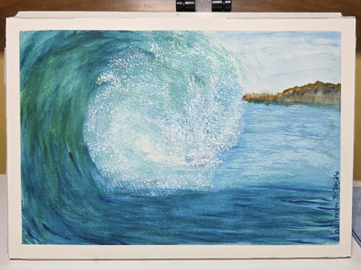
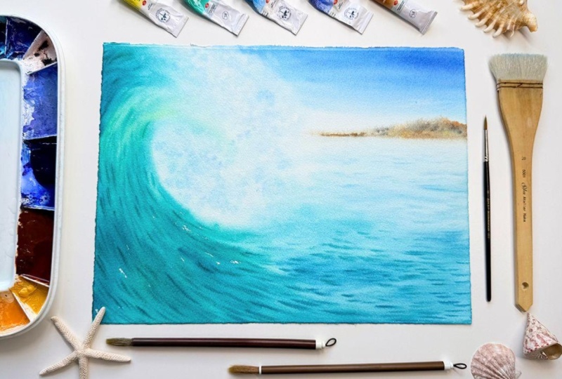
1. Intro to Crashing Wave: Have you ever wanted to learn how to paint
crashing waves, but was unsure how to
create soft transitions, smoothly blending colors
and beautiful sea foam. In this class, I will
show you how to paint beautiful crashing waves using the wet and wet
technique in watercolor. To achieve that, I'll
teach you how to use the la prima method all
painting in one go. I'll show you how to learn to control watercolor
using this method, and how to unlock endless
possibilities before you. Hi. I'm Tornodva and I'm
a watercolor artist, art teacher, and mom of two
gorgeous kids wonderful. I love painting vibrant
and expressive seascapes, landscapes, and
wildlife animals. I'm super passionate
to teach you how to do that in easy and
effective ways. I love sharing with you
all my tips, techniques, and secrets so you can learn watercolor in easy and fun way. In this class, I'll
walk you through the entire process
from start to finish. We'll explore all the materials
do using this class and I'll guide you step by step into every decision that I
make and why I do it. We'll learn how to
create soft blends, how to create contrast with
subtle changes of color, and even how to mix your paints to create
cohesive looking paintings. I'm super excited to show
you how to learn all of that using the easy and
beautiful la prima method. Are you ready to learn with me, then gather your paint supplies and let's just jump right in.
2. Materials: This lesson, we'll use a quarter imperial sheet for coal paper or
approximately a free. But if you want to
use a smaller size, that will be perfectly fine. My personal paper of choice
is under sweater for 300 GSM or 140 pound
code press W coal papa. But if you don't
have it, you can use any professional grade
papers such as Arch, honey Mueller, Bohn,
C Windsor and Newton. I would recommend any I'll use my standard plastic
wood color palette, and you can see all the
colors on my palette here or check them in the resources
section of the class. I'll use one hake brush, two round calligraphy brushes, but any medium sized round
brushes will do the job. I will also use a smaller
synthetic brush to paint the tiny shadows on the waves
and the distant island. We would also need
two jars of water, one to rinse off your brushes, and one to pick up
the fresh water. I'll use one towel and
some kind of kitchen roll. Plastic boat, but any non absorbent
surface will do the job. And last but not least
a Muslim square or any cotton towel that
doesn't hold a lot of dust. We'll use it to remove
all the excess, water and air bubbles from our paper
before we start to paint. Before we start painting, we have to wet thoroughly
our paper on both sides. If you use a brush, use the biggest brush that you have and drench your
paper very well. I'll usually wet my paper before painting for about
five to 10 minutes. That ensures that the
fibers of our paper are fully saturated
with water and we can paint for a very long
period of time before our paper dries
because we'll paint this entire painting using
the la prima method, or it's also otherwise
called painting in one go. If you have a bathtub
and don't want to spend those 10 minutes
wetting the paper, you can submerge it
there for 10 minutes, and it would be good to turn your paper halfway
through so we can ensure that is saturated
with water on both sides. Once your paper is proper wet, we can place it on
our plastic sheet and remove all of
the excess water and bubbles from our paper by pressing on it from the
middle towards the sides. We'll take our time and press well over your towel
in all directions. If you see that your
towel is wrinkling, just pull it gently
on the sides and continue pressing to remove all the water from your paper.
3. Painting the Wave: Once you're happy, we'll start creating two small
pools of paint, one with Viridian green
or any of your paints that will show pigment
green seven or PG seven. The second puddle
will be with lemon yellow or any cool
yellow of your choice. We'll start by adding a very yellowy green
mixture on our paper. The mixture will have a lot of water and will have
predominantly yellow color. With curvy brush strokes, we'll start applying our mix to the left side of our
paper exactly as I do. Then wash your brush and add clean water on the areas
around the curve of our wave so we can keep some soft edges on the
upper side of the wave. This is where we have the top of our wave and the splash or the little foam bubbles
that will form from the splashing of our
gigantic crushing wave. So we want to make sure that we keep that area nice and soft. Then we'll add some of the viridian mixed with a little bit of fallow blue and start adding it here and
there as shown. You can vary the intensity of the color and
the amount of it. So we have it a little bit more darker or light in
the different places. After that, wash your brush
gently without removing all of the color and add a diluted mixture back
on your painting. Here we want more soft edges
and light color values. So we are adding more
color with a large brush, and we can continue to
add more yellow blue. While continuing to
cover the bottom parts, make sure to keep a few gaps of white paper shown
in your paintings. That will create more interest. We can also use our
largest brush and smooch a little bit of the color by using
just clean water. This will prolong the wave. You can see that where I have pulled the
color, lighten it up. But we are still continuing
the form of the wave. So we have a peak on top, and then we have elongated
part on the bottom. Here, you can see
that I'm adding a little bit more paint
to my brush and adding more intensity on some
places and leaving some of the gaps still visible and some of the places
a little bit lighter, which will bring a lot more
interest to our painting. Just keep switching
between the two brushes. One that will be saturated
with more color. This was pale blue, and the other one is
our big hate brush, which is saturated just with
water and nothing else. If you need to
lighten up the color, you can use the hate brush
to lift up a little bit. Of the color, just
make sure that it's nice and damp and not saturated with lots
and lots of water. Otherwise, it can push
the pigment backwards. And here you can see I'm
using my soft damp brush, and I'm just softening
some of the edges. I adding a little bit of tiny little bit of the water
to the white of the paper, and that's keeping
it nice and moist and ensuring that we
won't create hard edges. After that, we'll add a little bit more
diluted paint mixture on top of our wave. And to do that, just add more water and add it on
a few places on top of the wave and on the
side where the foam will appear from the
crash of the wave. Now you can see I'm washing
my brush and I'm not removing all the
color from my brush. There is just tiny
little bit of color, which I wet in the in the heart of the
wave were exactly crushing, which will add a
little bit of color to the place where
the waves crashing, where all the foam is forming, and that will create a
little bit more interest. After that, we'll add more
pigment to our mixture and make sure that you have
more blue and green, and that will create deeper
turquoise color because our mixture contain less
water and more pigment that will automatically make the
pigments stay closer to the place where we paint them without spreading
further away. If there are some places where you want to bring
more light and color, you can add a little bit
more yellow and more water to keep them lighter. Or if you want your pigment to appear darker and
more saturated, you can add the complimentary
color of our turquoise, which in our case is orange, and preferably, you can
use cadmium orange. I'm not using it because I want to keep the vibrancy
of the wave. So I'm just using
Viridian green and I'm adding gentle brush
strokes one next to the other. To create this beautiful effect, we're just using our brush
and adding tiny little lines. So these strokes are super thin, short and intense
here and there. And don't forget you can always change a little bit of
color if you're fancy. We have a lot of time to work on our painting because
we water it down, so you don't have
to rush at all. Now I want my brush to
hold a lot more water, so I switch to my soft
white coat brush, and I can even soften some
of the edges with it. Once we are happy
softening the edges, I want to show you one of my favorite techniques for which one we need a soft
damp hair brush. We'll be just dabbing
the bristles of our brush perpendicularly
on the paper. That splits the bristles onto clumps of hair and
creates great effect. Like you're creating hundreds of soft sass platters on your wave, but a lot more
controlled and fun. You can place them below
the tip or the crest of your wave and around
it and create the effect of sea foam
forming in the air. It should look white and frothy, but also want to
introduce a little bit of color so we can create a
little bit more interest. When you load a little bit
of color on your hack brush, don't load your brush
on the normal way. Instead, just dap
your brush into the paint the same way as
your painting with it. Once you have created a
good amount of seafm, grab your medium size
brush and you can add more darker and
thicker turquoise line, subjecting the
movement of the water. We can also add a little
bit of Identrin blue to deepen the color and make
the lines more pronounced. You can paint with short and
quick brush strokes which will make it more inviting and more interesting
to the viewer. Once you're happy with it, you can just switch to our
hack brush and once again, add a little bit of water on the background where our
paper is still white. And now we want to paint the
water in the distance going towards our imaginary
horizon line and where we place our island. I have also applied
a little bit of clean water to the sky area
to keep it also moist. And when I do that,
I always remove the excess water from my
brush and keep it just damp. And this way I won't push the pigment that we
already have applied away. Here we use our
medium size brush, and you can soften some
of the darker strokes. Just spread the paint
gently and dap a little bit of the
water into it without leaving hard lines that
will ensure that you have more time to focus
on painting the sea. Just make sure that when
you're taking a pigment, always you don't introduce any
extra water to your brush. You just use dry
pigment or mostly dry, and you can always remove the excess water on
your paper tissue. This way, we are using
the water on our paper, and the pigment on our
brush is nice and dry. It is still nice and soft because of all the water
that we have on our paper, we still have a lot of
time to work on it, but we can ensure that Um, we can just use dry pigment
and add all the interests. Here I'm just adding a little bit more water to the upper part of the painting, so I keep the sky moist and grabbing dry
pigment with my brush. As you can see, there is just
dining little bit of water. And a tiny short lines with it. If you feel that your pigment
is not strong enough, you can always reload
with more pale blue and pale green and make your pigment a little bit
thicker on your palette. And you can always also
use your soft dumb brush. As shown here, I'm using
just the gold brush, and I'm just softening
the tip of the wave. I'm not introducing
any more water here. I'm just using soft dam brush and just softening the pigment. So we're dispersing the pigment without disturbing it or
pushing it backwards. Now, I just grab
a little bit more of the turquoise mixture and I'm defining the wave a little bit because we have
all the water there. It will keep the
edge nice and soft, but it will be a little
bit more defined. Here you can see a Mentin a
little bit, a French tamarin, and we'll add that mixture to the sky and adding even more ultramarine and that contrast of warmer pigment to the top of our painting compared
to the color blues. In the wave will create a very lovely contrast
in the painting, and it will keep a little
bit more interest. Once you add the pigment, don't forget to use your soft gold brush or
any soft brush that you have available and keep the line where the sky meets
the wave nice and soft. Here I'm adding even more
French chamarin to the sky. And I'm ensuring that the contrast is even
more pronounced. And once again, I'm taking the soft hair brush and softening the edges
nice and gentler. There is one more thing
that I'm not showing, but I want to mention if you
have some excess paint or water around your
pinching between the pinching and
the plastic sheet, you can grab a little bit of paper tissue and wipe it around so it won't come back to your painting and push
the pigment away. And if you have such a hair falling down from your
brush, as you can see, you can move it gentler
with your brush and soften up the pigment
once again with your brush. Our paper is really
saturated with water, so we can move the
pigment around easily and we can also soften some edges. We can blend the colors
gently, as shown earlier. And here I'm grabbing
my hig brush once again using just damp brush, and I'm positioning
it perpendicularly to our paper and just dabbing
gently on top of the paper. When you're using
this technique, make sure that your brush
is damp instead of moist. I always keep the bristles
split into clumps. So the hairs are creating just gently dots instead
of making lines. At this stage of our painting, we have established the base. So I'm just loading up my
brush with dry pigment, and I'll start
forming the C itself. To do that, make sure
that you have loaded your brush with dry
pigment and move it from the bottom of the page
towards the horizon line. So we want to have the most
saturated pigment towards us and the lighter pigment going towards the horizon line, which is creating
the sense of depth If you feel that your se
doesn't have enough pigment, you can always add a little bit more just to make it a
little bit more pronounced, more visible, and you are not keeping your
paintings Ora light. So by adding a little
bit more pigment and softening goes, we can ensure that our
seascape look cohesive enough. Once you're happy with
establishing the way how the seas skip and the
wave look together, you can grab a thin
round synthetic brush, which hold by the shape, and it holds a lot less water. We'll load it with fellow
glue and fallow green, creating a beautiful
fellow aquois colour. I need to ensure that our
lines are a lot thicker. You can see that I'm
not adding any water, so I'm ensuring that
the pigment is nice and creamy and doesn't
hold a lot of water. The only water that I have
on my brush is the water from loading it before
adding all of the pigments. O. And then we can start creating small lines following
the shape of the wave. Don't worry too much if you
drop your brush at this stage because our brush is not
loaded with too much pigment, and we can always soften it with our soft had brush
if we have to. But otherwise, because
we are creating the deeper colors in our
painting at the moment, everything should stay in one place and the pigment
won't be disturbed. If you want to create a
bigger sense of depth, you can try to keep the
lines closer towards you, a little bit bigger and the lines are closer to the horizon, a
little bit smaller. But at this stage, everything
it's about having fun. Here we are at the
very last stage, so you can add a
little bit more yellow if you want to warm up
the color a little bit. And if you want to
create deeper color, you can always add a little
bit of cadmium orange would make it a little bit less vibrant and more
natural looking. To keep the interest
of the viewer, you can always add
a little bit of French tamarin to warm
up the color as well. And you can defer to have more blue or more
green into your color. When you're going up towards
the crest of the wave, make sure that you're
keeping it a lot lighter. You can do the
pigment a little bit. And if you are doing so, just add a little bit of water, and we won't put our brush
directly onto our painting. We still don't want to introduce any more water so to do that, we can just take off the excess water on a paper
towel or on your cotton rack, make sure that you
remove the excess water, and then you can paint with
your brush on your painting. So once you are going up towards the top of the wave or
the crest of the wave, you want to make sure that, yes, we have a little bit of depth, that is made of the shadow. But these small
lines they will get lighter and lighter because this is where all the
air is coming up, and we want to make sure that we leave space
for breathing. Regardless of what part of
the wave you're painting, if you feel that you have way too much pigment
here and there, you can always clean the pigment and pick it
up with your damp brush. Just make sure that you're
keeping it nice and dry. It doesn't have
much water at all. And you can always remove all the excess water
on your cotton rack. And if you feel that you have
introduced some more water, you can use your
fan brush to fan out that and you can add
extra pigment afterwards. Just make sure that you
are not introducing more water because that can ruin the painting at this stage. There are some spaces on your
paper that already drying. Here you can see that I'm just adding a little bit
of light pigment. So I added more water. I remove the excess water
on my paper tissue, and now with a slight pigment, I'm just adding super light and short waves because they are getting
towards the horizon. The closer we are
to the horizon, the waves will be
shorter and smaller. Mm.
4. Painting the Island: Once you're happy
with the way how your wave and the sea look like, we can just go and grab some apples yo and start painting the distant
island on our painting. My naples yellow is
by Windsor Newton and pigment white six
and pigment brown 24. And I'll use just super
fin consistency of paint. So I'll start with adding a little bit of naples yellow
and a little bit of water. And if you feel that your
consistency is very water, you can take off a little bit of the excess water
on a paper towel. And start drawing the line
of your distant island. You don't have to fill up
all the gaps inside because we'll add some extra colors there to add a little
bit more interest. But we just want to
establish the base of our island with
the naples yellow. If you don't have any
naples yellow available, you can use some raw
sienna or raw amber. You can use yellow oka or any
warm yellow of your choice. Here you can see
that I'm not super happy with the way how
my island look like because my line is
not straight as I never put a pencil
sketch in advance, and you can totally do that. You can always at your
pencil sketch in advance. Or you can even use urula
as I'm showing you here, make sure that you are not pressing the ruler on the paper, and you are not creating any marks or crevices
on your painting. By doing so, because
they will be visible and it won't
look nice, too. It will be very, very
prominent if you have any crevices at this
stage of your painting. Here you can see I'm adding just tiny little bit
of naples yellow, and I'm starting to add more and more burnt
sienna into my mixture, starting with tiny little bit of burnt sienna in
the beginning and adding more and more as I go further and further into
painting the island. Here, that right
side of the island, that is a little bit higher. I've painted mainly
with burnseno and I'm softening the end of the island
with my soft coat brush. Now, I will lift the pigment on the island to
settle a little bit, and I'll use my soft
calligraphy brush on the same way as I was
using the cage brush. So I will split
the bristles into clusters of hair and use the
same dry dabbing technique. As we always using
with a hake brush, and I'll just dab a little bit
of pigment here and there. Here I'm making sure that my
pigment is not very deep. I have a lot of water, and I can take all
the excess water onto paper towel or on
my cotton rack. And you can also soften a little bit of
the color pick up a little bit of the extra
color with your fan brush, and that will make sure that the foam is not deeply
colored because essentially, we are just painting the
shadows of the drops. Now the light brown pigment
on our island have settled, so I grab a little bit of ultramarine and add
it to the ban sienna, so I can create deep brown by using exactly
the same colors. So I'm just adding
tiny little bit of French ramareno the Bnciena. Make sure that it's dark
brown instead of dark blue. So it's leaning a lot
more towards the brown, and that will create
the nicest contrast in our painting
because there will be an extra color that is on the island instead of all the blues that
are in our painting. Here, you can use your
smallest brush to add the pigment and the
soft coat brush or whatever soft brush
you have available, just to soften the edges around the island because
we want to make sure it looks very nice and air
is far away in the distance. As you can see that I have added a little bit extra
water with my brush, which was not intended, so I'm using my fan brush, and I'm just fan out
that extra water. You can add a little bit more pigment to the
front of the back. Just focus on your own painting and keep one eye on
what's going on on your paper and on your palette instead of focusing
entirely on my painting. If you feel that you need to add a little bit more color to your eel oned or a little
bit more color to the wave, you can still go back and forth. Whilst you still have a little bit of sheen
on your painting, you can continue adding
dry pigment to it. But you just have to make sure that you're
not introducing any more water because that will create a
cauliflower effect. And we are almost ready
with our painting, so we definitely don't want any cauliflower effects
to our painting anymore. Here I'm just adding tiny
little bit of super light blue. Below the island,
you don't have to. If you feel that your painting
looks good at this stage, you can just let it dry. And that's it. You don't have to touch anymore. I just feel that my painting is lacking a little
bit of colodm, so I'll add tiny
little bit of bloom, but you can see it's
just super transparent. And even though
I'm always wiping my brush on paper towel
and ensuring that it's super soft and
light and I'm not introducing more
water just to be completely sure I'm
using my fan brush, and I'm gliding it gently
on top of the paper. And this is ensuring that I
will remove I will pick up rather any excess
moisture that is on my paper with the soft fan
brush which is completely dry. Here, I'm just adding
some splatters. I just loaded my
small synthetic brush with a little bit of water. I'm just plattering clean
water onto my painting, and it's just the
area where I have the foam formed on the painting. Here I'm also adding tiny little bit of color
on the same dryway. My resources are split into
clusters of hair again. So I'm not making
uniform shapes and it's completely randomly putting
the color on the foam. Mmm. And once you're happy with your painting, you can take your hair dryer and dry your
painting completely. You can settle the pigment on the top of your
painting by starting to dry your painting with the hair dry directly as it's sitting
on the plastic board. And once it starts drying, at least the top layer
of your painting, you can take it out of
your plastic sheet and you can fairly dry it on both sides. It will start bending
a little bit. That's perfectly fine.
Don't worry about it. Once it's completely dry, you can spray the
back of your painting and put it under
a stack of books, and it will be perfectly
flat once it's dry.
5. Thank you for joining + a Bonus: So much for joining
me to this class. I hope that you enjoy exploring la prima method and learning
how to paint in one go. I cannot wait to see what you have created
into this class. Don't forget to share your painting in the project
section of this class. And if you are
sharing it online, please don't forget to tag
me a Reals underscore art. By sharing your paintings in the project section
of this class, you are giving yourself
a chance to receive a personalized feedback on your painting and get featured
on my Instagram account. By doing that, you are also helping a fellow
artist that may feel unsecure in their abilities and show them that
everything is possible. Please consider
leaving me a review. This helps me to learn what you did like in today's class, and how can I make
the future classes even better for you? I can't wait to see your
beautiful paintings. Have a wonderful day
and happy painting.
 Ralitsa Arnaudova, Watercolour Artist