Transcripts
1. Introduction: Have you always wanted to learn more about Copic markers but didn't know where to start? Or do you already own a whole stash of them, but want to brush up on your skills. Or maybe you always wondered why some colored images literally appear to pop off of the page, but you have no idea how to get that effect yourself. If you answered yes to any of these questions, you're in the right place. Hi, I'm Laura Lee Griffin and I'm a certified Copic marker instructor that has been teaching Copic coloring classes for the last 10 years. This is the course that I wish was available to me 10 years ago. I have a passion for Copic coloring and I'm so excited to give you the knowledge that I've learned so that you can take your coloring to the next level. During this class, we'll cover all the essentials to get you started. The class is divided into three parts. In part 1, we'll get to know your markers. We'll discuss what makes alcohol-based markers so special. The different styles and types of Copic markers that are available. We'll demystify the Copic numbering system so you know how to choose colors that blend well for your projects. We'll talk about the best paper and inks that will give you consistent results. I'll even demonstrate how to replace the nibs and refill the ink inside of your markers so that they can last you for years. In part 2, we'll practice six basic blending techniques that I use in my coloring every day. I'll be showing you clever, budget-friendly ways to stretch the use of your markers as you grow your collection. We'll chat about the colorless blender and its uses and discuss the three biggest mistakes that beginners make just so that you can avoid them. In part 3, we're going to dig into what can make your color images really pop off the page. We'll be discussing how to achieve contrast in your work and we'll combine the techniques that you've learned throughout the class to create your final project. Coloring a downloadable butterfly illustration that I've drawn for you that's available in your class resources along with lots of other great freebies too. We'll add dimension to your butterfly so they appear to be flying off of the page and we'll turn the finished image into a thank you card for someone special. Ready for some fun? Let's get started.
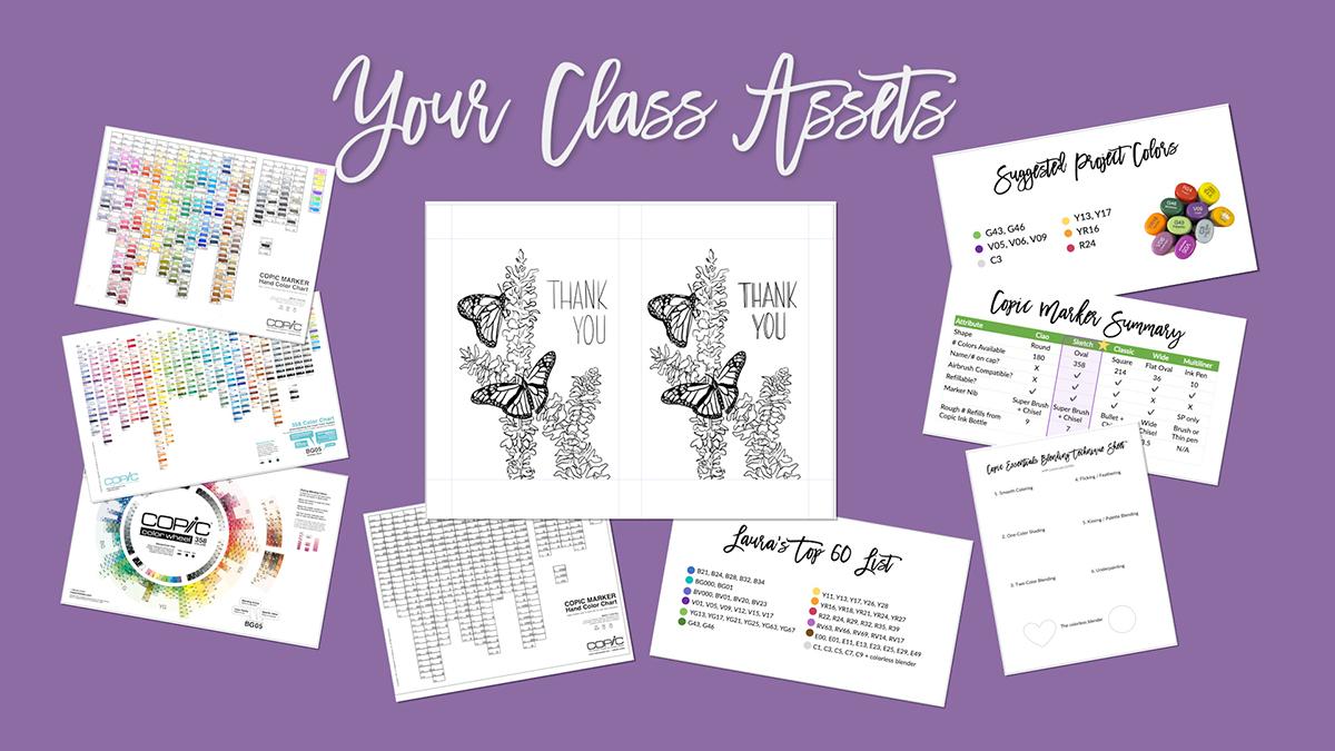
2. Your Class Project: The final project for this class is a beautiful three-dimensional butterfly card, that combines many of the techniques that you'll be learning throughout class. You're also welcome to apply the techniques you'll learn to color any other stamp or illustration that you'd like. If you want to follow along with the butterfly project, I suggest using these 10 colors. Now as we go through the course, however, you'll learn how to pick and choose colors that blend well together, so you may be able to substitute some colors for others in your stash. Now, let me show you where to find all of the class assets. These will come in handy throughout the class, and you can download them by going to lauraleegriffin.com/bonus. Once there, scroll down and enter your email address to unlock your access, and you'll be taken directly to the class Dropbox folder. You don't need a Dropbox account to access these files. You can download them individually or just click the "Download" button, and all the files will download in one-click. Here are the files I'm providing you today: the Copic color wheel, two Copic color charts, a blank reference guide, a list of my absolute fav 60 colors, a technique sheet, a marker comparison chart, the suggested colors for the class project, and my very own hand-drawn butterfly illustration. I'm including the class resources link in both the Project and Resources section, as well as the class description for easy access. Once you've finished your project, I will love to see what you've created. For easy sharing, make sure you're in a browser, not the app. Go find the big green Create Project button on the Project and Resources tab. You can add a description and images to the project, as well as upload a cover picture at the top to show off your work. Don't forget to look at other fellow artist projects and leave a kind word, if you can. To wrap it up, go to lauraleegriffin.com/bonus to download your assets, follow along with my project or you can take the techniques you've learned and complete your own, and don't forget to post in the student gallery so that we can see what you've created. Let's move on to part 1 of the class. Up next, we're going to talk about getting to know your markers.
3. Part 1: Getting to Know your Markers: Welcome to part 1 of Copic essentials. In this section, let's dive into getting to know your markers. You'll learn not only what makes Copic special, but all about the different types available and what the heck those letters and numbers on them actually mean. I'll teach you about compatible ink and paper, storing your markers, how to refill them, how to replace their nibs. This info is important because it will help you understand and care for your markers so that they will last you for years, which helps save you both time and money in the long run. Let's get started. Up next, we're going to talk about why Copics are so special.
4. What Makes Copic Markers so Special? : Let's talk about why Copics are so special. First of all, they're alcohol-based, low odor, and non-toxic. What I love about the alcohol-based markers is that they evaporate quickly once they're on the page. What that means is, you're able to blend them several times over without it damaging the paper like a water-based marker might. The quality control and consistent color is amazing on Copic markers, they test every marker as it leaves the factory, and I know that when I grab a Copic color or a refill, it's always going to be consistently the same, which cannot be said for all brands. The ink inside of Copics is refillable and you can replace the nibs. What that means is, you can have markers for years and just replace those pieces to it. Once you make an investment in the marker itself, you'll be able to use it again and again and again. Certain Copic markers come with something called the Super Brush nib, and it really is super. It's my favorite thing about Copic markers, and the reason I come back to Copics again and again, and you're going to learn a lot more about the Super Brush nib in this course. Finally, there is a Copic airbrushing system. It can be used either with compressed canned air or with an air compressor, and there's a gun that certain types of markers can fit into, and then you can airbrush with them for some really cool effects. Up next, we're going to talk about the types of Copic markers that are available.
5. Types of Copic Markers Available: Let's talk about the types of Copic markers that are available. There are five main types of Copics. The Ciao, the Sketch, the Classic, the Wide, and the Multiliner pen. But before we go into those details, let's just talk about the basic anatomy of the marker. All Copics have what we call a barrel, which is the center part of the marker that houses the ink inside. Most of them also have two tips on either end. We call this marker nibs and as I mentioned before, they're replaceable. It's important to note that the gray line on one side of the marker, basically gives you a hint that it's the pointed end and the other side with no line basically tells you it's the broad chisel end. There's even a little tiny diagram on the side of the marker to tell you this, but it's really hard to see. If I had a nickel for every time I open the wrong end of the marker before somebody told me about the gray line, I would be a millionaire, so learn from my mistake. Now I want to go through the pros and cons of each type of marker. We're going to start with the Ciaos. The Ciao marker is the smallest barreled marker that Copic makes. It's a round barrel that comes in 180 colors. It has two tips to it. One side has a broad chisel nib on it and the other side has a super brush nib. As I mentioned before, that's my favorite thing about Copics. That's really important when the marker has that nib available on it. It's also a budget option for the super brush nib because it is a smaller marker that holds a little less ink, so it might be a couple of $1 cheaper than some other options. The cons are that it holds less ink and it has to be refilled more times because of that, there's no name on the cap. I find that pretty difficult for when you're storing a marker and you want to grab a specific color, all of the caps may look like they're roughly the same color, so you're going to have to pull them out, look at the side of the marker and see up. Yes, this is YG41, the one I wanted. The Ciaos are not airbrush compatible, which means they don't fit inside that Copic airbrush gun in that system. There are also fewer available colors for the Ciaos than some of the other options. The Sketch is the second marker I want to talk about, and the Sketch is an oval-shaped barreled marker. It comes in 358 colors and it has the exact same nibs as the Ciao that we just looked at. There's the broad nib and the super brush nib. The pros are, this one has the name on the cap, so it's very easy to see when you store it and know exactly which marker that you're grabbing without having to pull it out and look at the side first. Again, it has the super brush nib that we love, a really comfortable oval barrel that holds quite a bit of ink more than the Ciaos. It's airbrush compatible, so it will fit in that system if that's something you might be interested in doing in the future. It's available in every single color that Copic makes. There really aren't many cons, but it is slightly more expensive than the Ciaos. It gets my gold star every time. This is what I personally use and what I personally recommend to all of my students. The next marker I want to discuss is the Classic Copic marker. The Classic Copic marker is the original marker that Copic made. It comes in 214 colors and it has a square-shaped barrel. The first nib on the top here is that medium broad chisel nib, which is the same that was on the other two markers we looked at. But the other side of the marker does not have the super brush nib, instead it has something called the bullet nib. Now, what's good about that is, it's a hard nib that's really great for fine details. The barrel of this marker is really large, which means it houses or holds a lot of ink before needing to be refilled. It's airbrush compatible and it'll fit in that Copic airbrushing system. It has the name on the cap, so it's really easy to find when you're storing it, to know exactly what color you're grabbing. But the main con is, there's no super brush nib on this marker and it will not fit inside of the specific nib holder that this marker has. For me, that is a deal breaker for me and this is not a marker that I recommend personally. There are also fewer available colors in this marker than the Sketch. The next one up is the Wide Copic marker and it does exactly what it says. It is a really wide marker and instead of being double-sided, it's only single-sided and it comes with a really huge chisel nib on it. Now, it used to come in 36 colors, but they were discontinued. Now, it's only available as an empty marker that you can fill with whatever color you choose. It's great for laying down large areas of color like a background, for example, but honestly it's not really ideal for much else. I have a couple of them and I think I've only used them once or twice in 10 years. Plus just keep in mind if you purchase this marker now, it requires inking to utilize it, so you'll have to have a read that you can then fill the marker with. The last Copic I want to talk about today is the Multiliner pen. It's actually not a marker, but it's a pen. It comes in 10 different colors. It's perfect for sketching your own illustrations and the ink inside does not bleed with Copics. It works beautifully with them and it comes in so many sizes. As you can see here, you can get the tiniest little line and nib with a 0.03 or you can go all the way up to a thick brushstroke variable line. The cons with this pen is that the smaller nib will wear out quite quickly and only the SP version is refillable. This version on the bottom has the aluminum barrel, that version you can replace the nibs in the ink cartridge on, but the top version is one that you will have to throw away when it runs out of ink or if the nib goes bad, it's disposable. Now, here's a summary for you of all the Copic markers that we just discussed. What you'll see is everything from the number of colors available to whether or not they have the name on the cap. I'm going to provide this in your class resources, so you can reference it again. I've even included the rough number of refills that you can get for each marker from one Copic ink bottle. What you'll see is that the Sketch marker wins and checks all of the boxes. Again, that's my favorite one and that's the one that I highly recommend. You may also want to pick up a Multiliner or two if you'd like to illustrate your own work. Lastly, I just wanted to remind you that even though we've just talked about how these markers come in more than 350 colors, you don't need them all to start out. You're going to want to build your collection in a way that works for you, which we'll talk about in an upcoming lesson. For the butterfly class project I meant demonstrating today, we're only going to use 10 markers and these are the 10 that I recommend. Now, you can even get away with just the V05 and the V09 and not using the V06 or perhaps you have other colors in your stash that you'd like to substitute and use instead. We'll talk more about choosing your colors later in the course. Up next, let's demystify the Copic numbering system.
6. Demystifying the Copic Numbering System: Let's talk about the Copic numbering system. What the heck do the letters and the numbers actually mean? The letters on the Copic marker stand for the color family. B in this example equals blue. The first number that's on the marker represents the blending group, and that means the saturation. How vivid or saturated the color is, or how desaturated it is if it has more gray in it. Then the second number stands for the value, which is the lightness or darkness of the color. We'll go into these in more details and I'll give you examples. The letters represent the color families, and here are all of the color families that Copic makes. Everything from E, which stands for earth tones. Think of all of your browns, and B is for blue. You've got blue, violet, violet stands for purples. You've got your pinks in your red violets, and so on and so forth, all the colors of the rainbow. Then you get to the grays, and they have a selection of four different grays that are available. The C's stand for cool grays and those have a bit more of a bluish tint to them. Those are actually my favorites and the ones that I use frequently all the time. The W stands for warm grays, those are a bit brown or grays, they have more warmth to them. N stands for neutral, which is somewhere between cool and warm, but it's a little bit closer to the cool colors. T stands for toner gray, which is an off-gray that I personally never use. Then efforts for fluorescence and the fluorescence are highlight markers, and there are a couple of fluorescent colors that are really beautiful, but I don't use those very frequently. The first number, as I mentioned, is the blending group or the saturation levels. Let's see what that means. The lower the number for that first number on the marker, the more saturated the color is. Here's an example of a yellow-green that starts with a zero. That's the lowest number you can get. That means it's a really saturated or a pure color. Then the higher the number gets, the less saturation there is in that color, or the more gray there, in it. Now we're going to jump from a zero to a six. We've now have YG67 instead of '07. Notice how it's now turned into a mossy green. Then if we keep going, and that number jumps to a nine, YG97, it's even less saturated. Now we're looking at way more than olive green, that has a lot more gray in it. That's what happens when you move from a zero to a six to a nine. As the numbers get higher, they get more and more desaturated for that first number. The second number is the value. The value represents again lightness versus darkness. The lower the number, the lighter the value. In this example, this is a blue and it starts with a two, which means it's a pretty saturated blue. It's lower on the scale. But that second number is a one, which means it's really light. Now the higher the number gets, the darker that value gets. If I move to B24, now you'll see that that's more of a sky blue color, and then if I keep going to an eight now, It's a really dark color, but you'll notice it's a really vivid dark color because it's saturated, because that first number is a two. Let's talk about how you choose colors that blend well together. It's easiest to blend colors that are in the same color family and to the same blending group. That's that first number of the marker. Then you choose markers that are two to four digits apart for the second number. Here's an example of a highly saturated natural blending group. It's in the yellow family, and I've selected Y11 here, which could be used as a highlight. Y15 is what I call a mid-tone because it's a five-smack dab in the middle. Then Y19 is a darker shade and that would become a shadow. Y11, Y15, Y19 would blend really beautifully together naturally. However, you can break the rules. None of the colors that I used in this whimsical flower fit the traditional Copic blending rules. They break all of the rules and yet they still work together. Just know that you don't have to always use the specific rules that Copic might give you as a guideline. Up next, let's talk about which markers you should buy first.
7. How to Grow your Collection: We have to start the section off saying that Copic Markers are known to cause color addiction. Look at this beautiful array of colors that are the full gamut of the rainbow. I have to admit that I do get rainbowitis, and I am going to provide a copy of this official Copic color wheel inside of your class resources so that you can download and utilize it. The way that you read this chart is that the color families are listed with the letters all the way around the circle, and the stacks of colors are the blending group. Each blending group is stacked on top of each other, where the darkest color is at the bottom or inside of the circle, and then the lightest color is on the outside of the circle. Then the saturation level shifts from one side to the other in each of the color family groups. You can also see which types of markers are available and which colors by looking at the tiny icons. For example, the Sketches don't have an icon because they come in every single color that's listed here, however, if you were to purchase a Chao, you would be able to look for the small circle. If there's a circle inside of the box, then you know that that color is available in the Chao. How do you start your collection? First of all, you have to ask yourself, what colors make your heart sing? Are you drawn to saturated or desaturated colors? What subjects do you enjoy illustrating or coloring? For example, if you're someone who really loves to illustrate people, then maybe earth tones for hair and skin would be the right markers for you to start with. However, if you're really into nature and flowers, then maybe greens and floral colors would be more appropriate. I would start off by selecting 2-3 markers from several different blending groups that you love. A light, a mid-tone and a dark value would be best, and a selection of cool grays, like C1,3, 5, 7, and 9. You do not need to buy all of the colors in the gray spectrum, every other one works perfectly and you do not need to purchase a black marker because C7 and C9 will become the blacks that you use. I'd also suggest getting a colorless blender. I'm going to provide you a list of all of my personal favorite colors in the class resources. Now, I tend to be drawn more to saturated colors than desaturated, so of course it's all personal preference, but those are the colors that I return to again and again for my coloring and I'm happy to share those with you. It's also worth mentioning that Copic makes quite a few different sets of markers that you can buy. Personally, I don't suggest going that route, I suggest that you look for the colors that call to you and buy them individually. If you buy a big pack of markers or a big set of markers, you'll probably end up having some that you just never use. It's just not an efficient use of your money and there will be other colors that you really want that aren't included. I would recommend that you just buy them individually instead. Once you've started purchasing or acquiring different markers, it's really helpful to create a color reference guide for yourself. Here is a picture of my personal one. I am including in your class resources a blank or empty chart that you can print out and I would print it on Copic compatible paper, whichever you plan to use in the future. We're going to talk about choosing the right paper in our next lesson. Fill it in as you grow your collection. I'm a bit of a geek, I store mine in a plastic sheet protector because you never know when accidents happen and I don't want to have to redo it anytime in the future, so I go ahead and keep it stored and place it in the top of my Copic box and I refer to it all of the time. The reason it's important is that, you want to know what the colors look like on the paper that you normally use, so when you go to choose colors, I can look at this reference sheet and know exactly what that yellow looks like or what that green will look like, and I can pick colors that I think go well together. It's so easy to do when you create a reference guide for yourself versus trying to look it up online or make a guess based on the caps, and the caps never look like what the color actually looks like on paper. Another cool thing to know is that Copic has a free Copic app. You can download it for Android or iOS and you can track your collection, which you can see here in the first picture. You can also look at, what all colors are available in each of the marker types? What's really cool is that you can view realistic color swatches, which is what you see in this second image. That's really great if you don't own the markers yet and you want to know, what is this marker really look like on paper? It might not be the exact same paper you're planning to use, but it'll come close enough to tell you what that color will look like. Next step, we're going to talk about how to choose the right paper to work with.
8. Choosing The Right Paper: All paper is not made equal for alcohol-based markers. Here's what you want to avoid. Don't use regular thin copy or drawing paper. Don't use watercolor paper. Think about it, watercolor paper is made to absorb liquid that means it's going to waste a ton of your great Copic ink. If you already have some on-hand, I would use smooth, white cardstock instead that's preferably about 250 gsm. You can run a test on it that I'll show you now. I've grabbed a couple of scraps of cardstock from my stash here. The first step to this process is to take a pencil or a pen. I'm using a micron and to doodle a circle on each of them. Now, don't worry if your circle is wonky. We're not into perfection here, it doesn't matter for this exercise. The next step is going to be to grab a Copic marker that's really juicy preferably a midtone and you're going to fill in each of these circles. Now the goal of this exercise is to see how the paper fibers interact with the Copic alcohol ink. You'll notice I'm going right up next to the edges as I color but I'm not going over the edge, just right up next to the edge. I am adding several different layers because I really want to coat the paper thoroughly and blend it to see what happens. Now, the first thing I immediately notice is that there is a lot of feathering outside of the lines here. That ink is going where I do not want it to go. Now, that means this is not a great Copic compatible paper. This particular paper came from a cheap ream that I found at a local craft store. The fibers are visible and rough on the paper and they're not connected in such a way that can hold that ink where I want it. It also bled through to the back of the paper underneath the copy paper and that's not ideal either. Although it is normal to see Copics bleed through to the backside of paper, you just don't want a lot of it to get on the paper underneath. That's also why I always work on cheap copy paper just in case. Now we're going to move on to the second scrap of cardstock and this card stock is very smooth. It has a coating on it and the color just lays down really beautifully here. I'm adding lots of juice again going right up to the edge but not going over it with several layers to see how the paper interacts. These fibers are a lot tighter and what I'm noticing is it holds the ink really well all the way around. I do have a little bit of feathering happening in that lower right corner. But it's really not bad enough to worry about and it's nothing like our first circle that we did. This is a paper that I would highly recommend if you flip it over it did bleed through but not quite as bad as the first but it bled through very evenly. When you put them next to each other you can see clearly the one on the left is the winner and the one on the right would not be considered Copic compatible. The one on the left is actually my favorite cardstock. It's called X-press It Blending Card and it works perfectly every time. You can get it in a pack of 25 or a ream of 125. My second favorite's called Neenah Classic Crest Solar White cardstock. It is not coded but it works beautifully with Copics and comes in 80 or 110 pound weights. Up next, let's talk about how to choose compatible inks.
9. Choosing Compatible Inks: There are three different types of inks you might use with Copics: the first is pen ink, and that's if you love to illustrate your own art work and color it in. The second would be an ink pad, and that's if you're a crafter and you really love stamping with rubber or acrylic stamps. The third would be printer ink, and that's if you like to print out a digital image or a digital stamp and color it in. We'll talk about each of these and my recommendations. Copic markers work great with these two pen inks. The Multiliner, which of course it would, because it's made by Copic. The second one is the Pigma Micron by Sakura, and I think that both of these work beautifully with it. The line holds with the Copic markers and it won't bleed. Really, pick up the ones that are easiest for you to find. Also, I would recommend getting maybe a couple of them in different widths. For ink pads, there is one ink pad that works every single time, and believe me, I have tried dozens of them. I've tried heat setting them, doing different things with them, but there's one works every time. So if it ain't broke, don't fix it. Get yourself the Tsukineko Memento. It comes in a larger ink pad like this or you can also buy it in a smaller Dew Drop size, and it comes in sets of all kinds of different colors. For printer compatibility, Copic markers always are compatible with any toner-based ink. So a toner-based ink would be something like a laser printer or a copy machine. It'll work 100 percent of the time. If you don't have access to one of those and you only have access to an inkjet printer, the answer is it depends. So you're going to want to run a little short test. To test your ink, you want to print out an image. Just print out a black and white image and let it dry completely, then you will color a layer of ink on top and look at it. Does it bleed like bad mascara? If it looks like bad mascara, then that's not a great printer for you to use. So here's an example of one that I printed on my HP ENVY printer, that takes type 61 ink, and that is not compatible. It does bleed. However, I also own a Canon PIXIMA PRO-100, and that particular printer works beautifully with Copic inks. So it just is a matter of testing out what's available to you, to see whether or not it works. Up next, let's talk about how to store your markers.
10. Storing Your Markers: Storing your markers is really easy with Copics. I get asked a lot, how should I store my markers? What angle should they be at? Should they be horizontal, should they be at an angle, should they be vertical? The answer is, you can store them at any angle you want, they're airtight which means it doesn't matter. Now, you'll see here the way I store my markers, I am a little bit obsessive about it, and I like having them in a pretty color order where I can easily find them. So I created this box for myself, and I store them vertically so that I know exactly what color I'm grabbing, and that I can see them very easily and then I store that color chart on top of the box. You want to avoid direct sunlight and heat because like many dye-based inks, Copics are not lightfast, so you want to make sure that you avoid direct sunlight and heat. That's why I like storing mine in an actual box. Then if your markers have been on an airplane at all, you're going to want to equalize them before you store them. What I mean when I say equalize, to equalize a marker, all you have to do is relieve the pressure inside by taking off both of the caps and letting it sit for maybe 20 or 30 seconds, and then you can put those caps back on and then store it. The reason you have to do that is it is an airtight marker, which means when the pressure shifts inside if you were to take off one side of the marker and then color with it, what'll happen is it'll splat out a whole bunch of ink at some point in the near future onto your page where you don't want it because that pressure has built up and now it needs to spill out somewhere. It's a waste of ink and it can also ruin a beautiful image that you're working on. Just know that equalizing is important to do if you've received a marker in the mail, a brand new marker that may have been on an airplane, or if you have taken markers on an airplane yourself. Another travel tip is to leave your Copic Re-inker bottles at home. They happen to be considered a hazardous material because of the alcohol content and a flammable material, therefore, you can't put them in your checked luggage. Up next, we're going to talk about how to refill your markers.
11. How to Refill your Markers: So how do you know when your marker needs a refill? It might if it feels lightweight, it has a splotchy or discolored nib, especially white spots on it. Or it has really poor ink flow and has basically lost its juice. If you take the chisel side and you just do a long stroke on the paper, does the ink skip? Is it not a full line? If so, it definitely needs to be re-inked. So there are two types of coping refill bottles that you might find. The first is the Various ink refill bottle that was manufactured prior to 2020. This is what it looks like. I have no idea why it's called Various ink. I don't think there's a specific ink out there, but that particular ink was manufactured during that time and it requires a special technique to fill your markers. The second type of ink is called, Copic ink, and those refill bottles are effective 2020. They're much smaller and they have a long nozzle on them, but they're much easier to store because of their size. They also have more of a see-through plastic on them, which makes it easier to see where your ink line is as you're inking. Before you refill, there's a few things you need to do. Always remove both caps, work on top of paper towels or scrap paper, and keep a bottle of rubbing alcohol handy for cleanup. So how do you refill your marker? It's super easy. You use the drip technique for various ink bottles and you use the insertion technique for newer Copic ink bottles, and I'm going to show you how to do both of them right now. Right now we're going to talk about how to refill your markers, and I'm going to show you how to do both the Various ink bottle as well as the newer Copic ink bottle. They have two different techniques associated with them. I also suggest that you have some tweezers handy. These happen to be scissors tweezers that I had available, but any regular pair of tweezers would work as well. It's a little bonus if they have a little bit of grip to them on the end. So how do you know if your marker needs a refill? As I mentioned, one of the things you can do is, run a test. I can see right now that this marker is dry. I can't even get the slightest hardly line of blue, even though this is a light color of blue, this is a completely dry marker. The tip of the marker is a bit discolored, you can see that. Also even on the other side, if I try to use the other side, I get very little ink coming out at the end. What I'm going to do is, first of all, I want to remove both sides of my marker and I want to work on top of some paper towels. You're going to twist off the cap. You're not going to pull it off like you do on the markers, you're going to twist it off. When you look at the side, you'll be able to tell on one side there are some little lines here, and these lines are the measurements of where the ink is. These are the CCs. I can tell that my ink comes down to about here on this bottle and if this particular bottle, refills a sketch about 13 times. I know that I only want to go down maybe two or three of these lines when I'm refilling the bottle before I would stop. The easiest way to do this, with the drip method, is you're going to hold your marker about at a 30-degree angle. I'm going to let gravity do the work for me. I'm going to basically touch the tip of the marker with my re-inker bottle, and I'm barely squeezing it, so one drop is coming out at a time. These drops are actually going to suck down into the barrel. Then I flip the marker to the other side and I continue, and add one drop at a time. Let me see if I can get a little closer for you, so you can see this in action. Now, if you hold your marker more horizontal, and you try to do this, it's going to start dripping and getting really messy everywhere. So you do want to hold it a little bit more vertical and again, let gravity do that work for you. You'll continue to do this four or five drops on each side rotating, and then looking to see where your marker is and how far down you've gone. Eventually, you will stop once you've hit the right place. If you overfill, what will happen is, the ink is going to start coming down out the bottom of the marker. When that happens, you're going to want to leach the fluid of the marker, some of the ink out onto your paper towel. Just let it sit there for a while and then do that before you put the caps back on. The reason for that is if you don't, what will end up happening is that the next time you go to use your marker and you pull one side off and start coloring that excess ink has no place to go but out on your paper, and you'll get a puddle of ink where you do not want it. So that is how you do it. You would go ahead and do that and fill it fully. You can always test it out and make sure that you're starting to get a better ink flow, which I'm now. Then I can put my caps back on and I'm done with that. I will take this, screw it back on and store my various ink refill bottle. Now, the other method is called the insertion method, and that's what the Copic ink bottle. This one also will screw off, but first, go ahead and take both caps off of your marker. But this time I'm going to use some tweezers, and I'm going to go ahead and take the tip, off of this marker. If you have a beautiful manicure, you may want to do this with gloves just to be on the safe side. But I'm going to pull that straight out and set it down. Now, you can see the inside of that marker goes right down into the sponge. I'm going to unscrew the cap, with my Copic ink bottle, it's got a really long tip on it that fits all the way inside. Then I'm going to gently squeeze to have the ink go directly inside of the marker. So that is how you do this one. Again, if it comes out the bottom, it means you've re-inked it a little bit too much, overfilled it. But, just like the other bottle, there are markings on the side of this bottle. I can look at where I started, and I know this bottle will fill my marker about seven times. I wouldn't want to go more than a 7th of the way down, or probably 2-3 lines. Once I'm done, I go ahead and screw the cap back on. I just need to reinsert the chisel end or the medium broad nib of my marker back into the top until it clicks right into place, and that's it, and you're done, super, super easy. There's a few other important things you need to know about to care for your markers. There are two things you don't want to do. Don't ever use your markers on top of paint because paint particles will clog your nibs. Also don't twist off the cap or you'll wear down that airtight seal. Always just pull it straight off instead. Periodically, you want to check the airtight seal of your cap if you're having any trouble with your marker, does it still click when you put that cap on? If you don't have that click, look on the inside and see if you have a whole bunch of gunk, and there could be a lot of dried ink stuck around the rim. Just grab some rubbing alcohol and some Q-tips and you can clean that right up. Then see if you still get the click. If you don't get the click at that point and the cap of the marker seems to be coming off very easily, you may have lost your airtight seal. If that happens, unfortunately, there's no fixing it, you're just going to have to buy a new marker. Up next, I'll show you exactly how to replace your marker nibs and just how easy it is.
12. How to Replace your Marker Nibs: Replacing your nibs is so easy. The first thing you need to understand though is when should you replace them. Is it permanently bent out of shape or has your nib lost its firmness? Is the tip dried out, fuzzy, or crusted over from failure to put the cap on firmly? Did you use it on a mixed media project on top of paint or glue by accident? If you did any of these things or you're noticing that your nibs look this way, then you probably need to replace them. You can buy nibs in packages of 3-10, and they're very easy to swap out. I'm going to show you how to do that right now. Now let's talk about replacing the nibs on your marker. This literally takes seconds. There are a couple of nibs on the sketches and chaus that are important to know. One of them is again the Super Brush nib. This nib has a pointed end on one side and it has a slightly flat end on the other. The flat end is going to go on the inside of your marker and the pointed end will go on the outside, and it's going to click into place around where this little line is. The Medium Broad Chisel nib looks like this. The bigger end is what goes on the outside of your marker and it will click into place right here, and then here is the end that will go on the inside of your marker. To go ahead and replace these, I'm going to go ahead and pop off the chisel side. Again, I'm going to use some tweezers or if you have gloves, gloves work perfectly fine as well just to yank this outside so I don't get the ink all over my fingers. Then I'm going to take this chisel end, insert it inside and pop it into place. Let's do the same thing with the other side. I'm going to open that up. This is my brush end. I'm going to pop that out, and I'm going to take the flat end and stick that right inside, push until it pops into place. Now, I will set this aside and this marker will fill up with ink on either end. Those nibs will get soaked up with the ink that's on the inside of the barrel. If it ends up already being a marker that needs more ink I might reink it at this time as well. That's how easy it is to replace your nibs. Congratulations, you did it. Here's what you learned in part 1. What makes Copic Markers special, the pros and cons of each marker type, how to navigate the Copic Numbering System, choosing colors that blend well together, how to grow your collection, Copic compatible paper and inks, how to store and care for your markers, and how to refill markers and replace their nibs. Up next, let's dig into essential blending techniques.
13. Part 2: Essential Blending Techniques: [MUSIC] Welcome to part 2 of Copic Essentials. In this section, we're going to talk about how to hold your marker, the awesomeness of the super brush nib and the types of marks it can make. We're going to practice six basic blending techniques that I use daily. We'll talk about the colorless blender and how it doesn't actually blend. We're going to discuss the three biggest mistakes beginners make so that you can avoid them. All along the way I'll be showing you some clever budget friendly ways to stretch the use of your markers as you grow your collection. Ready to get coloring? Let's dive in. Up next. How to hold your marker.
14. How to Hold your Marker: Before we practice our essential blending techniques, it's important to understand how to hold your marker, it is all about the angle. Let the marker nib do the work for you. For thin lines, you want to hold the marker vertical so that just the tip of it is touching the page. Then for thicker lines, you'll hold the marker more horizontal, which will mean more ink will flow out and be touching the page from the nib. Up next, let's talk about why the super brush nib is so magical.
15. The Super Brush Nib: I've mentioned before that my favorite thing about Copic markers is the super brush nib. Here's why. It's incredibly flexible. It's pressure sensitive, which means you can get really fine details or you can cover much larger areas depending on how much you're pressing on the paper, along with the angle of the marker like I showed you in the last video. As for the con, it's a little bit delicate, which means you cannot remove and reinsert it over and over again, which is why we don't use that side of the marker whenever we are doing re-inking. On the opposite end, you have the medium broad nib and that is durable. It's quite a hard nib which makes it great for ink refills. It also provides a pretty consistent straight line. It's great for airbrushing because that's the end you put inside of the airbrushed gun. But as for the cons, because it's hard, it's really inflexible. There's not a lot of types of marks that you can make with that end of the marker. I'm going to show you the types of marks you can make with both ends right now. I mentioned to you before that the beauty of Copic marker is this super brush nib. It has a pointed end, but it also has a fairly long nib, so you can get really interesting results. As discussed in our previous video, if you hold it vertical, you can get really thin lines. If you hold it more horizontal and more that nib is touching the paper, you'll get much thicker lines. We'll get into this more when we talk about basic blending techniques. But what's cool about the flexibility of this nib is that you can get a variable line as well. Depending on the amount of pressure you put down, you can have a thin line that turns into a thick line, that turns back into a thin line again. Thin line, thick line, thin line. That's all based on the pressure that I put down. Now this nib is flexible but you don't have to push super hard because the juice of the marker will come and flow naturally onto the page. So don't feel like you have to really press down super hard when you're working with it to get the results that you want. This is also really a great nib for brush lettering. If you happen to be a calligraphy artist or a hand letterer, this works really well for that. For example, you can do a monogram or a letter like this. You'll see that beautiful variables stroke because of this brush nib. Now, the other side of the marker has the medium broad chisel nib and it's really hard. What that means is that there's not a ton I can do with this. I can get these hard lines, but I can't get something with beautiful flexibility. I use this to do airbrushing because that's the end you put in the airbrush gun. But other than that, 99 percent of the time, I'm using the brush tip. Up next, let's dig into those essential blending techniques.
16. Essential Blending Techniques: Now it's time to practice blending techniques. I'm going to teach you six of my favorites that I use every day: smooth coloring, one-color shading, two-color traditional blending, flicking and feathering, which happen to be my faves, kissing and palette blending, and underpainting. If you haven't already, make sure that you download your technique sheet that's in the class resources. You can use that to color along or if you prefer, you can just use a blank sheet of Copic compatible card stock. Let's talk about six basic essential blending techniques. The first one I'm going to show you today is called smooth coloring. With smooth coloring, the goal is to have a really nice even blend. I can go back and forth like this with really thick overlapping strokes, or I can do some circles that are very, very tight together like this. What I don't want to do is have really big zigzags like this. I also really don't want to have big open spirals like this. As you overlap the color with different layers, it will become really uneven if you don't have that even layer of color going down to begin with. Basically, our goal is to have even layering, and we want to not do this or this, but really shoot for this one. Let's move on to one-color shading. For one-color shading, I'm going to use a red marker, and I'm just going to draw a little heart and fill it in. Then I'm going to let this heart sit here for about 45 seconds until it's dry. Then I'll come back to it. Now what we want to do is we want to go into our heart and just add a little swoop to one side. I'm just going to add a little curved swoop. What you're going to notice is that you end up getting a darker shade. The more layers you put with your Copic Marker, the darker that particular color becomes. For example, this is an R27 that I'm using. If I were to continue to add layers, this is going to turn into more of an R29, because it's getting darker and darker with each layer that I put down. The reason this is important is that when you're growing your collection, you may not be able to afford all of values that you want in a specific blending group. But you can get away with fewer markers sometimes and create shading just by using one marker. The next technique is called two-color blending. Two-color blending is a traditional Copic blending method, usually used with colors that are in the same blending group, but they don't have to be in the same group. We talked about breaking the rules, and we'll do some examples of that in a minute. But for now, I'm going to take a G43 marker and just lay down some color. Then I'm going to lay down a little bit of G46 next to it, which is a darker tone. Then I'll go back with my original G43 marker, and I'm going to color on top. Basically, what I'm doing is allowing these particles, especially in the middle where they overlap, to blend together. You also want to make sure that your markers are really juicy for this process. If there isn't enough liquid down, then the particles won't mingle together, and you won't get the blends that you want. Now let's talk about flicking and feathering. This one is my absolute gold star favorite. This is what I use every day. Probably 80 percent of the time that I color, I use flicking. The reason that flicking is great is that it gives you a ton of control over the value and the layering of your colors. I'm going to show you an example of how you flick. What flicking is, is it's a motion where you set your marker down on the paper, and then you flick upwards off of the page. You'll see here I'm flicking upwards off of the page. I can get a fat flick by holding my marker pretty horizontal, or I can get tiny little hairline flicks by holding my marker vertical. This is a really, really cool technique to learn how to use because we like having areas of the color that are darker and areas that are lighter. You can even feather different colors into each other. We talk about how traditionally Copic teachers will say you can't mix different colors together that are not in the same blending group, but I'm going to show you how you can break the rules and do just that. I'm taking a lighter color, this happens to be an RV02 pink, and I'm just going to add some flicks upwards. Then I'm taking a light blue, that's B00, and I'm flicking downwards into that pink. Where those two colors overlap, I get a really lovely lavender color. Know that this is completely doable. Let me give you a closer up view. Wouldn't this be great to illustrate cupcake icing? Just know that this is doable, and you can mix different color families together. It gives you such beautiful even coverage and helps you retain your contrast. You're able to retain your lights because you're not blending so much that you lost them. I just love flicking, and we'll be practicing this technique in our final project as well. The next one is called kissing and palette blending. Now the way that this works is that you can take two different color families, and you can put them together to get really interesting results. I'm going to try my orange marker, and I'm going to grab yellow. I'm going to kiss the tips of the two markers together. It doesn't really matter which side you use. When I do that and turn it over, you're going to see that there's some orange on the tip of my lighter yellow marker. Then when I flick, I get a lovely gradient of orange at the base of that color. Now don't worry, you're not going to run your markers as we do this. It's a very subtle difference that you see there at the base of the flick. But you could get some really beautiful sunflower petals or things like that using this technique. The only thing you want to be aware of is that when you're done, if you still have any color left on the tip, go ahead and wipe it on some scrap paper to make sure that when you grab that marker the next time, there isn't any of that ink leftover. You can also use this technique on markers that are in the same color family but might be really far apart, like V04 or V05 and V09. We can do something called palette blending. Now I'm just going to scribble on this bag with the darker color. Any piece of plastic will do as well. It just needs to be something that's non-absorbent. Then I'm going to take my lighter color, and I'm just going to pick up some color here. I'm going to do the exact same flicking motion that we did before, but I'm just grabbing the darker color off of the plastic and then flicking upwards. If I keep going, you're going to see that the color gets lighter and lighter and lighter, because this is the original V04 colors showing through. But when I take the V09 and mix it in, I end up getting a color that's somewhere in between the V09 and the V04. It's probably something closer to V06. This is another way, a great way of utilizing fewer markers to get more colors as you're growing your collection and you may not own that many yet. Now let's talk about underpainting. We'll start by creating a little circle, and I'm just doing it with my C3 gray color that we'll be using in the final project. I'm just sketching a circle, and I'm going to add a shadow to one side of this sphere. So a layer of gray, just plain C3. Now I'm going to grab my red marker, and I'm going to go right on top of this gray with this red. I'm going to fill in the circle that I drew. What ends up happening is we get a beautiful shadow and beautiful shading on the left side of the circle. All we did was use two colors. We have now desaturated the red a little bit and basically created almost a darker blending group. We started out with something in the R20 family, and now it's closer to probably something in the 4-5 range because we added that C3 underneath. This is another great way to expand your collection using cool grays or blue violets. As I mentioned before, I highly suggest getting C1, 3, 5, 7, or 9. Those happened to be my personal favorites, and they'll give you lots of flexibility to your coloring. Up next, let's talk about the colorless blender.
17. Colorless Blender: Let's talk about the colorless blender. It doesn't actually blend, but it's great for a few things. It's great for adding highlights, it's great for creating textures, and it's also great at fixing small mistakes. It won't fix any mistake, but it will fix some mistakes. I'm going to take you through all three of these and you can follow along on your technique sheet. Let's talk about the colorless blender and the cool things that it can do. There are three techniques I want to show you today. The first one is going to be creating highlights. I'm going to show you how we can take a color, I'm going to go back to my red marker again, and I'm going to fill in this heart. Just going to fill this in with some quick color. This is just an experimental exercise. Don't worry about it being perfect. I'm creating a little fence for myself here to color in, and then add some long strokes on top to even out the color. Next what I can do is take that colorless blender. The important thing to know about this blender is that it doesn't actually blend. It does these three other things instead. I'm going to start with my pointed end, and I'm going to come in here and just add a little swoop to one side, just like we did on the one-color shading exercise. Just a little highlight right here. This marker is basically full of colorless ink. The particles are pushing the colored particles around. You'll see that it continues to move for probably 20 or 30 seconds. The important thing to know about this colorless blending technique is that you just want to make sure that you rub off any of the excess color from your marker tip until it goes completely away, so that the next time you go to grab this marker, you're not going to have any red on it. As you can see, we've got some really cool highlights here. This is basically a way of making colors a bit lighter. You don't get quite the same blending as if you just used a lighter color to begin with, however, it does have an interesting effect. The next one I want to talk about is creating patterns and texture. I'm going to start off here with some blue, and I'm just going to add a patch of red next to it as well. Now what I'm gonna do with these is I'm going to create some textures. For the first one, I want to create some polka dots. I'm just going to add some dots randomly into the blue with the brush side of my marker. You'll see that these start to show up with some cool texture. Some cool little random polka dots. I can also take the chisel end of my colorless blender and I can basically stamp with it. Now in this red, I'm going to create a pattern of a brick wall. This is a cool little background texture, and I'm essentially just stamping in and holding it and wiggling for a few seconds onto the paper to create these faux bricks, fun. The last technique I want to show you with a colorless blender is fixing small mistakes. I'm not going to fill this whole circle in, but I just want to show you here where I've colored in a circle and I went a little bit outside of the lines and I want to be able to fix that mistake. Now you can't fix a lot of mistakes with a colorless blender, but you can take the chisel end of your nib and you can push it inwards. I'm going to do that now. I'm going to take my chisel nib, and I'm going to wet the paper and push it forward. Notice I'm not scrubbing back and forth. I'm pushing in one direction and I'm wetting the page and basically telling that green ink it needs to go back inside of the circle. Now, you have to be careful because if you really saturate the paper, you're going to end up with something like this where you can see a small little ring forming. It's not bad, but there's a tiny ring of color. Now, what I would do is allow this whole thing to dry and repeat this process a couple of times. It's better not to oversaturate the paper and just do a little bit several times in a row than to try to do it all at once. That's a way you can correct some mistakes. It's quite hard to do with reds and pinks and some other colors that stain, but it is something you can do with quite a few different Copic colors. Just experiment. That's how you can use your colorless blender in three different ways. Up next, we're going to talk about the three biggest mistakes the beginners make.
18. The 3 Biggest Mistakes Beginners Make: Let's discuss three common mistakes that beginners make. Mistake number 1 is not laying down enough ink. It's basically dry coloring and here's an example of some violets that I've used, some darker shades up to some lighter colors. What you'll notice is that I tentatively and very hesitantly put the color down. This is the flicking technique and you'll notice that there are spaces in between the flicks with no color. It's not blending together nicely. I perhaps I waited 20 or 30 seconds in-between colors too, and it's dried out a little bit so it really doesn't get me the look that I wanted. Now here's the exact same colors where I have put enough juice down. If you think about it, the color particles that are sitting in the liquid need to be able to move around and if you don't have enough moisture down on your paper, they're not going to be able to do that. So you do want to make sure that you put down enough color that you can blend those colors beautifully together. Avoid the one on the left and shoot for the one on the right. Mistake number 2 is over blending which is actually the opposite of mistake number 1. Mistake number 2 is basically putting too much ink down. Here's an example of a leaf that has some different types of greens in it. Some darker greens and some lighter greens and I just kept working on that leaf and working on that leaf and pretty soon I ended up over blending. What happens is all of the beautiful contrast I had in the first leaf is now lost. It's gotten darker and darker and darker with each layer and I also have basically only these blend tones left. There's no highlights and there's no shadows because I've gotten rid of them all. We want to avoid that one on the right and shoot for something closer to the one on the left. Mistake number 3 is staying in the mid tones and completely avoiding light-lights and dark-darks when you're choosing your colors. Here's an example of a rose that I illustrated and I colored it in quickly with just a couple of mid-tone colors. You'll notice it looks really flat and blend, it doesn't look interesting at all and it certainly doesn't pop up off up at the page. However, now when we look at the one on the right, you'll notice that because I have the dark-darks and some lighter tones mixed in with the mid tones. It now looks three-dimensional, it looks like I can smell that rose. A lot of beginners are really scared about using those really dark colors because they're scared of messing something up and that's why practice is there. You want to practice and you want to experiment and just know that the more you use those dark tones combined with lighter tones, the more you're going to see your coloring excel and you're going to be happier with the results because you'll have beautiful contrast. Shoot for the one on the right and let's avoid the one on the left. Congratulations, you did it. You've completed Part 2 of the course, and here's what you've learned. How to hold your marker for the best results, six essential blending techniques, several ways to use your colorless blender, and the three mistakes beginners make and how to avoid them. Up next, I'm going to teach you how to color images that pop off the page.
19. Part 3: Coloring Images that Pop off the Page: Welcome to Part 3 of Copic essentials. In this section, I'm going to teach you some tips and tricks to have your colors pop off the page. We'll be discussing the number one most important thing to achieve this, contrast. I'll take you step-by-step through how to achieve beautiful results making your final butterfly card project. Ready for some fun? Let's dive in. Up next, let's talk about contrast.
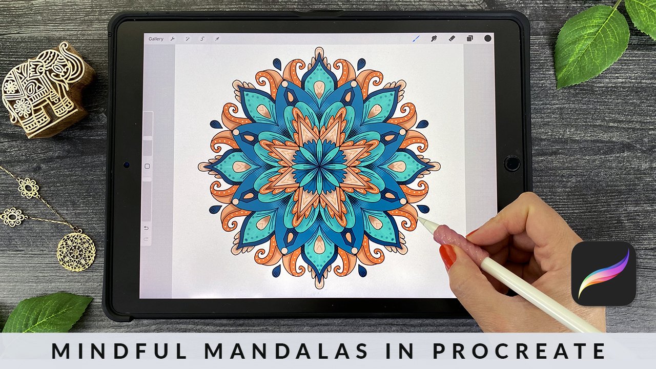
20. Let's Talk About Contrast: When we talked about the mistakes that beginners make, we talked a lot about the importance of contrast. Really contrast is one of the most important things to get an order for your image to be able to pop up off of the page. There are two types of contrast. One of them is value contrast, which is light colors versus dark colors and the second is color contrast, which is warm colors versus cool colors. Warm colors are your yellows, your oranges, your reds, and cool colors are blues and greens and purples and even some of the pinks. Here's an example of cool colors and warm colors in different rows. What you'll notice is when you put those next to each other, the colors really pop up off of the page. Having a green next to an orangey red, for example, or a blue next to a red are really going to provide you that color contrast. You also get value contrast when you look, for example, at the first row and you see those really light greens versus the really dark greens on the right and that will also help your image look fabulous. Here's an example where I've used these colors on the left and I have colored a mandala. What you'll notice is that the mandala really appears to pop off the page because I've used really light greens next to really dark greens and then I have these orange tones next to green tones, I have blues next to oranges. Because those have the warm versus the cool color contrast happening, it makes it really interesting for the eye to look at. Color harmony can be achieved with something called color triads. Now there's a lot of ways to get color harmony, but this is one of them that works really well. Here is a standard color wheel, and you'll see that there's a triangle in the center linking primary colors together, which are red, yellow, and blue. I'm not going to go into a lot of color theory in this class, but just know that color triads work really well together. When you mix primary colors together, you get what we call secondary colors and secondary colors are purple, orange, and green. For example, if I mix red and blue together, I get purple, if I mix red and yellow together, I get orange and if I mix yellow and blue together, I get green. Those three colors always look fabulous together. You wouldn't mix those colors together themselves because you might end up with some mud, but when you put those colors together in a composition they look beautiful. That's what we're going to use for our final project today, we're going to choose secondary colors. Here you'll see the purples and violets, you'll see oranges and yellows, and then you'll see greens and these will really make your butterflies pop up off of the page, off of these butterfly bush flowers. Now if you would prefer, you can use any other color combination that you choose in the project. You might want to have blue and purple butterflies and yellow and orange flowers, anything like that. It's really up to your imagination to choose, so use some of the information that you've learned today to be able to choose your own colors if you want to choose different ones from your stash. However, these are the ones that I mentioned previously we're going to use for the project and I've included these in the class resources so that you have this information available. Up next, let's get to coloring your final project.
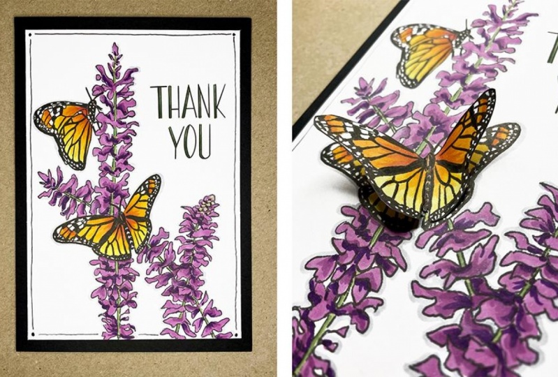
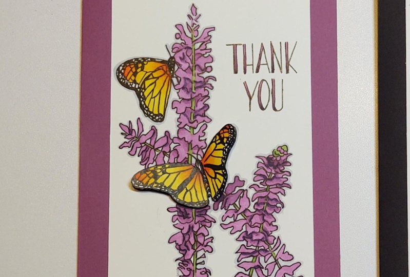
21. Download and Print the Final Project Image: All right, it's time for your class project. Let's get coloring. I'm really excited to share this illustration that I drew for you that you'll be able to use to create a Thank you card for someone special. Grab the colors discussed in the last video, and we'll get started with our butterflies first. Make sure that you've printed out your image from the class resources. I'm giving you a couple of different sentiments to choose from. I'm going to use this one in the demonstration today. Up next, coloring your butterflies.
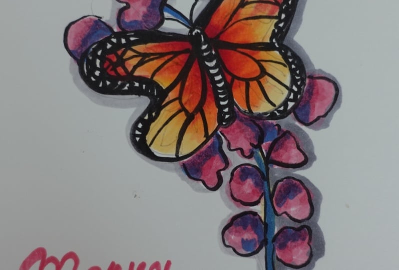
22. Coloring Your Butterflies: We're going to get started with our butterflies, and we're going to use some yellow and orange colors, as well as red. I want you to grab these four colors, Y13, Y17, YR16, and R24. We're going to use the flicking technique that you learned, and we're going to start with the darker color and work our way to the lighter color. This will actually help you naturally blend as you go along. To do these flicks, we're going to radiate them outwards, and it's okay to move your paper. Don't think it has to stay in place. It's much easier to move your paper than to move your arm as you're coloring. I'm going to come in here and add some flicks of red, short little flicks of red in the center, radiating from the base of each of the butterfly wings. Just a little bit, maybe a fourth of the way up the wings. Then I'm going to go right on top of this red with my YR16. I'm just going to add a tiny bit of it to the bottom wings and go about halfway across the upper wings. Now notice as I'm flicking, that I'm leaving just a little bit of white space between the flicks. It's not all one solid block of color, and that's what we want. We want to have the flicks slightly different lengths, so we don't end up with big bands of color. Now I'm going to go in with my Y17, and I'm going to extend these flicks out even further. In this case, I'm going to go all the way to the edge for the upper wings, and then for the bottom wings, I'm just going to flick out a little bit on top of the orange. I'm going to come in a little closer now, so you can see the next steps. Now I'm going to take my lightest yellow, the Y13, and I'm going to add strokes that come all the way out to the edge. Or you can color it in smoothly if you want as well. Now notice I'm leaving these little dots white. I want them to remain white. I want to add a little bit more color to the top. There's a few spots that I missed on the wings. I'm going back with some YR16 just right here and on the other side, and yeah, up right here. At this point, you can look at your butterfly and decide if you want to deepen any of the shades. You can go back with more flicks and more layers of color. For example, I can go back in with my red and add a bit more red to help this image pop even more. I want you to take the exact same technique that we did here and apply it up here to the top butterfly. Now I'm going to speed this up, but you can follow along. Now I'm going to go back to each butterfly and just add a few more flicks of color to smooth out the blends. Again, I'm working from dark to light and just wanting to get everything to look a little bit more smooth, and those blends to my eye. That's it. You're all done with your butterflies. I would suggest coloring a second butterfly that you can cut out with scissors. You can just use the second panel on your printed sheet for this. We'll end up layering that butterfly on the top of our card to create a 3D effect. Up next, let's color your flowers.
23. Coloring Your Flowers: Now it's time to color our flowers. We're going to be using four colors for this. C3, V05, V06, and V09. As I mentioned before, if you don't have the V06, that's completely fine. You can do the casing or the palate blending techniques that we learned in the essential blending section. That'll give you a color that's between these two colors. I'm going to start off with my V05, and I'm going to go along and add some color to the bottom of this butterfly bush. Now for better blending, it's easiest for you to do small sections of coloring at a time. If you do really big sections of coloring at a time between layers, you're going to find that the ink dries out and that the blending doesn't work as well for you. Now notice that there are some spots of air between these blossoms of this butterfly bush. I'm allowing some of the white space to show through, that way it won't be a big block of color. I'm also avoiding the green stalk here because we want that stock to be green later, so we don't want to color it violet or purple now and lose that. I suggest keep coloring with this base layer. The secret now is to add some contrast. We talked before about this. We're going to dive into our darkest color, which is the V09 and we're going to start adding shadows towards the base of the petals where they attach to the stalk into places where the petals might be overlapping. We want the back petals to be darker. I'm going to come in here and just add some darkness, and this is not an exact science by any means, I'm just adding it to a few places where it seems some petals are at the base or they might be in the back where they're just might naturally be some shadows. Don't be scared of this dark color. As I mentioned before, contrast is key, and contrast is going to make all the difference in your final image. Now that I've added these darkest dots, I'm going to go in with this mid-tone, the V06. Its slightly darker than our original color, and I'm going to add it next to the places where I added the darkest color and blend it in slightly in those spots. Again, this is not a flicking technique, this is just a bit of smooth blending, just dancing with my brush nib on the page and several places where the flowers might be a little bit darker. Just adding a little bit here and there. Let me take you a little bit closer for the next step. Now we want to add the stalk, and I'm going to start with a little bit of the darkest green, which is my G46. For the G46, I'm just going to add a hint of this dark green on one side of the stem, and then I'm going to add some lighter color, the G43 on top, and just drag it down. Now I've basically created a hint of some dark green shading on this stem that is just peeking through the flowers. You've learned how to do the violets and greens on these flowers. I'm going to speed up the video now, but you can continue to work on the entire section of flowers. One thing I wanted to mention is when you get up here, these flowers have not all fully blossomed. I do add a little bit of G43 to start in a few of these places, just to hint that there are some green buds on these flowers before I begin coloring them with the violet. Congratulations, now you're done with your flowers. Let's move on to some final details that can really make your card pop. Up next, let's add those details.
24. Adding Details: Let's start out with C3. You might want to add some extra layers of shading in certain places on your flowers using the C3. It's just going to desaturate the color just a little bit in a few places so that it's not quite as vivid. I mentioned I love working with saturated colors and this is a method I use to tone down those colors just a little bit. Feel free to just add some spots of gray on top and scatter those in amongst your flower petals. Try to make it evenly distributed throughout so your gray isn't all in one spot. But this just gives you some nice balance and tones down that image just a little bit. Another thing you can do with C3 to help your image pop is to outline it. I like to add a very thin outline to my image to really make the color pop up off the page. The way I do that, you can add a thin line if you hold it more vertical or a thicker line if you hold it more horizontally. But I'm going to come through here and just add an outline of this gray. It will dry slightly lighter than the color it is when you put it down. Now, I'm going to add this gray all the way around my image and around the butterfly as well. I'll come in around the flower petals and this is not being exact. Notice I'm doing this really quickly. You can even rotate your page or your paper as you go along if you need to. Don't worry if your line isn't perfectly even, it's okay if it's thicker in some places and thinner than others, this is a pretty light color, so it won't matter. Once I get to the top here, let me show you that the left-hand side is where I've added the outline, and that is enabling this image to pop a little bit more because it makes it look 3D. Now, this other side is not outlined and that is completely a personal preference thing. I just wanted to show you the technique, but it's not something that you have to do. It's just something if you like the look of it, it may help your image pop a little bit more, and I'm going to continue to go around through my image quickly and just speed up the video. Now that this image is colored, I can add some additional final details. Up here on the sentiment, this version of the sentiment has a little double line on one side and I can create some gradient color coming up that line. You can choose whatever color combo you want for this, I'm going to use some greens, and I'm going to start the flicking technique and add flicks of dark green or G46 up from the bottom of each of these letters. I'm holding my marker pretty vertical because these lines are super thin. Then, I'm going to fill in the rest of the letter with light green or G43. This is going to give me a beautiful ombre effect to my lettering. I use the darker color on the bottom because I want to weight the letters visually. But don't worry if you're going out of the line by accident at all, I've done that a little bit here, you can always fix this later with a white gel pen or paint pen. Another tip I wanted to mention is that sometimes when you print out an image, the black of the image isn't as black as you would like. It comes out gray and you can take a micron or a multi liner and you can come in and actually color the black parts of the image to make them a little bit darker. What you'll see is the side on the left that I'm coloring, when you compare it against the right, you'll see how much darker it is and how that really makes your image pop more because it's up against bright color and it'll make that bright color even more vivid. Lastly, if you've gone over any of these little white spots with color where you don't want it, you can actually fix that by adding just a white paint pen or a white gel pen to the dots on top. But always do that last. As I mentioned, if you go over paint with a Copic marker, it will clog the nib. Once you're completely done with your coloring, you're able to add those white dots in with a paint pen or even with Copic white medium, just don't touch it again after that. Up next, let's assemble your card.
25. Assembling Your Card: Let's start by creating our card base. Let's take a sheet of black card stock and cut it down to 10 inches by seven inches. I've measured 10 inches here. This is just a Fiskars paper cutter from a local craft store. However, you can just do this with scissors and a ruler or whatever you have available to you. The paper cutter just makes it a little bit easier. I'm going to fold this in half and create a five by seven inch card from it. You can crease it with your fingers or use a flat tool like this plastic bone folder. Now I want to take my colored image and trim it down so it will fit nicely on the top. The dimensions I want to trim it to are 4.5 inches by 6.5 inches or just half an inch smaller than my five by seven inch card base. Again, I'm just using this paper cutter for this. Now you'll want to assemble this piece on top of your black card. To do that, you'll want to add adhesive to the back. You can either use a dry adhesive like this or some form of liquid glue like this, whatever you have on hand. I like the dry adhesive because it's a little less messy. You can just align and center the image on your card front and then press down to it here when you have it in place. Once you've colored and cut out your second butterfly, you can bend the wings in half. What we want to do is add some adhesive to this center section. You can utilize dry adhesive, liquid glue or you can get some glue dots which look like this. They're small little rubber adhesive dots. I'm going to pick one up off the wax paper by touching the center back of the butterfly to the dot. I'm going to place this directly down on the page over the other butterfly. You can bend the wings up like this and your butterfly will be flying. For a finishing touch, you can use your black pen to add a dot to each quarter of your card, and then you'll connect the dots with a hand-drawn line. Now don't worry if your line is wobbly, this is just a handmade card, and it makes it more special if you can tell that. If you end up getting close to any part of the colored image, you can just skip it, like I'm doing with the flowers here. If you need to add any last white details, you can do so with a white gel pen or a white paint pen. This is a white Sakura gel pen. This is a white Sharpie water-based paint pen. They make oil-based ones as well with a pink stripe on them. But I like using the blue water-based paint pens for greeting cards. This way if you accidentally go outside of the lines, you can also fix that, like I did here on this you if you'd like for the inside of your card, you can add a white writing panel so that you can write on the inside. You would just cut down a sheet of blank white card stock similar to this size and then glue it to the inside of your card. Up next, some final thoughts.
26. Final Thoughts: Congratulations, you did it. Thank you so much for spending time coloring with me today. Here's a quick glance at everything that you've learned. I hope you had fun with your butterflies, but more importantly, I hope that you now have the knowledge and the competence to take what you've learned on copic coloring and infuse it into your own images and artwork. Now, I just gave you a lot of information, info that I've been learning and honing for years so please be patient with yourself and just have fun practicing. It really will make all the difference. Feel free to drop any questions that you might have in the discussion section and it's time to share your project. I would love to see what you've made. Feel free to upload it to the student gallery in the project and resources section. This is the group gallery for the class so you can share your own work and leave some kind words for your fellow students on theirs. If you share your project in Instagram, be sure to tag me so that I can see it and share it. If you've enjoyed this class, it would mean so much to me if you would leave a review and go ahead and click ''Follow'' up top so you can be the first to know as soon as I published my next class. If you'd like more regular and casual updates for me, you can follow me on Instagram @lauraleegriffin and if you don't want to miss the important stuff, you can join my monthly newsletter at lauraleegriffin.com where you can get the latest info on my artwork, digital stamps, start a society podcast, and upcoming classes. Thanks so much for watching and I'll see you next time. Thank you so much for taking this class. I hope you've learned a few new things about copic markers and may have started an addiction of your own. Happy coloring.
 Laura Lee Griffin, Artist | Illustrator | Podcaster