Transcripts
1. Introduction: Hi, I'm and I'm assaults on our disk. And I know media is alcohol marker. Now I know what you're thinking. Why does she sound like? Well, the shorter bit give out an operation when I was a baby and there were some complications, outlets being like, whatever the opposite is. I can assure you that the more you listen to me where your brain tells you that it's normal and the nice jarring it becomes. Thermopylae model of disability won't stop you from taking this course. I've been drawing for very much as long as I can remember. But there was a period in my life where I stopped drawing her about 10 years. So I wanted to get back you to heart, but I was in my last semester at university, I was using a thalamic. Oh, and I didn't have a lot of time to invest into art. I needed something great and easy, but I would still be proud of what I had when I was done. I was really good at painting just to me. But then I discovered alcohol, mercury. There was a learning curve, diverse. How is making art like this? And after a couple years of researching and practicing, I am not creating artwork like this. So I want to help you demystify alcohol markers. In this course, we will take a look at exactly what alcohol markers aren't. It's a great news dot da and outs of land with them to Lear them. What kind of paper you should use when alcohol markers, What are not watching is important. And with the help of the class project, I will show you five different magic on how to approach gallery with alcohol markers and say Does MI or walk your hearts. Now, there'll be something for you. Now this class is geared towards beginners. Not have a lot of spirits and homemakers. What do you do? You have some experience. Do you still have a hard time blending hearing? We're mastering the media and you might get some insight into local murders. I can give an official dx out. What do you think? Do you want to go on this journey with me and learn about alcohol markers on how to use them. I'll see you in the next section where we'll be discussing the glass project as well as not materials you will be needing to.
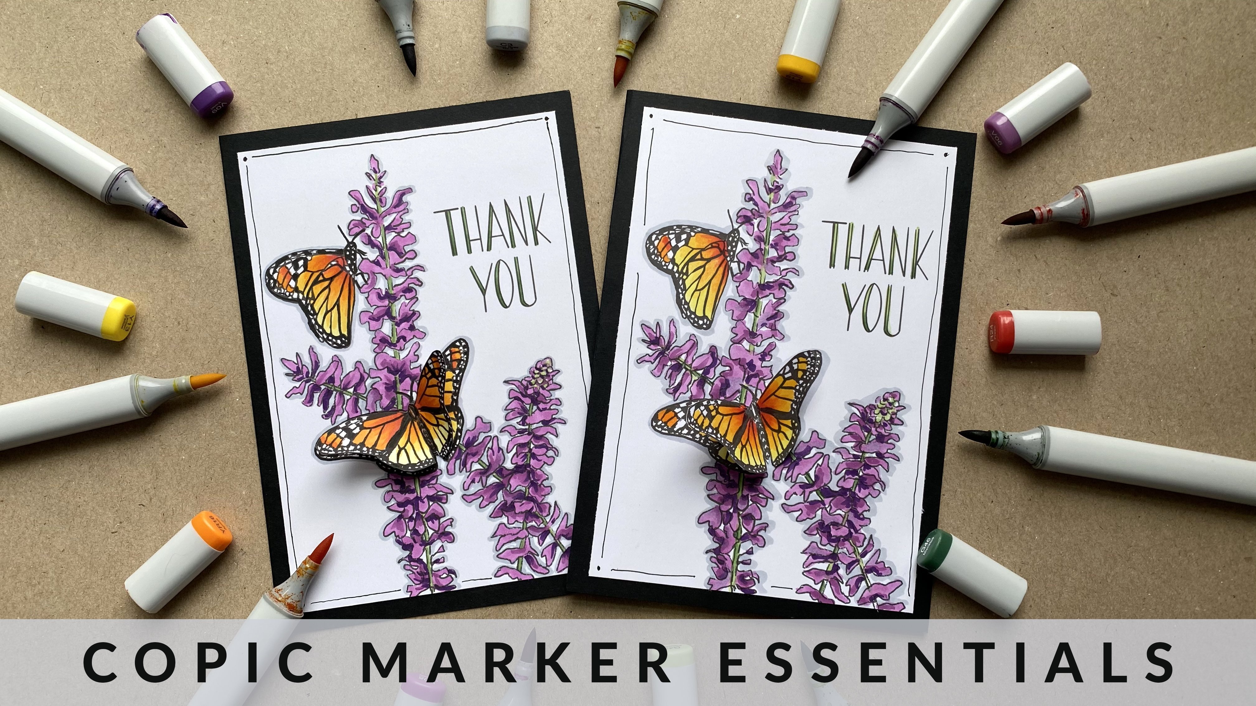
2. Class Project: I'm so glad you decided to take this journey with me. For this class. You will. I'll go markers. Any brand will do. Pencils. Again. Any brand will do. You will need something to make line art. I'm manners of rebels were the same color pencils from before. You will also need paper. I suggest burt card stock or Bristol giver. I'll be using card stock. You'll also need a line art of all are in. You will need five. Obvious, since we will be learning about Python record, your views are not on the line. Art has no problem. You, Leinhardt is provided to you and you can find it in the resource section off the path. You will see two line art on one sheet of paper, has it as you print out three copies. Bonus tool but not necessary. Is it white gel pen sort for the class project, I will be taking you step-by-step through the pods of recoloring the Diggs. Hi, and your class project is to complete each section and upload a picture of your completed artwork in the students. It would be nice if you could upload all of the projects. But if you don't feel comfortable avoiding, all right, then I hope you upload at least one of them so you can get feedback from me and other hazards.
3. Anantomy of a Marker: What our alcohol markers well, I'll call markers are what the name suggests. It's markers that have alcohol at a discord, a dry. So there's less chance of smudging. They are permanent, they lay on top of each other and the inks are slightly opaque. You can create our overlies, the halter sheets on Create multi-ton to pieces. They also layer on top of each other so that you can get different tones and values with one marker, water-based markers. How your water solution driving the big man or the file markers have HOCl driving pigment or I'll call it, records them to be TBL end in my crazy, they tend to look different across brands, but they do have similarities between that. In most markers, you have two hands with two different names. There will be a filler indicator either on the cops were on the marrow. There is usually an indication on the marker to tell you which is which. There is usually an indication on the marker to let you know which side is which needs. So for example, for this one to wider color band, Let's interactive side is the latter nip. While for this grant, there is a slight gray ring around the neck, which lets you know that this end is the brush. Now, they also tend to have the brand name and sometimes a little drawing indication, letting you know what end with. Some markers also have to color in them as well as the other number. I'm Amara, while some have it on the cups. Now, most loggers have two names for each marker. It tends to be a color number as well has Hey, color. Sometimes you can find both of them hung the markers. Other time you might find it in the packaging. Often marker, most markers to first letter or the first two letters, like hearing no, Rockefeller family homework belongs to. And the numbers isn't an indication of the strength worth of libraries have to markers. For example, with the kopecks, the letters, and let you know that it's the color found. So BV would be moving. While the first number is usually the saturation number, with the lowest number being the least saturated. The second number is the brightness number, with the lowest number being a lightest mind. And of course, you have your color knee just lets you know much mercury with some markers. The opposite is true. Where the number, this is the saturation of the color increases. There's a couple different options for advance that you'll find on an alcohol marker. Here's the chisel nib, the brush name. And in rare cases it fine liner, New. You can get different combinations of nims. So you may have a marker that has a bulletin have on one hand On the other hand or pitch them on one hand. I mean, brushed him on one end or hitches a limb on one end and hit bullet nip on gathering, or any combination of this. The most common combination is to bullet, I'm the chisel. And that's because at tends to be the cheapest workers to reproduce. So that's the one now would be the easiest defined. But the most sought-after combination tends to be the brush and the chisel nib. And that's because most artists values depression. So let's discuss why that may be hitch and have experienced annex cons. I'm their own set of facts. That bullet man, because of its size, it allows him to do a tiny bit easier host, but also because of its size, it's harder to cover a lot of ground. On the other hand, covers a lot of ground. And you put down on a lot of ink out ones, which makes it easier for blowing the photograph it so wide, it's harder to engage the health given line. When I say harder, I don't mean impossible. I'm the brush nib can be considered domestic Because it comes to a fine point. So you can get small details. But it's also a prime which allows you to cover a lot more space. And it puts down on a kink, which is ideal for VLAN10. It can also do a technique that is known as feathering, where you can flip the marker and it tapers off at the end. And that is extremely useful when coloring here or in creating smooth gradients. I'm, it's not impossible to recreate this quintuple or inches on. The mips can be made of different material. Depression it can be made of either compressed fibre or a rubber sponge. Now the compressed fiber tends to not be as Dribble has to reverse pinch. The reverse punch tends to last a lot longer. So you will find compressed fibers in single use markers because they're not made to last eternally. They're just meet to last for the duration of the marker life. In some brands, you do have the ability to remove the name. I'm flip it so that you can have a fresh. And a lot of marker brands offer replacement maps. Now of single use markers. Some markers have refills, basically their containers of ink that you buy separately. You can use to refill your markers. So you don't always have to buy in your market, but this is usually more indicative of higher end markers. It cheaper markers tend to not have refills, and they also do not sell the markers single. So if you have a set of markers and you run out of a specific color, you would have to buy an entire buck of markers that are placed on one, which isn't usually a problem because the markers are so cheap, while the more expensive markers to sell their markers individually and the hostile cell refills for those markers save you run out of a marker. You can buy individually or just by either IPO. And that works great if you don't want to buy all the colors. And in fact, if you like specific colors, you like a certain color pipe. You can just bad guys that you want. Now some of the cheaper and marker brands might not have replacement ink made specifically for them. But if you can figure out the color family or the court system at it operates on there. You can match it with other refills of other brands. Refills on replacement names help with the longevity of your markers.
4. Paper: Before we talk about what type of paper to use, let's talk about three things, spreading, leading, and coastal, and what the differences are. Writing is when you place your worker node is specific is and the marker spreads outside of that area. To demonstrate this, we can draw sir and put our marker down in the circle whom, and you will see it spreads outside of the circle. In my experience, this happens in certain types of paper and we'll discuss that in a little bit. The next thing is 0 state. So of course thing is when you're drawing or using your mercury, when you're done and you turn your paper, Homer, you can see as a marker from the other side and missile very common with alcohol markers. And the last thing is bleeding, which is when you're drawing on your marker bleeds onto the paper underneath. Now, I have heard a lot of people complaining about not knowing how to stop markers from bleeding or posting to the other side of the paper. And honestly, it's not anything that you can do to stop this from happening. It is the nature of alcohol marker. It will go and it will make you just have to work around that. There are some papers that are formulated to either stop or limit, costing more bleeding. That's getting to the people. You have papers specifically designed or markers. They're considered marker paper and it's meant to be thin and dab a coating on one side which prevents the marker from bleeding. Now with these paper, you might still get ghosting and you have to figure out which side is though we're excited to use, because on one side, your markers will look a lot less vibrant and it's easy to figure out which side is which. You just have to do a small little swatch on a corner. And you can see the difference of the vibrancy of the color. You don't have to use marker paper. When using marker, there is a Pontiac other papers that you can use. There are some papers that Louis that they don't have any bleeding or coolest thing. Hmm. Them. I have tried a few. I'm so far the one that works the best would be the Canson, the wall, the bert with that one is super hard to find and it's not 100 percent necessary. Neighbors that you can use when using markers would be Marker Paper blending Bart's mixed media paper, card stock or even copy paper, the papers that you'll want to avoid, watercolor paper, that's because it was made for watercolors. So it will absorb more on your markers will finish very quickly and some mixed media paper you want to avoid as well because of the tooth or fixture, you will tend to see more spreading on these the paper that I tend to use, his, his or copy paper or art style, I tend to lean more towards the cars. Topic is it's a little bit thicker but either works and they're inexpensive. Draw avoid having your markers lead on to another paper. You can always put something in between the sheets. You just need to put another piece of paper or a piece of plastic packaging. I use this piece of Lamanai to sheet of paper.
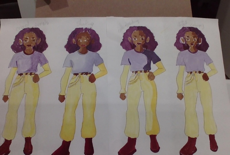
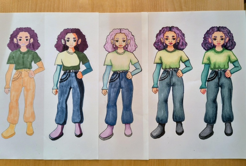
5. Swatching: Now that we've finished discussing, now, the swatch, swatch out on these small pieces of paper and get them together or keep it with my markers. I like to group by family members. So I just circled with the color and the brand of clothes. American barrels look differently. So a brush mark. I know exactly. Okay. I want this eye to look for that specific file. Just makes it easier quiet today I'm going to swatch, It's just this law. 12 marker, less expensive, not slouching is very important that these markers and do differently on different paper. So whenever you get a set of markers, you're going to want to swatch it out on the paper. So let's get an extra piece that's going to be swatching your sketchbook. Then we just for your swatch. So I am just going to make a square grip that children learn. The burden and the number of different brands of markers. You want to keep your swatches separate. A brand at the top of your paper. Now something that you would want to do at this age, you're planning to use in your drawing. You're going to want to test how they react, what the markers for AAC on the first line. And that's justice. Any smokey, you look, we'll see that some of the black did come out in the yellow. Yellow in that case, it's easier to see this monkey. And now sometime I just need a chance to dry. So we're going to use this one, the upper root and then alcohol markers are liable. And mandible. And your brand different brands with each other. It can react with each other. This brand top of each other. So I'll put and then go on top. We're going to do now. And then go on. But the same markers gives a different other. So with this in mind, if you allow them to the unleashes. So that's something that you should play around to see what you can get. Now let's talk about blending. Now some people don't like the keys. It's hard to blend, but you can somewhat easily work touches on. So in order to blend in with your life, if you're bringing others seem taller, men, richer, darker color. And we're going to want to go back in richer, lighter color. Now. Robert, Rob and wrong, not it just says if you are using a water brush where the beeper, this is why I prefer the water-based markers and put down a lot of allows you to get smooth. Others. Now say you're not up to see him. Instead of covering the area that you want with the lighter color, shows us where we group the next. About that. A little bit. Richer color. Your first car. Until you're happy with your color. On top of that. I'll just lay it out. And then we'll let it dry and we'll come back and layer again. Select this slide. So we have a lot less, not the line or some time to dry. Now, your line art reacts with your marker. That is not an indication that you can't use your line. It just means that you're going to have to put your color down priors and then put your line art on top. So there's no spin up. Come on, let's go back. I'm just going to go one of three and I'll look at Hungary. And then we're going to let that dry. Reasons why you would want to slot your markers before. Like I said before, it looks different on different deeper, but also some of the other partners itself. But I'm always line up with the color that the marketer actually and also the color that you put down. Does it look to see once it dries so that you will look one color when you first put it down and after it dry. So now her so you want to have a swatch so that you know what the market looks like once it is dry on that specific paper at you are using an hour or so. And we were able to create different even if you have a small quantities f mercury does not mean you can layer them on top of each other or you can layer them. Next section, let's talk about some markers. Just marker without any big, just asked to help all Bs at the markers. Nia boss. Now this has some cool uses, necessary. Mercury sick person on this. You don't need to worry a lot of pieces without using this, just using the groups that I talked about already are blending Merrick about what? Put down some of the other list. And then grow on top. We're chair marker. And it helps out. It's almost like doing a wet on wet watercolor. Where are you?
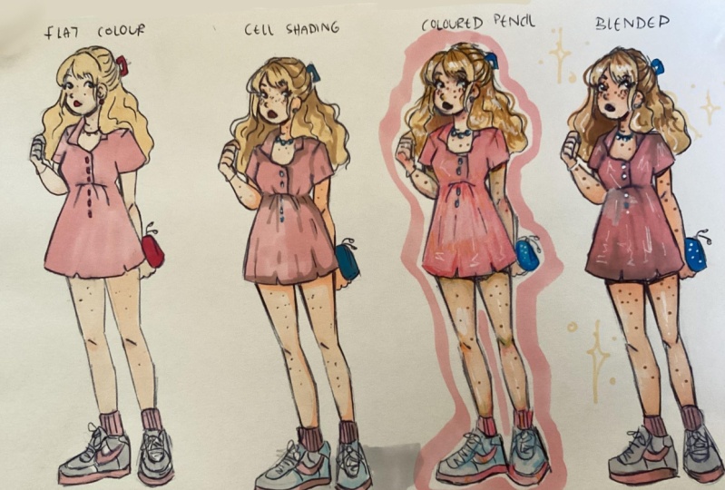
6. Method 1 ~ Flat Color: I start now or in the coloring section of the class. And I have my Leinhardt Hall ready. You can find the flaneur in the resource section of the class. There's going to be two. And each document it's going to be in a PDF format. So you need to print it out or address it out. Or if you have your online art, I can work to this one is just provided for you. So you don't have to worry about drawing aspect. All right, so let's start with the first. Coloring materials are going to be talking about flat colors. And it's as simple as it sounds, are just cutting down flat cars. So we pick the color that we want for a scan. And we just go in and put down a layer of column. And either using the markers and it's appearing a bit streaky, are you have to do to get rid of the streets. If you don't want them to wait until it dries and then go back in with another layer of color. And S is the flat coloring section. So there's not gonna be any shading or anything of that nature. This is honestly the ECS of the color you would say. We're just marking in columns. You don't have to call in the cheeks. If you don't want to. I think it adds a little something. So I'm just going to put a little circle of blush color. And then we're going to go into the here and the rest of the coloring process. So when you're coloring, you can switch between the name. So if your doing a small section, you can do the bullet nib were the tip of the brush name. If you're working on a larger section, you can do the chisel nib. What I usually do when I have sections like this, Here's how I would go a 100 outside and outline it with the thinner version of the marker. And then go back in and fill it in with the brothers section so that it moves faster. So like I said, this section is the flat colors. It's just blocking in your colors, k1 colors. You want what parts to be and putting it now. So I don't forget, for the class project you're supposed to color in the line heights along with me, and then share them in the class project section of the course, I really want to see what you guys are doing. So are finishing up with this RTD hand. We're going to move on to the next section, which is cell shaded coloring method.
7. Method 2 ~ Cell Shading: All right. So that last section was pretty easy. I'm sure you would agree with me. Now we're going to go up to the next level. And I don't want you to freak out. This one is going to be easier as well. So for this section we're going to be doing he associated look. And for that we're going to need a base. So I'm going to use the same BS from the last section to save on time. But if you wanted to, you could color the other line art so that you can have a comparison. Or maybe you just want different sets of colors for this week. So for this, we're going to be taking a look at CR in cartoons like Studio Ghibli, enemies and glyc Avatar The Last year vendor. So take a look at how they show shadow is in their artwork. You can see a clear definition of Watson and Watson shadow. So this section over here is where the light is coming from. So this section over here is going to be in shadow. That's what we're going to be doing for our drying. Now we're not gonna, we're in, we're just agree and marker to create the shadows. Instead, we choose darker on what our base color. So for example, for the skin, we're going to go in with a brown. Since her skin color is brown, but are going to get a marker that is slightly darker and that we have for our base. So let me show you that. So for this, I'm going to decide that way is going to be coming from the left-hand side, our left, the characters right? So I'm just going to go down the face with the darker marker. But since a person's faith is not flat, we want to show contour. So we're not just going to go straight down the middle, but instead of referring to call an EBIT of a curve to show that this shape of the face somewhat round and we can't forget the hand that's going to be on the right since that will also be in shadow. So I don't forget, for the last project you're supposed to color in the line hearts along with me and, and share them in the class projects section of the course, I really want to see what you guys are doing well, we can also add shadows and other part like the hairs and under the newest where shadows tend to fall. Now for the here, again, I'm going to pick the dark purple since her here basis purple. Now for this, I want to show a definition of what's behind and Watson bright. So I'm going to color him just by the neck so that we have that differentiation between the here that's at the front, here, that's at the back. For the rest of the year. I'm going to go in with the same color that I used for the bs to create shadow. Because like we discussed before, his new layer, I'll call markers on top of itself. They will get darker. And then I'm also just going to go in the center and had that original dark color just to show a little bit of separation between the two sides. Now we're going to move on to the shirt of the character. And again, we're going to try and follow that line that we established an escape. But I'm also going to put some shadow at the bottom to give the illusion that this person has breast. So shadows will be falling at the bottom because the breast is protruding and it would be blocking the light that's coming from the hopper left. Once we're done, again, we have to follow a contour. So make your lines slightly curved so that we can give the illusion that this is not a flat surface. I'm also going to add just a little bit of shadow on the left by the left armpit, making it That's a little further away from the light. Once we're happy with the amount of shadow that we have on the shirt. More you can do as shadow than I did if you want to. If you don't have to do the shadow at the bottom, if you don't feel comfortable doing that now we're going to move on to the bank and we're just going to follow the CMB blind that we established from the shirt moving down. And the way I designed disbands age that it's tucked in to them. So we want to show it at the bottom. We'll have some shadow. So again, put some shadow at the bottom. And we do it slightly curved because we want to make this look like it's a treaty object. And then we're going to do the pockets give the pockets tend to be darker and we can't forget the little bit of shadow underneath the t-shirt sleeves. But gifted t-shirt would be walking the line. So once you're happy with all your shadows, what I'm going to do now is add pupil to the high, just so that he can look a little bit more lifelike. This piece is optional. And I'm also going to use a white gel pen to add some catch light in the eye. And you also need to decide how you're going to do your layout. You can go for a solid or a solid colored line art. Like I have this copic mortar liner in white. And again, I'm using what I have bought. You could use colored pencils or able point. Alright, so let's get to the next section.
8. Method 3 ~ Colored Pencil: All right, So we've finished up the other section. And for this section we're going to be looking at blue colored pencil method. For this. We're also going to need her BS. So I went ahead and did it off camera. What you can feel free to pause the video and get your best done. Probably to be keeping the demonstration of the technique very simple because this is the beginner class. But this method can be pushed. I extremely far. A lot of artists who do photorealistic portraits tend to use this method where they would put down abs Hohokam workers and then go hint and build hooked up. And I mentioned were colored pencil. Now for this I'm going to be using two different colors to add my shadow just so that there's more depth in it. And we're not going to add the shadows that simply just like we did for the full shooting method. But instead, we would add them where there would normally fall on a person. So we're going to go around the here because they're here would be costing habit of shadow. And plus, we want to create the illusion that the face is rounded. So we're going to go around the piece. We're going to go underneath the chin. We're going to go inside the hairs, under the noise and under the Ambros. And once I'm done with my first shadow color, I'm going to pick a darker brown. I'm going again. But this time I'm going to keep it closer to the lines just to create hub at HealthTap. And then once we're done with the skin, we move on to the shirt. And again, I'm going to do the same thing. I'm going to go into my first shadow color. I'm going to put cheating where I think you would fall if this was an actual versa. So dorks to bottom in the corners where the light would have a hard time reaching. Now, while I do this, let me give you a tip. When using alcohol markers, you selected a darker color and you making this could be avoided if you have a swatch like I advised her earlier, but say you didn't look at your watch or you can't find your swatch, or you didn't do a swap and you colored it darker that new identity. Well, you can line it up by choosing a colored pencil that is lighter than the color and burnishing it, hoovering. And then now we'll work sufficiently to lighten the color. It's just a nice tip to know in case you do make a mistake. So I'm keeping my shadows very lighten, keeping my layers very minimal with the colored pencil. Because this is a beginner course. Want to make things too complicated. But if you feel comfortable, you can push it even further and built up even more layers. And I'm going to color the year one. Similarly like I did for the full shooting. What I'm also going to hide some shadow within the Here sections just so that it looks like there's dimension in there and it's not just one flat thing. And for all the parts, I always use to shadow colors. So he is shadow and then an even darker shadows for areas that are even more recessed. And again, that just serve to hide whole lot of depth and dimension to your heartworm with demoed of shadows that you have. All that's left is for you to go in and add your line art, which I am going to do off camera so that we can move on to the next section, which is my favorite coloring method though blending. And again, of course, you can use anything that you want to hide your line art. So you could use colored pencil, ballpoint, Ben's eye liners, or brush paints. I will see you in the next section.
9. Method 4 ~ Blended: All right, so for this section we're going to be doing what I like to call the blending technique. And this is my favorite technique to use. And this is the one that most people find the most intimidating. But not to worry. I am here to help heal. Just going to be using the same techniques that I discussed previously in the blending and swatching portion. And it's as simple as that. So first how I'm going to be tackling the fierce, because that's the focal point. So what you wanna do is you want to choose your colors that you're going to be using. Identity, use three colors on. I'm coloring in fees or any part of the drawing. I use heaviest color, his shadow color, and then a deeper shadow and are usually identical. Harland is same color family, so hard Bronx, you could use a different color for your shadow. So your base could be brown and in your shadows could be, for example, Hill, purple or 11. To get it just creates a different look. You can also choose a four color, which is going to be your posture. That's going to be pinkish, reddish, or orange bending which we use for your base skin tone courts or we want to work in one section at a time. And I'm going to start with the face. Since it's not very big, what we're going to do is we're going to go ahead and we're going to leave out one flat color of my lightest color. And this is just sort of pH and it makes it easier to blend on top of it because it's already wet. So you want to work relatively fast for this section. So what we're gonna do here is we're going to call him with Horace second color, which is harsh shadow color. And we're going to have the shadows and the sampling that we did with the colored pencils. So around the piece under denies, under the higher brows and in the high crease. And we're going to go Hindemith her lighter colors. And we're going to blend that outward circular motions. So right where our shadow color and our light colors are meeting, we blend it out with her BS color. And then we go in with Horace second shutter color. And we're going to stay closer to the hedges this time. Just agree, adapt. And then once we're done, we come back in with her lighter color, again in circular motions, just blending that out so we don't want any harsh lines. You can go back and forth building depth as much as you want. But once you're happy with what you have, we're going to go in order blush, we're going to lay it down and again, go in with herpes color and blend it out because we don't want any harsh lines. Once we're happy with that, I'm going to move on to our neck and do the same exact thing that we did for the face. And I like to work on the same sections once. So since I already have my skin tone markers out, I'm going to be doing a face connect guy here is in the hands all at once just to keep it uniform and to create a workflow. We're going to add some shadow on the inside of the ear because I would be darker. The life would have a URI Tang getting into that crevice. And now once our skin has finished, I'm going to move on to the year. And since they hear is a little bit bigger, I'm going to be tackling the year in sections, so I will only work on the left side. For now, the alcohol markers dry relatively fast. So we want to work relatively fast or working in smarter section makes the most sense. So I'm working on the left and again, I pick my lightest color and I'm going to go hand had hippies on the entire section of the left side of the year. And I'm just going in slowly and taking my time because I don't want to accidentally color order the skin or the shirt here. Yeah. I just take my time creating an outline of the ship and then filling it. And once I'm happy with that, then I'd go hin Whitman, shadow color. And again I had shadow near the neck. So that it gives the illusion that that part of the year is towards the back. And since this has a wavy here style, I'm going to have random marks with my shadow colors are over the year. So this section right here, I'm going to go ahead and I'm going to hide her somewhat. See, I'm going to go in with like I see motion using my markers to create depth. So it shows that this area is curving down and this just gives the illusion that the year is wavy. So you're going to notice that further here, I didn't go back in with my lighter shadow, the blending off just because I wanted to keep a lot of texture. I'm going to do the lips and for the patent or colored a top lip darker than the bottom lip. And since this drying is through smart, there's no need to put here a lot of detail in life. For now, we're going to move on to the share. And I'm just going to do the same process where in I have three colors that are very similar but different saturation. And I got him with the lightest color first and creative black color. And then I go Hinrich my shadow color and add shadows where I want them to be and then blend that. How, how would my first, later called Hansen's hungering for a slightly more realistic style in my chlorine traces. I am also going to add creases in the quoting, and I use my darkest color to hide the crease. Just a simple light. And then I blend it out with the lightest color. And I'm going to take that same technique and have it travel down towards the plants. But since the pencils larger, I'm going to do it one section at a time. So I'm going to start with the left. Add in Hippias color, haven't go inward, shadow colors. And then I can't forget to add my creases just so that it looks a bit more realistic. So you tend to get creases by the crotch area by adding me. And since this pants tucked into the wood, we're going to get some creases had tomato. And once I'm happy with that, I am going to go hinge on the right side and do the same exact thing. Now again, I am keeping the coloring very beer thick because this is a beginner course. But if you practice this same technique, eventually you will get a lot better already. You'll get more comfortable with it and you'll be able to build more shadows and Pill more depth and had more creases and add more details and had more texture that you can get to this level. Because it's the same exact technique that I just showed you that I use to create these pieces. It's just all about adding players hunt up of layers on top of layers. So since we're done and I have it where I'm happy with, I'm just going to go ahead and I'm going to add my Leinhardt and I'm going to go with your backline art for this because how light, high contrast, again, you can use whatever you feel the most comfortable. Wait for your Leinhardt. Be colored pencil, a regular pencil, ballpoint pen, fine liners, gel pen, ex cetera. I'm just going to be using this brush pen mic hits what I have handy, but I'm not going to let you sit here and watch hang of it. So let's jump to the next section, which is going to be her last method.
10. Method 5 ~ Lineless: Hi. All right, so now we're going to be looking at our last technique and hate what you do not feel misled. But the lightness art style actually has nothing to do with the way you color the artwork. You can color it however you want. I'm going to use a blending technique to demonstrate the lameness aren't scout. So I went ahead and did it half camera. You don't have to use to blending technique for this section. You can instead use the colored pencil technique, celebrated technique to foreclose whichever one that we did previously. Glivec effect. It has nothing to do with your coloring technique, but it has everything to do with the colors that you choose to line your hard work. Up until now, we have been lining our artwork in one solid color, be that black or wine red, or whatever color that you decided to choose. But for the landless Harvard style, we use multiple colors in lining or artwork. And again, you don't have to use fine liners. You can use colored pencils for this technique or ballpoint pens, gel pens, anything that you have really, as long as you have multiple colors. So for this, I am going to be using fine liners because I have more to backward a ton of different colors. And we're going to be, and the colors based on what's already there on the paper. So for example, for the year, I'm going to use here purple fine liner and for the skin in brown fine liner, for the shirt, pink fine liner, and so on and so forth. The one thing that you want to keep in mind when you're doing this technique is what is on top. So for example, we're going to do the first place. I always start with the piece because that tends to be the focal point. So for the face I want to keep in mind are part of the fear is above and white part his below. And this is in context of the year. So for the fierce mothers will tendrils are above the ear, like it falls to the side of the face above the feast. So that section is going to be used, is going to be left alone for this portion. And instead, I'm just going to focus on the parts of the faith that I can clearly see, select the chin, connect outside of here. And so then when we move on to the here, I pinky purple fine liner. And I go all around here. And then the tendrils that is falling had the front house or line in purple desk and be a little bit trickier when you're first starting out with practice, it becomes second nature in figuring out where to had which color, where. And then we can wind to the shore. And thanks, that T-Shirt is octet up. It's on top of theology shirt, a 108 bits on top of the skin. We don't have to worry about that. We can just line the entire thing in with the pink pen and then we just continue with the same mental process with the rest of the hardware or the high, especially when I'm doing female characters, I tend to always use POC because he didn't know it could be mascara or outliner. But I wanted to highest apart. And black is very graphic and impulse attention. So I tend to use black for that. You don't have to. You could also use a different color. So these are all the different methods that we use. On this one, I actually used the combination. Another method just to show you that you don't have to use one technique or one dried. You can instead use multiple techniques on one single drawing. So I don't forget for the class project you're supposed to color in the line heights along with me, and then share them in the class projects section of the course. I really want to see what you guys are doing. All right, so that's it. That's how the techniques, Let's move on to final time.
11. Final thoughts: First of all, I want to congratulate all the coloring magic eye level line. Since this is a beginners course, I wanted it to be as accessible as possible, buffer the methods that we learned today. I just want you to know that with some practice, you'll be able to gain some confidence using alcohol and rigorous what you learned here and use it has fundamentals to build upon and improve your skills and push it even further in your heartburn. I wanted to say this time again to encourage UFO Thought you're finished artworks in the class projects section so that I can have a look at it and give you some feedback. Or at the very least give you some encouragement and let you know, right? That's all for now. Our show up on your scarf.
 A Quest To ART, Artist I Illustrator