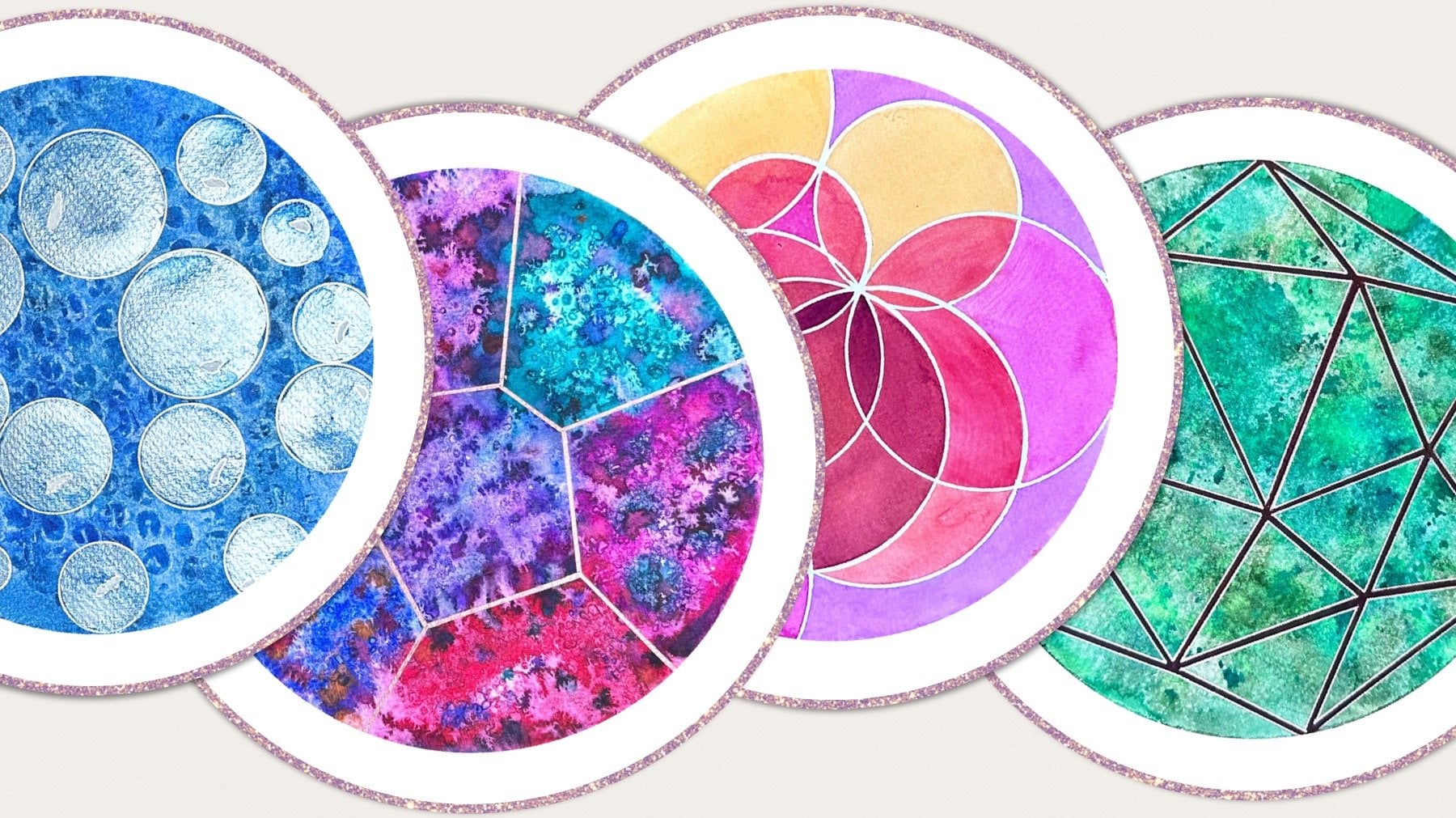
Transcripts
1. Introduction: Rose windows have graced architectural styles for thousands of years
through history, ever evolving complexity since the ancient Roman oculus to
gothic tracery and beyond. Their aesthetically pleasing
symmetry and proportions originate from their underlying
geometric structure. Hi. I'm Viana,
mathematics teacher, and a geometric artist. In this class, I will
teach you how to draw window design by constructing
a circular grid. Then you'll learn how to create two different interpretations
of the pattern, a stained glass variation
inspired by bar tracery, and a carved variation, inspired by the
earlier plate tracery. I will demonstrate numerous
coloring techniques on how to achieve translucent
water color effects. I will show you how to
thicken and decorate the frames to achieve
three dimensional depth. We'll also discuss
a wide range of tips to improve accuracy
and imperfections. This class is suitable
for all levels, and it includes step
by step instructions. The skills learned in this
class can be applied to any of your own future
designs. Enjoy.
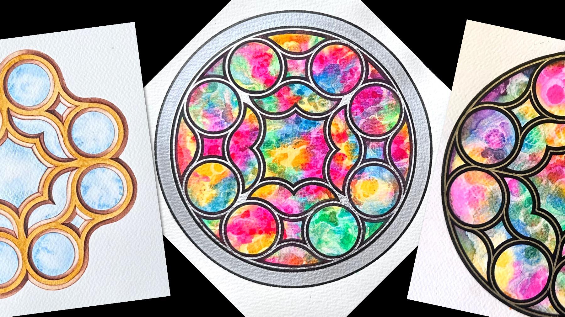
2. Project & Materials: Project of this course,
you're going to create two different interpretations of the same rose window design. Firstly, I'm going to
teach you to construct a circular grid with a
compass center ruler, and then use that geometry
to create the window design. Then we're going to
learn two different interpretations of
decorating them, inspired by gothic tracery. The first variation is a stained glass window
based on bar tracery. This is a gothic
tracery that's actually evolved from this
style of tracery, which is plate tracery. To complete this project,
you're going to need some multicolor paper
if you want to paint. That means that we can construct
directly onto the paper. Some bruler compass,
pencils, fine liners, permanent black marker,
hopefully metallic, and new compass ideally
has that pen attachment. A variety of different sizes of watercolor brushes, paint, somewhere to mix your
water and a pipette ideally and an eraser.
Let's get started.
3. Constructing the Circular Grid: Go to start our
construction now, that's the exciting part. We're going to need
to use a compass ideally with a pen attachment
for decorating later. For now you can use
one with a lead. If you're not 100%
confident using a compass, made a really detailed
video on different types of compasses and different
techniques and exercises in my course, constructor geometric Mandela
of interlocking hearts. If you'd like to go and watch
that part of the video, first, you can do that. If not, we can just get started. We now need to work
out the sizing of the paper and the design, depending on what
paper you're using. I'm using A four and the
dimensions for this are perfect. Here's a draft I
made a little bit earlier, very rushed one. But you can see here, we
need to be able to fit eight radius lengths
of our circles with a little bit on the side because it's going
to be circular, which extends it a bit plus the thickness of the frame
when we decorate that. You need to be able to divide your shorter side
by 8.5 at least. If like me, using a standard
A four or a letter size, which I recommend for
this design is perfect, then we're just going to use
a radius of 2 centimeters, and that gives us
the perfect size. That is about perfect. I I I show you on
the original design, the initial circle
is about that big. Now, before that, we need to
find the center of our page. This is how I like to do it. I'm going to measure the
left hand side of my page. And I know that it's about
29.7 f a and centimeters. I always go for fteen 0.7. Halfway. And I mark a
little notch on the side. Then I like to rotate
my paper and do the same thing from
the opposite side. Ten, three notches short of 15. Now sideways, this should
be 21 centimeters. Yeah. I'm going to
draw straight line. Not quite to the edges
because then the edges become a little bit
difficult to rub. 21 just under 10.5 is where
I'm going to the start. Now, usually we start doing the circles now and then at some point,
find the vertical. But for this design, before we commit to the radius
we need later repeatedly because I don't like
to change the radius to preserve some accuracy. We're going to find
the vertical now. In fact, when we do that, it's useful to do it
with a wider radius. It makes it more accurate. If we use that distance to
find where the vertical is, it might be a bit less accurate. We're going to open
the compass to some just an arbitrary length, further apart than
halfway ideally. Just like that, it doesn't
actually matter how big. I'm just going to
mark two inters, two little arcs, to intersect
the horizontal line. I'm not doing a full
circle, just two notches. Now, I've created
the intersections where I need to open the
compass now more than halfway, otherwise they won't be
long enough to cross. About half of the radius, I suppose, is fine. A arc above and below
the center where we think they will cross where we think the
vertical line will go. From the other side, you
could rotate the paper. I often like to do that
because I'm not left handed. But that's okay. Now we have three reference points
through which to draw our perpendicular
vertical length. So you prefer this. If this is fairly accurate, it will make constructing the rest much easier and
we don't have to worry about any lines later just placing the circles
in the correct. Place. That's really good. Now,
this circular design is the circles of the grid are all arranged in a
square orientation, which is why we needed the
two perpendicular axis first. That's great. Now we can actually start to
construct and build up the window and the
frame from those circles. This is now the point
at which we need to measure our radius
to be 2 centimeters. Make sure the pencil doesn't
point out too much further under the pin of your compass. Now because I'm right handed, I need to turn my ruler
upside down because the numbers will increase to the left, and that will help me. So That's looking just
perfect 2 centimeters. Now we have a lot
of circles to do. Firstly, we're going
to do the central one. We've already got our point on there that we drew earlier. And there's the first circle. We need eight radius
lengths across. That means we need to draw three more circles on the one side and
three on the other. I'm going to work
horizontally first, and I'm going to
go to the right. We've created another
intersection here, which is the same
distance from the center. Now we're going to
draw one more circle, and we don't have to worry
about the radius anymore. Now we've created
yet another one. Each new circle creates
more opportunities. That's two and last one
on this side, three. I don't count the central one. The central one is where
everything begins. I needed three on this side. Now, three on the
other side as well. You can I'm actually going
to rotate the paper. I like to have a nice clear
view of what I'm doing, and I like working in
that direction as well. Symmetry here helps. That's one. T make sure it looks
as if it's going to go through the center. Three. Try and be as accurate as
you can and take your time, but it's not the end of
the world if it's not, this is a hand drawing. We are making human art, so it can't be as perfect as a computer
generated artwork. We're going to do the same
thing now vertically. That will build the backbone of what we're creating later. There's the central circle. We have an intersection
below and above. We need three on either side. I'm going to go upwards
from this point here. And that will go through
the original center. One going up, two, three. That's the last
one on that side. You're starting to get a feel of the scale of the whole thing. Back to the center
and starting below. O23. You can see why it was useful to have that vertical
line already there. We didn't have to
wonder where that line is after these circles and then re changing
the compass. Now, you can see the beautiful
and shapes in the middle. Now where these mon shapes
have actually crossed over, only in the center for now. These are the four
vertices of a square. You can imagine how we
can draw square here. In fact, that's how
we do construct a square from circles. These four points are where
the new circles will go. Let me just demonstrate here. Now you can see how
The four points are at equal distance
from the next one, the two centimeter
radius we started with. Therefore, the circles are actually the centers
of the circles are in a square arrangement in a vertical and
horizontal columns. Now we need to fill each of these quadrants
with more circles. I'm going to start
with top right. Again, as I said, from
this point here at the top of this man shape. That should go through
that one and that one, the centers of the left
and bottom circles. One. Again, now we basically drew the first circle above
the first one below, which means we have two more. Each one is now going to go
directly above and overlap. There's another new man shape we created, new
intersection here. Again, two, and on this line, the final one, again, and the new intersection. It's as if we move those
three up by one radius. Now on the top layer here, we've created a
new intersection. While I'm doing this, I'm
going to tell you a bit about the name of these
shapes when we overlap two circles and we create an
area that's actually bound by two curvy circular arcs,
just like we did here. There can be different sizes, but particularly
this one that is made of two circles
with the same radius, and the width here is
one radius exactly. This in Latin is called vesics. Piss sounds great because we know it's something
to do with fish. Yes, to me, it looks
like the body of a fish. But vesica means bladder. It's actually the shape
of the bladder of a fish. I don't particularly think it's that nice to be thinking of a bladder of a fish while
I'm drawing nice art. It's like, Yes, I know
that's the official name, vesica pics, and of course, it gets shortened to
Vesica and not Piss, which is actually
the bladder aspect that I don't actually
like as much. Then I looked it up
and then I thought, Italians are going to call it the same thing as Latin, surely. But no, In Italian, these shapes are called mandas, and that actually translated
means almond shape. I much rather think of
almonds. I like it. It really does describe
it really nicely. I like to call them mandas. Everything happens at
the top intersection of each new Manda that we've
created a new Almond shapes, and we've created one quadrant. What I'm going to
do now is rotate this and do exactly the
same thing on this side. Again, starting from
the top intersection of the first almond and
going three across. And once I've created
the first row, I'm going to create two
more rows above it. The underlying grid
is now created fully. You can work out how many
circles we just drew. I'll leave the math
up to you to do. Now we just need to find the outer edge of the frame
of our circular window. This is a really nice way of
finding where to go next. We're going to go the c and above the horizon
on the left hand side. We're going to find the
first circle that's fly above it and find
the center of that. On the opposite side, on the right hand side
of the horizon, just under the line
under the axis, the full circle that we can find and find the
center of that. These are the three points, the circle below through
the middle and sideways. I'm not going to draw the line. But I'm just going to
align them like this. And now where that
line would cross the two circles that we're using their centers
to measure that. I'm going to draw a little mark on the edge of that center, that circle, and the
circle on the other side, whose center we are using. I'm also going to make a mark
on the outer edge of that. This distance now is going to be the radius of the surrounding
outer edge of the design. Going to put there and a line. Before I commit, I do want to make sure that it matches both
sides pretty well. Go through there, we'll
go through there. It's nice and lightly
a full circle. It should just about touch
along some of the circles. Those that are outside, they are not going to actually
be part of the design.
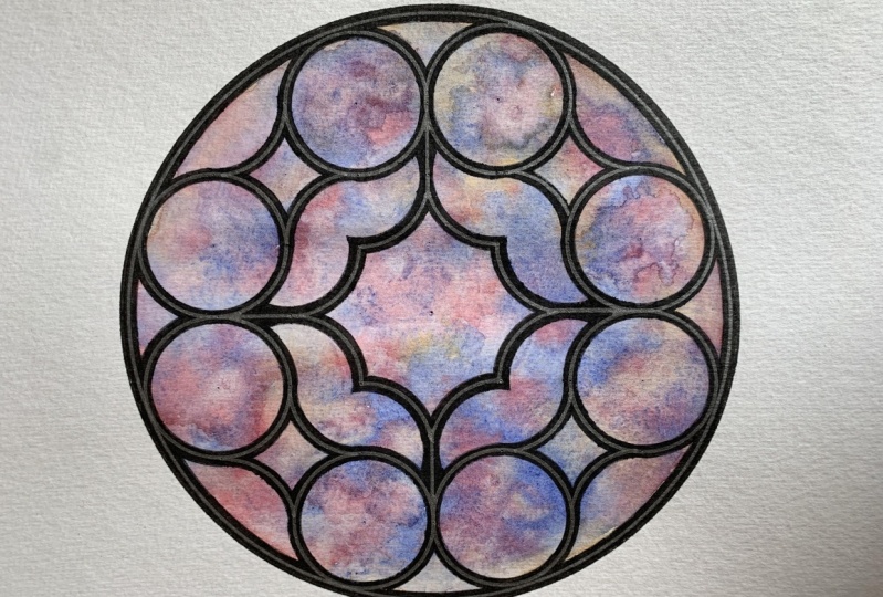
4. Drawing the Window Design: We are now ready to outline the actual design of the
frame of this window, actually making that
really nice shape. I'm going to start at the
top from the center all the way to the top and on either
side of the vertical axis, we're going to outline
the two full circles that fit perfectly under the
big circle on either side. We're just going to find the top center and then
go one either side. I'm going to go to this one here and do a full circle here. No all x will be
full circle here. On the other side of that
line, one center sideways. One more circle. Then we're going to do that
on the right hand side. This time, one below and
one above the central line. From the central line, from the third
circle, going one up, full circle, and one, two below below that line
across another circle. Then we're going
to do the same on the bottom because it
does have that symmetry. Bottom two circles
on either side of the vertical line, 12. Lastly, the two on
the left hand side, one above and one
below horizontal axis. And these are the only full
circles in the design. The rest is now made
of small arcs that are partial from the rest of the circles that we've drawn. The first thing we want to start with is to put some little arcs here that are going to join the circles where
there are gaps. Usually in rose windows, there are no gaps, the
frame is all connected. On the very top right,
the circle that's actually outside the design
and the center is outside. This is where we
need to go next. Now we need to draw only
a quarter of an arc just enough to touch
the two circles below and to the left. We're going to go below and
only do a 90 degree angle, a quarter of a turn and stop
just enough to touch these. Now we're going to do that
from all four corners. I'm going to go
down to the bottom. This time I went from left up, don't worry at this point if
it's not merging perfectly because that's not going
to be the last outlining. Now I'm going to rotate
the paper upside down, as as you can see,
I like doing that. I like to work from
the same perspective. Top quarter an arc and bottom quarter of
an arc and they're all facing in words
of the design. Now they're all joined in. Now we're going to create these
four sided little shapes, which are some of my most
favorite in this design. They're basically the arcs that are opposite the ones
we've just done. Now to locate the
centers of those, we need to find the
four diagonal points of that initial circle that
we drew in in the middle. The man shape coming out from the center
outwards diagonally, let's say, going up to the left. And the first point
we come across, that is the center. Again, we're only going
to do a quarter of an arc that connects those two. Now we're going to do the
same on the other side. Now from the center,
first almond shape, going right and up. That's the first center. Small arc there, quarter an arc. Then the one below, that
would now be two below. And the art goes from the
bottom up to the right, and then one to one man the way from the center from the
bottom to the left. Now these are nicely joined. When this thickens,
then this will create some little windows here, here, but they will be
all different shapes. Now for the central part, central parts really
pretty as well, we're going to go from the ends of the arc
we've just drawn. They are the centers
of the new arc. Let's say this arc here that we've just
drawn on the inside. There's a center there
and a center there. I'm going to start
from the top one. Again, I only want a
quarter of an arc. This one is not connected
to anything yet. I'm going to go from below. Quarter of a turn to the left. So down, left, stop at the axis, and I started from the top edge of this arc I drew previously. I'm going to move to this center here on the
other end of the same arc. And I'm going to do exactly the same a quarter
of an arc from below up to the left where
these two joined seamlessly. This is the shape we're
trying to achieve. I'm going to retape this now, and here's the
inner arc we drew. The two centers we need are
at the two ends of that arc. We draw a quarter of
an arc from below up, and we stop here where
they touch on the axis, and then we move to the
bottom of the same arc, and then draw
another quarter from the axis up to join
with the other arc. I'll just repeat
this two more times. It's starting to shape up
really well, isn't it? But we do have another
detail to add here. As I've mentioned before, the frames are usually
joined together. There are no gaps. What we need to do now, and some of the part of the frame can be straight lines. They
don't all have to be cas. We're just going to join these radii where there's
the gaps using our ruler. Now, what I'm going
to do is flip the ruler upside down because that way the ruler isn't touching the bottom
of the paper, and therefore, I'm not
going to smudge the ink, so I'm going to align this
whole vertical line together. I'm going to hold the
pen vertically straight, and then I'm just going to join this radius at the top and
this radius at the pot. Then I'm going to do
the same going across. Actually going to rotate again. 29 segments. Just to complete the look of it, we're going to draw the
outer circle as well, which is basically repeating the circle we already
have on the outer edge. And that gives us
the main frame. The main look of the
window, the main design. Let's see if that is
going to fit nice.
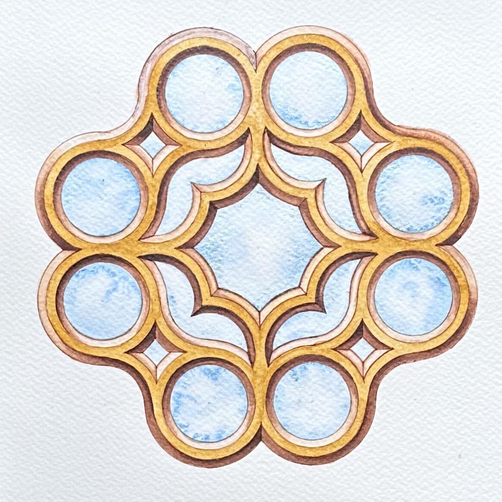
5. Thickening the Inside (Variation 1): The next step will be
to go and now thicken those frames to actually be able to give it that
beveled edge look. What we're going to do on either side of all
the arcs we've drawn, we're going to draw a
second parallel arc, and then the middle
that we've already drawn is going to
look as if it's above the surface and then the windows are going down
as if they carved downward. We'll try and make it look
as if it looks like this. Now we need to draw arcs on
the inside and the outside of each circle and we need to decide how
wide we want to go. For this particular design
with the beveled edge, I quite like it to
be not too thick. I think it looks quite elegant when we don't give
too much thickness. We can decide arbitrarily
how wide we want to go. I wouldn't add any more
than that distance here between the edge of this edge
circle and the outer edge. In fact, that would
give too much of a thickness because
that will double once we put it on the other
side. If I go here. Now, you might notice
that I'm doing this with a pencil first because I really want to try and
ensure we're doing really accurate
seamless arc joints, h. Let's not go straight
in with the pen. I think this here is probably a good Good thickness to have. You can just choose your own. There's no rule here, except for when we meet
it on the other side, we need it to be
the same distance. I've decided to go with that. It's about 2 millimeters, I think from just looking and the first four circles
that we started with, I'm starting with the same, and we're going to
draw full circles on the inside of the eighth we
already have on our page. Again, I'm going to
start with the top two. Next to the right
above and below the horizontal. At the bottom. What we're going to do
is draw all the arcs on the entire design of this
length that we need before we go to draw the outer
the outer circles. Otherwise, we'll keep having to change the radius
and we don't want that. The eight full ones are done. Now we need to do all the
other arcs that we've done. Again, I'll stick
to the same order, starting with the outer one. Remember we used
that outer center here to join here seamlessly. Now, I don't really know
how far I need to go. I can judge it that
it's roughly from the bottom from the
bottom to the end. But what might be
easier is just to do the whole arc here. Because later when we join that with the outer edge
of the other circles, that's when we need to make sure everything is joining perfectly. This is why I think
at this stage, doing it in pencil is
better because we can see where everything joins first and once we know
where everything joins, we can go over with the pen. Now I'm going to do the top, I'm going to do all four
corners bottom, rotate top. And bottom. These
are those four arcs. Complete. Notice that
the inner circles of those are actually the outer arcs of this little design because that design is what's
in between the circles. Now we're going to
do the ones that are opposite pointing outwards, the ones that are across. If you remember, the
centers of those were at the intersection, four diagonal intersections
from the central four Mandol. Again, here, I don't really
know how far it will go, so I'm going to go about half because I needed to go
from here to there, but I don't know exactly
where it will stop. In theory, it will
stop if I was drawing a straight line there and
that's where it will stop, but I really don't want to
draw lines. Over all this. So going here, two
centers to the right, half a circle, two below. I'm going to rotate
this actually. A half and two to the right. Again, about half. Just make sure it's way past. It runs parallel to the other
arc, but it's much longer. Now we're going to
do the final step, which is the one in between,
and if you remember, the centers of those two arcs were at the edges of
the previous arc. Now, luckily, we're still using the centers of
the original frame. We never change what
centers we use. We only change the radius. We don't have to go
from here, the new arc, we go from the old arc, the old center, the whole
grid, that's the whole point. Again, now I'm going to
do more than a quarter, and that is so that when I move to the next center down on the other edge of this arc and
do another over a quarter. I can see exactly where
the arcs all cross. Later when we repeat this
with the waterproof pen, then we know exactly
where to stop and to make it look
nice and tidy. Now I'm going to go below, here was the inner arc, the two centers at
either end of that. There's about more half or so, then go to the other
end of the same arc, extend to make sure these cross. Perfect, go to the next one
here. I'm going to rotate. These two, we'll go to these
two top edge of this arc. Then go down to the bottom
edge of that same arc. Same center. Make
sure it crosses. Beautiful. You can start to
see now how this is working. Finally, this inner arc. The last center is here. This is all the arcs
of that radius.
6. Thickening the Outside (Variation 1): Now we need to repeat
the same thing, but with the wide radius. To find out how much wide the radius is from
the initial one, we can just use
the inner edge of the next circle is actually should be seamlessly the
outer edge of this one, because the symmetry here,
the distances between those two smaller circles are
equal from the middle line. Therefore, we now know
we're increasing it by exactly that amount of space. Let's just see. Does it look the
same on both sides? Yes. For starting with
the eight circles, I'm drawing full circles even though A min on all the arcs later and
the one next to it. Top two circles, go
to the right. Top. See how this one is joining
with some of the other ones. Bottom. Two below. Keep an eye on that that they each one so touch another one, which is perfect and
two on the left. Yeah, again that worked
well there and there. And the final full circle here. Again, now in the same order, starting from the top right, remember the outer center. Now, this one needs to make sure that it crosses these two inner arcs
that are already there. I'm going to do quarter
of circles here. I'm basically going
to make sure I'm touching the two inner
circles of these two, just to make sure I can see clearly where things
are crossing. There's one on top,
one on bottom, out to center,
quarter of an arc, touching these two inner
centers circles, rotate, top out quarter of an arc, bottom quarter of an. The next four the inner ones, which are at the top of sorry, the top of the 41
shapes just here. Again, I'm going to do quarters to make sure I'm seamlessly joining the inner edges
of these circles. Now you could see
how that shape is already formed really well. You could see the black
line is the raised edge, and the two on either side are dipping in on
both directions. It's already forming
like a little curve diamond,
really nice shape. On the other side,
we started here, two across quarter two down. Dating actually, a
quarter of an arc to a cross and quarter of an arc or joining
those inner circles. The final eight in the middle, as before, they are
on the either side. Of these last inner arcs. Now here from the middle, you can go all the way to
the black line just again to see very clearly where
this will cross in a bit. If you extend it
to the black line, we know we're guaranteeing
that it will cross with the next one because
these should be a little bit shorter being
closer to the middle. Here, going all the way up
to join with this arc here. See what I mean here. That is now touching the
next arc, which is perfect. Go down to the other
end of the arc. Again, below from
the inner circle. To the left inner circle. We can clearly see
where these crossed on this side and where these
crossed on that side. They're all lying
on the diagonal. Now two radius below from the left quarter circle to where it crosses with
the inner circle above, move to the center
and another one. Making sure it joins here with that arc and crosses
there clearly. Go to rotate only
these two sides left. Now, just the last
finishing touch on that frame, of course, is those last four line
segments that we drew, and that was here. Now we need to join to a line from this point
where these two touch neatly and then we
want then a line running parallel to that up to where it reaches this
circle and here as well. That's a good point to align on either side of the black
vertical line segment. Hopefully, from the
arc that stops here, we then have a
nice seamless line running down and see how it
gets to this point as well. And here as well. Just make sure it's aligned with the bottom as well to give
it more accuracy. And on the other
side, the same thing. Align here. Here. It's actually easier now because we've already done
the other side, so it's parallel to the other
side, it's easier to see. So the line segment here
line segment there, see how I did this
a bit too close, so I can move and that's fine because that's why
we did it with a pencil. That one was too close. They look better on either side, and do the same on
these two verticals.
7. Outlining the Frame (Variation 1): The width of the frame and we determine where
everything meets. Now very carefully,
we need to now re outline these arcs
in permanent pen, but not go beyond
any of the joints. You might want to pause
here and really carefully look at where things
are joining together. For example, we will
start at the top. This is where we will start. We're not going to
do a full circle. We start here, where this
joins the next or outer edge. Go all the way here. Where does that merge
with the next one? It is here. See From here onwards, it's the inner arc
of this circle, and it goes up to here. We might need to look at one
by one, where are we going? This one stops here, from here to there that's
coming from this center here. Then from this circle
will start here and go all the way until that
reaches the adjacent circle, from here, we go and do
the same thing up to this point where it
touches the next. Whenever an outer edge changes to an inner
edge of another circle, that is basically
where we need to stop. Here. Is it round to here. It starts on a new
one, slips here, here. Here. Again, look
at the symmetry. It's basically those two
mandas, the smaller ones. Here, and here. I'm going to start at the
top left and I'm going from that point just to that
point and stopping. Now, I can't do this
one because remember that requires the
smaller radius, so we're not going
to do it that w, we're going to make all the
arcs that we need with that. We're going to do
the outer at ones. Now, though, if
you look at that, we haven't actually quite
finished because we also need these arcs here, they come from that
same outer circle. The arcs in the little
diamond shapes below, we need to start here where
the inner arcs cross. Thinking of this
circle, and then go to here where they crossed
here in the middle and stop. We need to emphasize this. We're basically only skipping the thickness of the frame
of the neighboring circle. But we need to do this. Then we're skipping
here because that's again in the frame itself. Then from here where
these two cross again, up to the up to the axis, we need to emphasize
these two as well. Let me show you what I mean. Starting from here, and then skipping and
continuing up to here. Can you see? The
only places were not outlining is where it's inside the frame overlapping
with another circle. Here it overlaps with this one, here it overlaps with this
one, we stopped here. We need to recreate that
symmetry here starting from the middle and stop where
the two inner arcs crossed. Skip a bit here, and then
again from where they're crossing to the next one. Then I'll move on
to this one now. Okay, so we have now
completed the outer circles, but we need to now
look at what else we need with the same radius. So if we go from
the outer edges, in the same order as we
constructed it earlier, this is going to give us
the inner curves here. So Again, now from those last arcs, pointing inwards, two
on each in this case. Here we need to only go from where the inner two cross and where they also
cross on the axis. Wow, amazing, isn't it? Now we need to just
find the new radius, the shorter radius
for the inner edges, and I'm going to use this point. I need to make sure. For example, that this will
join pretty perfectly, the inner ones, but
here nothing crosses, so it's harder to tell. I want to go somewhere
where I want to ensure that it's going to
join very seamlessly. Let's just g. It's a bit. It's a bit long actually. Yeah, I'm happy with that. Now I tested it there because I
wanted to make sure joins. If I do the circles
on the inside, I'm not going to find out if my radius were slightly wrong, if I did these first because
nothing crosses here. That's why I've changed
the order slightly. Let's just make sure all the
outer edges join nicely. We're going to do
the inner circles. Luckily here, we're
doing the whole circle. We don't have to stop and start because they don't
cross with anything. O what might be
wrong. The only thing that we should have stopped
for was those lines. But again, yeah, we
can fix that later. Now we already did
the outer edges, so these shapes on the
outside are complete. So we need to go and complete
them from the inner edges, as usual, top of the mando. And go here. Now just realize that we haven't gone far enough here.
But that's okay. We can add those later. We can't go any further here because that circle goes down. We need to actually go back and add a few
little arcs here. We should have extended
those arcs. That's fine. We can always add, but
it's harder to take away. Quarter, only a quarter, here. These little gaps. At the end, we're going to expand the radius again and just fix those. But we haven't finished
with this radius yet, so let's do that first. The inner eight arc
is the last bit. From where these
inner two arcs cross to the where the
straight line starts. From here, and then parallel
to the axis on that side, and then the rest going
up is a straight edge. Now, if you don't
want to do that, there is an option to
just continue that and join it here or gives
that slight curve there, which might actually look quite interesting if you decide
to go and do that. Now I'm just going to go and fix the little joints.
Now, let's see. We need to go from
the circles on the outer edges and extend
all the way out again to that needs to
Seamlessly join that. That's good. Now look at that, it's just all the curves. It's up to you,
what do you think? Do you want to do a straight
line there or a curve? I feel like, maybe we
should go with a curve. We need to just go back to
the smaller radius now. Yeah, and just join here. I just gives that extra curve, but actually I quite like it. Now we just need to do
the outer edge as well. The frame has to be
the same thickness on the outer edge as
everything else. Just make sure that
your inner circle just brushes over the inner
of those eight circles. I'm going to repeat that. Really nice and beautiful. The reason for this, the initial one
is just so we can see that and paint over it, but it will still be
visible underneath. It's not actually
the final outlining. Don't worry about
anything that might not look perfect.
There we have it. This is now fully construed. I'm now just going to rub off
the construction lines. I.
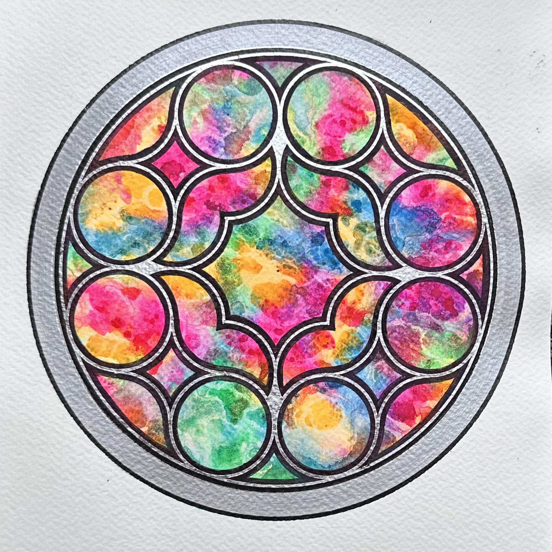
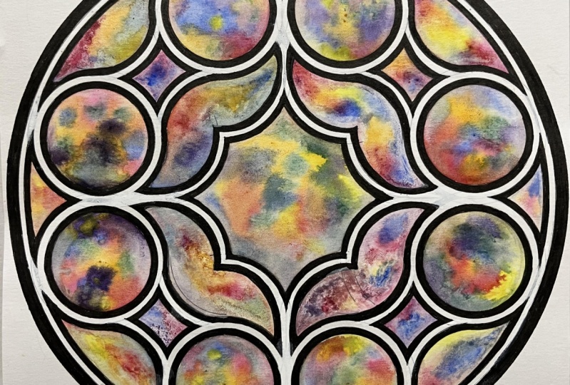
8. Painting the Stained Glass (Variation 1): We're now ready to create the stained glass
effect with paints. This is the best part, really exciting and it makes
the whole design come alive and realistic and makes it really look
like a piece of art. Now, in my mind, my
favorite way to achieve that look is to use neon shades, or the brightest
colors that you have, a few different
shades that can be both complimentary
and contrasting. Then using some rubbing
or medical alcohol, which actually creates
that translucent effect that makes it look like glass. Initially, I like to use a flat brush to saturate
the surface with water. Then after that, I like a big round brush to just
distribute the color. The color will be roughly
distributed in equal parts, but we need to be careful which colors could actually
touch together, make a nice shade and which one. For example, the pink can be next to the
orange or the blue, but I would avoid
putting the pink too close to the green, and the green can go
next to the blue, but I would avoid the blue
and the orange touching. Let's saturate the
whole page. With water. I mean, the whole
circle, not outside. You can use a compass and put the brush
inside the compass, if you prefer, that will
give more accuracy. I use that technique
as well sometimes. But it's not too big, so I'm almost already done. Now remember this outer edge is going to be the frame anyway, so it doesn't have to be
really accurate at the edge, that will get covered with the frame when we are
ready to do that. This is the water them. Now in any random order, we can start with any color. I might start with the orange. And just add a bit more water, randomly distributed
across the circle. Just bearing in
mind, I do want to make sure that at
least add the edges, things are fully saturated. I don't want any white space left over on the
edges of the circle. And any few random
bits of orange. We can add more of
the same color later. Look how bright this is. I'm going to go for pink next. Knowing that the pink
can touch the orange. Go near it. Make sure you
put some on the edges. The pink can merge with the orange without creating any unpleasant
muddy shades. I might add some more later when I need to bridge a couple
of colors together. But now I'm going
to go and add blue, and again, the blue
can be near the pink. We do need to make sure we leave enough space for
some green as well. This orange is deagerating
the vibrancy of the blue. That's fine. We knew
that would happen. A bit more here. Then
I'm going to green. I'm going to put some green here just in between the blue. That should look good. Here. Look how nice the pink and
the blue emerging together. Some are very interesting. Here, there's a bit of a patch. If you put it
directly onto white, even if it's close to a shade that we might
not want to mix it with, it might not go
far enough to mix. Let's make sure first
there's no white parts left really want any white parts. Simply because The design is the glass realistically would be fully
colored in something. There's too much green there and not enough green
in the middle. I feel like the, the biggest piece of glass should have
all shades present. That's a nice place here to
put in a little bit of green. I will go in with a little
bit of blue again now. That's to break up
this green there, seems like too much green. Pink all at once. I'm just going to break this up a little. And a bit here. That will make more
of a turquoise shape that's more of a purple shape. Again, it seems like a
lot of green over there. What I'm going to do is
dab off a bit of it. H. Now here, I'll add
a bit more pink to break up that
continuous blue streak. I'm going to use a
little bit of tissue and try to take off some
of that because otherwise, the green was going
into the pink, and then it's just too wet. The edges are always going to be where a lot of it will mix. That's good to add a
bit more blue here. Then a bit more pink
just to break up this This big blob of blue. Then I'm going to have to
add a bit more orange. I did anticipate that
the first color you put down is likely to be
the one you'll have to also put in last because it's likely to get covered
up by other things. We are going to add some alcohol after just that fun
element as well. It's a technique you can
apply to anything else. L et's place it here,
that's going to be pale. I know some of this
will get covered up by the frame, of course, but we still want it to look well saturated
at this point because the alcohol is going to take away from the
intensity of this. Yeah, I like how the colors
are getting defined. There's a lot of white here. Going to fix this part here. But I love how this
technique works. It's very fun, right and unpredictable
and just effective. I mean, there's some very
interesting mixtures happening here, very nice. Now there are many
different ways in which you can add the alcohol
to the paper. Whenever I've done it with
a little spray bottle, I felt that the droplets
were too small, so they really distributed
more evenly but really took away from the overall vividness of the colors and
I don't want that. I prefer to apply
it with my Pipe. Initially, it always leaves a little bit of white around it, which is fine in a way what
gives the effect we're after. But the more you
apply, the more you will the more it will blend, and so it won't be
about the droplets. It will be more about
the overall look. Again, if you feel
like you don't like the boundaries that the alcohol is creating and the effect, then we can just reapply some more fresh
water color on top. This is the stained
glass effect all dried. It looks really interesting
and unpredictable. It has leaked, but that's
a great opportunity for me to show you how we fix this and how we can go ahead now and
complete the frame.
9. Decorating the Frame (Variation 1): So I'm going to use a range
of markers here starting with a black paint marker
because this is how we're going to do the frame on either
side of the central line. Then the central
line, we're going to outline as the final
step in a metallic, maybe gold or silver
pen, if you have that. The black frame is now complete. I had to use a variety of black pens because they were running out,
but that's the idea. You could of course
use black paint, black quash, anything
else you have. Next, we're going to reline just the middle line of the
design with a metallic. I'm going for silver,
and this is where it's going to give that beveled
edge that's raised above, and it will give you that
metallic construction all over. This is actually
exactly the same radius as what we originally
started with. That's the two centimeter radius outlining exactly the
same as how we started. I'm going to go for
the full circles first and the middle of mi. Circles, I'll start
with the top two, then the sides, bottom,
and other side. Now, the four arcs
from the corner, you might have to look
carefully to find the original center and just enough to touch the two circles, not too far.'s a little bit. Sh. Not too far, not too close. Then the inner four. Again, you need to search for that point. Then from either side of those
arcs, just to the middle. Next, we're going to outline the full circle and
that's where we want the big circle to connect and touch all the
circles that are there. Just check because here we can't hide that
if it goes wrong. We don't want any to
obvious gaps or overlaps. I think that will be fine. Just going to repeat this
because it didn't come out as thick as the other lines. That looks great. Now, by hand, I want to feel these
little shapes here because they they
look really nice. The blacks nice as well, but I feel like I want
to fill this sea. You can decide whether
you want to as well. Another minor detail
that we can fix here is wherever we've used the
points for the compass. We can just gently go over those with the metallic to just
cover up any obvious holes. It's not really a big issue, but it's just that
extra finishing touch. It can't always be disguised, but it's something to keep in mind that you can try and do. Now, decided because
we need to do something to fix
the messy parts. I'm going to outline with silver once more at the very edge. There is another small
imperfection here, where a little bit of my silver is slashed into the black. Just with a fine line to try and repeat the black
on either side. I've now decided to add another extra
thicker silver band, but I'm going to use
silver silver paint that's solid because I know
it will cover this up. Probably won't go as far as
this I'll see how the ends, how far the edges come out. You might think this is going to make it even more inaccurate. However, I'm going
to use a brush. Need to make sure
that your brush actually fits because sometimes brushes can be too thin
to fit in your compass, and if that's the case, then
we can't use this technique. Something fun to
try, so I'm going to mix this in really well. Probably need a bit more. Then we very carefully, I'll going into open the bruh. Now, bear in mind, when you
press with the bristles, see that's what happened,
they will open up. So you have to try to
apply the same amount of pressure all the way around
to keep that the same. So let's move with the paper, and that will be
one way to fix it. The paint around it is now dry and managed to cover up the
paint that it's splashed. You can see a tiny bit of green left over here, it
left it on purpose, so you can see that it works, and of course, you can reapply that as many times as you like. Now as my brush slipped and
there's a few inaccuracies, the very last detail I'm going
to add is to just reline this black band on here and one on the very outside just
to really define the edges. I'm using my medium fine liner. It's actually size 12, so it gives it a
bit more thickness. And there we have it. All the
final touches are now done. I consider this to be
complete and beautiful.
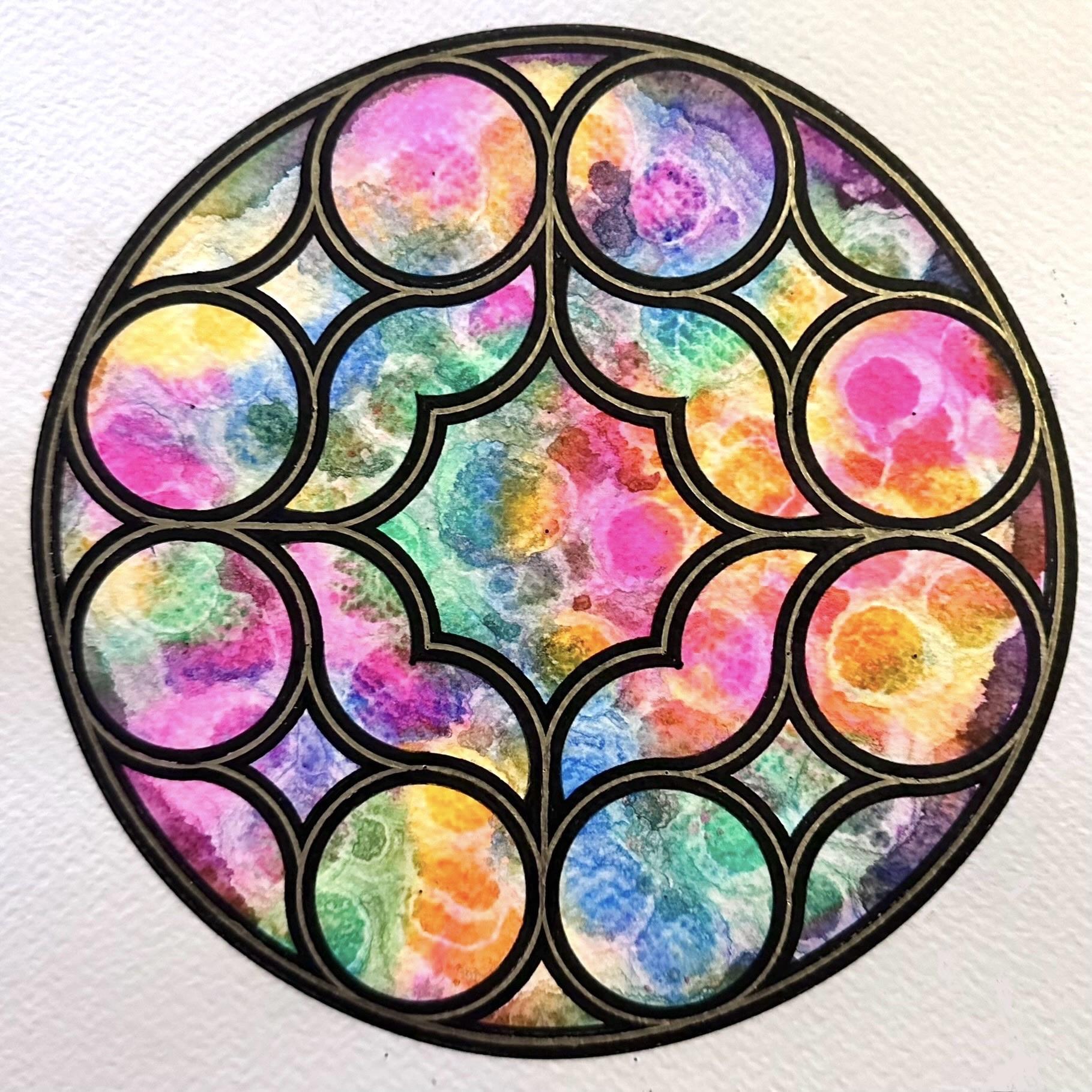
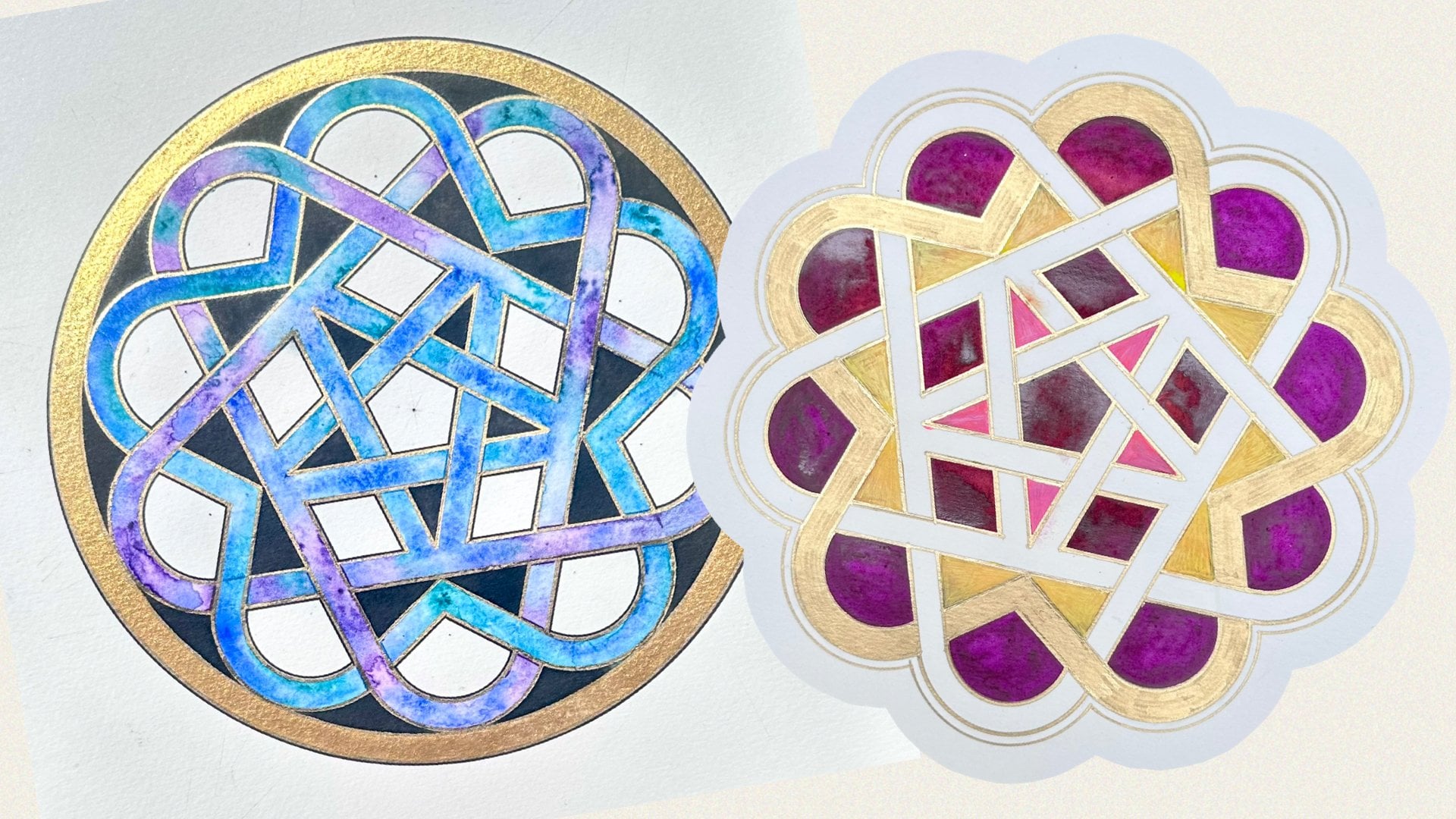
10. Planning the Frame (Variation 2): We are now ready to
learn the second design. It's actually the same
construction and the same window, but we are going
to decorate it in a very different way or give that completely
different look. I've made one similar before, which is a different design, symmetries 12 rather than eight. But this is the look
we're trying to achieve. There are fundamental differences
in how we're going to build that frame compared to how we did it for
the first variation. Notice here, we have some flat space in the middle between each of the window that
gets carved down. Instead of the two bands of the previous variation
that we need to create by drawing one circle on either side of the
original construction. Here, we need to draw two circles on either side
of the original circles, which aren't actually visible or part of the finished design. As you can see, I've constructed already the same exact frame, but I just want to
show you how we would take one circle and
how we would thicken it. In the first variation, we took a circle arbitrarily
smaller on the inside, and we found roughly
the same amount of space between the
original and the outside, and that was enough. Now, what we have to do here is if we delete
the middle circle, that just creates
that initial band that creates that flat
surface once we decorate it. Which means we now need to
create two more circles, one more on the inside and
one more on the outside. However, they need to be the same width as
these two combined. The distance between
the original circle and the inner circle has to be twice to create that
altogether, that bandwidth. We need to try and replicate this combined width
here and here. This distance from
the original circle that was 2 centimeters, now needs to be twice as far. Let's go on the
outside because we need to try and replicate
that combined distance. Does it look about the same? That will be on the outside. And then about the same
amount going inwards, maybe about here somewhere, then that creates the third
band, the inner band. Then if you visualize how this circle is actually
going to be deleted, Now we have three circles. The one that will decorate as a flat surface and the two
that are carved inwards, and we're going to use some browns rather than
blacks for this. Then we're going to leave the actual window parts as blue as if looking
through the sky and through the clouds and create some three D look shading and shading the
frame itself as well. That's the idea. We'll
be drawing more circles. On both sides of the
original construction. Now, because we are
doing more circles, we're actually taken
a bit more space, and so we do need to look
at the smallest part, the smallest shapes
in the design, and use that to decide how
much further n can we actually go because this will
leave less of window. More of frame less of window compared to
the first variation. This is the smallest
shape in the design. If you remember from my draft. This is the smallest part. That's only one art going in. We need two, and
we would like to leave a bit of blue in there. I wouldn't want to go
anywhere smaller than these. This is a similar
shape in that design, although created in a slightly different
way than this one. Let's see if we
start with this one, and we're going to try and decide how far in we want to go. So Let's start with this
smallest shape here and remember the center of
this was on the outside. I need to actually make
this bigger in order to go inside this little
diamond shape. It's probably wise to go
with the innermost arc first because that way we can guarantee that some
space will be left. I wouldn't want to go
any more than halfway between between that arc
and the center because that will leave That will leave a little
bit of space to be painted in blue or to leave that kind of
illusion of a window. If I draw this from
all four corners, because I'd like to visualize
just this one shape before I commit to that size, I want to complete
that one shape. That leaves plenty of
a window, actually. I think we could go a
little bit smaller. It doesn't leave that
much of space here. So let's go a bit further in. I'll delete these.
So a bit further. Yeah, I think this is giving
it a very a nice shape. Here where it joins
is almost where the circles cross over anyway. Yeah, I think that's
a really nice amount. It still gives that
slightly curvy shape, not as of, but it also
gives enough space to this
11. Thickening the Frame (Variation 2): Okay. What I'm going
to do now is complete all the arcs of that radius,
just like we always do. Let's complete
those shapes here. But in fact, we just need to also do the full
circles outside. Now we're going to
do the four corners from the outside and
I'm only going to do this arc from here and
now the inside ones. The four, now we're going
to do these ones here. Again, I don't really know
where they're going to cross. I know I can stop
here at that line, but here, I'm not sure
where they will cross, so I'm extending it just
to make sure they cross. Great. Now, we're going to replicate that amount of space
on the other side, and then we're going
to do the middle because it will be clearer to see that same distance,
but on the other side. I'm going to start
from this corner. I'm trying to judge that distance from
there to there and from there today
is about the same. Again, I will commit that actually slightly
bigger because it needs to touch he
doesn't, that's perfect. It doesn't need to
touch these two. Actually, we don't
have to guess. We go from that. So I. These are the inner
and outer edges. Now we know how big each individual window
is going to be, the amount of glass. But now we need to split that band and ignore the really thick one,
use that for comparison. But that thick band needs to now be split into three equal. So we need to draw an
arc on either side of this one that is the same
width combined as these two, that will be a bit of guesswork. In theory, by y, we need to split
that distance into three and go one third of that. This needs to be If I go like
that, or that's too big, that bit needs to be one third, one half of this bit, but a third of the whole. Thank you. I I just delete this and go a bit
closer to this one. That's looking a bit
more like half of that. Let me just go on
the other side just to ensure that that's looking like three
fairly equal bands. Yeah, I think this is as
close as we will get it. That's why we couldn't
really go much further in without
sacrificing this glass, but these are now looking a
lot in as they are this way. But that's fine. I'll come in to this one and
I'll do that one since I'm already at that length and then I'll
come back to this one after. Okay, so we are again
going to do that arc. Yeah. I'm going to do the circles again
first because then the circles will show us where
things are going to touch. And now only one more time
with this distance here that we tried earlier in this
corner to go further in, I'll repeat all of these arcs. Okay, this point,
we now have all the required needing to
create the design, but also quite a few
that aren't needed. It might be a good
idea now to delete some of them before we outline just the
ones we do need with a permanent fine liner, and then we'll rub off the rest. But this is what I mean. We need to actually be able
to visualize where to draw our permanent brown markers. This is what we're aiming for. This whole thing is
connected uninterruptingly, that flat surface because it was a flat wall and things were carved
into it separately. That's how we need
to visualize it, which means this is along where all the original circles were. We need to delete those
and create those channels. Let's do that first and
start from the middle. This will be the inner edge of the window. This
will be glass. This is the inner
carving, similar to this, but this is six pointed
and that's eight pointed. This is the glass. The first line we come across is the start of the frame
for this piece of glass. Then this is the bit we need
to delete in the middle, and then there will
be another piece. Starting here. We need
to delete this bit. Notice the original
slightly darker circles. We need to delete this.
12. Outlining the Frame (Variation 2): Now we need to very
carefully go over the four arcs that we actually need to keep.
We can't delete those. I'm going to start
with the smallest one. I am measuring the outer edge. This is where we need to try and seamlessly merge each
arc to the next, but we're not going to know how far the next one is
going to go because the next one is going to have a different radius
and we're going to commit to one radius at a time. Later on, we might have to just put some finishing touches
by hand, but that's okay. Again, as usual, I'm going
to start with the circles. These are going to
be the inner bands. Now I'll do the corners, only a quarter, where we anticipate they will
join in with the next one. In fact, if you go a
little shorter now, that's safer in case
if you go too far, we can't remove it. And the eighth in the middle. Do you know the drill by name? That's looking great. Now
what I'm going to do, I'm going to go to now
the biggest of the radii. You might want the y, but
I'm really anxious to see because they will be the ones merging in with what
we've just done. I think I've gone a
little bit too short, so I might need
to go a bit wide. I'm going to measure the existing small
arcs and make sure that mo points where I would would actually
join in. Let's see. I ended up giving it a bit more thickness, but that's okay. It seems like we'll
make a good transition. Just take it slowly. Now, I am going to
start with this circle, but we need to be very careful. It's not a full circle. First, we need to
join this. This is job number one. Let's try. Make sure. Let's be too wide. Let's But Let's join this one. That looks all right.
Then we need to go over the frame and then just
do the inner part of this shape and then only do check that this is
going to blend here. I think we're going to need to adjust the radius
as we go along. Otherwise, things won't
really lend in nicely, and then just do the lower
half the lower end of that. I think I went a bit too wide. Let's repeat the
same on this side. Let's do this little. A here. Then the inner
little window there. And then this part
and stop here. I'm going to repeat
that same thing on the other three sides. We just need to do from
the four corners now. We've done the eight circles. Now we need to do these to
complete the small shapes. From those arcs here. We
will do the inner part. Nice and short here
because we want the edges to the ends of
those arcs to join in re we. Is best if you stop
tiny bit short. This radius is now fully done, the inner and outer
radii are fully done. Now we need the two middle ones, but we've already experienced
merging them at the edges. We need to just slow down. They're not perfect.
However, look at it, it looks beautiful. I love these little wing shapes. These ones, it's
looking really great. I'm going to go with the
second with this one. And these will be
complete circles again. That's an easier
place to start with. Complete circle. Here now, we need to
anticipate where it will join in with this radius here
that we haven't drawn yet. Somewhere here. And we will adjust the last
one by using this one. Let's do the corners,
we've committed. The middle band might
actually end up slightly wider, but that's fine. We're going to now do this one. I'm actually going to use
which one should I use this one to make sure this
here joins seamlessly. The middle band will
end up slightly wider, but that's okay because
the symmetry is still. T here and stop. Then where we anticipate the
mile join line, the axis, and then most That's fine and then just
continue this bit here. Let's start here,
join these two. And this bit here, and
then join these two. Stop. This middle bit. Join us here, and then join this one and
stop in the middle. Rate and repeat those steps. Okay. Now, in the places where
things have merged very, you could just do a
little bit by hand. Change direction. We can go over the confidently
at a later stage. If you decide that's
something that we need. But overall, it's not bad. When we delete the
construction marks, these will be more clear if they need touching up anywhere. But remember, a lot
of the brown will get in once we start decorating it like this and we can give it
some shading anyway, it's not anything to worry
about at this stage.
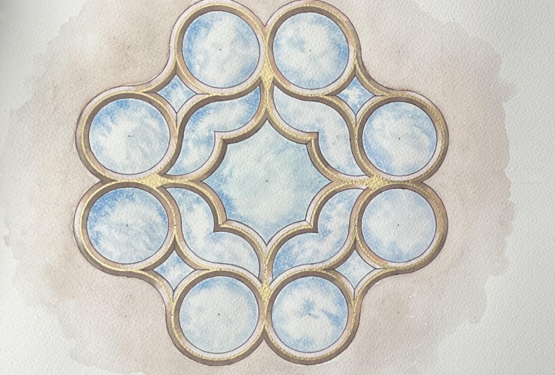
13. Painting the Window (Variation 2): We're now ready
to start painting and decorating this window. Remember we were
trying to recreate this second type of look. However, we're going to use some water color for a bit
more of a dramatic look. We're going to need some pale
blue for the actual glass, and then we're going to need
some neutrals for the frame. The first thing I want
to do is the glass. And this time I'm visualizing
looking through a window and seeing clouds
and just blue sky. We're going to use the
beautiful texture, the natural texture
of watercolor paper, and its whiteness, its actual color,
mixed with the blue to create that more
dramatic cloudy effect. Nothing, in my opinion can fake white the way
the paper can. I don't often tend to use white paint to make
white patches. We're going to let the water and the texture of
the paper do the job. We're going to individually
paint the window, the glass parts of the
window in light blue. You can use any blue. My lightest blue is
a little bit shiny. I don't mind a little
bit of shimmer. That's ideal, or you could just mix another blue in a little bit more water
to make it paler. But that's all that it needs and a little bit of clean water, a tissue just in case. If the paint doesn't quite
behave the way we want, we can use that to dab out
some of it and try again. I like to use a slightly
bigger brush to wet the surface first
and then purposely, a much smaller brush
because the idea is to just emphasize the edges and then let the water move the paint inward. I'm going to start
from the center. It's the biggest one, so it will give us a good
idea of how it will work. Get some water and just
carefully outline this shape, the curves of this shape. If we use the much finer brush, it will take too long
and the water could dry. In this case, we do want to emphasize that shape with the use of the water.
Go over it again. If something spills
a little bit beyond, it's not a problem because
we're going to do the frame afterwards and that's going to be some darker browns later. That's well covered in water. Now with my finer brush, is going to mix this a bit, it's already released pigment. I'm a fine brush. I'm just going to start
from the top and just gently go along the edges. And let the water create
shapes and blooms and clouds. But do make sure to at
least saturate the edges. It doesn't have to be an
equal amount of paint. It doesn't have to be
uniform on those edges. I purposely like to leave some of that
natural whiteness that's coming through now and even the completely
white patches. If you want a little bit more, blue, you could add. Now here there's
just a dry patch, so I'm just going to
add a little water just to make sure there's
no white patch. You can add more water
to actually control the flow of where
things are moving to. You can drag the paint
around if you feel like you want more saturation, you can add a bit of
definition on the edges. But that's pretty
much the effect I wanted and I'm happy with. It's very easy to achieve,
nice and effective. Dramatic and well
defined, yet delicate. So I'm going to do the two wing shapes
starting from the left. You have to judge
this carefully. Obviously, a smaller amount of water will be needed
in a smaller shape, like this one is considerably
smaller surface area. The one brush was enough to
saturate the whole shape. Plenty of water there now.
Let's do the same thing. Now you can mix up the blues that use and you can use
more than one shape, but because of the water and the witness that are present, I don't feel that that's needed. I think the variety of
shades here already exists. I notice how on this side, there's almost no white left because it's just
a narrower shape. You need to decide how
much whiteness you'd like. And again, no rules. It's just you need to be happy with what
it looks like and whether portrays the style
that you want to visualize. Now I'm going to do what I
said earlier, I might need to. So with a little bit of tissue, I'm going to dab just a bit off on that side
where at the start, there was a lot of blue.
See what that does. I deleted. I took off some of that, but
the end is already dried. I'm going to add a
bit of water and that will create a bit
of a bloom there. Water bloom. That's fine. Feel like these need a bit more. Less paint or more water. Dever one works out. Yeah,
I'm happy with that. Here. There's a few more seems like a more
defined white edge. It's up to you whether
you like that or not. If you blend it out too much, it will look more
gradual and nice. However, if I'm trying
to achieve a cloud look, quite often clouds will have a sharp
definition like that. I'm leaving that one
this way because the next one is going to turn out slightly
different anyway. Again, water this time
just towards the tip of that because I've now seen that this shape really
doesn't require water. Repeat on this side. Yeah. That is plenty. I'm actually going to put a little bit less
paint this time. Just a little bit more gently. If you start from
the thinnest corner, it can saturate too quickly, which is what happened
with the other one. I'm starting from the
curve in towards that. It's more gradual here. For smaller shapes, that's
a nice way of doing it, not starting at the corner, but actually gradually
pulling the paint towards the corner until you're happy with how much paint
there is there. Obviously, we do
want the corners and the edges to be nicely defined. That's pretty much
the only thing. Then in between what
happens inside the shape, it's a natural process
and unpredictable, which I always find exciting. Let's do the two small shapes. They will be the most
difficult to get right and I'm not even dipping this whatever water
is already there. I'm just going to brush on top. Very gently. That might not
even need all four arcs, perhaps on the on the top
and see what happens there. This one and this one, and not even reloading. Now we're just going
to use some plain water for this amount. Yeah, that's that
doesn't need any more than just a
little bit of water to just distribute that
paint a little bit more. What we might do then
later, actually, let's do that so we
give it a little bit of intensity on one side, but not so much on
the other side. Then if you want to redefine
the top edge again later, that would work, and it's se. We'll go back to these ones with the two circles on the bottom. Actually, I'm going to do this
one first because it will be easier for me afterwards. The circles should be
the easier ones to do. They're just a nice
round shape like this. There's not too many edges
or anything to consider. I'm going to get this
one a bit because I can go for a long time
uninterrupted. Now, if you go occasionally, then it will create
even more shapes. More water so that it flows along with the pigment
that's already there. These circles, all eight
of them, they will, of course, end up looking different from each
other and that's fine. Now, two clouds are the same. Is that, that about snowflakes? I'm sure it's true about
the clouds as well. Oh, I like adding
a bit of the water after it's actually making
these curves and emphasizing. Yeah, that's the perfect
look. That's exactly how I wanted it. When I say perfect, I don't mean perfect in the
absolute sense. I mean perfectly portrays
the vision I had. As long as you find the vision
you want it, that's all. Or if you find a new vision you didn't expect, but
it's just as good. Adding a tiny bit more now that this is just slightly drying, just having a tiny
few dots there. Then I'm going to do
the bottom left circle. So these side windows might end up slightly
darker than the middle. We can't really tell
yet until it's all dry. Again, it doesn't really matter. I mean, if you look at the
sky over here in England, everywhere you look,
it looks different, and it's usually
different shades of gray rather than blue. See, I didn't let go
quite often enough here and it's not
moving as much. So I'm going to do that more on the other side on the
right hand side here. The more times you lift off
your brush off the paper, the more shapes and blooms are going to form unpredictably. Where I'm choosing to add
water is where it looks a bit drier and as if no pigment. Again, that will dry
and it will probably create a nice sharp edge around, potentially what we making
to look like a cloud. But when you add more water, it also pushes the pigment together and then it
makes that nice contrast. Again, I'm going to just go back again to these
two tiny small shapes. I need to judge not to
put too much. Yeah. Now, I'm going to stop with
this and just let it dry. The meantime, I'm just
going to rotate this, repeat the same
steps and then have a look again and how
these are drying. We need to leave this to
completely dry before we can have a look at
starting the frame.
14. Decorating the Frame (Variation 2): This is now completely
dry and it is exactly how I wanted
it and visualized it, has that drama in contrast, but it's also subtle enough. It's a different look
to the first one where more of the drama
was on the glass. This is more about the
frame and the carvings. Now, remember the part in the
middle is the flat surface. I'm just going to paint and
I've gone for yellow ocher and it can go as pale
or as dark as you like. We are going to have to fix
this piece of paper later by using a heavy book or something heavy and
a bit of moisture. But for now, I'm
just going to go ahead and paint
the rest of this. Okay, once this is dry, we'll be completely
ready to start tackling that frame and making
it really off the page. Now for the carved
parts of this design, I'm actually going to use
some alcohol ink markers, and I find them a bit easier to control and blend and recreate that real depth as contrast to the
other two elements that we've already done. I do like to mix
it up, I like pens and markers alongside
watercolor. This is the idea of what
we're going to create. We'll see about that shading, but for now, we're going to
look at those brown areas. These are the colors similar to those I'm going to go with, which is why I wanted to outline the original construction
in brown as well. Now, we need to visualize, first decide which side of this you want to be the top for you. Then it depends on how you
like visualizing the sun. I always look at the sun
as if coming from above. That means the top bits are
exposed towards the sun. But those that are just
below something physical, they will have that shadow. We have at the very top it will be lighter and then
it will be alternating between dark on top
of each piece of glass and then light on the bottom of
each piece of glass, and then we will blend them in and go as deep a
shade as we like. Before that, though,
I'd like to add a little detail that is going
to help us at definition. That's these little
corners here. If you align the top shape here with the bottom, just like this. Then we're going to do a
small lye segment and there, and then here and here. Then we're going to
move to the middle. And we're going to
do the same thing the top in the middle shape, bottom of the middle shape, and the end at the bottom. This one needs repeating. This ruler is not great. Again, the same as
this side on here. Just the white parts. Now, rotate this way
and now I'm going to repeat the same
three lines going down. Now I'm going to do the diagonal of the central shapes
and the wing shapes. Rotate and do the same
on the other diagonal. Finally, those corners
here of the wing shapes. I'm going to actually
do those free hand. That's already given the shape and the structure a
bit more definition. That will help us now when we decide each segment will have
a slightly different color. Even though we won't
blend them out, there's that nice definition. We're going to want light
colors here, here, here, the curves that are
looking upwards, that are like a U shape. I'm going to t that as well
so I can see this a bit better and just scoop
around that edge. That's a fairly
dark brown already. So I only do the top
half of that arc and then go with my next shade
and then to the lower half, and then blend upwards. I'll continue with this
middle shade on the side. Then on the bottom, I will
go with a lighter shade, not the lightest, but
lighter shade here. Then the lightest shade I've chosen is this
one, and just do that. Then can just blend
out the rest. That's the effect. But I'm going to go over the top again with a
darker shade, not the darkest. The second one because there's already color there and
it does layer well. For even more drama, you could add shading as well above the actual
window like I did here. This took a lot of shading
with the medium shade, I'll blend that out
again a bit more. A little bit more
brown at the top. Especially if you see
any imperfections from outlining this earlier. That's where you want to use
these to try and disguise. Again, that whole thing
could be re outlined, of course, as well, and that will give
definition as well. It's up to you if you want to redefine the edges of
those circles as well. I'm finally going to
use a tiny bit of the sea blender just to create that little shining glow as if a sunrays
bouncing off of there. You could then add
a little bit of white here as well at the end. This is the idea
of what I want to create for each
individual frame, I'll leave the circles for now. Let's do the small shapes now. Let's start with the
darkest one again. Now, this is different because
we have those few edges. I'm going to go
from that edge and that way to the left
is my darkest part. With the next shade
and this out to here. This is the two parts that are looking in that are
carved inwards. This one with a medium shade. Although I want both
of these to be dark, I want just that side
to be that little bit because it defines
that edge really well. That line that we had there. Of course, you can
repeat that line with the thinner liner. I think this is doing
the job really well. Again, blend that out. Then the lightest shade then
should be on this part. And then one slightly
darker than this on here. Again, perhaps only half and then blend out the
lightest shade I have. Then with the
transparent blender just a little bit on here. Push away some of
the pigment away and create that extra
little white glow. There you go. That
one is perfect. Then let's make that wing shape. Again, it's the same idea. I'm going to start with the
darkest part just like here. Then in the middle
because that will be directly under the shade. Then bit of the
darkest one here. After a while when
the pigment settles, you could see then whether
you want to add a bit more and usually they do go a little less intense once they sink in to the paper. Back to that medium shade. And slightly darker, just
to blend these a bit more. With the very lightest shade, I'm just going to
repeat the whole thing. This could definitely
take on even darker because it would make
it even more dramatic. Now with the second light shade, I'm going to do the
bottom half of the shape, and I'm just going to
define the corners. This I envisage it
to be quite light. With the lightest
shade, lend it out. Define the edges a bit more. In exactly the same way, these here will be darker,
just like that one. These two will be a lighter
shade of the two ducks, and then the two lighter
shades on the bottom here. And variation number two is
now fully complete as well.
15. Conclusion: I really hope you
enjoy learning about both of these varieties
and learning a little bit about the geometry underlying the rose windows
and their evolution from the plate tracery style
into the bar tracery style. I hope you enjoy the variety of techniques we explored in
terms of decorating as well. You can use those techniques for any future art of your own. You could paint this style
for absolutely anything. Particularly the two frames
that you learned to make, you can apply these
to any other art that has shapes and
patterns in them. I really hope that this process that I've shown you gives you belief that it doesn't matter how messy things might get or
imperfect they might look. There's always a way to improve or change or make this your own. Please don't forget to share
in the project section, or follow me on Instagram and tag me in so I can see
what you're sharing.
 Diana Reeves, Geometric Artist & Educator