Transcripts
1. Introduction: I wanted to begin today by acknowledging the
Wadawurrung people, traditional custodians of
the land on which we meet today and pay my respects to
the elders past and present. I extend that respect to Aboriginal and Torres Strait Islander peoples who join us. Hello and welcome
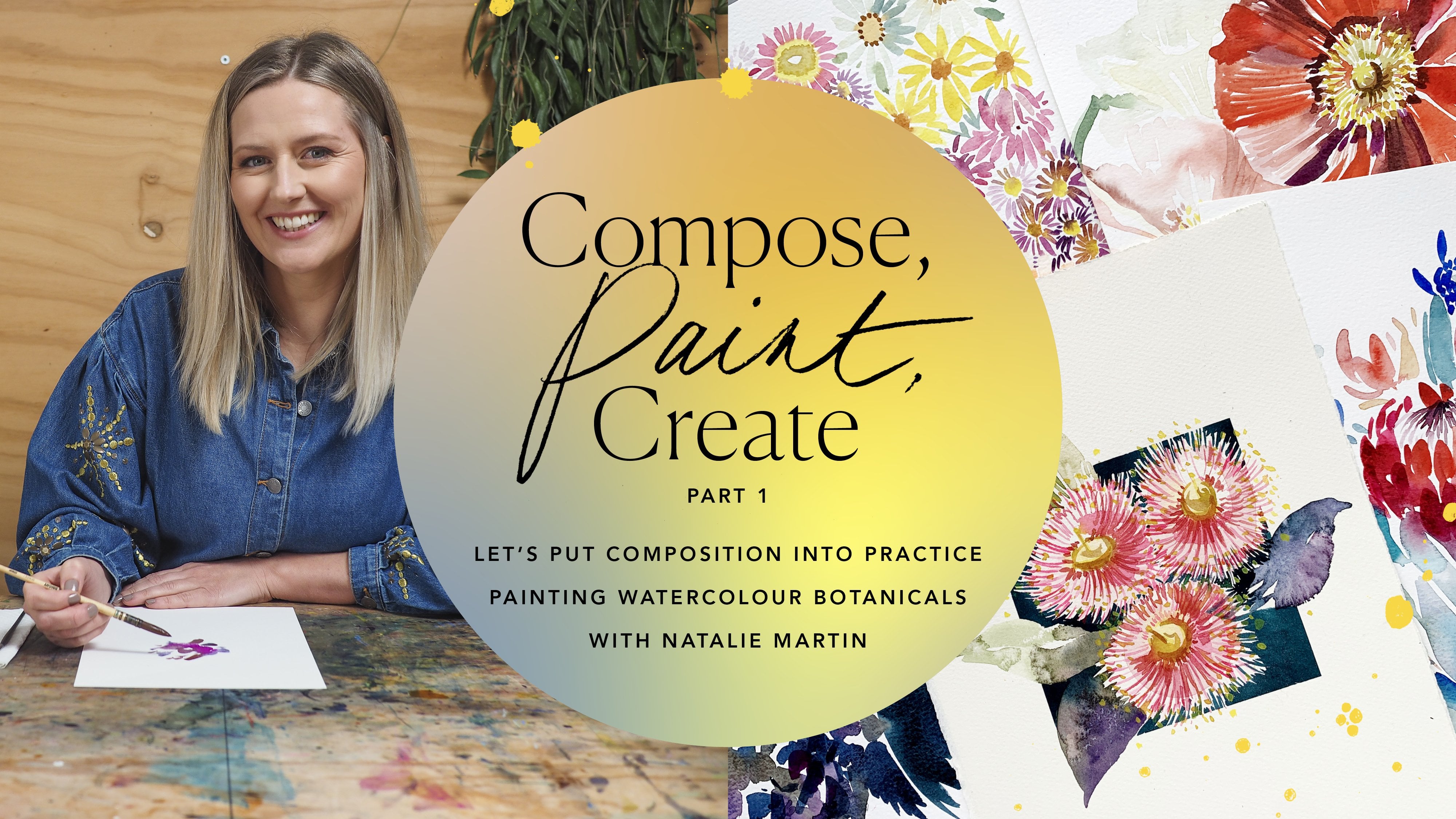
to compose paint. Create part two, where we're going to paint our way to
understanding composition. My name is Natalie
Martin and I'm a professional watercolour artist from the surf coast
in Australia. And today we're going to
explore a whole bunch of critical things that
are going to basically formalise our understanding
of composition. You may have joined
me for part one. If you haven't yet, I would highly recommend
starting there first. Because part two, I'm going
to refer to it a little bit, although it is its own
standalone course. In part two, we're going to visit the five other
principles of art, which are contrast, rhythm, pattern repetition and movement. Love movement, movement is a really good one to explore. All of these principles differ slightly to our first
five that we explored, because I'm going to speak more specifically to
how they generate a mood or an emotion
within the work. In part one, we looked more closely at how to
place things and where to get successful formulas happening with our compositions. From there, we're going to look at how to analyse
your composition, which I know sounds
potentially a little dreary. But I promise you it's
probably going to be your most favourite module of the whole course because it
brings everything together. And it's not going to only affect how you see
your own work, but how you see
artwork everywhere. And then the infamous. And also awesome is how to learn how and when
to break the rules. So breaking the rules is something that is
often talked about, but maybe we don't know
how to get it started or why it's actually a
fun thing to play with. If you've purchased the course through teachable or my website, your enrolment includes
the companion guide. My e-book. The e-book is
your ride or die alongside this course, it
has all your course notes, links to specific
products, extra tips, tricks and hints, as well as an extension projects
for each module. Every module has a project
wrapped around it. I think it's really
important that you are able to put things into motion as soon as you hear the theory. I think it helps cement
everything so well. And today we're going to use flowers as our guiding theme. Again, I think
having a subject to carry us through is going to
help focus certain things. And I've got lots of
different and fun flowers for us to paint with today. So, I can't wait to get started. Grab your paint brushes.
Let's get into it.
2. Let's Talk Materials: Before we launch into
our principles of art, I want to go through a few of the materials we're using today. And you definitely
don't need to give me an excuse to talk
about art materials. It's become a bit
of an ongoing joke, but I love to talk
about art materials. We covered most of what we're
going to use in part one, So if you did visit part one, it's all the same things with a couple of extra additions. So we have our paints which are covered quite
thoroughly in part one. You're more than welcome to use whatever paint set you have. do highly
recommend these. If you have you joined me for
previous classes they're absolutely fine
to use in this course. You'll need your jar of water. A handful of coloured pencils
is going to come in handy. I'm going to use these
in one of the exercises, just as one of the
demonstrations. But a little handful of those, if you don't have any, you can also just use paint. But the pencils just
shake it up a little bit for us. I've got my
handful of brushes. So with the brushes are, I'm lucky enough to own the whole suite of
Polina Bright brushes. Now I'm going to introduce a mock brush
for the first time, I've got a size two
and a size three here, I will largely use a size two. I was saying today
if you have one, it's okay if you have none. It's also fine because if we use our synthetic rounds to
do the same job, it is okay. The main difference
between these two, I'll pull out my two size two, so they're both size two. That is true here. And
you can see there's quite a distinct difference
in the shape of the brushes. This one here has a
really fine point, and it's really good for
getting a variegated line, and it gets a really nice
sharp fine point as well. And the bristles themselves
are very springy, so they've got a
really nice tension. Whilst you're painting,
if you haven't painted with a mop brush
before, they're much, much softer, bristles, they
hold a lot more water, but you can move things around
very smoothly on the page. It's quite a different sensation
whilst you're painting. It's not an essential
ingredient, but I would highly
recommend that if you are looking to expand
your kit in any way, when you go up a size
in the mop brush, it's just more water, more area. So it is a really
handy tool to have. What else do I have here?
I'm definitely going to encourage you to work on
cotton paper for this course. Again, cotton is just such a
beautiful thing to paint on. And there's a significant
difference between your cellulose common
in watercolour paper. It's often cheaper. Well,
definitely cheaper. Cotton is sort of the Ferrari of papers and
cellulose is more like a Ford. What I didn't show you
in part one though, is how I tear my paper down. So I thought I might do a quick demonstration of that today too. This is all large
full sheets of paper that I've bought
from the store and I tear down to the
size that I like. I haven't torn
them out of a pad. You can buy cotton watercolour
paper in a pad as well. But I find that I prefer to customise my sizes a
little bit too much. So I'm just going to put them to the side and I'm going
to grab my paper, which I forgot to grab. I've got a couple of sheets here that I'll
tear down for you. I've left them a bit
of a strange size, so hang on, let's
have a little play. I always use a metal ruler
whilst I'm tearing paper. A metal ruler has a
much crisper edge and it's a bit heavier, and you're going to
get a nicer tear when you're tearing
down that paper. So I'm just going to measure up, what length do I have here? That is 28 centimetres. I think I wanted to do a 28 x 22. Not quite A4. It's
a little bit more squared off. Yeah, there we go. So I'm just going
to measure really lightly and put a mark at 22, and then again at the other end. And then here's the bit
that makes people nervous. But you do get a beautiful torn edge as opposed
to cutting it. I wouldn't recommend necessarily cutting your watercolour paper. The deckled edge is the
handmade edge there, and this one's a torn edge, but you just get a really
beautiful finish to your paper. All right, so I'll
line up my ruler and the most important
part is lots of lots and lots of pressure on that ruler whilst
you're tearing, otherwise you're going to slip the paper from under the ruler, or you are going to get a bit of a bend in the paper and you're not going to
get a clean tear, or it might shift the angle. So lots and lots of pressure. And you'll see me
move my fingers down the ruler as I tear. And the other important part is to do it really nice and fast. It's like a ripping
a band aid off. So there we go. And then I'm just
going to keep moving those fingers down so
they have really nice, firm pressure on my ruler. There we go. That is
a nice clean tear. And then never throw away
these scrap bits of paper, because these are
really handy to cut down into smaller
pieces as like a little reference chart if you wanted to check your
colours against it. So all these scraps are
really handy as well. I'll keep those ones in
my pile of papers there. All right. Now, the
other things that we have here are the colour wheel, so this will come in
handy for contrast, If you don't have an
understanding of colour, one of these from the
art store will really help. Or if you've done my magic
of colour mixing course, this will also come in handy. This guy is the colour
colour mixing wheel that we paint in that course. Either of these is
going to come in handy for our
contrast module and then just a little bit of
your average printer paper is going to be really
handy as well. This is just really basic
light paper just to do our sketches and thumbnails
on what have I missed here? I've got pencil, eraser, and I just keep them
all in this little bowl to put my sharpenings
and everything in. That's what I have this
box cutter here for. I actually use that to sharpen
my pencils as opposed to a traditional sharpener because it makes them last a
little bit better. And then I've got
some paper towel, I might use some salt. I think we use salt
in the last one, but it might come in
handy again in this one. I haven't decided whether
I'll do that or not yet. And then finally, oh no, I haven't done palettes yet. That's something
that I really wanted to talk to you about because I completely skipped over them
altogether the last time. So I'll just get
these out of the way, because what I've
done here is I've got my watercolour mixing
palette here. And all of these
are my individual paints that I've squeezed out. And it's a plastic palette,
so it's lightweight. It has a lid so I can
transport it really easily. And it's really great
because I've been enjoying painting en
plein air lately, so taking my paints outside, so something light that's easy to carry has been really
important for me. But I wanted to show you because palettes are such a
personal journey. It took me a long time to
come to this as a palette. I had a vision in my mind
that I'm going to have this beautiful porcelain
palette, and da, da, da. It just wasn't practical
for me in the end. So I wanted to run
you through some of these palettes that
I've got here. These are all my
palettes that I've used throughout the
years and experimented with even the lid off your coin, or paints that can be
used as a palette, and I have used that
on plain air before. It's obviously very limited
with what you can do, but it is still a mixing
surface that can be used. This is the one that I see mostly with the beginners.
They run out and buy these. They're about $2 but
I find them very limiting because I love the broad mixing area and I really encourage
a lot of mixing. So by the time you've mixed
your nine colours or whatever, you don't have that much
room to keep mixing. And they stain. They're cheap. They're a great starting point, but you're going to grow out of it extraordinarily quickly. I wanted to show you this one. I don't know if I
showed you this in Welcome to Watercolour
the first course, but this is my original
set of water colours. This is what I was
given to me when I first introduced
myself to water colour. It's a little travel set. So this was the
palette under here, and again it's in the wells. I really struggled
with the wells, but at this point in time, I was working a lot
smaller and finer, so this was actually
really suitable to the style at the time. Once I started working bigger and with larger areas of colour, even these little pans
stopped working for me because it was too
hard to collect the paint quickly enough. But that's my beautiful
first set that I treasure. This one was
recommended to me by another watercolour
artist because you can dab your tube paints. It's a smaller version
of this essentially, but it's a heavy porcelain tile. You can dab your paint colours in here and then wash out here. Again, just not enough
area for me to mix. But that might be really
suitable to you if you've got a really specific set of
colours you want to work with. This one I broke pretty
much immediately. It's supposed to be a
beautiful travel palette, but it's supposed to seal it, never sealed, it leaked
all through my bag. And see how the plastic itself is like a buttery
yellow kind of colour. It meant that all your blues and everything represented a
little bit incorrectly. So this one I wanted to put
in there to reinforce it. It's important to have
white as your base for your colours so you
can visualise them on the palette really clearly
as you're collecting. So that one was a bit
of a palette fail. That was when I was originally getting into en plein air and I really wanted to have a really
neat and tidy little set. And then I just kept going
back to this one in the end anyway. Now this was part of my vision of the beautiful
porcelain plate. So this is a ceramic handmade,
had some chalk in it. Beautiful ceramic handmade one. The problem again was I ran out of mixing room
really quickly, plus the base is
not a pure white. So I found that I couldn't
get the clarity of colour that I found through
this process, that having the clarity of colour was really important to me. I stopped using
this one as well, but I should continue because all this paint is
completely viable still. Then the final one I
wanted to show you, let me just get rid of all that chalk that
I've dumped out of there is the one that everyone
always asked me about. I have included a link
to this inside the e-book and in the the link descriptions
because it's actually, it's an oil palette that I
got from my local art store. But it is the best one I've found for mixing
lots of different colours, but making sure that they don't
all run into one another. So this one I get an e mail
at least once a week about. So I wanted to
show you this one, and I've given you a link now. So that's it for me on palettes, I think that's everything
else we have needed to cover in materials. Just doing a visual check here. The last thing I
wanted to mention, which I forgot to
mention in part one, was we still need that
pinch of courage. The courage is so
important and it's an essential ingredient to
investigate and exploring, and just giving things a go. And today I'm going
to really push that. I'm going to really try
and encourage you to just give things a go if
you need to pause, revisit, check out the
e-book, and then come back. And then come back
with that courage. Come back with
excitement and you're going to have so much
more fun painting. So that's it for me. I'm going to stop talking about materials. Just give me another
opportunity and I'll be right back
there with you though. From here, we're going to dive straight into that
first principle of art, which is contrast. See there.
3. Principles of Art: Contrast: Okay, the first of our five principles
that we're going to explore today is contrast. Contrast is one of, I think, the most crucial
things to understand that influences
your composition. Contrast can really
change the mood, feeling, message, everything of the way
your work is interpreted. And it goes beyond maybe what you think is the obvious
kind of contrast. So there's three kinds of contrasts I want
to show you today. If you think of like
a value contrast, so looking at the brightness of your colours from
light through to dark, something like this
is a good example of a value contrast. The black background really
makes these light colours pop. So there's a very
strong contrast between the dark ground and the
white of the flowers. And having that range
gives everything. A lot of it gives it a dynamic feeling and a
little bit of energy as well. If I'd gone for a fully
black background, that would have
increased that contrast. So contrast has a range. It's on a sliding scale. And you can have
very low contrast, and that often feels very safe. Gentle, soft, and you can
have very high contrast. High contrast is more striking, more dynamic, more energy. Think of high contrast and the message
it's communicating. And you could think of say if we put it in a movie
posters context, your horror movies are
often black and white, and striking and strong
and very high contrast. But your romance films are
usually more harmonious. They're gentler,
softer, low contrast. So working with that contrast is a way of really communicating your message
that you would like. For this one, I
want it to be quite striking and bold and quite dynamic, rather than just
a static still life. I wanted to bring a little
bit more drama to it. So that's my reasoning
behind that. Here's another little demo that I did in another painting, in another class where
it was a sole subject, but I really wanted to lift
that subject out so I masked the black background a little
bit like what we did in the unity example in part one. And that just made that Bird of Paradise flower pop
out of the background. And it gave it a bit
more of an edge in a story than just a
floating flower on a page. Another way to think of
contrast though, value, is what we generally think of is the dark and the
light of things. And bringing those two things together in closer areas is what's going to
create that contrast. Contrast is all about bringing
differing things together. In this example here,
in this sunflower, I've used colour as
a way of contrast. And this is why I've got
my colour wheel here. In this example here,
I've used yellow as my main fundamental colour
of the flower itself. And if we've got yellow, if we track across the colour
wheel, we have blue. Actually, it's over here. I've got it spun around. Violet should be violet. The opposite to
yellow is violet. I've used violet
instead of, I say, a dark or a murky colour, or a black or a shadowy
colour in these deeper areas. And that is going to create
that dynamic energy again. So rather than it feel
a bit flat or too deep, adding in these
pops of blues and purples all through these
shadow areas is going to really exaggerate that
shape and give it more life. As opposed to just using, what we tend to do is go and put a black in there
or a dark brown. This is a way of
popping them out of the page at a little bit more. That's all about working with
your complimentary colours, which are colours that are on opposite sides of
the colour wheel. I go into this in way more depth in the Magic of Colour Mixing. But for this particular thing, complimentary colours, they can also be called
contrasting colours. You may have heard that
term before as well. Here's another example that's maybe a little bit more subtle. I've got two sets of complimentary colours happening
within this painting. I've got this purply
mauve colour up here, which again, is the
opposite, is yellow. So we've got the
yellow of the flower, but then I've also got
all these bluey greens. And I've got these tiny hints of pink all the way
through the painting. And having those two sets
working together is again going to pump that
full of energy rather than have
a flatness to it. I really love working with contrast to create
a dynamic painting, as opposed to just going with the colours that you might be
seeing with your eyeball. This is a way of lifting things and using a bit of
your creative intuition. This example here, I
don't have anymore. It's sitting in the
beautiful house somewhere. But this was another example, obviously really leaning towards the complimentary
colours in my own work. I think it's just although
I do work with value a lot and value and complementary colours
together can really, really enhance a work and
add a lot of contrast. But in this particular painting, I've got more
subtle brown tones. So I wanted to show you that
even though you may not use, I say, a bright orange
to complement your blue, Even an orange brown or
something that's familiar to orange is going to still create that really dynamic
energy within the work. The final type of
contrast that you can work that I use in your work and create is what we call a proportional contrast, which is actually kind of
covered in proportion. And I did kind of tell
you through part one. Like these principles, they
can't be neatly put in boxes, they are all entangled. And this is one of
those entanglements. Contrast falls into proportion, and proportion falls
into contrast. So I wanted to show
you this one example again in case you
didn't watch part one, where it's a more subtle
version of proportion. So the larger flowers are
where your eye goes first. And using that contrast
of the smaller flowers, it creates that energy to
drive you to those places. Okay, now I wanted to show you one final one which is a
contrast fail of mine very recently I'm working on
a series at the moment and I really didn't want to show you this because I really feel like I should be better
than this sometimes. But, you know, we all
have our moments. And this one, for me, it was really lacking contrast. Everything was of the same tone, all the same value, and there was no compliments
in there either. I'd gone too safe
with my painting, I might have just not been feeling it that day or whatever. So in the end, I tried to
add it in after the fact. So you can see these higher
value items here and it just never actually els because I didn't have it in the forefront of my thinking as
I was painting. So it's something to
bear in mind because it's harder to
introduce in later. You can always add more depth and add more contrast in value. But your colour selections, if you're going to work with
your complimentary colours, can be quite challenging. So I just wanted to
show you that one is that we're all human and we all have a funky one
every now and again. All right, we'll put
those ones away into our exercise today for
our contrast exercise. You may have already
had a little snoop in the download files, but I've provided
just one photo, which is this one here, of a still life. This is actually right
here with me as well. It's a still life
of a dried banksia. You're also more than
welcome to create your own still life if you're just not feeling that
that's not your vibe. Create your own still life and just follow the
same instructions. And you'll come up with a
beautiful example as well. What I'll do now is
demonstrate a few ways of playing
with this contrast. We're going to do a
couple little studies before I launch into
a final painting. I really highly encourage
you to explore all of these concepts
through the thumbnails and not skip over that part. I know it can feel like, you know, it's the grunt work, it's the bit we
don't want to do, but it's the bit that's
going to make you a better painter and have better outcomes and have better
resolve paintings. In the end, you're going to enjoy your painting
process so much more because you're going to
have a higher success rate. Thumbnails are so important
for our photo here. I've actually got it kind of
well composed in there yet. If I had a third, that vase is sitting on the bottom third. The banks ahead is sitting on the top left.
Third. Top left. Yes. And a few others
flying around the sites. What I wanted to explore
though was some of the fundamental things where people go wrong with
their compositions. So a few, a few
things that happen whilst we're painting that we
can't really work out why. I'm just going to drop
a few little thumbnails here and I'm going
to put my thirds in. I'm just going to
do this in pencil. Hopefully you can see
that nice and clearly. All right, one of the
main things that I see all the time is people put
things right in the middle. And we did talk about this
in a little bit in part one, but it means there's no
room left for the flower. It gets really crowded out, just fill that in
a little bit and it ends up glancing
this edge here. That is one of those
things that is always going to be a little
bit awkward for our eye. This little touch here, let's avoid that one there then. Having things placed
dead on the centre is it feels safe and it's familiar and
you know where that is. But if you can try and train yourself to slide
that onto a third, instead of just plunking
it in the middle, your whole work is going to feel a little bit more considered. The other one that
I often see, again, you could have things right
on the bottom go like this. That's also going to feel really weird. All right And then say if we
put the vase in, in the vase, glance at
the bottom edge again, that's a bit of a blunder when
we come to our composition because it's going
to feel like it falls off the
bottom of the page. I see this often with
my beginner students when they're excited
to get things on, but they're not
thinking about where they're placing
things on the page. So it's something
just to bring into the forefront of your mind when you're doing these thumbnails. Which other one did I
want to show? Okay. Overlapping, if we had a
second flower in there, this is one that I
often see as well, if I had two flowers. They're going to look better
with a slight overlap then if there was no overlap. A no overlap makes them feel
quite separate if you're wanting to explore that two
units instead of three, because three is far more
harmonious for our eye. But sometimes I like to challenge
that and work with two. That can be a really nice way to do it is just
overlap them and then you visually read
them as one element thing. That's just some of
the things that I see most often is that this
one falls off the page, glanced edges like
this or it can be a little cramped
at the top there. Really common mistake
when we're first starting because we get nervous about
where to place things. Thumbnail, thumbnail,
thumbnails. That's going to really help
you get to where you need to be and feel comfortable when you get to your
nice cotton paper. I like the good paper. I know that can be
scary. All right. I'm just going to explore these three concepts that we've just talked about
with this as my reference. The first one was contrast
and it was value. I'll do my little thumb now, the next one is colour. The final one is proportion. I'll do one more there. Something to bear in mind when you're doing these thumbnails as well is to make sure it reflects
the ratios of your page. This one over here that
I'm going to work on, my final piece, is
not quite an A4. You want to try and make
sure that if you've got a square up there, your
thumbnails are square. And if you've got an
A4, they're relatively, you're not going to try
and squish things in. You want to try and reflect the end zone that
we're working in. Value is the first one
that we'll be exploring. I'm actually going to stick to a similar composition to what we've got in the
photo reference here. I'm going to put that vase
on the first third, like so. And then I'm going
to put the flower on the top left third and I'm
going to connect the dots. So I'm trying to manipulate things and they
sit on the third nicely, not so much replicating
exactly what's in the photo. I'll slide some
leaves in there. All right, and in value, it's all about exploring the darks and lights
of the thing. It's about creating contrast by using the darks and lights. And using those
differences between the two to create lots
of dynamic interest. So I'm going to throw in
a little bit of colour into these different to
what we did in part one. Because I think
especially for contrast, it's really important to
visualise these things. It makes a huge difference. I'm going to just throw in, it's a bit of a dark, actually, I want a bit more blue in there. I really want a dark blue. There we go. All right, we'll pop this blue in here. I'm going to do it really
roughly and we're on really average paper that's
not designed for water colour. So I'm just going
to quickly throw it in together because it's
simply a visual reference. It, it's not the finished
artwork by any means. So I've got a really nice, dark, striking background there. That means to create
my value contrast, I should be doing a very
light and bright flower and that's going
to create really strong contrast between the two. I'm going to throw in a bit of ground colour there as well, just for fun, like so. And then I'm going to
stick to the colours that I'm kind of seeing
in the flower there anyway. So let's go
with a little bit of orangey, brownies, ochres. And I'm going to keep
trying to keep that as light and bright as
possible so that the focus is all about
the contrast in value. So there we go. That's about a speed that I
do a thumbnail for myself. Anyway, It's just
really to throw an idea down and see
if it's going to work. And sometimes you get
them, you're like, I just can't get it to work. Like it doesn't make from
my mind to the paper, it, it doesn't become
a cohesive idea. So it's a really
important step for us as we're learning to do
the thumbnail process. The next one is colour. I'm going to stick to
a similar layout here. Put my flower up there. So colour is going to
be all about exploring complimentary colours to create that same sense of contrast. Or better put the ground
in again. There we go. So this time around I might do, I want to go brights and just have a little
play with the brights. I'm going to grab
this turquoise here, throw that one in. When you
play with colour contrast, it's a really beautiful way. If you get a bit stuck with
painting things a little bit, literally like you're
looking at the subject, you're like, that's not green. I can't possibly paint it green. This is a nice exercise to shift that notion and
have a little play with getting more challenging
with your colour choices. I can get a little bit literal to myself sometimes, and I just want to
paint the thing as it is, but actually, once you put a little bit more of your artistic voice in there, it becomes your own. All right, so we've
got a teal in there. The opposite to a teal, if we look at our colour wheel, is a red orange. So I'm going to make
sure that there's a little bit of red
orange in there. And let's see, oh, that's a bit of muddy because
I've got a dirty brush. Bit of orange, wears a
clean bit of palette is the one problem with
my filthy mixing area is that it gets a
little bit grubby. I'm going to throw a bit
of pink in there as well. Just an extra compliment because I like to have a lot of
wacky colours in there sometimes. Sometimes I get
stuck in the literal, sometimes I go too far
outside that world. And then I'm just going
to throw a little bit on the vase and working very
quickly just for fun, I actually might even leave
that white on the bottom. Might go like that. Yeah, I
think that looks good. Okay. The final one is proportion. Proportion is all about
showing the differences inside the thing through scale when we're just working
with one subject. I've got two, I've got
the vase and the flower, and I want there to be a
contrast between the two. I need to bring
one of those into attention and send
one of them back. So I might actually look at this one from a
different perspective. That can be an interesting
way to change it. So I might actually go
something like that, where the flower becomes the dominant thing
in the picture. And vase becomes less of the thing if you're
looking at it directly on. You have to use your
imagination a little bit. Let me see. The flower becomes a little bit more oval and the leaves coming
out all other sides. Then the vase itself gets hidden behind
here a little bit. This is very rough.
That's the top up there, the vase is here. This technique is
called foreshortening. It's changing that contrast in perspective, basically. Like so. Now my challenge
to you here is to take your preferred
one of these to a final painting state
on your cotton paper. I was actually thinking I might tangle these two up
and do one with value, but has a little bit of colour
contrast in there as well. It's a way that I really
particularly like to work the proportion one
I use in some instances, but less so if you are someone that struggles with the literal colour thing. I would highly recommend trying just a straight
colour contrast one. And really go for bold contrast, go for directly opposite colours. And it's going to really shift
the way that you look at things because you
have to look at more specific kinds of things, dissect what colours
to use, where. All right, from here
I'm going to get started and I'll put
this to the side. Everyone knows I'm not a
big fan of pencil work. Once we get to the cotton here, another benefit of doing our thumbnails is I can
put this to the side. Now I don't need to
use that anymore. It can be a bit of a crutch. When we get to our
final painting, we get nervous about
breaking this white page up. But the pencil, once the under water
colour you can often see it and you often get quite tight trying to conform
to your pencil lines, I want you to feel
quite free flowing and relax when it comes to this. Yeah, I highly recommend just parking the pencil and
just going for it. And my other
challenge to you is, before you watch me paint it, give it a go yourself,
I am going to paint it. I'm not going to
leave you hanging. But if you give
it a go yourself, you have ownership
over that work. And I can guarantee you, you will love it so much more than if you just
mimic what I do. So pause now and
I'll meet you on the other side and I'll get
painting as well. All right, I hope you've had
a good go at it. And I can't wait
to show you where I come up with as well. And it's worth taking
time to compare the two. And not so much for
the skill level, but just your approach,
I think would be really interesting
to have a look at. Because the way I
explain things, you're going to
adopt and interpret different ways to
what I do myself. So I think that's
such a fascinating part of the learning process. I'm going to go with my
value and colour combination. So I'm going to go with a
bluey black background, which means that my complement
colour is an orange. So I'm going to use value
as well as colour within my final painting
without pencil lines. I'm just going to get started. Most people get really bound
up about where to start, especially with a
more complex subject, something like a banksia. I always say go with the
heart, go with the gut. If you're leaning towards painting the vase first,
just go with that. Or because some
people like that for the stability into something
so it grows from there. I tend to always start
with the flower. I love to put all
the energy in there, and then the rest
all complements it. So I'm just going
to get started, make up a few colours
here to work with. Now, I'm not necessarily
working with the literal colours
before my eyes, but I'm going to work
with some oranges, ochres, yellows for
the flower itself. And then I will, I'll
work in the background. So the background, I'm
actually going to do secondary because I'm going to use some negative space and stuff to create those leaves and to get a nice strong dark
background in there. All right, flowers going in. I'm just going to throw in some really rough shapes initially. And as I'm painting
the other things, the rest of it all start to come together really light and
bright with your brush colour. I got to go over here
a bit of yellow. You can still shift
your colours around. You don't have to get
stuck in one colour. It's not a monochrome exercise. But just be mindful of what
colours you are introducing onto the page because it's
all about creating contrast. You might be like, but there's leaves all going
in front of there. I'm just ignoring them. I'm I'm not going to try and
paint them in over the top, I'm just going to
put the rest of the leaves as support at
going around the sides. There is beginning of my Banksia. If you've gone too
heavy and you want to retain a little bit of white and it's a bit dark to
what you want and it's importantly still wet. I can blot that off and it can take it back
down to a white page. It's just something to
bear in mind if you work a little bit heavy handed and I tend to do that myself as well. It can just bring back those highlights
whilst it's all wet. All right, so now I'm going to paint in a little bit of branch, get this vase in as well. I'm making up a
nice kind of grey. I'll add a little bit
of yellow in there now. It's gone green. I
need my purples. Alright then I need to make sure I'm looking
at my picture here. Because I can sometimes forget
about that and carry on. And forget all about what I'm actually trying to paint here. I want to make sure I get
that vase sitting onto the third. All right. I've been painting a lot of green things lately and that is my palette is all green. Get a little bit more
contrast in there. Again, especially
on this dark side. I'm just getting a little
bit of colour on there. For the front surface of
the vase, it's feeling good. Alright, now I'm going to
get some of these leaves in. I know these leaves can
look very intimidating, but I promise you just
have fun with it. And you want to see how you don't have to be so prescriptive
of your shapes. You can get the gist
of things in without getting too pedantic
about details. All right, so it's all about getting lots of
playful shapes in there. All right. Now we need to
get yellowy, ochre back in. I'm just, I think
for me the arc of the leaf is more important
than the zigzags I get just doing the zigzag
generally through the shape, trying to mimic
these things over here and get those crazy
little wacky things in. If you're international
and you've never seen a flower
like this before, you have to look them up,
they're so beautiful. This particular one's
called an Acorn Banksia, and it's actually bright
orange down the bottom when it's not dried,
when it's fresh. So it's a little bit like
party streamers. Okay, it's getting closer
whilst this is drying here, I'm going to focus
on the background if there's always a task
for me to be doing, I think whilst I'm waiting for things to
dry and if I'm not, I'll be working on
something else completely while I like the idea of maybe the leaves
bleeding a little bit into the background as I paint. I'm basically going
to paint around all of that to create
the background, which I think can also feel
quite intimidating sometimes. And you're like, why don't
you paint the background first. But then I don't get to be all light and
bright with my brush. I think this is a nice way
to approach it instead. So I'm going to make
up my blue black. And this is going to be what
creates all that contrast, which is a mix of the Cerulean
and Paynes Grey again. All right, and then
we've got the browns. Oh, that felt good. As I get some of these
sharper shapes in, what I'm going to do is actually switch to my mock brush as well. Make sure I put some
negative space leaves in too. I might switch to the mock. Now, opportune moment,
I'm going to switch to my size to mop because I'm
covering a larger area. This is going to make
this whole thing a whole lot smoother and feel it'll make the paint sit
more happily on the page. That's the advantage of the mock. The way that it spreads
the paint on the page is that it distributes
it a lot more evenly than round brush. The round brush tends
to dry things up. All right. I'm going
to make up some more. When you work with dark browns, you really get you really note how much paint you
use because you use up a lot of paint. All right. I'm going to even
leave a little bit of these little white
spaces around because I think it has a nice
painterly effect. And then before it all dry as I
need to fill it in with that big mock. You want to work into the. You can see how I started
in a tight corner. You want to work into the
tight corners first and then make sure you're
always working into the wettest
area of your page. Always. Because that way you can keep that
wet paint moving. If you started up here
and had two directions, you would have to
constantly switch between the two directions to make sure that you weren't
getting a dry edge. Because the dry edge is what's going to leave
some ugly marks on your page and make
it less desirable. So you can still get quite a
nice fine point with this brush. I like so, but it just
carries so much more water. And it's got a cool kind of jagged effect when
we work like this. I've got my
concentration face on, his tongue just hanging
out of my mouth. A big more blue. This is where the
mock comes into its own. In the big areas. My challenge to
myself pretty much constantly is more
paint, more loose. If I get too pedantic about
this, I end up getting tight, like you can see it
in my shoulders, and I'm concentrating
really hard. If you just take a breath, you can and hold the brush
up higher actually is a nice way to think
of looseness too because you can't
control it as much. But if that is going to
generate a more stylish effect, I know it is a real thing. I love painting loose. Other people love
painting really tight and they like
the look of it, those hard edges, and the
very predictable outcomes. I love the unexpected. Having that unexpected
element come into it is really
important for me. I'm mixing my blue black mix over and over and over again, and it's constantly just
changing a little bit. I like that part as well where it's not
just one colour mix because I could
have just squeezed the tube and use
that one colour tube. But having a little bit of that shifting happening
with your mix I think can be really nice
as well. It flattens it. Without it get in there, I actually might switch to
my little guy again now, just getting these tight spots. I line it up well, not really. Alright. Yeah, I need to add a little bit more detail into my Banksia. Pretty dry. Pretty dry. I'm going to give
it a go anyway. I definitely better
rinse that one. I put that one
down fully loaded. That's a bad idea.
Switch to my little guy. I'm just going to add more
detail into this one. It's a little bit like
what we're doing, lessons in layering a
bit more information to make this the focal point. If we're thinking
about part one, this is going to
be our emphasis. Putting lots of extra detail
into it is more emphasised. And I'm using the orangey colour as a complement to the blue getting there. Oops,
get some of the blue out there. Right now, I just need. I'm going to go a bit darker
with like a orangey. My burnt sienna is running low. Alright, just do a couple that
kind of run over the top. That's feeling pretty good. Now. I did want to do a light
blue background as well, so I'm going to throw
in just a little bit more blue down
the bottom here, but I'm going to make a
really nice light blue wash. It's going to largely be a diluted version
of what I used in the background just as to really drive home that
value difference as well. So lots of water in that mix. I'm going to get it
really, really washy. And I'm going to
slide that in here. It's a lot more speedy when
you're painting with the mock. It spreads a lot easier. All right. There we have it.
That's pretty close. Well, maybe I need a couple
more little details. I can't help myself. We got to build a bit
more contrast in there. Alright, that's better. I've got to step back,
have the fresh eyes because sometimes it's just
glaring you in the face. What you actually need to do
with a thing. There have it. That's my example of a contrast project with using value and colour
as our contrast. My challenge to you as an
extension project would be to explore the one that you gravitated the least
to out of these three. Because in this course
we're only ever really throwing one
dart at the dartboard. Whereas you could really
explore every single one of these kinds that
we do in each chapter. So I would encourage you to try the one that you either aren't confident with or you don't
naturally gravitate towards and do this whole process again and come up with
another painting, and all the learning will
just start to settle for you. From here, we're going to dive into our next principle of art, which is movement, which I
cannot wait to share with you. See you then.
4. Principles of Art: Movement: I hope you enjoyed
exploring contrast with me. The next principle of art we're going to
explore is movement. Which is something that you may not typically
think of with artwork. Because artwork is
flat, it's static. In our case with watercolour. Anyway, there's two ways you can actually
work with movement. You can do it optically. Literally, moving
your eye around the work is one way to
incorporate movement. And you can also imply show
that the thing is moving. We're actually going
to explore both today. I've got some examples here. So implied movement here. In this piece of La Niña, I was literally inspired by the trees thrashing
around my head. So movement was a really crucial thing to
incorporate into this work and imply
that there was a lot of movement
happening around. So with all these little marks and the angles that
they're on is going to imply that there's
movement in this one here, which is called
Meditation in Green. It's a lot more subtle
in its movement. But I did want it to
feel like there was a little slight twinkling of the leaves, like there
was a light breeze. That's essentially all I wanted, but you still need to get
that gist into the work. This one here, energy abundant, has more movement to it
than say the previous, but maybe not as much as La Niña. There is again, that
sliding scale of like, is it howling wind or
is it a gentle breeze? These things we all
have control over, and they help communicate again the message within
the work and set the mood. If it's howling and
dark and stormy, it's going to feel that way. And then if it's more
gentle and light, then that's also going to help generate that
feeling in the work. When we're talking
about optical movement, that's literally
giving our eye cues to move through the work and moving our eye through the page. In this instance here, there's actually a number of ways
I've used optical movement, but I wanted to talk about the contrasting dark elements that are all
throughout the work. So the little, tiny, dark blobs help your eye move around the work and
take in what is quite busy with everything
that's going on. I also have the wattle piece, which I have on the easel
next door to me here. That is again, more subtle
in its optical movement. But I have these bright orange, dark hits that are all
the way through it. And those little things
help lead your eye around. Movement really coincides
with repetition. Repetition and movement. Go hand in hand and help guide
your eye around the page, especially when we're talking
about optical movement. The last bit of movement
that I wanted to talk about was leading lines. You may have heard me talk
about this in part one. During the emphasis section, I talked about using leading
lines in our work here. So these stems, the branches of the poppies are
our leading lines, Drawing our eye up to
the point of emphasis. Leading lines go hand in hand with movement because it's the way you're moving
around the work. And leading lines are almost always directing to
the focal point. So these two things are really important to create
engaging work. If you've just got
one sole focal point, there's less to engage with, less to emotionally respond to. Whereas this one helps you, it drives you up,
keeps you engaged, checks this one out over here, you can actually map the way that your eye moves
around to work. So for this one, for me
is I get let up this way, I engage in this main
key focal point here. Then I head off to this
secondary focal point, and then I exit out down here. But it's almost circular because then you kind
of enter it again. So it's just something
to bear in mind. I wanted to show some examples
of leading lines as well. They're probably most common. It's a term you may have
heard before if you've done any research on
composition whatsoever. But it's a term you
see most often in landscape because
it's an easier thing to generate in a landscape. Think of a road, a pathway, a line of trees, a fence line. Any of these things in
a landscape direct you. So in this particular example, this is a valley, and there's a river at the
bottom of the valley. And that orange
section there is that, it's a leading line taking
you off into the distance. But it helps you tour
through the work as you move in Another one. Here is another
landscape I've done, which is of Teddy's Lookout, which is an aerial view of
a river mouth by the ocean. And this leading line takes you out through the work and you get to explore
the whole thing. So it helps you meander
through the work. Essentially, another key when
I'm talking about florals, branches and our stems
become leading lines. And you would have
heard me harp on before about not too heavy with
the branches because they are so dominant if you have very strong lines through your work and it's
something to bear in mind. In this instance here, I've got all these sweeping branches, and they're leading lines that
help you digest the work, It helps you move around smoothly and take a
journey through the work. So today I've got a
little challenge for us. And it is to explore
not just one, but two kinds of movement. We're going to look at optical movement and we're also going to look at the implied movement. First of all, I'll do
some demonstration. Let me just put
these to the side. Yeah, I'll pop that one. Let's just wanted to
bear in mind with our leading lines for
the demonstration. What I wanted to show you
was ways to incorporate optical but also
implied movement. One thing to bear in
mind is the marks and the colours you choose actually help reinforce
your movement. Warm colours imply faster, like think of fast red car. That's not for nothing, that's a real thing.
There's science there. Cool colours are
slower and calmer. Then we also have sharp
triangles versus circles. Triangles are always
going to feel faster than they are a circle. Circle feels sluggish and round. The other thing to bear in
mind is with implied movement. We have our shapes
and we have colours. You can already see
like the marks that you make can imply speed. If I did that slower, it's not going to
be as fast feeling. The other thing to bear in
mind is the positioning of your subjects within
your picture frame. Think of it like a
tower of blocks. If I stack all my blocks really nicely and your eye trusts that that is
going to be stable, then that's not going
to have any movement, that's going to
feel really static. And if you look back at
our contrast example, we have a still life,
It's very static. It might feel pretty
dynamic because we have a lot of contrast.
But it's dead still. So I wanted to take that
and flip it on its head. And we're going to try and
get lots of movement in this one to imply movement. We might have to go
with our shapes. We'll just put that one on
a bit more of an angle. What else am I going to do?
Between those two things, this one feels safe,
stable, comfortable. This one has tension in it because they're going to fall,
they're going to tumble. But it's implying
movement mentally because has that
unpredictable effect. My challenge for this
project is we're going to take one of my favourite
subjects, gum leaves. And I feel like it's quite
a natural progression to gum leaves for a sense of movement because they
always are gently moving in the breeze or thrashing around in the wind or
anything like that. We've got these three
photos as references. But what I really
want to drive home is that I've actually
included a bunch of videos for your reference
inside the files as well. And I'm going to use
my little technical magic here with
the video editing, and I'm going to show
you one right now. That is going to be
our inspiration. I've got the photos
as a fallback, but I would really encourage you to paint with the videos. Because if you're painting
with something that is already moving and this happens with
working en plein air as well. Things shift change,
the light changes, everything's always moving. You will get a more
lively result just by painting from that as a basis rather than a static
thing like this. The photos are like this and the videos are
going to paint more like this because
you don't have that thing to perfectly get them
into the right place. I'm going to
demonstrate not one, but two paintings
in this exercise. So I'm going to do one that's
a static feeling painting, but I'm going to use
optical movement, meaning that the leaves
are going to feel still. But I'm going to move
the viewer's eye around by using
repeated elements. And that's going to help
your eye digest the work. And then I'm going to
do a secondary piece that's going to have
implied movement. So it's going to feel
like those leaves are flying through the air. It's going to be a really
interesting exercise, but I would like you to
give it a go first painting with a video and
see what you come up with before I take on my two. Everyone's going to
do this differently. And I think the videos, I think I've got a handful about
ten of them in there. So you're welcome
to choose whichever one suits you the best. It's going to be
quite, quite busy. It's a bit of a sensory
overload, but that's part of it, trying to dissect what elements and what parts you
want to work with. And it's the same with a photo. I want to omit all
that background and I just want to
work with that branch. So it's something to just
bear in mind is don't feel overwhelmed when you get to
painting with the videos. So take a moment, watch some of the
videos I've provided, give it a go, see what
happens when you try and work some movement
in to your painting. The idea we're going for is
to get that gentle breeze moving through the leaves and make them feel a
little more lively. Hit pause and have a
look at those videos. Give it a crack and then we'll come back
and I'll get painting. Welcome back. I hope you've
given it a good crack. I'm dying to see whether you end up doing
this again as well. So if you've done one, and then you've watched me and then
you've painted it again, I think that would be a really
interesting exercise too. The first painting I'm
going to tackle here is the optical movement one. So I'm going for the leaves
to feel quite static, but I want the eye to
move around the work. And it actually is going
to be quite similar to the final project in the
magic of colour mixing. So I'll move that
one to the side. I am going to use these
as inspiration, but not A literal reference
where I'm just going to mimic
exactly what's there. What I tend to do
with branches and things when you want
leaves to attach to a certain singular place
is I will put a stem in. I think that can really help where you attach your leaves. And I'm going to get some of those leaves happening there. I might put some down there. Really, it's only a marker, a guideline for where I'm
going to attach those. And I'll paint the
stem in last because the stem will ultimately
function like a leading line. And if I put that into heavily, it can just be a little bit overwhelming and
dominate the whole work. All right, watch me try and find that
pencil in a little bit. I won't be able to
find it. I've where I normally put it. Okay. Static leaves, optical movement. I'm just going to make
up some colours here. Get some nice gum
leaf greens going. Yeah, I'm going to use
these as my reference. I like to mix all my colours
up first because then I can move quite fluidly
once I'm painting. And I don't have to
stop and think as much, Although I still
will keep mixing, it won't be as stop start. Now I'm going to be thinking about value
and contrast as well. So it's all of the things, all the pieces of the puzzle that are going to
start coming together. All right. I'm really trying,
hard to not get too much implied
movement in there, so I can have quite an obvious, um, difference between
the two outcomes. And I'm really struggling
because I want to put movement in there because
the gum, the gum leaves. And that's what I love the most. They're so fun to paint. Now, what am I going to use as my tool for optical movement? I think I'm actually
going to use this really rich gold green here. And I'm going to use that as a repeated element throughout. And that is going to be what
helps lead that eye around. I might need to put a
little bit more over here. Put those behind a little bit. It's hard to put gum
leaves behind one another, but it's something that can make your work look a lot more sophisticated is if you've considered
where they're going, you just don't keep
piling more leaves on top and they become
quite flat and 2D. Definitely something worthwhile
considering in your work is I slot them behind by painting in a little
bit darker and it is safer doing it when it's dry. You can see that one
there. I've slotted it in, needs a little bit more there. I've used negative space to
let it sing out a little bit, but basically all my leaves
to make this feel quite static are just hanging
straight downwards. It's not really moving too
much, it's feeling very, very still. A bit
more of that one. Bit of purple or something. I really like it when the leaves bleed into one another as well. I think that can
make them look quite magical when your eye recognises patterns
and familiar shapes. Once it's seen it once,
it automatically, in your mind, multiplies
them out the same. So actually you don't need to paint everything
individually and perfect. There's some fingerprints
of mine. That's my bad. Yeah, I'm just going to do some final little
hits of this gold green, maybe. It's going to do little
touches all the way through. That is going to be
my optical movement. My eye is going to
recognise those marks and it is going to travel around the work trying to find them. And that's what optical
movement essentially is, moving that eye around
and encouraging the viewer to stay and engage. There's my branch. I think the pinks ended up becoming
quite optical as well. All right, so there is my example of a, say,
optical movement, as I said, that lime green has essentially become
that thing that is used to drive myself around. It's also probably
complemented by these soft pinks
that I've included because they hit around as well. So bang, bang, bang, bang, bang. And if I was to map where
my eye follows her in, I think my eye enters the work at this
green blob over here, and then travels up and
digests it this way, and then circles back down
because of this lower pink. It's a really interesting
thing to start thinking about, especially if you refer back to that pile of like unfinished
or unresolved works. Is sometimes it's just
not engaging you enough and you need to complete
the way that you absorb it. So a circular pattern
is really nice, or just a nice
meandering trail through the work rather than
like, bang I'm done. Nothing else to
engage with here. Okay, so I'm going to slide
that one off to the side. And in this one I'm going to do a far more dynamic
implied movement feeling. So I'm going to encourage
those leaves to fly around. They're not going to be at
that predictable angle, and that's going to imply
that everything's moving. And you'll see quite
a distinct difference between the two paintings. All right, so I might move that one
just a slightly more to the side
because I'm a splasher. Sometimes I get too enthused
and it becomes very splashy. This is the one that I would
recommend the most for watching the videos and doing
this one off the videos, because you will get a far
more interesting result if you can see how the gun leaves
move in the air and how they hang off the tree and how they bounce
around in the wind. That's going to
really help you with the angles and the shapes that you're going to paint here. I'm going to get a
similar kind of branch, but I'm going to
try and do it in a way that it feels
like it's a movie. I didn't even put
my branch in here. You can of course combine
the two ideas as well and do optical movement
inside something that has implied
movement as well. I hope I'm not confusing those two concepts
for you too much. They're quite different
from one another, so already you can get more of a sense that these
guys are on the move. There's a bit of
a breeze blowing. I'm going for a bit
of a gale force apparently. It's nice to work multiple cut, even if you're not thinking too specifically about
optical movement. It's nice to incorporate multiples of the same
colour all the way through. And we're going to
cover that a little bit further in repetition actually. That's what
that falls under, can be a really nice way to
lead the eye around too. A few more warmer colours
in this one is going to help it feel like it's moving a little
bit more as well. Just another thing to consider. So I might put a little
bit more of my pink in. Things that get a bit
blurry and interesting. That can also be a way of implying movement as
well like a speed blur, Like you can always see
that in cartoons and stuff. Or leaving a bit of a ghost of where one was behind you can, it's like a perceived movement. There's nothing I love more than watching beautiful spills
happening with my paint. And I only can put those wheels in motion. I can't control it. And that's one of the
things I love most about water colour is just
that letting go process of letting nature the rest of like taking
out of your hands, the rest is not in my control. I love that part. All right, so I'm going to throw in 'cause we've just
talked about how contrast creates
some dynamic energy. I'm going to throw in
some higher value colours to try and make this feel
even more energised. So really, really deep blue here and a little
bit more there. I just grew one more leaf, the bigger brush for that one. All right, Now I'm
just gilding the lily. I can just keep going forever and I'm really bad
at stopping myself. What I might do is just add a few little dobs
of that lime green again because I love that colour and it's going to help marry it over
to this one again. All right, so between optical movement and
static movement, there's quite a not
static movement, that's the opposite to
static movement that's implied movement were giving you the idea that
everything is moving. There's quite a
distinct difference to the way you
approach the paint, but it's just
something to consider because this one feels
a lot more energised, there's a lot more going
on, a bit more tension. This one feels a lot
more predictable, but there's still
enough interest in things going on there. So if you're working with
a more static subject, this is the way to go. And if you're working
with something with a lot of dynamic energy, using those sharp quick marks, and using angles and
things like this to imply your movement is probably
the better angle to take. Each of these have
a leading line, because that's the
branch leading you in. And I've got even
more subtle branch happening over here and it
leads you in and around. For an extension project, you could go back and review any of the works we've
completed so far. Say the contrast exercise
or anything from part one or even from that pile of the unresolved that we
keep talking about. And see if any of them could have benefited from movement. And see what kind of movement
would work best for it. And try and rework that
work to be resolved and a finished thing with the
sense of movement in it. From here, we're going to
go straight into rhythm, and I can't wait to
share that one with you.
5. Principle of Art: Rhythm: Okay. We
just had a look at movement and now we're
going to move into rhythm. You might start to
see some things that are repeating themselves
over the next little while. Because all of these
things that we talk about, movement, rhythm, pattern, and repetition all have
one thing in common. And that is that repetition. Repetition is a super powerful
tool in your composition. When we're talking about rhythm, it's not unlike when we
talk about music or poetry. It's that cadence that
steps you through the work. It really sets the mood and think of them
like stepping stones, and the pace at which
you digest that work. Rhythm is a really
crucial thing. It's not present in
every single piece and it is very driven
by repetition. It's really hard to create a rhythm without those
repetitive elements. I wanted to show you a few
examples of rhythm within my own work before I describe a few of the different types of
rhythm we can use. So are we going to need our colored pencils for
this exercise as well? This one here is a bunch
of native blue bells. They're called Wahlenbergia. In Australia, I wanted to
use this one and I like to think of explaining rhythm like different genres of music. And for this one, for me I
think of it as a classical. It's very soft and
gentle even though it's quite busy and there's
lots of things going on, you can kind of take it
in in a gentle pace. There's the way
you move through. It is kind of a dawdal, there's a lot of this
talk of movement, but when we talk about rhythm, it's the pace of which, the tempo that it
takes you through. So this one I think
of as classical. If I went over to this one next, it's like big Band
or jazz or not jazz, it's more like like a salsa
or something like that. It's hot and spicy.
There's a lot going on, there's a lot of
repetitive shapes, there's a lot of movement, but the rhythm is quite
distinctly different. That it is actually just a little trial
work and I've used a lot of salt and other
fun things in here, but it's very loud in
my mind That summary, that quick takeaway impression is what that rhythm
is leaving you with. This one here is quite
regular in its rhythm. The way that you
move through here, it feels a whole lot safer. It's more familiar, it's probably more like a
drumbeat in my mind. I don't work with regular rhythm very often because I
love organic shapes. But this is about as
regular as it goes. For me, it's a bit more easier for your eye
to move through and it's a very steady pace that
your eye moves through. This one here is actually what I would have
described as jazz. There's a lot going on in a lot of different
directions and these little repetitive
marks are what's going to determine how we digest that rhythm and how
we take it all in. That one's, again, quite busy, but the muted colour palette helps tone that one
down a little bit. And then I also
wanted to show you this one here because
this was a rhythm fail. This one here, it was, of the beautiful snow gums covered in snow in
the middle of winter. And because I've used these
really busy fast marks and the amount of marks
in the repetition, it feels too busy and intense. And it's not conveying the
message that I wanted it to the rhythm I got
wrong with this one, I should have done more gentle, big soft shapes that repeated
and that would give you that more gentle soft rolling
impression that I had. I got a bit carried away, I think, with this
one, but anyway, I just wanted to show you
one where the rhythm didn't really sit the way that I
wanted it to in the end. And that can affect the
outcome of the work as well. To explore our different
kinds of rhythm, I wanted to grab our
coloured pencils and explore these things through
colour and experimental line. So basically we're distilling our elements to just
colour and line. The very first one
we're going to work through is regular rhythm. I just had to second guess myself on how to spell regular. For some reason, regular rhythm is like what I was talking
about with that tree piece. It's very strong and familiar. It could be just simple lines, like this, very
geometric feeling. But then don't forget
that it can change. It's not just restricted
to this one thing. You could do little
lines like this, then, then bigger, then bigger. That still has a regular rhythm, a pattern and a cadence that takes you through
that particular kind. Regular rhythm isn't stuck in just very consistent
pattern marks. It can be a little bit more
vague than you would imagine. Sometimes rhythm is really
obvious in a piece and sometimes it's a lot more
subtle and harder to pick up. It's probably out of all of the ten concepts that we're running you through
in composed paint, create, it's probably the
most difficult to wrap your head around, but it is an important one to understand because as I
showed you in that last one, when you get it
wrong, it actually affects the whole
outcome of the piece. Irregular is our
next one that we're going to cover. Irregular. A little bit more unpredictable. Can't follow it as easily. There might be some overlapping,
What's going on here? Again, it's not just limited
to say, one colour even. We could go like this and then add another
shade of green. This is still going to create a pattern that our eye
is going to pick up, that irregular rhythm
of repeated elements. Irregular is probably
the rhythm that I like to work with most often. Next up we have
progressive rhythm. Progressive is letting things
grow and undulate as well. Say, if I went like this with my lines and they get bigger, that's a progressive
rhythm, we could go. I'm literally just restricting myself to two elements,
colour and line. If you start to involve
all seven elements, then you've really
got a lot of things to play with when
it comes to rhythm. The last one I want to
show is flowing rhythm. Another one of my
favourites to work with, because as you can imagine with branches
in the natural world, one thing flowing into the next that has a
really nice feel. Let's grab a different
colour just for fun. Now, flowing rhythm can be all kinds of shapes are thinking something along these lines
for our project, in this one, Alright, We're flowing along here, one thing flows into the next using those
repetitive marks. All right. So regular,
irregular, progressive flowing. And once you've wrapped
your head around those, you'll start to see rhythms
all over the place. And in particular, lots
of, say, abstract work, some of your own work,
you might start to identify rhythms
for our project. For this one, I'm going
to take this idea of flowing rhythm and I'm going
to evolve it into a work. And I'm going to show
you how I'm going to do that. Let's get rid of that one. We don't need that
one right now. I'm thinking all of these
little marks that I've made here feel a little
bit like stems of flowers. And what I want to do is create
a little gardenscape that feels like flowing flowers blowing in the
breeze in a field, maybe with a few bees in there. It has a really nice rhythmic
flow all the way through, really gentle and
just a quiet pace, not too busy, and we're going to go for
that nice, calm feeling. So if I was to start
to thumbnail this out, and I might just draw myself
my little thirds here. Mm hmm. In here. So I'm going to
grab, say, a green. And then I might grab
a different green. I might grab one more green. Then I'm going to keep
these flowing up like this. Put some of that one in there. This one's going to
build in stages. And I'm not going to challenge you to take off on
this one on your own. I think this one will be a
fun one to follow along. And you're, of course,
more than welcome to adapt it to however
you might suit you. You might have certain things in your garden you would
like to incorporate. The main thing to get across is this idea of getting the
flowing rhythm happening. If I went like this is starting to feel a little
bit more garden like, get a bit more in there, I'm going to fill
it out like so. And if I was to do
one more example, what have I done with my pencil? Well, there it is, hiding. I really thought I'd just
thrown it away or disappeared, then do like this. Now, if I was to do
basically this again, but start to think about
these things as flowers, I'm just going to start adding a little
bit of colour here, a little bit of colour there, and I have a thumbnail
to work from when to when it comes to
arriving on our cotton. So we don't have that
freak out and worry about ruining our
beautiful cotton paper. I've got a plan, man. What do we do next?
This one, yellow. I'm really just doing
generic flowers at this stage because
I'll probably get a little bit more specific once we get to the actual work. It's getting that flow. It's all about getting
the feeling down pat. Before worrying about all
those little details, I want the colours
to sing together. I want the crucial to
feel nice, soft, gentle. I need to add some
flowers in there. And then maybe a bit more
red using repetition again. Because as we talked about
in the optical movement, my eye is naturally
going to find those patterns and find
those repeated elements. I want to make sure that I have repeated things
through there too. Repetition is the key way of creating a rhythm
within your work too. What am I going to put there?
Maybe some more yellow. So I'm constantly
just analysing what's going where it doesn't
feel balanced. Is there enough value contrast, or am I going for
a colour contrast? I might go a bit more. Well, no, I do that pinks. Now what am I going
to put there? Maybe some more red.
Then this one again. This one again. I haven't got enough of that dark in there
at the moment. There we go. I wanted to shake things up and get into the
coloured pencils. Because I think when
you trying to do something with
water colour out of the picture and you just
playing with shape, two things, colour and line, it can help to
steal it all down. Just to understand it a bit better then we can get into
the painting part later. It's more about getting
these ideas and fomenting them in
your mind, all right. A bit more purple.
A bit more yellow. A bit more pink, pink here
and a bit of red. All right. So I've blown out my
surd there a little bit. I might just try
and make a note for myself that I do
need that top edge. I want to try and have it
equal spacing around this one, so it has a nice white bit
of breathing room around it. Okay, that's my game plan of what we're going
to translate there. The next stage is
translating it. I hope you can see the
benefit of just switching things up and trying out
with coloured pencils now, actually don't need
these at all anymore. I'm going to pop them to the
side for us clear the way. It's always nice to have a nice clear space to paint with. This is my roadmap of how and how I'm going to
get from here to here is I'm going
to feel it out. And I think I really wanted to incorporate
something like this where we have to troubleshoot on the fly because we might have, this is our roadmap, but as soon as things start
going a little bit pear shaped or they don't go on the page like we anticipated, it can be really easy to
just go, stuffed it up. That's got to go. It sucks, and you start
beating yourself up. I'd rather you try and
troubleshoot your way through it. So if you've maybe put
too much purple there, just compensate for
it elsewhere rather than give up on it altogether. And if I remember, I'm going to try and
talk out a bit of my verbal dialogue as I'm
painting along so you can see what's going through
my mind as I'm painting. So I want to get into
it. I'm going to start by painting a few
little things here and there. What I don't want you
to do is start a blob here and then start a blob
over there of the same flower. And then one over there. Because you're
going to lose that flowing feeling by creating
those building blocks. And you'll see what I
mean by building blocks. By painting out each
little section of flowers, you're going to naturally
flow a lot better than you trying to puzzle piece
your way to the next thing. That's going to be far more difficult to troubleshoot, so. All right, let's get started. I'm keen to get painting first. I'm going to kind of use like cottage garden flowers as
inspiration for this one. But really simplistically, it's gonna feel
quite illustrative. In the end, I'm going to put in some of my first lots of stems. And it's the stems in this
instance that are going to be those repeated elements creating
the flow of our rhythm. Oh, now I might start
off with something like a Tulip in the pink. There we go. I might actually add a couple of little
leaves in there too, so it feels nice and
garden like all right. First flower in now, I know it's really tempting
to go masted my tulip. I'm gonna go put all the
rest of the tulips in. That's exactly what I
was just talking about. We're gonna keep building
out and keep moving from the bottom upwards
so that it has that nice flowing effect
as soon as we try. And Piece things together,
that's when they get a bit stilted, a
little bit awkward, and we have these
strange gaps and we want to really consider where we place things from here. All right, from
here I'm going to do don't enough want to do red 'cause I end up doing
quite a ready pink there. So I might actually
already changed the plan and I've had
red in my mind here, but I might change it
to say, a blue instead. I'm going to change my
green though, as well. So the stem is going to feel
a little bit different. Might do some blue bells even. All right, so there's
the little stems. And then I was going to
grab some blue. I'm going to paint in these
little blue bells. And whatever I paint once, I definitely want to paint multiple times throughout
the whole thing. because that's that
repetition really important for keeping that
sense of rhythm going. Okay, It's always a good idea to take a little step back, make sure it's all
working for you. All right. Perfect. Now I might do, what am I going to do? I've got orange or a yellowy
kind of thing there. Maybe like a Gerbera or
something like that. I'm thinking I'll go with
maybe a lighter green and maybe a little bit more
yellow in it. There we go. And then I've got them
going up by this, let's get the flow going, grab some orangey yellow. I'm the absolute worst at
keeping my paints clean. Like I just completely
obliterated my yellow with a whole
scoop of orange. But if you do do that, just a little bit of fresh water and you
can clean it out usually, or sometimes you can even neutralise it with the opposite. But I find that can make
things muddy as well. So usually you can just
clean it out or grab from a different area if you're in the zone and you don't want to have to deal with that just yet. Now, I've made that too yellow. Okay. Just do the centres for now. I've got my littlest brush here because we're working
quite finely. This is the size zero and I
find this is really good. Like I don't often need to go
anything smaller than this because you can get such a beautiful fine
point with this one. So I highly recommend that one. For this exercise, you could
do it with a bigger brush, but the chances of like accidentally dropping water
in there and not being at, to work as finely
as you want is very high, these little petals. So it's a bit of a
different way of working, but I think this is a really
fun exercise to explore rhythm How much, now I might do, what am I missing? I need a purple in there I think, maybe a foxglove
or something like that. Going with my cottage theme, I'm going to paint the
flowers in first of this one. Um, and my lines are going
to go that way so you can already see you'll be like she's not following the plan.
I don't know what to do. I've started already adapting because if I put more
red there already, I just don't think it's
quite ready for that yet. It's my intuition telling
me maybe not just yet, we'll put that in elsewhere. So I really want to put
some purple in there. That's what to complement this orange and
set all this off, I want to put purple in, so I might almost be
flipping those two where I'd originally
intended to put red. I might put the purple instead. And it's that light footedness in you're paying
that I think can help troubleshoot along the way instead of just going,
oh nope, that's done. I can't be bothered
trying to fix that or I don't know
what I've done wrong. Persisting is sometimes
the best way to go, and I can 100% tell you the paintings that I have
battled with the most. And sometimes it is a
true internal battle. The ones that I'm most happy with and are
usually the best outcomes because I have had
to troubleshoot and problem solve like no other. And it ends up with a far more creative outcome than just, say the obvious result. So Foxgloves. Do these big bells. So these are just
like the little, daintiest little marks. I'm not worrying too much
about varying my colour enormously because there's
going to be quite busy anyway. There's going to be plenty
of variety on this. And I'm, when we talk
about variety and unity, I'm hoping for a unified
feeling as well. Just keep that flowing
feeling happening. All right. Now I'm going to put like a
turquoise kind of star. I just messed that up.
Turquoise kind of stem. In that one, I'll keep
that flowing feeling. I need to add a couple
more flowers in there. I might just put a few
leaves in there too for that one enhance that flowing
feeling. There we go all. Now I might need to do, I think a few more
tulips to tuck in there, so I'll go back to
my limey green. I'm going to mimic
these colours but just change the angle of the flow so everything's going to
start flowing together. But what I want to
do is make sure it fits snugly into this
little shape here, as opposed to just
jamming them in, because that's where I
thought they should go. So let's go like this. Maybe one more there. Yeah. And I'll get my pink
back again painting these tulips and say if you're just not the most
massive fan of a tulip, you're welcome to changes
to any flowers whatsoever. You might be a die hard fanatic of Australian natives, like me. You could do the whole
thing in natives, you could do the whole thing from flowers in your own garden. I just wanted something to hinge as a running theme through here. I've chosen new cottage
garden flowers to a few leaves. Like so. Now I think I'm going to counterbalance that with some more of these Gerberas. Let's grab a bit of green here. Something like so, like this. Go back to my yellow, my
goopy yellow yellow centres. I never did leaves
on the other ones. I was just trying to work out whether I need to add a leaf, adding these little pillows. One more. I need to add one more. There's a gap just
here. I need to add in a tulip pedal or
something. There we go. That's better right
now to my eye. These poor little bluebells down here are looking
a little bit sad. They're looking a bit lonely. I need to add some
more of them in next. It's constantly analysing what you're putting in place and then how to remedy
that into the work. Where am I going to
put them though? I might put some in here. Go with the same thing,
follow that flow like this, each one's folding into
the next to my blue. Clean off that
brush. I've realised I haven't put leaves
on that one as well, and I think I want to, I might
just do the littlest leaf. Oops, just want some
of them. There we go. That's looking good. All right. And you keep, you
might have heard me hearing talk about holes or things that are not
quite feeling right. If there's a gap and everything else is feeling quite populated, that's what I'd
call a visual hole. And that's one of those blunders that
I was talking about. In contrast, if there's something that's awkward
and there's a gap in there, then you can, that
visual hole will end up turning in to a
point of emphasis rather than something
that you want to ignore. So just be aware of where you're leaving gaps
and where things are maybe not quite
flowing that well. And bear in mind that they can accidentally
be a trap door in your work. Okay, So I almost,
what do I need to do? I need to put in
some more purple. I think next I'll get my purple. You may have also
noticed that I'm basically ignoring
my sketch here. Altogether. Because once you're
into the work, you need that to work
the best way possible. More so no one's ever going to be comparing
your thumbnail to the outcome. They're like, oh my god,
what were they thinking? They've completely stuffed
up their thumbnail. Put more attention
into this now. And it's okay to let that go, especially if you're
confident and feeling happy with where everything's driving. I'm going to put these guys in more foxgloves. Just fun illustrative
style to play with. Maybe a little bit
smaller down here. Grab my, what did I do? I did turquoise like a
bluey turquoise teal colour the stems and some leaves. All right. Yeah, I'm happy with how
this is coming together. Okay, Now, where to next? Could be two things. I actually think I want to
balance this out, so I just put a drop
of water on there. That's not going to
be very helpful. A little block, I think I'm going to put some
more of our Gerberas up here. And then I have to somehow
put a little bit of more tulip to just
something to bear in mind. Because otherwise,
with two lots of tulip down here and
nothing else up here, it's going to feel unbalanced. So it's all about finding
those balances as we pull the puzzle pieces together. I might actually
put the Gerberas in here and allow the tulips
to go at the top there. Grandma light green
again. Now there it is. So that's leaving plenty of
space up there to throw in some finishing tulips up
that end, what am I doing? gerberas, back to
those little centres. That is probably the topmost
point of this work as well. That's always something
really good thing to keep in mind is those
little boundaries. Because if you strike
on those boundaries and end up going beyond that, the whole work on the page is going to feel
a little unbalanced. Oops, still yellow on my brush. All right, now to put those
fiddly little petals in. Yeah, so there's
our topmost point. And I'm doing that by going, okay, that's about an inch. That's about an inch were good. All right. That almost might
be the last one of them. Now I know where I'm going next. I need to complete
that corner by using the tulips so that's
a clear path next. And then, like, I'm not working
a step ahead right now. Usually I've got the
next step in mind, but I need to work out
whether this is going to complete that balanced
feeling over this corner, And then I'll work out
what goes over here. Let's do, I think it needs to curve
in for these guys. Yeah, let me do some leaves, and the flowers themselves. All right. Hot pink tulips. All right, now I'm beginning to think I've got some blue
bells to put in next, maybe flowing out the
other way though. And then I'll work out what
to do in this top corner. Feel like there's going
to be blue bells. And then maybe a little
bit more of the Foxglove. And then I'm not sure how I'm going to fill out that corner, but it'll be one of those
things where I have to troubleshoot it once
I'm in the moment. Grab my blue bell green, I like that. Then a bit more blue, a little bit more.
A little bit more. And I've got to put
that leaf in again. There's a bit of a visual
hole in there again, for me, but I'll troubleshoot that
when I get to the end. I think now purple guys
versus what do I do next? What I do need to do, I've gone a bit tight over on
this corner over here, so I might just add
another extra couple of leaves over here to
counteract that. Then I may end up adding some leaves to the
bottom of the gerberas, potentially just
for that balance. All right, I'm now
going to put in, I think, the final
couple of foxgloves. And then I might have a
little awkward gap here, or I could potentially
fill it with tulips. I'll assess that
when we get to it. What is I doing? Foxgloves. Back to the foxgloves. We want them flowing back in again. So when I say back in again, I mean pointing in towards. If it was pointing outwards, I think the whole thing
would feel a little lopsided because
everything would be, too many things will
be pointing in the same, the same direction. Maybe just two stems. This guy, put those ones in there. Okay. Now I'm definitely
going to think, I'm going to finish
this one off with just a few more tulips
in that top corner, and then I might add some
leaves to these gerberas. There's all these
questions that are coming through my
mind all the time. And I'm constantly analysing
what's happening next. Where's the next move?
What colour is missing? What colour is needed? All
these kinds of things. All right. I'm going to
keep following this flow. Maybe just three
enough to fill in that little gap like so I'm grabbing my last
little bit of pink. Got a bit too much paint there. Yeah, I think I want to add those petals leaves to the
bottoms of the gerberas. Is It's going to help balance of their little funny leaves. Very non-descriptive leaf
I have to say. Alright. Oh, the one final
little thing that I wanted to add into this guy
was a little bumblebees. And that can be the little
bit of optical movement in this bright yellow that is going to carry out
eye around the work. I'm, we got a bit
of fluff there, get rid of you actually in this instance
it's going to be a really nice way to
fill any awkward gaps, those visual holes I
was talking about. I'm going to put a little one in there, a little one in there. And your eye will be like, oh no, Why did you put it there? You could put it there. That's your own intuition,
telling you what to do. And just trust your intuition. I'm not there to take the brush out of your hand or force
you to do anything. You can just work with whatever's
feeling right for you. Let's go maybe one in there. One over there and I need one down low. Where
am I going to put you? Maybe down there
all about balance. All the time, always
thinking about balance and maybe there. All right. I'm just gonna
wait for that to dry. I'm going to add a
couple of details on top to make them look
like cute little bees. And this one will
be done. All right. It's all dry now, so I
can add that final layer, those final few touches. Even with that bit of
space of just me drying, taking my eyes off everything, I can just see everything
clearer again. And I really can't
encourage that. Enough is to not get too buried in what you're
doing that you can't see the forest
for the trees. So I'm just going to add in some cute little details
here to make them look like little bees and little, maybe another little wing. Yeah. Then maybe this
one goes this way. Little be, it adds to the story when you add
these little quirks in. Like you probably weren't
expecting me to go there, but it can help tell your story, which I think is really
a nice thing to do. And anyone will be
like cute bees. Why did you put them in there? Obviously, it's spring and it's humming with energy and summer, it helps also take your eye around the work because
they're repeated elements. Repetition is going to be a very big theme for the
rest of this course. There's those ones there.
I'm just going to add in a few tiny little
background marks and details to fill
in some spaces. It's going to make it feel
a little bit more crowded, but I'm going to use a really
light tone just to fill in and make it feel like a very busy,
little, productive garden. I don't know if you
can hear the rain, but it's beautifully
tinkling rain outside. And it's just making me very
inspired to paint gardens and all these natural things. All right. Maybe a few in there. It's just like this. Like
these little marks are. If you're thinking, if this was music and we're
talking about rhythm, this is just another
little beat, another little tune
that's happening in this rhythm that's going to
make it feel more complete. There we go. I could
keep going, but I won't. All right. So my
goal was for like a lovely little dawdle in the garden and a gentle,
gentle flowing rhythm. And I hope you can see that
that's what we've achieved. My challenge to you, if
you've completed this, and love doing this as a project is to take
these same elements, but then shift their proportions or their colours or
something like this. And change that rhythm. Try and create a more
busy or faster rhythm. Or slow it down even more. But even just a few shifts with the assets that
we've built here, and you're going to have a
completely different rhythm. And it's a really interesting
thing to explore from here. We're going to
dive into pattern, which is another way of
exploring repetition and another crucial way of exploring the way
we think and paint. I can't wait to share
that one with you.
6. Principles of Art: Pattern: All right, we've just
explored rhythm, which is one kind of repetition we can use within
our work to create a flow or a cadence throughout the way we
interpret the work. Now we're going to
look at pattern. And you'd think pattern is the same thing
as repetition here, but actually it's kind of like
its own whole subdivision. And I wanted to talk about it separately because it serves a really separate, distinct
purpose pattern. We see all around us. It's on our homewares,
it's on our clothes, through to city scapes and
all throughout Nature. Pattern is literally
all around us and our eye loves to
seek out patterns. It loves to find a sequence
and find that familiarity. Pattern can be used within
your artwork in two ways. The artwork itself
could be the pattern. And you would see that like
if you're familiar with William Morris or any of
those really fabulous, fantastic pattern designers that for your upholstery or
anything like that. So you can do a whole
surface of pattern and you can just lose yourself whilst
you're painting those. It's a really, really
meditative process, trying to repeat things and pan painting them is
really fantastic. And then the other way
you can use pattern is you embed it
within your work. And I think Gustav Klimt is a really good
example of this one, where each of the shapes is filled with different
distinct patterns. You can also think of the
vase in say, your still life, if that had a pattern
on the vase that still classifies using pattern
within your work. The table cloth in that
same still life or anytime you're incorporating
pattern within a painting is also
a use of pattern. Because pattern can really
help communicate a culture, a time and place. I can convey opulence. It communicates a vast
array of things because we have so many mental associations with patterns in
the first place. Broadly talking, we have two
general kinds of patterns. There's geometric,
which should be Sound pretty self explanatory, from right down to your basic
ginghams and checkerboards, through to more complex
geometric and tesselated tiles. They're all geometric patterns. What I love to work with
are our organic patterns. And there's a few different
ways we can use those, and pattern is such a
fun one to play with. And I don't want
you to dismiss it, because I think if you
can sink yourself into a pattern and just
find your rhythm, I guess within that
it's a really, really fun way to paint and it's a whole other way of
applying your work. So for me personally
in my career, I have had the opportunity
to paint all kinds of seamless patterns
for fashion brands. I'm going to show you some now, and each one of
these is seamless. So elements are painted. Then I digitize them and
arrange them on the computer so that they can tie easily across
the length of the fabric. And they've been
applied to anything from dresses to high fashion, to packs, to anything really leggings,
all sorts of things. And it's a really,
really fun way to think of your artwork
in an applied way, but it's not limited
to that either. I just wanted to
show you a few of the other kinds of
things that you can do with your watercolour art, not just necessarily producing greeting cards or
paintings for your wall. Here are a couple
of other examples that I thought I'd
show you today. And this one actually did
end up as a yardage for a brand that I know we digitize, that we actually ended up changing the colours
a little bit, but it's just a really fun one. I painted this whilst
I was on holidays in Mexico and was inspired
by the tiles there. So it's a really nice way to collate your
experiences as well. This one was one I dug
out of the drawer, which was just some
really basic trees. It's from a little while ago, but it's quite stylized. I just wanted to
show you there's quite a pattern is
enormously broad like it could
actually just be its whole own captual course on its own because it's such a fun and broad
thing to play with. And I think that it's
quite distinctly different from repetition because we
go into repetition next, so I will sort of
distinguish the two. But pattern is very
much about motives. So these trees here are motive, which are collections
of elements that are repeated in a sequence
or an organized manner. And our eye will pick
up on those patterns. So that's something
to just bear in mind when we talk
specifically about pattern. Here's another little one of
like some mountain ranges. And then this was a fun
one that I did with some masking fluid and multiple layers and a
bit of salt as well. So this one is
actually I've used as the inspiration for where we're going to take today's project. What I'm going to show
you now is our subject, which I've chosen for us, which is the nasturtium.
I love these. I have them in my garden, and I don't know whether
people think of them as like Daggy Veggie patch
garden flowers, but I think the way that they sit in their environment
is just really beautiful. I thought I'd make a
perfect opportunity to do a bit of a pattern work. I've, I've got a piece of paper here to do
my final work on. So I'm going to work
on this size here, which is roughly a bit
shorter than four. I've also got a bit
of a scrap here, because what I'm first going to do is isolate some
of these elements. Because once we have a few
little pieces pulled out, that's easier for me to then arrange into a beautiful
pattern rather than Try and find my way
through the work itself. So I'm going to pull
out my puzzle pieces, and then I'm going to play
with some thumbnails to try and get a pattern that
has a nice flow to it. And then I'm going to
paint into this work here, bearing in mind that I
would love to introduce a negative space element
in there as well. Just to throw extra
curveball in there, because we all know I love
working in negative space. So the very first thing
I'm going to do is I'm just going to paint out a few
little things for myself. Basically just nutting out how I would approach painting
some of these things. So I'm going to
paint out a flower, maybe a bud, and a
few different leaves. And then I'm going
to try and use them as building blocks to create a beautiful pattern.
I need a smaller brush. I'm going to go down to
the size one on this one, which is the
equivalent of a eight, I believe in your
traditional brushes. She has her own
unique brush slizes. All right, So my main colours that I'm working with
are these bright, hot oranges, a bit of
yellow and a bit of green. So it's got that really, really garden lush feeling. So I really want to
try and enhance that. So when I'm working
and choosing flowers, I'm working with things that
I'm firstly appealing to. So if nsturtiums just don't do it for you,
choose another flower. Make sure that you've got
some photos of leaves or all the other parts
of the flower as well. Because if you just
have the flower itself, it may not be enough to build enough of a range
for your pattern. This one I love because it's got those funky little
lily pad style leaves and the flowers are
nice and bright. So I really want to run with that when I try
and do my painting, I'm just going to paint out a couple of different
flowers first. So I've got some orange, yellow, and red to work with. I've supplied all these photos
in the downloads as well. You don't obviously
have to print them. I just thought to
be handy so you can see what I'm
working from as well. And it's the same thing
as what you've got to. All righty. So they've got
the big petal down the bottom there and then side one, side one. Then keep those colours shifting. Things are in shadow. Things get the sun. Things
don't get the sun. We want all those feelings then. And then I just want to
wash off all that colour. And I'm going to grab
some bright red to get those little guys
right in the middle. I love those cat whiskers
kind of thing. There we go. And I'd say I just need
a touch of yellow in there for the center. All right, I'm going to try
one more of those as well. So make sure to remind myself that there's plenty of
variety to work with as well. When we talk about pattern. You can have a regular pattern, which is the same thing, repeated over and over
again in a familiar way. And then you can have
an irregular pattern, whereas that's in lind of
almost back in rhythm. When we talk about that where it becomes a little bit
more unfamiliar, I think the way that I
like to do my patterns, because they're
all hand painted, I gauge by eye, I'm not measuring anything out
or working on a grid. They become quite
organic and sit sort of somewhere between
regular and irregular. So it's just something to
bear in mind once it gets to a more formal stage and you're putting things into
commercial production, they need to be a
bit more regular and the seams have
to work perfectly. But when we're just
playing along like this and painting
out with our hands, it's perfectly okay for them to be a little
bit irregular. Alright, so here's a red one. I'm using a bit of negative
space here because I actually want to use
primarily negative space, is one of these
things that are going to bring the whole
thing together. I love working with negative space and if you've seen what I do in lessons in layering, this is going to be a little bit similar but with an extra spin, extra bit of challenge to it. I'm going to go a little
bit darker there. Perfect. All right, now, so there's a couple
of the key elements in my mind is the flower, now I really want to make
sure I get a bud in there. Let's a little bit like that and then
maybe a bit of green. So there's one bad, I might just do another one as
a little trial. Because, you know,
the more you paint, the more you get familiar with everything perfect. All right. Now, the leaf, the leaf is actually more challenging than
you would think. And I spend a bit
of time practicing them because I love the
little wobbly outline. But then to get all the veins in the center with a
negative space, I found quite difficult. So I end up kind of
painting triangles. That was the way that
it worked best for me. If you come up with
a better solution, please let me know so they all should come
and meet in the middle. It's definitely not
perfect because I want it to feel
quite loose and playful and I really
want to enhance that wobbly little outside
edge to play with. I might just tidy that up, the edge though. All right. Now, what else have
I got with I think the other shape that
I really want to try and incorporate into
this pattern of mine is the sideways leaf, which is a bit more like a, sorry, sideways, a
side view of it, so you get a bit more
of a idea of it. And then the stem
goes off like that. And that stem could
go like that. And stems and seed pods and pollen and all of these things are
really interesting, like you can bury
quite deep into one flower and pull all
of those elements out. I've only done the basics here. Two flowers, two buds, and a couple of different
shapes of the leaves. I mean, I could
do a smaller leaf because I think that
could look good too. But we could keep going down, and down, and down, and keep finding all these
shapes to play with. And they're our puzzle pieces. They're the things that are going to make this
pattern work or not work there too. And we could have
a little seed pod. I love the little seed pods. Mind you, I didn't
love them so much. At the end of summer when they were just all
throughout my garden, I could tell that they
were going to germinate. And I've now got 5 billion
Nttiums everywhere. All right, so this for
me is a little sheet, a little card of shapes that
I'm going to work with to build out the rest
of my passion. I've got those now. I know that I want to
work with negative space. This is a challenge
for myself that I really enjoy because it really makes you rethink how you approach a lot of things. Especially when it comes to I love the negative space
option for when you've got density of leaves and really rich colours can get
a really cool effect going. It's going to do my thirds. And I've got my
piece of paper here, so I want to make sure that
it matches that ratio. And I'm going to
start putting flowers in as my primary
key focal point. I might alternate them here, and this is just
me playing because there's literally
unlimited options. When it comes to
pattern, there's so much opportunity to play. And once you've broken
those elements down, then you've just got to think about how to pull
them together and whether you need to have a have a
look on Pinterest or have a look on line and see what kind of pattern
you can inspire you. Because there's Baroque, Rococo, traditional country, there's just so many
different kinds of pattern. I want to kind of go with
this really lush garden feel and that's what's driving
me to this outcome. What am I going to do next? I'm going to do a, maybe I'll do a bud out or maybe in
and continue that up. So I want it to feel a little
bit regular like you're expecting things to happen
in a pattern like way. Because by the time
we hand painted, it's going to feel
quite irregular. Then I need to put
some leaves in, there's sideways leaf, sideways leaf there. It's almost feeling
like a little bit like a Hawaiian tropical
floral at the mini. Then we want to do
circular leaves as well. Then the trick of it for me
is going to be working out. At what point in the
negative space layering do I introduce all these elements? We need to go fill that out. I could have done just
a regular pattern. I could have just done the
flower over and over again, and that would have been enough. I could have played with
scale and made some big, some small, or I could have just
focused on the leaves and just done the leaves
over and over again. There's just literally so
much to play with here and you could fill sheets and sheets and sheets
with thumbnails. Don't agonize over
it too much though, because I'd love for you to get into the painting
part of things too. Bear in mind regular, irregular, regular
meaning. Predictable. The same cadence, the same
pace all the way through. Irregular, slightly
more unpredictable. But I can still pick
up that pattern. It might be over
a broader scale, it might be more complicated, or it may not be as obvious. I like to sit somewhere
between the two. I think that's a really
nice balance of like a handmade hand painted pattern. So from here I think I should just get into
it and get started because I'm itching to
what are we going to do? We're going to get
first into this. Unlike what we've
done with negative space exercises in the past, I'm actually going to start by painting in positive
things first. So I'm going to paint
the flowers in first, and then I'm going to
paint around that and do the negative space
work in the background. I know that's going to be
a bit of a brain bender, but I've got this here as my reference. Where am
I going to put you? I'm running out of space now. I'll put him, I'll put you here. There we go. I've got this
to follow as my guideline, and I'm going to paint
this whole sheet, so I'm not going to leave
a border or anything. This is going to be
exactly as it is. And I'm just going to paint in these flowers as the main
key point right now. All right, so following
what I did before, sitting right on that third, I'm going to put a flower would be a good one
to do with pansies or there's lots of different flowers that
are going to suit this. Violets, Whatever
tickles your fancy if you're really not
feeling the nasturtium. I just thought it would
be a good challenge and something just totally different
to what I normally do. Put these little guys in because I don't want the
yellow center to bleed. I'm going to allow that
to dry and come back to it later because
in here it bled. And I don't want it to bleed as much as
what it did there. So I'm just going to
leave that one as is. I'm going to paint the next
one and I'm going to try and make sure that they're
not all too similar. I just want them all to
be slightly different. It has that really
hand painted nature. If you wanted to focus
entirely on the flowers, you could easily
do that as well. And just look at them at
all different angles. And that's enough of
an inspiration to create a completely distinct
and unique pattern. Put one down here, then I need to go up here,
put one on this. Again, really trying to use the fine tip of
the brush on this one. Get all those fine
veins in there. Then I'm going to go up here
and do the bottommost one. You can see I'm starting
to step this pattern out. You could easily do this on a sheet this size
or double the size, or quadruple the size, and you could just keep
stepping the pattern out. All right, next up is I'm
going to put these buds in which they come
off the flowers. We might go like this and I'm
going to keep a close eye on my thumbnail over there. I don't stuff it up. I'm gonna paint
this in in the red back to this colour and Yep. And I got to go back
the other way as well. I paint all those stems in, whoops, nilly went
the wrong way. I'm doing the thing that I
always tell everyone not to do and not spinning my page. Definitely worth
spinning your page, especially if you're
going to be working in something that's a
bit more complicated for your brain to just run with. Okay. That's as far as I'm
going to take that for now. I'm going to let dry and I'm going to come back
and I'm going to paint the whole background in and work into a negative
space area from here. It'll be really exciting to
see how it all turns out, so bear with me whilst
I let this dry, and I'll be back in a moment. Okay, the paintings all dry now. And I've done this so that
when I paint the background in that my orange doesn't bleed
into my greens and blues. You don't necessarily
have to do this, but I did want to kind of
butt the colours up together rather than have too much white
space around the flowers. So that was an important
step of the process for me. I'm going to fill
this ground now with a mix of greens and blues. Maybe a little bit of purple. We've got a lot of strong
red and orange here, so I've got to bear
that in mind with my colour balance with the
rest of the painting. If it's all blues, that's going to make
that too extreme. And if it's all greens, it because it's orange and red, the opposites are
blue and green. That's going to make that
contrast too strong. And I want it to be a little
bit more subtle than that. So I'm going to fill
it up with lots of different shades of
greens and keep it moving. Maybe even with a little hint
of purple or something like that with my mop brush.
So I'm back in the mop. Again, we didn't just invest
in mop for one exercise. I'm going to quickly paint in this ground as fast as possible. I mean, you can take your time, but I don't want you
to have to sit here and watch me paint
the whole time. I'm going to mix those colours. In each time I pick up paint, I'm going to try and pick up a different shade of
grainy, bluey mix. A little bit careful
around those little edges, but I want to be
pretty light and painterly with my
choices as well. I'm not getting too stuck. This mix here is going to be the lightest of our
leaves, if that makes sense. Because it's going to
be our topmost layer in our negative space. So it's important to keep
that fairly light and washy, not too strong. I love all the sound effects
that I do as I paint. It's like 'cause I go into silent mood
and concentrating on, because that makes perfect
sense to everyone else. Okay, I'll go almost to a yellowy green just to really harmonize those stems
in there as well. Paint up here. This
is what I was talking about when we're painting in our backgrounds for contrast. If I don't come and revisit
that edge there soon, that's going to freeze on the paper and it's going
to leave a hard edge. So you want to try and keep everything moving as
much as possible. I might have to take
a little holiday from this corner and go
back down there. I might even throw a bit
more blue in the mix there. And keep that edge
wet and moving because otherwise it will
leave a mark on your page. Too much water and
it's all going to take too long to dry and you'll
get fed up with it. Try and keep it not too wet. I'm going to feel this whole
ground as I'm moving around. Those of you that are
unfamiliar with this process, it's a really fun way to think about your
shapes within the work. Negative space is such
a powerful tool with water colour because it's
always translucent no matter what you get these
magical effects when we start to think about things with a negative scope rather
than always working into the positive need a bit more bluey over here. All right. Now I've forgotten about
this edge over here again, so I'm going to have to
whizz back up there, make sure that doesn't freeze. Okay, get in there, people, let me in those dots. I love the variety of greens that you can
get in here as well. And it's funny because me, myself in my own artwork, you may or may not
have noticed it. It's quite subtle,
but I loathe green. Like I really struggle
to work with green. And I have very few
greens in my palette. I very rarely reach for them. I almost always cheat
greens with like a brown, a gray or a yellow. I really struggle with green. I don't enjoy painting
with it very much. I really wanted to challenge myself and I think
that's always a good like hat to have
on is like how can I challenge myself to improve? And one of my things this year is to start
just embracing green. It's not evil or anything, it's just something I prefer
not to use very much. Which is very odd for
someone that loves to paint plants as,
as much as I do. But once you've seen it,
you'll see it everywhere. I do not paint with
green very much at all. Alright. So this is my little
challenge to myself. Paint and enjoy green. Make sure my balance is good. If I've got one huge
more teary colour, I better introduce a bit
more of that elsewhere because otherwise it's
going to look very lonely. So I might put some
more of that over here. Some of you might
be like, what's she done with the
rest of the leaves? Why is she just painting
it all in green? That is yet to be revealed. It will come together. This is our base of our negative space that we're
putting together right now. Nearly lost that edge. It's
just starting to freeze. If you do find that one of your edges is a
little bit frozen, you can just give it a
little bit of a scrub and that will generally
activate it again, not a day old or anything
but a few minutes. And it might have changed. But you can see if you've
fussed your paint too much. It's always obvious where
your brush has been. So I'm going to try and
get rid of those marks and hopefully they'll
sort themselves out. That's looking really nice. What I thought I might
do from here is I want to really sort of capture
that dappled light, that feeling that comes
through the leaves when they're all dense and lush
like that in the garden. So I'm going to ad, a little bit of salt helps if it's open. Oh, that's way too much salt. It's definitely like less is
more when it comes to salt. If you haven't worked with
salt in water colour before, it has this magical way of
absorbing all the water around it and it
leaves a beautiful, dappled, mottled kind of effect. Less is always more. And I think an even
sprinkling as much as it's nice on your
roast lunch or whatever, it's better if it's a little bit more
varied on your piece. Here we want a little bit
here and a little bit there, but not too even coverage. It will make a
much nicer effect. There was one other thing that
I wanted to do, this one, which is one we
haven't done before, which is grab a
nice big wet brush and get a little
bit distractive. We're going to put big fat blobs of big drips of clean
water on there. And that's going to have a really interesting
effect as well, but it's going to
get a bit more of that organic loose
feeling that we want. So basically flick the brush and watch out for other
things around you. So, and you can see it dispels all that
pigment and displaces it, and you get a really cool,
dappled light effect. So I'm going to,
again, pause for now. I'm going to dry this off
and then I'm going to paint, start beginning to paint in my negative space
layers. All right. We're all dry again.
Now, if you let your work dry off in another room and the
salt is still on top, just brush that off
once the work's dry. Don't try and do that while it's wet because that
will cause disaster. Basically, it just brushes
off once it's dry, and it's feeling
like a little bit of an ugly duckling right now, but it only gets more
exciting from here. I love all the textures
that have come together from this texture is something that
people don't really associate with water colour because you've just
got the one surface, you don't have the thickness
of the paint to work with. But I think there's
so many awesome ways to manipulate your
pigment on the page. And they're unique
specifically to water colour that I don't even worry about the texture so much. Now my next challenge
is to pencil in. And I'm going to use my pencil here so I don't
get too lost with, because it's going
to get more and more complicated as I go in to
do this negative space. So I'm going to pencil
in some of the leaves, this, and this is where the irregular pattern
comes into play. Because I'm doing this by hand, it's all going to be
slightly different, which is one of the aspects
that I really like of it, to be honest, is you just
don't have that much control. They're going to be a
little bit regular. Like I've got a rough idea
of where I'm placing them, but they're not
really too specific. Okay, I think that's
going to be our next set. I've just done one level of leaves and they're going to be some of the biggest
leaves in the mix. If I'm looking at my
little road map here, I've placed these ones along
the way and I've ended up putting extra ones on the sides here to
marry that all in. So I'm going to grab
my mop brush again. I'm going to get a
same similar mix of grains going but
just the same depth again. So it's going to add. By the time we add
another layer on, we're going to keep
adding that depth of colour and it's going to
keep getting richer, and richer as we add and add one of the beautiful aspects of
painting with water colour. Okay, now for me, the tricky part is to follow
those lines and not get too lost in the moment and paint over an area that should
be in negative space. So I'm going to have
to concentrate, right? And hopefully I don't run into too much salt along the way. I haven't quite got it all.
Off the page there yet. Go off all those areas again. Basically, we're painting
anywhere that is not the leaf, the whole background
all over again. Anywhere that I've penciled
a leaf I'm avoiding, you're going to leave
a little bit of that wobbly line that sits
around the leaves as well. All right? Each time
we do a new layer, the area that we're painting gets smaller, if
that makes sense. Making funky shapes there
that I didn't like. I'm going to get quite blue. I think over here, maybe a
bit more water in there. Hoops nearly did. It got a
bit too much water there. Now, you definitely don't want swimming pools as you
move your colour around, it's all well and good to
have a little bit of a loss of control and allow
things to swim around, but too much water is
definitely problematic as well. It's a bit of a
bad habit of mine. See, we're halfway there already and the leaves are
starting to evolve. They're starting to
reveal themselves. We're gonna dive through here next in this
little tight gap. I forgot this
little gap in here. That's an important one too. All helps define. Negative. Space can be
so tricky because you're painting everything but what
your brain wants to paint. I think that's why it looks
so effective in the long run. But it can do your head in a little bit whilst
you're trying to work out what's next and where to paint. What have I forgotten? And just give yourself
a bit of kindness. It'll come together and
it might take a couple of goes to get it right. I try not to get my fingers
in the paint there. Yeah, there's a
bit of leaf there. I got to make sure I get those edges before
they dry again. Okay. Now we through
with this layer. It's gone a bit heavy with
the blue on this side, but I can balance that out
within the next layer. Actually, don't mind that it's a little bit one
sided for this layer, I think it looks good.
Come around here. This is a little edge
that I'm going to have to reawaken because I
forgot about him. If you're not careful,
it can reactivate the pain a little bit and
get a sort of ugly bloom. There's beautiful blooms
and there's ugly blooms. Ugly ones are when we've tried to fix things, unfortunately. And that was me trying to
fix that edge that I'd forgotten about. All right. Ideally, if we've painted sort of relatively closely
enough to our pencil lines, they should disappear
and not have to be. You wouldn't even
have to erase them. They just disappear under
the various layers of paint. I'm painting a little more painterly so you may
see some of mine, but I might be
able to erase them afterwards if they're
not under paint. Okay, there is our next layer. I'm going to let
it dry this time. I'm not going to do anymore. Actually, I might do a splatter because I really
enjoyed that look. I'll do a splatter and then I'm going to dry it off again. You can see that I've preserved the areas where there's leaves. I've preserved a little
bit of the salt effect, but I've lost a lot
of the water effect. So I'm going to do
that one again. We get that going again. It's almost like it's been raining and it is just really
fun, splattering water. It's not something
that we do every day, so why not enjoy it? Alright, Give me a mini, I'm just going to dry that
off again and then I'm going to do the next layer and see how it's all
coming together. Alright, that one's
dried off again, so now you can see the leaves are starting to
reveal themselves. I'm going to do at least
one more layer layer, maybe two, we'll just see how
it starts coming together. So I'm going to add in some more leaves because
I'm basically just working into the
greens and gritting that depth of leaves
happening in here. But I want to keep that
pattern feeling going, so I need to make sure that
I'm really considering the placement of each leaf
so it creates that flow. Because each one's got
a bit of a similar, but not identical placement
to where it is right now. Okay, So I'm going to
maybe put one in here, and then that means there's
one that goes over here, there, then another
one goes there, then it means I got to
do another one here. Then what I thought I
might do is do a bit of a sideways leaf as well, which means that one goes there. I know you won't be
able to see what I'm painting very
well, but really, it's a little map
for me to follow and you'll see it as I paint
what gets revealed. I'm missing one.
Needs to go here. Yep. Okay. Do I have
my balance right? I reckon that's going
to be pretty good then. Once I get to the
end of this layer, I'll just do a little
bit of assess, see if I need to do
one more final layer or whether this one's enough. I don't want it so complex and busy that you lose
that sense of pattern. I want it to feel
really playful and colourful and like that sense of dappled light through
the garden as well. I might have to switch down to a round brush now because I'm getting
some fiddly corners. And having that really,
really nice fine point is going to be very handy. I'm going to do the same thing
again and keep introducing some more of the
blues and greens. I might even add a
little bit of purple. It's going to help
harmonize that in, because at the moment it's
quite like green and red. And I need to just shift that
totally down a little bit. I can either do that
by adding yellow, which I've done in
the stems of those. That helps harmonise,
it helps bridge that gap between the
complementary colours. I'll start by adding a
bit of blue again though, because that was
where I had in mind. Again, not painting anything, it's just the backgrounds
of the areas. Not painting. Where I've
put the pencil marks, one leaf starting to come through because I've put
the sideways angles, leaves in, they're going
to be a different shape. Again, I've put some of these
shapes in there this time. And leaving a few more out. Ok, now a bit more. Maybe just like a ultramarine blue might be nice in there. Put it through the center. Do a simpler version
of this in lessons. In layering, we do it without putting the negative shaped
flowers in the first place. We just do the whole thing as a reduction style
negative space exercise. That's really fun. It's one of my
favourite things to teach because it's a bit of
a choose your own adventure. And finding those holes and
getting your brain to adapt to see the negative space is such a crucial thing
to learn in water colour. All right? You can see them being
a little bit more careful now because it's
actually a bit hard to see. It gets more and
more complicated as we go deeper into the layers. But I really wanted to show you that not all
paintings have to be done in a single. You can take your
time with them. You can really just
consider layers. Layers are such a powerful
tool in water colour. As you can see, it's all
unfolding in front of our eyes. Where we got here. Yes, this side, It's probably not where you thought I was going to take
this like pattern. You'd think, we'd
just build this on. And I thought, now I
need to give it a spin. I want to make it a
bit more challenging. And I do definitely
want to explore negative space somewhere
in this course. And I thought this
could potentially be the perfect little
opportunity to introduce it. Okay, back over here. Went over my pencil marks, but I'll work around
troubleshooting on the fly if you can
get in the habit, like the mindset if something
doesn't go to plan like not doesn't hit the
vision in your mind and instead of beating yourself
up about it and just go, that was the way it
was meant to be. It was never meant to be
the way that it was in my mind because that's
not the way it happened. If you can change that mindset, you'll have such a more happy, pleasurable
painting experience. Beating yourself up is so counterproductive
to creativity. I don't mean physically
beating yourself up. Mentally beating yourself up. Um, okay, I feel like I've forgotten
to place one in here. I think there we need got there. Yeah, I've forgotten
to place one. Yeah. Yeah, I've got my sequence and my
sequence wasn't lining up. Yeah, that's fun. Second guessing myself,
getting to buried in the work of blue. Again, really there with this one guys. All right, final touches there. Okay, What am I doing? What am I thinking? I think
I'm going to do one more, but it's going to be
a very minimal one. Just to create that extra layer
of depth and really punch out that value contrast that we were talking about
right at the beginning. What am I going to
do? Should I do salt? Yeah, I think I might add
another layer of salt. So a little bit in the hand. Well, I just did it
again way too much. You just don't need
that much at all. Sprinkle it on, it's only going to work in
the wettest areas. If it's even remotely
started to dry, you're probably not going
to get a very good result. So that's something to
bear in mind as well. All right. I'm going to
let that do its thing, dry it off and be
bear with me and I'll be back in a mini okay. I couldn't resist
one final layer. And that's really
going to enhance all that contrast work that
we did at the very beginning. Cause you might have
noticed that all of these things are almost
inextricably linked. We can't really talk about some things without talking
about other things. And in this case I've
got a lot of contrasts in my mind whilst also
producing a pattern. Okay, so final one. I'm just going to pencil in a few more leaves and
may
7. Principles of Art: Repetition: The final of our five principles that we're exploring
today is repetition. And you might be like, well, we did repetition in movement. Yep. And we did
repetition in rhythm. And I'm pretty sure
pattern is repetition too. Repetition is a
really key ingredient in creating cohesive
compositions. But it also, apart from each of those
standalone concepts, it has a purpose all
on its own as well. And it's probably in a way that you not necessarily expecting, because repetition can be
repetition of a subject, but not necessarily identically. So it can be a cropped
on a different colour, different angle, all kinds
of things like this. But it also can drum down, right down to a repeated mark or a repeated colour all the
way through the work. So it's a really
great way to unify your work and really
convey a strong message. So repetition is really
crucial and I wanted to it as its own standalone thing at the very end so
that we can see the difference
between each of those four that sort of
hinge on repetition. But this is its own thing in that there's no
pattern involved, The rhythm is taken
out of there. It's all about having
those subjects or elements repeated
throughout the work to make it feel cohesive. I've got a few
examples to show us. There's four kinds of repetition that we can
explore with our work. The first one is
regular repetition. And you might have
heard me say regular and irregular in
pattern as well. It means the same thing. An expected less obvious way of repeating an
item through there. And the only example
I could find within my own work is probably
borderline regular repetition. The flower is at the same
angle from the same length, although the heads are on
slightly different angles. I think this is, it's a good
example of how repetition, this doesn't
represent a pattern. To me, it is a singular work, but the repetition
is within that. And that helps drum home
that style of flower, the style of painting. It's actually a
really fun way to work and I like subtle shifts between things as well can makes a really nice way
to repeat things. Then we have an
irregular repetition. I think similar to
my use of pattern. I sit somewhere between
regular and irregular. This one is an example of
this is the paper daisy. We've got paper daisies at
all different angles and all different colours and there's bud form and through
to fully open. So it's the same flower, they're all repeated,
but it's not a pattern. It's got a little
bit of a rhythm, but in my mind it hasn't
got a strong rhythm. It's that repeated element
that's making it feel unified. Same with this
spansia piece here. I've repeated a number
of things here. I've used a triangular
composition, and then I've used repeated bits of crayon
in the same colour. That helps all the shadows
talk to one another. But then I've also
used that colour elsewhere that is
helping that eye, it's actually using
movement with the repetition
throughout the work to help your eye travel around. It helps it feel cohesive, and then I've got
little hints of pink. So it's these repeated elements
that draw everything in, draw the viewer in, but then also help you
engage in the work. In this little example here, I've got a landscape and it's these repeated
wax marks that I've used underneath
the water colour that is what I wanted to draw
attention to here. And that's where
your eye goes to. The repeated elements
is often a way of drawing attention
to an area as well. You can bring energy to a place by creating repeated
elements altogether. Or if they were spread apart, they would help our eye
move through the work. Similar to this one here, the repeated elements are all
relatively the same colour, but the way that they drop down is the way that our eye
falls through the work. There's bud form, open
side, all of those things. I'm exploring the subject from all different
kinds of angles, but it still feels cohesive
and it's not disjointed. The final one I literally just got back from the
framers right now, This is one that
I've just completed. It's actually water colour
and crayon on a board, it's on an ampersand aqua board. What I wanted to show
was another instance of where I've used
the same subject, but they're really quite
distinctly different. So I've got quite dark rich
coloured purple ones here, and the gum blossoms fade
right out to a light yellow. Because I wanted it to
feel like sunset when all the sunlight is beaming through and
it's all back lit. So I wanted to have lots of
variety of colour and like prisms almost coming through
and then these other sizes. So you can have a large
one, small one, anything. So you can play with proportion inside repetition as well. So I just wanted to
show you that one too. I'll slide that down here. We also have
conceptual repetition. Conceptual repetition is. When you are painting
within a theme. In this instance, I've used the indoor plants in my
studio as the theme, and it feels cohesive and repetitious because of the
theme choice that I've used. So everything is an indoor
plant and then this one here is all species
from a similar family. They're all South African
flowers except for the banksia, but they're all
related to each other. They all are basically cousins essentially, in
the flower world. In Australia, we would call
this the natives bouquet, including the Leptospermaen, the leucadendron,
protea, and banksia. By putting those specific
few flowers together, that is making them feel repetitious because they
are of a similar theme. I've also used similar
colours all the way through and that helps your
harmonize everything as well. So they're our two
conceptual repetition and the final one
which I didn't have an example for was
radial repetition. And the best example I
can think of is think of a fern unfurling or a sea shell. And they're patterns
radiating off the seashell. The radial repetition is
probably best found in nature. I couldn't find a good example. Maybe Georgia Keefe
has something of that kind because she used a lot of that as
her inspiration. But it's a gradual unfurling essentially of your repetition. That's just another way
of doing repetition. Our flower of choice for this exercise is the
Dahlia, the day Dalia. I love a Dalia. And I think they're having a
bit of resurgence. I've got some photo
references for us today. These are also included
in your download files. I just love the
way that they're a bit floppy. They hang on. They've got these
funny little stems and their heads just look too
heavy for their stems. They've got a little character. All of these things and all these observations
are things that I want to try and imbue
into the idea in the work. So I want to try and
think about that and use that in a repetitious way to generate the
idea on the page. So I'm just going to do
a series of thumbnails. Where's my pencil
gone? There it is. So I'm going to explore each of those styles
of repetition. Maybe not radial,
because we actually radial would almost be
the flower in itself. If you went like that and you
painted it out like that, that could be radial in itself. So maybe I will do a little
example in the radial world. Let's do the first one, put it in those thirds. Now regular repetition
is probably, there's two ways
to think about it. You could do all the same size or all the same positioning. Could be just the way to do it. I might make it almost
feel like a pattern. I guess it's not something
I really lean towards because it's not
how they sit in. Nature necessarily is in this
perfect regular pattern. Maybe I'll put one there. Maybe I make them
feel like poker dots. That would be a regular
use of repetition. Regular irregular is what
I tend to lean towards a I really love the idea of having a
exploring repetition, but maybe through
scale and angle and bud through to
open flower form. All of those things, different ways of
playing with repetition. I was thinking about
maybe creating a big, maybe another big one. Really working those thirds
with my key flowers. But then little one, another one over there
and maybe they're not even coming from usually typically we do flowers
with their stems going up. This time I want to have them
exploding forward at me. Instead, I love this
photo reference here for all the different
kinds of dahlias as these spidery ones
and these really big, full lush ones and all
the different colours. I really want to use that
as well as reference. There's my, there's so
many different ways to even play with just
one of these concepts. Some nail it out. If
you've got another idea, you're more than welcome
to explore that as well. That's irregular. I've tried to think about irregular in a number of different
ways for that one. Next we have radial,
which I talked about. We could actually just paint out a huge flower and make it feel repetitious as
the petals grow out. You'll find that
actually in nature, that's a little bit like
the Fibonacci Sequence, which is the optimal growth
pattern for a lot of things. You'll get that radial
effect. There's radial. I've really squished myself down here and I'm going
to do conceptual, well, it's really raining now. Conceptual concept. If I just only had the Dalia, I don't think that's probably
enough to illustrate that. So I'd have to introduce
some other flowers, maybe some nunculus and some other things that
are maybe related to it, things you associate
with the Dalia. And that's how you're
going to create a conceptual version to explore, I might actually go back to a stems down here and it'd
be, Feel like a bouquet. And I've got al, I'm
going to do a dahlia. This is repetition on
a different scale. Maybe a bit of baby's breath
for a different scale. Daffodil. Let's do bulbs. This is how we're
going to explore, do a few, few more buds, and that's how we would
explore our conceptual idea. What I'm leaning towards
painting is the irregular one. But if you wanted to explore
any of these other things, you're of course,
more than welcome to. And I always challenge you to trial each one of these if you have the
time and patience. It is a lot to take in, but even exploring one is
going to benefit you more than you're just going
to excel and be amazing. So from here I'm going to
start with my painting. I'm going to go onto this sheet here, have a go at painting. My daily dailies are
so fun to paint, and I know you're probably
looking at them going, oh my god, where do you
even start, I promise you. Pause. Don't watch me paint
it just yet. Have a go. See what you come up
with. Because the way you troubleshoot it may not necessarily be the
way that I do. And you may come up
with something genius. It's only worth a go. So give it a pause, have
a go at this exercise, and then I'll meet you
on the other side. We're down to our final
project for course two, and I can't wait to
share this with you. We're going to
paint our dailies. I'm going to go for a very
big, vibrant pompom explosion. Basically, that's the energy I want to try and get in there. And setting that intention, I think is really important
if you're sort of winging it, hoping for the best that can often read on the page and
it can look a bit lost. I usually like to start
with my key flowers, the ones that are going
to be sitting on, those thirds that are going
to stand out the most. I'm kind of leaning towards a really big mixture of colours because I
think that's going to enhance that big explosion
feeling and All right, I hope you gave this to go
first on your own as well. I think that's such an
important way to learn. And of course, I'm never
going to leave you hanging. You can watch me
paint too, But I just think you'll learn
more if you give it a go yourself. All
right, here we go. Lots of little tiny,
super clustered marks. Then I'm going to
wash some of that off because I kind of want it to be like a pale one, but the centers are
almost always darker. I actually think I need
to go down one size. Keep those colours
mixing as well. You don't want to have
it 21 way or the other. A little bit of a variety
is going to really give that a lot of playful energy. I keep wiping off a little bit more pigment each
time I drop that brush in. Because I want to have lots
of light and bright marks and want less and less
pigment as I go further out, little bit of brown even
might be nice in there, more of a dusty pink. You can forget
about your shades. And if you're not familiar
with your shades and tones, highly recommend getting into
the magic of colour mixing. Because you just open up a whole new world and everything stops looking like lollipops. You can have a bit more
sophisticated colour. All right. Just do a little bit
more dark in there. Add a little bit more contrast, deeper value darks in there. All right, Now I'm going to
go for a red one down here. Look for this exploding
one down here. I want to have that
quite a rich red. I want to kind of go for
this more deep red colour. Keep that in mind
as I'm painting, really trying to utilize
that negative space. But also keep the brush moving and keeping
it light is going to help not get too bogged
down in the details. Don't expect you to
paint this fast either, I promise you.
That's not normal. I'm I'm very used to
doing demonstrations, so I've managed to get things moving very, very, very quickly. All right? I'm going to throw
a little bit of colour in here and maybe a stemmed because I
want to kind of bleed them in as I'm painting, so that they feel like they're all talking
to one another. Where am I going to go next? Maybe over here I'm
going to do my orange, yellow one if you wanted to. You can also throw colour
into your thumbnails. I do find that can
be beneficial if you're uncomfortable
doing things super quickly on the fly. It can be a really
good way to just feel a bit more
comfortable about your approach with
colour as well. I definitely still
do that sometimes, especially for a commission
or something like that. Having an idea of
what to expect when it comes to colour is very
helpful for the client. I really want to wipe
off a lot of that colour now with the dailies, and I'm basically just
doing a variated stroke up. We do in welcome to water colour, it's all about the
direction that they go in bear that in mind. That direction is the way you're going to drive all that energy. Now, I want to do a
really light pink one. I think I've lost my way
with all my colours here. I might do a dusky pink
one that'll look nice. Maybe down here. Yeah, always dark in the centre
and you can let that colour bleed out and you're gonna get really
nice soft pinks. I kind of want to
go even lighter again and tie you in a couple of leaves, and then I'll
definitely want to make sure I have like a bud as well. So I'm starting to
explore some of the other shapes
that could happen. Okay, getting there, I want
to do a darker one in here, but it's really just
going to be a hint of a one really rich colours, maybe a little bit of a, I actually love these
spidery ones as well. Maybe I'll do
something like that here. Quite a different shape. The petal shape is
quite different, but that contrast of shape
might be really nice. We might need to marry
that up somewhere. Maybe do got a lot
of red and pink. I need to get a little
baby one in there. I think when you work fast
or you get into the zone, it's very easy to
overwork an area, just conscious of getting
too carried away. I think need a orangey red. I do a little bit of
just tying things in, that explosive feeling. I think I'm starting to get
that explosive feeling. Do some of those
lighter back ones there need a little
bit more pink. Get out there and crazy. I might just, Do you like one? Just a bud. It's really just
a hint of an idea of a bud. Okay, I reckon that it's
feeling pretty good. I find these guys so
much fun to paint because there is so much
variety within them. But they're all the one kind of flower and they're
super playful and you don't have to get too hung
up on the tiny details. It's just having a lot of fun with your mark
making, essentially. So there we have it. That's
our last painting exercise. I can't wait to jump into
the next topic with you, which is analysing
your composition. But first of all, your
extension project, which I actually found challenging to come
up with an extension project that was
quite different. But what I want
you to think about is we've really relied on colour, we really relied on
colour and mark making to create this
particular version. What I would love you to do is try something similar to this, an accompanying piece,
but remove colour. You're actually using
your mark making plus tone value as your
repetitive elements. Instead, I've done
an example for you because I know that might
be a little bit confusing. So I've done this
all in turquoise. You can see that the mark
making is all the same. But what I've done is the repetitive elements
are the mark making, but also the high value items. So everything that's really, really intense is a repetitive
element within that work. Once you take colour out of the picture and you're
only working with tone, it is a whole
different exercise, so it's a really fun one
to play with from here. As I said, we'll get into
analysing your composition, which is essentially bringing
everything together. And I cannot wait to see
how this affects your work.
8. Analyzing Your Composition: That's it. We've covered
all ten principles of art over the part one and part two of our composed
paint, create course. I hope this has rounded out your
understanding of composition. And this exercise here
is what's going to button everything
up and help you. I work out how to improve, what to change, where
are my bad habits. And that is analyzing
your composition. And what I've done is I've put together a series of
questions for you. There's a series of
general questions, then we go into
specific principles. And then the final page is to how to analyse
another person's art. Because that is often how
you learn new things. Identify what it is that
is appealing to you. You know, when you
stand in front of a glorious piece of art and it just like you just feel
it in your whole body, that usually comes down to
a brilliant composition. And if you are able to
analyse it and work out what it is that's doing
what is creating that, to do that to you, you can then harness that and
use it yourself as well. So I think it's a super,
super powerful tool. It's one that a lot of us
are probably going to go, ah, now I don't need to do that. But this is going to help you get through
that pile of works, help you resolve
unfinished works, and help you see better
outcomes. Everywhere you look. What I was going to do was I've got this series of questions, and I'm going to analyse
two of my own works. And what my suggestion is, is to pick out of
your ten paintings if you've done both
part one and part two, and I am going to refer to part one during this section as well. But take those ten paintings, those ten projects we've done. Pick your least favourite
and your most favourite, and we're going to
analyse both of those. My least favourite was the
very first painting I did, which was the balance painting. I wasn't totally happy
with it in the end, although it feels balanced, I'm not happy with
it as an outcome. What I wanted to do was
analyse that for you. The first series of questions, I'm just going to go
through the basic ones. And then of course, you're
more than welcome to go into the more in depth
questions on each principle. Because once you've identified
a few of the principles, then you can easily
follow down to that principle and ask those
questions of it as well. So it's a bit of
a flow on effect. The very first one
that I'd like to ask though is on first impression. Is it a successful composition? If we're not feeling
it, it probably isn't. And I think that means for me, that that isn't necessarily a successful composition.
Does it appeal to me? No, I've missed the
boat somewhere there. Does it feel resolved? Yeah, I guess so, but it's
only just hanging together. Then the next question is, is there something not working? Is there something missing? And for me, what I think is missing is that this
really stands out. And yes, it's on that
bottom right hand third, but it feels quite
isolated and lonely. And the way that it feels
quite gappy up here, I feel like I probably could have worked a
second flower head in and that would have helped resolve this
composition for me. Identify which elements
of art you have used, which are line, colour, value, texture, shape,
form, and space. Well, I've definitely used line and I've used
colour obviously, value I think I could have
done a better job of, because there are
some darker values, but there's not enough
really, really light values. And having that range of
value is going to make a more interesting
work to look at text. I've got lots of variety, which I'm happy with, but I
don't have a lot of texture. The shapes are
probably a bit bitsy. And that's the
other thing I think is not working for me is I could have put
some bigger shapes in and some smaller shapes in. And right now, there's a lot of S. I think that variety would have helped
that work altogether. The forms I'm happy with
generally the space. I think I could have
improved my use of negative space in
this one because I ended up with like a C shape. But maybe not quite yet. I just didn't quite nail this one and I wanted
to share that with you. The most important question
which is going to help us understand all of our
learnings in composed paint, create is identify
which principles of art you have used,
which are balance, proportion, emphasis,
unity, variety, contrast, movement, rhythm,
pattern, and repetition. Everything we've covered so far, This was the balance exercise. Is it balanced? The I
didn't quite nail it. I could have kept rejigging
with my cutouts and I think I could have come up
with a better composition. So for me, I would be going back to rework this
and I'd go right back to the cutout stage and try and come up with a composition
that I was a bit happier with. I think what happened was I had my cutouts and I
got really stuck on how that looked and I didn't troubleshoot and it didn't translate the way
that I wanted it to. So I should have been a bit more aware of what
I was painting at the time and troubleshot as I've gone along and
gone, this isn't working. How do I fix this rather than getting to the end
result and going, yeah, not totally
happy with that one. I think proportionally
it's doing okay. It's just that these shapes are there's all too much
of the same going on. There's definitely an emphasis. Does it feel unified? I guess so. The colours
all kind of feel quite harmonious and
it's all one unit. So it does feel unified. The variety is there
definitely as well. Because there's plenty
of different shapes and marks. Is there contrast? Yes, I guess because I've used colour contrasts in the
greens and the red. So I've tried to use a softer
green with the strong red. And that's going to create
a more subtle kind of contrast in a colour
sense movement. Yes, I've got little green
dots that are going to help with my optical movement
up throughout the work. Rhythm, totally lacking rhythm. I think that's the
other thing that not really worked for
me in this painting. Pattern not relevant
in this case. And repetition, as I've said, the marks are probably almost
too repetitious to make it feel like a
resolved work for me, like the shapes
didn't quite land. I would be definitely having another go at this one
to try and improve it. The final other
questions I've got were, which compositional
structure did I use? And I used the rule of
thirds because this was the example where we had the overlay of the rule of thirds. Does the work capture
what I was trying to say? Not really, because
I missed the mark. I need to rethink how that came together. Is there
a focal point? Yes. Is the colour
palette working? I'm actually quite happy
with the colour palette. It was more just my
arrangement of elements. How does my eye move
through the composition? And I do think it naturally
does follow that it's like not quite a successful S
and not quite a successful C. And I think that's
one of the things that bothers me. There's two exits. So my eye follows up like this, and then it gets a bit
lost when we get up here. Did I use a leading line? Not particularly because there's no one distinctive line
coming through there. And what would I do
differently the next time? That's probably the
most key question here for me and for me, it's pretty much, go
back to square one. Rethink how I came up
with that thumb now and troubleshoot some
of the problems that I had pulling
the piece together. And that's how I would
approach that one. I'm pretty harsh
on myself there, but I really wanted to show you that it can happen to anyone. And it is important to review this stuff and identify specifically what it is
that's bothering you. Because sometimes you
could actually resolve it the same work or sometimes
it's just a simple fix. In the next time you
revisit something similar, you remember how you
did that last time, Then try not to do that. Again, just get out of those
bad habits straight away. The other one I
wanted to analyse was my most recent painting, which was the Dalia painting. I was really happy with
how this one turned out. It was really fun,
it was playful, it was everything I was talking about as I was
discussing it with you. And I can simply run through the same questions
on first impression. Is it a successful composition? Yes, I'm really happy with it. It talks to me, it's got
my message down pat. The structure is good. Does it appeal to me? Yes.
Does it feel resolved also? Yes. Identify which elements
of art you have used. I've used line because I've used that brush really lightly and
used lots of line in there. I've used colour,
I've used value. I nailed the values a
bit better in this one, using quite light tones, all the way through
to very rich tones. Texture. I've got a bit more texture
going on there because of the way that I've
used the brush and that negative space generates
a little bit more texture. I think the shapes I
got down really well, and I was really happy with how all those angles came off. And each of those petal
shapes has a really fun, playful, painterly
feeling the forms. It's the only space that I probably could have
improved on because they're a bit flatter with
my application of pigment. I could have used a bit
more value and that would have created a
more formed shape. Like a more of a sense
of its three denis. Then I was really happy with all the negative space
that I've left around there and the positive and the way that
they're falling. So I'm really happy with
how the space was used. Now the principles identify which principles of
art you have used. Balance, I think it feels
balance happy with that. I've definitely used
proportion because I've used different size
flowers all throughout. The emphasis I think is quite clear and I've successfully
put that right on a third that feels really good and obvious
and everything, all the leading lines draw to
that one point of emphasis. It feels unified. I think it feels unified because
of its use of colour, the use of mark making, and of all the negative space. There's plenty of
variety as well, because I've used lots
of different colours and lots of different marks. So those two things
like unity at one end, variety on the other
end, that sliding scale, I'm really happy with the
balance that I found there. Contrast, I do have
value contrast going on. And then I also
have a little bit of colour contrast
because I've used quite a bright
green to complement those reds and pinks
that I've put in there. I think it has a little
bit of movement, but it's more of an
implied movement. With them sort of
launching out at you. I really wanted that
explosion feeling happening, so I wouldn't call it a
direct hit with the movement. But I think there's a little
bit of movement there. There's less of an
optical movement here, I guess you could say. The green is the
optical movement which leads your eye around. Which takes you actually
around in a circle. But there's less of
an implied movement. The rhythm, I think is maybe
irrelevant In this case. I guess it has a
little bit of rhythm, but not in the sense that we were talking
about in this class. In this case, it was very much, I was trying to
isolate the concept of repetition, pattern and rhythm. I tried to avoid when I was
demonstrating this one. To stop them getting convoluted. Yeah, repetition, that
was the repetition clas, I really hope I got repetition
right for that one. What compositional
structure did you use? And it was the rule
of thirds again. It is the one that
I lean on the most. But I do love it when
the rule of thirds, I can use, say, the optical movement to create a circular composition as well. It's almost like two
things happening at once. Essentially, I've got some
key elements on thirds, but then with these
green hits around here, it helps your eye
travel in a circle. You've got two structures
happening together. Did it capture what
I wanted to say? Yes. Does it capture the
feeling I was aiming to convey? Yes, I'm very happy with
how that one turned out and then the rest, the colour palette worked.
There's a focal point. Yes, I've talked about how my eye moves around
the composition. There's leading lines
because all these stems all lead back to our point
of emphasis over here. And what would I do
differently next time? I would probably just go back
and really think about that form idea and try and get a little bit more of a
three D sense in there. And I would have done that
by adding more value, so I could have gone darker
in the center of that one. I think this one worked
out pretty well. This one worked out pretty well. It's just like the
tiniest little bit of critique for this one. But generally, I was
really pretty happy with how this one turned
out from here. I would love for you
to do the same thing. Go back to, I mean, you can go back to the
pile of unresolved works in your workspace or in
your cupboard, or wherever, Or you could go back to any of the ten projects that
we've done throughout the two courses and
pick your least favourite and your most favourite and run through these questions, most importantly, the
general questions. And then if you've got to say, if you have a weakness
and you don't really wrap your
mind around say, rhythm or a
particular principle. There's questions specific
to each principle as well. So you can go to that
one and go, okay, So if the movement
wasn't really working, here are some questions
specific to movement about how I could
what was wrong. And it might just help
you inquire and work out how to achieve
it better next time. Other ways for you to analyse your work or decide whether
it's resolved or finished. It's really, it can be a really challenging
thing to see things objectively when
you've created it yourself. So some of the easiest things to do is take a photo of it, take yourself to another room, put that away so
it's out of sight, and then look at
it on your phone. It's so bizarre,
but it can actually completely shift the way
that you're seeing the work. Just different
context or something. It really, really helps
just taking a photo of it. And then the other thing you can do is turn the work around. That's going to
help you identify flaws, especially visual holes. Areas that are just
like vacuums to your eye or anything that's not particularly working can
be sometimes more easily identified when you don't
have the subjects jumping at, at you or the context
you flip upside down. And it just changes
your perspective and you can see things
a little bit easier. The other thing you
can do is yeah, just basically it's
just fresh eyes. I love having fresh eyes and sometimes I'll only do the
littlest bit tour work, put it away to the side, maybe somewhere where it might be in the corner of my eye. And work on something
else to distract myself and then look at
it almost accidentally. And that has a huge impact
on my perception of it because without having to put all those mental filters on, like I'm struggling
with that bid and I just stuffed up that
colour there, Dad, you can see it with
fresh eyes and you'll have a whole new lease of life and understand
what's going on there. I hope that really helps you find your feet in
analyzing your composition. I do have the final
page here as well, which is questions to ask
of another artist's work. Take this to the gallery.
Take it to a local art show. Take it anywhere you like, even just viewing stuff online. But it's always
better in person. This can really help
you identify what you admire or dislike in
another artist's work, which is also a really
powerful tool in your arsenal. From here, we've got the very final module and it's the one I know you've
all been hanging for. It's the infamous
Breaking the Rules. We all love them,
We all hate them. So let's get into it.
9. Breaking the Rules: Now we've all heard that, to make great sensational
compositions, you have to be able
to break the rules. But I do really want to drive home the fact
you have to understand the rules which we've just gone through to be able
to break them. And some of those
are going to be really simple breaks and some of them are far more complex. But I thought I'd run through
when and how to break the rules as it's maybe not as obvious as
what you might think. I've got some examples here
that I want to show you. First of times that
I've broken the rules, but maybe that you
just think, well, that's just, you know, it's not so much of a
significant break, but sometimes it's not so
much breaking the rules, but not always picking the most obvious
choice that makes something a little bit
more obvious and I think, or not obvious,
more intentional. Often when we have a two perfect composition and everything's
placed immaculately, it's actually less
interesting to view because it's
more predictable. And having that element of surprise is what makes it
so exciting to look at. So I've got a couple
here to show you, which will come up
on screen for us. This one here is one of my
favourite paintings all time. But you'll see that the brunt
of the visual weight to the balance is all tucked in the bottom right hand corner and the top right hand corner. That should not be the case. Normally you would
be talking about following those
thirds and really, really situating your key
elements on those thirds. I really love challenging
this rule of thirds concept. So basically the negative
space branch that crosses that top third is the only thing that's really
adhering to a third there. So there's not much holding onto everything that I've
spoken to today. But this is, again, one of my most favourite
paintings of all time. So breaking those
formulas is often, and having the
confidence to do that, actually one of the biggest
shifts I think you'll see in your practice as
you grow more and more competent in
your compositions. This one here was a little
example that I did. It was just a study
for an exercise and it was a very loose brief. So what I wanted to do was
challenge that whole idea of, don't put things in the center. This one I've put
the main tree trunk, the focal point just
off the center. So it really kind of bugs you. But then it makes you engage in that work and follow the rest
of the composition around. So it's like a hook
trying to get you in. I love playing with those
rules and just shifting it maybe one step
to the left to try and get people in. This
one's really similar. So I've put the
main focal point, the tree trunk, right up
the center of the picture. And that shouldn't,
in theory, work, but the way that I've situated the other branches and
everything has helped balance that out and helps
guide the eye around. It's almost like the far
right hand main trunk and the central trunk even
out and land on the third. It's like a trick
of the eye almost. This one here is again a little
bit like that first one, where nothing really should
be where it should be. If we were following all
the rules immaculately, the central focus is right
through the center and then the visual weight is in the top and the bottom centers. There's nothing about this
should work in theory. It could be considered
a cross composition. I guess like a big plus sign. But with the spacing and the negative
space through there, I don't think I would
technically call it that. I love this piece as well. It's another one of
my most favourites. I think when we can confidently
break the rules that's, I don't know, you take ownership over your work and it becomes a whole other level. I really enjoy watching people develop enough
that they can go. I don't need to follow that. I think this is going to be
more successful like this. Now, this one here is called
Wartar, standing tall. And you might think, well, it's sitting on a third, it
should be all fine. I've technically broken two
little rules with this one. First of all, there's two flowers and we love
the rule of threes. Our eye loves having
threes together. In one painting, any kind
of odd number is going to be more appeasing
to our eye twos. We don't know where to look. The other thing
I've done is push these right up to those edges, crushing them in on the edges. Which is another thing I
talked about blunders. But I love this painting
as well and I think it's just that way that, that gives elongates
the whole thing. So it leans into what I
was trying to communicate. If I was trying to communicate
that was short and stumpy, that wouldn't have
worked at all. But because they crush
right up to the top edge, that makes them feel
very long and elegant. So it's just something that
I wanted to play with. So there's some examples
of me breaking the rules. My challenge to you is
to go back to one of our previous projects and take a look and see what could benefit from breaking the rules. To add that extra bit
of dynamic energy. It could be the one that you either love the most
or hate the most. Because either way, you can just play into one
of those feelings. The thing that I
recommend the most, it's almost like a choose
your own adventure. You pick your focal point or a key element
within the painting and place it where
it shouldn't go. Ideally, not on an
intersection of those thirds. And that will be a
really interesting way to play into breaking
those rules. If I do this, typically we want to put things
on these ones here. If I went and put something here that's breaking
the rule of thirds. And then for you to keep
working elements in there, maybe a secondary focal
point goes over on a third. But the key one isn't, that's enough of a break of
the rules that's going to help create that little bit
of magic in the painting. And I think that's what
breaking the rules does, is it gives that confident
magic in the work. What I do want to say as well is the works that we button
up so perfectly often, the ones that we don't
really love as much, the ones that we have to strive
for and really challenge for are the ones that we end up loving and
appreciating the most. And they're the ones
that often we have to do the most
troubleshooting with. And if you close everything
up and make it all perfect, it doesn't leave that
door open for someone to inquire to engage
with to invest in. So I think it's just
something to bear in mind so it's not
like significant. Let's chuck the
whole rule book out. It's more just a little
tweak here or there. Even just working with two things rather
than three things, or four things rather than three things is
going to challenge that sense of rules and our
expectations within the work. So I really, really recommend
giving this one a go. It's definitely the
best thing to do at the very end once you've wrapped your
head around everything. Because we do have to learn the rules first before
we can break them. But I do think it's an
absolutely essential ingredient in your composition learning. And that's why I've left
it to last. And that's it. We've done it, we've
reached the end, and I hope we've covered everything that you need
to know about composition. And from here, you'll
be able to carry on and create some
beautiful artworks.
10. The Final Project: That's it. We're at the
completion of composed paint, create part one and part two. My final challenge to is go
back, review all the work. We've done, the analysis, we know how to break the rules. Now what I'd love
for you to do is to start thinking about
things in a little series. Find your most
favourite exercise. It could be part one or it
could be from part two. Here's some of part one,
I would love for you to take one of these concepts used to reference photos
or some of your own. It's entirely up to you and
create a little mini series. Now, two is nice, but as we've learned, two is not optimal for our
viewing pleasure. So I would highly
recommend going from doing a little mini series of three and exploring these
concepts out further. Seeing just how much
range you can get from even just the simplest
little few elements that we've been
playing with today. And I really hope that you
don't just take this with your watercolour painting or your floral painting or
whatever you've got going on. This is going to
influence and have a ripple effect through your
entire creative experience. So that's my
challenge. Then we've just got to do the
final little wrap up. And I can't believe we
finally did it because composition was such
an ambitious subject for me to try and teach you. I was really, really, really sure that this is
what I wanted to teach, but once I got the ball
rolling, I was like, it's complicated, it's
convoluted, it's subjective. I hope I've broken
everything down into a really
digestible way for you. And you can just
get so much out of it because you could go
back, pause, rewind, revisit this course
so many times over and get like so much
value out of it. I can't even explain to you. I've tried to give you lots of little rabbit warrens to
explore all the way along. Your reviews mean the world. I cannot express to you how much they have an impact on
everything that I do. It helps me shape
future courses, but it also helps
your fellow students work out whether that's
the course for them. I also have my student
Facebook group called Natalie Martin's
Student Forum. It is a beautiful community
of like minded students. We all love to learn together as ask our silly questions,
the one that we, you know, might be a little bit
uncomfortable to ask, but it's a perfectly warm, friendly place and a lovely
community to be a part of. I give everyone a monthly
creative challenge and it's a total open
book for everyone. There's a share file of photos
and all kinds of things. Don't forget about your
e-book as well if you've made it this far without
the e-book. Good on you. Because you actually,
I think you'll really find the value in it with this course in particular. It has links to products. It has all of your course notes, extra diagrams and notes, tips and tricks, as
well as helpful links. You'll find it in
the download section if you've purchased
the course through Teachable or my website, if you may have heard me
mention along the way. Some of them are other courses. If you want to go right
back to fundamentals, you've got welcome
to water colour. But I'm sure I've probably
met you there before. There's the magic of
colour mixing which is going to make you a
super mega colour boss. I cannot recommend that
one enough lessons in layering is going to take
us through some of the, like, a simpler
version of some of the concepts we've
gone through today. And how to create depth and interest in detail in your work. And then if you've got
this far without part one, I would definitely
recommend going back to part one
of composed paint, create as it is, although there
are two separate courses. Part one sets us
up for part two. I hope I've covered
everything and you have a beautiful painting
experience from here. And thank you so much for choosing my courses.
Happy painting.
 Natalie Martin, Australian Watercolour Artist