Transcripts
1. Introduction: all right. So before I started filming, this class actually made a bunch of knows. I thought about the things that I wanted to talk about in this class, how I wanted to present them, the type of angles I wanted to use to film the class. And if I would have just stood in front of the camera and press record right away, I probably would have left out a lot of important details, and I would have been leading myself very small margin for error. So I guess you could say I kind of made a layout for the class before I started filming it . Well, that's kind of what we're going to talk about in this class, but we're gonna apply it to making a comic. This class is going to focus on all the essential preliminary work that goes into me. We'll talk about determining what size your final comic page is going to be and how to create layouts and artwork that is in proportion to that size. Layouts are all about focusing on composition, not only inside the panels but the composition of the pages. A whole we'll talk about what level of detail your layouts in order to make changes and move things around. As need be, we'll compare the different styles of paper to create your final artwork on, as well as how to transfer your layout onto a final art board in order to start pencilling . I'm just like you. I can't wait to just jump into the drawing process and start creating awesome drawings. But I've learned that pacing myself definitely helps. Taking these proper preliminary steps ensures that the process moves smoothly and the final artwork is stronger for it. And not only that, it ensures that everything is gonna be clear and makes sense for the reader as well. This class will be taught from the perspective of working with traditional tools, but most of the things we learn here can definitely be applied to creating comics digitally as well. I'm looking forward to sharing the preliminary steps that I use my own process with you and hopefully don't make your comic book making process much stronger. So without further ado, let's stop talking and jump right into it. I'll see you there
2. Choosing Your Size: Okay, So a really important place to start before getting into any of your layouts and moving further on with the art is to determine what size you want your comic book to be. There's really no right or wrong here, and your choices are completely up to you. Um, I brought out three different sizes here. Just off my shelf size is a huge factor in the type of story that you're trying to tell the audience that you're telling your story, too, and also where you plan on having your book sold. So when thinking about comic books sizes, I think most of us are familiar with this size. This is your standard American monthly comic book. Uh, the most of them. If not all of them come in this particular size totally, completely acceptable size, although over the years artists and publishers have gotten a lot more experimental with the way that they make and print their comic books. As you can see here, this is the Salon by Nick Potosi. This is a completely horizontal comic book. I really love the way the story flows in this format, and I think this really stands out on a bookshelf as well, Whether in a comic book shop or a bookstore. Here we have Monkey Shift by Mike Fray Hype Mike is telling a really substantial story here , and I think the size that he picked really fits for the way the book is bound and the kind of story that he's telling it slightly shorter and a little bit wider than your average American comic book. So I feel like something like this works really well in bookstores as well as comic book shops. The reason why this is such an important step is because every other step after this is going to relate back to the size and dimensions that you pick for your comic book. You want your layouts and, of course, your final art toe all be in proportion to whatever size that you determine for your comic book. I recommend going to a bookshop or a comic book shop and looking at all the choices that you see out there, Do you want your story to be in a pretty standard American format? Do you want it to be in something a little bit mawr unique and different? It's completely up to you and I think it has a lot to do with the kind of story that you're telling. So think about this before moving on to any of the other steps. Once you do determine a size, though, then you could move on into layouts, and that's what we're gonna be talking about in the following steps.
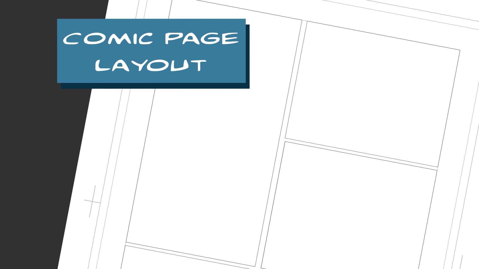
3. Layouts: Okay, So now that you've determined what size you want your comic book to be, you're ready to move on to the layout stage. A layout for a comic book page is essentially just a sketch of what you want that page to look like. This is the stage where you're figuring out composition of not only the page but also the panels themselves. You're figuring out how you want the action on the page to flow. You're indicating where you want the word bubbles to be. These air obviously not meant to be detailed at all these air just pretty much shaped. Some artists will get more detail than others, but for the most part, this is just a really rough language of what you want the comic book page to look like. If you can understand the story at this stage, then you've done your job. Everything else after that, as faras detail ing penciling and inking goes, is really just kind of labour at that point. This is the stage where the storytelling actually happens. With that being said, I consider the layout stage the most important part of the comic book process. So, generally speaking, most comic book artists, including myself, work on their layouts at a smaller size than the final artwork and as well as the final printed comic. The reason for this is because most of us, I think, have a easier time visualizing something when it's a little bit smaller, as opposed to going directly onto the final art board and trying to figure it out all their . It's a little bit easier to figure out composition size relationships between objects, all that important stuff when you could kind of grasp it within a smaller scope. Now how much smaller you go is completely up to you. So let's take that example of the standard American comic book size I can do a layout that is this small. As you could see here, there's not a lot of detail that you could really get onto a canvas this small, but that's kind of the point. It pretty much forces you to just think about the specifics of this page where you want the panels to be where the characters or objects are within the panels, where the word balloons you're going to go, how much spaces between each panel, all that really important stuff can definitely be executed at this small size. Now it doesn't mean that you have to do all your layouts at this small size. There's also nothing wrong with doing your layouts at the final print size, considering that you're probably going to be drawing your final artwork much bigger than this. The most important thing, though, about the layout stage is making sure that your layouts are with in proportion to the final printed size. So this small little canvas here is in direct proportion to this comic book. Now, how did I do that? Well, I'm an artist, and that means I'm probably pretty bad at math, and I actually happen to be pretty bad at math. So I utilize a trick that I learned a while ago, and it really helps me create something in proportion to something else, either smaller or larger, and all you really need is a ruler or some sort of straight edge. So what you want to do is take the size that you want your final comic to be printed at. This is the size right here for this example, take a sheet of paper and put it underneath it. Now take your ruler or whatever straight and you have and lay it across whatever stock canvas size you're working with from corner to corner, and you can draw imaginary line and then press down when you get to the paper underneath and continue that line as far as you want it to go. Let's take it all the way to the edge of this sheet for this example. So now that you have that diagonal, essentially all you really want to do is draw a horizontal line, and wherever it meets anywhere on that diagonal line, then you draw a vertical line connecting it. So, for instance, if you want to make a size that is smaller than that original comic book size but still in proportion, you would create a horizontal line that is higher on that diagonal. So I'll I will put a horizontal line right here just until it hits the diagonal. Now, if I wanted to be really small, I'll just keep going up this line. Wherever that horizontal line meets the diagonal, I then draw a vertical line to connect it. And as you could see here, this size right here is in direct proportion to this size right here, but it's dramatically smaller now. The lower I go on this diagonal, the bigger I could make the size. So once again I draw a horizontal line, touches the diagonal, and then I draw a vertical line to connect it. Now this size is bigger than this size, which is smaller than this size, but all of it is in proportion to each other. For me being not super savvy with numbers and math, it's visual enough from me to make sense of it. And it's up to me. I could kind of tweak it to how big and how small I wanted to be. You can do this with any shape, by the way. So say you choose a comic book size that is a little bit more unique, like this horizontal size. The same principle applies. So once again, this small size right here is in direct proportion to this size. So if I was going to lay out a comical page that was in this size, I would do it at this size. For instance, if I wanted to work much smaller now, once you figured out with size, you want to work on for your layouts. Let's then go into the next step, which is adding guidelines to your pages.
4. Creating A Framework: Okay, so now that we've decided what size we want our comic to be, and we've created a layout size that is in proportion to that final size, let's get into creating some guidelines for that page. So in order to create some form of order on your page to not have any important information , get cut off in the printing process and to make sure that there's enough room for important details like narration boxes and word bubbles you're gonna wanna place in some rough guidelines. So you might have all seen the PRI ruled comic book pages that you can get at the art store pretty much those air. Just Bristol board sheets of paper with blue line guidelines around them. Pages like that condemn finitely be convenient to work on, but they're also a little bit expensive. So I'm gonna show you how to rule out your own pages and with those guidelines, even indicate so here we have our sheet of paper to begin our layouts, so this page indicates one page of comics just at a smaller size. Now, if we look at a page of comics, here is an issue of Riverdale. When I'm illustrating these comics. I'm taking into account that I want some pieces of the artwork to go straight to the edge of the page. Right here is an example. Over here is an example. Some of the black that I indicated in the background is an example that's called full bleed . Full bleed is when the artwork goes all the way off of the page straight to the edge. That's a storytelling choice that I make when I want certain scenes where parts of the page to have a certain amount of impact. It only works as an impactful visual if everything around it is contained within some sort of framework. So here's another example where most of the panels are contained within a certain framework . And then this last panel here goes all the way down to full bleed. I achieved this effect by ruling out on my pages a template that I work off of. One set of guidelines indicates where I want all the important artwork to go within meaning where most of the panels are gonna fit within past. That line indicates where bleed starts to happen. Like this, for instance, were a full bleed image like this. So because layouts are a small sketch version of what you want the page to look like, you want to start that guideline process during this stage, so a good place to start is to figure out where you want to border your page. So how far from the edge of the comic page do you want your panels toe lay within for me? I think a good rule of thumb is about 1/2 inch on all sides. Okay, so now we have a framework that are panels can work within. You also want to indicate a second set of guidelines. Generally, these guidelines will indicate where you want the word balloons to stay within and the narration boxes as well. So all the important lettering will stay within those guidelines. And for me, I'll usually indicate maybe 1/4 inch from the edge of this live area. Now you can make exceptions for where certain lettering does pop out of these guidelines for effect, just like your artwork. But generally this is a good frame of reference to work within. So now that we got our guidelines in, let's start adding in our panels so say I had a three panel story going on over a year. Here's panel one hears panel to and panel three. I want to have be very impactful moment, and I wanted to go all the way to full bleed in order to create that sense of impact. I know that I'm going to go past this live area all the way to the edge of the page. So say, in Panel one, we have an establishing shot, and it's a low angle shot of a building or something like that. And, um, there's a hero silhouetted at the top. We just see an indication of a hero with a cape silhouetted at the top of the building. I'm gonna do this really quick. Just give me sketch quality just the way our layouts would be. Some clouds windows. We get a sense of the composition of the panel that in Panel two we have a close up shot of that character's eyes. Maybe he's seeing something down below danger we're seeing through his mask and then in Panel three, we want that to be the big, impactful moment where the superhero character jumps off the building and flies into action So this is the area where I want to go past this live space here and go all the way to the edge of the page. - Okay , So bear with my terrible stick figure drawings here, But I'm just trying to illustrate a point of what I'm talking about by creating a certain framework for your page so that certain things can pop out of that framework if necessary. So here we have our hero character jumping into action with some of the background buildings that he jumped off of in the background. His cape can even be shown going past all the way to the edge of the page underneath some of those panels that were above him. Now, for instance, if I just jumped into the page without putting any of those guidelines down and then just saying, Oh, there's gonna be a panel here panel one panel to is gonna be here, and perhaps it I'm not taking into account that it goes completely off the page. And then, uh, yeah, the character is gonna jump out over here, and it's gonna be really great scene and half of him gets cut off. He gets cut off his hand, for instance, some of the panels go all the way to the edge. There's really no structure to the page, so sometimes you get really excited and you just want to start drawing already. I totally get that minorities to, but it takes just a little bit of time to put in a certain kind of framework, and that will definitely help you in the long run. When you're creating these comic book pages, it's going to be much more pleasing to the eye of the reader, and it's going to be a much more efficient way for you to work as well. Now, even if I'm not lettering, this myself. And when I illustrate the Riverdale Comics, I work with a letter I do in the layout process indicate where some of the narration boxes and word balloons can go this way. That sort of already factored into the artwork so that I know that there's more than enough space for word balloons and narration boxes to fit so that nothing really important is gonna get covered up in the lettering process. So again, even if you're not lettering, this yourself, it's really important to indicate where you want narration boxes and word bubbles to go, because that's just a much a part of the page composition as the art itself. I hope you're starting to see so far how some of these steps along the way really contribute to the overall quality and clarity of your final comic art. So now it's time to move on to the next step.
5. Making Adjustments: So when you're working on your layouts, the thing to keep in mind is that these aren't pencils. These aren't supposed to be full pencils. This is really like I said, this is the most malleable part of the process. This is when you're really trying to figure out everything. So don't be afraid to just completely move things around. For instance, if I'm not like in the way this panel is working, maybe instead of a close up shot, I want to pull back a little bit and maybe show a little bit more of his, uh, his costume and his expression. So maybe all he's he hear something from a distance coming from this side. And I feel free enough to do something like that at this stage, because again, these aren't pencils. I didn't spend too much time detail ing this and adding all these fancy lines. This is really just the sketch stage. So you want to make sure that you don't get super invested in the little details here so that you have enough freedom to make the bigger changes. I want to change this to a fist. For instance. You indicate that he's not gonna have an open hands fist. Just move things around completely. At this stage, I can decide that. Maybe this won't be one full panel. Maybe all status, and this would be kind of one panel tool and another beat here on this will be panel three . The point I'm trying to make is that everything should be as movable at the stage as possible. Really, this is like I said earlier. This is where all the storytelling happens. It's this layout stage, So you want to make sure that everything is reading clearly at this stage and not worry about necessarily drawing problems that will come in the pencil stage. So the next step from here is going to be How do we get these layouts on to our final board ? And that's what we're going to talk about in the next step.
6. Paper: Vellum vs. Smooth: Okay, so now that we've completed the layouts, it's time to transfer those layouts on to the final art board. I wanted to take a moment to go over the types of our poor that you can choose to draw your final artwork on. Most comic book artists and illustrators, including myself, used Bristol board paper to draw their final illustrations. And comic art on the Bristol board tends to come in two different finishes. One is a vellum surface, and the other is a smooth surface. You can buy whatever brand you want. I'm just showcasing Strathmore here, but there's plenty of brands out there that make Bristol board paper. In case you weren't familiar, there is a slight difference between the two different finishes. Let's start with the smooth finish. The smooth finish Bristol is just that. It's actually he really smooth. It's very nice to draw on. Your pencil really tends to glide right on to the paper. The tricky thing about the smooth finish paper is that I think it's because of the surface that if you press too hard with the pencil, it tends to kind of make an imprint into the paper. I think that has to do something with the finish, so it becomes a little bit harder to a race. So the smooth finish Bristol actually enjoy yanking on it a lot more than I do. Pencilling ah, lot of the PRI ruled comic book paper actually comes in a smooth finish, so it's not uncommon for comic artists to work on smooth finish paper. I think for me it just takes a little getting used to in the pencil process, but it's different for everyone. But like I said, inking on a smooth finish is actually really nice. The brush and the pen tends to glide really well. On the surface. It's actually really nice to do a technical inking with a pen and ruler. You do have to watch out a little bit for smudging. The ink lays on top of the paper a little bit more before it soaks into it, so it's more prone to smudging. Here's an example of an illustration that I did on a smooth finish, first aboard paper, and as you can tell, I used a lot of Penn. I also used brush as well, but these straight lines worked really well for this paper. I was able to get some nice cross hatching effects on this paper, and the brush your areas took to it pretty nicely as well. Often what winds up happening is I get so used to working on one type of Bristol board that when I switch over to the other, it's almost like a treat. It kind of slightly influences my approach and my style a little bit, and it's always refreshing to go from one to the other. So to have that option is really nice. Speaking of options, the other option is vellum Finish. Now. A vellum finishes what I used primarily most of the time. Felon finish is a to thier paper, so it's a lot better for me. In terms of pencilling. I definitely don't have that issue with erasing. Erasing is pretty easy on this. I contend to be a little heavier handed with the pencil as well. When I'm working on this paper, it's much more forgiving in that regard. I feel like it works really well with a soft pencils. I enjoy thinking on a vellum finishes well. You can use a range of tools, pens, brushes, um, the ink soaks in really well so you could fill black areas pretty easily. The film finishes also really nice. If you wanted to do like a slight wash and ink wash, I wouldn't suggest going full out watercolor on these sheets of paper. But like a simple wash will work really well on here, so that's in effect. If you wanted to incorporate that into your comic book, I would recommend using a vellum finished paper as well. It's almost like a really light watercolor paper. Here's an example of a comic book cover that illustrated on vellum finished Bristol board paper. As you can see, it's a little bit different than the last example I showed you. I was able to get pretty aggressive here, laying down a lot of ink, and the paper takes to it really well. I used the mix of brush pin, mechanical pen and brush, and if I wanted to throw a wash on top of this, the paper wouldn't buckle to be pretty all right. Like I said, I wouldn't go too overboard with so much water. But a light wash will definitely work, so the choice is definitely up to you again. There's really no right or wrong answer here. It really depends on the type of art that you're making and what you're going for and what your preferences are. Do you like to draw on something that's a little bit smoother or something that has a little bit more tooth to it? I hope this clears up some of the differences for those of you who weren't familiar with the difference between the two finishes. Now that we got our paper knowledge down, let's move on to the next step.
7. Transferring To Final Art Page: Okay, so remember that layout we completed a couple steps ago? Well, that was in the proportions of a standard American sized monthly comic book. Most artists, when working in these proportions, will draw the final art larger and usual proportions for drawing. A final artwork is on an 11 by 17 sheet of Bristol board paper. So now, in order to transfer this layout onto this paper and to start the penciling process, what I did was I took this layout and I scanned it into the computer from there because he was in the same proportions as 11 by 17. I created 11 by 17 file placed this layout in that file and printed it out. Now, if you don't have an oversized printer that can print out in 11 by 17 sheet of paper, most of us don't. What I did was I actually printed it out in pieces and then just take it together so I'll do this often times when I'm transferring something onto a sheet of paper that's bigger. I'll just take Ford or as many sheets of typing paper as I need Print the image out in pieces, taped them together, and there you have it. So the next step is to place the layout onto the back of the final Bristol board paper, tape it or just hold it in place. And then what I like to do to transfer the art is use a light box. A light box is a really handy tool for a comic book artist or an illustrator because it's perfect for transferring sketches and layouts and penciling on top of it on a new sheet of paper. I've had this lightbox for years, so I can't necessarily recommend that this brand even makes this anymore. But I recommend going online and checking out the variety of light boxes that they have on the market. Now I've seen some really thin ones, ones that almost look like ipads, and you can use those and those air much easier to travel with if you needed to. So you just turn on the light, preferably in a dimly lit or dark room, and the darker your surroundings are, the more you will see the under drawing. So I'm in a pretty light room right now, so it would be hard to see the drawing underneath. But if I were to shut off all the lights and try to get this room nice and dark. Or do this at night. The under drawing would show through a lot more clearly, really, though all you're really looking for is a ghost of the image again. I mean, look at this play out. It's really roughly drawn. The important elements of this layout are where things were pleased and compositional elements, So it's not really important for me to get that exact shape of the head. I'm just using that as a guideline to then create my pencils on top of because since this is going to be the final sheet of paper, this is where I'm gonna be handling all the drawing details. But it's definitely nice toe have all this work done underneath, so I know exactly where I need to go. But have fun creating a brand new drawing with your pencil on this sheet of paper. Now, if you don't have a light box and you don't want to get one, that's totally fine. Over the years, I've used Windows on a really sunny day. I'll just put the sketch behind the sheet of paper pasted up to the window and transfer things that way. I've used a glass coffee table with a lamp underneath that works really well. Essentially, all you need is a light source and a dimly lit room in order for the artwork to show through. And you can pretty much get the job done so I wouldn't get too crazy about what lightbox you get or that you even need a light box. There are other ways around it, so that takes us from the very beginning step, which is picking your size all the way up to just about ready to start pencilling the's steps tend to get overlooked, and I totally get it because I'm an artist, too, and sometimes you're just really excited about wanting to draw this story. You're really looking forward to drawing these characters and bring this story to life. But hopefully now, having a better understanding of all the steps that come prior to this will create a better framework, allow you to create ultimately better art and have more fun in the process. So I hope the steps were informative and helpful, and I'm looking forward to seeing some of the work that you create. Having applied these steps
 Thomas Pitilli, Illustrator