Transcripts
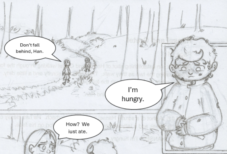
1. What Is A Panel?: The panel is really just a single moment of time within a comic story. A panel can be any shape or size, and depending on the pacing of a scene, a panel can represent a second of time or years worth of time. There's no set standard and a comic creator has full control over how the panel is used to communicate the passage of time. The artists can choose to fit as many elements in a panel or as few as they desire. Always with the consideration of possible word bubbles and narration boxes. In Scott McCloud's Understanding Comics, he theorizes that the space in-between each panel is where the story actually happens. That's the space where the reader fills in the gaps provided by the artist. And this is where the story truly comes to life. So since comics are primarily a storytelling art form, It's all about how to piece these panels together on the page in a way that best serves the story. But sometimes it's important to understand how each element on a page works individually before we can better understand how the entire page works as a whole. That's what this course is going to be about. So just like a science class where you might dissect a frog to better understand its inner workings. We're going to do the same thing with a comic book panel, just minus all the blood. So put on your lab coat and let's take a deep dive. How a comic book panel works and how to compose one like a pro.
2. Negative Space (or lack of): If we treat the comic panel like a canvas onto itself, we quickly start to understand that the same principles that help us create strong compositions for a drawing, painting or a photograph also applies to our comic book panel. You may have heard of the term negative space, perhaps in an art class or an instructional book. In comics, I consider negative space to be any part of the panel that isn't occupied by a heavily rendered figure or background. It's important to have areas where the reader can rest their eye a little bit. If you feel the panel corner to corner with visual information, it can be overwhelming and not as inviting to want to read. Remember, you want the readers eye to easily flow from panel to panel. And if their eyes get stuck on one overly cluttered panel, they're going to wind up spending more time on that panel, then you might want them to. Because of this, you might inadvertently take them out of the story. Now, this isn't to say that you want to have bare backgrounds and every panel, since that would make the reading experience pretty dell. On the contrary, you certainly want to give the reader a sense of space and environment and your panels. But you wanna do it in a way where it's pleasing to the eye. Just like you were a photographer or a director trying to frame the perfect shot. Think about your panel as a map with areas of land and water. In this metaphor, the negative or more open space is like a stream that cleverly flows through your image, breaking up the land or your linework in between. You can use this space to help frame the action happening in the panel, as well as using it to help point the reader's eye exactly to where you want it to go. Sometimes the perceived limited space of a panel can be intimidating, especially when you're trying to fit in several elements into the panel. Like multiple people were involved establishing shots. But remembering to approach it like any other formal piece of art will help you to create a much stronger composition within. Having said all that about creating space in your panel, there will also be times where you can use this idea of cluttering or little to no space to your advantage. Perhaps there's a part of the story where you want the reader to slow down and really have to spend that extra couple of seconds on a panel. You might want to have that panel or series of panels feel a bit tighter in denser to get through. Perhaps this is a panel with more text and dialogue and various areas of visual interests composed within. Also, what if your character is feeling claustrophobic or generally overwhelmed? Literally closing the edges of the panel and around him might be a very effective way of communicating that every line you put down on a comic page helps communicate the story you're trying to get across. The same is true about every line you don't put down. So the next time you're composing a comic panel on your page, keep this idea of negative space in mind.
3. Using Scale To Your Advantage: When creating an interesting composition in any art form, varying up the size relationship between elements within the composition is an important thing to think about. This also applies when creating a visually interesting comic panel. Ultimately, the comic pages, a one-dimensional flat art form. But extreme foreground and background elements help create the illusion of depth and space, broadening the world you're trying to create and making it easier for the reader to fall into the story. 1, 2, and 3-point perspectives definitely helped create a believable space for your characters to exist in. But simply by cropping a figure in the extreme foreground and having a smaller figure or object and the background can just as effectively create the illusion of depth. When we're just starting out making comics, I think sometimes we feel like our character should be front and center all the time. As though if they were drawn to small, they would lose their significance. Also when we're first starting out, it can certainly be a challenge to have to draw a smaller figure in various poses. If this is a problem you are having, I encourage you to try and break out of this tendency as much as possible. A whole world will open up to you when you're able to get your characters against various sizes of objects or people around them. There's great examples of this in the story 100 rooms by Jaime Hernandez from his Love and Rockets series. In this story, the two main characters find themselves exploring a very large mansion with many rooms. Jaime Hernandez uses scale to his advantage throughout the panels in the story to get across the idea that these characters are exploring the space that is so much larger than they are. He does this by masterly showing the character so small and tiny against very high walls and doors, or even in one case, in a bed that seems exaggeratedly big. Many of the panels within the story are actually fairly small themselves. But by playing with scale the way he does, he's able to make them feel very large in scope while leaving more than enough room for the word balloons. When you get more comfortable playing with scale and your panels, you'll understand that you don't always need a full-page splash to show a significant moment or get across the feeling of vastness in your story.
4. "When In Doubt, Black It Out": So much of comics is figuring out ways of making a scene come to life within these little boxes we call panels. And every artist has a different approach to doing that. Some art is highly render the scene, leaving very little room for ambiguity. Describing very clearly what each element and action of the panel is with various lines and textures. Some even create comics that are fully painted, which brings the images on the page that much closer to what we see in reality. There's obviously no right or wrong approach. It all comes down to the artist's choice and the readers taste. Since comics exist on a flat sheet of paper, some artists lean into that so-called limitation and choose to take advantage of the use of silhouettes. Todd McFarlane famously said about drawing comics when in doubt, black it out. There's definitely some validity to this technique. And it can definitely have its benefits for both storytelling and aesthetic reasons. To artists who are very much known for the use of silhouettes and heavy areas of black and white. Or Mike Mignola and Frank Miller. They've both figured out ways of creating very unique and recognizable styles using this approach. Stylistically the bold, high-contrast, the aesthetic is very pleasing to the eye and helps create a moody and fully realized world without really needing any color. I think there's something naturally satisfying to the eye when it views a piece of art that seems to have the perfect balance of black and white. For comics, I feel like it's a very inviting style that allows for the reader to clearly understand what's going on while still looking cool. This approach certainly doesn't work for every artist, reader or story. But you don't necessarily have to have a very graphic style in order to successfully use these techniques from time to time. Using silhouettes in the foreground or background of the panel can help frame whatever else is in the panel that is not drawn in silhouette. Incorporating silhouettes and to your panel also generally helps the balance of the panel, which in turn helps the balance of the page. But like every line on a comic page, there's an effect it has on the storytelling as well. And it's important to keep that aspect in mind, like the gutter or space between the panels. Silhouettes also put the reader's imagination to work by allowing them to fill in the gaps between what is shown and what is not shown. We tend to read images differently when they are fully detailed versus something that's more iconographic. When we're looking at a silhouette of a figure or a scene, our imaginations are acquired much more to project onto it with the character or seen might be feeling. I'd be remiss not to mention the practical application of using silhouettes as well. I wouldn't recommend overdoing this, but it can definitely be a shortcut when trying to stay on deadline. I think Todd McFarlane, quote, definitely speaks to that aspect of it. Regardless of why you're incorporating silhouettes though, they are definitely an option you should keep in your comic panel making toolkit.
5. Think Outside Of The 'Box': Sure, most comic panels tend to be square, but that doesn't mean you can't think outside the box from time to time. Comics are a blend of storytelling as well as aesthetics. And varying up your panel shapes is a way to satisfy both of those elements. Generally, changing up your panel shapes are a fun way of adding a sense of impact to a scene. Usually for a more fast-paced action scene. But it can also be used for other types of scenes as well, such as flashbacks or dreams. Organizing panels on a diagonal or creating various shapes for your panels is also a way of creating a page design that can mix things up within an issue of comics or a full graphic novel. Sometimes when I'm designing comic pages, I think about the reader quickly thumbing through the issue, trying to figure out whether it's something they want to read or not. I like for my pages to have varied panel layouts so that adequate glance, it looks visually inviting to the reader. And changing up the shapes of the panels is one way of doing that. Another way is something that if overused, can be very distracting to the flow of the story. But when done sparingly and at the right times, can add some impact and variety to your panels. And that is breaking out of the borders. This was sort of a trope of the 90s image comic style. And I think it's safe to say that it was definitely a technique that was overused back then, often throwing off the entire flow of the storytelling, making it difficult to understand what was going on. But there are also plenty of examples of where it's used really effectively. It's something that can give your panel and page some life to it. Remember you want the information on the page to be clear and makes sense to the reader, but it also has to be visually pleasing as well. And little tricks like this or would I like to call the candy of the page? You don't want to eat candy all the time, but every now and then, a little bit of sugar can go a long way. Okay.
6. What About The Words?: You felt all about making your comic panel as solid as possible, took the time to balance the black and white areas, incorporate some negative space, change up your panel shapes but variety. But you forgot about one crucial element, those pesky words. Unless you're making a wordless comic, you're going to have to include word balloons, narration boxes, and even some sound effects somewhere within those panels. Remember when we talked about leaving space in your panel for the scene in the image to breathe. While space should also be considered in the panel for the words to. This doesn't mean that you have to leave completely empty space in your panel, just for the word balloons and narration boxes. But it does mean that knowing some of your work will be covered by areas of text or a sound effect. The worst thing is to put all that work into a panel only to have to squeeze in the lettering at the last minute. Somehow, it totally ruins the whole construction of the panel, as well as the artwork. And by the way, it does the lettering, no justice either. Ideally, you definitely don't want it to have to come to that. So the way we prevent this from happening is by factoring all of the lettered areas in during the layout stage. Remember word balloons, narration boxes, and sound effects are just as important elements of the panel as the figures and backgrounds, literally part of the composition. So when you're picking your shots and laying out your comic page, be sure to include with a lettering will go. If you're working off of a fully written script, you'll know exactly who's saying what and just how much dialogue and narration will be on the page. Which is a great benefit. If perhaps you're writing your own material or maybe working off of a looser plot. I would still leave space for with the lettering would go. Even if you don't know exactly what will be said just yet. Now how big or what shape you make your balloons and boxes is completely up to the vision of you and anyone else involved in the project. But be aware that just like the panels themselves, you're going to want to compose the lettering smartly, which mainly means making sure that there's enough space between the letters and the edge of the balloons and boxes. This will make it much easier for the reader to read and not make it looked all smushed in. Back in the day when comics were drawn completely traditionally, lettering was drawn right onto the artwork. Nowadays, though, with digital tools, lettering is often done separately after the artwork is completed. In some ways, this makes it easier to compose the balance between letters and artwork within a panel. But either way, keeping lettering in mind, even if you're not the one who will be doing the actual lettering, will always make your panel that much stronger.
7. Stocking Up Your Toolkit: The art of making comics is a never-ending experience of learning new ways to tell your story. Every now and then, a creative comes along that paves the way for a unique way of expressing an idea. And then over the course of time, it becomes more commonly used. In short, there's pretty much no one way of doing any of this stuff. Comics is an art form like any other, and that requires people to regularly push the limits and experiment with new ways of doing things. We talked about a lot of structural foundations so far and creating a comic panel. But I wanted to take some time to mention a few other ideas regarding panel creation that you can add to your toolkit. Whether we're working within a traditional square panel or a more uniquely shaped panel. Oftentimes we're outlining the borders of that panel to contain the image. At least that's how I generally do it. One way to add variety and play with your page aesthetic is to have borderless panels. This is something that the artist, greg Smallwood does very successfully and it seems to be a trademark of his style. You don't have to do this for every page and panel, but keeping it in mind as a way of adding an accent to your overall storytelling every now and then might not be a bad idea. Inset panels are another option to keep in mind. An inset paddle can act as a quick way of showing an establishing shot or sense of place for the reader. Inset shots can also be used to zoom in and highlight certain moments in actions. In comics, we don't have a moving camera like in movies. So an inset panel can be similar to a quick camera transition or zoom. Along the same lines. Sometimes panels can be used as a way to break up the whole image, pushing the reader to absorb the whole image while breaking it up in their minds as individual scenes or moments of time. This approach has storytelling benefits, as well as looking aesthetically pleasing. There's also a nifty cheat sheet that was made by the legendary cartoon is Wally would call 22 panels that always work. This sheet has been passed around from artist to artist for decades and in the age of the Internet has been shared on countless platforms. It's a great quick research that's worth taking a look at. It includes 22 panel ideas that you might be able to use from time to time in order to enhance your scene. Overall, I think it's important for us as comic artists to regularly try and push ourselves to try new and different ways of doing the same thing. You don't want to become complacent and fall back on your own tropes all the time. Changing up the way you look at panel design and overall page layout will not only make the experience that much better for the reader, but it will also make it a much more enjoyable and exploration will experience for you as well.
8. In Closing: Well, that's all I got for now. I hope this course was an enjoyable one for you. And hopefully you now have a bunch of new ways of thinking about panel composition. Like I mentioned at the beginning, comics is really all about moving the reader's eye from panel to panel seamlessly. But it's important to know how to make each panel read clearly as well as look attractive so that the experience is enjoyable for them. There's so much more theory and storytelling concepts to go into and creating comics. But I wanted to keep this class is focused on the actual structure of the panel as possible. Allowing you to now have a very strong foundation to build off of an experiment with. Teaching is always an exercise and learning really. And throughout the process of putting this course together, I feel like I learned a lot myself and have been reminded of all the possibilities of this great medium. I want to thank you for coming along and participating in this class, and I look forward to seeing any progress you make. Thanks again for your time. I'll catch in the next one. Take care.
 Thomas Pitilli, Illustrator