Transcripts
1. 1 Intro: Hey everyone, I am Barbara and I'm a pattern designer and illustration artist, and one of my favorite media to use when I create my illustrations and motifs is markers. These markers are alcohol-based and therefore you can blend and layer them. Using them is almost like painting, and this makes it possible to create beautiful effects for depth, body and texture. Markers are used by professionals within all areas like fashion design and technical design, comic artists, and commercial illustrations just to mention a few. In my series of courses about markers you can learn how to use markers for your art too. The first course is about the fundamentals, what markers are and how they work, and there you learn how to use the color system, and the basic strokes, and coloring techniques. The second course is about the blender and how you can use that to create different textures and defects. This course is all about chaise and you learn how to think when creating illustrations with shades and highlights to make them pop from the paper, or have a realistic look to them. In class, you will learn five different techniques for shading with markers, and having these techniques in your illustration toolbox is not only going to build on your markers skills, but also give you flexibility to work with the markers that you have even with a limited collection, because with these techniques you will find ways to work around missing colors and shapes. The course is structured with lessons on how the techniques work, and then you'll get fun exercises to practice each technique, and all you shoe lovers out there are in for a treat because all exercises are about just that. You will learn how to create stunning and realistic and detailed shoe illustrations, and to really get you started all students will get a mini coloring book to download and print, and use for the class exercises and project or just for fun. Come join me in class and immerse yourself in the world of markers.
2. 2 Welcome & class overview: Hi and welcome to class. I'm Barbel and for you who don't know me already, I'm a pattern designer and illustration artist from Stockholm in Sweden. This class is the third in a series about coloring with markers, and if you're a beginner when it comes to markers, a good advice is to take the course about the fundamentals first, just to get the basics down. In this course, you'll learn how to build an illustration with markers using five different techniques for creating shade. These five techniques are tools that you can pull out depending on the illustration you want to create. Actually, I often use at least two or more of these techniques for one single illustration. The lessons in this course are structured in the way that I first show you the technique, and then give you an exercise so you can practice it on a real motive. For the exercises, we're going to create illustrations of shoes; high-heels, flat's, clogs, and sandals. You can draw the outlines yourself making it just the way you want it or by looking at how I do it. This way, we also squeeze in some drawing exercises as well. You can also download and print the Mini Coloring book that I have created for you and especially for this course. It includes five shoe illustrations with only outlines, all the illustrations in this coloring book has light gray outlines so that they won't be too visible when you color it. Then you can always fill in the contours afterwards if you want that type of look. You will find this companion coloring E-book in the Your Project section of this class. I recommend that you print it on marker paper for the best results and for not having the ink bleed through or fed there outside of the contours of this, as it will be with ordinary printing paper. Your class project for this course is to take a picture of at least one of your shoe exercise illustrations and then to upload it to your project in the project section of this class. But I'll talk a little bit more about the class project at the end of this course. In order to follow along with this course and do the exercises in class project, you will need some materials as well. You'll need marker paper, alcohol-based markers, you can not use water-based markers, and preferably with a brush nib because that's what I'll be using and showing for all the techniques and exercises in class. You can also have use for a pencil and eraser, if you want to draw your own motifs for the exercises and not use the templates. For some of the techniques, you will need a specific group of markers. But I will specify this more in the beginning of each lesson. But don't worry, if you only have a few markers in your collection so far, because among these five techniques are ways to work around any missing colors or shades in your collection. That's the beauty of knowing all these five techniques. They make it easier to create the motifs you want with the markers that you have, you just use the technique or techniques that works for you and your collection. But if you still feel that you don't have all the markers that you might need or want to use, you can watch each lesson first or the whole course, do the exercises that you can with the markers you have, and then run up and buy some new markers, add to your collection, and then come back and do the others when you have the markers that you need. But before we get started with the techniques, let's talk a bit about shade and light and what that is and how that works. For that, I'll see you in the first lesson.
3. 3 What is shade?: What is shade really? Well, one way to describe it, is that it's a lack of light. Unless you are in a pitch black room, you are always surrounded with some light and it has some light source. When you have a light source shining or reflecting on an object, whether it's daylight coming from a window, the sun if you're outside, or a lamp in the room or even several sources combined, that object will cast a darker spot on the ground and also on the opposite side of the object itself, where the light won't reach properly. Where the light hits the object, it creates a highlight or even a reflection. When you draw, paint or illustrate, it's the shade and highlights that will create the body and depth of your illustration. It's what makes it pop and creates that realistic look. Whenever you want to draw or paint an object that you want to give some shade, you have to consider the light source. From what direction is the light coming and where is it hitting the object. In many art classes, they teach you to do directional lines and arrows as a guide to where the light comes from and how it hits the object, but I never do that because usually, you don't have a distinct one light source. You just use the natural daylight and it can come from many directions. Usually when you look at an object, the light that's hitting the object is coming from the side front and mostly the highlights and reflections on an object seem to be in different places. Don't get too theoretical on the light source and guiding arrows or you'll risk the illustration to look fake and weird. To play it safe though, decide on a top front a bit to the left or right reflection, and then place the shades around the edges. That will create a nice body to your illustration. Sometimes you want to have a dramatic shade and shadow though, and then you can get more nerdy about the direction of the light source if the light is sharp or muffled. But mostly, you just want to create a shift in tone in order to get a more realistic and contrasted look. Next, let's go to the first shading technique and we'll start with the easiest one first, of course.
4. 4 Shading with multiple layers: The first technique, I'm going to show you is to some extent covered in the first course, "The Fundamentals of coloring with markers". So far some of you, this will be a little bit of revisiting but not in the same context. Anyone who took the fundamentals course might remember the misty mountains exercise. They're a way created a simple landscape illustration with depth by adding layer after layer. Because with markers, you can get some flexibility with one single marker by saturating the paper to different degrees. The more ink you apply to the paper, the more it absorbs, of course, until it's reached its limit. Then the excess ink will float around on the surface. For every layer you apply, the stronger and darker the color will appear. This is one of the fundamentals of how markers work. We can use this to create a shading effect on an object or a motif as well. For this technique, you only need one marker, and it can be from any color family, or gray of your choice. The important thing is though, that you pick a tone that is not too bright and not too dark. Because a too dark and too bright tone will not give as much as flexibility or versatility in how many times you can layer. It doesn't really matter what grade of saturation, but the tone you should pick, should be between one and three. A one, two or three, I advice you to just try out the colors that you are choosing between and then pick one that can create many layers with the distinction between them. For this first demonstration, I'm going to use this marker called R81, Rose Pink. Since the saturation value is eight, a very high level, it's going to appear very desaturated, permuted, and it's quite light tone which has the number one. To show you this first technique, I'm creating a circle using glass and the marker that I have chosen. Now, hold your pen or your marker very far up on the battle like this, because this is going to prevent you from pressing too hard on the paper because this is really important now that you just make really swift and light strokes, so that your first layer won't be too strong. This will also allow you to use a broad side of the brush. This will make it a bit more easy. You're going to have to probably turn the paper around. But for this demo, I'm just going to try and make it without doing that. You apply some of the ink onto the paper like this. This is the first layer and it's going to look really uneven and streaky like this but that's fine because we're going to work on this on lock the door. So this was the first layer, let's say that. Now, we're going to do, and as you see, I saved a little bit of white here because this is going to be the reflection. Now, I'm applying the second layer and still just a swift hand. Same way as the first layer. Add a second layer. If you want to, you can go into the white a bid more. There aren't really any rules here, something like that. Then, we'll do the third layer. You can definitely see if we can follow the shape of this circle because if you do it straight like this, the texture or the surface of the sphere will look flat. But if you follow along the shape and make it rounded like this, it will be a bit more realistic. This texture will work better. Now, we have the base down and it looks awful. But let's work on it some more. Now, I like to get the outline a bit and sharpen this to make it look a bit more even. Now, I'm going to smoothen this out and deepen the shaded areas even more. It's really easy now to saturate the paper too much. If you do, you might have to start over again, because it's really easy to destroy the illustration by applying too much into it. Try to see if we can still keep the layers. Add some more ink. On the bottom here, is where I want to have the darkest, the shaded part. Here, I'm applying more ink. As a final touch, you can smoothen it out a bit more and make those streaks blend in more. Then, you can go over it a bit more. I think also, around this edge, needs a bit more distinct color because that will add to the volume. Coloring with markers like this is actually more or less like painting. It's a mix between painting and watercolors, sometimes, I say. Another important thing is, don't use a marker where the ink is running out, I think, this one is a little bit to dry, but it works fine. Here, I created some shades to a shape with one marker and it's all about layering. To be honest, this technique for shading, I almost never use alone because it's a bit too flat. It's not very realistic. Mostly, I use it in combination with other techniques that I'm about to show you. But this is a great start for building a motif and shade, though. To get a more distinct impression, you need to have more contrast than this. But to use this as a single technique, could work when you want to create something that's going to have very lyrical, or misty, or diffuse impression. Also, when coloring skin, or perhaps the sky, could be useful. But as you can see, it's quite difficult to get a smooth and even coat without any streaks. You have to work on it a little bit. Sometimes, you can go in with the blender to smooth things out. "Oops" Maybe, enhance this reflection. If you want to know more about how to use the blender? You can check out my second coloring with markers class. This is the first technique and now we jump on over to the next video. We're going to try this out with the first shoe exercise.
5. 5 Exercise 1: To practice how to create shade with this technique, we're going to color a pair of ballerinas shoes or flats maybe they are called. You can even draw the outlines yourself or you can download and print the first outlined illustration from the companion coloring book in the section called your project of this course. First, I quickly sketch the shoes with some rough lines, narrowing it down until I find the outlines that I want. When using a pencil, be sure to keep the lines very thin and light because once you start coloring on top of it with the markers, two things will happen. The first is that the pencil lines can contaminate the ink so it will look gray and dirty. The second thing is that the alcohol and the ink solvent will preserve the lines and it will be difficult to erase them afterwards. Just keep them thin and swift and only as guiding lines. The technique that I'm using here with drawing and erasing is something that I have come up with when sketching my illustrations for markers, and that is that I sketch, erase, sketch, erase, but I don't erase the lines completely. I leave a little bit of residue enough for me to see where they were, and then I fill in the lines that I want again, but now very softly with thin lines. Then I can do this over and over again until I find the exact lines that I want and have erased all the residue lines that I don't need. Then I do this until I have that clean, final thin outlines left. Now, it's time to find the corner, tone, shade that you're going to use to color the shoe itself, and then also of course the insides. To do that, I'm going to refer to my chart. This is the Hex chart by Sandy Allnock that I have started to use, and you can see the colors next to each other, and it's easier to see colors that are similar or just slightly in saturation and tone, and it's just a bit easier to find the perfect shade or saturation that you want of the colors that you have. As you can see, I only have a few colors. I don't have all of them. I don't even have like a third, I would say. So this is what I have. This is what I can play with, and for my ballerina flats, I think that this area over here could be a good color families. Among the Earth tones, like this one, E71 could be a pretty good one. I think that could be mimicking some swayed, and even the E23, perhaps even 25, could be a bit too dark, and also this one, E04 could also work well with a little bit more color. It's a bit more pink or toward the burgundy color, I think. I'm going to test the E71, E23, and E4, and see what they will look like when layering. Now I have to test this on the same paper as I'm going to use for my illustration. Here I have a piece of paper. It's the same. It's the [inaudible] the wall, and I'll start with the E71, and I'm going to start up here in this corner because I'm going to use this scrap paper or this test swatch paper for the other exercises too. I have to be effective and not waste any paper. This one creates pretty light first layer, and so I do this with flicks and with the broad side of the brush nip because that creates the widest streak, and it just makes it easier to cover the paper or the area that you're going to color. Then also an advice is to let the ink sit and rest and settle a little bit in between layers, and then you'll see what it will develop into after it has seeped down into the paper fibers and spread out as it does. The third layer. Do the flicks, so that you can get as best gradient as he can. Like you see, we're getting our gradient from darker to lighter towards this way. With this one, I feel that I can create quite a bit of a difference between the layers in brightness and shade. The second one I'm going to try is the E04. It is a bit more pink. It also creates a pretty light first layer. Makes a difference here for the second layer, the third layer as well. You can definitely see that gradient building, and then let's see if I can do one last. This could work as well. My third color I'm going to test is the E23, hazel nut. This one is a great candidate as well. It will definitely create a difference in brightness and shade. I just have to pick one of them. Which one do I feel for more with the inside shoes color, which will be this one. I think I was leaning toward this one first, but now I have changed my mind into it's going to be like those really nice chocolate brown swayed ballerinas. I would like to have a pair of those actually. So this one, it is.
6. 6 Exercise 1 continued: So now that you have your outlines, your own drawing or using the template from the companion PDF, it's time to start coloring and shading. Now my trick to start out coloring shoes like this is to start with very lightly and carefully sketch the outlines with the marker. Because the outlines or the edges of the shoes are going to be the darkest. So it's okay if they get layered and a bit darker. This is going to make it easier for you to color inside the lines because you make that distinguishing mark. You can, of course, always use lighter, like a light gray or light earth tone if you want to make sure that your outlines are really bright. It's okay to do them a bit sketchy at this point because you can work on this later on to. So that was the broad outlines and I'll just keep that for now and I'll color in and do the outlines for the inside of the shoes with the lighter earth tone for that I'm going to use for that, now I'll do that later. So now it's time to start coloring by layers and start from the edges, the outsides. First, before I forget it, start with deciding where you want to have a bit of reflection in your shoes. So I'd say somewhere around here would be nice to have a reflection and then probably over here and you can have two reflections if you want to. So mark those very lightly with your pencil or just in your mind, try to remember where the boundaries are. Then I think we're going to have a little bit of reflection over here. So this is for me remembering where to keep the layers really light. So just go for it and see how it will develop in and if you make mistakes, that's fine. You can just start over again because the first time to do this, it's not going to be great, but you have to practice. Maybe you have to do five of these before you find the right way for you to create the effects and the impression that you want. So then just start with very light flakes falling the shape, the roundness on the shoe. Turn the page like I do like this, that's definitely easier to get the right flake then start building layers. Now, you go in and darken the places that you want to be really dark. Make sure that you saturate the paper with as much ink as you can without it starting to flow around because that's how you get the darkest shape. So you can definitely see the difference between here and here. Just a little bit at a time. Just like when you're painting. I'm thinking, so wedge the shoes now, it can't be that of really sharp reflection, just a subtle one and also what's typical for suede is that the fibers are swayed. The surface has irregularities in them. So perhaps I've saturated the paper, but too much, so I can't really make that much difference in color anymore, but if I just get some of these irregularities, that's a difficult word for a suede to say, then I can accomplish the fact of suede. All right, so that was the first time. I think I'm going to just let it settle and see what it will look like in a couple of minutes. So I'll just continue doing the same thing with this one. So I think that's good. Now I'll go for the inside of the shoes with my E31 and I'll just start with the outlines, carefully just follow along the lines that I have drawn just to set my boundaries so I know where the sharp contours should be. When I have the outlines and all the borders towards the round, I will start filling in with long swift strokes like this, trying not to press too hard too the paper from start. I'll just try to cover the whole inner soul with the first layer. Towards the edges, I'm going to want to have a bit more of a stronger color, so I can do that already from the start now, just to get some ink onto the paper. when it comes to soles like this and shoes, there is usually some a little bit of a padding so you can get the contours and the different textures of that. Just to create some variety and something happening without just having a solid colored surface. Then I'll go over it again and again just adding some more color and in the same, since the shade is deepening the color and see if I can create this even in smooth texture and surface without just making everything look the same. So over here, in the toe area, there is usually a bit of a shade or perhaps where your foot has been, so that can be a bit darker. Then also sharpen the contours a bit because imagine that it's a bent border there towards where the soul is attached. Try to make distinguished coloring so that you can create the different shades and highlights. So a trick is to do those borders a bit darker. Then from the edges with flicks go like that. So you can creates a rounded feel to it. So I think it's getting close. That looks good on our start with the next one and do the same thing. So that's that and all that's left now is to color the insides of the shoes for the walls of the shoes sole. For that I'm using the same marker as for the soles. Just really applying the color much more softly and swiftly, creating only a one layer so that it will have a completely different shade, then sole. Here in for the heel, you can make distinguish between the two half's because usually there is a sim. Make a little bit of shading in some of the corners just to make dynamic and varied impression because there is some shade of course. The trick is, as you can see, I have left out some white areas along the contours of the sole because that will create a shine to the surface. So if you leave out a little bit of white so that there is a white line here and there, that will create the impression of a reflection or highlight. Then I'm just going to add a little bit more distinguished color here with that swayed brown is the finishing touches. The thing that the reflection is a bit sharp here, so I need to smoothen it a little bit and at same time see if I can create some word swayed surface effects. So I think that's it. So with only two colors, I have now shoe colored and shaded a pair of suede ballerinas or flats. Now it's time for the next technique, so I'll see you for the next lesson.
7. 7 Shading with a natural blending group: For the next shading technique, we're taking the complexity one step further with a natural blending group. For this technique, you're going to need at least two markers, preferably three, and you can use more if you have them. First, let's do a little recap of what a natural blending group is. The natural blending group concept is something created by Copic Markers, but with a bit of an organization effort, one could probably cluster the other brand colors this way too. Natural blending group is a set of markers within the same color group or color family, the same saturation, and then with a range of at least two or three different values of brightness or tone. Color family, or a group is the same as hue, which in its basic colors is red, yellow, and blue. Mixing blue and yellow, you get green, and with these four colors, we can create orange, yellow green, blue green, and violet, and of course, even more use in-between these. You will see what color group the marker is on the color code, on the cap, or the barrel. It's the letter or two letters that show the color group. The next step is saturation. Colors with a natural blending group has the same degree of saturation. The saturation is shown in the number next to the color group on Copic Markers. The higher the number, the more de-saturated it is, which means the more gray it appears. The third number is the one that shows the tone, which is about the intensity of the color. The lower the number, the brighter the tone. To get a nice and usable set to work with for this shading technique, you need two or preferably three tones with two or perhaps three steps in-between in tone, depending on what's available. Here is an example of a red natural blending group where the saturation is three, and then I have three tones with two steps in between 35, 37, and 39. For demonstrating how to shade with a natural blending group, I'm going to continue with the same red color group that I had in the previous lesson, just to show you the difference of layering and a natural blending group. I'll start with my R81 again, and draw a simple circle. Now I don't really have to be very swift because I just want to get this base layer down. Unless I want to have a reflection somewhere, then I will leave the white area. I'll leave maybe a little bit of highlight up here. Then I'll go in with the midtone, and this time that's R83, so just two values in shade or tone up, and I go in about a third of the space color. A little bit up here too, and at last, the R85, which is my dark tone. Now, I'll start with edges like this. Go with flicks to be able to blend it easier as our gradient, and a little bit up here too. Now to blend these together, I go backwards with my marker. Next up, I'll blend with the last one I used, the midtone, and then I'll go and graph with the bass tone, the brightest one, and blend those together. Then of course, you can do some final touches just to deepen the shade and create as much contrast as you possibly can. That's shading with a natural blending group. When you compare the first technique with layering and the second one with a natural blending group, you can see that you can create a darker and deeper shade, which also creates a lot more contrast. It's a one-step towards a more realistic look that will make the illustration stand out from the paper a little bit more. Time for the next exercise, and I'll see you for that in the next section.
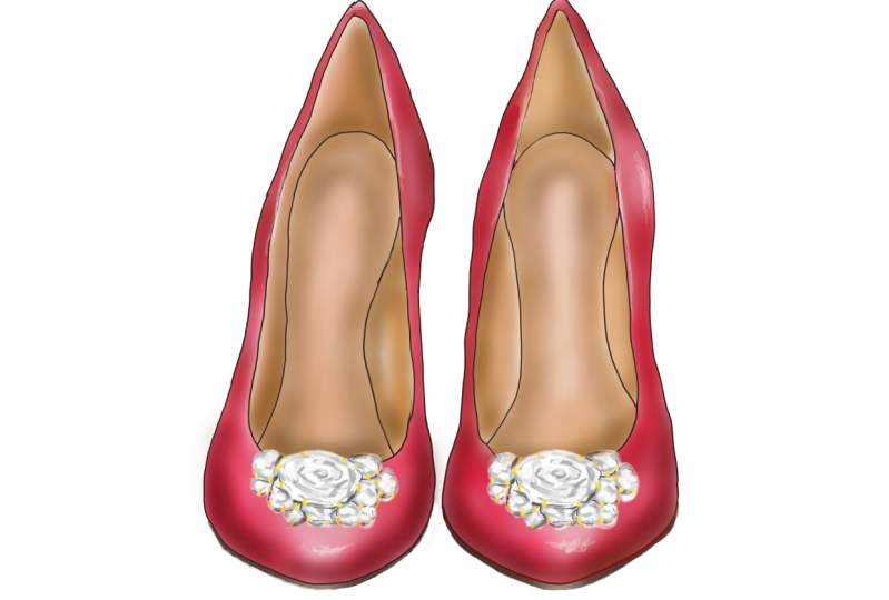
8. 8 Exercise 2: For this exercise, we're continuing with the shoe theme, of course, this time with a high-heel shoe viewed from the side. You can choose to either draw your own illustration or print the shoe illustration on page two in the companion coloring book. This is the illustration I'm talking about. I'm going to see if I can draw up some outlines looking like something like this. After having a complete meltdown with this shoe, no matter what I did, it just looked like a kid drew it. Sometimes shoes can look so weird. The heel and the angle and it can be really, really difficult. I just had to turn off the camera and just try to get a shoe that doesn't look like Miss Piggies foot or something. I don't know. Sometimes things just don't work out. The thing is, don't give up. Let's just get to the coloring part now and get this one done with. It's time to pull out your color charts or just the markers that you have and let's see what we can find. Now need a natural blending group. Actually for this one, it's easier to use the Copic color chart, which is arranged and sorted by color family like this and then you can see the colors that you have within the same saturation and see the different tones that you have and you can choose between. I'm going to pick three markers within a color family with the same saturation but through different shades. I think that I'm going to go with this one. I'm going to go and get those markers and let's start coloring. I got my markers and what I have now for the base color, I have this one, it's called R32. The next one is R35, R37 and then I chose to add a really dark shade too because I had it in this natural blending group, so it's an R39. As always with coloring and shading with a natural blending group, you start with the base color. Since we're going to use perhaps up to four colors, or at least I will, I have to be really careful with how much ink I get down on the paper from the start because I want there to be room for adding multiple layers here as well. You know what? I forgot. We need to decide on where we want to have the highlights or even reflections. For this one, definitely over here will be a highlight and then perhaps a little bit over here and here, I think. I'm just making a mental note. First just get some ink onto the paper so don't be nervous for all the streaks because that's always how it is in the beginning. Just see if you can color the whole thing and then we're going to make it look good step-by-step. What's up with this? I have to fix that with my blender, I think. When you make mistakes like this, color outside of the line, with some colors at least, you can push back the ink inside the border where you want the outline to be like a room pushing your error color back into the place where you wanted. Some colors will leave a residue that's not possible to get rid of but since we're going to color the inside of the shoe as well, that's something that we can fix later. This looks also like a kid's drawing, I think, but we'll continue. This was the R32 and I'm jumping straight up three steps and shade to the R35. I'm always starting with the borders because then I have set those outlines boundaries. For the base cutter, why am I covering the whole thing when I'm going to color over with a darker shade anyway? Well, since coloring and markers is bad blending and the alcohol and the ink is reacting to the colors that you're using. If you skip to color one area, then borders between those areas will show. Using flicks now to get the pattern down here and then come in with the R37. Now I have the first layers down and I'm going to go over it with the midtone again and see if I can blend in, so here is the R35 again. The trick is to work with wet on wet so let the ink sit and rest for awhile in between, but also not too long because then it's going to be more difficult to to blend them. I have waited a little bit too long between my layers because there were some other stuff going on here so they might not blend as much as I would have liked it to but let's give it a try anyway to see if we can do with it. Now I'm blending with the base layer or at the base color and the thing is to build it up. In the beginning it looks just not at all as you might have envisioned it but the thing is to work on it like this and add more and more little at a time and then go back with the midtone again perhaps if you feel that can do some more with that. Maybe you want a deep in the color a bit and see if you can find that gradient or that shift that you are looking for and go back with the lightest shade again. I'm keeping this little reflection here, you never know what that can be useful for. Then you will come to a point where you can see that the ink is just floating around on the top of the paper and then that's when you have saturated the paper. There are some shifts in the leather of the shoe, so to speak and I'm going to see if I can darken the shade a little bit more. To do that, carefully go just along the edges and deepen the dark shade of your blending group. I could go in with the really, really dark shade the R39 to deepen it even more. Let's just do that to see what will happen. Once you create when you have the really dark shades is a much more distinct look and that's because you have more contrast between light and shade. Another detail you can do when you color your shoe like this is that you have a little bit of the red on the other side showing on top of the inside of the shoe. To do that, you could get that the mid tone so I have my R35 and just with a little thin line to show that the other side of the shoe is showing usually there is this little it's rounded or folded. For this, if you have a small nib, it's probably easier but if you just go really, really careful you can do that with a brush nib. Now onto the inside of the shoe, the underside of the shoe and the heel. For the soul of the shoes, so to speak, the underside I'm using a really, really dark gray. Cool. Great eight. It's almost black but not completely. To the inside of the shoe I'll use my favorites for that purpose, the E30 and E31. This is a mini natural blending group, so to speak, with only two shades so I'm starting with the light on. Be careful not to go into the red or your color too much because this one is gray light and it can bring some of that red or with it. Now to bring some shade to that, let's see where do you think the darkest place is? Well, along this top edge is going to be very light. Then I think down here it's going to be bit more shaded. That was exercise number 2 and now it's time for the next technique so hop on over to the next lesson for that.
9. 9 Shading with a desaturated color group: For this third technique, we're going to use something that I call a desaturated blending group. It builds on the same principle as the previous technique, where you add darker tones for each marker to create the shade. But with a desaturated blending group, you also add desaturation for each marker within the blending group. For our blending group with this technique, we're going to pick colors from this same color group again, but this time, instead of staying with the same saturation for every marker, we go up at least one step in saturation for each marker, so that each marker is more desaturated than the previous one. Then the tone value go up two or three values just like with a natural blending group. For example, let's say we need a desaturated blending group from the yellow color family, and our first marker is yellow double zero, so it's zero in saturation and zero in tone. But for marker 2, we go up one or two values of desaturation and two or three values of tone, which means it becomes two or three steps darker. This will give us, for example, the Y13. For marker 3, we do the same. Up one or two values of desaturation, two or three values for tone, which will give us yellow 26. As you can see, for every marker in the group, the color looks both more muted or grayish and darker. That will create a deeper shade compared to the natural blending group. If we'd pick a natural blending group of the yellow color family and based on that first marker of yellow double zero, the other two markers would keep the same saturation and appear much more clear and vivid and not muted or grayed down as with the desaturated blending group. With the desaturated blending group, the shade that you create appears more gray, which looks more realistic. Here I have some examples of desaturated blending groups. This one is from the red color group with the first, the base tone is zero saturation and five in shade. Then I go up in saturation, one step, so I have a one, and then I go up two for tone, so I have a seven. For the third color, with the third tone, I go one up in saturation again, so now I have a two and two more up in tone, so I have a nine. Another one is this one, where the base tone is a blue violet zero zero, so zero tone and zero saturation. Then I have one up in saturation and one up in tone. So tone wise, these two don't differ that much, but the visual difference is enough. For my third, my darkest color, I have used saturation three. So I go up two, which will be quite more of a difference in between the mid-tone and the dark tone. Then I go up also three in tone. Now, which one shall I choose for my example, I would like to try the blue violet and just see how that difference between the mid and the dark tone will work. I'll pick that one. With my base color and my glass, I make that circle again, my outlines. As with the natural blending group, I start with my base tone, again, just applying the base coat of color. This time just for variety, let's have the reflection over here. It might not even have a white reflection for this one. I think I'm just going to go all in with this one. Then I take my mid-tone, my blue violet 11, and I'm going to start with a bit of an outline just to set my boundaries, and not be so sloppy here with the outlines. Then using flicks again, like two-thirds in, something like that, I go in and apply the second layer. Then I'll do the dark tone. The saturation here makes it look visibly a bit more blue, but it's the difference in saturation. Now we go backwards, back in tones. I grab my mid-tone again, and now I try to blend the dark and the mid-tone with each other and make a smoother gradient, and using flick strokes. Usually I would turn the paper to do this because I think that's a bit easier. Then last but not least, the light tone, the bass tone again, going from the mid-tone and into the light tone again, smoothening the edges. Now I can see that I have really saturated this paper, so the ink is starting to float around on the top of the surface. But what I want to do is smoothen out the borders between the different tones. That serves smooth, I think. I want to do more to have this bright white reflection. I go back a little bit with my other tones, see if I can make more contrast, and with a dark tone. Yeah, my paper is completely saturated, so it won't take more ink, I'm just pushing it around now. But here's the example of how you create a shade with a saturated blending group or a 10 plus two blending group, which gives it a bit more of a gray tone into the shade. Because the more desaturated colors that you use, the more gray they appear. To demonstrate this with a desaturated color to shade with, I have made this example. It so happens that I have some blue markers that can be combined into different blending groups. First I have this one which is a B00, and then a B02, and a B05, which makes a natural blending group. This is how the appearance will be with a natural blending group. The next one, this one, is a desaturated blending group. I used the same one as a base color, the B00, then I went up in saturation one and two in tone so it became a B12. Then for the dark tone, I used one up in saturation, so it's a two and two in tone, so a four. I used a B00, a B12, and a B24. That's a desaturated blended group. You can see, compared to this first one, that this one appears a bit more muted in the colors in the shade actually. Then I also had an even more desaturated dark tone. For this one, I used the first two desaturated color group colors, which was the B00 and the B12 and then I used B34. So I went up two in saturation and two in tone. Compared to these ones, you can see that this one in its shade appears quite a bit more gray than these ones. This comparison, I hope, will show you what the difference between a natural blending group is and a desaturated blending group. Now it's time for your next exercise.
10. 10 Exercise 3: For this third exercise, we're going to continue with our shoe theme and now with a sandal. As before, choose if you want to practice your drawing by drawing your own shoe, or perhaps if you want to use the template from the companion coloring book. This is the sandal we're going to make and the saturated coloring group that I have picked out for this illustration is from the blue violet color family. The first one, the base color is blue violet double zero. The mid tone is blue violet 11. My dark tone is blue violet 34. Let's see if I can manage better this time without having a meltdown. So as always, I start with the base tone. So now I have the base layer down, the first layer of ink and I have not really marked the highlights here, because I think that this is going to be more of a muted reflection or a muted highlight. So there are going to be some darker areas here and there and of course around the contours and the edges, where we want to have the contrast to make the shoe look a bit more realistic, and a bit more 3D, or pop from the paper. So now it's time for the mid tone and for this I'm going to go around the edges a little bit, though I can even out the color a little bit more. Remember to just do a little bit at a time, like here, I wanted to have a little bit more of as a shade coming out from this little strap holder. Also here I wanted to have it more of a shade like that. Then here at the buckle and also here, and over here where the heel part meets the sole part, I'm also going to make a bit of a distinction here. Do a little bit of time as I said, so that you don't overdo it in the beginning, because you can always add more colors, it more difficult to take away color oi ink. All right, and now for the shade marker, the blue violet 34. Now I'm going to be really careful because I don't want to darken this too much. So I'm just going to add a little bit of ink here and there just to be able to make that contrast that I want, but not too much. Then we're going to blend it with the mid tone and the base tone. So really important to go careful here. So now I'm going to start blending. It's always easier to create a sharp outline if you have the nib towards the outline. So remember that overdo it hazard there, it's always there with marketers. It's now when you go in with the base color again for the second time, this is when you even out the ink, and get rid of the streaks. Now I want to add a little bit of that suede feeling. So I guess this is going to be some suede shoes. So I'm just making some areas where it's a bit more distinct. You can feel that there is something going on here in the surface. Then I go and even it out a little bit more. More as a base color, actually I should let it sit and rest for awhile, otherwise, it's just going to float around. Perhaps just a little bit here too. If we think that there is a need of some more contrast going with the darkest one again, we'll just add a few lines here and there, where you feel that you need some more contrast. I can see that I am starting to saturate the papers to be really careful. I'm also going to go in with a mid tone to create that as we did with the red shoe, to create that edge of the swayed on the other side of the toe here, that's folding over and showing, and also on the strap up here. But I'm going to do that after I have colored the inside of the shoe with that tan or nude color, because I don't want to risk the really light, leather color is going to be contaminated with the purple. For the leather, I could definitely go with my traditional and favorite with the E30 and E31. But I also want to add a little bit of that desaturated blending group that we are practicing now, I could use an E00 and an E11 and E23, that will be a desaturated blending groups. So let's see how that will work. I don't want it to be too pink. So the base color I think would be pretty with the purple. Then if I go in with this one, how was that shade effect look? I think it could work. Then with the darkest one, the E23 is still not very desaturated, but I think that would also work. For a really dark shade, I could go in with a very desaturated color, which is the E71. So it's lettering shade than my E23, but I think it could work anyway. So this one could actually add some shade. So with my lightest tone, the base color, be careful not to go into the purple too much, because you can risk bringing some of that ink with you. Now the next one. Keep up a really light edge right next to the purple, just to create the impression of a reflection. I'm blending in a little bit with my mid tone. So I had my really, really dark tones too and I want to add a little bit of a contrast at the bottom here. Just something like that, just to create a little bit of a detail. Now to some more details, some fun details, first I'm going to go with my blue violet mid tone, and create those edges. Now to some more details, and if you want to, if you have like a fine liner now you can definitely use that. We're going to create a little bit of same impression on the inside, just by creating just tiny little stitches. I'd also a little bit on the inside of here. For the little stud here, we also need to do something and a tip is to just do the edges like this, and then you get a reflection in the middle. There's one more thing we're going to do now and that is the buckle. So this is a really, really tiny area, and you could definitely use a fine line or if you have a small point nib for this, but I'll try to work with my brush nib. I'll start with the edge in this corner here just to make a little line. Then on the inside of the buckle, the opposite, so I'm thinking that the reflection for this one is coming a little bit from here. Sometimes I just fill it in with black like this, and then I use another tool to bring back the white highlight. I also want a little bit of gray in this just to do some variation. Now the trick that I'm going to show you is to use a white gel pen or posca pen is what I'm using for this. With this you can just add some white highlights on top of this. Here, you have a sandal made with a desaturated blending group, or actually to desaturate blending groups, because we used that for the inside of the shoe as well. With some detailing, some highlight, and trying to mimic some of that chrome in the buckle. Hope you enjoyed it.
11. 11 Shading with complementary colors: Up till now, we have used markers from the same color group for creating shade. Now, we're going to pick colors from two different color groups. This technique is called shading with complimentary colors. For the shading techniques that I have demonstrated so far, I've used only one or up to three tones and not only dark tones. You can, of course add even more and darker tones to that natural or desaturated blending group and create even more contrast. But what if you don't have a natural or desaturated blending group with those darker tones? I certainly don't have all colors and shades, although I wish, but with this technique, we can work with our limited collections in a more flexible way and also learn how to create more contrast. Complimentary colors are colors that are on the opposite side of each other on the color wheel, and Copic has its own clever color wheel that is quite helpful for finding complimentary colors for their color system. In the about section of this course, I have included a link where you can download and print this color wheel chart if you'd like. How does this shading technique of complimentary colors really work? Well, if I want to color an object with a red color group for example, which is over here, to add shade to it with a complimentary color I go to the opposite side of the color wheel, where I find the color groups of green and blue-green, and even blue, so I have to choose a color among these color families. When I use them together and blend them, they create a third neutral color, actually they become gray, so by using a complimentary color, you are in fact desaturating the color of your object. This technique builds on the previous one, using a desaturated color group. To choose the colors for this technique, you will start with choosing the color family you want to use and then the base color, the midtone and then the darkest tone according to the desaturated blending group. Then you refer to the color wheel and depending on the color group or color family that you have chosen, you go to the opposite side and see what colors that you find there. It doesn't have to be the exact opposite, like for this red, it doesn't have to be blue-green, it can be in the green and blue color families as well, so somewhere over here. My advice is to try which ones that works the best, and you're going to hear me say that a lot from now on. Now, what saturation and shade should you pick for your complimentary color? Well, it all depends on the darkest tone of your blending group. I recommend that you gather all the markers that you have in the complimentary color families and try them out to see what will work well together, and then you don't have to feel limited because you don't have the markers according to a specific rule. In general, a complimentary color, unless it's too light in tone, will desaturate and darken the blending group no matter. What to watch out for though, is to find a complimentary color that doesn't keep its color too much. By that I mean that it shouldn't appear too blue or too green or too red when blended with your blending group, it should become as gray or perhaps brownish as possible to make a good shade. Now let me show you with an example. Here I have put together a desaturated blending group of reds, it's an R12, R24, and an R29 as my darkest tone. When I referred to the color wheel, a complimentary color to the red would be within the blue-green color group, but also green and blue-green would work. When I looked at what colors I have in these color groups within my marker collection, these are the ones I would like to try out. As you can see, they're in the blue-green color family and I have some greens and some blues. The darkest tone in my desaturated blending group, was the R29, so it's pretty low or mid in saturation, but high in tone and nine is the highest tone you can have. But as you can see, it doesn't really appear that dark, so we'll have to see what will match with this one. With my complimentary colors they are actually ranging in saturation from a zero to a nine, and in tone they are from a two up to an eight. Now let's try them out and see which ones will work the best together with red blending group. For testing out the complimentary colors, I made these sloppy tests washes with red saturated blending group. Here's a reminder of the colors that I used, I think I'm going to start with the one which is green 82, so it's high in saturation but low in tone which means that it might be too bright, we'll see, so I'll start with this one. Yeah, you can see that the tone is just too bright, so it won't create a shading effect at all almost, so let's keep in mind which one, green 82. The next one I want to try is green 03, this one was really dark, it becomes very nice and gray together with the red, don't keep the green that match. Let's see if I try to blend it with the dark red, it could work, but I think the difference is a little bit too sharp. But then I have a green 94, which means really high in saturation, it's going to be very desaturated, and then it's a four in tone, so it's a lot lighter in tone than the darkest red that I have, but let's see what happens with this one. I like it already. See, it creates a nice complimentary shade and it appears desaturated and grayish, so this one was a great match, I think, and then I could add the green 03 to deepen this shade, but this one I think works pretty well together with the red group. As you can see, the tone all depends on the blending group and how it works together. I'm going to try a couple of blues as well, here's a blue 21, so it's mid in saturation and very light in tone. As with the green 82, it doesn't make that much difference in darkness, you can see a little bit of gray shade to it when it dries up, but not enough for a nice shade, you could use it as a transition, a blending color too and then use another more darker tone. What happens if I use a darker one, B34? Yeah, this one also works the same as the G94. Then I have a couple of blue greens as well, let's start with this one, a blue-green 23, blue-green 13, and the last one, pretty dark one, blue-green 18, and this one is way too dark, it's low in saturation which means it doesn't bring that much grayness to it, but it's very dark in tone, so the transition between this one and the blending group, it's too sharp. According to my little tests, let's see which ones are my favorites. I think this one, this one, this one could work, and this one, but I think that, perhaps, this one is what I will use. To be honest, this technique, shading with complimentary colors, it has its limitations because in theory it works well, but in real life, when you start mixing blue-violet with the opposite color or if you take a blue and trying to shade with a yellow-red, it's quite difficult to find a great combination that will accomplish that grayish desaturated mix. To show you in the same manner as I did with the previous techniques, I made this sphere with a desaturated blending group. I used R05, other than that I used the R24 and R29. It becomes a bit more desaturated towards the shade and towards the edges. But now I want to have that really sharp and contrast adding shade to this. According to my test swatches before, the best complimentary shading color to this was the B34. I have that one here, and now I'm going to see if I can add some shade with this one, and I'm starting just around the edges. Now, it's so easy to saturate the paper so that the ink will just float around. Just apply it carefully a little bit around the edges, you can add more later but just get some of the ink down there because now we're going to go in with the dark tone again from the blending group and blend them together. All the way from the edge and out towards the middle so you can bring some of that blue out from the edge. Here is how you can use a complimentary color, and this time I used red together with a blue as a complimentary color. Now it's time for a new exercise, so I'll hop on over to the next lesson for that.
12. 12 Exercise 4: Welcome to Exercise 4, where we're going to practice how to create an illustration with shade, using a complimentary color. For this exercise, I have made it a bit easy for me, but I also wanted to show you how to use the templates that I have provided in the companion coloring book. For this exercise four, we're going to color these pair of high-heel shoes viewed from the front, and for this illustration, I have chosen red desaturated coloring group or blending group. I'm going to try them out on my scrap paper and the base color is going to be R12. My mid-tone is going to be R24. There's a bit of difference between the two shades. My darkest tone for this desaturated blending group is going to be R37. These to the mid-tone and the dark tone is closer to each other in shade. Now I'm going to blend them together before I go in with a complimentary color. Then for a complimentary color, if I take a look at the color wheel, I have my reds over here, so I have my red 37 over here and I wanted to try something across that's, a blue-green, and what I had in my collection there was either a blue-green 18 and a blue-green 13. Let's try the blue-green 18, which is very dark, and the blue-green 13 that I also had, which is lightering tone than my darkest red. And let's see what happens when I blend them. I think that, the lighter blue green is blending a bit easier, so for me it's going to be the blue-green 13. Then for the inside of the shoe, I'm going to use my favorite one, the E30 and E31. I have my E30 and the E31 over here and that would also be some kind of blue-green, and I guess I'm going to need something very desaturated but still light. Let's see what I have. I use my scrap paper to test out some of them. I have this blue-green 93, let's see where that will lead us, and that's beautiful. I think this one is going to be perfect to create, any shade if we want to. I have my set of markers ready now it's time to color, and as usual, I'll start with my base tone, but first I'm going to decide if I want to have some reflections and where they're going to be. For this one, I think I'm going to want to have some reflections here at the tip of the toes. May be a bit of reflection here, and here, here, could even do some here. But I think this shoe is shading that one, maybe bit over here as well. So maybe I'll just keep that untouched at first. That's the base color, and when it comes to the mid-tone, if you would only use one color for your shoes, this is the mid-tone is the color for your illustration. Then you will use the base tone and the dark tone to create highlights and shifts and gradients and shade. The mid-tone is the true color for your illustration. I want most of my illustration to actually be colored in this color. But the same principle applies a little bit at a time. Now it's time for the dark tone to create those shades, but with this one I'm creating some of the darker areas. Okay, time for some blending, and now with the base tone, the lightest tone. Okay, now, we're ready for the complimentary color shading, and let's see where do I want to have the darkest parts of my shoes, I think over here is going to be pretty dark, maybe a little bit in-between here too, and also on this side and underneath in some places at least. I'll start really careful with my blue-green and add a little bit of color like that. No flicks or anything, just get some ink onto the paper. Now I'm going to go back with my dark tone to blend this out. They can almost use this to push that complimentary color to the edge, a little bit. Just like you do when you fix mistakes with a blender, because that will make them blend a bit more and start to feather. Now you can squint your eyes and see where it needs some more, and I think over on this side needs to be dark as well, maybe I'll do a bit extra here to create some more contrast, I like contrast. Sometimes you don't even want to smoothen out these edges, you might want to have some sharp shadow edges as well. I think that I can be pleased with, now I want to go in and create some more highlights with my posca pen, but I think I'm going to do that last, first I'm going to color the inside of the shoes, so starting with my E 30, my lightest earth tone. With one of the previous shoes, I'm going to divide the heel into two-halves, so I can have a little bit of reflection in a seam or like in the back part of the shoes sown together. That was the base layer. Okay, so I think that's a good start, I'm going to blend it over together with the base layer. Now imagine that your pair of shoes, they might have a bit of an imprint of your foot or if they are completely new, you have to imagine where you will have some shades here. I think that here and the toe part, that's where you want to have some shade, and also you might want to have some shade over here and here as well. Let's create a little bit of shade or even shadow perhaps starting over here. Here is one of the places where it's going to be the most dark. Now it doesn't even have to be gradient shade, some shades are really sharp. There and now we can blend it with the mid tone. Blending is also making sure that all the colors are related, they are mixing. Here I can use a bit of that layering shading technique in the first lesson and exercise as well, where we deepen the base color with more layers. The only thing that's left now is to do something with the sole underneath, and we can either do it with a black sole completely, maybe with a little bit of reflection in it or we can do it also, in this color palette, I think I'm going to do that. For the final touch, I want to use my posca again and add just some of those sole fun highlights. I can do that along the edge here, where you think that there could be some accent from reflection. That was Exercise 4, and now it's time for the last technique.
13. 13 Shading with gray: Using gray tones to create shade is in many ways done with the same principle as using the complimentary colors, where you mix two colors to create a third neutral color, sort of a gray color. But for this technique, we're going to use the gray tones to create the shade and this is useful for creating really dark shades because for some colors and saturation, even the darkest tones of the value nine doesn't give that really dark impression. First, let's take a look at the gray tones available. Most marker brands have different groups of gray, in general, they are cool gray, neutral gray, and warm gray groups, and they can be named a little bit differently between the brands though, and Copic uses the cool gray, neutral gray, and warm gray, and Windsor & Newton call their pro and brush markers for ice gray, cool gray, and warm gray. There's a little bit of difference. When choosing what gray markers to use for your illustration to create a shade, there are a couple of things to consider; temperature and tone together with saturation a little bit too. But first, I'll talk about temperature. Technically, shades are always a bit cooler than the color of the object and since Gray is a cool color in itself, in general, you want to use at least the same temperature of gray as the temperature of the color you've used for the blending group or the base color for your illustration, or you can use cooler gray. How do you know what temperature your base color is? Well, in general, you can say that yellow and orange are warm colors and blue and blue-green are cool colors, but for example, red, green, purple can be both cool and warm, and you can actually find orange and yellow cool versions as well. When you compare them next to each other, like these two red ones, you can see that one appears warmer and one cooler. It often has to do with a value of saturation of course, the more desaturated the color is, the more gray it has in it, and therefore it appears more cooler. If I have a cool red color, I pick a gray from the cool grays, and if I have a warm red, I can choose a warm gray or a neutral gray. I can even pick a cool gray, that would work too because remember, it should be at least the same temperature as your color or cooler, but if I have a color that's difficult to determinate the temperature, I can always go with a cool gray I will be home safe doing that with a cool gray. You'll never go wrong in theory, but as always, try it out before you start coloring the illustration, because there are always exceptions to the rule and you might miss out on cool effects to and mixes if you just stick to the rule. For example, if you use a warm gray on a cool color, there might be shades and shimmer and effects that you just want to keep. So just try it out. Try it out. That was temperature. The second thing to consider is tone and sometimes also saturation. Starting with tone, in general, the best gray to match with your color is by starting off with a gray shade that has the same value of tone as the color or the darkest shade of the blending group you've used. Like for this one, the E31, which is a color I often use when I color the inside of the shoes. For this one is good to start off with gray, which has the same value of tone as the color itself. Here I will use a neutral gray one to start off with, and you just put down some of the gray like this and then I can go up in value with the N3 just to add more contrast, but this is how I like to work. I like to add more and more grade gradually because if you start off with one that's too dark in tone immediately, it would be more difficult to blend them. For this particular base color, to start off with the same value tone in the gray as the base color works pretty well, but there are other situations, other colors where you actually want to start off with a gray that's lighter in tone than the base color. Be careful though, because if you use a tone of grade that is a lot lighter than your color, well, first of all, it won't have any effect, it won't add a shade or even be visible, but another thing that will happen is that it's actually going to brighten up your color or create a light spot like when you're using the colorless blender. For this demonstration, I will show you how to shade with a warm gray and a cool gray so that you can see the difference. For base color, I will use only two tones to make their gradient, the E30 to start with, and then E31 to create a bit of a gradient, and then I'll go in with some gray tones and make the shade. I'll just fill the first one with the base color, and just get some ink down onto the paper, don't worry too much about the streaks or covering the whole thing. This is something that we can fix later when we smoothing out and blend it together, and then go in with the second tone and see if you can follow the shape of the sphere, get that round body and volume, and then I'm going to go back with the base tone, the lighter tone and blend them together. First I'm going to start not with the cool gray, but with a neutral gray because this one is pretty warm in itself. I'll start with an N1. It's the same tone of shade as the darkest earth tone that I used, and I'm going to go a little bit up here too. It's just creating a very slight shade of gray. Now I want to have the neutral gray 3 to deepen the shade a little bit, and then I'll finish it off with N5, neutral gray 5 to create a more distinct contrast. I just wanted to get some ink down there. Now I'm going to go back with the N3 and smoothen it out, and I'll go back with lightest gray that N1 just to even it out some more. Now we can go in with the earth tones again, just to make sure that it deepens the color, smoothen it out. You can go in and fix the contours a little bit more even. Now this paper isn't very good for multiple layers anyway, but it is really, really full of ink at this point. What I would do is to go in and even this out a little bit more. I'll go ahead and do that and just sharpen the impression, the shade and it's almost impossible to add more into it actually, but something like that. Here we have a more distinct great shades to this sphere. Now let's go in and do the same thing but with a warm gray instead. Looking like that and let's save the rest, not even blending these two and with a lighter tone yet and now I'm going to go in with a warm, gray 1, and I think it might actually be too much similar to the earth tones that I've used. I'm going to go in with the warm gray 3 right away instead. Otherwise, I'm just going to saturate the paper too much. Here, I think that was a good choice. The warm gray 1 would probably not even have made a difference, and then the darkest warm gray that I have. Now it's time to blend them. I'll start with one gray 3, just to smooth the edges or the transitions between the warm grays first. Then I'll go in with the E31. As you can see, it's the same blending techniques as we've used in every other technique exercise. Then I'll go and blend with the last one, the base tone again, and just see if I can smoothen it out and I don't want to have that bright reflection. There you have it. We have shaded with a cooler gray or actually this was the neutral gray, and then you have a shade with a warm gray. As you can see, there is a little bit of difference in the impression of them. This one becomes a little bit sharper and this one is a bit softer and warmer. Depending on the effect that you want to achieve, you pick the cooler or warmer version out of the shade. Now it's time for you to practice this. Go to the next video for your next exercise.
14. 14 Exercise 5: So this is your last exercise and we'll continue on our shoe theme this time with a clog to honor my Swedish culture perhaps. Either draw your own clog or shoe or use the templates, and this is the template in the companion coloring book that you can use. First I'll do my sketch. For my clog, I have decided to go pretty natural and just use colors of some brown, grayish leather on the top and also try to find a way to mimic the lime tree that the bottom is made out of, and then I'll find something for the inside, and then we have that little chrome detail in the buckle as well. But I'll start with the top part and a little ankles strap, and for the color, I have chosen, from the earth tone color group, the E71 as my base color, and for my second marker, I'm going to use the E74. This is a two marker coloring and then I will add shade with a gray tone. The earth tones that I'm going to use are pretty warm, so I could use warm gray as well, but I would like to have a bit of a cooler shade, but not too cold, so I'm not going to go for the cool grays, I'm going to use the neutral number 5. I'll start with the base color. For this, I think I want to have just a little subtle shine or highlight over here. I'm keeping this middle part white for now, because I'm going to want to go in and blend again. I'm probably going to cover this so there won't be any completely white areas, but at this point I don't want to go in and saturate the paper too much. While it's still wet, I'm taking my woke, let's call it a mid tone, but it's also a dark tone in this case, and with flux in the same direction and use the direction of the flog. Here might go like this. Now I'm going back with my base color to blend this out, see what it looks like. That's a good start, and now I'm coming with the gray, the neutral 5, and see if I can find some places where I want some more shade. Be really careful now so you don't overdo it. Apply some ink there and then you can now blend it out with your mid tone, the dark tone, whatever we should call it this time. You can of course choose blending group, either a natural one or a desaturated one, or maybe just one marker with layering. I'm going to go over with my base colors of the light tone, so that now I can say that I'm starting to saturate the paper a lot here. Now for the gray part. For finding the right color and shade for the wooden bottom, and also the inside of that leather, I'm going to refer to the real world and see what it does look like and the colors that I need. Here is a clog that's actually has my pattern on it because I have licensed this pattern to leather company that prints it and then sells the leather to manufacturers of clogs. I have clogs in my web shop with my own brand bear bell on that just a little bit for fun. That was a mini commercial. Anyway, I need to find markers that will work for this line wood and rubber sole and also for the inside of the leather. I found some colors that could work for this, and for the inside of the leather, I think this warm gray number 1, and then to add some shading to that warm gray number 3. Then for the wooden bottom here, I'm going to use my favorites the E30, and to create those streaks that you can see in wood, just to slightly difference, I'm going to use the E31 too as well. For the rubber soul that actually haven't really drawn here, I'm going to use another earth tone, the E23, and that one we'll see if I need to bring in some accents or shading in this one. I'll just get started with the inside of that leather. I could actually go a bit darker so I can bring in the warm gray 5 as well, just to add a little bit more depth to that shade. Having a set of different gray tones is the best advice that I can give you, if you only have the budget to buy a couple of markers, start out with great tones because you can sketch with them, you can create all kinds of colors as well almost, because if you have warm grays, you have cool grays, you have neutral grays, you have some variety that you can do a lot with. You can make monochrome illustrations, and I think it's just a really great way to start your collection to have a bunch of gray tones, and also earth tones, of course. I think I'm pleased with that. I can probably create some work contrasts here and there, but I think I'm just going to let it sit and rest for a while. Now I'm going to take on the wooden bottom. For this one I actually want to get an even coat color, no specific highlights here, because I even going to create some wooden texture to bring this to life instead. Let's see if I can manage to do that. Add some shading of course. We're going to need some gray shading on this one too. Okay, let's see this one as well, I think it needs to have that base color. Now I'll go in with my E31, and let's see. I'll take a look at my clog and see how the wood texture or how what it really, really looks like, and so I think there are something like this, and then I can blend this out with my base color. I'm thinking that the light is coming from the upper right side, or a little bit from the front on the upper right side. Let's see, the shading is going to be here, and then I'm blending it with my light earth tones. Another gray was pretty wet, so it means [inaudible] block, which I'm not very happy with. You taking the N3, the neutral gray 3 a little bit darker than the other one, and just add a little bit of dark shade here. All I have left now is the buckle, and for that, I'm going to use black fine liner this time, and just a little bit of gray, I'm thinking I'm going to use the neutral gray 3, and then I can bring in some extra highlights with my posca pen. Okay, so that's the clog, and the last exercise, and all that's left now is to erase the pencil lines that might be left. I hope you had fun with this one as well.
15. 15 Class Project: For your class project, I suggest that you take a picture of at least one of your shoe exercises illustrations. Or if you are illustrating some other object that's totally fine. Then you create a project in the project section of this course and their upload your image. I look at every project and we'll give you feedback. Posting a class project is also a great way to network and skill sure is, as you may have already discovered, super friendly and supportive and you'll receive lots of love and encouragement from your fellow students. Also take some time to check out other class projects and give feedback and comments. This is the best way to squeeze out all the best from your learning process. Plus every student of this course, and your flowers will get a notification when you post a project in the course. This is a great way to build your own following if that's something you're looking for. So I can't wait to see your shoe illustrations or if you want to draw an illustrates something else, that's totally fine as long as you have fun.
16. 16 End note: This is the end of this course. It's been really fun to put this one together for you. I hope you enjoyed it and that you learned a lot of new and useful things, and if you didn't like it, I would really appreciate it if you would give me a thumbs up or even better, write me a little review. I loved those. That way, you will also help other students that are considering learning about markers and tell them if this course is for them as well. As always, if you have any questions or requests for a new course, you are welcome to write me a comment in the Comment section of this course. You can also, if you'd like to, visit me on my website at www bearbell productions dot com, or follow me on Instagram at bearbellproductions. Thank you for watching this class and until next time.
 Bärbel Dressler, Surface pattern designer & educator