Transcripts
1. Colour Mapping Skillshare intro 012023: Welcome to my basic
color mapping course on Skillshare. I'm Chris Carter. In this class, I'm going
to introduce you to the technique and the
practice of color mapping. Color mapping for me has
changed my life as an artist. It has enabled me to work better both in the studio and when I'm sketching
out in the world. Plan air, or in a museum, or in a railroad station, or really anywhere when
I'm also using color. And it also has helped me
to focus specifically on color without all of the other considerations
of the drawing, the composition, the values, all of those things. I'm just focused on color. And of course, I'm
focused on color value, color, temperature,
color saturation. Those are my focus is
when I'm color mapping. And I want to share this
with you because it can enhance both the
joy of creating and your ability to really
express yourself in your own unique
way, own unique voice. In this class, we're going to be making a project which
is this little book. And in this book, I'm going to show you how to make this book folded out of one piece of
paper and make little cover. And then to color a map with several
different techniques. The class we'll begin
with teaching you simply how to make the
basis of this book. Then we will move right into the basic technique
of color mapping. I'll share an
additional technique of color mapping with you. And then we'll go into using the color mapping to make
three different sketches. I'm after we've done that, we'll put the book altogether. And the project is really
completed at that point. But I'm including in the course to additional
bonus lessons. Because one thing that
I don't want you to be thinking about so
much when you're color mapping is drawing. And yet drawing is essential
when creating drawing, whether it'd be abstract for representational,
It's still drawing. So I've included these
two bonus lessons, which are other
videos that I like to include in almost
all of my classes. Because they give you a
basis for contour drawing, which for me is also
a daily practice. And it also explains the difference between closed
shapes and open shapes. For color practice, I often use closed shapes and I want you to understand what the
difference is between those. So I've included those at the end of all the
other lessons. Please remember to photograph
your project and to share your project on the project page in this class.
Let's get started.
2. Preparing Books: This is a letter
sized piece of paper, 8.5 by 11 ". First, you will
fold it this way. Open it up, turnip, unfold it the other way. Open it up and fold each
and into the middle. Fold it in half that way. Open it up. And on this fold, you're going to cut
from the folded part, not the end than
the folded part. Along this fault
line up to the fall. Just a teeny bit beyond. Then open it up, pinch here. Open it like this, and flatten it out. There. You have your
book, 12345678. Now I suggest that
with a pencil, since we are going to be gluing pieces of paper onto this, I suggest that lightly
you mark each one and I suggest you make a one that has an indication that this is the
top and that's the bottom. So I I'll do it darker. 12345678. And this is the size book
that you end up with when you start with a letter
size piece of paper. Now, I'll show you with an
11 by 17 sheet of paper. This is 11 " by 17 ". That's twice what this is. And this is also a standard
size piece of paper. I'm just using a
scrap piece of paper. Fold is here. Cut along this line. Reside turned it
over as I can see the fall a little bit
easier on this side. 12345678. Now I'm going to turn
this around the other way so that my spreadsheet fold them in both
directions if you're having trouble getting it
into the bookshelf. So there's 12345678. So this is the size
that you end up with. Relation to the
pencil with 11, 17. This is the size that you have with
eight-and-a-half by 11. And there are other options, so you can hold any
piece of paper this way. This is a piece of somewhat
heavy drawing paper. And with this one, I'm going to do the
color mapping on the drawing right on my box. So I will not be writing the numbers one
through eight because I'm going to just create the whole book just out
of this piece of paper. And I will fold it the same way. I'm not sure how this
paper will take. Watercolor certainly is
an old piece of paper. And I'll use a bone folder. Really get the edge because it's a thicker piece of paper. I'm going to do that on both sides so that
it folds easily. When I turn it into a much easier at folds, when you score it doesn't fall these lean one
way or the other way. This was not folding
to easily like that, but it does fold well like that. So you can play around with it. Okay. Now I'm gonna be making
a cover for these two, but you don't have
to make a cover. You can just leave it
like this if you want. So we have three
different sizes. These are both just regular
copy paper weight pieces of paper and this is
heavier drawing paper. It feels almost like
probably 1140 pound. Okay, When you open this up, you can see that in this case, my one started here, depending on how you fold it. And this one, I numbered it
and my one started here. So the one could end
up starting anywhere. That's why it's really
good to number your pages. If you're going to work directly on the **** like this one, your book is folded. So you can it's the
way it's going to be. You're not going to be opening it up to glue things on it. Now I've cut the pieces of paper that I'll be
gluing into here. I have eight pages, 12 345678. This is Reeves PFK
printmaking paper that I like to use
for watercolor. I have a pages that
will go inside of this. A2 and A3, 4.5, 6.7, 8.1. And then this will be the cover. So I'm going to
fold that in half. This will all go inside. What I did was I
made these pages slightly smaller than my page, and I made the cover slightly
larger then my page. So depending on what
size paper you fold it, you will make the
size adjustments for your cover and
you're inside pages. Same thing here. I have eight of these. I have a cupboard
for this in half. Doesn't like the
fold as well that way because it's
against the fibers, but I just make it
I make it work. 12345678. And it all fits inside of there. And then we're going to
stitch this at the very end. And I ended up with
some scrap paper. Remember, if you're doing
one made out of paper, you can watercolor on. You don't have to
do any of what. You still need scrap paper
to test your colors, but you don't need the pages. You can make a
cover if you want. I went ahead and made a cover. This is Reeves PFK
printmaking paper too. So I made a cover
for the one that I'm painting on the
pages directly.
3. Materials: This is my setup for the color
mapping I'm going to do. I normally work
directly from life. But for the ease of
demonstrating this on using captured digit graph
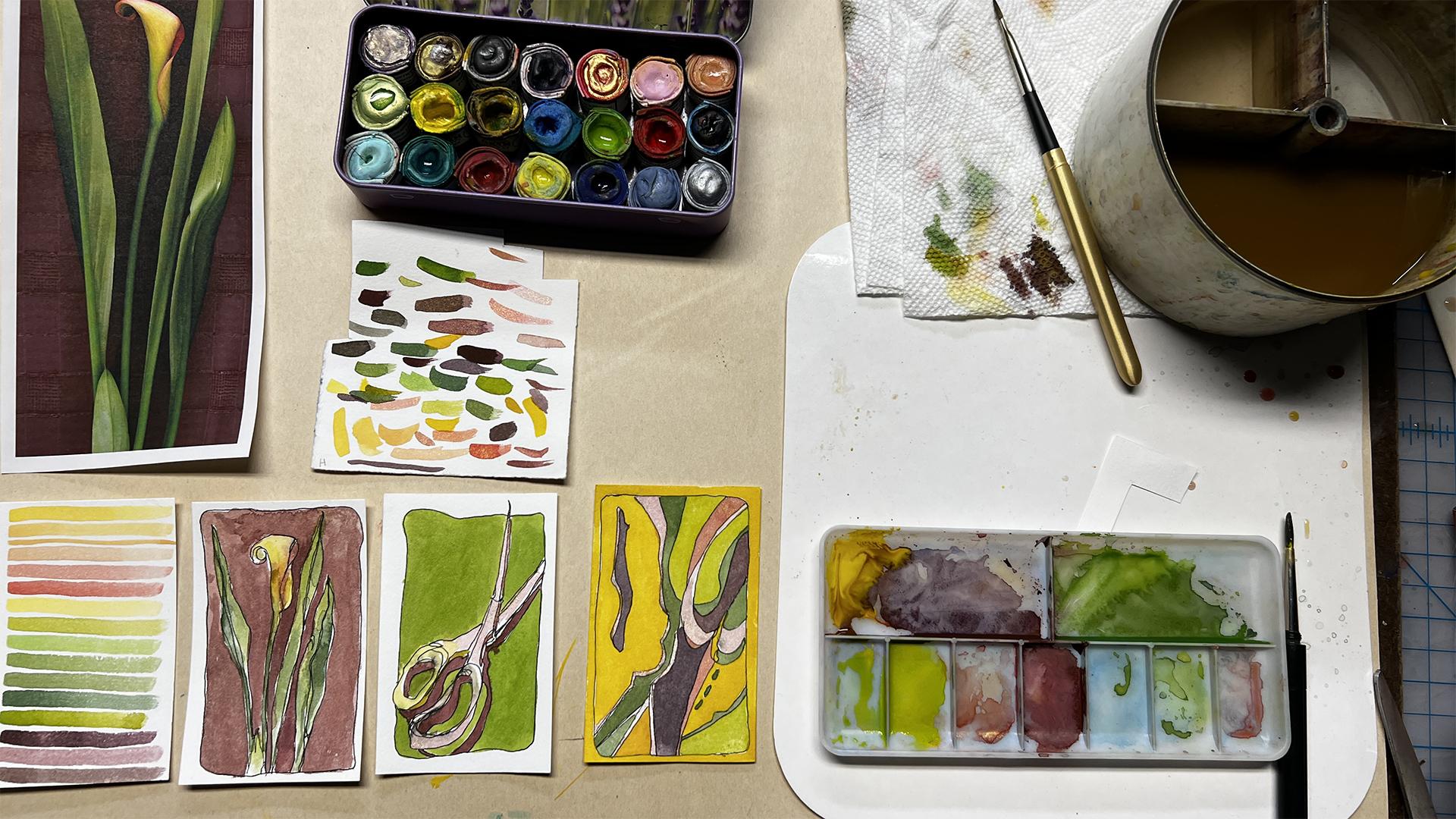
that I made years ago. What I did was I lay a calla lily onto
my flatbed scanner. I put a silk scarf behind it, scanned it, and capture
the image that way. So I am going to use this to color map so that I can point out to you areas
that I'm working on. And you'll see
exactly what that is. Oh, colormap on one
of my sheets of Reeves PFK paper that I will later glue are taped
down into my book. What I have is I
have my reference that normally would
be in front of me, which you wouldn't
be able to see. So I'm using my photograph. I have a spray bottle
to moisten my paints. Gets those going nice and juicy. I have my water bucket with three divisions in it so that
I can keep cleaner water. I have a quarter inch flat brush to make my colormap
of a mixing palette. Scrap paper, paper towel to wipe off any extra water or
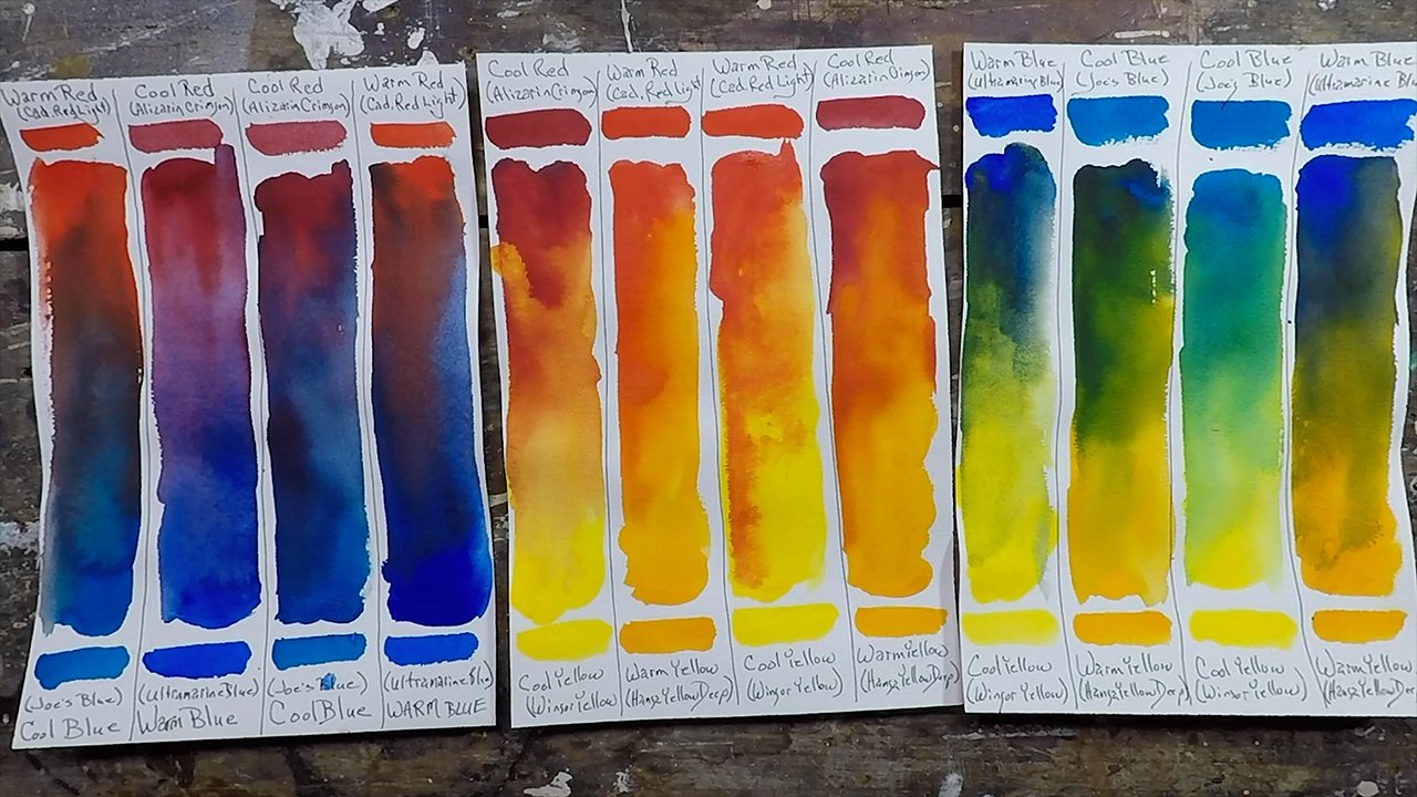
for cleaning my brush. In terms of the watercolors, I'm going to use just this miscellaneous ten of watercolor. I would challenge
you to work with a limited palette because if
you choose just one yellow, one red, one blue, and you attempt to make
all of these colors, you will learn right
away which colors can be mixed with those three primaries
and which colors cannot. And you will learn an
incredible amount. But to begin with, I
just want to show you the basics of color mapping and use whatever
pigments you have. You don't have to go
out and buy them. If you don't have any watercolor or any other paints
that you want to use. Then go and just grab
one yellow, one red, and one blue off the shelf
and work with those. I'm just saying that you may not be able to match
the colors exactly, which is perfectly fine. A whole other way of color
mapping is to use pigments that won't present you with a finished product
with these colors. But that gets into
creative color and choices of sticking with reality or
expanding beyond reality. So here we go. Now that we
have our materials ready, we can begin the process.
4. Colour Mapping Technique #1: Now the process is
really so simple. In fact, it's simple and
it's quite boring to watch. So I will be speeding
up a lot of this video because it would
just be dreadful for you to watch it in real time. I take my time with
it and really get as specific as I'm
in the mood to get. The technique is simply to
look carefully at your source. Choose a color anywhere on it. It does not matter. Try to mix it. And then put a stroke
that clean your brush. Pick another area, mix it, test it, change it
if you need to, and put another stroke down. Find another area.
Look carefully. Try to mix it, test it, adjust it, put a stroke down. Now for this first example, I'm just putting one
simple horizontal line for each color mix that I mixed and I'm going
to go in any order. It doesn't really matter. I'm not gonna do the
whole background for the flower first. It doesn't matter at all. I'm another way you can do it when you get more familiar with it is to do it in proportion
to the amount you see. In other words, if there's a lot more of this burgundy
color than the yellow, you would make a
much bigger area, but that's getting
ahead of ourselves. I want you to just
watch what I'm doing and I will speed it
up when I'm not talking. And then I will point out what
I'm working with as I go. I'm going to start with
a bit of the yellow. And I want you to see that there are a number of different
yellows in there. I've made that Mark and I
look back and see. Okay. Do I see that anywhere? Yes, I absolutely do. That's not the area that I
was looking at initially. I was looking at one that was
a little more cool yellow, but I do see that. So I've already mixed up, I don't want to waste it. I can put that down. And then I can adjust this
adding a little bit more red. And do I see that? Yes, I absolutely do. And it's okay that
it's getting lighter because that I have
a lot of lights, so I'm really saying
quite a bit with that. Now, in that case, I only see a wee bit. So I'm actually going to make just a skinny line
just so that I know that that's in there. I'm seeing it just
in little tiny dots. I want to go cooler. Okay, that's good. I also want a good dark. These are all pretty light. Okay. That's right In in their ongoing into
the cooler yellow. Okay. And I did stick with
the blossom for that. I'm going to work
down into the green. You can do it in a
logical order or not. It's up to you. That's part of the background. And there is my colormap
of the calla lily. That's all there is to it. What's extraordinary
about the color mapping is not only do you come up with a beautiful palette to work from, take this away. You can use this palette
for any other painting. You can have a black
and white line drawing that you paint in with
this beautiful palette. So you're taking from reference, you're taking from life. You're understanding
this a lot more. If I use these colors, if I kept this in mind
when I was painting this, I would have a
cleaner, brighter, more beautiful painting because I wouldn't get confused by what I was seeing as I was
looking at the real object, as the light was
changing in the room. Or is my eyes got tired of
focusing with the color? I have my roadmap of the
beautiful colors I want to use. That is the technique
of color mapping. And you can color map anything. Color map from a photograph. You can color map
from a real painting. You can color map from a still-life in front of you or sitting in a
railroad station. You can color map,
just everything. A shoe. So this is the technique,
not that hard. It does get trickier when
you're limiting your palette. And you can't quite
get that color, but then you discover
what you can get with the palette
you already have. And that is the key to being able to pink
wherever you go, taking just a few colors making, making beautiful, beautiful combinations
with the colors you have, even if they don't
match reality exactly. Or if you have going on a trip and you have a colormap,
you really like. You can take it along with you. That's what's nice about
these little books, is you can just grab one
of your little books, knowing that you really
love this color palette. And if you get to some place where you want to paint it and you want it
to be great and fun. But you don't really
have the colors, the pigments with you that
would create the reality. Just grab one of your color
mapped palettes and use that.
5. Colour Mapping Technique #2: Another way to colormap is to colormap not only by the
colors that you noticed, but also in the proportion
that you notice. In this case. I think that there's
about the same amount of green as there is the Burgundy or the
maroon in the background. There's a little bit less green. And then there's
just a tiny bit, the yellow and the pinkish. There's a little more pink. Well, it's kind of a toss up between there being more yellow or pink when
you really break it down. And you can include
as many colors or as few colors as you wish. I'm going to include just a
few of the colors because I have my whole colormap up
here with the variations. Here are my two color
maps of the calla lily. I could go darker, but I have the dark
there between these two. I have a lot of information
about this image. And this is valuable
too, to use. For a different painting. I could create a whole painting around just this color mapping, the proportions and the color. Add this to it. And I can really create
something wonderful.
6. Sketch #1 - Cala Lily: On another piece of
my watercolor paper, I'm now going to draw a really quick sketch
of my calla lily. And I'm going to first
draw a little frame. The contour lines. Going along the contour
of the catalog. There's my quickie, calla lily. Now, using this as my colormap, I will add color to this. Again, I need to test my cost. Now I want some much darker like I have in there
and I hadn't mixed enough. So I'm going to go back
and see if I can add some. Should probably move
to a smaller brush. For these tiny, tiny areas. If I turn the
quarter-inch sideways, I can get a pretty thin line. I want the contrast of the dark to the light. Remember it doesn't this part, this part doesn't really matter in terms
of color mapping. This is just a fun
thing to do to apply some color mapping
to a little sketch. That will remind
you of where you got the original
color palette from. See how the leaves show up a lot better when that's darker. There's my little sketch
of the calla lily. Now I still, I love this
more than I love this. So I'm gonna go ahead and sketch something out and then use these bright colors
and just some fun way to paint in a
different object.
7. Sketch #2 - Scissors: For this, I'm going to sketch the scissors again
very, very quickly. Right there, my scissors. Now using this colormap,
I'm going to paint this in. And this is a
technique that I call pulling the puddle where you can fill in a whole area
without leaving any streaks. I forgot a bit of
a shadow up here. Okay. Now they're using the
same color palette, different proportions. But it's playing with
color, playing with values. And it's just a lot of fun, at least it's a
lot of fun for me. Now looking at this as it dried, I think that I'm gonna
go in with more of these dark darks because I don't really see the dark darks
and you can do that. You can go back and forth. That's what you do
with paintings.
8. Sketch #3 - Found Composition: Out of my scrap
paper, I just created some else. With these. I want to find a
composition that I like. And I'm going to want a long skinny ones since that's
the shapes of my papers. And I'll do another drawing. Because if you don't
put your color mapping to good use, what's the point? And this does not
have to be exact. Okay, Now that
wasn't really there. It was really up in there, but since I was making
a mark and it's ink, I just went with it and I'll
create something from it. It's not a problem. And I'm changing things as I go. That's what's fun about having the evolution
of a drawing. And I just invented that
because now I'm looking more at my abstraction
than I am at this. Since this is a big empty area, I'm just going to
put a shape in here, one that is somewhat
like the other shapes. And this looks kind
of lonely up there. And I'll add that just for fun. Going back to my color mapping, I do want to start with
a really fun ones. I love this pinky, glittery one. And I'm just looking
at this painting, paying attention to what
it might want from me. I have to let it dry
a little bit more. I think that's trying to
remember this is about shapes. Now it's not about scissors, about shapes,
colors, and values. I wanted this to be
slightly different from the yellow because I do have
other colors in there. Alright, so now I'm looking
back and saying, okay, what, what can I use over here
that's different now I don't have any
of the very dark, dark purple, so I will
make up some of that. When you have a big
puddle at the end, you just wake it up
and wipe it off. Barely touching the paper. Okay. I like that dark thing. I want to put the dark here too, but I don't have enough, So I have to make sure
it's very important to mix enough and it's okay if
it's not exactly the same. Vector, could be better to
be a little bit different. I think I wasn't sure about
painting this in dark, but now I think I
can paint in dark. I have to keep looking at the effect of the last
thing that you do. How does it change
the composition? How does it change the way that your eye moves
through your painting? Should it be like,
should it be dark? Should it be warm, should be cool, be saturated,
should be neutral. All these questions
are good questions that are to be asked
throughout any painting. Okay, Now again,
I think, Alright, What I need is I need a very
yellow green to tie this, to bring the two sides together. And I might end up putting this kind of mustard
color right in there, but I'm not sure I'm going to
do the yellow greens first. Then you say, how do those two colors look
next to each other? How do they either make the color next to it more
beautiful or less beautiful? Does it support the
color next to it? Or does it challenge it? This is all just
playful practice. Do I want shapes
to hold together? Like the greens that
I'm painting right now. They'll hold together
this side and that side will look like one
shape behind another shape, rather than painted
a different color and have them sitting
on separate planes. Big question is, what color
when my last shaped P, I have to imagine, what could it be? What could it be? And I
think it really needs to be a yellow mustard good thing to bring both of
those sides together. Alright, and then the
last thing I'm gonna do is I'm going to paint around the edge and that I'm
also going to do yellow. I'm gonna have to go quickly to make it all the way round. There we go. And of all the paintings that I did of this, I
like this the best. So we went from the colormap of a Calla to the sketch of
the color, to the sketch. The scissors, both using the color palette and
then to the abstraction, the found composition in here, also using the colormap. And I can see it's not exact, but it's a guide,
it's a reference, and that's what
it's meant to be.
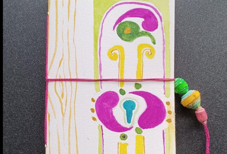
9. Create Book Cover: For my cover, I'm
just going to play. I'm going to use
up these colors. Don't like to waste paint, so I'll use all of these up and mix-up whatever
other colors I knew. I'm basing it on my colormap. I'm just making arbitrary
shapes of different sizes. I hope that at least
some of you will find this stage as much
fun as it is for me. I'm leaving it just like that because it's
different by made it just a solid.it it
wouldn't have the energy. And I was gonna make
it a solid dark. But when I saw that, I realized that that was better just as this is
better because it's a little bit different from that. All right. That's it.
10. Stitch Cover onto Book: What I did to get the images of the calla lily to
put into my book is I snapped a photo of my
reference, shrink it down, copied, pasted it onto a new
page in the program pages, and then shrink it
to the right size, duplicated it, and
printed it out. These are the supplies we
need to finish our project. Scissors to cut either
the double-sided tape if you're using that, or to cut the thread
or string or yarn, whatever you're using to
stitch your book together. If you're not using
double-sided tape, you'll need a glue stick
or some kind of glue. You'll need thread,
something to bind your book. You'll need a needle
to stitch a book. And you can either make the holes for your
stitching with the needle, which is what I'm gonna do. Or you could use an all. And then we need our book. We need our cover, and we need the
watercolors that we did along with the
reprints of the photo. First we're going to
assemble the book, and then we will tape or glue
these sheets into our book. There are many ways to stitch
the cover onto the buck. I'm going to show you
two different ways. Make sure you have
enough threats. So that's more than enough, three times the distance. This is waxed bookbinding
thread, waxed linen. Center your book. So you have the same distance Extra above as you do below. Then open it up in the middle. And very carefully
puncture a hole through. And about the same distance. Puncture a hole through, go through the outside, back through the whole
leave enough to tie, go through this hole. And then you simply
tie this off. And trimming the wax thread
is great because it holds, well, I'm not going to
pull this really tight because I'm going to
take it out and show you the other way of stitching it. So I pull that tight
and trim the ends. Take this out. And I'm going to put two
more holes through it. Again. I'll go through the bag. Go. That's stitch. Stitch. Stitch. I'm going to pull those tight. Then I'll go back
through that hole. Back through this hole. And now I'll tie it. See I have plenty of thread. If you don't have waxed thread, you can wax it just by running
the thread over beeswax. Okay, then I'll trim it. And there we have our book. Now we're going to adhere
the pages into our box. I'm going to put my
favorite painting in the front, which is that one. Then I'm going to put a copy of the calla lily and my
first color mapping. Then I'll put the
second calla lily, my proportional color mapping. Next, I'll put the
calla lily sketch and then the scissors. And on the last page, I can either write
notes if I want. Right now, I'm just going to
put the calla lily again. So now there's going
to be my book. And I'm going to do everything.
11. Complete Book: First, I'll show you the method of using the double-sided tape. Double-sided tape comes in a
couple of different forms. This one has paper backing. You can also get it where it's just the film itself
without the paper backing. In this case, I like to use the paper backing
because I can put it all down and then either set it aside and do it later or pull the backing off
and put it right on. This is how I do it. I trim right close to the edge. I don't worry about being right on the edge for
something like this. To be careful not to
overlap it because then it's kind of a pain to
take the paper off. So you wanna make sure
that it's spaced. And then I like to put one in the middle when it's so small, it you don't really need the
one in the middle. Okay. Then this is easier if you
have good fingernails, which I don't peel up the paper. Alright, now, I
can position this. And I like to put a piece of paper over and press it down. That's how you do the
double-sided tape. For this one, I'm going to show you how you use the glue stick. Sure that you know how
to use glue sticks, but I'll demonstrate anyway. So what I do on a
piece of scrap paper, I do go all the way to the edge. I don't have to cover
all of it in the middle. With this. It's pretty easy too
because they're so small. And then line it up, put it down and
press. That's it. I'm gonna go ahead
and either glue or tape all the
other pieces down. You can also do this
just three across one. It's as narrow as this. I'm using double-sided tape on the heavier sheets of
paper and I'm gluing. The thin pay for that I
printed the photos on. And three strips is much easier
to pull off the backing. Then two strips. If you run over the edge
just a little bit, you can just trim it. It's so much more
fun learning about color when you make a
little book like this, and then you refer back to it. Instead of practice
being drudgery. It's a joy. There is my book. Now there's another last
finishing touch even do. Since it's kind of thick, unless it's weighted down, it's going to pop
open like that. So you can either put just a little rubber
band around it. Or if you have some
of this elastic cord, you can find some in
a nice color that works with your book. Cut off a bit of it. What I do, I do those
for the sketchbooks. I make two because sometimes
they end up pretty thick, so I'll stretch it
a little like that. And then then I tie one of these knots, just kinda a loop around. Trim it. And then there it is. There's my finished book. My favorite painting
was the last one. The first color mapping for I just picked out a lot of colors. Every color that well,
not every color, but a lot of the
colors I saw in there. The second one where I mapped by the proportion of the colors. The sketch of the
calla lily using the pigments that I
mixed, using my colormap. It's not quite as bright
as my color map was. Then I did another one of the scissors where I just played around with
the colors first. Then I made my third one, which was just zooming in here, finding a found composition, and then just playing with
those shapes and the colors. And that's the story of the color mapping
of the calla lily. I hope you enjoyed the class. I hope you've returned for more. Please remember to
photograph your project, post it, and join
in the discussion. You've now completed
viewing all of the lessons in the basic
color mapping course. The next two lessons, or the bonus lessons in drawing.
12. Bonus Lesson #1- Contour Drawing Examples: By now, you will
have discovered that contour drawing is
not just a technique, it's also a way of seeing. It's a way of thinking. And when you think
and see in terms of contours of the
objects around you, your hand will automatically
move that way. The more you do it, the more automatic it becomes. What's the point? And learning a technique to draw
unless you put it to use. I'm going to share with
you several sketches that I've done while I'm
either at home, just walking about my house, seeing things that I
stopped to sketch, or when I'm traveling and I'm exploring cities or mountains. I think that you'll start to see the little bits of
contour within them. I usually mix it up. I have linear drawings
mixed in with contour. And that difference
between the curves and contours and the linear aspects of buildings or the floor. That difference between them makes the drawing come to
life more. Let's take a look. Look for the differences between the kinds of drawings
that I'm showing you. Outdoor cafe, look
at the difference between the straight
lines and the people. The contours on the
body of the goats. More people, people are just great for contour
drawing because it makes their clothing look like their bodies within
the clothing. Hair at stake gives
volume to hair. Bodies on statues in gardens. Those are contours. My father's hands, as he
writes in his sketchbook. He's actually
holding that pencil. You can feel that shrubbery
around buildings, even the texture of buildings. Simple line depicting a
mountain with its valleys. It's California where
those little crevices are. Architectural details. The planes on a face, people on the street, just fantastic look even where I put in the
parallel lines for values, I curve where the pipes are. Stuffed animals, the contour of that teddy bear and the planes on the faces
of busts in museums. People hanging out
in a pub look at that hair and the
bodies and the sofa. Architectural details,
again, giving form to those simple
contour lines. People sitting in a
coffee shop, clothing, you feel the bodies
under the clothing because the clothing
is drawn in contour. More sculptures, a
fountain, and bodies. You can feel the gesture of the people because
of the folds of their clothing captured with
contour stripes on a shirt. You can feel the
muscles in his back. A band practicing in a forest. And you can see their body
because of the stripes. The cliffs of Clark feel
those crevices going down. This lunch of a man in
a chair on his phone. Rubber boots. You can feel those rubber boots, the contours of the Maidan, two dogs, and items
in a general store. The form of the bowls, the hats. And again, a horse's face. You can feel the
form of that face. So give it a try. Don't worry about
whether you're doing a contour drawing
correctly or not. Mix it up with your
other kinds of drawing. If you start to think,
I'm I doing contour, just stop for a second. Make sure that your eye and your pen or in sync
with one another. They're looking at
the same point. They're touching
the same point on the object and then
move slowly together. That's contour and see
what you come up with. So what's next? I would love it if you
would give this a try. Pick up a pen, pencil. If it's dark, it's
gonna be hard to photograph your project
if you do it in pencil, but do it in pencil if that's what
you're comfortable with. This is not about erasing, this is about moving forward. It's about taking a
walk, gliding across, running across the surface of the things that you
see in front of you. Mix it up any way you want. Have fun with this. Snap photos of your projects. You can add as many projects
as you want to your page. And let's see what you do. Give me some feedback, please. Let me know if this is
coming into play in your sketches and
if you start to enjoy drawing a little bit more. Thanks so much for joining me. I'm Chris Carter
here on Skillshare.
13. Bonus Lesson #2 - Closed & Open Shapes: This is Chris Carter. In this video, I'm
going to clarify what I mean by closed shape
versus OpenShift. When I'm talking about closed
shape, Let's take e.g. the letter 0 is a closed shape. It has a boundary
all the way around. I can fill that in. I know where to start, I know where to stop. If I cut it out, I cut along this line. That whole little piece
of paper with dropout. The letter U is an open shape. Why? If I cut along this line, the piece of paper
would not drop out. And if I were to color that in, where would I stop?
I don't really know. Now, Matisse was famous
for OpenShift, right? He would draw a figure that we create volume because
he did not connect it. Look what happens
when you connect that line to that line, that line, that line. You see how that whole
thing flattens out. You can move in and out of it. So there are reasons to connect and reasons
not to connect. And a lot of the exercises, what I'm doing is I'm
making closed shapes so that you can clearly see where to begin
and where to end. Either the color you're
using or the hue. And where to begin and
where to end the value or tone that you're choosing and that way you become
stronger InDesign. Now, in reality, you're
often not going to have those those
severe boundaries. I just want you to be
attentive to that. Because when you start doing a lot of the color exercises, you're going to run
into trouble if you're not working with closed shapes. Here's another example. I've drawn a tree here. I could fill this in trunk. But what do I do down here? You say, well it's
grass or something and you've drawn in some grass. But where do you stop the grass? Where do you stop the trunk? And over here, I have the sky
breaking in to this tree. In order to close this off. You look back at
any open shapes. Really close them off. Now I have closed shape. I just wanted you
to start thinking ahead about these things. This is closed shape
versus open shape. We have circle, close, close, close, close. Closed, closed. Closed. Open. Open, open, close, close. Okay. So that's how I think in terms of closed
shapes and forms and shapes. I hope this helps.
I'm Chris Carter. Thanks for watching.
14. Conclusion: This brings us to the
very end of this course. I hope you've
enjoyed the course. I hope it's opened up
some doors for you. And I hope that you will enjoy color mapping as much as I do. When you make this
daily practice, you begin to see this
way on a regular basis, even when you don't have
a brush in your hand. Please share with me
your discoveries, your thoughts, your questions. Include them in the
discussion part of the class and post
your projects. If you enjoy color mapping
and you think that you might like to explore it
more on a deeper level, please feel free to join my
color mapping community. It's free community. On my website at
Chris Carter art.com. Go to the websites store, scroll down to the bottom
and you'll see the listing for the free
color mapping community. Thank you for joining
me. I'm Chris Carter. This was the basic color mapping course here
on Skillshare.
15. Evolving Colour Mapping Journal : The last few weeks
have really shown me how incredibly valuable
a daily practice can be. Not one that just
lasts for a day. No, that's daily practice, or a week or a month
or even a year. I've shared with you my daily color mapping
journal practice for the year 2024, and you saw that it
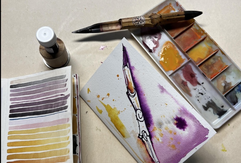
was mostly bar graphs. This is my most recent addition to the 2025 daily color
mapping practice. And you can see that it's
changed in a huge way. This was incredibly
significant when the shapes changed a great deal. Now, these started out
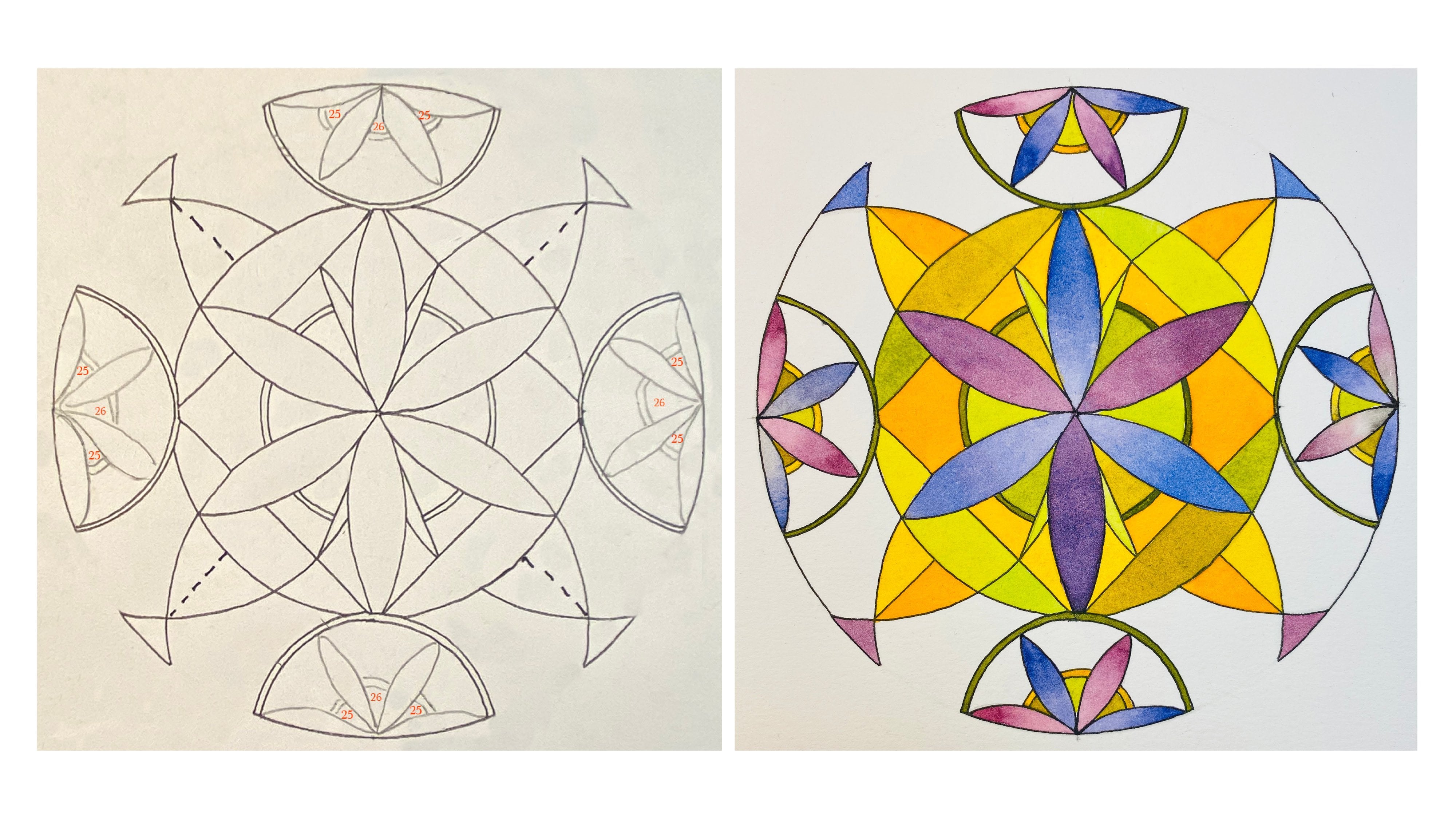
with automatic drawings. Of course, in this one I had
drawn beginning of Adala, I drew a circle
using a template, and then I did a
swooping pencil line. And because of
personal challenges that I've been going
through recently, my emotions have played a huge part in the colors that I discover
in my environment, that I add into my journal. And sometimes I veer
away from what I see completely and allow the environment of my inner
artist that's much more inspired and controlled
and energized by my emotions and my feelings. That artist comes out in sharing the environment
from the inside. Then what was really
surprising to me was the transition
across here, especially this this last one. Now, this one is
affected a lot by the recent sessions
live sessions of our art book club
sketchbook Story Time, the live session that the members of the
artist community, Artists Journey community share and participate in on Mondays. We had been looking at
the color of water. And in doing so,
we were looking at John Singer Sargent's
watercolors venice. And the comment was made
about the limited palette he used of what I thought was ultramarine blue
and burn sienna. I was wrong. So I started
to explore that because I noticed in one or two of the paintings that there
was a touch of green. Okay? So I tried I tried to get a touch of green
by mixing ultramarine blue, and burnt sienna, and it
really was not happening. Sometimes it would tease
toward it, but really not. So I thought, Okay,
I'm wrong about that. Maybe because burnt
sienna is so warm, it tends towards red, and
ultramarine is so warm, it tends towards red. Maybe I just don't have enough yellow coming into
play to turn it green. I thought, possibly let me
try raw sienna or raw umber. I started experimenting with those also yellow ochre and I started
getting some greens, but I still was not
completely happy. Let's see. I don't think that
those tests are in here. Now, the problem, I
realized maybe is the blue. I went to a cobalt blue, and I started getting
more greens but not quite what I was seeing
in Sargent's watercolors. So then I moved closer and closer to the yellow and away
from the red with my blues. I came across the ddanthne, however you say that blue in my box of miscellaneous
blues because it was okay, I was totally wrong about
the old Marine blue. Let me see what I
can come up with. I started experimenting
with that and I went ahead and experimented also
with anthraquinone blue. What I haven't done
yet is I haven't explored with Prussian
blue or Thalo blue, but these two are so much closer to that and
look at these greens. This is more of what I saw
in Sargent's watercolors. Now, I also don't know
because the printing of books can really portray the color of paintings
and sketches differently. But that aside, I can't
really control that at all. This is what I was looking for. But I was also looking for
it to be a little redder. Than the raw umber. So then I played with
mixing all three, even though I don't know
what he was really using. So I went on to
play around since I had all kinds of paints left in my palette and I didn't want to waste them. I thought I would
play with this. So I played with that and went on to play with it again using a slightly
different palette. And that led me because
of the personal things I was going through
of an attempt to merge my inner artist's
palette that I had realized many years ago had been my inner artist's preference
that I fought like crazy. I wanted to merge it with the palette I was
working with that seemed so much more subdued
and more representative of the personal issues
I've been going through. So I moved on to this one. And this was also this
was the 19th, okay? June 19. And June 19, going back to here, okay? So these were some
really challenging days. And I found that
what was left on my pallets really worked
well for those days. But I also started
seeing on the 18th, I had some experiences
with my spirit animal, and a bobcat had crossed the
road in front of my car, and that had been pretty
significant to me, among the other things
that were happening. And I noticed that these
colors were coming in. So the following day, I needed to draw from
all my strength. And this was not at all what I was seeing in
the landscape outside, but it was the landscape
inside. So I went with it. And that on June 19
is what inspired this merging of
the two palettes. And this was pretty
startling to me. I really responded
powerfully to this sketch. The next day, this one came
out or maybe even later, that was on the 21st. Okay. So this was the 21st. I guess I've lost
track of things. So that was yesterday. Okay. And this was fascinating to me. This is both a combination of my inner environment and
my outer environment. This was my outer environment. This was when I woke very early, I hadn't slept well, and there was hardly any light
on the landscape. The sky was just starting to
turn kind of a peachy color. And then as I was doing this, it lightened up a little bit. But these shapes
were very different. These shapes were also
kind of merging of these more angular shapes and my more typical
loopy dancing shapes that I've done for years. These are fairly new, and you can see
there's emerging. And then this one was
also started yesterday. Again, going back to
using up palette colors, but also adding to them. So my daily practice has
changed and expanded. This is still in my mind, my daily color mapping journal. That's what I want
to say about that. I am not restricting
myself, clearly. Had I not gone through
an entire year of color mapping in a
bar like fashion, I really don't think I would
have come to this point. And I'm quite thrilled
by coming to this point, and I will continue. I didn't know how long I would do this color mapping journal. Right now, I'm
feeling that I will continue it throughout
2026, for sure. I mean, 2025, for sure. And I'm thinking that I'll
probably continue in 2026. But it may be a completely different
format. I don't know. This is starting to combine with another kind of
journaling and exploration. I'm just letting it happen. This point that I've gotten
to is very healing for me. The issues I've
been dealing with in my personal life have gained so much stabilization and positive energy
from this practice. So you will make your practice
whatever it is for you. I just suggest
that you listen to your inner artist and
you stay disciplined, guided by your outer artist and find your own path
that works for you. But make whatever commitment
you can to that exploration. I'm exploring the power of using color to
express the moment, the place, the experience, the feeling, the thoughts, all of those things to
express that moment in time. Whatever you want
to use color for, be clear about what you want
to do with it on that day. Doesn't mean it won't
change the next day. So I think that's what
I want to say about it. And now today is the 22nd. So I'll start a new
sheet of paper. Put this one away, and
I'll see what today will bring because this morning, I've already had quite
a roller coaster ride. Doing this helps me to know where I am and to
not be derailed. Thank you for watching, for listening, and being
part of my journey. I hope that I can encourage you and be part of your journey.
 Chris Carter, artist, illustrator and explorer