Transcripts
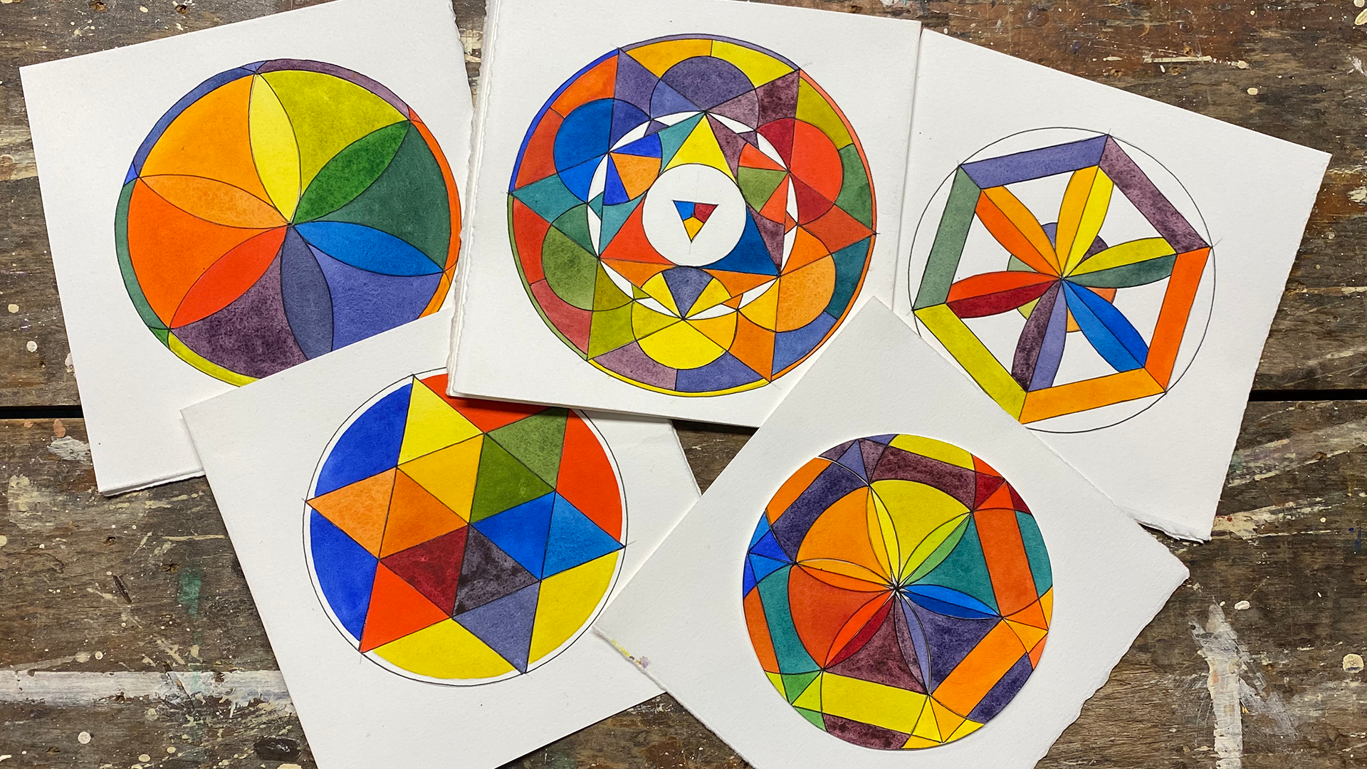
1. Introduction: welcome to part three of color wheel Mandela. I'm Chris Carter. In Part one. We created several Star Mon dollars using one of each primary color. This is one to three, and we created far more and the those of you who have taken that class and posted your projects, thank you very much on I would suggest that everyone else who is interested take a look at those projects because they were really, really wonderful. And they went beyond just the storm on dollar. People changed it out and it graduated, washes and pulled the puddle of it and did some really fun things with it. And then, in Part two, we made flower petal. Montella's on. This was pretty much the basic one. Andi did all kinds of variations there got a little bit more complicated and played with some wild colors. Again, we just had three pigments. We were using a blue, a yellow and a rib, and any red, any blue or any yellow. We were seeing what we could mix for kind of secondary colors we could get from that of also, we worked with some tertiary colors where we mixed from thes. Let's see here we go. So the yellow, the red and the blue are your primary colors on the green on the violet and the orange or your secondary colors. And these are your tertiary colors. So this is a blue violet. This is a red file on orange yellow, and I'm sorry, An orange red and the yellow red. This is a yellow, green and blue green. So, um, same thing here and these are my words. Projects air posted in part two are magnificent. They went way. The students went way, way beyond what was expected of them. And that is some of the patterns and designs that they invented for themselves based on the floor pedal, Mandela are just exquisite, well worth of color. Now, in part three, some of the artists have already done part three in a way because they extend that they're designed so much more than the basic flower petal. But we're going to do one big difference this time. In parts one and part two. We, um, we used three pigments, only three pigments to mix everything in parts three and four. We're going to use six pigments were going to use a warm and cool of each of the primaries of warm and cool yellow. Ah, warm and cool red and a warm and cool blue. And we're going to make It's going to be the flower petal again, basically, and then we're going to make other geometric shapes around it, huh? So there's this one. The reason it's cut out is because I lost track of what I was doing, and I had to cut it apart and put it back together again. Aunt, Here's another example. So I'm going to show you how to create these two designs in Part three, and then she'll be on your own to create whatever variations of that like, and just a sneak preview of Part four Part four. I will show you how to make this mandala and, um, and then you can make your own variations of that, too. So here we go can pick out any six pigments as long as it's a warm read. A cool grid, a warm yellow, a cool yellow Ah, warm blue, A cool blue and I will post in the reference materials are are in the description. You will see a list of pigments on whether they are listed is a cool pigment or a warm pigment. So you'll you'll see your yellows, reds and blues broken down in Mormon. Cool so you can take a look at that and choose accordingly. Well, let's get started.
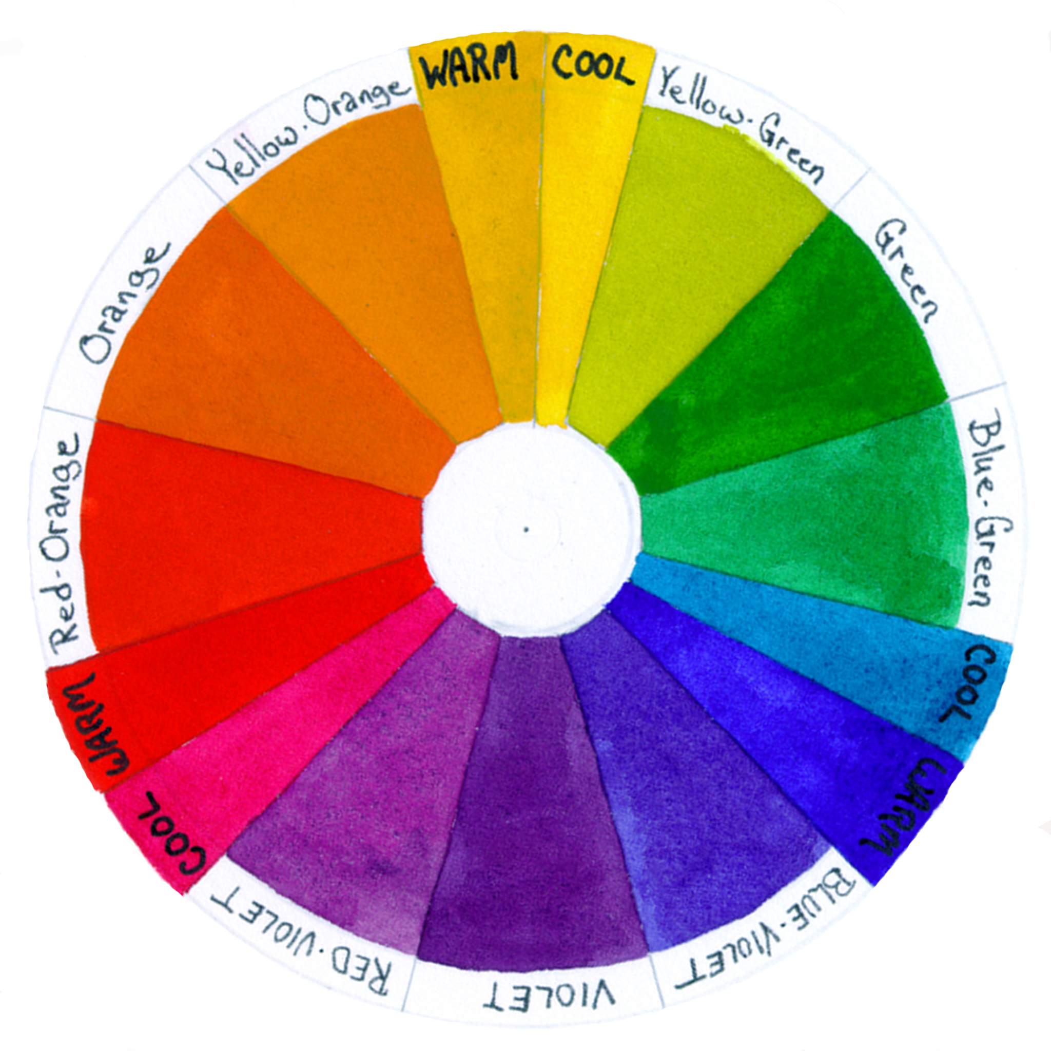
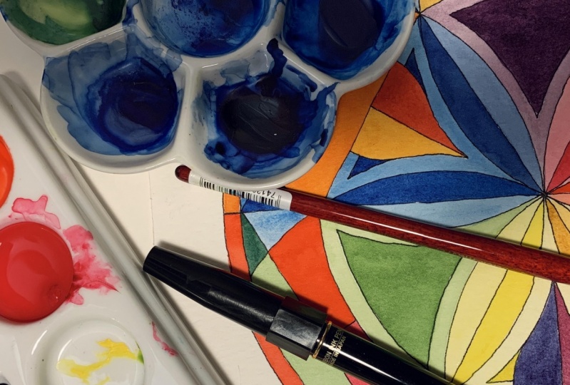
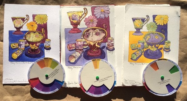
2. Materials: I'd like to go over the materials you'll need for this class course. You'll need a piece of paper. I use Reeves B F K printmaking paper, but any watercolor paper quality water color paper will do, and I make. My Mondal is about seven inches, so in eight by a nine by nine piece of paper will be just fine. You will need an adjustable compass and it it doesn't have to be fancy like this. It can just be cheapo compass. As long as it holds its position. Well, you will need a straight edge. It doesn't have to be a ruler, really. Any straight edge. You used the edge of a piece of paper. A song? Is it straight? Fine. You will need a pencil. You'll need paintbrush. You'll need a palette to put your paints. And to mix your paints, you'll need Ah, water container. I used one with three holes to make sure that our three sections to make sure that my water is always clean and you'll need six pigments. A warm and cool of H primary color. A cool yellow, a warm you a cool read, a warm red. They don't have to be the ones I'm holding up a cool blue and a warm blue, and that's it. Oh, two more things, your needs and paper towel, and you'll need scrap paper to test out your mixes. Still, let's begin. First, I'll show you how to draw to create two different variations of the complex flower petal mandala. And then I'll move into painting it in color, and I will go through the stages of where I put the colors. You do not have to follow that order, but I do it that way to keep it straight in my head because it is so, so easy. As you'll see, it's easy to put your color in the wrong place. I've also given you a PdF file of two different color wheels. This color wheel. See, I always have yellow on the top that shows you where the cool and warm of each belong, and then another color wheel that is just a standard color wheel that shows you the primary , the secondary and the tertiary colors and where they belong on the color wheel. Those air meant for your guidance, which I hope will help on keep it straight. It will reinforce in in your brain. Uh, why these colors mix and create beautiful tones that they do, so let's get started.
3. Creating Mandala A: for this new mandala were going to be starting out the same way we did with the 1st 2 We start off by drawing a circle on dividing it into six equal parts. We're just marking the sections on the circumference of the circle with a straight line. Make a way around connecting the dots. You've now created a hexagon, a six sided shape. Six equal sides. Divide your circle in half with a straight line that starts at the top and ends at the bottom. Then connect the other dots that are opposite on the circle. Adjust your compass to be smaller than it was when you drew the original circle. There's not a specific measurement for this. You can just make it. The distance is appealing to you. Using that measurement, create arcs in three triangles, skipping a triangle between the ark's. Place your compass at the end of one of the arcs and, using the same dimension, create your flower petal. Your flower petal arcs will extend from one side of the hexagon to an adjacent side of the hexagon. You have a somewhat symmetrical mon dollar. Notice that there are slight differences in every other triangle place your compass at one of the points where the arcs intersect as an option, you can also continue those arcs all the way to the outer circumference of the circle that will give you extra little shapes to paint and later, because I create these as I go, I realized I could have added those lines when I was making the arcs in the first place. I like to make changes along the way, depending on how it's looking now with straight lines. Connect the points of the flower petals in the three triangles that did not have the original Arkin them. The Mondal A is complete, and it's ready to ink. If you're not using the Carbon Platinum Inc. Make sure that you have a piece of paper under your hand so you don't smudge your even if you are using the platinum carbon ink, be cautious. Make sure it's Dr before you rest your hand on it.
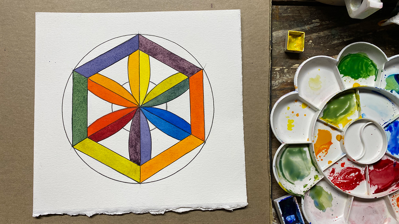
4. Creating Mandala B: Mandela be isn't uncomplicated Mandela to create. It also opens great opportunities to be creative on your own and add little details. Starts off in the same way. The other Monday dollars have started off with a circle. The second step is also the same. Divide the circumference of the circle into six equal segments, as you did in Mandela. A. Connect the points around the circle, creating a hexagon. Divide the hexagon into six triangles by connecting the opposite points, passing through the center of the circle. Just your compass to be about 3/8 of an inch smaller than it was when you made your original circle on Markoff. That distance on each of the straight lines you just created, the ones have passed through the center of the circle. Connect those marks, and you will have created a smaller hexagon within your larger exit. Readjust your compass to its original setting. Markoff The flower petals as you did in the first mandala, stopping on the border of the inner Hexi. Go ahead and create all £6. Readjust your compass and make a smaller circle that sits behind your flower petals. And now you're Mondal is complete If you want to add any extra little details, go ahead and do that. Now you're ready to ink your Montel once again. Be careful that you let your lines dry before resting your hand over the top of in ink line .
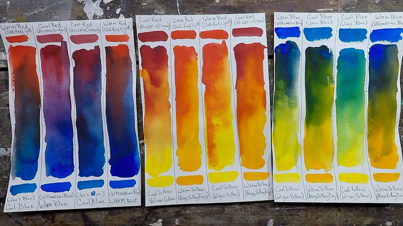
5. Bonus Color Mixing Lesson: welcome to basic color mixing. I'm Chris Carter in this video. I'm going to share with you the method that I've used to teach color mixing and color theory in my life workshops. The method that I'm gonna teach you is a way of thinking about color and thinking about color, determined by where each pigment rests on the color wheel as to whether it's warm or cool, this is more a way of thinking in a way of doing rather than a way of understanding from the scientific point of view off how color works through lightwaves. Normally I get a little carried away with the science behind it. In this video. I'm not going to bring science into it. I'm simply going to show you what happens when you mix colors that are either closer together on the color wheel or further apart. And from there you'll understand how to create beautiful, intense, fully saturated, brilliant colors, and you'll understand why, mixing other colors that are considered to be fairly primary, we'll give you neutrals, and then you can mix beautiful neutrals. You'll learn why some of your primaries, such as a warm red on a cool blue won't give you a violet, but we'll give you a brown or somewhat of a grey instead. So let's begin. In this demonstration, I'm using a standard 12 section color wheel. I have three primaries, a yellow, blue, red. I have three secondaries, a green, a violet and orange, and I have six. Tertiary is a yellow, green, blue, green, blue, violet, red, violet, red, orange and yellow orange. Each of the primaries is divided into either being warm or cool, so I have two of each primary. I have a cool yellow. I have a warm yellow. I have a cool blue, which is a halo and a warm blue. I have a cool red and warm red for my cool yellow. I'm using Windsor Yellow for my warm yellow. I'm using Hansa Yellow deep for my cool blue. I'm using a Joe's Blue, which is a halo for my warm blue. I'm using ultra marine blue for my cool red. I'm using a lizard crimson from my warm red. I'm using cadmium red light. Now I have squeezed those colors out into pains. I can remove this and then place my pigments right on this template, The template I laminate with clear contact paper. That way I can use this when I am painting to keep my paints straight so that I am sure that I'm not mixing them up, especially the blues, because sometimes they look the same and I don't want to by mistake mix a cool blue in with my reds. I'm trying to get the violent, so I use both of these templates will use this as reference. And I use this to actually keep track of my paints when I'm actually mixing my pigments. I'll be using this palette and placing these right on here. I will only mix to pigments at a time. I will never mixed three pigments to make sure that I'm imprinting my brain with the information that I wanted to retain. I always have my yellow at the top, my color wheel. When I lay my oil paints out, I do the same thing. I lay my paints out in a circular pattern. I start with yellow at the top, going clockwise. I moved to blue, continuing clockwise, I moved to read and then back to yellow. Some artists flip it around the other way. They have their blue here in the red. Here I am consistent with the way I'm exit so that I don't confuse myself. It's easy enough to do when you're painting intuitively and dipping here and dipping their and you want to make sure that you've programmed your brain correctly for your own way of working in terms of warm and cool. What does that mean? My cool yellow? I think of it because it's closer to blue than it is to read. I think of it is having a little bit of blue in it. I think of a warm yellow as a yellow with a touch of red. I think of my cool blue as blue with the touch of yellow. I think of my warm blue as blue with a touch of bread. I think of my cool red as a red with a touch of blue. I think of my warm red as a red with a touch of yellow. When I'm teaching color mixing, I begin by mixing violet. I believe that that will illustrate in the best way possible the idea of mixing pigments that air closer together and mixing pigments better further apart to mix my Violet. I'm only going to use two pigments, one red and one blue. There are four possible combinations of these pigments. In order to get a violet, I can mix my cool red and my warm blue. Or I can mix my cool red and my cool blue. Or I can mix my warm red and my warm blue four, my warm red and my cold blip. I've duplicated those possibilities on this sheet. I've made four columns, one for each of the combinations. This is my cool red and warm blue. This is my cool red and cool blue. This is my warm red and cool blue. This is my warm red and warm blue. So I'm going to mix the two together and we'll see what possibilities we have. We'll see how violent we get and how violent we don't get. Notice that the cool red and the warm blue are closest together on the color wheel going back to this color wheel. The warm blue and the cool red are the closest Together the warm red and the cool blue warm red, cool blue are the furthest Depart the warm red and the warm blue are the same distance away from each other as the cool red and the cool blue. No, that the results will, of course, depend on which pigments you've chosen. But I think that you will clearly see when I make these strips the point that I'm trying to make the first combination. All mix will be cool red, which is the illusion crimson and the warm blue, which for me is the ultra marine blue To make sure that I keep my colors clean, I'll put some of the color in the wells, and I'll make sure not to dip back into my pigment with the brush that has any other color on it. I will wash that brush up first. When I make these strips, I want as much information as possible. So I'm going to see what it's like full strength and also in dilutions. In making these strips you you learn a lot about the pigments. I know that the Lizard Crimson is very staining, so I'm going to be careful that I don't use to much lizard crimson to start with. It's not always half in half. In fact, it hardly ever is half one color and half the other to make the one in between. By diluting it, you get to see more of the character, the nature of the colors you're mixing. So I'm seeing violets. I'm seeing red Violet's an awful lot of red violet, so I'll go back in and add some more at the blue, going to switch now to my cool blue. So I'm using the listen crimson on the Jos blue. When this dries, you'll see more clearly the differences between these two mixes. I'll begin mixing the warm red, and the warm blue noticed that they're not the furthest away. Ah, getting much of a violet here, am I? I looted a bit to see the nature of What do you think about that? All right, well, let's move around to the warm red on the cool blue. Here we have the warm red and the cool blue. Those are the furthest away. Let's see what happens with even less of a violet. And no matter how much blue I add, or how much red I add, I don't get anywhere close to a violent. We'll let that dry and take a look at it again. Let's take a look at our results very early on, probably in elementary school. Most of us are taught that to make violet for purple, whichever you want to call it, you mix a red and the blue, and basically that's true. However, we're also taught that the way you bake a neutral A brown or grey is to mix all three primaries together, and that's also true. So what are we doing here with the cool red? We don't have any yellow at all. Let's put our yellows back or just one young. In the beginning, I said that the warm red has yellow in it, and the cool blue has yellow in it, whereas the cool red is closer to the blue, so it doesn't have any yellow in it. It has a little blue in it, and the warm blue is closer to the red, so it has some red in it, but it doesn't have any yellow in it. So when we mix the cool red and the warm blue close to each other, this one has a little blue. This one has a little red. Neither one has any yellow. So when you mix the two, it's true you mix red and blue and you get violent. And that's what happened right here. Okay, but what happens when we mix these two? Well, this has a little bit of yellow in it. So we're adding all three primaries. It looks like we're mixing red and blue, but we're mixing red and blue with a tiny bit of yellow, so therefore it's neutralizing. What is the complement of yellow? How is it that we're taught? Oh, to make a neutral You mix the compliment. So to make a neutral either a brown or grey from a violet, you would add yellow. Well, that's what we did by adding the warm red. We added a little bit of yellow, so we neutralized it at these two are these two and we neutralized it. If we mix the warm red and the cool blue, we're mixing some yellow in with this one and some yellow in with this one because these both have yellow. So we're neutralizing it even more. And what happened there? We have a warm red and a cool blue and look at how neutral that is. We don't have anything close to Violet there. Why? Because there's a little bit of the other one that there's a little bit of yellow in this. When we mixed the cool red and the cool blue, there's no yellow in the cool red, but there iss yellow in the cool blue. So we're neutralizing. We're adding a little bit of yellow to the violet that we might be able to get, and that one is here and here. We've got a tiny bit of violet, but not like we do here. That's the basis of all of it. And this ill straights it the most clearly. Let's move on and mix some greens Based on what we just learned. I think you can predict what's gonna happen. Will we get a saturated bright green by mixing the cool yellow and the cool blue, the two pigments that are closest to each other on the color wheel? Will we get a bright clear green by mixing the warm yellow and the warm blue, The two pigments that air furthest away from each other on the color wheel, the warm yellow that has a little bit of red in it, the warm blue that has a little bit of red in it. What happens when you add red to green. I think you know the answer. Let's take a look. A bit of a warning when it comes to mixing your colors with the yellows. Yellow is not very strong, so it will turn into a green almost immediately. Hard to talk and do this at the same time. I put my yellow I met two. Makes this one first and see how quickly it mixes. You do want to see all the greens you can get. How dark? How like Well, that's still somewhat wet. I'll do this trip very different green on my screen, but it's more of a neutral green. Let's take a look at the 1st 2 strips. The cool yellow and the cool blue. That's the cool yellow and the cool blue. They're the closest together, and they give a bright green. Then we have the cool yellow and the warm blue. They still give you a nice screen that's not as brilliant as that green and look where they are. They're a little further away from one another on the color wheel. Remember the yellow. The cool yellow has some blue in. It doesn't have any red in it. It has blue in it. Okay, The warm blue has a little bit of red in it. So when you add the warm blue and the cool yellow, you're adding a little bit of red. You're neutralizing it a little bit. Let's move on to the other two possibilities using the warm yellow. Remember, the warm yellow has a little bit of read. And so what do you think is going to happen? Let's take a look at our results. Ask ourselves a few questions. Let's look first at the two pigments that are closest to each other. What do we think? Probably will get the most intense prince. Is that true? This is the cool blue. This is the yellow cool. Yeah, Yes, indeed. Definitely the most brilliant, Most saturated greens. These aren't neutralized in any way. You've got a yellow, yellow, green, blue, green, a blue. You don't have any indication of a brown or grey. Now look at the ones that are furthest apart. The warm yellow and the warm blue over here. And what do we have here? We have a lot of neutralization in here. It looks like a charcoal gray. Even the neutralised greens are very olive, a green. It looks more like full colors. Beautiful neutrals, great for shadows and foliage. All kinds of things were for you have greens, and you want a nice, rich form of a change of planes of light, and you don't want it to be grey or brown or black and to go flat. Look at all these beautiful, rich deeps. These are all neutralized. So why is that? It's because the cool yellow and the cool blue don't have any red in the middle. The warm yellow and the warm blue, our closer to read. They have a little bit of red in them, so you've neutralized the green that you're trying to make with the tiny bits of red that air in your warm yellow and your warm blue. But there's none at all in the cool yellow and cool blue, so you get a pure, brilliant green. Let's move on to the oranges. Now the oranges air harder to discern. The ones closer together will give you a brighter orange, then the ones further away. Let's see if that's true. Let's take a look at our results. The brightest orange on this page is this one. It's the most saturated orange, the least neutralized. That's the warm red and the warm yellow, the warm yellow, the warm red, their closest together on the color wheel and which might be the most neutralized. Now, this is a little bit tough. I can see the differences, but I've been looking at this for so many years that the differences jump out at me. But I know that it was very difficult for me to see, say, the differences between this and this, although now it's pretty clear this is the most neutralized. Which two colors of those the cool yellow and the cool rep Okay, the two that are furthest away on the color wheel. And then these two are those in between ones where you have a little bit of distance, but not the whole distance. Why the warm red and the warm yellow don't have any blue in the middle. The compliment off orange is blue, so if you add a little bit of blue, you're going to neutralize the orange. You're going to make it less orange doesn't mean that it's going to be ugly and dreary. It just means it's going to be neutralized. The warm red and the warm yellow do not have any blue in them. The cool red has a little bit of blue in it. The cool yellow has a little bit of blue in it. So when you take a warm yellow and a cool red warm yellow cool red, the cool red is adding a little bit of blue to it, so it gets neutralized when you have a cool yellow and a warm red. The cool yellow has a little bit of blue in it, so it gets neutralized. I don't see it as being terribly neutral here, but it's definitely more neutral than it is there. Hey, and over here, there you have a cool yellow and a cool read. The cool yellow has blue in it, and the cool red has blue in it. So you're neutralizing it even more, I said. With these six pigments, look at what you can make. You could make all of those beautiful colors, so it's easy to use just six pigments and paint full color paintings. You've got your browns, you cut your grey's got your primaries, your secondaries return, she Aires and all the neutrals. You could want the example here. These strips are only just a fraction of the beautiful colors you can make with those six pigments that concludes the concentrated color mixing plus that combined a two day, sometimes a three day workshop into one short class. I know it was a lot to process, but it was distilled down to the real essence of why mixing different pigments works the way it does. If you wonder how your pigments are going to react, discover where the pigment lies on the color wheel and with a little bit of practice, it will become totally intuitive. And you'll be mixing gorgeous colors, both neutrals and saturated colors in no time at all. And you won't have to reach for 12 other tubes of color to get exactly what he wants. There are definitely some pigments that you cannot make with these six. I carried turquoise, cobalt turquoise with me because I can't mix that and usually a cobalt violet on their there. Some rents like a permanent rose that I can't get from anything else. But overall, I can really makes everything I want, especially when I'm traveling or landscapes. It's it's easy, and when you limit your palate, you learn even more about color, and you get stronger and stronger. And then when you do get one of those very special pigments that you can't make, you know how to make it sing and glow in a way that it it can't if you just mixing and in how passively with your other pigments. I hope you enjoyed this dose of color mixing theory. I tried not to get scientific about it, and I hope I succeeded. So enjoy your exploration of color. It's a world that can delight you each and every day of your life. I'm Chris Carter.
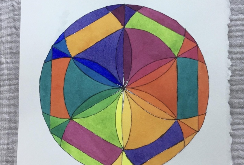
6. Painting Mandala A: I included the pdf file of this color wheel for you to use his reference while you're painting in your dollars, it's easier to keep track of which tertiary is you're putting in which location I began at the top with the cool yellow. Then I painted in the warm red and then the warm blue. I established three primaries next that painted in the warm yellow and then the cool red and then the cool blue. Now I have the warm and cool off each of my primary colors the yellow, red and blue. Then I moved on to mixing my violets. I mixed Ah, cool red and a warm blue to get the best violence possible. I didn't use any of my warm red, nor did I use any of my cool blue. First I painted in the warmer violet. That's the violent that's closer to my read. Next I painted in the cooler violet. That's the violet that's closer to my blue. I moved to the outside and started painting in the little sections to mix my two variations of green for the flower petal. I used the cool yellow on the cool blue to give a nice, clean green and you can see I'm jumping around. I went back to the blue and painted in the cool blue around the outer border. I went back to my pure yellows and I painted in my warm yellow and my cool yellow, and I move around so that each section conjour I completely before I go back to the shape next to it. Then I moved on to my last secondary Next, which was a cooler green, agreeing that leaned more toward my cool blue. Once again, I used the cool yellow and the cool blue to make it. I hadn't mixed enough orange, so I had to mix the orange again, and I used my scrap paper to test the color. I was mixing my inner pedals and my outer shapes that touch the pedals are now complete. I decide in the inner circle behind the pedal that I'm going to use analogous colors as it moves around. In other words, between the yellow and the green is going to be a yellow green between the orange and the yellow is going to be a yellow orange. I move on to the connecting shapes, right, Here's where I make my mistake. My intention was that it would be a blue violet in there and instead painted an orange. At that point, I wasn't sure what I was going to do about my design because I had a contradictory design going. I returned to my original plan and decided that I would just cut those sections out and flipped him around. When I was done paying them on dollar, I placed a blue green between the green and the blue, the colors I'm mixing now. Our tertiary colors there, the colors between the Jason primary and secondary colors. The red orange goes between the orange and the red petals, and the red purple goes between the red on the behind the pedals. I noticed that my earlier mistake has divided the dollar into two parts split on the diagonal. I'm going ahead with my plan to cut from on dollar out and switch those two sections around . Here's a comparison of the Mondal A. Before I cut out the sections and after I cut out the sections and you can see that there's a big difference. This is the final version of the Mondal, a cut out re glued and in the order that I have intended. Next up is painting in Mondal, a B
7. Painting Mandala B: when painting in Mondello B. I followed very closely the same sequence of painting in the shapes as I did in Mongella. A. I didn't use any tertiary colors in Mondal Obey. It was pretty basic straightforward. Painting in of warms and cools of the primaries and warms and cools the secondaries. I decided to leave the shapes within the hexagon and behind the flower petals white. I wanted more of a spoke. Well, look to it. An open air look where there is space going through the layers.
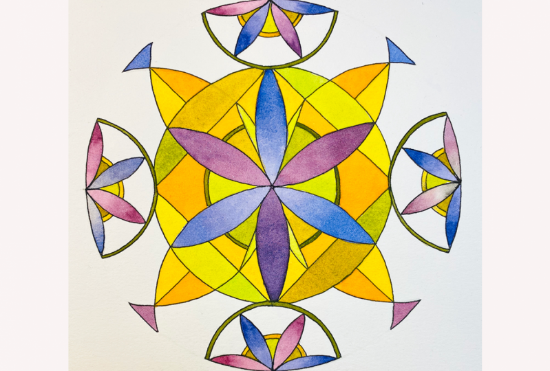
8. Conclusion: we've reached the end of part three of color wheel Mondal A and in part three, I presented the creation of two different, more complex flower peddled mandalas. And I shared with you the order in which I painted in my shapes to keep my warm and cool colors clear. And I also shared the mistake that I made in painting in some of the areas on Guy shared that because, most likely, you're going to end up putting a color in a shape that you didn't intend to also, and it it's okay. I think that you learn a lot from looking and analyzing what the effect waas between what you had intended and what you actually did. And that's why I cut it apart and put it back together the way that I had intended to make it. And I think it's really clear how different the design is, depending on where he put the colors basically because of the warm and cool off a color and because of the value of the color, the lightness or darkness. I hope you've enjoyed this class and that you will join me in part for to remind you this is what we're making in part for its a little bit more complicated. I would also like to share enclosing a few of the pages that I shared before in my very first color wheel Mondal a sketchbook, the sketchbook that started me on this. This wonderful journey through color through color wheels, color schemes and then eventually through extra drawing in the geometric shapes led me to creating the dull art that I'm pretty well known for now. And ah, lot of people have become justice, addicted to creating fell apart as they've become to creating beautiful color wheel Montella's. And if you enjoy this class, please try out some of my other classes. The pulling the puddle class is really, really useful for techniques for all kinds of painting, and I highly recommend that that be one of the first ones that you do. That's also a series of several classes. I think you'll find it so useful. I use that technique every single day of my life, and I've done that for well over 40 years in for very large paintings and small paintings. It's it's just really being in touch with the consistency and the natural tendencies of water color, which is such a joy. I'm Chris Carter. Thank you for joining me
9. What's Next?: Where do you go from here? Well, what's up next? Is you taking this wherever
you want to take it, tapping into your
own inner artist. I will share with you some
basic mandalas that you may or may not have done earlier in this class
or in a previous class? I'm just going to go through
them as a quick review. To show you how many
varieties or to remind you of how many varieties you
can come up with with the same design changing
out your palette. Changing your design a bit. Playing with pigments
you may have, but haven't really used, and a good way to find out
what they do is to create a mandala where
you're not worrying about your drawing so much and just playing to see what
the colors will do. If you like the
color combinations, and you can get more
extreme with your design. You can see that the
sky is the limit, not only with the design, but with the pigments too. There really is no end to
what you can do playing with geometry and mandalas when
it comes to creating art. I've shown you a number of examples of different
things that you can create, and it goes on and on and on. This last one I'd like to share is different from the rest and that what I painted
it in with is ink. And it's not just any ink, it's ink that I have made myself from foraging plants and
weeds in my backyard. Okay, I have jars of all kinds of things that have dried up from when I
first started doing this. Most recently, I'm back to creating my own dyes and
also my own watercolors. This one is done in watercolors from plants in my backyard that I've turned
into lake pigment, and then created watercolors
that I fill caps with. But this one, just to give you an idea of what it's made from, I will list some
of the ingredients that are in different colors. The only one that
I did not forage myself is avocado pins, and some of the pink
colors have a bit of dye from avocado pit. The rest of them are made from either parts or combinations
of the following plants. Poke berry, walnut, wild berry, dead headed flower
blossoms, roses, lichen, black tea, that
was not from my backyard. Sweet potato, purple potato, berry with vinegar added to
it and scorched walnut dye. All of these
different colors came from the pigments I
made from those plants. Now, the gray was a result of adding vinegar to
one of the pinks. The way of creating
color is so different. It is chemical rather
than light reflective. It's twisted my brain to be thinking completely
differently, and I have to say that
to create something, to paint something, created
with pigments I've made myself is a very rich and
rewarding experience. The colors can vary as they dry. I talk about using
limited palettes and really learning about
how color pigments work. And that is my background
upon which I am now exploring in an entirely new world
of chemistry and color. So living the creative
life is bountiful. I encourage you to play
not only with the designs, but play with any color you can make from mud, from beet juice. Now, I work in my
sketchbook because not all of these
colors are light fast. If I put this out in
the sun this afternoon, The reds would fade quite a bit. It would be very different. But this is my sketchbook.
It doesn't matter. It's not going to be
exposed to sunlight. It could stay like this forever, or maybe it would fade, but it doesn't take
away the experience I had while creating this that
was absolutely magical. Please move forward,
exploring what you want to explore based on what I've shared in this Mandolic
class. Thank you. Thank you so much for attending. I'm Chris Carter.
 Chris Carter, artist, illustrator and explorer