Transcripts
1. Colour Confidence: Easy Tips for Choosing Yarn Colours You Will Love: Ever come across a
blanket with colors that just seem to
flow together and wonder how they pull it off or glance at your own
yarn stash and feel uncertain
about how to blend those shades into something
that feels like you? In this class, I'm
going to share some of my go to color tips
to help you build confidence and start creating
palettes that you'll be truly excited to work with in
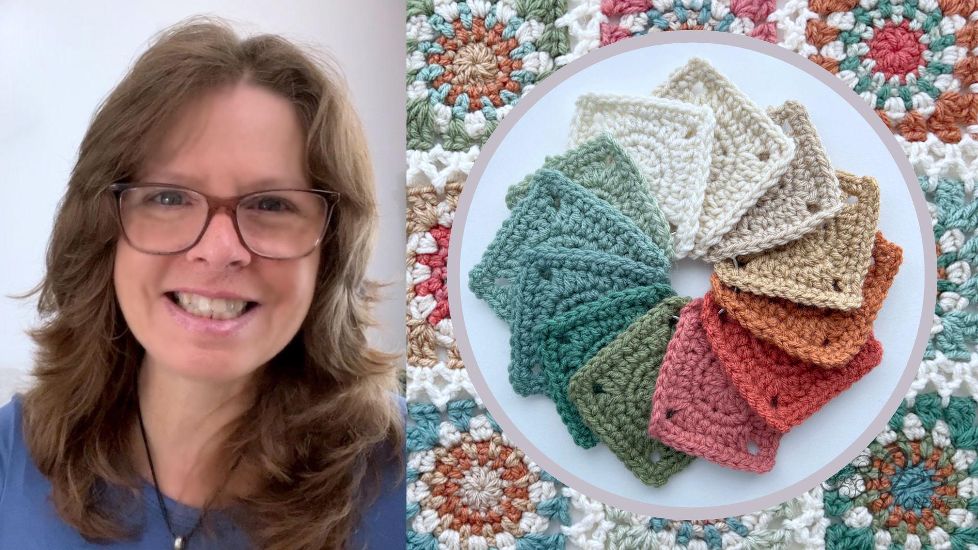
your own crochet projects. Hi, I'm Jane. Welcome
to this class on Tips for choosing your colors
for your Crochet projects. I've been crocheting
since I was very little, and from the very beginning, color has always
been my passion. Over the past few decades, I've designed patterns
for garments, home decor, written
books, and talk classes. And what excites me
most is how color can completely transform even
the simplest project. What I'm really drawn
to is Granny squares. They feel like little
mandallas to me. Each one has a chance to
experiment with shades, textures and endless
color combinations. So that is how I express. Days, I share my love of color through
tutorials on YouTube, my blog, and behind the
scenes Extras on Patron. I've learned that the
best way to discover your own style is to
just let yourself play. Make mistakes and
learn as you go. That's exactly what we'll
be focusing on here today. A few of my color
tips to make color play a little less overwhelming
and a lot more fun. This class, I'm going to
share how I get inspired. Everything from everyday life, nature walks and even scrolling through
my own photo role. I'll show you how I
organize my yarn, so playing with
color combinations becomes easy and enjoyable. We'll use a simple Granny
Square as a tool to experiment, and I'll provide a
download pattern so you can follow along and
try out your own ideas. We'll cover some simple tricks for understanding color value, the importance of swatching, and how to play with
different color combos until they feel just right. The emphasis here
is on exploration. No right or wrong, just learning and discovering
what speaks to you. By the end of this class, you'll feel more
confident choosing color palettes and combining
the shades that you love. Class project will be to share a color palette of your own
using the tips in this video. Share your journey,
what inspired you, the colors you began with, and how you arrived at
your final combination. It's a creative way to
experiment, reflect, and celebrate your progress, while gaining confidence
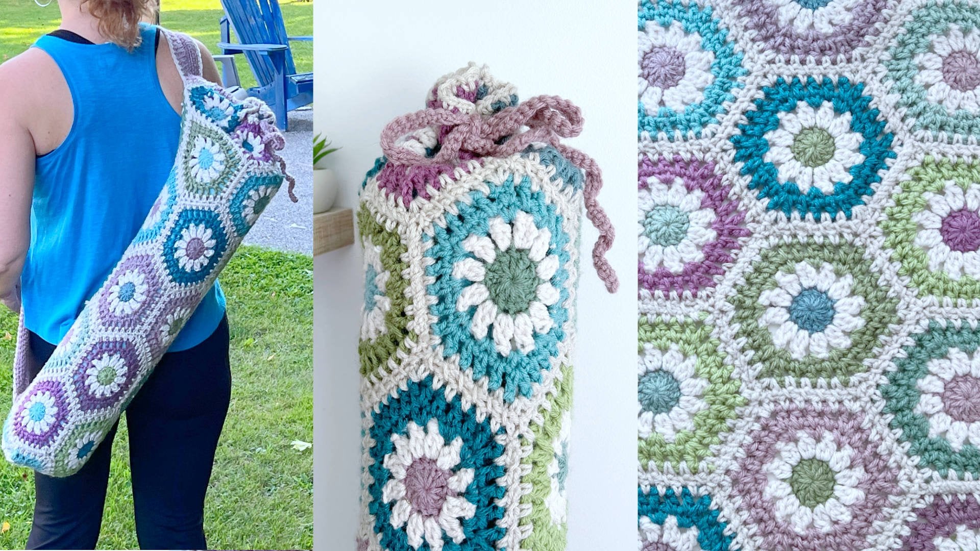
in your color choices. And the square that I use for the samples in this class is the basis for the one I use in my full Granny
Square Scarf Class, the perfect next
step for putting your new color
palette into action. Grab your yarn and let's get
ready to play with color.
2. Supplies: We start the first
lesson, I just want to talk about supplies. We're just going
to discuss ideas here and not actual
crochet projects. You probably have some
colors in your stash already that you want to play around with, and
that is our goal. So that's the cool
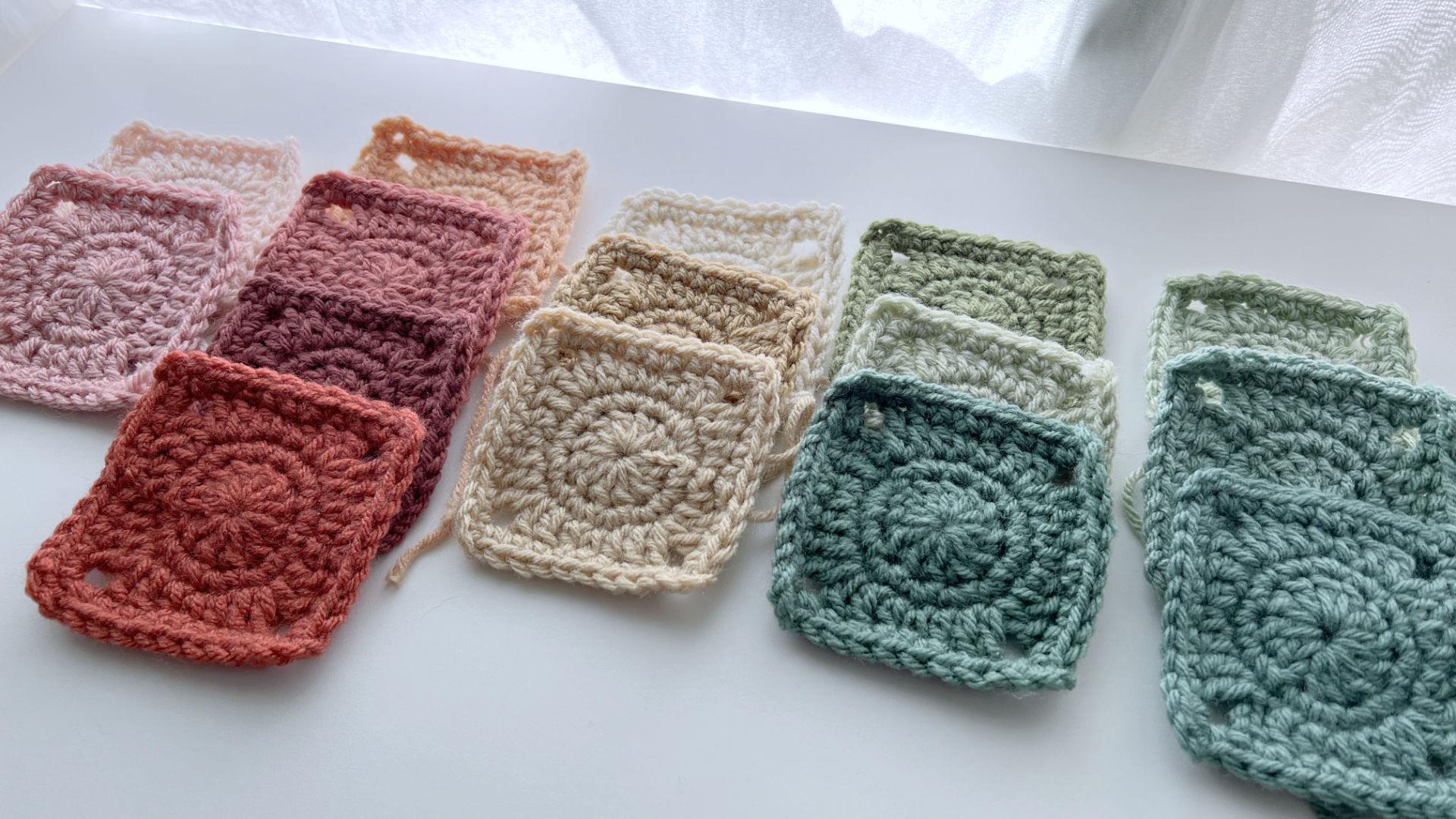
thing. Anything you have on hand will work for this. I'll be showing you how I create a little swatch
square from my urn, and I'll be providing you with the pattern for this square. I call it my Easy Breezy Square because it's a simple and
quick square to make with enough different
stitches to give some texture so you can see what the color will look like
in a crochet design. Light catches the
texture and can make the color look a little
different once it's worked up. And since I'm showing
it to thought you might like the
pattern for it. So you can find that in
the project section. We're just discussing
color here, so it doesn't really
matter what you're using. The nice thing with
it is it works across the board
for any project, any yarn, and, of course, the hook that goes
with your yarn. But this is going
to lead you towards choosing colors for your
own crochet projects. Now, are you ready
to get inspired? Let's move on with our tips.
3. Choosing Your Colours: To play with color.
In this lesson, I'm going to share
a few fun ways to spark inspiration and show you how I organize my yarn so it's easy to mix,
match, and experiment. Think of it like a little
playground for your yarn. No rules, no pressure, seeing what combos
make you smile. So one way I start is by
browsing my camera roll. I love snapping quick photos of anything that catches my eye. Nature scenes, especially
sunrises and sunsets, or even plants in my garden. These are all my favorites. I also have an inspiration
board over on Pinterest, where I save images
with cool color combos. These are the sources that
kick in my inspiration, and these I can do
anytime, anywhere. From there, I'll gather a range of yarn colors to
experiment with. I do this with my
little baskets of sample squares, but
before I get into that, understanding the basics of the color wheel can
be really helpful, don't worry, we're not diving
too deep into theory here, but let's quickly review this. We start with primary colors,
red, blue and yellow. Remember those paint
bottles from school. Those are the foundations
for all colors. Next, we have the
secondary colors, green, orange, and purple. These are created by
mixing the primary colors. Then we have what's called
the tertiary colors, and these are the blends of primary secondary
colors which often make up a rich varied
palette, like my yarn wall. Then we have the neutral
colors which are white, black, gray, and I include browns there when we're
talking about yarn. These are often used as
background colors to create balance and give space for the main colors to be
the star of the show. We're also going to
touch on color value, which is the light and
darkness of a color, but that's something
I'm just going to demonstrate a little bit later. Back to my sample squares, these are like fabric samples
or paint chips for me. For every new yarn I
bring into my home, I make a quick square using my Easy Breezy
Square pattern. But you can use any
square of your choosing. I like them all to be the same so that I can
compare them easily. It's a simple square with a few stitch variations
to add texture. So I can see how the color works in a Granny
Square context, and I keep these samples
organized by color baskets. Basket one has all
the reds, blues, greens, yellows,
purples, and oranges, and all the variations
in between. And basket two, which oddly has the same number of samples
has all my neutrals. So I have in there
all my whites, my grays, my blacks, my browns, and the Bass. I don't label these
squares because I handle them a lot and the
labels tend to fall off. So instead, I have a
binder where I keep samples of all my yarns
with the brand information. And that way I can keep
all the brands together. Helps me keep track because sometimes yarns
get discontinued, so it's nice to have a
record here so I can find a nice substitute
if I need to. So let's take a look
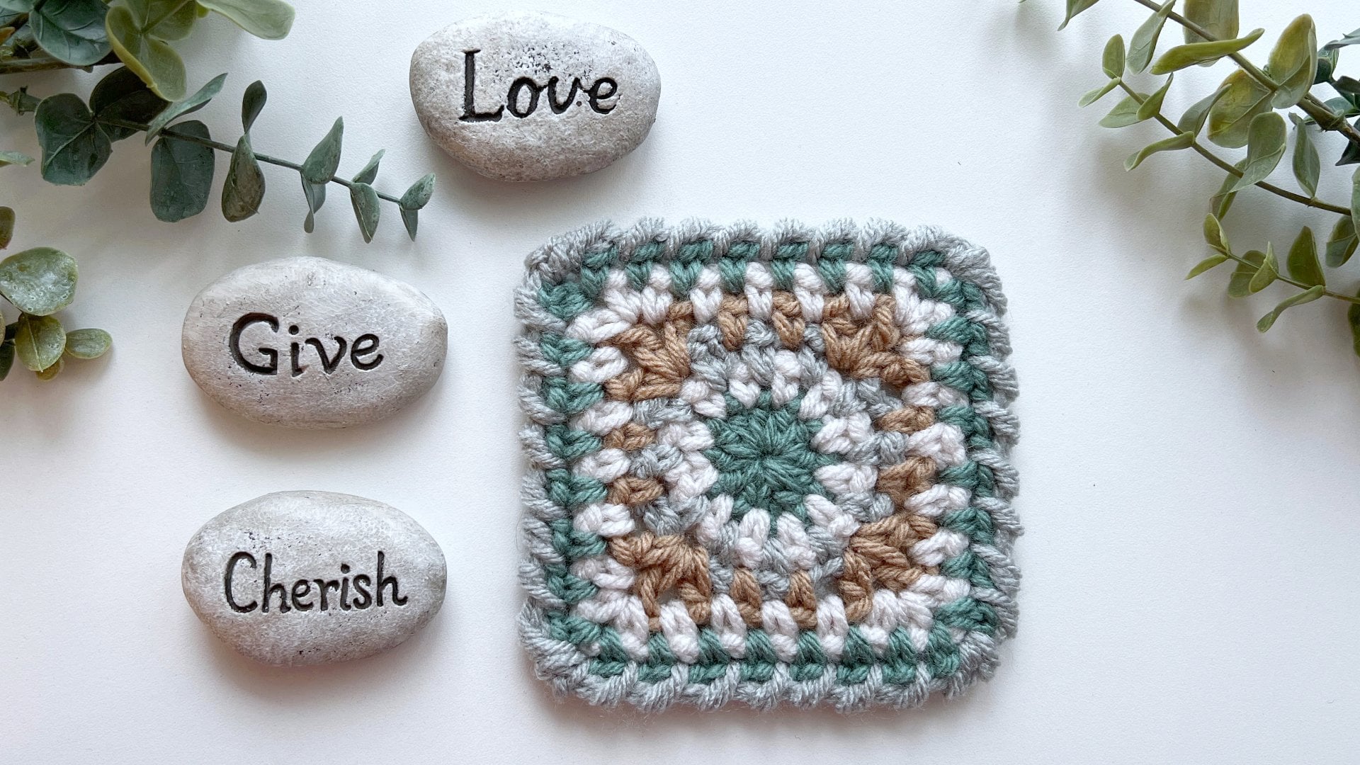
at an example here. This square is my sand
dollar squared pattern, which I made using
a fall inspired palette that also works
well for the holidays. I pull reds, greens, ambertons and neutrals to figure out what I wanted
to use in this square. For most squares, I stick to about three to four
colors at the most, but for larger squares, I may use more colors, and definitely for blankets, I like to use a lot of colors. Ten to 15 colors to get that nice eclectic look that I spread out among
all the squares. Like to dabble a little
in quilting, too, so I love scrap quilt, and this definitely inspires
my approach to crochet. Once I've narrowed
down my choices, I make a variety
of test squares, experimenting with different
color orders to see what works best and which
one feels the nicest. So that's a great
start to finding some inspiration and starting to let yourself play
with your colors. Up next, we're talking
about color value, what's really happening when different shades come together, why some pairings just work, and what our eyes are noticing behind the scenes.
I'll see you there.
4. How to See Colour Value: We're going to move
on to color values, and I know that that can
sound a little daunting. It's actually really easy and it can be really surprising
what you discover. We're going to dive a
little deeper into what your eye is really
seeing so you can start to understand how
light and dark contrast and balance really work
in your color choices. This can significantly affect
how patterns stand out. And without you
even realizing it, it's the reason that you like some designs better
than other designs. So what is my simple trick? Well, I just use the
photo app on my phone. I take a picture of my swatches, and then I use the photo app, which is right on my phone. I desaturate the image, which means I remove
all color from it. This can also be done
on a computer as well, but any photo app or
photo editing program will have a saturation setting. Whatever you have handy for editing your photos, use that. Choose the saturation setting and take it right
down to the bottom. So this image that
has all red swatches, when it's desaturated allows you to now see the color values, which are the lights
and the darks that are involved within
the range of reds. This is the part your eye sees, but you're not aware of. This helps when
you're dealing with a large number of colors
to choose from for your project because
you want to see how they relate to
each other in value. Do you want more
contrast between them? Or are you going for a
more monotone effect, which means they appear to be the same shade when
you desaturate them? Sometimes we pick
different colors thinking we'll have contrast
because the colors are. Instead, they blend into each other because they
have the same value. Here's a square
where I use a green, a red, a caramel, and a putty. When I desaturate the picture, you can see the green and
red are similar in value. The caramel is slightly lighter and the putty
is much lighter, creating a lot more contrast. Using this technique
really helps me decide on what
look I'm going for. It's really just about the value of the color that
you're looking at. Let's compare five versions of this square using the
same four colors. Which one do you like best? Pause the video to
decide and choose your favorite. Have
you got your favorite? Now, let's desaturate
them to check the values. Does your choice still hold up or have you
changed your mind? This trick helps when I'm
stuck between a few options. Sometimes I want colors with similar values for a
softer, calmer look. While other times I prefer a high contrast for
a bold statement. As you can see with
these two examples, the square on the left gives
you a much calmer look, and the square on the right
has more of a statement. This shows up when you desaturate
and look at the values. I hope this simple
tip on desaturating your photos makes it easier to see the color values at play. Try it out not just with urn, but with any images that inspire you and notice how the
values work together. It's about developing your eye
for color through practice and experimenting as you build your color palette
for the class project. And it will help you choose
colors you truly love for your next crochet
piece that you or someone you love will
treasure for years to come.
5. Project and Inspiration: Congratulations on
completing this class. I hope you're feeling
inspired and excited to bring what you've learned
about color into your crochet. For your class project, I'd love to see the color
palette you've created. Share a little
about your journey. What inspired you, which
colors you pulled out first, and how you ended up
with your final choices. Sometimes it's the
unexpected combinations that surprise us the most. And I think it's always
so interesting to see how each person's
process unfolds. Be sure to post your palette in the project selection so we can all celebrate
your creativity. And if you'd like to take
it one step further, you can also share a
square worked up in your palette so we can see how these colors come to
life in stitches. I want you to remember that this is really just
the beginning. Color is such a
personal journey, and the more you experiment, the more confident
you'll become. The key is not to stress about whether you're
doing it right. Instead, think of color as
something to play with. Mix shades together, try
out different pairings, and see what sparks joy for you. Mistakes or what
feel like mistakes, often turn into the most
interesting discoveries. The heart of it
all, what matters most is that the
color speaks to you. Your palette is like a
story told in urine. It can reflect your mood, a memory, or even just a
color that makes you smile. Some projects call
for a handful of shades and others,
you just fill it up. It's all about what
feels right to you. Trust your instincts and let your inner guidance
lead the way. If you'd like to keep exploring, I have lots of extra resources for you on my YouTube channel, and if you'd like to
go a little deeper, you can join me
over on my Patron, where I share behind the
scenes color samples and experiments from my squares and Crochet projects to
inspire you further. I truly can't wait to
see the palettes you put together and how you bring
them into your crochet. My hope is that this
class has given you the confidence and encouragement to embrace color more fully, to enjoy the process and to make your projects
truly your own. If you'd like to take your
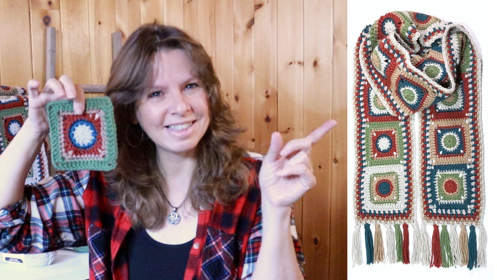
color palette for a spin, hop on over to my Modular
Crochet class where we use the same little square as a basis to make a gorgeous
Granny Square scarf. It's a fun next step to see
your colors come to life. Thanks so much for joining
me and Happy stitching.
 Jane Snedden Peever, Living the Creative Life