Transcripts
1. Introduction: Hello, everyone.
I'm Denise Love, and I want to welcome you to class where we will embark on an inspiring journey into
the world of abstract art. Together, we'll explore
the magic of colors, the fluidity of paints, and the beauty of unique marks. In this course, I'll guide
you as we experiment with delightful palettes of colors and explore the power
of mark making. We'll start with small samplers, allowing you to experiment and gain the confidence
in the techniques. As your skills blossom, we'll transition into creating larger abstract pieces that truly showcase your artistic
voice. Let's get started.
2. Class Project: For your class project, I want you to unleash
your creativity and create abstract art
showcases your unique style. Remember, the techniques
we've explored throughout the course from experimenting
with colors to mark making. Don't be afraid to
experiment and take risks. Let your intuition guide
you as you create art. Embrace the beauty
of imperfections and happy accidents
in your pieces. Be sure to post
your projects under the project tab and connect
with your fellow students, share some feedback and celebrate
each other's creations.
3. Supplies: Let's take a look
at the supplies that I'm going to
be using in class. I'm going to try
to simplify down to just a few supplies that I really love that I want
to use on each project. Out of those, I'm just picking a set of
supplies to pull from. I'm going to be working on the Honmle watercolor paper
140 pound coal press, it is a cotton paper. The reason why I
like cotton papers is because on a
project like this, it gives you a little
more working time for your colors to blend because
I like working on dry paper, put wet paint on the paper and let those merge
and do fun things. If you're using a
student grade paper, your paint dries a lot faster than it does
on the cotton paper. That's not to say
it's not going to dry fast because it's still
going to dry fast, but you do get just
a little more time when working with
a cotton paper. So that's the paper I'm going to be using all through
class today. I'm also going to be working
in my Kitaki water colors, and I have the 48 pan set and the 24 art Nouveau set and the colors are different
between these two sets. Kitaki makes about 100 colors
and out of those hundred, this is the majority of them. I like working with these because it gives me
an opportunity to pull from a range of colors to work in
different color palettes. Without having to deep dive
into color mixing and things. A lot of times when I'm
wanting to experiment with a color palette and do some things that I don't normally do. Mixing color isn't part
of the goal for that day. If mixing color is your goal, then definitely make that an
element in your projects. That's the water color I'm
going to be working with. I'm also going to
be pulling from some oil pastels as some
top mark making things, and I'm using the senili
oil pastel collection. I also have some other
oil pastels just to I talk about them because I have them and tell you a little
bit of difference. I have the Card neocolor
one oil pastels. It's got some lovely colors in here and I really like them. They are a bit different than
the senilia oil pastels. The senili oil pastels are
softer and creamier to use. These are a little
harder than the Sinia. It's just very interesting the differences in
the oil pastels. But for this project, I'm going to be
working in the Sania. You can pull together, whatever it is that
you happen to have. I'm also going to be
working in the neo Color two crayons by dash
because I love these, you can use them wet,
you can use them dry. They're water soluble, and
there's lots of colors. I have the big set, but you
don't need the big set. I just happen to love having all the colors to pick
from since I make classes. I'll be using these for
mark making along with the oil pastels. I
may use some gold. If I use gold today, I'm going to use the
golden descent, fine, heavy bodied acrylic paint
because the gold that I usually use this
KutakiGld Mica paste is a lot harder to find
for a lot of people, and I figured this gold
would be easier to find. I have a gold card a gold
card, not like a credit card. I have a watercolor card that I have painted of all the different golds
that I happen to have. This is the heavy bodied
acrylic that I'm using and look how pretty and shiny that one is compared
to some of the others. I like all the
differences in the golds. I have a gold to this very similar to the artesa
and that gold. But I feel like with the gas gas is expensive watercolors, I feel like you
waste your guash if you're using it
in the way that I might be using it in class where I'm may be
using it on stencils, perhaps or mark making. I'm going with this
heavy bodied gold. I do recommend you do some fun page like this
if you like things that are shiny and
bright and You want to see what you have and
what you might choose from, make yourself a swatch sheet
of all your metallics. Super fun. That has
come in very handy. That's the gold I'll be
using if I use gold. I'm also going to be pulling
out posca pens and micron, the five pin this pen I like because It's nice and it's fine and gives me
pretty black marks and dots. These pins I like
because they're paint, and you're basically
painting with acrylic paint, and I really like white because I like white dots and things. I'll be using some of
those for mark making, pull out your favorite
pins for mark making, and I'll be using a Princeton
Neptune quill number four brush and probably
the soft Aqua zero. Brush by Raphael because I like these quill brushes
for the watercolor, and I'll be using
those to paint with. I know these look like big
gigantic squashes of color, but really we've broke it down
to paint and mark making. Then if like me, sometimes you have
trouble picking colors or looking at the big palata colors like we're looking at here. I've really deep dive this
year into color palettes and making my own color
palettes and using historical references
for color palettes. I've also got into using these color cube color palette
cards by Sarah Rene Clark. I'm probably going
to use these in class to determine some of our color palettes because
these are boxes of 250 colors. There's two boxes. I don't know the differences
in the two boxes. I do have them, but
I haven't looked through all of them because I like doing blind pools
and then saying, Okay, what can I create today with these colors that
I have pulled out. You can find color
palettes on Pinterest. You can make your own from
your own photography. I've got other classes where we dive into making our
own color palettes. But I like these
because these are things that maybe I might
not normally go to. Let's say like this one here. I don't know that
I would normally work in this bright
color palette, but look how pretty
that is in that photo. Now if I were using
one of these to create a color palette for us, I would start with
the water colors. Okay. And I would say, okay, let's pull the colors out
of here that we've got going and create ourselves
a color palette. And my goal as I'm creating
these is to not to get 100%. If we're trying to get close, work within a color palette, but it doesn't have to
be completely exact. We just want to be close. So we're then working
within a field that we don't normally work in Okay. Then two, you could
color swatch stuff out if you wanted to pick colors
and say, well, did I get it? Let me color swatch
these and see how I did. You could color swatch them. You could do some color mixing in there if
you're thinking, I think I'm getting
close, but I'm not sure. We could color swatch these
out and make little samplers, which is exactly how
I want to start. I want to make some
little samplers, maybe using some inspiration
color palettes and saying, here's what I've picked. Let's create a little sampler
and see if we like it, and then if we do, those
can inspire larger pieces. This is how I start
picking a color palette based on some reference items that maybe you could
pull and work from. Then I'd start painting, I'd pick my mark
making supplies. I'd go ahead and pull
those same colors out and we would work
in that color palette. I'm going to be working
in color deck one. Because it's my goal over the next I don't know how
many years it'll take. But it is my goal
to work through all the color palettes in these color cubes as my
own personal project. I like pulling together workshops and things and
pulling you in on some of the personal projects that I like to do and see what can we make with these
things that we have pulled together that
we're going to create from. So just thought I would put a little info on how I'm going to pick color
palettes for class, we're going to make
some little samplers. We're going to pull
together colors, and then we can pick
our favorites to decide what it is that we
would like to work in. You don't have to use
the colors I'm using. Feel free to substitute any materials in class for
stuff you have on hand. That's the goal of
this project is to play and work with the
supplies that you have. If you've got Daniel
Smith watercolors or Sanelia watercolors
or Paul Rubens, or whoever it is that you have that you like
to paint with, pull your colors from
what you have already. The thing I like about
these Kitaki colors is there Japanese colors, and they're made a
little differently than Western water colors
generally are. They're a different binder, and they're a little more
pigmented and they are a mix in look between a
watercolor and a guash. But I use them just like
the regular water colors, but they are slightly different in their
look and they dry mat and they're just
beautiful and I've become really obsessed
with this collection. You'll see me use it quite
a bit going forward. But that is why I'm using that, but I want you to
pull together what you already have
that you can work with and try some
of these projects out. Let's get started.
4. Color Inspiration: Let's talk about
color inspiration for your projects today. I am going to be using color pilot inspiration
out of the color cube. These are the color
cube volume one by Sarah Rene Clark and you
can get this on her website. If you want, you do not have
to use these in your class. I just wanted to give you more color palette ideas than what you
normally would go to. My goal this year has been to work outside
my comfort zone, use color palettes that
I wouldn't normally use, whether that be from
historical paintings, historical tapestries, my own photography or color
palettes that I find online on Pinterest
because you can search color palettes in
the search bar on Pinterest and hundreds of
palettes like this come up. My goal was to start stepping
outside my comfort zone. Normally, I reach for pink
and orange or blue and green. I never go deeper into that color palette for three
to five or six colors, I stop at those two
like, I'm done. I got two colors in a gold. What else do I need?
I want to dig deeper. I want to see what I can
get if I were to pick. Five colors in a
range that I normally wouldn't pull from and
see what could I create? I just wanted to give
you a little idea of my thoughts and where I was going in class with the
different projects, you can pull your own colors, you can pull your favorite colors that you
always work with. You can look online for free color palettes
to be inspired by. You can follow along with the color palettes that I
do in class by just pulling similar colors in
whatever materials that you have available to you. I'm working in watercolor.
You could work in acrylic. You could do something
different types of abstracts, if that's what
inspires you today. I was just leaning into these yummy drippy
splotchy abstract pieces that are whimsical
and different. I'm leaning into this
style recently and I absolutely love the
different ways that you can lay color and mark
make on top and create some interesting well
thought out depth. In your pieces, abstracts. That's where I'm going
with this class. But you can definitely
take all the stuff that we're doing in
class today and go your own direction and
pick your own colors and see what it is
that interests you. But I do think that
stepping outside our comfort zone with different color palettes like
I'm playing in today is really fun and expands your artistic knowledge and depth and just the things that maybe you'll
reach for next time. You just learn so much. I hope you enjoy
where this class goes today. Let's get started.
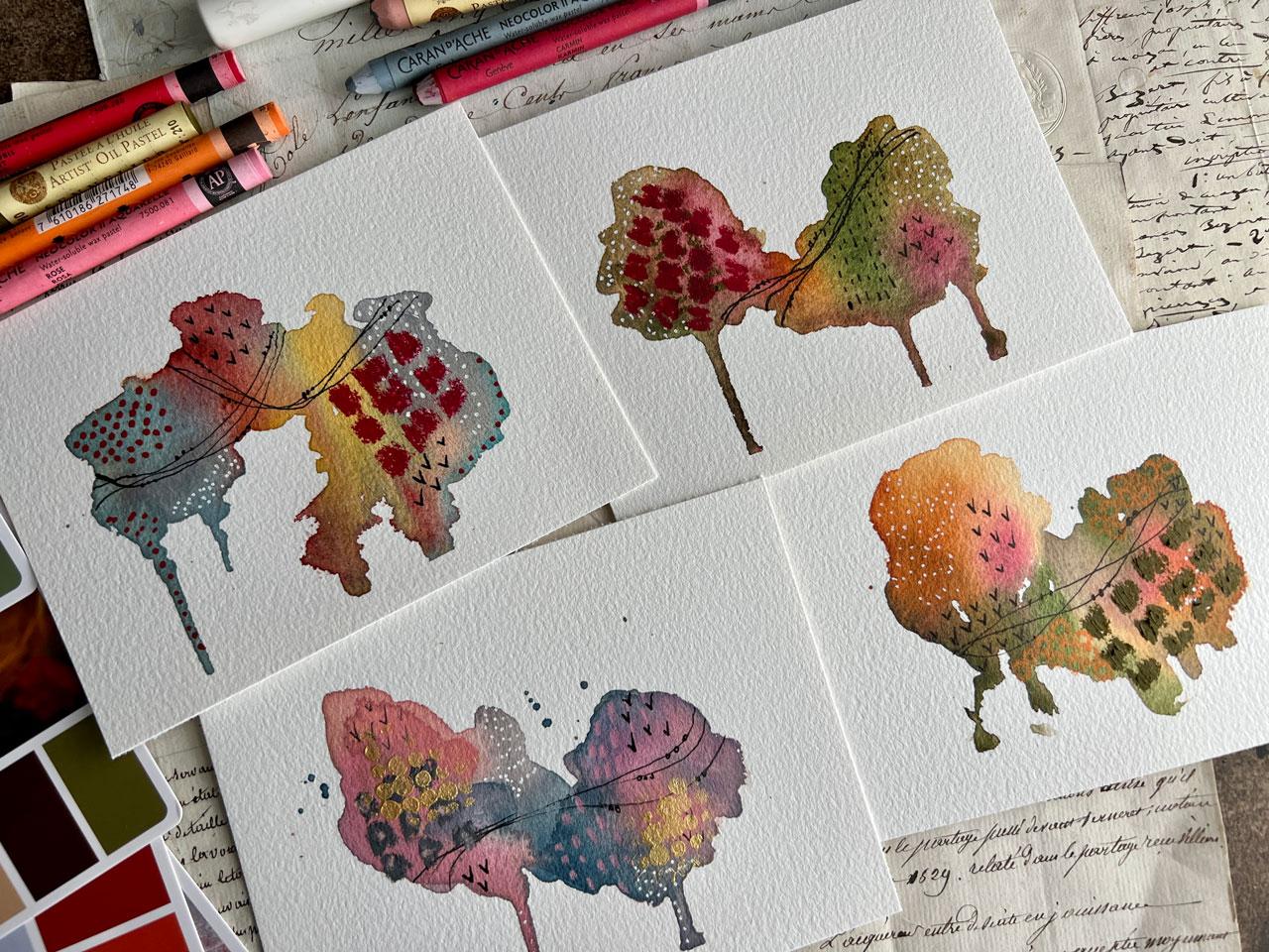
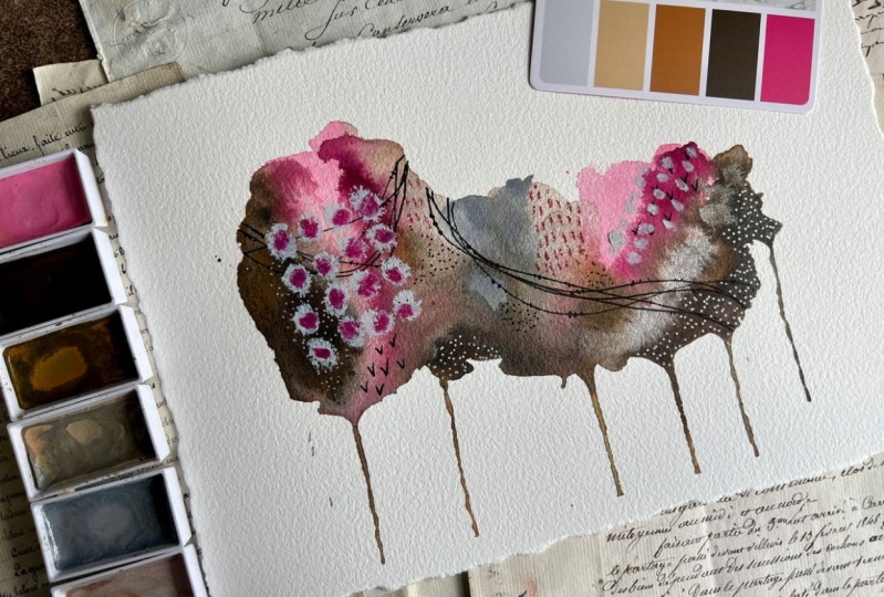
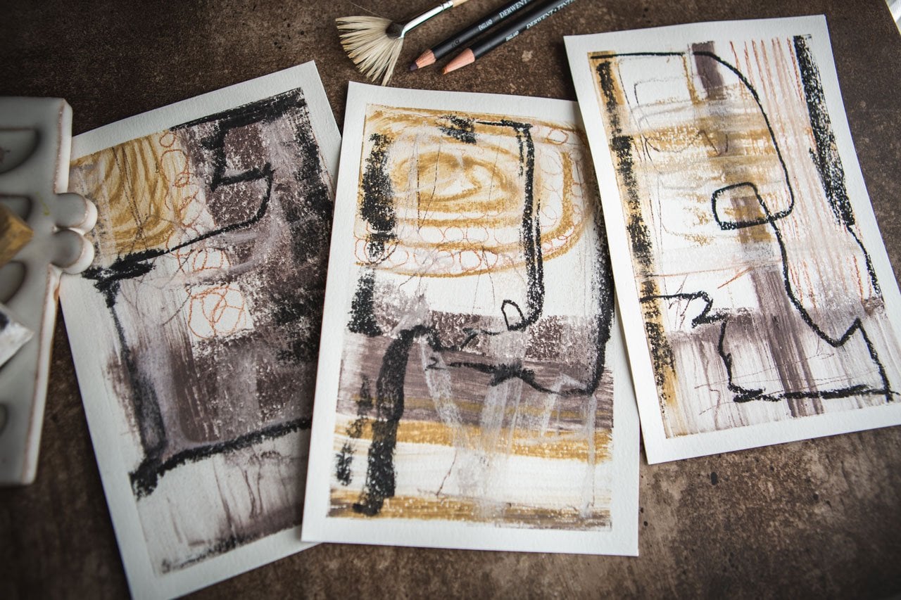
5. Color Samplers - Picking Colors: All right. I started
pulling colors out. I thought we'd start with that color palette that I showed you in the very first
in the supply video. I've got those five
colors that I picked, which was cherry blossom pink, 17 coral pink, 19 Potters Pink, 20 1 gray and 601
grayish blue to do that. Then some of these colors overlap on a few of
these other cards. So I've got on this one. That same color way here. I've got this 602
cobalt turquoise light, 44 yellow ochre, 72 maroon, 71 Indian red and
that 20 1 gray. Then over here, I have
picked these colors. I've picked 54 olive green, 47 raw umber deep, 12 rose Big 72 Moon
and 46 burnt sienna. Then over here, I have just used some of these Let me
get this moved a little bit. I've got 54 olive green, four oh six Big gray, 49 yellow brown, 72 maroon
and four oh two mars yellow. Like I was saying in
the supply video, when I pull colors like
this from color cards, my goal is to get close. It's to work within
a color range. It isn't necessarily to
duplicate these colors 100%. It's to work within a color palette that I would
normally never pull from. So I'm going to move these color palette
cards off of my paper. Now you know where I have
picked these colors from, and we're going to
do some painting and just see How do these work? Did we like what we picked? I want you to do 100 of
these if you need to. I want you to do as
many color samplers as you need till you get
to where you're like, oh, I love this one, and this is what I'll
create a big set out of. Let me just sprit
this first color set. Because we're working
on little pieces, I've taken that piece of Homule paper and I've cut it into four. And I'm going to
start with one of the five colors that
I've got here from our color inspiration card and just set these
over here to the side. I'm going to work in a
little bit elongated manner here and create some longer
patterns with our color. If there's a color in here that you don't think
that you love love, which that could
certainly happen. Sometimes there's a color that
I'm like, I'm throwing me. Work with all the other
colors first and throw that last color in
when you're like, let's see if I can tip
this in somewhere. I'm using quite a
bit of water here on my brush and Just to start out, I'm going to work my way around the colors and let some of these colors
touch each other so that they start to blend and
flow into each other and create their own little rhythm there and
what they're doing. Pretty gray in the gray. Let's do this pretty
blue in here. Then we'll get those
definitely touching. Everywhere I put the color, I usually want there to be more than one spot
for that color to be. I won't just dab it down and
be like, Okay, that's it. I might dab it down and be like, Okay, let's do it there
and maybe over here. And then we'll see, did
we like that or not? Because I want some of these
to be a little drippy, what I might do while I'm
painting is drip this down. But because I'm doing
a little set of four, I'm going to get
me a paper towel here to catch any
drips that might come down onto the next surface so that I can get
some yumminess there. And there is the rule
of three, you know, if you get something
and you get two drips, at this point, I'm
not worried about it. But the rule of three,
basically says things are more interesting if there's odd numbers dripping down or places where you've put stuff or you think in odds instead
of two and four, which are You know, less interesting normally and just see
what you can get. But for the moment,
we're going to let the drip do
its drippy thing. I've got a couple of little
splitters of color here. I might do a few more
splitters so that it becomes something
you did on purpose, not something that
was an accident. Then we're going to
let that color dry. That's the start of
these little abstracts. Now, thinking, and we'll need to let it dry before I pick up the next set. I might let that dry a bit, but let's go ahead and pull together the colors
here for this set. We've got these five
colors for those. I don't know about these colors. I am doubting these. Let's just dive in. Orange and blue are beautiful
together because they're complimentary colors
there on the color wheel. They're across from each other. If we're looking at
our color wheel here, we're working directly
across from each other with those so I can definitely see where they are going to make an exciting dynamic
set of colors for us. Again, I'm just thinking blobs. Where do I want to put those? I'm not thinking super
hard about composition, but I am elongating what it
is that I put on this paper. Now the blue, I was
excited about the blue, and I am excited about the blue. But it's blending in, and if you blend it
in blue and orange, that's going to give you mud. I don't know that on the wet on wet if I'm going to see any of the
blue at the end, and I may need to
come back at the end and put some more of that
blue on top of there. Then if we want some drips, I going to be real careful
with this one over here too. I don't want it to continue
onto my next paper, but we can pick this
up and get some drips. Okay. And if you're getting it, but it's stuck, you could take a little palett knife
and help that drip. Let me set it where there we go. You can help those little drips along a little bit if you want to make sure you're getting it and it's not running for you
like you thought it should. Now that's looking pretty cool. Now that we did
that. Look at that. Now I can see, I can
definitely throw some of this. It's almost like turquoise. It's so beautifully bright. I love how it has
this little line of that turquoise over here. Oh yes, I'm loving that. Those are super yummy. Third, we've done two cards. I'm going to set those
up there to the side. This third card down here, it's our fall colors, basically, and let's just set these over here to this
side and wet them down. And see what we
can get down here. The goal of doing these is to figure out what do you like? Did you like any of these color ways to
do larger pieces of? That's why I want you to
if you need to 100 of them because you're looking for color palettes
that you're like, now I could work with this and then create some
larger pieces from it. Okay. If you've got some really bright colors in here and you're
like, I don't know. I want you to try five
colors and I want you to use all five, no matter what, even
if one of them is just a little drip
in there somehow. Look at that. This
green is really pretty. Even if that last color is just a little tiny
touch that you're like, I'm sure about that, but
now that it's in there, I've got the touch of Look
at that super pretty. Because I want you to at
least try every color once. Then you'll know if you love it, fine, if you don't love
it, that's okay too. Now we've got the fifth
color pallete over here. I'm going to do these over here. We could pick this up
and let those drip some. Let's get some driper at that. Got some good drips. I
got another drip here. Perfect, but I don't want
it on my new paper here. There we go. It's easier if these are all on separate
boards for yourself. I'm trying to keep it all on one board while I'm
working on this, but If you could do separate
boards, that would be great. If you lose some color
and you're thinking, I need a little more of
this color that color. Come back in and add some
more of that in there. You can definitely tap that in. Another thing that you can do while they're still damp is tap a little water in there and
let the color bloom out. That's always fun. Get
extra texture in there. Don't be afraid to come back and some more on there
after you do some drips. After it's dried some up there, you might look at
that and think, I need some more color on top, which we may get with
our mark making. But I want you to keep
in mind you could keep layering on top of
here with some color. I could come back on
here now with some of this blue and maybe the pink and get them a little more
defined than what we've ended up with after we've mixed them together
and dripped them. Always fun. Think of all
the little options here. What can we do as we're
building the layers. Fourth set of colors
was this one. Still in the fall
colors, but I like them. There are different fall colors than the last fall colors. Let's just go for it. On mine, I might not do these exact
colors for the big pieces. I'm getting you in the habit of color swatching and mark making and
just seeing like, where is this going to go? What can I do? How
can these blend? What can I make it do
to make it exciting? What are some of the
options? Look at that one. Because a lot of
color is the thing that most people say
they get stuck on. This is an excellent
exercise to get you stuck. Let's do this brown in here, see this brown is really light, so I might want something as a contrast, but
that's super fun. We can get some drips
out of this if we want. I could lift it up a little bit, maybe help it with my brush. Okay. Because these are fun when they've got some
little drippy elements. Then we're going to let
these dry and Mark make on top of them and just
see what did we get. All right. So I'm going to let them
dry and I'll be right back.
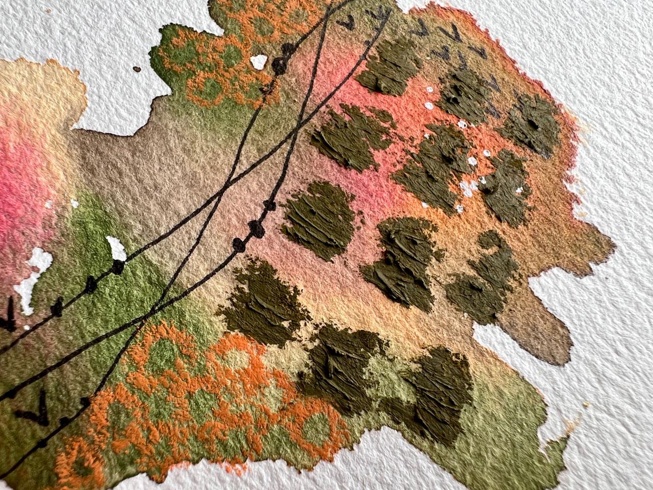
6. Color Samplers - Mark Making: All right. I've pulled out a few of the neo coolor
crayons and a couple of the pastels to start
on this piece up here. I've also got white
Post black pen. I want you to start thinking
of interesting marks and different things that
you might want to do as some mark making
here in your piece. I do have an inspiration that I've given out
in several classes, and I'll put it
in this class two over there under
the projects and resources for different ideas that you could maybe start with. Then if you start making your own mark making
sheets to work from, these are fantastic for giving you ideas
when you get stuck. This, I just keep hanging on the wall behind me so
that I can refer to it. But some of my
favorite things to do, a lot of times are some lines that intersect and do something
pretty that way. I'm marking these with a little micron five pen because it draws really nicely
on the different supplies. Then I can come
back and I can do some little circles like
it's little pearls. Another thing I
like to do when I do these is to make it into little leafy vines
and your paint does need to be dry when you
start drawing on top of it, mine is 98% dry. Hopefully, I don't hit any
spots that's wet with my pen. I think I have Usually
when that happens, your pen quits writing and
you can just set it to the side for a bit until
that comes back down. Let me just pick one of my
other ones because I want some circles on here and
I want to keep moving. 100% dry though, wait
a little bit longer, but you could do little
pearls like that. I'm just pulling
different micron pens I have over here because
I want to keep working. We could do a shape. I like these little Vs that
look like little birds. I'll put a few of
those in there. You could do that in
more than one place so that it's got a
reason to be there. We could also come back, if you're going to do the pastels do the pastels on top of
some of these ink things. Let's do white posca pen. I'm going to let me
clean off my b here. I'm going to do white dots. I get make sure this is started. I'm just going to get out
some piece of palette paper. There we go. What
I'm going to do is do some white dots in here
because I love white dots. White dots are so
whimsical and it just gives your piece
something lovely. I'm using the
different colors of water color that we've put
in there to be my separators visually so that I know
where I could stop and start a set of marks and you could come down the
drip if you wanted to. This looks like a tree, and then a wop sided
tree next to it. I love it. Then you could be like, Okay, do I want any pastels in this? Do I want something
like going to give me some real vivid mark? You could have a spare
piece of paper and draw on the paper to see how vivid
is that really going to be? Was it the right
color that I picked? I don't think that was quite
the right color to pick for this. Let me see. Maybe a gray, maybe it's always, let's do the gray,
like a dark gray. I'm still working within
my color palette. There is a gray in here.
Maybe it's a shade darker. Maybe it's a shade lighter. You just have to start
playing and experimenting. I think I want some
larger dot areas as a focal spot over here. If you start working
and you're like, Oh, I love this. I don't
want to mess it up. Maybe I'll touch these with the center of a lighter color. You're like, I don't
want to mess it up. Set these to the side
before, at the beginning. You don't have to do any
of the things I'm doing. If you like it so much
and you're scared to mess it up, come
back to it later. These are fun. I'm just mark making and
thinking in my mind, do I want to maybe
do some lines, lines in a certain area, and maybe from far back, it's not going to be
super noticeable, but as you get up close to it, you're like, oh, look at that little detail that
we just added in there. Look how cool that is. I like fun little surprises and details that show up
as you get closer, but maybe as you're far back blend in as part
of the total picture. I'm loving that. Another
thing that I love to do, and I'm going to pull
a stencil on you, is to do some circles in
gold or something like that. This is the Tim Holtz
half tone circle one and I really love it. I know I got that
gold paint over here. I'm always doing these
in that Mica paste, but let's do this in
this golden descent, gold, fine, heavy bodied. I'm using just an
artist's sponge. It's a little circular sponge that I've just cut into fours. They're perfect for
stencils because they use it dry and you
can have a bunch of them and I'm just going to come look at that. Oh my gosh. Just at the top and it
gives us that sparkle. That's what I wanted. I don't want it
in just one spot. I'm going to maybe throw
some of that down here. A lot of times, when
I'm using stencil, I don't use the whole stencil. I just use parts of it very organically moving
throughout that piece. I'm loving how that
one turned out. Let's start looking
at this one here and check it out with
our color palette. How did we do? I
consider just so I consider white black gold
and silver to be neutrals. But you can put in
any color palette. Don't limit yourself to some of the things
that you might be limiting yourself to. You could pull out some of
these other colors and go. What can I do with this? If it's white, black
gold or silver, you can put that on
any color palette. Somebody on one of my channels got a kick out of the
fact that I said that. Let's start with white posca
dots because in your mind, is white and black and silver and gold neutral,
maybe, maybe not. They were like, can I
make turquoise neutral? I got tickled. I'm thinking, that could be your neutral. But my personal rule of thumb on these pieces doesn't matter
what color palette I pull. I'm free to use white or
black and my mark making, and I'm free to add a little bit of shine and
some bling with a metallic. That's why I'm saying I
consider those neutrals. While we're working, let's just continue down while I've got this out. Let's
make some more. Marks on these other pieces. That's what makes
these little abstracts so beautiful is the layers. If you're like, I'm not
feeling if it's done yet. If you don't know, set it to the side and live
with it for a while. If you're thinking, is it done, is it not done, set it to the side and live
with it for a while. Sometimes you'll be
like, yes, it is done. Sometimes you'll be like, no, I know exactly what it needs now. I don't know that
you can overdo this. But if you do overdo it, you could always use these as collage materials and cut
them up for collages. I have several collage
classes here on Skillshare, where you could use
these bits of color for different cut up pieces that I know you'd love
that you could check out. Nothing goes to waste. Don't be afraid of
your beautiful pieces. Let's see if my little pen has I'm going to use a
different black pen just because I have a bunch
of black pens up here. Okay. Look at this one. Oh, my gosh. Then I'm
going to do the pearls. In this black pen, it's
a Kitaki black pen, but it came in my sketch box, and I've not been able
to find it again. I can't tell you exactly
what pin this is. It's just a random
one I got sitting up here because I was
using it the other day. But it does the same
as our microns. Any black pen that you happen to have that you love
use and, go for it. I'm going to use some of
these birds on this one. I'm really loving
this color palette. We're going to have
to that was this one. I'm feeling like that could be a big one because those
colors are pretty amazing. But I probably do different
colors on a big one just to give you some fun ideas. Just want to throw it out
there. That one's good. Maybe we'll do some
black lines on this one. Now, that's super fun. I do like these little. This is the perfect way to play and discover
and figure out. In this one, I'm feeling like some green.
Do I have a pretty This one is right out there. Feel like for some reason, and I've done this a lot
in some of my pieces. This is just one of those
things that I love. I love big splotches
of color too. What I like about doing it
with these pastels is there's so much texture and it's another layer that's actually
coming up off the paper. It just adds that element
that you're like, Wow, that's pretty cool.
I really like that. I like it enough to Maybe maybe do something a little different over
here, but similar. We could do some little lines, I could have done this with
those neo coolor two pastels? That would have
been a good choice for a little lines like this. I'm just trying out different things and
seeing what can we get? I've got a red here
that I've pulled out. It's probably brighter
than what I need. But I don't know that
there's a darker shade. Is that a darker shade? This is a car mine.
Let's do this one. Let's just go for it. We can do great big splotches of color with these two, and
they do really good. If you're scared of oil pastels, let me te you I
was scared of oil pastels for a long time. But now I'm obsessed
with them. I like that. That that's super fun. I really love the orange over
here and this one. I've got an orange crayon. Reddish orange, that's
reddish orange. Maybe we could
just come and draw some circles as an
accent over here. Oh, yeah. I want you to start doing some
mark making gathering. I want you to do 100 of these
and just start thinking, What do we want to do on here? Let's do these over
here. What do we like? What do we want to end up with? What's going to look good? Start making a catalog of
favorite marks and things. Then when you get to
these, you'll be like, I know what I want to
do. That was fine. Let's just do Look at that, and we can come
across over here. I should have done that before. I did those red marks, but I just wanted to
get them in there. We could do little
leaves or little pearls. I feel like a pearl day. To these the little
pearls. Okay. Okay. Could come back. Let's see. That one is let's see what
are the colors we have. We have this is this one here. What colors could we
come back with feeling like I like this
orange bit in here. I don't have a darker orange. I could have a darker
orange in the pastels. Let's take a look. Oh, look
at this one. Oh, there we go. It's in between those two. But it's a nice choice. What do we want to
do? We already did that with great big splotches. Could just come back in
here. You know what? I could come back in here. Before I even do
that, Posca pens are some of my favorite
things to work with. I have colored posca
pens randomly from my art boxes that came
in and we could do some posca pen dots or
lines or mark making, and this is that color too. Look at that. Look around at
the different posca pens. Posca pens are nice because
they're acrylic paint. They don't smudge
and smear like maybe some pastels do,
and they're vivid. You can really get that color on here to be like,
Oh, look at that. We could come back around
the edge fun. Look at that. I'm like that. Oh, yeah.
That was super fun. Let's just go down the line. That's like T and red, which always looks
pretty together. I'm loving it. Loving.
I am feeling like. This one down here is
missing something. Maybe it's missing some of these lines and I
need some lines. Oh, yeah, that's pretty. And what's fun about
these little things and doing many at
the same time is you're not getting yourself stuck on where to go with one. You're not getting
stuck on crap, but I want to ruin
this one because now you're looking
at all of them, and you're thinking,
what can I do here? What could I do that? I
feel like I could use more birds over here. Okay. You're starting to now
think outside the box and rather than getting
paralyzed with one piece. Now you've got several pieces that free your mind
to do other things. As you move through your pieces, you start thinking of new
stuff and you're like, maybe I should do this or
maybe I should do that. Everything that you're
thinking, maybe I should, I want
you to try that. Let's put some birds over
here because I'm filling it. We're filling birds
and pearls today. Maybe you're filling crosses or lines or hashes or who knows. Feel like I could
use a few over here. Oh, yeah. I'm loving those. All right, let's stick
some birds in here. This is definitely birds
and pearls day. Love it. Then let's peels and tape. I feel like we're at a
spot where I'm like, Okay, these are good. See, I like doing many. Many gives you choices. Okay. And these are perfect
as color samplers, swatching many pieces of art when you get into
colors you love, Gifts. These are great to
go away as gifts, if you make a bunch of
these and you're like, All right. What can
I do with them? Cards. These are
great for cards. I could have put
some gold on these. Come back with some gold, maybe. Let's check out the different
pieces that we've created. I'm loving that one. Maybe this will be a
bigger project for us. Definitely love how some of
these colors turned out. Do you see what makes working with color palette cards so fun? I never would have put
these colors together. But as we look at how we did with each of
our color palettes, how amazing did that turn out? I want you to start getting into the habit of maybe looking
at color palettes. You can go to Pinterest and type in the search bar color palettes and tons of these come out. The color que by
Sara Rene Clark is the color palette cards I was using and I
particularly like playing with these because
I can hold them in my hand as I'm working
on stuff and you can also make your own
color palette cards with historical documents
or your own photos. These are super fun things
that we can work with. Now, after you do a bunch of these and you're
like, Okay, Wow. I love this one. Now I
want you to start planning on the next bigger
piece because we're going to make something
bigger here next. I'm probably going to pull
another color palette card just to give you
some more ideas. But if I were going to pick
my favorite out of these, this one is the one
that's grabbing me today. I'll see you back in class. Okay.
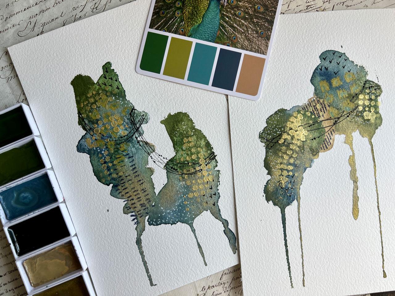
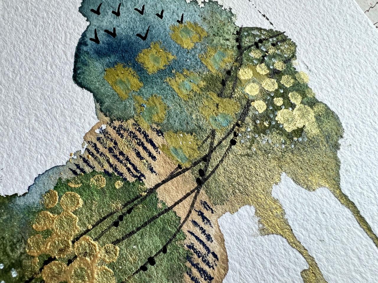
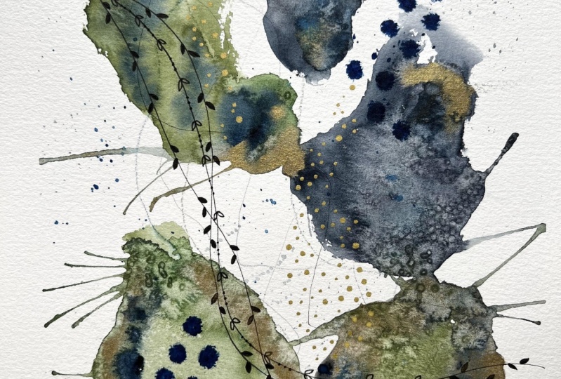
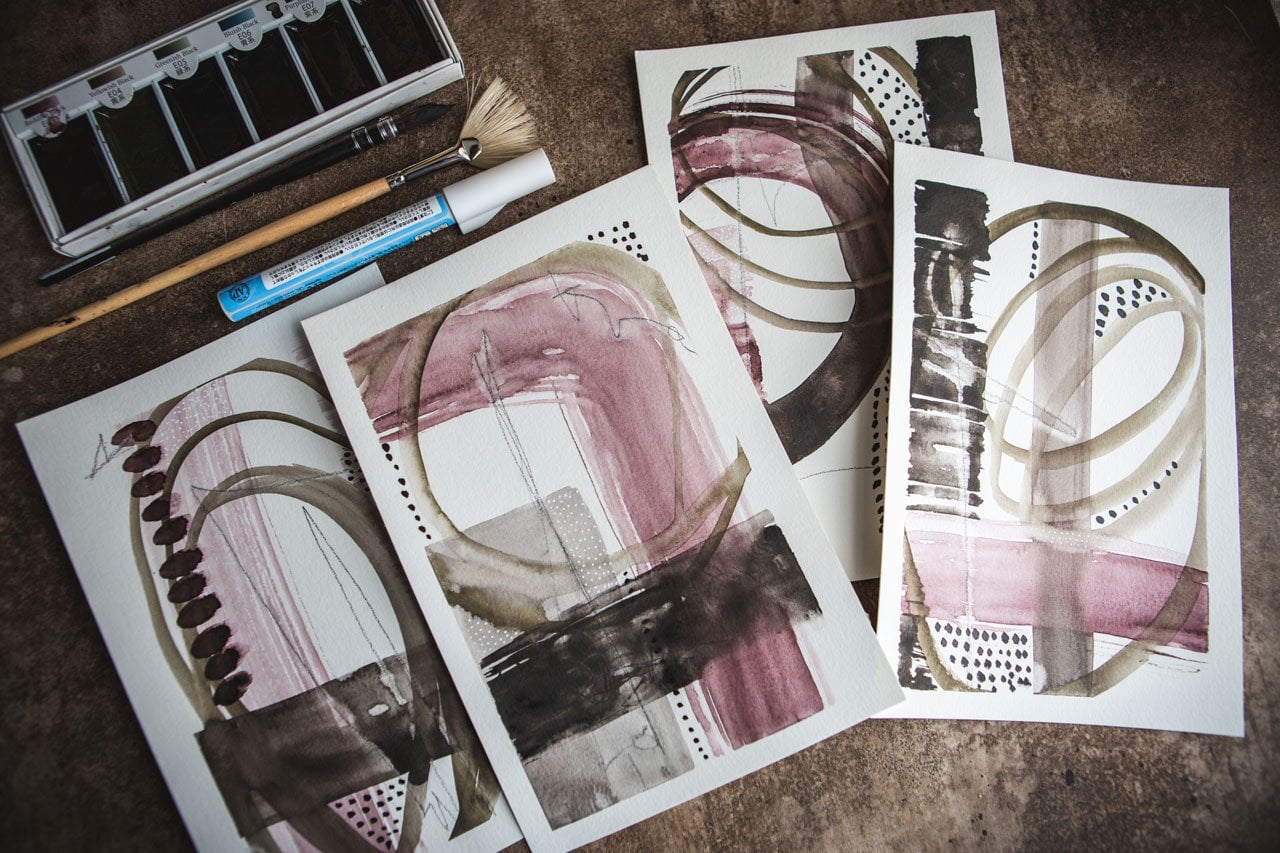
7. Peacock Color Set: For this project, I thought, let's do some that are
a little bigger than the samplers going
the other way. I've cut that homule paper
in half and I pulled a color pallete
card to be inspired by number one 19 in this deck, number one of these color
cubes by Sarah Rene Clark. I just love being inspired
by these color palettes. I'm probably going
to keep using these forever for all my projects. You can certainly pull all
your favorite colors together. You don't have to be inspired by color palettes
if you don't want. But I thought what a
way to push myself outside my comfort zone
every time I sit to create because part of
my fun in creating is pushing myself outside of my normal color things
that I would pull, which would usually
be like a pink and orange or blue and green. No way am I going to get more complicated in that
color pool like this. Then if I start playing in things that push
me in that direction. That's why I enjoy
pulling these. I have pulled colors out of our talkie set that
come very close. My goal is to work within this color palette,
not be exact, but if you want to put as part
of your gold color mixing, definitely get as
exact as you can. But I've pulled 58 sap green
deep and 54 olive green, and 601 grayish blue. This is more of a teal than a blue, but I'm going with it. And I've pulled 62
turquoise blue, which looks very similar
to this in this pan, but I feel like this
might be a little brighter, but we're
going to go with it. Four oh one flax beige. I told you in the
last little section, white and black and metallics,
I consider neutrals. I did pull out a bluish
gold number 91 to throw in this with the
peacock because I feel like peacocks need a
little bling bling. I pulled a couple of the
neo cool two crayons out of my batch that I thought match, so I'm
just going to go with it. Got my water over
here and I'm going to spritz these to
get them started. I love it when I now I can already see that blue is going to be brighter
than I thought. Let's go a little test. Before I commit to
that color for good. Let's test it out.
I'm going to use a little bit bigger paint brush. That's that color, which is quite a bit brighter
than that deep color. Maybe I should revisit the blues and get a little
darker in that blue. Let's see what else we got. This salian blue,
that's too bright. Because I'm trying to get close. I don't want to be so far out of it that I'm just not getting anything that
I was trying to get. Let's just see what we got here. These look so much brighter and they look so that
one right there. All right. Got it. Got it. Let's pull this one out. All right. This one is 67 digo. Oh, yeah, yeah. I like indigo. I'm
good with that. Where did I get this out of
turquoise blue right here? Now I'm feeling better. Don't be afraid to
revisit stuff if you do a little test
watch and you're like, not at all what I
thought I was getting. Now, let's go for it. I should have thought
Indigo, I like indigo. I'm going to work on two
in the same color palette just because and see.
What can we get. I'm going to start with whatever color you love first whatever color you I don't
know about this about. Use that last or start with your neutrals
and then lay in the color. Anything that gets
you started and gets past that mental
block of where do I start? We could also mark make on the page before we
even get started. I'm not really going wall to wall with this
collection though, edged edge, I'm free floating some lovely
little abstracts in here. I'm going to lay color
wherever I'm thinking. I love this green, good choice. I love this blue, not too far outside my comfort
zone, but good choices. This brush tends to flip water and stuff out on your things, so if you don't want
the water there, have a little cloth handy. I looked like a peacock
right there, doesn't it? I like doing more than
one because a lot of times one is going to
be your least favorite. If you're creating
like I create, A little bit brighter
than I was thinking. The one that you create
first is probably the least favorite and that's the only
one you created that day. You're going to be
very disappointed and not want to be
creating anymore. You get sad, I get
sad, I get mad. If you will create
more than one, one can be the one that you
do all the experimenting on, fresh hold of water today. One can be your experimental
one and the other one can be the one that you do after you've done
all that experimenting, what you end up with is a piece of art that's
like, amazing. And a piece of art
that was like, Okay, I like it, I'm glad
I didn't do just one. I'm just laying color in. You can see just laying that first color in
different spots on each one just naturally gravitates you to
different compositions, which I think
that's pretty cool. Before I get too far, I'm going to do some dripping. Because I've got these
going the same way, I don't have to really
protect the paper. Okay. And if it's not quite
dripping where I want, I can help it with a little bit of water and get that started because if you like thinking in the rule of odds versus evens, maybe you don't want
just two drips, maybe you want three or
maybe you want five, and I'm going to let
that one be even. I don't mind four. I just
on one that I did two, it bugs me that there's two. Okay, look at that. Um, yummy drippinss.
This is fun. Now, we could let it
dry a little bit, but I think I'm going
to come and lay some more color back up here
of what I really liked. I really liked the green. I'm just going to strengthen that up
because at the moment, it made it all shear down. Now I want to pull
some of that back up as where it belongs and keep
it up here a little better. Add another layer in there. I really liked the digo, the digo worked really nicely, so we're going to lay some
of that back in there. I like doing it when
it's all wet because now these colors are allowing themselves to blend
into each other. But I don't wet my whole paper. Mostly because I
don't want this going past into the rest of the page. I want it to stop in the defined areas that
I've laid color down. Now, the one I've been
avoiding is the bright green. Let's just go ahead. If it's
a color that you're like, I don't know, do it last
and do just a little bit. Now that it's in there, I
actually really like it. But if it's a color
that you're just not sure and you're
like, I don't know. Do it last and do it a
little bit, but do it. Pick five colors and make
yourself use each one, a little differently
if you have to, but just see what you can do. Now, once we get to this point, I'm going to let this dry. We could lay some salt on here if we wanted to
have some texture, and I have some salt back here. You know what?
Let's just do it. We'll definitely have
to let these dry, really good before we
pull the salt off. This is just sea
salt that's larger, it's the kind of sea salt that
you put into the grinders. I'll just be interesting
too to see how does this Kitaki soak into the salt versus regular water color.
Let's just do it. Let's experiment with a little
bit of chunky sea salt. I put my salt back
into my container, like I don't care that I have. Contaminated my salt doesn't bother me a bit if there's
colored salt in there. When I scrape this off,
I don't throw it away. I just scrape it and put it back in my salt container here. The salt will last me forever. But if you want pure salt
that's not contaminated, you can definitely
wash those off. I wash them off, put them in a different container
than your original so that you have a
contaminated container and a clean container rather
than just throwing it out. If you're using a
little tiny salt pieces like out of a salt shaker, you might not be
able to do that, but these are great big pieces.
I can definitely do that. I'm going to let this dry
and then we're going to move the salt off and we will mark make so I will
be back in a bit. Made myself walk away
and go get some lunch so that I wasn't tempted to try to move these
before they dried. And I'm going to
be very careful. I just in case that
salt is still wet. I'm going to try
my best not to get it on the white piece of paper. Okay. And I'm just using
an old library card to throw this salt back
into my salt container. If you need if you're doing a piece that it's important
for color not to bleed in, you probably want
to use clean salt rather than salt
with color on it. But mostly, I don't
mind either way. So hasn't bothered me a bit for the salt to have any
color on it when I use it. But if it were
something that was important, I'd use clean salt, and there's plenty of clean salt in this container if I needed to dig far enough down you can see that it's pretty clean the way I got
all this off of here without getting it all over the paper just in case there was
something that was wet. But I actually did go eat lunch. I wasn't tempted to hit
it with my heat gun because with the salt
and the water color, you want to let them do
some of their own things. You want to give them
a chance to soak in. Do what it's going to do, blend, how it's going to blend, bloom, how they're
going to bloom. Let me pick this up just to make sure I've got all the salt off. You want to resist. I
had a couple of pieces. You want to resist hitting it with the heat gun if you can because you want the watercolor to do all the lovely things
that it's going to do. That's why we put the salt
on there and that's why we use the watercolor
sometimes to do that blending. Then check out all the
yummy texture that that created that I can now use
as part of that composition. Tell me if I'm wrong,
but doesn't that look like a peacock,
right there. It's the bird and the tail. How hilarious is that. Now, I always going
to think that's the peacock holding its tail up and there's his legs.
We made a peacock. We get that piece of salt. Now the fun part begins. We want to do some mark
making. What do we want to do? Do we want to color on here with some neoclor two crayons
or with the pastels. I definitely want some black
marks, maybe some gold. Many choices. It's
time to decorate. On this one, I'm
actually feeling yummy lines and this one is a pigma brush pint
of the micron. I really like the brush pins. When I do stuff like
this because look at that nice line that
gives me. That is fun. To maybe use a brush pen rather
than a blunt tipped pin, something to keep in mind. And we could come back in. You know what we
could do? Could come back in with a posca pen. I could have done that with post totally should have done
that with Posca pen. This is a 0.7 millimeter fine tip
posca, which I love love. But I was thinking we could do our pearls and it's
got the salt on it, and I think that the posca post, however you want to
say that, I think that the posca pin might actually be the best
choice rather than the pigma pins because I don't think the salt would
bother the tip on this because you just squish it down to get more
paint to the end of it. I think out all the choices, this would be the one
I'd recommend the most. Now that I just
thought of it, I took my aposcapins out of the
box they were in because there's a pretty wooden
box that sits on my desk behind us so that I
can just reach for stuff. But then I got to thinking, how can I use things in the box if I can't
see inside the box, and so mid filming while I was taking a
break letting these dry. I took everything
out of that box and set it on the shelf
so I could see it. Now I can grab all the
colored posca pens and use them in my pieces. This one is so pretty. What do we want to do over here? Over here, we could actually connect them. What
if we do that? What if we do some of these
yummy little swoopy things. Then maybe we'll connect
it right across the white. Look how pretty. Glad I did that. Now that I'm definitely using
this little fine tip posca. I think this might be my
favorite going forward. You have to try all the ways, make a lot of art,
practice a lot of pieces before you're like, a. This is my favorite. I make a lot of stuff.
For me to still be like, now I've found my favorite
after all these years. There's a lot of play in there.
Look how pretty that is. I'm loving that. What if let's do some more black
in here, I'm not done yet. Let's do some of our
favorite little marks. Right now, I feel like
that's little birds. So I'll put some
little birds in here. Okay. Oh, yeah. Feeling that one. Good choice. Let's put some over here. Look how beautiful
this pen marks. Let's do it down here too. It's almost like
little check marks or little V or little birds
flying in the sky. I like it. I like it. I'm loving that. You
can tell eight lunch. I feel like I got more energy. A little posca pen.
This says it's gold, but it looks like that green. What do we want to do here? I'm I really love. Let me pull this up here. I love everything that's
going on right there. Look how beautiful that is. Love that. That's gorgeous. I'm feeling like,
yeah, be brave. That's my new mantra this year. I'm going to get a shirt with that on it that says be brave. Because in the
end, why are we so scared of putting
paint to paper? It's just paint,
it's just paper. Why are we afraid to
put paint to paper? I really like that. What if we do a little center of blue. Okay. You know what that reminds me
of now that I've done this. These peacock circles. It's fun to be inspired by more than just the picture
really be inspired. Now I like that so much and
I thought that so much. What if we put these
circles right up here. That really is, we're painting
the abstract Peacock. I might frame this and the title might be Abstract Peacock. Look at that. We don't have to
keep it all even, we can come out here
and do a little offset. That's pretty. A
little blue in there. Yeah, why are we so afraid? I mean, you don't know
how many times I sat at my table frustrated. That's pretty. I'm loving that. That whatever I wanted to
do wasn't coming to me. Let's do some white.
Let's do some white. I would get super
frustrated because I would not create anything by the
time I was done getting angry. Because it was a white page and I was paralyzed and I wanted some masterpiece to come out of whatever creating I
was going to do that day. For some reason, it just did not come to me and
then I'd get mad. That's why I like
doing practices with these color
palette type cards, or if you Google and use some on Pinterest or whatever
because color is one thing that
paralyzes all people at one point is what
colors do I want to use, and if you're good with colors, maybe you've never
experienced that. But the rest of us
get hung up at color. Or maybe you don't like to color mix and you get hung up
at the color mixing. You can see by using a color palette card and having a set of
colors that lets you pull from how much
less stress and pressure you've taken
off of yourself right at the beginning
of your creating. I've eliminated most of what
some of my paint issues are. What do I want to paint? What
colors do I want to use? Look how pretty that is. This was a good paint session here already and
we're not even done. The Peacock was
so inspiring with our little peacock that
we've created. I like that. I like the marks
we put in there. Now we just got to decide what do we want any
other marks in here? Or are we at a point that we're like, Oh,
yeah, this is it. Maybe we want some lines. Okay. If you're at a point
where you're like, I think it needs something
else, but I'm not sure what. Maybe at that point, you need to stop later after you've done
15 other projects, it might come to you. What would be the perfect
finish to a piece. Don't be afraid to just
pin pieces up on the wall, look at them while you're
creating other things, and come back to them and finish them later when you're like, this is what that needed. Because sometimes you need
that time for it to perculate. And figure out what
did that need? I like those. I'm loving that. Do we need a little
bit of gold in here? I feel like we could use
a little bit of gold. I'm going to use the
same golden descent, fine, heavy bodied
acrylic paint. I got my little sponge
back here and I'm going to just strategically
put some gold in here. You can dab, you can rub
it, you can do either way. Everybody's got their own
favorite stencil technique. Then a lot of people
too asked me, do I wash my stencils
and I do not. Look at that. I like that. I just let them do their thing. The paints really thin on them. I just don't worry about it. After it gets thick enough, I could probably
soak it in water. Oh, yeah. I'm like in that. I could probably soak it in water and perhaps
clean them that way, but honestly, I just
don't bother me. I don't get so
precious with stuff. I want to use the stuff. I want to not be so precious,
I'm afraid to use it. I just don't let that bother me. Okay. Some people, I know
it's going to bother because they've told
me that bothers me. If I don't have all
my stuff clean, but I feel like that
gets in the way of my creating if I worry
about all the stuff. I try not to be precious with
the stuff. Look at that. Then if we shine
that in the light, that's what I like about the
gold bits is the shininess that we get as that tilt occurs. Look at that. I feel like
these could be done. Let's peel the tape
and take a look at it. Okay. And if you tape is
pulling at your paper, which this paper does fantastic. It's not sticking
to the tape at all. But if you're using a paper
that sticks to the tape, use your heat gun to
heat the tape up, that makes the adhesive
release and you'll be able to peel it and
not ruin your paper. This paper, highly recommend coming right off with no damage. Check it out, check it out. At this point, too,
you might look at it and think, it
needs one more thing. There's nothing saying that
this has to be finished. You can keep adding
things as you think of things or as
things come to you. Look at that with our
inspiration palette. These are fantastic. I hope you enjoy
painting a little set of two that are a little bigger
than your small samplers, but pick some of your
favorite colors and go a little bit larger and
see what we can create. I hope you enjoyed seeing a new color palette
to try that in. I'll see you back in class.
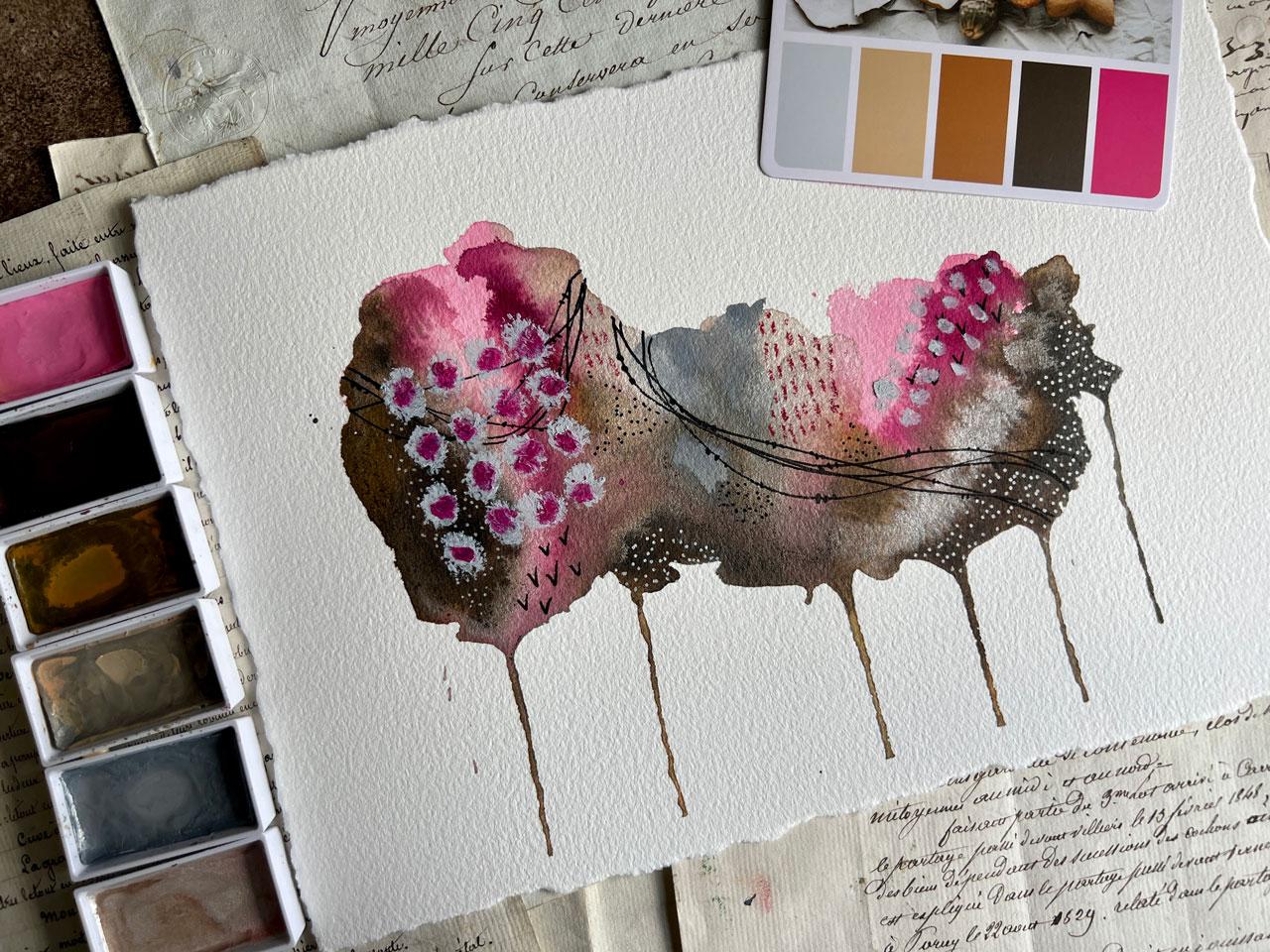
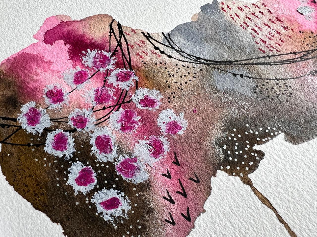
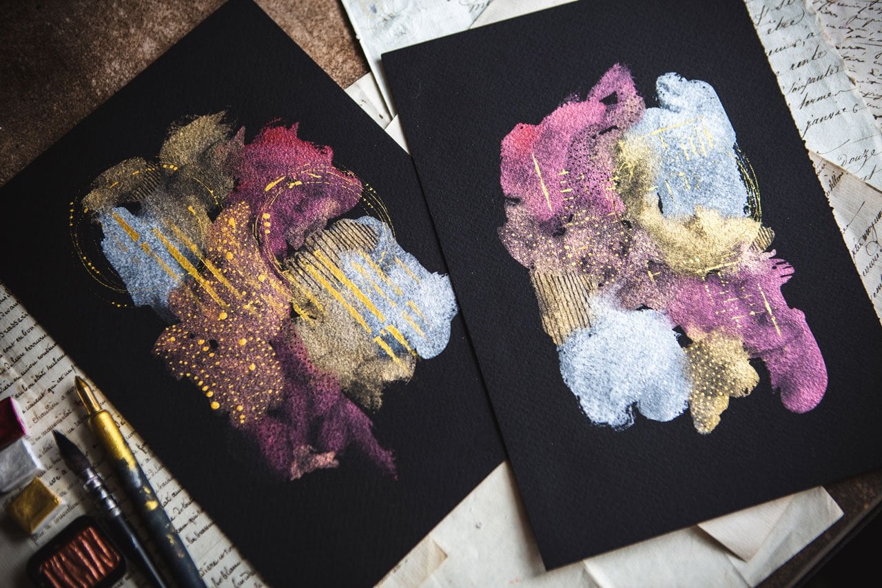
8. Christmas Cookie Colors: On this project, we're going
to go a little bit bigger and actually before I
take this paper down, I'm going to take my Rp ruler. This is a dual edge ripper,
that's a rip ruler. And you can get these on Amazon
and you can get these at the dual edge
ripper com website. But what I'm going to do this
has two different edges, one is a little rockier
than the other. I'm going to rip my edges
before I start painting. This was the top. This is
the bottom and I'm going to tear towards the bottom
because as we tear, one side will have a
nice clean edge and on the other side will have a lip. I'll show
you what I mean. If I can get this edge up. Here we go. I'm
just eyeballing it. It doesn't have
to be act, exact. Then you just grab that page
and pull towards the ruler. You can do this with
a regular ruler to, you'll just have a
straighter edge, but it'll still be a torn edge. You see how easy these are with this ruler.
Ruler is like magic. I'm just leaving enough
paper for me to grab. You can leave less paper, you can just whatever
enough that you can grab and stand up when you're doing this with
all your weight on that ruler. Last edge. I like doing this
before I get started rather than after
just in case I paint something amazing and then
I'm afraid to tear my paper. Okay. So if you tear
the paper first, it was easy, no stress. You haven't painted on it yet. Then if you paint
something that you don't like, it was no big deal. If you paint something
that you love, you got to finish deck with edges so you can
float frame this. This edge, you can see,
there's a lip on this side. But if I flip it
to the other side, you can see how it's
nice smooth torn edge. That's what I was looking for. I'm going to tape
it down. I'm using my painter's tape. Okay. And just because I like to
work on taped down paper. Then it should just
peel off, no big deal. You can use your heat gun to
peel it off too if you need to because the heat will release the
adhesive off your paper. This paper peels really
nicely though with the tape. I'm loving this animo. That's painter's tape, taping
it to an artist panel, so you can get those
at the art store. You can get these on Amazon too. I love working on artist panels because then I can
move it off my table. And I pulled a really fun card. This one's like Christmas,
but I don't even care. I just like the colors
in that papa pink. I have pulled out
just a selection of colors that I thought went here with our palette or at least was
within the palette. I've got a pink, which is
this 14 cherry blossom pink. We could go even a little
brighter with the opera pink. I like raw umber 47
deep, 49 yellow brown. 406 beige gray, 20 1 gray. Then I did pull out
this 906 white gold, so it's shimmery even
though it looks pink, I've had pink in it obviously. Just because it's
Christmas cookie, why not? Let's do stuff that shimmers. And I pulled out a
couple of neo color two crayons in that
same color pillet. I've got some pasta
pins to the side. I always come back in here
with some oil pastels. Let's just jump in
to our larger piece. Now, I'm doing these in the horizontal
landscape position rather than the
vertical ones like we did on those other sets. So Let's just go ahead, got my big Princeton quill, bigger the piece of paper, the bigger the brush usually. Like with the other ones,
pick what you think you love and start there first and whichever one you're most
afraid of, go there last. I'm loving the pink. Let's just jump
on into the pink. Composition wise,
I'm going elongated, not going to worry a lot about, does it take a particular shape? I'm just going to elongate it
and maybe do some dripping. That's my thought here. And just working those
colors in next to each other so that they can
blend and do fun things. I'm just picking each
color up and going for it. No particular order, no super Rymer reason on why
just what feels good, intuitively putting the
colors where I'm like, I think here and I think there. Did I already use this color? No. Okay. These are fine. At
this point before I get all the colors out,
we could do some drips. Let's do some drips.
Oh, look at that. That is super fine. Let me just get it off the
edge of the tape there. I'm loving that
right there already. What about not used? Let's see, I use the gray
use this dark brown. That's going to be our
yummy contrast in here. I'm just going to dip that in
and just see what it does. I think too hard about it there. But I do like the
yummy contrast, a dark color ads. Just to throw this out there as we're doing
mixed media thing. If you're looking at it
and you're like, Wow, I wish it even had a deeper
color or brighter color in there or something
in that range. You could pull out
some acrylic inks. I've got some acrylic ink here. You could mix in some acrylic
inks here with these. Let me just shake this up. You don't have to keep
it all to watercolor. I'm introducing you this on the this last bigger project has an idea of something else
you might could consider. Look at that. I like
that color in there. I also have Some of these
peerless water colors. This is a rose
bright opera pink, which could be closer in color. Let me just get a little
piece of paper here. Could be closer in
color to that pink on our card that we might that little pop of pink
I was thinking of. That might be nice. We could
always come back in with some of this just letting it
do its thing a little bit. We could come back
in with some water, tap a little water in that, let it really spread and
do something interesting. We look at that. As you're going, even though we started all the
other projects with very limited supplies and some things that we
were considering. Think about some of
these options that you could possibly do acrylic inks, other water colors
that you have. You don't have to stick right in with everything that I've used or the way
that I've done it. I want you to start thinking
outside the box and think, what else could I do here? How could I blend or make this do something
even more different? I want you to get creative
in some of these. Something separated out here and made this look like a
little bit of orange peeking through which I thought it was that one,
but I don't think it is, but I love that bit right there with that
little bit of orange, so it's like it's
this color here, but in that watercolor pan, that was not coming
out that color, or it separates into that color. Feel like maybe
with, you know what? Let's go back in here
with this white. I feel like that gray is out
there doing its own thing. Let's come back
in here with this white and throw some of that
in here and make that gray, do some blending and
some other stuff. You can tap water in, start making marks, and just let it flow and blend
and do what it's going to do. Look at that. Think about tapping some
other colors in as it's drying after it's
dry, experiment. What would it do if I did
this or if I did that. I'm like that a lot better now. Do we want to throw
some salt on here? Do we want to let it
do its own thing? We could also as it's
dry when it gets damp, not when it's sopping wet, but as it gets damp, you could come back and tap in water and then watch
those colors bloom out. That's another
thing to consider. But it can't be sopping wet. It's got to be shiny, that it's not completely dry, but it can't be a puddle. I think I'm going to let this
do its own thing and dry. I'm not going to add
any salt to this one, but I am digging
what it's doing. I've got some really
nice separating and granulating going on there. Let's let this dry
and I'll be back. All I have now let this dry's set some of these
other things out of the way. Now we just got to decide what finishing marks do
we want to do on here. I already know that I
want some swoopy things. I want you to figure
out what your favorite little
marks and things, and that's what I want you
to get in the practice of doing and experimenting and just seeing what
can you end up with. Then once you discover what some of your favorite things is, then you can start playing
and experimenting with those lines that you
love. We know I love Lines that cross
over each other, gives that little bit
of a black contrast. Also like little birds in here. Next class, I'll
like something else. Every class, I've gone into
some things that I loved. Now I've got new things
I'm obsessed with just bring you along on all
my little personal projects. Some of these I like
drawing little leaves on. It's little vines that are
going through the piece. Today, I'm in a pearl mood. We're going to do
our little pearls. Now after all these years, I've decided that the fine liner poscain 0.7 millimeter
is what this one is. It's definitely a good one
for drawing lines and marks. I decided it's my new favorite
after all these years. I'm just going to
put little pearls gives everything a
little bit of whimsy. It's like white dots. It just gives that little
bit of whimsy that I like in my pieces
and you might like grunge and you might like
stencils and you might have your own favorite marks that you like to put
through your pieces. That's what starts to define your personal style and the
things that you like to do in all your pieces are the different marks and things that
you end up loving. I've also got a couple crayons, also got silver and gold posca. We could come back
with some silver dots. I never do silver dots. I always do white dots. But what if we do silver dots because this bit of
that white watercolor, that metallic white gold
that I put in that. It's got that little
bit of shimmer. I don't know if you can see that little bit of shimmer in there, but man, is it pretty. It's inspiring me to come off of that with some silver
posca pin dots. This is 0.7 millimeter tip also. It's really more like a pin tip than a paint tip
that those usually have. I'm just letting the
water color itself guide where I stop
and start those dots. Wherever another color
comes in almost is a natural gateway there to
stop you where you're going. I love that. I love using the color transitions as my
stopping and starting points. Look at that. It is so
pretty, oh, my gosh. Telling you pulling little
color palettes to be inspired by has just really
ramped up my art making this year and had me practicing and playing
and experimenting in all the different
directions that I was maybe afraid to personally
go just by pulling colors. This is just a paints stick from the paint department paint store five gallon bucket stir stick. I'm just using it so I'm
not leaning my hand on the paper as I'm continuing to go the wrong
direction with my dots. I like to work the wrong way. But I don't want to get
something all over the paper. Now that I've decided I
really like this one. If it's one I don't
really like, I'm not nearly as careful. Sometimes I just got my
arms all over stuff. But this one I'm
actually liking. We want to keep it pretty. Look how pretty that is. That was pretty. We
like the silver dots. Sometimes I like
circles in my pieces, but I'm not going to
do a circle today. We can come back in here
now with some dramatic red, or we can come in
with the dramatic gray big splotchy pieces is a possibility or
I could come back in here with some pastels. Let's take a look
at our pastels to see any of these
jumping out at me. I want it to be
something spectacular. I mean, we could come back in here with this
really light gray, which is almost a silver, and I could go in
the middle of that with that pinky color. That might be fun. I
don't know. Let's see. Let's do this. I want the
splotches because I'm all about the bigger
splotchy pieces. Just be brave. I didn't even look too hard about where I
was putting that because when you go to
add this extra texture, sometimes you just
need to jump on it, and if you sit there and think too hard about it,
you won't do it. Yes, it could be the moment that you're like,
that ruined it. But I don't think
that ruined it. I'm okay with that.
I'm digging it. My maybe we could come in
here with some center dots. Okay. Just giving you all some ideas and things that you might think, you might be looking at
this, going, not that. That's okay. It's all
about experimenting. I'm not worried about
ruining the pieces. That actually looks like
silver and that pink brown it. I like that a lot. I almost feel like it needed
some of that over here. Now that we're
looking at. I don't feel like maybe it
needed it over here too. What do you think? I need I
need some feedback there. Maybe let's get that gray back out because we could
come back over here and just do some
little bits of the gray. It doesn't have to be as
dramatic as we just did it. It could be little ones just
to pull both sides together. What do you think about that? I'm feeling that. I like that. That made it. That made me feel
better. Now, what else do we need in here? I've got this color that I
could color on here some. I do like it. I could come back
in here with marks or lines, dots, dashes. We might come in here
with maybe some lines. Well, maybe some
dashes. There we go. Okay. And another trick that you
could do if you're like, I'm scared and I don't want
to do that and mess it up. You could make a copy of this on your color printer if you've
got a color printer and then do all the practicing and marks on that practice piece
until you're like, this is what I want to
do, and you can practice. Then you don't have to worry about messing
it up because you practice on pieces that weren't important to get to this
piece that you're like, right, here's how I
want to finish that. Just drawing you some ideas. I like that. Feel like we could do with some black dots and then I think I'll be good. It's all about what
you're feeling. It doesn't matter what anybody else is thinking
about the piece. It's what makes it
feel good to you? Yeah, I like that bit of a little details as you get close and you're
like, Oh, what is that? Okay, so pretty,
yeah, like that. I'm feeling good about that. Here's the really fun part. Let's pull this tape
and just see what does that look like with that beautiful
edge that we tore. I could some splatter in there. So splatter would
have been pretty. Oh, my gosh. Look at that edge. You see tape just
pulls right off of it, doesn't even bother it. But look how that just
finishes your piece of when you have an
edge on it like that. So pretty. You see how now that
you finish the piece, you might not want
to tear after you finished it because if it was the best piece you ever did, you might be like, I don't
want to mess that up. But now we already cut that
edge and we can do that. If I look at it
and think, there's too much white edge up here, I could go ahead now that I thought that
because I did think that. Let me grab a piece
of wax paper. I just want to show you
how you could do this if you decide that you left
too much space somewhere. So this is wax paper
from the grocery store. Because I've got
pastels on there, I don't want to get
those all over anything. I'm going to use the wax paper and we can get that rip ruler. It's at the top. Make sure that's the
top. Got the rip ruler. I used the side that
wasn't as textured edge. I might just go ahead and do one more tear on the edge that was too much
space at the top. So if you do that,
don't despair. Look how easy that is
to fix. There we go. See, that's exactly
what it needed. Now, it's a little more
even all the way around. I could take a tiny
bit off of this side, but I'm actually quite pleased
with the way that looks, I might just go ahead
and leave it like that. But look how pretty that
is. That's a pretty piece. That inspired by our Christmas
cookie color palette. Who knew that that's what we get when we finished
with those colors. See how fun that is
to experiment with a color palette that's
got some colors and depths and complications that maybe you wouldn't have pulled out of your
paints to use. I love that experimenting and playing and seeing
what we can end up with. I can't wait to see what
your big piece looks like, and I will see you
back in class.
9. Finishing Pieces: Let's talk about
finishing our pieces. If you're doing just water color and your mark making
on top with things that may or may not be able to smudge like just ink pen or
something like that. You might not have
to finish it at all. Sometimes I don't do any
finishing spray on this at all. I just store it in a
car archival sleeve that is made for art and you can get clear
sleeves off Amazon, you can get them off of line. You can just Google art sleeves, clear art sleeves
and you can come up with some good sources
where you live. And what I like about those, you're usually looking for
archival art sleeves so they won't turn your pieces of art colors or yellow
or anything like that. If it's got pastels on it. In today's class, I
used oil pastels. Then I would definitely fix that piece because
the oil pastel always seems to stay creamy and malle and you could still touch it and
get on your fingers. It never really seems to dry. In this case, the ones
with the oil pastels, I will spray those with the senili oil pastel
fixative, I take it outside. I do a light coating. I'm not holding my spray
onto a particular area, but I do a light coating, I let that dry, takes a minute, maybe a second light coating, and then I set that to
the side and let those really be able to harden up
over the next day or two. That's what I would do if
I'm using oil pastels. If I'm using soft pastels, the ones that are chalky, I would use the soft
pastel fixative on this because they are powder and they
always seem to shed. Don't have to use the fixative if you don't want.
You could frame it. When you frame it, you can
leave a little gullet for the pastels to shed and
that'll keep it off your mat. That's a good choice also. If you want a workable fixative, you want to continue to
add things on top of layers that would reactivate or move or do something
weird in between, you could use a workable
fixative by crylon. That's a good choice.
If you want to varnish, the crylon archival
varnishes are really good. I do like UV archival. In the Matt finish,
if you can get it, they may make this in a
different package now. I don't know. I don't like the pieces to be
sprayed with shiny varnish, but that's just my preference, but that is a choice. But having said that, and even though I have
all these choices, generally, the only thing
I fix are the pastels, and you got to be careful and do a little sample to see if you're going to like what that fixative does to the pastel, because on the soft
pastels, it darkens them. And it may matter
and it may not. If it's a big pastel piece, it matters, and you
don't want to do that. But on a little
piece where you've got pastel marks, it
doesn't really matter. But on the oil pastels, I definitely hit that with the pastel fixative
because they stay wet and continue to get sticky stuff everywhere
on anything it touches, even like the clear sleeve,
you can pull it out. You've got oil pastel
inside that sleeve. I hope that gives you an idea. If you need to finish it and
what you might could use. I'll see you back in class.
10. Final Thoughts: Congratulations on completing this abstract
art journey with me. Remember, abstract
art is all about expressing your unique
creativity without boundaries. Embrace the freedom to experiment with the
different colors, different supplies, and marks. As you continue
exploring abstract art, don't shy away from taking risks and letting your
intuition guide you. Each brushstroke and mark you make is a reflection of
your artistic voice. Keep practicing, keep evolving, and importantly, enjoy the process. I'll
see you next time.
 DENISE LOVE, Artist & Creative Educator