Transcripts
1. Introduction: Alcohol markers. They come
in all kinds of sizes, shapes, brands, but they have
all one thing in common. They are fun to use. In this art class, I'm going
to explore some techniques on how to effectively use
these alcohol markers. And I'm going to experiment
also a little bit with different kind of papers to see the different
kind of effects. What works? And
what doesn't work? And to really have some fun
with these alcohol markers, we're going to create a
set of trading cards. This art class focuses mainly on how to color with
alcohol markers. You don't have to draw for that. There's a little sheet included. Which you can use to copy these designs or print these designs to the
paper you want to use and then create these beautiful
trading cards with the techniques I'm going to
show you in this art class. We're going to look
at simply coloring. We're going to look at
coloring with two tones. Coloring with one
color and gray tones. Also coloring with free
tones or a tritone coloring. Then we're going to mix
up things a little bit, add some mixed media like some paints or
some color pencils. You get some different
kind of effects, and I'm also gonna
give you my thoughts about what paper would
be the best to you. And because coloring with
alcohol marks is so much fun, I invite you to come along in exploring the wonderful
world of alcohol markers.
2. What do you need?: Welcome to this first video. This is not really a lesson, but I'm going to walk you
through the materials you need and can use for this class. Now, since we're going to color with alchol markers,
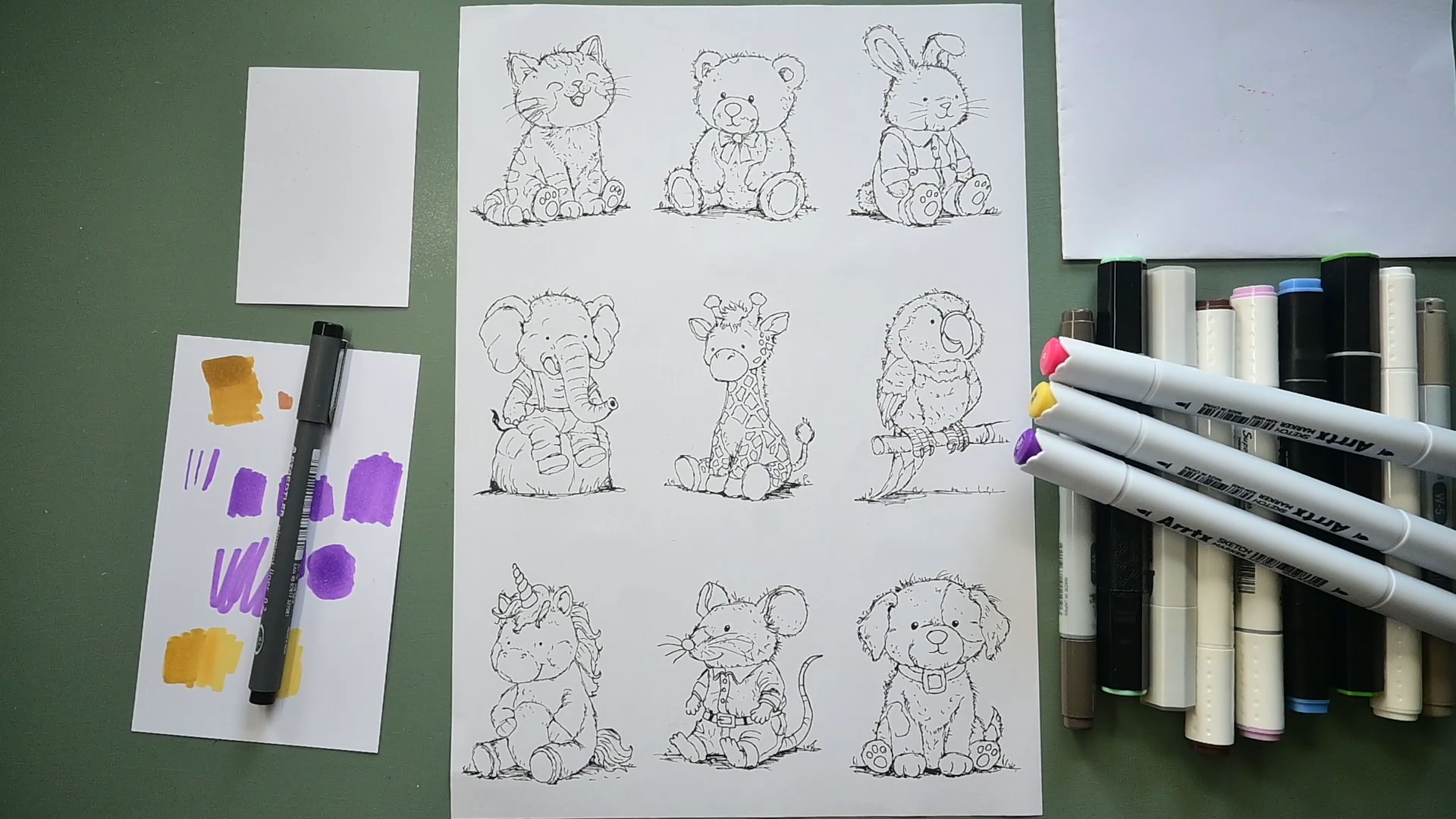
we, of course, need something to color on, and I made these sketches. And you need some
alcohol markers, which is pretty obviously. You will see me use these
Arctic sketch markers, and I like sketch markers
a lot because they have a brush nip on one side and a small nip on
the other side. But if you have other kinds
of markers like these, with a small nip on one side and a chisel
nip, that's fine. But we're not going to
use the chisel nip, then only use this fine nip. Brand doesn't really matter. You see me use these first Adi, but I might switch to a different brand.
You can use picks. I got some touch markers, some very cheap twin markers, and they all work
fine for this class. So let's put those away.
Those are the markers. The next thing you need is
to print these on paper. I printed them on just
a regular piece of paper because I want to
transfer them to the cards. And I'm going to use
different kind of papers. And in the end, I'm
going to just give you my thoughts on some
of the papers you used. But you could also use just print it on a
thick piece of paper, and then I would recommend
something like this. This is called color copy. It's copy paper, but it's
a nice and smooth paper, and it works really well
with alcohol markers. I'm going to show
you that. That's one I did on this paper. It's also called digital
color printing, I think, paper, DCP, or just color
copy, something like this. It works with both
laser and ink yet. This is 250 grams, which is around 90. Lbs, I think. I'm
not totally sure. 90 pounds. And you
can print on that, and then you print
the designs on it, and you can color on that paper right away and later
cut them to size. Now, that's another
thing, of course, we're going to make these cards, trading cards, and there's an international size for that, and the sizes in centimeters, it's 6.35 or 6.4 and 8.89 or 8.9 centimeters
or 2.5 by 3.5 inch. And that's the size you need
to cut the trading cards in, then you have a perfectly
fine trading card. Now, if you're going to transfer your design
in the next video, I'm going to show you
how to easily do that. Let me put this
little guy aside. But then you're going
to need a fine liner. This is a waterproof fine liner. You make sure you have a
waterproof fine liner. Otherwise, it's going to
react to the alcohol ink. Then the next extra
things you see here, you're going to need
probably a scrap piece of paper to test some colors
and see how that works. And another piece of paper, which I put under my drawing because it's gonna
bleed through most likely. And then, especially if you're going to use
something like a pad, it's going to go into
the next page and you don't want to ruin
that or on your desk. And this prevents
that from happening. And as you can see here,
from coloring this one, there are some
colors having bleed through that happens
with alcohol markers. Now, papers, you will see me use some different
kind of papers. I'm going to use
some sketchbooks, specially made for
alcohol markers. This is a very cheap one,
and this is an that's, I think, a well
known brand by now. And it's great paper to work on. It's really made for
alcohol markers. It's not that really fin paper you have for alcohol markers, which is about 80
grams very thin, but this is a nice thick, sturdy paper, nice
to make hearts on. And something else you could
use is a mixed media pad, which works for all
kinds of media. And especially if
you're going to do some mixed media techniques, which we will discuss later on. This might be a good
paper to work on. Mixed media paper, and
something else you could use is a
bristol paper block, and you don't want the vellum, but the smooth real paper works great with
alcohol markers. Or something called
smooth multi techniques, mixed media smooth paper, which is basically
pretty much the same. And this is 150 pounds. It says 250, and that
is a nice size to work with or 140 pounds, I think, 300 grams,
that is great, too. And the last thing
that you could use is something called
hot press paper. So brands call it smooth paper, and that is basically
a watercolor paper, which is really nice and smooth. Don't use the cold press because that has
a texture on it, and that texture will eventually destroy the nip of your marker. And you don't want
to do that. You want to use smooth paper, and you see me using some
hot press too later on, especially when you're
going to do mixed media. I so I transferred my design
to various kind of papers, but you can just use
one kind of paper. Now, we're going to
do some mixed media, too, but I know not
everyone is into that, and I'm going to discuss
the materials I'm using for the mixed media later on
in that particular lesson. If you don't want to
do mixed media but only want to use
alcohol markers, then you can just
stick to one paper you like and do
them all on that. Cut them to size, and
then you're done. So you don't have
to go out there buying all these
kinds of papers. That is just for a demonstration because I know people won't use the same kind of paper just to show that it works
on various papers. But if you have markers, some paper you like, just use. Alright, that's it
for this video. We're moving to the next video where I'm going to show you how to transfer the designs
to another paper.
3. Ideas to transfer the Sketch: So you have decided
you don't want to color on the printing
paper directly, but you want to
transfer, as I've done, these designs to a
different kind of paper. How are you going to
do that? Now, probably you've got some ideas already. The easiest way would
be a LED light pad, which you just
connect to the power. You put your design on it, and you can just trace
it and it shows through. But not everyone
has one of these. A different way to do this. The really easy way
is during the day, just take one of these cards, put them on the
design, and then put this against a window where
the light comes through, and then the design
will show through. So now let's pretend we've
got some light going through. So let's pretend
we have a window. Here's our window. I'm going
to put that under there. It's going to be tricky. Now, if you don't
want this to move, the best thing is, of course, just take some masking tape. And then center it. Well, that code doesn't go too well and just stick
it somewhere, so now it won't move. So put it against the window, and now my phone has
to act as the light. There you go. That should work. Now you're going to
see a bright sunlight. Put it under there, and the sunlight should be shining through. And
there you see it. That works. Put the
phone away for a minute. So put it against
the window and just start tracing it
with the fine liner. But if it's not sunny or you want to do
this in the evening, you can actually build
your own light box, and what you're going to
need is something like this, clear plastic or a
plate of glass like this or just take a frame, and there's a piece
of glass in it, take it out there and use that temporary for
your light box. So let me demonstrate that. You want to put that piece
of glass, clear plastic, whatever you have on
something that raises it, I'm using these little jars. There you go. Oh, I got to make sure
you can see that right. I'm going to put my
piece of paper on there, and you still don't see a thing. But if I put my phone on the here or whatever
light source you have, you should be able to
faintly see the lines. But if I'm gonna make
it dark, let's do that. Alright. Now I've
put down the blinds, you can see it already better. But if I switch off my
studio lights, there we go. Now it gets really dark, but you can see the
design very well now, and you can trace it this way. So that's an easy, self made light box, and you can trace them on
whatever paper you like. Now, if you use coloured paper, this is going to be very tricky. I wouldn't recommend using color paper with
these markers anyway. Just make sure you just use
some kind of white paper, and then it will shine through. And if it's around
the 200 5,300 GSM, somewhere around
110 to 140 pounds, you would still be able to
see it perfectly through. Alright, let me switch
back my lights. And it's still going to be not
as light as it was before. And now I can still see it, but probably you can't
see it that well. All right, so that's an easy way to create your own light box with the light just coming through and you can
trace the design. And that is an easy
way to transfer the design from one
paper to another one.
4. Coloring with one and two Tones: Now we're really going to
start the first lesson. What do you need for
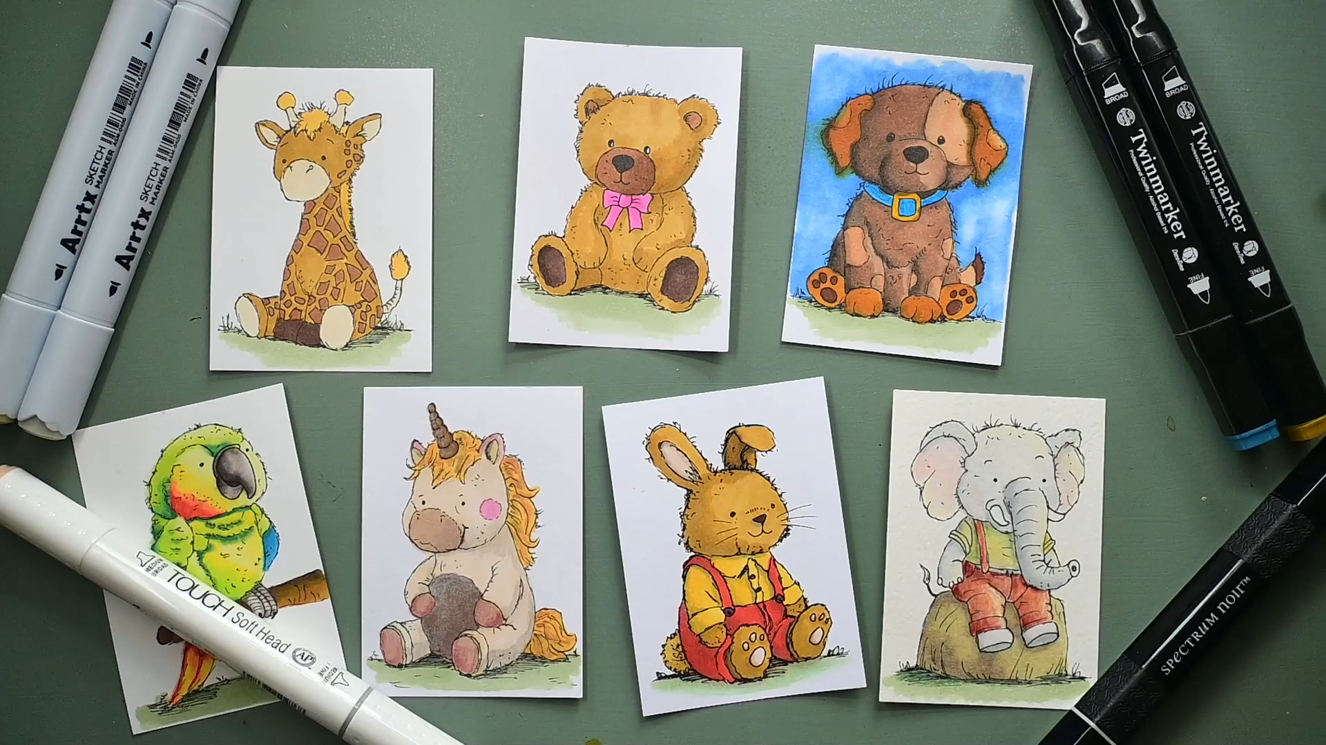
this first lesson? Are these two animals, the stuffed giraffe and the stuffed bear
or the teddy bear. And we're gonna, of course, color with alcohol markers. Now, what are alcohol markers? Alcohol Markers are
simply a dye ink, and the vehicle which
is transported in which goes into your
paper is alcohol. And alcohol evaporates
at a certain time, and then you're just left with the die ink in your design. Now, they could have also done water in it, and there's water. Markers, Watercolor markers. But they work a bit different. You would need water
with this. With this, you don't need anything
else but the marker, and it's really wet
in the beginning, so yet you can really
blend the colors nicely. But at some point,
all the alcohol will evaporate and
it's going to be dry, and then you can start layering. And I'm going to
show all of that. So if these two, we're going
to do two different things. We're going to just
color in one tone, and we're going to color in
a dual tone in two tones. So for that, we're going
to need some colors. Let's start with the giraffe. And as you can see,
I've zoomed in. For the giraffe,
I'm using the Oh. Marker pad. And you're
going to need some colors. And if you have a set
of alcohol markers, then the best thing to do is
just take a piece of paper. And this is, again, this is just this is the
printing paper, I think. This is the printing paper, and just do some swatches. So that you know what
colors you have. Now, you see that there's
two tones in here. I'm going to show
you that later on. Don't worry about that yet. So just do if you have
a lot of markers, do all these and just
do one application. I'm going to show
you how to do that. Well, not on this paper, but let's just do it on
my scrap piece of paper, and I said, I'm going to
do something under it, and I've got some color. Now, I've got two tips. This tip does do
nice fine lines. This tip actually
does very fine lines, too, but also does the Car ones. Now, with alcohol markers, what you want to do if
I'm going to color, you're going to color like this. So not quickly like that, but you're going to
take your time and pass over the first
bit you've laid down. And then take your
time coloring. And then, as you can see here, it starts blending
in each other and you get a nice even layered. Now, if you get
streaks in the end, like you can see here, then either you got to slow
down a little bit, or what you could do Al is
instead of doing like this, you could actually
color like this, too, and that works well, too, and pretty much
does the same effect, but it takes a little
bit more time. So you could do circular
motions or you can do just single strokes, but overlap the previous
stroke a little bit so that you get a
nice blend of colors. So no rush, take your time. And as you can see here,
this one is going to bleed through and get onto that paper. We're going to start a
set with the giraffe. And I don't think I want
to use this purple for it. I want to take a look at
my color swatch I made, and I'm going to say,
I like this color. That is number 32, and I somewhere have a list. I have a nice list
of color names. It is 32, and that
is a deep yellow. So perhaps if you have a deep
yellow, that might work. And then I would use that for
the giraffe for its spots. I'm going to use
some darker color. I'm going to use this
number 100 free, and that is potato brown. Okay, potato brown. So a bit of a mid brown that is. And his hair, I think I'm going
to make his hair lighter. And what would be fun, some
yellow hair? 35 of her? No, I'm gonna pick 34, and 34 is what is it? It is a yellow. Oh,
brilliant. That's a yellow. These are the three
colors I'm going to use for my giraffe
and then the ground. I'm gonna just pick 175, and I'm gonna probably
stick to all of them. 4,075 this color for the ground. And that is A. Now, let's
see, lime green, it says. Alright. Well, if your lime
green is really lime lime, then you may want to use
a bit of a color that is a bit more muted if it's really bright,t
more muted green. Alright, those are
the three colors. I'm going to start with the 32. That is this one for
the giraffe itself. And I said, I'm going
to take my time. I'm just going oh, I need
a color for this. Ah. Might do the hair color
for that? Let's check. Oh, that's a good one. So this I might do a
lighter color like this. Hundred and nine and 109
is called a pearl white. And I'm starting
with this color. Now, coloring is basically very easy as if you have a marker, but you're going
to take your time. So I'm gonna just color, and I'm going back over again so that the color
can really nicely blend. Make sure I don't do his hair and go in between color spots. Now, this I'm going to
do a different color. This I'm going to do a
different color, of course. You don't have to
press hard with these fings just
lightly as fine. And as long as the alcohol is wet and not evaporated
completely, then you can just go over and it will just blend right in. Well, I think you get the idea, and that's all there
is to the coloring. Alright. And oh, I got to
do this here, too, huh? And even if I do
just a little bit, I'm going back over
to get a nice blend. And as you can see, this blends really nicely. Now,
what did I say? I want to do this part with this color which is
kind of a faint color, but I'm okay with that. And I'm going to
do the inside of the ears, the same color. Again, take my time. And I'm gonna do his horns. I think they call horns, huh? With this color, too. Well, that's Those colors. Then I said, I wanted to
use this one for the spots, the hundred and three
and the 34 for the hair, I'm going to go for
the hair first. So that yellow for the hair.
Oh, yeah, I like that. That gives a nice contrast and a little bit of hair there. And I'm going to do these
with that same color too. And while I have this color, I might just do this part too. Alright. And then the last color I'm going to use is this color. For the spots, now
I'm going to use that tip And there we go. That's it for this giraffe. Now, I'm going to put
this aside for a moment. And I'm going to make
sure I don't put it down like this somewhere because it's still going
to bleed through. I'm going to put it on
my scrap piece of paper. And I'm going to take
the bear. And I'm actually going to use exactly the same
colors for the bear, but I'm going to do something different with those
colors later on. But we're going to start
with the same color, and that was that 32, I think. Was a deep yellow. No, it's more like a brown, so you might want to if your deep yellow
is not like this, but more like that color yellow, then take a light
brown, I would say. And I'm going to do the
bear's head with that. And again, I want to
take my time. Coloring. I don't want to go over the ice since I have a nice
white spot there. I'm going to leave that white. So there we go. I missed
a little bit there. I missed a little bit
there and some there. And as long as this is wet, I can perfectly
fine, go over it. And there we go. Alright. That looks good. We'll
leave that to dry. And with the bear, I'm going to take that
103, that darker color. That was a potato brown, set the inside of his ears. There you go. And I'm gonna swap around and I'm going to do his snout with this
dark color, too. Missed the spot there. Alright. There you go. The bear has
a little bow high there, and I want to give that
a different color, and I'll leave it up to you. Make it red, make it purple, make it pink, make it blue,
whatever color you want. If you want it to be
a boy, do it blue and make it more pinkish if
you wanted to be a girl. And, of course, his
nose, the nose, I'm going to take
not a black color, but close to black color. I'm going to take
a warm gray nine, and that is close to black, but it is not completely black. There you go. And that's
that part of the bear. And I'm gonna do the bow tie. What color am I gonna pick? I'm gonna make it a girl. So I have a pinkish color
here. What is that? That is a nice
bright pink color. That is pale purple. Well, it seems very
bright for a pale purple. And I'm gonna colour. That in I missed a
little bit there. And there you go. I'm going
to leave this to dry. And I'm going back
to the giraffe. But I think you get the
idea of the giraffe. So what I'm gonna do,
I'm going to color it, but speed this part a little
bit. Speed this part. Speed up this part a little bit so that you don't
have to wait for me. So basically, I'm going to
exactly do the same as here. And what I'm going to do is
I'm going to do his feet, the bottom, the
sole of his feet. I'm going to give it
this light color. I might do it that right away. And the go. And his hoofs, you would
give a very dark color, but it might be the same as the spots or an even
totally different color. Let's see. I'm picking
a 92 and a 92 is. Let me see where is
that. That is chocolate. I'm gonna do this part with it. That's a very dark brown. And if all is well,
the little black line shoot steal. Show frou. There you go. Alright. So I'm introducing a very dark
brown for his hoofs, and the rest, I'm going to just use the same colour as the head, and I'm going to
speed this pit up. Well, that's a giraffe. You probably did see me
pick up a wrong marker. That was the 32. That was a darker color than
I intended to be. But if you're quick enough
and it's still wet, you can still blend away a
little bit of that dark color, but you cannot return. And probably you've noticed
that with these markers, you want to go from
light to dark. I was going to explain
that in the next lesson, but let's show it right away. So this is the darker color, and this is the lighter color. Now, if I go over this
with the light color, it lightens a little bit, but I'm never going to
get this color back. What is way better to do
is go from light to dark. Then the dark really shows up, and the light and the dark are separated from each other and
don't blend like this one. So if I have a dark spot like I had
the Giraffe, dark there, and I'm going to add this
light color, as you can see, I'm never going to
get my original light color back again. So I got to pay attention to
that as much as possible, but mistakes can happen. And it's still lighter than the body is
with the same color. So I'm okay. That's the giraffe. Now I'm going to going
back to this bear, which I've half done. And what we're
gonna do now is we did one tone of
color on this one, and I'm going to
leave this like this, just one tone of color. But with the bear, what I
want to do is I want to go back in with the same
color I already used. So that's why we got to
remember the colors. And that is then a
32, a deep yellow. I did his face with that. Now I got to decide where do I want my light to come from? I think I want it
from this side. So that means that this side
is lighter than this side, and I want to darken this side. Now, for this to work,
it has to be really dry, and I'm going to show you
this is my 32 right here. This is the first layer. Then I left it to dry
really long enough. And then I did a
second layer with exactly the same color over
it, but not all the way. And as you can see, you
can create two tones. Now, if you have
really good markers, you might actually get three
tones with one marker, but the third one
is a tricky one, but for some markers, it works, but we're going to do
three tones differently. So two tones, my light
comes from this, so that means that this side of the bear, I want definitely. A bit darker. And I'm just gonna go in a little bit with this one to create
that darker shadow part. I think I want it here, too. A little bit like that. And now here, I barely touched it just a little bit so that it can blend in
with the previous one, as you can see, If I
press really hard, I'm going to get a
lot of ink down, and then it takes a while
for it to blend in. If I press just a little bit, it's still going to
blend in slightly. I want some darker here, too, and at the edge, I'm going to draw
very, very lightly. And now you can see that
with this one color, the deep yellow, I
have two tones now. I want to do it on his snow two. And which color did
I have for that? That was, Oh, God,
pick the right one, this one, the hundred and three. That should be the right one. If I'm not sure. What I could do is test that here,
that's the right color. And I'm going to do the same. This part stays light
and this part here. I'm going to make darker to create an interesting two tones. There you go. I go very light on the edge and a bit stronger
away from the shadow. There you go. Now I'm going
to leave this to dry. And we're gonna
give it a try later on to see if I can
get more tones in it. But before I do that,
I'll just let it dry. I'm going to do the
bow tie the same. And There you go. I'm gonna do it like that.
So a little bit here, I'm going to leave
light a little bit here, a little bit there. Very little bit there.
And there I go. There I have two tones on it. Alright, I'm going
to do exactly the same with the bear.
I'm gonna finish it. Got to pick that right
color, this one. And I'm gonna color
the complete bear. These I probably do very dark. Yeah, I'm gonna do
that right away with that that What was it? That chocolate? Yeah,
that's this chocolate. Probably. I'm gonna
leave that one tone, but maybe I'm gonna do a
shadow line. We'll see. Alright, and that's
it. Leave that to dry. And now I'm going
to do the rest, and I'm gonna obviously
speed that up again, too. I'm gonna leave the bear to dry, and that's the nice thing
about making a video. I can get back in a minute. And then I'm gonna
go over it with the other darker colors
and create some shade. A and you can see the different here. This is just one color, and on a tiny, this
is all quite small. That works very well,
but if you have larger areas like this and
the head you could do too, you could go back now in and create several tones here, too, but I think I'm going to leave this like that so you can see, clearly, so you can
compare the two. Well, when it's dry, I'll be
back and finish this one. Well, I think it's dry. I'm going to take
that number 103, which was a potato brown. And I want to see if I
can get slightly darker. Around that part. I'm not happy with
how dark that is. So, there you go.
Leave that to dry. Now, I'm going to
take that chocolate. And around here, I'm going
to create some shadow here too. There you go. You could do it on
the other side. Now it's more like
there's a hole in it. If you would do it on this side, it's more like as if
this is on top of it. Like we've done here,
you get that free D, a little bit of a free
D effect right here. We're going to go back to that original deep
yellow it was, and I'm going to do
a little bit here, too, too just simply. There you go. And a
little bit there to enhance the three dimensional as if it has more shape and
form than it really does. And the whole thing
about coloring is you just bring in color, not only color, but you
bring in shape and form. And the illusion
of that this bear now doesn't have a flat
face like this one, but as if the light
is playing a part, and you can see that it has
a clear shape. Let's see. This I would have darker there
that casting the shadow, a little bit there and the arm casting a little
bit of a shadow. Here, too. And I want to do that right with this leg, too. I think I'm gonna
put just a stroke. There, I'm happy
I'm okay with that. There you go. Oh, I
forgot to do the ground. And let's see the arm, unless you can see, by the way, we're managing to get pretty
much free tons out of this a little bit, but not really strong. And let's see. I want to
do the arm under here, too, and the back of this. And a little bit here. And I want to do the
same right here. Create the illusion of depth. And I'm, I want to do that
here, too. There you go. And I think I'm okay with this. Yeah, a little bit more there. It is showing up,
so that's good. Perhaps slightly. A little bit there, too. I think that is good. Seems like this part might not have been dry
enough. Where's my ground? And I forgot that one. And for the grounds, I'm okay. I'm going to depend
on the shadow I've already added beforehand
with my fine liner. But for the ground,
you could of course, do weigh two and then
add another layer of this too. All right. And I think I'm okay with that. So there's the first two. One, simply colored. In one tone and the second one with exactly the same colors, go over it to create
the illusion of a second tone and create that illusion of depth
and shape with it. And as you can see on the
head, that works really well. And I could do probably a fur tone here
too once it's dry, but I'm going to
leave this like that, and we'll call this lesson done and move on
to the next one. Um,
5. Coloring with Color and grey Tones: Welcome to the next lesson. We're going to work with color, and we're going to
work with gray tones, and we're going to mix
the gray with the color. We're using the grays
for the shadows and, of course, the color
for the color. Bit of a different approach
than the previous lesson. And I'm not going to
use all these colors. I've just got them
here so that I can determine which one goes
well with which one. Now, I've got the dog here, and the dog needs
to go for a moment. And I want my test sheet. For the dog, I'm thinking of using as a main color,
a lighter color, and that is this color that
is called muted brown, and this is a different
kind of alcohol marker. And as you can see, I've got
a number of brands here, and we're just going to
mix and match them all because they're all
alcohol markers. And that will give me this
muted brown, light color. And I think that is a good
color for the dog overall. Now, for the patches, I want a darker color, and I got this burnt
orange, it's called. I think that color
matches really nicely. And for the pores,
I've got two colors. I've got a dark yellow
and a sand color. I'm not sure which
one I want to use. So this is that dark yellow. That might be a bit too yellow, and this is the sand color. And I'm going to put that there. And that one I
like a lot better. So I'm going to do the sand. So now I've got a sand color, a burnt orange,
and a muted brown. For the color, I found
two metallic ones. If I can open them. No,
that's the wrong side. I don't want to use the chisel. Let's see if they still work. Oh, yes, they do work. I'm
not sure if you can see that, but that is metallic, for sure. For the color and then
a gold with that. And that should work
nicely for the color. Yes. The next thing, what
I want to determine is which of the gray tones
I do want to use. I want a gray tone, which is darker than
the tones I'm using, but not too dark so
that it overpowers it. There's a few, and I'm
thinking I'm going to use this one let's see that
one. Put that next to. That would be a good
color for that one. So I'm going to put that aside. And let's see what do we
have here? This is darker. This one, let's try this one. That would pretty much work. Or let's that one
works better for that. And then the really dark ones probably working better
as a shadow for this. Yes, there we go.
I've got the shadow. So I'm using a warm gray. I'm using a warm gray three
for the lighter shadows, a warm gray five for
the mid shadows, and a warm gray seven
for darker shadows, and I'm going to combine these, but I'm going to show you
how to work with that. Alright, let's bring back
the dark. There's the dark. What I'm going to do
first with the dog, I'm going to take that color
I wanted that muted brown, not the middle
brown, muted brown, and I'm going to do the
dog head with that. So these color different. Then the one with a brush, what just taking a
moment to adjust. And I'm taking this color
right away with it, too. Oh, and I need
something for his nose, but we'll determine
that later on. The paper I'm now using
is the Bristol Paper. So I'm switched papers from the marker pad to
the Bristol Paper. And as you can see, it flows
pretty nicely on here, a bit too nice, as
you can see there. Oh, I need this bit too. Alright. There you go.
That's the first bit. Making it a little bit
more moist so that I can work with it a bit more. I'm not going to
do this bit twice. Now, what I'm going to say is I'm going to do my
son from this side, so this side gets
the darker side, and this is the darkest color. So I'm going to take that
five and that seven, and I'm going to create some
shadow tones with that. I'm going to start with the
five the gray tone five, so the one in the middle. And I'm going to say
where my first shadow is. I'm going to lay that in, and I want some shadow there, and I want it here, and I
definitely want it there. There you go. I think I want a little bit
here too and there. And that's enough shadow part. But what I'm going to do
right away is I'm going to take the darker one, and I'm going to lay in
some of the darker shadows. Where I want them to be. And there you go. Those
are the really dark parts. The next thing, I'm going
back to my muted brown. And I'm going to color this
again and I'm going to move into that shadow and
into the dark shadow, I'm making a little bit
of circular motions, and I'm going to
blend my shadows in, and I'm starting on purpose in the color I already
have so that I don't drag the dark color into my
lighter color. Same here. And there we go, and I'm going to do
the same right there. And blend these colors
in, and there you go. And now, as you can see, you get a nice blend
here of that gray as a shadow moving into the head. But I'm not getting
all these layers because I'm using it quite wet. And this on purpose, I'm leaving lighter like that. Let's do the next bit,
which would be the ears. But for the ears, I might
actually go to the yellow. The yellow, I put aside. I said, It's too
yellow. Why not? I'm going to use that Yellow for the ears to create some
nice contrast here. There you go. Oh, look at that. That is that what was it? Dark yellow. This color
is a lot lighter. So instead of using
that very dark one, the warm gray seven, putting that aside,
I'm going to use the warm gray free and the warm gray five to
determine my shadow. I'm starting with
the warm gray free. As you can see that does a little bit and around
here where the head is. I'm going to that warm gray
five now to do the edges, and I think This is dark enough. Now, one thing you probably
notice with this paper is that it bleeds a lot
more than the other papers. It's a different kind of paper. And because I'm
working pretty wet, that's what you get. So I should have stayed
away from the edge because this paper is definitely
bleeding quite a lot. All right. That is the ear. And there's the other ear part, I'm going to go back to that. Three, add some shadow right there. Not
touching that part. And then the five on the
edge and a little bit. On the bottom, I
want some shadow. And I'm going to do this. Now, you probably already
noticed one thing that my shadow here
probably isn't dark enough, so I might try the darker one, the seven, see if I can get a bit more. That's a bit better. But now I'm running into
more problems because my color is gonna
bleed a lot more. The patches. Let's see. If I'm gonna go for these
patches really dark, like I intended to
do with this color, then this dog gets really dark. I think I'm going to take
that scan color instead. Where is it here and use
that for my patches. Yes, and I'm going to use that
darker color for the paws. No, that I can still
blend in a little bit. It's same here. I can blend in, but then it's gonna
bleed. Probably too. The patch, I'm going to
take that warm gray free, and do the edge of the patch and the bottom
just a little bit, but only one color here. And then I'm going to
start in the patch color, and I'm going to
blend this color in and I leave the
color to do its fing. I'm not gonna touch
that. This will slowly bleed into the rest, since this paper is bleeding, as you can see, quite a lot. Let's take that very dark color. The burnt orange, it says, and I'm going to do carefully
the ports with that. I'm going to do the end of his tail with this
color as well, and I'm going to let
this dry, there we go. That's at least this
part. Let's see. Let's go for the body. I need this one again. There you go. I'm
leaving this one. And we're going to do the
same thing again with the warm brown five, do my first shadow layer. I want some shadow there. I definitely want some
shadow on this side, a little bit on the paw here. Just a little bit
of shadow there and on this paw on the bottom. And under the color
and under there. So. And away from the light. I'm going to do my
shadow like that. I'm going to get that
very dark color, which I'm going to put on there, and I'm not going
to blend this part. I'm going to leave it like this. This I want darker. I want a line here, a little bit there on
the bottom here. Very little there. I don't think I want
anything dark there. And now I'm going
back to this color, my brown I'm going to blend in. Start there. Blend that one in. I'm moving from the brown
color into the grays, and I'm blending those in. And here I'm going to do it too. And I'm gonna leave
it like that except for blend that in a
little bit nicer. Okay, and let the alcohol do his thing and leave
it like that. We're going to continue
with this color, and that was the scan color. Not the dark yellow.
That was his ears. The scent the scan
is. There it is. Yes. And here is some sand color, too. Now, probably your set
has one of these two. That is a blender, and
this one is pretty dirty, so I'm going to take a different
blender. There you go. Here's a new one. And what
we're going to do now, this one is too dark, so I'm going to use this blender to actually not blend
but lift some color. You see that it lifts
that color off now. And what we're going to do here, I'm going to blend
just a little bit. Keep in mind, it's blending, but it's also taking
off some of this color, so it becomes lighter
as you can see. So if you want some highlights, this is a great color to use, and I'm going to
do the same here. Make this a little bit lighter. And where it has bled
a lot, let's see. I can take perhaps
a little bit away. So a blender isn't
really a blender. Well, it does blend,
as you can see here. But it also lifts your color, and I'm letting it
work now so that you get the color away, and now I'm going
to go over with the original color
if I can find it. And now it should
blends in quite nicely. I'm going to leave it like that. And up here, I need that scent color back
that is this one. There you go. So, now this
starts to blend really nice. So it lifts the color, but you can bring it back the color with your brush and
bring back the color. Again, brush, your color. You marker. These are not Boya. They have brushes. Wait, we
need some color there, too. Alright. And that's
the dog. Let's see. Do I want some I want
some there, too. Do I want some? Yes, I do want a little bit,
but only one color. I'm going to take that one brown five do the patches
just a little bit. There you go. That's enough, and now I'm going to take
my sand color again. Start at the sand color
and now blend it in with some circular
motions, and there you go. And there's my little dog. I only need to do those. I
think I might do the pole with that dark yellow kin And I'm taking the middle one, the brown five, the warm
gray, not the brown. The warm gray five. Add a little bit of
shadow on the bottom. And let's blend that
in a little bit. Well, it's going to
blend by itself. And there we go. And I'm doing the bottom of the paws
with the same color too. I'm moving a little
bit over that or dark brown because it's not going to do much to the
dark brown anyway. There you go. I missed just
a little spotted there. And obviously, I missed
a part of the tail. I'm going to do that
with the sand color. Now, I've got these two. Colors, the gold. I'm going to do
the darkest color first, and that is the blue. A metallic blue color. I'm not going to do any gray in this color because
it's a metallic color. I don't think you can
see it on the camera. And I'm gonna let that dry. I'm going to do its nose.
I don't want the black. This is the pure black. I want the darkest gray
I do have for the nose. I got that lime green, which in my case, doesn't really look
like lime at all. More like a sage
color than a green, this is although than
a light sage color. And the last bit.
And there's a dog. Now, as you can see,
you can just mix and match all kinds of
brands like I have done. That is not a problem at all. The one thing that
you probably right away notice the paper
that was bleeding a lot, but it also depended on which brand I used
and which color. And this color, this dark
yellow from the Where is it? The dark yellow, this one. That was very, very
probably a lot of alcohol in it,
and it bled a lot. So what I would
do with this is I would either create
a background or just redo it again
and just taking into account that that one
color is bleeding a lot, but I could do a
background on it, a background color and
see if that works. I'm going to use a
sky blue for that one and move this bit aside. It's a very nice light color and blend my mistakes in a little bit with
this blue collar. Tomorrow or less, hide it. That's what I'm actually doing. I'm correcting my mistake color. I don't think I want to go
all the way to the edge. So I'm blending this in as much as possible and letting
that color work. G to do the same here, too. I'm going to start at the bottom though and work my way up. Now, I went over
this a little bit, so I need that scan color back. Blend that in a little bit. There we go. And I'm going
to find that blender. Lift some of this cour. And I'm gonna lift
some of this coa around here where I made my
mistake, lighten that up. Lighten that up and I'm
not going to light it up. I'm going to lighten
it a little bit. And now I'm gonna get my blue
back while it's still wet. And blend in. Some
more of my blue. And there we have a dog with a background. Take the blender. 'Cause I think my
blue is too dark. And that's how I would
solve this issue. Right. And that's it. Now the dog is
pretty much ready. We're leaving it to dry,
and as you can see, the papers now
really, really wet. And when it's dry, should straighten again nicely. And that's the lesson
on the two tones of gray with the one
tone of colour.
6. Coloring with Tri-tones: In the previous lessons, we covered coloring colorings with two tones and
doing gray tone, dual gray tone, and
a single color. This one is actually the same too, but on different paper. In this lesson, we're
going to go full color. That's about time
that we do that. For that, I'm going
to use this paper. Claire Fontaine Paint on mixed media paper that
is smooth and cold. The Lisa, it's really
nice and smooth. And I've already
done my subject, the parrots, and we're going
to use colors for that. So let me move this
out of the way. Now, first, I need
to, of course, establish some colors and
determine what colors. So this I can ignore
what I'm going to do Let's get the parrot on
top of it. That's the best. I want to do mainly
some green colors, but also some blue and
some red yellows in it. So I'm going to start
with the greens. Now, I don't have a lot
of choice in the greens. If you have more choice, then, well, pick the colors you like. You need free colors.
You need a light tone. For my light color in the green, I'm going to use this 166, which is, I think, a nice
color. Yeah, a nice color. This one. For my mid color, I'm going to use that 124, which is some kind of spring green probably
Fluorescent green. Yeah, well, that's
nice for a parrot. And for my dark green, I've got some options. I think I want to
go for this one, the 54 or the 55. I'm going to check. Now,
I'm thinking about the 54, and that is A Vidian, I think. Yes, that's the
Van. So these are the three colors I'm using this one, this
one, and this one. Instead of the nice,
which go to it. The yellow, you could use a very light green
if you have one. That's for the greens, which will be the main thing of the parrot. For the blues. I'm going to use probably just one blue since it's very small. No, I'm using two blues. Let's go for a nice blue. These two would work
nice a 64 and a 66, and that would be 64 is an Indian blue in my
selection and a baby blue. These two blues,
I'm going to use. So the main triton coloring will be done with
these three colors. And if you have a
larger subject, then you could do it everywhere. And let's see. And for
some of the other parts, I want some red,
some middle red, maybe even some orange. Let's see. This one is good. 14 is a nice red for a
parrot. 14, where are you? That's a familion. And I'm
gonna do one of these yellows. This yellow, probably 35 or this yellow, the
very bright one, that is a lemon yellow or 45, which is a canary yellow. Well, we have to go with the
canary yellow, don't we? Canary yellow for that one. And I think I want
a darker red, too. Let's see. We can
go with that one. Is that a lot darker?
This one is nice. I'm going with the
11th probably a red. What is it? A carmine
color. So I'm using that. Okay, so the blues, I'm
only going to use two. The greens, I'm going to use free colors and the
yellow and the red. So I'm using a
yellow as the light, but if you want
to use an orange, you could do that,
too, but my familion is close to the orange,
leaning to the orange. Well, that's the colors
I'm going to pick. And of course, the branch
that it's sitting on, we're going to just do
pick whatever brown. I'm going to pick. M
is 96. Do we do that? That's a mahoni color. That is great. And
I need a dark one. Then I'm going to use
this one, the 92. This is too dark, I think, 102 is nice, too. That is a raw, but
let's do that one. Then we've got the
different colors. Since the branch is very small, I'm not going to do three colors either. Going to start
with the ground. And the ground is that
same green I've been using and now they're all
rolling everywhere. Let's see. That is that 175, which was a
lime green in my selection, but more towards a sage green. I want to start with
that one at the bottom. That is definitely
not a lime green. I don't know about
these color names. They should put probably pigment numbers as
they do with paints. Then you know how
to compare them, but they don't do
that with marks. Alright, that's
enough of that color. Well, that was quick and easy. I want to start at the top here. I'm going to do this all green. And then using those
free tones of greens, this is more the yellows and
the reds I've picked out. And I might pick a light. No, I'm going to do
something different. I'll show you what I'm
going to do with that. And the beak, of
course, needs a color, but that's for later on, probably one of these
gray and the legs do, but that's later on. Let's
start with this one. So I'm going to
get those greens, and I'm going to start
with the lightest one. So what I'm going to do
with this as with the gray. This will be my lightest color. And see that leans definitely
towards the green. This is my lightest color. And let's see if this bird, I'm going to go with the
light from this side again. So here, the light, so this side is the lightest, this side is the darker
and some in between color. I want to do one more layer
for this. There you go. Put that aside. Now I'm
going to that middle color, and that is 100 and 624, which is a fluorescent green. And I'm going to
determine that this part stays the lightest, definitely. Around here. I want some darker here and definitely the back, so I'm going to colour in
the back with this color. Not touching the
top. Going in there. So, there you go. Now I have two choices. I'm going to show
you the difference. I could go back in
with this light color and blend it all in. Let me do that. And now pick the
very dark color, which is the what is it? The 54, the Fridian. And around there, I want
some really dark color. And very little
bit. Right there. That's all the dark I want. And I go back with
this slightest color. And as you can see, that blends in and lightens
this color a little bit. And on purpose, not touching
that anymore. There you go. Let the alcohol marker do
its thing and let it blend. That's one way we could do this. The other way is, I'm going
to do that on this wing. You start with that
lightest color again. There we go. Then go to that middle color. And I want that around there. Next thing, go to
the dark color, which seems to have
magically disappeared. There is. And I'm going to do some dark color around there, but I also want a little
bit of dark color there. There you go. And now take that
lightest color. Make sure I got the right one, that is this one,
and from the top, away from the dark,
from the lightest part, start blending in
all these colors. And that's the other
way, you can do it. There is another way. Let's see. Do we have enough room to
demonstrate that, yes, we do. We can do this leg too. Again, we're starting
with the lightest color. So the difference is now that
what we've done is here, do the lightest
color, mid color, go back with the lightest color, do the dark color, and then go back with
the lightest color. Here we did the lightest color, the mid tone, and the dark tone, and then blend it all in, starting from the
lightest point, working towards the dark and
blend all these colors in. There is another way to do this. We're going to go with
the lightest color. Okay. Next, we're going to
take that mid color. I don't want to touch that side. Go back in with the
lightest color from the top from where it
is light, blended in. They go and now take
the darkest color, which I want around there. Pick the mid color,
go over there. But not where the lightest is. There you go and take that
lightest color one more time, but only blend in the mid color and the lightest color
and leave it out to dry. I think probably you
can see a difference in colors that are
slightly different. The way you blend them that determines slightly
different how they blend. It's just what do
you like the best? What do you want to go
in with the light color? Then do your. Mid color, go back
with the light color, do your dark color
and your light color, or just do the light color, do the mid and dark
color and go back with the light color or do the
light color, the mid color, go back with the light color, then go the dark color, do the mid color, and then finally
the lightest color. And that's just three
different way of doing this. And as you can see, with
this one probably is the nicest because you get
these nicer blends. But if you're not happy, let's say, I'm not happy
here with the mid green. I want it a bit stronger, so I pick my midgreen
and just simply. I can always go back
and do the same here. Mix that in a little bit. A o, and leave that to blend. So you can always go back and strengthen a color that
you really don't like. Alright, now, back here, we
need some dark color, too. I'm going to do the
mid color right away. And I'm going to blend
in a little bit of dark color at the back and then blend that
in with the rest. And there you go. We
might do that one with a mid color and a dark
color. No blending. And here, of course, we need some colors too. We're going to do that with
the lightest color here. And I'm not going to use the dark color here because
I don't want this too dark. But I might use a little
bit of that mid color. I'm going to leave it like that. The next. This part, this part. Here I want only some really yellow and some green
colors. So let's do that. This is what is it the
canary yellow I have. And instead of that nice color, I'm now going to use
that canary color canary yellow for
my first layer, and see you get a nice contrast
with the other colors. And I'm going back
for that mid green. Let's see. I want that to go around the bottom
there. I wanted to go here. And I definitely want
that mid color there. This a little bit more
and no more of that. And I want a little
bit of that dark green just around the edge and a
little bit at the bottom. And I might do a
little bit of shadow. Under those hairs hairs, no feathers, doesn't have hairs. And of course, I do want a
dark color under its head. And I'm going back
with that middle color first. That's the wrong one. I want to blend in this one. But I'm not going to all
the edge of the yellow. I'm going to leave
that yellow as it is. All right. And the rest, I'm going to pick that yellow and blend in some
of that dark color. And some of this, but I'm
not touching this side, which I did with the yellow. I'm going to leave that
really light color. But this yellow will really
brighten the green nicely. Well, that's the main
part of my parrot. There we go. Now, on here, I want some blue. And so on this side, too, and here I want some
red and yellow. Let's go for the blue first. I want the lighter blue. That is this one. That
should be the baby blue. And in this one, I actually don't mind if the colors have
bleeded slightly. That gives a nice effect. So that's the light blue. And now I'm going
with my second blue, which is a little bit darker. And I don't want this too much. I want that under here around that edge
and that back feather. And that's all I want. I don't want the furred
color in this one. Definitely not since I
don't have much room to work with. There you go. And I'm leaving on purpose, some of these spots very light. Alright, that's all I'm
going to do with there. Blue. Now I'm picking that
yellow back up again. I actually want to
make some red oranges. So when I colour everything I want yellow. That's it. I'm gonna pick that
middle, that familiar red. And I want it there, too, and I'm going to
leave it like this. I want to see if I can actually create more of an orange color with this and
I should be able if I do. Enough Enough yellow
on top of it, not red. See, I'm getting now
some nice orange colors. There you go. I do like that. And now I'm going
to get that very dark red, and I'm
going to do that. There. And a little bit there. And I'm going back
with my yellow. Tone this down
just a little bit. I'm leaving that really dark. Alright. That's it. And
with that middle yellow, I just want one line there, one line in the back, and I'm
happy with that. The face. Actually, I think I might
want to do a different one. I'm gonna pick that Nice. I'm gonna pick the yellow, and
I'm going to pick the red. For that, I'm starting with the nice color that
greenish yellow. And coloring this in
as my lightest color. Next thing I'm going to
do is pick that yellow. Go over it. I think I do
want my yellow there. Pick that nice again. Blend it in a little bit, and this is going to blend into one color most likely
and then get that red. The middle red, the
familiar, not the dark red. And I'm going to put some
red right there, I think. I'm okay with that. And I'm going to pick that yellow again. This is the yellow.
Yeah, that is the lemon yellow and blend in. The edge. I'm not going
to blend all the way. I want to keep some of that
nice red only blend in. The edge. There you go. And I think that
is nicely my bird, but one thing I want to
change is down here. I'm not sure if it cut out. So, in case the camera
stopped working, what I've done here on these
feathers here, I want some Middle red, the
familiar red on there. And I think I'm going
to leave it like this. Now, we only need the beak
and the branch and the leg. Now, those I'm going
to do with gray. I'm gonna pick two warm grays
or should I pick a cold No, I really like the
warm don't like the cold grays here.
I'm going to show. So these are my color choices. These are the warm grays. These are the cold grays and I just think these are too harsh. I like this warmer color. This is my beak. Gonna
be my beak color, my warm gray seven. But I'm going to start
with a nice light color under that, the warm gray one. And I might do a warm gray. Two, so those are going to be my three colors for the beak. Then I'm going to start
with the warm gray one, the lightest cause there pretty much on all
parts of the beak. That is my lightest color. I'm gonna leave that open. The next one. I'm going
to take my middle color. And I definitely
want this part to be a middle color. I want it here. I'm not going to do that
I'm going to do really dark. I want it here. And now I did this myself. I didn't do that right. I went outside of the line, and I'm going to go with a dark color and I'm
going to do it like this. Now I'm going to get my lightest warm gray one and I'm going to blend this in a little bit and blend
that in a little bit, but I want some light
color to stay there. I'm just going to
blend in. I like that. That looks nice. The legs, the same starting
with this side. Now I'm not moving right away to this side because I want to
make sure this stays wet. And I'm going to go
in with the warm gray seven right away for
this, some shadow here. And around the edge, just a little bit. There you go. So on the top under the feathers and around the sides
away from the light, I'm now picking up that
warm gray one again, and I'm just simply gonna
mix these colors in. There you go. And I'm going to do the same
right away here, too. There we go. And now I
need that warm gray seven. Bottom around that
side and go in with the warm gray. And there we go. Good. I like that. I only want to correct a
little bit there. I'm going to get that
yellow. Should work. Okay. And I'm gonna leave
that to do it thing. So now I'm corrected my
shadow a little bit. Now, in the beak, I
want the dark one. But I'm picking a darker
one, warm gray nine. Let me carefully do that. With the nip and only do that. The only thing I've got
left is the branch. Two colors, I had
102? Where is it? Raw umber and a mahoni which
is 96 and a raw umber. These two colors. The main color will be this mahoni color. I'm gonna take that 102. Let's see. That is even darker. I think this might go too dark. So I'm gonna do
some shadow shadow there. And some shadow there. I think this mahoni might
turn out slightly too dark. So I'm gonna pick
a lighter color. I have 100 Walnut, this is a lighter brown. Me to the green side. Putting that over there,
and now I'm going to really light the lightest
or do I pick a dark yellow? I'm going to pick a dark
yellow 32, and that is A. What's that called in my
selection, a deep yellow. Yes, I'm going to
use that. I'm going to pull these colors down
together with this color. Same there. I'm dragging the dark colors a little
bit into this light color, we're not going to be
bothered by that part. Oh, I'm not bothered by. I'm not gonna bother
with that part. That part I'm leaving like that. That will be my branch, I
think. That looks good. And there's the
parrot with a tritone with three tones of color
done in different ways. And you can really
see that here, the color scheme is slightly different than what it is here. And this is, again, a slightly different
color scheme. And by mixing different
color choosing lighter and darker colors
in a different way, you get some nice lens, and the parrot looks great. And that also right away,
concludes this lesson. So combining triads of colors. So if you could
combine free reds, but also like I've done, three reds and a yellow
to create some tones. And for the greens, I picked a really light one, a mid one, and a very dark one
and combined that now, because I didn't have much room, I only used two blues. But for the reds, I
used three colors, but I tried to create a
little bit of an orange blend here and some darker red and
very dark red down there. And here I used the ie,
the greenish color, and the yellow color, and also mid red color and
just blended at all. And as you can see, I get various colors there by
mixing in the certain colors. And that's it for this lesson. Then there's only
one lesson left, and that is a mixed
media Project.
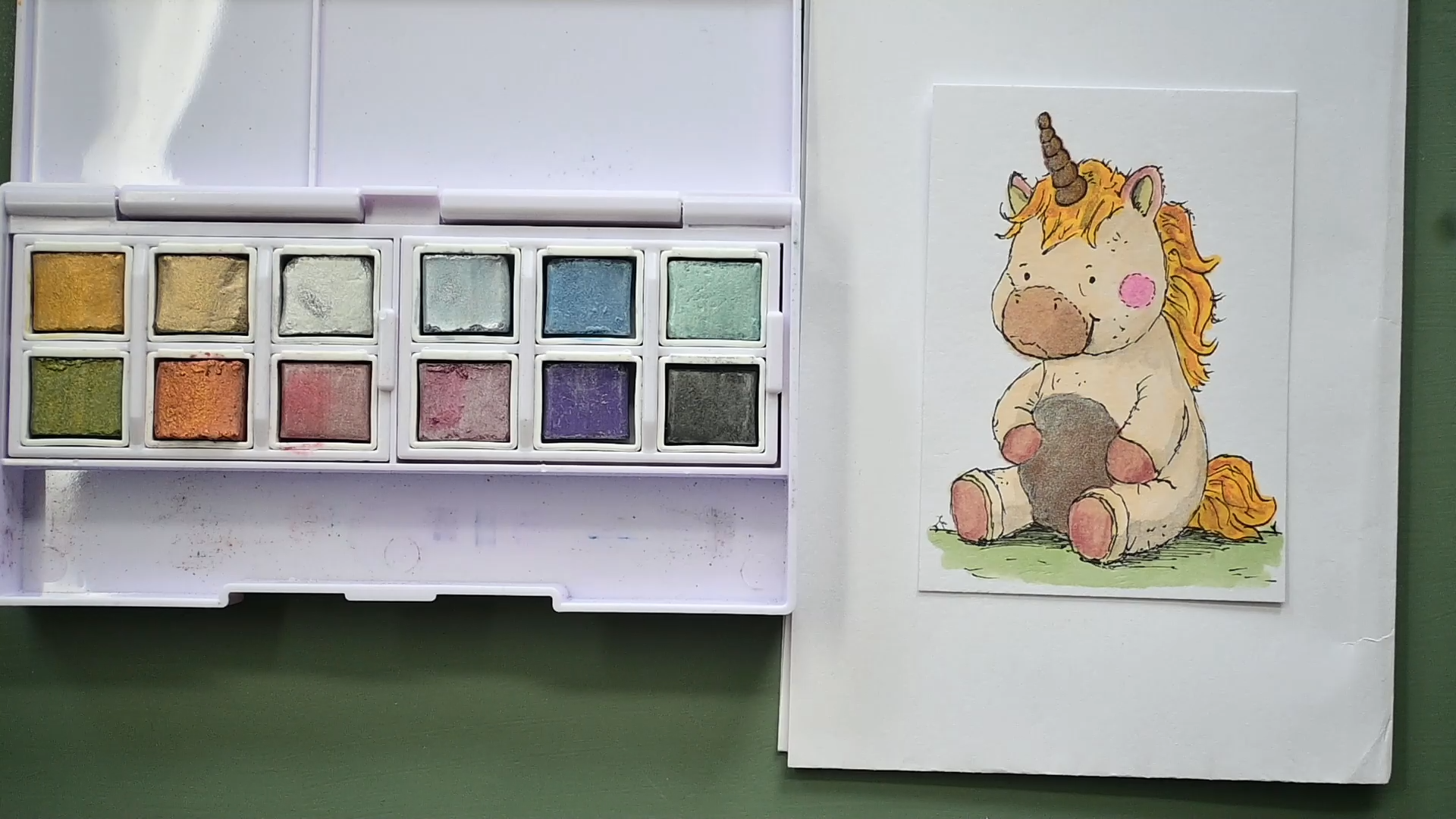
7. Combining Markers with other Media: Well, welcome to
the next lesson. I'm going to work
on this unicorn, but I'm going to do
things a bit different. Now, if you're not interested in mixed media and you only
want to use your marks, then you could just
color this differently, but I'm going to use some
mixed media for this. And I've done this on a bit
of a different paper, too, on smooth watercolor paper, and that is basically hot
press Watercolor Paper. I'm very curious to the results. I picked some colors, and what I want to do first is colour this with some marcus and then use some metallic paints
after that to paint it. Oh, I can't see that. And you could just use
a simple set like this, too, a cheap set with
a lot of colors. But I want to keep my card for a little bit more for
as long as possible, so I'm using some paints which I know will not fade too quickly. And with very cheap paints, I never know how quick
they will or won't fade. I'm going to use some brush and, of course, some water for this. But if you don't want to paint, then you could use some
colored pencils, too. That's totally up to you what you want to mix
all of this with. Some colors I'm going to use. A couple of colors
for the ground, we're going to use
that same green 175, which was a lime green, looking more like a sage. I'm going to do some blush
color that is color 196, which is pale pink light. And I got some different colors. One for the hair, which is
34, and that is yellow. Liquor regular yellow 169, which is, I'm not
sure. Let's check. Putty potty 142,
that is pale cream. And that's the colors I'm
going to use to colour this. And then once I've colored it, I'm going back in with back in. I'm going with the
Watercolor Paint. So I'm first gonna color this, but before I do that
is I'm going to put it on my scrap piece of paper so that it won't bleed through, and I'm going to
speed this part up. And that's it. The
only thing I added is number 96 mahoni
for the belly and for the horn
because I want to use some golds and some
lighter colors on here, and I know that if I put a too light color on
the horse itself, the unicorn itself, then those lighter colours
might not show up well. So I'm hoping that
by doing this, some darker color under, they might show up very well. Now, as you can see these
paper colours really nice. I look at the back,
but you can see how much this is
watercolor paper. So it just goes
through right away. So it will drain a little bit more of the
alcohol markers in it, but the result is very nice. I'm going to use the back of the I don't have
a swatch for this. I'm just going to
use the back of this box as my guide on
which colors to pick. And here is my paint set. And I'll probably have to
move this a bit along long. Yes, now you can see it both. And I'm probably going to
use pure colors for this. And I've got a cup of water, which I'm going to
put to the side, and I've got a small brush
since it's not so large. And what you could
do also, of course, if you want, you can put shading on here with the markers. You can shade it all the way, but I'm going to do this
just a quick and easy way. I might just use some of these
colors rather for shading. Since I got some
interesting color, I've got some graphite here, which is this color, and I can use that
pretty much for some light shading.
Got to activate it. That should be it.
And as you can see, that works really nice
for some shading. I'm not even sure
if that graphite is a color that is sparkly
or not, glittery or not? I don't know. W? I want this to be a bit more dark. I got to pick up some more
paint to get that dark. And I want to blend
this slightly. More, you go. And this is just
quick and easy watercolor. Just pick up the colour from
the pen itself and paint. And we should be
some more color. I'm not going to do that one. I'm gonna do a little
bit of color on there. There you go. Pick up
some more on here. Do a little bit
of shading there. And as you can see, that
result is rather nice. Oh, let's do some
on the belly, too. This is also pretty much darker. Ah, that works very nice. Do some in the hair. Just a little bit of dark
spots here and there. And as you can see, the
alcohol marker won't move. That is pretty much waterproof. Nothing will happen to that. Let's do the tale a little
bit too. All right. And that is Basically, my first layer of
watercolor paint, nice and simple, might do
some of this querfied stuff. A little bit on the hair, too. I want slightly more back
here and a little bit there. And there you go.
Now, that improves the little unicorn
quite a lot already. Now, there's some nice shading
on it. Now, let's see. I don't think. This paint is glittering
or doing anything. The next thing, I'm
going to do that horn. And I said I want to do a
light color on the horn, but I want to contrast
with the dark, let's see if my
reasoning is correct. I'm going to start
with a pale gold. See, and that comes out. Really nice. Let's see. Can you see that? I can see
that shine and glitter. I'm not sure if the camera
picks that up. Clean my brush. Well, and now I'm going
to pick up some of that. Gold gold, and I want
that on the back here. Um, and there goes my horn. Now, let's see. Where
do I want some more? I definitely want some yellow. It's called sunset
here in the hair. It might be very interesting. Not everywhere, but
some of these spots to just make it a bit
more interesting. Let's do this a bit
better. There you go. And, of course, then
I need to do that. Some parts of the tail, too. And check. I don't think the
camera picks it up, but I can definitely
see it spark. But even if it doesn't spark, the combination
looks really nice. The belly, I'm
going to do silver. Probably should have taken
a larger brush for this. And I'm just gonna put
that over here. I want. The paint to flow a bit
nicer. There you go. Just add a layer of
silver around the edge, I do want it a bit
stronger here. So, simple watercolor,
not too complicated, just picking up my paints. Adding some details
here and there. Bit of nuances to make
it more interesting. Okay, I'm gonna let that dry
and once this dry spray, this gets a lot stronger. I can see it there already. This might then become
slightly too strong. There you go. Alright. What do I have more for a nice color? I'm going to use some pink. To let this spark to. There you go. I'm leaving it
like that and let it dry. Now I want to put some
red details just to draw some attention to
some of the parts. There you go. And
that's not red. Since the water color is
a little bit transparent, the colors under it will
still come through nicely. That's a bit too wet probably. But shouldn't be a huge issue. Once it dries, I can just put a layer over it again
with my watercolor. And let's do soles, too. Or in this case,
hoofs, I would say. Need a bit more water. All right. Well, I want a bit more in the shadow
part here too. And this already has moved to that part, so
I'm going to leave it. That like that only here. Just a little bit. And I think I'm pretty
happy once this dries, that should look quite nice. I don't think I'm
going to do the body. I'm going to leave it
like that. Alright, and my unicorn is done.
It's dry, too. I'm not sure if it picks
up some of that metallic, the glitter and the sheen. I think it does a little bit, so you can see it in the light. When the light hits
it, it looks actually quite nice with all
the little nuances. So that's the mixed
media project on the hot press paper using the alcohol marks
as a base and using some paint on top of it
for some details here. Just to make it look nice
and also doing the shadow. But you could do
that, of course, with your alcohol markers, too. I could have used
colored pencils or something else, and
I'm going to do that. Actually in the project,
I'm going to do another one on a mixed media
paper that is hot press too, and use colored
pencils on that one. So pick whatever you like
for the mixed media one, and if you don't want to do the mixed media part that all, then just color it
the way you want.
8. The Project - Now it is your turn!: Now, in the lessons, I've shown you how to
create several of these trading cards with alcohol markers and a
little bit of mixed media, but we haven't done all of them. There's still a cat.
There's the bunny. There's the elephant. And
we've got the mouse left. And that will be your
project to pick one of these or all of them left and create something
nice with them. And you can do, as I've
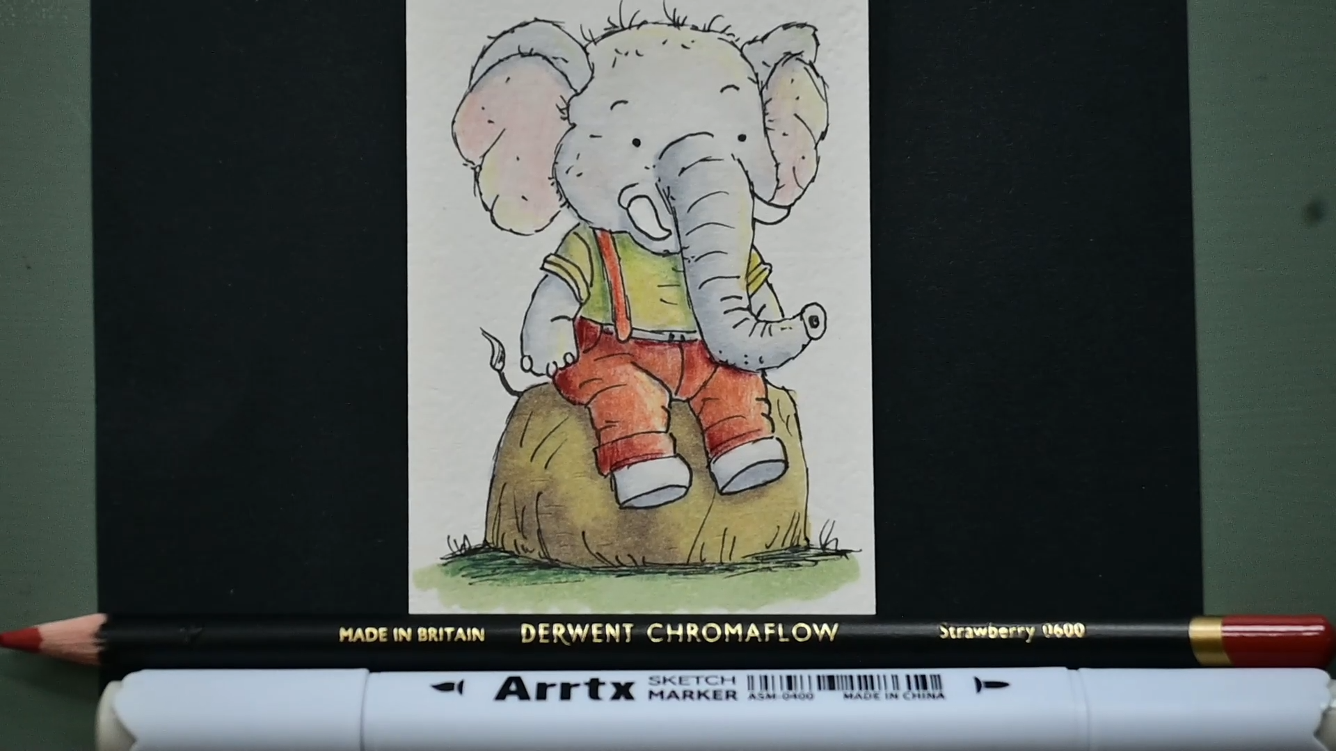
done with this bunny, just use all the techniques in the lessons, or you can do, as I've done with this elephant, go a little bit further and create something
with mixed media, which I used the markers, and I use some colored pencils. And first, I colored this all with some very
light markers, the gray markers, and I went over that with
the colored pencils. And in the end, I
even went over it with some marker again
for some of them. Let me put this away again. So that will be your project. Either pick one of
the animals left or do all of them and come up
with something yourself. And once you've done, then take a photograph of
what you've made, like I've got here, and then submit it to the
projects at Skillshare. And to submit your photo, you just scroll a little bit down under this class
where you're watching and you see about and then
projects and resources, click on Project and resources. And then on the left. You see a really purple? Yeah, it's purple, I think. But then that says,
submit my project. You click on that, and then
it brings you to New Page. You can add your title there. You can add some
description if you want, and you see under
there some icons, and one of them
says upload image, and you click on that and
you upload your image. You pick it from
your computer or your phone and just
submit it that way. And once you've submitted it, we all can enjoy the beautiful
creations you have done.
9. Some final thoughts: So we've created all these little trading cards
in the lessons, and if it all does well, you've even created
some yourself, which I would love to see,
as I said in the projects. And when I first started
working on this class, I thought it would be a good
idea to use different kind of papers on purpose
to show what's happening and what's
probably not happening. And I know I haven't covered every paper there is just
a selection I do have. And you've seen in the lessons already how they react
a bit differently. So this was the
first. These were the first two made on market paper, the Iger market paper. There's also really thin
market paper that has a backing to make sure it
doesn't bleed through, which works very well, but
for a trading card, too thin. So I had two fig. This is from the Budget store, this is a brand,
and as you can see, the budget store is warping just a little bit
because of the wet, the wet alcohol in it. So if I would, let's say, give these away or trade them with others or even
think of selling them, this paper I definitely
wouldn't use, but I would pick
the regular marker, the better marker paper, the brand marker paper instead. Now the next one I
did on Bristol Paper. And because I went very wet, I had this issue of
bleeding that it started bleeding where
I didn't want it to go. So if I would use
this paper again, the Bristol Paper,
which would work, I wouldn't go as wet as I did, but go a little bit less wet, and that might work pretty well, but I think I still
would prefer this. Now the next one. I did on the smooth paper by
Claire Fontaine. There was a little
bit of bleeding. And whether that was
me or the paper, well, that's debatable, I think. I would use this again,
wouldn't go too wet, but it was nice
paper to work on. And the surprise
paper was this one, and you haven't seen me do that, but I did that as a test myself, the digital color printing paper or digital color copy paper, which works really well, which isn't really surprising because it's made
for ink yet, too, laser and ink yet, and ink yet, of course, is a dye
ink or a pigment ink. So that works with
ink very well. And this is nice and
sturdy paper, too. So not even a bad choice. But my preference
would definitely be one of these the
hot press paper. I really liked working on that. Nice thick, sturdy paper and takes alcohol
marks really nice. And I also like that
the difference between all of these is that this has slightly a bit of a texture, but this had a more texture, the mixed media hot press paper, not too much so that it
would damage my markers. But enough to get a
different kind of background and also a
slightly off white color. And I do like that that just
gives it a certain charm, which these ones don't have. This one has a little bit of the texture which
makes it look nice. And also, when you decide to
not only use the markers, but want to use some paint, some colored pencil, some
ink or whatever else, you can just simply
do that on this paper because it works
very well with that. Now, if you want to
trade these cards, give them somebody else
or create your own cards, then you might
consider signing them. You could do that.
Now, normally, I sign my work on the back
and put a date with it. But with these, I'm not
sure if I would do that. Probably could work. But since they're in folders,
nobody would see that. So you could sign them sl, very small on the front. But also, you could
put on the sign them. Let's say I would sign this, then I would sign
this with my name. And I put the date with it. That would be
something like that. Sign them. And I would
say what this is. So this is Alcohol marker and Water color paints on Hot Press. What color paper? So,
and then whoever gets the card would know what it
is and how you've made it. The other thing you
could do is, of course, put a personal message on the back and sign it
and give it away. Now, these I would have
no problem with giving away or trading with somebody, I wouldn't sell them. That's because as you can see, some of them didn't
work out 100%, or the paper isn't
strong enough. It's bending a little bit. And I would definitely do all of them on quality good paper, if I would sell them to make sure that I don't
run into issues. And then these two definitely
would be my preference. I would do them on hot press, either the mixed media
paper because of the background or
the mixed media, sorry, not the mixed media or the hot press Watercolor
Paper because it just works really well. And you could put any medium on this, also colored pencil, ink, gouache paint,
whatever you can think of. But that would work here, too, but with a lot of water, this paper might actually
start buckling a little bit, and this is probably a
bit better for that. So if I would actually
sell my cards, I would get the best paper, and then also, of course, spend a little bit
more time on them, make them even nicer than that. They are right now. I think
that concludes this class. Yes, no, all that's
left to do is say, thank you for being
with me in this class, looking forward to
what you create. And I hope you really
enjoyed this class. I enjoyed creating it just going through
these techniques, but also experimenting a
little bit with paper. And if you've got some
different papers, hey, just experiment with them. You never know what comes of it.
 Benjamin A, Art Teacher, illustrator Art by Benjamin