Transcripts
1. Introduction: Cold pencils can
make some beautiful, detailed and vibrant drawings, but it can feel a bit overwhelming if you're
not sure where to start. I want to show you today
that actually I follow the exact same process for every colored pencil
drawing that I create. And in this class, I want to talk you
through that process. My name's Gemma Chambers, and I've been making online
art tutorials since 2020. I've helped tens of thousands of people improve their art
on my YouTube channel. But today I want to cover
something very specific. I want to show you
the full process I use for every single one of
my colored pencil drawings. Now, I will cover the
materials that I always use, as well as the general
basic techniques. We can then go through
the process and I can show you how I build up these colored
pencil drawings. And then we can work through that same process to
put it into practice. Let's get started.
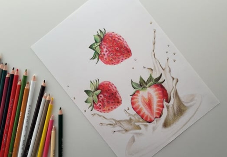
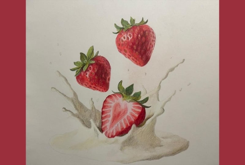
2. Class Project - Drawing the Strawberries and Cream: For the class
project, we will be drawing these
strawberries and cream. And there's a few reasons that
I've picked this drawing. First up, I think it's
a really nice balance between simple, not too time consuming, but also has a good
amount of detail. I also think it's just
a really fun drawing. Now, I will show you
everything that you need to know to
create this drawing, including how to
make the sketch. If you don't want to
create your own sketch, if you want to use mine, you can find that in
the class resources. Along with all of
the specific colors that I'm using for my drawing. You finish your
drawing, please do upload it into the
class projects. I would love to see
what you've done. Now, let's talk about
the materials that I use in every single
one of my drawings.
3. The Materials You'll Need for Coloured Pencil Drawing: Now let's talk about the
materials that I use in every single colored pencil
drawing that I create. And the most obvious
material that you'll need is a set
of colored pencils. Now, for most of my drawings, I use either polychroms colored pencils or prisma
color colored pencils. These are both professional
colored pencils. They generally
have a good amount of really vibrant colors and go down onto the paper in a really nice and smooth way. That said, you don't need really expensive
colored pencils. You can create some
absolutely beautiful drawings with something
cheaper like Creola. Do think will be a
bit easier is if you have a slightly larger
set of pencils. So for the strawberries and cream that we'll
be drawing here, I'm using pencils from the
set of 72 prisma color. I think it's
generally easiest if you use at least a set of 36. It just gives you more
colors to choose from. Now, as I always
say, what is more important than the
pencils is the paper. You can create a much
better drawing with cheap pencils and the right kind of paper than the
other way around. Now, in order to create a
colored pencil drawing, we need to build up all
of the colors gradually. Building up a lot
of layers of color. In order to do this,
we need a paper that's able to take all of those
layers of colored pencil. I like working on something
called Bristol Board. This is a really smooth paper. It's almost thick like a card. You won't be able to build
up the pencil correctly on something like printer
paper or sketch paper. Now, the next thing
you'll need is some way of sharpening
your pencils. I have a hand crank
pencil sharpener. I particularly like that I can change the blade
when it gets blunt. But you don't need a pencil
sharpener as fancy as this. As long as it creates a really sharp pin, that's
what's important. Next up, you will need a
set of color swatches, and this isn't actually
something you can buy. It's something you need to make. We'll talk more
about color swatches in the next section because it is one of the main backbones
of my drawing process. The final thing
that you'll need is some way of looking
at a reference photo. So for every drawing
that I create, I always work from a reference. Find this is the best way to create really realistic
looking drawings. Generally speaking,
we're drawing nature when creating
realistic drawings, and nature's just quite random. If you want to create something
that is really realistic, working from a reference photo is the best way to see all of those random shapes
and colors that you wouldn't necessarily
otherwise imagine are there. I like working from my iPad. I particularly like that I can zoom in to see all
of the details. But you don't need an iPad. You can always print out
the reference photo. So those are the
materials that I use in every single one
of my drawings. Let's talk a little bit
more about color swatches.
4. Creating Colour Swatches: Talk about color swatches
because they are so important. They are one of the
main tools that I use for every single
one of my drawings. Now, color swatches show me what each color actually
looks like on the paper, specifically the kind of paper
that I'm going to draw on. Now, what I do is I
go from as light as I can to as dark as I
can for each color, and then I label it. I tend to do this in kind
of a rainbow order so that I have all of my reds,
for example, together. This shows me what the colors
look like on the paper, specifically the actual paper
that I'm going to draw on. I frequently see people
trying to select colors based on the barrel
of the pencil or the lead, generally speaking, this
just isn't very accurate. I can compare my drawing
to my reference photo and my color swatches to easily see which color is missing at
various points of the drawing. We'll talk a bit more about
how this works in practice. But essentially,
it enables me to mix the colors
together to build up the correct colors
that I can see in the creating color watches is a little bit time consuming, but to give you a
bit of an idea, the color swatches that I have
are at least 5-years-old, so it's not something that
needs doing very frequently. Let's talk about the
basic core techniques that I use for every drawing.
5. The Core Basic Techniques: Let's talk about the
core techniques that I use in every single
one of my drawings. And the most important
core technique is something called layering. This is where I gradually build the pencil up in a
series of light layers, rather than just pressing
really hard with the pencil. By working lightly like this, this enables me to mix
the colors together. And generally, it's a much
more forgiving way of drawing the pencil looks much softer
and lighter as it goes down. Now, layering will
become a lot clearer as we start building up
through the drawing. Most important thing
to remember is that we do need to work lightly. Now, in order to help me press
lightly with the pencil, there are a few
things that I do. First up, I hold the pencil further back than
you might expect. Rather than holding the pencil
really close to the tip, if I hold it about
halfway down the barrel, it literally stops me from
being able to press too hard. Now I can still build up light pencil whilst holding
the pencil closer to the tip. I just need to have a lot more control over the
pencil to do this. Generally speaking, if I am
blocking in a large area, it's easier to hold the
pencil further back. The next thing
that I'm doing is, generally speaking, working
in circular motions. I want to not only put
down the pencil lightly, but also try and put down the pencil as
smoothly as possible. I don't want to just create
a whole load of scribbles. So if I work in circular
or oval motions, the pencil goes down in a much smoother and
more consistent way, and it's going to be easier to build up all of these
layers of pencil. We're going to end up
with a better effect. Finally, I always want to be
working with a sharp pencil. Again, the pencil goes down in a much more consistent
way if it is sharp, and I also find that
I don't need to press as hard to get down a good amount of
pencil if it's sharp. So I do frequently
sharpen my pencils. Now, those are the main
techniques that I always use. Let's cover the full process, and then we can start working
through that process.
6. The Full Process: Go through the full process that I use for every one
of my drawings. If you can learn this process, creating drawings is
very much a case of just repeatedly
following this process. And for every drawing, I always start off by
choosing a reference photo. Now, as I mentioned when we were looking at the materials, I always work from a reference. I find that it is the best way to create realistic drawings. But I need to make sure that I choose the right
reference photo. It's not going to create the same really beautiful
detailed drawing if I choose the wrong
kind of reference photo. And we can talk about
that in the next section. Once I've selected
a reference photo, what I then want to do
is take a minute to really look at that
reference photo. Now, as I mentioned, if we're drawing something from nature, sometimes the colors and shapes can feel a little bit random. If I can take a minute to have a look at the
reference photo, really notice these areas
that I need to be paying particular attention to it's going to make the
drawing process easier. And again, this will
make a lot more sense when we go through the
reference photo together. I have chosen that
reference photo, what I can then do
is create my sketch. I need to know that all
of the proportions are going to be correct and where
everything needs to be. Now, I again, will go through my sketching method
in a short while. But the most important thing to know about creating a sketch is that you want to end up with really nice
and light pencil. If we have a really thick,
heavy lined sketch, the colored pencil isn't
going to cover that up, and it's going to end up
showing through at the end. For every sketch that I create, before I start drawing, I want it to look so light
that I can barely see it. I've selected my reference
photo and I've got my sketch. What I can now do is start adding some of the
colored pencil. And generally speaking, what
I want to do is start from the lighter colors and work
towards the darker colors. So I want to begin
by looking for the lightest color that
I can see in each area. So I can compare the lightest area on the
strawberries themselves. So I would say that that is
the very light shine patch. I can compare that shine to my color swatches and see what the closest color
is that matches. I want to add in a really
light layer of light pink. That is the closest match, and I want to block that in over the whole of
the strawberry. I then want to do exactly the same for the green
leaves at the top. Look for the lightest
color that I can see in this section by once again comparing
my reference photo to my color swatches. And I can then block in that green on the
whole of the leaves. Here, I want to work from these lightest starting colors
towards the darker colors, focusing on building
in all of the shapes. I don't expect the strawberry
to look like a beautiful, vibrant strawberry
by the end of this, but I do want to have a really
good idea of what's going where and generally get
those main colors marked in. So I want to focus on
marking in the seeds, making sure that they're
all in the right place. I do have those
marked in already from my generally building up the vibrancy on the skin of the strawberry and marking in the main shapes
on the leaves. Once I've worked from
those lighter colors towards the darker colors, I can then start
once again comparing my drawing to my reference
photo and my color swatches. And I want to always be
thinking about the next color that's I might notice that the strawberry isn't
looking bright red enough, so then I can add
in some more red, or maybe the seeds aren't
looking clear enough, so I can define those
a little bit better. I just constantly want
to be looking for the most obvious difference between my drawing and
my reference photo. Once I'm generally happy
with the strawberries, I can then do exactly the
same process with the cream. So once again, marking in the lightest color
that I can see within the cream and then gradually working towards
the darker colors, the cream is obviously not
as dark as the strawberry. Can then start comparing the cream to the reference
photo and the color swatches, thinking about the
main color that is missing and adding in
some more of that color. So just lightly building
up some of the color. Once I've done this for every
section of the drawing, I can then look at the drawing
as a whole and once again, refine any final details. Look at if anything needs
to be made brighter, if the details need
refining, generally, adding in all of
these final details. I find it easier to work
one section at a time. So in this strawberry picture, it's easiest to work on
the strawberries and then the cream and then the
whole drawing altogether. Be the same with something
like this sushi, for example. It's easiest to focus on the detailed vibrant
area in the middle of the sushi and then the rice and then start looking at
drawing as a whole. So that is the full
process that I always use for every
one of my drawings. Let's work through that process.
7. Selecting a Reference Photo: Let's start off by talking
about reference photos. As I mentioned, it is so important to select
the right reference. It is not going to be
possible to create a stunning drawing from
the wrong reference photo. So the number one thing
that I'm looking for in a reference is that it has a really good
amount of contrast. I want a reference
photo that has a good amount of light colors, dark colors and mid tone. Reference photo like this
is never going to create as good of a drawing as a
reference photo like this. Now, I also particularly
want to make sure that I can see any
details I need to. If I want to create a really
beautiful detailed drawing, I need to be able to see those details in
order to draw them. Trying to draw from a
blurry picture is never going to come out as well as
a nice, clear crisp picture. The final thing that I'm
particularly looking for is the angle of
whatever I'm drawing. So generally speaking, I find
that something that looks okay in a photo often doesn't translate
very well into a drawing. If you're trying to draw
something from a funny angle, be it an object or an
animal or a person, it doesn't tend to
translate as well. I like selecting
reference photos generally that has the
subject matter head on. So with these drawberries, we're looking directly
forward at them. I don't think it
would look as good if we were looking
down at an angle. Whereas for this egg on toast, I think it works really well
looking directly down at it rather than looking at it
to the side from an angle. Ally, if things look a little bit funny in their proportions, I don't think it's going
to translate well. So you want to have
a reference photo with really good contrast, detail, and from
a sensible angle. Let's take a look at the reference photo
that I've selected.
8. Studying the Reference Photo: As I mentioned when we were
talking through the process, I like to take a minute
to have a good look at the reference photo before I start my drawing or
even create my sketch. So let's do this now, and hopefully we'll see a
bit better what I mean. So let's start off by
looking at the strawberries. And the strawberries themselves are obviously covered
in all of these seeds. Now, I am noticing the patches of prominent light
around these seeds, particularly around here, there's a few little
light patches, but mostly it's around here and around here
on this strawberry. There is also some light down either side of the
strawberry, too. So this is kind of light
to mid pink, I guess, with some darker dots in and amongst it of
all of those seeds. For the most part, I would
say the strawberry is a mixture of pink
in the light areas, a kind of orangy, pinky red, I guess,
in the mid tones. And here, it's a very dark red. It's darkest in this
kind of triangle here and this triangle
here on this strawberry. And then the seeds themselves are an almost orange
kind of color, like an earthy orange. So I want to take the time
to draw all of these seeds. This strawberry is cut in half, so we're looking at the
middle of the strawberry, and I can see the pattern
going down the middle. But in terms of the
actual colors here, I would say they're
pretty similar to some of the lighter and more
mid tone colors on the outside of
the strawberries. There's an orangy color mixed
with little bits of red, as well, and a bit of
pink towards the middle. Terms of the greenery, it
looks reasonably simple. On the most part, I think
there's two main colors. There's this kind of
light, yellowy green. And then there is a much
darker green, as well. And it will really on
the most part, I think, be a case of looking at where
all of the contrast is, where the lights and darks are, and just mapping in the
shapes that I can see. So that's the main thing
on the strawberries, looking at the splash
down the bottom. Now, this is thought
of as white. This splash, I guess, it's
supposed to be cream. When we actually
look at it, it's important to note
that it's not white. First up, most of this is
kind of very light yellow, very, very light yellow,
mixed with a bit of gray. There are some
lighter areas like there's a very light shine here, but look at how dark this shadow around
here is, for example, and all of the dark
shadows surrounding the splash that's giving
its shape all around here. We need to draw in
these darker shadows that I would say are
kind of like a mid gray. And if we draw in these
mid gray shadows, the whole thing will
end up coming together. And it will give the
cream the shape. Those are the main things that I'm noticing to begin with. Let's create our sketch.
9. Creating the Sketch Outlines: Let's create our sketch
for these strawberries. And to create my sketches, I like using something
called the grid method. This is where I draw a grid on my drawing paper and a grid
on my reference photo, and I only draw what's in
each individual square. This stops me from looking at these strawberries like they are strawberries and
allows me to start seeing them more as just
a series of shapes. If I were to try and create my sketch drawing strawberries, I'm likely to make
various assumptions about the shapes
that I expect to be. I work through one
square at a time, really looking at the key shapes and outlines that I
need to be adding. So I can look at where a line is passing through
the edge of the box, mark that mark where the
other end of the line is, and fill the two lines together, and generally work
one square at a time. Now, if I'm creating a
reasonably simple sketch, I can create quite
large grid lines. But if I'm drawing something
extremely complicated, I can create a
much smaller grid. Once I've drawn in every
single grid square, what I can then do
is erase the lines, and I will be left with
just my sketch outlines. What is so important, as I mentioned earlier, is pressing really lightly. I'm actually pressing
reasonably hard simply so you can see all of these sketch lines
on the camera. But in actuality, I create such light lines
so that they are much easier to erase and don't
show through at the end. I do recommend really
taking your time creating this sketch because it does make a huge difference to
the finished drawing. So now that we have our
sketch lines marked in, let's start adding
some colored pencil.
10. Building up the Base Layers on the Strawberries: I want to start this drawing off in the way I usually would, starting from the
lighter colors, and I want to gradually work my way towards the
darker colors, mapping in all of
the key shapes. So I'm going to start off by only focusing on
the strawberries. We'll do the cream
splash a bit later. I want to be looking
for the lightest color I can see on the red area
of the strawberries. As I mentioned when
we were looking at the reference photo, I would say the lightest
color on the strawberries is this kind of pink
color around here. And I think it's a
similar color on the lighter area on the inside of the
strawberry, as well. And there's the same
light pink around here. So what I want to do is
compare my drawing to my swatches and look for the
closest pink to that pink. Now, I think the closest
match is the blush pink. And what I want to do is
use this pencil to just lightly block in the color on the whole of the strawberry. Going to go over each
of these strawberries, regardless of whether it's the outside skin or the
inner middle section. I'm going to block it
in as lightly as I can just put something
down on the paper. Now, I do also want to make
this as smooth as possible. So what I'm doing is working in circular or oval motions to try and get this down
as smoothly as I can. Now, to help me press as lightly as possible
with the pencil, you'll see that I'm not holding the pencil really
close to the tip. Now, this is actually a
reasonably short pencil, so I'm also not holding
it too far back, but I do want to hold it
a little bit further back because that stops me from
being able to press too hard. Finally, I want to make
sure that I'm working with a really nice
and sharp pencil. It's just going to
go down much easier and more consistently
if it is sharp. So I'm literally just
going to work through here one strawberry at a time
blocking in the color. So you can see that I'm using
my sketch outlines to see where I'm going so that I can go carefully around the
edge of the strawberry. And then I can use these
circular motions to block it in. And as I mentioned, we will work from these lighter
colors gradually towards the darker colors
so that I can bit by bit get my bearings on
what's going to go where. Let's also block in this
last strawberry and using the pink color to go over the
whole of the red section, including the middle of
the strawberry here. There's quite a
lot of light areas on the middle of the strawberry, but I do think that
they have much more of a pink tone to them. They're not really white,
so I do want to make sure that I'm blocking this pink in over the whole of the area. Now, I do generally
recommend if you're using a pencil of this sort of length to use a
pencil extlender, it is going to be a lot easier. And it will mean you're
able to hold the pencil a lot more comfortably
than what I'm doing here. Would have made sure to use
a pencil extender if it was a longer period that I
was using this pencil for. So if I was drawing
in a larger area. So once I'm happy that
I've got something down over all of
the red sections, I'm not drawing on white paper. What I now want to
do is gradually work from these lighter colors
towards the darker colors. So I want to be looking for the next darkest color I can
see within the strawberries. I actually think that it is the orange dots that
I mentioned for the I think these kind of earthy orange dots along
here are the next darkest. After this, I think we get a lot darker with the kind
of bright orangey red. So I want to use
the color that I think is closest to that orange. I'm using the golden rod pencil, and I'm going to use this to mark in where all
of the dots go. Now, I did mark in all of
those seeds on my sketch, and because I've only put a very small amount of
pencil down on the paper, I can see just about those dots. So I'm going to go over where I marked this from the sketch. Mark all of these dots. This is all part of helping me get my bearings and working
out what goes where. Now, you'll see here that I
am using a pencil extender. My golden rod pencil
here is absolutely tiny. It is about to get to
the end of its life. But if I use a pencil extender on the
end like I'm doing here, it just means that I can use the pencil for a
little bit longer, I get a bit more life out of it. I always highly recommend
getting pencil extenders. They make the whole process
so much easier and does save you money because
you can use these tiny pencils a lot
more comfortably. See that I'm just
really nice and lightly drawing in
all of these dots. There's not any more to
what I'm doing here. I'm just working in
little circular motions to mark the dots in, literally just going
over those sketch lines. And then it's going
to make life so much easier as I work towards
the darker colors. So let's do the same on
this other strawberry. Nice and lightly marking where all of these
dots need to go. There aren't as
many orange seeds on this strawberry on the left. It turns into just darker spots as we get towards the right, so it's really only these view towards the middle
that need doing. So once I've added in all
of these orange dots, what I then want to do is
once again think about the next lightest color
in the next area. So I'm going to focus on the greenery on the top
of the strawberries, and I want to be looking for the lightest green I
can see in these areas. So this is the lime peel pencil. It's a nice kind of yellowy
green, I would say. It looks like a
good light green to be filling in the tops
of these strawberries. And you'll see that all
I'm doing here is blocking in the green on the
whole top section. So I find it easiest to mark
in the outline of the shape. So you can see me
doing that here, marking in the outline, looking at the sketch lines. And then I can shade once I know where I'm
shading up, too. So again, marking in
the outline here, and then I can shade
in up to that line. As I say, I am
literally just blocking in that green section
with this pencil. So carefully going over
where the strawberry meets the green leaves
so that I'm left with the right shape at
the top of the strawberry, even if we haven't got all of the contrasts that I can
see within those leaves. So let's do the same on the
other two strawberries, going around the
edge of the shape from my sketch and
then shading in. Now, the most important
thing here is that you are pressing
nice and lightly. We're going to need to
build up so many layers of color on top of this. This is just the
underlying color. Just an opportunity to start to get our bearings on
what's going where. You'll see that I am
pressing nice and lightly, and I'm working with a
sharp pencil to just put a light and smooth
covering of the pencil. So once I put down this color, I would now say that
I have something down on each area of
the strawberries. And we can start
gradually working from these lightest colors
towards the darker colors, with my main focus being to get all of those shapes further marked in rather than trying to get them looking as
vibrant as possible. Want to be thinking about
my next darkest color. And actually, what I'm
going to do from here is use the pale vermilion color. This is a kind of orangy red. It's more on the orange side, but I think it matches the lighter and mid
tone colors of the red of the strawberry much
better than a red wood. We obviously will use
a red a bit later. Want to use this
pencil to mark in all of the main red
shapes on the strawberry. So looking at this strawberry
at the top, as I mentioned, it is pretty light in
between these darker spots. What I want to do is mark
in the darker spots, and then the bulk of the rest of the strawberry will
just need shading in with this red because it is more of this kind of color. But I do want to work around these light patches
around these seeds, and I want to work around
the seeds themselves. You can see I'm starting
off by blocking in where those patches are going
on the right hand side. I'm just trying to get
them marked in as close as I can to the reference photo. I don't think it
needs to be perfect. I am trying to use
the placement of the seeds as a bit of a guide
on where they need to go. So marking in these circles, it is so important to remember to work with
a sharp pencil because you can see how fine some of the details are that
I'm needing to work with. I can't be doing that
with a blunt pencil. I won't be able to be accurate enough about where the
pencil needs to go. So once I've marked in the bulk of the shapes
on the right hand side, I can then start shading
as I get towards the left. Now, I do want to
make sure that I am working around all
of those light spots. There's actually more
than just the light patch on the left hand side
that I mentioned. There's some smaller
light patches all around here that I also want to make sure that
I'm working around. So you can see that I have
just drawn in circles on where those patches need
to be and then I'm shading up to the
outlines of those shapes. Also trying to work around those seeds so that we
can keep that orange. It doesn't matter too
much, but it would be better to keep the orange
a bit more prominent. So you can see that I've marked
around that light patch, and then I'm shading up
to the edge of that line. I just want to take my time as I'm working round
and doing this. Now, I'm also going
to work around this light patch around here, just trying to follow the shape. So I can very much use where the seeds are as a guide here. And then I also want
to draw where the darker circles around
these seeds will be. And then it will be
much easier for me to see where I'm shading, too. And then I can shade
up to those lines and generally shade around
all of these shapes. It's really all I need
to do at this point. It's obviously not
looking amazing, but it is just a case of gradually building up the
color so that we end up with the shapes in
the right place and the rough colors looking correct so that we can
build on it as we go. So once I've blocked
in this color on the whole of this
strawberry at the top, I can then start working
on the other strawberries. This strawberry here
is very, very similar. There are much fewer
light patches, though, I would say
on this strawberry. There's only a few along here, and then there's these couple of light patches
along here as well. So let's mark in the outlines of these shapes and around the shapes on the light
patches at the top, and then I can start shading
around those shapes. Now, I do expect it to look a little bit peculiar
at this point. I'm not expecting
it to look perfect. That's okay. It's
something that, as I say, is gradually
going to build up. Think it gets easier once all of those light patches
are marked in, I can now just block in the
rest of the strawberry. I think this was much simpler than that first
strawberry simply because we haven't
got as many of those seeds prominently showing. So once I finish this
second strawberry, I can then move on to adding some sort of shapes into
the third strawberry. And here I want to
start off by marking in the central shape on this
strawberry along here, which I have already got
marked in from my sketch. So you'll see that I have marked in the outline of the shape, and then I'm working
in circular motions to put something
down on the middle. I want to be quite light here. It's not a really
vibrant section. Do want to get those shapes
marked in with this pencil. And then from here, I can start marking
in those rectangles, I guess, around the outside
of this strawberry here. So all of these rectangle
shapes around the edge, I want to mark all
of these in making sure to avoid these
lighter lines in between. So on my sketch, I only have the main outline shape marked. Trying my best to
work out how big each of these rectangles
need to be as I'm working around here to
try and get ideally the same number of these shapes marked on my drawing as is on
the reference photo. That said, if I don't get it exactly the same, that is okay. But I do want to try and get
it the same where possible. So once again,
you'll see that I'm marking in the
outline of the shape. And then once I've
got that outline, I can fill in the
secular motions once again to block
in this area. And I can do the same the whole way down the side
of the strawberry. Not too tricky at this point. It is literally just a case of trying to get all of
these shapes marked in, work out what's going we, and then we can start
building all of the more vibrant
colors on top of this. But to start with,
I really want to be working from the
light to the dark, gradually building up
all of the main shapes. So once all of those shapes around the
outside of the section, I then want to just put
down a solid block of color on you can kind of see the
edge of the strawberry here. You can see the edge of
the strawberry here, so I'm going carefully
around where the cream is. I want to have a nice crisp line around the edge of
the strawberry. So I can mark in that
edge once again, and then I'll shade
up to that edge. And the strawberries are looking quite a bit like
strawberries already. So the last thing I want to do in this first
section is just put one other color on the greenery at the tops
of the strawberries. I want to be looking
for the closest green to the slightly darker green. I can see at the top
here. And I think my closest match is
the olive green. It's quite a earthy
kind of green. So I'm going to work through
these shapes one at a time. I'm really looking at where the lighter and darker
areas are on the leaves. And I'm just going to look at the shapes of the outlines
I've already got here and try and draw
these shapes in to close the match with
those outlines. So, for example, on
this little leaf here, you can see that we pretty
much need to block in the whole leaf shape except for a light line
going up the middle. Here there's a
slightly folded leaf, so I need to draw
this shape here, leave a light gap, and
then draw the kind of zig zag and then shade
in the leaf at the top. Here I need to
draw in this curve coming around here for this
leaf and then also add a little bit of shading
in this area and draw some darker leaves
around here as well. So it doesn't need
to be perfect. I can't stress that enough. I am literally just using the shapes that I
already have marked in as a bit of a guide to try and work out where
everything else needs to go. Let's do the same for the
next strawberry, as well. And there's not as
much dark green, I would say, on this strawberry. The main green area
is this leaf here, and then it's got this lighter
patch on it in the middle. I think this might actually
be maybe the stem. There's a little bit
of darker green around the edge of this leaf
and a little bit here. And then you can see the
underside of this leaf, which is a bit darker and around some strips
on the edge here. But on the most
part, these leaves are more of a light green. And I just need to add in
the odd dark green area. I actually think some of the leaves here are going to need to be
much darker than this, and we're going to need
much more vibrant colors. But as I say, it's
not about trying to get the colors perfect at
this point in a drawing. It's literally about trying to put something down on the paper. I'm obviously trying
to make it as close as possible
to the reference, but I don't expect it to be perfect or look super vibrant. Draw in the last green
section at the bottom, and there's a lot
more of the dark green on this final one. You can see dark
green all along here, and then it's lighter in
the middle in this section. So I'm pretty much
adding this over the top of most of
the strawberry here. So few little tweaks to this
leaf on the bottom here, and then that is it for
this first section. By the end of here, we have something marked in on
all the strawberries. They are looking
quite a lot like strawberries at this point,
but most importantly, I feel like I have
started off getting my bearings on where
everything needs to go. And it's going to be
easier as we move into the next sections
to tweak all of these shapes and generally
refine everything because I have a bit of a better idea on where everything needs to be. So that is the end of
this first section.
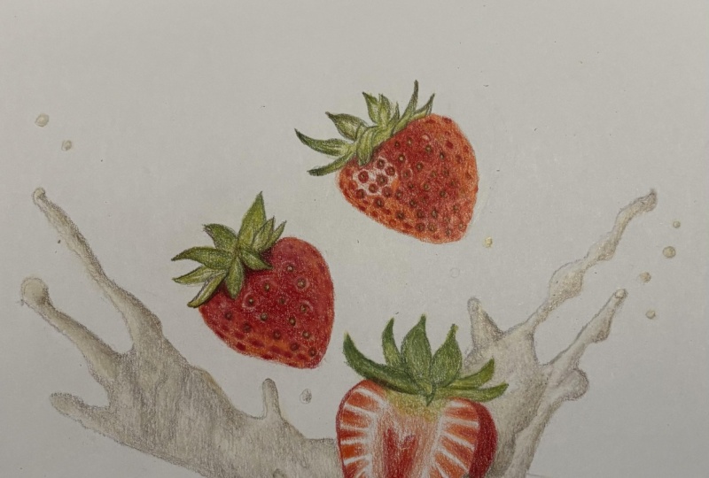
11. Work from Light to Dark on the Strawberries: In this next section,
I want to carry on working from the lighter colors towards the darker colors. Right now, we've put
something down in each area, but I want to gradually continue building those
colors up a bit further. So I'm still only focusing on the strawberries
at the moment, and I want to generally
go in order that said before we get started
on the next darkest color. I'm actually going
to take a minute with this very dark brown. This is the dark umber, the darkest brown in
my set to just go around all of the seeds
on the strawberry. Reason I want to add these
in at this point is, I think if I
continue building up from those lighter colors to the darker colors
without doing this, it would be very easy for me to lose where these seeds are, and I generally think it
will be a lot harder work. So I'll mark them
in at this point, and I think it will make
life easier as we go. So let's take a quick moment
to have a look at the seeds. You can see that pretty
much all of them have quite a dark shadow on
the right hand side. It's generally not
got much on the left, but it is pretty dark
around the right. See, I am just going around
that right hand side mostly, very, very lightly
with a sharp pencil to mark all of these in. So at this point, I can still see where these are,
but I think, as I say, it'll get a lot more difficult if I don't add
them in at this point. I can see where I put all
of that RNG color before. Now, the most important
thing when adding in all of these seeds is
to press lightly. This is quite a
dark color anyway, so adding it in is going to look pretty dark from
pressing lightly. We really don't need to
put a lot of pressure. But I don't want it to be a really dark color
on these seeds. It's not a super dark color
on the reference photo. So I don't want it to
be really dark now. Want to make sure that
you're pressing lightly. Also, you'll see working with
a really sharp pencil here. Because these are some very
small and fine details, I need to have a sharp pencil so that I'm able to build this up as neatly as
possible and really have a good control over
where the pencils going. So once I'm happy with this
strawberry at the top, I want to do exactly
the same thing for this other strawberry. Now, this is quite a bit easier. There's not as many dots on this strawberry that
need building up too much. I'd really only say it's these view towards
the middle here. Let's add these in, and
then I can carry on working from the lighter
color to the darker colors, carrying on from where I left off at the end
of the last chapter. So let's think about
the next darkest color that I want to be adding
in at this point. And now looking at
the strawberries, I want to be adding
in a richer red. So up until this point, I've only used the
pale vermilion, which is kind of an orange red. But I would say the
bulk of the red on the strawberries
is a much darker, richer, more vibrant red. So I've compared my drawing
to my reference photo, and I think the closest match
to this is the crimson. What I'm going to
do is start from the left hand side and
work to the right, and I'm literally just looking at the shapes within
the strawberry. So I think it's all
going to look a little bit odd and feel a bit odd
as this is being built up, but it will all come together. So I can use a lot of the seeds that I've already
added in to fill this up, to use those as a
bit of a guide. And what I want to be
doing is filling in any area that is this
bright red or darker. Let's take a minute
to have a look at the reference photo. On this area over
the left hand side, you'll see that there's all
of this kind of patchiness down here from all of the dips of the seeds in the strawberry. There's a patch here, there's a patch here around
the top around here. There's also all of
these dark patches down the left hand side that we don't currently have marked in. I'm also noticing it's
very much that dark red along the top
along here and in these darker circles
around the seeds on this light I want to be lightly building up this pencil
over all of these areas, marking in these patches, and generally
building up the red. Now, I think what's
helpful when doing this is to just draw in the strawberry
as a series of shapes. As I said, I think
it can look a bit peculiar trying to mark
in all of these patches. But I use the seeds that I've already marked in from my sketch as a bit of a guide, and I use them to help work out where the other patches that I haven't marked out need to go. I can get a good amount of these quite
accurately marked in. Now, something that
I find helpful if, for example, down
this left hand side, where it is a series of patches, but in some places, I think those patches look quite similar to the main kind
of background color. I think it helps when looking at the reference photo
to sort of squint, and that allows you to not be trying to look
at all of the detail. You look at the main
overall shapes, and those are what we're
wanting to mark in at this. You see here I'm
generally going to start on the left and work my
way towards the right. I'm doing that solely
because I think it helps to work in quite
a methodical way. Now notice that I am
working around the seeds. We built up that orange color on the seeds in
the first chapter. I don't want to lose all of that orange that
I've built up. It probably does
need to be darker, but we can think about
adding that as we go. For now, I just
want to get the red marked in as
accurately as I can. Going to work all the way
along the top here as well. I want to make sure
that I'm avoiding those light patches that we added in and I
talked about before. So I'm just drawing around
those light patches and around this large light
patch on the left hand side. And then for most
of the strawberry, I am just going to be solidly
blocking in the area. It's really only down
the left hand side and down the right
hand side that I need to be a bit more cautious and I need to be marking in all of those patches. Now, do you make
sure that you're taking your time when
building up all of this? I think it's probably
one of the most time consuming parts
of the drawing. Once again, it is so much easier if you're working with a sharp pencil just
because once again, you can be really accurate
with where this pencils going. I am re sharpening my
pencil very frequently. I do find that it will
get blunt quite fast, so we'll need to
continually sharpen it. So now, keep working
towards the right, and hopefully you can see, as I'm building this up that
it's not looking amazing. It looks a bit odd and patchy, but honestly, that is what it's supposed to look
like at this point. The whole key to these first
two sections is to just mark in the shapes and get a good idea on what
is going where. Literally all we
want to be doing. And then we can
tweak and build up the colors once we
have a good idea on where all the shapes need to be in the next few sections. So let's just solidly block in a lot of the rest
of the strawberry, but working around both those light patches
and the seeds. You'll see that I
am still working in little circular motions
to try and make the pencil go down as
smoothly as possible. And then what I want to do on this right hand side is go over a lot of those patches that I marked in with the
previous color. I just want to go over them, maybe slightly tweak their
shape in some areas, but on the most
part, I want to make them a richer, darker red. Once again work around the seeds that I've
already marked in here. And then I am going to
add a little bit of extra light shading on
this strip around here. It just looks too
light at the moment. So you can see I'm pressing
really, really lightly. And then I'm not going
to do the same at the very edge of the
strawberry because I think that needs to
be more of a pin. So this is what I
want to be adding for all of the strawberries this
kind of amount of shading. So now I'm happy with this
strawberry at the top. Let's move on to the
next strawberry. And I want to do exactly
the same thing here. So I want to build up
the patchiness, I guess, that is on the right hand side of this strawberry and I'll work around the seeds and add in any extra shading
towards the middle. So you can see all of these
darker patches along here that are surrounded by a much lighter red or maybe a pink. There's all of these
darker patches all down here and all down this
left hand side, as well. So mark these patches
in nice and lightly, as well as adding that darker shading that's towards the
middle of the strawberry. And then that will give
us a really good basis to work from as we go. So this is the vast majority of what we need to be
doing in this section. I think it's worth looking at the top strawberry and seeing, again, how odd and
patchy it looks. But that is what we need to
achieve by the end of this is this kind of patchiness that means all of those
shapes are marked in. All of those shapes are
within the strawberry. We can see them on
the reference photo, so I do need to draw them. Going over all of these patches
on this strawberry here, making sure that I'm
carefully going around the greenery at the
top of the strawberry. And then I'm going
to start working my way down this left hand side and carefully working
around these seeds. So I do have these
seeds marked in, so they give me a bit
of a guide on where the darker areas need
to go around them. And also, I can see
where I need to add any light patches. And then once I've
added in all of those patches around the
edge of the strawberry, on the most part
towards the middle, I'm going to need
to just block it. See I've gone around a
couple of the seed shapes, but now I am just going to block in this section because the middle is so much darker. And then any extra
detail we need to add, we can do that with a darker
pencil in a short while. So again, you do expect that this strawberry is going
to look a little bit odd, as well, because of
how many patches there are that need to be added. And it will be the
next section that this will really start
coming together. At this point, I want to start thinking about that
bottom strawberry, and this strawberry
is a bit different because there's not actually any of the dips that we can see on the first
two strawberries. So the darkest areas
that I can see on this strawberry is
around the edge. You can see there's a thin, dark line around the edge
that generally is shaded a little bit onto the strawberry in just
these darker sections, not in the lighter sections. And there's a lot of
shading that's needed to be added where we can see a bit of the skin of the strawberry, but you can't really
see any seeds. And again, that
needs fading onto the main area of the strawberry. Start off by going
around the edge and filling in that nice
and crisp dark line. And then I can start
shading very lightly onto the darker areas
around the edge here. So you can see I've gone from that edge line onto
the strawberry itself. So let's do the same
for this next section. And I know I keep
saying it, but again, it is so important to have
a sharp pencil for this. Look at the thin line I'm needing to make
along the edge here. I wouldn't be able to make that thin line without
a sharp pencil. Add some light little shading coming onto the
strawberry itself. Again, see how I'm working in circular motions and
pressing lightly. Now, I am holding the pencil closer to the tip as
I'm pressing lightly. That just means I need to
have a bit more control over my pressure. But I do need to hold it closer to the tip because
I'm needing to be so accurate at this point about where
the pencils going. I can hold the
pencil further back if I am just
generally blocking in an area and I don't
need to be as perfect about the
edges, basically. But I do really want to control where this pencils
going at this point, and that's why I'm holding
it closer to the tip. As I say, I am still
pressing light. Keep going around
the edge here and shading onto each
of these patches. And then I'm just going
to add a little bit of something towards the middle. As I mentioned
before, the center of this strawberry is a bit
darker than the rest. So I've added a little
dark spot here, and then I'm going to keep
working around the edge, filling in that darker line, being careful to
go over any area where the cream is
and then shading up. Let's add a slightly softer line around the right hand
side of the strawberry. Although we need a really nice and crisp line on
the left hand side, it does need to fade nicely into the rest of the
strawberry on this side. And then I want to block in
this whole area around here, and then I'll be able
to fade these patches into the edge of the strawberry, like I
did on the other side. So do you think
this is the easiest strawberry, to be honest, out of the three, 'cause
we don't have all of these little dips and grooves
that need to be added? Just fill in this last section, fading the red into the edges of the
strawberry all along here. And then once I'm happy with
the red on this section, let's once again think about the next darkest color
that I need to add. And I'm thinking at this point, more about the greenery. So I'm going to move on
now to a brown pencil. This isn't as dark as the dark umber I used at the
beginning of this section. This is the dark brown pencil. It is obviously a dark brown. It's not as dark
as the dark umber. Want to use this to add
in some extra dark areas, anywhere that needs to be darker or extremely dark on the leaves, and we're going to work our way down all of the strawberries. So on this greenery at the
top here, for example, I'm seeing how dark
it is around here and around here and all around here. I would say it's very dark here and on this leaf here and here. So basically I want to be
putting this anywhere that needs to be darker than
it is at the moment. Can do this in the
same way that I was before pressing lightly
working in circular motions. I don't need to be
making absolutely loads of pencil marks. I don't need to be building
up tons of the pencil. Because although I
want it to be darker, I don't want a lot of these
areas to be jet black, and I do want to be able to build more colors
over the top of this. Now, what's good
about putting brown over the top of the
greens I've already added is we end
up with something that looks like a dark green, I would say, rather
than a brown, and that is what I'm
wanting to do here. Also add some of this brown
onto the strawberry itself. So when you look
at the strawberry, particularly this
kind of area here, look how dark of a red between
some of these seeds are. I would say it's particularly
from around this edge here, all the way around here and a little bit
along here as well. Generally, anywhere there
isn't a really vibrant red. Lightly adding some
of this brown over these areas that I want
to be more of a dark red. When I put the crimson red
back over the top of this, it is going to create
a much darker, richer red in a way that I don't think I have a darker
red in my set. So this is kind of my only
option to make this darker. Now, I think it looks
a little bit odd. It looks a bit muddy at the
moment, but that's okay. And it's really only this
central kind of section that I need to be adding I'm happy
with that first strawberry. Let's do the same
on this next one. And I'm starting on the
greenery at the top, looking for any areas that
need to be made a bit darker, particularly along
here, along here, all over this leaf here, here, along here, along here. And then it's
generally darker where the leaves are meeting
the strawberry. And you can see how
just building up a reasonably small
amount of these areas is making such a
massive difference to the contrast on the
top of the leaves. So I'm happy with the greenery. At the top, I can
then start filling in the darker patches and the darker areas that I need
to on the strawberry itself. So let's have a look at
this strawberry, too. And here, the darker patches are generally around this area. It all looks quite patchy to me. So there's a dark patch
here, here, here. You can kind of see a bit
of a zigzag shape here. It's darker here
and here and here. So I just want to be drawing
in that kind of patchiness, lightly building this pencil up a little bit with these nice
small circular motions. It's kind of giving
that patchiness to this darker area in the same way the rest
of the strawberry. So once I'm happy with
this strawberry here, I want to once again move
on to the last strawberry. And here you can
see some kind of subtle patchiness
down this side. There's not a huge amount of it. It's a bit darker
here. There's a bit of a patch here, here, here. So I'm going to add in that subtle patchiness
on this strawberry, but you'll see that
I really haven't added a huge amount at all. And again, in comparison to
the other two strawberries, this area is reasonably
simple, I would. Just think about
anywhere else where I want to add a small
amount of this pencil. So just maybe around
the outside edge here, where I just want it to
be little bit darker, not fading onto the
strawberry, though, only around that
very outside edge. And then I'm going to start
adding some of this pencil onto the green leaves on the top of the
strawberry, as well. Start adding it
onto the leaf here, all around this top
section up the top here, and generally building up the pencil a little bit on
the leaves around here. So let's have a look
on these leaves. You can see that I need
to build up a good amount of the dark brown on this leaf. It's generally darker around
this right hand side, up the middle and around here. It's a bit darker
on this leaf here, around here and around here. I need to build up a good amount of the pencil on
these few leaves. Actually, a lot of
these leaves are darker than on the other
strawberries, I would say. I think that's looking
much better already, just adding a small amount of the pencil onto these leaves. Being very careful, again, to be working with a sharp
pencil so that I can be going right
around the edges and really making sure that I am refining the shape of the
leaves so they look nice and the last pencil
I'm going to be using in this section is that
dark umber pencil. This is the very,
very dark brown, and I want to be
using this only in a very few places where I really want to build up
that very dark color. So, generally speaking, I
would say that this is only used where the leaves are
meeting the strawberry. Or write down the
bottom of the leaves. So along here, for example, there's a very dark line separating the leaves
from the strawberry. I have marked it in with
the dark brown pencil, but I just want to
make it little bit darker because that's what I'm seeing on the
reference photo. That's what's going to help
this pop a bit better. Let's go all around the edge
of this leaf here and look how much more three D
that's making that leaf look just from adding a small amount of
this very dark brown. Now, this dark brown is actually the darkest color I'm going
to use in this strawberry. I don't want to use the black, which is the only color
that's darker than this in my set because I think
it would be too much. I think it would be
a bit too harsh. I do try where possible
to avoid using black on natural objects
like this because I think it can overpower
it quite a bit. By the end of this section, what you should have is all of the strawberries drawn
out pretty clearly. All of the shapes
are marked out, so I think that is
the hardest part. And we can now in
the next section, focus on brightening up
and tweaking the colors. But that is it for this section.
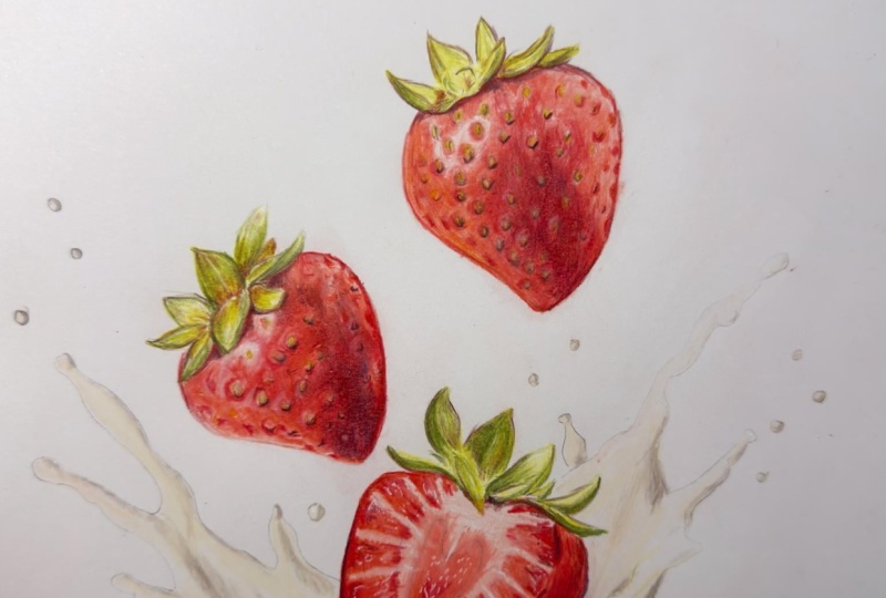
12. Brighten up the Strawberries: That we've taken
the time to mark out all of the shapes
on the strawberries, what I now want to do in this section is focus on
brightening everything up. So I want to be comparing my drawing to my reference photo and thinking about
the main color that's missing at this point. So right now, the first
color that I think is missing is kind of orange red. It's looking way too light down all of the left hand
side of this strawberry. And the main color underlying here is orange quite bright red. I'm going to go back to the pale vermillion that I used right at the
very beginning to build up some more of this color over all of the areas
except for the seeds. So you can see that
I'm working once again in circular
motions to go over the top of all of that
dark red and all of the patches that I built
up in the last section. Can see that I'm working
in circular motions here, adding a little bit of
the color over the top, and it's making a
massive difference to the whole strawberry. Now, I do want to
be very careful not to go over any patches that I want to keep that quite bright
white that I added in. As well as not going
over the seed, so I'm being careful
where I put this color, but I am just gradually
building up some more. I'm also tidying
up the line down the side because it looks a
little bit not quite right. So I'm just adjusting
that and then adding more circular motions on the left hand side of
this first strawberry. It's made a huge difference
to this strawberry. Just adding 2 minutes of color has made a
massive difference. It makes the red areas blend a bit better
into this orange area, and all of the shapes
don't look as odd. Now, let's also build up some of this color over the
middle section. So adding this color
over the top of all of that crimson red that we
added in the last section, it's just going to
make the colors blend together a bit better. It's going to add a
slight orangy red to that crimson red
to make it almost like a darker version
of this color. Also add some of this color
down this strip here. So on the very right hand
side of this strawberry, I would say it's a pink color. But this strip here is
more of this orangy red. So let's add some
of this in before continuing to build up some of this color over that
middle section, still avoiding those
patches of light. And then I can move on
to the next strawberry. So it's not a huge amount of this color that
needs to be added. But I do want to add some
to make it a bit brighter, a bit more orange. Keep working in
circular motions and building up the color
on this strawberry. And let's think about where
we need to add this here. So on this strawberry, you
can see a lot of this kind of orangy red all down
this left hand side, all around here, but a little
bit around here as well, although I think this area is on the most part, a bit more pink. We're going to do
in this chapter is work one color at a time. So for every color that I add, it will make the next color that we need to add
a bit more obvious. I think it's important
to bear in mind that I'm really only thinking
one color at a time, because until I've
added this color in, I don't truly know how it's going to change the colors
that are already here. So I want to add each
color in one at a time and then think about how that's changed the drawing and
what I need to add next. Keep going with this same
pale vermilion color, and I'm just adding some more
of this color to each of these rectangular shapes around the edge of this
strawberry here. So I'm just working up
these one at a time, going over what I've
already got here, building up a little
bit more of the color generally closer to the
edge of the strawberry. I am looking at each of these
sections one at a time to see where the brighter color
is generally built up. So let's go all along here. And you can see how again, just adding a small amount
of this color is making a massive difference to how
bright the strawberry looks. Now I've gone over all
of the strawberries. I've built up this color. As I mentioned, I
want to think about the next most obvious
color that's missing. So I talked before
about how on some of particularly the
right hand sides of the strawberries look
more like a pink. Let's add in the pink now. This is the blush
pink that I used, again, right at the
very beginning. I'm going to add some
more of this color, particularly down
that right hand side. To just tone down how bright this side of the strawberry
feel like now the strawberry, this strawberry at the
top, looks more like it's one consistent color on
the whole strawberry, except obviously it is lighter
on the right hand side. I'm also going to look
at this light patch and add some of this pink into this light patch because I think the white patch here looks
too light at the moment. And there are some
areas on here, particularly around
here, around here. You can see these areas
are generally darker. It's lighter in this area, for example, and around here. So by toning down those areas that do need to be a bit darker, it makes the lighter
areas look even lighter. Add a little bit of pink down this left hand side as well. Just a hint to kind of blend together a little bit
what I've got here. And then let's start
adding some of the pink on this
next strawberry. So down this right
hand side, once again, I can tidy up the line of the edge and generally
build up some more of this color where
it's looking quite bright on this right
hand side at this point. Also going to go over the
light patches here as well, tone them down in some areas
like I did on the other one. I think, although it's not actually bright
white because we did build up some of this same pencil right at the
very beginning, in comparison to the
rest of the drawing, it looks white or
too light right now. This also adds a little bit
down the left hand side, generally tidy up this line. And then I'm also
going to add some of this color onto the strawberry. So again, even though we've
added some of this pink onto the lighter areas of the middle of the
strawberry here, it all looks a bit too
light at the moment. And actually, these lines
between these shapes at the side of the strawberry
need to be a bit darker. It needs to blend a bit
better into those shapes. So I'm just using this pencil to go over all of these lines. You can see I'm going up
to where that thicker line is and just blending down to
the edge of the strawberry. And it's making it
look so much better. It looks so much more realistic. Do be careful as you go
around the bottom because you don't want to go over
where the cream will be. We will add the cream
in in the next section, but it needs to be so light. I don't want to add any of the red or pink over that area. Let's go all along
the sides here. Still using those
circular motions. And then I want to think
about any other area where I want to put this pencil. Actually, I am going
to add a little bit generally around
the edge hip. I don't want to go all
the way up to the top. I think it is much lighter at
the top near the greenery, and it's generally a
bit of a darker pink, not a dark pink, but a darker
pink lower down down here. And I think that's
looking much better. Let's once again
move on to the next. Now I've added in the
pink and the orange red. I think that a lot of the darker red on the strawberry looks a little bit washed out. It's not looking dark enough. So let's go back to
that crimson red and do pretty much the same as
I did in the last section. I want to be going over
all of these darker areas one more time to make
them this brighter red. This is exactly the
same as I did before, but the more color
that I build up, one on top of another, the richer that color
starts to look. I do want to be
particularly focusing with this pencil down the
center of the strawberry, as well as going
over these patches, but it is so much faster now because I've already
built this up, so I can see where I
need to be adding this. I'm just going over
what I've already done. But I think the patches kind of look a little bit
lost at this point, so I want to make them a
bit of a brighter red. Now, you also remember at
the end of the last chapter, I added in some of
the dark brown pencil to make the shadows on the strawberry itself
a bit stronger. As I mentioned at
the time, if I add this color over the top
of those dark patches, it makes those dark
patches look more like a dark red rather
than at the moment, I think they kind of
look like a brown. So you can see where I'm adding this color over the top
of that dark brown, it is making it more of
this nice vibrant red. Now, once again, I'm being
careful going around the seeds and going around
the light patches. It's amazing how much lighter the seeds now look
now that we've built up these darker
reds around them. Even though we added
the golden rod, the kind of orange pencil over
the dots at the beginning. You wouldn't necessarily
know it by this point. So we will need to build
that up in a short while. But for now, I just
want to be focusing on making the strawberry
a brighter red. And what I do to one strawberry, I want to do exactly
the same to the other. So let's build up more of this red color on this strawberry
on the left hand side. Really help to make that
red pop a bit more? I can't stress enough. This is exactly the same
as we did before. I'm just adding I would say
that I'm probably using more like a medium pressure here rather than a super
light pressure. As I build up more
of the pencil, you do find in order to build
up the color vibrantly, you have to start pressing
a little bit harder, but I'm definitely not
pressing full force. So it's also the same
as we did before go around the edges of
this section here, just making these
parts a little bit darker around these dark
rectangle shapes here. Let's go back to that
golden rod pencil that I mentioned that we added at the beginning
that orangy tone to go over all of
these seeds again. As I said, they're
all looking so, very, very light at this point, and I want to make them
a little bit darker. So let's use this pencil, go over all of these dots, and it's going to help make the light areas stand
out a bit more. We'll be able to see more where the patches of light actually are and
where are the seeds. We want these seeds to match the rest of the
strawberry a bit more. So I'm literally going over these one or two time
to tone that down. What I do to one strawberry, again, I need to do
the same to the other. So let's go over the seeds on this strawberry,
too, and again, it makes the light patches stand out a bit better
on this strawberry. So now that I've
added that color in, it shows me that a lot of the strawberry looks too
much like a mid tone. We're left with something that doesn't have a huge
amount of contrast, not as much as I
would like it to. So you'll remember that
in the last section, we added some of the dark
brown pencil to a lot of the shadowed areas on this kind of part
of the strawberry. Want to do exactly
the same again, but we're going to build
up more of the color. So I'm doing exactly the
same as I did before, looking at where those
more shadowed areas are within the strawberry and
building up that shadow. And it's sort of reducing
the red, but that's okay. The most obvious thing
that's missing right now, I would say, is
that the strawberry isn't looking dark enough. So I really want to
add to the darkness of the strawberry before I go
tweaking any of the red again. Also going to build up some of this color down this
right hand side. A lot of these darker
patches here have only been added in with the red pencil and they're not
looking dark enough, so let's add to them. And it's going to
make the pink that surrounds them stand
out a lot better. And the same on this
left hand side, as well. Not as much, but I do
just want to make a few of these patches
a little bit darker. You'll see I'm really not adding a lot of this color, though. It's not stopping it from
looking red, I wouldn't say. It's just making it darker. Do the same on this
other strawberry here, build up the pencil on this one. I generally want to
build up some of this color on this
area around here, which is the part of
the strawberry that I think is generally
more in shadow. But hopefully you
see that we're doing the same thing over
and over again, building up more
of the color until eventually it matches
the strawberry. We just particularly more than anything need to
get the contrast. Also add some of
this color around the outside of this
strawberry once again, just like I have done before. And then let's go back to
the dark umber pencil. This is the darkest brown to go back over the
outlines of the seeds. Now, just like before, I think the more color
that we've added, the more lost the outlines to these seeds have
become to the point that it's hard to see where the seeds are in relation to
the rest of the strawberry. So let's add this back in again, particularly focusing on adding the dark curve around
the right hand side. And that looks so much better. Do you want
to take my time? I want to make sure
that I get this pencil over all of the right
areas on the strawberry. And then let's do the
same here as well. So these strawberries are
looking so much better than they did at the
beginning of this section. Let's once again compare them to the reference photo
and think about the most obvious thing
that's now missing. So I'm now thinking that they're not looking
bright red enough. So I'm going to use
a different red to what I've used so far.
This is the poppy. I always think of poppy red
as a kind of generic red. Maybe it's a little bit
on the orange side, but not to the same
degree as pale vermilion. And I'm going to
use this to go over pretty much all of
the strawberries, except for where it is
that more pink color. Now, you can see I'm starting to use a medium to firm pressure, I would say, here, to try and blend all of these
colors together. And I'm still being careful to go around those
light patches, although maybe slightly changing the shape of the light patches. And this is beginning to smooth out the
strawberry, as well. Going over pretty much the
whole of the strawberry, except for all of the really light areas
down this right hand side, but I can, as you
can see, go over the darker areas,
those darker spots. I also want to go around
these darker patches here, and I think it's just changing
the whole strawberry to be more kind of what you would imagine a
strawberry color to be. Let's also adds a bit of shading onto this area on
the left hand side. And I think it's
helping to blend this lighter area onto the left into the rest
of the strawberry. Once I'm happy with
how this strawberry on the top is looking, just go to add a few
more tweaks around these lighter patches to
just ti that up a bit more. A lot of them I do want to be
pretty small light patches. I'm going to add
a small amount of this color over the top of all of the seeds because I think the orange is
looking a bit too light. And then I'm going to
start building some of this color up over
this strawberry. Gay wants to be putting this
color over any area that is, I would say kind of
mid red or darker. So I don't want to be
going over any areas that will need to be quite a
light pink at the end, but I do want to be generally blending and just adjusting the color of the darker areas. Again, you can see
putting this color over the top of all of the
darker patches that I've already got is not taking away from
those darker patches. It is just blending it and adjusting the color
to be this brighter. Again, want to be careful going around those light patches. I'm just really focusing on looking at the
reference photo, really looking at the colors
and shapes that are here. Although it just is really
a series of random shapes, if I draw the shapes in and blend the colors as I can see them on the
reference photo, I will end up with something that looks
like a strawberry. Let's just create
a nice gradient on this left hand side
of the strawberry so the darker middle blends a bit better with
the light edge here. Still going over some of these darker patches to
make them more like a dark bright red rather than what they
are at the moment. And then let's just
add a little bit of this red onto the
strawberry here. So I feel like this
middle section has got a little bit lost now that
I increase the pink. So I'm just going to add
to it with this poppy red. I'm also going to go over all of these shapes around
the outside here as well to make them
a little bit more defined and also make
them a bit darker. The last color that I
want to focus on on the red sections of the
strawberry is the pink areas. I've talked a lot
about the pink. Let's go back to that pink and start blending these areas
on the right hand side, really smoothing it out as well as this lighter patch here. Pretty much any area
that isn't really bright white that I haven't added
some of the poppy red to, I want to be going over the
top of that with this pink. Let's do the same down
this right hand side of this strawberry, as well. And you can see
it's quite subtle, but I think it really changes the look of the
strawberry, interesting. Makes it look like a light area, rather than an unfinished area. Let's add a little bit down
this left hand side, as well. And now I'm generally happy with the red areas on
the strawberries. I now want to think about
the leaves at the top. So let's do exactly
what I've already done, but I want to be adding more. So I'm going back
to the olive green. This is the darker green out
of the two greens I used, and I'm going to go
over every single leaf really looking at that leaf in the reference photo
and thinking about how I need to make
that leaf darker. Making this leaf darker, this middle leaf is probably the most prominent on
this strawberry. And it is literally just
a case of looking at the lights and darks
and building up the green where I
feel it's needed. I'm looking at the shapes, looking at what I've
already got marked in because that's a really good
guide now at this point. To just really add more, I think all of the
greenery at the top of all of the strawberries
just looks too light, and it just needs
increasing in vibrancy. There's really not any
more that I'm doing here beyond just adding
to what I've got. Again, I'm drawing it as
just a series of shapes, trying to match those
series of shapes to my reference photo rather than trying to draw
some leaves because, as I normally say, I think
that would be really hard. And once I've gone over all of the leaves on this
first strawberry, I can then start looking
at the next strawberry. Let's build up more
of the color on. Again, this middle, leave here, which I would say
is the darkest. Once again, I can't
stress enough how important it is to
have a sharp pencil, particularly at times like this where we're really needing
to build up more of the color and have a
darker color is going to go down much better when
it's a sharp pencil. I can start building up
on the other leaves. So I'm going over this
reasonably quickly in my voice over because it is exactly the same as
we've already done. I do want it to be what
I've already got here, but darker and sharper. I can tidy up some of
the shapes as I go here as well if I
feel it needs it. If I think the leaf is a slightly wrong shape or
it's not maybe pointy enough. This is a good time to be
making those sorts of changes. Move on to the last leaves
at the top here now. And once again, I'm just
building up more of this color. I'm starting off
on what I think is the darkest leaf,
so this leaf here. And then I'll start working over some of
the other leaves. It is so much easier
at this point because all of these shapes
are so thoroughly marked in. I just need to see where I
want to add more of the color. So I'm happy that I've got
all of those darkest areas marked in the leaves are
looking pretty accurate. What now wants to
do is work over the whole of the leaves
with the lighter green. This is the lime peel I use
right at the very beginning. So you can see I'm using medium to firm
pressure, I would say, to just blend things
together and generally make those lighter areas a
little bit less light. On the most part,
there aren't areas that need to be really,
really light green. They mostly need to be
a mid or dark green. So I need to be building
up this color in a lot of areas so
that it matches. By the end of this chapter, what you should have is the strawberries all marked
out reasonably clearly. Now, I do think that
we will need to add them a bit more later. But I think at this
point, it makes sense to draw in the cream splash, and then it'll be
a bit easier to work out what else
needs adding when we're looking at the drawing as a whole rather than
individual sections. But that is it for this section.
13. Draw in the Cream: Now focus on drawing in
the splash at the bottom. This is something that I think looks very tricky
because it's so light, but we just want to focus on drawing in the colors
that we can see. So let's start off by adding
in the lightest color, and I want to work generally from the lightest
to the darkest. So the lightest color that I
can see within the splash, I would say, is a very,
very light yellow. I do think there's a little
bit of gray in there as well, but I think the
more obvious color out of the two is a
really light yellow. So I'm going to use
this cream pencil. It's really the only light
yellow that I have in my set, and I'm going to
use this to go over every single part of the splash. So as normal, I want
to start off by just putting something
down on the paper. Now, you'll see that
I'm going about this in the same way that I did right at the very beginning when I started the drawing. I'm working in circular motions. I'm pressing lightly,
and I'm holding the pencil quite far back to help me with that
light pressure. Now, you can very lightly
see my sketch lines. I'm literally just blocking in this color within
those sketch lines. That's all I'm doing. You do expect this to look extremely
light on the paper. The lighter areas of this
splash are very, very light. So it looks light on camera. I actually think
it probably looks even lighter in person. I want to make sure
that I go over the bulk of the main
area of the splash, but I also want to go over
any odd little droplets. There are some drops
around the outside of the splash that I
just want to make sure that I put a
little dot of yellow. It's not the end of the
world if I miss a couple, but I do want to strive
to get that mapped. Once I've got some yellow down on every area
of the splash, what I then want to do is start looking at the
more shadowed parts. So when we look at the splash, I would say the main areas that actually make it look
like a splash are the more shadowed areas around here around here
in here as well. And generally the
shadows that run up the side of each of these blobs, this sort of color here, I want to think about
what the closest match is to this color in my set, comparing this reference
photo to my color swatches. Now, I actually think it's
quite a tricky color. I don't think I have
anywhere close to an exact match to this
kind of shadowed color. So I just want to be
thinking about what the closest color
is to this shadow. And I think the closest color
is the 50% French gray. Is kind of mid gray. It's not particularly warm, it's not particularly cold. It's just a standard gray. I think if I start
off by marking in all of the shadows
with this pencil, then we can adjust the color by adding other
colors over the top. But for now with this pencil, I just want to focus on getting the lights and darks
in the right place. I think that's the
best way to approach. I'm using the sketch
lines here that I can still see as a
little bit of a guide. And then I'm drawing
a crisp line over those sketch lines, and then I can look at adding
the shading around that. I'm just trying to
get my bearings, just like we did when
drawing the strawberries. I want to get my bearings, get the main shapes marked in, and then we can adjust the colors and add
to it from there. Now, once again, the
most important thing is to be pressing lightly. You can see how
pressing lightly and going over the area
just a few times. With this pencil is actually building up a
reasonably dark color. So I'm being careful
to go around this light blob that's in here. I also want to think
about the shapes and looking at each of these
parts one section at a time. So just like I said, when we
were drawing the strawberry, you want to be looking
at this like a series of random shapes rather than trying to draw a
splash of cream. I think if you try and
draw a splash of cream, it's going to be difficult. It's a random shape, so it's going to be much
easier to just focus on trying to draw a series of random shapes
that you can see, and it will all come together. So let's look at this
shape here, for example. Is this part of the splash here. So I've got the
outline marked in. I can see that I
need a darker shadow coming all the way up here and along the top edge of this
shape, it ends about here. And then it's a midtne kind of color in this triangle here, midtne around here as well. And then a very light
shadow on the underside just to kind of outline
a little bit this shape. So you can see that I've drawn
up the side of this shape, and then I'm adding
a small amount of shading coming down until it joins into the darker shadow that I've added down the bottom. So I'm happy with this area, I can then move on
to the next shape. So let's have a look
at this shape up the top and generally
this area in between. So looking at this
area all along here, you can see quite a dark
line going up this top edge, and then there's some
lines coming down here. It's also a little bit
darker coming lower here. There's a dark line
going along here. And it's generally again, dark along the top edge. There's a darker patch here, a darker patch here, a darker patch here and
here and around here. Good thing about drawing
and particularly the cream is that it doesn't need
to be absolutely perfect. We obviously want to
try and get it as close as possible to
the reference photo. But if it doesn't look exact, because it's cream,
because it's a splash, it's less important
than the strawberries, I would say, because it's a bit of a random shape, anyway. As long as it's pretty close, it will probably look good. Once again, let's remember
that if you want to build up a darker area on something
like this splash, you want to go
over the area more times rather than
pressing harder. And that's going to
create a much nicer, softer color than just pressing really hard
with the pencil. Let's focus on this splash. Here I'm going along the edge following my sketch line
for this splash here. And then once I've got
that line marked in, I can start adding shading to any area where that line
needs to be a bit wider. I'll add some subtle shading
down the bottom as well just to give this a
little bit of shape, a little bit of a more
obvious outline, I guess. I'm generally happy with
this part of the splash. I don't want to forget to go
over some of the droplets. Generally speaking,
the droplets are shadowed on the right
and light on the left, so I just want to be building up the pencil on that
right hand side. I can do that over all
of these droplets, and that's part of what's
going to make this look nicer and more splashy. So let's start focusing on the splash shape on the
right hand side now, and let's have a look at some of the shapes
that are here. In some ways, this right
hand side is a little bit easier because it's
so much lighter here. So you can see that a decent
amount of the shading needs to be in this
section and along here. And then there's some
dark shading all around the bottom edge
of all of these shapes. But there isn't too much
on the main section here. It's obviously darker here, for example, than these
really light patches. But I wouldn't say
it's a dark color. So I want to be going all around the right hand sides and the bottom of these
splashes, as well. Focusing on following
both my sketch lines and the shapes I can see here. To just try and get a bit of an idea for how this
splash needs to go. I would say that the droplets are probably the
easiest part of this, because we're literally only shading on the right hand side. You can see I've added
in a few of the sort of mid tone shapes on this section, but I haven't added
too much because we can do that with
a lighter pencil. Then let's start working on
this area down the bottom. So look how dark this whole
triangle shape here is. We need to build up quite a lot of this pencil in this section. We need to add
shading all around here and build up a darker area, particularly down the
bottom of this triangle. I'm also going to take
a minute to have a look at the shading around
the very bottom. So particularly note how dark
this shadow is along here, then it gets much lighter
over to the left hand side. And there's some darker, again, triangular shapes
around here that I'm also going to want to add
in and around here as well. I can mark in where that
triangular section needs to be, which is good
because I do already have this shape marked
in from my sketch. So I'm marking out the outline, and then I can shade this in. And I once again want to be gradually building
up the color here. I don't want to go from nothing
to a really dark color. I want to go over the
area multiple times with this pencil to gradually
make it darker. And then I also want to just blend it out a little
bit at the bottom, create a slightly smoother
edge because it looks quite harsh from where I drew
that straight line along. Just carefully go
around the very bottom where I said that that darker
shadow around here is. Let's add a nice crisp
line around the bottom, and then I'll be able to
shade up from that point. So you can see me adding
a little bit of shading, particularly on the
right hand side. And then I'm
generally happy with the overall lights and darks in this section
at this point. Let's think about the next
color that needs to be added. So what I actually want to be thinking about at this point is the next color that I
could add to this gray. That's going to make it a bit closer to the reference photo. I almost think that the
color of the splash, although I think the gray was the closest color
for the shadows, it needs to be a little bit
more almost gold, I guess. It just has a slight hint to a yellowy brown that I
don't have at the moment. So I'm going to use the
light umber pencil. This is the closest color to
gold that I have in my set. Going to use this to go over all of the shadows a
little bit darker. So you can see, it's not
a drastic difference really to the French gray, but it is making it
have a little bit of a warmer tone, I guess, to it. And it only wants to be
using this color nice and lightly on the
darker shadows for now. I think it's really making
the splash look a lot richer, and it is a closer color
to the reference photo. You can see how
adding, as I say, just a little bit of
this color is making a huge difference to the
richness of this splash. So I'm going over exactly the same shapes
that I did before. I'm doing exactly the same. Now that all of the
shapes are marked in, it makes it so much easier to work out
what's going where. And then let's start adding to the darker areas on the
right hand side, as well. So going up the darker
side of the splash, everywhere where I've put
that 50% French gray, I just want to be making
it that little bit richer. I can also start
adding this onto the darker shadowed patch
down the bottom here as well. I feel like adding this
splash in is making the strawberries look
more realistic, as well. And that's why I
don't want to finish the drawing and finish the strawberries until
everything's mapped in. Once the splash is in, I think you can
suddenly see things about the strawberries that need to be added that maybe
aren't at the moment, or they just end up looking better when more of
the drawing is added. I always think for
every color that I add, it makes the next color
that's missing more obvious. And I want to be thinking
about any other colors that I want to be adding
into this splash. It's obviously got some pretty subtle colors because
on the most part, it is a cream splash. And actually, on the
most part, I feel like it matches the reference
photo quite well. What I'm particularly noticing is some of the less
obvious colors, particularly in the shadows. Now, if you look really
around this area, it has a slight kind
of yellow tone to it, quite a bright, I would say, yellow, particularly
in this shadow. Let's use a bright yellow to add that little
hint of color in. This is the lemon yellow. I would say it's the
next darkest color after the cream pencil, and I'm going to add
this onto a lot of the areas where I
added the light umber because it's just adding
that little extra bit of yellow that I think
is particularly missing in the shadow. See, I only added
a very tiny bit, and now we can move on to any of the darker shadowed areas where I think we need
to add more shading. So let's move on to
the dark brown pencil. This isn't the darkest brown. This is the slightly
lighter dark brown. And I'm going to use this
in only a few areas, only any areas on the splash that is particularly in shadow. And that is generally speaking, I would say, very close
to the strawberry. Most of the splash is
pretty light and I think matches what
I've got quite well. So I just want to add a little
bit down the bottom down here and on this
section here as well. Let's keep thinking about the
next color that's missing, and I'm going to move on
now to a lighter color. So this is the 20% French gray. It's the lighter version
of that gray that I use to add in all
of the shadows. And I want to be
using this to really add to those lighter areas. So I mentioned before a
lot of the lighter areas. There's some light patches
around this left side. And generally along
the bottom here, any of the lighter folds need to be added in
with this pencil. But there's also quite
a lot of this pencil I'm going to need to add
on the right hand side. So it's working circular
motions all along here. Then I want to build up a
decent amount of the pencil on this area that I think at the moment looks
a bit too light. It doesn't look like
it has enough shading. There's obviously the odd area that is very bright
white along here. I want to not go
over that patch, but a lot of the other
patches need adding too. So the last thing I'm going
to do on this section for now is add in more of
the 50% French gray. So for every color
that I add, as I say, I think it makes the next color that's missing a
bit more obvious. And now that you've built up
all of these lighter colors, I think this dark shadow here isn't looking
quite dark enough. So I'm going to go back
to the same pencil I used earlier on in the chapter
and just build up color. You can see I'm still
pressing lightly. It's creating a really
nice soft color, but it is just building up more of this so that it looks a little bit richer and matches that reference
photo a bit better. Now, at this point
of the drawing, there's a really good template for all aspects of
the drawing now. Everything is drawn
in and just really, I would say, needs final tweaks. You probably could
leave the drawing here. I do think it looks
good as it is. I just think that we can
take it little bit further. But that is it for
drawing in this splash.
14. Adjust the Colours and Add Final Details: Now that everything's
mapped out, I've got a really good idea on where everything needs to go. In this section, let's
take a minute to really try and brighten everything
up and finish it off. And my main goal here is to try and make everything as
smooth as possible, specifically focusing
on the strawberries. So I'm going to start here from the lightest color and work generally towards
the darker colors. So I'm actually starting
here with the white pencil. Want to use this on all of the areas where I
added that pink. So because I'm generally
happy with the color of the pink down both sides
of the strawberry, what I want to do
is try and remove that grainy look without
changing the color. So by using the white here, putting white over
the top of any color really doesn't make
that color white. It maybe lightens it a tiny bit, but on the most part, it's
good for just blending it. Now, it wouldn't use white to blend a very dark color that would end up washing out the dark color and kind
of turning a bit gray. But for something
like this pink, applying the white pencil
works really well. Because at this point I
want to blend the pencil, you'll see that I
am pressing much firmer than I have
been up until now. And we'll see that
more in a second. I'm just going over all
of the white parts, all of those little light
areas that we left, just to smooth these
out a little bit and around the edge of
this light patch here. Before then, you
can see me applying this firmer pressure down
the side of this strawberry. It's important to
note that I am still working in circular
motions as well, which helps me make this
as smooth as possible, and I'm going to do
exactly the same thing on the left hand side
of this strawberry. So the goal of
this final section is to brighten everything up, smooth it out, and add
in any final details. That's really all I need to do at this point
of the drawing, because the drawing right
now looks pretty good. You could leave it before going through these last
steps, and it's fine. This is just going to
give it that little extra wow factor, I guess. I'm going all the way up the left hand side of
this strawberry here. And then I'm also going
to add a little bit of white just near the
top of the inside of this strawberry as well before
also using the white to go over the lightest
areas on the leaves. So on the most part, the leaves need to be
either that lime peel, that kind of quite light green or the much darker olive green. What I want to do is
use this white for any color that I want
to remain pretty light. So that would be on
this little line here, along here, along here. All of those light areas. And it's just going to help
smooth out those light parts. Now, let's do the same
on these leaves on the left and on this bottom
strawberry, as well. So I'm just trying to remove the look of any of that
kind of graininess. So I'm kind of generally working from the lighter colors towards
the darker colors again. And I now want to think
about the next color that I want to add to really brighten
up these strawberries. So I'm going to use
the pale vermilion. Again, that's that
kind of orangy red. And I'm going to use
this pretty much on all of the mid tone areas. Now, once again, you can see me using a firm pressure here, and it is really nicely
smoothing out the strawberry. Using a firm pressure over
some of these midton areas. It's not removing all of that
texture that I've built up. What it's doing is
just smoothing it out. You can still see it
all showing through. I want to be adding this
red down the bottom and in between there's a
few dark patches here in this little
gap along here. And generally, anywhere else, I think would benefit from a
little bit of brighten up, which is mostly down
the sides, I would. Go a little bit along
the top, as well, and just tidy up a bit around
the edge and around here. And again, you can see all of those patterns that we added
in showing through still. Let's do the same on the
other strawberry around here. So once again with a
nice and firm pressure, I particularly want to
be going near where that very light area
is down the sides. And you can see that it's really nicely smoothing everything out. It just looks a little bit
patchy before we do this. So some nice and firm pressure
but also circular motions. I'm not pressing full force. I am definitely pressing harder than I have been up
until this point. Go all the way down this
left hand side as well, building up all of the color along here and kind of smoothing out between this area and the darker area of the
strawberry towards the middle. And then let's go around adding
some of this color around the outside on all of these
rectangle shapes once again. I've built up this color quite a few times around here already, but I still think it needs more. So we're just bit by bit
increasing all of the vibrancy, all of the color until it looks like that
reference photo. Go down here using
circular motions once again and generally
building up this color. And that's looking
much better already. Once I'm happy, I've
gone the whole way around the strawberry. I just want to brighten
up around the edge here. I'm also going to
add a bit more of this quite bright color towards the middle of
the strawberry here. This area is just looking a little bit too muted right now. So let's think about the next
color we need to be adding. And now I want to go back to that kind of orange color I use towards the very
beginning to just make the seeds a bit darker. They're too light at the moment. I think they're the right
color. They're just too light. So I'm back to the golden
broad pencil to go over every single one of these
seeds and make them a little bit darker,
a little bit more orange. I think it shows maybe
more on these ones, these seeds look even
lighter and look how much darker they look from just adding a
little bit of that. Let's keep going through some of the red that
we've already used. So this is the crimson red, and I'm going to use
this to really brighten up that darker area
at the center of the strawberry to both make
it a little bit darker but also smooth out all of
the shading we have here. So I once again
want to be working in between these seeds. As I've mentioned before, it's a little bit lighter
around the seeds, and then I want to be
adding this darker shading after that light patch directly around the and you can see me working
in this firma pressure. It's exactly the same as
we've done a few times now. I'm just going over these
same areas over and over again until it looks like
a nice and solid color, and all of the colors look
nicely mixed together. Let's just tidy up around some of these light
spots as well. 'Cause some of them
just look a little bit too sort of wonky. Once I'm happy with
all of these areas, and it's looking a
little bit tidier. I then want to do the same
thing on the other strawberry. So, particularly on the
middle of this strawberry, it really shows how patchy
and kind of light it looks. I want to build up a lot of
extra of this pencil onto this strawberry here to help to smooth out particularly
this middle section. So you can see me using
that firm pressure and working in circular motions. And what a massive difference that's making quite quickly. I still want to be working
around those seeds and generally looking at where these darker patches need to be. As I say, it's very much the
same as I've already been. Just add a little
bit of this dark red just on the skin of
this strawberry here. So, again, a nice and
firm pressure with circular motions
to smooth down and remove the patchiness
down this side here. And it's only really
on the strawberries themselves, on the skin, I would say, and on
the leaves that I want it to not look
particularly grainy. I actually think I don't need to add anything more
onto the splash. Although it probably
looks almost as grainy, I think if I try
and smooth it out, it's such a light color, it will end up blending together in a way that doesn't look as good as it
currently does. I also don't think
the graininess is really a problem
on the splash. You always expect a
very small amount of that kind of effect
with colored pencils. And I almost think with the center of the
strawberry here, it kind of adds to it, as well. So I'm particularly
focusing on smoothing out and adding firm brussure
onto the strawberry skins, but not so much the rest. I say, I'm not going to do
anything more to the splash. I'm happy with how
the splash looks. It is worth saying that
I think the splash doesn't look exactly
the same color as the reference photo, but that's okay because
no one's going to be looking at the
reference photo when they're looking
at your drawing. And I think it looks
good as it is. I think we probably could
mix that color together. It would take an
awful lot of colors, and I think it already
looks great as it is. Now, let's just add a
little bit of this yellow down the particularly left hand side of both
the strawberries. I can see a hint of yellow here, so I want to add it in. And I want to add in this
quite bright yellow. This is the lemon yellow onto all of these patches
on the strawberry along just making
the orange color that we have a little bit
more on the yellow side, which I think is more accurate to what I can see
in the reference photo. So I'm going around each of
these little rectangles, just filling in this yellow. And I'm going to add a tiny bit in the middle here as well, but not a huge amount. I'm going back here to
light pencil motion. Actually, I'm going to
use a little bit of the yellow on the
seeds as well to just make them slightly more on that yellow side of things. Let's now go to the pink pencil, the pink that we've used a lot
in the first few chapters. And I want to once again, tone down the light areas in between all of
these rectangles. We have done this before, but I think I need to add more pink. It's not looking
like quite enough. So let's just add a little
bit of pink along here. Once I've gone all
along this side, I once again want to add just a tiny bit onto the
middle of the strawberry. Just particularly around
this edge here and maybe a little bit down the very
white line along here as well. And again, that's looking
much, much better. And then let's move on to
the dark brown pencil. So this is the lighter
of the two dark browns. And I'm going to
use this pencil to just tweak some of the greenery. So it's looking in some areas lighter than
I think it should. And I'm just going
to add to some of the darker areas on
the green once again. Still the same steps that
we've already gone through. I just need more. That's the good thing
about building up the pencil in light layers is that you can always add more in if you think it's not
looking like white enough. Now let's also use some
of this brown to fill in some of the shadows on
the strawberry itself, as well, particularly
around the top around here. I also want to use
this pencil to just increase the contrast on
this area of the strawberry, as well, particularly
that darker triangle that I mentioned before. We've again, added this
pencil in this place before. I just want to add
and once I'm happy, I've built up more of this brown and it's
looking much better. I can then do exactly the same
to this other strawberry. So I'm looking at increasing the shading underneath
these leaves and maybe in some areas, slightly tweaking the shape
if I think it needs it. And then adding extra shading onto the strawberry itself here. So just working in
circular motions. I would say that I'm back
to using a medium pressure. I wouldn't say I'm
pressing really lightly, but I'm also not pressing hard. I'm just going to add to some of the shadows down
the bottom here. I don't think I've
got quite enough. And as part of this, I can also tweak the shape
of the splash here as well. Just going to increase the shading down the
side of the strawberry. So the final few tweaks, I'm just going to add to the greenery on the top
of this strawberry, and that is the last tweaks
that I need to be adding. Alright, that is it
for this last section.
15. Summary: That is the end of the drawing. So I always start
off by selecting the right reference photo before then pausing to take a look
at that reference photo. I then create my
sketch outlines to create really lovely and
accurate proportions. I can then start from
the lightest colors and work my way up to the darker colors
before brightening up and thinking about what's missing in each of those areas. From there, I can further
refine everything and look at the drawing as a whole to tweak all of these final
shapes and colors. I do hope that you've
enjoyed this class. Please do leave a
review if you have. And don't forget to upload your drawings into
the class projects. Happy drawing, guys, and I'll
see you in the next class.
 Gemma Chambers, Pencil Artist