Transcripts
1. Introduction: Hello, everyone. My name is Sandre Curtis and I'll
be your teacher today. I've been drawing
with colored pencils, on black paper for over 15
years. For a little while. No, I've been enjoying
sharing with you what I've learned and the
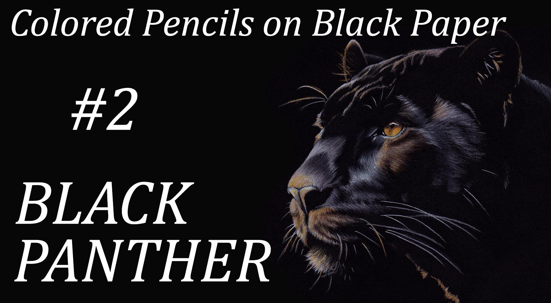
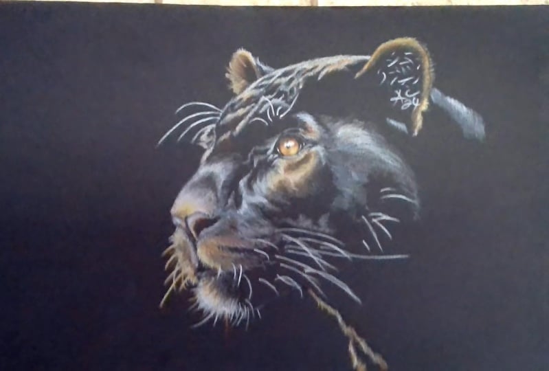
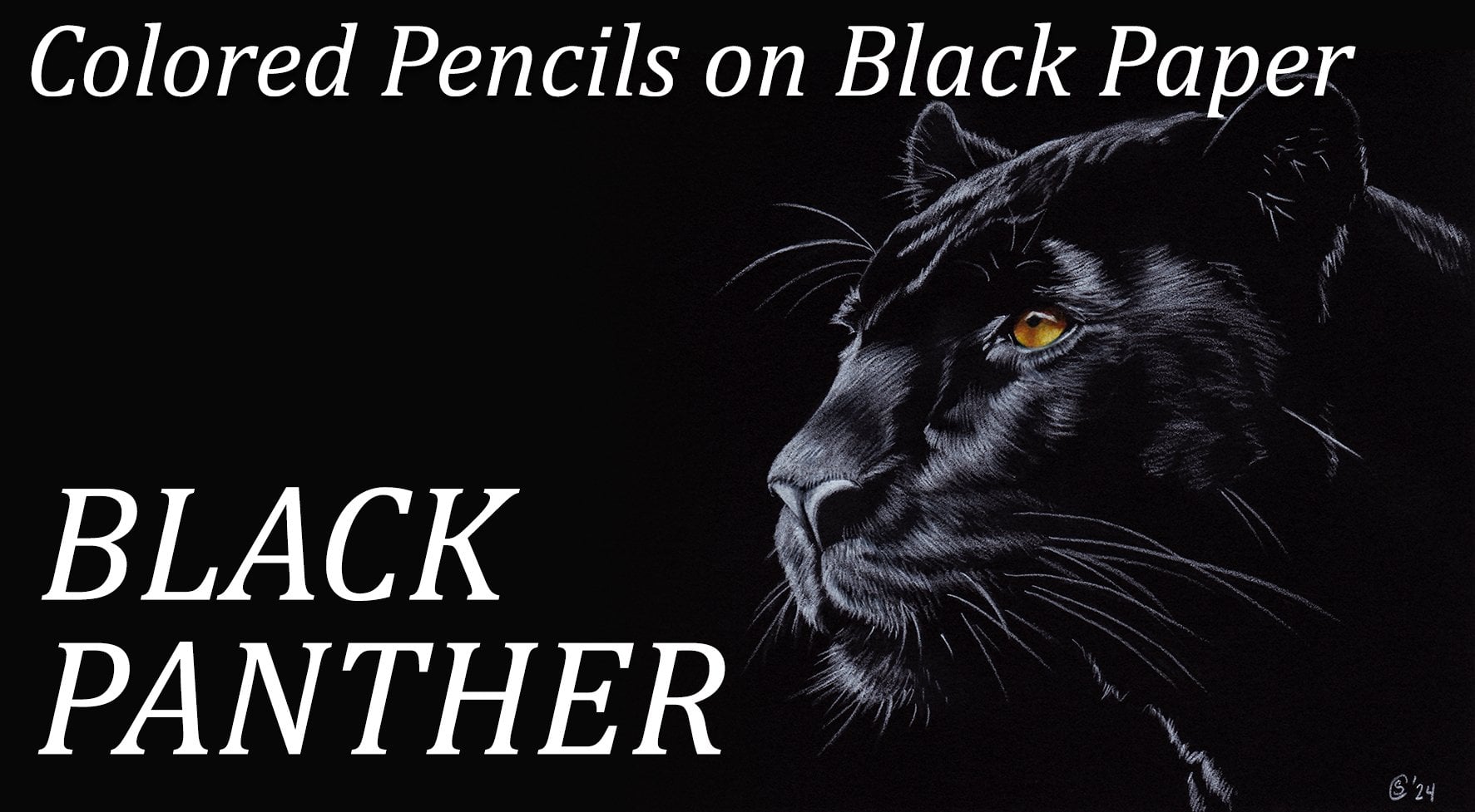
techniques that I use. In the previous lesson, I showed you how to draw a black panther in
black and white. Using the black of the
paper and a white pencil. The only colors we
added was on the eye. It was a very simple way of drawing a black
animal on black paper. In the second version
of the Black Panther, I invite you to take out
your colors and show you how to pick all those that you
will need for this project. Instead of drawing a white
reflection on the black fur, we will be observing and drawing all the colors
that are reflected on it. This will add an extra
challenge to the drawing, but it's a very good
skill to learn. This isn't easy to
follow step by step. Tutorial, each lesson is in
real time so that you can see how fast or actually how slow I'm applying the
pencil on the paper. Drawing with colored
pencils is a slow process, and to have the best result, you need to be patient and
apply very light layers. I hope you'll join
me in this class. While you can follow the easy instructions at your own pace. You can either watch
the full class once and then watch it again as you're drawing or jump right in. Please feel free to
share your progress with the other students
and ask questions whenever you need to.
I'll see you in class.
2. Supplies: For this project, you will first need a piece
of black paper. I like to use the
black stonehenge paper because it's smooth, but it still has a little
bit of grain to it, so I can add a lot of layers. It's pretty thick. You can feel free to
use any paper you like. Don't use something that's too, otherwise you'll
have a hard time smoothing out your layers. You can try if you don't
have any stonehenge on hand. Enson Excel makes some very reasonably
priced black paper. You can try that if you want to. Since colored pencils are a
very time consuming medium, I always suggest for start
to use a small format. Here I chose a five
by seven format, which I really like. I think it's really nice for
portrait with your paper. You're going to need
some tracing paper to transfer your sketch
onto your paper, or some transfer
paper. It's up to you. I do not recommend to draw
straight on your paper, because if you need
to erase your lines, you're going to
damage the surface of the paper On black paper, you actually see it very well. The surface of the paper
will start to shine. It's going to give you an
uneven surface later on. If you need to remove
some pigments, to not use an eraser for that, I use some blue or taking stick, it's basically poster putty. This is great to remove
anything that's on your paper. You can check out my
class called The Basics. In it, there's a part where I'm talking all about
erasing your pencil. Another way to keep
your paper clean is with a draftsman brush. If you don't have one, you can use a soft watercolor brush. You're going to need
a graphite pencil to trace your drawing, some paper towel for the final
steps when you're going to need to smudge your
pencils a little bit, then you medium the
colored pencils, you're going to need a
white and black pencil. All these except for this one are prisma
color premiere pencils, which are my favorite
for black paper. But feel free to use whatever
you have in similar colors. The colors that we have
here are for the eye. On top of these, we have
terra cotta, sunburst, yellow, Spanish orange, mineral
orange, and dark brown. Again, you can use whatever
colors you want use. This is what I'm
using for my own, also for the final steps, I'm using another black pencil, which is the ivory black. And it's a door went
drawing pencil. Like I said, these particular
colors are for the eye. In the next lesson, I will show you how I pick
my colors for the fur. That way you can either use the colors that I
picked if you want to, or if you have a different
brand of colored pencils, you can use a similar palette
in the brand that you have.
3. Picking Colors: When I'm looking for
subtle colors on a picture and it's hard to
determine which color to pick, I often put my
reference photo on Photoshop and used
the color picker to help me determine
which color, which pencils to pick. You can use really any photo editing
program that you have. If you have one, you just go
to the color picking tool. This one is called
the eye dropper, and when you click on something, it just shows you
a little circle. The color that you're
clicking on is the top color to help you, I'm going to click on it twice, so that it's going to show you the color in
the full circle. We're not going to take care
of the eye right now because I've already
determined the colors we're going to be using for it. But we're going to look more
into the colors on the fur. When you look at the highlights, you'll see that
they're mostly gray. They're not really white. We're going to click this. Looks like something like a 70% cool gray or maybe a
warm gray. It's in between. Now you see that I just
moved slightly and then it just changed the
intensity of the gray. When I click in the shadows, you will see that there are
a huge variety of grays. This is like a 90% cool gray. That's even darker. Here is more like a
30 or 50% cool gray. Here you have some warmer tones. It could be the French gray, but you could be adding some muted purples
also, and some browns. The reason why I'm
using this tool is so that if you don't have the prisma color
pencils that I'm using, you can refer to it
for your own colors. Whatever brand you
have here, again, we have a 70% to 90%
cool gray, much darker. So we'll be blending
it with black. This is like a dark
brown or dark umber. That's a dark brown and then you have some
light umber going on. This is not white. If you look at the very bright
highlight, it's not white. It's more of a beige and maybe a 20% French
gray or warm gray. Here we go back in the cool
grays with a 70% darker, one 90% maybe, or maybe black. Actually, here we
have more of like a 30% but those will blend together anyway to find the right combination
for the color you want. And it doesn't have to be exact, because if you move
the picker slightly, just ever so slightly, you'll see that there's a
huge difference in colors. You're going to need to
make a choice, really. Shadow of the nose. We have another 70% to
90% warm gray this time. Get some reddish brown. Get a pretty bright orange here. I don't think I have this
orange with my selection, but I could use maybe a yellow orange with a mineral orange and
mix them together. Some darker beige, some peachy. Be I guess more beg, they're all similar
colors around here. This could be like
the sand color. This is a little, it could
be a light peach there. We have more warm grays here, some reddish brown. The slightly pinkish
beige around here. It's brown on the very
edge on the inside. And then it's pink also. It's like a pinky beige. Again, I think all those
areas are similar like another bege basically
as I'm drawing, as I'm using all those colors, I will let you know
what colors I'm using. But from what I
can see right now, there's a lot of grays, varying from the cool
grays to the warm grays. The 20% for the
very light ones and then 30% 70% for
the darker ones. I've got a pinkish color. Very light pink,
more like peach. And be colors the oranges. We can see some oranges here. They are pretty subtle though. They're not bright,
bright oranges, definitely not as bright as the eye even on the neck here. And then the outside
of the ears, those will be mixed
colors between be peach, yellow, orange, mineral orange. I'm going to mix all
these work layers upon layers to get the right
color that I want. Gather up your colors and
we'll get started soon.
4. SketchTransfer: To transfer the line drawing
onto my black paper, I usually use a piece
of tracing paper. I go over the lines with
a white colored pencil, a Prisma color premiere, which is the brand that I'm
using throughout the project. And once the lines are traced, I flip my paper over with the white lines touching
the black paper. I use a graphite pencil, not too soft, but not too hard either to trace
over the lines. Again, I'm careful
not to push too hard as I don't want
to indent the paper. All I want to do is transfer the white lines onto
my black paper. Now, there's different ways
to transfer your lines. You can use a piece of transfer paper which
is like carbon paper, and it's actually available
in different colors. You can have it in graphite or you can have it with white, or blue, or red. Yellow. I think also I would
use an actual color, but since we were doing a
drawing in black and white, you probably could use
the white carbon paper. I think it would be
your best choice because the lines would
stand out nicely. You could also use
a tracing paper with a graphite pencil, but the graphite doesn't
stand out very well. On the black paper, you
could still see the line. If you tilted your paper, you'd see the shine
of the lines. But I would rather
use a white pencil as the lines stand
out a lot better. Feel free to tape your
paper onto your table. I've done this so many times
that I'm pretty used to it. But if you don't want
your tracing paper to move and having your
lines not align anymore, that's always an option
from time to time. You can also lift
the tracing paper to make sure that
you're covering all the lines that they're
all there on the paper here. You can see that once I'm done, there are quite a few
little white flex of pencil these I like to clean up. Before I get started for that, I use some blue Tac, whatever brand you want. I slightly dab all the little flex and they
come right off the paper. I do not use an eraser because it's going to damage
the surface of the paper and you
will start seeing a sheen on the paper itself. That's something I
avoid at all cost, which is also the
reason why I did not sketch straight
onto the paper.
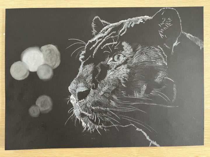
5. Underpainting: Once I've cleaned my paper with my brush and my poster putty, it's time to work on the first layer which
is the underpainting. We can start anywhere. I decided to start
with the right ear. I'm only going to be
using a white pencil. Now you can see
that the ear is not just a line that traces
the shape of the ear. There are hair sticking out. I'm using short, wispy lines to make them
stick out of the ear. With a quick motion, I also drew the longer hair that comes from the inside of the ear that sticks
out even more, the hair on the edge of the ear, if that makes any sense. Once that's done, I work on
the wrinkles on the forehead. For these, I'm drawing
really short lines. During the whole process of
doing the underpainting, I'm drawing really light lines. I am not pushing hard at all
on my pencil because this is the very first layer
and I'm going to be adding a lot more
layers of colors. If I push too hard
from the get go, there will not be
enough grain left on the paper to hold on to the
pigments of the pencil. Don't destroy your
paper too soon. While the goal of this
process is to block the main shapes that are represented by the
highlights on the dark fur, I'm not just coloring
those shapes, I'm still representing the fur. I'm going in the
direction of the fur. I'm constantly looking
at the reference photos, drawing the highlights
on the fur. That's what is starting to form the shape of the head and
all the elements on it. Make sure you keep your pencil tip
sharpened at all times. As you add your lines, don't draw on the same side
of the tip all the time. Spin your pencil so that
it will help keeping it sharp without having to
constantly sharpen it, But once you've used some of
that tip, sharpen it again. Also make sure you
keep your paper clean all the time so
that you don't damage it. On the top of the nose, you can see that there's a big shadow in
the middle of it. You can apply even
less pressure on your pencil so that the black of the paper
shows through more. And it gives you the impression
of the shadow compared to the areas where you added
more pigments on the paper. And that covers the black of the paper and it looks
like it's highlighted. You can always go over the brightest highlights
with several layers. So go over them a few
times with a pencil, but don't just don't push on it. Just adding light layers is
enough to brighten the area. Now you see that
in several areas, like the left side of the nose, for instance, It
is a shadowy area, but there are also a
lot of highlights. You can, again, play
with your pencil to either draw the lines of
the fur closer to each other, you cover more of the paper and make the highlights
look brighter. And then you can
also those lines further apart from each
other with less pressure. And then those highlights
look a bit darker for the whiskers. I sharpened my pencil really well first, and it's a quick
whisper line with your wrist that you
have to just commit to. If you're unsure of yourself, you can always try to do
the motion up in the air right above your paper before
you put your pencil down. Now I do sharpen my pencil
throughout this video, but just to shave a few
minutes of this video, I cut those parts
because it's off camera. Anyways, and I didn't want
this lesson to be too boring. The reason why I call this
first layer the underpainting, and that we're doing
it all in white, is because this
time we're going to add some colors to differ. Now, a lot of colors are a
bit transparent and they do not show very well on the black sink in the
black paper absorbs them. Doing an underpainting
with a white pencil is like building a barrier against the black of the paper. We're building our first layer to cover the black of the paper. And then with the colors, we're just going to
glaze that white. Because the white
is already covering the majority of the paper or
a good amount of the paper, the colors will
not be sinking in. They will stand out a lot better than just going straight
on the black paper. You can see that around
the eye and nose. The fur is going in all
sorts of direction. So make sure you
keep your eyes on the reference photo so that you can draw those lines
in the same direction for the eye. I am accentuating the highlights and I'll build several layers of colors
over them after that. But I'm pretty much drawing the eye ahead of time
just in black and white. I guess if you're interested, you can always watch
the same video. It's not the same
video, but it's the same step in
the previous class, which is the drawing of this same panther Pddressed
in black and white, except for the colored eye. This particular step
is not really an under painting in that case because we're not
adding colors to the. It's really more just like a first layer where we're blocking all the
different shapes. In that video, at some point, I show the application of the pencil with two
different angles. And it shows you a close up of the pencil
hitting the paper. It might be useful if you're interested on that ear. It was a great example on how to draw the wispy line that
I was telling you about. You basically commit to a particular spot and then
you put your pencil down. You draw your line real quick, and then you feather
it at the end by quickly lifting
up your pencil. Before you do the line, it tapers off that line and it gives it
really nice shape. Now for this lesson,
I'm keeping my paper nice and straight so that
you can see what I'm doing. But if it's easier for you, feel free to turn your
paper so that it's easier for you to draw the lines
in the direction of the. It's really more of the same throughout the whole process. I haven't sped up
the video at all. I just wanted to show you
really how it's done. And it took me about
just a little over 21, 22 minutes to do this
whole first layer. Just take your time. And again, always go back to
the reference photo. Your eyes should be
constantly going back and forth and back
and back to the photo. Back to your drawing as you go. Keep going like that
over and over again. Now for the whiskers again, make sure you have a sharp
pencil and they don't have to be exactly in the same spot
as on the reference photo. In the general direction
is good enough. In the general area
is good enough also.
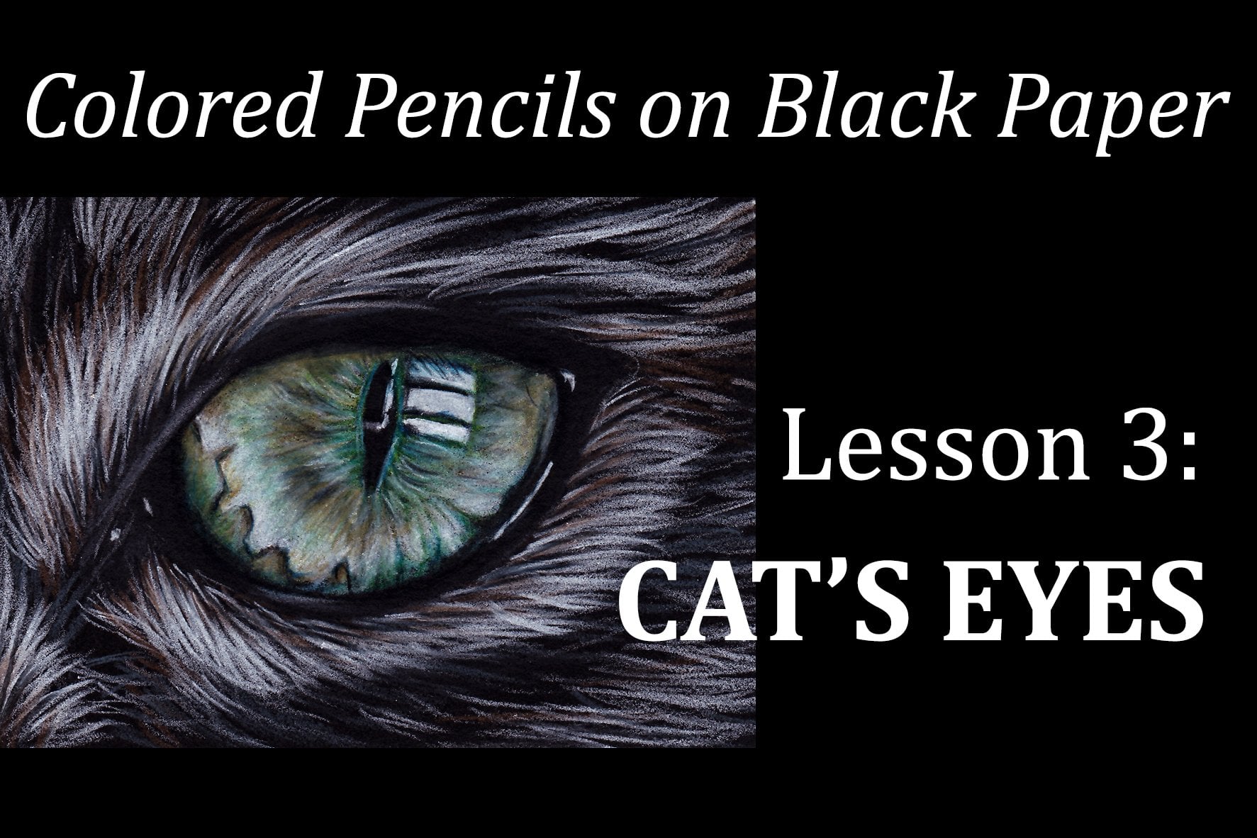
6. The Eye: Before I start using the colors, I want to establish the
lightest areas of the eye. To do that, I'm adding more
white to those highlights. It's going to allow
the color to stay at the surface rather than sink into the black paper
and disappear. But I want to make
sure that I do not push too hard on my pencil because I'm going to add
quite a few layers of colors. If I already push too
hard on my white pencil, the paper will not be able
to take very many colors. After that, start
with the terra cotta, which is a reddish brown because the dark areas near the pupil
have a reddish highlight. Instead of using an
actual brown brown, I think this one
would work better. Then with the sunburst yellow, I go over the whole iris. Again, not pushing too hard. You'll see that in the areas where the white was left white, the sunburst yellow
really pops and it also tones down the terra cotta. Then with the dark brown, I go over the shadows again. The dark brown also has a little bit of a
reddish undertone to it. I use the white again to go over the high light areas just so that I can add
more colors to them. I always make sure that my tips are nice and sharp
because it will allow me to add enough pigments without pushing too
hard on my pencil. With the Spanish orange,
I start burnishing. A burnishing means that
you start applying a bit more pressure to try to blend the colors you have
on the paper already. I'm trying to blend
that orange with the previous layers and also
the brown in the shadows. Then I add some mineral orange, And I tried to bring back those highlights with
another layer of white, again, with a layer
of Spanish orange. And you'll see that the whole
time I'm adding layers upon layers to give the whole
area a nice depth. I added some more
terra cotta for the red highlight
under the pupil. Now with the black, I'm going
to redefine the pupil and around the iris since it's
working on the details. Make sure that, again, your tip is nice and sharp. After that, with a
very light pressure, I go over the shadow areas
just to darken them with a light of it needs to be light
enough so that you can see the other colors through it. Defining a few more details, a bit more white, a little harder on the white
reflection on the eye. Then, with a very
sharp black pencil, I added the few eyelash
shadows, and that's about it.
7. Adding Colors Part1: Now that we're done with our white underpainting and adding the colors to the eyes, it's time to add the
colors to the fur. So we're not going to be
using much white for now. We're going to start
building layers. And it's not going to look
very good right away, It's going to look choppy. But as we keep on adding
layers and layers, it will soften the
previous layer. In the end, the fur will
look all nice and smooth. We're starting with
a 70% cool gray to darken the temple
near the eye, then closer to the ear, we're going to darken
it a little bit with a 70% cool gray. Some areas are warmer
and some are cooler depending on how the light
reflects on the fur. And that's really a
matter of observing the picture at this point. I'm basically adding a wash of color over the white under
painting to tint it, to add some color to it. I'm not necessarily
trying to add defined hair, I'm just glazing. You can see that on
this side of the eye. Some areas are more in
the shadows than others. I'll go back from the lighter, warm gray to the
darker, warm gray. Because even in the
darker shadows, you see a few highlights
here and there. With the scena brown, I'm adding a touch of red because the Siena
brown is a reddish brown. I'm adding that touch
of red under the eye. And again, just a light
touch of it for now. Now I'm blending the light umber with the Siena
brown under the eye. And adding a little bit in
the corner of the eye to, on the temple where I saw a
slightly brown reflection. Back to the gray. This one
is a cool gray because the shadows on the inside of the eye and closer to the
nose are a little cooler. So I'm going back and forth with different degrees of grays at this stage. It doesn't really matter much how
sharp you pencil is. The sharper it is, the
more defined it is. But you don't want to
push too hard because it's still the beginning of
the layer building process. If you push too hard
with a sharp point, then you risk crushing
the texture of the paper. If it gets flattened
too early on, then you won't be able
to add very many layers. When you use colored pencils, it is a layer building process. It takes time and patience, and so you do not too hard, you just keep on adding light
layers over light layers. And that's how you colors start blending together and
that's how they start showing more and
more intense colors as you add more layers. If you push too hard, too soon, you won't be able to
achieve this effect. Now it's time to use the badge to lighten the high
lights under the eye. As you can see,
I'm still going in the direction of the hair
and because in that area, I've already started glazing
a bit with the browns. I still want to see the hair direction because you can actually see
it on the picture. It's not all smooth and flat. So I'm just drawing
uneven little lines in the direction of the fur. And I'm going back and
forth with the brown in the yellow colors to start building the colors that I
see on the reference photos. But the yellow, orange, I'm adding that obvious orange highlights
right there too. I didn't want to do it too early because it's not a
bright, bright orange. And adding the other colors underneath made it a
little bit more subtle. And with a dark umber, I'm defining that little shadow, the little crease under the eye. Trying to blend it so it's not
super defined and it just, it looks a bit more
natural that way. And actually it's
not dark umber, sorry, it's dark brown. And that one also has
a reddish undertone, but a lot darker
than the other one. Always look at your
reference picture and try to find the little nuances
of colors here and there. Use your color picker
if you need to. If you have the
option of using one, that's very helpful
all the time. If you have a hard time defining which
colors are showing, don't rely on your own
judgment saying, okay, that the Panthers, the whole thing is
supposed to be black. There are a lot of
different reflected colors that are from the environment of the animal back to the grays. Now that we're getting
closer to the mouth, the shadows are a
little bit warmer. So I'm using a 70% warm gray to create the shadows
around the nose. The grays are nice because they're pretty opaque and often so I'm talking about the prisma colors because
of their softness. They really help blend the
colors together really nicely. They soften the lines. I really like them.
It's nice to use them to work on the
transitions between colors. Just softening everything,
making it look more natural. Again, just doing it
with a light hand. I don't want to cover
everything with that color. Just want to transfer some pigments from the
pencil to the paper. I hope I'm making
sense at this point. I'm looking all
around the picture to see where that darker gray is. Now back to the shadows
around the nose, you can see some
lighter shadows. Also some light
reflecting on the hair. This time I'm using a
lighter gray, 20% warm gray. I believe that's what I like to use for the warm highlights. That one is really soft too, so it's very nice
to soften the hair. And again, I'm using it
to soften transitions between the darker
and lighter areas. It's better to use
that one to blend the colors than the white, which is a bit too harsh. All right, now it's time to add the colors around the mouth. So with a peach, I'm adding that pinkish
undertone before add the orange, then I'm adding some beg
again, mixing those colors. Eventually you'll
find the right color that will resemble the
color of the picture. It's not always straightforward. You might not have the
exact color that's needed. Sometimes you need to play
with the colors you have. Sometimes you pick
one and it's a little bit too yellow or too pink. You have to tone it down
with another color. Remember to keep your
paper clean as much as you can because the black
paper is pretty unforgiving. If you have pencil
residue on your paper, as soon as you see it,
try to get rid of it. Whether it's with a
brush with your poster, puddy, Just just get rid of it. Because if you're by mistake, crush it with your hand
because you didn't see it, it might just leave a
permanent mark that you won't be able to erase
later or remove. Make sure you keep
your paper clean. Now it's time to
work on the orange because I already have a
few colors underneath that. Orange is not going
to be too bright and too orangy for the fur. This one is mineral orange. I'm pushing a little
bit harder this time, but not much harder. I'm at a point where I'm
trying to keep my tip a little sharper because I've already started
working in that area. The layers are building up. I need to add a bit more
pressure to show the color. Adding some dark brown
for the shadows on the warmer side of the
mouth, the right side, and glazing that same
color on the left side of the mouth where there
is a lot more shadows. But they're nice and
warm and have an orange, red undertone the
same on the chin. You have a reddish
shadow there adding orange but lighter orange, yellowed orange, this time
to the side of the mouth. Pushing yet a little
bit harder on the sharpened tip and
always following the hair and using besh for the highlights as I'm
pushing a bit harder. Now on a pencil, you see how everything's
blending together. All the different layers of colors that I've already added, they come together and the
fur looks a bit smoother. It's not a harsh as it was when it was just
the white underpainting on the chin. There's a
lot of longer hairs. And I do believe
actually that cats, they do have whiskers
also on the chin. That's why you see
some longer hairs that you think are hairs. I think those are whiskers.
8. Adding Colors Part2: I'm using the black a
little bit early here. I just wanted to go back to the line between the two
sides of the upper lips. I don't know how you
call those parts of the animal's head, but I was losing
a bit that part. So I wanted to define
again the line, and I'm doing that by
following the direction of the hair and carving back into the color, same under there. I needed the hair to be more
unruly and stick out more. I used the black to
redefine that area. I'm also on the chin,
drawing black hair, going into the colors to detail the chin
a little bit more. Then with the side of my pencil, I just add a little
glaze to blend the hair into the darker area so that there is
a soft transition back to the dark brown. I'm doing about the same thing as I just did with the black, where I'm trying to define
some of the hair a bit more. It's actually
something we can do in the next lesson where we
work more in the details. But I started doing it there to help me see if I needed
more colors or not. Both with the black
and the dark brown, I made sure that my pencil
was nice and sharp. Because I'm actually
drawing hair now. I want to make sure that the lines are
a bit more defined. I'm not just glazing, I'm adding more details. I'm going back and forth with all the different colors
that I've already used to readjust and make
sure that I end up with the colors that I
want in the right areas. Like I said earlier, it's really a game of patience
and observation. Just looking at each little area and comparing them with
the reference photo. Checking the colors,
see if they match the shadows to see if
your shapes are correct. If you get tired with an area, you can just move onto another one and come
back to that one. After that, now I decided it was time to start adding colors to the
tip of the nose. I'm basically doing the same as I did with the
side of the mouth. I added some yellow
orange first, and then something a bit
darker, the mineral orange, blending everything
with a French gray to tone it down a little
bit so it's not too bright. In some precise little spots. The highlights are
really bright. That's when I'm adding the white just a little
bit, just a touch. And redefining everything
with the black, if necessary, if I
lost some contours. But again, this is also
part of the detailing. It can be done later on. I just wanted to do it now because it helped me see better. So I decided to lighten the highlights with a
French gray here too. I'm using the lighter ones, the 20% 30% and I'm going
back and forth with this two. That's what I'm going to be
using for the nose as well. I'm trying to blend and get a smooth transition on
the top of the nose. It's going to take
quite a few passes just because you
have the grain of the paper and then you'll be able to see the black
underneath for a while. Going lightly, I'm adding lots and lots of layers
to cover it all up. Nothing too much right away. I'm always going in the
direction of the fur, The 20% French gray for
the lightest highlights, and then the 30% French gray for the slightly
darker ones. Now with a 70% warm gray, I'm going to work on that darker shadow in
the middle of the nose, but I'm going light because I don't want
it to be too dark. This is a very light glaze and I overlap the highlights as well. For a very soft transition, some areas are a little darker, so I'm adding a very
light layer of black. And as you can see, I'm
using the side of the tip. The point I don't want like a clear cut black line, the light peach. I'm working on the high
lights under the eye, the right eye that we barely see on the left side
of the drawing, the highlights are almost white, but there's a tiny, slight pinkish color on it. A light peach is
working well for that, madding, some also to
the tip of the nose because there's not quite
enough colors just yet. Wherever I think I see some to try to tie
everything together. I'm a sliding a bit of
beige and some warm gray. Redefining the shadows
with a darker gray. Now I'm working on the color
on the top of the head. That's a tricky area
because it's not very well defined that the forehead wrinkles you can
still in some areas, follow the direction
of the hair, but some others you can't
really see anything. You're mostly adding flat
washes of your colors up there. It's between pink and orange. I'm using a peach. The right ear, the edge of the right ear is a
little bit more orange. And same with the left ear, so I'm using the
mineral orange Again, the hair sticking
out is also orange. A little bit for the top
of the head and the ears. I'm going back and forth
with the peach color, peach light, peach badge. The back of the neck is
more of a cool gray. It's not as warm as
the front of the head. The neck right under the head has a nice little highlight
and it's nice in orange. So I'm using the middle
orange and the yellow orange. At this point, I'm working
all over the place to try to add the last colors that I see and try to tie
everything together. If you keep on working in
one small area at a time, you might have a tendency
to just add that color in that area and then it stands out because it's nowhere
else in the drawing. So it's nice to add it
in different areas. So heading more badge
on top of the head. And yellowed orange as well, just glazing it
because you don't really see the hair much. And it's a very
light glaze really. Now, with a very sharp black, I'm going to try to define the hair where you can actually see it on top of
the head, on the forehead, and same around the ear because it's not
like an even line. You can see the hair
sticking out of the ear with that black pencil. I'm basically cleaning up and defining the shapes
a little bit more, trying to make the transitions
a little less harsh. And by adding lighter
washes in the shadow areas, applying very light pressure, I can redefine those shadows and make them blend seamlessly. At this point, just observe your picture go from one little area to
another little area. Compare your drawing with the reference photo
and see if there's anything else that
needs to be added that's not quite part of
the detail process yet. Just make sure
your colors match. See if you want to add more and then we'll start
adding the details.
9. Adding Details: At the end of the
previous lesson, we had already
started working on the details a little bit with the prismacolor
black pencil. Trying to blend
the shadowy areas and make the transition
nice and smooth. But now we're
finally going to use the door went drawing
pencil in ivory black. This pencil is in softer. When you apply a layer of it on the black paper,
it does not shine. As opposed to the black
prismacolor pencil. With a very light hand, I'm applying some
black pigments on the black fur where we
haven't put any pencils yet. And I blend it with a soft paper towel overlapping
the edges of the fur. The colors where we
already established the fur to help soften the
transitions even more, I'm basically covering
all the black areas of the paper except
for the background. Of course, for the
chin, for instance, you can see that it's
very easy to fade those lighter areas into
the darkness of the fur. This technique makes it very
easy to do so now of course, you can very well leave the
black paper black as it is. But I found that
it really softens the edges and I personally
like it better that way. I'm very lightly going all over the dark fur and
overlapping and darkening the shadowy areas
because I'm not applying very much pigment and
I'm not destroying the grain of the paper by
applying a lot of pressure, I will be able to adjust the
values later on by adding more colors or lighter colors if needed in the large areas. As you can see,
it's just coloring. And I'm even using the side of the pencil to
make sure that I'm not using the tip and adding too much pressure
and too much pigment. Then I spread the pigment
again with the paper towel. Also, there is pigment
transfer on the paper towel. So there is some
black colored pencil on the paper towel as well. In some areas, I can
actually use that to darken some shadows rather
than using the pencil itself. I just go and rub
in that area with the paper towel and it
helps add some shadows. Now that the mid tones, the darkest shadows
have been established, I can rework the lightest
highlights For that, I'm finally using
the white pencil. For that, I make sure that
the tip of my pencil is nice and sharp because I'm going
to apply a bit more pressure. It's the very last
step of the drawing, so I can apply more pressure because I will not need to
add very many layers anymore. I also need to
have a sharp point because at this stage
I'm not glazing anymore. I'm actually adding details. I'm working the fur, so I'm drawing thin, even wispy lines in the
direction of the fur. And I'm trying to push
hard enough so that the white really stands out because I'm mostly working
on the highlights. Oh, if in some areas I went overboard with the white, I can always go back and glaze
more colors on top of it. The white will shine through
but will not be so obvious. Here again, it's working
in one area at a time. Comparing it with
the reference photo, making sure that I got
all the colors correct, all the shapes and details similar to
the reference photo. I'm also adding some colors to the whiskers because
they're not all white. Some of them have
colors reflected on them, some warm highlights. Another way I can emphasize
the high lights without making it bright white is
by using the lighter grays. A warm gray or a French gray. Because those colors, as I was saying in the
previous lesson, are nice and opaque. They are great to add on top of several layers because they
stand out really nicely. Oh, and now you see that after all the layers
we've added everywhere, the fur looks much smoother
than it did at the beginning. The colors were blended, all the lines were smoothed out, and it all looks a
lot more natural.
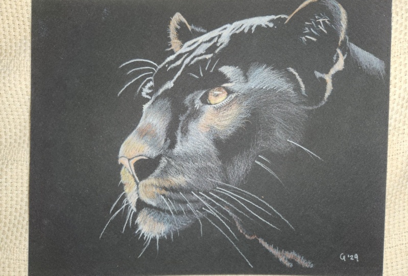
10. Final Thoughts: This concludes our six
class on colored pencils. I hope you enjoyed
adding colors to our Black Panther And
that this class helped to give you a better
understanding of how colors work on black paper and
how to pick your colors. It's quite tricky to draw
colors on a black animal. Remember that there are
always reflections on a shiny and all the colors around your subject
will reflect on it In any case. I hope you liked having two options for
drawing the same subject. An easier one where you
just used a white pencil, and one a bit more advanced, where you get to
pick your colors. If you've attempted
both classes, I'd love to see
your two drawings and let me know
which one you liked. Best feedbacks like that always help in the planning
of future classes. As usual, if you
have any questions, please don't hesitate
to ask and feel free to share your
progress with the class. Thank you for joining
me again today. I'll see you with
the next class.
 Sandrine Curtiss, Artist, explorer.