Transcripts
1. Introduction: Hi everyone. My name is Sandrin Curtis and I'll
be your teacher today. I've been drawing
with colored pencils, on black paper for
over 15 years. And it's time for
me to share what I've learned and the
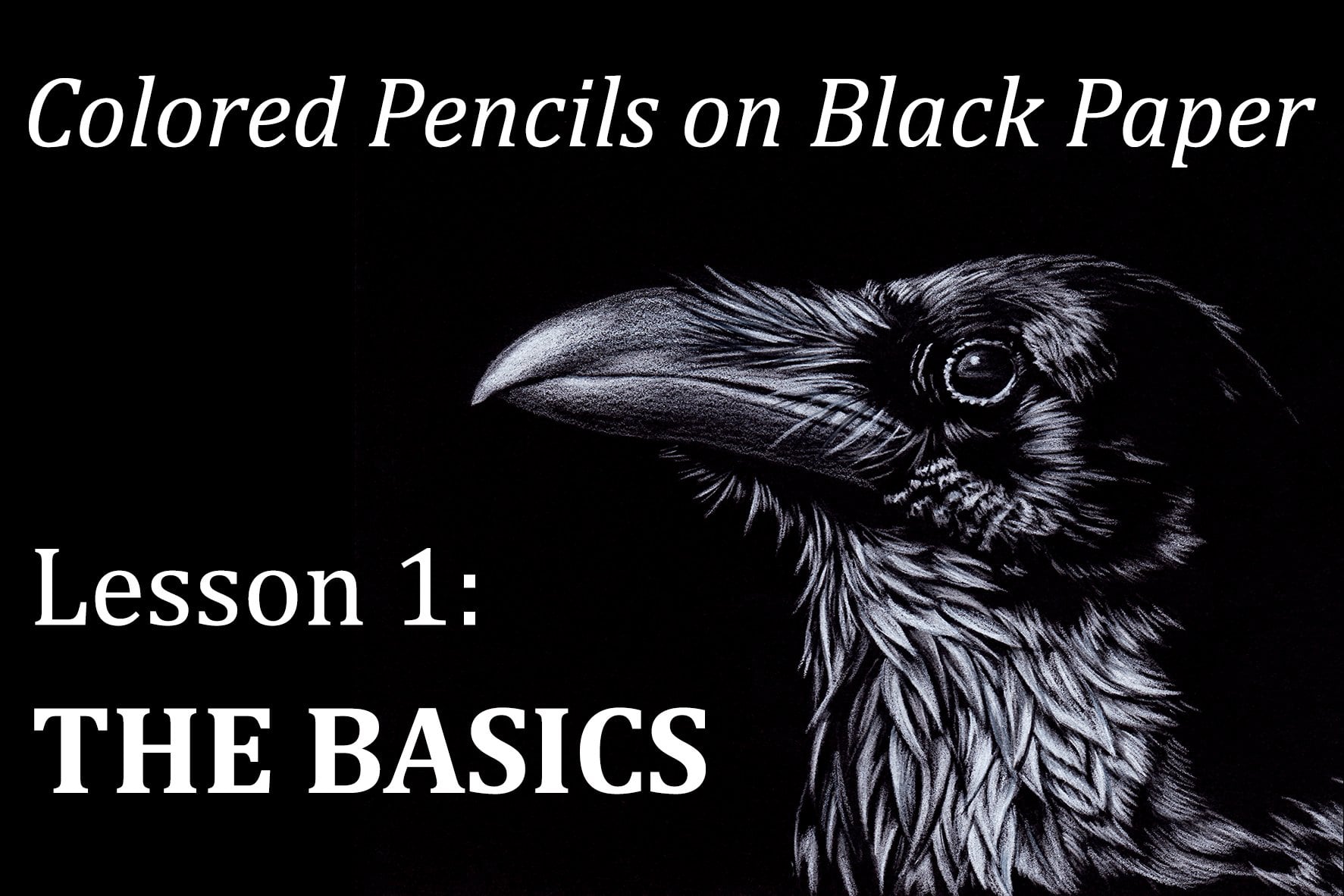
technique that I use. If you're brand new here today, welcome as a warm up. Before working on this project, I would suggest to
check out the videos 34.5 of the first class
called the Basics. It will give you a
few helpful tips if you've already watched
the previous classes, welcome back. You're probably
starting to be more familiar with working on black paper with
colored pencils. By now, this new project
will come in two versions. This first one is the easier, more basic version of the two, where we'll use
only a white pencil with a few colors for the eye. The second version will
be published shortly. That one will
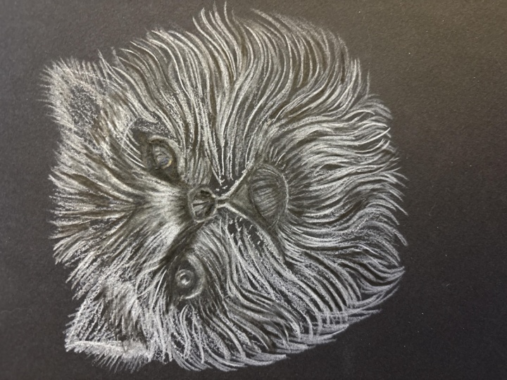
involve more colors. As you can see that the reflected lights on the
fur aren't actually white. But for now, I'm offering you an easy to follow step
by stepatorial that includes mostly real time
videos that you can see the full process and speed when I apply the
pencil on the paper. I hope you'll join me in
this class where you can follow the easy instructions
at your own pace. And please feel free to share your progress with the
other students and ask questions whenever you need to. I'll see you in class.
2. Supplies: For this project, you will first need a piece
of black paper. I like to use the
black stonehenge paper because it's smooth, but it still has a little
bit of grain to it, so I can add a lot of layers. It's pretty thick. You can feel free to
use any paper you like. Don't use something that's too, otherwise you'll
have a hard time smoothing out your layers. You can try if you don't
have any stonehenge on hand. Enson Excel makes some very reasonably
priced black paper. You can try that if you want to. Since colored pencils are a
very time consuming medium, I always suggest for start
to use a small format. Here I chose a five
by seven format, which I really like. I think it's really nice for
portrait with your paper. You're going to need
some tracing paper to transfer your sketch
onto your paper, or some transfer
paper. It's up to you. I do not recommend to draw
straight on your paper, because if you need
to erase your lines, you're going to
damage the surface of the paper On black paper, you actually see it very well. The surface of the paper
will start to shine. It's going to give you an
uneven surface later on. If you need to remove
some pigments, to not use an eraser for that, I use some blue or taking stick, it's basically poster putty. This is great to remove
anything that's on your paper. You can check out my
class called The Basics. In it, there's a part where I'm talking all about
erasing your pencil. Another way to keep
your paper clean is with a draftsman brush. If you don't have one, you can use a soft watercolor brush. You're going to need
a graphite pencil to trace your drawing, some paper towel for the final
steps when you're going to need to smudge your
pencils a little bit, then you medium the
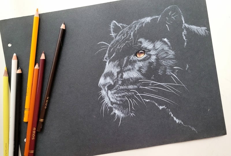
colored pencils, you're going to need a
white and black pencil. All these except for this one are prisma
color premiere pencils, which are my favorite
for black paper. But feel free to use whatever
you have in similar colors. The colors that we have
here are for the eye. On top of these, we have
terra cotta, sunburst, yellow, Spanish orange, mineral
orange, and dark brown. Again, you can use whatever
colors you want use. This is what I'm
using for my own, also for the final steps, I'm using another black pencil, which is the ivory black. And it's a door went
drawing pencil.
3. Sketch Transfer: To transfer the line drawing
onto my black paper, I usually use a piece
of tracing paper. I go over the lines with
a white colored pencil, a prisma color premiere, which is the brand that I'm
using throughout the project. Once the lines are traced, I flip my paper over with the white lines touching
the black paper. I use a graphite pencil, not too soft, but not too hard either to trace
over the lines. Again, I'm careful
not to push too hard as I don't want
to indent the paper. All I want to do is transfer the white lines onto
my black paper. Now, there's different ways
to transfer your lines. You can use a piece of transfer paper which
is like carbon paper, and it's actually available
in different colors. You can have it in graphite or you can have it with white, or blue, or red, Yellow. I think also I would
use an actual color, but since we were doing a
drawing in black and white, you probably could use
the white carbon paper. I think it would be
your best choice because the lines would
stand out nicely. You could also use
a tracing paper with a graphite pencil, but the graphite doesn't
stand out very well. On the black paper, you
could still see the line. If you tilted your paper, you'd see the shine
of the lines. But I would rather
use a white pencil as the lines stand
out a lot better. Feel free to tape your
paper onto your table. I've done this so many times
that I'm pretty used to it. But if you don't want
your tracing paper to move and having your
lines not align anymore, that's always an option
from time to time. You can also lift
the tracing paper to make sure that
you're covering all the lines that they're
all there on the paper here. You can see that once I'm done, there are quite a few
little white flex of pencil these I like to clean up. Before I get started for that, I use some blue tack, whatever brand you want. I slightly dab all the little flex and they
come right off the paper. I do not use an eraser because it's going to damage
the surface of the paper and you
will start seeing a sheen on the paper itself. That's something I
avoid at all costs, which is also the
reason why I do not sketch straight
onto the paper.
4. First Layer: For this part, I'm
only going to use a white pencil and I'm going to keep it as sharp as
possible the whole time, always keeping my eyes
on the reference photo. My goal is basically to
cover all the white areas, those lines that you see, the lines for the transfer. They're not lines that we're
going to go over unless it's the outline of the panther, but they're more like patches of hair with the light
reflecting on them. We're going to see the hair, but we're not going to
draw them quite yet. That said, when we
cover those areas, we're still going
to use lines going in the direction of
the hair of the fur. Oh, with a very light touch, I covered those areas. I use a coloring motion. I might not necessarily
lift my pencil, but I'm still going in
only one direction. As if I was drawing lines
that gave the idea of the, I hope it makes sense. Over the panther's
right eyebrow, I start giving an
impression of hair sticking out because you see
the edge of the head. You will see in some areas where the hair
is a little fluffier, you see it stick out. It's not going to
be a straight line showing the profile
of the animal. In some areas the hair will
stick out a little bit. There's a little bit
of the cheek also sticking out from
behind the nose. Don't miss that part. It's going to help you add to the three D effect of
your, your panther. I tried to film parts of this lesson on the two
angles so that you can actually see what the tip of the pencil looks
like on the paper. Unfortunately, the
quality isn't that great. I kept both footages and
decided to have them going at the same time so that you can choose which one to watch. But you can see on the
left one that the tip of my pencil is not touching
the paper very much, it's just barely caressing it. At this stage, I do not want to put too much pigment
on the paper. I'm just defining all
those areas and blocking the areas that we'll
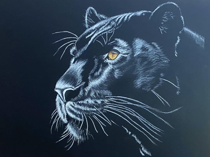
be working on a little bit more later on. For the eye. I'm also starting
to define it a little bit. This part will be in color. That will be the only part that will be in color
in this drawing. But I will not go straight on the iris with the colors because
the colors will sink in. Because it's a black paper, it's going to absorb the colors. Instead, I'm going to
add a layer of white, which will work as a barrier and will make
those colors stand out. If you paint with acrylic paint, you're probably familiar with this technique because there are quite a few colors that are pretty translucent
when you try to have, for instance, a yellow
rely on your painting. Unless you're painting
it straight on white, it will not show very well. If you add some
white to your paint, it's going to change the
brightness of the color. So often what you need to do is put some white on
the painting itself. And then add the color, the transparent color you want on top of it to make it pop. So that's what we're going
to do with the eye later. As I mentioned earlier, I always try to keep my
pencil nice and sharp. However, in this stage, because we're not really
working the details very much, I'm not pushing very
much on the tip. The tip stays sharp a little bit longer
to a certain extent, but I've taken the habit
of spinning my pencil. I'll just draw one area, then I'll spin my pencil so that I'm using
another part of the tip. It sharpens on its own that way, but I still sharpen
it regularly. I figured that
you're getting the just of what I'm
doing right now, blocking off all those areas, using the direction of the fur to put my marks
down on the paper. I did speed up a little bit of this
video to make it shorter. I figured you'd still get it. It's not super,
super fast either. Now for the whiskers, again, you need a
very sharp tip. Sharpen it as often
as you can for that. And you need to draw
them in one go. So you can't just hesitate, because then your
lines will be crooked. Do not push too hard. We will add more
highlights on them later. But if you can
just do one quick, wispy line, lifting your pencil towards the end of your line
to give it a softer end. You can always practice in the air before you put your
pencil down on the paper. But use your wrist and
just go for it again. Keep your eyes on
the reference photo to see where to put them. It's not exact. They don't have to be exactly where they are on
the reference photo, but in the general area. And the similar length as well. Don't make them all parallel. They need to cross each other, otherwise it's going
to look unnatural. On the side of the mouth, the nose where the
whiskers come out, I don't know if
you've ever noticed, but there's often, it
looks like a darker line. There's a few rows of those. I guess the indent in there, the whiskers come out, don't put too much
white in those areas. We will define them more later on when
we add more details. The long whiskers there, they are a bit trickier
because they are long. Do the best you can. Again, in one go usually
helps make it better. I'll show you a trick to define your whisker later on if it ends up being
crooked or something, but you'll see later. And finally, I'm
adding a little bit more white to the eye to
define it a bit more, but I'll work more on that when we start
working on the eye.
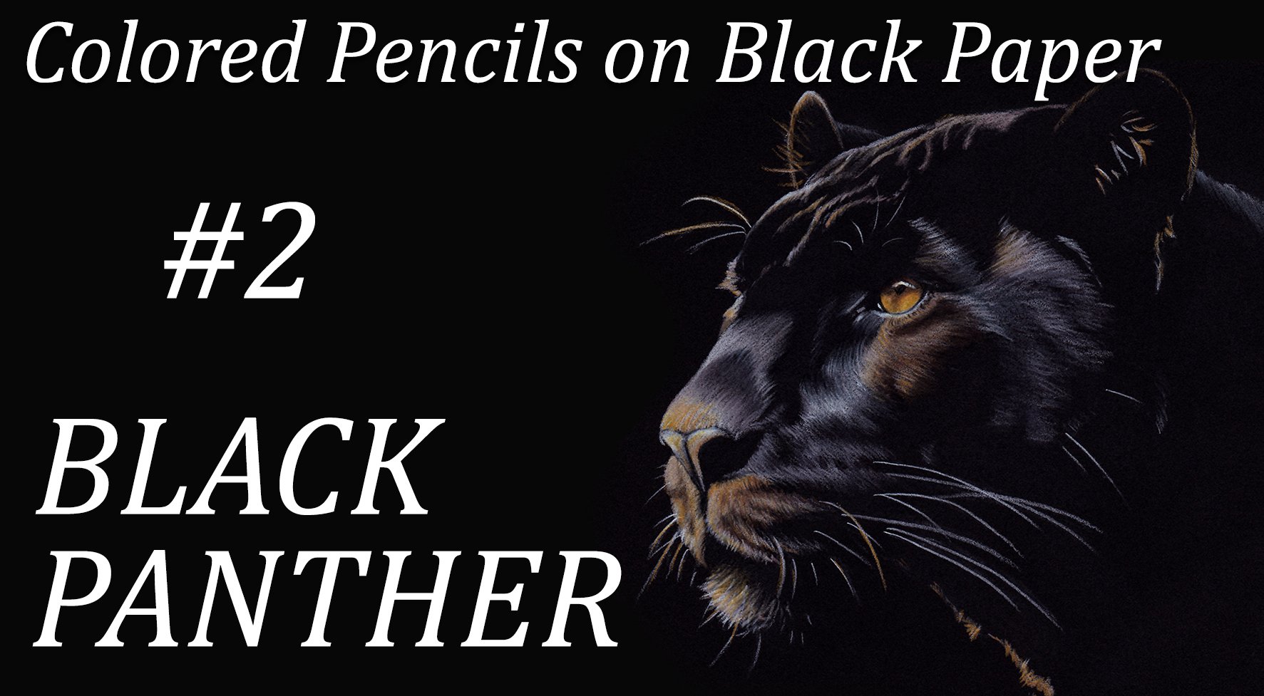
5. The Eye: Before I start using the colors, I want to establish the
lightest areas of the eye. To do that, I'm adding more
white to those highlights. It's going to allow
the color to stay at the surface rather than sink into the black paper
and disappear. But I want to make
sure that I do not push too hard on my pencil because I'm going to add
quite a few layers of colors. If I already push too
hard on my white pencil, the paper will not be able
to take very many colors. After that, start
with the terra cotta, which is a reddish brown because the dark areas near the pupil
have a reddish highlight. Instead of using an
actual brown brown, I think this one
would work better. Then with the sunburst yellow, I go over the whole iris. Again, not pushing too hard. You'll see that in the areas where the white was left white, the sunburst yellow
really pops and it also tones down the terra cotta. Then with the dark brown, I go over the shadows again. The dark brown also has a little bit of a
reddish undertone to it. I use the white again to go over the highlight areas just so that I can add
more colors to them. I always make sure that my tips are nice and sharp
because it will allow me to add enough pigments without pushing too
hard on my pencil. With the Spanish orange,
I start burnishing. A burnishing means that
you start applying a bit more pressure to try to blend the colors you have
on the paper already. I'm trying to blend
that orange with the previous layers and also
the brown in the shadows. Then I add some mineral orange and I tried to bring back those highlights with
another layer of white, again, with a layer
of Spanish orange. You'll see that the whole
time I'm adding layers upon layers to give the whole
area a nice depth. I added some more
terra cotta for the red highlight
under the pupil. Now with the black,
I'm going to redefine the pupil and around the iris, since it's working
on the details, make sure that, again, your tip is nice and sharp. After that, with a
very light pressure, I go over the shadow areas just to darken them with a very
light glaze of black. It needs to be light
enough so that you can see the other colors through it. Defining a few more details. I added a bit more white, push a little harder on the
white reflection on the eye. And then with a very
sharp black pencil, I added the few eyelash
shadows. And that's about it. Now, just as a quick disclaimer, I just want to let you know
that I did lose the footage for the coloring of the eyes
for this particular panther. I used the footage
for the other panther drawing the one
with the colors in the fur because the eye was drawn the exact same way
and with the same colors. But if you see a slight variance on the drawing after this
part of the tutorial, that's the reason why they're probably not exactly the same. But I drew them in a
very similar fashion.
6. Adding More Layers: That we've blocked
all the highlights, which is essentially the only areas we're
going to work on, and that we've finished
working on our eye, it's time to define
the firm more. We're going to work on the
highlights again and apply different pressures depending on how bright those highlights are. We're going to keep
our pencil as sharp as possible and define the
hair a bit more now, always going in the
direction of the fur. Keeping an eye on
the reference photo. And working one area at
a time as you can tell. Like especially around the eye. For now, I'm not applying
a whole layer anymore. I'm just drawing lines just they don't have
to be super precise. Just make sure they
are not parallel. They need to look
a little bit messy because far is never going, always in the same direction. You can overlap them in some areas where
it's not really smooth. You can show the end of the hair that's not
the same length. Remember to spin
your pencil a little bit so that you don't have
to sharpen it all the time. But do remember to sharpen it as often
as you can, though. If necessary, you can always move your paper around to
make it easier to draw. I try to keep it straight so that it would be easier
to follow along. It's never easy to watch a video when the paper is being
moved in all directions. And it can make you actually
it's happened to me before. Whatever makes it
easier for you, just follow your instincts. Some areas of the head are hit by the light a
bit more than others, and it's mostly the
front of the face. As you add your layers, add a bit more
pressure each time. In some areas it's so bright that you can
just color it all in without necessarily showing
any details for the hair. Now on top of the head, what we're doing is mostly
working on the folds, the ridges and
valleys of the skin. It's wrinkly a little bit, that's what you're
working on and you're just drawing the ridges. Some are look, just
like a white line. But you know that it is
fur that you're drawing. You can try to define
the fur a little bit, but it doesn't have to be
very detailed in that area. It's not really very precise. Now, there is no particular
order in which I draw whatever part of the
drawing catches my attention, that's where I'm going
to go and I don't finish necessarily one area
before I go to the next. Sometimes my eyes are
playing tricks on me and I'm having a hard time figuring
out where I add the lines. When that happens, I just try to refocus my
attention somewhere else. I go to another part
of the drawing. And then I focus
on that new part. For the Ear, it's true with a lot of the outside
edges of the face. What I mean is like the lines that mostly are on the
left side of the face, on this drawing, you see a
lot of the hair sticking out. Don't just draw a line that
shows the shape of the ear. Make sure your hair sticks out a little bit
to make it look more natural then the hair that
sticks out of the ear. Same. Just make it light and wispy and overlapping.
Don't overdo it. You don't need to
draw a lot of it, but just show that there is some light hitting, some of them again on top of the head. It's hard in some areas to see which direction
the fur is going. Keep your eyes open and try to follow the
direction if you can. Now on the very top, it's, it's pretty smooth, so you don't necessarily need to show the fur, the fur lines again, on the left ear. Try not to make a line
that's too nice and neat. Show a few marks
that give the idea of a little bit of F sticking
out the hair inside that. Also too many. Just a few will do. So I'm going to start adding brighter highlights
on the whiskers too. For this one, I could
have messed up a bit. I noticed that it
was a bit too long, so I was trying to
shorten it a bit, and then I made it a crooked, but I'll fix it later when I'm working on
refining the details. The top of the nose
is quite bright. I'm going to start pushing on my pencil
a little bit more. Not too much, because
I'm going to add even more white layers later on. But it's definitely
brighter than a lot of other areas here. I'm making sure that
we do see the lines of the fur and I'm making sure that they go
in the right direction. Although there's a big
shadowy area right in the center of the
top of the nose. I'm making sure that I'm not
adding too much white there. And I added some hair
sticking out from the top of the nose because it's never
a clean edge right there. You can play with the pressure
you put on the pencil to work on the shadowy area, to add less pressure than the mark you're
putting is not as bright. And therefore you can still
see the black of the paper underneath and still give
an impression of a shadow. Apply more pressure
where it's less, where it's more shadowy. The nose itself
is pretty bright. So I'm putting more
pressure on my pencil, trying to add a
smooth layer of it. And then I'm trying
to redefine the shape of the nose to that
I lost earlier. Now this side of the
nose and mouth area there is very bright. Again, I'm pushing a bit more on my pencil to be consistent
with the highlights. It's one of the brightest
areas along with the nose. Here again, you can see
that the fur sticking out, adding a little bit of
unruly hair helps to add some texture and makes the
drawing look more natural. Also, around the eye and the side of the nose, the hair goes in quite
a few directions, so be very careful
and attentive. Always keep, well, you always have to keep your eyes on the reference picture
no matter what. But in some areas it's particularly
important that you do. So now on the very side
of the nose there, the highlights aren't as bright, so I'm not adding as much
pressure on my pencil. With each pass of my pencil, I'm overlapping more
and more layers of hair going in
different directions. Well, going in the direction of the fur that I see on the photo. But like I said before, the hair needs to overlap and not be parallel so
that it does look natural. Something that I forgot to
mention earlier when we were tracing the
lines onto the paper, is that if you go too hard
with your graphite pencil, when you trace
your line drawing, you might end up having
grooves on your paper. If you do then when you start adding the
colored pencil on it, then you'll see that pigments
will not be able to go into that groove of the paper and it's going to stick out. You're going to see it
very well in your drawing. It's just basically
going to ruin it. So be extremely careful
when you either trace your drawing or transfer
it with transfer paper, or however you put your
lines on your paper. Now for the chin, there's a lot of little
hair sticking out, so I have fun with that and put a little bit more pressure and make a lot of little wispy
hairs sticking out of the chin while you're adding a
bit more highlights, again, on the whiskers. And be careful when you do that because it's not always very easy to go over your lines again,
especially the whiskers. They're already hard to
draw in the first place. A small, high light just
on the edge of the far, the rest of the neck
is in the shade. Because of the chin and
the rest of the head, the neck is in the shadows, but you have a little bit light hitting the edge of the far, which helps define that neck and makes it look pretty cool. There's a little bit of unruly
hair right above the eye, so make sure to make
it look a bit uneven. And then there's a
bit more highlights on the side of the eye. That's about it with this part and we're just about done
adding all the highlights.
7. Adding Details: With a very sharp black pencil, we're going to start defining
the edges of the hair, not all over the drawing, but in certain areas. Going very lightly
and with wispy lines, I'm trying to soften the edges
of the highlighted hair. In some areas, like
near the nose, near the nostril, I'm mostly adding a light glaze of black. Rather than really
defining the hair, I'm just marking the shadow a little bit more
near the mouth. I'm defining those darker lines
that I mentioned earlier. The D, I guess if you
can call them that. Where the roots of
the whiskers are, where they come out
through the fur. The nose needs a little bit
of a shadowing as well. It's not all highlights. And the top of the nose
also was a bit too bright. I'm adding a glaze
of black as well. I'm doing it just
the way I did it. When I started applying the
very first layer of white, I'm following the
direction of the fur. What I'm basically
doing is going all around the drawing
and see where I can define the hair bit more and correct the shadows
to help my values more. I don't want everything
to be all white. I'm using also a door
went drawing pencil. It's a black one and
this is very soft. I'm using it on its
side and I'm using it to glaze more shadow areas. I like this pencil because the finish on
the paper is matt. When I apply a bit
more pressure, it's not glossy like
most colored pencils. It also smudges very nicely. I can use a paper
tel to smudge it around and give a very soft
effect on the white fur. It helps me establish
some soft shadows, which later on I'll be able to readjust again with
a white pencil. Now on my P Patel, it leaves me some black residue, which I can use in a few areas if I need to
add very subtle shadows, rather than applying the
pencil straight on the paper. Also using that
black at the base of the whiskers to soften
that end of the line. Because sometimes it
can be very thick, that helps me soften it. I can correct, like the whisker all the way on
the right of the drawing. I had drawn it too long, I was able to cover the end. Earlier I had dabbed my poster putty onto it to remove as much of the
pigment as possible. And this time I just used that black pencil
to cover the bit. For the nose, it's pretty shiny. I pushed on the white
pencil quite a lot, but I want to make sure
that it looks natural. The fur that sticks out onto
the softer part of the nose, it's not a straight line, so I need to make
sure that I show that back to the top
of the nose where I'm lightening those
highlights even more, pushing a little bit
harder on my pencil, I'm using the paper that has
a bit of a black pigment on it to soften the difference between the shadow
and the highlights. My goal is to basically have very soft transitions
between those two so that we have a
more natural contrast. I'm just working on the values, pushing and pulling work
black, working on the white, the highlights around
the eye are pretty bright as well as I'm adding
more layers of white, I'm pushing a little bit more. Also, whenever I see a little bit of pencil residue
falling onto the paper, I try to clean it up as soon as possible so
that I don't end up crushing it with my hand and leaving
a mark on the paper. I'm using a soft
brush to do that. Here again, you get to just really make sure
that you're looking at your reference photo and determining which areas are brighter and which
areas are darker. Squinting your eyes
actually helps you to find those lighter
areas in those contrast. Just really compare
each part of the photo with the same part of your
drawing one at a time to see if your highlights
are bright enough or if they're too bright and you can adjust your
drawing that way. Always keep in
mind that you need to follow the
direction of the fur. Your lines cannot be parallel to each other because
it's very unnatural. They need to cross each other
and go over each other. Go in separate directions on the edges, like the edges of the mouth, the fur sticks out. It looks a bit more unruly. If you have a hard time defining that area with just
your white pencil, remember to use your very
sharpened black pencil, the prisma color one
to draw black lines and cut into that white
f, which is white. It's just the highlights.
But you know what I mean. Keep on observing your photo and working throughout
your drawing. Once you reach what you think
will be your final layers, don't hesitate to push a bit harder on your pencil
because you know you're not going to need any more
grain for your paper. You're not going to
need any more layers. It's okay to push harder on
your pencil towards the end. Can also add some wider
marks on your whiskers. Not all of them
just because some of them are catching the
light a little bit more here, I made a mistake and my
line was not very steady. I was able to
correct it by using my black pencil on either side. Don't push too hard though, but that's a way to
correct your mistakes and the final touches, and that's about it,
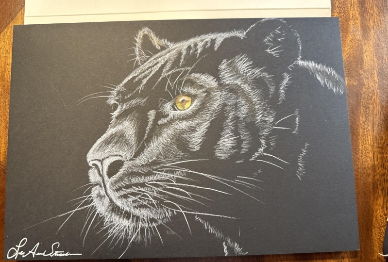
we're pretty much done. Once you're done, use the brush over your drawing again to
clean up all the residue. If they stick, use your posta putty to detach all those
that are stuck to the paper. And there you go, you have your beautiful portrait
of a black Panther.
8. Final Thoughts: This concludes the fifth
class on colored pencils. I hope you enjoyed working
on this new project. As I mentioned at the
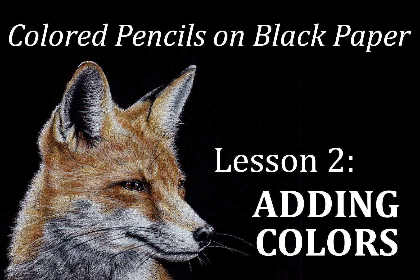
beginning of this class, a second version of this Black Panther will
be available shortly, where we will add
the surrounding reflective lights to the fir, rather than just using
plain white highlights. If you're feeling brave, I encourage you to try it out. And don't worry, it's
really not that hard. If you have any questions, please don't hesitate to ask and feel free to share your
artwork for this class. Thank you all for
joining me today. I'll see you soon with
the second version.
 Sandrine Curtiss, Artist, explorer.