Transcripts
1. Introduction: Colored pencil is a medium that everyone has tried but not everyone is aware of it's
incredible potential. What if I told you
that you can make amazing drawings using relatively simple techniques? Hello, my name is Matheus Macedo and specialize in
realistic drawing. I usually invest my time in highly detailed species. But in this class I'm going to teach you the basics, which is how to
mix colors and get a smooth, and refined finish on your drawings. Before doing so I invite you to do simple exercises with me so that you can understand the fundamentals of
colored pencils, showing you the step by step to improve your drawings. I'll use professional pencils, but I'll also show you how you can make the best of cheap materials. I'll also show you some extra tools that can help you when working with this medium. For the project of this class, I'll teach you how to choose the right colors to make a drawing by studying any reference image you choose. We will then apply the technique of mixing colors. We'll even learn how to read a texture in our drawing. Our ultimate goal is to make a drawing with vibrant colors and then refined finish that will
make it stand out. Do you feel like improving our colored pencil drawings? If the answer is yes, grab your tools and let's draw.
2. What we are going to draw: Thank you for signing up for this class on how to draw using colored pencils. In the next videos, I'll show you the materials I'm going to use to do the
studies of this class. I'll show you how I mix colors in the videos about gradients, doing them with both professional and cheap pencils. Then I'll show you how to apply the technique learned
to color a sphere. Finally, we're going to review and apply everything in a class project in
which I will show you how I choose the
colors I will use, how I draw the sketch, how I do the base
layers and details of each one of the parts of the objects that I chose, which is in this case a pair. Let's talk about the materials.
3. Materials: Regarding the materials, guys, let's start with the
colored pencils. I'm going to work with Faber-Castell
Polychromos pencils. I chose them because they are high-quality
professional pencils. They are easily
found where I live, and because I can buy them open stock individually. Of course, they're not the only pencils we can buy open stock. Polychromos pencils
are oil-based, which makes them ideal for details as they
have a firmer lead. On the other hand, filling large areas with them
takes more time. I'm going to give you a list of the colors I'm going
to use in this class. All the colors I chose
are available in the Polychromos 24 color set. Other excellent pencils are Prismacolor Premier, and Caran d'Ache Luminance. These pencils are wax-based, which makes them easier to blend but more difficult for details. If you want to use
professional pencils, it is best buy a few pencils individually before buying a whole set as they are more expensive, and then you'll figure out which options suit your needs. You can do the exercises of this class using
only cheap pencils, like Faber-Castell classic set. With these pencils, you'll have a wider range of colors for a much lower price. If I were a beginner, I would start with them. Be aware that I will not use watercolor pencils here. You can use them,
but you have to know that they need a
different approach, and are not the
best to do details. For the gradient, and sphere studies, I'm going to use
the underneath side of this Canson paper. It has some texture
which makes it able to absorb more pigment from the pencil. On the other hand,
the painting will look grainy, less smooth. I will initially use a
more porous paper so that later you can compare
the results, I will get using a smoother paper. In this case, I'll use the Strathmore 300 Series Bristol Smooth. The vellum version from the same brand is
also very good, but more textured. I prefer smooth
papers because they allow me to work
the details better. There are other good paper options, preferred, those with a wave superior to 150 grams per square meter, and suitable for colored
pencils, of course. Any pencil sharpener will do as long as it fits
the pencil you use. If you're not sure
which one to buy, look for sharpener of the same brand of your pencils. I personally like hand-cranked sharpeners. They shape the tip very sharp, and have only the disadvantage of not being portable. To do the outline, I will use a HB graphite pencil. H, and B pencils will also do. Common plastic erasers can be used to erase graphite
sketch lines. To erase colored pencil I prefer the eraser pencil. This type of eraser is very useful for doing highlights. Since erasers release crumbs over the drawing, I think it's nice to
have a soft brush to get those crumbs out
without having to blow, and eventually, spit
on your drawing, which would be inconvenient. That's it.
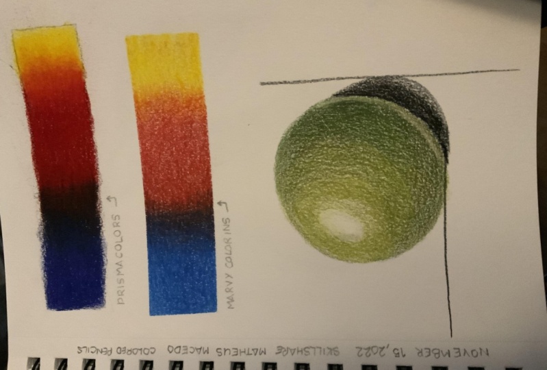
4. Gradients: professional pencils: Hello, guys. In this video, I will show you how I blend colors using colored pencils. For that, I'm going to make a gradient with
the dimensions of 4.5 per 1.5 centimeters. Regarding the
colors, I'm going to use the three primary colors, which are blue, red, and yellow. You don't need to
use the same colors as me to do this exercise. But if you want to do so I'm using Faber-Castell Polychromos colors Number 110, 219, and 107. This gradient is the result of the overlap of
these three colors, each of them varying in intensity as we
see in this image. Take a good look at this as it will be our reference to
fill in this gradient. My suggestion is that we put the three colors on the
paper gradually and simultaneously so
that the transitions between one color and
another are smooth. The technique presented here is known as layering. What we're going
to do here is fill in through successive
layers of color. Let's start with blue. It is important to
understand from the beginning the movement that is done with the hands. Without putting too much pressure on my hand, I'm going to do a
circular oval motion. Initially, I'm doing these movements diagonally, but in the next layers, I'm going to do this movement in other directions, to cross the strokes. From left to right
for this color, the covering will
be a little more intense and will
gradually become lighter. However, as this is
still the first layer, even the most intense
part will be light. It is important to understand that this movement
must be light. If you apply too much pressure, you may damage the tooth of the paper and it will not be able to work
with successive layers. Why should I work with many layers you might be asking, because from my point of view, working with layers will get a much more beautiful, much more refined result. This is what will make your drawings level up. Now with red, we'll follow the same procedure. However, since we're starting in the middle, the idea now is to start strong in the middle and decrease the intensity towards left and right sides. How to paint with lightness. Watch how I hold the pencils. To make it lighter, I hold the pencil a little
further back. Your thumb will be about the middle of the pencil's
body, not near the tip. Now using yellow, starting with more
intensity on the right, and decreasing the intensity of the painting towards the middle of the gradient. The pencil movement is the same as I did with the other pencils, a more diagonal movement, sometimes almost vertical. Now, we're going to start the second layer. I'll go back with blue, this time doing a more horizontal movement if the purpose of
crossing the strokes with those of the
previous layer. But that's all that changes. I'm not yet putting a lot of pressure on the hand. I'm going to decrease
the intensity of the layer towards the center of the gradient, just like I did on
the first layer. Now the same thing with the red pencil, look how I hold the pencil further back, you won't even see my hand here. Same thing with
the yellow pencil. Now, on this new layer, let's perform a more
intense covering. This means I will increase the pressure I
apply with my hand. Regarding the direction
of the strokes, I'm going to do it in a different direction than what I did on the
previous layer. In a way, it repeats
the movement of the first layer I made. I will do this with
all the three colors, emphasizing the most
intense area of each color where the
colors are pure. At this point, you may have noticed how the field
looks grainier. This is because I am using a more porous paper. Conversely, if you're using smooth paper, your gradient will
be less grainy. In the pair exercise, I'm going to use a smoother paper, which is my favorite so you can
see the difference. As you can see, each color will invade the area of the others. As we fill in these areas, the colors will gradually
blend together. From now on, just
repeat the process. I'm going to speed up the video a bit so you can see how the colors are being build up little by little. Every new layer I make, I will increase the
pressure on the pencil. However, you don't
need to exaggerate it. Especially, if you're using professional pencil. If you're using a
workspace pencil, I believe you won't have to make as many layers as I make as these pencils
blend out more easily. This is the case with Prismacolor premier and Caran d'Ache luminance. The advantage of Faber-Castell Polychromos, as it is oil-based, is that it is better
for doing the tails, which let's face it, it's not the case here. When you're looking for your new professional
colored pencils, keep in mind what your goals are with these pencils. If possible, test them before purchasing a multi-color set. At this point, we
will see what emerges when we mix one
color with another. It's no surprise that when mixing red with blue, we'll see purple and when mixing red with
yellow, we get orange. Here, more and more, I'm going to use the three colors simultaneously, trying to those, each
one of them in order to obtain a balanced gradient. When you notice that the paper is no longer holding new layers of color, it means it got
saturated and you won't be able to do
much else after that. Here, I will consider
my gradient finished. The whole process
took an hour to complete, so don't be in a hurry when doing this exercise. This is a perfect
opportunity for you to master your
coloring with pencils. This exercise is the
basis of any and all colored drawings you will make with this material. Try to do it with all the patience and
dedication it needs. I hope you enjoyed this lesson.
5. Gradients: cheap pencils: In this video, I'm going to do the same gradient of
the previous video, but using cheap pencils. As I did the previous gradient, using Faber-Castell Polychromos, now I'm going to use more affordable pencils
from the same brand. The paper used is
the same though. This is the set I
find here in Brazil, and as far as I know in all
Latin America countries. These pencils can
be found all over the world with a few
variations in the box, but they are the same pencils. I have a 48 color set, but they can be found in
sets from 12-72 colors. In this video, I
don't need to give detailed instructions
because they are the same given in
the previous video. Despite working with
cheaper pencils, the process is the same. It is important to know, however, that the result
will not be the same. As I got to the end
of this exercise, I realized that cheaper pencils have a lower ability to overlap. I get to a point
where the paper just won't accept new layers
from these pencils. I don't know exactly
why this happens, but I believe they have
a higher amount of binder and a lower amount of pigment in their composition. In practice, I felt
that in general, I need to apply a little
more pressure to fill in the gaps and it affects
the tooth of the paper. As I go on, I noticed the paper
becomes more waxed and less capable of absorbing
the pencil's pigment. For these reasons,
to my surprise, I finished this gradient
in half the time I spend doing the same gradient
with Polychromos pencils. That is, I finished this
gradient in about 30 minutes, but I finished faster
because I couldn't work anymore as the colors
weren't blending anymore. Let's compare the two gradients. The top gradient was done with Polychromos pencils and the bottom gradient
with cheap pencils. The feeling of coloring with cheap pencils was
actually pleasant. I didn't find the
pencils hard despite having applied more pressure
since the beginning. However, as the pencil
seems to have less pigment, I felt the result is poorer. The colors definitely
became less vivid. There is more wax than pigment
in the lower gradient. But it's important to know that non-professional
pencils are less resistant to natural light, so the durability of your drawing is compromised
when using them. If you want to reach
a professional level and want your drawings to last, you should invest in a
higher quality material. However, as you can see, you can make good drawings
using cheap pencils. The drawings I'm showing here were made with them.
6. Sphere: In this video, we're
going to draw a sphere. Now that we've
learned how to blend colors in the gradient exercise, we can go ahead and put what
we've learned into practice. To paint the sphere, I'm going to use two
shades of green, one lighter, the other
darker and a shade of brown. I also added black and the dark gray to make the shadow
that is cast on the ground. The polychrome pencils used are the ones that
appear on the screen. Since the outline is drawn with the HB pencil and I try to
draw it as light as possible, we can barely see the
lines of the sketch. However, the scheme on the left shows exactly
what I'm doing. First, to draw a
circle perfectly, I use the masking tape. The sphere is about seven
and half centimeters in diameter, three inches. Then I divide the sphere
into five different areas, each with different
light and shadow values. When we are coloring our sphere, we will have these
areas as a reference, but we will always make a smooth transition from
one area to another. Make the sketch very light so the graphite won't be seen
in the finished drawing. If you drew the lines
a little darker then use an eraser to
make them lighter. Now, let's start coloring. I'm going to start
with the brown pencil, but I could start with one
of the green ones as well. Following the process we
did in the gradient study, I start by applying the
colors lightly on the paper. As with the gradient, I'm going to make a
smooth transition between the limited areas. This is very important. On each pencil layer, I will also cross the strokes in different directions so that the covering will look smooth. Then I use this darker
shade of green, which is emerald green. With it, I'll cover not only the areas
besides the brown area, but also the brown area itself. I'll make a lighter layer because we're still
on the first layer. But also take care to
make a gradient from the darkest area to the
lightest, avoiding sharp edges. I'm doing this exercise on the same surface I did
the gradient studies. Once again, we will have a more porous result
with more texture. Here I keep on using the
emerald green pencil, covering almost the entire
area of the sphere, except them white areas. Later, we will use
a light green. Here, I went back to using brown and I'm going to
make the second layer, putting a little more pressure
on the hand and making the strokes in
different directions so they don't get marked. You will notice
that I'm going to go a little further
with the brown, always trying to
make a gradient from the darkest to lightest area, decreasing the intensity
of the painting. Always remember to work
with a sharpened pencil. This will help the pencil
grip onto the paper's tooth. I will do the same with
the emerald green pencil. I'm going to focus more
on that darker area. After all, here we will have a more intense blend
of green and brown. I'm going to skip some parts because I don't want the
video to be redundant. But it is important
for you to understand that this work requires
a little patience. The total recording time for
this video was two hours, so it's twice the
time it took me to paint the first professional
pencil gradient. Now, adding a layer
of light green, you can put a little more
pressure on your hand, but that doesn't
mean you're going to apply maximum pressure. This will leave for the end. For now, let's mix
the colors gradually. Don't forget to apply some of that color on the bottom
of the sphere as well. There is a little bit of
light reflection coming from the surface where
the sphere is resting on. I'm going to show you some of the work with
the emerald green. I'm going to speed up
the video so you can see this step without
interruptions. In the area we
painted with brown, you can apply a green with maximum intensity painting
until the paper is saturated. Before that, if you
think it's necessary, apply a little more brown because later we won't
be able to go back. This also applies
to the light green. I will use it to paint
the sphere until the end, preserving only the light areas. If you haven't made a consistent
layer of emerald green, do that before
applying light green. After all, the idea is to blend the emerald green
using the light green. The technique of applying
a final color more forcefully to blend
the other colors on the paper is
called burnishing. At the top of the sphere
on the highlight, I'm going to use the
eraser pencil to make this transition from
color to light smooth. I'm going to do the same on
the bottom of the sphere. Right after that, I'll do
some more touches using the light green pencil and the emerald green to
finish the sphere. To finish this drawing, I'm going to make a small
shadow cast on the surface. For this, I'll use a black
and a warm gray pencil. I start with the black making circular motions,
doing it lightly. As this is a small area, the movements are
very restrained. Here again, it's important to make the edges of
the covering smooth, especially for its
being a shadow. Only the edge of the
sphere will be sharp. Soon after, I'm going
to use the warm gray. Also with a light hand doing sharp motions and feeling an area a little larger
than a black one. Making the second layer, returning with the black pencil, already coloring with a
little more intensity. The sphere's boundary is where the black would
be the most intense, so use the black
pencil more there. Right after that, I come
with the second layer of warm gray filling
in another area around that zone or the
black will be more intense. I felt the need to use the eraser pencil to smooth
the shadow edges out. From here until the end, I did the final touches
to this drawing. This is the moment when you
can stop for a while, get up, take a break and then
when you come back, you can look at your
drawing more critically. You will understand better
if you have something to correct or simply consider
your drawing finished. I hope you enjoyed
this exercise. I look forward to seeing
you in the next videos. See you there.
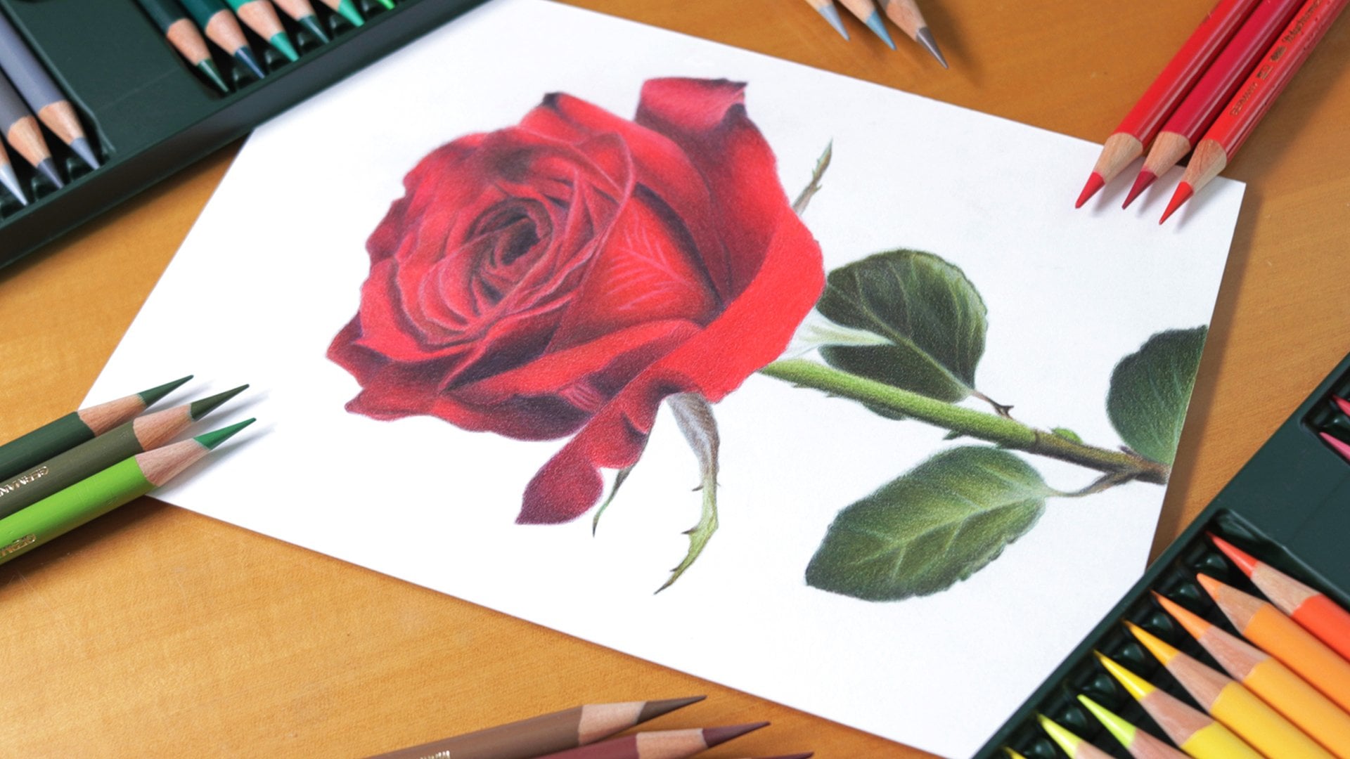
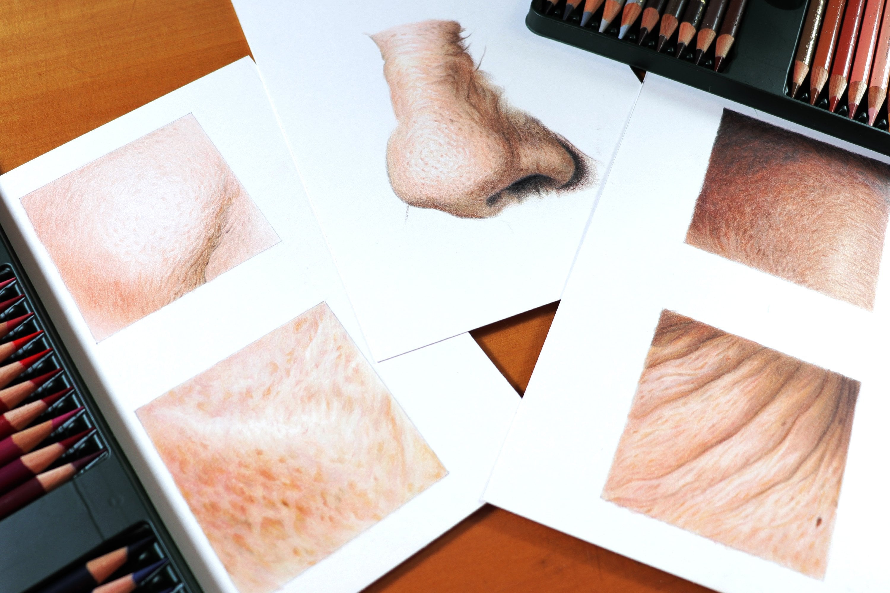
7. The class project: For the project of this class, I'm going to show you how I draw these pear, including how I choose the colors I'm going to use. In addition to the sketching and painting process. The way to draw it, it's like a sphere, but it has a few more elements to work with. First of all, here we will have the chance to work
with more colors. In addition, we also have the chance to make the texture that
covers its surface, which makes everything much more interesting. I made this drawing on an A5 size sheet of paper, which is half
a regular A4 size. It's not a big drawing. Without further ado, let's get started.
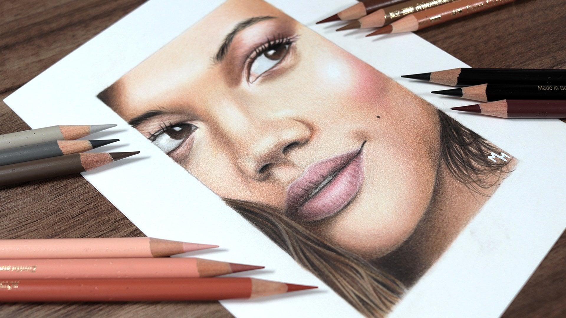
8. How I pick the colors: In this video, I want to talk about how I choose the colored pencils that I use in a project. This is a topic that
unfortunately is often neglected by drawing courses in general. However, it is very important because this skill
will make you an artist independent of tutorials and step-by-step videos. The first step for us to know what we're going to use is to look at
the pencils we have. In my case, I have a 60 colored pencils set of Faber Castell Polychromos. But to make this class
more accessible, I've committed to separating the pencils that are available in the 24 color set. From there, I look at
my reference image, analyzing what the
main colors are and what pencils I
have for each color. Let me give you an example. To do this, I open the image in Photoshop, starting with the fruit itself. What are the main colors we see there? The first color I see is yellow. In Photoshop, I use
the eyedropper tool to separate the colors, I think are the most important. I'm doing this just
to be more deductive, so you can see what
colors I'm talking about. Then I sort out my yellow pencils and see which ones I think
I'm going to need. I recommend that on
a separate sheet, you make a color chart with the pencils you have, so you'll know what they
look like on paper. In the case of
yellow for example, I tried the three shades
of yellow I have, and the first color I identify was the lightest
shade of yellow, Number 100 far from polychromos. On the fruit, not including the stem and the leaf. In addition to the yellow, I noticed shades of orange, red, and brown. I also separated all the pencils that I have that
could be related to these three main colors and trying them on paper. The second color I identified, there was a light orange, and I thought that to achieve that shade, a single pencil
would not be enough. The only orange pencil I have is 115, so I would have to use this
color combined with some other color to achieve the desired shade. After trying the orange with other colors,
I found that the combination of it
with burnt ocher, 187 was the closest
to what I wanted. I would be sure that the second pencil
would be used as well. I went on right on
the next color. I tried two colors, and I thought I was close to the result until I added a shade of red and I thought it
was even better. In this case, I found
three colors at once. Of course, some colors can be guessed quickly. For example I knew since the beginning that I could use all three shades
of yellow that I have, because they are
similar to each other, only varying in intensity. Others, I knew I wouldn't use, purple is an example. There are cases where
you might not have any suitable color to use and have to improvise. For example the leaf on this pair has a general view closer to yellow. However, in polychromos
24 color set, only one of the greens has this characteristic, which is 168 green yellowish. The solution was to
use this shade of green as a base
throughout the leaf, and use a more bluish green, moderately 264, dark
yellow green in addition to a shade of brown, 177 one brown. What I think is very
important is that you don't fall into
the temptation of simply using black for darker areas and white for lighter areas. Usually shadows and lights are much richer than that. Simply using white
to lighten and black to darken, and will make your drawing a little poorer. That doesn't mean these colors are banned, of course. I'm going to use white and black in some specific areas. I will upload to
the attached files, the colors identified
in despair. You can use my list, but it will be
interesting for you to do your own tests to put your observation
skills into practice. I hope this video was helpful.
9. Pear: outline: In this video, I
want to show you how I draw the pear's outline. As it is a very simple drawing, I believe you'll not
have any difficulties, but I still wanted
to give you a tip to make the task easier. A piece of advice is
that you draw the pear by simplifying it into simple shapes and
using guidelines. The pencil I'm using
is the HB pencil. The first thing I did was to place the drawing on
the sheet of paper. For this, I drew a vertical
axis passing through the middle of the paper so that the pear is centered on it. Then I marked the
highest and lowest point of my object on the axis. The position of these
two points will define how big our
drawing will be. I suggest not to make them too close to the
margin of the paper. Leave some space between
the margin and the drawing. Then I mark where the fruit
ends and the stem begins. In this case, it's towards
observed reference. Position this point in a similar proportion so that the elements are balanced
with each other. Now that I have the height of the fruit's body well-defined, we can draw its outline. For that, I'm going to simplify the fruit into simpler
geometric shapes. In this case, I think
that this fruit can be simplified into two circles, one on top of the other, the bottom one being
larger than the top one. Regarding the size of
each circumference, it's up to you to define it. Having traced the circles, it's much easier to draw
the outline of our object, which will pass around them. When it comes to the
stem and the leaf, these parts I do in a freeway. A tip I give to draw these
elements is to observe the empty space that exists
between them and the pear. This space is technically
known as negative space. Try to make this
empty space present in your drawing as well, tracing the inside of the
stem and the leaf first. Done. Now we have
our sketch prepared. Then I use an eraser to lighten these lines as I don't want to see them when I'm
coloring the drawing. This is the main reason
I use a harder pencil. As I said, I use the HB pencil. Softer pencils, like 4B and 6B, release more graphite
powder on the paper and end up mixing with the pigment
of the colored pencils, making our drawing dirty. Before you start coloring, remove any remaining
eraser cramps that may be on a
drawing surface. Once your drawing is clean, it is ready to be colored.
10. Pear: fruit: [MUSIC] With the sketch
done, let's start coloring. Since the color I see most in this pear is yellow,
let's start with it. I usually start with
the predominant color, as it will certainly
be present in all the other colors I add here. It is very important that
the first layer is done lightly as many other colors
will still be overlapped. I'm going to use three shades
of yellow in this drawing, which are the numbers 104, 107, and 109 from Polychromos. I started with the
lightest yellow because I'm doing the lightest
area of the pear. [MUSIC] Then I took the median yellow to
paint the middle area. Then I'm going to
use a darker yellow, always doing this circular and light motion
with the pencil. The idea is to cover
this entire area, leaving only the
highlights blank. [MUSIC] This leftmost area is closer to orange, so I'm going to make a second
layer using this color. Note that I'm not doing
those fruity spots yet, I'm just doing a more
general covering. [MUSIC] After the orange, I add the reddish tones. I started with the brightest
red I have, number 121. Another less saturated
red is 190 Venetian red. I like this tone because
it is less saturated, which allows you to lower the intensity of the
color if necessary. It is still a more
intermediate tone color which will not lighten or
darken the drawing too much. [MUSIC] Now we come to the green that I
use the most here, which is number 168. It's a green with a
more yellowish hue very present in this
reference, mixed with yellow. I hope you can see these green, the pear, because it's
yellow is not pure. I place it more to the right and in the lower portion
of the fruit. [MUSIC] Gradually by overlapping layers, will fill more and more the pores of the paper
and blend the colors. [MUSIC] This is 187 burnt ocher; a brownish orange that I believe will help us give the
pear a more natural tone. I'm also going to use
the 180 raw umber, which is also a brown, but with a more yellowish
and neutral tone. These two colors will give us a hand to decrease
the saturation, the intensity of the yellow, orange, and red
tones I used here. [MUSIC] As I get to the darker side, I obviously use darker colors. This is the case of
177 walnut brown, which I will use with care as the shadow is
not that intense. [MUSIC] Here I am using a dark red for the
first time, number 225. I'm starting to make smaller
spots more detailed. Only at this point we will begin to see our
pear take shape. It takes a while to get here, but it's worth building up
our drawing little by little. I still need to do
a wider covering, which is what I'm doing
with the 180 raw umber. [MUSIC] Notice how these smaller spots change color along the fruit. On the left side and on
top, they are orange. Further down and to the right, they become dark red and brown. Also try to make
the spots lighter first and then
increase the pressure. In some cases, you can make them using more than one color. In fact, it's hard to
find any pure color here. I always mix various colors as it makes our
painting more dynamic. Now, let's watch how
I make these spots. [MUSIC] The pattern of the spots here continues
with a more intense red. I decided to make more of
them here in this area, as I noticed them
in the reference. I think there is
more orange and red around here in bigger spots. If you think you've made
some areas too intense, try picking up colors less
saturated, closer to brown. In the case of
Polychromos pencils, these are pencils such
as 180 raw umber, 187 burnt ocher, 190 Venetian red, and 177 walnut brown. I could also mention
the white pencil, but I use this one
only in the end. [MUSIC] When I use this intermediate
shade of yellow, 107 cadmium yellow, it's because I already wanted
to blend all these colors. For this, I put more
pressure on the pencil. I'm doing this because
I think I've done enough spots around here and now it's time
to blend them out. Soon I will turn my attention to the lighter area which
is still incomplete. More spots needs to be done, most of them being orange. Then to blend these colors, I use the white pencil, which will also decrease the saturation of the
yellow and the orange. It's nice that there's a
bit of light yellow here as well as a base to be blended
with the white later. [MUSIC] Here, working on the darkest area
of this fruit down there, using walnut brown and black. [MUSIC] From here, I'm going to finish this part by doing the final
touches on the fruit. In the end, I always take a moment to look at
my drawing and see where I can make
adjustments to make it look more like my
reference photo. [MUSIC]
11. Pear: stem: Now, I'm going to focus my attention on the stem, which is a much simpler part, but notice that it shows a certain richness of color. I start by using 180 raw umber, as it is a more neutral and this slightly yellowish brown tone. But there is a bit of orange and yellow here as well. I use this color to
sketch the inner parts of the stem from what I see in the reference photo. Right after that, I'm going to do their darkest parts. I prefer to start with
the walnut brown, red, and then black. Maybe you've already
noticed that I prefer to darken the
drawing gradually. This way, I believe I have more control of the process and the tonalities themselves. I'm going to use the 115 dark cadmium orange to give that touch of color that I see
in the reference. Then moving on with the colors, I intensify the shadows using the same brown, and also introduced the black where the values are really dark. I come back with the raw umber form on general covering, and closer to the leaf, the colors are a little lighter. I'm going to use the lightest yellow I have number 104, after having used raw umber and walnut brown. I had noted that I would use the dark red to 25 in this area, but I ended up not using it, you can use it if
you want, though. On the other hand, I didn't know that I would use the white
and green pencils, but you can use them conversely, I think there are colors that make sense here and I didn't use them just because I wasn't that peaking here. I'm saying this just to show you that these lists of colors to use are
not a close thing. You can and should use colors that you'll
notice in the reference, even if nobody pointed them out.
12. Pear: leaf: Now we go to the leaf. As I said, I see this leaf with four general
yellowish tone, and this obviously
influenced my colors choice. I started right away
with the green 168, the most used color around here. I made a light stroke to sketch this line that divides
the leaf in half. Then I colored the entire leaf lightly as it is just
the first layer. These green, I'm
going to combine with the medium yellow number
107 from polychrome. These two colors will
be the base of the leaf To random volume, I use the dark
green numbers 264. However, this green is called closer to
blue then to yellow. I had to compensate
for the coldness of the screen using
yellow and green 168. If you don't have
a specific color, try to compensate it by mixing it with others that
suit you better. Soon, I will also
introduce the 177, one or two brown, still moderately as this
is the base layer Here, the black 199 is
used in the small area. As I said, I tried
to moderate the use of black and brace
whenever possible. Right now, I'm alternating black and brown to give
volume to the leaf Here the general base values are already relatively
well-established. The next step is to consolidate these values through layering. I go back to using yellow
and the two shades of green. We also go back to
using brown and black. I'm going to speed up the
video a little so you can see the entire
process for awhile. After finishing this drawing, I thought I made
this line through the middle of the
leaf too thick. To make it thinner, use the shades of green, brown, and black around this line, decreasing
it's width. It is made from the outside in. As soon as you were satisfied with the
volume of the leaf. After using dark green, brown, and black, use light green and yellow to blend the colors
that is burnish, but not all over the leaf Notice in the reference
photo that there is a lighter area that is neither
yellowish nor greenish, but it's almost white. There then, I'm going to use a white over the other
colors I applied. Depending on the
brand of your pencil, white may leave a wider mark
or look more transparent. Faber-Castell's
white will not leave a strong white trace
over the other colors. On the other hand,
it will lessen the intensity of the colors
that are underneath. But the truth is
that I didn't use much white here on
the leaf anyway. Finally, I used green and brown to give some definition to
the contour of the leaf. Then it's time to do
the finishing touches.
13. Pear: cast shadow: Time to finish this drawing up. I decided to make a cast shadow, because I didn't want my pear floating in space. In this I will use three colors: 271 warm grade 2, 274 warm grade 5, and black 199. The most important
thing is to make a shade of that doesn't
have its edges sharp. From beginning to end, I'll do a shading by doing circular motions
with the pencil. I recommend holding the pencil a little
further back. Your movements will become lighter and loser. The [inaudible] , of course, is more concentrated in the part closest to the pair where less light arrives. From the first
layer, I try to work the transition from black to gray, making it smooth. I mainly use these two colors on the edges to finish it up. I'm going to use
the lighter gray, the warm grade 2, 271. The edges of the cast shadow will be blurred and that's the idea. To make the signature, I first sketched it with the HB graphite pencil, and then I use the black pencil over it. I didn't do it directly with the colored pencil because it's harder to erase it
in case of mistake, but you do as you like. Here we are at the
end of this video. I hope you both learned and had a lot of fun with this exercise. Thanks for watching until the end, and I'll
see see next time.
14. Conclusion: This was the class
with notions on how to use colored pencils. I ask you to post your drawings here on the platform. I would love to see
your drawings there, be then the gradient, the sphere or the final project. You can post all of your drawings there if you'd like. If you watch this
class until the end, please leave it a review. This will help me know how I can improve my classes and reach more students like you. Thank you very much and I hope to see you in other classes. Bye.