Transcripts
1. What's in This Class?: Welcome to my understand Hue saturation and
brightness class. My name is Thomas
and we are here to explore the three
main color properties. This session is part of my
color theory basic series to help you understand colors better in a hands
on style fashion. In this episode, we
are going to paint three dimensional color
space where you will learn how you can manipulate
your watercolor paints, how you can make them lighter, how you can create
pastel colors, how you can lower the intensity, and how you can
darken your paints. Working with colors
is fascinating, but it can be much
more exciting and effective if you actually
understand what's happening. So I encourage you to
come with me and let's continue our journey in the
world of watercolor paints. To paint your own color space, you will need the
following tools. Sheet of sketchbook paper. I'll be using an A four size, similar to the US letter size, 120 grams paper, a watercolor palette with
at least six base colors. Yellow, orange, red, violet, blue and green, a size eight
watercolor round brrush. Other than that, you will need the common
watercolor supplies, a water container,
and a paper towel. Whenever you are ready, I'll
see you in the first video.
2. Preparation: I'm so glad you are
taking this class. As a first step, let's
do some preparation. You can find this chart in a file for download
next to the lesson. The easiest option is to
print out this chart. But before you do that,
please check the paperweight your printer can handle
in the search engine, enter your printer type plus
the keyword paperweight. My paper is a 120 grams
relatively thin sketchbook paper, and my printer had
no issue with that. Another option is to trace this chart on your
computer screen. You open the file,
set the zoom level, you tape your paper to the screen and use a
pencil to draw the chart. Ather option is to print out
the chart on a copy paper, tape that paper on your window, tape your watercolor paper
above it, and trace the lines. The bravest students can try
to draw this chart manually. I'd love to see those projects. Anyway, I have my chart taped
done on a drawing board. I have a mixing palette
right next to it, so you can see what I
do with the paints. I have my color palette, the size eight run brush, a container filled
with clean water, and a paper towel to clean
my brush if I need to. If everything is set, we can start creating
a color space.
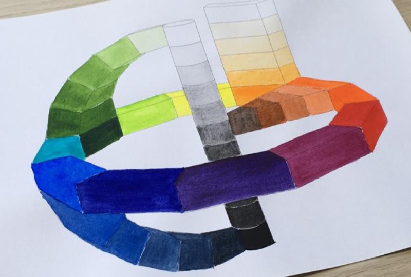
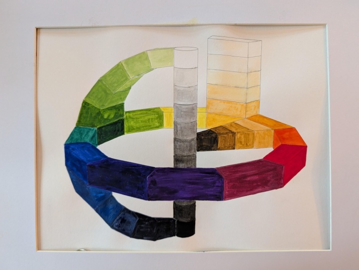
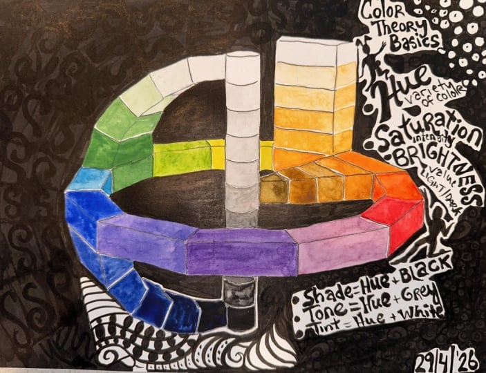
3. The Value Scale: I let's start off by painting a so
called value scale on the cylinder in the center. A value scale is a tool used by artists to measure the lightness
or darkness of colors. You can also see the
terms like tonal scale, tonal range, or value steps,
meaning the same thing. We have an 11 step value
scale that will show the transition
from black through different shades
of gray to white, which will be eventually the color of our
paper on the top. Let's paint the
value scale first, then we are going to talk
about what purpose it serves. So I'm dipping my size
eight round brush into the water and
dilute some black paint. You can use whatever
black paint you have. It can be even paints gray
if that's what you have. I'm putting some paint on my mixing palette that I'll be using to make
some grays soon. But first, I'm painting the bottom section with
the darkest black I have. Depending on your taste, you can try to be precise
with your brush strokes or you can just mark
this color with a few quick movement
on the paper. Now I'm taking my water bowl
and dipping my brush into the water slightly so the paint between the bristles
get diluted a bit. As you can see, we are
getting a lighter shade. I'm trying not to touch the already painted
section below. Our goal is to lighten
this black step by step until we reach the
top that paper white. I guess this is a bit
lighter than it should, so I'm taking some extra
paint from the palette. This looks good, I think. I'm gently dipping my
brush into the water again and painting
the next step, which is just a narrow stripe because this section
is behind the ring. To help me distributing
the values evenly, I'm painting a 50% gray in
the middle of my scale, so I can calibrate the
other steps more easily. The 50% gray value is
also called the mid tone. Water helps pigments to spread, but I don't want to
use too much water as my paper is relatively
thin and as such, it can get bumpy real quick. Maybe a bit more black to that. I guess this will
do for a 50% gray. Now another touch of
water with my brush, and let's paint
the next section. I I think there is too much water in here, so I'm taking my paper towel and lift off some moisture
from the paper like this. Let's take the paint even lighter with a touch
of water again. I'm trying to be
conservative with my value. I can always add
more pigments in a second round on a second
layer if I need to. Let's dilute the paint on
our brush to the extreme. This is almost like pure water. Very good. Now, let's
fill in the gaps. What's important here is that we keep an order
regarding values. A certain section has to be
darker than the one above. We may need to make amendments to the values, but that's okay. We are forming the final
value scale in steps. The top four
sections seem right. They are gradually darkening. But here below, I need to add
some more black pigments. If you feel your brush
stroke is too dark, make a dip into the
water and try again. Okay, it looks better now. Not that as watercolor
paint dries, it gets a bit lighter. So I'm going back to this one and adding further
black pigments to it. Let's also take the one both darker and paint this one too. In the meantime, I'm
checking the values of the adjacent sections so I can make a value on halfway
between the two. This is a simple but
excellent practice for learning to control
the lightness and darkness of your paint. We are doing it with black now, but this can be done
with any other color. The principle is the same. We are using water to
make our paint lighter. Now I'm just making some final
touches to shift the value slightly so I can get a nice even gradation
from black to white. I'm playing with the
ratio of paint and water. This is called water control, considered as the
most essential skill in watercolor painting. It's basically the
art of managing the ratio of water to
pigment on your brush, in your palette,
and on the paper. When we are making
this value skill, we are actually practicing
a fundamental skill. As I mentioned, I was conservative with
my black pigments, so now is the time to take these tonal values a bit darker. In case you wasn't
that conservative and you feel you applied too
much pigments in a section, meaning it's darker
than it should, you can try to lift off some
paint from the paper with a clean and relatively dry brush using your paper towel to
collect the excess paint. Okay. Mm. All right. I guess we are
done with our value scale. I hope you also got
some satisfying result. Now we can clean our brush
first on the paper towel, then rinsing it in the water.
4. Why Values Matter: Now let's stop for a
moment and see why this simple tool is so
important for artists. Once you understand the concept behind and start using it, it will be game changing. Let me show you two
thumbnail paintings. Which one do you like better? I guess most people would say that the second
one looks better, but can you tell me why? Now, let's see their
gray scale versions. I use the graphic
software to convert the original paintings into
black and white images. Now you see the difference. On the first one, we see
very similar values, some mido grays everywhere, so there is no contrast at all. While on the second one, we see values from very
light to very dark. There is high contrast
on this painting. So the broader range of values
you use on your artwork, the more depth and realism
you will get on your forms. If you limit your values
to a narrow range, you will get something that
appears flat to the viewer. Now the good news is that
you can train your eyes to see these value differences
even on colorful images. And once you have that skill, you'll be able to create
much more exciting artworks. All right. I guess we can move on to the next step
in our color space.
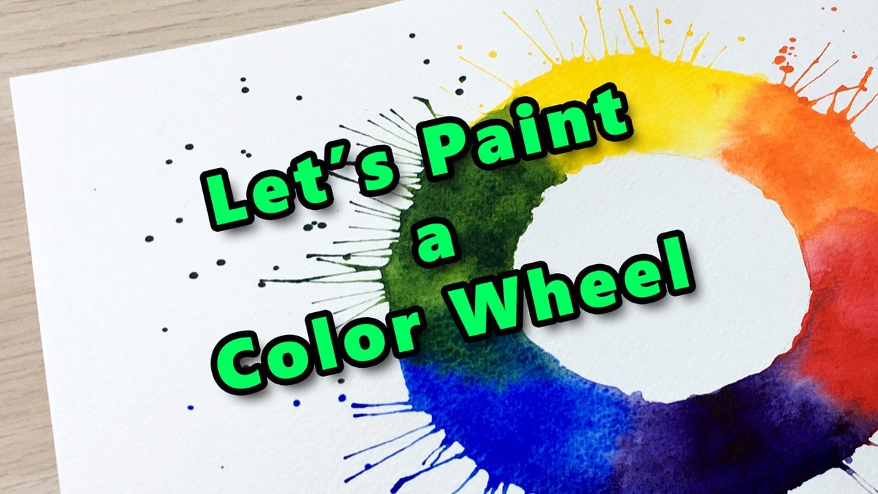
5. Primary Colors: By definition, a color
or in other words, a hue refers to a
certain wavelength, which will define its location on the color wheel
or in the spectrum. First things first, let's paint our primary colors
on the color wheel. If you took my let's paint an expressive color wheel class, you are already familiar
with these colors. However, here you can see
a 12 segment color wheel, which means that beyond
primary and secondary colors, we will also paint additional six so
called tertiary colors. But let's paint the
primaries first. This will be yellow at the back, red on the right, and blue
on the left over here. As I'm a right handed person, I'm starting on the
left with the blue. But still, I have to be careful not to touch the
value scale with my palm. I'm using ultramarine
blue paint, but feel free to use
whatever blue you have. Another frequently used blue
is cobot blue, for example. Tramarin is on the warmer
side of the blue family, while cobot blue is
on the cooler side. On this ring, I'm trying to paint with less
diluted paint, keeping my color as
intense as possible. We can also say that this
blue is highly saturated, but let's clarify the
term in a bit later. Now, let's just focus
on our primary colors. Once I'm done with the blue, I'm cleaning my brush. Remember first on the paper
towel, then in the water. This way, keeping my rinsing
water as clean as possible. I think I'm using cadmium lemon to paint
the next primary. It's on the cooler side of
the yellow color family. Again, feel free to use
any yellow paint you have. If your value scale
is still damp, make sure you leave
a gap between your yellow section
and the gray one. Otherwise, your
nice yellow paint will be contaminated by gray. If some gray is bleeding
into your yellow, dry your brush with the
paper towel quickly and lift off that gray from the yellow area as
soon as you can. Then wait for the area to dry and reapply
the yellow paint. Anyway, my yellow
section seems okay, so I'm cleaning my brush. And move on to the third
primary red over here. I'm using my so called Ruby to paint the striking
red section. Now, I'm cleaning my brush. And we can move on. A
6. Secondary Colors: Now, let's paint the secondary
colors on Acho wheel. These ones will be green,
orange, and violet. I'm using my sap green to
paint the first section, which is basically
just a rectangle shape over here, as simple as that. Now we can clean our brush. And move on to the
next secondary, which will be orange. I'm cleaning my brush again. And taking some violet paint. Here, a bigger size round
brush would work better, but I stick to my size
eight round brush anyway. M. As I mentioned, I'd like to have the
most intense colors possible on this ring, so I'm taking some more
dense paint from the pan. This looks good to me, so
I'm cleaning my brush. And we can move on.
7. Tertiary Colors: As you can see, we have six section left for
tertiary colors. Each one of them is a mixture
of the two adjacent colors, a primary and a secondary. Again, as I'm a
right handed person, I'm starting on the left. When we mix blue and green, we get the bluish green color, something from the Sian family. For the sake of simplicity,
wherever I can, I'll be using a paint out of
the box for the tertiaries. In this case, I have a nice
cobalt turquoise paint, which is in the Sian family,
so I'm using this one. If you don't have
a hue like this, feel free to mix your
blue and green paint on your mixing palette
in equal proportions. This is a beautiful color. I like it a lot. I want
to make this more vivid, so I'm bringing some
more dense paint. We can clean our brush now. Now, between yellow and green, we find a yellowish
green colour. I have a so called
My green paint, but you can get a
very similar hue by mixing sap green
with some yellow. This is, again, a
fascinating colour. Nice. We can clean
our brush now. Now, between yellow and orange, we find a yellow orange hue. I have a nice paint
called golden, so I'm going to use this one. I'm painting only this
kind of triangle shape, and we'll come back to
this section later. I'm cleaning my brush again. Between red and orange, we find a mixture of the two. Depending on which
component is dominant, you call it red orange, which is closer to
red or orange red, which is closer to orange. I have a cadmium red light paint that I'm mixing
with some orange, so I'm getting something between the red primary and
the orange secondary. Good. For this section, I have a wonderful paint called
quinacridone lilac, so I'll be using this one. But as usual, feel free to mix your violet and red
to get a similar hue. Perfect. Now for the last tertiary color, I need to mix something
from blue and violet. So I'm using my mixing
palette to create that hue. Actually, this is also a good opportunity to
improve our motor skills. We need to make some precise
brush strokes over here. Very good. I guess we
are done with the ring. We can move on to the next step.
8. Lighten with Water: Now we can get back to our
yellow orange section. What we are going
to do here is to lighten our base color
gradually with water. This will be pretty much
the same that we have already done on our value
scale in the center. We are just using our yellow
orange paint as a base, so I'm taking some
golden from my pen. Roughly, this is the
density that I used to paint the first section
for this tertiary color. In the meantime, I took some clean water so I can
use it to dilute this paint. I'm creating an
initial value scale on my mixing palette by adding more and more water
to my golden paint. Now I'm loading up my
brush with this value. I'd like to create
five value steps distributed evenly until I reach the paper
white at the top. Maybe I'm taking it even darker. Now, I'm taking a more
diluted paint from my palette and painting
the next section. I'm trying not to
touch the area below. But if some darker paints
are bleeding into, we can remove it like this. I guess I'm putting my eraser
below the drawing board so the surface gets a direction and paints can move only
downwards hopefully. Let's take some even
more diluted paint and fill in the next
section with that. Now I can see these two
are too similar in value, so I'm adding some extra
paint to this one. It looks good now. And let's paint the last section with
a highly diluted mixture. Remember, the top section
will remain paper white, just like on the black and white value scale in the center. Good. Now we can balance the values, so we get a nice gradation
from bottom to top. I'm adding some more golden
pigments to this section. And to the one below as well. Maybe to this one too. Oh, right. This gal looks nice to me. Note that each section on this column uses
the very same hue. We just made the base color lighter by adding more
and more water to it. Basically, we
change the pigments to water ratio gradually. This is the traditional
approach in watercolor to
lighten your colors. The water will keep your painting transparent
and luminous, as well as your paints vibrant. You may also see some dark spots on your yellow orange column. Don't worry about it.
It's just the thin paper as it interacted with water. As it dries, the
spots will disappear. Now I'm cleaning my mixing
palate with a paper towel. And we can move on
to the next step.
9. Lighten with White Paint: Now let's get back to our
green section and see what happens if we add white
paint to our base color. Will we get the same result just like with water or
something else? Let's find out. I'm putting some sap green on
my mixing palette. I'm cleaning my
brush completely. And taking some titanium
white paint from my pen. I'm cleaning my brush. Rinsing it and we can start mixing these
two paints gently. So adding very few
green to the white. We can, of course, dilute our paints with water
to get some fluency. For practical reason, we are going to move from light
to dark this time. It's easier to add
green to white gradually than creating
each value separately. So let's paint the top section with an almost white paint. Very few green pigments
are in the mixture. Let's add some green. And paint in the next section. Maybe there is too
much green in this, so I'm adding more
white to that. I need some water here. The reason is that I can
make this layer lighter with a second layer is that the titanium white
paint is opaque. It's not transparent like
most watercolor paints are. I can cover the previous layer
of paint to some degree, making it a bit lighter. Now let's add more
green to the mixture. And paint in the next section. I can add more green to
that. This will be nice. M. Actually, we don't need to clean
our brush at this point. It was just automatic. Even more green to the
mixture and paint. We can go even darker with it. As you probably feel, the consistency of your paint is different now from the
one we used with water. It's more creamy. It's getting harder to make your
brush strokes invisible. One last section with more
green in the mixture. I can go even darker with this. Very good. I'm pretty much satisfied with
the gradation of migraine, so I consider this scale done. Mixing white paint with your colors will
create an opaque look. The white will lower the
intensity of your mixture, which will eventually
create a pastoral feel. Adding white is also
called forming a tint. Now let me clean
my mixing palette so we can move on
to the next step.
10. Lower Saturation: Now is the time to talk
about the term saturation. Saturation refers
to the intensity, strength, purity, chroma,
or richness of a color. A vivid color has
high saturation, whereas a dull color
is desaturated. We can also call desaturated
colors muted or grayish. In our color space on the ring, we painted highly
saturated colors. Manufacturers try
to produce pure, highly saturated,
intense paints. That's what you get
out of the box, at least for professional
grade palettes. Student grade paints may contain less pigments and more
binding materials. You may need to reduce the intensity or
saturation of a color. You can do that in
several different ways. You can add white. That's
what we did with the green. You can add gray, that's
what we are going to do with the orange and
you can add black, what we are going to
do with the blue. Furthermore, artists often use a colors complement to
reduce its strength. A complement is the color directly opposite
on the color wheel. Now let's lower
the saturation of our orange by adding gray
to the mixture gradually. So taking some
dense orange paint. And let's create a
middle gray color from our black paint by
adding some water to it. Now with a clean and damp brush I start adding a bit
of gray to the orange. Let's test it on the paper. I guess I need more orange
paint from the pen. And let's paint the first empty section toward the center. So our paint is not
pure orange anymore. It contains a bit of gray. Now, let's add more gray to the mixture and paint
the next section. If you need to, add some
more orange to the mixture. As you can see, a brown
color is forming. We can say that
brown is basically a muted or desaturated
orange color. I'm playing with the
paint and water ratio on my mixing palette in order to get a nice shade
for the next section. I guess there is too
much orange in here, so I counterbalance
it with black. The goal would be to
keep the value at the same level similar
to this 50% gray, why we are changing only the orange black ratio as we are approaching
the center. This is definitely
a challenging task as you need to control
three different components, orange paint, black
paint, and water. Okay. We are supposed to maintain that
50% value level in each orange section and only lower saturation
toward the center. Oh If we convert this into a grayscale image, we should see a
similar 50% gray value throughout this entire
orange brown slice. I'm not sure I comply with that. I guess I have added a bit too much black to the
last two sections. They are darker
than 50% in value, but I hope you get the idea. I guess now we can move on.
11. Darken with Black Paint: Now let's see how we can darken our color by adding
black to the mixture. When we darken with black, we also say we are
forming a shade. Note that this is also
the third alternative, how we can lower the
saturation of our color. So I'm putting some
black paint over here. Cleaning my brush. I'm taking some ultramarine
blue from the pen. This is the color I painted the color we have for the blue. I'm cleaning my brush. I'm adding some water to
the black to dilute a bit. I'm cleaning my brush again. And let's mix some
with the blue. This paint is mainly
ultramelon blue, but it also contains
a few black pigments. And Now, let's add some more black to the mixture and paint
in the next section. Our color is supposed
to get duller, less intense, or less saturated. Mm. Let's increase the black ratio further and paint in the next section. Mm. By adding even more black, we are getting an
indigo like hue. So this is how you can darken your originally highly
saturated and vivid paint. M. In the last section, we have very few
blue pigments left in the mixture.
It's almost black. Not that we can actually
keep the intensity of a hue high while
we are darkening it. Some examples are deep magenta, dark navy blue, or
dark royal purple. They are all dark
in tonal value, but still saturated
or vibrant colors. And that's pretty much it. We have completed
our color space.
12. Let's Summarize: Now let's summarize. First, we painted the value
scale using black paint, showing all the values we
can make from dark to light. Then we painted the
three primary colors, yellow, red and blue. As a next step, we
painted the secondaries like green, orange, and violet. Then we painted the
six tertiary colors. We practiced how we can make
a color lighter by using water or by adding white
paint to the mixture. We use mid grade to lower the saturation of
our orange paint, and we saw what happens if
we add black to a colour. Finally, I'd like to
mention that there are two different color systems,
subjective and objective. The one that we were dealing with was the subjective model. This is based on
human perception. How our eyes see color or hue, saturation,
and brightness. This is used by
artists and designers. On the other hand,
the objective model is backed by numbers and scientific data using
the physical properties of light like wave length. It's include color matching, a device independent
system used in industry like print with exact numerical
values for color.
13. What's Next?: All right. I hope you enjoy this color space
painting session. In the next episode, we are going to dive into
color harmony in a hands on style project where
we will paint plenty of mini thumbnails
with watercolor, so you will get to know the
basic color combinations that work just great together. I'd really like to see
your own beautiful colors used in this color space. So please upload your work in the project section
right below the video. If you found joy
in this activity, please leave a review on the review tab below
the video player. Your feedback is
important to me. If you like my teaching style, I definitely have some more drawing and painting
sessions for you. Make sure you check them
out on my profile page. I hope you had a
good time with me. See you in another class.
 Tamas Benko, Drawing & Painting Classes