Color Harmony: Double Complementary Mini Paintings
 Tamas Benko, Drawing & Painting Classes
Watch this class and thousands more
Watch this class and thousands more
Lessons in This Class
-
-
1.
What's in This Class?
1:38
-
2.
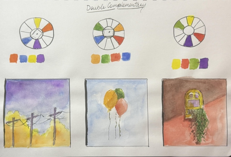
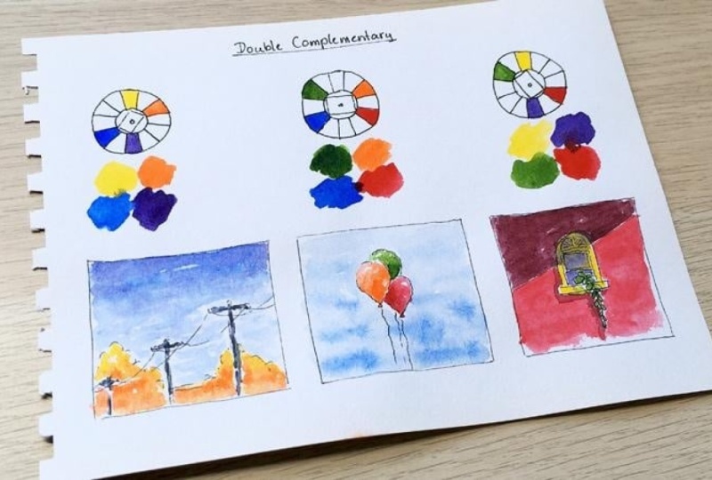
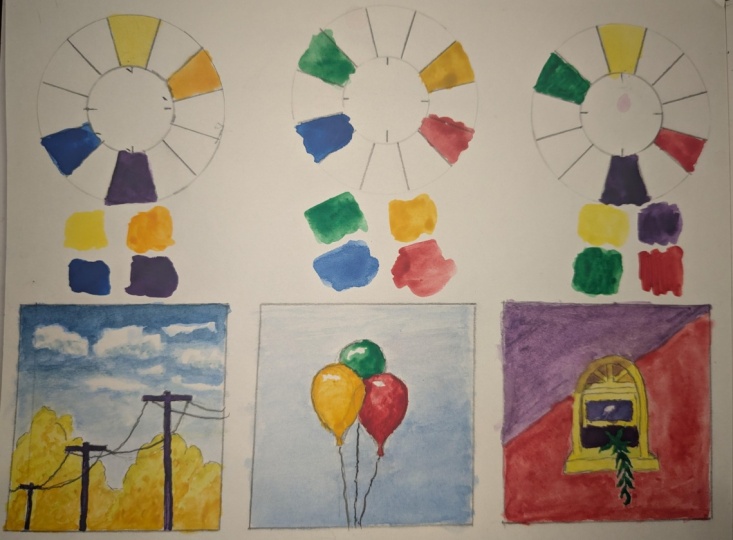
Yellow & Orange vs. Blue & Violet
10:33
-
3.
Orange & Red vs. Blue & Green
7:29
-
4.
Yellow & Green vs. Red & Violet
11:57
-
5.
Let's Paint Some Shadows
8:32
-
6.
What's Next?
0:49
-
-
- --
- Beginner level
- Intermediate level
- Advanced level
- All levels
Community Generated
The level is determined by a majority opinion of students who have reviewed this class. The teacher's recommendation is shown until at least 5 student responses are collected.
15
Students
5
Projects
About This Class
Let's explore how we can create aesthetically pleasing Double Complementary color combinations, also known as Tetradic. This session is part of my Color Harmony series to help you understand color relationships better.
Links for other episodes:
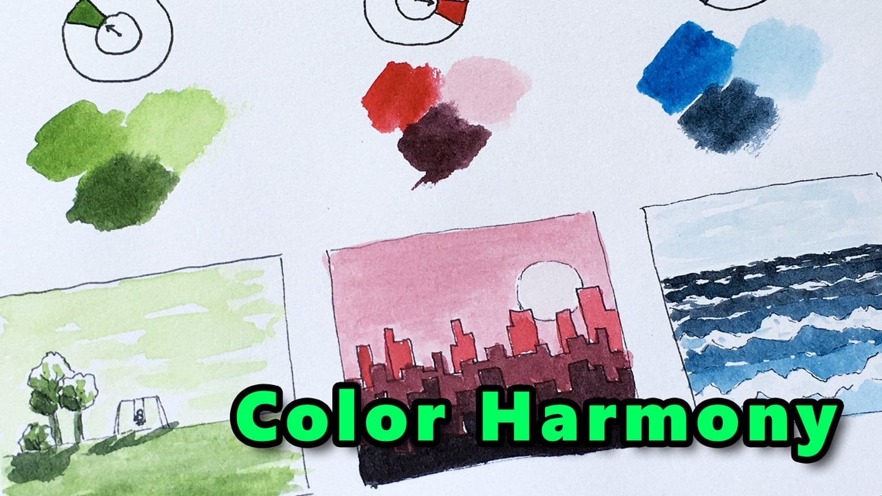
- Color Harmony: Monochromatic (start here if you're new to the series)
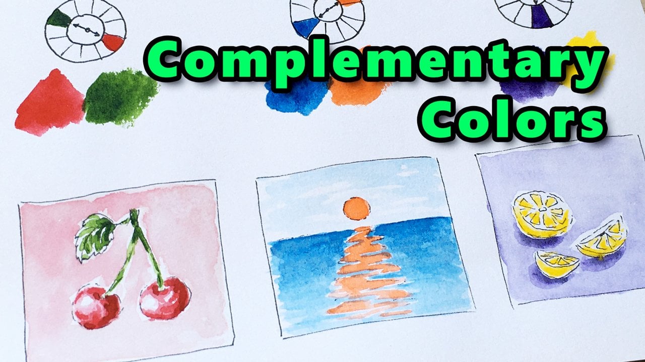
- Color Harmony: Complementary
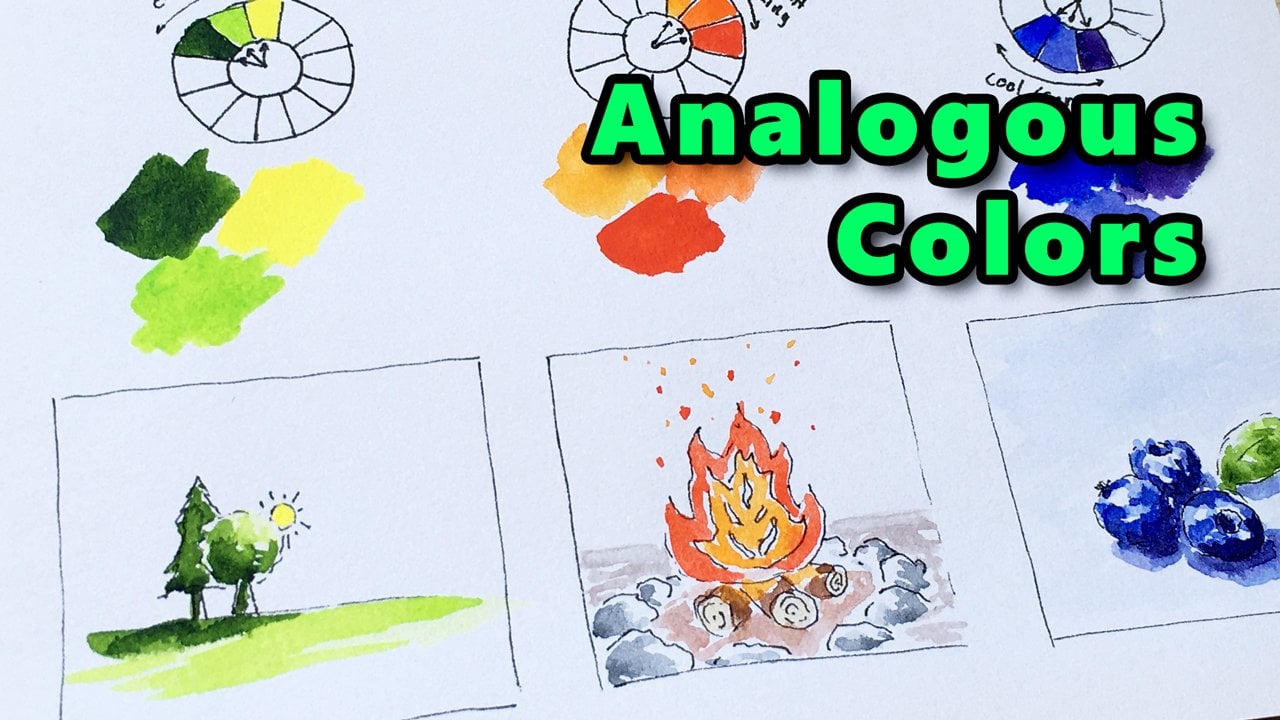
- Color Harmony: Analogous
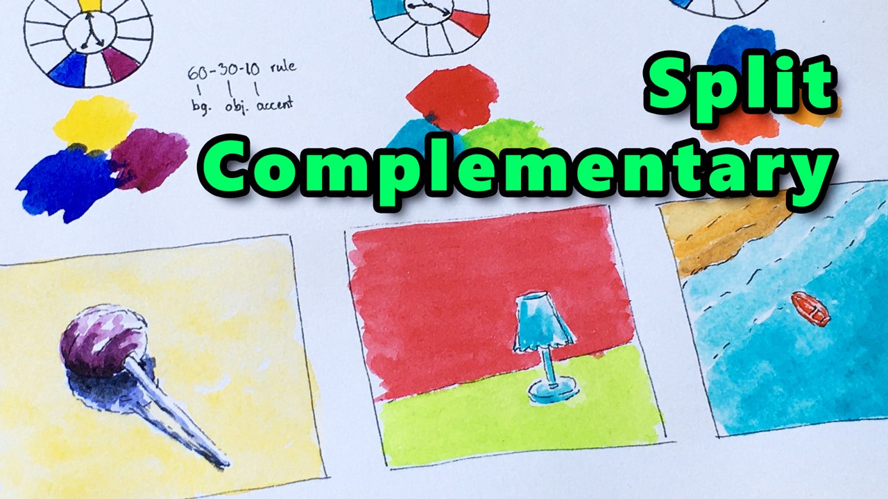
- Color Harmony: Split Complementary
- Color Harmony: Double Complementary (you're watching now)
- Color Harmony: Triadic
Who this class is for
This class is for you if you'd like to get familiar with Color Harmony basics through practice.
What you will learn
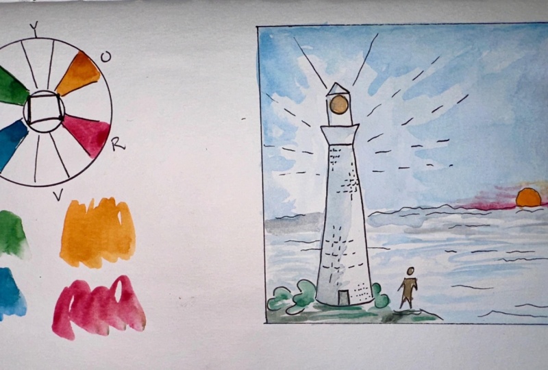
For a beginner, it's useful to know the most commonly used color harmony types that have been proven effective. In this episode, we’re going to explore the Double Complementary color combinations. We will paint 3 simple mini compositions to see how these colors work together. So, I encourage you to come with me, and let’s continue our journey in Color Theory.
What tools you need?
We’ll be painting in watercolor. You need the basic accessories:
-
some sheets of A5-size sketchbook paper, 120 gsm.
-
a water-resistant archival ink or permanent marker with a thin tip
-
a watercolor palette with the 6 base colors (like yellow, orange, red, violet, blue, and green) + black and white
-
a size-8 round brush for painting the minis
-
and some common tools like a water container, and some paper towels.
Learn & practice
I hope you’re excited. Whenever you’re ready… I’ll see you in the first video.
Meet Your Teacher

I'm Tamas. I love to teach new skills to students. Join one of my drawing or watercolor painting classes for beginners! Learn the fundamentals of drawing and painting, and your journey in art will be less frustrating, and much more exciting.
Don't forget to hit the +Follow button to stay up to date with all my new classes.
See full profileHands-on Class Project
Once you've completed the class, your project is to paint your own double complementary mini using the principles learned in the class. As a reminder, here are the steps to follow:
- Choose your favorite color combination, and make a palette based on that.
- Now, come up with an idea for a composition that fits your color scheme. You can think of a simple composition just like the examples included in the class, or something more complex. Some tips: your theme can be a household object on the table, a simple landscape scene, a still life, your favorite animal, a street view, whatever you like. Unleash your creativity.
- Now, draw a simple ink sketch of your composition.
- Finally, paint your composition in double complementary style using your chosen colors.
- Share your work with me and the community: Take a photo of your artwork, and press the "Submit Project" button on this page to upload your illustration. You can also write about your thoughts and feelings related to the project.
I'd love to see what you have created and what you think about it. Sharing your project is the way to let other people see it, and to get some feedback.
If you have any questions or need more tips, please let me know! I'm here to help!
Class Ratings
Why Join Skillshare?
Take award-winning Skillshare Original Classes
Each class has short lessons, hands-on projects
Your membership supports Skillshare teachers
Learn From Anywhere
Take classes on the go with the Skillshare app. Stream or download to watch on the plane, the subway, or wherever you learn best.