Transcripts
1. What's in This Class?: Welcome to my introduction
to color harmony series. My name is Thomas, and we are here to
explore how we can create aesthetically pleasing
color combinations that just feel right
to the viewer. This is the first
episode of the series. So as a warm up exercise, we'll be making a
mini coolor wheel, plus clarify some basic terms
like shade, tone, and tint. Then we are going to explore the most beginner friendly color harmony type
monochromatic. We will paint three simple
mini compositions to see how this color scheme can be simple and great
at the same time. Working with colors
is so interesting, but it can be much more exciting if you actually understand
the key principles. I'll be painting
with watercolor, but you can take this class
using any other medium. Our focus will be on colors
and not on the technique, how we apply them on paper. If you choose to use watercolor, you just need the
very basic supplies. I'll be using some sheets
of A size sketchbook paper, 120 GSM, the water
resistant archival ink. Alternatively, a
permanent marker with a thin tip will also do
the watercolor palette. If you have the six past colors
like yellow, orange, red, violet, blue and green, plus black and white,
you'll be just fine. The size one round brush
for the warm up session, the size eight Run brush
for painting the minis, and some common accessories like a water container and
some paper towels. I hope you are excited. Whenever you are ready, I'll
see you in the first video.
2. Let's Paint a Mini Color Wheel: I'm so glad you are
taking this class. First, let's do some
warm up exercise. We are going to paint
a mini colour wheel that we will use as a
reference during the class. Color harmony is based on the relative position of
colors on the color wheel, so it will be useful
to have one at hand. I have my A five size
sketchbook paper in landscape orientation. I'm taking my pencil and
drawing a circle with a size like this positioned on the left side of my format. And let's draw
another one around. Don't worry about your circles. Today, we are here for exploring colors and not judging
your drawing skills. Now I'm taking my waterproof archival ink and drawing over. It's far from perfect, but I don't mind. This
one looks better. This will be our
traditional color wheel where we are going to
arrange 12 different colors, including primaries,
secondaries and tertiaries. Hopefully, you took
my let's paint an expressive color wheel and understand hue saturation
and brightness classes, so you are already
familiar with these terms. But no worries if you are not. First, let's place the
three primary colors on our color wheel like yellow. Red. And blue. They are forming
a triangle shape. Remember, these are the colors that cannot be mixed
from other colors. Now we are going to place
the three secondary colors. Let's divide this empty
section into thirds like this. And the section in the
middle will be for green. This one for orange, and the one below for violet. You can get these
colors by mixing two adjacent primaries
in equal proportions. The remaining six sections
will be for tertiary colors. Tertiary is
theoretically a mixture of the two adjacent colors, a primary and a
secondary. Very good. Now it's time to take
our color palette and activate our paints
with some clean water. I'm using a spray batter to do this for all the paints
I'm planning to use, but you can also use your brush. In that case, it
would be practical to activate only the first
paint that will be yellow. I'm taking my size
one round brush, dipping it into my clean water, and taking some cadmium, yellow, medium paint, but feel free to use any yellow paint
you have or you like. Now I'm taking my paper towel and cleaning my brush as much
as I can by rotating it. So when I'm rinsing
it in the water, my rinsing water remains
relatively clean. This is important as we are
about to paint color wheel. We are supposed to keep our
colors as pure as possible. Now, let's paint
the red section. My paint is called Ruby. I'm cleaning my brush. And let's move on to blue. Mine is ultramalin blue. I'm cleaning my brush again. Even if I don't say this, every time we touch a new color, we'll be doing that with
a clean brush, okay? Now, let's paint the
secondary colors. I'm starting with sap green. Remember, you can
make some green from the adjacent primaries,
yellow and blue. Now let's take
some orange paint, which could also be mixed
from yellow and red. Finally, let's paint violet. Similarly, you can
make one by mixing blue and red if you don't
have it out of the box. Good. Now let's paint the tertiaries. This is a so called golden paint that will work pretty well
for my orange yellow. Let's try to keep our section separate so no paint is
bleeding into another. For tertiaries, I'll be using a paint out of
the box if I have. If not, I'll be mixing one
from the adjacent colors. For the next section, I'll be using my cadmium
red light paint, mixing it with some orange. Good. Now for the next one, I have a beautiful quinacridon lilac paint that I'll be using. You can also use some kind
of magenta if you have, or just mix one from
red and violet. Here, I do need to mix one from violet and ultramanin blue. Note that theoretically, indigo is also classified
as a tertiary color, so we could use that one, but it's kind of a
desaturated color, and I'd like to keep my
color wheel intense. The section between
blue and green, I'll be painting with my
cobalt turquoise paint. This is part of the cyan family. Other colors that fit into
this family are teal, aqua, or Cerlem blue. Some are closer to green, some are closer to blue. I'm adding a touch of water here so the pigments
can spread nicely. Finally, I'm using my so called My green paint for
the last section. Use whatever yellowish green or greenish yellow
paint you have, or just mix one from
green and yellow. Awesome. We have our mini
colour oil. Now we can move on.
3. Shades, Tones & Tints: In this lesson, we'll be
painting some color scales to get an understanding of some key terms in color theory. Shades are created when
we add black paint to a hue or in other
words, a pure color. Let's see an example for this. This time, I'll be using a bit bigger size brush so
it can hold more paint. This is a size eight run brush. I'm taking some
ultramarine blue. This will be my base color. Note that this could be any other color from
the color wheel. I'm cleaning my brush and taking some black
paint from the pans. I'm cleaning my brush again and taking some dense ultramarine blue
directly from the pan. I start painting a kind
of strip like this. Actually, the consistency of my blue on the mixing
palette is better, so I'm using that one. All right. Now I'm
cleaning my brush, rinsing it in the water, and taking some black paint. This is too light, so I'm
taking some paint directly from the pan and I start painting
with my brush toward left. I remove some black from the brush and continue
painting gently. I'm leaving less and less
black paint on the paper. The idea would be to create a gradual transition
between blue and black. We should see a pure
black on the right, a pure blue on the left, and some equal proportions
of the two in the middle. Not that watercolor paints
get lighter when it dries. So the different shades of blue will look just fine
in a few minutes. Interestingly, many artists try to avoid using black paint. Instead, they darken
the base color by mixing it with
its direct opposite, or in other words, it's
complimentary on the color wheel. Actually, we could have used orange to make
the blue darker. By mixing with a
compliment color, we can create a
rich natural shade producing natural
grays or browns. Sounds amazing, right? Now
let's see the term tone. A tone is created when
we add gray to a hue. By adding gray, we reduce the
vibrancy of our base color, making it more muted or subdued. Let's see what happens
with our ultramarine blue, if we add gray to that, just like how we added black. Remember, you can do this
with any other color. This is my base
color stripe and I'm creating a mid gray color by adding some
water to the black. I think this level
of gray will do. What I'm actually doing here is I'm gradually mixing
gray with blue. The intensity of my blue is
decreasing towards right. In other words, it
gets desaturated. Good. Finally, let's see
the term tint. A tint is created by adding
white to a pure colour. A tint is a soft, pale or delicate color. It's a lighter version of a hue often resulting
in pastel colors. Let's test this with
our ultramarine blue. I'm using titanium white
to mix with the blue. The technique I'm using
is pretty much the same. We can see the pastel look as we are reaching
the right side. Now in watercolor,
a tint can also be created by adding
water to a pure paint. In this case, we primarily
make our color lighter. Here is how you can
make a scale like that. Let's put some
blue on the paper. Now, I'm taking my
water container, dipping the brush, and
continue the scale. More water and more
brush strokes. There are less and less
blue pigments on the brush, so the paper white shines through our paint more and more. I'm trying to improve my
transition here a bit. All right. We can clean our brush now and
let this paper dry. Finally, I'd like to
mention that while common language uses
shade to describe any variation of a
color regardless of whether they are light
or dark in color theory, a shade refers to a darkened tone while a tint
refers to a lightened tone. Wonderful. We have completed
our warm up session. Now we can dive into the most beginner friendly
color harmony type.
4. Green Color Scheme: The monochromatic color scheme
is the simplest approach. We are taking no risk, so it's a good practice for a beginner to experiment
with this one first. Schemes like this are made up of shades and tints
of a single color. So we can pick any color
from the color wheel and alter the pure paint
with black or white. I hope these fundamental
terms like hue, saturation, and brightness or tonal value are clear for you. If not, please find my three D color
space class where you can get familiar with these
terms in practice. All right. Now we'll be making three
mini paintings on this page. Above each mini, we
are going to mark the colors that our fame
painting will be based upon. I'll be using sap green
on the first study, painting with my size
eight Run brush. Now I'm cleaning my
brush and raising it. By definition, we
can also change the lightness or darkness
of our chosen paint. I'm adding some white
to my mixing palette. I'm cleaning my brush again. And taking some green
from the palette to paint the corresponding
section of the color wheel, as well as to paint
a sample underneath. Now, let's create a tint. By mixing our pure
green with white, we are getting a wonderful
soft light green. And with a clean brush, I'm putting some black paint on my mixing palette so I can create a shade
of green as well. So we'll be painting our
first monochromatic mini with these three colors.
We have a hue. Remember, this is
the pure paint. In this case, sub green. We have a tint, the
green mixed with white, and the shade, the
green mixed with black. Now let's draw a frame
for our painting. We are going to have two
others next to this one, so we choose the
size accordingly. For all our minutes, we'll be using a mixed
media technique, the so called line and wash. This technique combines ink sketching with loose
watercolor washes. I believe this will make the painting process
less stressful. Painting on an empty page can be intimidating
for a beginner. The ink sketch will give
you some confidence. Anyway, let's start
off by drawing the horizon line at
the lower third. I'm drawing some
trees on the left. And maybe a bush underneath. Don't worry about your linework or your brush strokes later. We are not here for drawing or painting something perfect. Our goal is to
experiment with colours, to discover how they
look next to each other and doing all of this
in a relaxing fashion. Now let's draw a swing next
to the trees with a kid. O. That's it. We are done with our
simple composition. Now we can paint. Let's
paint the sky with the tint, you know, with the mixture
of green and white paints. We can add some dark to that. A. Now let's add some more green to the mixture and
paint the ground. Let's also paint the trees
with some brush strokes. Now, I'm cleaning my brush. Adding some more
black to the mixture, so I can make the
ground plain darker. A touch of water to my brush. Maybe that's too much, so
I'm lifting off some paints. I'm doing this with a
relatively dry brush. Now let's take some dark green again and add a second
layer to the foliage. Good. I'll let this thumbnail
dry for a few minutes, then we'll come back and
make some fine ear touches.
5. Red Color Scheme: Now let's see another
one color scheme. That's true another color wheel. The hue will be red this
time opposite the green. We are going to do
pretty much the same. I'm putting some red paint
on my mixing palette. Painting the sample.
Cleaning my brush. Taking some white
and mixing a tint. Note that by mixing
red and white, we get pink color. Let's paint a sample. I'm cleaning my brush
so I can bring some black et's mix it with red. So we are getting a shade. As a next step, we are
making our ink sketch. Let's draw the frame. The composition will
be a cityscape. We will have four layers of
buildings, one in the front, we are drawing
very simple stuff, just the outline of those
buildings like this. Let's draw another layer behind Now, third one. We will have the sun over here and the last
layer at the back. These ships will be more like
individual tall buildings. Mm. Let's say that we are in
the middle of a sunset. I'm drawing a circle
representing the sun. Something like this. That's it. I guess our first
mint is dry enough. Let's paint some shadows there. I'm taking some black paint, mixing it with green, and painting those
shadows for the trees. For the swing. And the
kid as simple as that. Maybe I'm adding some extra
dark to the trees, too. Now, I'm cleaning my brush. And we can get back
to our cityscape. I guess I'm bringing
some more white in here. And let's paint the sky with this pale pink colour. Okay. Now you have two options here. You can either follow the outlines of these
buildings like me. This way you improve your
precision in your brush work, or you can make
loose brush strokes, taking the ink sketch
less seriously. I will love to see those
more expressive minis do. Let's not forget these gaps
between the buildings. Now, let's clean our brush. And take some black
paint so we can make a very dark red shade that we will be using for
the very bottom section. The plan is to create
a gradation between the light sky and these dark
buildings in the front. Think of this as a value
scale that you can be familiar with from my
three D color space class. There we painted an
11 step value scale. Here we are painting
only five steps. Now, let's clean our brush. We can always add some
extra paint to our mixture. I'm bringing some white too. And let's create another tint for the buildings
right below the sky. This layer is supposed to be
a bit darker than the sky. A touch of water to my brush. Now, let's paint the next
row of buildings from the bottom with a bit lighter
shade than the one below. This is also an excellent
practice for color mixing. This is how you learn to control the lightness or
darkness of your paints. H I guess this layer looks good. I'm cleaning my brush again. And let's paint the sun
with an almost white paint. But still, there is a
touch of red in it. Like so. Good. Now let this thing dry before
you paint that last layer.
6. Blue Color Scheme: Our third composition
will be based on blue. As I'm planning to paint a sea, I'll be using my cupboard
as your blue paint. I'm cleaning my brush
and bringing some white. So this will be my blue tint. Now, let's make a dark
blue shade using black. Let's create our ink sketch. The On our first mini, the horizon line is
in the lower third. Now let's create the composition where it is in the upper third. Somewhere over here. I guess now the best would be to watch me drawing
this sketch first, then pause the video
and make your own. We'll be illustrating waves with light foam on the
surface of the sea. So there will be darker
and lighter layers alternating We are also adding some perspective
to our illustration by making these layers narrower
as they recede in space. I'm using very lighting strokes. I don't want them to be
dominant on the final painting. I just need some
guidelines for the waves. Very good. Now you can post a video
and make your own sketch. In the meantime, the paint on
our second mini has dried, so I guess we can make
the last section. Let's mix a shade that
fits into the big picture. I like to be conservative with
the lightness of my paint. You know, it's always
easier to darken your watercolor paint on the paper than to
make it lighter. This is too light, so I'm
applying a second darker layer. M. Maybe this is slightly
darker than it should compared to
the layer above. I'm lifting off some paint with a relatively dry
brush like this. I guess I'm making the
blocks below a bit darker. I think they are a
bit lighter than they should compared
to the darkest layer. I also try to calculate
with the fact that watercolor paints get
lighter once they dry. Note that the easiest
way to create a gradual transition in tonal values is to
proceed in order, starting from the lightest. But in that case, we should have waited for each
previous layer to dry. Now, it's more challenging
to create the right value, but at least we are
practicing this one too. Now, the layer above
seems a bit off. Maybe its previous value
was right, but no problem. I can make it darker again
with just a few brush strokes. One last correction
to the bottom part. I'm okay with the gradation. Let's get back to our seascape. H
7. Painting the Sea: I'm taking some blue
paint from the pen. Diluting the paint
with some water, it'll be easier to work with. Also taking some pure white. So I can paint the sky with a very light tint.
Something like this. Now, let's work on the sea. Here are tonal values will be in a reversed order compared
to the cityscape. Shallow water seems
lighter than deep sea, so we paint the front
with light blue. Let's start with
something like this. Now, mixing something darker. Leaving out one section
for the white foam, painting the next area. Good. Now let's mix an even darker shade. For the next section, this is directly connected
to the previous one. Feel free to add some water
to your brush if you need to. Nice. Now let's make it
one step darker again. Let's leave one section out for the foam and paint this one. This can be a bit
darker, I guess. One more step toward blackness
in the next section. I'm taking black paint
directly from the pen. Some water too, and painting the darkest
sections at the back. M I'm leaving some paper right here and there to
illustrate some forms in the distance. Very good. Now we can clean our brush. Maybe I'm adding some light
blue to the white foam, making it more realistic. Good. So we have painted three different monochromatic
color harmonies. This approach creates a
cohesive, clean, organized, high contrast, and sophisticated yet
simple visual harmony. It uses a single base hue, plus some variations in value. To avoid a monotonous look, we incorporated varying
textures in the compositions.
8. What's Next?: All right. I hope you enjoyed this color harmony
painting session and you made something
that you like. But there is still so
much left to explore. In the next episode,
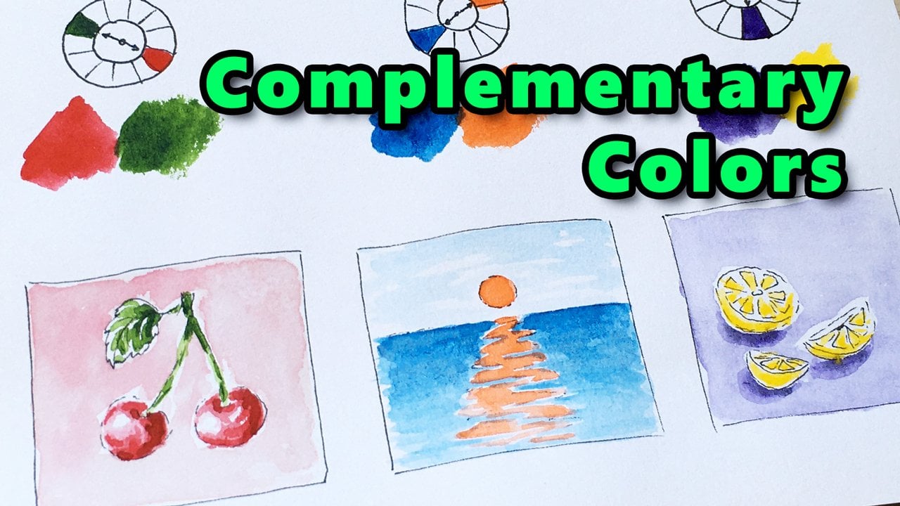
we are going to dive into the complimentary
color harmony type. Note that you can find links to all my related color theory
classes on the About tab. Now I'd really like to see your own beautiful colors used
in this painting session. So please upload your work in the project section
right below the video. If you found joy
in this activity, please leave a review on the review tab below
the video player. Your feedback is
important to me and it will also help others
to find this class. If you like my teaching style and you are interested
in other topics, I definitely have some more drawing and painting
sessions for you. Make sure you check them
out on my profile page. I hope you had a
good time with me, see you in another class.
 Tamas Benko, Drawing & Painting Classes