Transcripts
1. Create Color Schemes in Illustrator - Introduction: Hello, I'm Helen Bradley. Welcome to this Graphic Design for Lunch class, Color Schemes to Make and Sell in Adobe Illustrator. Graphic Design for Lunch is a series of classes that teach a range of tips and techniques for creating designs and for working in applications such as Illustrator, Photoshop, and Procreate. In this class, we'll create color schemes in Illustrator that you can use for your own art and for sharing on social media. You'll learn how to create link teens of colors to set up and use color scheme templates and how to sample colors from images. You'll also learn why teens of global colors can be linked and why true shades cannot. I'll also show you how to use these color schemes in practice in your own art. By the time you've completed this course, you'll have enhanced your knowledge of working with colors in Illustrator and created some handy color schemes too. Without further ado, let's get started.
2. Pt 1 Layout a 3 x 5 Grid: The first of those swatches we're going to create is this grid of swatch color. So what we've got is five individual colors, and for each of those colors, we're going to have a Shadow Color, a main color and then a highlight color. So setting the document up is going to be fairly critical if you want it to look neat and tidy, so let's see how we'll do that. I'll choose File and then New, and the document size that I'm using is a width of 680 pixels and a height of 1,120 pixels. So if you want yours to look like mine set up those values and click "Create". Now the boxes for our swatches are going to be 200 pixels by 200 pixels. So go to the rectangle tool, click once in the document, type 200 as your width and height and click "Okay". Now at this point, you may want to set up a color, just something that you can see. So what I'm doing is removing the stroke from this shape, you won't want a stroke and that's really important. You will of course want a fill, and I'm going to choose just a color for my fill, something that I can work with. So this 200 by 200 pixel box is going to be positioned, at a position that's 20 pixels down and 20 pixels into this document. So our boxes are going to be 200 pixels wide and the gaps are all going to be 20 pixels. With this box selected, I'm going up here to the Tool Options bar here, and what I want to do is locate the values that are setting the position for this box and they're here, they're the X and Y values. You can see that they're not 20 and 2, so I'm just going to type 20 and 20 in here, and that's got that box in the exact right position. Now if you're having trouble working up here, you can always go to Window and then Transform, and this transform dialogue will give you all the tools that you need. So what you want to do is make sure that this reference point out of these nine little boxes is this top left corner, because that's this corner here and we want it down 20 and in 20. So we want our X and Y both to be 20. Having done that, we will Alt, drag a duplicate away and of course, that would be option drag on the Mac. Again, focusing on this top corner it needs to be, 20 plus 200 plus 20, which is 240 in from the side. You can see here the X value is not 240 yet, so I'm just typing 240. I'm making sure that the Y value is the same, 20 pixels which it is, then I'll Alt or option drag my final duplicate away. Again, looking at this reference point, it needs to be 200 plus 200 is 400, and then three lots of 20 is 60, so it needs to be 460 in its X value and 20 in its Y. So double check here, it's perfect, I'll just click away. Now I need to make this into five copies, so I'll select over all three this time, Alt or Option, drag all three down at the same time. Now I'm not going to let go of this set because I want its reference points, so we're looking again at this top left. The X value needs to be 20 because that's just 20 in from this side, which it is, it's perfect, but the Y value is not correct, it needs to be 20 plus 200 plus 20, which is 240. Mine's not so I'm just going to type in 240. We'll go and do that again. We have to add 220 every time, so 240 plus 220 is 460, and that's in a perfect position. Alt, drag, double-check it, it needs to be 680, it's not, so I'll just type 680, and then once more, and this will be 900. It's in the correct position, I'll just click away. Now that we've got our boxes all laid out in a grid format, we're ready to progress with adding some color.
3. Pt 2 Create the Tints: For our next step, we need to create these boxes as successive tints of the color that's in this box here. We're going to start by selecting over everything. We've got this one color that we're using right now that's is as it should be. I'll go up here to the Swatches panel. What I'm going to do is add this as a global color swatch. I'll click here on "New Swatch" and I'll make sure that I have Global selective and I'll click "Okay". Now, it doesn't really matter what color you are using at this point, you may want to use a slightly darker color as a starting point. If that's the case, double-click on the color here and then go and make it that little bit of a darker color. But we're not actually going to be using this color for anything other than a reference as our starting document. It can be any color that you like. It probably would be better if it was a slightly darker color. I'm going to settle for this. I'll click "Okay". All of these boxes are colored with the same global color. You can tell that they're colored with a global color by selecting on a box. You'll see that the color in the swatches panel has this little border around it telling you that that is the color in use. What we're going to do is select this middle row. I'm just going to drag here with the selection tool and select the middle row of colors. These are going to be the darker colors. These are going to be tints of that color. To color these, I'll go to Window and then Color Guide. Over here, are the tints. Now, I'm going to show you how I've got my color guide setup because you all probably want yours to be set up in a similar way. Go to the flyout menu and choose Color Guide Options. I've got mine set to five steps. Four or five steps is a good idea. I've also got my variation set to fairly high. Now, you can add more variation or less variation as you like. I'll just click "Okay". But for this middle set of boxes, I want something that is around about the middle of this set of colors that all have little white corners on them. The reason why they have white corners is that they're global colors. We need to be using global colors. The leftmost one of these global colors is the color in use at the moment. To get a color that is a lighter version of that, we're going to choose one of these. I'm going to select this one as my color. Just visually have a look at it, see if it looks all right. It looks pretty good to me. I'll just click away. Now, with the color guide still on the screen here, let's go and select the third column of boxes. Once we've got those boxes selected, we'll go back to our color guide here and choose a lighter version. How we are going to look at what we've got here now is, we've got a color for shading, we've got a color for the main part of an image, and then we've got something that we would use as a highlight. Now, this point, I would suggest that you save this because this is going to be a grid that potentially you will use over and over to create a color scheme from.
4. Pt 3 Create a Color Scheme: > > Now that we've created our grid of pre-prepared color swatches. It's time to have a look and see how we would use it to develop some colors to use in an illustration. To begin with, make sure you don't have anything selected all. You want to click outside the area of these boxes and then choose a color to use as your base color. I'm just going to double-click here and choose a base color. I'm going to choose a sort of ready orange. You want your base color visible here as your current fill or your stroke color, it doesn't matter which. You'll go next to the swatches panel over here and click here on new swatch and make sure to select global and click "Okay." That adds this color as a new global swatch, but make sure that nothing in the document has changed, because it shouldn't have recolored anything at this point. So this is going to be the base color for our illustration. We're going to use that for one of the rows. But we want four other rows of colors that will all go well with this orange. The Color Guide tool will help us find those colors. I'll choose window and then Color Guide. Now, the color guide at the moment is only looking at the current color, the color that we have selected. Yours might be a bit different to this depending on whether you've been in the Color Guide tool previously and you've made changes to it. But assume yours looks just like this. You'll click on the drop-down list here to see the harmony rules. Now what harmony rules are, is a relationship between this color orange and other colors on the color wheel and their spatial relationship. Some of them are opposite each other, such as this complimentary. This blue is opposite orange on the color wheel. Others will be at different relationships. Say a third of the way around the color wheel. There are some Monochromatic Color Schemes that are very close to each other on the color wheel. These relationships are relationships that designers use for selecting colors that are guaranteed to go well together. Right now we're going to choose a color combination here that only has five colors, our original plus four others. I'm going to show you in a minute how to deal with a color combination that has more than five colors, how you can get rid of the ones that you don't want, but let's have a look at one that we like right now that only has five colors. Well I'm looking at this TETRAD here. I'm going to select it and as soon as I click on it, you'll see that the Color Guide Dialogue changes and these additional colors are added to this grid, but only the orange at the moment is a global color. All of these colors are not yet global colors, but we can arrange for them to be that. All we need right now is an indication that these are going to be our five colors. We'll go to the flyout menu and choose save colors as swatches. That adds these as swatches into the swatches panel but again only one of them is a global color. It's going to be important that the remaining four are all converted to global colors. The way you'll do this is to select one of them, shift-click on the last one so that all the four are selected and go to the flyout menu and choose swatch options and then global and then click "Okay." Now it's really important that you only select the ones that are not currently global swatches when you do that. Let me just wind that back. If you select, all the five of these, a mix of options four that are not global and one that is, and you go to the flyout menu, you'll find that the Swatch Options Dialog has global disabled. You are not able to select global because you've got a mixed group here. The other thing you can't do is select it using this icon here because that selects the color group and that's very different. You'll see that Swatch Options is being replaced here by Color Group Options. Just be careful that you select only the things that you want to change and then go and change them. We're making all of these global swatches. Now we have five colors here that we know will all go well together because they have this TETRAD relationship with each other on the color wheel. To add them to our grid, this is what we're going to do. I'll select over the first row and then click on the first global color. When I do that, the color is applied to this box here and then we have two successively lighter tints of that one color. We can do that all the way down, select a row and apply the next color to that row. Now we have a grid of colors that we can use in our illustration. These would be the main colors that we use, these would be our shadow colors and these would be our highlight colors.
5. Pt 4 Editing Colors: In the last video, we set up our five colors that all have a relationship with each other, and so we know that they're going to work pretty well together in a document. Let's go back to our starting point and let's see how we would handle a situation where we choose a color scheme that had say, six colors in it, one of which we don't want. Or perhaps it has some colors in it that we don't actually like and that we want to edit before we add them to the swatches panel. Let's see how we could do that. I'm going to start with this color here. I'm actually choosing a color from the Swatches palette as my base color. I'm going to click here on the "New swatch" and I'm going to add it as a global color. Again, it doesn't matter where it goes in the swatches panel. We'll go back with its selected here in the swatches panel and with nothing else selected in our document, and choose Window in Color Guide. Now because the color guide look like this last time we were here, that's what we are getting as the default. With pink selected here as our base color, I'm going to open the dropdown list and we're going to choose a color scheme this time that has more than five colors. We only want five, so we're going to choose something that we're going to remove a color from, and here is a left complement. It's a really nice little color scheme. I'm going to select that. Now, there's no option in this dialogue here that allows you to remove a color from the color scheme. This is what we're going to do. We'll click the flyout menu and we'll go to "Edit Colors". Now this might be familiar to you if you follow my classes, because I used this tool a lot. Edit colors is a color editing dialogue where you can adjust the colors based on the color wheel, based on their position in the color wheel, and you can see that all these colors have got this spatial relationship to each other. These reds are all darker versions or lighter versions of each other, and so too are the greens. Well, I want to get read of one of these colors. What I'm going to do is go to this option, which is the remove color tool, and I'm going to choose the color I want to get rid of, which is this green here. I'm going to click on the "Green" so that it is targeted, and here it is here. With this minus tool, I can click on the green, and it's removed from the color scheme. Now everything is related to only five colors. You'll see I've got five colors here. I've got five colors here. Exactly what I need to populate my color scheme. But also in this dialogue, I can make changes to a color. For example, I may not want this really dark red. What I'll do is unlink this harmony colors. I'm breaking the link in this color scheme, and what I'll do is drag this red around to find perhaps a different position for it. I might want it to be a bit more pink or a bit more purple. I actually like a little bit of purple in this color scheme, I think goes pretty well with the greens. Now, I can drag it into position. I can also adjust it here so I can make it a little bit lighter. Keep an eye on how it looks up here, because these are going to be your base colors. Here it is here as one of your base colors. Everything is live at the moment. Any changes that we're making, we're seeing live in these dialogues. You can remove a color using this Remove color tool, you can unlink your harmony colors and move them around, or you could link them and move them lot around. By linking them, I can now pick up any one of these and just move them around. I'm going to have that same linear relationship between the colors. This time, a relationship that I've created, I've broken the original color scheme arrangement up a little bit by bringing this color down here. But I can also match at anywhere I want on the color wheel, and this new spatial arrangement is being adhered too. Once I have in position the colors that I want to use, I'm just going to click "Okay". Now, I can save them as a color group at this point by clicking "Yes", but if you just click "No", don't worry because they're available up here in the color guide dialogue, and we know that we can add them by clicking the flyout menu and choose "Save colors as swatches". Now this time the swatches, none of them are global, but we know they need to be global, so we're going to click on the first one, Shift and click on the last of them, go into the flyout menu, choose "Swatch options", and set them all as global swatches. This means that when we apply them to our grid, they're going to behave exactly as they should. I'll select over the top row and click on my first color, and then we'll select each subsequent row and apply the colors to them. We now have a second color scheme that we can use. Again, we've brought it in from the color guide. We've chosen colors that have a relationship to each other, and then we've made some edits to that. Now if you look at this and think that there's still some changes you want to make, you could do that. This color I'm a little bit concerned about, I think it's a bit too close to this one, so I wanted to darken this up a little bit. I'll locate it over here and just double-click on it. That opens up the swatch options dialog, now because I want to make it darker, RGB is probably not the easiest color mode to use. In fact, hue saturation brightness is, so I'm going to select that. These are going to end up with the exact same results. It's just how you get there. Here you can see I've got a brightness slider as well as the saturation slide. I can pump up the green little bit to try and darken it. We are going to turn preview on, because that will show us the changes live. I'm going to darken it a little bit, and we're looking at the change live in this dialogue because we've got preview turned on. You'll notice that we didn't have to have any of these squares selected because that's how global colors work. Just be aware of that. I'm going to darken it up even a little bit more, and if I'm happy with what I'm seeing, I'll click "Okay". Here is our new and complete color scheme.
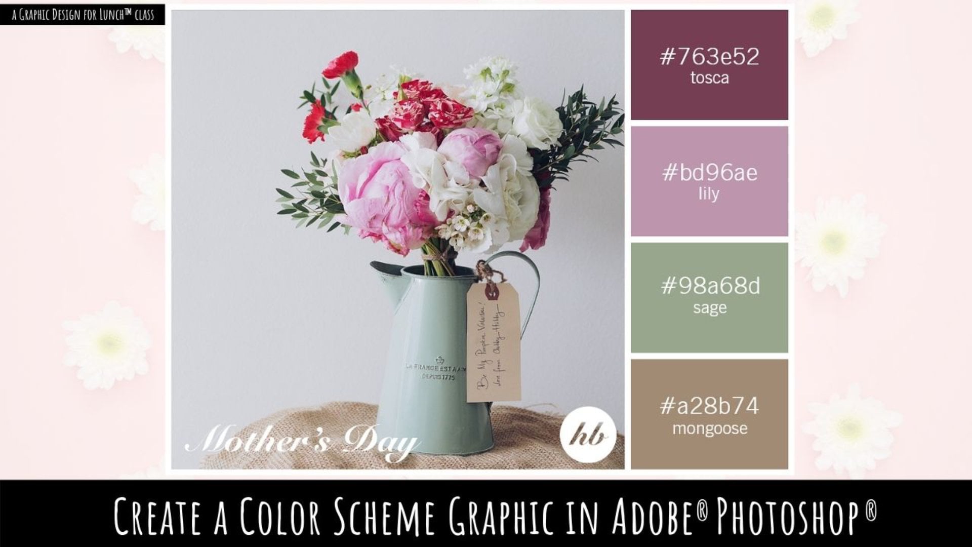
6. Pt 5 Create a Layout to Include a Photo: For the next color scheme we're going to create, it's going to have a photograph in it, and so this is going to be the color scheme that not only could you use, but you could also post it, for example, to Instagram or to other social media. We're going to create a document that's got space for everyone of the color blocks as well as the photograph itself. I'll click create new and the size we're going to use this time is 1780 pixels wide and 1120 pixels tall. I'll click create. Now again, we're going to create boxes for each of the individual elements because it's going to be easier to manage that way. I'll select a base color to use, and this is only for my own entertainment. The color I'm using is just a color that I'm happy to look at because the document's going to be full of this color. I'm going to choose a turquoise because that's one of my favorite colors. Let's just remove the stroke from these boxes, that's pretty important at this stage. Now the biggest box is going to be the box for the photograph, and that's 1,080 by 1,080. I'll click on the rectangle tool, I click once in the document, I'm going to click this link option because the width and height need to be at the exact same amount. I'll type 1,080 and click okay. This adds a rectangle of this exact size to the document. I'm going to drag it up here into the top left corner. Again, as we did with the previous design, we need to make sure it's in the right spot. You're going to select the reference point as being the top left corner and it again needs to be 20 pixels in from the top and from the left of the documents. I'm just making sure that it's 20 pixels. Next we're going to have a grid of colors, again, we're going to have five 200 by 200 boxes. I'll go and select the rectangle tool again, click once in the document, these boxes are going to be 200 pixels I'll click okay and I'll move this into position. It's leftmost most corner needs to be, again, 20 pixels down from the top of the document which it is here and then it needs to be 1,080 plus 40, which is 1120 pixels in from the left-hand side of the document, and this is in a perfect position. I'll drag a duplicate away. This time the position of the top left corner in from the left-hand side is going to be what we used last time, which was 1,120, and to that we're going to add 220. We're going to add this box plus that space and that's going to be 1340. We'll alt option drag a duplicate away. Now at this stage if the math is getting you, what we're going to do is change everything relative to this corner. Let's click over here to the top-right corner and we know it has to be 20 pixels down from the top, and in this case 20 pixels in. We're going to make sure that the y value is 20 pixels and the original document dimensions with 1780. It needs to be at 1760 to be 20 pixels in from the right hand side. Now all of our little squares are in the exact correct position. Let's go and grab them, alt option drag. In this case we're going to move them down by 20 pixels. This is 20 plus 200 plus 20, so that's a position of 240 down. Now my transform tools have disappeared. I need to just click the transform dialogue here. Let's go and make this 240 in the y-direction. Select it, drag it down. This measurement here for the top of this set of selected objects is going to be what we used last time, which is 240 plus another 220. That means it's going to be 460. Let's select it, let's go to transform and let's make sure that we are at 460. It's working, just perfectly. Select it, drag it down. This will be at 680 again, I'm just adding 220 to it. The positioning is perfect, if it wasn't, I would just change it. Alt option, drag the last set. For this set, it's probably going to be easier to adjust everything according to this bottom corner. I'll go to the transform dialogue. I'll click here on the bottom-right corner. It needs to be 20 in from the side of a document that's 1,780 pixels wide, so it needs to be 1,760, that's perfect. The height of the document was 1120, and so we need to subtract 20 for that for this bottom corner, that would be 1100, again, it's perfect. Our grid layout is now complete. Having done that, having put all the working, we would save that in the next video, we're going to go and create our boxes as tints and shades, and then start getting some colors from a photograph of our choice.
7. Pt 6 Create The Tints: The next step in preparing this template document is to do exactly what we did with the three by five grid last time. I'm going to select over absolutely everything here. I've got all of these boxes selected. I'm going to open up the Swatches panel and we're going to add this base color as our Swatch. We'll click on it over here and then click here and add it as a global color. I'll click Okay. It's really important that it is a global color. Now we're going to click away from everything. I'm going to click on Add color, and I'll go to Window and then Color Guide. Now, I only want one color here. It's just really difficult to get rid of all the other colors. I'm going to select maybe this top harmony rule. We're only dealing with two colors at this point. Now the two colors that I want, the tints I want to use are going to be this one here, and I'm going to use this one here as well. I'm going to click on this one and I'm going to Control or Command click on this one, and I'll click the Flyout Menu and save those colors as Swatches. Then I added to the Swatches palette, I'll drag this one down to join them. These are going to be our three colors. I'll select over this first column of boxes and just make sure that they are using the first of the colors here which they are. I'll select over the second column, and we're going to click the middle color here, which is the tint of the base color, and then we'll select over this third column and we're going to use the lighter tint. Now, this stage, if you don't like the colors that you've got in use in this document. You can change them very easily. Double-click on this color and just make alterations to it. I'm going to make it a little bit bluer. Turn preview on and you can see that the colors are all changing. This color is not changing because it wasn't a global color. If it were a global color, it would have changed. You can select whatever starting color you want for your document. This is going to be your template. You're going to use this repeatedly. If you want to color match this, select this big box here and color match it to any one of these colors. Then you can go ahead and save this because this is going to be the template that you'll use when creating color schemes from an image in Illustrator.
8. Pt 7 Add a Photo and Lock it Down: Now that we've completed our color scheme template, we're ready to put it to use. Now, I've saved this as a template, so I've just called it three by five swatch with photo tints included. So this would be my template file and anytime I needed it, I would open it up. The first thing I would do at this point is to save it so that it becomes a new document. I'm not at risk of overwriting my templates. I'll choose File and then Save As, and I'm going to call this graffiti color scheme. Because I'm going to be using an image of some graffiti that I have. This is now the graffiti color scheme. It's not my template document. I'm not at risk of losing or destroying my template in the process. I need to grab my photo and for this I'll choose File and then place. Now I'm going to embed my photos. I'm just going to go and locate it here, I'm going to make sure that link is not enabled because that will then embed it inside the document. I'll select this piece of graffiti and click place. Now, my graffiti image is not in the same proportions as this square, but that's just fine. I'm going to just drag over to create the image in this document, you can say it's quite a bit bigger than the square. I'll press Control or Command zero just to zoom back out. What I want to do is to place this image roughly where the pieces that I want are over where that square is and I think I would like to bring it across a little bit. I want some of these oranges. That's why I grab this image as a graffiti image. It's got some really nice colors that we can borrow to get a color scheme. I think I'm pretty happy with this. I'm going to take this image and I'm going to move it to the bottom. I'll choose object arrange and I'll choose send to back, so it's behind absolutely everything. I'll select the image and I'll select the square. I'll shift, click on the square. The two objects that I have selected are the other square and the photograph behind it. I'll create a clipping mask object, clipping mask make and that just clips the image to the size of that square. So we're seeing a square photograph even though it is rectangular. Let's go to the Layers palette, and I'm going to show you how you can move things around if you haven't got exactly the portion of the image that you want in the area that you'll have got visible here. Let's just open up this layer and down the very bottom we're going to find our clipping mask. So I'm going to open up this little panel. This is the rectangle. We don't want to adjust the rectangle because it's fine. It was in the exact right place. What we do want to do is adjust the placement potentially off the linked file. I'm selecting the linked file. I've got the selection tool enabled, and now I can just move it inside the box that it's contained in so I can position it exactly where I want it to be. This is just a piece of graffiti of some little fish from a building in Australia. Now having done that, I'm going to lock this down. Now, locking it down is important for this reason. If you have it available, you'll find that anytime you're hovering over this area of the document, you start seeing the original image and the clipping mask and everything just comes alive. But if you lock it down, it's not selectable and so it's not going to highlight, you're not going to be confused by seeing it on the screen. I just think that that's a handy way of approaching this. Let me just put my panels back to where they were. As I said, I chose this image because it's got some really good colors in it and colors that we can use for our color scheme.
9. Pt 8 Add Colors from the Photo: Once your photo is in place, you can go and sample some colors from the image to use for your color scheme. Let's open the Swatches panel here. With nothing selected, I'm going to add a new color group. I'm just going to click on that and just add my new color group. Next, I'm going to sample a color from the image. I'll go to the Eyedropper Tool and I'll hold the "Shift key" as I click on a color to sample it. If you don't hold the "Shift key", you'll find that the color doesn't appear in the color little Swatch here. You'll just "Shift" click until you find the color that you want. I think, I want this slightly darker green. With it selected over here, I'm going to click here on the color group I want to add it to and click on "New Swatch". Make sure the Global is selected and click "Okay". It's added as a new swatch. I'll "Shift" click on another color to use. Click here on the Swatch to add it to an add it as a New Global color swatch. I'll continue to do that and select colors to add to my swatches. Now, if I don't select my color group before I add it, you will find that it gets added up here, but it's very easy to just drag it down into position. Because our layout is set up for five colors, we need to select five colors to use. Once the five colors are selected, you'll see that they are all global colors because we set them up that way. We can just progress through the document as we did with the previous document. Select a row of colors, the original color and two tins, and click on the color that we want to apply to that row. Now, if you get to this point of your color swatch creation and you think you want to make changes to it, this is what you going to do. There are a couple of options that you have at this point and one of them is just a sample a different color to use. I'm going back to my Eyedropper Tool and I'm going to see if I can find a better option than this green up here. I think this is a better green. I'm just going to add it as a color swatch. Here it is up here and I want to replace this color. Now, there's a method in Illustrator for replacing those colors. What you need to do is to select the color that you actually want to use, first of all. That's critical because the order in which you select these colors is going to impact which color gets replaced. This is the color I want to use, and this is the color I want to replace so I'll "Command" click on the color to replace. With these two colors selected in the order I've selected them, I now go to the flyout menu and choose "Merge Swatches". What that does is, it merges those two swatches together and applies this replacement swatch to those boxes. Now, all I need to do is to just drag it down into the color scheme where it belongs. Of course, you can also edit colors by just double-clicking on the color over here and make changes to it. You don't have to have the documents selected to do this. I'll double-click on this blue and make some changes to it. I can choose to do it in color mode, RGB, or CMYK or Hue Saturation Brightness. It doesn't really matter, you just choose which of those color modes works best for you. Make sure that you have preview turned on so that you can see the impact in the overall color scheme when you make changes to it. Now, I'm going to select a color here, but I want to darken it a little bit, so I'm going to switch from RGB to HSB, which I can do at any time and just darken it off a little bit and click "Okay". That's another way of changing up your color scheme once you've actually created it.
10. Pt 9 Understanding tints and shades: At this point, I want to explain to you why it's possible to get tints of a color, but it's not possible to get a linked global shade of a color. I have four boxes here, and we're going to color these three the way we've been doing all along in this class so far. I have this blue color selected here. I'll go over here to the swatches panel. I'm just going to add this as a global color. I'll click away from everything, let's go and get at two-tints of that color. We'll go to Window and then we'll go to Color Guide. Now I've got my color guide back to just one color. If you want to reset yours to one color, it's really tricky to do, so let's have a look at that first of all. I'm going to just select a two-color, color guide and you can see that I can't get back to one color, because there's no option here that is only one color. So what I'll do, is I'll click here and go to Edit Colors because that gets me to this dialogue, and we've already seen how we can remove a color. We'll go to the remove color tool and click on the color that we want to remove. Now we're back to one color. I'll click "Okay". I don't want to create a swatch group for that, so I'll just click away and now we're back to one color. So if you want to just remove all of those color harmony groups from your color guide, that's how you're going to do it. Now what we want is the color that we're using and we want a couple of tints over it. I'm going to select this one and control click on this one. So I'm going to add all of these to my swatches panel. I'll click here and choose save colors as swatches. Now, here are the two tints and here is the original color. I'm just going to bring that down to sit alongside these colors. Now, when I hover over these colors, you'll see that we read off the RGB values. This is 48, 48, 226. Now, whatever the color you choose is probably going to be a bit different, but what's important is that as soon as we hover over this one, we get the same 48, 48 and 226, but this is a 60 percent tint, and this is going to be 48, 48, 226, but it's a 20 percent tint. Let's just go and apply this tints to these boxes here. Now, a shade would be adding black to a color and a tint is adding white. When you create tints you could have them as linked colors. When you create a shade, it's not going to be linked, so let's go and see why. I'm going to select on this color and I'm going to make a shade of it. I'm going to do it using the exact same dialogue we've been using, because that's going to give us the best chance of matching this color. This is a color that we're using. It's here, so if I was to select one of these colors, I'm going to get a shade of it. It's got black added to it. It's going to cause this dialogue down, let's go and add this color to a color scheme. So I'll click on "New Swatch" and in the new swatch dialogue, you can see that even though we sampled the color from that row in the color guide, the color numbers have changed. The RGB values are different, and that's because they can't be the same values as these other colors, because we've had to add black to create a shade. This is never going to be a linked color, even if we create it as a global color. Even if we place it down here and cross our fingers, as soon as we change this color, let me just deselect that square. If we change this color, we're going to change all three of these but it's going to have no impact at all on this color, because this color is not linked. It's not the same color to begin with, so we can't adjust a shade that way. That's why throughout this class, we've been treating this as our shading color, and this is the base color we're going to use, because it's the only way that we can create these linked global colors. Of course, if you want a shade, your welcome to go and create a shade. Just be aware that you won't be able to change all four of these colors the same way as we've been just changing the three because they are not linked. You would be able to change these three, and then you'd have to go and manually adjust this color in the document.
11. Pt 10 Using the color schemes: Having created our colors schemes, it's time to see how we might put those to use. I'm going to start with a document where we're going to draw whatever it is that what we're going to draw using this colors schemes as we go. I'll choose file, and then new. I'm just going to make a very simple landscape document. Now, I want to bring in the colors from this particular color scheme, so I'll open up the file and I'm just going to drag over all of these boxes to select them. I'll choose edit, copy. I could use Control or Command Z, I'll go back into my new document and paste them. I could choose edit, paste, or control, or command V. Now you can see that the actual color scheme elements are way bigger than the document. With them still selected, I'm just going to hold the shift key as I scale them down to a better size and just place them over here on one side of my document. Having done that, the best thing to do at that point is to open up your layers palette and lock this layer down. That means that you can't select any of these shapes. They're not going to be in your way as you're drawing, and add a new layer for your regular content. There's also a means that it's going to be very easy for you later on once you've finished your artwork to just remove this entire layer and the entire color scheme will disappear. Of course, it's going to be embedded inside the elements in your documents, so that's not going to worry you. It's just going to be a nice easy way to clean up your documents. I'm going to work on layer two at this point. I'm going to create some really simple flowers. I'm going to the rectangle tool, so let me go and get that. I'm just going to drag out a square in my document. I've got my fill selected here, so I'll go to the eyedropper tool, I'm going to click on this color as being the first color to use. I'll choose object's path and I need to add some anchor points. I'll just click, add anchor points. That just add intermediate anchor points around this shape, it makes the next tool work just that little bit better. With my shaped selected effect, distort, and transform and then purker and bloat. Turn preview on, and I'm just going to go in the bloat direction and create this flower shape. I'll click okay. I'm going to copy and paste this in place so edit, copy and then edit, paste in place. I'll go back to the eyedropper tool click on the second color. This one I want to make a bit smaller. It's right on top of the other one, so I'm holding down Shift and Alt. That would be shift and option on the Mac, just go and scale it in a little bit. I'll rotate it around so it's slightly offset, and I'd like to alter this purker and broat just a little bit. What I need to do is to go to the appearance panel this time and just click on this pucker and bloat, because that opens the dialogue back up, so that I can make a minor adjustment to it. The last thing I'll do is add a circle to the middle of the document. I'll go to the ellipse tool and just drag over, go to the eyedropper tool and click on the final color in this color scheme to use. Now this point, I could select over this and group these objects together. I could also expand them. If you were selling this stuff, then you would obviously need to expand it because you can't have shapes in your illustrations that are not expanded, isn't look very good. There's a way of sampling the colors from your color scheme very easily using the eyedropper tool as you create your piece of alt. Because these are all global colors, you can make a change to the underlying global color, which is this one here, it's been added automatically. Go the swatches panel, double-click on this turn preview on if you want to make it a little bit yellower, for example, it's adjusting it in the color scheme and everywhere it is in use in the document either as the base color, or the shape color, or the highlight color. Then once we've created our first flower, it's very easy to create additional flowers. I'm going to select over this entire group containing this flower and I'll Alt, or option drag I duplicate it away. I'm going to scale it down just a little bit again by selecting the group and holding Shift and option, and just scaling it down. Now, I want this flower to be this color here. I'm going to select that group, and all I need to do is just click on the color I want to make it. The entire flower changes color. The base color changes the color that we're using as a shading color and highlight color are changing automatically. We can do that for any flower. We can just select on the color that we want to use, and all those three colors within that flower shape are going to be changed automatically. Another scenario in which we may want to use your color scheme is where you've actually got your art already drawn. Thought I've got these flowers drawn already here, and these do not use global colors. I'm going to my graffiti color scheme, but it could be any color scheme. Going to grab all my colors and copy them. I'll go back to my flowers image and I'm going to paste these in, but if I'm smart, I'm going to put them on a new layer. Let's just add a new layer, target this new layer and paste them into it. They're pasted into this new layer. I'm going to just slice them down holding shift and options so that they're scaled nicely. Just tuck them away in the top corner over here. They only need to be big enough to sample. They don't have to be huge and lock them down so that they can't be selected or moved. Next up, I'll go to the flowers, and these flowers have just been drawn with different colors. These colors do not have any tint or relationship to each other. What I'll do is select on the outside the darker area, go to the eyedropper, and then select the color I want to use for this flower. I'm going to choose the same colors that I used last time. I'll go and select the next flower, and for this, it's going to help me if I learn some keyboard shortcuts. The letter V, gives me the selection tool, and the letter I, gives me the eye dropper. It's very quick then to select a shape by just pressing the letter V, click on the shape, press a letter I, and sample the color to use for it. I'm going do that for all of these flowers. The later V, to select it, the letter I, to select the color. Now that the global colors have been applied to these flowers, they're going to respond to a change of color the way that everything has been so far with these color schemes that we're creating. Here are the global colors. They were added to the document when we added these little elements in. If I don't like this blue, I can double-click on it, turn preview on, and I'm going to make it a little bit more green. Adjusting the color here in the swatches panel, adjust this color and the color in use in the document. Of course, it's going to affect these other two colors not just this darker one, because there is tints of that darker color.
12. Pt 11 Add Color Names a Logo and Titles better: Up until now, we've been looking at this color scheme from the point of view of using them ourselves. But they could also be shared on social media and you could also make a file of these colors and sell it. We're going to look at both of those options. But we're going to start with sharing it on social media. Before you do that, you may want to give your colors, names, and also give the user or the viewer the number of the color so that they could find that themselves. I'm also going to add a small logo here and a name. To start out with, we need to work out what this color is. I'm going to the eyedropper tool, I'm going to click on this color. Now if I double-click on the IV here, you'll see that selected already for me is the hexadecimal value for that color. It's a six digit number, and hexadecimal is base 16 number system. It's used on lot for web colors and for referring to colors. This would be the color number. The reason why I'm sampling the color from over here and not through the swatches palette is this, if I double-click on the color here, you'll see that I'm not getting a hexadecimal value, I get an RGB value. It's a little more complex to enter anywhere. I just find that the hexadecimal is a whole lot easier to use. We'll double-click on here, it's already selected, so I'll press "Control" or "Command C" to copy that color. I'll just cancel out of that dialogue. We'll go to the web because there are a couple of websites that we can use. One of them is color name and hue here.
13. Pt 12 Sharable Color Swatch File: The other use that you might have for those colors schemes is in actually selling them or giving them away as an asset on your blog. We're going to look at that now. I'm going to choose File, New and create a brand new file. Doesn't really matter too much how big your file is. I'm going to my graffiti color scheme, I've got all the blocks selected. Actually I'm going to leave the text behind, so I'm going to try and grab just the boxes. I'll copy them with Control or Command C and then paste them into this document. Now I'm going to size this down a little bit, so I'm going to hold the Shift key and just size them down. I'll place them over to one side. By bringing them into the document, you will see that we have brought in the global colors, the main colors down this side of the color scheme. I'm going to get the laundry one; they're already selected here, so I'll copy them and paste them into this document. Again, I'm going to size them to match. These colors have been added as well. We'll go to the last one, which is this one here. I'm going to select all the colors, copy them, and paste them into this document. Again, just sizing them down, holding the Shift key as I do so that they're constrained to a perfect set of squares. Again, the colors have all being added to the swatches panel. Now we need to lighten up our swatches panel. We're going to get rid of all the swatches that we don't need. Click on a group, Shift-click on another group so that you've got all this group selected. We're also going to delete all of these swatches. The only thing that's left is none and registration, which you can't delete anyway, and our 15 colors. There's five from each of these color groups. We're going to group them now. What you're going to do is click on this icon here to create a new color group, and you can call it whatever you like. I'm going to call it by watered ears. This one was sourced from a graffiti image, so I'm going to call it Graffiti. These are the colors that I want, which are the first five colors here, so I'm clicking on the first Shift-clicking on the last, dragging it into the Graffiti color group. Then I'll do it for the next one, this is the laundry one, I'm pretty sure. We'll go and get the laundry colors, which are these five colors. Then the last set is from an image shot at The Neon Boneyard in Las Vegas. We're going to go and grab the last five colors for that. That's a nice, neat color swatch set. If you're going to be selling these online or giving them away, this is a really nice way of presenting them. You could even put in titles here like graffiti and just make it clear as to which set was which. Then you would just save this as an AI file, just like you would regularly save any file and put it somewhere where you can find it easily to be able to distribute it to other people. If you want to use this yourself on your computer, then you need to do something very different. What you're going to do is once you've created this file as you're going through the flyout menu here and you're going to choose say, Swatch Library as AI. You could save it as ASE because it doesn't contain tints per se, but I would just continuously recommend that you save them as AI, it's just so much easier. We're going to save this Swatch Library as AI. When we do that, Illustrator takes us to the location where illustrator expects your swatch files to be. It's tucked away on your computer. It's really hard to find, but it's really important that you put your AI file there so you have access to it. I'm just going to call this Three Swatches. Now that's going to be accessible on my computer anytime I need to get access to those colors. I'm just going to close this. I'm going to create a brand new file. When we open the swatches panel, not surprisingly, these swatches will not be there. The only swatches that are there are the ones that are the defaults that I have set up in my version of Illustrator, so these three color swatches are not there. To get to them I'll go to the flyout menu, choose Open Swatch Library, go to User-defined, and go to my Three Swatches file that has the three sets of swatches in it, Graffiti, Laundry, and Neon Boneyard. To add them to my swatches panel, all I do is click on the Color group and each click adds that group to my swatches panel for this document. These are now available inside this document for use but as I said, probably the easiest way of distributing the color swatches to another user is just to give them the AI file, then you might suggest that they open the AI file in their version of Illustrator and then that they go and save it so they would go to the flyout menu. They would choose Save Swatch Library as AI, then they would save it to their version of Illustrator in the location that they're version of Illustrator, expect those files to be. It's a nice quick and simple way of giving your user instructions for installing the swatches into Illustrator, otherwise it can be really confusing. The other scenario is that you want to distribute a color scheme that has the tints in it, as well as the main colors. What I've done is created a brand new document and I've copied all of the swatches into it. Because we're going to be creating a full set of new swatches, the temptation might be to go ahead and clean up the Swatches palette before we begin. Let me show you why I don't think that's a particularly good idea. I am going to empty my swatches panel and what we're going to do is select over the first set of swatches, come down here to the new color group option, choose, Selected Artwork with these two options selected and click "OK". Now, the giveaway here that things have not worked out correctly is the order in which these color swatches appear. Because if I hover over this one, you'll see that it's number is 223-178 and 81. The assumption would be that this is a tint of it, but it's not. We're not actually getting the right colors. Let me just get back out of this. What I'm doing this pressing Control or Command Z to undo everything. Let's look and say how I suggest you do do it. Don't clear out your Swatches palette, to begin with. Select over these objects and go and do exactly what we did a minute ago. I click on this icon here, select, Selected artwork and these two checkboxes, click OK, and the result is so different. I don't know why Illustrator is doing this. I suspect it's probably a bug. But this color is still 223-178-81, but this is a tint of it and so is this a tint of it. This is a main color and these our tints. You can tell that because they're in this order. Don't delete everything out of your Swatches panel before you actually create your tints. I don't know why it works like this; It's incredibly frustrating but if you know which order in which to create things, and if you know what to look out for, then you're not going to make the mistake. I'm just creating all of my color swatches. Now, I could give these names, and I probably would. I'm just trying to work through this at a reasonable pace. Now we've got our color group's ready to be distributed. But of course we've got a whole lot of other stuff in here that we don't want, so let's just go and select the first one, Shift-click on the last and go down to the Delete option here, delete them and we're left with color swatches that are in actual fact tints. These would be our color groups that we would then distribute by either selling them or giving them away or whatever. Or you could just save them for your own purposes. If you're saving them for your own purposes, flyout menu, Save Swatch Library as AI and go through the steps for saving them to the location that Illustrator offers to save them too, because that's going to be accessible for you. Of course, if you want to share them with others, then you are going to your user area on your Mac or on your PC and you're going to store them somewhere completely different. I'm going to do the desktop because that's going to make it very easy for me to find them later on to distribute them. I'm going to call it Three Color Schemes with Tints and click Save. Depending on whether you want to share them with others or keep them for yourself, you're going to say that AI file in a different location. That's how you will save the color schemes, not only so that you can get access to them in your own projects, but also so that you can deliver them in an easy-to-use format that other people can install into their versions of Illustrator too.
14. Project and wrapup: We've now finished the video learning content for this course, so it's over to you. It's time for you to put these concepts into practice. So your class project is going to be to create a color scheme of four or five colors with the original color and two associated tints of each color. If you'd like to sample your colors from a photograph, go ahead and create that second template and use that. Post an image of your completed color scheme as your class project. Now, as you're watching these videos, you will have seen a prompt asking if you would recommend this class to others. Please if you enjoyed the class and learned from it, would you do two things for me? Firstly, answer yes, that you do recommend the class and secondly, write just a few words about why you enjoyed it. These recommendations help other students to say that this is a class that they too might enjoy and learn from. If you see the follow link on the screen, click it to keep up to date with my new classes as they're released. As always, if you'd like to leave a comment or a question, please do so. I read and respond to all of your comments and questions, and I look at and respond to all of your class projects. My name's Helen Bradley. Thank you so much for joining me for this episode of Graphic Design for Lunch, and I look forward to seeing you in an upcoming episode soon.
 Helen Bradley, Graphic Design for Lunch™